
MediaWiki talk:Monobook.css/Archive 4
| This is an archive of past discussions. Do not edit the contents of this page. If you wish to start a new discussion or revive an old one, please do so on the current talk page. |
| Archive 1 | Archive 2 | Archive 3 | Archive 4 | Archive 5 |
My contributions
Is this the place to point out that the "My contributions" link doesn't go bold when you're on that page? Stevage 12:38, 15 May 2006 (UTC)
- Woa, I never noticed that before. It would be nice if the link would be bolded while I'm looking at the page, more for aesthetic reasons than for practical ones. Can someone make it happen? AmiDaniel (talk) 07:04, 24 May 2006 (UTC)
- This is a php problem, not a CSS problem. Try bugzilla. Dragons flight 07:13, 24 May 2006 (UTC)
- This issue has already been reported. — Edward Z. Yang(Talk) 23:33, 11 June 2006 (UTC)
- This is a php problem, not a CSS problem. Try bugzilla. Dragons flight 07:13, 24 May 2006 (UTC)
List items
The list items of unordered and ordered lists do not align properly.
Example:
- This is a level 1 unordered list item
- This is a level 2 unordered list item
- This is a level 3 unordered list item
- This is a level 4 unordered list item
- This is a level 3 unordered list item
- This is a level 2 unordered list item
- This is a level 1 ordered list item (note this lines up with a level 2 unordered list item)
- This is a level 2 ordered list item (note this lines up with a level 4 unordered list item)
- This is a level 3 ordered list item (note this probably lines up with a level 6 unordered list item)
- This is a level 4 ordered list item (note this probably lines up with a level 8 unordered list item)
- This is a level 3 ordered list item (note this probably lines up with a level 6 unordered list item)
- This is a level 2 ordered list item (note this lines up with a level 4 unordered list item)
The indention of them is quite different. Could this be modified so that the levels of both unordered and ordered lists are the same at each level?
-- Lady Aleena talk/contribs 10:01, 30 May 2006 (UTC)
- I definitely agree with that. I proposed it at WP:VPR because there doesn't seem to be much activity on this talk page. —Mets501 (talk) 01:59, 11 June 2006 (UTC)
- I support that. Incidentally, that would also make new-style references indent the same as old-style references so that they can be used side-by-side better. — Saxifrage ✎ 23:46, 11 June 2006 (UTC)
- This has been brought up before (above). Ordered lists have an extra-large left margin to accommodate lists with up to three-digit numbers. If they had the same small margin as unordered lists, then two- and three-digit list numbers would overlap the left rule of the article (e.g. below). —Michael Z. 2006-06-25 21:09 Z
- This list has a more normal left margin: notice that the left margin of text now aligns correctly with the default unordered list, below.
- Two-digit numbers fall outside the left margin of text
- Three-digit numbers collide with the left rule
- Sub-item
- Matching this unordered list
- Sub-item
- Why did the discussion above die? It should be continued. I see no reason why this should not be implemented. We have a workaround for the one case where lists are displayed in tables. As far as screwing up previous formatting, it's already screwed up for people using other skins, so we should change it now and make it consistant for the future. —Mets501 (talk) 22:11, 25 June 2006 (UTC)
- Thus the bullets should be moved out, not the numbers moved in.—Simetrical (talk • contribs) 04:54, 26 June 2006 (UTC)
- This list has a more normal left margin: notice that the left margin of text now aligns correctly with the default unordered list, below.
- Two-digit numbers work correctly
- So do three-digit numbers
- Sub-item
- Item
- These align correctly
- So does this subitem
- Thus the bullets should be moved out, not the numbers moved in.
diff style suggestions
.diffchange {
    font-weight: bold;
    background-color: inherit;
}

td.diff-addedline, td.diff-deletedline, td.diff-context {
    font-size: 85%;
    color: inherit;
}
I would suggest:
.diffchange {
    font-weight: bold;
    text-decoration: underline;
    background-color: inherit;
}

td.diff-addedline, td.diff-deletedline, td.diff-context {
    font-size: 85%;
    color: inherit;
    white-space: pre-wrap;
    white-space: -moz-pre-wrap;
}
This will do two things. First, any client that supports pre-wrap, Mozilla's equivalent -moz-pre-wrap, or both will refrain from collapsing spacing, which will stop the content from being different from in the edit window. Second of all, it will underline all changes as well as boldfacing them, which will allow spacing changes to be seen.
Thoughts? —Simetrical (talk • contribs) 23:24, 11 June 2006 (UTC)
- Does anyone care? —Simetrical (talk • contribs) 04:58, 26 June 2006 (UTC)
- Well, it is annoying that spacing changes are hard to see. But it's even more annoying that some folks make edits that are entirely spacing changes. What a waste of time!
- --William Allen Simpson 01:46, 27 June 2006 (UTC)
- Well, it is annoying that spacing changes are hard to see. But it's even more annoying that some folks make edits that are entirely spacing changes. What a waste of time!
- I don't see why spelling corrections like the addition of a space is a waste of time.
- I tried Simetrical's proposal out. I think the underline is sometimes useful (not only for spaces but also for small characters, like a full stop or a comma). It has the disadvantage that underlined text is harder to read. On balance, I think it's an improvement and I'll keep it in my css. The pre-wrap has the annoying feature on my browser (Firefox 1.5.0.4 on Debian Linux) that it adds an empty line before and after changed paragraphs in the diff. Its benefit is not very clear to me, so I'd rather not have it. -- Jitse Niesen (talk) 05:00, 28 June 2006 (UTC)
- Without pre-wrap, spaces would be compressed (to nothing at the beginning of the line, or to a single space elsewhere). Generally, this will make spacing changes less visible, unless it's being added where there's no preexisting space.
An alternative to the underlining is something like
background-color: #EEEEFF;. I'm trying that out now, and find it makes the spacing changes as visible without obscuring underscores or the like. Then again, colorblind people might miss the background differences unless they were more dramatic, so maybe it's not appropriate for the main stylesheet.Also, it occurs to me that if underlining is kept, the bold could be dropped. —Simetrical (talk • contribs) 22:21, 28 June 2006 (UTC)
- Without pre-wrap, spaces would be compressed (to nothing at the beginning of the line, or to a single space elsewhere). Generally, this will make spacing changes less visible, unless it's being added where there's no preexisting space.
On the Template_talk:Dynamic_navigation_box_with_image#Image_broken page there was an issue where NavHead was being displayed over NavPic. This is due to the 'position: relative' line in the class definition. That line doesn't appear in the original German and other language versions of this class. Do we know what it is being used for? I was able to get around the issue on that template by adding a 'position: relative' style to the NavPic section and settign it to a higher z-index than NavHead, but is this something we should change in the class rather than on individual templates? --CBD 12:43, 22 June 2006 (UTC)
Span.texhtml
I would like to propose a change to the font settings for TeX rendered as text (not PNG). Right now, it displays in a serif font, which makes it look drastically different than the surrounding text on many browsers (![]() ) where the first x is rendered with <math> and the second with italicized HTML. If we add this line
) where the first x is rendered with <math> and the second with italicized HTML. If we add this line
span.texhtml { font-family: sans-serif; }
to the Monobook.css file, then the TeX rendered as text will look identical to the surrounding text, which in my opinion is ideal. Also note that several users have already done this to their personal css file (see User:Jitse Niesen/monobook.css, User:Dmharvey/monobook.css, and many more). It was added to MediaWiki:Common.css on March 14, 2006 and then quickly removed by Omegatron with the summary rv math font change - no consensus yet. Well, now I would like to build a consensus so that it can be added. (By the way, the reason I proposed it here instead of at MediaWiki:Common.css is because I don't think it is a problem with other skins because it is the default monobook css that has texhtml rendered in serif fonts.) —Mets501 (talk) 22:19, 23 June 2006 (UTC)
- Support. I've seen sans-serif formulas before, and they worked fine. The only problem would be finding a sans-serif font that covered all the math symbols. However, only do this where the article text font is sans-serif (i.e. only the Monobook skin, and not for the print format or on tlh:). Seahen 20:32, 25 June 2006 (UTC)
- Comment: If this is done, just don't define
span.texhtmlas anything special. It will then be automatically handled like normal text. —Simetrical (talk • contribs) 02:29, 26 June 2006 (UTC)- The problem is that right now it's in MediaWiki's default Monobook.css to render as serif, so if we want it as Sans Serif then we need to overwrite that with Wikipedia's local monobook.css. —Mets501 (talk) 03:39, 26 June 2006 (UTC)
- Then set it to
span.texhtml { font-family: inherit; }. —Simetrical (talk • contribs) 04:55, 26 June 2006 (UTC)- Yeah, that's good. That will let people keep their personal fonts if they have it in their monobook.css. I would also like to post here the concerns raised by KSmrq posted at Wikipedia talk:WikiProject Mathematics. —Mets501 (talk) 01:50, 27 June 2006 (UTC)
- Then set it to
- We've seen it before. There's little enthusiasm for a global stylesheet change for two reasons (at least).
- For an inline formula using <math> tags that happens to force a PNG, the "x" will appear in a serif font, which is also the way it appears in most displayed equations (since the typical display is a PNG); consistency in this case dictates that the HTML should use a serif font as well.
- Anyone who really cares about using a sans-serif font can do so using using their personal stylesheet, just like the users you noted.
- No matter which choice is taken, so long as the monobook body text uses sans-serif and TeX PNGs use serif, we have a conflict. Nor is that the end of it; look at the difference in other characters, such as Greek symbols and operators.
- This conflict is unlikely to end with the release of the STIX fonts, as suggested by the following statement:
- “Most of the glyphs in the STIX Fonts have been designed in Times-compatible style. Times was first designed under Stanley Morison's direction by Victor Lardent at The London Times in 1932. Many variations of this design have been produced since the original.
- “In addition to Times-compatible glyphs, some portions of the STIX Fonts include other design styles such as sans serif, monospace, Fraktur, Script, and calligraphic.”
- Thrilling; all of the extra styles except sans serif are essential for TeX. So get used to serif mathematics; it looks to be with us for a long time to come. --KSmrqT 00:27, 25 June 2006 (UTC)
- The problem is that right now it's in MediaWiki's default Monobook.css to render as serif, so if we want it as Sans Serif then we need to overwrite that with Wikipedia's local monobook.css. —Mets501 (talk) 03:39, 26 June 2006 (UTC)
- I've been brewing up a similar idea in my head for a while now, which will end all debates over the serif/sans-serif math fonts ... take a look at TeX fonts with math support to get an idea, which I'll write up in a more formal proposal someday later.
+mwtoews08:47, 17 February 2007 (UTC)
Set table background to transparent by default
I suggest adding the line
table { background-color: transparent; }
Currently, the default background color is white, which doesn't make a lot of sense and looks bad outside of article space. See Special:Movepage/Rabbit (or any Special:Movepage) for an example.
This has been discussed on the village pump here. A suggestion was made to create a new CSS class, but first of all that should be unnecessary and second of all you may as well use inline style if you're going to do that. —Simetrical (talk • contribs) 22:56, 9 July 2006 (UTC)
- Never mind, someone (Tim Starling) finally fixed the default. —Simetrical (talk • contribs) 04:48, 21 July 2006 (UTC)
Block quotations
I'd like to propose some new formatting for blockquote elements. Although colons are often used for long quotations, blockquote can be typed in manually or entered using a template.
#content blockquote {
    font-size: 93.75%;
    margin: 1em 1.6em;
    }

#content blockquote p {
    line-height:inherit;
    }
The intent is to provide a slight contrast to set off block quotations from the surrounding text, without any jarring differences. It corresponds to common typographic practice, and I developed this after consulting Bringhurst's Elements of Typographic Style.
The slightly font size corresponds to 15px size in the usual 16px default, but the relative size should work in all situations. The left margin will align neatly with the default setback for an unordered list, and right margin is the same. Line-height inherits to fit in better with surrounding text. Here is an example block quotation formatted this way:
Either the English or the French language may be used by any person in the debates of the Houses of the Legislature and both those languages shall be used in the respective Records and Journals of those Houses; and either of those languages may be used by any person, or in any Pleading or Process, in or issuing from any Court of Canada established under the Constitution Act, 1867, or in or from all or any of the Courts of the Province. The Acts of the Legislature shall be Printed and published in both those languages. (Manitoba Act, Section 23)
Anyone object, or suggest changes? —Michael Z. 2006-08-03 02:28 Z
- I suggest the quotation should start and end with quotation marks. Either "..." or « ... », which start to the left of the margin of the quoted text (not as below).
« Either the English or the French language may be used by any person in the debates of the Houses of the Legislature ... Acts of the Legislature shall be Printed and published in both those languages. » (Manitoba Act, Section 23)
- This clarifies the distinction between the body text and other text (which might possibly be the start of an indented unordered list) and block quotation. However, I'm not a typographer or design professional, so this suggestion could be laughably naïve. WLD 16:27, 4 August 2006 (UTC)
- In theory, this can be done in the style sheet using the content:before and content:after psuedo-properties, but I would prefer not to:
- In printed type, block quotations don't have quotation marks
- Quotation marks would always surround the entire block quote, so it would be impossible to add the citation outside of them, as in the example above
- It would be less flexible; as it stands, individual editors can still type any kind of quotation marks if they please
- These properties are not supported by Microsoft browsers
- —Michael Z. 2006-08-04 17:15 Z
- In theory, this can be done in the style sheet using the content:before and content:after psuedo-properties, but I would prefer not to:
- That's fine - it was just a suggestion, and as you asked for suggestions... Regards WLD 19:57, 4 August 2006 (UTC)
This sounds like a good idea, but it should probably go into Common.css instead of Monobook.css —Ruud 17:47, 4 August 2006 (UTC)
- Perhaps a version belongs in common.css, but I made the margins align with the margins of unordered lists defined in the monobook skin. It might just work fine in common.css anway. —Michael Z. 2006-08-04 18:14 Z
- See {{quotation}} {{cquote}}, and all the rest in Category:Quotation templates. There should be only one style, and the other templates and styles should be deleted. — Omegatron 20:16, 4 August 2006 (UTC)
- I can see how some of those could be useful in special cases, but they are not designed for block quotations in text, and most of their markup is very bad. I pretty much agree that they should go away.
The quotes above appear entirely on one line on Netscape 4. --ais523 17:33, 24 November 2006 (UTC)
My nav menu has just become messed up. Using IE7 Beta 2, the clipping between the links of the nav menu has increased to the approximation of double-spaced. Does anyone have any thoughts about this (other than use a different browser...yeah, I tried it in FF both logged out and in--haven't tried it logged out in IE yet--and it was fine). Any thoughts? -Mysekurity 23:49, 14 August 2006 (UTC)
- Nope, tried it logged out. Colors are usual anon's, but the spacing is still ginormous. Clearing cache didn't work either. I imagine it had something to do with Timwi's change, but I'm not sure.. Any help would be appreciated. -Mysekurity 23:51, 14 August 2006 (UTC)
- Looks fine for me in IE6; I don't see anything in Timwi's change that could have done anything. Weird. —Mets501 (talk) 01:01, 15 August 2006 (UTC)
- Um, whups. I guess that's why it's a beta. After a restart, the nav links look fine. Thanks... -Mysekurity 01:42, 15 August 2006 (UTC)
- It looks really good. Good work guys! --Siva1979Talk to me 03:33, 15 August 2006 (UTC)
- Um, whups. I guess that's why it's a beta. After a restart, the nav links look fine. Thanks... -Mysekurity 01:42, 15 August 2006 (UTC)
- Looks fine for me in IE6; I don't see anything in Timwi's change that could have done anything. Weird. —Mets501 (talk) 01:01, 15 August 2006 (UTC)
Fix for Preferences
Fix for Preferences (Time tab skrew up in Firefox)
.prefsectiontip {
  float: left;
  width: 98%
}
--82.200.186.14 07:24, 28 August 2006 (UTC)
I've spent 15 minutes searching and can't find the documentation for .NavFrame. Where is it? —Michael Z. 2006-10-31 03:40 Z
- Do you mean something like instructions of use? I don't think any exist - usually people just copy off another example, and modify from there. GeorgeMoney (talk) 03:57, 31 October 2006 (UTC)
- Rats. I was modifying Raoulduke47's template, which had <div class="NavFrame"> nested three deep. I presume he copied it from some other example. It didn't look quite right, and I figured out that two of those templates could be just discarded (figured out, by 45 minutes of vainly searching for docs, and 10 minutes of trial-and-error). Too bad somebody put in all that work writing Javascript with no docs. —Michael Z. 2006-10-31 05:17 Z
- Be careful; the code is designed to hide navframes once there's at least two of them, and that's been worked around all over Wikipedia by nesting two so as to set it off, which is horribly kludgy and probably based on a misunderstanding of the code in the first place, so check on a page with no other navframes before you try modifying the template even further. The ideal solution would be to replace the script, with documentation this time, and change all uses of it everywhere, but that's unlikely to happen in practice. --ais523 15:42, 31 October 2006 (UTC)
- Rats. I was modifying Raoulduke47's template, which had <div class="NavFrame"> nested three deep. I presume he copied it from some other example. It didn't look quite right, and I figured out that two of those templates could be just discarded (figured out, by 45 minutes of vainly searching for docs, and 10 minutes of trial-and-error). Too bad somebody put in all that work writing Javascript with no docs. —Michael Z. 2006-10-31 05:17 Z
- Thanks. I've created a page to start documenting this at Wikipedia:NavFrame. —Michael Z. 2006-10-31 15:45 Z
Why are NavFrame and NavHead here rather than in common.css? Because of this template:Navigation worked only in monobook skin. As a temporary expediency I've inlined these styles in this template, but it seems to me moving these styles to common.css would be a better fix. Is there some reason not to do this? -- Rick Block (talk) 13:24, 24 November 2006 (UTC)
diff align
I would like to change
td.diff-addedline, td.diff-deletedline, td.diff-context {
    font-size: 85%;
    color: inherit;
}
to
td.diff-addedline, td.diff-deletedline, td.diff-context {
    vertical-align: top;
    font-size: 85%;
    color: inherit;
}
so the text align better. →AzaToth 18:27, 5 December 2006 (UTC)
Fundraising notice
Shouldn't this be at the common CSS file, not here? Karl Dickman talk 11:24, 12 December 2006 (UTC)
- It doesn't show for logged-in users, and anons can't change their skin. --ais523 11:10, 13 December 2006 (UTC)
Words added/removed
What is people's opinion on the addition of
 .mw-plusminus-pos {
     color:green;
     font-weight:bold;
 }
 .mw-plusminus-neg {
     color:red;
     font-weight:bold;
 }
to the css? It would make a recent change like this:
23:55 Danny Dyer (cur; last) . . (+4,033) . . AntiVandalBot (Talk | contribs) (BOT - rv 80.176.133.116 (talk) to last version by Ashworth66)
look like this:
23:55 Danny Dyer (cur; last) . . (+4,033) . . AntiVandalBot (Talk | contribs) (BOT - rv 80.176.133.116 (talk) to last version by Ashworth66)
and
23:55 Danny Dyer (cur; last) . . (-4,033) . . AntiVandalBot (Talk | contribs) (BOT - rv 80.176.133.116 (talk) to last version by Ashworth66)
look like this:
23:55 Danny Dyer (cur; last) . . (-4,033) . . AntiVandalBot (Talk | contribs) (BOT - rv 80.176.133.116 (talk) to last version by Ashworth66)
—Mets501 (talk) 00:19, 22 December 2006 (UTC)
- I have copied this css ruleset to common.css, and will remove it from monobook provided that there are no objections. Karl Dickman talk 23:43, 24 December 2006 (UTC)
darkgreen and darkred
According to the W3C CSS Validator[1], these are not valid CSS colors. I suggest we replace darkgreen with #006400 and darkred with #8B0000 per [2], this should let the page pass the validator. HighInBC (Need help? Ask me) 01:03, 10 February 2007 (UTC)
- Ok, I changed it, now the validator says "Congratulations! No Error Found.". HighInBC (Need help? Ask me) 13:49, 17 February 2007 (UTC)
- The proper css color names, incidentally, are green and maroon --Random832 14:09, 4 April 2007 (UTC)
Suggestion for default monobook.css for nowrap span.texhtml
Hi, The default CSS for the HTML-rendered math are breakable (as opposed to using non-breaking spaces). This isn't desirable, since parts of a single equation can appear on more than one line. To fix this, you can edit your Special:Mypage/monobook.css to:
span.texhtml {
        white-space: nowrap;
        font-family: serif;
}
This idea was hinted to me here. I proposed this at the Village pump for the default monobook.css, but not a single comment was posted in reply, and was promptly archived within a week. I don't think it's a poor idea, nor is it controversial at all, so I thought I would add it here to collect more dust. +mwtoews 08:37, 17 February 2007 (UTC)
- This isn't the default behavior for inline LaTeX, at least. Long equations may need to be broken up. —Simetrical (talk • contribs) 19:47, 23 March 2007 (UTC)
Overlapping text/images
This applies to readers who are not logged in. The "Your continued donations keep Wikipedia running!" text blurb in the top right corner of the page is not pushed in far enough to the left. If a user is reading an article which is both featured and spoken, for example DNA, then the spoken article icon overlaps the "g!" of the donation text. I'd suggest either moving the text inwards, or stacking the icons on top of one another. Phuzion 21:02, 24 February 2007 (UTC)
Not citing the Main Page
Removal of the "cite this page" link from the Main Page has just come up on Talk:Main Page and I seem to remember it coming up before (either there or elsewhere). Adding body.page-Main_Page #t-cite to the list of things not to display on the Main Page (right at the top) would presumably do this? – Qxz 06:20, 23 March 2007 (UTC)
- Last time it was during the Main Page namespace discussion (in which you participated, if I remember rightly); it was mentioned that the Main Page's cite link was a result of the namespace it was in. --ais523 18:11, 23 March 2007 (UTC)
"cite this article" on the main page
Why is "cite this article" in the sidebar toolbox on the main page? It just seems embarrassing, especially after all the effort that has clearly gone into making the page near-perfect. Sitewide CSS should remove it, if this line is added to this page:
.page-Main_Page #t-cite {display: none}
— Jack · talk · 06:23, Friday, 23 March 2007
Done. —Ruud 09:52, 23 March 2007 (UTC)
Horizontal lists
Is there a "wiki" method to mark-up horizontal lists, like that at http://en.wikipedia.org/wiki/A34_road#Former_route, so that they're rendered as an HTML list, styled horizontally? Elsewhere, (for example http://www.westmidlandbirdclub.com/test/) I use something like:
.horizontal
		{
	  	padding: 0;
		margin-top: 0;
		margin-left: -1.5em;
		margin-bottom: 0.5em;
		margin-right: 0;
		}

.horizontal li
		{
	  	display: inline;
		font-size: 90%;
		line-height: 1.5;
		border-left: 0.1ex solid;
		padding-left: 0.5em;
		padding-right: 0.5em;
		}

.horizontal li:first-child
		{
		border-left: none;
		padding-left: 0;
		}
but I have no idea how to apply that to a list, or to a template for a list, in WikiCode. The border-left separator could, of course, be omitted if so desired.
Ideally, the solution would take the form:
  {{starthorizontallist}}
  *cat
  *dog
  ...
  *horse
  {{endhorizontallist}}  (if required)
Andy Mabbett 19:08, 29 March 2007 (UTC)
(See also discussion at Wikipedia:Village pump (technical)#Horizontal lists - Andy Mabbett 22:36, 29 March 2007 (UTC)
- Very easy to do. Just add that code to the sitewide css and then add
<div class=horizontal>before the list and</div>after the list in the article. —METS501 (talk) 22:20, 29 March 2007 (UTC)
- "Just add that code to the css" - where? And is it wise (or acceptable) to expect users to insert DIVs? How do we then let people know that that option is availabale to them? Andy Mabbett 22:34, 29 March 2007 (UTC)
- I was speaking purely from a technical standpoint. Putting the divs in a template works just as well. The css can be added anywhere in the sitewide css at MediaWiki:Common.css. —METS501 (talk) 22:44, 29 March 2007 (UTC)
- "Just add that code to the css" - where? And is it wise (or acceptable) to expect users to insert DIVs? How do we then let people know that that option is availabale to them? Andy Mabbett 22:34, 29 March 2007 (UTC)
- Common.css seems to be protected. Andy Mabbett 22:54, 29 March 2007 (UTC)
- Yes, and there needs to be community acceptance before the code is added. I suggest suggesting this change at MediaWiki talk:Common.css and possibly WP:VPR. —METS501 (talk) 23:08, 29 March 2007 (UTC)
- Thank you. I'd already flagged up this discussion at the former; and have now done so at the latter. Andy Mabbett 23:13, 29 March 2007 (UTC)
- Yes, and there needs to be community acceptance before the code is added. I suggest suggesting this change at MediaWiki talk:Common.css and possibly WP:VPR. —METS501 (talk) 23:08, 29 March 2007 (UTC)
- Common.css seems to be protected. Andy Mabbett 22:54, 29 March 2007 (UTC)
Centering images on image pages
I propose we centre images on the image page. —Ruud 15:24, 1 April 2007 (UTC)
- I think it looks much better on the left. Images that are taller than wide tend to have too much white space on each side otherwise. HighInBC(Need help? Ask me) 15:26, 1 April 2007 (UTC)
This is a matter of aesthetics and personal preference, of course, but I find a significant amount of whitespace one side to look stranger, especially on small images. —Ruud 15:45, 1 April 2007 (UTC)
- Yes, but images like this: Image:Totem Park pole 2.jpg, look just terrible(a matter of aesthetics and personal preference of course) if centered. HighInBC(Need help? Ask me) 15:51, 1 April 2007 (UTC)
- Only few images have such extreme propotions. —Ruud 17:05, 1 April 2007 (UTC)
- Thousands and thousands of images will have that problem. HighInBC(Need help? Ask me) 17:51, 1 April 2007 (UTC)
Try adding #file { text-align:center; } to your personal css, and look at the results. It doesn't look good on many images. See for example Image:Polar to cartesian.svg. —METS501 (talk) 17:58, 1 April 2007 (UTC)
- And you might not even think to look in the middle to see a tiny image like Image:X mark 18x18 04.gif. —METS501 (talk) 19:42, 1 April 2007 (UTC)
- That's your opinion. —Ruud 20:24, 1 April 2007 (UTC)
- How about, small images are hard to find because they are floating off in nowhere land? HighInBC(Need help? Ask me) 20:38, 1 April 2007 (UTC)
- The images used in articles are usually at least 180px wide; smaller images will still be right at the top. —Ruud 20:49, 1 April 2007 (UTC)

Better rendering for .diffchange in diff's...
Something I run into every so often is trying to locate what has been removed or added in a page change when it is just a period, comma, dash or other very small single character. For instance, take a look at the top changed section in this diff. It takes a little while to realize someone removed the minus sign on the record low temperature. I am suggesting a change in this CSS to add the following two lines to the .diffchange {} CSS selector:
background-color: #FF9999;
color: #000000;
I have implemented it on my own monobook.css and it seems to make the above minus sign *much* easier to spot in the diff. --MattWright (talk) 00:15, 4 April 2007 (UTC)
- I like this idea, and I just experimented with some different colors. In my opinion, the best combination that I came across was white text on a dark blue background (the same shade used for our links, so it matches nicely).
.diffchange { background-color: #002bb8; color: #fff; }
—David Levy 01:12, 4 April 2007 (UTC)
Definitely a good idea to color the background. Not sure which colors, though. — Omegatron 02:15, 4 April 2007 (UTC)
Hi David, I'm not too concerned about the specific colors, I just chose the red/black as it appeared to more closely match the pastel look of the yellow/green diff boxes and retain a shade of the red color that .diffchange currently uses, so it's not too stark of a difference for users when they first see it. I'm fine with whatever people prefer and thanks for trying it out! --MattWright (talk) 15:06, 4 April 2007 (UTC)
- MattWright, I don't think you will be able to find consensus on which exactly style to use. And even if you do, after this is implemented a lot of people will come to forums asking to revert. In any case, you're welcome to add your suggestion at WikiProject_CSS. P.S. for me the following is good enough. — Alex Smotrov 22:08, 10 April 2007 (UTC)
.diffchange {border: 1px dotted gray}
- I find that still makes me hunt a little for some really minor edits, but it is better than the existing CSS. I understand consensus on a CSS change is hard, but this functionally improves the site. Before I realized I could change the CSS in this way, I have dismissed some edits that I just couldn't figure out what was changed without a lot of work. I feel that for the casual user who doesn't understand this, they could be passing up on reverts of bad edits such as the one linked above where a serious change was introduced in the article, but it was really hard to tell. --MattWright (talk) 22:42, 10 April 2007 (UTC)
.diffchange {padding: 0px 2px 0px 2px; border: 1px dashed red;}
- I love the red dashes! They draw attention to the subtle changes without uglifying the text. —David Levy 22:56, 10 April 2007 (UTC)
.diffchange {padding: 0px 2px 0px 2px; border: 1px dashed red; margin: 0px 1px 0px 0px}
- Looks nice. --MattWright (talk) 23:58, 10 April 2007 (UTC)
- Hm. I tend to be partial to dotted, rather than dashed, lines. It could just be a personal aesthetic thing, though. GracenotesT § 20:17, 11 April 2007 (UTC)
- Looks nice. --MattWright (talk) 23:58, 10 April 2007 (UTC)
- This is a fantastic idea. --- RockMFR 14:59, 13 April 2007 (UTC)
Compare history page of Main Page with eg. history page of "Wikipedia" article. There is a difference on top - in case of Main Page there is no (among other things) link "View logs for this page". I guess this line:
body.page-Main_Page #contentSub,
is responsible... What is the reason for this? Thanks. Gen. von Klinkerhoffen 23:00, 1 May 2007 (UTC)
- It's to hide the title ("Main Page") from the actual main page. The workaround (as far as I know) would be using javascript, but I don't think that's really necessary. —METS501 (talk) 23:19, 1 May 2007 (UTC)
- Actually, the title is hidden with
h1.firstHeading. ThecontentSubdoesn't seem to have anything inside it on article pages, so I too have no idea why it's hidden on the Main Page. P.S. It was Javascript (to hide stuff on Main Page) until a couple of months ago when MediaWiki introduced additional classes for <body> tag. — Alex Smotrov 00:04, 2 May 2007 (UTC)- I've made a patch that will include a class based on the action parameter, e.g.
action-history,action-view(the default). Hopefully it gets accepted. Update: looks like there was already another one. Mike Dillon 00:12, 2 May 2007 (UTC)
- I've made a patch that will include a class based on the action parameter, e.g.
- Actually, the title is hidden with
Listifying special page transclusions
Sorry, I meant to put this on MediaWiki talk:Common.css. I'm moving it now. --ais523 16:14, 17 May 2007 (UTC)
Background image
Is this the script that set's the flowery background behind everything? I was thinking about using it on my Wikia, can I? --Steinninn talk 01:10, 1 June 2007 (UTC)
- The flowery image behind everything is an open book, and is set in main.css, which comes with every installation of MediaWiki since 1.5. It will appear in the Monobook skin by default on your Wikia if you have not modified the skin. —Simetrical (talk • contribs) 21:41, 1 June 2007 (UTC)
Justify
Please, add to CSS-file "Justify" for the all texts. —The preceding unsigned comment was added by 24.168.39.49 (talk • contribs) 13:34, 15 June 2007 (UTC)
- That would be a huge change, and (as far as I know) is nowhere near having Consensus. I think it will be opposed by many, including myself, as it makes the text harder to read. —METS501 (talk) 14:10, 15 June 2007 (UTC)
You must to see not have to think.)) Wiki isn't place of text-garbages. We can to do nice for the readers. —The preceding unsigned comment was added by 24.168.39.49 (talk • contribs) 14:21, 15 June 2007 (UTC)
you can see:
- Asian Elephant -
Justify - -Justify- - nice.)) —The preceding unsigned comment was added by 24.168.39.49 (talk • contribs) 15:03, 15 June 2007 (UTC)
- If you have firefox you can add
body{text-align:justify;}to your userContents.css file, that way all websites you visit will have justified text (unless the author thinks that otherwise). —Dispenser 16:30, 15 June 2007
But... If don't have? —The preceding unsigned comment was added by 24.168.39.49 (talk • contribs) 02:01, 16 June 2007 (UTC)
- You can register a Wikipedia account and use a user stylesheet. Mike Dillon 02:12, 16 June 2007 (UTC)
- Uh-ha, now I remember something that you guys don't ;) There is an option "Justify paragraphs" in Preferences→Misc, making justifying even easier. As for 24.168.39.49, he kind of launched a campaign, requesting global "justify" on several mediawiki projects, although a lot of people already explained to him why this is not such a good idea ∴ Alex Smotrov 04:18, 16 June 2007 (UTC)
- Mike and Alex, my idea is fine, I can explain to you why. The project 'Wiki' not only for the registered members. We are obliged to give to people not only the information in the form of the text and illustrations, but also to show accuracy and beauty. This site not a dust dump. The CSS-file possible to change or correct. Visitors of the 'Wiki' cannot change something in options and add the command "Justify" in options. The registered members can make it only. And if so, the registered members of this site - who does not like alignment of pages and 'Justify", - will disconnect an option at registration.
- I don't agree that justified text looks better and it doesn't seem like anyone else does either. Mike Dillon 15:25, 16 June 2007 (UTC)
- Mike, did u see that?
- Asian Elephant -
Justify - -Justify- - nice.))
- Asian Elephant -
- Yes. Like I said, I don't think it looks better. Mike Dillon 15:53, 16 June 2007 (UTC)
- ))) OK! Allow to ask you a question in another way: who is pleasant to you - a peacock, a paradise bird or a pig in a dirt more?
- Um... Please stop your trolling. Mike Dillon 03:04, 19 June 2007 (UTC)
- Sorry, but I have to agree with Mike. Please stop: no one else wants this change. Also, if you want to go the route of analogies, which looks better to you: a Zen garden, or a massive pile of rocks? The Zen garden is like selectively placed text; the pile of rocks filling the whole container is like justified text. OK, that was a really lame analogy :-) —METS501 (talk) 05:00, 19 June 2007 (UTC)
- Um... Please stop your trolling. Mike Dillon 03:04, 19 June 2007 (UTC)
- "...no one else..."???? Are you all of all people??? Don't "trolling" as a communist russian stupid -- be a self.) The garden is not a dump and you can't live on the peak of the highest mountain (I'll not having told the massive pile of rocks about). ;-p Any person (even the vagabond), as well as animals, search and equip a convenient and beautiful place for a life.
- The little of that that I could read just reinforces Mike's point - you're getting annoying now. Stop trolling - your proposal doesn't have consensus, and consensus is needed to make the change - therefore it's not going to happen. —Vanderdecken∴ ∫ξφ 18:47, 28 June 2007 (UTC)
- You very, very, very much are mistaken! Visitors of the site 'Wiki' are not obliged to be registered and change something as Justify too, but we write here for those who comes to read. Accordingly, for those who comes on this site it should be beautiful, instead of for us - registered here. We should have possibility something to change or tale off Justified text, instead of all those who comes here behind the information! If YOU want to see not justified text, YOU can make an account or just put up with it, like they do everywhere else on the internet BUT NOT those who comes to read here instead of to write something, receiving knowledge and studying in accuracy and beauty.--24.168.39.49 13:15, 29 June 2007 (UTC)
- We are not going to disrespect browser settings for text alignment. If you wish to continue you campaign I'd recommend that you start hitting up the IEBlog and ask them to add a option to justify text. I'd also advise you to read our article on Justification to understand the downsides of doing this. —Dispenser 17:28, 29 June 2007 (UTC)
Rounded corners on interface elements
Could somebody possibley add
/* rounded corners - Mozilla/Firefox only */
.pBody
{
    padding: 0.1em 0.1em;
    -moz-border-radius-topright: 0.5em;
    -moz-border-radius-bottomright: 0.5em;
}

#p-cactions ul li, #p-cactions ul li a
{
    -moz-border-radius-topright: 0.5em;
    -moz-border-radius-topleft: 0.5em;
}

#content, .toc
{
    -moz-border-radius-topleft: 0.5em;
    -moz-border-radius-topright: 0.5em;
    -moz-border-radius-bottomleft: 0.5em;
    -moz-border-radius-bottomright: 0.5em;
}
for rounded corners on some infoboxes? 77.99.107.117 22:02, 3 July 2007 (UTC) (typos fixed 77.99.107.117 04:42, 4 July 2007 (UTC))
- I strongly oppose this addition! This is an experimental, Gecko-specific feature, and an UGLY one at that. It has no place in the site-wide CSS. —David Levy 22:08, 3 July 2007 (UTC)
Note that this CSS will not do what the original topic said, putting rounded corners on infoboxes. It will put rounded corners on various interface elements, including the main content area, the sidebar boxes, and the content-action buttons at the top of the article. It will also change padding significantly for no apparent reason. Here's a sample, before:
And after:
Applying it to all corners instead of only two, which was probably the intention to start with, and adding rules to work with non-Gecko browsers:
It looks okay, but I don't care much either way. Of course, those will all look identical except in browsers based on Gecko, and maybe Webkit or KHTML, which I think are the only browsers to have even preliminary implementations of the CSS3 border-radius property. If this is implemented, it should be something like
/* rounded corners for browsers that support them */
.pBody
{
    -moz-border-radius: 0.5em;
    -khtml-border-radius: 0.5em;
    -webkit-border-radius: 0.5em;
    border-radius: 0.5em;
}

#p-cactions ul li, #p-cactions ul li a
{
    -moz-border-radius-topright: 0.5em;
    -moz-border-radius-topleft: 0.5em;
    -khtml-border-radius-topright: 0.5em;
    -khtml-border-radius-topleft: 0.5em;
    -webkit-border-radius-topright: 0.5em;
    -webkit-border-radius-topleft: 0.5em;
    border-radius-topright: 0.5em;
    border-radius-topleft: 0.5em;
}

#content, .toc
{
    -moz-border-radius: 0.5em;
    -khtml-border-radius: 0.5em;
    -webkit-border-radius: 0.5em;
    border-radius: 0.5em;
}
This 1) omits the irrelevant padding change, 2) uses the official property names (which should always be done) as well as the property names for experimental implementations of those engines that I've heard have them, 3) fixes the fact that only two corners of the sidebar boxes are rounded, and 4) condenses some excessively verbose rules. —Simetrical (talk • contribs) 00:26, 4 July 2007 (UTC)
CSS code to remove ugly border around thumb images
{{editprotected}}
I would like to suggest to add the following code:
 div.thumb {
        border: none;
 }
 div.tright {
        border: none;
        margin: 0.5em 0 0.8em 1.4em;
 }
 div.tleft {
        border: none;
        margin: 0.5em 1.4em 0.8em 0;
 }
... to get this instead of this effect (the difference is the ugly white border around the thumb). The code is copied from the German wikipedia. Freestyle 13:02, 4 August 2007 (UTC)
 Melsaran (formerly Salaskаn) 14:36, 4 August 2007 (UTC)
- Seems uncontroversial.
 Done. Cheers. --MZMcBride 14:39, 4 August 2007 (UTC)

Cleanup
Can we please clean up this CSS page? Please remove the following ∴ Alex Smotrov 19:09, 4 October 2007 (UTC)
#mytabs: I think it's something very outdated
#bodyContent #siteSub a ...: there are no links in #siteSub
- MediaWiki:Alreadyloggedin: Seems like this message is not used anymore; in any case, it should have been inline style
.diffchange- font size and weight are same as in diff.css, other styles make no difference
form#userlogin table- there is no such form (it's<div id=userloginForm><form name=userlogin>, and it's already styled good enough in main.css)
.portlet a { text-decoration: none;} .portlet a:hover { text-decoration: underline;}- doesnt add anything compared to main.css
#p-nav ...(3 times) - most likely somebody's mistake
#editpage-specialchars ...(2 times) - doesn't add anything new
.mw-plusminus-pos, .mw-plusminus-neg- duplicates Mediawiki:Common.css
- Less comments would be nice:
{{interwiki-all}}<pre><nowiki>- long notice to admins → "Admins please see talk page notice first"
If you don't want to see special characters list at all ...- "Blue light" comments - just make it shorter
{{editprotected}}
P.S. And I'm pretty sure there are a lot of other useless rules or rules that were supposed to be in Commnon.css ∴ Alex Smotrov 19:09, 4 October 2007 (UTC)
- I completely agree that this CSS needs updating, however, the changes need to be made carefully. Things should only be removed if we know they're no longer needed (e.g., #mytabs) and we're sure that they won't be needed in the future (e.g., #siteSub a). I suggest creating a temporary subpage where the changes can be made and everything can be adjusted and then the CSS can be updated all at once. That way, we'll hopefully avoid the majority of caching issues. Cheers. --MZMcBride 20:04, 4 October 2007 (UTC)
- Unfortunately I don't see much activity discussing this. Would it help if I created the userscript that disables Monobook.css, imports "New Monobook.css" and provides a tab on the top to quickly switch between them? Then some test users could walk Wikipedia pages for a day or two and confirm that nothing is broken ∴ Alex Smotrov 14:39, 5 October 2007 (UTC)
- Yeah, that's an option. It's only been a day since you posted to this talk page, so I'm not concerned people haven't responded yet. I'm going to cross-post to MediaWiki talk:Common.css and WP:VP/T and try to get more input. Personally, I think having a /temp page at MediaWiki:Monobook.css/temp may be the best option. Let's see what others think. --MZMcBride 02:47, 6 October 2007 (UTC)
- I'm not sure whether the comments should be removed. I mean, not everyone reads the talk page... Titoxd(?!? - cool stuff) 06:04, 7 October 2007 (UTC)
- I think the comments should be kept to a minimum. Long explanations/instructions should be on a separate documentation page ∴ AlexSm 17:59, 17 October 2007 (UTC)
- I'm not sure whether the comments should be removed. I mean, not everyone reads the talk page... Titoxd(?!? - cool stuff) 06:04, 7 October 2007 (UTC)
- Yeah, that's an option. It's only been a day since you posted to this talk page, so I'm not concerned people haven't responded yet. I'm going to cross-post to MediaWiki talk:Common.css and WP:VP/T and try to get more input. Personally, I think having a /temp page at MediaWiki:Monobook.css/temp may be the best option. Let's see what others think. --MZMcBride 02:47, 6 October 2007 (UTC)
Not a whole lot of response here. I've created a /temp subpage at MediaWiki talk:Monobook.css/temp. Put all edits in there and re-enable the editprotected request or ping me and I'll update the page. Just try to make sure that any changes are cataloged here along with the reason for the change. Cheers. --MZMcBride 23:39, 7 October 2007 (UTC)
- I started editing "my version", then realized that I'm making too many changes and nobody will accept them in this form anyway. Besides, any change has to be discussed anyway, why not discuss it first? ∴ AlexSm 17:59, 17 October 2007 (UTC)
Cleanup (again)
More than half of the current Monobook.css either should be removed or moved into Common.css. It's so easy to thoughtlessly add new rules into these files, but not so easy to clean up the mess afterwards. I'm in the process of editing global CSS/JS files in the project where I have an admin flag and. I thought I could also help English Wikipedia a little. If I'm the only one interested in improving these files here, then I can as well stop trying. I'm making one last attempt, and this time I tried to explain things a bit better. All the following rules can be removed ∴ AlexSm 17:59, 17 October 2007 (UTC)
#bodyContent #siteSub a {
    color: #000;
    text-decoration: none;
    background-color: transparent;
    background-image: none;
    padding-right: 0;
}
There are no links in MediaWiki:Tagline. This CSS was added in 2004, look at the comment: it was even a different system message at the time.
/* Display "User $1, you are already logged in!"
   ([[MediaWiki:Alreadyloggedin]]) in red and bold */
div.alreadyloggedin { color: red; font-weight: bold; }
MediaWiki:Alreadyloggedin is an obsolete Mediawiki message, and this should have been inline CSS anyway
form#userlogin {
  float: left;
  padding: 1em 1em .7em 1em;
  background-color: #ffffe6;
  border: 2px solid #fc6;
  color: #000;
  margin-right: 2em;
}

form#userlogin table {
  float: left;
  background-color: #ffffe6;
  color: #000;
}
Look at the Special:Userlogin: it's structure is <div id=userloginForm><form name=userlogin>, so the code above is useless.
.portlet a {
   text-decoration: none;
}

.portlet a:hover {
   text-decoration: underline;
}
/* Special characters list below edit window works better without underlining */
#editpage-specialchars a { text-decoration: none; }
#editpage-specialchars a:hover { text-decoration: underline; }

/* If you don't want to see special characters list at all,
   put the following line in your User:You/monobook.css file
  (and remove the slash-asterisk comments) */
/* #editpage-specialchars { display: none; } */
This is default links behaviour anyway (see main.css). The tip (long comment) doesn't belong here.
.mw-plusminus-pos {
  color: #006400;
}

.mw-plusminus-neg {
  color: #8B0000;
}
Duplicates Mediawiki:Common.css
#mytabs li {
    background: #F8FCFF;
}

.ns-0 * #mytabs li {
    background: white;
}

#mytabs li a {
    background-color: #F8FCFF;
}

.ns-0 * #mytabs li a {
    background-color: white;
}
This was added in 2004 and related to
- either bottom tabs in Monobook interface in 2004 (see MediaWiki talk:Monobook.css/Archive 1#Edit/history/watch etc. on bottom)
- or a personal script at meta:Help:User style/bottom tabs (local copy)
∴ AlexSm 17:59, 17 October 2007 (UTC)
- Done. Thank you for simplifying this. Cheers. --MZMcBride 05:17, 18 October 2007 (UTC)
- Thank you ∴ AlexSm 16:19, 18 October 2007 (UTC)
Cleanup (part3)
Please remove the following:
#p-nav h5 {
   display: none;
}

#p-nav .pBody {
   padding-right: 0;
}

#p-nav a {
   display: block;
   width: 100%;
}
added (plus next diff) in January 2005. Unfortunately MediaWiki:Sidebar's history doesn't go that far, and that user is inactive now. However it's clear from the edit summary that the intent was to remove the header «navigation» from the portlet on the left, and that portlet id was p-nav (now it's p-navigation).
/* try adding here, this had no effect in [[MediaWiki:Common.css]] */
.plainlinksneverexpand a.external.text:after {
 display: none !important
}
added in September 2005, duplicates exactly same rule in MediaWiki:Common.css
/* Remove padding from external links displayed without icon */
#bodyContent .plainlinks a {padding: 0 !important}
added in March 2005, duplicates this rule in main.css :
#bodyContent .plainlinks a {
	background: none !important;
	padding: 0 !important;
}
∴ AlexSm 16:19, 18 October 2007 (UTC)
And I believe a lot of code should be moved into Common.css, particularly #content blockquote, @media print, and I don't see why .infobox, defined in MediaWiki:Common.css, needs any special rules specifically for Monobook skin (code added) in December 2006 ∴ AlexSm 16:19, 18 October 2007 (UTC)
- Do you have access to the MediaWiki code to verify whether or not there are any conditions under which these CSS rules will appear? (This question may be irrelevant, but it's just a possible concern) -- Renesis (talk) 21:27, 18 October 2007 (UTC)
- MediaWiki code is irrelevant here; CSS only tells the browser how to display all elements. See Wikipedia:Catalogue_of_CSS_classes for a list of currently implemented CSS classes and the files they are stored in. — Edokter • Talk • 21:32, 18 October 2007 (UTC)
- PS. The cleanup has some side-effects, see Wikipedia:Village pump (technical)/Archive 141#Underlined links. — Edokter • Talk • 21:42, 18 October 2007 (UTC)
Not hiding #contentSub on the Main Page
See this discussion on the administrators' noticeboard: it seems the hiding of the #contentSub section on the main page makes it confusing if someone creates a redirect to Main Page. Since the section is normally empty, I see no actual need to hide it. I'd therefore like to propose that the line that reads "body.page-Main_Page #contentSub," be removed from this stylesheet. Any objections? —Ilmari Karonen (talk) 16:19, 26 October 2007 (UTC)
- Since no-one has objected, and since my testing didn't show any obvious breakage, I've made the change. —Ilmari Karonen (talk) 18:26, 5 November 2007 (UTC)
A standard for padding in boxes/notices/divs
I'm a little fussy over how text juts uncomfortably close to the sides of boxes in Monobook and throughout Wikipedia. To me, it does not look optically balanced or consistant, and I presume the reson for that is that many of the boxes used on the site are not set with a standard width of padding. For this reason, I propose adjusting the padding on all boxes and containers to this standard style:
padding: 1ex 1em;
It's pretty simple. the top and bottoms of boxes receive 1 ex-unit of padding (an ex-unit is the height of the letter "x" in the base font). Left and right padding would receive 1 em-unit of padding (an em-unit is the width of the letter "M" in size of the base font), a bit more than the height padding for visual balance. The advantage of using ex- and em-units is that the units scale precisely to the base font size. Should a user increase or decrease the browser font size or the base font size in their stylesheet, the units change proportionally along with the font size. Another advantage to this method is that ex- and em-units are supported across all major browsers and are unlikely to cause conflicts.
Here's a small example of the difference in the display of these units:
Messagebox padding before:
Messagebox padding after:
I believe this more generous padding aids readability and improves the appearance without drastic changes to the site's layout or box heights.
If this change is too drastic, the units can be cut down equally:
padding: 0.6ex 0.6em;
Right now, I'm using Safari in Mac OS X, so I don't know how this looks in other browsers, but it shouldn't make too much of a difference. Your thoughts? —Down10 TACO 23:05, 3 November 2007 (UTC)
- First to unnerve a misconception: the em unit has nothing to do with the width of M. Instead, em is defined as the font's size and is relative in relation to the base font being used. Second, the ex unit (while acytually based the height of x) is given to unpredictibility, so it is best left alone. Mixing them is even worse. Best practice is to use the em unit exclusively, with px for absolute positioning when needed. — Edokter • Talk • 00:10, 4 November 2007 (UTC)
- Okay, I corrected the em-unit definition.
- the ex unit … is given to unpredictibility, so it is best left alone. Mixing them is even worse…
Can you be more specific? What makes it bad? —Down10 TACO 02:42, 4 November 2007 (UTC)- For one, the ex unit is hardly used, even in professional typesetting, one reason being it is defined even in typesets that do not contain an 'x'. And not all browsers treat the ex unit the same way (example), giving it the unpredictability. Since em is actualy defined as a square unit (1:1 acpect, see also defenition of various units), and better supported across browsers, it should be used as the main unit for width and height. — Edokter • Talk • 10:51, 4 November 2007 (UTC)
- Okay, getting past the use of ex's, as support and innate reliability seem spotty, what about just using a standard format of ems?:
padding: 0.6em 1em;
- It'd be better than what we have now, no? —Down10 TACO 06:22, 5 November 2007 (UTC)
- However, there is no way to set a standard padding for each element in a page; they all have their padding and margins set in their respective CSS declarations, and we would have to change them all. However, most are set on either 1em or .5em; based on the induvidual designs. It really doesn't bother me that much actually. — Edokter • Talk • 10:11, 5 November 2007 (UTC)
- It'd be better than what we have now, no? —Down10 TACO 06:22, 5 November 2007 (UTC)
Fonts
I recently copied a few hundred fonts from an old XP installation to my current reformat, and my mediawiki pages started to look off in Interenet Explorer. I tried to check monobook.css to see if I'd installed some font that's higher in the font family heierarchy, but I don't see a font family in the monobook.cs. Does anyone know what is wrong, or where the font family is? This wasn't a problem on the old Xp install though, so I'm baffled.
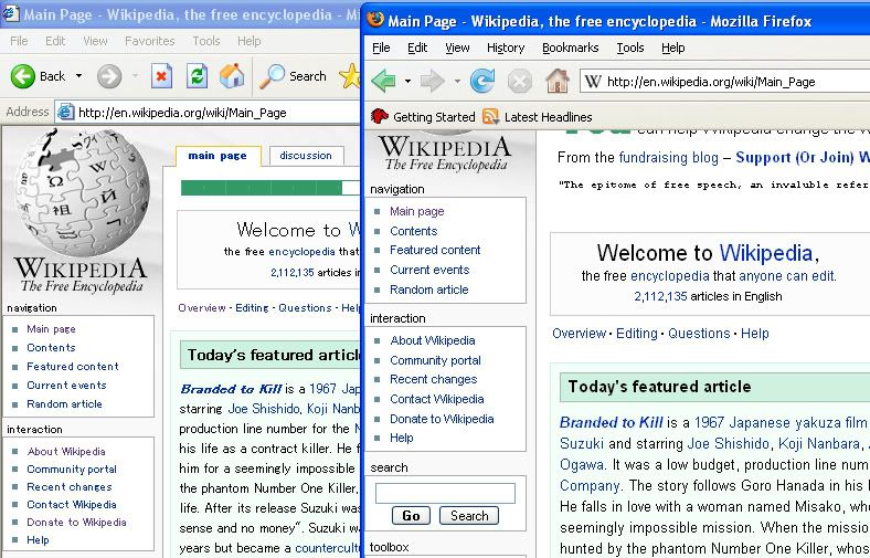
Here is an image of the issue; Firefox shows how it used to look in IE and still looks in Fox TheHYPO 09:45, 3 December 2007 (UTC)
- There is no specific font set, just a font-family. On wikipeida that is "sans-serif". On Windows and Internet Explorer, that usually results in Arial being used, or otherwise the first sans-serif in the fontlist. In Firefox, one can set the font for sans-serif explicitly. — Edokter • Talk • 10:28, 3 December 2007 (UTC)
- For anyone having trouble finding this, it's hard-coded in the main.css file mentioned above. See http://en.wikipedia.org/style/monobook/main.css where body is defined as "x-small sans-serif;" Of course, anyone can override this (or anything else) in their Special:Mypage/monobook.css if they see fit. Superm401 - Talk 02:54, 23 December 2007 (UTC)