Portal:Mathematics/Selected picture

From Wikipedia, the free encyclopedia

This is the collection of pictures that are being randomly selected for display on Portal:Mathematics. (This system replaces the previous "Featured picture" system that was in use until March 2014.)

To add a new image:

  1. Edit any existing subpage in the list below (link in upper-left corner of box) and copy its wikicode.
  2. Select the first non-existing subpage listed below (shown as a "redlink") to start editing that subpage, and paste the wikicode you just copied.
    • If there is no "redlink" at the bottom of the list, edit this page and look for the code {{numbered subpages|max=nn}}. Increase nn by 2 (so there will still be a redlink after you create one new supage) and save the page.
  3. Change all the relevant template parameters, as necessary.
    • Note that the value of the caption parameter is used as the image's "alt text" and so should describe the appearance of the image as if explaining it to someone who cannot see it. You need not use a complete, grammatically correct sentence for this (e.g., "animation of blah" can be used instead of "This is an animation of blah.").
    • The text parameter is displayed as a paragraph of text below the image and should use complete, grammatically correct sentences to explain the meaning of the image and its significance from a mathematical perspective.
    • If the code you copied in step 1 used the size parameter to specify the image size, try removing that line to see whether the image looks acceptable at the default size.
    • Finally, note that we do not use the gallery, location or archive parameters of the {{Selected picture}} template. Also, please do not change the page = picture or framecolor = transparent lines.)
  4. Save the new subpage and check that it's being displayed correctly in the list below. (You may have to purge the cache to see the changes.)
    • If the default size is not acceptable (for example, if a raster image is being displayed larger than its actual size or if a GIF animation is showing up as a static image), the size parameter can be used to set the width (in pixels) of the image.
  5. Edit Portal:Mathematics and locate the template call that randomly chooses the pictures for display:
    {{Random portal component|max=nn|subpage=Selected picture|header=Selected picture}}
  6. Increase the number nn to reflect the new count of selected pictures, and save the page.
  7. And you're done.

To find good images to add here, see any of the following image collections:

You can also simply look through the images currently being displayed in our mathematics articles:

Try to select new images from areas of mathematics that are not already represented in the list below.

Purge server cache

Selected picture 1

Portal:Mathematics/Selected picture/1

animation of the act of "unrolling" a circle's circumference, illustrating the ratio pi (π)
Credit: John Reid
Pi, represented by the Greek letter π, is a mathematical constant whose value is the ratio of any circle's circumference to its diameter in Euclidean space (i.e., on a flat plane); it is also the ratio of a circle's area to the square of its radius. (These facts are reflected in the familiar formulas from geometry, C = π d and A = π r2.) In this animation, the circle has a diameter of 1 unit, giving it a circumference of π. The rolling shows that the distance a point on the circle moves linearly in one complete revolution is equal to π. Pi is an irrational number and so cannot be expressed as the ratio of two integers; as a result, the decimal expansion of π is nonterminating and nonrepeating. To 50 decimal places, π  3.14159 26535 89793 23846 26433 83279 50288 41971 69399 37510, a value of sufficient precision to allow the calculation of the volume of a sphere the size of the orbit of Neptune around the Sun (assuming an exact value for this radius) to within 1 cubic angstrom. According to the Lindemann–Weierstrass theorem, first proved in 1882, π is also a transcendental (or non-algebraic) number, meaning it is not the root of any non-zero polynomial with rational coefficients. (This implies that it cannot be expressed using any closed-form algebraic expression—and also that solving the ancient problem of squaring the circle using a compass and straightedge construction is impossible). Perhaps the simplest non-algebraic closed-form expression for π is 4 arctan 1, based on the inverse tangent function (a transcendental function). There are also many infinite series and some infinite products that converge to π or to a simple function of it, like 2/π; one of these is the infinite series representation of the inverse-tangent expression just mentioned. Such iterative approaches to approximating π first appeared in 15th-century India and were later rediscovered (perhaps not independently) in 17th- and 18th-century Europe (along with several continued fractions representations). Although these methods often suffer from an impractically slow convergence rate, one modern infinite series that converges to 1/π very quickly is given by the Chudnovsky algorithm, first published in 1989; each term of this series gives an astonishing 14 additional decimal places of accuracy. In addition to geometry and trigonometry, π appears in many other areas of mathematics, including number theory, calculus, and probability.

Selected picture 2

Portal:Mathematics/Selected picture/2
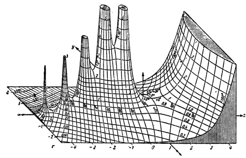
hand-drawn three-dimensional graph
Credit: TakuyaMurata (uploader)
This is a hand-drawn graph of the absolute value (or modulus) of the gamma function on the complex plane, as published in the 1909 book Tables of Higher Functions, by Eugene Jahnke and Fritz Emde. Such three-dimensional graphs of complicated functions were rare before the advent of high-resolution computer graphics (even today, tables of values are used in many contexts to look up function values instead of consulting graphs directly). Published even before applications for the complex gamma function were discovered in theoretical physics in the 1930s, Jahnke and Emde's graph "acquired an almost iconic status", according to physicist Michael Berry. See a similar computer-generated image for comparison. When restricted to positive integers, the gamma function generates the factorials through the relation Γ(n) = (n − 1)!, which is the product of all positive integers from n − 1 down to 1 (0! is defined to be equal to 1). For real and complex numbers, the function is defined by the improper integral . This integral diverges when t is a negative integer, which is causing the spikes in the left half of the graph (these are simple poles of the function, where its values increase to infinity, analogous to asymptotes in two-dimensional graphs). The gamma function has applications in quantum physics, astrophysics, and fluid dynamics, as well as in number theory and probability.

Selected picture 3

Portal:Mathematics/Selected picture/3

animation of the classic "butterfly-shaped" Lorenz attractor seen from three different perspectives
The Lorenz attractor is an iconic example of a strange attractor in chaos theory. This three-dimensional fractal structure, resembling a butterfly or figure eight, reflects the long-term behavior of solutions to the Lorenz system, a set of three differential equations used by mathematician and meteorologist Edward N. Lorenz as a simple description of fluid circulation in a shallow layer (of liquid or gas) uniformly heated from below and cooled from above. To be more specific, the figure is set in a three-dimensional coordinate system whose axes measure the rate of convection in the layer (x), the horizontal temperature variation (y), and the vertical temperature variation (z). As these quantities change over time, a path is traced out within the coordinate system reflecting a particular solution to the differential equations. Lorenz's analysis revealed that while all solutions are completely deterministic, some choices of input parameters and initial conditions result in solutions showing complex, non-repeating patterns that are highly dependent on the exact values chosen. As stated by Lorenz in his 1963 paper Deterministic Nonperiodic Flow: "Two states differing by imperceptible amounts may eventually evolve into two considerably different states". He later coined the term "butterfly effect" to describe the phenomenon. One implication is that computing such chaotic solutions to the Lorenz system (i.e., with a computer program) to arbitrary precision is not possible, as any real-world computer will have a limitation on the precision with which it can represent numerical values. The particular solution plotted in this animation is based on the parameter values used by Lorenz (σ = 10, ρ = 28, and β = 8/3, constants reflecting certain physical attributes of the fluid). Note that the animation repeatedly shows one solution plotted over a specific period of time; as previously mentioned, the true solution never exactly retraces itself. Not all solutions are chaotic, however. Some choices of parameter values result in solutions that tend toward equilibrium at a fixed point (as seen, for example, in this image). Initially developed to describe atmospheric convection, the Lorenz equations also arise in simplified models for lasers, electrical generators and motors, and chemical reactions.

Selected picture 4

Portal:Mathematics/Selected picture/4

truncated icosahedron with black pentagonal faces and white hexagonal faces, beside a similar-looking 1970s soccer ball
Here a polyhedron called a truncated icosahedron (left) is compared to the classic Adidas Telstar–style football (or soccer ball). The familiar 32-panel ball design, consisting of 12 black pentagonal and 20 white hexagonal panels, was first introduced by the Danish manufacturer Select Sport, based loosely on the geodesic dome designs of Buckminster Fuller; it was popularized by the selection of the Adidas Telstar as the official match ball of the 1970 FIFA World Cup. The polyhedron is also the shape of the Buckminsterfullerene (or "Buckyball") carbon molecule initially predicted theoretically in the late 1960s and first generated in the laboratory in 1985. Like all polyhedra, the vertices (corner points), edges (lines between these points), and faces (flat surfaces bounded by the lines) of this solid obey the Euler characteristic, VE + F = 2 (here, 60 − 90 + 32 = 2). The icosahedron from which this solid is obtained by truncating (or "cutting off") each vertex (replacing each by a pentagonal face), has 12 vertices, 30 edges, and 20 faces; it is one of the five regular solids, or Platonic solids—named after Plato, whose school of philosophy in ancient Greece held that the classical elements (earth, water, air, fire, and a fifth element called aether) were associated with these regular solids. The fifth element was known in Latin as the "quintessence", a hypothesized uncorruptible material (in contrast to the other four terrestrial elements) filling the heavens and responsible for celestial phenomena. That such idealized mathematical shapes as polyhedra actually occur in nature (e.g., in crystals and other molecular structures) was discovered by naturalists and physicists in the 19th and 20th centuries, largely independently of the ancient philosophies.

Selected picture 5

Portal:Mathematics/Selected picture/5
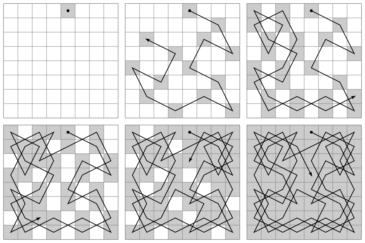
animation of one possible knight's tour on a chess board
The knight's tour is a mathematical chess problem in which the piece called the knight is to visit each square on an otherwise empty chess board exactly once, using only legal moves. It is a special case of the more general Hamiltonian path problem in graph theory. (A closely related non-Hamiltonian problem is that of the longest uncrossed knight's path.) The tour is called closed if the knight ends on a square from which it may legally move to its starting square (thereby forming an endless cycle), and open if not. The tour shown in this animation is open (see also a static image of the completed tour). On a standard 8 × 8 board there are 26,534,728,821,064 possible closed tours and 39,183,656,341,959,810 open tours (counting separately any tours that are equivalent by rotation, reflection, or reversing the direction of travel). Although the earliest known solutions to the knight's tour problem date back to the 9th century CE, the first general procedure for completing the knight's tour was Warnsdorff's rule, first described in 1823. The knight's tour was one of many chess puzzles solved by The Turk, a fake chess-playing machine exhibited as an automaton from 1770 to 1854, and exposed in the early 1820s as an elaborate hoax. True chess-playing automatons (i.e., computer programs) appeared in the 1950s, and by 1988 had become sufficiently advanced to win a match against a grandmaster; in 1997, Deep Blue famously became the first computer system to defeat a reigning world champion (Garry Kasparov) in a match under standard tournament time controls. Despite these advances, there is still debate as to whether chess will ever be "solved" as a computer problem (meaning an algorithm will be developed that can never lose a chess match). According to Zermelo's theorem, such an algorithm does exist.

Selected picture 6

Portal:Mathematics/Selected picture/6

spiral figure representing both finite and transfinite ordinal numbers
This spiral diagram represents all ordinal numbers less than ωω. The first (outermost) turn of the spiral represents the finite ordinal numbers, which are the regular counting numbers starting with zero. As the spiral completes its first turn (at the top of the diagram), the ordinal numbers approach infinity, or more precisely ω, the first transfinite ordinal number (identified with the set of all counting numbers, a "countably infinite" set, the cardinality of which corresponds to the first transfinite cardinal number, called 0). The ordinal numbers continue from this point in the second turn of the spiral with ω + 1, ω + 2, and so forth. (A special ordinal arithmetic is defined to give meaning to these expressions, since the + symbol here does not represent the addition of two real numbers.) Halfway through the second turn of the spiral (at the bottom) the numbers approach ω + ω, or ω · 2. The ordinal numbers continue with ω · 2 + 1 through ω · 2 + ω = ω · 3 (three-quarters of the way through the second turn, or at the "9 o'clock" position), then through ω · 4, and so forth, up to ω · ω = ω2 at the top. (As with addition, the multiplication and exponentiation operations have definitions that work with transfinite numbers.) The ordinals continue in the third turn of the spiral with ω2 + 1 through ω2 + ω, then through ω2 + ω2 = ω2 · 2, up to ω2 · ω = ω3 at the top of the third turn. Continuing in this way, the ordinals increase by one power of ω for each turn of the spiral, approaching ωω in the middle of the diagram, as the spiral makes a countably infinite number of turns. This process can actually continue (not shown in this diagram) through and , and so on, approaching the first epsilon number, ε0. Each of these ordinals is still countable, and therefore equal in cardinality to ω. After uncountably many of these transfinite ordinals, the first uncountable ordinal is reached, corresponding to only the second infinite cardinal, . The identification of this larger cardinality with the cardinality of the set of real numbers can neither be proved nor disproved within the standard version of axiomatic set theory called Zermelo–Fraenkel set theory, whether or not one also assumes the axiom of choice.

Selected picture 7

Portal:Mathematics/Selected picture/7

animation illustrating the meaning of a line integral of a two-dimensional scalar field
A line integral is an integral where the function to be integrated, be it a scalar field as here or a vector field, is evaluated along a curve. The value of the line integral is the sum of values of the field at all points on the curve, weighted by some scalar function on the curve (commonly arc length or, for a vector field, the scalar product of the vector field with a differential vector in the curve). A detailed explanation of the animation is available. The key insight is that line integrals may be reduced to simpler definite integrals. (See also a similar animation illustrating a line integral of a vector field.) Many formulas in elementary physics (for example, W = F · s to find the work done by a constant force F in moving an object through a displacement s) have line integral versions that work for non-constant quantities (for example, W = ∫C F · ds to find the work done in moving an object along a curve C within a continuously varying gravitational or electric field F). A higher-dimensional analog of a line integral is a surface integral, where the (double) integral is taken over a two-dimensional surface instead of along a one-dimensional curve. Surface integrals can also be thought of as generalizations of multiple integrals. All of these can be seen as special cases of integrating a differential form, a viewpoint which allows multivariable calculus to be done independently of the choice of coordinate system. While the elementary notions upon which integration is based date back centuries before Newton and Leibniz independently invented calculus, line and surface integrals were formalized in the 18th and 19th centuries as the subject was placed on a rigorous mathematical foundation. The modern notion of differential forms, used extensively in differential geometry and quantum physics, was pioneered by Élie Cartan in the late 19th century.

Selected picture 8

Portal:Mathematics/Selected picture/8

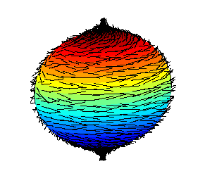
colored ball with "hair" (representing a vector field on a sphere)
This image illustrates a failed attempt to comb the "hair" on a ball flat, leaving a tuft sticking out at each pole. The hairy ball theorem of algebraic topology states that whenever one attempts to comb a hairy ball, there will always be at least one point on the ball at which a tuft of hair sticks out. More precisely, it states that there is no nonvanishing continuous tangent-vector field on an even-dimensional n‑sphere (an ordinary sphere in three-dimensional space is known as a "2-sphere"). This is not true of certain other three-dimensional shapes, such as a torus (doughnut shape) which can be combed flat. The theorem was first stated by Henri Poincaré in the late 19th century and proved in 1912 by L. E. J. Brouwer. If one idealizes the wind in the Earth's atmosphere as a tangent-vector field, then the hairy ball theorem implies that given any wind at all on the surface of the Earth, there must at all times be a cyclone somewhere. Note, however, that wind can move vertically in the atmosphere, so the idealized case is not meteorologically sound. (What is true is that for every "shell" of atmosphere around the Earth, there must be a point on the shell where the wind is not moving horizontally.) The theorem also has implications in computer modeling (including video game design), in which a common problem is to compute a non-zero 3-D vector that is orthogonal (i.e., perpendicular) to a given one; the hairy ball theorem implies that there is no single continuous function that accomplishes this task.

Selected picture 9

Portal:Mathematics/Selected picture/9
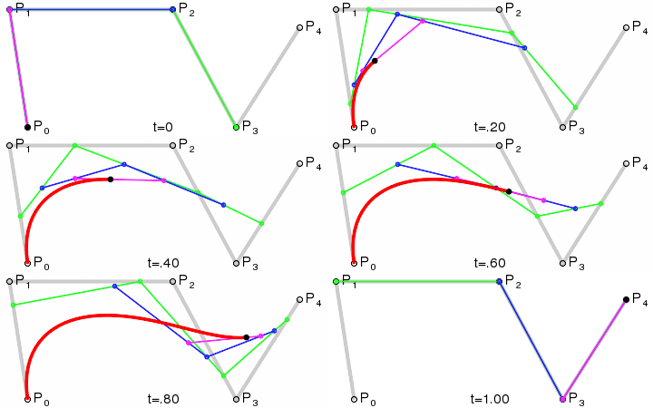
animation of the construction of a fourth-degree Bézier curve
A Bézier curve is a parametric curve important in computer graphics and related fields. Widely publicized in 1962 by the French engineer Pierre Bézier, who used them to design automobile bodies, the curves were first developed in 1959 by Paul de Casteljau using de Casteljau's algorithm. In this animation, a quartic Bézier curve is constructed using control points P0 through P4. The green line segments join points moving at a constant rate from one control point to the next; the parameter t shows the progress over time. Meanwhile, the blue line segments join points moving in a similar manner along the green segments, and the magenta line segment points along the blue segments. Finally, the black point moves at a constant rate along the magenta line segment, tracing out the final curve in red. The curve is a fourth-degree function of its parameter. Quadratic and cubic Bézier curves are most common since higher-degree curves are more computationally costly to evaluate. When more complex shapes are needed, lower-order Bézier curves are patched together. For example, modern computer fonts use Bézier splines composed of quadratic or cubic Bézier curves to create scalable typefaces. The curves are also used in computer animation and video games to plot smooth paths of motion. Approximate Bézier curves can be generated in the "real world" using string art.

Selected picture 10

Portal:Mathematics/Selected picture/10
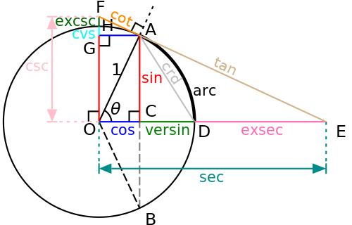
diagram of a unit circle and several associated triangles whose side lengths are the values of the various trigonometric functions
Credit: Steven G. Johnson (original version)
This is a graphical construction of the various trigonometric functions from a unit circle centered at the origin, O, and two points, A and D, on the circle separated by a central angle θ. The triangle AOC has side lengths cos θ (OC, the side adjacent to the angle θ) and sin θ (AC, the side opposite the angle), and a hypotenuse of length 1 (because the circle has unit radius). When the tangent line AE to the circle at point A is drawn to meet the extension of OD beyond the limits of the circle, the triangle formed, AOE, contains sides of length tan θ (AE) and sec θ (OE). When the tangent line is extended in the other direction to meet the line OF drawn perpendicular to OC, the triangle formed, AOF, has sides of length cot θ (AF) and csc θ (OF). In addition to these common trigonometric functions, the diagram also includes some functions that have fallen into disuse: the chord (AD), versine (CD), exsecant (DE), coversine (GH), and excosecant (FH). First used in the early Middle Ages by Indian and Islamic mathematicians to solve simple geometrical problems (e.g., solving triangles), the trigonometric functions today are used in sophisticated two- and three-dimensional computer modeling (especially when rotating modeled objects), as well as in the study of sound and other mechanical waves, light (electromagnetic waves), and electrical networks.

Selected picture 11

Portal:Mathematics/Selected picture/11

graph of an increasing curve showing cumulative share of income earned versus cumulative share of people from lowest to highest income
A Lorenz curve shows the distribution of income in a population by plotting the percentage y of total income that is earned by the bottom x percent of households (or individuals). Developed by economist Max O. Lorenz in 1905 to describe income inequality, the curve is typically plotted with a diagonal line (reflecting a hypothetical "equal" distribution of incomes) for comparison. This leads naturally to a derived quantity called the Gini coefficient, first published in 1912 by Corrado Gini, which is the ratio of the area between the diagonal line and the curve (area A in this graph) to the area under the diagonal line (the sum of A and B); higher Gini coefficients reflect more income inequality. Lorenz's curve is a special kind of cumulative distribution function used to characterize quantities that follow a Pareto distribution, a type of power law. More specifically, it can be used to illustrate the Pareto principle, a rule of thumb stating that roughly 80% of the identified "effects" in a given phenomenon under study will come from 20% of the "causes" (in the first decade of the 20th century Vilfredo Pareto showed that 80% of the land in Italy was owned by 20% of the population). As this so-called "80–20 rule" implies a specific level of inequality (i.e., a specific power law), more or less extreme cases are possible. For example, in the United States in the first half of the 2010s, 95% of the financial wealth was held by the top 20% of wealthiest households (in 2010), the top 1% of individuals held approximately 40% of the wealth (2012), and the top 1% of income earners received approximately 20% of the pre-tax income (2013). Observations such as these have brought income and wealth inequality into popular consciousness and have given rise to various slogans about "the 1%" versus "the 99%".

Selected picture 12

Portal:Mathematics/Selected picture/12

animation showing a roughly star-shaped graph being traced out as a smaller circle rolls around inside of a larger circle
A hypotrochoid is a curve traced out by a point "attached" to a smaller circle rolling around inside a fixed larger circle. In this example, the hypotrochoid is the red curve that is traced out by the red point 5 units from the center of the black circle of radius 3 as it rolls around inside the blue circle of radius 5. A special case is a hypotrochoid with the inner circle exactly one-half the radius of the outer circle, resulting in an ellipse (see an animation showing this). Mathematical analysis of closely-related curves called hypocycloids lead to special Lie groups. Both hypotrochoids and epitrochoids (where the moving circle rolls around on the outside of the fixed circle) can be created using the Spirograph drawing toy. These curves have applications in the "real world" in epicyclic and hypocycloidal gearing, which were used in World War II in the construction of portable radar gear and may be used today in 3D printing.

Selected picture 13

Portal:Mathematics/Selected picture/13

graph in the complex plane showing a looping curve passing several times through the origin
This is a graph of a portion of the complex-valued Riemann zeta function along the critical line (the set of complex numbers having real part equal to 1/2). More specifically, it is a graph of Im ζ(1/2 + it) versus Re ζ(1/2 + it) (the imaginary part vs. the real part) for values of the real variable t running from 0 to 34 (the curve starts at its leftmost point, with real part approximately −1.46 and imaginary part 0). The first five zeros along the critical line are visible in this graph as the five times the curve passes through the origin (which occur at t  14.13, 21.02, 25.01, 30.42, and 32.93 — for a different perspective, see a graph of the real and imaginary parts of this function plotted separately over a wider range of values). In 1914, G. H. Hardy proved that ζ(1/2 + it) has infinitely many zeros. According to the Riemann hypothesis, zeros of this form constitute the only non-trivial zeros of the full zeta function, ζ(s), where s varies over all complex numbers. Riemann's zeta function grew out of Leonhard Euler's study of real-valued infinite series in the early 18th century. In a famous 1859 paper called "On the Number of Primes Less Than a Given Magnitude", Bernhard Riemann extended Euler's results to the complex plane and established a relation between the zeros of his zeta function and the distribution of prime numbers. The paper also contained the previously mentioned Riemann hypothesis, which is considered by many mathematicians to be the most important unsolved problem in pure mathematics. The Riemann zeta function plays a pivotal role in analytic number theory and has applications in physics, probability theory, and applied statistics.

Selected picture 14

Portal:Mathematics/Selected picture/14

three double-cones cut by planes in different ways, resulting in the four conic sections
The four conic sections arise when a plane cuts through a double cone in different ways. If the plane cuts through parallel to the side of the cone (case 1), a parabola results (to be specific, the parabola is the shape of the planar graph that is formed by the set of points of intersection of the plane and the cone). If the plane is perpendicular to the cone's axis of symmetry (case 2, lower plane), a circle results. If the plane cuts through at some angle between these two cases (case 2, upper plane) — that is, if the angle between the plane and the axis of symmetry is larger than that between the side of the cone and the axis, but smaller than a right angle — an ellipse results. If the plane is parallel to the axis of symmetry (case 3), or makes a smaller positive angle with the axis than the side of the cone does (not shown), a hyperbola results. In all of these cases, if the plane passes through the point at which the two cones meet (the vertex), a degenerate conic results. First studied by the ancient Greeks in the 4th century BCE, conic sections were still considered advanced mathematics by the time Euclid (fl. c. 300 BCE) created his Elements, and so do not appear in that famous work. Euclid did write a work on conics, but it was lost after Apollonius of Perga (d. c. 190 BCE) collected the same information and added many new results in his Conics. Other important results on conics were discovered by the medieval Persian mathematician Omar Khayyám (d. 1131 CE), who used conic sections to solve algebraic equations.

Selected picture 15

Portal:Mathematics/Selected picture/15
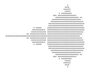
low-resolution ASCII-art depiction of the Mandelbrot set
This is a modern reproduction of the first published image of the Mandelbrot set, which appeared in 1978 in a technical paper on Kleinian groups by Robert W. Brooks and Peter Matelski. The Mandelbrot set consists of the points c in the complex plane that generate a bounded sequence of values when the recursive relation zn+1 = zn2 + c is repeatedly applied starting with z0 = 0. The boundary of the set is a highly complicated fractal, revealing ever finer detail at increasing magnifications. The boundary also incorporates smaller near-copies of the overall shape, a phenomenon known as quasi-self-similarity. The ASCII-art depiction seen in this image only hints at the complexity of the boundary of the set. Advances in computing power and computer graphics in the 1980s resulted in the publication of high-resolution color images of the set (in which the colors of points outside the set reflect how quickly the corresponding sequences of complex numbers diverge), and made the Mandelbrot set widely known by the general public. Named by mathematicians Adrien Douady and John H. Hubbard in honor of Benoit Mandelbrot, one of the first mathematicians to study the set in detail, the Mandelbrot set is closely related to the Julia set, which was studied by Gaston Julia beginning in the 1910s.

Selected picture 16

Portal:Mathematics/Selected picture/16

animation of patterns of black pixels moving on a white background
Conway's Game of Life is a cellular automaton devised by the British mathematician John Horton Conway in 1970. It is an example of a zero-player game, meaning that its evolution is completely determined by its initial state, requiring no further input as the game progresses. After an initial pattern of filled-in squares ("live cells") is set up in a two-dimensional grid, the fate of each cell (including empty, or "dead", ones) is determined at each step of the game by considering its interaction with its eight nearest neighbors (the cells that are horizontally, vertically, or diagonally adjacent to it) according to the following rules: (1) any live cell with fewer than two live neighbors dies, as if caused by under-population; (2) any live cell with two or three live neighbors lives on to the next generation; (3) any live cell with more than three live neighbors dies, as if by overcrowding; (4) any dead cell with exactly three live neighbors becomes a live cell, as if by reproduction. By repeatedly applying these simple rules, extremely complex patterns can emerge. In this animation, a breeder (in this instance called a puffer train, colored red in the final frame of the animation) leaves guns (green) in its wake, which in turn "fire out" gliders (blue). Many more complex patterns are possible. Conway developed his rules as a simplified model of a hypothetical machine that could build copies of itself, a more complicated version of which was discovered by John von Neumann in the 1940s. Variations on the Game of Life use different rules for cell birth and death, use more than two states (resulting in evolving multicolored patterns), or are played on a different type of grid (e.g., a hexagonal grid or a three-dimensional one). After making its first public appearance in the October 1970 issue of Scientific American, the Game of Life popularized a whole new field of mathematical research called cellular automata, which has been applied to problems in cryptography and error-correction coding, and has even been suggested as the basis for new discrete models of the universe.

Selected picture 17

Portal:Mathematics/Selected picture/17

illustration of a closed loop (a circle) and progressively more knotted loops
This is a chart of all prime knots having seven or fewer crossings (not including mirror images) along with the unknot (or "trivial knot"), a closed loop that is not a prime knot. The knots are labeled with Alexander-Briggs notation. Many of these knots have special names, including the trefoil knot (31) and figure-eight knot (41). Knot theory is the study of knots viewed as different possible embeddings of a 1-sphere (a circle) in three-dimensional Euclidean space (R3). These mathematical objects are inspired by real-world knots, such as knotted ropes or shoelaces, but don't have any free ends and so cannot be untied. (Two other closely related mathematical objects are braids, which can have loose ends, and links, in which two or more knots may be intertwined.) One way of distinguishing one knot from another is by the number of times its two-dimensional depiction crosses itself, leading to the numbering shown in the diagram above. The prime knots play a role very similar to prime numbers in number theory; in particular, any given (non-trivial) knot can be uniquely expressed as a "sum" of prime knots (a series of prime knots spliced together) or is itself prime. Early knot theory enjoyed a brief period of popularity among physicists in the late 19th century after William Thomson suggested that atoms are knots in the luminiferous aether. This led to the first serious attempts to catalog all possible knots (which, along with links, now number in the billions). In the early 20th century, knot theory was recognized as a subdiscipline within geometric topology. Scientific interest was resurrected in the latter half of the 20th century by the need to understand knotting problems in organic chemistry, including the behavior of DNA, and the recognition of connections between knot theory and quantum field theory.

Selected picture 18

Portal:Mathematics/Selected picture/18

three-dimensional rendering of a pink, translucent Klein bottle
A Klein bottle is an example of a closed surface (a two-dimensional manifold) that is non-orientable (no distinction between the "inside" and "outside"). This image is a representation of the object in everyday three-dimensional space, but a true Klein bottle is an object in four-dimensional space. When it is constructed in three-dimensions, the "inner neck" of the bottle curves outward and intersects the side; in four dimensions, there is no such self-intersection (the effect is similar to a two-dimensional representation of a cube, in which the edges seem to intersect each other between the corners, whereas no such intersection occurs in a true three-dimensional cube). Also, while any real, physical object would have a thickness to it, the surface of a true Klein bottle has no thickness. Thus in three dimensions there is an inside and outside in a colloquial sense: liquid forced through the opening on the right side of the object would collect at the bottom and be contained on the inside of the object. However, on the four-dimensional object there is no inside and outside in the way that a sphere has an inside and outside: an unbroken curve can be drawn from a point on the "outer" surface (say, the object's lowest point) to the right, past the "lip" to the "inside" of the narrow "neck", around to the "inner" surface of the "body" of the bottle, then around on the "outer" surface of the narrow "neck", up past the "seam" separating the inside and outside (which, as mentioned before, does not exist on the true 4-D object), then around on the "outer" surface of the body back to the starting point (see the light gray curve on this simplified diagram). In this regard, the Klein bottle is a higher-dimensional analog of the Möbius strip, a two-dimensional manifold that is non-orientable in ordinary 3-dimensional space. In fact, a Klein bottle can be constructed (conceptually) by "gluing" the edges of two Möbius strips together.

Selected picture 19

Portal:Mathematics/Selected picture/19

network diagram showing inputs A and B with carry-input C_in, five intervening logic gates, and the resulting sum S and carry-output C_out
This logic diagram of a full adder shows how logic gates can be used in a digital circuit to add two binary inputs (i.e., two input bits), along with a carry-input bit (typically the result of a previous addition), resulting in a final "sum" bit and a carry-output bit. This particular circuit is implemented with two XOR gates, two AND gates and one OR gate, although equivalent circuits may be composed of only NAND gates or certain combinations of other gates. To illustrate its operation, consider the inputs A = 1 and B = 1 with Cin = 0; this means we are adding 1 and 1, and so should get the number 2. The output of the first XOR gate (upper-left) is 0, since the two inputs do not differ (1 XOR 1 = 0). The second XOR gate acts on this result and the carry-input bit, 0, resulting in S = 0 (0 XOR 0 = 0). Meanwhile, the first AND gate (in the middle) acts on the output of the first gate, 0, and the carry-input bit, 0, resulting in 0 (0 AND 0 = 0); and the second AND gate (immediately below the other one) acts on the two original input bits, 1 and 1, resulting in 1 (1 AND 1 = 1). Finally, the OR gate at the lower-right corner acts on the outputs of the two AND gates and results in the carry-output bit Cout = 1 (0 OR 1 = 1). This means the final answer is "0-carry-1", or "10", which is the binary representation of the number 2. Multiple-bit adders (i.e., circuits that can add inputs of 4-bit length, 8-bit length, or any other desired length) can be implemented by chaining together simpler 1-bit adders such as this one. Adders are examples of the kinds of simple digital circuits that are combined in sophisticated ways inside computer CPUs to perform all of the functions necessary to operate a digital computer. The fact that simple electronic switches could implement logical operations—and thus simple arithmetic, as shown here—was realized by Charles Sanders Peirce in 1886, building on the mathematical work of Gottfried Wilhelm Leibniz and George Boole, after whom Boolean algebra was named. The first modern electronic logic gates were produced in the 1920s, leading ultimately to the first digital, general-purpose (i.e., programmable) computers in the 1940s.

Selected picture 20

Portal:Mathematics/Selected picture/20

animation of dots of varying heights being sorted by height using the quicksort algorithm
Quicksort (also known as the partition-exchange sort) is an efficient sorting algorithm that works for items of any type for which a total order (i.e., "≤") relation is defined. This animation shows how the algorithm partitions the input array (here a random permutation of the numbers 1 through 33) into two smaller arrays based on a selected pivot element (bar marked in red, here always chosen to be the last element in the array under consideration), by swapping elements between the two sub-arrays so that those in the first (on the left) end up all smaller than the pivot element's value (horizontal blue line) and those in the second (on the right) all larger. The pivot element is then moved to a position between the two sub-arrays; at this point, the pivot element is in its final position and will never be moved again. The algorithm then proceeds to recursively apply the same procedure to each of the smaller arrays, partitioning and rearranging the elements until there are no sub-arrays longer than one element left to process. (As can be seen in the animation, the algorithm actually sorts all left-hand sub-arrays first, and then starts to process the right-hand sub-arrays.) First developed by Tony Hoare in 1959, quicksort is still a commonly used algorithm for sorting in computer applications. On the average, it requires O(n log n) comparisons to sort n items, which compares favorably to other popular sorting methods, including merge sort and heapsort. Unfortunately, on rare occasions (including cases where the input is already sorted or contains items that are all equal) quicksort requires a worst-case O(n2) comparisons, while the other two methods remain O(n log n) in their worst cases. Still, when implemented well, quicksort can be about two or three times faster than its main competitors. Unlike merge sort, the standard implementation of quicksort does not preserve the order of equal input items (it is not stable), although stable versions of the algorithm do exist at the expense of requiring O(n) additional storage space. Other variations are based on different ways of choosing the pivot element (for example, choosing a random element instead of always using the last one), using more than one pivot, switching to an insertion sort when the sub-arrays have shrunk to a sufficiently small length, and using a three-way partitioning scheme (grouping items into those smaller, larger, and equal to the pivot—a modification that can turn the worst-case scenario of all-equal input values into the best case). Because of the algorithm's "divide and conquer" approach, parts of it can be done in parallel (in particular, the processing of the left and right sub-arrays can be done simultaneously). However, other sorting algorithms (including merge sort) experience much greater speed increases when performed in parallel.

Selected picture 21

Portal:Mathematics/Selected picture/21

animation of a grid of boxes numbered 2 through 120, where the prime numbers are progressively circled and listed to the side while the composite numbers are struck out
The sieve of Eratosthenes is a simple algorithm for finding all prime numbers up to a specified maximum value. It works by identifying the prime numbers in increasing order while removing from consideration composite numbers that are multiples of each prime. This animation shows the process of finding all primes no greater than 120. The algorithm begins by identifying 2 as the first prime number and then crossing out every multiple of 2 up to 120. The next available number, 3, is the next prime number, so then every multiple of 3 is crossed out. (In this version of the algorithm, 6 is not crossed out again since it was just identified as a multiple of 2. The same optimization is used for all subsequent steps of the process: given a prime p, only multiples no less than p2 are considered for crossing out, since any lower multiples must already have been identified as multiples of smaller primes. Larger multiples that just happen to already be crossed out—like 12 when considering multiples of 3—are crossed out again, because checking for such duplicates would impose an unnecessary speed penalty on any real-world implementation of the algorithm.) The next remaining number, 5, is the next prime, so its multiples get crossed out (starting with 25); and so on. The process continues until no more composite numbers could possibly be left in the list (i.e., when the square of the next prime exceeds the specified maximum). The remaining numbers (here starting with 11) are all prime. Note that this procedure is easily extended to find primes in any given arithmetic progression. One of several prime number sieves, this ancient algorithm was attributed to the Greek mathematician Eratosthenes (d. c. 194 BCE) by Nicomachus in his first-century (CE) work Introduction to Arithmetic. Other more modern sieves include the sieve of Sundaram (1934) and the sieve of Atkin (2003). The main benefit of sieve methods is the avoidance of costly primality tests (or, conversely, divisibility tests). Their main drawback is their restriction to specific ranges of numbers, which makes this type of method inappropriate for applications requiring very large prime numbers, such as public-key cryptography.

Selected picture 22

Portal:Mathematics/Selected picture/22

graph showing two sets of 4 points, each set perfectly fit by a trend line with positive slope; the set of points on the left is higher and the set on the right lower, so the entire collection of points is best fit by a trend line with negative slope
Simpson's paradox (also known as the Yule–Simpson effect) states that an observed association between two variables can reverse when considered at separate levels of a third variable (or, conversely, that the association can reverse when separate groups are combined). Shown here is an illustration of the paradox for quantitative data. In the graph the overall association between X and Y is negative (as X increases, Y tends to decrease when all of the data is considered, as indicated by the negative slope of the dashed line); but when the blue and red points are considered separately (two levels of a third variable, color), the association between X and Y appears to be positive in each subgroup (positive slopes on the blue and red lines — note that the effect in real-world data is rarely this extreme). Named after British statistician Edward H. Simpson, who first described the paradox in 1951 (in the context of qualitative data), similar effects had been mentioned by Karl Pearson (and coauthors) in 1899, and by Udny Yule in 1903. One famous real-life instance of Simpson's paradox occurred in the UC Berkeley gender-bias case of the 1970s, in which the university was sued for gender discrimination because it had a higher admission rate for male applicants to its graduate schools than for female applicants (and the effect was statistically significant). The effect was reversed, however, when the data was split by department: most departments showed a small but significant bias in favor of women. The explanation was that women tended to apply to competitive departments with low rates of admission even among qualified applicants, whereas men tended to apply to less-competitive departments with high rates of admission among qualified applicants. (Note that splitting by department was a more appropriate way of looking at the data since it is individual departments, not the university as a whole, that admit graduate students.)

Selected picture 23

Portal:Mathematics/Selected picture/23
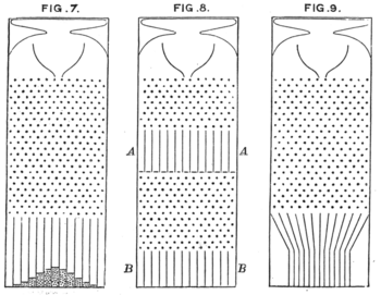
three hand-drawn diagrams of boxes containing grids of pins that a small ball may fall through, ending up in one of several bins at the bottom
Credit: Fangz (original uploader)
This is Francis Galton's original 1889 drawing of three versions of a "bean machine", now commonly called a "Galton box" (another name is a quincunx), a real-world device that can be used to illustrate the de Moivre–Laplace theorem of probability theory, which states that the normal distribution is a good approximation to the binomial distribution provided that the number of repeated "trials" associated with the latter distribution is sufficiently large. As the "bean" (i.e., a small ball) falls through the box (the design of which is quite similar to the popular Japanese game Pachinko), it can fall to the left or right of each pin it approaches. Since each lower pin is centered horizontally beneath a pair of higher pins (or a higher pin and the side of the box), the bean has the same probability of falling either way, and each such outcome is approximately independent of the others. Each row of pins thus corresponds to a Bernoulli trial with "success" probablility 0.5 ("success" is defined as falling a particular direction—say, to the right—each time). This makes the final position of the bean at the bottom of the box the sum of several approximately-independent Bernoulli random variables, and therefore approximately a random observation from a binomial distribution. (Note that because the bean may reach the side of the box and at that point only be able to fall in one direction, this sequence of Bernoulli random variables might be interrupted by a non-random movement back towards the center; this would not be a problem if the box were wide enough to prevent the bean from reaching the side of the box, as in the top half of Fig. 8—see also this photograph.) The box on the left, in Fig. 7, has 23 rows of pins (not counting the first row which is positioned in such a way that the bean always passes between two particular pins) and a final row of slots, so the number of trials in that case is 24. This is large enough that the resulting columns of beans collected at the bottom of the box show the classic "bell curve" shape of the normal distribution. While a level box gives a probability of 0.5 to fall either way at each pin, a tilted box results in asymmetric probabilities, and thus a skewed distribution (see this other photograph). Published in 1738 by Abraham de Moivre in the second edition of his textbook The Doctrine of Chances, the de Moivre–Laplace theorem is today recognized as a special case of the more familiar central limit theorem. Together these results underlie a great many statistical procedures widely used today in science, technology, business, and government to analyze data and make decisions.

Selected picture 24

Portal:Mathematics/Selected picture/24

four scatterplots each containing 11 points and a fitted regressions line; the scatterplots look very different but each has the same regression line
Credit: User:Avenue based on original by User:Schutz (data by Francis Anscombe)
Anscombe's quartet is a collection of four sets of bivariate data (paired xy observations) illustrating the importance of graphical displays of data when analyzing relationships among variables. The data sets were specially constructed in 1973 by English statistician Frank Anscombe to have the same (or nearly the same) values for many commonly computed descriptive statistics (values which summarize different aspects of the data) and yet to look very different when their scatter plots are compared. The four x variables share exactly the same mean (or "average value") of 9; the four y variables have approximately the same mean of 7.50, to 2 decimal places of precision. Similarly, the data sets share at least approximately the same standard deviations for x and y, and correlation between the two variables. When y is viewed as being dependent on x and a least-squares regression line is fit to each data set, almost the same slope and y-intercept are found in all cases, resulting in almost the same predicted values of y for any given x value, and approximately the same coefficient of determination or R² value (a measure of the fraction of variation in y that can be "explained" by x, or more intuitively "how well y can be predicted" from x). Many other commonly computed statistics are also almost the same for the four data sets, including the standard error of the regression equation and the t statistic and accompanying p-value for testing the significance of the slope. Clear differences between the data sets are apparent, however, when they are graphed using scatter plots. The plots even suggest particular reasons why y cannot be perfectly predicted from x using each regression line: (1) While the variables are roughly linearly related in the first data set, there is more variability in y than can be accounted for by x, as seen in the vertical spread of the points around the regression line; in this case, one or more additional independent variables may be needed to account for some of this "residual" variation in y. (2) The second scatter plot shows strong curvature, so a simple linear model is not even appropriate for the data; polynomial regression or some other model allowing for nonlinear relationships may be appropriate. (3) The third data set contains an outlier, which ruins the otherwise perfect linear relationship between the variables; this may indicate that an error was made in collecting or recording the data, or may reveal an aspect of the variation of y that has not been considered. (4) The fourth data set contains an influential point that is almost completely determining the slope of the regression line; the reliability of the line would be increased if more data were collected at the high x value, or at any other x values besides 8. Although some other common summary statistics such as quartiles could have revealed differences across the four data sets, the plots give additional information that would be difficult to glean from mere numerical summaries. The importance of visualizing data is magnified (and made more complicated) when dealing with higher-dimensional data sets. Multiple regression is a straightforward generalization of linear regression to the case of multiple independent variables, while "multivariate" regression methods such as the general linear model allow for multiple dependent variables. Other statistical procedures designed to reveal relationships in multivariate data (several of which are closely tied to useful graphical depictions of the data) include principal component analysis, factor analysis, multidimensional scaling, discriminant function analysis, cluster analysis, and many others.

Selected picture 25

Portal:Mathematics/Selected picture/25

proof without words that the sum of the cubes of the first n natural numbers is the square of the sum of the first n natural numbers
Nicomachus's theorem states that the sum of the cubes of the first n natural numbers is the square of the sum of the first n natural numbers. This result is generalized by Faulhaber's formula, which gives the sum of pth powers of the first n natural numbers. The special case of Nicomachus's theorem can be proved by mathematical induction, but a more direct proof can be given which is illustrated by a proof without words, pictured here.

Selected picture 26

Portal:Mathematics/Selected picture/26
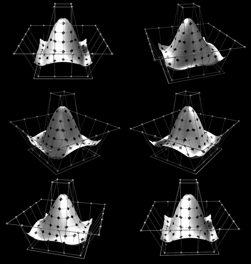
a smooth surface, vaguely conical in shape and embedded in a basket-like mesh of points, rotates in empty space
Non-uniform rational B-splines (NURBS) are commonly used in computer graphics for generating and representing curves and surfaces for both analytic shapes (described by mathematical formulas) and modeled shapes. Here the shape of the surface is determined by control points, shown as small spheres surrounding the surface itself. The square at the bottom sets the maximum width and length of the surface. Based on early work by Pierre Bézier and Paul de Casteljau, NURBS are generalizations of both B-splines (basis splines) and Bézier curves and surfaces. Unlike simple Bézier curves and surfaces, which are non-rational, NURBS can represent exactly certain analytic shapes such as conic sections and spherical sections. They are widely used in computer-aided design (CAD), manufacturing (CAM), and engineering (CAE), although T-splines and subdivision surfaces may be more suitable for more complex organic shapes.

Selected picture 27

Portal:Mathematics/Selected picture/27
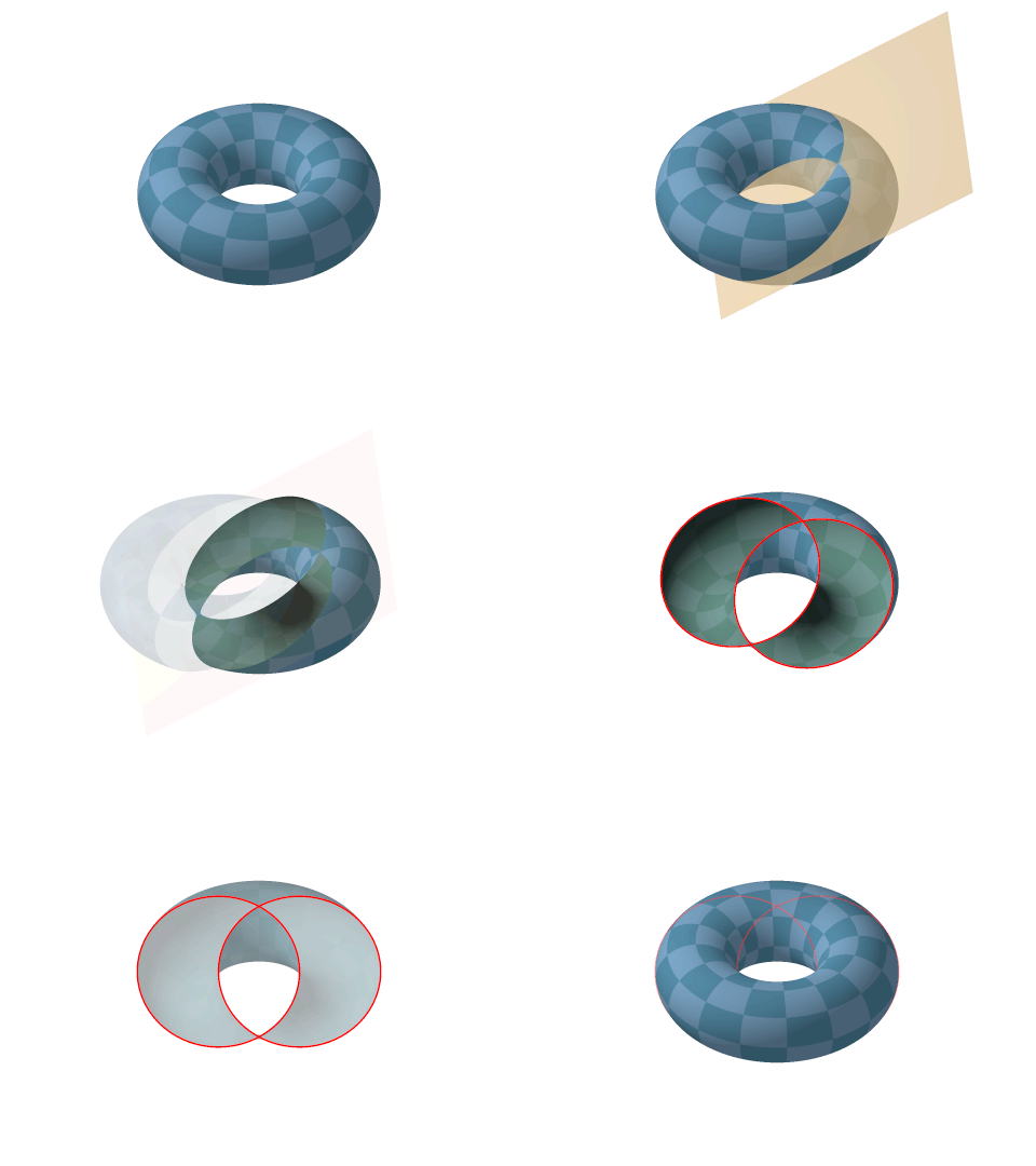
animation showing a torus (a doughnut shape) being cut diagonally by a plane, causing the appearance of two interlocking circles on the cut surface
An animation showing how an obliquely cut torus reveals a pair of intersecting circles known as Villarceau circles, named after the French astronomer and mathematician Yvon Villarceau. These are two of the four circles that can be drawn through any given point on the torus. (The other two are oriented horizontally and vertically, and are the analogs of lines of latitude and longitude drawn through the given point.) The circles have no known practical application and seem to be merely a curious characteristic of the torus. However, Villarceau circles appear as the fibers in the Hopf fibration of the 3-sphere over the ordinary 2-sphere, and the Hopf fibration itself has interesting connections to fluid dynamics, particle physics, and quantum theory.

Selected picture 28

Portal:Mathematics/Selected picture/28

three lines connecting corresponding vertices of a larger triangle on the left and a smaller one on the right converge at a point further to the right called the "center of perspectivity"
Credit: User:Jujutacular, based on an original by User:DynaBlast
In projective geometry, Desargues' theorem states that two triangles are in perspective axially if and only if they are in perspective centrally. Lines through the triangle sides meet in pairs at collinear points along the axis of perspectivity. Lines through corresponding pairs of vertices on the triangles meet at a point called the center of perspectivity.

Selected picture 29

Portal:Mathematics/Selected picture/29
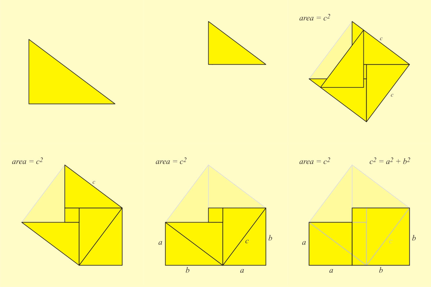
animation showing a right triangle being duplicated and rearranged in a way that illustrates the Pythagorean theorem
An animated geometric proof of the Pythagorean theorem, which states that among the three sides of a right triangle, the square of the hypotenuse is equal to the sum of the squares of the other two sides, written as a2 + b2 = c2. A large square is formed with area c2, from four identical right triangles with sides a, b and c, fitted around a small central square (of side length ba). Then two rectangles are formed with sides a and b by moving the triangles. Combining the smaller square with these rectangles produces two squares of areas a2 and b2, which together must have the same area as the initial large square. This is a somewhat subtle example of a proof without words.

Selected picture 30

Portal:Mathematics/Selected picture/30
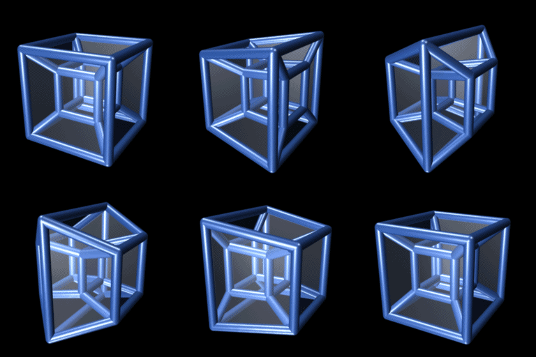
animation showing what looks like a smaller inner cube with corners connected to those of a larger outer cube; the smaller cube passes through one face of the larger cube and becomes larger as the larger cube becomes smaller; eventually the smaller and larger cubes have switched positions and the animation repeats
A three-dimensional projection of a tesseract performing a simple rotation about a plane which bisects the figure from front-left to back-right and top to bottom. Also called an 8-cell or octachoron, a tesseract is the four-dimensional analog of the cube (i.e., a 4-D hypercube, or 4-cube), where motion along the fourth dimension is often a representation for bounded transformations of the cube through time. The tesseract is to the cube as the cube is to the square. Tesseracts and other polytopes can be used as the basis for the network topology when linking multiple processors in parallel computing.

Selected picture 31

Selected picture 32

Selected picture 33

Selected picture 34

Selected picture 35

Purge server cache