Wikipedia:Featured picture candidates/delist/File:Oceans.png
Ocean Diagram[edit]


- Reason
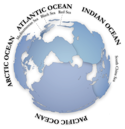
- Has no description, so I have no idea what the projection of this map is, though I believe it is a azimuthal equidistant projection (similar to the UN emblem). That said, this projection creates a misleading size comparison as anything in the northern hemisphere is much smaller, relatively speaking, to its southern counterparts. Also, the image is not used in any articles except Common heritage of mankind, in which its use is dubious anyway. And on a side note, this really should be an SVG (if it can find an article).
- Previous nomination/s
- Wikipedia:Featured picture candidates/Ocean map, creator and nominator notified
- Nominator
- upstateNYer
- Delist — upstateNYer 02:06, 6 November 2009 (UTC)
- "Please leave a note on the talk pages of the original creator/uploader and/or FPC nominator to let them know the delisting is being debated." Thanks. Makeemlighter (talk) 03:49, 6 November 2009 (UTC)
- Comment Aside from the technicalities being debated, I think that this image has huge EV. I love how it focus strictly on the bodies of water--an inverse of what your focus would be on a typical world map. Even in spite of the size, I would advise to keep this as long as the projection can be determined. -- mcshadypl TC 06:48, 6 November 2009 (UTC)
- Delist. Yes, the subject is an interesting one, and I could certainly see there being an oceanic map FP. However, this file is not the one. The labelling is poor, the scale is off and it really should be an SVG. J Milburn (talk) 11:46, 6 November 2009 (UTC)
- Comment Agreed, an ideal candidate for SVG conversion. Nezzadar [SPEAK] 22:02, 6 November 2009 (UTC)
- Delist. Low EV. Mostlyharmless (talk) 01:33, 7 November 2009 (UTC)
- abstain, author It makes me sad to know this is being delisted as I think althought being simple is a very different view of the world's oceans that we normally don't see around. This is a view of the world in an azimuthal equidistant projection whose center is the antipode of urumqi, which itsef is the point of earth furthest form any ocean. The purpose is to show the map of the worls oceans as one, ignoring most landmasses. Of course it distorts asia, but it's proposital since it's the biggest landmass. Maybe wikipedia standards have risen well above this simple map, and then I welcome it as a good thing. I also uploaded a SVG version (it wasn't accepted back then) --Alexandre Van de Sande (talk) 23:37, 8 November 2009 (UTC)
I planned to do a map of the worlds currents based on that map, but never did it. I Hope someone picks it up.--Alexandre Van de Sande (talk) 23:37, 8 November 2009 (UTC)
- Comment Personally, I quite like the idea. I would like to see that the SVG version put up here replaced the current animation at the open of the Ocean page. Cowtowner (talk) 04:05, 9 November 2009 (UTC)
- Request Suspension of Delist I think that if we could pad the edges of the SVG with some empty space and make this more square, it would be a prime candidate for a transfer of FP status from one version to another. The suspension would give time for a fix of the SVG. Then we could get into the details of transfering FP status, since the SVG clearly works, and this is a high EV image. Nezzadar [SPEAK] 04:45, 9 November 2009 (UTC)
- You're welcome to vote delist and replace if you'd like (might want to send this over to User:ZooFari, who is the SVG expert around here - also, you don't really need to suspend, delists go on for as long as they need to in practice), but I still don't think this is the best projection to use because it scales bodies of water in the south up and scales bodies of water in the north down so the area they take up in the diagram aren't actually comparable. upstateNYer 04:56, 9 November 2009 (UTC)
- I seriously doubt any perfect projection is possible. I'm just glad the illustrator didn't use the Boone projection. Nezzadar [SPEAK] 14:52, 9 November 2009 (UTC)
- Given the current nom, I don't think there is any denying that there is no perfect projection. I think the best representation for this kind of image may be the Peirce quincuncial projection for its conformity. Cowtowner (talk) 01:24, 10 November 2009 (UTC)
- Yea, I'm not saying there is a perfect projection, only that this is far from the optimal one to compare area. upstateNYer 01:26, 10 November 2009 (UTC)
- I seriously doubt any perfect projection is possible. I'm just glad the illustrator didn't use the Boone projection. Nezzadar [SPEAK] 14:52, 9 November 2009 (UTC)
- Delist. Projection isn't the only issue; the inclusion and exclusion of landmasses on this map seems to me to be kind of weird and arbitrary. Where's New Zealand, for example? Spikebrennan (talk) 21:14, 23 November 2009 (UTC)
- New zealand is where it should be, by the side of australia. Its a small patch of white, but its there --Alexandre Van de Sande (talk) 22:00, 23 November 2009 (UTC)
- New Zealand, Indonesia, and Scandinavia are all horribly mangled. The last is arguably a function of the projection, but there isn't an excuse for the first two. Mostlyharmless (talk) 11:25, 28 November 2009 (UTC)
- New zealand is where it should be, by the side of australia. Its a small patch of white, but its there --Alexandre Van de Sande (talk) 22:00, 23 November 2009 (UTC)
Delisted --Caspian blue 01:24, 11 December 2009 (UTC)
