
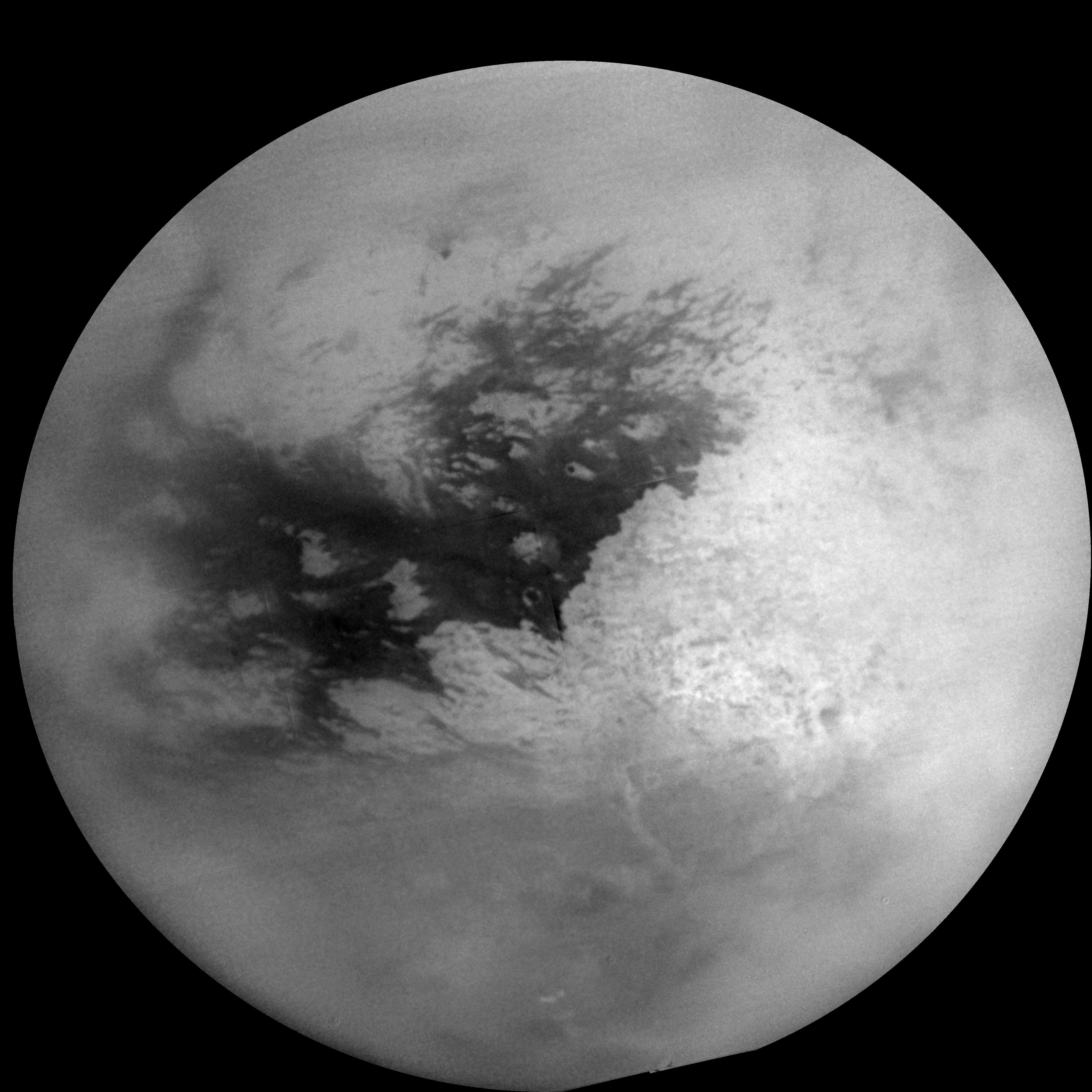
Wikipedia:Featured picture candidates/delist/Titan globe.jpg
Titan globe[edit]


- Reason
- Noisy, lack of detail, improper focus(?), areas of focus varying.
- Previous nomination/s
- Wikipedia:Featured picture candidates/Titan globe
- Nominator
- Muhammad(talk)
'Delist' — Muhammad(talk) 04:54, 1 June 2009 (UTC)Delist Woah, that is pretty rough. The stitching is also kind of obvious, especially with the error at the edge of the globe at about the WNW position. The sharp edge is also unrealistic and distracting. Is that a natural background or did NASA just replace with a single black? wadester16 06:16, 1 June 2009 (UTC)- If you read the page description, it says that NASA has processed the image to sharpen the surface details. OhanaUnitedTalk page 13:20, 1 June 2009 (UTC)
- Keep per ev and technical difficulty. This is the highest resolution full view ever taken of Saturn's largest moon. When the National Geographic folks rocket over and take better pictures we can delist and replace. Note: I have a COI regarding this image, which I will disclose in full to anyone who asks via email. Perhaps that's what pushes this over the edge to break boycott, but am really surprised by recent delist noms which appear to entirely discount tremendous ev. DurovaCharge! 17:09, 2 June 2009 (UTC)
- I agree about the EV but IMO this image befits being a VP rather than a FP. --Muhammad(talk) 17:31, 2 June 2009 (UTC)
- Indeed. See my comment below about "demoting" lower quality FPs (which were promoted mainly on EV before VPC existed) to VPC. wadester16 05:39, 3 June 2009 (UTC)
- VP is second string. FP is the stuff that belongs on Wikipedia's main page. Does the best photo ever taken of the solar system's second largest moon belong on the main page? Absolutely. We're an encyclopedia, not a photography studio. DurovaCharge! 16:08, 4 June 2009 (UTC)
- Picture of the day
 I'm not really a fan of images getting POTD more than once, especially considering how many FPs have yet to be honored with that. So it's already gotten that chance. It still has rough quality, even if taken from space. wadester16 17:08, 4 June 2009 (UTC)
- I'm sorry.... rough quality? You fancy popping to titan to take a picture in pitch black and insanely cold temperature? This image was produced with 1990's techknowledgy, it takes 8 years to reach Titan, and the next mission to this moon isnt even planned to lauch until after 2020 and wont reach the moon until possibly 2030. Please start learning about images outside the digital photographers perfect world of latest teckknowledgy and perfect conditions, get some clue and then possibly you might be able to provide a valuable critique on these images. Seddσn talk 23:15, 5 June 2009 (UTC)
- Yes, rough quality; did I stutter? Look at it. Do we not already have this entire section? As a citizen of mankind and a respected member of this community, I have the right to express my opinion. You, in turn, have the right to disagree, but I believe I've made it clear that I don't think this deserves to be an FP. I would ask that you deal with that. wadester16 07:59, 6 June 2009 (UTC)
- Regardless: the precedent this tends toward is dangerous. What do we do with the next rare NASA photo? Boot it down to VP so that yet another macro of a fly gets the main page attention? DurovaCharge! 17:26, 4 June 2009 (UTC)
- I'm sorry.... rough quality? You fancy popping to titan to take a picture in pitch black and insanely cold temperature? This image was produced with 1990's techknowledgy, it takes 8 years to reach Titan, and the next mission to this moon isnt even planned to lauch until after 2020 and wont reach the moon until possibly 2030. Please start learning about images outside the digital photographers perfect world of latest teckknowledgy and perfect conditions, get some clue and then possibly you might be able to provide a valuable critique on these images. Seddσn talk 23:15, 5 June 2009 (UTC)
- Picture of the day
- VP is second string. FP is the stuff that belongs on Wikipedia's main page. Does the best photo ever taken of the solar system's second largest moon belong on the main page? Absolutely. We're an encyclopedia, not a photography studio. DurovaCharge! 16:08, 4 June 2009 (UTC)
- Indeed. See my comment below about "demoting" lower quality FPs (which were promoted mainly on EV before VPC existed) to VPC. wadester16 05:39, 3 June 2009 (UTC)
- I agree about the EV but IMO this image befits being a VP rather than a FP. --Muhammad(talk) 17:31, 2 June 2009 (UTC)
*Delist - Agree this would make a better VP than FP. Technical quality is low - stitching errors, pixelated edges, inconsistent sharpness, grainy, etc. The EV is extremely high though. Kaldari (talk) 21:08, 2 June 2009 (UTC)
- Keep (just to make sure that my position is clear to everyone). The rarity and the superior resolution size makes up for the other shortfalls. OhanaUnitedTalk page 01:13, 4 June 2009 (UTC)
- Keep - per OhanaUnited —Preceding unsigned comment added by Rlendog (talk • contribs) 14:36, 4 June 2009
- Keep This image is not easily reproducable. There is a lack of images of titan, possibly one of the more important bodies in this solar system. And this is currently the best composite image of the whole surface. Please do some reading up on the FPC guidelines. They are there to read, understood and applied, not to be simply ignored. Seddσn talk 01:17, 5 June 2009 (UTC)
- Keep per encyclopedic value. MeekSaffron (talk) 01:58, 5 June 2009 (UTC)
- Keep Unless someone is going to go out and take a better picture than this, then this picture is of tremendous encyclopedic value. Chillum 14:59, 5 June 2009 (UTC)
- See my comment at Wikipedia:Miscellany for deletion/Wikipedia:Valued pictures. We should not make encyclopedic value our second string and technical quality our first string. We are an encyclopedia not a gallery. Chillum 15:12, 5 June 2009 (UTC)
- I have no objection to other images of great encyclopedic value becoming featured pictures. If you look at my FPC record you will see I have supported many such images in the past. Chillum 13:40, 6 June 2009 (UTC)
- Are there higher quality versions of the surface of titan? No. Is there difficulty in taking better images of titan? Yes. Do the guidelines for FPC state that such images are allowed to become FP? yes they do. Are lower quality, rare images of highly encyclopedic content supposed to be Featured Pictures? They most certainly are. Point made Seddσn talk 23:04, 5 June 2009 (UTC)
- Keep Best known image of the moon, until something better comes along this should stay. Astronomical images like this shouldn't be judged by the technology limitations that captured them. We have nothing better yet. — raeky (talk | edits) 14:21, 6 June 2009 (UTC)
Delist and replace as per Kaldari below, the second source is better quality.— raeky (talk | edits) 22:15, 9 June 2009 (UTC)
- Keep per Durova, Raeky. NW (Talk) (How am I doing?) 18:50, 6 June 2009 (UTC)
- Keep Easily meets the FPC. Note especially that criterion 1 states that "Exceptions to this rule [high technical standard] may be made for historical or otherwise unique images. If it is considered impossible to find a technically superior image of a given subject, lower quality may sometimes be allowed." While the image may be imperfect, it's impossible for there to be anything better. Nick-D (talk) 02:42, 7 June 2009 (UTC)
- keep While the wow factor isn't great uniqueness and historical significance compensates for that.Geni 03:39, 7 June 2009 (UTC)
- keep I'm sorry, but this is one of the most technically impressive images in existence. The level of scientific and engineering work that went into this is simply mind-boggling. That it doesn't look great compared to images of nearby objects or such is in now way a reason to delist. JoshuaZ (talk) 17:30, 7 June 2009 (UTC) To clarify that there is now a "replacement image" I still favor keeping. That an image was the best that could be done at the time makes it still highly encyclopedic. The replacement image also appears to have less detail. I see nothing wrong with promoting the replacement to featured status as well. JoshuaZ (talk) 16:00, 15 June 2009 (UTC)
- keep per everyone, nom should find something more useful to do William M. Connolley (talk) 07:14, 8 June 2009 (UTC)
- keep The most technically impressive images on wikipedia. Koko90en (talk) 14:15, 8 June 2009 (UTC) PS : Both image should be featured picture. I don't change my vote. Koko90en (talk) 15:29, 15 June 2009 (UTC)
- Delist and replace. I scoured NASA's databases and it turns out someone did create a better image. The currently featured image is a mosaic of 9 images taken by Cassini during its October 2004 flyby of Titan. A similar mosaic was created from 16 images taken during Cassini's February 2005 flyby. This later mosaic is higher resolution and doesn't suffer from all the glaring problems that the original has. In particular, the masking and stitching are much less noticeable (and it is much closer in shape to a circle, rather than an egg). The reason the bottom of Titan looks different in the newer image is that the cloud cover over the southern pole had dissipated during the months between the two flybys. Please compare both of these images at full resolution and you'll see a huge difference. (FYI, the replacement image does have some noticeable banding, but otherwise it's a much cleaner image.) Kaldari (talk) 21:02, 9 June 2009 (UTC)
- Delist and replace Thank you very much for that excellent work, Kaldari. wadester16 21:14, 9 June 2009 (UTC)
- Reaffirm keep, though the second image is quite solid and should be an FP in its own right. While the stiching is better for the second one, it also simply does not have as much detail of the planet's surface, which is also preferable. NW (Talk) 04:33, 15 June 2009 (UTC)
- I have striked out my delist but IMO the original has better details than the new higher resolution version --Muhammad(talk) 05:57, 15 June 2009 (UTC)
- So does means that you're withdrawing this nomination from delist? OhanaUnitedTalk page 06:06, 15 June 2009 (UTC)
- Reaffirm keeping original. I prefer to see the stitching/processing/photoshopping done by a professional at NASA because that person probably has a better CLUE how Titan really looks like than any one of us in who participated in this discussion and guessing whether it's noisy, lack of detail, or improper focus. OhanaUnitedTalk page 06:06, 15 June 2009 (UTC)
- Keep original as William M. Connolley says. The earlier photo has more obvious artefacts but has been nicely cleaned up, and the features are indeed a bit clearer despite its smaller size in pixels. Ohana : aren't they both processed/photoshopped by professionals at NASA? +sj+ 05:40, 16 June 2009 (UTC)
- No. The 1st one is processed solely by NASA. The 2nd one is processed first by NASA, then "seams removed, distortion corrected, missing corner extrapolated" by User:Kaldari. I think if NASA has already touched up the photo, we should leave it as it is or else it could be over-manipulating. OhanaUnitedTalk page 16:10, 16 June 2009 (UTC)
Where do you assume that User:Kaldari manipulated the photo? He states he got it from NASA's database and it's from the second flyby a year later which included more detail and more images. So where do you get that someone other than NASA has touched the second version?— raeky (talk | edits) 15:10, 17 June 2009 (UTC)
- No. The 1st one is processed solely by NASA. The 2nd one is processed first by NASA, then "seams removed, distortion corrected, missing corner extrapolated" by User:Kaldari. I think if NASA has already touched up the photo, we should leave it as it is or else it could be over-manipulating. OhanaUnitedTalk page 16:10, 16 June 2009 (UTC)
- Keep replacement - I agree with reasons for keeping the image, but I rather the replacement. --Woglinde 02 (talk) 20:16, 17 June 2009 (UTC)
Keep original Regardless of NASA employees' photoshopping skills, I think this image should remain as is. Not every image needs to be cleaned up so it can look pretty, this is an encyclopedia not an art gallery. So what if there are stitching issues? This image is irreplaceable for the time being.--ErgoSum•talk•trib 21:14, 18 June 2009 (UTC)- Just to clarify, the proposed replacement is NASA's. It was taken after the current FP. wadester16 21:16, 18 June 2009 (UTC)
- Delist and replace Hmmm, I was under the impression that the replacement was a photoshopped version by a WP user. Perhaps I was mistaken... after carefully reviewing the source image and the proposed replacement I think it is an acceptable improvement. --ErgoSum•talk•trib 21:32, 18 June 2009 (UTC)
- It was photoshoped by the uploader, the original is here, you can clearly see the problems he clone brushed out, which is the concern people express. In the image's description he notes he retouched the image. — raeky (talk | edits) 00:37, 19 June 2009 (UTC)
- I really should be more specific sometimes, I meant to say I thought the replacement was purely a photoshopped version of the original. I didn't read the entire discussion and thought that someone had drastically altered the photo. It looked like some of the detail (cloud cover) had been removed and that is what I based my original assessment upon. Thanks to wade I realized it was actually an updated photo from NASA that had been photoshopped and I suppose this is what the controversy is about. I support photoshopping as long as it is done correctly and with minimal harm, and that is the case here. Although I disagree with the uploader who "corrected" the shape to resemble a perfect sphere, when actually planets are oblate spheroids, and in reality should be distorted from a perfect circle somewhat. But in my opinion this is a minor issue and I am willing to overlook it. However I would understand if someone had an issue with this as it does not accurately reflect "reality", I just happen to disagree. --ErgoSum•talk•trib 21:45, 19 June 2009 (UTC)
- The edge on the bottom-right that's missing in the original NASA version is definitely not natural; it just means NASA didn't photograph those spots. wadester16 21:55, 19 June 2009 (UTC)
- Yes I realize that, but user Kaldari said, and I quote "In particular, the masking and stitching are much less noticeable (and it is much closer in shape to a circle, rather than an egg)", this is what I had an issue with. --ErgoSum•talk•trib 22:10, 19 June 2009 (UTC)
- Considering that the different mosaic versions of Titan from NASA all have dramatically different shapes, I don't think any of them accurately represent "reality". A body with the mass of Titan is going to be pretty much spherical (although obviously not perfectly). Regarding the corner that was extrapolated: It is actually based on later images that show that region, i.e. blurry gray clouds. None of my edits changed any factual information about Titan. In fact, in my opinion they created a more realistic image. For example, Titan in reality doesn't have a corner missing, nor does it have dramatic stitching lines across it's surface. I was very careful, however, to edit the image as conservatively as possible while still correcting these small problems. Kaldari (talk) 20:30, 24 June 2009 (UTC)
- Yes I realize that, but user Kaldari said, and I quote "In particular, the masking and stitching are much less noticeable (and it is much closer in shape to a circle, rather than an egg)", this is what I had an issue with. --ErgoSum•talk•trib 22:10, 19 June 2009 (UTC)
- The edge on the bottom-right that's missing in the original NASA version is definitely not natural; it just means NASA didn't photograph those spots. wadester16 21:55, 19 June 2009 (UTC)
- I really should be more specific sometimes, I meant to say I thought the replacement was purely a photoshopped version of the original. I didn't read the entire discussion and thought that someone had drastically altered the photo. It looked like some of the detail (cloud cover) had been removed and that is what I based my original assessment upon. Thanks to wade I realized it was actually an updated photo from NASA that had been photoshopped and I suppose this is what the controversy is about. I support photoshopping as long as it is done correctly and with minimal harm, and that is the case here. Although I disagree with the uploader who "corrected" the shape to resemble a perfect sphere, when actually planets are oblate spheroids, and in reality should be distorted from a perfect circle somewhat. But in my opinion this is a minor issue and I am willing to overlook it. However I would understand if someone had an issue with this as it does not accurately reflect "reality", I just happen to disagree. --ErgoSum•talk•trib 21:45, 19 June 2009 (UTC)
- It was photoshoped by the uploader, the original is here, you can clearly see the problems he clone brushed out, which is the concern people express. In the image's description he notes he retouched the image. — raeky (talk | edits) 00:37, 19 June 2009 (UTC)
- Delist and replace Hmmm, I was under the impression that the replacement was a photoshopped version by a WP user. Perhaps I was mistaken... after carefully reviewing the source image and the proposed replacement I think it is an acceptable improvement. --ErgoSum•talk•trib 21:32, 18 June 2009 (UTC)
- Just to clarify, the proposed replacement is NASA's. It was taken after the current FP. wadester16 21:16, 18 June 2009 (UTC)
- Keep original. I don't think editors should be retouching one off images such as this, the rule for photoshop should be to do no more than you could have done with more time shooting - this is clearly not the case here. Removing stitching changes the history of the image and alters what one might learn about NASA photography techniques. It also artificially increases the detail of the surface which seems dishonest. I would strongly oppose using the edited image. |→ Spaully τ 15:54, 22 June 2009 (GMT)
- I think having a more accurate image of Titan is a bit more important than learning about NASA's "photography techniques". Removing the stitching merely involved adjusting the contrast where any two photographs intersected (along with a tiny bit of blurring). I really don't think there's any difference in the amount of detail. Besides, why would be want to preserve stitching artifacts? They certainly don't accurately represent the surface of Titan. Kaldari (talk) 20:42, 24 June 2009 (UTC)
- With the stitching marks present we know those areas do not represent the true surface, when they are removed we are meant to presume that those areas are as true as the rest, making it dishonestly accurate - the image is no more accurate, as you suggest, but we no longer know the limits of our knowledge.
- On the point of NASA photography techniques, this could be of interest to some as in this image - File:Eagle nebula pillars.jpg, albeit more dramatically for Hubble.
- One final point, NASA are perfectly capable of taking out the stitching themselves if they saw fit so I wonder why we should second guess their decision not to. |→ Spaully τ 21:35, 24 June 2009 (GMT)
- I think having a more accurate image of Titan is a bit more important than learning about NASA's "photography techniques". Removing the stitching merely involved adjusting the contrast where any two photographs intersected (along with a tiny bit of blurring). I really don't think there's any difference in the amount of detail. Besides, why would be want to preserve stitching artifacts? They certainly don't accurately represent the surface of Titan. Kaldari (talk) 20:42, 24 June 2009 (UTC)
- Keep original - Per Spaully's comment above. Garion96 (talk) 21:30, 24 June 2009 (UTC)
Kept Sorry, I know I voted in this, but it's been open far too long. This is an obvious keep (quick count gives me 16 K, 4 D+R). --wadester16 16:12, 25 June 2009 (UTC)