This is an archive of past discussions. Do not edit the contents of this page. If you wish to start a new discussion or revive an old one, please do so on the current talk page.
Now that the electors have voted, why do we still need the projected notation?Saberwolf116 (talk) 18:30, 18 December 2008 (UTC)
We don't know who the Electors voted for. We can assume it's 365 for Obama/Biden & 173 for McCain/Palin, but there have been faithless electors in past elections. Best we wait for the results on January 8, 2009. GoodDay (talk) 18:50, 18 December 2008 (UTC)
January 6th or January 8th?
The last sentence under the "Election Day" section states, "The presidential electors have cast their ballots for President and Vice President, and these votes will be tallied by Congress on January 6, 2009." However, one of the first sentences in the next section, "Grand Total", states "Electoral vote totals are projected; they will become official when Congress tallies the electoral votes on January 8, 2009." On which day will the votes actually be tallied?--Danaman5 (talk) 21:50, 20 December 2008 (UTC)
"Public Law 110-430 changed the date of the electoral vote in Congress in 2009 from January 6 to January 8. This date change is effective only for the 2008 presidential election."
Making the edits now.Lestatdelc (talk) 21:57, 20 December 2008 (UTC)
Citing sources
Could someone please give me step by step instructions on how to cite sources? My campaign issues section has a few "citation needed" signs and while sources are not hard to find online for me, every time I try to cite I mess up. Thanks!
75.30.176.218 (talk) 23:05, 23 December 2008 (UTC)Geoff
Well, the simplest way is to insert <ref>website address</ref> or <ref>[websiteaddress page title]</ref>. That's what I usually do, although there is a {{cite}} template. However, I think there are bots that create it from ref tags. If you need to know more, see Wikipedia:Citing Sources. Timmeh! 23:22, 23 December 2008 (UTC)
But a better way, which will not be subsequently edited by another editor for being a blind citation which fails to describe the cited source in the footnotes is to say:
<ref> Author Last, Author First. (DATE) [URL *space* TITLE OF ARTICLE] Name of Journal. </ref>.
Check out the {{cite news}} template for an even better method. You would use that template as follows:
<ref> {{cite news | ---various items here using the template--- }} </ref>
Should we include a -(minus)NE-02 after McCain's state total? Why or why not? Of course, the basis for this whole argument could depend on whether "states carried" means in popular vote or electoral votes. The way I look at it, to "carry" a state, a candidate would have to win the popular vote in that state. If that is true, then there really is no reason to show that NE-02 is subtracted from McCain's states carried total because he did in fact win the popular vote in Nebraska by a large margin. Timmeh! 01:47, 25 December 2008 (UTC)
Thanks for adding this discussion to the discussion page. If we are only including states carried with popular vote then we shouldn't include NE-02 with Obama seeing as it isn't a state (or a state-like area like DC) . That was essentially my point, if we have NE-02 on Obama's side, then logicically and mathematically we should have it on McCain's.
When will this page have a full campaign summary? It should look like every other election page. And feel free to add anything to my campaign issues section. I only started it because I figured somebody had to. Even scrap the campaign issues heading and merge it into the general election campaign heading if you want.
It definitely needs some work, but it's only a rough outline to begin with, so at least it's a start. -- 74.225.164.184 (talk) 19:09, 27 December 2008 (UTC)
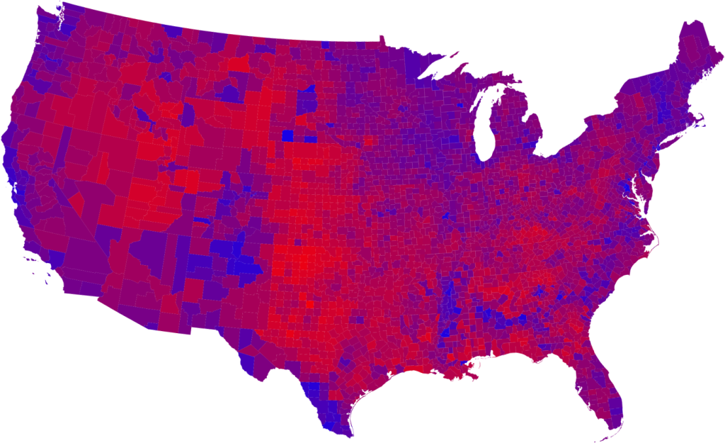
"County results" Map
There is a map of "results by county" in this article which is not only completely irrelevant to the subject, but raises POV concerns. County results do not play any role whatsoever in presidential politics and including the map here gives no relevant information whatsoever. Further, this and other similar maps have been used primarily by right-leaning blogs to give the mistaken impression that McCain actually won a "majority" of the country. Unless someone has a compelling argument for adding this map to the article, it should probably be removed. --Loonymonkey (talk) 19:48, 27 December 2008 (UTC)
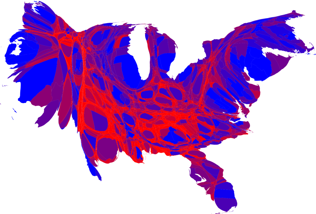
Using a cartogram of the county results would eliminate the POV issue. This map is also shown in the 2004 election article. However, it is not in any other election articles, and it isn't even in the relevant section in the 2004 article. In addition, I agree with you about the map being irrelevant to the subject. On the other hand, a cartogram of the county results would be relevant, as we also use the national popular vote numbers which are just as irrelevant to the winner of the election. Timmeh! 23:12, 27 December 2008 (UTC)
I fail to understand how a map of election results is irrelevant to the election. Showing which areas of the country supported each candidate is extremely relevant to the election, particularly because trends at the micro level are what allows a candidate to win additional states and, thus, the election. In this instance, Obama's strong showing in a number of rural and suburban counties allowed him to win a number of states; likewise, McCain's unusually strong showing in, say, rural Kentucky, also has historical significance. I don't understand how presenting the map without commentary is POV. Only an idiot or a hack wouldn't understand that land area does not correlate with number of votes cast. Qqqqqq (talk) 00:05, 28 December 2008 (UTC)
Which, IRL, is exactly what is happening. Idiots and hacks are fairly loudly interpreting this map, not on WP, but out there... County level or CD level map, with a clarifying remarks (about votes != area) might belong in state level articles, but not here where it would be wide open for easy misinterpretation, and the necessary explanation would be inappropriately detailed. Jd2718 (talk) 00:24, 28 December 2008 (UTC)
If we keep on worrying about how our content can be misconstrued, this encyclopedia will not exist. The stupidity of the loud should not hamper our means of conveying information, in this case, geographical political inclinations. —kurykh 00:51, 28 December 2008 (UTC)
National article - state level results. Individual state articles US Pres Elec in State X (2008) - county level results. Useful to the particular articles. Not really so hard, is it? Jd2718 (talk) 00:56, 28 December 2008 (UTC)
That doesn't really answer the assertion that we should not be stifling ourselves because there are dumb people in this world. —kurykh 01:17, 28 December 2008 (UTC)
Restore the map! Such maps do not "raise POV concerns" Only misinterpretation does; not the map, itself. If you are concerned about possible misinterpretation of factual information (maps, tables, etc.), then add a caveat -- don't suppress the facts.
Besides, suppression of this map is pointless, since it is widely available, elsewhere. Better to include it here with a clarification, than to simply omit it from this "encyclopedic" source, for fear that somebody will misconstrue the facts.
Nobody is "suppressing" anything. It's simply that the case has not been made for including the map (and there are several arguments against including it). The arguments presented above seem to be making the case that, rather than this map, we should have a map of results by electoral district, something to which I don't think there would be any objection. But why would we need to know who "won" each county when counties don't even have winners or losers in the electoral process? --Loonymonkey (talk) 01:54, 28 December 2008 (UTC)
Answered below. —kurykh 01:57, 28 December 2008 (UTC)
Not really. You still haven't explained how a map of a hypothetical election scenario is necessary to this article. --Loonymonkey (talk) 19:51, 28 December 2008 (UTC)
By the way, using electoral districts instead of counties won't solve the "problem": rural areas tend to vote Republican and urban areas Democratic, for one thing, leaving the wide expanses of red intact for the most part. Also, using electoral districts (I will assume congressional districts) tend to give inaccurate information about the demographics of the vote due to gerrymandering of the districts (cracking of partisan constituencies in Texas and California, etc.). —kurykh 02:07, 28 December 2008 (UTC)
outdent - Put it in the place where it belongs - where the differences being shown are meaningful. For example, this article does not discuss rural Kentucky, but a Kentucky election article would. Jd2718 (talk) 01:44, 28 December 2008 (UTC)
That's not the point of the map. The point of the map is to convey more specifically what place voted for what candidate. In this case, the subdivision used was county. I do not see how controversial that can be.
By the way, with all due respect, I find the edit summary of this edit highly amusing. So somehow the removal of the map upholds the "incomplete discussion" and is not "mistak[ing]...assertion of...opinion for a complete discussion"? The original version had the diagram, and I am seeing no reason to remove the diagram at all, other than that there are people who can't read maps correctly, which isn't a valid reason. —kurykh 01:51, 28 December 2008 (UTC)
Well, that's the point. The map is a distortion of electoral facts. Counties do not have a "winner take all" role within the election (and in fact play no role whatsoever). But this map is a diagram of what the results would have been if counties did have a winner take all system. It's a meaningless hypothetical and serves only to visually distort the facts. And, as always, claiming that facts are being suppressed isn't a valid argument for including something in an article. The question is, what necessary information does this graphic add to the article. The answer is none. --Loonymonkey (talk) 02:03, 28 December 2008 (UTC)
Any map using any sort of subdivision will be distorted by your definition. Should we remove all maps other than the electoral college map? Confining ourselves to only reporting what is legally binding is a disservice to our readers; sure, we can click on each state article for a breakdown of the vote, which is, incidentally, by county, but would combining all the maps into one be even better? I say yes. —kurykh 02:11, 28 December 2008 (UTC)
That's a strawman argument, I never said anything of the sort. The objection is to the hypothetical "winner take all-by-countyl" scenario in which each county is represented as solidly red or blue, regardless of the vote totals (or the totals by the state). If the map were to give an accurate representation of vote totals, it would be actually be useful. As it is now, it's a distortion of the facts. --Loonymonkey (talk) 02:18, 30 December 2008 (UTC)
The easy question: what part of the article is the map illuminating? Jd2718 (talk) 01:59, 28 December 2008 (UTC)
Not all images need to refer to some specific part of the article; it may refer to the article in general, or convey information related to the article in a more concise way. —kurykh 02:02, 28 December 2008 (UTC)
This map contains quite specific information; it's not general. And if it contains information that belongs in the article, the information should be directly added. A map can enhance text, can illuminate text, but should not substitute for text. If the level of detail is inappropriate for the text of the article, then the image itself is inappropriate. Jd2718 (talk) 02:10, 28 December 2008 (UTC)
If you take a look at the articles on the election for each state, you will notice that the results are broken down by county. The image is not a substitute for text; it is merely a visual and concise compilation/combination of text that exists in these 50 articles. —kurykh 02:14, 28 December 2008 (UTC)
Actually, the results are not even "broken down by county" in most of the state-by-state articles. (In fact, most state articles fail to list any third-party candidate totals; but that is yet another topic.) This "results by county" map is, in many cases, the only information showing county-by-county results. If the reasons for suppressing it are deemed valid, then they also apply to the infobox map (http://en.wikipedia.org/wiki/File:ElectoralCollege2008.svg), which also depicts the (electoral college) vote by area rather than by population. Must we then remove that one, too??File:2008 countycartpurple1024.pngFile:Countycartredblue1024.png
I think the problem is that this widely-publicized map (already available on websites, bumper-stickers, tee-shirts, etc.) has often been used to illustrate the fact that Obama's support was somewhat concentrated in certain regions (urban, etc.) However, that usage has no bearing on the validity of the county-by-county data represented by the image. The questioned image remains a legitimate representation of factual data. Since the image accurately represents the granularity with which election data was tallied, reported, and re-canvassed in nearly every state of the union, it is quite appropriate for inclusion (with or without caveats) in any "encyclopedic" compilation of the 2008 presidential election results!
Recently, I saw some (geographically-distorted) maps showing areas proportional to population. I'd have no objection to the inclusion of such maps, too. Nor would I object to one which showed counties with population-adjusted areas or states with electorl-vote-adjusted areas. However, I strongly object to the arbitrary omission of http://en.wikipedia.org/wiki/File:2008_General_Election_Results_by_County.PNG ,and I believe that suppressing this factually-correct illustration tends to be a violation of NPOV.
BAM ("tripodics") (talk) 05:05, 28 December 2008 (UTC) 04:52, 28 December 2008 (UTC)
The map should stay, per Tripodics' and Kurykh's reasons. Saying that it should be removed because it is not relevant to the article or the winner of the election is ridiculous. If you went by that logic, the national popular vote totals should also be removed, as they have no influence on the winner of the election. Timmeh! 01:58, 28 December 2008 (UTC)
The map should stay, and I think Timmeh's reasoning right above this is along the lines of what I'm thinking. Election results by demographics, election results by county, popular vote, etc. all "don't matter" if we're simply using the electoral count as a gauge. A map like the NYT map with county bubbles might also be a good addition to the article, but quite frankly, that right-wing circles are using this kind of map to fuel their agenda has absolutely nothing to do with its validity in the article. -- 74.225.164.184 (talk) 04:19, 28 December 2008 (UTC)
The straight "all or nothing" county map fails to accurately convey 1) the relative population of individual counties (New York County has a lot more people in it than San Bernadino County, but a "all or nothing" map would be visually skewed in "favor" of San Bernadino) and 2) the "margin of victory" (I would wager a lot of the "red" counties in Illinois would be a very deep purple color, for instance). It's therefore of little use at best, misleading at worst (depending on the intelligence and/or savviness of the person viewing the map). I think a better county-by-county map would either be a cartograph or a map with different shades (something like this). Ideally, both. The state-by-state map is "all or nothing" since the Electoral College itself is "all or nothing", but there's no rational need to drag this principle on down to the county level. If neither of those two maps has yet been created, I would be in favor of removing the image. Badger Drink (talk) 04:59, 28 December 2008 (UTC)
And now I see that one exists. We should replace the "straight" county-by-county map with this. Maps are used to give a visual representation to a certain set of data. The only meaningful visual representation a "straight" county map delivers is which particular hunks of land, arbitrarily broken up over the course of 300 years, had a majority vote one way or the other. No real rhyme or reason to be found in that - it's just as silly as listing the total weight (in pounds, of course) of Obama supporters versus McCain supporters. The "straight" map provides nothing that a simple "list of which counties had which majorities in the 2008 elections" couldn't offer, and is - worse yet - somewhat misleading in its representation. Simple is not always "better". Badger Drink (talk) 05:04, 28 December 2008 (UTC)
Election results are usually reported by county. Recounts are done by county.
Also, there are good reasons why the Constitution gives an extra two electoral votes to the less-populous states.
Regardless, the county map is a valid representation. It should be included, not "replaced" by a distorted map. (Include an electoral-college map, too, if you wish.) BAM ("tripodics") (talk) 05:18, 28 December 2008 (UTC)
They're reported by county, yes. I fail to understand your point. They're also reported by country, so would a large map of the U.S. colored solely in blue add anything to the article? Of course not - even though the U.S., as a whole, voted blue (in much the same way that, in your paradigm, certain counties voted as "blocks"). The map is distorted and adds nothing to the article, unless you are seriously planning to argue that people will a) want to find out how county x voted, b) find an unlabelled map of the entire country to be the best way of deducing this information, and c) be able to pick out county x despite the map being a sea of monochrome. The cartogram gives a pictoral representation to voting trends that actually takes into account both a) number of votes and b) percentage of votes in each given area. The simple county map, not so much. I'm not quite sure whether it (the simple county map) should be included at all - there's a fine line between informative and over-informative, and (tipping me further towards "no include") I have a nagging suspicion that the underlying urge for inclusion is personal political biases, dressed up in whatever way sounds most altruistic. Badger Drink (talk) 09:39, 28 December 2008 (UTC)
LoL @ "nagging suspicion." That's funny because I've had a nagging suspicion that the people making the biggest fuss are simply Obama supporters who are afraid of right-wing fringe groups. Get over yourself. If you can't successfully refute the massive support for the map without resorting to "You guys have a bias, methinks," then end this discussion because it will go nowhere. I'm a very proud Obama supporter who donated money several times to his campaign and showed off a lovely Obama/Biden sticker on his car; I'm heavily supportive of the map being in here. I've been looking at these county by county results closely ever since the New York Times released this map: http://elections.nytimes.com/2008/results/president/map.html. It's terrific looking at the voting shifts and how Clinton swept Arkansas and now it's shifted so far the other way. It's fascinating to see how Montana opened up to the Democrats and comparing it with Clinton's showing there in 92. It's historically significant and important, and the reasoning against its inclusion seem to be stemming from a deep-seeded fear about how right-wing groups will misrepresent facts.
Oh, and about people wanting to find out how county x voted -- you're not only straw-manning your opposition, but you're basically outlining how I look at the map. First, it's not just showing how county x voted; it's showing how the counties in a certain region voted. Missouri was close, but the county-by-county results show more red. In the 90s, Clinton swept most of Missouri, so what gives? It's a very good representation of how many rural unpopulated areas vote one way in comparison to the most populated cities in Missouri. And it's telling how you can win the state by winning the more populated areas like Obama did (or at least come close to it). Not being a southern white governor like the past two Democratic presidential winners made it harder for Obama to win on a county-by-county level. Add in the divide that still persists (but might be weakening), and you have a historically significant map, which I find fascinating. So yes, some people will want to read into the map like that; it's historically significant that a man won the election but lost the majority of the counties. Remember the Southern Strategy? That kind of thing, however outdated it is becoming, planted the seeds which we still see today. There is nothing misleading about showing a map with that kind of historical significance. -- Frightwolf (talk) 16:38, 28 December 2008 (UTC)
Yeah, the other map has been added, but there is absolutely no reason for the straight county-by-county map to be replaced. It is still historically significant that Obama is the first president in a long time to win the election but lose such a high proportion of counties. It represents a divide that still lingers in the United States, and it would be foolhardy to discard a very interesting piece of historical information. In fact, having the straight county-by-county map precede the other one works in showing how a candidate can lose so many counties in Nevada and still win (Bill Clinton won the same way in 92 and 96, minus the northwest portion of Nevada, which Obama won and he lost). There is nothing misleading about who won what counties; if you read into it a different way, that's your problem. -- 74.225.164.184 (talk) 16:28, 28 December 2008 (UTC)
No, you're still missing the point. Counties do not have "winners" and "losers" in American presidential elections. They play no role whatsoever. This is a map of a hypothetical scenario in which each county assigns a winner based on a winner take all system. But that scenario does not exist in reality. --Loonymonkey (talk) 19:58, 28 December 2008 (UTC)
(outdent) If there were a map showing the grades of red to purple to blue by which each county voted, that would actually illuminate voting trends. But inventing a hypothetical scenario in which each county has a "winner take all" victor (even if only by a few votes) adds nothing to the article, and in fact, distorts the facts. What is especially absurd about this argument is that the article doesn't even contain a map of the victors at the state level, which is how the election is actually decided. --Loonymonkey (talk) 20:02, 28 December 2008 (UTC)
Further, as it is not illustrating facts already contained in the article, the map would need to be reliably sourced by a verifiable third-party before it could even be considered for inclusion. That has not been done. Are we to simply take the creator of the map at their word that the information is correct? That's not how Wikipedia works. --Loonymonkey (talk) 20:11, 28 December 2008 (UTC)
As I've said before, a cartogram of the county results would be better than the normal county map, but I think both should be shown as it would be useful to compare the differences and not give the impression that counties are those distorted sizes in reality. In regards to your point about inventing a "winner take all" scenario for the counties, I believe most counties were not very close at all, and it would not create a hypothetical "winner take all" scenario. It would just show the reality of who got more votes in each county. The map of the victors at the state level is right in the infobox and very visible, as it is for every election article. As for the reliable source part, county results can be taken from each state's election article or each state's election website, to which there are links in the popular vote table in the article. Timmeh! 21:08, 28 December 2008 (UTC)
I would much prefer if both the standard county map and the distorted cartogram that is now on the page were shown. While the county map has its flaws, I feel like it presents information in a way that is more easily understandable. For example, if I want to know whether my county was more red or more blue than last time, I can simply find the county on the county map. On the cartogram, geographical boundaries are distorted, so I can only see that sort of the general area in which I live was more blue. I think that theorizing that there is a danger of people misinterpreting the map is overreaching. It's all just data, and I feel like we should present it in as many forms as possible.--Danaman5 (talk) 22:09, 28 December 2008 (UTC)
Well, you've hit the problem on the head. If you're want to know "whether my county was more red or more blue than last time" this map will not tell you that at all. In fact quite the opposite, unless it completely flipped in four years (very few did) your county will show up just as red or blue as last time, despite the fact that obvious electoral changes have taken place. What you seem to be arguing for is a different map, one that would be color coded by percentages of red and blue. I would be entirely in favor of such a map (as I've already argued). --Loonymonkey (talk) 02:10, 30 December 2008 (UTC)
Incidentally, the new cartogram map has some copyright warnings on it. Someone needs to fill in its info, or it will be deleted.--Danaman5 (talk) 22:14, 28 December 2008 (UTC)
I agree. Why only have one? The county-by-county does a great job at showing the divide that still exists in the country -- urban vs. rural areas -- in a way that the other maps cannot. -- Frightwolf (talk) 04:19, 29 December 2008 (UTC)
Actually, no, it only serves to perpetuate certain myths about that "divide" through statistical falsehoods by mapping out a hypothetical and non-existent election scenario (in which counties are awarded in a "winner take all" system). It's a distortion of the actual electoral reality. For instance, a county that was won by just a fraction of a percentage point shows up just as solidly blue or red as one that was won by a wide margin. Thus, it creates several false impressions about the election; that McCain garnered no support in the North East or that Obama's victory came entirely from urban areas (a statistical impossibility). I would have no objection to the map if it were graduated by electoral total (from red to purple to blue). Such a map would actually provide useful information. But the map in discussion is at the very least useless if not blatantly dishonest. --Loonymonkey (talk) 02:02, 30 December 2008 (UTC)
No, now you're throwing in your opinion that the divide's a myth when it's been documented, researched and discussed thoroughly by many scholars and historians. That's a terrible, terrible reason for removing something that has been established since the last election wiki and has been discussed by many. But now I see your bias and why you don't want it in the wiki. That's still not a good reason for its removal, and you've yet to reach consensus about its removal (we're not trying to add it; you're trying to remove it). Also, the fact that Obama has won the election after losing 70 percent of the U.S. counties is historically significant. You've also yet to properly address any arguments for why the map is a great resource. -- Frightwolf (talk) 04:40, 30 December 2008 (UTC)
Again, the burden of proof in a content dispute is on those wishing to include the material in question, not those wishing to remove it. That is official Wikipedia policy if you care to look it up (and maybe take a gander at WP:AGF and WP:NPA while you're there). You've claimed several times that you don't feel your arguments were properly addressed but you've never mentioned anything specific. Reading through this discussion I don't see anything unanswered, what are you speaking of specifically? --Loonymonkey (talk) 00:11, 31 December 2008 (UTC)
Loonymonkey - I'd be happy with a map like you described, with each county colored on a continuous gradient from red to blue depending on the percentage of the vote won by each candidate. I just don't want geographical boundaries distorted. I notice that the 2004 election article has such a map. Can someone make one for this article?--Danaman5 (talk) 06:23, 30 December 2008 (UTC)
Exactly. That would be a perfect compromise (and I doubt anyone could reasonably complain about providing more specific information. It wouldn't be a distorted map, that map is demonstrating an entirely different principal (the fact that some small counties have very large populations and many gigantic western counties have almost no residents). --Loonymonkey (talk) 00:00, 31 December 2008 (UTC)
Hey, since we're including colored maps based on geographical boundaries, let's include a national popular vote and have it be all blue. Seems just about as relevant to me. Seriously this map much more accurately represents the political landscape... 71.178.193.134 (talk) 04:51, 30 December 2008 (UTC)
As I've said before, we should keep the county winners map, but we should also include other maps, such as a county margin of victory map, a cartogram (counties sizes distorted by population), and a voting shifts map (from 2004). I think the voting shifts map on the New York Times website would word fairly well for this purpose. The image linked in the previous post is a good county margin of victory map, and some of these cartograms would be satisfactory. Timmeh! 17:41, 30 December 2008 (UTC)
Yeah, just like the 2004 version election. It gave about five maps showing the election results, and speaking as someone who loves reading these election wikis, I can say I studied all of them and found them all to be very helpful. I'm not too good at the mark-up, but I think this: http://www-personal.umich.edu/~mejn/election/2008/countymappurpler1024.png, would also be a good map to use. -- Frightwolf (talk) 18:08, 30 December 2008 (UTC)
That's exactly what I'm talking about. Viewing a map like this indicates just how much the hypothetical "winner take all by county" map distorts the results. I would be all for including a map such as this one, but that raises the question as to why we would then need the other, less accurate, map as well? --Loonymonkey (talk) 00:15, 31 December 2008 (UTC)
Can you be more specific on how the county map "distorts the results"? As frightwolf said earlier, it shows the growing divide between urban and rural areas and the fact that Obama lost 70 percent of the counties, while going on to win the election. Timmeh! 00:39, 31 December 2008 (UTC)
Timmeh, what evidence do you have to support this "growing divide between urban and rural areas?" I don't believe that to be accurate, but at best it's unsupported. Regardless I wouldn't go so far as to say the map "distorts the results." The numbers are there for all to read. The map quite correctly points to the number of counties won by each candidate. However, it is not an accurate representation the political leanings of any geographical area, nor is it intended as such. Obviously the most ideal scenario would be to have a gallery of images similar to 2004 election. Until additional images are available, I would recommend moving the "winner take all" county map to the "Analysis" section in which the data explaining it is referenced and leave the Cartogram in the Popular vote \ Vote totals section, as that is exactly what it is describing. Thoughts? Electiontechnology (talk) 01:23, 31 December 2008 (UTC)
I'm not exactly sure that it's growing, but there definitely is a rural vs. urban divide. You can see the divide by looking at any county map. Urban areas tend to vote heavily Democratic while rural areas tend to vote heavily Republican. That's why states with large urban populations (CA, NY) vote strongly Dem and rural, sparsely populated states (WY, ID, UT) vote strongly Rep. There is absolutely no reason to remove the "winner take all" map completely, as it does not distort the results and provides a useful reference. Additional images (cartograms, voting shifts, margin of victory) would also definitely be desired and would provide a lot of useful information. About the map arrangement, I would definitely agree to having a gallery of maps like the 2004 article does, and until then, doing what you suggest with the existing images. Timmeh! 04:59, 31 December 2008 (UTC)
While I wouldn't argue that there is some divide, I guess the point is that "winner take all" style map does not accurately represent that divide and at the risk of repeating myself, wasn't intended to. While the most rural areas are the most likely source of majority conservative beliefs and urban for liberal beliefs, this map is not designed to show you that. There are liberal rural areas and conservative urban areas, but largely you'll find not a wide margin of difference in most areas. (see this map) Electiontechnology (talk) 22:04, 31 December 2008 (UTC)
This map probably portrays the urban vs. rural divide better than the others, but it does have its disadvantages. Mainly, it distorts geographical boundaries and locations. That's why a map gallery containing several different types of maps would be a good idea. I don't think anyone objects to that, but someone needs to make one and insert it into the article. Timmeh! 22:32, 31 December 2008 (UTC)
I'd love to, but I'm kind of bad at mark-up. I can try, though, and make it like the 2004 article, where the end of the results section had about several different maps displaying the results county-by-county. -- Frightwolf (talk) 22:58, 31 December 2008 (UTC)
Actually, far from being a "growing divide" the gap narrowed considerably in this election and, as I said earlier, it would be statistically impossible for any candidate to win with support from only urban (or rural) areas. You keep mentioning this "growing divide" as if it were obvious, when in fact it's simply not true, which is really one of the concerns with the hypothetical "winner take all by county" map. The main problems with it were that it represents heavily red or blue counties exactly the same as counties where the margin was close, that it doesn't give any indication of electoral trends, and that large, sparsely populated counties carry more weight than small, heavily populated ones. Two of the maps which has since been added take care of the latter two concerns, but it would be nice to get a map for the former (so that Orange County where McCain got 51% doesn't show up as solidly red as, say the suburbs of Salt Lake City where he took 85%). --Loonymonkey (talk) 01:44, 3 January 2009 (UTC)
One of the county maps currently in the gallery shows the percentage voting for each candidate on a scale from red to blue, so that counties that voted 85% for McCain are more red than those that voted 51% for him. Doesn't this address your concern?--Danaman5 (talk) 06:00, 3 January 2009 (UTC)
You're right. Sorry, I was getting that one mixed up with the vote shift map. Okay, that settles that, then. I still don't really see what the hypothetical "winner take all" map adds to the article since we now have the much more accurate "margin by county" map, but seeing that it serves certain ideological purposes I suspect that the less accurate map cannot be removed without a serious edit-war. I'll just let it drop for now. --Loonymonkey (talk) 20:02, 3 January 2009 (UTC)
Electoral vote column in table
I'd like to add a column to the state-by-state "Popular vote" table, showing the number of electors. (I'm not sure whether it should it be the second column or the last.)
BAM ("tripodics") (talk) 01:25, 28 December 2008 (UTC)
It would just be redundant. The map in the infobox shows the number of electors for each state. Timmeh! 01:53, 28 December 2008 (UTC)
Wright and Ayers and the crazy woman who thought Obama was an Arab
Should a section be devoted to the Wright and Ayers controverses? Maybe even include something about that Minnisota woman who thought Obama was an Arab? True, Obama won and those issues are moot now but they were issues Obama had to deal with during the campaign. Are those even campaign issues though? After all, they had little impact on election results. —Preceding unsigned comment added by 75.18.160.171 (talk) 07:19, 7 January 2009 (UTC)
The Wright and Ayers issues were a lot more important in the primariesPonileExpress (talk) 00:57, 21 January 2009 (UTC)
There's no mention of Ayers there, either. »S0CO(talk|contribs) 01:03, 21 January 2009 (UTC)
Election results announced
Does anybody have a source for the certification of the Electoral votes? I believe Vice President Cheney has made the annoucement of the results, to a Joint session of Congress, today. GoodDay (talk) 18:05, 8 January 2009 (UTC)
The floor summary of events that occurred today in Congress. It mentions the official electoral vote totals. Timmeh! 21:35, 8 January 2009 (UTC)
Support for Bush
"...President George W. Bush's policies and McCain's support for them, in both foreign and domestic matters, were key issues throughout the campaign." This unsourced statement is the only one in the first paragraph that mentions a candidate's name in relation to campaign issues. It could just as easily say that Obama's inexperience was an issue. It just makes it seem anti-McCain, which is especially futile considering the election is very over. --Sir Bradfordshire (talk) 03:58, 14 January 2009 (UTC)
Obama's experience was not as big an issue as this. There were so many polls out discussing people's fears over where they felt McCain's direction would take the country, and like 1980, this election was a rejection over past policies. A statement like that needs to be in the introduction, as the opening paragraph should outline what the article is supposed to be about. -- 70.171.41.155 (talk) 19:52, 14 January 2009 (UTC)
In agreement with Bradfordshire. GoodDay (talk) 19:55, 14 January 2009 (UTC)
I agree as well. We could either change it so it looks like this: "President George W. Bush's policies and actions, in both foreign and domestic matters...", which is just removing the part about McCain's support of them; or we could add in an issue about Obama and find sources for both. But we definitely need to keep a brief summary of the main campaign issues in the lead. Timmeh! 20:50, 14 January 2009 (UTC)
So, what do you guys think we should do with this phrase? The section definitely can't stay the way it is. Which of the options I outlined would you prefer? Timmeh! 01:38, 18 January 2009 (UTC)
The lead should rely on material in the article - look at my suggestions. It wasn't just an argument about Bush and his policies, although that was part. It was about the future and who would be a candidate for the 21st century.--Parkwells (talk) 12:02, 18 January 2009 (UTC)
What you've added to the lead looks good to me, and it removed any of the bias that may have been there beforehand. Thanks. Timmeh! 13:36, 18 January 2009 (UTC)
Wow, I actually like the change. It's a way to show how Bush's image was prominent in a very unbiased way. Very nice. -- Frightwolf (talk) 02:50, 21 January 2009 (UTC)
Obama photo
I brought up the current photo a few months ago when it first released for discussion on this talk page to get a consensus to be able to change the image; so I would like to get a consensus for the Official White House photo to be used as Obama's image. Just wanted to make sure it would be okay to change the image to the image at the right. Jason (talk) 20:45, 14 January 2009 (UTC)
Seeing as Presidential portraits have been used in the other Prez election articles, then this image could be used here. Personally though, I believe Official Prez portratis should be only used when a incumbent Prez is running. GoodDay (talk) 20:49, 14 January 2009 (UTC)
It seems appropriate to use the official White House photo of the (soon-to-be) President for this article. FWIW, I also think it's a superior photo to the one currenty on the page.--JayJasper (talk) 20:51, 14 January 2009 (UTC)
I don't know, I agree with GoodDay, the White House portrait of President Obama (finally) wasn't created when during the electionPonileExpress (talk) 00:56, 21 January 2009 (UTC)
I agree with GoodDay and PonileExpress; it seems somewhat historically inaccurate to use that photograph in this article. The presidential photograph was created after the subject of this article had ended. Using that photograph in this article is kind of like when someone makes a movie set in the year 1939, but in the movie uses cars from 1940, or something similar. Penthamontar (talk) 01:57, 17 February 2009 (UTC)
If you take a look at the 1860 and 1864 election articles, they use different photos of Lincoln, the former using a photo taken after his nomination but before his election. Although I agree that a photo of Obama taken before his election should be used here, just about every other election article pair shows the same image, the presidential image, for both elections. Timmeh! 02:35, 17 February 2009 (UTC)
Edit warring on this article
IP 66.99.149.246, please stop edit warring (you've breached 3RR) & bring your proposals here. GoodDay (talk) 23:16, 15 January 2009 (UTC)
I fear the IP has returned, with a new account number. GoodDay (talk) 19:21, 16 January 2009 (UTC)
Actually, I am a not the same person you are referring to, but I have seen the edits made by the other person and agree that they are perfectly legal. You really don't have much reason to keep trying to remove them, unless you're a partisan that's sad McCain lost the election. 131.230.185.11 (talk) 19:23, 16 January 2009 (UTC)
If being disruptive is your choice for course of action, very well. You're leading yourself to being blocked. GoodDay (talk) 19:25, 16 January 2009 (UTC)
You have been made well aware of the policies/guidelines for adding content and the consequences of edit warring and violating the 3 revert rule, as well as the fact that abusing multiple accounts/IPs will get you blocked here. If you wish to edit constructively, discussing changes that others don't agree with, fine. If you continue to make reverts and do it with multiple accounts, each of your IP addresses will be blocked from editing. Timmeh! 21:21, 16 January 2009 (UTC)
The Surge
Although most mainstream pundits agree that the surge worked. I believe it should not simply be stated that the surge was successful. That is something that can be contested. I recommend removing descriptions of the surge as specifically successful. —Preceding unsigned comment added by Lantern1025 (talk • contribs) 09:57, 27 April 2009 (UTC)
think this would be a much better picture to use as McCain's portrait. As you can see it is more professional and formal, especially when in comparision to Barack Obama's new Presidential portrait. --PJMBSU2011 (talk) 07:09, 16 January 2009 (UTC)PJMBSU2011
You'll have to upload the image first, then insert it. However, it should be a free image, as Sarcasticidealist said on your talk page. Timmeh! 14:58, 16 January 2009 (UTC)
Isn't it customary to use the official portrait of a politician? Although I'm not sure if senators have an "official" portrait. I think head shots are much better, and that link is of a wide shot. What say you? --Punkrocker27ka (talk) 19:20, 17 February 2009 (UTC)
The picture could easily be cropped to show only his head. However, the picture already in the article is fine. It is his official portrait, but it is cropped and I think too much. Compare the photos in this article to those in previous election articles, and you will find that these are noticeably more cropped. Timmeh! 21:51, 17 February 2009 (UTC)
Lead material on unique aspects
The last paragraph of the lead had two points of material on how long it had been since the incumbent pres and vice-pres did not run or seek re-election, etc. This is a moot point, as presidential term limits prevented Bush from either running or seeking reelection, so it does not make sense to use precious lead space to write about it. It could not have happened. This material was moved lower in the article.--Parkwells (talk) 15:08, 18 January 2009 (UTC)
Cheney decided not to run. Clinton couldn't run again in 2000, but Al Gore was an incumbent and ran. The same happened in 1988 with Bush, and in 1960 with Nixon. In almost every election of at least the last century, either an incumbent president or vice president ran. In all of the last 14 elections, an incumbent was running. That makes the information particularly notable. Timmeh! 22:03, 18 January 2009 (UTC)
Electoral votes for each state (plus districts in ME and NE)
Electoral votes for each state did not appear anywhere else in the text or tables of this article.
(Yes, some numbers did appear within certain images, sometimes within borders and sometimes at the end of a pointer.
However, there was no other state-by-state list, nor any other indication to show, e.g., that the landslide in Idaho was far less notable important than the small majority in North Carolina.)
In each state, the popular vote determined which candidate got the presidential electors (all of them, in 48 states), but this all-important table (which is the only state-by-state list of any kind in the entire article) gave no indication of how many were won by the candidate with the highest popular vote.
Without the weighting factor (i.e. number of electors won), the table is far less useful and the entire article is deficient (since there is no other text that can be possibly be used to analyze the actual results).
Also note that the column is sortable, which is extremely useful for analysis of the results.
I carefully added the number of electors for each row of the table.
Unfortunately, this addition has already been reverted TWICE.
(I really don't know if that qualifies as "vandalism" or not, but I hope the perpetrator will not remove this vital information by reverting it a THIRD time!)
BAM ("tripodics") (talk) 00:25, 24 January 2009 (UTC)
Okay, Tripodics, instead of making a whole new column for the number of electors for each state, how about we add the numbers in parentheses after the state names? Your electors column didn't have a heading anyway, and adding one just makes the table look odd and the column seem out of place. By doing this, since the number of electors is not the same type of information as the rest of the data in the table, we don't confuse readers by mixing them. Can you agree to this? Timmeh! 00:29, 24 January 2009 (UTC)
There is no text in the article that specifies the number of electors for each state -- which is how the presidential election is decided. (Yeah, there are some images from which you can read the numbers, if you know the boundaries, etc., but there is no text with the numbers!) These numbers deserve clear enumeration, not hidden in some parenthetical appendage to the state names. One might just as well eliminate the state names (or place them in parentheses, following the elector-count). The state-by-state table should not only have a state-name column, which can be sorted alphabetically, but also a column that reveals the number of electors, which can be sorted from most- to least-siginificant electoral count.BAM ("tripodics") (talk) 05:57, 26 January 2009 (UTC)
Also, please do not accuse me of committing vandalism. Reverting edits is NOT vandalism. If I had broken the three revert rule, you'd have every right to report me. However, I just disagreed with your addition and reverted it, as is appropriate. I just didn't have the time to start a talk page discussion until now. I urge you to PLEASE assume good faith and not make unfounded accusations. Timmeh! 00:33, 24 January 2009 (UTC)
Tim, please re-read my statements more carefully. I did not "accuse" YOU (or anyone else) of "committing vandalism". After noting that my extensive edit (wherein I had "carefully added the number of electors for each row of the table") had been reverted for a second time, I expressed the hope that there would not be a third reversion of this addition of notable information (which had not been available elsewhere in the text of the article).
I also said, "I really don't know if that qualifies as vandalism or not". As a "newbie", I do not pretend to know the rules and definitions as well as veteran Wikipedians, and am still trying to learn the 'ground rules' and constraints that must be followed by those whose primary motivation is to contribute information and improve the accuracy of Wikipedia.
I'm sorry if you were offended by the concerns I expressed on the talk page; no "accusation" was made nor intended. BAM ("tripodics") (talk) 05:57, 26 January 2009 (UTC)
20,000 votes not reported online, but may have been certified by state
Hi folks, it appears the good professor may have found a few extra votes. Perhaps a little asterisk may be in order. --Happysomeone (talk) 06:06, 25 January 2009 (UTC)
Captain Obvious Says...
I'm thinking that the "(Bush was barred from seeking a third term by the Twenty-second Amendment)" caveat is retarded and unnecessary. —Preceding unsigned comment added by 76.200.161.107 (talk) 17:45, 26 January 2009 (UTC)
The country seems content with it. There's been no attempts to pass an amendment, revoking the 22nd. GoodDay (talk) 17:48, 26 January 2009 (UTC)
I think the IP user means that stating such in the article is unnecessary. I, however, feel that the mention is necessary because not all readers would be familiar with that context. Qqqqqq (talk) 17:50, 26 January 2009 (UTC)
As most people with a functioning brain can readily infer, I did mean what you suggest here. And I think that most folks can tell you that American presidents can't be elected more than twice and nearly all Americans can tell you that it's an amendment to the constitution that prevents it, even if they can't tell you offhand which one. In this light, this additional "context" seems to me to be mere trivia. —Preceding unsigned comment added by 76.200.161.107 (talk) 18:02, 26 January 2009 (UTC)
I'm not sure I appreciate that ..functioning brain.. quip. GoodDay (talk) 18:07, 26 January 2009 (UTC)
In the future, other editors will take you more seriously if you try to abide by Wikipedia:Civility. Qqqqqq (talk) 18:15, 26 January 2009 (UTC)
Yep, it's necessary. We've got it mentioned at 1960, 1988, 2000 elections, so we need it here. GoodDay (talk) 17:56, 26 January 2009 (UTC)
Agreed. Regardless of how many times we mentioned it, on the surface it seems negligible, but many types of people from all over the world visit Wikipedia, not just Americans. So in order to give a further understanding as to why Bush didn't run for a third term, we should include it. Agreed with Qqqqqq, you should be more civil next time. Acerbic sarcasm isn't always appreciated here. obentomusubi 06:12, 28 January 2009 (UTC)
Inappropriate use of "narrow" to describe election result - Part II
No, he is NOT "the only editor still opposed to inclusion of the word "narrow" and, no, it is untrue that he "is not convincing anyone". My opposition to the re-insertion of the word "narrow" (and, therefore, my opposition to version 3) was clearly stated in the discussion, several times. I also agree that "the assertion of a 'clear' consensus does not appear correct either."
Even in the very small number of comments that responded to your call, opposing points of view were presented. Regardless of the narrow "margin" between differing POVs expressed in that tiny handful of comments (which you mistakenly label as an overwhelming "consensus"), version 3 clearly violates NPOV by presenting one of these differing views and excluding the other. My oft-stated position remains that:
Inclusion of these characterizations ("narrow" vs. "decisive") adds nothing but SPIN!
Their inclusion is completely unnecessary, given the point of the sentence.
If one such POV is to be added, then so should the other.
Nevertheless, it is becoming clear to me (as a Wiki-newbie) that this has become merely a "war of attrition" (which has cost me far too much time, already) and that the winner will probably be whoever has nothing better to do. Tripodics (talk) 21:01, 28 January 2009 (UTC)
Why is the above posting signed by 2 editors? GoodDay (talk) 23:29, 28 January 2009 (UTC)
I believe it is an artifact of when I moved the section, and sinebot added the second (incorrect) signature. CaptainChrisD (talk) 03:28, 29 January 2009 (UTC)
I removed it for you. :-) Timmeh! 03:31, 29 January 2009 (UTC)
Please do not move a current discussion to an archive age. Please read the header at the very top of the archive page. It says:
"This is an archive of past discussions. Do not edit the contents of this page. If you wish to start a new discussion or revive an old one, please do so on the current talk page."
Please do not edit it. That includes moving comments from the current talk page. If the editor in question wishes to discuss something (as he apparently does), then the place for it is this discussion page. Thanks. CaptainChrisD (talk) 23:12, 28 January 2009 (UTC)
It appears that CaptainChris are Tropidics correct. And, coupled with my agreement, their position to eliminate 'narrow' appears to be the consensus at this point. "Narrow" adds nothing (but 'spin', as mentioned above) and is certainly a POV. It is easy enough to find other, equally valid sources that suggest the victory was clear and decisive. But since NEITHER of those is "neutral", the most reasonable perspective is to leave out ANY description of the size of victory, since in this context it does NOT MATTER. The NPOV rule suggests we leave it out, and the current consensus appears to be to leave it out, so I have deleted it. —Preceding unsigned comment added by 66.38.37.220 (talk) 15:57, 29 March 2009 (UTC)
Please see this discussion, along with this one. Your view of consensus is completely backward, and sources were provided showing the election is narrow. As I said repeatedly to CaptainChris, clear and decisive (which he coincidentally also touted the election as being) is not antonymous to narrow. Timmeh! 16:15, 29 March 2009 (UTC)
Actually, I gave up on this discussion for a while, but think the poster DOES make some good points. There really was NOT much of a consensus, and consensus doesn't trump NPOV anyway. The anon guy makes the point that it adds nothing in context, and is (obviously) open to intepretation.
I think the anonymous guy is right, but as tripodics says above
"Nevertheless, it is becoming clear to me that this has become merely a "war of attrition" (which has cost me far too much time, already) and that the winner will probably be whoever has nothing better to do."
I do NOT have nothing better to do, and (no offense Timmeh) you have indicated that, for some reason, you feel VERY strongly about this, so even though I believe you to be wrong, and acting contrary to the spirit of Wikipedia, I'm not going to bother with it any more right now. —Preceding unsigned comment added by CaptainChrisD (talk • contribs) 21:13, 29 March 2009 (UTC)
Sorry, but you were just as much involved in the original discussion as I was. I'm sure everyone has something better or more important to do than sit here and argue for so long about one word. I just find it odd that CaptainChris decided to suddenly reply here (after a month of inactivity) after an IP began repeatedly editing against consensus, both using the same claim that the use of the word "narrowly" is really against consensus and that it is "non-NPOV". I am not accusing you of anything, Chris, but I just wanted to make sure you're aware that it is against policy to use multiple accounts to attempt to sway consensus or to get a point across. As for the use of "narrowly", that was discussed much more than was needed, and I think a clear consensus (4-1) was reached (an RFA with 69 supports and 22 opposes (that's 3-1) recently passed as consensus). Timmeh! 21:43, 29 March 2009 (UTC)
Not so odd at all. I keep tabs on this page (and several other pages), and have noticed that you seem to have a extremely deep interest in keeping this particular word.
Thanks for reminding me that creating multiple accounts is inappropriate. Even tho I did not do this, it is good to be reminded of the rules from time to time...for instance I'd just like make sure that YOU understand that making false and groundless accusations against another editor are inappropriate too. You ARE aware of that, right? BTW, the IP address of the anonymous poster traceroutes to a location 300 miles from me. I'm not accusing you of anything, Tim, like lying to try to discredit somebody who disagrees with you.
I think he chose some of the same words I used because he read the (linked) discussion, and saw the same points I (and others) made there. The IP poster is not me...he just happens to agree with me (as do several others, as evidenced by their postings on here). As I said, I don't have time to keep correcting you, since you seem to be especially attached to this wording, so I'm not making any changes to this right now. I just like to see that there seem to be others who also oppose sneaking in one's viewpoint by including a POV word like 'narrowly' when such isn't justified or appropriate. Obviously you are more motivated to keep your viewpoint in this than I am, so (as the above-referenced editor pointed out) you get to win this particular edit war. Congrats. —Preceding unsigned comment added by CaptainChrisD (talk • contribs) 22:22, 29 March 2009 (UTC)
Please stay civil; those were not groundless accusations, or accusations at all. They were just a culmination of facts that seem to point to a conclusion. Also, 300 miles is not a large distance, especially since one site I used to check my IP says I am in New Jersey, several hundred miles from where I really am. Timmeh! 22:31, 29 March 2009 (UTC)
separate article(s)
I would suggest having a General Election page, along with one for the "controversies." Maybe have a separate results and analysis page. This article is awfully long.--Levineps (talk) 23:25, 28 January 2009 (UTC)
The article's length can be blamed on recentism. After a few months, I'm hoping it'll be stripped a bit, to match the other US prez election articles. GoodDay (talk) 23:28, 28 January 2009 (UTC)
I love long election articles. Lots of good information. -- Frightwolf (talk) 00:48, 29 January 2009 (UTC)
I get what you're saying, but I think there still should be a good amount of information in the main article. If I want to know about an election, I'd like most of the information to be right there and not in a dozen categories. As a guy who reads more than edits, I've always loved the length of the articles. -- Frightwolf (talk) 02:30, 29 January 2009 (UTC)
Length is fine, as long as the content abides by WP:Notability and has plenty of reliable sources. Also, I do agree with GoodDay. Much of the extraneous information can be blamed on recentism and is not notable. I've just begun to remove a lot of the non-notable and unsourced information from the 2004 election article, as that one is even longer than this one, and it goes into way too much detail with certain aspects of the election. Timmeh! 03:05, 29 January 2009 (UTC)
Voter demographics
Is a table of exit poll results by a news organization really notable? The table takes up an awful lot of space in the article. Also, no election articles prior to 2004 show the exit poll results. I did remove the table that was in the 2004 article. But I thought about it, and I wanted to get some input on whether this exit poll data is really useful or notable, and why it does or doesn't merit inclusion before I delete it. Timmeh! 00:11, 30 January 2009 (UTC)
Tim, I feel it is. I think it goes to the scope and breadth of President Obama's victory. Part of the notability of the event was the widespread support for Obama, across ethnic, religious, educational and economic strata. My vote would be to keep it. CaptainChrisD (talk) 02:09, 30 January 2009 (UTC)


