
Talk:Misleading graph
A fact from Misleading graph appeared on Wikipedia's Main Page in the Did you know column on 19 July 2012 (check views). The text of the entry was as follows:
|
| This article is rated C-class on Wikipedia's content assessment scale. It is of interest to the following WikiProjects: | |||||||||||
| |||||||||||

Challenger[edit]
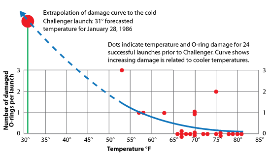
I've been reading about the Challenger disaster as an example of fatally misleading data, but I just can't find the connection. There's the famous example of the O-ring chart, but even the Wikipedia article on Challenger mentions that the argument is not so simple. There were so many factors involved in that misguided launch decision that it seems highly misleading to say that one chart (or the lack thereof) was to blame. I'm removing the reference to it. Silverhammermba (talk) 16:14, 15 July 2015 (UTC)
The works of Edward Tufte might be helpful in expanding this article at some point. Cheers! Woz2 (talk) 21:10, 17 July 2012 (UTC)
Suggestion[edit]
In every case, except the Extracted graph, the misleading graph is to the left and the accurate, or original graph is to the right. Can I suggest that the "Extracted graph" is made to conform.
Amandajm (talk) 06:00, 19 July 2012 (UTC)
- I agree, and I hope someone who knows how can alter the underlying image accordingly.—A bit iffy (talk) 10:35, 19 July 2012 (UTC)
- Unfortunately that image is licensed under the GFDL which does not allow modification. I uploaded two new images to replace it (since all of the other examples use separate images), and have updated the article accordingly. Silverhammermba (talk) 15:48, 15 July 2015 (UTC)
request for consensus[edit]

was added 05:39, 19 July 2012 , and then immediately removed by "216.80.148.168 (talk) . . (21,275 bytes) (-115) . . (purged irrelevant & biased example from truncated graph section; a 25% increase is non-trivial)"
Is this a valid example, or not? (It was in the truncated graph section.) GangofOne (talk) 06:07, 19 July 2012 (UTC)GangofOne (talk) 06:08, 19 July 2012 (UTC)
- The image used is a much better example of a truncated graph, and the article only needs one. Yours depicts a >25% rise, whereas the one used shows only a 4% difference. Also, the subject of the graph used is neutral, while yours is loaded with climate-change controversy. And putting it in at full size is just shouting.
- So yes (to your unasked question) it was quite correct to delete it. Moonraker12 (talk) 08:10, 19 July 2012 (UTC)
- (ec) PS: I've taken the liberty of reducing the image here, too. Moonraker12 (talk) 08:18, 19 July 2012 (UTC)
- It's certainly a truncated graph, but not every truncated graph is misleading, and not every small change is insignificant. The problem with this example, and with this over-simplified article in general, is that context is everything. 58.106.7.175 (talk) 08:13, 19 July 2012 (UTC)
- This last point of "context" is important and it may be good to have a new section headed "Context" to discuss this. This example graph could be used with some apprpriate commentary in the text. It would be good to find examples where this or similar graphs have been used, to know whether they have been accompanied by graphs on "better" scales, and also why the graph was used in its original publication. In this instance the intention might have been to reveal the size and shape of the seasonal variations. Certainly a problem with the original inclusion of the graph in this article what that it was not accompanied by any description/comment at all. Melcombe (talk) 08:42, 19 July 2012 (UTC)
- I have a suggestion: perhaps have a graph of human body temperature as an example of where truncation is not misleading. It's something everyone can relate to, and understand the meanIng of, unlike that atmospheric CO2 one. One could illustrate the point by showing the minimal apparent difference between hypothermia, hyperthermia and normal body temperature on a graph starting at absolute zero (i.e. a misleading graph), alongside one with one showing these on a graph where the scale is between 33C and 40C (i.e. a non-misleading graph).—A bit iffy (talk) 13:54, 19 July 2012 (UTC)
- Thanks. All we need now is someone competent with graphics to construct these things...--A bit iffy (talk) 16:38, 2 December 2012 (UTC)
-What things? I made all the graphics in the article...could add more if you're specific.Smallman12q (talk) 20:43, 2 December 2012 (UTC)
Bar graph omitting negative value[edit]
I've removed the "Bar graph omitting negative value" because:
- It doesn't strongly demonstrate the point (indeed, one could think the increase from 1993 to 1994 suggests rapidly growing income, thus undermining the point)
- The "Net Income" title doesn't display properly (it appears as "Net Incon" on my iPad at least)
—A bit iffy (talk) 10:27, 19 July 2012 (UTC)
Feedback[edit]
I've expanded the article with a number of illustrations, I'd appreciate some feedback.Smallman12q (talk) 19:44, 23 July 2012 (UTC)
Truncated Bar Graph[edit]
I think the images that accompany the truncated bar graphs are incorrect for the subject. When comparing those graphs truncation does not pose a problem: scaling poses the problem. Wouldn't truncation be a problem when comparing a set of charts where the truncation occurred at different values? Thelema418 (talk) 18:24, 24 July 2013 (UTC)
Awesome[edit]
This page is probably the most useful Wikipedian page I've seen in years. 104.229.142.212 (talk) 19:23, 14 June 2015 (UTC)
Details missing[edit]
There are two sxns with almost no content: "Complexity" and "Poor construction" **Maybe** I can imagine why an overly complex graph would be misleading, but I'm not told what complexity is necessary vs. what is not, or else what to do with data that's necessarily complex. Inquiring minds want to know. As for "Poor construction", I have no idea what it's referring to (besides what was covered under other categories above). I suggest that both of these categories be expanded or removed. Also "Extrapolation": there's at least a link to another article there, but I don't see that it explains anything about misleading graphs, so it's not helpful. Mcswell (talk) 22:06, 10 October 2019 (UTC)
External links modified (February 2018)[edit]
Hello fellow Wikipedians,
I have just modified one external link on Misleading graph. Please take a moment to review my edit. If you have any questions, or need the bot to ignore the links, or the page altogether, please visit this simple FaQ for additional information. I made the following changes:
- Added archive https://web.archive.org/web/20160815090929/http://malrep.uum.edu.my/rep/Record/uitm.ir.3284 to http://malrep.uum.edu.my/rep/Record/uitm.ir.3284
When you have finished reviewing my changes, you may follow the instructions on the template below to fix any issues with the URLs.
This message was posted before February 2018. After February 2018, "External links modified" talk page sections are no longer generated or monitored by InternetArchiveBot. No special action is required regarding these talk page notices, other than regular verification using the archive tool instructions below. Editors have permission to delete these "External links modified" talk page sections if they want to de-clutter talk pages, but see the RfC before doing mass systematic removals. This message is updated dynamically through the template {{source check}} (last update: 18 January 2022).
- If you have discovered URLs which were erroneously considered dead by the bot, you can report them with this tool.
- If you found an error with any archives or the URLs themselves, you can fix them with this tool.
Cheers.—InternetArchiveBot (Report bug) 04:21, 2 February 2018 (UTC)
Discrete-item line charts[edit]
See Talk:Deflategate#Misleading graphic. A set of eleven footballs are measured twice for inflation pressure (possibly at a consistent rate and in a consistent sequence) and the result is graphed as a line chart instead of a bar chart.
In a quick scan, I didn't see this case covered here, so I thought I'd post this example to the talk page. — MaxEnt 18:15, 11 April 2018 (UTC)
A potential graphical example[edit]
Yes, part of the Trump impeachment but you do have articles like CNN's that point out how the graph is misleading. The original image from Trump's tweet should be PD-USgov so can be used as an example. --Masem (t) 17:06, 1 October 2019 (UTC)
Conspiracy nuts[edit]
This article is being cited by trolls and conspiracy nuts to claim that any graph in any journal that does not conform to the ideas presented here is false and misleading. This is ridiculous nonsense, as are the examples cited - EVERY SINGLE ONE! For instance the first example shown has no context. If there is a reason to emphasize the small differences then the "bad truncated graph" is the CORRECT ONE! Who ARE you people?! There are so many examples. I will cite two here, but at present this is a junk page. And yes, I have read Tufte, and been through his seminars, I have plenty of publications. Statistics is NOT everything! An apparently small change can drive VERY large effects! Balch, et al. 2022. PNAS https://doi.org/10.1038/s41586-021-04325-1 - Fig 6. Chapter 2 of IPCC report. "Changes in Atmospheric Constituents and in Radiative Forcing" Figure 2.3. https://www.ipcc.ch/publications_and_data/ar4/wg1/en/ch2s2-10-2.html No, I don't have an ID here on Wikipedia. I don't have the time. This is just awful. EVERY example should have a counter discussion of why someone might legitimately present data this way. What will you do next? Attack the use of log scales as "misleading graph" technique? Of course someone can be misled by graphs. But in the examples of climate, that 100 ppm is a HUGE forcing of climate! Doing what you recommend here is GROSS MISREPRESENTATION!!
FIX THIS JUNK PAGE!!! 206.214.225.129 (talk) 22:11, 18 February 2022 (UTC)