
User:Fir0002/FPCandidates/Archive 2
Grapes[edit]
I recently went picking wine grapes at a neighbours farm, and took some photos. They've got some pretty tough competition from the US government pix, but I think some of them are pretty good. --Fir0002 01:00, May 11, 2005 (UTC)
- As ususal, all are excellent. I like Image:Wine grapes.jpg the best. BTW, could you add a link to here next time you ask for a comment? (It was way up somewhere in my talk page). Good luck -- Chris 73 Talk 05:10, May 11, 2005 (UTC)
- The lighting seems a bit flat on most of them. For composition I like Image:Wine grapes03.jpg, but the DoF is perhaps a little too narrow as the top of the bunch lacks sharpness. Many of the others have compositions which don't quite work - Image:Grapes02.jpg could work with more of the sides cropped off. Overall I would agree with Chris and go with Image:Wine grapes.jpg, but I'm not sure it would get through FPC and as you say the USDA photos such as Image:Grapes.jpg are quite effective. It would be good to put some of the pictures of netted rows of vines an vineyard - particularly with an explanation of what the nets are for (birds?). Also do we know what variety of grape these are? -- Solipsist 08:08, 11 May 2005 (UTC)
- I'm coming from the viewpoint that your photos should have something that our existing photos in the grape and vineyard articles don't have. Those articles have several nice photos of different varieties of grapes in bunches, and a view of a vineyard. You shouldn't compete with those photos; find a different angle. Your shots are good, but not all of them are great.
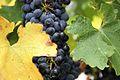
- Close-up grapes is trying to compete with those, but the grapes are cut off at the edge of the shot, so it doesn't compete successfully.
- Grape vines has the central pillar as its focal point. That's not sufficiently interesting.
- Grapes02 isn't bad, but it's competing with the existing photos, and the leaf at the top centre is out of focus.
- Vineyard is really good. It's a quite different view from the photo in our vineyard article. It tells a story with its view of the netting. In New Zealand we have a rose at the end of each row as an indicator plant which shows disease before the vines do - do they have that in your vineyards or is that just a NZ thing? It would have been nice to have a shot of that if you get another chance.
- Wine grapes02 is cut off and has a leaf in front of the grapes.
- Wine grapes03 competes with the existing photos. Nothing wrong with it (although I'd crop the left side to remove the cut off bunch), just doesn't fill a gap in Wikipedia.
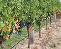
- Wine grapes04 - the netting distracts from the shot
- Wine grapes05 - again the netting is a distraction
- Wine grapes06 - ditto
- Wine grapes07 competes with existing photos, cut off at the sides
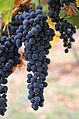
- Wine grapes08 shows the grapes on the vine much more clearly than existing photos, and is well framed.
- Wine grapes lacks a focal point.
- Grapes02 crop competes with existing photos
- In summary, I like Vineyard and Wine grapes08 as well framed, interesting photos which add material that Wikipedia is lacking.-gadfium 09:47, 12 May 2005 (UTC)
- Fair enough. I can see your point, and I'd probably agree with you. --Fir0002 22:23, May 12, 2005 (UTC)
Do you know what variety these grapes are?
Unfortunately not --Fir0002 11:29, July 14, 2005 (UTC)
-
 Close up grapes
 -
 Close up grapes
 -
 Grapes02
 -
 Vineyard
 -
 Wine grapes02
 -
 Wine grapes03
 -
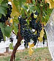 Wine grapes04
 -
 Wine grapes05
 -
 Wine grapes06
 -
 Wine grapes07
 -
 Wine grapes08
 -
 Wine grapes
 -
 Grapes02 cropped


Pincushion Hakea[edit]
Only three this time, but I can't really decided on only one. Funnily enough a couple of days ago on the weather report (I think it was channel seven) they used a photo of these flowers as the background!
 |
 |
 |
I like number 2 best, --Fir0002 11:04, Jun 20, 2005 (UTC)
... #2 has the sun shining off the inside of the flower, which makes for visual pyrotechnics. but the pistils aren't as well lit, and the position of the flower isn't ideal. For illustrative purposes, I think #3 is a bit better; lighting at a better angle; the flower more uniformly in focus. and you get that neat section of a branch on the left-hand side, and have a perfect circular cross-section for the flower (the connection with its stem is wholly hidden from view). +sj + 17:23, 20 Jun 2005 (UTC)
- I prefer the third one, because the flower is not obscured by leaves and there are no distractions. In the first, there's a leaf over the flower, and in the second, the leaf from the top is a distraction. I have to admit I didn't notice the branch on the left of the third photo until Sj pointed it out, but I agree that it adds even more to that photo's superiority.-gadfium 22:59, 20 Jun 2005 (UTC)
Chestnuts[edit]
I thinks these are quite nice.
-
 1
1 -
 2
2 -
 3
3 -
 4
4 -
 5
5


I like either #2 (the most informative: shows the chestnuts, the container, AND the leaf shape), or #4 (most detail, most in focus), --brian0918™ 12:59, 22 Jun 2005 (UTC)
- I would tend to agree with Brian on #2, although #1 is the only one that doesn't work so well. However it is also interesting to see them in the context of still being on the tree. #4 is slightly marred by the yellow leaf, but only very slightly and whilst I prefer the composition and lighting on #3, the focus/DoF is better on #4. So I would probably go with the order #2, #3, #4, #5 (I can count, I can). Its important to make clear that these are sweet chestnuts, we wouldn't want to compete with the Horse Chestnut picture already in FP ;-) Mind you the French picture on sweet chestnut is already pretty good and looks very similar to #3. -- Solipsist 14:15, 22 Jun 2005 (UTC)
- Definitely #3. It's like the good sweet chestnut image, only... twice as good. Hence featurable :) And you should find a good place to put #5 in an article. +sj + 18:52, 22 Jun 2005 (UTC)
- I also like 3 best. 2 seems to have a small blurry leaf in front of the image. 4 is also good. 1 and 5 are nice but 3-5 have more interest to me. Otherwise, pic 5 is also pretty good. -- Chris 73 Talk 09:32, Jun 23, 2005 (UTC)
- I like 3 the best because it's on a slight angle, which makes it more interesting than the otherwise similar photos 2 and 4, and it shows the chestnuts in their shell, and that spiky shell is in focus. The first photo and fifth photos show the contrast between the shiny brown nuts and the spiky green husks, but the first suffers because the husks are out of focus, and for the fifth, the diagonal split of the contrasting images just doesn't work for me - it divides the picture into two triangles which are an unnatural shape which doesn't go with the natural subject.
- Photo 3 could be improved by trimming the out-of-focus piece of husk on the right-hand side. It's a shame that all the leaves are cut off; they would have looked better complete, but I do realise that it isn't always possible to get the perfect framing for a nature photo. The out-of-focus background works really well, and perfectly sets off the spiky husk. The image is very close to being centred in the frame, but most subjects look better slightly off centre. Overall, this photo is better than the third hakea that I like in the previous set.-gadfium 05:08, 25 Jun 2005 (UTC)
Moto X[edit]
-
 no.1
no.1 -
 no.2
no.2 -
 no.3
no.3 -
 no.4
no.4 -
 no.4 edited out the spectator
 -
 no.4c crop to concentrate on the riders


Tally:
No. 1 = 1 vote
No. 2 = 2 votes
No. 3 = 2 votes
No. 4 = 1 vote
No. 4c = 1 vote
Seems like there's a mixed bag.
I took these photos at a recent motocross meet of the Lakes Entrance MX club, they came out pretty well IMO. --Fir0002 June 30, 2005 01:47 (UTC)
- Wow! I'd probably go with #1 or #2, because they're simpler and your focus isn't diverted. I'd lean toward #2 because his leg isn't down and he's more in motion, plus all the mud helps. --brian0918™ 30 June 2005 02:30 (UTC)
- You have two distinct themes here: the solo motocross rider, as in the first two photos, and the motocross race, in the last two photos. I agree with brian0918 that #2 looks better than #1. I prefer #3 to #4, partly because there are more riders visible, and a better idea of the track. It's a shame about the cut-off spectator at the extreme right of #4, but if you trimmed him you'd have a cut-off tree, and if you trimmed that you'd lose some of the mud-splash.-gadfium 30 June 2005 03:17 (UTC)
- I'm impressed with your ability to edit out the spectator, that does look good. I still have a preference for #3 over #4 for the reasons stated above.-gadfium 30 June 2005 10:16 (UTC)
- Wow! All of them are good. Also, as gadfium said, there are two themes. If i start nitpicking, then I prefer #1 over #2, because #2 has a small hill in the foreground that distracts, and I also prefer #3 over #4 because it is a larger group and shows more of the racing character (more people). But any one of them would have my support for featured pic. -- Chris 73 Talk June 30, 2005 07:16 (UTC)
- They are all nice. But #4 just has some quality of excellence the others don't. I can't put my finger on it; but I know a keeper when I see it. The others have various qualities, but the last is the one I will remember... +sj + 30 June 2005 07:31 (UTC)
- Nice to see some action shots. I would agree with gadfium, that you need to decide whether to concentrate on the solo rider or the race. Although the exposures are well handled, I'm not sure the back lighting works so well as the colours on the bikes and leathers end up rather muted - so that makes me lean towards #3. And whilst the dirt plumes are impressive, cropping much tighter helps remove the plain backgrounds and concentrates on the colours and action. A tighter crop on #4 brings out the intent, hungry-for-winning, look on the lead rider's eyes. - Solipsist 30 June 2005 15:19 (UTC)
- Yes that's certainly a vaild point, and the cropped does highlight the look in his eye. --Fir0002 July 1, 2005 01:06 (UTC)
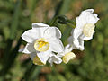
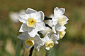
Jonquil Flowers[edit]
-
 no. 1
no. 1 -
 no. 2
no. 2 -
 no. 3
no. 3 -
 no. 4
no. 4 -
 no. 5
no. 5 -
 no. 6
no. 6


Spring time is near and the jonquils are looking nice. My personal fav. is no. 4
Thanks again for taking the time to vote here! --Fir0002 10:17, August 20, 2005 (UTC)
- I'd say #2 or #4 are my favorite. Very nice! — BRIAN0918 • 2005-08-20 14:34
- I'd concur - probably #4, #2. In principle a good plant illustration would also show something of the leaves as well as the flowers, so the others have value too. -- Solipsist 18:42, 20 August 2005 (UTC)
- #3 for sure. Covers all parts of the plant, gets light into the bowl of one flower, gets a profile of others; some excellent large-scale detail visible in the disfocused background. +sj + 23:07, 21 August 2005 (UTC)
- Looks like no. 4 gets the consensus --Fir0002 09:00, August 24, 2005 (UTC)
Mt Ainslie View[edit]
 |
 |
 |

View from Mt Ainslie at night. Personal preference for the panorama. --Fir0002 10:23, 3 December 2005 (UTC)
Panorama has been nominated --Fir0002 09:34, 5 December 2005 (UTC)
- Sorry, I've been away for the weekend and only partially in touch. I would also have gone with the panorama, although it doesn't quite have the richness of Image:Wellington City Night.jpg. There are also some areas where the stitching looks a bit off. It might be worth talking to User:Geocachernemesis for some tips. I've yet to find any stitching software that I am totaly happy with.
- Of the others, probably 02, although it would be better cropped to be completely symetrical. -- Solipsist 15:32, 5 December 2005 (UTC)
Crepuscular Ray Sunset[edit]
Nice photos captured on top of the Telstra Tower:
-
 No. 1
No. 1 -
 No. 2
No. 2 -
 No. 3
No. 3 -
 No. 4
No. 4


Personal preference for the exposure bracket (no. 2) --Fir0002 04:06, 12 December 2005 (UTC)
- Tricky. Its probably #2 or #1. #1 shows the rays more clearly, whilst #2 has a more pleasing effect with patches of light falling on the countryside. It is also quite difficult to determine the horizon since the range of hills decreases to the right, however #2 feels like it leans to the right quite a bit and judging from the cloud layers it is a little off level (level might be somewhere between #3 and #1). -- Solipsist 09:26, 12 December 2005 (UTC)
To better illustrate the rays, #1. For a better picture, #2. --BRIAN0918 13:16, 12 December 2005 (UTC)
Butchers Creek, Omeo[edit]


Testing out my new 17-40 L lens.All are pretty similar, and I think only 11 and 12 are probably candidates as they don't have any burnt out areas (exposure bracket). Anyway see what you think... --Fir0002 05:53, 13 February 2006 (UTC)
- Not 11, no good image composition, preferences are 5 (sharp image) and 7 (composure). -- Chris 73 | Talk 06:51, 13 February 2006 (UTC)
- The dynamic range of most of the images could be a problem. Many have areas of overexposure that some may not like. 12 mostly manages to tread the tightrope, but I quite like 7 too. I haven't managed to spot the butcher in any of them :-) -- Solipsist 22:22, 13 February 2006 (UTC)
- Not that I've been invited to comment specifically, but I stumbled over this page and wanted to mention that sunny days and rainforest scenes do not usually work. Case in point your rainforest panorama in Canberra. It was a good scene, but there were large areas that were blown out.. You really need an overcast day to minimise the dynamic range of the scene. Diliff | (Talk) (Contribs) 21:31, 18 February 2006 (UTC)
Hay Bales[edit]
I've already unsucessfully put a couple of photos on FPC, and although they were generally rejected, I really find beauty in haybales - could be just the countryboy in me :-)


Anyway I'd appreciate seeing what you think of these. Personal pref for Image:round_hay_bale_at_dawn02.jpg --Fir0002 www 23:49, 18 February 2006 (UTC)
- The panorama has too much shadow, out of the others, Image:Round hay bale at dawn02.jpg looks best, but I am not sure if it is feature quality. -- Chris 73 | Talk 23:59, 18 February 2006 (UTC)
I like the panorama, but I don't know that others will. I would go with dawn02. — 0918BRIAN • 2006-02-19 00:29
Bearded Dragon[edit]
The DOF maybe a little shallow, but I kinda like the lizard and photos


Personal preference for Image:Bearded dragon04.jpg --Fir0002 www 23:48, 18 February 2006 (UTC)
- The focus is a problem. If you could blur the background, I might go with the #1. Otherwise, maybe 3 or 5. — 0918BRIAN • 2006-02-19 00:27
- These photos really rub my image sensors the wrong way. Funny how that works... #1 is the only one that doesn't bother me. If you burn the two glare spots (leaf? and twig) it could be good for the right article[s]. +sj + 06:52, 24 February 2006 (UTC)
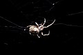
Orb Weavers[edit]
-
 01
01 -
 02
02 -
 03
03 -
 04
04 -
 05
05 -
 06
06 -
 07
07 -
 08
08


Testing out the extreme macro end of the 17-40 f/4. 02 works good as a desktop background - simply add black space to fit the aspect ration of your screen! --Fir0002 www 22:46, 25 February 2006 (UTC)
- The black ones look cool. Technically, 03 is best with everything in focus, although some may object to see only the underside (even though I think it is a rarely seen interesting view) 02 is best in composition, but one leg is fuzzy. All the white backgrounds have arifacts in it that would make it difficult to pass the nomination. Overall either 02 or 03. Good work! -- Chris 73 | Talk 23:31, 25 February 2006 (UTC)
Ahh, back to the resident Orb Weaver. I'm beginning to believe that 78% of the biomass of Australia is composed of spiders ;-) I'd concur with Brian, in that the black background pictures are the interesting ones - largely due to the definition on the body hairs. #05 is a non-shot whichever way you look at it. #07 is nice, but should have greater DoF to get all legs in focus. The first four look like the best of the bunch (orb weavers weave their web at night to be ready for the dawn, right?). Composition wise, #03 should probably take it, for its lighting, clarity and for having an even distribution of eight legs (still a good indicator of an arachnid). Its just a shame that its orb web is rather a mess.
BTW, since Image:Wolf spider attack position.jpg looks like it is about to survive delisting, its number is up to reappear as PTOD on the 1st March. -- Solipsist 23:06, 27 February 2006 (UTC)
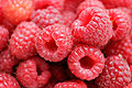
Raspberries[edit]
-
 01
01 -
 02
02 -
 03
03 -
 04
04 -
 05
05 -
 06
06


No. 2 makes a great desktop background --Fir0002 www 08:08, 1 March 2006 (UTC)
- I prefer number 5 out of all of them. The problem I have with 1, 2 and 4 is the out of focus berries in the background. I know they can't really be avoided, and without them the background would be more than a little boring, but I just don't really like them. Any of numbers 3, 5 and 6 are good, but I think I prefer 5. Raven4x4x 09:11, 1 March 2006 (UTC)
- Either #5 or #1 I think. Most of the others either have an uncomfortably shallow DoF, or foreground elements out of focus. However, they all look a little dry/matt. There might be some food photography trick that could be used here (spraying with glycol or some such). Do you have some new studio lights now? -- Solipsist 12:26, 1 March 2006 (UTC)\
- I would go with #5. — 0918BRIAN • 2006-03-1 13:41
Dragonfly[edit]


Personal preference for #5 or #6 --Fir0002 www 09:31, 18 April 2006 (UTC)