User:Schakel2/sandbox
Examples[edit]

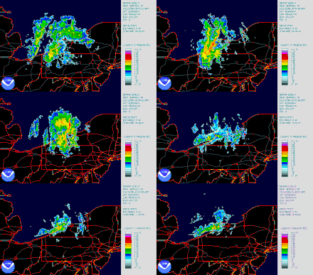
Heat maps are used in a variety of industries. Doppler radars are used to provide information regarding movement of targets as well as their position. Radars transmit pulses of radio waves and measures the shift in phase between the transmitted pulse and the received echo. Oftentimes, these radars are used to show weather forecasts. The National Weather Service provides weather, water and climate data, and forecasts that frequently utilize heat maps to display this data.

Although similar to a heat map, a surface plot is a different visualization technique. It is a three dimensional visualization of data. One main advantage of a surface plot is the ability to depict data using both height and coloring, while a heat map can utilize only color.
A Contour map (Contour lines) is another visualization technique that is similar to a heat map. Contour maps feature curves along which the function being graphed has a constant value. As such, these curves join points of the same value together to form a common line. This type of map is often used in topographical mapping.
A Short-time Fourier transform is a tool that is used for audio signal processing. It is used to graph changes in input signal over time. It is common to graph different frequencies of the input signal, oftentimes visualized on a heat map.
Another common usage of heat maps is visualizing the playing board of the game Darts. The Darts Regulation Authority (DRA) Rule Book has specific guidelines for dartboard coloring; however, these guidelines only pertain to the 20 segment on the board. There are no rules guiding the coloring of any other part of the board.[1]
-
Human voice visualized with a spectrogram; a heat map representing the magnitude of the STFT. An alternative visualization is the waterfall plot.
-
Score of each contiguous region of a dartboard (not to scale)
- ^ "The Darts Regulation Authority, DRA - PDC". www.pdc.tv. Retrieved 25 April 2022.


