Wikipedia:Featured picture candidates/Shuttle approaches the ISS
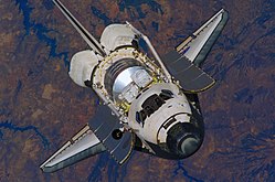
Shuttle approaches the ISS[edit]


- Reason
- Great details, you can even see the inside of the cockpit.
- Articles this image appears in
- Space Shuttle Orbiter, STS-121, STS-121 Timeline
- Creator
- NASA
- Support as nominator — Chris H 02:54, 28 May 2007 (UTC)
- Comment I sort of remember an extremely similar pic that was nominated before. I forget how long ago. I might be hallucinating though. ;) Jumping cheese Cont@ct 08:07, 28 May 2007 (UTC)
- Comment Is "upside down" more enc, or more "zero grav"..? It looks fine (and is easier on the neck!) the other way up. As far as FP goes, there are so many of this kind of shot that I'm inclined to be extra strict on the criteria. It's a little bit flat (could use a small curves tweak) and the tail is cut off (not a huge big deal, but might be if it ever needed a clipping path) Other than that it's pretty cool. Might support a rotated version, certainly a less cropped one. mikaultalk 09:08, 28 May 2007 (UTC)
- Oppose - NASA has set a very high bar for themselves, and this image doesn't measure up IMO. Too washed-out, inverted subject hurts enc, and cut off tail. --TotoBaggins 18:30, 28 May 2007 (UTC)
- Comment - I added a new version.Bleh999 07:48, 30 May 2007 (UTC)
- How is a makeing the shuttle orange an enhancement? Please choose a less valuing and more descriptive caption. --Dschwen 17:06, 31 May 2007 (UTC)
- Photographic conditions don't always result in the true color levels, these are more accurate Bleh999 22:47, 31 May 2007 (UTC)
- That was actually what I was disputing. What do you base your colorcorrection on? The Shuttle tiles are yellow/orange in your edit. I would think that NASA isn't completely moronic about calibrating their images, and in fact the original looks more natural to me. Please don't take this the wrong way, but have you had a look at the calibration charts at the top of this page? Is your monitor maybe adjusted a bit too cold? --Dschwen 23:00, 31 May 2007 (UTC)
- Photographic conditions don't always result in the true color levels, these are more accurate Bleh999 22:47, 31 May 2007 (UTC)
- How is a makeing the shuttle orange an enhancement? Please choose a less valuing and more descriptive caption. --Dschwen 17:06, 31 May 2007 (UTC)
- Strong oppose edit 1 Flipping kills the encyclopedic value, weak support original. Noclip 17:42, 31 May 2007 (UTC)
- point taken, but it certainly is easier to see cockpit details in the rotated version, this could be useful in the case someone wanted to label such details, most definitely encyclopedic Bleh999 22:15, 31 May 2007 (UTC)
- I dont really like the added yellow color cast much either. -Fcb981 15:13, 3 June 2007 (UTC)
- point taken, but it certainly is easier to see cockpit details in the rotated version, this could be useful in the case someone wanted to label such details, most definitely encyclopedic Bleh999 22:15, 31 May 2007 (UTC)
Not promoted MER-C 09:26, 5 June 2007 (UTC)
