
Wikipedia:Featured picture candidates/Typeset writing examples
Typeset writing examples [edit]


Articles: Alphabet, Language, Typography, Writing, Writing system, Typeface, Written language, Letter (alphabet)


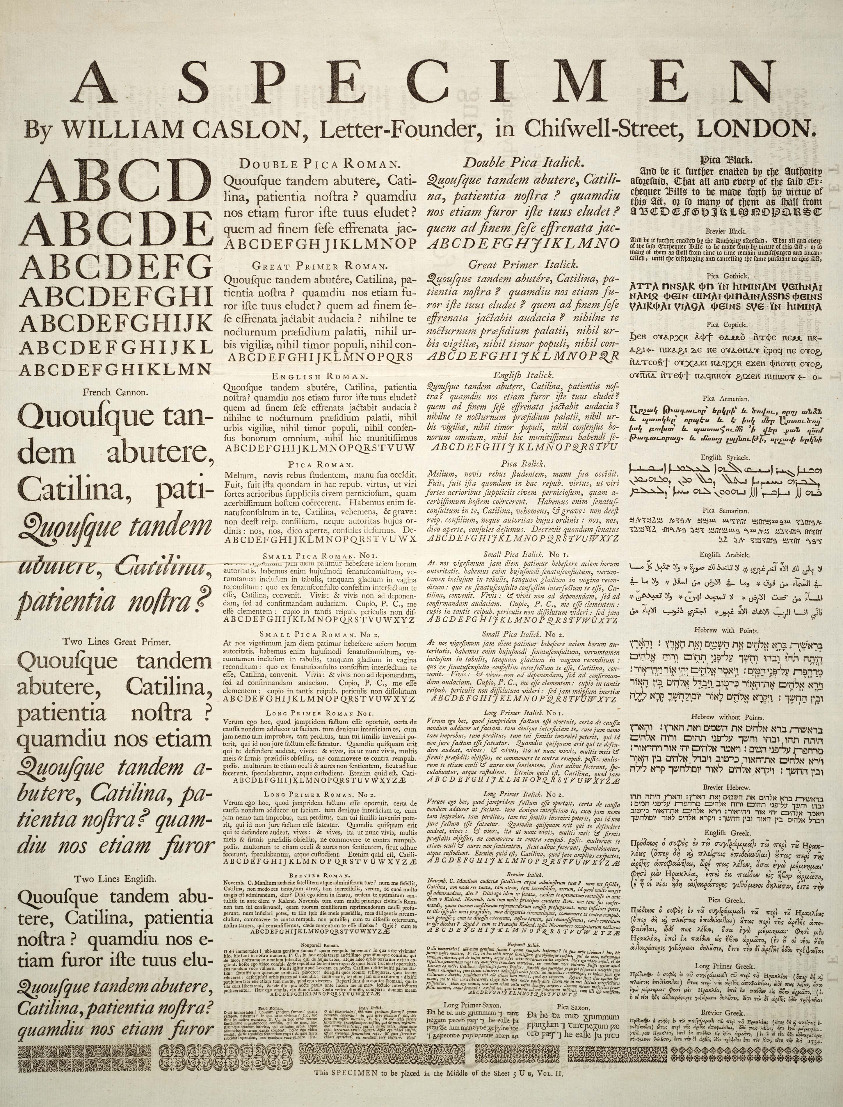
I found this highly informative plate in the 1728 Cyclopaedia. It seems that the author asked a letter-founder to provide him with a specimen of typeset fonts and writings systems to illustrate his encyclopedia entry on letters. It is used in several Wikipedia articles which were without pictures, and provides perfect examples for all of them.
- Nominate and support. - BRIAN0918 05:05, 19 March 2006 (UTC)
- Support great example of old style typesetting formats. Pegasus1138Talk | Contribs | Email ---- 05:45, 19 March 2006 (UTC)
Support.See below, re original color scan. Of great interest to people perusing the subjects above. --Janke | Talk 07:05, 19 March 2006 (UTC)- Support. Totally sweet.--ragesoss 07:53, 19 March 2006 (UTC)
- I definitely support the 4th (original) version; it provides the visual context to make sense of the fonts, which look odd in the cleaned-up version.--ragesoss 18:06, 23 March 2006 (UTC)
- Support Clear,, high-res, readable, and important. What more can you want? Msoos 15:23, 19 March 2006 (UTC)
- Support Having been involved with fonts, this is a remarkable picture. --Thermos 15:53, 19 March 2006 (UTC)
Support<!-still supporting but comment updated below--> Again, a superb entry ~ Veledan • Talk 19:25, 19 March 2006 (UTC)Support, nice find! :) - Mailer Diablo 20:40, 19 March 2006 (UTC)Support original colour scan, better of the best! :) - Mailer Diablo 23:03, 23 March 2006 (UTC)
![]() Support Have uploaded an edit, but wouild support either --Fir0002 www 23:50, 19 March 2006 (UTC)
Support Have uploaded an edit, but wouild support either --Fir0002 www 23:50, 19 March 2006 (UTC)
- Support original color scan The nominator forgot to mention that the author of this specimen, William Caslon, is one of the most famous type designers. –Joke 23:33, 21 March 2006 (UTC) (edited to support original color scan Joke 15:39, 23 March 2006 (UTC))
Oppose. Does no one see the error (paper fold) near the left side? --Dante Alighieri | Talk 01:15, 22 March 2006 (UTC)- It's in the "French Cannon.", second line from the bottom. The "fixed" version from Fir masks the fold and makes it appear (perhaps) as a scanner error. In the original it is clear that the paper is folded. --Dante Alighieri | Talk 01:18, 22 March 2006 (UTC)
- Support. Apparently it was a tear, not a fold, but it's been fixed. Nice work. --Dante Alighieri | Talk 06:07, 22 March 2006 (UTC)
- Clarification. My support vote is currently for Version 4, the true color version, on account of the high level of detail. --Dante Alighieri | Talk 16:41, 23 March 2006 (UTC)
- Support. Apparently it was a tear, not a fold, but it's been fixed. Nice work. --Dante Alighieri | Talk 06:07, 22 March 2006 (UTC)
- It's in the "French Cannon.", second line from the bottom. The "fixed" version from Fir masks the fold and makes it appear (perhaps) as a scanner error. In the original it is clear that the paper is folded. --Dante Alighieri | Talk 01:18, 22 March 2006 (UTC)
- Comment: I've uploaded a fixed version. I found another copy of the page and pasted its undamaged section over the original damaged section. — 0918BRIAN • 2006-03-22 02:20
- Comment. I prefer the "tone" of the original (first image), actually. I think the "fix" (second and third) loses some important details. Look at the "faded" part above the tear on the original and the same spot on the fixed copy... see? --Dante Alighieri | Talk 06:11, 22 March 2006 (UTC)
- I cannot figure out what you're talking about. — 0918BRIAN • 2006-03-22 06:24
- The faded text reads "consules defumus", it is above the tear area, a little to the right. It is above the "Q R S T" in Pica Roman. If you compare the first and second (or first and third) images, you will see that there is some loss in the fine detail. Also, the "fixed" version just seems "stark" to me... it looks more like a poorly digitized scan than a photo-realistic representation. --Dante Alighieri | Talk 08:49, 22 March 2006 (UTC)
- It's also quite possible that I'm nuts. ;) --Dante Alighieri | Talk 08:53, 22 March 2006 (UTC)
- The faded text reads "consules defumus", it is above the tear area, a little to the right. It is above the "Q R S T" in Pica Roman. If you compare the first and second (or first and third) images, you will see that there is some loss in the fine detail. Also, the "fixed" version just seems "stark" to me... it looks more like a poorly digitized scan than a photo-realistic representation. --Dante Alighieri | Talk 08:49, 22 March 2006 (UTC)
- I cannot figure out what you're talking about. — 0918BRIAN • 2006-03-22 06:24
- Comment - I'd really like to see the color scan of the old document here (see my comment in Warship), too - these edits are good, but too clean, for images being from 1728. --Janke | Talk 10:19, 22 March 2006 (UTC)
Oppose agreed, it looks far too clinical and artificial at the moment. The third version is better but not perfect. chowells 13:39, 23 March 2006 (UTC)- Support the fourth version only. chowells 19:15, 23 March 2006 (UTC)
- The problem with the original is that the back of the page can be seen, something that can only be drown out in the way that has been shown. I think the cleaned up versions are better, because the coloring is as it was originally intended to be, not browned and damaged with time. — 0918BRIAN • 2006-03-23 14:01
- I do not consider it a problem chowells 19:15, 23 March 2006 (UTC)
- Support original color scan. As seen in Warship above, after the original color scan was uploaded, voters favored that. So, I upload and support the original again. The imperfections in the paper and printing are of historical significance, and should not be edited out. Nuff said... --Janke | Talk 14:29, 23 March 2006 (UTC)
- What historical purpose do they serve? To show that the text is old?? I highly doubt Caslon wanted to present a browned, damaged, see-through page as his best work. This picture is used in articles about alphabets, languages, and fonts, not articles about water damage and paper aging. — 0918BRIAN • 2006-03-23 15:35
- In this case I'm not sure that they are significant. Since the candidacy focuses on the typefaces themselves, I'm not certain that the age of the paper itself is an issue. Nevertheless I'm supporting that 4th version as it is unquestionably the clearest and most detailed of the available options. --Dante Alighieri | Talk 16:41, 23 March 2006 (UTC)
- I agree that they are not necessarily particularly significant. On the other hand, they don't detract from understanding the image as a type specimen, and give it historical context. The sample was printed with lead type on paper almost three hundred years ago. It is pointless and dishonest trying to make it look as though it was laser printed yesterday on unnaturally white paper, and looking closely at the processed image is off-putting: the letters are rough but the contrast is so high it seems like a black and white image and it is difficult to register they are rough because it was printed with metal type. I don't like the lack of any texture in the three other versions. I say, unless there is a clear argument to the contrary, it is best to use the least manipulated image. (With that said, it is regrettable that the text behind is visible in this image.) –Joke 17:53, 23 March 2006 (UTC)
- Support original colour scan I mean, Wow! the detail is beautiful, the depiction of the early typefaces loses nothing whatsoever from the ageing of the paper, and the cross-print from the other side of the page is neither ugly nor encyclopedically irrelevant. There is no contest here, it has to be this version IMO ~ Veledan • Talk 21:44, 23 March 2006 (UTC)
Promoted Image:Caslonsample.jpg After weighing everyones' opinions, it seems that the last one was the favorite. --PS2pcGAMER (talk) 08:37, 2 April 2006 (UTC)