
Wikipedia:Graphics Lab/Illustration workshop/Archive/Apr 2015
Two illustrations for the PCI Express article[edit]
-
 PCI Express Terminology
 -
 Example PCI Express Topology


- Article(s)
- PCI Express
- Request
- Please have a look at pages 3 and 7 in this PDF file – they contain two great high-level illustrations of the PCI Express architecture, which would be a really great addition to the article. Based on the content these illustrations depict, I'd say that we should have no copyright issues.
- Just as a note—as usual—there's no need to capitalize all words in the labels on these illustrations, and capitalizing only the first word would be just fine; for example, "PCIe bridge to PCI/PCI-X" should be written instead of "PCIe Bridge To PCI/PCI-X", or "PCI Express device A" should be written instead of "PCI Express Device A".
- Thoughts? As always, I'm here for all additional questions. Thank you in advance! — Dsimic (talk | contribs) 10:16, 25 December 2014 (UTC)
- Graphist opinion(s)
- Q: on page 7 bottom right on PCI/PCI-X bus are those two white boxes Slots? --Victor•talk 22:09, 26 December 2014 (UTC).
- Any chances, please, for anyone to pick this up? It would be greatly appreciated! — Dsimic (talk | contribs) 05:53, 30 March 2015 (UTC)
- How about this? For some reason my preferred font (Franklin Gothic Heavy) didn't come through on the illustration.
- —Mliu92 (talk) 15:02, 7 April 2015 (UTC)
- Only fonts that appear here will render correctly, so as yours isn't on the list it's been replaced by the default sans-serif font (Liberation Sans, I think). NikNaks talk - gallery 15:09, 7 April 2015 (UTC)
- Thanks! Darn these default Windows fonts. I located and installed DejaVu and Bitstream Vera, that should be good for future reference. —Mliu92 (talk) 15:35, 7 April 2015 (UTC)
- Hello, Mliu92! Thank you very much, the drawing looks great! Here are a couple of small improvements that should be implemented:
- We should have "Root complex" instead of "Root Complex", as there's no need to capitalize "complex".
- Arrows should be deleted, as the communication goes both ways (full-duplex communication, in particular) so arrows might be confusing.
- It would be great if you could implement these cleanups. — Dsimic (talk | contribs) 01:01, 8 April 2015 (UTC)
- Hello, Mliu92! Thank you very much, the drawing looks great! Here are a couple of small improvements that should be implemented:
- Thanks! Darn these default Windows fonts. I located and installed DejaVu and Bitstream Vera, that should be good for future reference. —Mliu92 (talk) 15:35, 7 April 2015 (UTC)
- Only fonts that appear here will render correctly, so as yours isn't on the list it's been replaced by the default sans-serif font (Liberation Sans, I think). NikNaks talk - gallery 15:09, 7 April 2015 (UTC)
Change me color[edit]
- Request
The following image i think should have generation in red or something. Then just customers would be black. Can someone make this edit and maybe ping the energy group? 76.120.164.90 (talk) 15:37, 24 January 2015 (UTC)
- Graphist opinion(s)
![]() Done NikNaks talk - gallery 18:34, 28 March 2015 (UTC)
Done NikNaks talk - gallery 18:34, 28 March 2015 (UTC)
Mendeleev's tables[edit]
-
 1869
1869 -
 1871
1871 -

-


- Request
- Please make the letters crisper, for easier reading. Most preferably keeping the original fontstyle & whitespace &tc., because this table is quite iconic. If a priority is needed, #2 (1871) is more important. -DePiep (talk) 17:24, 28 January 2015 (UTC)
- Graphist opinion(s)
Do you have any idea about what the typeface used is? I've attempted to find some similar ones online (here) but due to the poor quality of the image, the suggestions aren't necessarily viable. Any ideas? NikNaks talk - gallery 18:20, 28 March 2015 (UTC)
- Seems to be like a type old handwritten typeface. Not sure if a similar font can be found. ///EuroCarGT 05:23, 29 March 2015 (UTC)
- 1871 version (righthand image)
-
- I've made a start with the generic serif font for now; we can always exchange it later. Is this the sort of thing you were looking for? NikNaks talk - gallery 21:42, 1 April 2015 (UTC)
- Yes. Of course the more the font is similar, the nicer. (Also 19th century habits like the double == symbol). We might even need artwork! So the setup is nice already, acceptable for me (I'll ask some WP:ELEMENTS over to take a look: we need to convince them). In short: pls go ahead with this font, if a better one is found we can change it. -DePiep (talk) 21:55, 1 April 2015 (UTC)
- There we are. Hopefully it'll be of use as it is. The file is written using a text editor, so if you want to experiment with fonts, simply do a find and replace for "Liberation Serif" and try some others from that list and see if you can find a more suitable one. You can upload it to SVG check or File:Test.svg to see how it looks. NikNaks talk - gallery 14:35, 3 April 2015 (UTC)
- Looks great! Maybe return to single "="? I was a bit too enthusiastic about fancy creative fonting. One thing, about the file name: "Periodic table" is an essential word in here, because well Mendeleev invented it. Also we need "1871" for his versions vary. So could we rename it to, for example, "Periodic table by Mendeleev, 1871.svg"?
- Will try to find more about the other image. -DePiep (talk) 17:02, 3 April 2015 (UTC)
- There we are. Hopefully it'll be of use as it is. The file is written using a text editor, so if you want to experiment with fonts, simply do a find and replace for "Liberation Serif" and try some others from that list and see if you can find a more suitable one. You can upload it to SVG check or File:Test.svg to see how it looks. NikNaks talk - gallery 14:35, 3 April 2015 (UTC)
- Yes. Of course the more the font is similar, the nicer. (Also 19th century habits like the double == symbol). We might even need artwork! So the setup is nice already, acceptable for me (I'll ask some WP:ELEMENTS over to take a look: we need to convince them). In short: pls go ahead with this font, if a better one is found we can change it. -DePiep (talk) 21:55, 1 April 2015 (UTC)
- I've made a start with the generic serif font for now; we can always exchange it later. Is this the sort of thing you were looking for? NikNaks talk - gallery 21:42, 1 April 2015 (UTC)
Are "Reiben" and "Gruppo" contemporary German words? I'd expect "Reihen" and "Gruppe". Note: with me, in the RxOx row: the superscripts in O5 and O7 are not aligned with the other superscripts like in R2O3. -DePiep (talk) 10:06, 4 April 2015 (UTC)
- Ouch. Ten years ago today, this was uploaded. -DePiep (talk) 10:13, 4 April 2015 (UTC)
- 1869 version (lefthand image).
- As for the other image, it would be helpful to have the script for the title typed out here, as I'm not that familiar with Cyrillic. It's also hard to tell how much of the wiggling of the columns is deliberate and how much is simply due to warping from the scanner or the paper. NikNaks talk - gallery 14:35, 3 April 2015 (UTC)
- I think the Cyrillic in the 1869 table reads: (title) "ОПЫТЪ СИСТЕМЫ ЭЛЕМЕНТОВЪ." and (subtitle) "ОСНОВАННОЙ НА ИХЪ АТОМКОМЪ ВѢСЪ И ХИМИЧЕСКОМЪ СХОДСТВѢ", although the latter was somewhat difficult to read. Do note that I don't actually speak Russian and so we probably ought to consult someone who actually does, like R8R, to confirm what it actually says. Double sharp (talk) 04:10, 4 April 2015 (UTC)
- As for the naming of a new svg file, please use wordings "Mendeleev", "periodic table" and "1869" somehow. (see my note on the 1871 one). -DePiep (talk) 06:57, 4 April 2015 (UTC)
- As a native Russian speaker, I can assure you it says, "ОПЫТЪ СИСТЕМЫ ЭЛЕМЕНТОВЪ." and "ОСНОВАННОЙ НА ИХЪ АТОМНОМЪ ВѢСѢ И ХИМИЧЕСКОМЪ СХОДСТВѢ." I guess that was what was required?--R8R (talk) 08:21, 4 April 2015 (UTC)
- Maybe first search what dewiki uses. -DePiep (talk) 10:13, 4 April 2015 (UTC)
- Wow! Only one mistake! :-D Double sharp (talk) 12:32, 4 April 2015 (UTC)
- Sorry, but that's actually two. (Not bad anyway, it just reveals room for improvement) --R8R (talk) 20:57, 4 April 2015 (UTC)
- Miscounted... :-( Double sharp (talk) 16:28, 5 April 2015 (UTC)
- Too much for google translate: [1] -DePiep (talk) 23:14, 4 April 2015 (UTC)
- Because GT does not understand non-modern Russian spellings. The lines are "An experiment on a system of the elements." and "based on their atomic weights and chemical similarities."--R8R (talk) 07:31, 5 April 2015 (UTC)
- This document is from 1869; hence it predates the 1918 spelling reform of Russian. If you want it to work with Google Translate, you'll have to replace "Ѣ" with "Е" and delete all final "Ъ". (Of course that's not all there is to it, but that should make this particular text work in GT.) Double sharp (talk) 16:28, 5 April 2015 (UTC)
- Because GT does not understand non-modern Russian spellings. The lines are "An experiment on a system of the elements." and "based on their atomic weights and chemical similarities."--R8R (talk) 07:31, 5 April 2015 (UTC)
- Sorry, but that's actually two. (Not bad anyway, it just reveals room for improvement) --R8R (talk) 20:57, 4 April 2015 (UTC)
- As a native Russian speaker, I can assure you it says, "ОПЫТЪ СИСТЕМЫ ЭЛЕМЕНТОВЪ." and "ОСНОВАННОЙ НА ИХЪ АТОМНОМЪ ВѢСѢ И ХИМИЧЕСКОМЪ СХОДСТВѢ." I guess that was what was required?--R8R (talk) 08:21, 4 April 2015 (UTC)
- As for the naming of a new svg file, please use wordings "Mendeleev", "periodic table" and "1869" somehow. (see my note on the 1871 one). -DePiep (talk) 06:57, 4 April 2015 (UTC)
- Checked 1869. H==1 into "H=1". Order should be: Pt=197,1. / Ir=198 (not Ir=197, that appears in 1871). Could not check/decypher the decimals.
- Interesting note: so M wrote "I" in 1869, and "J" in 1871 for iodine? -DePiep (talk) 14:03, 5 April 2015 (UTC)
- While I can't tell for sure, that may be the case. It was the time when the German language was growing more influential on the upper classes of the Russian society and, of course, science. (German for "iodine" is Jod.) "J" was used in Russia for iodine for a long time; the Soviet book we heavily use (well, we actually use a 1970 translation into English) in the astatine article, for example, uses "J" (the book was published in 1966).--R8R (talk) 08:42, 6 April 2015 (UTC)
- I've fixed the Ir/Pt error. Is there anything else you need me to do? If you want to translate the file or edit individual numbers at this point, it should be relatively straightforward to do that yourself using a text editor. If there are only adjustments like that to be made, perhaps we could mark this request resolved and continue the discussion at the Wikiproject instead? NikNaks talk - gallery 13:32, 6 April 2015 (UTC)
- While I can't tell for sure, that may be the case. It was the time when the German language was growing more influential on the upper classes of the Russian society and, of course, science. (German for "iodine" is Jod.) "J" was used in Russia for iodine for a long time; the Soviet book we heavily use (well, we actually use a 1970 translation into English) in the astatine article, for example, uses "J" (the book was published in 1966).--R8R (talk) 08:42, 6 April 2015 (UTC)
- I think the Cyrillic in the 1869 table reads: (title) "ОПЫТЪ СИСТЕМЫ ЭЛЕМЕНТОВЪ." and (subtitle) "ОСНОВАННОЙ НА ИХЪ АТОМКОМЪ ВѢСЪ И ХИМИЧЕСКОМЪ СХОДСТВѢ", although the latter was somewhat difficult to read. Do note that I don't actually speak Russian and so we probably ought to consult someone who actually does, like R8R, to confirm what it actually says. Double sharp (talk) 04:10, 4 April 2015 (UTC)
- Regardless of whether a clearer version already exists, I still think it's nice to have it as a vector as well. I've added the vertical one to the gallery, and I've also uploaded the table under a new name; the one under the old name will need to be deleted. NikNaks talk - gallery 12:00, 4 April 2015 (UTC)
- The title "ОПЫТЪ СИСТЕМЫ ЭЛЕМЕНТОВЪ" should be followed by a comma instead of the period (the title and the subtitle form a single sentence).
- In better copies of the 1869 table, it is seen that the atomic weight of Al is given 27,4 and that of Pt is 197,4.
- The spelling reform of 1918 affected proper names, too. The table was signed "Д. Менделѣевъ". Burzuchius (talk) 20:13, 7 April 2015 (UTC)
- "So" and "Tc" in Group VI of the 1871 table should of course be Se and Te.Burzuchius (talk) 21:04, 8 April 2015 (UTC)
- I notice however that in the png previews, the archaic Ѣ letter shows up in a different font from the other letters on my system (IE11 on Windows 7). Strangely, though, it seems to show up OK in the original svg file. Double sharp (talk) 13:50, 7 April 2015 (UTC)
- I didn't see this first time around! Replying in the middle of the block almost made me miss it entirely. I can't understand the discrepancy; the fact it renders correctly as a vector suggests the character exists as part of the font (unless it's being rendered in another one by your machine - possible) but clearly MediaWiki hasn't been able to do that. If that's the case, someone will need to file a bug report and hope that it's fixed. NikNaks talk - gallery 14:36, 9 April 2015 (UTC)
- Again, this can be considered done (greatly). As the graphic editor says: improvements can be made in the file. -DePiep (talk) 18:56, 12 April 2015 (UTC)
A high-level overview of the Linux kernel's I/O stack[edit]
-
 Linux kernel's I/O stack

- Article(s)
- I/O scheduling, Virtual file system, Linux kernel, etc.
- Request
- As noted in the file's description, it should have transparent background, and should be optimized for a reduced SVG file size – if possible, of course. The file was created by extracting a drawing from a PDF file (page 8, the license stated there allows that); those were my baby steps in Inkscape, so the results weren't that great. :)
- At the same time, it would be great to do some cleanups regarding the capitalization of words/labels, if possible. Any help would be greatly appreciated! — Dsimic (talk | contribs) 04:35, 29 December 2014 (UTC)
- Graphist opinion(s)
- This illustration (at page 8) is not a vector graphics, it's a bitmap (raster graphics) at 220 dpi (1238 × 1521 px) embedded in PDF. --Victor•talk 12:29, 3 January 2015 (UTC).
- Well, that just shows how much of a dummy I am when it comes to vector graphics. :( Would you, by any chance, be willing to convert it into an SVG drawing? I know it's a lot of work, but this is a really useful illustration for more than a few articles. — Dsimic (talk | contribs) 17:52, 3 January 2015 (UTC)
- You may just zoom-in PDF file (or .svg, or .eps, etc.) to 200–300% to see the actual bitmap (pixels). Some time may be more than 300%, if bitmap is scaled down in the other application's file. The math is simple: if bitmap is scaled down 50% you have to zoom 200% and up, if bitmap is scaled down 25% you have to zoom 400% and up, and so on. In case of vector graphics you'll never see pixels at any zoom. --Victor•talk 00:48, 4 January 2015 (UTC).
- Thank you for the tip, I did zoom in the PDF file but obviously not far enough to see the pixelation. Will remember it for the future! — Dsimic (talk | contribs) 04:58, 4 January 2015 (UTC)
- By the way, would you, by a chance, be willing to vectorize it? — Dsimic (talk | contribs) 05:01, 4 January 2015 (UTC)
- You may just zoom-in PDF file (or .svg, or .eps, etc.) to 200–300% to see the actual bitmap (pixels). Some time may be more than 300%, if bitmap is scaled down in the other application's file. The math is simple: if bitmap is scaled down 50% you have to zoom 200% and up, if bitmap is scaled down 25% you have to zoom 400% and up, and so on. In case of vector graphics you'll never see pixels at any zoom. --Victor•talk 00:48, 4 January 2015 (UTC).
- Well, that just shows how much of a dummy I am when it comes to vector graphics. :( Would you, by any chance, be willing to convert it into an SVG drawing? I know it's a lot of work, but this is a really useful illustration for more than a few articles. — Dsimic (talk | contribs) 17:52, 3 January 2015 (UTC)
- Any chances, please, for anyone to pick this up? It would be greatly appreciated! — Dsimic (talk | contribs) 05:53, 30 March 2015 (UTC)
 Request taken by Goran tek-en (talk) 19:10, 7 April 2015 (UTC).
- @Dsimic: Could you give me clear information on what you want changed in this file, and any other information I need, thanks.
- Is there a system/levels with the different shades of grey and other colors? --Goran tek-en (talk) 12:00, 8 April 2015 (UTC)
- Sure thing; basically, the file is currently an SVG drawing with an embedded bitmap and no true SVG elements. The whole thing should be recreated as a true SVG drawing, based on what the embedded bitmap depicts. Sorry, I'm a bit confused about the shades of gray you're referring to, could you please elaborate it a bit further? Sorry for my delayed response. — Dsimic (talk | contribs) 22:28, 9 April 2015 (UTC)
- In the current image the group-boxes have different shades of grey an the smaller boxes different colors. Is there a meaning of the different colors like; levels, functions and so on? --Goran tek-en (talk) 13:14, 10 April 2015 (UTC)
- That's a very good question. The shades of gray are there to help in visually grouping different elements together, while the other colors have more specific meanings:
- Green: kernel's file systems
- Blue: kernel's drivers, subsystems and frameworks related to block devices
- Yellow: kernel's I/O schedulers
- Orange: kernel's transport mechanisms related primarily to block devices
- Turquoise: various hardware devices
- Thus, we should preserve the color coding of various elements, while the shades of gray would probably also be helpful. — Dsimic (talk | contribs) 16:08, 10 April 2015 (UTC)
- Thanks, and the colors for "more specific meanings". Does the actual color (like green) have the same meaning on different illustrations so that exactly that green always is: kernel's file systems? --Goran tek-en (talk) 17:12, 10 April 2015 (UTC)
- You're welcome. :) That's the case just for this illustration, there's no such color coding standard – if that's what you've referred to. — Dsimic (talk | contribs) 23:27, 10 April 2015 (UTC)
- Now there is a draft for you to look at. I have changed some positions and I don't know if that affects how you interpret the illustration. You should also check it so I got all right or forgot something. Give me feedback on what to change, thanks. --Goran tek-en (talk) 18:28, 15 April 2015 (UTC)
- Looks awesome, thank you very much! Got it compared in detail, and almost everything is fine; one of the small mistakes is the presented selection of I/O schedulers in yellow boxes, which should list cfq, deadline and noop, not ext2/3/4. Also, "ext2", "ext3" and "ext4" should be written without spaces, and there's a small typo in "optinal".
- Speaking of required small changes, primarily for the capitalization of labels, my initial plan was to do that myself once the SVG is done, simply because there are too many small changes and a complete to-do list would be simply too long – and it would have, probably, scared away anyone thinking of taking this request. :) Would you agree with that plan, or would you prefer me to provide a complete list of those small label-related changes so you can implement them? I'm more than willing to write down a complete cleanups to-do list if you prefer it that way. :) — Dsimic (talk | contribs) 22:14, 15 April 2015 (UTC)
- I prefer to do the cleanup my self, so please provide me with a list of things to-do.
- Also I will need the following;
- Name of the file
- Description
- Category/ies at commons
- to be able to upload it at commons, once we are done. --Goran tek-en (talk) 16:52, 16 April 2015 (UTC)
- Sure thing, here's the list of small changes that should be implemented (thank you for incorporating those I've already mentioned):
- "Applications (Processes)" → "Applications (processes)"
- "mmap (anonymous pages)" → "mmap(2), anonymous pages"
- "malloc" → "malloc(3)"
- "direct I/O" → "Direct I/O"
- "Page Cache" → "Page cache"
- "block based FS" → "Block-based FS"
- "pseudo FS" → "Pseudo FS"
- "BIOs (Block I/O)" → "BIOs (block I/Os)"
- "I/O Scheduler" → "I/O scheduler"
- 'optional stackable devices on top of "normal" block devices — work on bios' → 'Optional stackable devices on top of "normal" block devices (operate with BIOs)'
- "maps bios to requests" → "Maps BIOs to requests"
- "request — based device mapper targets" → "Request–based device mapper targets"
- "hooked in Device Drivers (hook in similar like stacked devices like mdraid/device mapper do)" → "Hooked in device drivers (similar to stacked devices created by mdraid or device mapper)"
- "Transport Classes" → "Transport classes"
- "SCSI upper layer" → "SCSI: upper layer"
- "SCSI mid layer" → "SCSI: middle layer"
- "SCSI low layer" → "SCSI: low layer"
- I'll almost surely find a few more once you've implemented all these. :) Regarding the uploading of the file once it's polished up, you should just upload a new file version to File:IO stack of the Linux kernel.svg. — Dsimic (talk | contribs) 03:08, 17 April 2015 (UTC)
- New draft to check. Why did you upload that png inserted into a svg file, it doesn't give you any advantages just problems? --Goran tek-en (talk) 22:14, 19 April 2015 (UTC)
- Well, using a PNG bitmap was a not-so-smart mistake I've made – I was under false impression that it was a vector graphics. Thank you for implementing the cleanups, and as I've predicted here are a few more I've somehow managed to miss:
- "special purpose FS" → "Special-purpose FS"
- "Block I/O Layer" → "Block I/O layer"
- "SCSI: upper layer" → "SCSI upper layer"
- "SCSI: middle layer" → "SCSI middle layer"
- "SCSI: low layer" → "SCSI low layer"
- Hopefully there will be no more cleanups after these few leftovers. — Dsimic (talk | contribs) 02:23, 20 April 2015 (UTC)
- @Goran tek-en: ping, as you've noted that brief notifications should be used. :) Sorry if this ping was redundant. — Dsimic (talk | contribs) 21:59, 22 April 2015 (UTC)
- New draft to look at.
- Just to be on the safe side, did you first add : and then removed : from the three SCSI layers?
- Also I will need the following;
- Name of the file
- Description
- Category/ies at commons to be able to upload it, thanks.
- Give me feedback. --Goran tek-en (talk) 09:28, 23 April 2015 (UTC)
- Looks great, I see no more things to be corrected. Thank you, Goran tek-en, for implementing all those cleanups!
- Exactly, I've added colons and removed them later, as on second thought they've seemed rather redundant. Regarding the uploading of the file, as I've already written above you should simply upload a new file version to File:IO stack of the Linux kernel.svg. — Dsimic (talk | contribs) 09:56, 23 April 2015 (UTC)
 Done Sorry I didn't remember that, it's now uploaded. --Goran tek-en (talk) 12:19, 23 April 2015 (UTC)
- @Goran tek-en: ping, as you've noted that brief notifications should be used. :) Sorry if this ping was redundant. — Dsimic (talk | contribs) 21:59, 22 April 2015 (UTC)
- Well, using a PNG bitmap was a not-so-smart mistake I've made – I was under false impression that it was a vector graphics. Thank you for implementing the cleanups, and as I've predicted here are a few more I've somehow managed to miss:
- New draft to check. Why did you upload that png inserted into a svg file, it doesn't give you any advantages just problems? --Goran tek-en (talk) 22:14, 19 April 2015 (UTC)
- Sure thing, here's the list of small changes that should be implemented (thank you for incorporating those I've already mentioned):
- Now there is a draft for you to look at. I have changed some positions and I don't know if that affects how you interpret the illustration. You should also check it so I got all right or forgot something. Give me feedback on what to change, thanks. --Goran tek-en (talk) 18:28, 15 April 2015 (UTC)
- You're welcome. :) That's the case just for this illustration, there's no such color coding standard – if that's what you've referred to. — Dsimic (talk | contribs) 23:27, 10 April 2015 (UTC)
- Thanks, and the colors for "more specific meanings". Does the actual color (like green) have the same meaning on different illustrations so that exactly that green always is: kernel's file systems? --Goran tek-en (talk) 17:12, 10 April 2015 (UTC)
- That's a very good question. The shades of gray are there to help in visually grouping different elements together, while the other colors have more specific meanings:
- In the current image the group-boxes have different shades of grey an the smaller boxes different colors. Is there a meaning of the different colors like; levels, functions and so on? --Goran tek-en (talk) 13:14, 10 April 2015 (UTC)
- Sure thing; basically, the file is currently an SVG drawing with an embedded bitmap and no true SVG elements. The whole thing should be recreated as a true SVG drawing, based on what the embedded bitmap depicts. Sorry, I'm a bit confused about the shades of gray you're referring to, could you please elaborate it a bit further? Sorry for my delayed response. — Dsimic (talk | contribs) 22:28, 9 April 2015 (UTC)
- @Dsimic: Could you give me clear information on what you want changed in this file, and any other information I need, thanks.
Ministop[edit]
-

-
 for example

- Article(s)
- Ministop
- Request
- please create a bright yellow background outside a white outline, brighten blue, png or svg, per all files in the Commons category… -- Kintetsubuffalo (talk) 03:23, 14 February 2015 (UTC)
- Graphist opinion(s)
![]() Done Please ensure the correct licensing is applied, or else the file risks deletion. I do not intend to take credit for this vector trace, so consider my contribution PD. NikNaks talk - gallery 20:45, 29 March 2015 (UTC)
Done Please ensure the correct licensing is applied, or else the file risks deletion. I do not intend to take credit for this vector trace, so consider my contribution PD. NikNaks talk - gallery 20:45, 29 March 2015 (UTC)
Thermal Shift Assay diagram[edit]

- Article(s)
- Thermal Shift Assay
- Request
- SVG format desired--Kopiersperre (talk) 22:04, 15 February 2015 (UTC)
- Graphist opinion(s)
![]() Request taken by Goran tek-en (talk) 18:41, 17 April 2015 (UTC).
Request taken by Goran tek-en (talk) 18:41, 17 April 2015 (UTC).
@Kopiersperre: Now there is a draft for you to look at and give me feed back on. It's really hard to see the different bindings on the png image so you have to tell me what has to be changed, thanks. --Goran tek-en (talk) 21:44, 19 April 2015 (UTC)
- @Goran tek-en: Looks great. I think it's ready for upload now.--Kopiersperre (talk) 14:10, 25 April 2015 (UTC)
::Hi, i guess Aggreation should be aggregation? Cheers, --Ghilt (talk) 14:14, 25 April 2015 (UTC) it was already corrected, --Ghilt (talk) 14:18, 25 April 2015 (UTC)
- @Kopiersperre: I will need the following;
- Name of the file (can't be the same as on the png)
- Description (same as on the png)
- Category/ies at commons
- to be able to upload it at commons, thanks. --Goran tek-en (talk) 15:53, 25 April 2015 (UTC)
- @Kopiersperre: I will need the following;
- Name can be the same, if you check "Ignore any warnings" box. I will refine the category and the description later.--Kopiersperre (talk) 16:28, 25 April 2015 (UTC)
- I didn't see that check box so you can find it here Thermal Shift Assay diagram. --Goran tek-en (talk) 17:36, 25 April 2015 (UTC)
- Name can be the same, if you check "Ignore any warnings" box. I will refine the category and the description later.--Kopiersperre (talk) 16:28, 25 April 2015 (UTC)
![]() Done
Done
Square Union Jack[edit]
-
 1:2 proportion
 -
 Not quite square
 -
 Now very square


.svg)
- Article(s)
- Request
- Would someone good with SVG encoding be able to make a version that is exactly square? There are several flags I would like to make but I need a square version. Fry1989 eh? 02:27, 10 April 2015 (UTC)
- Graphist opinion(s)
How about this? Cheers, Mliu92 (talk) 08:06, 10 April 2015 (UTC)
- That's great, thank you! Fry1989 eh? 16:44, 10 April 2015 (UTC)
OOPS![edit]
-
 Ordinary stop sign with "X", used in block messages

- Article(s)
- {{User accidentally blocked}}
- Request
- Please add OOPS! (all four letters and the exclamation point) to the SVG, ideally superimposing them on the stop sign; I was hoping for something where you'd still easily recognise the stop sign and be able to catch the allusion to a block template. Be sure to upload under a different name; the base image is heavily used in contexts where OOPS would be thoroughly unhelpful. Nyttend (talk) 00:53, 14 April 2015 (UTC)
- Graphist opinion(s)
Will this work?
Let me know if something needs to be changed. Offnfopt (talk) 03:51, 14 April 2015 (UTC)
- Could you try having both the X and the OOPS, with the latter on top? Not sure if that would be workable; I really don't understand SVGs very well at all. Nyttend (talk) 04:31, 14 April 2015 (UTC)
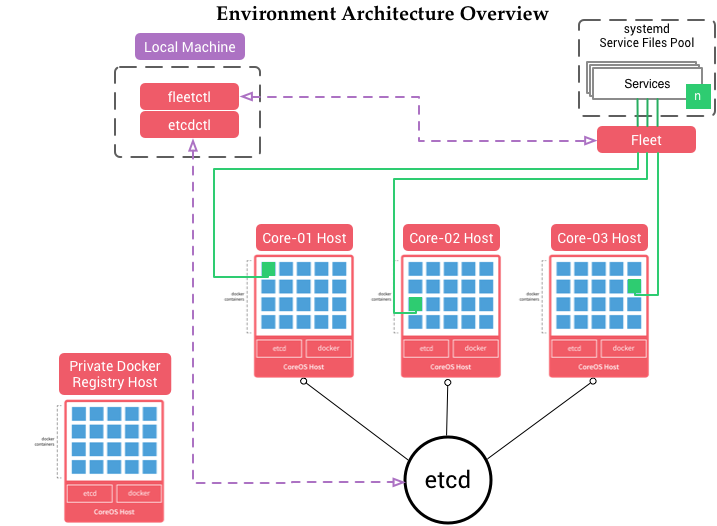
CoreOS architecture overview[edit]
-
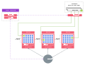 CoreOS Architecture Diagram.svg

- Article(s)
- CoreOS
- Request
- Please have a look at this picture, which is available from this web page – it's a very good high-level illustration of the CoreOS architecture. This illustration would be a really good addition to the article, and based on the content this illustration depicts I'd say that we should have no copyright issues.
- The "cluster" in the lower left corner, titled "Private Docker Registry Host", should be omitted. Also, labels should have only their first words capitalized, so we should have "Local machine" instead of "Local Machine", "systemd service files pool" (that's some kind of an exception, with lowercase s in "systemd") instead of "systemd Service Files Pool", and "Docker" instead of "docker", for example. "etcd", "etcdctl" and "fleetctl" remain unchanged, but they should be written using fixed-width font, as "etcd", "etcdctl" and "fleetctl". Labels "Core-0x Host" should also be changed into "Host #x", and the "Environment Architecture Oveview" title isn't needed. The only unreadable label, repeated three times (plus once on the not needed "cluster"), is "Docker containers" (it's better visible here).
- Thoughts? As always, I'm here for all additional questions. Thank you in advance! — Dsimic (talk | contribs) 06:24, 27 February 2015 (UTC)
- Graphist opinion(s)
- Any chances, please, for anyone to pick this up? It would be greatly appreciated! — Dsimic (talk | contribs) 05:53, 30 March 2015 (UTC)
- Looks great, thank you very much! I'd have only a few small suggestions:
- Further capitalization of the labels should be performed as described in the above available original request, which boils down to:
- "CoreOS Host" → "CoreOS host" (three times)
- "systemd Service Files Pool" → "systemd service files pool"
- "Local Machine" → "Local machine"
- More formatting should be applied:
- "docker" → "Docker" (three times)
- "etcd" → "etcd" (the one in the circle on the bottom)
- "etcdctl" → "etcdctl"
- "Fleet" → "fleetd" (a small correction, also in lowercase)
- "fleetctl" → "fleetctl"
- Some whitespace should be added all around the drawing, so it looks better when displayed in thumbnails.
- Further capitalization of the labels should be performed as described in the above available original request, which boils down to:
- If you could implement these small cleanups, it would be great. Regarding the size of the SVG file, I'd say that 18 KB is just fine, but it would be awesome to have an even smaller file. :) — Dsimic (talk | contribs) 03:11, 17 April 2015 (UTC)
- Looks great, thank you very much! I'd have only a few small suggestions:
- @Dsimic: I added the padding to the image, the rest of the changes are so minor that you should be able to handle them. If you download the file and open it with a text editor you will see all the text elements at the bottom of the file. Should be self explanatory once you see the syntax. Offnfopt(talk) 05:45, 29 April 2015 (UTC)
- Offnfopt, thank you for adding the padding. Got the rest of changes handled myself – I didn't know whether you prefer to do such cleanups yourself, so I thought that listing all of them here would be better. In the end, it looks great, thank you once again! — Dsimic (talk | contribs) 06:31, 29 April 2015 (UTC)