
Wikipedia:Graphics Lab/Illustration workshop/Archive/Feb 2016
Stale[edit]
Flag of Laeken (Belgium)[edit]
-
 District flag of La(e)ken, Brussels Capital Region, Belgium (proposed image)
.svg)
- Article(s)
- Laken
- Request
- The flag has a 3:4 ratio and is a horizontal tricolour, turquoise-blue/yellow/turquoise-blue. -- Amschouten (talk) 19:18, 14 January 2016 (UTC)

- Graphist opinion(s)
![]() Request taken by Mliu92 (talk) 16:15, 17 February 2016 (UTC).
Request taken by Mliu92 (talk) 16:15, 17 February 2016 (UTC).
- @Amschouten: Is this what you were proposing? I can switch to horizontal stripes if needed, or if you have a raster version that would be helpful, too.
- Cheers, Mliu92 (talk) 16:15, 17 February 2016 (UTC)
Laneway Festival logo[edit]
- Article(s)
- St Jerome's Laneway Festival
- Request
- I'm not sure how active are the graphists here. Anyway, I'm requesting for an SVG version of their wordmark, sans the background. You can find it on this link. Israel's Son 03:11, 23 January 2016 (UTC)
- Graphist opinion(s)
- Typefaces used:
- "ST.JEROME'S" typeface is "Monotype Grotesque Std Extra Condensed". Non-free; US$49 at myfonts.
- "Laneway Festival" typeface is "Leitura Display Swashes". Non-free; US$26 at myfonts.
- Cheers, Mliu92 (talk) 16:57, 19 February 2016 (UTC)
Saltwater Density[edit]
- Request
- A diagram like this one, from this page, please. This is a standard illustration of basic physics, and a diagram somewhat like this one is in most oceanography textboks, and has been for over a century, so I am not asking for a copyright violation. Ideally freezing temperature (as well as maximum density) would be plotted as a cross-cutting line/area, with lines distinguished by dashes or weight so the diagram is usable by the colour-blind. HLHJ (talk) 16:04, 25 January 2016 (UTC)
- Related request; an illustration of fresh-water cabbeling, analogous to the one illustrating salt-water cabbeling (as above, but no maximum-density or freezing lines, just a cabbeling line joining two same-density endpoints, with endpoints and midpoint labelled A, B, and C, respectively).
- The needed equation is called the "UNESCO equation of state for seawater"; it gives density as a property of temperature and salinity and exists as a package or FOSS function in many and programming/plotting languages/programs.
- Graphist opinion(s)
Resolved[edit]
WikiProject India noticeboard barnstar image[edit]

- Article(s)
Template:WikiProject India Barnstar
- Request
Following this we are going to create a "WikiProject India noticeboard" barnstar. Please design a barnstar keeping the them (India, noticeboard) in mind. Thanks. --Tito Dutta (talk) 17:56, 19 February 2016 (UTC)
- Graphist opinion(s)
- You're probably better off asking at the Illustration Workshop. (Hohum @) 19:29, 19 February 2016 (UTC)
 Done,
Done, but I have no idea how to properly format a template so have at it, Tito. nagualdesign 22:15, 25 February 2016 (UTC)- User:Nagualdesign, Great, thanks. Thanks a lot for creating this. --Tito Dutta (talk) 05:30, 2 March 2016 (UTC)
Sensor sizes[edit]
-
 Sensor size comparison

- Article(s)
- APS-C
- Request
- Could somebody please lighten this image up a tad. Seems unnecessarily dark. nagualdesign 18:00, 8 March 2016 (UTC)
- Graphist opinion(s)
![]() Request taken by Mliu92 (talk) 15:26, 9 March 2016 (UTC).
Request taken by Mliu92 (talk) 15:26, 9 March 2016 (UTC).
- @Nagualdesign: I updated the background color to #EEEEEA (was #D3D7CF ) and simplified the SVG markup since it was quite messy (Inkscape does not make the most efficient SVG).
- Cheers, Mliu92 (talk) 15:26, 9 March 2016 (UTC)
Diagram translation[edit]
-
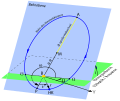
-
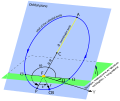 in English


- Article(s)
- Request
- Please could you make an English language version of the above diagram. Translations for the text can be found here. nagualdesign 11:53, 4 March 2016 (UTC)
- Graphist opinion(s)
![]() Request taken by Mliu92 (talk) 20:56, 11 March 2016 (UTC).
Request taken by Mliu92 (talk) 20:56, 11 March 2016 (UTC).
- @Nagualdesign: I included a hidden layer with text using transforms to facilitate further translation, since the Wikimedia SVG rendering engine does not handle angled and transformed text gracefully (and text on a path not at all). The file can be edited in Inkscape with new text, then that text can be copied to the visible layer as a path. I note the file appears to be providing similar information to File:Orbit1.svg, if that's of any help.
- Cheers, Mliu92 (talk) 20:56, 11 March 2016 (UTC)
- That looks great. Thank you. I posted this request on behalf of User:Vayvor, so I'll pass that information on. nagualdesign 21:54, 11 March 2016 (UTC)
Convert PNG to SVG[edit]


- Article(s)
- Corky the Hornet
- Request
- Please convert the file to an SVG image from a PNG. Thanks. -- 🇺🇸 Corkythehornetfan 🇺🇸 04:47, 22 February 2016 (UTC)
- Graphist opinion(s)
- There are some vectors available at [1]. The link says that the download is for jpgs, but the download also includes some pdfs that appear to be vectors. I don't have time to extract and upload this at the moment, but hopefully someone else can handle it. Sn1per (talk) 04:37, 23 February 2016 (UTC)
- @Corkythehornetfan: Thanks to Sn1per, I have extracted the vector from the PDF in the 'Corky' download using Inkscape and uploaded it as noted above. Please replace the PNG with the SVG if it looks okay to you.
- Cheers, Mliu92 (talk) 15:11, 23 February 2016 (UTC)
- It's perfect! Thank you! I've replaced the png with this file. 🇺🇸 Corkythehornetfan 🇺🇸 18:53, 23 February 2016 (UTC)
What's in Wikipedia?[edit]
-
 Interesting view of what's in Wikipedia
 -
 I was hoping this had 1,000 "volumes" in it but the right side is a bit short
 -
 Broken down into the large categories
 -
 With subdivisions for Biography, Geography, and Culture & Arts


_noSub.svg)
.svg)
- Biographies of Living People , Male 143 14.3%
- Bios of Deceased People, Male 92 9.2%
- BLP, Female 30 3.0%
- BDP, F 11 1.1%; 27.5% All biography
- GEOgraphy, Eastern hemisphere 138 13.8%
- GEO, Western hemisphere 40 4.0%; 17.8% All geography
- Culture and Arts, 1991+ (after 1990) 86 8.6%
- CA, 1990- (before 1991) 78 7.8%; 16.4% All arts & culture
- Sports (non-biography) 64 6.4%
- Schools & Universities 18 1.8%
- Religon 7 0.7%
- Other society 36 3.6%; 12.5% All society
- HISTory 100 10.0%
- Biology Health & Medicine 78 7.8%
- BUSiness 45 4.5%
- SCIence 36 3.6%
- totals 1002
15.9% All sports (inc. bio) BLP, M 70; BDP, M 14; BLP, F 11; BDP, F 0
- Article(s)
- User:Smallbones/1000 random for now
- Request
- After seeing the first illustration above, I've always wanted to see what's really in Wikipedia, so I sampled 1002 random articles (see data above) Can you make the real contents look as nice as the joke illustration? -- Smallbones(smalltalk) 21:03, 5 January 2016 (UTC)
- Graphist opinion(s)
 Request taken by Pbroks13 (talk) 00:36, 8 January 2016 (UTC).
- Unfortunately @Pbroks13: seems to have disappeared since the opinion immediately above. I sent an e-mail last week, but there's been no response. If anybody else wants to work on it, please leave me a message here or on my talk page. I do have some updated material and what might be viewed as a self-made "good try" graphic, though it certainly is not of the quality I'm looking for.
- Smallbones(smalltalk) 22:34, 22 January 2016 (UTC)
- @Smallbones: I took a rough cut at it. The shelves are redrawn to have exactly 100 "volumes" (representing 100 articles) in a single 100-pixel wide bookcase: 20 volumes per shelf, 5 shelves per case. I put up two versions for your review.
- The "subdivided" version may be a little hard to distinguish between the various shades of a single color. The files are actually identical, as I added the subdivisions as an overlay transparency layer, and made it visible for the "subdivided" version. I realize that layers aren't officially supported in Wikimedia, but this was the most efficient way to handle those.
- Cheers, Mliu92 (talk) 16:09, 12 February 2016 (UTC)
- Wow, thank you very much! I've done some updating (recategorized maybe 15 articles), see User:Smallbones/1000 random results but I should check that everything is updated there. My 1st impression is that this is about 80% of what I want, and that 10% can be easily changed (I hope), and that you might think the last 10% is pretty picky. The "easy 10%" - I really like the proportions of the joke illustration File: Size of English Wikipedia broken down.png, i.e. the shelves should be taller. I know that's an unrealistic size for shelves, except in old libraries - but it just grabs me. The "picky 10%"
- Perhaps the colors in the related categories (e.g. bios) could be made more distinguishable by modifying the intensity or transparency (is that the right word?)
- Perhaps the lettering for the sub-cats could be put on top of the "books" in letters that are lighter or darker than the books themselves, so that you can read them if you want, but won't interfere with the white lettering for the big categories.
- Maybe just use regular black letters and arrows for the sub-cats (like the "actually useful stuff" in the joke illustration) or a combination
- I really like the 16% in sports finding - I had no previous idea of this. Perhaps a cross-hatching for the sports bios and the SOC (sports) category. It would be especially nice if these were placed together.
- I'll send you an email Sunday night after triple checking all the numbers in the table at 1000 random results and show you how I make a mess of this with a spreadsheet graphic (it'll at least show some of my ideas - but I can't do lettering at all).
- Thanks again.
- Smallbones(smalltalk) 17:23, 12 February 2016 (UTC)
- @Smallbones: I've updated the "NoSub" version (broad categories only) with 8-shelf bookcases, which is what the "joke" illustration shows. Thanks! It does look much better, but I'm using the old numbers for now until I get them tweaked. Biography and Society are next to each other so it should be easy to "carve out" the sports sections.
- Cheers, Mliu92 (talk) 18:29, 12 February 2016 (UTC)
- Fantastic!!! I'll have all the numbers in final final version by Sunday night and send you an email. Smallbones(smalltalk) 19:28, 12 February 2016 (UTC)
- Wow, thank you very much! I've done some updating (recategorized maybe 15 articles), see User:Smallbones/1000 random results but I should check that everything is updated there. My 1st impression is that this is about 80% of what I want, and that 10% can be easily changed (I hope), and that you might think the last 10% is pretty picky. The "easy 10%" - I really like the proportions of the joke illustration File: Size of English Wikipedia broken down.png, i.e. the shelves should be taller. I know that's an unrealistic size for shelves, except in old libraries - but it just grabs me. The "picky 10%"
Lead production graph[edit]
-
 graph
graph

- Article(s)
- Lead
- Request
- I'd love to get an extraction of figure 1a for this document, please. In addition, I'd love to have it reflected, so that 0 years B.P. is located in the lower right corner, not the lower left one, and I think the break in the time axis is not necessary (it would be just as accurate to just connect two points closest to it with a straight line--R8R (talk) 10:16, 13 February 2016 (UTC)
![]() Request taken by FOX 52 (talk) 07:57, 16 February 2016 (UTC).:
Request taken by FOX 52 (talk) 07:57, 16 February 2016 (UTC).:
- Graphist opinion(s)
- @R8R Gtrs: have a look and let me know what changes are needed - FOX 52 (talk) 18:27, 16 February 2016 (UTC)
- Great work, thank you! One last thing, though: could you please mirror the graph horizontally, so that the time axis stretches not from 0 to 5000 years before present and beyond, but rather from 5000 years before present to 0 (I think the break can stay.)--R8R (talk) 03:51, 17 February 2016 (UTC)
- Done @R8R Gtrs: have a look - FOX 52 (talk) 23:46, 17 February 2016 (UTC)
Nevada Wolf Pack colors[edit]
- Article(s)
- Nevada Wolf Pack
- Request
- Please update to one color per the school's identity guide. Both 'Nevada' and the 'Wolf' should be #003366. -- 🇺🇸 Corkythehornetfan 🇺🇸 18:27, 12 February 2016 (UTC)
- Graphist opinion(s)
![]() Request taken by Mliu92 (talk) 16:36, 19 February 2016 (UTC).
Request taken by Mliu92 (talk) 16:36, 19 February 2016 (UTC).
- @Corkythehornetfan: Colors updated per branding guide. Logo color was #183e5f and "NEVADA" color was #002a5c . Both updated to #003366 .
- Cheers, Mliu92 (talk) 16:36, 19 February 2016 (UTC)
- Thanks! I appreciate the help! 🇺🇸 Corkythehornetfan 🇺🇸 19:13, 19 February 2016 (UTC)