
Wikipedia:Graphics Lab/Illustration workshop/Archive/Jan 2010
 | This page, part of the Graphics Lab Wikiproject, is an archive of requests for January 2010. Please do not edit the contents of this page. You can submit new requests here. |
Stale
SVGify please


Article(s): Hong Kong Special Duties Unit
Request: Please merge the two files listed above to a single SVG file please... - Jameson L. Tai talk ♦ guestbook ♦ contribs 16:12, 4 December 2009 (UTC)
Graphist opinion(s):
- Anyone?!?!?? - Jameson L. Tai talk ♦ guestbook ♦ contribs 22:58, 9 December 2009 (UTC)
You're going to have a hard time finding anyone who will vectorize this (convert it to SVG) because the images are quite distorted due to the nature of embroidery. And most Wikipedians still won't vectorize because it's non-free (it's a copyrighted image). If you can find a better image, please let me know, but otherwise I can only wish you the best of luck. Mononomic (talk) 00:14, 10 December 2009 (UTC)
Mao Zedong/Hu Jintao Signature
Article(s): Mao Zedong, Hu Jintao
Request: I'm terrible with these types of signatures. Can someone vectorize this? Connormah (talk) 21:00, 13 December 2009 (UTC)
Graphist opinion(s):
Lithium levels
-
 Energy levels in lithium converging on the first ionization energy. Lowest three values of orbital angular momentum.

Article(s): Rydberg atom, Energy level
Request: This is an image that should definitely be an SVG and is probably trivial to convert. I created it in Mathematica version 6 which can export as SVG but does so in a way that seems to display incorrectly within Wikipedia. If it helps I could provide a file with the datapoints for the positions of the levels. DJIndica (talk) 03:40, 15 December 2009 (UTC)
Graphist opinion(s):
- Can you upload the Mathematica SVG? It's probably easier (and more exact) to fix it then to convert the raster. /129.215.149.98 (talk) 11:49, 15 December 2009 (UTC)
Arms of Trinity College, Dublin
-
 Arms of Trinity College, Dublin

Article(s): Trinity College, Dublin
Request: Convert line drawing to vector drawing, and colourize per the heraldic blazon for this coat of arms: "Azure, a Bible closed, clasps to the dexter, between in chief, on a dexter a lion passant, on the sinister a harp, all or, and in base a castle with two towers domed, each surmounted by a banner flotant from the sides, argent, the dexter flag charged with a cross, the sinister with a saltire, gules." Kwekubo (talk) 17:24, 21 December 2009 (UTC)
- A higher-resolution version of the picture is available at the Internet Archive (pg 287 of the book). --Kwekubo (talk) 19:26, 24 December 2009 (UTC)
Graphist opinion(s):
Homenmen


Article(s): Homenmen, Homenmen Beirut
Request: as these are redundant images and there should only be one, please merge the blue and tan coloration of File:Homenmen Beirut.png and the clarity of detail in File:Homenmen.png into one graphic so the better-detailed Homenmen.png isn't monochromatic... Chris (クリス • フィッチュ) (talk) 02:57, 28 December 2009 (UTC)
Graphist opinion(s):
Oxygas welding station
-
 Oxygas welding station
 -
 Re-positioned the trolley so it's appear behind the welder, but the hoses clip is difficult to re-positioned because the table is so full (by Ivan Akira)


Article(s): Oxy-fuel welding and cutting
Request: Reason for Request: SAFETY.
This image should be edited to reflect that the oxy-fuel gasses should not be positioned next to the area to be worked on. The "trolley" should be positioned behind the welder, and the hoses/gasses should be positioned so that they may not come in contact with the flame, molten slag, and/or sparks that may occur during the welding/cutting process.
Thank you for considering this image for editing.
MKC
Original request by 75.4.13.204 (talk) 20:17, 21 December 2009 (UTC) reformatted by Certes (talk) 21:46, 21 December 2009 (UTC)
I have added a warning to the image's caption as an interim measure. You may wish to revert this edit when the request is complete. Certes (talk) 21:46, 21 December 2009 (UTC)
Graphist opinion(s): This would be a lot easier if we had access to the source file. It was obviously drawn in something like Illustrator, so the original author might still have it. --Slashme (talk) 08:34, 24 December 2009 (UTC)
 Request taken by Ivan Akira.: Maybe I'm able to do this request, but It will take a long time because I'm quite busy right now. And if it done, does I should upload it over? Ivan Akira (talk) 23:37, 3 January 2010 (UTC)
- That's the quick finish of this request... (half-
 Done) But one of the request criteria haven't been fulfilled yet. Ivan Akira (talk) 11:30, 4 January 2010 (UTC)
- I'm re-upload the image to different name that is File:Oxygas welding station Fix.jpg, it's because when I'm already upload the correction at File:Oxygas welding station.jpg it's seems that the Wikimedia cache have some error, so the older version of File:Oxygas welding station.jpg is always previewed, so now I'm revert my upload and put the correction under new name. Ivan Akira (talk) 11:46, 5 January 2010 (UTC)
- That's the quick finish of this request... (half-
Resolved
Russian Boy Scouts signaling postcard 1915

Article(s):
Request: remove extra edging, straighten... Chris (クリス • フィッチュ) (talk) 06:18, 28 December 2009 (UTC)
Graphist opinion(s):
- Done. Let me know if that works, ZooFari 07:01, 28 December 2009 (UTC)
- Perfect, thank you! Chris (クリス • フィッチュ) (talk) 07:36, 28 December 2009 (UTC)
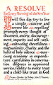
New Year's resolution

Article(s): New Year's resolution
Request: trim and straighten, splitting if you have to... Chris (クリス • フィッチュ) (talk) 07:55, 28 December 2009 (UTC)
Graphist opinion(s): ![]() Request taken by Ivan Akira.: Do you want me to upload over the image? Ivan Akira (talk) 00:44, 30 December 2009 (UTC)
Request taken by Ivan Akira.: Do you want me to upload over the image? Ivan Akira (talk) 00:44, 30 December 2009 (UTC)
- Hmm... I decide to split the file the image and upload it separately... Please wait. Ivan Akira (talk) 01:12, 30 December 2009 (UTC)
-
 The left side postcard
 -
 The right side postcard


![]() Done Those are the results... I slightly increase the quality of each image, and fill the edge's gap. What do you think? Ivan Akira (talk) 01:22, 30 December 2009 (UTC)
Done Those are the results... I slightly increase the quality of each image, and fill the edge's gap. What do you think? Ivan Akira (talk) 01:22, 30 December 2009 (UTC)
- Nice job! For the sake of seeing how it comes out, can you do a combined one and upload it over the original? Thanks! Chris (クリス • フィッチュ) (talk) 07:12, 30 December 2009 (UTC)
- It's Done again... I'd loved to hear that you like it. Ivan Akira (talk) 00:56, 1 January 2010 (UTC)
- It's
Signature of Nicolaus Copernicus
-

-
 autotrace
Article(s): Nicolaus Copernicus
Request: Convert to a decent SVG version, not autotraced. Connormah (talk) 04:04, 4 December 2009 (UTC)
Graphist opinion(s):
- Why no autotrace? Look at the file I created above. Is that ok? Not exactly sure why SVG was needed here in the first place, but I guess that is another issue. -Andrew c [talk] 16:10, 4 December 2009 (UTC)
- Never mind,. it looks good. It's just that some autotraces round too many corners..etc. Connormah (talk) 17:31, 5 December 2009 (UTC)
- Isn't that what we want? It's scratchy and some smoothing would benefit. ZooFari 20:41, 5 December 2009 (UTC)
- I must admit I'm at a loss to understand why anyone would want to replace a perfectly good 4 kB PNG with a 28 kB SVG (which gets delivered as a 13 kB PNG to the client at that size anyway). --RexxS (talk) 02:22, 6 December 2009 (UTC)
- I agree with RexxS. You are not really gaining anything with the signature being scalable. The source is the PNG, so there is no way that the SVG can have any more accurate detail than the PNG. It is also an approximate autotrace, so that the SVG product is already an inexact copy of the original. We may give the illusion that the SVG has more detail/information because you can zoom in. But what you are zooming in on isn't any accurate information not already contained in the PNG. RexxS's point about size and thus bandwidth is also very pertinent. SVG is great for things that actually need to be scalable that are vector based to begin with (a linedrawing of a signature, I'd argue, isn't vector based). SVG is also good for things that need to be editable by other users, such as labels, graphs, diagrams, charts, captions, schematics, etc. I don't see how SVG would be preferred in the case of someone's signature, as not only would I argue that the content is raster based to begin with, but also I do not see the benefits of ediability/scalability showing in a depiction of someone's signature. Anyway, my 2 cents. Sorry for the rant ;) -Andrew c [talk] 16:15, 8 December 2009 (UTC)
- I would also make the point that a trace of a persons signature no longer amounts to a facsimile of their signature. In effect, it is a forgery. I think that this should practice should be stopped as a bad principle, even if the result does look acceptable. There seems to have been a large number of these done already. I further think that these should be reverted. Does anybody here have a list of them? SpinningSpark 10:08, 17 December 2009 (UTC)
- I'm not sure we want to revert them just yet. They are fine, in my opinion. In reference to the article for forgery, it is 'Forgery is the process of making, adapting, or imitating objects, statistics, or documents (see false document), with the intent to deceive.' I don't think we are attempting to deceive, and they are clearly all in good faith. Connormah (talk) 14:33, 17 December 2009 (UTC)
- We have debated the principle of converting signatures before but never reached a consensus. I admit to creating File:Pat Nixon Signature.svg from the grainy File:Pat Nixon Signature.jpg. The article now looks prettier, but I'd not object if someone reverted the change. Certes (talk) 14:19, 30 December 2009 (UTC)
- I would also make the point that a trace of a persons signature no longer amounts to a facsimile of their signature. In effect, it is a forgery. I think that this should practice should be stopped as a bad principle, even if the result does look acceptable. There seems to have been a large number of these done already. I further think that these should be reverted. Does anybody here have a list of them? SpinningSpark 10:08, 17 December 2009 (UTC)
- I agree with RexxS. You are not really gaining anything with the signature being scalable. The source is the PNG, so there is no way that the SVG can have any more accurate detail than the PNG. It is also an approximate autotrace, so that the SVG product is already an inexact copy of the original. We may give the illusion that the SVG has more detail/information because you can zoom in. But what you are zooming in on isn't any accurate information not already contained in the PNG. RexxS's point about size and thus bandwidth is also very pertinent. SVG is great for things that actually need to be scalable that are vector based to begin with (a linedrawing of a signature, I'd argue, isn't vector based). SVG is also good for things that need to be editable by other users, such as labels, graphs, diagrams, charts, captions, schematics, etc. I don't see how SVG would be preferred in the case of someone's signature, as not only would I argue that the content is raster based to begin with, but also I do not see the benefits of ediability/scalability showing in a depiction of someone's signature. Anyway, my 2 cents. Sorry for the rant ;) -Andrew c [talk] 16:15, 8 December 2009 (UTC)
- I must admit I'm at a loss to understand why anyone would want to replace a perfectly good 4 kB PNG with a 28 kB SVG (which gets delivered as a 13 kB PNG to the client at that size anyway). --RexxS (talk) 02:22, 6 December 2009 (UTC)
- Isn't that what we want? It's scratchy and some smoothing would benefit. ZooFari 20:41, 5 December 2009 (UTC)
World Association of Girl Guides and Girl Scouts

Article(s): World Association of Girl Guides and Girl Scouts
Request: I'm really stumped here. Usually I'm at the Graphic Lab to fulfill requests, not to bring up new ones. Anyway, File:World Association of Girl Guides and Girl Scouts.svg is in the Images for Cleanup category because the "colors should match File:World Association of Girl Guides and Girl Scouts flag.png." So, I opened up my trusty Adobe Illustrator, eyedropped the correct colors in, and re-uploaded the file. When I refreshed the page for the image (.svg), the colors remained incorrect. Clicking on the image to open in Firefox showed the same problem. Interestingly, when opening it as a PNG (the links at "This image rendered as PNG in other sizes: 200px, 500px, 1000px, 2000px"), the colors are correct at 500px and 2000px (see example here) but not at 200px or 1000px (see example here)! Anyone have any idea of what's going on? Thanks in advance. Mononomic (talk) 21:59, 3 January 2010 (UTC)
Graphist opinion: I think it's already done by yourself, I checked all your image that you pointed and see that the colors are all corrects, I don't see a problem here... Maybe it's just caching issue in Wikimedia server? Ivan Akira (talk) 23:48, 3 January 2010 (UTC)
Bad paintbrush image rectification
76.117.247.55 (talk) 02:52, 6 January 2010 (UTC)
-
 Original PNG
 -
New SVG

Article: Fireman's chair knot
Request: Create a similar drawing (SVG if possible) illustrating the same thing, but not looking like it was done in paintbrush. Also, the filename of the new image should have an apostrophe in "Fireman's". Thanx, 76.117.247.55 (talk) 23:33, 29 December 2009 (UTC)
Opinion: Okay, I fixed it. I'm not sure how to embed it in this page, though, so you can find it by visiting the previous picture (linked to from here). threecheersfornick (talk) 01:31, 5 January 2010 (UTC)
- I have added Threecheersfornick's SVG to the gallery above. It already appears in the article. Certes (talk) 23:33, 5 January 2010 (UTC)
- In that case this is done. 76.117.247.55 (talk) 02:52, 6 January 2010 (UTC)
Flag of the Chairman of the Joint Chiefs of Staff

.svg)
Article(s): Chairman of the Joint Chiefs of Staff
Request: Vectorize. Connormah (talk) 22:20, 26 December 2009 (UTC)
Graphist opinion(s):
- Detail is too low for vectorization, unless someone has the powers. ZooFari 23:41, 27 December 2009 (UTC)
- The eagle is almost certainly the same one as on the seal of the Department of Defense. 76.117.247.55 (talk) 23:30, 29 December 2009 (UTC)
- Done. I took the eagle from the DoD seal and resized it as best I could to approximate the size of the one on the flag. --Kwekubo (talk) 23:37, 31 December 2009 (UTC)
Korean Broadcasting System.svg at Chinese Wikipedia
Request: Can you transfer File:Korean Broadcasting System.svg at the Chinese Wikipedia to Commons? And also, can you make a separate image without the "KBS" letters? JSH-alive talk • cont • mail 17:28, 17 December 2009 (UTC)
Graphist opinion(s):
- We cannot transfer the image to the Commons because it appears to be a copyrighted logo. The Commons does not accept non-free content. It would have to be uploaded locally here on en.wiki, and given a proper fair use rationale and copyright tag (the default non-free logo text should work though). Do you need help from a graphist doing that, or can you do it yourself? (click on image, hit "save as", then upload it to en.wiki, etc. you could use File:KBS.png as a guide for the FUR and tag) -Andrew c [talk] 15:37, 18 December 2009 (UTC)
- As to part 2 of your request, regarding "a separate image without the "KBS" letters", what purpose would that image serve? Non-free content is severely limited, and I don't see why we would need 2 different logos of the same entity. But if you explained your intended purpose more, and if it fits the NFCC, we could consider your 2nd request further. -Andrew c [talk] 15:39, 18 December 2009 (UTC)
- OK.
I need the 'circle' logo to put it on a section on the corporate logo at the ko:한국방송공사 article.Oh, can I order an image simply with "KBS" letters to make it sure being free from copyright? -- JSH-alive talk • cont • mail 14:27, 19 December 2009 (UTC)- Yes, KBS by itself, just the letters with no graphical information, would be PD-text. I can create that image and upload it to the commons. I can also easily make the other image, but I don't know where to upload it because it would be non-free. I can't upload it to en.wiki because all non-free images must have rationales and be used in articles. I would upload it to ko.wiki, but I don't read Korean and I'm concerned I couldn't navigate their upload pages, and I am not familiar with their non-free content policies or how to tag the image in Korean and such. -Andrew c [talk] 16:28, 21 December 2009 (UTC)
- OK.
OK, see the image I added here File:Korean Broadcasting System-text only.svg. -Andrew c [talk] 16:32, 21 December 2009 (UTC)
- All right. Can you copy zh:File:Korean Broadcasting System.svg to English
and KoreanWikipedia?(The Korean upload page is here) If you still can't read Korean, call me.-- JSH-alive talk • cont • mail 15:32, 25 December 2009 (UTC) - Never mind. Just copy zh:File:Korean Broadcasting System.svg to English Wikipedia. -- JSH-alive talk • cont • mail 09:38, 4 January 2010 (UTC)
![]() Done --Beao 17:05, 9 January 2010 (UTC)
Done --Beao 17:05, 9 January 2010 (UTC)
File:Korean Broadcasting System.svg
File:Korean Broadcasting System-text only.svg
Did you know? Awards
-
 Award for 25 DYK entries
 -
 Award for 50 DYK entries
 -
 Award for 100 DYK entries
 -
 Award for 200 DYK entries
 -
 Proposed 500 medal


Article(s): Wikipedia:List of Wikipedians by number of DYKs
Request: These medals have been awarded to Wikipedians who have achieved a milestone number of Did you know (DYK) entries. Per this RfC, the DYK project wishes to have separate awards for DYK Nominations and DYK Creations and Expansions. This request is for an illustrator to devise a raft of new awards visibly different from the ones shown in the gallery above, to differentiate not only between DYK Nominations and DYK Creations/Expansions, but between the old combined system and the new separate system.
Requested images could be named something like the following:
- File:Dyk25CE.png – Award for 25 DYK creations and expansions
- File:Dyk50CE.png – Award for 50 DYK creations and expansions
- File:Dyk100CE.png – Award for 100 DYK creations and expansions
- File:Dyk200CE.png – Award for 200 DYK creations and expansions
- File:Dyk500CE.png – Award for 500 DYK creations and expansions
- File:Dyk25N.png – Award for 25 DYK nominations
- File:Dyk50N.png – Award for 50 DYK nominations
- File:Dyk100N.png – Award for 100 DYK nominations
- File:Dyk200N.png – Award for 200 DYK nominations
- File:Dyk500N.png – Award for 500 DYK nominations
Any questions, please post on my talk page or on Wikipedia_talk:List_of_Wikipedians_by_number_of_DYKs. Binksternet (talk) 22:19, 1 January 2010 (UTC)
Graphist opinion(s):
How about these? I hope that the barnstars give a Wikipedia flavour, whilst the gold and silver variants reflect the extra effort and skill involved in creating or expanding an article rather than nominating an existing candidate. 1000CE is unlikely to be awarded, but I believe 1000N may be needed soon. Certes (talk) 16:32, 2 January 2010 (UTC)
|
Awards for DYK creations and expansions |
|
|
|
|
|
|
|
Awards for DYK nominations |
|
|
|
|
|
|


- Marvelous! I will ask for more opinions but I like your work very much. Binksternet (talk) 17:33, 2 January 2010 (UTC)
- This request has been filled by Certes. Thanks! Binksternet (talk) 17:18, 9 January 2010 (UTC)
Vectorize simple image
-
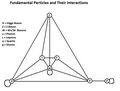 The interactions between the particles of the Standard Model

Article(s): Standard Model
Request: Vectorize and otherwise prettify. W+ and W- should be W+ and W− The symbols for the legend should be in italics too, same for those in the diagram. Headbomb {ταλκκοντριβς – WP Physics} 03:56, 7 January 2010 (UTC)
Graphist opinion(s): A vector image on this topic seems to already exist:

I presume this one is not suitable? But why? —Quibik (talk) 20:52, 10 January 2010 (UTC)
- Ah, nevermind then, it's perfectly suitable. Headbomb {ταλκκοντριβς – WP Physics} 21:16, 10 January 2010 (UTC)
Chief Russian Scout

Article(s):
Request: Please cleanup graininess, this was a scan from a bad photocopy... Chris (クリス • フィッチュ) (talk) 08:31, 29 December 2009 (UTC)
Graphist opinion(s): Cleaned it up. I hope it's good enough. — Quibik (talk) 20:37, 10 January 2010 (UTC)
- That's great, thank you! Chris (クリス • フィッチュ) (talk) 10:31, 11 January 2010 (UTC)
All-America Football Conference
Article(s): All-America Football Conference
Request: Redraw stars and color to match US flag. Though the All-America Football Conference is 60 years defunct, I imagine their logo looked better... Chris (クリス • フィッチュ) (talk) 14:00, 8 January 2010 (UTC)
Graphist opinion(s): Is this good enough? Parutakupiu (talk) 03:36, 11 January 2010 (UTC)
- Perfect, thank you! Chris (クリス • フィッチュ) (talk) 10:40, 11 January 2010 (UTC)
Nazi eugenics

Article(s): Nazi eugenics
Request: cleanup background, sharpen image... Chris (クリス • フィッチュ) (talk) 05:55, 17 January 2010 (UTC)
Graphist opinion(s): ![]() Request taken by Beao. --Beao 06:57, 17 January 2010 (UTC)
Request taken by Beao. --Beao 06:57, 17 January 2010 (UTC)
![]() Done Did what I could. Is is okay? --Beao 07:11, 17 January 2010 (UTC)
Done Did what I could. Is is okay? --Beao 07:11, 17 January 2010 (UTC)
- Much better, thank you! --Chris (クリス • フィッチュ) (talk) 08:21, 17 January 2010 (UTC)
Putrajaya
Article(s): Putrajaya
Request: Please SVGify this image. Thanks in advance Arteyu ? Blame it on me ! 18:28, 3 January 2010 (UTC)
Graphist opinion(s):
![]() Done: File:Flag of Putrajaya.svg on Commons. — Andrwsc (talk · contribs) 00:20, 20 January 2010 (UTC)
Done: File:Flag of Putrajaya.svg on Commons. — Andrwsc (talk · contribs) 00:20, 20 January 2010 (UTC)
Wubi (Ubuntu installer)
Article(s): Wubi (Ubuntu installer)
Request: Please fix image so it meets Wikipedia Guidelines for logos and, if possible, copyrights. I am not so good as a Vector Graphics...Because not everyone pays taxes. (talk) 16:24, 11 January 2010 (UTC)
Graphist opinion(s): I've overwritten the image with a fixed and smaller-scaled version. Parutakupiu (talk) 22:56, 11 January 2010 (UTC)
Mongol Empire Alleged Flag
-

-
 Vectorized version


Article(s): none
Request: Vectorize. Connormah (talk) 01:42, 16 January 2010 (UTC)
Graphist opinion(s): ![]() Done — Parutakupiu (talk) 19:13, 16 January 2010 (UTC)
Done — Parutakupiu (talk) 19:13, 16 January 2010 (UTC)
Haruki Murakami


Article(s): Haruki Murakami
Request: work your magic... Chris (クリス • フィッチュ) (talk) 10:24, 18 January 2010 (UTC)
Graphist opinion(s):![]() Done: Hope this helps SPLETTE :] How's my driving? 02:10, 20 January 2010 (UTC)
Done: Hope this helps SPLETTE :] How's my driving? 02:10, 20 January 2010 (UTC)
- Much better, thank you! --Chris (クリス • フィッチュ) (talk) 02:28, 20 January 2010 (UTC)
SVG cleanup

Articels: Many on SP&M.
Request: Clean up the lines around the crown and anchors; currently they look like they were done by tracing a bitmap. 76.117.247.55 (talk) 02:53, 6 January 2010 (UTC)
Oppinion: ![]() Done --82.56.13.174 (talk) 13:38, 21 January 2010 (UTC)
Done --82.56.13.174 (talk) 13:38, 21 January 2010 (UTC)
Intestine/Pancreas


Article(s): Colon (anatomy), ....
Request: Vectorize. Connormah (talk) 22:53, 5 January 2010 (UTC)
Graphist opinion(s):
there's a try, feel free to modify it and please fix it's page in commons cause I'm in a kind of hurry ;) -- CD 18:11, 10 January 2010 (UTC)
- Nice job ! 2 more nice SVG ! If you have time, upload a numbered version under file names such File:name-num.ext ;) Yug (talk) 13:37, 12 January 2010 (UTC)
Ryūkyū Kingdom
-
 Raster version.
 -
 Vector version.
 -
 Alternative vector version.


Article(s): Ryūkyū Kingdom
Request: solidify border... Chris (クリス • フィッチュ) (talk) 10:26, 18 January 2010 (UTC)
Graphist opinion(s): ![]() Request taken by Beao. --Beao 13:49, 19 January 2010 (UTC)
Request taken by Beao. --Beao 13:49, 19 January 2010 (UTC)
![]() Done --Beao 20:15, 19 January 2010 (UTC)
Done --Beao 20:15, 19 January 2010 (UTC)
- Really nice, thank you! --Chris (クリス • フィッチュ) (talk) 00:16, 20 January 2010 (UTC)
- I do not feel, that the digital reproduction by User:Beao is accurate enough with regard to the dimensions, colour and placement of the lines of the inner text and therefore I decided to make an alternative version located at File:Royal Seal of Ryukyu Kingdom.svg. In my honest opinion the dimensions (width and height) should be equal (a square) and the four columns should be equal in width. Also, I strongly believe that more symmetry regarding the lines, that make up the text, should be present. Though I am not in a position to question whether I was able to recreate each of the signs properly. Froztbyte (talk) 00:39, 22 January 2010 (UTC)
Salmon2
Just when you thought it was safe to go back in the water...
-
 Types of salmon
 -
 Transparent background


Article(s): Salmon
Request: Cleanup straggly white bits surrounding the fishes and labels so the blue background is uniform, ideally in such a way that the straggly bits do not reappear if an editor using a simple "fill" from a paint program tries to change the background colour. Thanks. Geronimo20 (talk) 01:25, 20 January 2010 (UTC)
Graphist opinion(s):Why does the background need to be blue? Can't this version of the same image with white background be used? SPLETTE :] How's my driving? 01:42, 20 January 2010 (UTC)
- It's an aesthetic call, it looks better visually as the lead image in the article on salmon if the background is blue. --Epipelagic (talk) 20:39, 20 January 2010 (UTC)
- Can we have a transparent image which, when used in salmon, lies over a blue background? I'm not sure how to do this without a fancy set of <div>s. Perhaps there's an option in the [[Image:Whatever.jpg|thumb|right|123px|My caption]] syntax: does anyone know what this feature is called or where the documentation is? Certes (talk) 21:30, 20 January 2010 (UTC)
- Done Luckily, I still had the transparent version lying around from when I made the background white. I uploaded the transparent version as File:Salmon 01 transparent.png and used that to fix the blue background version. However, there is unfortunately no way I know of customizing the background color of a transparent image in an article. (WP:Extended image syntax lists all functionality available). —Quibik (talk) 15:59, 21 January 2010 (UTC)
- Thank you very much! --Epipelagic (talk) 18:56, 21 January 2010 (UTC)
AIS Schema
-
 Scheme of a typical AIS configuration
 -
 English version
 -
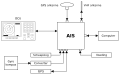 Dutch version


Request: Is it possible to obtain an Engish and/or Dutch version of this scheme? --Stunteltje (talk) 10:30, 24 January 2010 (UTC)
Graphist opinion:
![]() Request taken by Quibik.. I think I can work out the English translations, but you will definitely need to provide the captions in Dutch for me. —Quibik (talk) 13:11, 24 January 2010 (UTC)
Request taken by Quibik.. I think I can work out the English translations, but you will definitely need to provide the captions in Dutch for me. —Quibik (talk) 13:11, 24 January 2010 (UTC)
- No problem at all. My technical French is insufficient, that's why. --Stunteltje (talk) 13:15, 24 January 2010 (UTC)
- I'm almost done with the English translation. I'm not sure how to translate loch however. It seems to translate to chip log, but I'm not sure that's appropriate. Could you help me out? —Quibik (talk) 13:33, 24 January 2010 (UTC)
- It is. In Dutch just "log". It records the distance over water, as the AIS records the distance over the ground. The difference can be of importance for sailors. --Stunteltje (talk) 14:22, 24 January 2010 (UTC)
- The English version is now available. It still needs some tweaking in text layout due to MediaWiki's annoying text bugs. You are encouraged to verify, that all the translations are correct. I'll make a Dutch version, as soon as you provide the translations. —Quibik (talk) 15:57, 24 January 2010 (UTC)
- Thank you very much indeed for your help.
- The English version is now available. It still needs some tweaking in text layout due to MediaWiki's annoying text bugs. You are encouraged to verify, that all the translations are correct. I'll make a Dutch version, as soon as you provide the translations. —Quibik (talk) 15:57, 24 January 2010 (UTC)
- It is. In Dutch just "log". It records the distance over water, as the AIS records the distance over the ground. The difference can be of importance for sailors. --Stunteltje (talk) 14:22, 24 January 2010 (UTC)
- I'm almost done with the English translation. I'm not sure how to translate loch however. It seems to translate to chip log, but I'm not sure that's appropriate. Could you help me out? —Quibik (talk) 13:33, 24 January 2010 (UTC)
- I think "Computer operator" has to be just "Computer" or "PC", also in Dutch "Computer" or "PC", as there is no operator involved
- "antenna" is in Dutch spelled "antenne"
- "Chip log" is in Dutch "Scheepslog"
- "Gyro compass" is in Dutch "Gyro kompas"
- "Power supply" is in Dutch "Voeding"
Rest is identical. --Stunteltje (talk) 16:13, 24 January 2010 (UTC)
- "Converter"? —Quibik (talk) 16:53, 24 January 2010 (UTC)
- We use the word in Dutch too, more in electronics. There is also another Dutch word: "Omvormer". Unfortunately "omvormer" is also used for electrical machines with an electric motor and a generator. In my Dutch feeling is an "omvormer" a piece of equipment with rotating elements and a "converter" an electronic device. --Stunteltje (talk) 17:17, 24 January 2010 (UTC)
- Now the Dutch version is used in nl version of Automatic Identification System. Tanks for your speedy help. --Stunteltje (talk) 19:34, 24 January 2010 (UTC)
Accurate News and Information Act
-
 First page of An Act to Ensure the Publication of Accurate News and Information (short form: Accurate News and Information Act), a never assented-to statute of Alberta, Canada
 -
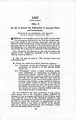 Cropped and cleaned a bit.
 -
 Cropped and cleaned the background fully.


Article(s): Accurate News and Information Act
Request: Crop and make it nicer. Arteyu ? Blame it on me ! 17:14, 26 January 2010 (UTC)
Graphist opinion(s):
![]() Request taken by Beao. --Beao 18:54, 26 January 2010 (UTC)
Request taken by Beao. --Beao 18:54, 26 January 2010 (UTC)
![]() Done Kept it a bit natural, so that you can see it's a paper. --Beao 19:06, 26 January 2010 (UTC)
Done Kept it a bit natural, so that you can see it's a paper. --Beao 19:06, 26 January 2010 (UTC)
- I was working on the request at the time Beao uploaded his/her version. Mine has been cleaned much more heavily, so I decided to upload it as an alternative option. —Quibik (talk) 19:33, 26 January 2010 (UTC)
- Umm, this is difficult, I love Quibik's work but I don't want Beao work to be deleted either. Is it possible to merge both files? For the time being will use Quibik's work for the above article. Anyway, great job to the both of you. Arteyu ? Blame it on me ! 22:35, 26 January 2010 (UTC)
Port Royal
-
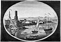
-
 Transparent PNG.


Article(s): Port Royal
Request: remove dark background... Chris (クリス • フィッチュ) (talk) 14:09, 27 January 2010 (UTC)
Graphist opinion(s): ![]() Request taken by Beao. --Beao 14:24, 27 January 2010 (UTC)
Request taken by Beao. --Beao 14:24, 27 January 2010 (UTC)
![]() Done Is that what you wanted? --Beao 14:30, 27 January 2010 (UTC)
Done Is that what you wanted? --Beao 14:30, 27 January 2010 (UTC)
- Fantastic! Thank you! --Chris (クリス • フィッチュ) (talk) 17:07, 27 January 2010 (UTC)