
Wikipedia:Graphics Lab/Illustration workshop/Archive/Jan 2015
A high-level overview of the KVM/QEMU virtualization environment[edit]
-
 Kernel-based Virtual Machine.svg

- Article(s)
- Kernel-based Virtual Machine
- Request
- Please have a look at page 3 in this PDF file – it contains a great high-level illustration of how KVM and QEMU work internally to provide a virtualization environment. This illustration would be a really great addition to the article. Based on the content this illustration depicts, I'd say that we should have no copyright issues.
- Just as a note, there's no need to capitalize all words in labels on this illustration – capitalizing only the first word would be just fine; for example, "Hardware emulation (QEMU)" should be written instead of "Hardware Emulation (QEMU)". Also, "File System & Block" should be written as "Filesystem and block devices"; in addition, "&" should be replaced with "and" in both places.
- Thoughts? As always, I'm here for all additional questions. Thank you in advance! — Dsimic (talk | contribs) 17:22, 15 December 2014 (UTC)
- Graphist opinion(s)
 Request taken by --Victor•talk 20:38, 15 December 2014 (UTC).
- Should I use all caps in the LINUX KERNEL, HARDWARE, KVM GUEST, or not, as it was in the previous illustrations? --Victor•talk 21:29, 15 December 2014 (UTC).
- Excellent question, I've missed that! :) I'd leave that decision to you – using all caps in those places is pretty much only putting an emphasis on the names of "boxes", and you can judge much better whether that additional emphasis is required or not. — Dsimic (talk | contribs) 22:59, 15 December 2014 (UTC)
 Done. --Victor•talk 07:58, 3 January 2015 (UTC).
- Awesome work, just as always, thank you very much! The only small cleanups could be to write "KVM Guest" with a lowercase g and "Kernel" with a lowercase k, write "filesystem" as two separate words, spell out 1 in "1 thread", add a definite article to "to host", and append an s into "handle events". :) — Dsimic (talk | contribs) 08:53, 3 January 2015 (UTC)
- Excellent question, I've missed that! :) I'd leave that decision to you – using all caps in those places is pretty much only putting an emphasis on the names of "boxes", and you can judge much better whether that additional emphasis is required or not. — Dsimic (talk | contribs) 22:59, 15 December 2014 (UTC)
- Should I use all caps in the LINUX KERNEL, HARDWARE, KVM GUEST, or not, as it was in the previous illustrations? --Victor•talk 21:29, 15 December 2014 (UTC).
Decomposition of macro-operations into micro-operations[edit]
-
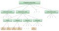 Micro-operations.svg

- Article(s)
- Micro-operation
- Request
- Please have a look at page one in this PDF file, in particular slide on the left in the second row – it's a neat illustration of how machine instructions are decomposed into micro-operations. This illustration would be a good addition to the article; based on the content this illustration depicts, I'd say that we should have no copyright issues.
- Just as a note, there's no need to capitalize all words in the labels on this illustration – capitalizing only the first word would be just fine; for example, "Instruction cycle" should be written instead of "Instruction Cycle".
- Thoughts? As always, I'm here for all additional questions. Thank you in advance! — Dsimic (talk | contribs) 18:51, 29 December 2014 (UTC)
Scout Association of Japan[edit]
.png)
- Article(s)
- Scout Association of Japan
- Request
- yellow badge is actually a photograph-please match stylistically with other graphics… -- Kintetsubuffalo (talk) 06:06, 3 January 2015 (UTC)
- Graphist opinion(s)
![]() Request taken by Gaff (talk) 19:04, 3 January 2015 (UTC).
Request taken by Gaff (talk) 19:04, 3 January 2015 (UTC).
- Done @Kintetsubuffalo: I updated the file. Is this suitable? -- Gaff (talk) 04:30, 4 January 2015 (UTC)
- @Gaff: Thank you, that's fantastic! The stars should be browned out, can you do that? Thanks and happy new year!--Kintetsubuffalo (talk) 04:51, 4 January 2015 (UTC)
- Done. @Kintetsubuffalo: Please mark as resolved if this is okay. Gaff (talk) 18:02, 4 January 2015 (UTC)
- @Gaff: Thank you, that's fantastic! The stars should be browned out, can you do that? Thanks and happy new year!--Kintetsubuffalo (talk) 04:51, 4 January 2015 (UTC)
- Once again my thanks!--Kintetsubuffalo (talk) 10:16, 5 January 2015 (UTC)
Scouting and Guiding in Tasmania[edit]
.png) |
 |
 |
 |
- Article(s)
- Scouting and Guiding in Tasmania
- Request
- please turn into graphic png or svg, using the elements above… -- Kintetsubuffalo (talk) 10:56, 6 January 2015 (UTC)
- Graphist opinion(s)
- How's that? MjolnirPants Tell me all about it. 13:59, 6 January 2015 (UTC)
- Wow, fantastic, thank you! Can you make the gold just a tad deeper, and the lion larger inside the circle? Otherwise, perfect!--Kintetsubuffalo (talk) 15:12, 6 January 2015 (UTC)
- DoneMjolnirPants Tell me all about it. 16:24, 6 January 2015 (UTC)
- Wow, fantastic, thank you! Can you make the gold just a tad deeper, and the lion larger inside the circle? Otherwise, perfect!--Kintetsubuffalo (talk) 15:12, 6 January 2015 (UTC)
- @MjolnirPants:Perfect! I just noticed, it should not be hosted on Commons, just the English Wikipedia. Can you move it here please?--Kintetsubuffalo (talk) 17:09, 6 January 2015 (UTC)
- I'm not sure how. I'll look into it. MjolnirPants Tell me all about it. 17:40, 6 January 2015 (UTC)
- @MjolnirPants:You can park it at https://en.wikipedia.org/w/index.php?title=Special:Upload&wpDestFile=Tasmania_%28Scouts_Australia%29.svg Thanks!--Kintetsubuffalo (talk) 11:01, 7 January 2015 (UTC)
- @Kintetsubuffalo: Alright. I uploaded it there, and requested speedy deletion on commons. I realized after the fact that I'd given it the wrong license (I'm pretty sure the image is not free), so I'm pretty sure that will go through quickly. MjolnirPants Tell me all about it. 13:18, 7 January 2015 (UTC)
- Thanks so much, sorry for the ping-pong!--Kintetsubuffalo (talk) 13:41, 7 January 2015 (UTC)
- It's all good, man. I wouldn't be here if I didn't enjoy it. :) MjolnirPants Tell me all about it. 13:54, 7 January 2015 (UTC)
Animation (.gif) - Ayers Rock (band) - Beyond cover[edit]
_cover.jpg) |
_Cover_(animated).gif) |
| Image of the front cover of the LP album Beyond (US release) by the band Ayers Rock. |
Animated .gif version of the first image. |
- Article(s)
- Ayers Rock (band)
- Request
- You will rapidly realize that this image has a special feature which is that the "rock" in the distance appears to change into the head of an Aboriginal man when the cover is rotated to the right. Previously, I illustrated this feature by displaying a double image with both views. This led to FfD! (deleted 2nd image) Fair use is OK with one image. I request that a .gif animation be created to alternate between the two views. My suggestion is to present the image in the normal view for a couple of seconds, and then change to a second view, rotated 90° to the right for a couple of seconds, then back to the normal ... etc. Flashes of creative genius would be welcomed. Thanks. -- CaesarsPalaceDude (talk) 06:24, 12 January 2015 (UTC)
- Graphist opinion(s)
![]() Done I've uploaded an animated .gif to wikipedia. Brace yourself for the all-but-inevitable FfD. MjolnirPants Tell me all about it. 14:34, 26 January 2015 (UTC)
Done I've uploaded an animated .gif to wikipedia. Brace yourself for the all-but-inevitable FfD. MjolnirPants Tell me all about it. 14:34, 26 January 2015 (UTC)
Thankyou so much; it looks stunning. Here's hoping it lasts a while. CaesarsPalaceDude (talk) 08:55, 27 January 2015 (UTC)
Dubai[edit]
.png)
- Article(s)
- Dubai
- Request
- please remove yellow background per MOS, and straighten lettering… -- Kintetsubuffalo (talk) 12:30, 12 January 2015 (UTC)
- Graphist opinion(s)
-
 Coat of arms of Dubai

- This file is already available. Is it what you need?
- Cool, thank you!--Kintetsubuffalo (talk) 10:50, 14 January 2015 (UTC)
Deutschlandsberg[edit]

- Article(s)
- Deutschlandsberg
- Request
- please make background transparent… -- Kintetsubuffalo (talk) 03:52, 17 January 2015 (UTC)
- Graphist opinion(s)
- Done MjolnirPants Tell me all about it. 00:51, 18 January 2015 (UTC)
- Thank you!--Kintetsubuffalo (talk) 09:04, 18 January 2015 (UTC)
Drawings for conversion to .png format[edit]
- Article(s)
- See "File usage on other wikis" for each file - it's a loooong list.
- Request
- I've learnt the hard way that these .jpg thumbnails don't display well, so I need help. Please convert all these files from .jpg to .png format. It would be simple for me to just convert the drawings from .jpg to .png and re-upload them as new versions, but the system refuses to accept the different file extensions. Uploading the .png versions as new files will be easy as well, but editing all those articles that the images are used by, is a rather daunting task. So I'm asking for help here. If there's a simpler way, please let me know since there are several more to do and I really don't like wasting your time. -- André Kritzinger (talk) 00:25, 18 January 2015 (UTC)
- Graphist opinion(s)
- Simply saving the files as .png might not do it. The compression distortion will remain, which (I believe, but cannot be sure) could still mess with the rendering of the thumbnails. I've created a .png version of the first one at File:Ribbon APLA Gold Star for Bravery(png).png and checked it out, and it does display much better. I haven't tested simply converting one to .png with the compression distortion intact, however. I don't recommend trying it, as the designs are easy enough to recreate. I think the reason they show up on so many pages is that they are used in templates. I'm going to replace the first one in the template I found it in and see if that fixes it. MjolnirPants Tell me all about it. 01:37, 18 January 2015 (UTC)
- Saving the files as .png will only do the trick as long as I then go back and upload a true new .png version, which will be easy to do since I've already converted them all. I've considered doing it this way too, by requesting the renaming of files from .jpg to .png (can't do it myself since I'm not an admin), and then uploading the true .png versions as new versions. Will try that tomorrow - it's 04:00 here already. Your other option will still involve too much unnecessary article editing. -- André Kritzinger (talk) 02:05, 18 January 2015 (UTC)
- Renaming is a non-starter as well, since just changing the file extension is not seen as a name change. I'll do it the hard way, then - there are only 78 of them. Thanks for the help. --André Kritzinger (talk) 13:33, 20 January 2015 (UTC)
- Saving the files as .png will only do the trick as long as I then go back and upload a true new .png version, which will be easy to do since I've already converted them all. I've considered doing it this way too, by requesting the renaming of files from .jpg to .png (can't do it myself since I'm not an admin), and then uploading the true .png versions as new versions. Will try that tomorrow - it's 04:00 here already. Your other option will still involve too much unnecessary article editing. -- André Kritzinger (talk) 02:05, 18 January 2015 (UTC)
Docker's interfaces to the Linux kernel's virtualization features[edit]
-
 Docker-linux-interfaces.svg

- Article(s)
- Docker (software)
- Request
- Please have a look at this picture, which is available on this web page – it's a great illustration of the interfaces Docker uses to access virtualization features of the Linux kernel. This illustration would be a really good addition to the article. Based on the content this illustration depicts, I'd say that we should have no copyright issues.
- As a note, here a few changes in how labels should be written, together with additional formatting and uppercase forms that should be applied:
- libcontainer → libcontainer
- libvirt → libvirt
- lxc → LXC
- systemd-nspawn → systemd-nspawn
- selinux → SELinux
- apparmor → AppArmor
- netfilter → Netfilter
- netlink → Netlink
- Thoughts? As always, I'm here for all additional questions. Thank you in advance! — Dsimic (talk | contribs) 11:39, 20 January 2015 (UTC)
- Graphist opinion(s)
- Done: I left the logos out, because there is currently no svg version of the docker whale on commons and I am not sure if creating one violates their trademark. Feel free to ask if anything needs to be changed! -- Maklaan (talk) 23:48, 21 January 2015 (UTC)
- Looks awesome, thank you very much! Leaving out the logos is the way to go as they add nothing to the value of this illustration. The only minor change, which I unfortunately forgot about and apologize for, could be to replace "Linux" with "Linux kernel" – that would make it slightly more precise. — Dsimic (talk | contribs) 04:34, 22 January 2015 (UTC)
- Done: No problem. -- Maklaan (talk) 04:51, 22 January 2015 (UTC)
- Looks awesome, thank you very much! Leaving out the logos is the way to go as they add nothing to the value of this illustration. The only minor change, which I unfortunately forgot about and apologize for, could be to replace "Linux" with "Linux kernel" – that would make it slightly more precise. — Dsimic (talk | contribs) 04:34, 22 January 2015 (UTC)
Open Access SVG[edit]
-

-
 File:OpenAccessButtonLogo.svg


.svg)
.png&action=edit&redlink=1)
- Article(s)
- Not used in article space.
- Request
- Please create a vector version of this file. The necessary elements can be found here. Thanks! -- P. S. Burton (talk) 18:19, 24 January 2015 (UTC)
- Graphist opinion(s)
- Done -- Maklaan (talk) 09:22, 25 January 2015 (UTC)
 Not done – Did you notice the SVG looks very different compared to the JPG version? It even uses a different font! The hand is probably traced and needs some work.
In the current version the JPG is clearly favorable (unless you want to print a poster or paint a house front). Please take care when generating SVGs that they really improve quality! Commons:Transition to SVG clearly states "Make absolutely sure that the quality of the replacement is the same or superior to the original, before marking it as redundant". --Patrick87 (talk) 12:28, 25 January 2015 (UTC)- The changes I made were intended to improve the quality of the picture. I usually take a look at the request and reference images posted and then make a quick research to find missing elements or clarify ambiguity as good as I can. In this case there were no official font, orange color or vectorized hand. The font in the reference image is different to the font here or here. I couldn't find a text logo on the official website, but the site itself uses Helvetica new for the open access button text, which is again different. I tried matching the font in the reference image, but don't have the exact font installed. There are at least two more different hand versions on the website. The orange color in the reference image is different to the color of other images in that category and different to the color on the website. The Access text in the reference image is vertical off-center.
- I decided to use a Sans font I have installed, that best-matched the font in the reference image (DejaVu), traced the hand of the reference image, use the color from the official website and correct the off-centered text. For anyone affected by the svg-conversion feel free to make suggestions, what the logo is supposed to look like. -- Maklaan (talk) 16:10, 25 January 2015 (UTC)
- Well, I concur that in this case there might be some inconsistent sources. However (even in this case) you should never choose fonts to your liking or change other key elements of the image in any way. Always base your work on a reliable source!
- Regarding the font: The officially encouraged representations of the logo can be found here. The most similar representation to our source file would be this, which uses yet another font, but should probably be the font to be used here. If you don't have it (and really can't find it on the Internet) you have to ask somebody else to do the vectorization – choosing a "similar" font is not an option.
- Regarding color: Take it from the high quality JPG file, too. (The color values I found are so similar, that no visual difference can be seen anyway, though)
- The hand has two major flaws: The "nail" on the thumb is missing (probably lost in the auto tracing process). Also the width of the outlines varies in your vectorization (which I can't see in any of the available raster versions).
- --Patrick87 (talk) 19:27, 25 January 2015 (UTC)
- Done: When I looked at the website before I did not see any text logo and the inconsistencies made me believe there is none. Now that you found the official logo, I do fully agree that it's not a matter of taste and the correct font should be used. Thanks for finding it! -- Maklaan (talk) 00:47, 26 January 2015 (UTC)
- Thank you very much. I think it looks great now! --Patrick87 (talk) 02:18, 26 January 2015 (UTC)
- Thank you very much Maklaan. Excellent work. P. S. Burton (talk) 16:19, 26 January 2015 (UTC)
- Thank you very much. I think it looks great now! --Patrick87 (talk) 02:18, 26 January 2015 (UTC)
- Well, I concur that in this case there might be some inconsistent sources. However (even in this case) you should never choose fonts to your liking or change other key elements of the image in any way. Always base your work on a reliable source!