
Wikipedia:Graphics Lab/Illustration workshop/Archive/Mar 2012
 | This page, part of the Graphics Lab Wikiproject, is an archive of requests for March 2012. Please do not edit the contents of this page. You can submit new requests here. |
Stale
-
 Current logo on Wikipedia
 -
 Current seal on Wikipedia
 -

 Done
Done

Article(s): Naval Criminal Investigative Service
Request: Request that the logo above be replaced by the current logo as depicted by NCIS official website as seen here.
Request that a SVG version of the seal above be reproduced. A higher resolution of the seal can be found here. In addition, an official depiction of the seal can be found here for color references.
Lastly, request that the file names be changed to http://commons.wikimedia.org/wiki/File:Naval_Criminal_Investigative_Service_logo.svg and http://commons.wikimedia.org/wiki/File:Naval_Criminal_Investigative_Service_seal.svg (should seal be capitalized?) respectively. NCIS is no longer referred to as NIS, which stood for Naval Investigative Service. Evan.oltmanns (talk) 02:57, 3 February 2012 (UTC)
Graphist opinion(s):![]() Done
Done
Make BeF2 glass diagram, possible crop/pad of other image

_-_cropped.png)


Article(s): Fluorine
Request:
Please:
1. Make new image "BeF2 glass" from the Silica file
- rotate 90 deg (I like short, wide aspect ratio)
- Change the labels. O becomes F; Si becomes Be.
- Change the color of all the little F's from blue to "fluorine yellow" (use the yellow from the fluorite picture)
2. Make the two diagrams have the same aspect ratio (and prefer wide and short). If you alter the fluorite (pad or crop it), definitely save as new image "crop" because this fluorite image used in very many articles other than mine.
TCO (talk) 08:48, 4 February 2012 (UTC)
Graphist opinion(s): ![]() Done If you would prefer them in a different aspect, let me know, but it seemed to work nicely as it was. NikNaks talk - gallery 21:26, 5 February 2012 (UTC)
Done If you would prefer them in a different aspect, let me know, but it seemed to work nicely as it was. NikNaks talk - gallery 21:26, 5 February 2012 (UTC)
- Thanks for new diagram. I would prefer aspects changed to short and wide, to support more of a panaroma presentation. See Fluorine#Low oxidation state metal fluorides.
- What is the advantage of the new picture 1??
- Thanks for new diagram. I would prefer aspects changed to short and wide, to support more of a panaroma presentation. See Fluorine#Low oxidation state metal fluorides.
Michigan Heritage Route markers
-
Historic Heritage Route marker
-
Recreational Heritage Route marker
-
Scenic Heritage Route marker
Article(s): Michigan Heritage Route
Request: SVG versions of these would be nice. The typefaces used should be the FHWA Highway Gothic series, which is available as the Roadgeek 2005 fonts (the B-F series are the FHWA Highway Gothic; the 2W/2B through 6W/6W approximate Clearview). Thanks! Imzadi 1979 → 11:03, 5 February 2012 (UTC)
Graphist opinion(s):
Space Shuttle Solid Rocket Booster
-
 Vertical diagram
 -
 Horizontal diagram
 -
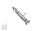 Mock-up


Article(s): Space Shuttle Solid Rocket Booster
Request: Vectorise - Hi folks, was wondering if someone would be kind enough to produce a vector diagram of the Space Shuttle SRB. The images above should provide a reasonable start point, with a bit of luck. Would be much appreciated, so thanks in advance! SalopianJames (talk) 16:42, 30 January 2012 (UTC)
Graphist opinion(s): I have a few questions about the request. Do you prefer a wide-format, or vertical format? The two images are not identical w.r.t. (i) style, (ii) proportions, (iii) annotations. What style/proportions/annotations would you prefer? (It doesn't necessarily need to be the same as either - we could do something different altogether, though it would be limited to what the wiki-SVG engine can handle.) Jon C (talk) 02:05, 8 February 2012 (UTC)
- Well, I like the vertical image's scaling, as it shows all the parts without repeating segments as on the horizontal one, but it doesn't show a general overview of the entire booster - would it be possible to, say, have an larger-scale image such as the vertical one at 45 degrees (a square image would be easier to place in an article), with a smaller-scale vertical image of the entire booster (similar to the horizontal one) to one side with lines indicating where the parts come from, such as on File:SaturnV S-IC.jpg? Thanks for replying, BTW! SalopianJames (talk) 12:36, 8 February 2012 (UTC)
- ATM I still have a poor grasp of the content, so I'll likely be working on some sketches and do this with you iteratively. The 45 degrees view is workable, and since we're not too sure what is the optimal solution, I'll probably do this as a hybrid 2D-3D piece to preserve the flexibility. Do you know if there are orthographic views (to scale top/side CAD-like views) floating around? Or technical docs like the ones with the fuel system? Jon C (talk) 13:53, 8 February 2012 (UTC)
- Thanks, that sounds great - not as far as I'm aware, but there are a few of the Ares V booster which is similar, if that helps? SalopianJames (talk) 14:10, 8 February 2012 (UTC)
- Thinking out loud here.
- * I, for one, didn't know what the boosters are --- I think the small scale vertical image would make most sense if it's shown in the context of the Space Shuttle itself (with the rusty orange external tank).
- Thanks, that sounds great - not as far as I'm aware, but there are a few of the Ares V booster which is similar, if that helps? SalopianJames (talk) 14:10, 8 February 2012 (UTC)
- ATM I still have a poor grasp of the content, so I'll likely be working on some sketches and do this with you iteratively. The 45 degrees view is workable, and since we're not too sure what is the optimal solution, I'll probably do this as a hybrid 2D-3D piece to preserve the flexibility. Do you know if there are orthographic views (to scale top/side CAD-like views) floating around? Or technical docs like the ones with the fuel system? Jon C (talk) 13:53, 8 February 2012 (UTC)
- * For the larger scale drawing, I don't have enough reference material to get to a SaturnV like rendering, and SVG don't support gradient meshes (complex shading) anyway, so it'll have to remain quite graphically simple.
- * There's still the problem with, well, the details on all the images looking just like scribbles to me. I wonder if all of the details are needed in the final image, or if we should have only some important bits in (like in the Ares example).
- * I didn't understand what you meant by "without repeating segments as on the horizontal one" - could you clarify that?
- * Looking at both the Ares and Saturn examples, it seems that your preference is for the large image to be in perspective.
That's looking great - with reference to your last point, I hadn't thought that before, it was just coincidence, but I certainly do now! I like the diagram of the stack, however the same booster type will be used on the Space Launch System, any way of including that too? I'm quite happy for it to remain graphically simple, too. With regards to the repeating segments, if you look at the horizontal diagram, you can see that there is a nose assembly, an aft assembly, and a long, slender cylinder in the centre. This comprises four largely identical booster segments, the forward, forward centre, aft centre and aft segments, which are the repeating segments I was referring to. If the diagram were to show the nose, a segment and the aft in more detail, it might help with scaling. As for labels, they would hopefully be:
- Nose
- Nose cap
- Drogue and pilot parachutes
- Frustum
- Forward booster separation motors
- Main parachute support structure
- Main parachutes (3)
- Separation/ordnance ring
- Forward skirt & IEA
- Igniter
- Segments
- Wall
- Propellant
- Central opening
- ET attachment ring
- ETA struts
- Forward systems tunnel & RSS
- Aft systems tunnel
- Aft structure
- SRM nozzle extension
- Aft skirt
- Aft booster separation motors
Hope that helps! SalopianJames (talk) 16:09, 8 February 2012 (UTC)
- Whoops. I forgot to post back that I've updated the mock-up awhile ago, and was sorta waiting on feedback (and sorta procrastinating). My slight sticking point is not knowing what each of these (many) components look like; will need to spend more time digging up info. Jon C (talk) 13:42, 23 February 2012 (UTC)
create strip of pharma/agrichem chemicals with F substituents


Please make me a new file that is a "life sciences fluorochemical montage". Make it in the style of the montage above (strip).
The chemicals to includer are, in order:
- Atorvastatin (above fourth image)
- Fluoracil (above montage H)
- Fludrocortisone (above, second image)
- Isofluroane (above, montage E)
- Trifluralin (above, third image)
(purpose is for a section image for Fluorine (section on pharma and agrichem)
TCO (talk) 20:52, 2 February 2012 (UTC)
Graphist opinion(s):
![]() Request taken by Pi.1415926535.
Request taken by Pi.1415926535.
![]() Done: I believe this should be sufficient. I can change the filename if desired. Pi.1415926535 (talk) 20:39, 5 February 2012 (UTC)
Done: I believe this should be sufficient. I can change the filename if desired. Pi.1415926535 (talk) 20:39, 5 February 2012 (UTC)
- Change C and D places, please. Also please make file name "Fluorine pharmaceutical and agrichemical compounds montage". (The other strip is all organic chemicals, just not biologically relevent.) As always, thanks so much for your expert attention. Really helps text to have such well composed illos!TCO (talk) 21:38, 5 February 2012 (UTC)
OXO logo
Article(s): OXO (brand)
Request: Create a SVG version of the OXO logo for use on Wikipedia. Another version of the logo form the official website can be viewed here. Licensing information can be viewed on the Garmin logo page. Evan.oltmanns (talk) 00:57, 4 February 2012 (UTC)
Graphist opinion(s):
![]() Done: the X might need a little work (it seems a little too small), and librsvg may not be able to handle a gaussian blur yet (for the drop shadow). The shadow could be fixed by embedding a blurred raster drop shadow, but I don't think it's worth the effort for such a small image. gringer (talk) 23:10, 14 February 2012 (UTC)
Done: the X might need a little work (it seems a little too small), and librsvg may not be able to handle a gaussian blur yet (for the drop shadow). The shadow could be fixed by embedding a blurred raster drop shadow, but I don't think it's worth the effort for such a small image. gringer (talk) 23:10, 14 February 2012 (UTC)
Great Lakes Circle Tours markers
-
Great Lakes Circle Tour marker
-
Lake Superior Circle Tour marker
-
Lake Michigan Circle Tour marker
-
Lake Huron Circle Tour marker
-
Lake Erie Circle Tour marker
Article(s): Great Lakes Circle Tour, etc.
Request: SVG versions with consistent borders and rounded corners would be nice. The typefaces used should be the FHWA Highway Gothic series, which is available as the Roadgeek 2005 fonts (the B-F series are the FHWA Highway Gothic; the 2W/2B through 6W/6W approximate Clearview). Thanks! Imzadi 1979 → 11:08, 5 February 2012 (UTC)
Graphist opinion(s): I am working on Lake Michigan and Lake Superior. –Fredddie™ 04:40, 1 March 2012 (UTC)
Neptunium series
-
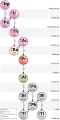 Neptunium series
 -

.svg)
_rotated.svg)
Article(s): Astatine
Request: Please, rotate it 90 degrees clockwise. Of course, make the symbols readable, i.e. if this was a png, you'd have to rotate it and then all the symbols, etc. Shouldn't be very hard. R8R Gtrs (talk) 12:01, 10 February 2012 (UTC)
Graphist opinion(s): I assume you mean counter-clockwise (decaying from left to right?) NikNaks talk - gallery 14:57, 16 February 2012 (UTC)
- I've rotated it as such, but can rotate it the other way if required. NikNaks talk - gallery 17:50, 16 February 2012 (UTC)
DARPA
-
 JPG
JPG
Article(s): DARPA
Request: Please vectorize... Antemister (talk) 21:41, 11 February 2012 (UTC)
Graphist opinion(s):
- This should probably be a vectorised version of the most recent logo on their website, rather than the one shown here (from 2009). gringer (talk) 23:15, 14 February 2012 (UTC)
Seal of Mossad


Article(s): Mossad
Request: Please recreate in SVG. The Menorah is available in SVG from the above-provided Emblem of Israel, and the PNG of the Mossad seal has the inscription in Hebrew in it's description box. Thanks Fry1989 eh? 23:19, 11 February 2012 (UTC)
Graphist opinion(s): I would take this, but I'm concerned I'd get the Hebrew backwards or even upside down! NikNaks talk - gallery 13:09, 16 February 2012 (UTC)
- Haha, the problem with languages that reads right to left :D Since I don't read Hebrew, took me long enough to figure out how the inscription was oriented too. Fry1989 eh? 20:55, 16 February 2012 (UTC)
Vietnamese flags


.svg)
.svg)
Those vietnamese flags have slightly different colors, especcially the red seem sto be to dark. As the colors of those old flags are not exactly defined, all of them should use the color of the todays flag.--Antemister (talk) 12:18, 14 February 2012 (UTC)
Graphist opinions: I can't say I see the issue with the current colours used. They seem consistent with each other and there's little logic to suggest they ought to match the current flag. NikNaks talk - gallery 17:17, 14 February 2012 (UTC)
- Not taken, the old flags colours were/are different from the modern flag, and I find it rather ironic to want to use the modern Communist flag as a colour source against the South Vietnamese flags. Fry1989 eh? 20:58, 14 February 2012 (UTC)
- Do you know a better color? At first, those flags had that bright FOTW-red, now they are to dark. The colors of the todays flag are also not defined, see the file history. As long the vietnamese government does not define the colors of their flag, we should use the same color for all historical flags. We (and you) do that for every country.--Antemister (talk) 21:16, 14 February 2012 (UTC)
- The Communist Vietnamese flag is in no way a source for the old Vietnamese flags. Fry1989 eh? 21:24, 14 February 2012 (UTC)
- And what ist our source for the vietnamese flag?--Antemister (talk) 21:34, 14 February 2012 (UTC)
- When there is no direct source, observation is the only option. Fry1989 eh? 21:40, 14 February 2012 (UTC)
- And oberservation shows that the red of the historical flags is to dark, see other sources or photos from that time.--Antemister (talk) 21:46, 14 February 2012 (UTC)
- When there is no direct source, observation is the only option. Fry1989 eh? 21:40, 14 February 2012 (UTC)
- And what ist our source for the vietnamese flag?--Antemister (talk) 21:34, 14 February 2012 (UTC)
- The Communist Vietnamese flag is in no way a source for the old Vietnamese flags. Fry1989 eh? 21:24, 14 February 2012 (UTC)
- Do you know a better color? At first, those flags had that bright FOTW-red, now they are to dark. The colors of the todays flag are also not defined, see the file history. As long the vietnamese government does not define the colors of their flag, we should use the same color for all historical flags. We (and you) do that for every country.--Antemister (talk) 21:16, 14 February 2012 (UTC)
- Not taken, the old flags colours were/are different from the modern flag, and I find it rather ironic to want to use the modern Communist flag as a colour source against the South Vietnamese flags. Fry1989 eh? 20:58, 14 February 2012 (UTC)
OK. I can send two pages from flag books. Of course, also those books print both flag in the same color--Antemister (talk) 21:19, 18 February 2012 (UTC)
- A better source would be photographs of the flags being flown, although that's clearly difficult. Equally, any documentation from the period would be a good source. NikNaks talk - gallery 21:27, 18 February 2012 (UTC)
Logo of Websites
- File:Demonoid.png
- File:Torrentz logo.png
- File:Flipkart india.png
- File:HomeShop18.com Logo.png
- File:Snapdeal logo.jpg
- File:Alibaba.JPG
Article(s): Demonoid, Torrentz, Flipkart, HomeShop18, Snapdeal, Alibaba.com
Request: Vectorize.--Kkm010* ۩ ۞ 04:53, 17 February 2012 (UTC)
Graphist opinion(s): In the case of Snapdeal, it would be sufficient to convert the {{badJPEG}} into PNG format. --Leyo 15:40, 17 February 2012 (UTC)
- Whatever u think is possible u go ahead. Make sure these logos are all converted into SVG.--Kkm010* ۩ ۞ 04:52, 21 February 2012 (UTC)
- Most of these are low resolution, and do not seem to have vector equivalents readily available. We generally try to avoid recreating logos ourselves, especially low quality ones like these, unless they are more "historic" and there aren't any SVG versions. It risks copyright infringement and misrepresentation. NikNaks talk - gallery 12:37, 26 February 2012 (UTC)
- Whatever u think is possible u go ahead. Make sure these logos are all converted into SVG.--Kkm010* ۩ ۞ 04:52, 21 February 2012 (UTC)
Tahiti arm
Article(s): Kingdom of Tahiti
Request: Anyway to redraw this, remove blue background and vectorize? KAVEBEAR (talk) 19:25, 19 February 2012 (UTC)
Graphist opinion(s):
Coat of arms of Shetland.jpg

Article(s): Shetland
Request: Please can you vectorise and convert into an svg file. Or, is possible, convert the current image into png with a transparent background -- Peter (Talk page) 00:30, 20 February 2012 (UTC)
Graphist opinion(s):
Sublingua
-
 View of the tongue and sublingua of a ring-tailed lemur from the side
 -
 Views of the same structures from the underside

Article(s): Sublingua
Request: I would like to have these two illustrations vectorized so that I can label them to assist with article clarity. Adding color would be nice: the tongue can be colored like ours and the sublingua off-white from what I've seen. I may also be able to get feedback on images from veterinarians at the Duke Lemur Center to insure accuracy. I had asked ZooFari to help with this, but he doesn't appear to be very active. Note: the article will be featured in DYK on 22 February, and I may make a run for FAC once the illustrations are complete. – VisionHolder « talk » 06:22, 22 February 2012 (UTC)
Graphist opinion(s):
Original TV series of Mission: Impossible
-
 Original TV series

Article(s): Mission: Impossible
Request: I discussed this image in WP:MCQ and learned that this image consists of a text within and is ineligible for copyrights due to its lower threshold of originality. Nevertheless, I insist that the SVG format be uploaded to Commons rather than English Wikipedia, unless... otherwise? George Ho (talk) 21:37, 23 February 2012 (UTC)
Graphist opinion(s):
Declawing illustration
-
 My attempt at illustrating the process
Article(s): Onychectomy (declawing)
Request: I'm trying to find a good illustration of the declawing process on cats. I attempted my own (above) but I'm afraid I got some of the anatomy wrong. The third bone is amputated when a cat is declawed. Could someone please draw a picture of before and after an onychectomy? Thank you! Turn685 (talk) 00:20, 24 February 2012 (UTC)
Graphist opinion(s):
Fonts
What fonts are recommended in images on Wikipedia? Ndanielm (talk) 20:58, 25 February 2012 (UTC)
- When I asked this question (some years ago) I was recommended the Liberation family of free (as in freedom) fonts. Here is a page with the fonts that the SVG engine theoretically can render --- I said theoretically, because no font I choose from Adobe Illustrator actually gets used. For tight illustrations or units that won't be translated, I tend to make them outlines.
- If you are working with raster, then you could use any fonts you like. Folks might still recommend a free font. Jon C (talk) 02:51, 1 March 2012 (UTC)
Communist Starry Plough Flag


Article(s): Communist Party of Ireland
Request: Create a new file named File:Communist Starry Plough Flag.svg by changing the blue field to red and the stars to yellow, based on the colours from the Communist Party of Ireland logo.
Graphist opinion(s):
![]() Done Jeran Renz (talk) 01:22, 3 March 2012 (UTC)
Done Jeran Renz (talk) 01:22, 3 March 2012 (UTC)
-
 Ministry of Defence (Albania)
Article(s): Ministry of Defence (Albania)
Request: Vectorise please Vinie007 13:00, 29 February 2012 (UTC)
Graphist opinion(s):
SVG Request for Lanwar

Article(s): Lanwar
Request: Please convert this to an SVG image. Urda (talk) 17:28, 1 March 2012 (UTC)
Graphist opinion(s):
Greater coat of arms of Copenhagen (needs some work) and create a lesser coat of arms
-
 Greater coat of arms

Article(s): Copenhagen, Coat of arms of Copenhagen
Request: Please can you complete the Greater coat of arms using File:Københavns byvåben 1894.png or File:Den danske Vitruvius 1 tab002 - Kiöbenhavns Stadsvaaben.jpg as model; it needs the war equipment underneath the top compartment (the colours don't need to be exact, they usually aren't). Thanks in advance! -- Peter (Talk page) 15:58, 3 March 2012 (UTC)
Graphist opinion(s):
Dinamo Riga logo
Article(s): Dinamo Riga
Request: Could you create SVG version please? There is logo in better resolution, too. Edgars2007 (Talk/Contributions) 13:01, 5 March 2012 (UTC)
Graphist opinion(s):
Resolved
Constitution of May 3, 1791 (painting)
-
 Map of the persons portrayed in File:Konstytucja 3 Maja.jpg

Article(s): Constitution of May 3, 1791 (painting)
Request: As the article has been expanded to identify about twice as many characters, the map should follow suit. The list of about 14 more characters to be identified is at Constitution_of_May_3,_1791_(painting)#List_of_characters, and the more precise information about where they are is in the text. I'd be happy to work closely with the illustrator and clarify any confusion. Piotr Konieczny aka Prokonsul Piotrus| talk to me 20:44, 5 March 2012 (UTC)
Graphist opinion(s):![]() Done
Done
National Movement for the Liberation of Azawad

Article(s): National Movement for the Liberation of Azawad
Request: Can someone extricate the logo on the right top of the page to add to the article. Shouldnt be a copy vio if used only to illustrate the logo of the organisation. ThanksLihaas (talk) 07:54, 5 February 2012 (UTC)
Graphist opinion(s):
![]() Request taken by Orionist.
Request taken by Orionist.
Karplus equation


Article(s): Karplus equation
Request: Please remove the artifacts, make the groundground transparent and sharpen the figure. 129.132.225.23 (talk) 18:02, 16 February 2012 (UTC)
Graphist opinion(s):
- Done I've re-generated the graph in R, which directly outputs SVG. I took some liberties with the tick marks and axis boundaries (mostly leaving them at defaults), but that's all quite customisable if it needs to look exactly the same. gringer (talk) 01:19, 20 February 2012 (UTC)
Please improve
-
 Coat of arms of Tuva

Article(s): Tuva
Request: The quality of Tuva's coat of arms is extremely bad. A more detailed picture of the horse can be found here... Antemister (talk) 14:11, 20 February 2012 (UTC)
Graphist opinion(s):
![]() Done--Antemister (talk) 22:33, 4 March 2012 (UTC)
Done--Antemister (talk) 22:33, 4 March 2012 (UTC)
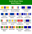
South African police decorations
-
 South African police medals
 -
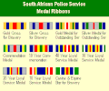 South African police medals since 2004
 -
 South African Railways Police medal ribbons 1966–86
 -
 South African Municipal/Metropolitan Police medal ribbons
 -
 South African police medals, SVG
 -
 South African police medals since 2004, SVG
 -
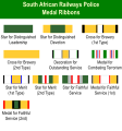 South African Railways Police medal ribbons 1966–86, SVG
 -
 South African Municipal/Metropolitan Police medal ribbons, SVG


Article(s): South African police decorations
Request: Can someone remake these as vectors, preferably without the yellow background? Thanks! ♠PMC♠ (talk) 00:31, 23 February 2012 (UTC)
Graphist opinion(s): ![]() Request taken by Imzadi1979.; will work on these tonight.
Request taken by Imzadi1979.; will work on these tonight.
- I've added two additional graphics to the list since it wouldn't do to revise only half of the article's illustrations. Now, I'm recreating these without the yellow background, but would you want the green background at the top? Would you like me to update them so that the overall dimensions are similar? Imzadi 1979 → 06:19, 23 February 2012 (UTC)
- Another query, but are these ribbons supposed to be the same width? Or one of two different widths? If so, I might try to reorganize the display a bit so that the text legends aren't abbreviated. Imzadi 1979 → 11:01, 23 February 2012 (UTC)
I'll be honest, I haven't the faintest clue about the sizes of the ribbons. I'm terribly sorry. My assumption would be that they are supposed to be the same width. Go with that, and I hope if we're wrong, a horde of well-informed South Africans well descend upon us and correct us with righteous fury. As for the header, I suppose keep a header of some kind so people know what they're looking at. Whether it's green or not would be up to you, I don't have a preference for color. ♠PMC♠ (talk) 22:06, 23 February 2012 (UTC)
- OK, for the time being, I just vectorized things as is, with minimal changes to unabbreviate the text where I could. I have to take a few days off here to move, so it additional changes are made, I can do that next week once I'm back online. Imzadi 1979 → 03:31, 26 February 2012 (UTC)
Asteroids scale
-
 Asteroids scale

Article(s): Asteroid
Request: Change "243 Ida 1 Dactyl" to "(243) Ida I Dactyl". This is a correction. Double sharp (talk) 07:00, 25 February 2012 (UTC)
Graphist opinion(s):
![]() Done ―― Phoenix7777 (talk) 08:56, 26 February 2012 (UTC)
Done ―― Phoenix7777 (talk) 08:56, 26 February 2012 (UTC)
Icons for GA
-
 Can you merge this image...
 -
 with this...
 -
 Like this!
 -
 Done
Done


Article(s):
Request: Can you create new icons like the third image? I want to suggest new Main page for ko.wiki, but there is no image for FA icons that ko.wiki uses as FA stars. kwan-in (talk) 13:48, 26 February 2012 (UTC)
Graphist opinion(s):
![]() Request taken by Gauravjuvekar (talk).:--I prepared the files but due to a upload problem, I'll try uploading tomorrow--Derivative FX says it uploaded but I can't find the file anywhere. I also vectorized the grey star that was png.--Gauravjuvekar (talk) 17:23, 26 February 2012 (UTC)
Request taken by Gauravjuvekar (talk).:--I prepared the files but due to a upload problem, I'll try uploading tomorrow--Derivative FX says it uploaded but I can't find the file anywhere. I also vectorized the grey star that was png.--Gauravjuvekar (talk) 17:23, 26 February 2012 (UTC)
![]() Gauravjuvekar (talk) 05:45, 27 February 2012 (UTC)
Gauravjuvekar (talk) 05:45, 27 February 2012 (UTC)
Update the description pages of the necessary files adding a notice about this new version.--Gauravjuvekar (talk) 05:46, 27 February 2012 (UTC)
Circus Circus Reno Logo
Article(s): Circus Circus Reno
Request: Do something with them... 68.120.69.32 (talk) 06:45, 26 February 2012 (UTC)
Graphist opinion(s): Er, you need to provide "something". What exactly are we supposed to do?--Gauravjuvekar (talk) 16:28, 26 February 2012 (UTC)
![]() Done: Retrieved from website Circus Circus Reno logo.svg
Done: Retrieved from website Circus Circus Reno logo.svg
Closing a business checklist
-
 Example checklist

Article(s): Checklist
Request: Wingdings checkbox appears as lowercase letter 'q', though font-family appears to be set correctly. Also, bounding box is too tight--text is clipped on the right-hand side of the document. Thanks for your help. DanielPenfield (talk) 22:52, 6 March 2012 (UTC)
Graphist opinion(s):
![]() Request taken by Perhelion (talk).: Wingdings is not installed on Wikimedia
Request taken by Perhelion (talk).: Wingdings is not installed on Wikimedia
![]() Done: -- Perhelion (talk) 00:02, 8 March 2012 (UTC)
Done: -- Perhelion (talk) 00:02, 8 March 2012 (UTC)
Need help identifying a color
Article(s): Big_East_Conference#Membership_timeline
Request: I tried editing Big_East_Conference#Membership_timeline, to change the legend, specified as a sentence, to a proper legend. However, the timeline is specified using Wikipedia:Timeline. The colors are specified using Ploticus color page. While I think some of the colors (e.g. orange) are fine, that source defines a color called powderblue, which doesn't match the color used if I use the fontcolor template. I tried guessing, but I haven't managed to match it correctly. I used to have a tool where I could simply click on a color and it would tell me the code, but I don't have it currently. I suspect it is easy to identify the color, but I'm not sure how. Can someone tell me what named color or rbg code to use? SPhilbrick(Talk) 20:36, 7 March 2012 (UTC)
Graphist opinion(s): See Powder blue. Kaldari (talk) 21:27, 7 March 2012 (UTC)
- Thanks for the link, but I don't see the color on the list. My goal is to use a named color, if possible, or figure out how to use the code if there isn't a named color match, but I don't yet know what code or name corresponds to the color used in the table. It looks a little like Iris, but definitely lighter.--SPhilbrick(Talk) 13:46, 8 March 2012 (UTC)
- I'm going to go with Mediumslateblue, not exactly right, but close enough. Still would be interested to know how to get it right.--SPhilbrick(Talk) 14:13, 8 March 2012 (UTC)
- If you're on Firefox, theres an addon out there called color picker, which lets you click anywhere on the screen and get the color for it in hex and rgb--Trex2001 (talk) 10:39, 9 March 2012 (UTC)
- Thanks, it works.--SPhilbrick(Talk) 15:07, 9 March 2012 (UTC)
- If you're on Firefox, theres an addon out there called color picker, which lets you click anywhere on the screen and get the color for it in hex and rgb--Trex2001 (talk) 10:39, 9 March 2012 (UTC)
- I'm going to go with Mediumslateblue, not exactly right, but close enough. Still would be interested to know how to get it right.--SPhilbrick(Talk) 14:13, 8 March 2012 (UTC)
-
 Pike zjarri bunker
 -
 Qender Zjarri
 -
 SVG Done
 -
 SVG Done


Article(s): Bunkers_in_Albania
Request: Please vectorise, they are high quality Vinie007 17:52, 16 March 2012 (UTC)
Graphist opinion(s):![]() Request taken by The Hedonist.
Request taken by The Hedonist.
![]() Done --The Hedonist (talk) 16:17, 18 March 2012 (UTC)
Done --The Hedonist (talk) 16:17, 18 March 2012 (UTC)
Get the "F" out
-
 Green fez with white "F"
 -


Article(s): none
Request: I'd like just the green fez please, no "F". It's already been converted to svg. - Dank (push to talk) 11:32, 24 March 2012 (UTC)
- Have you tried to do it yourself using Inkscape? --Leyo 13:35, 24 March 2012 (UTC)
- I haven't, no. This is for a generalized clerk icon; let me know if I need to ask my wikiproject for help with this. - Dank (push to talk) 13:39, 24 March 2012 (UTC)
- Thanks much! - Dank (push to talk) 12:05, 25 March 2012 (UTC)
- I haven't, no. This is for a generalized clerk icon; let me know if I need to ask my wikiproject for help with this. - Dank (push to talk) 13:39, 24 March 2012 (UTC)
Graphist opinion(s): ![]() Done NikNaks talk - gallery 11:17, 25 March 2012 (UTC)
Done NikNaks talk - gallery 11:17, 25 March 2012 (UTC)
Convert WikiLove heart to SVG
-
 Original image
 -
 An attempt
 -


Article(s): WikiLove extension
Request: Convert PNG icon to SVG. See https://bugzilla.wikimedia.org/show_bug.cgi?id=35334 Kaldari (talk) 00:56, 25 March 2012 (UTC)
Graphist opinion(s): The colours need some work (they seem darker than the original), but this is hopefully a start. NikNaks talk - gallery 11:13, 25 March 2012 (UTC)
Universal calendar icon

Article(s): not for articles
Request: Could this image be converted to SVG or PNG before transfer to commons ? It is the only universal (language free) calendar icon I can find for documentation such as User:PALZ9000/console which goes onto wiki servers in other languages. I guess I could just convert it to PNG, but is that as good as conversion to SVG for commons ?
I had second and third thoughts about my request, as I figured I could find equivalents, but only found one and cropped it for russian, for Japanese, it's harder, and there are dozens of languages to go. A default for 'calendar' would be helpful.
Stylizing in any way you see fit would be cool too, colours, perspective, whatever, it's all good so long as it avoids text and numerals. Penyulap talk 19:06, 16 March 2012 (UTC)
Graphist opinion(s): I just remade the existing JPEG as an SVG. I hope this is sufficient! NikNaks talk - gallery 13:10, 25 March 2012 (UTC)
schematic diagram of diurnal variations in atmospheric boundary layer

Article(s): atmospheric boundary layer, capping inversion
Request: an SVG of [1] or [2] would be neat. -- 31.164.16.122 (talk) 21:23, 19 March 2012 (UTC)
![[2]](http://www.geog.ubc.ca/g2field/images/g2f_images/clima/bl1.png)
Graphist opinion(s): How's this? I've omitted the clouds because I can't be bothered to add them right now, but will do later if no-one else does. NikNaks talk - gallery 11:39, 27 March 2012 (UTC)
- AWESOME -- 31.164.16.122 23:31, 27 March 2012 (UTC) — Preceding unsigned comment added by 31.164.16.122 (talk)