Make this into a regular chart (SVG preferred), rather than a chart with cutesy graphics. Also remove the title and key from the image. MoreTomorrow (talk) 07:02, 9 February 2015 (UTC)[reply]
Thank you Goran tek-en, that looks like a good start! I would suggest making the numbers and labels larger, moving the axis labels outside of where the numbers are, and also fixing the spelling of 'Months'. MoreTomorrow (talk) 03:48, 8 March 2015 (UTC)[reply]
@Goran tek-en: That looks great! Is it possible to center the axis labels? Otherwise, I think it is perfect. MoreTomorrow (talk) 18:54, 10 March 2015 (UTC)[reply]
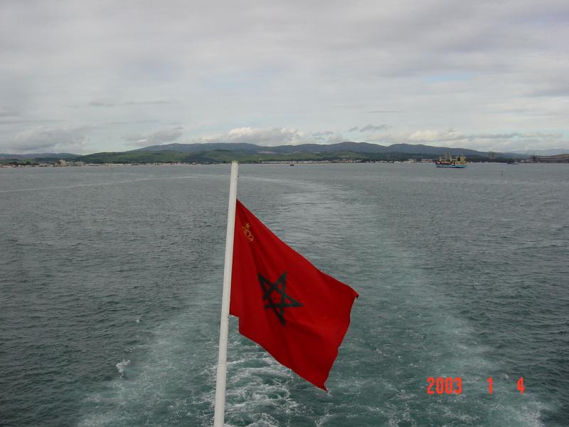
I don't think the highly stylised crown on the civil and naval ensigns is correct. Photos of the civil ensign show a much more detailed crown. The problem is that it doesn't appear to be the same crown as on the coat of arms, but instead more of a European-style crown with 5 arches facing the viewer's perspective, topped with a solid pentagram. It does appear to have some of the same decoration with green and red pearls like the crown on the coat of arms though. Would anyone be willing to try and create the more detailed crown for these two flags? Fry1989eh? 18:11, 1 March 2015 (UTC)[reply]
Graphist opinion(s)
To me you will have to find a better source so that one actually can see how it looks. --Goran tek-en (talk) 15:21, 2 March 2015 (UTC)[reply]
That file gives a base to work from. I can take this request but you will have to guide me on how it should look as the sources are very vague. If that is not OK with you just remove my Take otherwise check here for Drafts. --Goran tek-en (talk) 13:11, 7 March 2015 (UTC)[reply]
@Fry1989: Now there is a first draft for you to look at. Now you have to tell me what to change more, jewels, if you want something to support the pentagram, and so on. Give me feedback, thanks. --Goran tek-en (talk) 13:34, 7 March 2015 (UTC)[reply]
Thank you, that's getting close. Enlarging the images best I can, I would say the pearls are bordered in the same gold as the arches of the crown and coloured red like the flag. The leaves have no pearls on them and are also bordered gold and coloured red. The base appears to have 4 green emeralds instead of pearls and diamonds. Fry1989eh? 16:09, 7 March 2015 (UTC)[reply]
@Fry1989: Now there is a draft to look at. As I'm not sure of what to do I have just done one pearl on the left side and on leaf and also the base.
Question: On which image can you see those details?
On the GIF, you can enlarge the image and the pearls and leaves all are red like the flag so they appear see-through. On the first photograph, you can see the 4 green emeralds. Your latest draft is excellent, if you will provide me with the SVG I can finish it up myself. Fry1989eh? 16:33, 8 March 2015 (UTC)[reply]
to be able to upload it at commons. Then you can work from that, thanks. --Goran tek-en (talk) 18:31, 11 March 2015 (UTC)[reply]
I would suggest uploading it as Crown of Morocco 2, describe it as the version of the crown commonly used on the Moroccan civil and naval ensigns, and categorise it as Category:Coats of arms of Morocco and Category:SVG coat of arms elements - crowns. Fry1989eh? 18:45, 11 March 2015 (UTC)[reply]
@Fry1989: As you haven't seen it complete I want you to look at this draft and say if it's OK or not, thanks. --Goran tek-en (talk) 13:45, 13 March 2015 (UTC)[reply]
That is excellent. There are one or two minor touch-ups I would like to do with the arches but I can do those myself, and I can put them on the flags. I would keep you attributed as the creator of the crown. Fry1989eh? 17:21, 13 March 2015 (UTC)[reply]
I added a backside of the base crown as it was missing. Now you can find it here. --Goran tek-en (talk) 14:46, 14 March 2015 (UTC)[reply]
Hi graphists, for the article English language (a majorly important article with 3 million views per year) I need a schematic illustration of the Great Vowel Shift. I am imaginging something like this: [1]. ·maunus · snunɐɯ· 20:29, 4 March 2015 (UTC)[reply]
Graphist opinion(s)
First I would like to tell you that next time please use the link "—New request—" at the top of the page. In that way all the code that is needed will be added. I have added the code here but please add it to your other request, thanks.
@Maunus: I don't know what the two signs to the left of "boat" is. You will have to post theme here so I can copy, thanks. --Goran tek-en (talk) 18:35, 5 March 2015 (UTC)[reply]
Ah, the signs are all IPA so IPA font should probably be used. It is ɔː. Also a correction needs to be made - the illustration I linked has a vowel too few: the "beat" should be shifted down to where it says bate/bait and the vowel ɛː should be used next to it, then bate/bait and the vowel [a:] should be shifted down a level so that it is not at the same level as ɔː. I hope that makes sense. On page 73 in this book is an illustration that looks like it should[2].·maunus · snunɐɯ· 18:43, 5 March 2015 (UTC)[reply]
Looks great to me! But you should probably use the same IPA style triangular length marks after all of the vowels (i.e. the ː istead of :). ·maunus · snunɐɯ· 20:21, 6 March 2015 (UTC)[reply]
to be able to upload it to commons, thanks. --Goran tek-en (talk) 09:51, 7 March 2015 (UTC)[reply]
The Great Vowel Shift.jpg, "chart showing how the vowels of the English language shifted in the period 1450-1700", category English language, lingustics.·maunus · snunɐɯ· 16:58, 7 March 2015 (UTC)[reply]
@Kelvinsong, Erutuon, and Maunus: OK now it's to much discussion that I'm not in need of, it really confuses. This is not a subject I have knowledge about so I really JUST need you to give me a source and of course needed information to be able to create the graphic. Everything else I'm happy not to see as it's hard to know which is for me or not.
Remove all unnecessary information from above.
Hold your discussions some where else, I do hope you guys understand.
Tell me (when you have agreed) what you want.
Tell me which (one only) font to use.
The link to dropbox is bad.
Give me a message when you are done, I will wait for that, thanks. --Goran tek-en (talk) 18:31, 8 March 2015 (UTC)[reply]
The words and phonetic symbols in this sketch are shown in the table below.
bite
iː
uː
bout
beet
eː
ai au
oː
boot
beat
ɛː
ɔː
boat
bate
aː
As the sketch shows, the phonetic symbols are in a roughly triangular shape (trapezoidal), with arrows between them. The left side of the trapezoid has a shallower angle (about 50°) than the right side (about 80°). Words are positioned on the outside, next to phonetic symbols. The table shows vertical positioning: iːuː at same level, etc.; and aiau in center of diagram between eː and ɔː. (Thus aiau should be slightly lower than in my sketch. Don't follow my sketch in this respect.)
It has a white background and thin border, tell me if you want that or not, give me feedback, thanks. --Goran tek-en (talk) 15:42, 9 March 2015 (UTC)[reply]
Maybe you could fit it onto this grid as a background? That is the vowel space. . ·maunus · snunɐɯ· 18:48, 9 March 2015 (UTC)[reply]
I would say no border. I don't think we should use the grid, since it might make the diagram more noisy.
Overall very good, but I have realized that proportions are too cramped in my sketch. We need longer arrows, more space between ends of arrows and symbols. This image shows more what I'm looking for, though symbols and arrows are a little too small. iːeːɛːaː and uːoːɔː should be evenly spaced. Perhaps arrow length should be 2 * height of symbols, and space between ends of arrows and symbols about 1/2 * height of symbols. You can adjust vertical and horizontal positioning of symbols to achieve better proportions. — Eru·tuon 18:57, 9 March 2015 (UTC)[reply]
I must say that if we don't use the grid then I don't understand the point in having the triangular design at all, it just makes the image bigger than it has to be. The grid can be rendered in an unobtrusive grey for example to provide background without making noise. And tagging the vowels to the grid would be the best way to make sure the proportions and angles are right.·maunus · snunɐɯ· 20:45, 9 March 2015 (UTC)[reply]
The file "Blank vowel trapezoid.svg" doesn't hold the angels you gave me before, and if you knew about "Blank vowel trapezoid.svg" you could have given it to me at once. I do have other stuff to do.
I have made one version according to the "Blank vowel trapezoid.svg" trapezoid. The trapezoid is of course not visible.
An image just to show the difference between the two versions difference. Reddish is the first version black is trapezoid.
This was done before the last three comments and now we are back to having discussions and I don't know what to do. Please come to ONE intend and tell me that. I do understand that things change as the work progress and you have an image to look at, that is no problem. What do you want me to do? --Goran tek-en (talk) 11:02, 10 March 2015 (UTC)[reply]
I think the black trapezoid based version is better. I will let it be up to you as the graphist to decide whether it makes more sense to have the grid in the background or not. Thanks a lot for your work and I apologize for the confusion.·maunus · snunɐɯ· 14:36, 10 March 2015 (UTC)[reply]
Sorry about the confusion; Maunus and I don't always agree, and we're both giving directions, which is a bad situation. We need to discuss further in another place, and notify you if we come to an agreement. — Eru·tuon 16:37, 10 March 2015 (UTC)[reply]
@Maunus and Erutuon: Of course you will come to an agreement and I will wait for you to get back to me, thanks. --Goran tek-en (talk) 19:35, 10 March 2015 (UTC)[reply]
Okay, after some discussion we've come to an agreement.
Three versions: rectangular (as in image posted earlier), trapezoidal, trapezoidal with grid as background.
No border in all three versions.
Filenames: rectangular as Great Vowel Shift2a.svg, trapezoidal as Great Vowel Shift2b.svg, trapezoidal with grid as Great Vowel Shift2c.svg.
Your earlier draft of the rectangular version looked good. I suppose you may not have it saved, and have to remake it. Sorry about that.
The draft of the trapezoidal version looks good. A few modifications: more space between arrows and phonetic symbols. I think the space should be about 1/2 * height of symbols. Try removing bolding; I think the diagram might look better with normal font weight.
After you've modified the spacing and font weight of the trapezoidal version, try adding the grid in very light gray. It should be inconspicuous or unobtrusive. The phonetic symbols should be in the corners of the grid. Not sure if the lines of the grid should intersect the symbols, or be inside or outside of them. Use your artistic judgement, or create several versions and let me decide. — Eru·tuon 04:32, 13 March 2015 (UTC)[reply]
Now you can look at the three different drafts. I have tried to make the them as similar as I can so there is a familiarity between them if you use them together.
Shape and proportions look really good now. Some tweaks:
Move aiau in rectangular version to center, between ɛːoː, and of course reshape arrow to fit.
Rectangular diagram should have the same phonetic symbols and words as trapezoidal, just in a different shape. (So use aː rather than æː, delete bait, etc.)
I think that's all. I'm not totally sure if the grid version looks good as it is (grids usually use dots, like this chart of Italian vowels), but if we want it changed, we'll ask for it later. — Eru·tuon 19:02, 14 March 2015 (UTC)[reply]
New drafts. I have no knowledge of how the trapezoidal should be used but in the Italian it seems as the positioning of the vowel means something. So maybe you have to check out that, how it should be used.
Please fix the spelling error at bottom right, "Wars ot the Three Kingdoms." -- 65.210.65.16 (talk) 16:09, 5 March 2015 (UTC)[reply]
Graphist opinion(s)
Request taken by Goran tek-en (talk) 10:07, 7 March 2015 (UTC).[reply]
I guess you mean "bottom left" and it had been more helpful if you gave us the right version of text to change to. You can't take for granted that we (graphic workers) can spell correct in English. --Goran tek-en (talk) 10:07, 7 March 2015 (UTC)[reply]
Could someone please abstract the lettering from http://www.allmusic.com/album/in-the-lonely-hour-mw0002605902 and upload it to Commons for use on projects without fair use? The abstraction needn't actually be an actual abstraction; just using the right fonts, sizes, and spacing is probably enough. Magog the Ogre (t • c) 02:05, 14 January 2015 (UTC)[reply]
Graphist opinion(s)
Something like this? --Victor•talk 00:27, 16 January 2015 (UTC).[reply]
Request taken by Gaff (talk) 04:24, 24 January 2015 (UTC).: I should be able to get this into SVG. If somebody else can get it faster, let me know. Gaff (talk) 04:24, 24 January 2015 (UTC)[reply]
On second thought, there are better images than I could make available already on the Italian language WP page The licenising is in Italian, but looks the same as our Fair Use. Maybe as at Help Desk or elsewhere for somebody able to read/speak Italian to make sure of the licensing and assist with upload here. You cannot upload to Commons, since they are fair use. --Gaff (talk) 05:47, 24 January 2015 (UTC)[reply]
I would very much appreciate if these two floor plans could be redrawn in vector format. It would make them much easier to read. They are both used in a Good article which will probably soon become Featured. Thanks! -- P. S. Burton (talk) 10:48, 31 January 2015 (UTC)[reply]
@P. S. Burton: Now you can look at a draft here. I didn't put in the legend as I think it's better in the info on the drawing. If you want it in I will of course add it. You should check so I got everything right, give me feedback, thanks. --Goran tek-en (talk) 14:06, 15 March 2015 (UTC)[reply]
@Goran tek-en: excellent work! Thank you very much. I agree that the legend is better placed in the file description. There is an opening missing in the passage on the upper left hand side and an error on the window between area C and D on the right hand side. P. S. Burton (talk) 14:25, 15 March 2015 (UTC)[reply]
@Goran tek-en:. They both look good. I cannot find any errors. Please upload with file descriptions given above and below. P. S. Burton (talk) 15:06, 23 March 2015 (UTC)[reply]
File:First Floor Bramshill House.svg
Floor plan of the first floor of Bramshill House in the 1880s, based on Bramshill: Its History & Architecture (1883) by William Henry Cope pp. 44–45
A. Chapel
B. Chapel room
C, C, C. Staircases
D. Great drawing room
E. Library
F. Gallery
G, G. Bedrooms
H. Green bedchamber
I, I. Passages
K. Dressing room
L. Boudoir
Category: Bramshill House
I had to change the names somewhat as the names are used for the jpg images. Now you can find them here;
Could someone please create SVG files of the two alternative versions of Kyle Lockwood's proposed flag for New Zealand based on the one above, found at http://www.silverfernflag.org/proposal.html
I also need a tree diagram showing the relation of the English varieties to other Germanic langauges. Something like this: [3] (but only the Germanic branch, and with a node Anglo-Frisian below "West Germanic").·maunus · snunɐɯ· 20:29, 4 March 2015 (UTC)[reply]
@Maunus: Now there is a draft to look at. I haven't put in the node "Anglo-Frisian" yet because I can't find "West Germanic". Give me feedback and tell me where to put the new node, thanks. --Goran tek-en (talk) 12:08, 7 March 2015 (UTC)[reply]
Great, thanks! Where it says "West" it should say "West Germanic" and it should have two branches - Low Franconian and Anglo-Frisian - Anglo-Frisian then leads to Old English and Old Frisian, Low Franconian leads to Dutch, Flemish and Low German. - here is the tree that your tree will be replacing. Maybe you can find a way of using color shape the tree to make it more graphically appealing.·maunus · snunɐɯ· 19:51, 7 March 2015
Yes I do, what I need is a view of West-Germanic with added detail in the classification of English. That tree by the way is really not a good graphic representation of IE, it is neither pretty or easy to read.·maunus · snunɐɯ· 22:38, 7 March 2015 (UTC)[reply]
@Maunus: The file that you say this will replace doesn't have the same content to me, am I misunderstanding something?
It's hard to make this kind of chart graphically appealing. If you add color or shapes there should be a meaning for it. I also try to make my work here so it works as well as possible for people who has color issues, it's very hard to make that work for most though. Now there is three different drafts for you to look at and give me feedback on, thanks.
No, you are right the content is more detailed in the one I want, so I would like both a more detailed content and a clearer graphic representation to help the reader. I can see from the tree that I was unclear in my description. From West Germanic there are only two nodes: one leads to Anglo-Frisian, the other leads to Low Franconian. Anglofrisian then connects to Old Frisian (which in turn connects to Frisian) and Old English. So where it now says Frisian, you should put the Old Frisian and there should be a level below Old Frisian saying just "Frisian". And it should only say Old English once in the tree, namely in the main Old English node descending from Anglo Frisian, Old English then splits into Anglian and West Saxon (yaou have an extra -a after Saxon that needs to go). So the Anglo-frisian node should be an additional level in between West Germanic and Old-English/Old Frisian, not a separate node out to the left as you have now. I also think maybe removing the entire North Germanic node with its daughters (Scandinavian etc.) will make the tree more focused on the West Germanic branch. Instead from the root proto-Germanic you can have three lines, one leading to West Germanic, one to North Germanic and one to East Germanic - then latter too without any further nodes going off them. I think the grey tones is probably best. Also try to remove where it says "Anglo-Danish" so that Northumbrian just goes straight down to Scots. ·maunus · snunɐɯ· 20:02, 9 March 2015 (UTC)[reply]
I think Goran tek-en is going to find your explanation confusing, so I've created a table. If there are any changes to be made, best to display them in the table. — Eru·tuon 20:18, 9 March 2015 (UTC)[reply]
Germanic
West Germanic
North Germanic
East Germanic
Anglo-Frisian
Low Franconian
Old English
Old Frisian
Dutch
Flemish
Low German
Anglian
West Saxon
Frisian
Northumbrian
Mercian
Scots
East Midland Middle English
Standard Modern English
Yeah, but I don't want any of the daughters of North Germanic in there, instead I do want a branch leading off to East Germanic as well. I've struck the ones I want removed.·maunus · snunɐɯ· 20:49, 9 March 2015 (UTC)[reply]
And I deleted them for clarity. — Eru·tuon 20:54, 9 March 2015 (UTC)[reply]
Thanks, I used both the chart and text to hopefully get it right. I try to have some "rules" when I do something like this, same distance, same angel and so on. This makes the impression more calm and I hope easier to grasp. Still you can't use the rules all the time so you have to break them in between. Now there is a draft to look at. Give me feedback, thanks. --Goran tek-en (talk) 19:21, 10 March 2015 (UTC)[reply]
Goran tek-en (talk·contribs) Two inaccuracies in the tree have been brought to my attention, and I hope you can help me fix them.
One is that I have accidentally omitted the third branch of West Germanic which is German. That is a third branch should go down from the West Germanic node to "Old High German" which should then have a single node down to "German".
The second is that "Flemish" and the line going down to it from "Low Saxon" should be removed.
Does this make sense? Or should I try to show a diagram with the changes?·maunus · snunɐɯ· 19:51, 27 March 2015 (UTC)[reply]
@Maunus: Look at this new draft, but should "Flemish" be a word by itself? Give me feedback, thanks. --Goran tek-en (talk) 20:58, 27 March 2015 (UTC)[reply]
The addition of the German branch is good, but "Flemish" should dissappear altogether (it is actually just a form of Dutch) so that there are only two branches under "Low Franconian". One more thing I am thinking is if we could have the modern languages on the base line so that "Frisian", "German", "Dutch" and "Modern English" are on the same horizontal line on the bottom (similar to this image [4]). That would require making some of the nodes a bit longer. ·maunus · snunɐɯ· 21:08, 27 March 2015 (UTC)[reply]
Yes, it is. Could you put Scots down on the bottom horizontal line as well. Then just upload it as a new version of the one that is already in the article. Thanks!·maunus · snunɐɯ· 15:53, 29 March 2015 (UTC)[reply]
Added {{GLNF}}s, non-free media. Also .png should be low resolution, not 2,048 × 1,536 pixels and 1,600 × 1,165 pixels. --Victor•talk 09:37, 21 December 2014 (UTC).[reply]
Please converts these images to SVG format as early as possible. These images has been pending for too long. Thank You--♥ Kkm010 ♥♪ Talk ♪ ߷ ♀ Contribs ♀ 05:57, 31 December 2014 (UTC)[reply]
Please be patience. These images has been pending for too long - its only been a couple of days, there are requests above that are still not finished and are the ones to be completed. ///EuroCarGT 06:11, 31 December 2014 (UTC)[reply]
Kkm010, what is point of this? Redrawing will not make this logos free. It's only waste of our time. --Victor•talk 06:46, 31 December 2014 (UTC).[reply]
All right guys take your time no hurry, but, please ensure these logos are converted to SVG. It is my humble submission to you.--♥ Kkm010 ♥♪ Talk ♪ ߷ ♀ Contribs ♀ 14:18, 31 December 2014 (UTC)[reply]
Hello, excuse my very low level of english. I have a real problem : William Williams-Hope (1802-1855), son of John Williams-Hope and family of Henry Hope (1735-1811), was british. He was extremly rich and had many houses in England and in France. He was living in France most of the time and had french naturalization. I would like to put his heraldry in William Hope (banquier) and in his Paris’ home (hôtel de Monaco) on Wikipedia fr. Unfortunatly his heraldry is only in english without picture. I have no answer from french Wikipedia:Graphics Lab/Illustration workshop . I think it is because of the langage.
His heraldry is : Hope (as borne by William Williams Hope, of London esq.) Azure a chevron or, between three bezants, within a bordure of the second, quartering Williams, viz. argent a greyhound courant sable between three Cornish choughs proper within a bordure engrailed azure charged with four crosses crosslet or, and as many bezants alternatly. Crests – First, a globe fractured proper charged with an anchor sable over the globe a rainbow, for Hope ; second, a cubit arm erect, habited sable charged with a cross crosslet or, and cuffed of the last, the band holding two sprigs of oak in saltire proper acorned or, on the hand a Cornish chough statant, also proper for Williams. URL Encyclopaedia of heraldry: or General armory of England, Scotland, and Ireland, comprising a registry of all armorial bearings from the earliest to the present time, including the late grants by the College of arms.
Can you help me and make it ? Thank you very mutch.
Photographs of these small, primarily nocturnal, not very exciting forest dwellers are hard to come by. If somebody could draw a quick illustration of this animal it would help me get it through at least Good Article review. The article provides more detail about animal size and description.
Please change the following to fix typos and apply a consistent variant of English: "Genuary 16, 1944" to "January 16, 1944"; "Open City" to "Open city"; " "Nov. 1st, 1944" to "November 1, 1944"; "Territories lost between 1943, Dec. and 1944, Sep." to "Territories lost between Dec. 1943 and Sep. 1944"; "ITALIAN SOCIAL REPUBLIC DURING ITALIAN CIVIL WAR" to "THE ITALIAN SOCIAL REPUBLIC DURING THE ITALIAN CIVIL WAR"; "Territories under German Operational Zones (military administration)" to "German Operational Zones (military administration)"; "Partisans Republics and Free Zones and territories held by Yugoslav partisans (1944)" to "Partisan Republics, Free Zones and territories held by Yugoslav partisans (1944)";
Change note 1 to: "Rome was declared an "open city" on August 14, 1943 by Badoglio's government. This was recognized by the Italian Social Republic and the Third Reich, although Germany de facto occupied the city and violated its status by using Rome to host troops. The Allies never recognized the open city."
Change note 2 to: "The Province of Ljubljana was annexed by Italy until 1943 and then occupied by Germany until 1945"
Change note 3 to: "The Province of Fiume, annexed by Italy from 1941, fell under Croat civil administration and German military control within the Operational Zone of the Adriatic Littoral in 1943"
I've attempted to replace the majority of the text stored as paths with editable text as well as provide some general cleanup. I've inadvertently deleted the white background, but I'll replace that once I've changed more of the text. Please let me know if I've corrected all of the grammatical errors you spotted; I think I got them all, but I could be wrong. NikNakstalk - gallery 15:25, 30 March 2015 (UTC)[reply]
I've fixed that and a few other mistakes I'd introduced and now all the text (except for the three curved pieces, which I couldn't get MediaWiki to render correctly) are editable directly. Let me know if there are additional errors that I've made or if there are other things that need fixing. NikNakstalk - gallery 15:58, 31 March 2015 (UTC)[reply]
Great job. Thank you very much. I managed to correct the last parts on my own using a text editor. P. S. Burton (talk) 16:34, 31 March 2015 (UTC)[reply]
Would anyone be able to turn the following into a graphic useable on wiki? It is the arm badge of the British 80th Division, and would have been worn by the men assigned to the unit. It will add a much needed visual to the current article. IWM Link. If needed Catalogue number INS 5488. Regards -- EnigmaMcmxc (talk) 02:36, 16 March 2015 (UTC)[reply]
That great work, thanks. Would you be able to make a minor addition? Remove the dotted blue line and make the yellow border around the blue box even. The dots are guideline for the soldiers to cut along as they were issued with a piece of cloth that had two flashes on (one for each arm). Thanks.EnigmaMcmxc (talk) 14:19, 21 March 2015 (UTC)[reply]

 Existing chart
 Coat of Arms
 Civil Ensign
 Naval Ensign


 Question: On which image can you see those details?
 Request taken by Goran tek-en (talk) 17:58, 5 March 2015 (UTC).
 The pic in question
 Ground floor
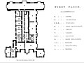 First floor


.svg)
.svg)


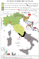 Map of the Italian Social Republic
![[1]](http://www.ling.upenn.edu/courses/Fall_2007/ling001/gvs.gif)
![[3]](http://www.dsl.ac.uk/images/fig1-w700.png)
![[4]](https://upload.wikimedia.org/wikipedia/en/1/18/West_Germanic_languages_%28simplified%29.png)
.jpg)
 SVG Vectorized version