
Wikipedia:Graphics Lab/Illustration workshop/Archive/Nov 2014
Presidential seal of South Kasai[edit]
-
 JPG version
 -

 Done
Done


Article(s): South Kasai
Request:
- Please vectorize... -- Antemister (talk) 12:21, 1 November 2014 (UTC)
- OK, but one issue remains: The font! Does anyone here know one that is more suitable here?--Antemister (talk) 13:26, 2 November 2014 (UTC)
- The difficulty being that the image is such low resolution and ill-defined that I have no idea what the font is other than it being a sans-serif font. I can't even tell if it's a 'rounded' font or that it just looks that way because of a) low quality scan or b) ink bleed on the original document, or both. So I went with Myriad Pro (the default font for AI18) for the pathed circular text, and Liberation Sans for the centre text just to keep the file size down, ie for totally arbitrary reasons given that I couldn't identify the font. I would hazard a guess that it's some variant of Helvetica or Frutiger or similar, but all things considered it would still be an arbitrary choice. The other suspicion I have is that given the lack of sophistication shown in the seal that other official versions would have different fonts too. --207.207.22.187 (talk) 15:42, 2 November 2014 (UTC)
- OK, but one issue remains: The font! Does anyone here know one that is more suitable here?--Antemister (talk) 13:26, 2 November 2014 (UTC)
- [1], Liberation Sans Narrow looks different. I guess it is HEROIC, posibly with condensed filter or DIN MIttelschrift known from German road signs, looks similar. --Hans Haase (talk) 14:15, 9 November 2014 (UTC)
Graphist opinion(s):
Illustration of a patched function for the kpatch article[edit]
-
 Linux kernel live patching kpatch

Article(s): kpatch
Request:
- Please have a look at this YouTube video – in 2:07 there's a great illustration of how kpatch works internally by "routing around" old functions. This illustration would be a really excellent addition to the article. Based on the content this illustration depicts, I'd say that we should have no copyright issues.
- Just as a note, the illustration, as a single SVG drawing, should contain all that's visible in 2:07 – minus the "Dynamic Kernel Patching Overview" title and "Red Hat Enterprise..." footer, of course.
- Thoughts? Of course, I'm here for all additional questions. Thank you in advance! — Dsimic (talk | contribs) 12:37, 7 November 2014 (UTC)
Graphist opinion(s):
 Request taken by --Victor•talk 06:21, 8 November 2014 (UTC).
- Done. --Victor•talk 15:00, 11 November 2014 (UTC).
- Looks awesome, thank you very much! — Dsimic (talk | contribs) 17:43, 11 November 2014 (UTC)
- A small fix would be required, please have a look at File talk:Linux kernel live patching kpatch.svg § Small fix required for more details. Thank you in advance. — Dsimic (talk | contribs) 23:39, 11 November 2014 (UTC)
- Looks awesome, thank you very much! — Dsimic (talk | contribs) 17:43, 11 November 2014 (UTC)
"World views" illustrations for the kGraft article[edit]
-
 Linux kernel live patching kGraft (1 of 3).
Will fix problem with MediaWiki's PNG prewiew rendering (dotted lines as solid). -
 Linux kernel live patching kGraft (2 of 3).
 -
 Linux kernel live patching kGraft (3 of 3).


Article(s): kGraft
Request:
- Please have a look at this PDF file – on pages 14, 15 and 17 there are three great illustrations of how kGraft works internally by providing different "world views" etc. Those three illustrations would be a really excellent addition to the article. Based on the content these illustrations depict, I'd say that we should have no copyright issues.
- Just as an unnecessary note, obviously there should be three separate SVG drawings. :)
- Thoughts? Of course, I'm here for all additional questions. Thank you in advance! — Dsimic (talk | contribs) 12:53, 7 November 2014 (UTC)
Graphist opinion(s):
- Request taken. --Victor•talk 06:24, 8 November 2014 (UTC)
- @Dsimic: Should I include "BOOM!" in red? (p.14) --Victor•talk 06:36, 8 November 2014 (UTC)
- That "BOOM!" does look a bit childish, but it's quite important as the scenario it's mentioned in is what "world views" actually prevent in order to ensure consistency. In other words, yes, please, include it; maybe we could use "FAIL!" instead, or something similar? By the way, I'd say that we should ditch the "Comic Sans" style and convert the illustrations into a more formal style, with straight lines and a regular sans font. Hope you agree. — Dsimic (talk | contribs) 06:46, 8 November 2014 (UTC)
- @Dsimic: Should I include "BOOM!" in red? (p.14) --Victor•talk 06:36, 8 November 2014 (UTC)
As a small suggestion, how about going with a completely transparent background, and separating userspace and kernel space with a horizontal line or something similar? Just as it might look a bit better that way. Thoughts? — Dsimic (talk | contribs) 00:33, 12 November 2014 (UTC)
- Let's try light gray, dotted lines also fixed. --Victor•talk 19:04, 13 November 2014 (UTC).
- Thanks, this shade of gray looks much better. — Dsimic (talk | contribs) 19:14, 13 November 2014 (UTC)
- Done. --Victor•talk 05:08, 14 November 2014 (UTC).
- Thank you very much! Here are a few small things that should be fixed:
- In File:Linux kernel live patching kGraft1.svg, "kernel_func" box should be made a bit taller (with the middle dotted arrow extended, of course), so the arrows pointing to and from the "fixed_func" box on the right are exactly above and below the second invocation of "buggy_func()", just as it's already the case for its first invocation.
- In File:Linux kernel live patching kGraft2.svg, arrows that point to the right of "kernel_func" box and back to it should be right above and below the invocation of "buggy_func()". That way, it will be clear that the reality check is performed exactly when the buggy function is invoked. At the same time, '"new universe" flag set" should be changed to 'per-process "new universe" flags', as the flags are actually set upon exiting back to userspace, so making it independent in that way (and even more informative) should be better.
- Similarly, in File:Linux kernel live patching kGraft3.svg arrows that point to the right of "kernel_func" box and back to it should be right above and below the invocation of "buggy_func()".
- Applying those fixes would be highly appreciated. — Dsimic (talk | contribs) 06:47, 14 November 2014 (UTC)
- Thank you very much! Here are a few small things that should be fixed:
- Done. --Victor•talk 05:08, 14 November 2014 (UTC).
- Thanks, this shade of gray looks much better. — Dsimic (talk | contribs) 19:14, 13 November 2014 (UTC)
Is there a volunteer animator in the house? (for a Google-y SpaceX-y huge satellite constellation)[edit]
-
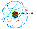 This is the legacy incorrect visual used in the article today. It is a visual example of the much-smaller 24-satellite Global Positioning System constellation in motion with the Earth rotating, and moreover, the sats in WorldVu are not orbiting at the inclinations that GPS uses which are shown in this animation, nor at the high-altitudes fo the GPS satellites.
 -
I can't post the rather more desirable image, as it is not licensed for use on WP. You can see it if you go to this link.

Article(s): WorldVu satellite constellation
Request:
- The image currently used in the article is an (incorrect) animated graphic of 24 GPS satellites orbiting around Earth, just to give some rough idea of moving satellites covering different parts of the surface of the Earth. This is totally the wrong image however, as the satellite constellation proposed for the WorldVu satellite constellation will have 360 satellites in it (not 24), the geometric angles of inclination will not be at all like the existing GPS constellation, and the orbital altitude will be much lower for the WorldVu constellation, not the very high altitude of the GPS sats.
- (Full disclosure, I am the one who added that incorrect image as a best effort attempt to help the reader grok just a bit of what is being described in that article, when that article was initially created many months ago.)
- I would like to request that a Wikigraphist with the right interest and skills make a new animation, one that properly illustrates this particular constellation, or maybe illustrates just the first chunk of 180 (which should make the animation less busy) orbital satellites that would provide broadband internet service to Earth's surface. Here is a non-free image that is a much closer illustration of how the WorldVu constellation will operate.
- If helpful, I would be happy to consult/assist; for example, I could help a Wikigraphist understand how the celestial mechanics and orbital trajectories work with a rotating Earth to give moving zones of satellite-based broadband internet coverage, and get the angles and orbital altitudes right, etc.
- Are there any volunteers who might find this an interesting challenge? Cheers — N2e (talk) 04:56, 9 November 2014 (UTC)
- BTW, another editor (User:LowLevel73), just wrote me to say that this open source software tool for Satellite Visualizaton might be helpful. I know nothing about this software tool, but the description page does look like it might enable an animator to rather straightforwardly illustrate satellites in Earth orbit. N2e (talk) 14:29, 9 November 2014 (UTC)
Graphist opinion(s):
The King's school, Gloucester Logo[edit]
Article(s): The King's School, Gloucester
Request:
- Details of your request go here... -- 81.170.78.79 (talk) 20:41, 10 November 2014 (UTC) Can you update the logo for The King's School, Gloucester article as it is out of date? An example of the current one can be found here: http://www.blueskyuk.com/wp-content/uploads/2013/01/Kings-600.jpg or from the left-hand section of http://www.thekingsschool.co.uk/uf/00132_840152d19b83/themes/kings_school/images/logo.png.
Sorry if I've not done this quite right, I'm new here!
81.170.78.79 (talk) 20:41, 10 November 2014 (UTC)Colin
Graphist opinion(s):
Simon I[edit]
Article(s): Simon I of Kartli
Request:
- Please SVG vectorize this signature. Jaqeli 23:45, 13 November 2014 (UTC)
Graphist opinion(s):
- Request taken by Ebisan.Ekperigin (talk) 09:02, 27 November 2014 (UTC).:
CDN[edit]
Article(s): Content delivery network
Request:
- Pretty scheme (like this)--Kopiersperre (talk) 15:52, 14 November 2014 (UTC)
Graphist opinion(s):
TALEN[edit]
-
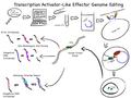 pdf
pdf -
 svg with embedded pngs
 -
 true svg (still nasty)


Article(s): Transcription activator-like effector nuclease
Request:
- May some redraw the SVG?--Kopiersperre (talk) 13:55, 15 November 2014 (UTC)
Graphist opinion(s):
- I have converted the PDF to SVG with Inkscape and reuploaded as "TALEN copy.svg". The font is different (the original was silly anyway), but otherwise it looks fine... — Mikhail Ryazanov (talk) 21:55, 29 April 2015 (UTC)
Egyptian Army[edit]

Article(s): Egyptian Army
Request:
- please remove vast unnecessary deadspace... -- Kintetsubuffalo (talk) 10:49, 17 November 2014 (UTC)
Graphist opinion(s):
- Done I also despeckled the transparency (it had random white pixels around the hat) and anti-aliased the hat outline. MjolnirPants Tell me all about it. 15:27, 17 November 2014 (UTC)
- Fantastic, thank you!--Kintetsubuffalo (talk) 10:28, 20 November 2014 (UTC)
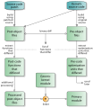
A high-level overview of Linux kernel's kdump inner workings[edit]
-
 kdump
kdump

Article(s): kdump (Linux)
Request:
- Please have a look at this PDF file – on page 10 there's a neat illustration of how Linux kernel's kdump works internally by using kexec to start a new Linux kernel etc. This illustration would be a great addition to the article. Based on the content this illustration depicts, I'd say that we should have no copyright issues.
- Just as a note, there's no need to capitalize all words in labels on this illustration – capitalizing only the first word would be just fine (for example, "Capture kernel" instead of "Capture Kernel"). Also, "Kexec Enabled Boot" should be written as "kexec-enabled boot". Additionally, "/proc/vmcore", "panic()", "gdb", "cp", "dd", "ftp", "scp" and "initrd" should all use a monospace font.
- Thoughts? Of course, I'm here for all additional questions. Thank you in advance! — Dsimic (talk | contribs) 11:19, 18 November 2014 (UTC)
Graphist opinion(s):
- Request taken by --Victor•talk 12:05, 18 November 2014 (UTC).
- Done. --Victor•talk 03:31, 19 November 2014 (UTC).
- Q: Is it Dump-capture kernel (as in the article) or Capture kernel?
- It looks great, thank you very much! It's awesome that you've changed a label to "dump-capture kernel", so it flows consistently with the article!
- A small adjustment could be to use sans-serif font for "Alt-Sysrq-c", and to write it as "Alt+SysRq+C" – for a combination of keypresses, a sans-serif font should fit better. Sorry for not mentioning that in the initial request. Also, we could have spaces after commas in "cp, dd" and "scp, ftp", following the standard way for using punctuation. Hope you agree. — Dsimic (talk | contribs) 03:54, 19 November 2014 (UTC)
- Q: Is it Dump-capture kernel (as in the article) or Capture kernel?
- Done. --Victor•talk 03:31, 19 November 2014 (UTC).
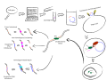
A high-level overview of Ksplice's hot patches generation[edit]
-
 Ksplice

Article(s): Ksplice
Request:
- Please have a look at this PDF file – on page 3 there's a nice illustration of how Ksplice generates hot patches. This illustration would be a really great addition to the article. Based on the content this illustration depicts, I'd say that we should have no copyright issues.
- Just as a note, we might want to capitalize first words in various labels, such as "Source code patch" etc. Also, "post code", "pre code", "post object" and "pre object" should be written hyphenated, as "post-code" etc.
- Thoughts? Of course, I'm here for all additional questions. Thank you in advance! — Dsimic (talk | contribs) 11:45, 18 November 2014 (UTC)
Graphist opinion(s):
- Request taken by --Victor•talk 12:06, 18 November 2014 (UTC)..
- Done. --Victor•talk 18:22, 23 November 2014 (UTC).
- Q: Is it ...differed or ...differ or both?
- (And I will fix white box in the ceter. --Victor•talk 18:29, 23 November 2014 (UTC))
- Looks great, thank you very much! Regarding "differ" vs. "differed", it might be the best to leave it as-is, because "differed" is used to describe the next step so it refers to something in the previous step, while "differ" is used to describe already established diffs. Of course, it's all just a matter of fine details and using only a single form would also fit, but it might be easiest to just keep the current version. :) — Dsimic (talk | contribs) 22:23, 23 November 2014 (UTC)
- (And I will fix white box in the ceter. --Victor•talk 18:29, 23 November 2014 (UTC))
- Q: Is it ...differed or ...differ or both?
- Done. --Victor•talk 18:22, 23 November 2014 (UTC).
Please Convert [[File:HTC One V Logo.jpg]] to SVG[edit]
-
 HTC One V Logo
 -
 SVG
SVG
Article(s): HTC One V
Request:
- Please make this file SVG for use at HTC One V. Also the correct color scheme is HERE EoRdE6 (talk) 19:57, 19 November 2014 (UTC)
Graphist opinion(s):
- Done. ///EuroCarGT 21:54, 20 November 2014 (UTC)
Discovery Kids[edit]

Article(s): Discovery Kids (Asia), Discovery Kids (Australia), Discovery Kids (Latin America)
Request:
- The logo of DK should be redone. -- John123521 (Talk-Contib.) RA 14:13, 20 November 2014 (UTC)
Graphist opinion(s):
- Request taken by tianazhangTianazhang (talk) 08:51, 27 November 2014 (UTC).
- DoneTianazhang (talk) 08:54, 4 December 2014 (UTC)
SATA Express logo[edit]
- Article(s)
- SATA Express
- Request
- Please have a look at this PDF file – on page 9 there's the SATA Express logo, which would serve very well in the article's infobox. Also, please have a look at File:Serial ATA.svg, as it might be used as a basis for this new logo; I'm not sure whether reusing that would be helpful or not, so I apologize in advance.
- I'm not sure about any possible copyright issues, but as we already have the Serial ATA logo as a SVG drawing, having the SATA Express logo as well shouldn't pose any problems.
- Thoughts? Of course, I'm here for all additional questions. Thank you in advance! — Dsimic (talk | contribs) 22:00, 20 November 2014 (UTC)
High-level overview of the SATA Express software architecture[edit]
-
 SATA Express interface

- Article(s)
- SATA Express and M.2
- Request
- Please have a look at this PDF file – on page 4 there's an excellent illustration of how SATA Express supports both SATA and PCI Express storage devices, through both AHCI and NVM Express logical device interfaces. This illustration would be a truly awesome addition to SATA Express and M.2 articles. Based on the content this illustration depicts, I'd say that we should have no copyright issues.
- Just as a note, the illustration should use "PCI Express" instead of "PCIe", "NVM Express" instead of "NVMe", "Applications" instead of "Apps", and "Operating system" instead of "OS". Also, there's no need to capitalize all words in labels on this illustration – capitalizing only the first word would be just fine (for example, "Upper driver layers" instead of "Upper Driver Layers"). Also, "SATA Phy" and "PCIe Phy" should be written as "SATA PHY" and "PCI Express PHY", respectively. Lastly, "Host Chip Set" should be written as "Host chipset", making "chipset" a single word.
- Thoughts? Of course, I'm here for all additional questions. Thank you in advance! — Dsimic (talk | contribs) 11:45, 21 November 2014 (UTC)
- Graphist opinion(s)
- Request taken by --Victor•talk 22:55, 20 November 2014 (UTC).
- Done, will fix problem with MediaWiki's PNG prewiew rendering. --Victor•talk 04:29, 29 November 2014 (UTC).
- Done --Victor•talk 06:55, 29 November 2014 (UTC).
- Looks great, thank you very much! There are only a few small suggestions:
- SATA Express connector should be expressed as a bare box instead of as an edge connector depiction, as there's also a plug-and-socket type of connector available (one on the left in File:SATA Express motherboard connection.svg). Just as a thought, maybe you could include very small depictions of both types of connectors inside that bare box?
- "AHCI driver" and "AHCI controller" boxes should have a different shade of color than "PCI Express root port", "PCI Express PHY", "PCI Express link" and "PCI Express transport" boxes, as they're not directly related. The currently used color for the "SATA Express / AHCI" path matches well the color used for "AHCI driver" and "AHCI controller" boxes, so changing the color for other four boxes should be a quicker option.
- If possible, it would be good to write "host bus adapter" instead of "HBA", and I apologize for not including that in the initial request description.
- Once again, thank you! — Dsimic (talk | contribs) 07:02, 29 November 2014 (UTC)
- Looks great, thank you very much! There are only a few small suggestions:
- Done --Victor•talk 06:55, 29 November 2014 (UTC).
- Done, will fix problem with MediaWiki's PNG prewiew rendering. --Victor•talk 04:29, 29 November 2014 (UTC).
Scouts de Argentina[edit]

- Article(s)
- Scouts de Argentina
- Request
- please redraw hands and lighten blue per File:Coat of arms of Argentina.svg -- Kintetsubuffalo (talk) 00:25, 22 November 2014 (UTC)
- Graphist opinion(s)
- Done. --Victor•talk 03:05, 22 November 2014 (UTC).
- Thank you again!--Kintetsubuffalo (talk) 12:11, 23 November 2014 (UTC)
Skelly oil[edit]
 |
 |
- Article(s)
- Skelly Oil
- Request
- png or svg version, please… -- Kintetsubuffalo (talk) 10:38, 22 November 2014 (UTC)
- Thanks for catching the typos! I have now fixed the filename.--Kintetsubuffalo (talk) 13:22, 22 November 2014 (UTC)
- Graphist opinion(s)
- Also rotated 2° CW.
- Great, thank you!--Kintetsubuffalo (talk) 12:24, 23 November 2014 (UTC)
Translation in dutch of File:History_of_Indonesia.png[edit]
-
 Description of first image
 -
 In Dutch


- Article(s)
- Zijbalk geschiedenis Indonesië
- Request
- Please make a translation of the text "History of Indonesia"; it should read "Geschiedenis van Indonesië". Thank you! Tekstman (talk) 20:26, 22 November 2014 (UTC)
A high-level overview of Ceph's inner workings[edit]
-
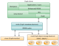 Ceph components

- Article(s)
- Ceph (software)
- Request
- Please have a look at this web page and this picture in particular – that's a great high-level illustration of how Ceph works as a distributed storage system. This illustration would be a really great addition to the article. Based on the content this illustration depicts, I'd say that we should have no copyright issues.
- Thoughts? Of course, I'm here for all additional questions. Thank you in advance! — Dsimic (talk | contribs) 12:17, 23 November 2014 (UTC)
Help imrove[edit]

- Article(s)
- Bay (shelving)
- Request
- Please help create a more realistic and in colour image. It is meant to be a bookshelf. By realistic, I don't mean photorealistic. I mean make it resemble more of a bookshelf. Also please add info about the rows. -- Hipposcrashed (talk) 20:02, 23 November 2014 (UTC)
- Graphist opinion(s)
![]() Request taken by Goran tek-en (talk) 18:57, 30 November 2014 (UTC).
Request taken by Goran tek-en (talk) 18:57, 30 November 2014 (UTC).
- Now there is a draft for you to look at draft bookshelf and then give me feedback on it. You are the one who knows what you want, I'm the tool so be honest. I'm not sure what you meant with rows so I did this. --Goran tek-en (talk) 20:10, 1 December 2014 (UTC)
- Thank you, that looks fine.--Hipposcrashed (talk) 16:47, 2 December 2014 (UTC)
- Do you want me to replace your version on commons or as a new file?
- It needs a category at commons, which?
- It's great if you sign your post with 4 tilde signs, thanks --Goran tek-en (talk) 12:39, 2 December 2014 (UTC)
- Put it in the Shelves category and you can replace the image if you want.--Hipposcrashed (talk) 16:51, 2 December 2014 (UTC)
- Thank you, that looks fine.--Hipposcrashed (talk) 16:47, 2 December 2014 (UTC)
@V4711: You should not have uploaded that image as it was a DRAFT. I have uploaded the final image now. --Goran tek-en (talk) 17:25, 3 December 2014 (UTC)
![]() Done
Done
Chitral[edit]
-

-
 it appears to have contributed elements to this flag


- Article(s)
- Chitral
- Request
- please make a Wiki-worthy png or svg… I will try and collect the elements as best I can-- Kintetsubuffalo (talk) 05:08, 24 November 2014 (UTC)
- Looks like it reads "چترال"--Kintetsubuffalo (talk) 05:10, 24 November 2014 (UTC)
- Found a tiny bit more. Per https://en.wikipedia.org/wiki/Chitral_%28princely_state%29#The_State_Flag , The state flag of Chitral was triangular in shape and pale green in colour. The wider side of the pennant depicted a mountain, most likely the Terich Mir peak.--Kintetsubuffalo (talk) 16:15, 24 November 2014 (UTC)
- Graphist opinion(s)
Staggered tuning[edit]
- Request
- I have a file created with the function plotter extension of Inkscape that has a bit of a problem. It displays fine in Inkscape but on attempting to upload it, the upload form crashes. It crashes right after the source file is selected while it is trying to generate the thumbnail and before I have entered the description or clicked the upload button. If I try and display it in my browser, my browswer crashes. If I try to run it through SVG Cleaner, SVG Cleaner crashes. If I try to export it as a bitmap from Inkscape, Inkscape crashes. If anyone thinks they can fix this toxic file, you will have to e-mail me because there doesn't seem to be any way to upload it. I might put a screen-scraped bitmap image in the article as a placeholder so you can see what it is supposed to look like; file name will be File:Synchronous_tuning_plot.jpg. SpinningSpark 18:07, 24 November 2014 (UTC)
- I have pasted the svg file code into User:Spinningspark/Sandbox2. SpinningSpark 19:27, 24 November 2014 (UTC)
- Graphist opinion(s)
- The W3 Validator shows the file is a valid SVG. Jarry's SVG Check does not crash, but does not render anything either, and returns a lot of warnings relating to the fonts used in the file:
Line  79: *Warning* You appear to have specified a font that does not exist on Wikimedia wikis.
Line  79: *Warning* You should define a fallback font type, which should not be placed in quote marks and should be in lower case.
	Allowable types are serif, sans-serif, cursive, fantasy and monospace.
- However, what I think causes most programs to crash while loading the file are the huge coordinates used for the three dashed paths: over 1e18 pixels. Since they are outside the viewBox and thus invisible anyway, I suggest just removing those. While the IDs are not necessary, it seems unlikely to me that their presence causes any problems. SiBr4 (talk) 20:39, 24 November 2014 (UTC)
- What dashed paths? Are you sure you are looking at the right file? There are three dashed paths in the circuit diagram, but that is not giving me any problems. I can't see anything outside the viewbox in the synchronous tuned plot. Are they still there in the current (uploaded) version? If so, could you remove them for me please as I can't find them. SpinningSpark 23:09, 24 November 2014 (UTC)
- In the SVG code in your sandbox, it's the first three path elements, right after the white background rectangle. The uploaded file does not have them. SiBr4 (talk) 10:33, 25 November 2014 (UTC)
- What dashed paths? Are you sure you are looking at the right file? There are three dashed paths in the circuit diagram, but that is not giving me any problems. I can't see anything outside the viewbox in the synchronous tuned plot. Are they still there in the current (uploaded) version? If so, could you remove them for me please as I can't find them. SpinningSpark 23:09, 24 November 2014 (UTC)
- Helpful (I hope) lurker here: I added mediawiki syntax highlighting to the code in your sandbox. It should make it easier to read and copy by highlighting the syntax, wrapping overflow and numbering the lines. Hope it helps some. MjolnirPants Tell me all about it. 18:26, 23 December 2014 (UTC)
Windows Family Tree[edit]
-
up-to-date PNG
-
 updated
May someone update the SVG?--Kopiersperre (talk) 23:41, 24 November 2014 (UTC)
2014 AFF Championship Logo[edit]
- Article(s)
- 2014 AFF Championship
- Request
- Help! Can someone fix the number 4? I don't know how to fix it anymore. ~ Muffin Wizard ;) 08:31, 26 November 2014 (UTC)
- Graphist opinion(s)
I'll give this a shot. ///EuroCarGT 21:11, 26 November 2014 (UTC)
- Done. ///EuroCarGT 21:40, 26 November 2014 (UTC)
- Thank you! But may I know how did you extract the logo from PDF file? Is it can be done using Inkscape? ~ Muffin Wizard ;) 00:26, 27 November 2014 (UTC)
- Yeah, it's quite easy, there are plenty of videos and tutorials out there on Inkscape. ///EuroCarGT 04:27, 27 November 2014 (UTC)
- Thank you! But may I know how did you extract the logo from PDF file? Is it can be done using Inkscape? ~ Muffin Wizard ;) 00:26, 27 November 2014 (UTC)
Twelve Symbols national emblem[edit]
-
 Old version
 -
 My rendition (Sodacan)


- Article(s)
- Twelve Symbols national emblem
- Request
- The image is a start, but there are many details missing or incorrect. The plummage of the phoenix should be much more detailed. The red four letters at the bottom need to have a profiled surface. The moon behind the dragon's head is not really discernible, it should be a proper crescent. The dragon also seems to be missing his right horn. Something is odd with the snout of the dragon and his two whiskers, they should be in extending in front of him, also the beard is incomplete. Please compare to this image File:China Qing Dynasty Flag 1889.svg. The red sign at the top between the heads of the phoenix and the dragon is not properly drawn, it looks as if a circle was placed on top of a square. The phoenix is not grasping the cup properly, it looks superimposed. The weed it is holding in its beak and talons should be more detailed, it's a seaweed or algae. The three stars on top of its head interconnected cannot have the same colour as the crest of the bird. The crest should either be same colour as the phoenix, and also more detailed plummage is necessary. The pupil of the phoenix should be centric and a bit more fierce looking. The golden ribbons at the bottom should be more three-dimensional with shadows. Please see the original images, which illustrate my points [2], [3], [4], [5]. Thank you. -- Gryffindor (talk) 15:07, 27 November 2014 (UTC)
- Graphist opinion(s)
![]() Request taken by Sodacan (talk) 01:14, 30 November 2014 (UTC).
Request taken by Sodacan (talk) 01:14, 30 November 2014 (UTC).
- Would like some input from Gryffindor on the new image before I sign off. The colours are based on my own guess work, any further suggestions and help would be greatly appreciated. Sodacan (talk) 07:29, 3 December 2014 (UTC)
- Hi Sodacan, I am impressed. The crescent moon should probably be white or silver, as well as the interconnected three stars above the phoenix's head. The pattern of the plumage on the main body of the phoenix looks a bit rhombic or lozenge, could we have more flowing or detailed feathers, as seen on the coins? The whites of the eyes of the phoenix look yellow, they should be white please. I would think that below the stem of the cups there should be a tiny circular foot, otherwise the vessels would fall over if put down on a table. I thought I saw a foot when you see here on the dragon's side [6]. I don't know how it is showing on your monitor, but maybe colour saturation could be lowered a couple of notches to be similar to the original image, at the moment the colours are too strong. About the red 亞-looking symbol at the bottom, I am under the impression the distances between each other might be just a tad bit too little, but I could be wrong. I like the frame inside the figures, however I think there should be very light lateral stripes or etching marks going from top left to bottom right, see this coin for example [7]. I have also left a message on User:Ericmetro's talk page to help us with the colours of the phoenix, it seems to be rather more complex. Thank you. Gryffindor (talk) 10:27, 3 December 2014 (UTC)
- I have uploaded an new version with your suggestions. Firstly I did not look at the previous version at all, I drew everything on top of the coin and traced as much detail as I could into the new image (I don’t like cut and pasting different images; all new elements). Assuming that User:Ericmetro has as much original sources as I did, I decided not to put my trust in him concerning the colours and made my own educated guesses. The phoenix should have more than three colours, most often green, yellow and red. The bright colours reflect the palette that is used in Chinese art, in particular in silk embroidery. Bright primary colours all have meaning in Chinese art and symbology. The rhomboid shapes on the phoenix were my attempt at renditioning feathers (they actually do look rhomboid; i.e. this Chinese Pheasant). The other version I did, which is more similar to the texture on the coin is not as pretty, but I can change it if you insist.
- The bird-like animal on the left actually is common pheasant (华虫/雉鸡) instead of phoenix. Unfortunately I didn't find any origional coloured image of the emblem. However the twelve symbols are widely used on early occasions of the Republic of China. One close source for the possible colour is an official invitation of the first presidential inauguration: [10]. Some orders also have this patterns: [11] [12]. It seems the goblets were more likely to be white or silver. The features are also a bit more complex.
- As for the colour of the common pheasant, my previous source of the green color was taken from a movie [13], but this modern rendition is obvious not accurate in many details, as well as this early printed version [14]. I created File:Commander-in-Chief Flag of the Republic of China (Beiyang Government).svg based on the origional invitation of the first presidential inauguration, which was mainly in blue/violet, with purple/pink feather on its back.
- Also some my personal opinion, it seems to me the colours are a bit strong, espeacially the ribbons. I think a bit pale yellow like the previous version could also be an opition. :) --Ericmetro (talk) 14:04, 3 December 2014 (UTC)
- Hi Ericmetro, thank you for your information. Just to correct that, the bird shown is a fenghuang (鳳凰), which can be literally translated from Chinese as "pheasant", however since it is a mythological bird comes closer to a phoenix in English translation. It is not a common pheasant however. Gryffindor (talk) 14:28, 3 December 2014 (UTC)
- Also some my personal opinion, it seems to me the colours are a bit strong, espeacially the ribbons. I think a bit pale yellow like the previous version could also be an opition. :) --Ericmetro (talk) 14:04, 3 December 2014 (UTC)
- Thanks Ericmetro! I fixed the ribbon so that it lies on top of the axe now. Sodacan (talk) 14:29, 3 December 2014 (UTC)
- Thank you Sodacan. I didn't know you drew everything basically from scratch. Yes, could we please see the phoenix with the detailed plumage so that we can compare? I just think it would be best to be as closely possible to the coin image. Colours traditionally employed for its feathers contain the five holy colours or the elements: black, white, red, blue and yellow, just like in the Five Races Under One Union national flag. The head is green, the neck white, the back red, the breast black and the talons yellow. Gryffindor (talk) 15:55, 3 December 2014 (UTC)
- Thanks Ericmetro! I fixed the ribbon so that it lies on top of the axe now. Sodacan (talk) 14:29, 3 December 2014 (UTC)
- I just found Dmitri Kessel, a photographer of Life magazine visited Beijing in 1946, and took a series of colored photos of Beijing. In one of his photo contains the throne in the imperial palace. It was still the one Yuan Shikai used during the short lived Chinese Empire, with the twelve symbols national emblem in the center. This throne could provide some information for the colour of the emblem. I also find some other current photo of the throne. [15], [16], [17]. [18] --Ericmetro (talk) 15:58, 3 December 2014 (UTC)
- Alright, this is what I would suggest: @Sodacan, could we please just have a black and white image of the emblem? Please change the plumage from rhomboid to more natural to reflect how it appears on the coin. @Ericmetro, the images of the throne are great, I am assuming it is always showing the same object, just in different times and places? Is the latter one now in a museum? Please try to find as many colour images of the emblem and then we'll revisit it here? I would like to avoid Sodacan going through unnecessary work first. Gryffindor (talk) 21:11, 3 December 2014 (UTC)
- I just found Dmitri Kessel, a photographer of Life magazine visited Beijing in 1946, and took a series of colored photos of Beijing. In one of his photo contains the throne in the imperial palace. It was still the one Yuan Shikai used during the short lived Chinese Empire, with the twelve symbols national emblem in the center. This throne could provide some information for the colour of the emblem. I also find some other current photo of the throne. [15], [16], [17]. [18] --Ericmetro (talk) 15:58, 3 December 2014 (UTC)
- It seems the 1946 throne photo is the only possible colour image for the emblem by the time being, as I hardly find any colour photos. (@Gryffindor, yes the latter one is the same object in a museum, but the emblem is removed currently for its poor condition).
- However, I have found the 1914 version of official formal dress for commemorating rituals of the Republic of China and some actual photos. The embroidery followed traditional symbol system of Twelve Ornaments with the newly Republican style. I found the colour of the bird-like animal is accordant with the one on 1946 throne photo. These could be a great source for our research: [19], [20], [21], [22], [23]. --Ericmetro (talk) 08:01, 7 December 2014 (UTC)
- Hi Ericmetro, that's very useful information, we should use it. For the image of the throne, I think it looks like a plastic cover was put on top of the emblem to protect it, I am not quite sure if it was removed. Are you able to find out in which museum the throne is kept now, and maybe if they have an image or photo of it or give us a better description? Thank you. Gryffindor (talk) 14:51, 9 December 2014 (UTC)
- The throne was poorly kept. The current situation of the throne can be seen here: [24]. It seems the emblem was removed at the museum. Here're a few other photos of the throne:[25][26][27]. As there is little information for the emblem, the museum failed to recover the image.--Ericmetro (talk) 11:59, 16 December 2014 (UTC)
- Hi Ericmetro, that's very useful information, we should use it. For the image of the throne, I think it looks like a plastic cover was put on top of the emblem to protect it, I am not quite sure if it was removed. Are you able to find out in which museum the throne is kept now, and maybe if they have an image or photo of it or give us a better description? Thank you. Gryffindor (talk) 14:51, 9 December 2014 (UTC)
- However, I have found the 1914 version of official formal dress for commemorating rituals of the Republic of China and some actual photos. The embroidery followed traditional symbol system of Twelve Ornaments with the newly Republican style. I found the colour of the bird-like animal is accordant with the one on 1946 throne photo. These could be a great source for our research: [19], [20], [21], [22], [23]. --Ericmetro (talk) 08:01, 7 December 2014 (UTC)
Simple request ... put a star (given) in a fez (also given)[edit]
-
 Featured article star
 -
 Green fez
 -
 Here it is...


![[2]](http://farm4.static.flickr.com/3300/3522470580_c0bdd6ffea_o.jpg)
![[4]](http://www.shuobao.com/web/Member/UpLoad/2010/1/20/S2010120181622153.jpg)
![[5]](http://cdn.shuoqian.net/bigimg/56/56210d1c92cdd01271fba800e997e150.jpg)
![[8]](http://img8.mycollect.net/201109/08/2011090818032423068788.jpg)
![[9]](http://estimation.cang.com/201210/2012100914551952363000.jpg)
![[10]](http://1.im.guokr.com/gkimage/xb/qe/en/xbqeen.jpg)
![[11]](http://1.im.guokr.com/gkimage/qf/36/0g/qf360g.jpg)
![[12]](http://www.warsawto.net/bbs/attachment/22_482_aee8575db0be1bf.jpg)
![[13]](http://image.hnol.net/c/2011-12/27/10/201112271047059591-2278633.jpg)
.svg)
![[15]](http://imgsrc.baidu.com/forum/pic/item/b91b8794a4c27d1eac14e63a1bd5ad6edcc438c6.jpg)
![[16]](http://img1.ph.126.net/xI0DNr62iP4-vTfS1i2OGA==/6597968067655932801.jpg)
![[19]](http://pmgs.kongfz.cn/data/pre_show_pic/1/10/031.jpg)
![[20]](http://www.xn--rhtw9vlu4bfqe.tw/EastCapital/attachments/forumid_20/20080221_7bcab534dc512b20b229n0MEDC95k6YM.jpg)
![[21]](http://www.xn--rhtw9vlu4bfqe.tw/EastCapital/attachments/forumid_20/20080221_92b74f0301f6babc7ca7Q1o0x8ocaH35.jpg)
![[22]](http://www.xn--rhtw9vlu4bfqe.tw/EastCapital/attachments/forumid_20/20080221_c4e7908576948e87d16fgA7oEOFhQrn9.jpg)
![[23]](http://www.xn--rhtw9vlu4bfqe.tw/EastCapital/attachments/forumid_20/20080221_7f4c40650e14e2641e3ewvcqqK2ZAzTI.jpg)
![[24]](http://www.zghmgdjjw.com/uploadfile/2008101454394017.jpg)
![[25]](http://www.archives.sh.cn/wszl/qdl/images/33.jpg)
![[26]](http://www.archives.sh.cn/dalt/dary/201203/W020120313107467500951.jpg)
![[27]](http://www.zghmgdjjw.com/uploadfile/2008101454430205.jpg)
- Article(s)
- none (intended for user pages)
- Request
- I'm up for a promotion (or demotion?) to Today's Featured Article coord. I looked around and saw that the various FA coords don't have a suitable symbol available for their user pages. I suggest putting the star (given above) on the fez (also given).
- Graphist opinion(s)
![]() Done. ///EuroCarGT 04:34, 28 November 2014 (UTC)
Done. ///EuroCarGT 04:34, 28 November 2014 (UTC)
- Beautiful, thanks. - Dank (push to talk) 14:36, 28 November 2014 (UTC)
Star on top of logo.[edit]
 |
 |
- Article(s)
- Western Sydney Wanderers FC
- Request
- Please place the gold star on top of the logo, such as Brazil national football team or Red Star Belgrade. Thank you. -- Macktheknifeau (talk) 14:07, 29 November 2014 (UTC)
- Graphist opinion(s)
- Done. --Victor•talk 23:30, 29 November 2014 (UTC).
- I reverted the star addition as the star is not part of the logo per the source (official) page. Also, the source did not match the non-free image with the star. I hate reverting others' work, but if the requester is trying to create a new (non-free) logo, it definitely needs to have a source/reason and not just a simple request. If the requester will give a valid reason and source explaining the change, this can all of course be reconsidered. The Haz talk 00:59, 1 December 2014 (UTC)
- The reason is that the club has won a particular trophy, and has chosen to the star on their crest to represent it. It was officially unveiled last Saturday 29/12/2014. Thank you. Macktheknifeau (talk) 09:12, 1 December 2014 (UTC)
- @The Haz, see club's latest tweets: [28], [29]. --Victor•talk 06:02, 2 December 2014 (UTC).
- And have put it on their facebook page too. Macktheknifeau (talk) 07:37, 2 December 2014 (UTC)
- Thanks for the information. Their website (the source in the information template) still uses the logo without the star. If you're going to change the logo to one with the star you need to change the information template to match it (by changing the source). Or, find an article that explains their new version of their logo. It's not simply enough to update the image, especially a fair-use image, without correcting the source of the image or image information. Also, please feel free to change the source if you have one and revert the image yourself. I certainly would have no problem with that and I can't imagine that anyone else would. The Haz talk 03:50, 3 December 2014 (UTC)
- And have put it on their facebook page too. Macktheknifeau (talk) 07:37, 2 December 2014 (UTC)
- @The Haz, see club's latest tweets: [28], [29]. --Victor•talk 06:02, 2 December 2014 (UTC).
- The reason is that the club has won a particular trophy, and has chosen to the star on their crest to represent it. It was officially unveiled last Saturday 29/12/2014. Thank you. Macktheknifeau (talk) 09:12, 1 December 2014 (UTC)
- I reverted the star addition as the star is not part of the logo per the source (official) page. Also, the source did not match the non-free image with the star. I hate reverting others' work, but if the requester is trying to create a new (non-free) logo, it definitely needs to have a source/reason and not just a simple request. If the requester will give a valid reason and source explaining the change, this can all of course be reconsidered. The Haz talk 00:59, 1 December 2014 (UTC)
Image translation - File:Regular Durak.JPG[edit]
- Request
- For Durak, we have a photo of the game with Hebrew labels. I think we should have the image labels translated - at the left we have the deck; at the top, we have "Player 1" (labeled in blue), who is the "Initial attacker" (labeled in red); at the right, we have "Player 2" (blue), who is the "defender" (red); and at the bottom there is the "Player 3" (blue), who is an "Additional attacker" (red). עוד מישהו Od Mishehu 08:55, 30 November 2014 (UTC)
- Graphist opinion(s)
- Request taken by --Victor•talk 21:51, 30 November 2014 (UTC).