
Wikipedia:Graphics Lab/Images to improve/Archive/Jul 2008
 | This page, part of the Graphics Lab Wikiproject, is an archive of requests for July 2008. Please do not edit the contents of this page. You can submit new requests here. |
Stale
New Zealand COA
-
 Raster
 -
 Elements possibly from here,
 -
 and definitely here


Article(s): Several
Request: Vectorise please. Thanks -- Mangwanani (talk) 18:36, 3 June 2008 (UTC)
Graphist opinion: There's an outdated template on it as far as determining usage rights? The image seems to be different from what it originally was; vector-images.com has a different version (http://vector-images.com/image.php?epsid=76) and this is obviously not a .png version of that particular file. Where is the current version from?
Even contemplating vectorizing that makes me want to cry. >_< MissMJ (talk) 19:59, 3 June 2008 (UTC)
- The outdated template is the one that used to say "This is a raster from VI, and they allow free use of the rasters", however further enquiries into the situation produced such hopelessly contradictory replies that Commons just gave up and is attempting to get rid of them as fast as they can get new, free replacements for those images, hence the "this tag is obsolete" (Sorry if you already knew this).
- As to vectorization, the shield could possibly be done fairly easily (Easier than the supporters), and @least get the ball rolling? 68.39.174.238 (talk) 21:11, 3 June 2008 (UTC)
- Dunno, but if we get the Vector done then it won't matter... Mangwanani (talk) 16:58, 4 June 2008 (UTC)
- Ask user User:Avala on Commons and revert the image before it's deleted (Unsurprizingly, someone marked the new version as NSD!)!. 68.39.174.238 (talk) 21:35, 4 June 2008 (UTC)
- That would be me, the source has been fixed but I'm not convinced the licens is the right one since the latest version was created by the New Zealand government not the UK one. The best way to get around this is to create a free version based on the blasoning only. /Lokal_Profil 22:59, 4 June 2008 (UTC)
- Ask user User:Avala on Commons and revert the image before it's deleted (Unsurprizingly, someone marked the new version as NSD!)!. 68.39.174.238 (talk) 21:35, 4 June 2008 (UTC)
Arms: Quarterly, Azure and Gules on a Pale Argent three Lymphads (sailing vessels) Sable. In the first quarter four Mullets in cross of the last each surmounted by a Mullet of the second (representing the Constellation of the Southern Cross); in the second quarter a Fleece; in the third a Garb (wheat sheaf); and in the fourth two Mining Hammers in Saltire all Or.
Crest: On a Wreath of the Colours a demi-Lion rampant guardant Or supporting a flag-staff erect proper thereon flying to the sinister the Union Flag. Supporters: On the dexter side, a female figure proper vested Argent supporting in the dexter hand a Flag-staff proper, hoisted thereon the Ensign of the Dominion of New Zealand, and on the sinister side a Maori Rangatira vested proper holding in his dexter hand a Taiaha all proper.
Motto: Onward.
The present New Zealand arms are a 1956 revision of the 1911 design. The crest was changed to the Crown of St. Edward, the quarterings were redrawn, and the supporters, instead of facing the front, now faced each other. The motto was changed to “New Zealand”.
- Any takers? Mangwanani (talk) 16:15, 9 June 2008 (UTC)
Done. Sodacan (talk) 04:43, 28 March 2009 (UTC)

Personal Standard of Prince Albert II of Monaco
-
 Image:Albertii.gif Original image from Monaco web site

Article(s): Albert II, Prince of Monaco ; Flag of Monaco ; Gallery of flags with headgear
Request: The .png standard is derived from the original image. I think you cannot do anything about the princely crown, too small on the original but both "A"s are connected together in quite a different way. Can something be done about it ? Hektor (talk) 21:15, 9 June 2008 (UTC)
Graphist opinion::
How about an SVG? I can give it a go when I'm on the right computer later... Mangwanani (talk) 12:20, 10 June 2008 (UTC)
- I hate to be the one to bring it up, but the image is fair use so it shouldn't really be here... On the other hand I don't see that SVGifying it would do any harm. Time3000 (talk) 14:29, 10 June 2008 (UTC)
- What is the track record of fair use raster to svgs surviving? I would think it's clearly a violation of the terms of (fair) use, since you can scale it to any resolution you like. We had this discussion about the Interpol logo, and it didn't fly. Dhatfield (talk) 14:52, 10 June 2008 (UTC)
- Question A : The second file is in Commons, so it clearly is not fair use ? Or it should not be in Commons ? Or can we just correct the second file to the right shape, and keep it in .png format (no .svg) so that it remains non scalable... ?
- What is the track record of fair use raster to svgs surviving? I would think it's clearly a violation of the terms of (fair) use, since you can scale it to any resolution you like. We had this discussion about the Interpol logo, and it didn't fly. Dhatfield (talk) 14:52, 10 June 2008 (UTC)
- I hate to be the one to bring it up, but the image is fair use so it shouldn't really be here... On the other hand I don't see that SVGifying it would do any harm. Time3000 (talk) 14:29, 10 June 2008 (UTC)
| This fairuse image was uploaded in a raster image format such as PNG, GIF, or JPEG. However, it contains information that could be stored more efficiently and/or accurately in the SVG format, as a vector graphic. If possible, please upload an SVG version of this image. After doing so, please replace all instances of the previous version throughout Wikipedia (noted under the “File links” header), tag the old version with {{Vector version available|NewImage.svg}}, and remove this tag. For more information, see Wikipedia:Preparing images for upload. For assistance with converting to SVG, please see the Graphics Lab. |  |
- As far as I'm aware you can have SVG free use. Such images do exist on the wiki...Mangwanani (talk) 15:23, 10 June 2008 (UTC)
- I'm guessing the second file should not be on commons. There is no free way (i.e. non derivative) of doing the monogram. /Lokal_Profil 17:54, 10 June 2008 (UTC)
- If you are right, that it is forbidden to do a .SVG from a fair use .gif, the template above {{SVG|fairuse}} should be deleted, since it serves no purpose. Hektor (talk) 18:06, 10 June 2008 (UTC)
- All I'm saying is that an svg (or png) designed from a fair use image remains copyrighted by the copyright holder of the fair use image. Whether the new image qualifies for fair use or not I don't know. /Lokal_Profil 18:25, 10 June 2008 (UTC)
- So it is allowed to do a .png out of it, upload it on English language wikipedia claiming fair use - since it is non scalable contrary to .svg - , not uploading it to Commons ? Can I ask for that here ? and what about a .svg ? Hektor (talk) 18:30, 10 June 2008 (UTC)
- Just had a thought, could this be recreated in SVG freely in the similar style a flag or COA can be? What I'm thinking is of calling this a flag as surely, its used in that style, similar to the Queen's standard Mangwanani (talk) 18:51, 10 June 2008 (UTC)
- The differences between CoAs and this image is that CoAs are defined by a blazon. That means that a free version can be created from the blazon (not from an existing interpretation of it which is why Image:Coat of Arms of Iceland.svg is in trouble). Simply recreating an image in svg does not delink the svg image from the copyright of the original, this is why images such as Coat of Arms of Johannesburg above are in trouble. /Lokal_Profil 12:29, 11 June 2008 (UTC)
- As I understand it the template {{SVG|fairuse}} is indeed a completely pointless contradiction. "...information that could be stored more efficiently and/or accurately in the SVG format". While arguably technically true, functionally nonsense. The fair use rationale stipulates that the image must be low-res. So even if you make a vector version you still have to render it in low res. The "efficiency" difference between a 30kB PNG and a 20kB SVG is negligible, and the rendering resources needed for SVG do away with that benefit. Accuracy is irrelevant, because you still have to deliver it to the viewer at low accuracy (ie. low res). Someone could download it themselves and view it in high res, but then they'd be in violation of fair use. No matter which way you slice or dice it that template is an invitation to waste your time. Dhatfield (talk) 18:17, 11 June 2008 (UTC)
- The differences between CoAs and this image is that CoAs are defined by a blazon. That means that a free version can be created from the blazon (not from an existing interpretation of it which is why Image:Coat of Arms of Iceland.svg is in trouble). Simply recreating an image in svg does not delink the svg image from the copyright of the original, this is why images such as Coat of Arms of Johannesburg above are in trouble. /Lokal_Profil 12:29, 11 June 2008 (UTC)
- Just had a thought, could this be recreated in SVG freely in the similar style a flag or COA can be? What I'm thinking is of calling this a flag as surely, its used in that style, similar to the Queen's standard Mangwanani (talk) 18:51, 10 June 2008 (UTC)
- So it is allowed to do a .png out of it, upload it on English language wikipedia claiming fair use - since it is non scalable contrary to .svg - , not uploading it to Commons ? Can I ask for that here ? and what about a .svg ? Hektor (talk) 18:30, 10 June 2008 (UTC)
- All I'm saying is that an svg (or png) designed from a fair use image remains copyrighted by the copyright holder of the fair use image. Whether the new image qualifies for fair use or not I don't know. /Lokal_Profil 18:25, 10 June 2008 (UTC)
- If you are right, that it is forbidden to do a .SVG from a fair use .gif, the template above {{SVG|fairuse}} should be deleted, since it serves no purpose. Hektor (talk) 18:06, 10 June 2008 (UTC)
- I'm guessing the second file should not be on commons. There is no free way (i.e. non derivative) of doing the monogram. /Lokal_Profil 17:54, 10 June 2008 (UTC)
- As far as I'm aware you can have SVG free use. Such images do exist on the wiki...Mangwanani (talk) 15:23, 10 June 2008 (UTC)
 | This is a Scalable Vector Graphics (SVG) image of a registered trademark or copyrighted logo. If non-free content restrictions apply, this image should not be rendered any larger than is required for the purposes of identification and/or critical commentary. See Wikipedia:Logos. |
- That being said, I'd be most thankful if someone cares to produce a nice fair use .PNG of the standard of Prince Albert II. Hektor (talk) 18:27, 11 June 2008 (UTC)
- Find a blazon and create the image springs to mind, bearing in mind the cliché "easier said than done". The Joburg raster was uploaded by Flagmanbruce who says he is the FOTW Southern Africa administrator (for want of a better word). Mangwanani (talk) 19:41, 11 June 2008 (UTC)
- That being said, I'd be most thankful if someone cares to produce a nice fair use .PNG of the standard of Prince Albert II. Hektor (talk) 18:27, 11 June 2008 (UTC)
- But thats just the thing. Coat of arms (and coat of arms like flags) have a blasoning, logos and monograms normaly don't, thus making free versions of the impossible. The Joburg raster is the same as that here and is thus not an "original interpretation of the blason" but rather a copyrighted interpretation from 1997. The fact that Flagmanbruce has scanned it gives him no copyrightrelated rights. Thus since the new vector version are a derivative of these they are also copyrighted by whoever created the raster. In order to create a truly free image the new one would have to based only on heraldic rules and the text:
ARMS: Vert, a fret couped Or, the mascle voided Gules, between in chief and base respectively four shield thongs Argent; behind the shield a spine erect Or, plumed Sable.
SUPPORTERS: Two young lions Or, armed and langued Gules, each gorged of a beaded collar dancetty throughout Gules and Azure, the triangles fimbriated Or. SPECIAL COMPARTMENT: A ground, the flanks Azure and the centre Sable, separated from one another by means of narrow piles inverted, Argent.
MOTTO: UNITY IN DEVELOPMENT.
- The new image would have to be created without any regard to the "official" interreation in Image:Jhb Arms.jpg. As it is now the new vector versions (although nice and impressive) are fair use at best and should probably not be on Commons. /Lokal_Profil 22:07, 11 June 2008 (UTC)
Back to the Joburg Arms, it isn't entirely based on the raster. My trace obviously was but the rest of the work done by other users was an interpretation of the raster... Mangwanani (talk) 15:51, 12 June 2008 (UTC)
- I know it isn't entirely based on the raster (let's call it the "official interpretation") but both the trace and iterpretations of the "official interpretation" are processes which create works that are derivatives of the "official interpretation", and those covered by it's copyright. As an example if you watch all of the Star Wars movies and then draw a free hand sketch of the Millenium Falcon then that is stil a derivative of the copyrighted movies.
- What's needed in order to make the image free is basically that you completely forget about the "official interpretation" and do a new image based on the blazon only. As for the blazonings being written in code I wholehartedly agree, it's hard enough to understand them when they are written entierly in one language (swedish for the ones I've done) but the english ones always seem to contain about 50% french in them. There is a heraldic glossary somewhere on Wikipedia (lost the link) but to start I'd recommend asking one of the heraldicaly experienced editors to translate the description to plain english (e.g. SanchoPanzaXXI), after a while you'll start understanding the code.
- Anyhow this discussion (although important especially for a graphics lab) seems to have trailed of from the original discussion about the Monaco monogram. /Lokal_Profil 12:15, 13 June 2008 (UTC)
- But I speak French and I still don't get them. o_O Silly business this whole coat of arms thing is. MissMJ (talk) 21:59, 13 June 2008 (UTC)
- Template:Blazon Is a good starting point for translating the words. Yes CoAs are a complicated business but it's an oportunity to create freely licensed alternatives to copyrighted images which is always nice. /Lokal_Profil 00:00, 15 June 2008 (UTC)
- But I speak French and I still don't get them. o_O Silly business this whole coat of arms thing is. MissMJ (talk) 21:59, 13 June 2008 (UTC)
Newfoundland flag
-
 Flag of the Dominion of Newfoundland

Article(s): Loads of articles.
Request: SVG please --SelfQ (talk) 19:12, 15 June 2008 (UTC)
Graphist opinion:
Here are the two parts that make up the flag. --SelfQ (talk) 19:12, 15 June 2008 (UTC)
-
 Red Ensign
 -

Roanoke Star in white
-
 The Mill Mountain Star lit in white following the Virginia Tech massacre.

Article(s): Mill Mountain Star
Request: The Roanoke Star was lit in white following the shootings at Virginia Tech. However, the only free images I know of showing the star in this configuration are the ones I took, and parts of the star were not working correctly, as this was the first night showing the star in this configuration. This was also the regular color configuration prior to 9/11, when the pattern was changed to red-white-blue. Would a graphist be able to "fill in" the remaining parts of the star to complete the image? It would make a great addition to Mill Mountain Star, but I'm loath to add it in its current state. SchuminWeb (Talk) 02:07, 12 June 2008 (UTC)
Graphist opinion: Doesn't look like an easy thing to do. Only because of the awkward perspective you took from the right. I'll try this. But I can't promise anything. XcepticZP (talk) 08:44, 12 June 2008 (UTC)
- Seems doable, though as XcepticZP says, it'd take some work. However, the image would lose a lot of its documentary value: for the amount of retouching it'd take to add in the missing parts, we might as well just take an image of the star in ordinary red-white-blue colors and whiten it. In fact, that would probably be an easier and less invasive approach, if you really wanted an image of the star all lit in white. Personally, I don't see why we couldn't use your image as is: that's what the star really looked like on the first night, after all. —Ilmari Karonen (talk) 22:46, 13 June 2008 (UTC)
- History is always better in its raw form. I prefer it like this, it's more real; I would suggest not editing it to fill in perceived gaps. --Golbez (talk) 23:24, 16 June 2008 (UTC)
- I agree. This picture should be left alone... but in case someone wants to do it this image could help the filling in Image:Roanoke star.jpg iDosh! talk? 21:49, 18 June 2008 (UTC)
SVG please
-
 1
1 -
-
-
 SVG of image 1


Article(s):Multiple micronation related articles.
Request: SVG please
- Original source : http://www.owk.cz/symbols/flag-owk-s.jpg —Preceding unsigned comment added by 82.120.246.10 (talk) 17:55, 12 June 2008 (UTC)
Graphist opinion: I did one image. Doing the second one now. XcepticZP (talk) 19:43, 12 June 2008 (UTC)
- For the SVG1, the center white square is white, while the four white lateral triangles are transparent and NOT white, is this ok ? Hektor (talk) 20:33, 12 June 2008 (UTC)
- Nope, its got to be all white, or it would not function properly as a flag.--SelfQ (talk) 20:42, 12 June 2008 (UTC)
- Now three out of the four triangles have been corrected, but the top one is still transparent. Hektor (talk) 07:35, 13 June 2008 (UTC)
- Please note that image 2 is Fair Use so any derivative will be similarly copyrighted. /Lokal_Profil 11:55, 13 June 2008 (UTC)
- In all fairness, an interpretation on a blazoning isn't going to be too different to that image as its pretty plain and simple. Not like a COA with intricate detials... Mangwanani (talk) 15:29, 13 June 2008 (UTC)
- Please note that image 2 is Fair Use so any derivative will be similarly copyrighted. /Lokal_Profil 11:55, 13 June 2008 (UTC)
- Now three out of the four triangles have been corrected, but the top one is still transparent. Hektor (talk) 07:35, 13 June 2008 (UTC)
Sorry for this late reply, but could you remove the clear edge around the flag, it makes boxing the flag look strange. --SelfQ (talk) 13:12, 19 June 2008 (UTC)
Somerset Towers
-
 Compton Martin Church
 -
 Winford Church
 -
 Chew Magna Church


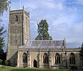
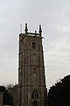
Article(s):Somerset Towers & A Tour of Somerset Towers
Request: The article A Tour of Somerset Towers has been split from Somerset Towers as the page was too long. It contains approx 50 images of different church towers illustrating the architecture of the towers. The current challenge is to select the "best" to go onto the Somerset Towers article. I'm not photography expert (as will be seen from some of my pics on there) & help with choosing the best (and deleting the worst) would be helpful. In addition many of the photos are dark or have slight angles - any help with improving them would be great.— Rod talk 13:15, 20 June 2008 (UTC)
Graphist opinion:
Have started improving several of the images by correcting perspective, channels, lighting and colour-correction etc will continue editing others.Tango22 (talk) 23:25, 20 June 2008 (UTC)
Hilversum inaccuracies
-
 inaccurate version (PNG)
 -
 inaccurate version (SVG)


Article(s):Hilversum.
Request:This COA is horribly inaccurate, see here ([1]) how it sould look and is used on everything from documents to vehicles. If someone could make a accurate version that would be greatly appreaciated. Note: the tekst "Hilversum" and the Blue surounding it sould not be included, that is just a part of the website, see [2]. Another note: I am going to iceland tomorrow and wont be back for a week, so I wont be replying this week. --SelfQ (talk) 11:06, 21 June 2008 (UTC)
Graphist opinion:
- If this is a coat, aren't there an infinite number of ways of showing it? 68.39.174.238 (talk) 14:32, 21 June 2008 (UTC)
- Here's Google's transation. §hep • ¡Talk to me! 13:55, 22 June 2008 (UTC)
Resolved
Burmese language requests
.
-

-
 #2 From font-closest to needed
 -
 #3 Other Version-also good


Article(s): all sorts of Burmese language requests
Request: SVGify -- Chris (クリス • フィッチ) (talk) 03:59, 25 April 2008 (UTC)
Graphist opinion: There was already an SVG version in use, but it looked traced. Rather than overwrite it, I uploaded a new one converted from a unicode font with burmese characters in it — ₪₪ ch1902 ₪₪ 10:56, 25 April 2008 (UTC)
- I also created one based on the jpg with Inkscape-- Cradel 10:59, 25 April 2008 (UTC)
- Please overwrite what I have labeled #1 with the much better #2, thanks! Chris (クリス • フィッチ) (talk) 13:57, 25 April 2008 (UTC)
- The thing is, #1 is absolutely horrible wrong, it needs to be either deleterd or overwritten. If overwritten, the licenses can also be overwritten very easily. It needs to go, it is incorrect and has no place on the 'pedia. Chris (クリス • フィッチ) (talk) 04:53, 30 April 2008 (UTC)
- I've filed for the 1st one (The traced one) to get removed on Commons. 68.39.174.238 (talk) 23:55, 9 May 2008 (UTC)
- Someone want to comment here on #1? 68.39.174.238 (talk) 17:36, 19 May 2008 (UTC)
- I have removed the resolved tag as the horribly incorrect image has not been deleted from Commons. Chris (クリス • フィッチ) (talk) 13:12, 10 June 2008 (UTC)
Why are they taking SO LONG?! 68.39.174.238 (talk)
Image 1 has been removed from Commons; is this closeable now? 68.39.174.238 (talk) 22:46, 23 June 2008 (UTC)
Gagauzia and Tibet
.
-

-
SVG

Article(s): w:tr:Gagavuzya (exemplary:http://tr.wikipedia.org/wiki/Resim:Gagavuzya_arms%C4%B1.png ), w:tr:Tibet
Request: Hello.I am Turkish Wikipedian.Turkish Wikipedia and other Wikipedias need colored and svg format Image:Coat of arms of Gagauzia.svg and svg format Image:Tibetarms.jpg.Excuse me.I don't speak Engilish enough.Urgent, please! Signore Faccia di cuoio ileti 19:42, 19 May 2008 (UTC)
- Yes Mangwanani.I have exemple.This [4] is colored Gagauzia arms. Color
 (example:[5])Please.Signore Faccia di cuoio ileti 23:49, 20 May 2008 (UTC)
- Before anyone can work on that svg, they need to know what the text in that COA is. The second word looks like YERS or YERI. It is ambiguous and it would help if the exact word and spelling was known. XcepticZP (talk) 23:55, 20 May 2008 (UTC)
- It's Gagauz Yeri—see the article. I'll gladly take this one now we have a color version to work from. Lord Leatherface, please remove the Turkish arms from your signature—images in signatures are not allowed in the English Wikipedia :) Fvasconcellos (t·c) 00:07, 21 May 2008 (UTC)
- Would someone like me to colour and PNG the raster or is that a waste of resources if we're going straight to vector? Mangwanani (talk) 16:11, 21 May 2008 (UTC)
- It's Gagauz Yeri—see the article. I'll gladly take this one now we have a color version to work from. Lord Leatherface, please remove the Turkish arms from your signature—images in signatures are not allowed in the English Wikipedia :) Fvasconcellos (t·c) 00:07, 21 May 2008 (UTC)
- Before anyone can work on that svg, they need to know what the text in that COA is. The second word looks like YERS or YERI. It is ambiguous and it would help if the exact word and spelling was known. XcepticZP (talk) 23:55, 20 May 2008 (UTC)
- Yes Mangwanani.I have exemple.This [4] is colored Gagauzia arms. Color
I don't speak English.I speak Turkish.Colored Gagauzia arms Please.Signore Faccia di cuoio ileti 19:52, 23 May 2008 (UTC)
I found this image on the commons and it looks a bit different than the link Lord Leatherface gave :

It is also the one used on the gaugazian wikipedia (its a test wiki)-- CD 21:01, 23 May 2008 (UTC)
- Excellent, thank you. The shield is done—now for the rest :) Fvasconcellos (t·c) 22:16, 23 May 2008 (UTC)
- OK, done. How's this? Fvasconcellos (t·c) 14:31, 31 May 2008 (UTC)
I've requested the requester review the image and comment on it (and close it if satisfactory). 68.39.174.238 (talk) 20:56, 6 June 2008 (UTC)
- No response. Do you think we should just mark this one as "Resolved"? The request has been completed, so letting it go stale seems like a misfile... 68.39.174.238 (talk) 15:28, 22 June 2008 (UTC)
South Caroline/Carolinian flag
-
 Tree is already here.
 -
 Vectorized flag.


Articels: Flag of South Carolina, Flags of the Confederate States, etc.
Request: SVGify. 68.39.174.238 (talk) 22:43, 23 June 2008 (UTC)
Oppinion:
Is this what you were looking for? Emok (talk) 03:20, 26 June 2008 (UTC)
- Perfect. 68.39.174.238 (talk) 23:11, 26 June 2008 (UTC)
Ares I-X patch
-
 Patch of Ares I-X
 -
 Patch of Ares I-X in vector


Article(s): Ares I-X
Request: Improve this NASA patch by making the colors more solid, remove Collectspace logo and convert to the right image format. Hektor (talk) 23:24, 9 May 2008 (UTC)
Graphist opinion:
- Comment Can't a better version be found at the NASA website? On another note, Mysid (talk · contribs) is our resident mission patch maven—she's done dozens of these in SVG, maybe she can work her magic on this one :) Fvasconcellos (t·c) 13:04, 10 May 2008 (UTC)
- Answer Unfortunately I haven't found it anywhere so far except in two places : hanging on a wall in a Lockheed building I was visiting in Denver last February, and on this Collectspace web site where it was taken from. However, maybe that in a few months, when the actual flight is going to draw closer, NASA is hoing to make this patch broadly available ? Hektor (talk) 13:50, 10 May 2008 (UTC)
- Done. The fonts are not perfect, but as good a match as I could find. Dhatfield (talk) 21:26, 30 May 2008 (UTC)
- I have put the vector image in the article. If someone finds a better fonts he is welcome to give it a shot. Hektor (talk) 21:57, 30 May 2008 (UTC)
- "DEVELOPMENT FLIGHT TEST" is Skia. I don't recognize the other one. Fvasconcellos (t·c) 22:49, 30 May 2008 (UTC)
- Ok, then in this case I remove the "resolved" tag and if someone can put DEVELOPMENT FLIGHT TEST with the Skia font... Hektor (talk) 06:48, 31 May 2008 (UTC)
- Skia is a Mac font that is only available commercially. Sorry, can't help. If someone can recommend a similar free font... Dhatfield (talk) 08:35, 31 May 2008 (UTC)
- As a Mac user, I was able to create a Skia version, which (after converting to a path) I uploaded over the old one.--HereToHelp (talk to me) 13:58, 1 June 2008 (UTC)
- Not to be picky or anything, but it looks like it should be a smaller point size with more letterspacing. The 'T' on the original patch lines up with the rocket thing. MissMJ (talk) 16:06, 1 June 2008 (UTC)
- Sorry; If you care to play with it, go ahead. It's still much better than the old version.--HereToHelp (talk to me) 23:31, 1 June 2008 (UTC)
- Unfortunately, I do not own a license for Skia, so I can't reset it myself, or I would. =( MissMJ (talk) 01:54, 2 June 2008 (UTC)
- Non-graphist stupid question : could it be possible to re-draw the unavailable letters in vector ? Hektor (talk) 15:27, 7 June 2008 (UTC)
- It's possible... Just a pain in the butt? xD Plus it seems silly to bother when it's so much easier to just set the type in that font. Type on a path takes about 5 seconds; provided you have the font. MissMJ (talk) 06:25, 8 June 2008 (UTC)
- Was thinking mostly of the bottom ones ; it seems that everybody agrees that the top ones are commercial Skia font, but I have seen no hypothesis regarding the bottom ones (ARES I-X). Hektor (talk) 21:28, 8 June 2008 (UTC)
- It's possible... Just a pain in the butt? xD Plus it seems silly to bother when it's so much easier to just set the type in that font. Type on a path takes about 5 seconds; provided you have the font. MissMJ (talk) 06:25, 8 June 2008 (UTC)
- Non-graphist stupid question : could it be possible to re-draw the unavailable letters in vector ? Hektor (talk) 15:27, 7 June 2008 (UTC)
- Unfortunately, I do not own a license for Skia, so I can't reset it myself, or I would. =( MissMJ (talk) 01:54, 2 June 2008 (UTC)
- Sorry; If you care to play with it, go ahead. It's still much better than the old version.--HereToHelp (talk to me) 23:31, 1 June 2008 (UTC)
- Not to be picky or anything, but it looks like it should be a smaller point size with more letterspacing. The 'T' on the original patch lines up with the rocket thing. MissMJ (talk) 16:06, 1 June 2008 (UTC)
- As a Mac user, I was able to create a Skia version, which (after converting to a path) I uploaded over the old one.--HereToHelp (talk to me) 13:58, 1 June 2008 (UTC)
- Skia is a Mac font that is only available commercially. Sorry, can't help. If someone can recommend a similar free font... Dhatfield (talk) 08:35, 31 May 2008 (UTC)
- Ok, then in this case I remove the "resolved" tag and if someone can put DEVELOPMENT FLIGHT TEST with the Skia font... Hektor (talk) 06:48, 31 May 2008 (UTC)
- "DEVELOPMENT FLIGHT TEST" is Skia. I don't recognize the other one. Fvasconcellos (t·c) 22:49, 30 May 2008 (UTC)
- I have put the vector image in the article. If someone finds a better fonts he is welcome to give it a shot. Hektor (talk) 21:57, 30 May 2008 (UTC)
Since this doesn't seem to be going anywhere and it is completed to a sufficiently high level of accuracy (my opinion), I'm marking it as resolved. Dhatfield (talk) 12:15, 28 June 2008 (UTC)
- I am not lucky with my request. I think it is more stale than resolved. Hektor (talk) 21:24, 28 June 2008 (UTC)
Request for SVG and modified icon for Flagged Revisions
-
 not sighted
 -
 checked for absence of obvious vandalism
 -
 Proofed version


-
 Unreviewed
 -
 No Vandalism
 -
 Approved


Article(s):
These images are used with the new FlaggedRevisions (currently beta-tested in German WP). They are available in png and need svg versions — but this would have some time. However, I am bringing this forward here because of my hope that at least one of the icons could be improved to a better metaphor. Everyone responsible at German WP is very busy fixing other bugs, but at the same time a lot of bad blood about "white revolutions" / "admin versus contributors" is going on on German WP. I personally believe that the wording of text messages and the icons contribute to this. Non-reviewer contributors are told that the quality of their contributions is unknown and – even though the first step review only looks for obvious vandalism – the impression is that after review the quality is ok. This is not how Flagged Revisions are intended, just unfortunate wording. The FlaggedRevs-1.png enforces this: I believe it should not be a "minus" or "forbidden" sign! I cannot do nice icons. I got positive feedback from others for my ideas but with the catch: If you can find someone who can create new icons. Can you help here?
Request:
- Instead of the gray minus, please create a gray question mark icon or (perhaps even better) any icon that suggests "draft" version (a pen?).
- Consider whether the yellow eye is OK, or whether a more neutral metaphor can be found. The icon should make clear that the article was checked for obvious vandalism, but not for hidden (values wrongly changed) nor for any quality aspect of the article. It has not been scrutinized, just a plausibility check was made. The wide open eye may suggest more scrutiny than was done; but I cannot think of a better metaphor myself.
- The third icon would probably be ok as it is.
SVG+PNG would be superb, but PNG alone would also be greatly appreciated. Many thanks! --Vigilius (talk) 18:05, 26 May 2008 (UTC)
The yellow eye is ok and the green sign too, but the grey minus could be a grey question mark. Furthermore the current icons have a wrong shadow effect, they should better look like buttons instead of holes. -- Nichtich (talk) 15:56, 27 May 2008 (UTC)
Graphist opinion:
![]()
![]()
![]()
![]()
![]()
![]() How about these? Reasons for selecting these icons:
How about these? Reasons for selecting these icons:
- Gray question mark seems perfect. No value judgement is implied and a pen will look like a blob at 18x18 pixels.
- The gray-green "V" is between gray (unknown) and bright green (approved). "V" stands for Vandalism, obviously - does the German term also start with a V? If there is confusion, people will quickly learn what it means. I don't like the eye because in my opinion it is too Eye of Sauron / "Big Brother is watching you" for a sensitive editing environment.
- The green tick is bright and easily recognised.
A comment on icon size: 18x18 pixels is very hard to work with. As you scale up, the images immediately become clearer and easier to identify, especially for people with eyes like mine - we're not going to run out of pixels so consider going a little bigger. Images at different resolutions are shown below for reference. Dhatfield (talk) 14:00, 14 June 2008 (UTC)
- Many, many thanks for the good work! I like all three images. The V does work in German ("Vandalismus"), but it may not in other languages. However, it may be acceptable in many language to learn that it means no vandalism. One point: A crossed-out "V" would intuitively make more sense / be easier to remember (i.e. no' vandalism). However, I imagine this is graphically undesirable (to many lines at small angles?). --Vigilius (talk) 10:11, 15 June 2008 (UTC)
- The "Approved" icon is good and even to recognise when very small:
 . The hook could be slighlty broader.
- No problem, will do tomorrow morning.
- The "V" first depends on culture and second two kinds of green are too complex. Every assumption that contains with "people will quickly learn" is an assumption too much. An eye on orange is better, the idea "... is watching you" is wanted, that's the point.
- surely you are trying to say 'checked', 'passed', 'not vandalism', not trying to intimidate contributors that are not vandals. It should be a neutral or even friendly icon. Can we come up with another alternative? Blue?
- The question mark is good but could be more recognisable when very small. Compare
 and
and  or
or  . This can also be read when very small:
  .
.
Thanks and greetings, -- JakobVoss (talk) 12:15, 16 June 2008 (UTC)
Thanks for the revisions Dhatfield! With the bolder font the question mark indeed has become much more readable at small sizes. And as said in the introduction, I personally disliked the eye a bit myself; I would vote for the V for the time being, with the option that someone comes up with a n even brighter idea. Some comments on German WP suggest to me that the eye is being interpreted as an indication of much more scrutiny than is actually happening. -- I have tow minor technical points: perhaps the gradient of the outer ring in ? and V could be a bit less contrasty. In small size at 1 o'clock it looks like a spot on my monitor on the ? (much less so on the V). Secondly, the OK sign (![]() ) might have accidentially become non circular, both in total and with respect of the width of the outer ring. --Vigilius (talk) 21:38, 18 June 2008 (UTC)
) might have accidentially become non circular, both in total and with respect of the width of the outer ring. --Vigilius (talk) 21:38, 18 June 2008 (UTC)
- Is it non circular or is it that the two circles have not the same center ? Hektor (talk) 07:40, 21 June 2008 (UTC)
. Many thanks to Dhatfield for his excellent work here! --Vigilius (talk) 18:47, 28 June 2008 (UTC)
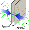
Casimir effect
-
 Vectorized
 -
 An attempt at the right side.


Article(s): Casimir effect
Request: Please vectorise this quirky quantum mechanical effect that needs a lead image. Dhatfield (talk) 02:46, 24 June 2008 (UTC)
Graphist opinion: I created the left side of the image, I'm not sure what to do for the right side. Is this what you're looking for? Emok (talk) 18:31, 25 June 2008 (UTC)
- That looks great for the left - have to run it past a physicist to make sure, but looks excellent. Only edit I'd like is the text in Verdana - it's more 'neutral' in appearance. The right image is just a couple of plates and some ellipses with radial gradients. I'll take it from here if you can't do elliptical gradients in (package X). Dhatfield (talk) 20:48, 25 June 2008 (UTC)
- Okay, the left side is in Verdana now. Emok (talk) 18:38, 26 June 2008 (UTC)
- Sorry I didn't mention it before, can you please increase the font size so that the labels will be visible in a 200 pixel thumbnail. I think "Vacuum fluctuations" could also start with a capital. The colour of the plates in both images should also be consistent to imply that they are the same thing. Thanks. After that, we replace them in the original article and ask for comments. Dhatfield (talk) 12:06, 27 June 2008 (UTC)
- The font size for the left image is larger. I tried to edit the right image to correct the plate colors, but for some reason couldn't do it without Inkscape crashing. Either MissMJ will need to do this, or I'll have to revert to the previous version with the ugly bubbles. While we're at it, shouldn't the bubbles between the plates be noticibly smaller? Emok (talk) 13:42, 27 June 2008 (UTC)
- Sorry I didn't mention it before, can you please increase the font size so that the labels will be visible in a 200 pixel thumbnail. I think "Vacuum fluctuations" could also start with a capital. The colour of the plates in both images should also be consistent to imply that they are the same thing. Thanks. After that, we replace them in the original article and ask for comments. Dhatfield (talk) 12:06, 27 June 2008 (UTC)
- Okay, the left side is in Verdana now. Emok (talk) 18:38, 26 June 2008 (UTC)
Made the bubbles more bubbly! :D MissMJ (talk) 21:24, 26 June 2008 (UTC)
- Very nice. Posted to Casimir Effect, requesting that comments be posted here. Lets see what the physicists say. Marked as resolved for now. Dhatfield (talk) 11:19, 28 June 2008 (UTC)
-

-
 Yay, it displays!


Articles: Time, Future, World line, Light cone, Past, Present, Causal contact, Milne model
Request: Considering the important articles where this image appears, it deserves to be some of our best work. Initial suggestions: use different inner and outer gradients for the cones to improve contrast. Bring the time axis in front of the back of the cone as it projects into the future. Create a sense of scale to space and time in the image - I suggest the space axis should be on interstellar scales and the time axis should be in years because this image misleadingly suggests that our usual perceptions of space and time 'fit' with the speed of light. Dhatfield (talk) 13:10, 24 June 2008 (UTC)
Graphist opinion: Hey, something I could actually possibly do! I see somebody's been perusing one too many science articles. >_> Clarification on the scales of the graph please: what do you mean by "interstellar scales" for the space axes, and what sort of intervals do you have in mind for the time axis? One year? Ten years? A hundred? Would the observer be at 1 and go down into BCE and up into CE, or be at say... 2000? MissMJ (talk) 21:35, 24 June 2008 (UTC)
- I started and it's looking pretty good, except Wikipedia won't display it (Image:World line2.svg). =( I'm not sure what's wrong, although I have a sneaking suspicion that using Gradient Mesh to shade the cones is what's causing it to crap out. But, it's the only way I know how to get the gradient to be a shape other than straight stripes or a circle so... If anyone has any ideas, share 'em. MissMJ (talk) 02:12, 25 June 2008 (UTC)
- I know what is wrong, you used adobe illustrator, and the output is not valid SVG, but instead it is a collection of SVG and png files embedded in an SVG file. If you open the file in notepad you will see there is a very large payload of useless binary data. Jackaranga (talk) 13:40, 25 June 2008 (UTC)
- A few simple shapes like that should be maximum 20Ko your file is over 900 ... Jackaranga (talk) 13:40, 25 June 2008 (UTC)
- There are a number of problems with the file:
- A few simple shapes like that should be maximum 20Ko your file is over 900 ... Jackaranga (talk) 13:40, 25 June 2008 (UTC)
- 1. There is a load of useless binary Adobe illustrator data included in the file
- 2. The cones are png images embedded in the SVG file (probably you created them using a tool in Illustrator that has no equivalent in SVG)
- 3. The text is saved as paths instead of plain text, making it much more difficult for a third party user to translate or modify the text, negating one of the main advantages of using SVG
- I don't know if it is Adobe that sucks or the users who are not using it correctly, but every time it is the same thing, Illustrator creates huge files, when a small one could be made, and often looses many of the advantages of SVG as pointed out above. In short this file has only the disadvantages of SVG and none of the advantages. The original is full of useless Adobe crap also, the file is unnecessarily large. Damn I hate that software. Jackaranga (talk) 13:57, 25 June 2008 (UTC)
- Well somebody's got a chip on his shoulder.
- I don't know if it is Adobe that sucks or the users who are not using it correctly, but every time it is the same thing, Illustrator creates huge files, when a small one could be made, and often looses many of the advantages of SVG as pointed out above. In short this file has only the disadvantages of SVG and none of the advantages. The original is full of useless Adobe crap also, the file is unnecessarily large. Damn I hate that software. Jackaranga (talk) 13:57, 25 June 2008 (UTC)
- How Adobe Illustrator codes SVGs is not something I can fix; I don't write software, I draw images.
- That's probably the Gradient Mesh tool. It's the only way Illustrator can make nonlinear/nonradial gradients and it probably got rasterized when saved as SVG.
- Certain label text is converted to paths because of the way it is angled along the plane to make it look three dimensional. In order to do this in Illustrator, the text loses its ability to be edited.
- You can hate it all you want, that's your prerogative, but considering it is the design industry standard for editing vector images, it's really not going to go anywhere anytime soon. MissMJ (talk) 22:42, 25 June 2008 (UTC)
- Wow! That was an amazingly unhelpful rant from our friend Jackaranga. The one I just uploaded renders in the direct link Media:World_line2.svg, but not in thumbnail. 0_o Anyway, it's the non-linear gradients on the cones. Can you try changing them to linear and maybe saving as plain SVG or similar? With the scale idea, I was thinking of some stars and galaxies scattered around on the plane - we know how much you love stars ;), and put "(Years)" on the vertical axis so you get the sense that the plane dimensions are on the order of light-years. Doable? Dhatfield (talk) 21:34, 25 June 2008 (UTC)
- The labeling is doable, the gradients won't look as fancy... but they'll work, which is the important thing, I guess. >_> Stars and galaxies... Hm, that would look infinitely better with raster images, but I'll see what I can do. MissMJ (talk) 22:42, 25 June 2008 (UTC)
- Alright, it displays! Yay! I'll work on figuring out the galaxies thing. MissMJ (talk) 23:42, 25 June 2008 (UTC)
- Great! Your first version looked better, but what can you do. You're right, a raster shifted into perspective would be the best option, but we'll get some
smallminded induhvidualesteemed coeditor who will no doubt complain. Would you give it a try - it really may give great results and I have had success with embedded images in this. I re-organised the comments so we can focus on being artists, hope you don't mind. Dhatfield (talk) 08:20, 26 June 2008 (UTC)
- Great! Your first version looked better, but what can you do. You're right, a raster shifted into perspective would be the best option, but we'll get some
- Alright, it displays! Yay! I'll work on figuring out the galaxies thing. MissMJ (talk) 23:42, 25 June 2008 (UTC)
- The labeling is doable, the gradients won't look as fancy... but they'll work, which is the important thing, I guess. >_> Stars and galaxies... Hm, that would look infinitely better with raster images, but I'll see what I can do. MissMJ (talk) 22:42, 25 June 2008 (UTC)
Been in numerous articles with no negative comments. Resolved - thanks MissMJ. Dhatfield (talk) 22:33, 28 June 2008 (UTC)
- No offense guys, I think the original one was better. The gradients look amateurish on the new one (they aren't correct for the forms), the stars don't mean anything, and the original one had a nice simplicity to it. The original one looks like it could be in a science textbook. The new one looks like it is something someone made for Wikipedia. Just my two cents. When I am looking for a light cone image to use, I'm going to use the first one, not the second one. Specifying "years" for time is totally inaccurate. In fact the whole thing has gotten more inaccurate. The light cone is not just meant for interstellar distances—it's a fundamental concept to all of special relativity, and applies even on small scales. Ugly and inaccurate -- bad combination! --98.217.8.46 (talk) 15:10, 12 September 2008 (UTC)
- I second all of this. The two things that were added—the "(years)" label and the stars in the hyperplane—are wrong, however well intentioned, and need to be removed. The new image doesn't look perspective-correct to me. The gradient should be more subtle so that it gives a 3D effect without being distracting. The sides of the cone should ideally be inclined at 45° to the axes, not at some random angle. With all of those changes I could accept the new image, but the result of making all of those changes would pretty much be the original image. Not that the old image is perfect, but it's a better starting point for tweaking than the new one. For the time being I'm going to switch back to the old image. -- BenRG (talk) 16:02, 2 December 2008 (UTC)
Image:APISmap1.pdf
.
-
 118 kilobyte PDF map of part of Wisconsin.
 -
 SVGfied. Takes about 5 seconds.


Articles, categories:
- commons:Category:PDF maps
- Category:Maps
- Category:Wisconsin maps
- Wikipedia:WikiProject Maps
- commons:WikiProject Atlas
- commons:Category:Maps
- commons:Category:SVG maps
Request: Is there any program (paid or free) that will convert PDF maps to SVG vector maps? This would greatly help various map-related projects. I will link to those conversion programs from commons:Map resources, the above-linked WikiProjects, and other places.
PDF maps are great vector maps that can be enlarged to any size, and to zoom in on any area of the map. This is especially useful for maps. Try it in the PDF file, and see what I mean if you aren't already familiar with this (increase the percentage to 200% or 400% for example). I picked the above map at random from commons:Category:PDF maps as an example.
To see the map you may have to download it first. For some reason I can't click on it in either the Firefox browser, nor in MS Internet Explorer, and have it show up in Adobe Acrobat Reader. Once downloaded though it shows up fine when I click on the downloaded PDF file. To download it in Firefox right-click the above image, and then click "save link as" in Firefox. In Internet Explorer click the image, and then on the image description page right-click the link below it, APISmap1.pdf, and then click "save target as." Or just click on the link and your PDF reader should open it.
I categorize many maps on Wikipedia and the commons, and good SVG maps are a great help. They allow maps to be used in other-language wikipedias just by changing the map labels in the SVG code. --Timeshifter (talk) 08:52, 21 June 2008 (UTC)
Graphist opinion: Inkscape, with the right set of extensions and associated programs, can convert pdf to svg. You'll need phyton (unless it's being bundled with inkscape now), pstoedit, ghostview (and thus also ghostscript). You may also have to update your environment variables so that pstoedit get added to the path. I can give this one a try when I get to my laptop. Not all pdf's will be convertable to svg since some contain embeded raster images rather then vector images. /Lokal_Profil 13:03, 21 June 2008 (UTC)
- Thanks! It is good to know that it can be done at all. I have left a link to here from Wikipedia talk:WikiProject Maps#PDF map conversion to SVG. I, or others, might copy this thread to a subpage of the Graphic Lab, or somewhere else, later on, and use it as the beginnings of a tutorial. We can link to it from the relevant WikiProjects, etc.. There are many great vector illustrations of all kinds in PDF files. --Timeshifter (talk) 13:35, 21 June 2008 (UTC)
- You can just open a PDF in Illustrator and then save it as an SVG. No extensions or associated programs needed. ;) MissMJ (talk) 03:40, 22 June 2008 (UTC)
- That is great. 5 seconds! Are there any free programs that will convert PDFs to SVG? Also, how can I view the actual downloaded SVG file? I downloaded the file, and clicked it. My image editor, IrfanView, just shows a very small image that can't be enlarged. Firefox (v2.0.0.14) and MS Internet Explorer will not open the downloaded file. I have been doing some reading concerning the Adobe SVG Viewer [6], and Firefox 3. Inkscape opened the SVG file, but I only recently installed Inkscape, and have no clue how to enlarge the small image that I see in it. Is there any SVG viewer that will zoom as easily as Adobe Acrobat Reader does with the PDF file? And why is the SVG file 10 times larger (in kilobytes) than the PDF file. Is that due to the font problem you mentioned? --Timeshifter (talk) 08:38, 22 June 2008 (UTC)
- Re: file size: it probably is a font thing. =S The map used Helvetica Neue (which actually wouldn't display for me at first because, although I have the fonts, they were named differently; had to substitute them) and since I doubt many people outside graphic design own that typeface and I have no idea how to embed a typeface into an SVG (is there even a way?) I chose the "Convert font to outlines" option when saving. It's still editable as type if you own the fonts, but I guess it creates outlines if you don't, making the file really big. No idea how to go around this, honestly, except for completely changing the typeface to something generic, which would then mess up the placement and spacing of the labels. MissMJ (talk) 17:50, 22 June 2008 (UTC)
- Is it possible to increase the size of the SVG map at full size? (note: Those reading this who are not familiar with the full-size SVG map please go to Image:APISmap1.svg with the Firefox browser, and then click the image to see it at full size). The smaller black text is hard to read at the current full size of the map. I experimented with sizing, and found that at least 1100 to 1300 pixels wide was the minimum needed. Copy [[Image:APISmap1.svg|1100px]] into a sandbox and see what I mean. The same is true for the PDF map. That needs to be viewed at the 125% setting to be legible enough. Click:
- http://upload.wikimedia.org/wikipedia/commons/6/64/APISmap1.pdf --Timeshifter (talk) 11:20, 24 June 2008 (UTC)
- Yep, you can just open it in an image SVG editor, select everything (Ctrl+A, usually) and proportionally resize it. In Illustrator, there's a menu option to uniformly scale objects where you just type in a percentage (125% for example), I assume Inkscape probably has something similar? You could also do it manually by dragging the corner of the selection box, just make sure that it's not distorting it (in Illustator, again, you could just hold down Shift while dragging, Inkscape probably has an option to do that as well). Then just Save, and voilà! Larger nominal size (since vectors can be scaled to any size, the "full size" you are referring to is commonly called nominal size). MissMJ (talk) 21:16, 24 June 2008 (UTC)
- Thanks again. Would you like to edit this page:
- Wikipedia:WikiProject Maps/PDF map conversion to SVG/Adobe Illustrator
- I think you would do a better job than I would since I don't understand well the text that I would copy from here. --Timeshifter (talk) 16:50, 25 June 2008 (UTC)
- Sure, I put some instructions on that page. Also nominally resized the map so it's bigger. Purple lines are still there though. :( MissMJ (talk) 22:26, 25 June 2008 (UTC)
- Thanks for the instructions! The map looks almost exactly the same though, size-wise, to me. But I am not sure this map is worth any more effort. Due to the text problem. From Wikipedia:WikiProject Maps/PDF map conversion to SVG#Warning is this: Some PDFs create very "bad" SVG files when converted automatically. A "bad" SVG can be identified because it will convert slowly (more than 5 seconds), it will be very large for an SVG (over 1MB) and it will render very slowly on WP - there is a long wait while the text and other images on the page are loaded, but the SVG image does not show up. Bad SVGs put a lot of strain on the Wiki servers. If you suspect you have a "bad" file, go to a Wikigraphist for a manual conversion. These will almost always be much better than the automated versions in terms of being smaller, better drawn and easier to translate because the text is created properly. --Timeshifter (talk) 20:49, 26 June 2008 (UTC)
- I think that paragraph refers to PDFs that have both raster and vector images in them; Wikipedia can't display those, so the file is "bad", and big. I think this particular map will be pretty large any way you do it, just because it is so detailed (and manually tracing it would be rather tedious and useless). At the end of the day, not every SVG is going to end up being less than 100kb. *shrug* MissMJ (talk) 21:21, 26 June 2008 (UTC)
- Thanks for the instructions! The map looks almost exactly the same though, size-wise, to me. But I am not sure this map is worth any more effort. Due to the text problem. From Wikipedia:WikiProject Maps/PDF map conversion to SVG#Warning is this: Some PDFs create very "bad" SVG files when converted automatically. A "bad" SVG can be identified because it will convert slowly (more than 5 seconds), it will be very large for an SVG (over 1MB) and it will render very slowly on WP - there is a long wait while the text and other images on the page are loaded, but the SVG image does not show up. Bad SVGs put a lot of strain on the Wiki servers. If you suspect you have a "bad" file, go to a Wikigraphist for a manual conversion. These will almost always be much better than the automated versions in terms of being smaller, better drawn and easier to translate because the text is created properly. --Timeshifter (talk) 20:49, 26 June 2008 (UTC)
- Sure, I put some instructions on that page. Also nominally resized the map so it's bigger. Purple lines are still there though. :( MissMJ (talk) 22:26, 25 June 2008 (UTC)
- Yep, you can just open it in an image SVG editor, select everything (Ctrl+A, usually) and proportionally resize it. In Illustrator, there's a menu option to uniformly scale objects where you just type in a percentage (125% for example), I assume Inkscape probably has something similar? You could also do it manually by dragging the corner of the selection box, just make sure that it's not distorting it (in Illustator, again, you could just hold down Shift while dragging, Inkscape probably has an option to do that as well). Then just Save, and voilà! Larger nominal size (since vectors can be scaled to any size, the "full size" you are referring to is commonly called nominal size). MissMJ (talk) 21:16, 24 June 2008 (UTC)
- Re: file size: it probably is a font thing. =S The map used Helvetica Neue (which actually wouldn't display for me at first because, although I have the fonts, they were named differently; had to substitute them) and since I doubt many people outside graphic design own that typeface and I have no idea how to embed a typeface into an SVG (is there even a way?) I chose the "Convert font to outlines" option when saving. It's still editable as type if you own the fonts, but I guess it creates outlines if you don't, making the file really big. No idea how to go around this, honestly, except for completely changing the typeface to something generic, which would then mess up the placement and spacing of the labels. MissMJ (talk) 17:50, 22 June 2008 (UTC)
- That is great. 5 seconds! Are there any free programs that will convert PDFs to SVG? Also, how can I view the actual downloaded SVG file? I downloaded the file, and clicked it. My image editor, IrfanView, just shows a very small image that can't be enlarged. Firefox (v2.0.0.14) and MS Internet Explorer will not open the downloaded file. I have been doing some reading concerning the Adobe SVG Viewer [6], and Firefox 3. Inkscape opened the SVG file, but I only recently installed Inkscape, and have no clue how to enlarge the small image that I see in it. Is there any SVG viewer that will zoom as easily as Adobe Acrobat Reader does with the PDF file? And why is the SVG file 10 times larger (in kilobytes) than the PDF file. Is that due to the font problem you mentioned? --Timeshifter (talk) 08:38, 22 June 2008 (UTC)
- You can just open a PDF in Illustrator and then save it as an SVG. No extensions or associated programs needed. ;) MissMJ (talk) 03:40, 22 June 2008 (UTC)
May I note that whoever did this particular map is a complete idiot (then again it is the government -_-')? The labels for the rivers and channels are actually individually placed letters instead of angled type, or type on a path. So much for easily editing them. MissMJ (talk) 05:27, 22 June 2008 (UTC)
- Yes Illustrator should be able to do it... but Illustrator isn't free =) /Lokal_Profil 08:17, 22 June 2008 (UTC)
- BTW. Is it only I who see purple lines on the map when I view the actual SVG (in firefox)? /Lokal_Profil 08:19, 22 June 2008 (UTC)
- I see the purple lines, too. Weird. I can see the actual SVG file only by clicking the link:
- http://upload.wikimedia.org/wikipedia/commons/7/71/APISmap1.svg
- I read somewhere that Firefox 2 does not implement all of the latest SVG code. I also read that MediaWiki implements SVG differently too, and that one has to carefully choose which format to save the SVG file in before uploading to the commons. See: User:Phidauex/SVG tips. Maybe those are the problems. I don't know. I haven't installed Firefox 3 yet. I have been doing some reading trying to figure out how best to view SVG files. See:
- Comparison of layout engines (SVG)
- Scalable Vector Graphics#Support for SVG in web browsers
- Adobe - Scalable Vector Graphics: SVG zone: [7]
- Adobe SVG Viewer download area. [8]
- SVG. Mozilla Development Center (MDC): [9]
- Category:SVG at Mozilla Development Center (MDC): [10]
- SVG in Firefox. MDC: [11]
- SVG improvements in Firefox 3: [12]
- Mozilla SVG Project Frequently Asked Questions: [13] --Timeshifter (talk) 09:06, 22 June 2008 (UTC)
- How FF or IE implement SVG is really not an issue here (I also get weird purple lines :) ) because all SVGs are pre-rendered on WP and Commons and are served to the reader as .pngs. As for the conversion, Inkscape 0.46 now has native PDF support so it's both FOSS and easy! I'll write a tutorial at Wikipedia_talk:WikiProject_Maps#PDF_map_conversion_to_SVG. Dhatfield (talk) 13:45, 22 June 2008 (UTC)
- Done first draft. Please take a look and edit mercilessly :) Dhatfield (talk) 14:47, 22 June 2008 (UTC)
- BTW. Is it only I who see purple lines on the map when I view the actual SVG (in firefox)? /Lokal_Profil 08:19, 22 June 2008 (UTC)
- Well, the original question was "Is there any program (paid or free) that will convert PDF maps to SVG vector maps?". =P Of course there's always more than one way to do something, and the free version is probably preferable for Wiki purposes/more accessible to people in general, but it seems complicated and requiring some knowledge of software and what to install. I highly doubt that I'm the only person in Graphic Lab who uses Illustrator. Perhaps along with a table of Wikigraphist ability we could have a table of what kind of software everyone uses/has access to, so that people with Illustrator could be contacted to quickly do a PDF-SVG conversion?
- I thought Timeshifter was looking for a DIY guide, so I chose software that is easily available to everyone. Somebody who has Illustrator probably doesn't need a tutorial on this stuff ;) With regards to converting we just need to make it known that we are happy to do them here at the lab. I think it'll be better if the mapmakers know how to do simple conversions and bring the challenges to us. Next thing you know we'll have gone from COA Central to MapsRUs. Dhatfield (talk) 19:37, 22 June 2008 (UTC)
- Thanks for the tutorial! I started a subpage. Please see:
- Feel free to edit it. I already started. It is for conversion using FOSS tools. I am also working on an Adobe Illustrator subpage here:
- Wikipedia:WikiProject Maps/PDF map conversion to SVG/Adobe Illustrator --Timeshifter (talk) 12:52, 23 June 2008 (UTC)
- I thought Timeshifter was looking for a DIY guide, so I chose software that is easily available to everyone. Somebody who has Illustrator probably doesn't need a tutorial on this stuff ;) With regards to converting we just need to make it known that we are happy to do them here at the lab. I think it'll be better if the mapmakers know how to do simple conversions and bring the challenges to us. Next thing you know we'll have gone from COA Central to MapsRUs. Dhatfield (talk) 19:37, 22 June 2008 (UTC)
Dino snack


Article: Theropoda
Request: This has been sitting around with a request for svg conversion. Vector graphics aren't my thing or I'd do this myself: original artwork from multiple sources, obvious encyclopedic value, and engages the viewer's interest in the subject. A bit small for FP candidacy in its current incarnation, but that could be addressed during the conversion. Any nibbles? DurovaCharge! 21:45, 24 June 2008 (UTC)
Graphist opinion:
I might be biting off more than I can chew, but I'll give it a try. Would you please clarify "a bit small"? Dhatfield (talk) 08:22, 26 June 2008 (UTC)
- I tried for a direct copy. Please shout if you want the teeth to be perfect (lots of work for marginal overall improvement) or you want any other changes eg. size, scale lines or anything else. Cheers. Dhatfield (talk) 13:02, 26 June 2008 (UTC)
- Yummy. Would you like to conominate? :) DurovaCharge! 14:11, 28 June 2008 (UTC)
- Hmmm, not sure it'll make it, but you never know with that crowd 0_o Why not? Would you leave a note when it's up - I try to avoid the FPC page due to Wikistress? Thanks. Dhatfield (talk) 22:27, 28 June 2008 (UTC)
- As a veteran of FPC I can say that it will have a much better chance if you take the time to smooth out the rough edges--literally. There doesn't seem to be a curve in the entire image! Make things less blocky and you'll increase you chances dramatically.--HereToHelp (talk to me) 22:32, 28 June 2008 (UTC)
- Can I see the scars? That's what I get for being lazy and tracing the bitmap :) Thanks for the heads-up. I'll hand-tune it and get back to you with something better once I finish mucking about with the Utah teapot. Dhatfield (talk) 12:07, 29 June 2008 (UTC)
 Dhatfield (talk) 21:55, 29 June 2008 (UTC)
- Hmmm, just noticed that the renderer is up to its usual tricks again. Tried to fix the offsets (white 'drop shadows'), but no luck, they have a consistent offset with the rest of the image. I'm stuck. MissMJ? Dhatfield (talk) 23:17, 29 June 2008 (UTC)
- As a veteran of FPC I can say that it will have a much better chance if you take the time to smooth out the rough edges--literally. There doesn't seem to be a curve in the entire image! Make things less blocky and you'll increase you chances dramatically.--HereToHelp (talk to me) 22:32, 28 June 2008 (UTC)
- Hmmm, not sure it'll make it, but you never know with that crowd 0_o Why not? Would you leave a note when it's up - I try to avoid the FPC page due to Wikistress? Thanks. Dhatfield (talk) 22:27, 28 June 2008 (UTC)
Star Stub
-
 Star icon.svg
 -
 A sample version.
 -
 Perhaps an icon of Ursa Major? (Prettier than this, obviously.)
 -
 Potential icon?
 -
 Ground reversal for better visibility.

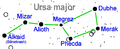
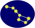
Article(s): All star stubs.
Request: Can someone create a simple star svg to put here? Thank you. XcepticZP (talk) 09:14, 11 June 2008 (UTC)
Graphist opinion: I'll do it.--HereToHelp (talk to me) 13:09, 11 June 2008 (UTC)
- How's this?--HereToHelp (talk to me) 13:29, 11 June 2008 (UTC)
- Sorry but I don't see how a blurry yellow circle looks like a star. Maybe it can be used for a representation of a sun, not a star. Even though they are the same thing. I uploaded a little sample I came up with. I think one of the talented svg people here can make it much better? XcepticZP (talk) 19:35, 11 June 2008 (UTC)
- Well, what do you want done to it? Looks good to me. Unless... Since the current image is of a star constellation, you could use an icon of the Big Dipper or something? I could make that. MissMJ (talk) 19:57, 11 June 2008 (UTC)
- Hmm, the constellation thing is a really good idea. Better than a single star. Let's see how it looks? But I'm definitely leaning towards your constellation idea. XcepticZP (talk) 21:19, 11 June 2008 (UTC)
- There. Though remember, when used as a stub icon it's going to be pretty tiny, so any minor changes made to it are unlikely to be visible. MissMJ (talk) 22:33, 11 June 2008 (UTC)
- Hmm, the constellation thing is a really good idea. Better than a single star. Let's see how it looks? But I'm definitely leaning towards your constellation idea. XcepticZP (talk) 21:19, 11 June 2008 (UTC)
- Well, what do you want done to it? Looks good to me. Unless... Since the current image is of a star constellation, you could use an icon of the Big Dipper or something? I could make that. MissMJ (talk) 19:57, 11 June 2008 (UTC)
- Sorry but I don't see how a blurry yellow circle looks like a star. Maybe it can be used for a representation of a sun, not a star. Even though they are the same thing. I uploaded a little sample I came up with. I think one of the talented svg people here can make it much better? XcepticZP (talk) 19:35, 11 June 2008 (UTC)
- Minor comment: That's invisible on some monitors (EG. Mine). This may be an isolated case. 68.39.174.238 (talk) 21:48, 13 June 2008 (UTC)
- Wow, that IS terrible. I can barely see it. =S Perhaps this wasn't such a great idea... MissMJ (talk) 22:01, 13 June 2008 (UTC)
- What if you took just one star from that constellation and used that?--HereToHelp (talk to me) 22:07, 13 June 2008 (UTC)
- Wow, that IS terrible. I can barely see it. =S Perhaps this wasn't such a great idea... MissMJ (talk) 22:01, 13 June 2008 (UTC)
- Without comment on it as a SVG icon, I will say that can be easily seen on this monitor. 68.39.174.238 (talk) 16:04, 14 June 2008 (UTC)
- How about an eliptical background rather then a square one (sure I've seen such stub images elsewhere), maybe even one which fades towards the edges? Dark background works well. /Lokal_Profil 00:03, 15 June 2008 (UTC)
- Hm. It looks ok, but the problem with a circular background rather than a rectangle is that the crop area needs to be larger to fit the background shape, making the image in the center (which is really the important part) even smaller when scaled down. =S Maybe a rounded rectangle?... MissMJ (talk) 02:15, 15 June 2008 (UTC)
- P.S.: A fade would take up even more room, plus, the only way I could do it is with a radial blue to white gradient in Illustrator which A. removes the transparency (Illustrator doesn't support gradients to transparency, AFAIK), B. looks funky because the gradient is circular and the background is elliptical. MissMJ (talk) 02:18, 15 June 2008 (UTC)
- I think it looks fine how it is.--HereToHelp (talk to me) 15:41, 15 June 2008 (UTC)
- How about an eliptical background rather then a square one (sure I've seen such stub images elsewhere), maybe even one which fades towards the edges? Dark background works well. /Lokal_Profil 00:03, 15 June 2008 (UTC)
SVG not working for me
-
 Image:IILWY map.svg I tried to make on SVG image but I failed :(
 -
 Of course png worked


Article(s):IILWY
Request: Could someone make a proper SVGify of this image ?. If you don't want to use the image I created as a base; I used Image:BlankMap-World6, compact.svg and http://www.alexa.com/data/details/traffic_details/iminlikewithyou.com as sources-- iDosh! talk? 02:56, 28 June 2008 (UTC)
Graphist opinion:
Gandhi's signiture
-
 Gandhi's signiture
 -
 SVG
SVG


Article(s): Mohandas Karamchand Gandhi
Request: Put on a clear background and if possible SVG like Robert Mugabe's --SelfQ (talk) 16:25, 1 July 2008 (UTC)
Graphist opinion: Ta-da. MissMJ (talk) 19:29, 1 July 2008 (UTC)
Article(s): Sisters of Perpetual Indulgence
Request: Hi, please trim off the color all around edges and trim off the slogan in the lower right corner. Thank you!!! Banjeboi 00:37, 2 July 2008 (UTC)
Help please. Your bot keeps deleting the logo, can someone still work on it? Banjeboi 23:18, 2 July 2008 (UTC)
- Fair use images need to be linked rather then displayed (as done above). Anyhow I'll trim the image for you. /Lokal_Profil 23:30, 2 July 2008 (UTC)
- Done. Is the result ok? /Lokal_Profil 23:35, 2 July 2008 (UTC)
Graphist opinion:
Ceylon
.
-
 The current coat: Get the lion and maybe the inner circle pattern off of here.
 -
 Most of it

.svg)
Article(s): Coat of arms of Sri Lanka
Request: SVGify -- Chris (クリス • フィッチ) (talk) 21:28, 28 April 2008 (UTC)
Graphist opinion: Couldn't elements from Image:Coat_of_arms_of_Sri_Lanka.svg be used instead of tracing this entirely? Or does it need to look older/different from the current CoA...? I'll do a little work; if anyone else decides to work on this, please post. James1293 (talk) 20:00, 29 April 2008 (UTC)
- I can't speak for the original requester, but the lion could probably be taken from the current coat without much trouble. 68.39.174.238 (talk) 14:24, 30 April 2008 (UTC)
- I would be okay with that if someone wants to cannibalize other images. Chris (クリス • フィッチ) (talk) 01:13, 19 May 2008 (UTC)
- The Sri Lankan coat of arms svg is being screwy and I can't open it in Illustrator. If anyone can do it, you can copy the lion from that and stick it in the center. This is mostly done, but I don't speak whatever language is used in the banner so I don't feel confident tracing the letterforms; I can't figure out what a lot of the proper strokes would be and I don't want to accidentally spell something wrong. xD MissMJ (talk) 02:17, 10 June 2008 (UTC)
- I'll try to incorporate the lion. The text is Tamil (left) and Sinhala (center), it's definitely Lanka in Sinhala but I'm not sure about the Tamil part. Fvasconcellos (t·c) 14:37, 10 June 2008 (UTC)
- The Sri Lankan coat of arms svg is being screwy and I can't open it in Illustrator. If anyone can do it, you can copy the lion from that and stick it in the center. This is mostly done, but I don't speak whatever language is used in the banner so I don't feel confident tracing the letterforms; I can't figure out what a lot of the proper strokes would be and I don't want to accidentally spell something wrong. xD MissMJ (talk) 02:17, 10 June 2008 (UTC)
- I would be okay with that if someone wants to cannibalize other images. Chris (クリス • フィッチ) (talk) 01:13, 19 May 2008 (UTC)
- The Tamil is "இலங்கை". 68.39.174.238 (talk) 21:15, 10 June 2008 (UTC)
- You can get the Sinhala from si:ශ්රී_ලංකාව. 68.39.174.238 (talk) 21:21, 10 June 2008 (UTC)
- Added the lion. Managed to add the text as well but I'm not 100% "ලංකා" (in the center) is right. Also please feel free to improve the text alignment. The visible text is converted to paths but a unconverted backup exists to the left of the image (outside the displayed area)./Lokal_Profil 00:40, 3 July 2008 (UTC)
- Thank you so much for picking this back up! :) Chris (クリス • フィッチ) (talk) 03:22, 3 July 2008 (UTC)
- Done, thank you for finishing this! Chris (クリス • フィッチ) (talk) 08:25, 3 July 2008 (UTC)
- No problems. Does anyone know where the CoA to the right in this image comes into the picture? /Lokal_Profil 11:06, 3 July 2008 (UTC)
- Done, thank you for finishing this! Chris (クリス • フィッチ) (talk) 08:25, 3 July 2008 (UTC)
- Interesting! I never saw that before! Perhaps a different proposal from 1972? Chris (クリス • フィッチ) (talk) 13:58, 3 July 2008 (UTC)
Carpentry Stub
-
 Smoothing plane drawing.
 -
 SVG
SVG


Article(s): Woodworking stubs template and woodworking templates.
Request: Can this be converted to an svg. Or perhaps a similar woodworking-type svg found to replace it? Thank you. XcepticZP (talk) 08:48, 12 June 2008 (UTC)
Graphist opinion:
- Although not svg I think there might be better images in commons:Category:Planers. /Lokal_Profil 13:45, 12 June 2008 (UTC)
- I did a quick trace in Inkscape, just using the default settings. Added a white background while I was at it. —Ilmari Karonen (talk) 23:13, 14 June 2008 (UTC)
- Notifying requester so this isn't archived as "Stale" without further input... 68.39.174.238 (talk) 21:32, 1 July 2008 (UTC)
Schrodinger's Cat
-
Existing illustration
-
 New SVG

Article(s): Schrodinger's Cat.
Request: Can we please have a labeled vector diagram of Schrodinger's Cat. The cat is both alive and dead, the bottle is both whole and broken, the poison is both in the bottle and spilled and the lever and hammer are both up and down. Dhatfield (talk) 22:41, 25 June 2008 (UTC)
- I've asked User:WikipedianProlific to take a look at this. Dhatfield (talk) 23:25, 25 June 2008 (UTC)
Graphist opinion:
Done. Dhatfield (talk) 16:20, 26 June 2008 (UTC)
For our sensitive viewers, that is a silhouette of a sleeping cat. No animals were harmed in the making of this diagram. Dhatfield (talk) 17:34, 26 June 2008 (UTC)
- Thanx, the quality of illustrations in that articel has frequently left much to be desired. 68.39.174.238 (talk) 22:18, 26 June 2008 (UTC)
- Even more important improvment since the original was actually under a non-commercial license. /Lokal_Profil 11:41, 30 June 2008 (UTC)
- Shouldn't the opacity of one of the states be lower to provide some contrast? vlad§inger tlk 15:57, 3 July 2008 (UTC)
- Even more important improvment since the original was actually under a non-commercial license. /Lokal_Profil 11:41, 30 June 2008 (UTC)
Flight Officer insignia
-
 Flight Officer
 -
 Technical Flight Officer
 -
 Senior Flight Officer
 -
 Cadet Airman Basic/Senior Member
 -
 Vector version


Article(s): Civil Air Patrol
Request: Would it be possible to vectorize these images (the ones on Commons, not the ones saved locally to en.wikipedia)? Also, please remove the funky border effect. — scetoaux (T|C) 19:53, 25 May 2008 (UTC)
- Actually, I hate to do this, but there are 14 other images in the article Cadet grades and insignia of the Civil Air Patrol that also need to be vectorized. Anybody up to the challenge? — scetoaux (T|C) 02:28, 26 May 2008 (UTC)
Graphist opinion: Here's some of them:


MissMJ (talk) 22:23, 28 May 2008 (UTC)
Midnightcomm had already made a vector of the Cadet Major insignia (back in 2007, too), which I used to make the Cadet Lt. Col. and Cadet Col. ones:


MissMJ (talk) 23:08, 28 May 2008 (UTC)
Some more!

The one with the two circles is currently Image:C1Lt_2.svg, but I'm trying to get it moved over to Image:C1Lt.svg since my version is more complete. MissMJ (talk) 01:37, 29 May 2008 (UTC)
Last ones:
That's all I have time for. =) MissMJ (talk) 02:15, 29 May 2008 (UTC)
Thanks but the cadet insignia needs to be cropped so that there are no margins. Right now the way these are, they don't show up too well in image caption boxes. If you could crop them that would be great. I have no idea how to work with Inkscape so I'm afraid I can't do it myself (otherwise I would). — scetoaux (T|C) 00:38, 31 May 2008 (UTC)
- Inkscape?... No idea how to work with that either. =P Cropped them, so they should show up fine now. =) MissMJ (talk) 01:20, 1 June 2008 (UTC)
CAB.gif still needs to be vectorized, but that's about it. :) — scetoaux (T|C) 17:48, 16 June 2008 (UTC)
- Can anyone do that? I hate to see this get filed as stale with only one thing undone... 68.39.174.238 (talk) 15:26, 22 June 2008 (UTC)
French'd vector
-

-
 SVG
SVG
Articels: Any stub on French education.
Request: SVGification (It was made from 2 SVGs, but saved as a PNG). 68.39.174.238 (talk) 19:22, 5 July 2008 (UTC)
Oppinion: Well, I just combined the 2 SVG's. :) Cheers! Λua∫Wise (Operibus anteire) 11:42, 7 July 2008 (UTC)
- Fixed the source info. Don't forget to link to the components that you use to make up the image. not doing so is in violation of the hat images license . /Lokal_Profil 16:27, 7 July 2008 (UTC)
- Well, thanks! Mark as done?
- Cheers mate!
- Λua∫Wise (Operibus anteire) 17:21, 7 July 2008 (UTC)
Text vector
-

-
 SVG, good?


Articel: Al-
Request: SVGify. 68.39.174.238 (talk) 21:33, 5 July 2008 (UTC)
Oppinion: Was easy enough, I hope it's good. I think it does its job for the purposes of that article, but feel free to correct me. :) Cheers! Λua∫Wise (Operibus anteire) 11:31, 7 July 2008 (UTC)
- Image refuses to display on MW... Did you trace it, or...? 68.39.174.238 (talk) 21:03, 7 July 2008 (UTC)
Image:Nigericin.svg
Article(s): Nigericin
Request: This graphic looks fine when viewed full size, but it's compressed on the image page. The Nigericin infobox has room for a properly expanded image but for some reason this is squished. (My apologies if I'm being stupid, pls explain and be gentle.) -- JaGa (talk) 02:18, 8 July 2008 (UTC)
Graphist opinion:
- Fixed. I'll take a look at your code and se if I can find the problem. /Lokal_Profil 02:35, 8 July 2008 (UTC)
Havana
-
 Flag of Havana - Image:Flag of the City of Havana Cuba..png
 -
 Coat of Arms of Havana
 -
 Used the CoA


Article(s): Havana
Request: Would it be possible to vectorize these two images Thank you -- iDosh! talk? 02:24, 24 June 2008 (UTC)
- Could someone please do it. If I knew how to work with SVG I wouldn't be asking this here! Thank you again iDosh! talk? 21:40, 25 June 2008 (UTC)
- Note: The key looks like it can be gotten off of the Gibraltaran flag. The towers maybe from San Marino's? 68.39.174.238 (talk) 21:58, 25 June 2008 (UTC)
- Nevermind, it looked like someone already vectored the coat. The flag should be easily done now... 68.39.174.238 (talk) 19:25, 5 July 2008 (UTC)
Graphist opinion: Flag done, used the blue colour from the CoA since I'm guessing they should be the same. /Lokal_Profil 14:56, 8 July 2008 (UTC)
Fidel Castro Signature
-
 Signature
 -
 Vector version


Article(s): Fidel Castro
Request: Could some one please SVGify it. Similar to the George W. Bush one -- iDosh! talk? 22:10, 1 July 2008 (UTC)
Graphist opinion: The original at [14] might be better. Tried but wasn't hapy with my result. /Lokal_Profil 22:56, 1 July 2008 (UTC)
- Done, let me know whether this is OK. --Slashme (talk) 18:49, 4 July 2008 (UTC)
- Looks nice. Did you use Inksscape and if you did which setting did you use? /Lokal_Profil 23:40, 4 July 2008 (UTC)
Sorry, was away for a bit. I did it in Inkscape, but not automagically: I just used the bezier tool, putting control points wherever I thought they'd be needed, and then went around with the curve editing tool fitting the curve as precisely as possible. To find the inaccurate bits, I put the jpeg in front of the curve, and deleted it, then went "undo - redo" to see which parts moved. --Slashme (talk) 10:41, 7 July 2008 (UTC)
Map of Jones' battle
-
-
 SVG
SVG -
 SVG, take 2.
 -
 SVG, take 3.
 -
 Autotrace is not always the best solution...

Articels: Battle of Flamborough Head
Request: SVGify. If possible, use colors that contrast better (On my monitor, the land and sea are indistinguishable. 68.39.174.238 (talk) 01:35, 5 July 2008 (UTC)
Oppinion: Here is my initial attempt at it...any suggestions? :) Λua∫Wise (Operibus anteire) 12:28, 7 July 2008 (UTC)
- There is this problem with transperancy in the background so if anyone can fix it...
- Cheers!
- Λua∫Wise (Operibus anteire) 12:39, 7 July 2008 (UTC)
- Yes, only I wonder if you could increase the size of the base map to as to avoid the appearance of all the text crowding it (Also it would allow writing "F.H." out) and secondly, the edges of the things like the North arrow would appear sharper and less "traced". Finally, I suspect the text should be "Jones' fleet" for the possessive. The idea of the turning it is probably a good one; if anyone later determines it would be better the original way, it should be easier to change an SVG than a GIF. Thanx, 68.39.174.238 (talk) 21:10, 7 July 2008 (UTC)
- Here you go. Oh and Auawise, when making new versions of a file you may simply upload them over the previous image. This prevents Wikipedia from having a bazillion versions of one file under different names. If you're starting completely over or doing something radically different, a new file with a version number may be warranted, but for minor fixes (color changes, etc.) it's not necessary. MissMJ (talk) 21:56, 8 July 2008 (UTC)
- Yes, only I wonder if you could increase the size of the base map to as to avoid the appearance of all the text crowding it (Also it would allow writing "F.H." out) and secondly, the edges of the things like the North arrow would appear sharper and less "traced". Finally, I suspect the text should be "Jones' fleet" for the possessive. The idea of the turning it is probably a good one; if anyone later determines it would be better the original way, it should be easier to change an SVG than a GIF. Thanx, 68.39.174.238 (talk) 21:10, 7 July 2008 (UTC)
- Image:Battle of Flamborough Head Map.svg is easily the best version. I would note that squares for ships is a little odd, but the map is so improved that I have to give it my endorsement. 68.39.174.238 (talk) 22:05, 8 July 2008 (UTC)
Havana
-
Flag of Havana - Image:Flag of the City of Havana Cuba..png
-
Coat of Arms of Havana
-
Used the CoA
Article(s): Havana
Request: Would it be possible to vectorize these two images Thank you -- iDosh! talk? 02:24, 24 June 2008 (UTC)
- Could someone please do it. If I knew how to work with SVG I wouldn't be asking this here! Thank you again iDosh! talk? 21:40, 25 June 2008 (UTC)
- Note: The key looks like it can be gotten off of the Gibraltaran flag. The towers maybe from San Marino's? 68.39.174.238 (talk) 21:58, 25 June 2008 (UTC)
- Nevermind, it looked like someone already vectored the coat. The flag should be easily done now... 68.39.174.238 (talk) 19:25, 5 July 2008 (UTC)
Graphist opinion: Flag done, used the blue colour from the CoA since I'm guessing they should be the same. /Lokal_Profil 14:56, 8 July 2008 (UTC)
Fidel Castro Signature
-
Signature
-
Vector version
Article(s): Fidel Castro
Request: Could some one please SVGify it. Similar to the George W. Bush one -- iDosh! talk? 22:10, 1 July 2008 (UTC)
Graphist opinion: The original at [15] might be better. Tried but wasn't hapy with my result. /Lokal_Profil 22:56, 1 July 2008 (UTC)
- Done, let me know whether this is OK. --Slashme (talk) 18:49, 4 July 2008 (UTC)
- Looks nice. Did you use Inksscape and if you did which setting did you use? /Lokal_Profil 23:40, 4 July 2008 (UTC)
Sorry, was away for a bit. I did it in Inkscape, but not automagically: I just used the bezier tool, putting control points wherever I thought they'd be needed, and then went around with the curve editing tool fitting the curve as precisely as possible. To find the inaccurate bits, I put the jpeg in front of the curve, and deleted it, then went "undo - redo" to see which parts moved. --Slashme (talk) 10:41, 7 July 2008 (UTC)
Map of Jones' battle
-
-
SVG
-
SVG, take 2.
-
SVG, take 3.
-
Autotrace is not always the best solution...
Articels: Battle of Flamborough Head
Request: SVGify. If possible, use colors that contrast better (On my monitor, the land and sea are indistinguishable. 68.39.174.238 (talk) 01:35, 5 July 2008 (UTC)
Oppinion: Here is my initial attempt at it...any suggestions? :) Λua∫Wise (Operibus anteire) 12:28, 7 July 2008 (UTC)
- There is this problem with transperancy in the background so if anyone can fix it...
- Cheers!
- Λua∫Wise (Operibus anteire) 12:39, 7 July 2008 (UTC)
- Yes, only I wonder if you could increase the size of the base map to as to avoid the appearance of all the text crowding it (Also it would allow writing "F.H." out) and secondly, the edges of the things like the North arrow would appear sharper and less "traced". Finally, I suspect the text should be "Jones' fleet" for the possessive. The idea of the turning it is probably a good one; if anyone later determines it would be better the original way, it should be easier to change an SVG than a GIF. Thanx, 68.39.174.238 (talk) 21:10, 7 July 2008 (UTC)
- Here you go. Oh and Auawise, when making new versions of a file you may simply upload them over the previous image. This prevents Wikipedia from having a bazillion versions of one file under different names. If you're starting completely over or doing something radically different, a new file with a version number may be warranted, but for minor fixes (color changes, etc.) it's not necessary. MissMJ (talk) 21:56, 8 July 2008 (UTC)
- Yes, only I wonder if you could increase the size of the base map to as to avoid the appearance of all the text crowding it (Also it would allow writing "F.H." out) and secondly, the edges of the things like the North arrow would appear sharper and less "traced". Finally, I suspect the text should be "Jones' fleet" for the possessive. The idea of the turning it is probably a good one; if anyone later determines it would be better the original way, it should be easier to change an SVG than a GIF. Thanx, 68.39.174.238 (talk) 21:10, 7 July 2008 (UTC)
- Image:Battle of Flamborough Head Map.svg is easily the best version. I would note that squares for ships is a little odd, but the map is so improved that I have to give it my endorsement. 68.39.174.238 (talk) 22:05, 8 July 2008 (UTC)
Image:TdFPrizeMoney.svg
-
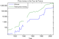 png version of prize money in Tour de France
 -
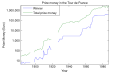 svg version of prize money in Tour de France


Article(s):Tour de France
Request: I recently added a png version of this graph, made by matlab, source code is in the png talk page. At the image page, an infobox appeared saying that the image would be better in svg format, so I tried to change it. Everything worked, except the aspect ratio: the svg version is wrong. But I also noticed that the svg file is larger than the png file. So I have two question: 1. Is svg really better in this case? I would think not, because the svg file is larger, but maybe that's not relevant. 2. Can somebody help me change the aspect ratio of the svg file?-- EdgeNavidad (talk) 07:28, 8 July 2008 (UTC)
Graphist opinion:
- Think something had got messed up in the aspect ratio where the image got forced from 399x306px to 200x200px. The quick fix is to wash it through Inkscape. I.e. open the file in inkscape and copy everything into a new file with the same size (which I did). The nicer solution is to remove the offending bit of code, this however normally requires a few tries since mediaWiki seems to render everything in it's own unique way.
- Even if the svg has a larger filesize I'd still say it's preferable since it's easily translated and updated, but then that's just me./Lokal_Profil 15:13, 8 July 2008 (UTC)
Image:Protestantbranches.gif
-

-
 SVG
SVG


![[1]](http://www.hilversum.nl/live/imghsum/logo.jpg)
![[14]](http://www.fidelcastroruz.net/images/fidel/firma_fidel.jpg)
Article(s): List of Christian denominations
Request: Could we get a better font and perhaps a non-GIF format? —Preceding unsigned comment added by Rmhermen (talk • contribs) 23:13, 7 July 2008
Graphist opinion: On it. /Lokal_Profil 00:50, 8 July 2008 (UTC)
- Made the basics. Will have to face the horrors of text rendering badly tomorrow. /Lokal_Profil 01:44, 8 July 2008 (UTC)
- Looks much better. Thanks. Rmhermen (talk) 03:29, 10 July 2008 (UTC)
English Copyedit need on Tutorial-cartography_(basic).svg
-
 Former version.
 -
PNG version (for curious) is vissible here
-
Corrected version.
- Article
Graphic Lab's Tutorials, for wiki graphists !
- Request
Hello,


I worked 30 hours this 2 last weeks to create -in English- a really complete 15 pages long Tutorial:Cartography (basic).svg. This tutorial aim to take a perfect newbee in both Inkscape and map making, and teach him/her in 15 pages and one hour of explanations and exercices all what he need to know to make respectable, nice, and reliable wikimaps. This was made according to all I learnt on the French Map lab.
Despite I'm French, I wrote it in English since 8 wikipedians out of 10 can understand basic English, while only 1 out of 10 for basic French. Also, this Tutorial need first a big copyedit. Afterwhat: your advices are really encouraged ! (dowload and read the SVG version to test it)
So (please !), one volunter to copyedit this long svg (probably 2 hours of work, . (one only, or the second after the first).
- Need: one volunter ;
- For : a 2 hours copyedit (+ or -1h) ;
- Tool need : Inkscape, correct English
- File to copyedit(11 sections): Image:Tutorial-cartography (basic)-2.svg to download and open in Inkscape.
- Note : some indications are in the SVG ; the file have 11 sections (you can copyedit just 2: each help is welcome) ; 3 are missing and will be add later.
-2.svg&action=edit&redlink=1)
I will not work on this tutorial this week allowing the volunter to work as much as he want. Yug (talk) 17:48, 7 July 2008 (UTC)
Graphist opinion:
Note: There is a big display bug (ImageMagic don't understand the FlowRoot fonction), and according to the French SVG FAQ: there is no easy wait to fix this. This bug disallow the display of the SVG on wikipedia, but you can still dowload it and copyedit on it. 62.147.248.245 (talk) 10:47, 9 July 2008 (UTC)
- I'll do a bit. vlad§inger tlk 01:59, 10 July 2008 (UTC)
- Okay, that's it down to the sources section. I am doing some rewriting as well as fixing language issues to make sure the intent of the text is as clear as possible. Also fixing layout issues. Onwards! vlad§inger tlk 02:53, 10 July 2008 (UTC)
- ...And, that's it for now. It's 1AM here and I'm off to bed. I went through every section, moved stuff around (though I may have neglected to add notes saying so). Somebody else is free to scan it again and fix anything I missed. Of course, I wasn't able to edit the parts that aren't written. I'm impressed with this - must have taken a while considering it took me ~2.5 hrs just to tweak. vlad§inger tlk 05:07, 10 July 2008 (UTC)
- Okay, that's it down to the sources section. I am doing some rewriting as well as fixing language issues to make sure the intent of the text is as clear as possible. Also fixing layout issues. Onwards! vlad§inger tlk 02:53, 10 July 2008 (UTC)
A big thanks for your tweak on Tutorial-cartography_(basic).svg , I think the final version will help map creation and wikicartographers' beginning greatly. After my big effort to create this tuto, a big thanks to you for this correction, I quickly overviewed it : that's really better ! I also appreciated when I seen you display good initiative by changing many sentences and expanding some explanations with your knowledge. This was completly my aim : make a wiki-SVG-tutorial, first started by one big effort, then improve by every cartographers when better explanations are possible, exactly like a wiki page ^-^y . For all this : a big thanks to you.
As I said, I will let other cartographer read it and expand it if they want. I will probably create the missing sections separately on my PC, then, in one or 2 weeks, I will include them and make some structural update (change some sections' order). I hope the version 1.0 (complete and corrected) will be available for August 2008 :]
- Note on next steps
- Copyedit = Done ; I mark the request as "Resolved" to avoid waste of time of other graphists.
- 3 missing sections = to do in the 2 next weeks, with little reorganisation (sections' order), and rewriting of the bolean section (cf Inkscape 0.46 new tools).
- last copyedit: will then need a small copy edit.
- Final release and review: August 2008, graphists will be welcome to keep this tutorial as best and as up to date as possible.
Yug 14:52, 10 July 2008 (UTC)