
Wikipedia:Graphics Lab/Photography workshop/Archive/May 2013
Stale[edit]
Roman Emperors[edit]
-
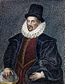
 Augustus of Rome
 -
 Titus of Rome
 -
 Alexander of Constantinople


Article(s): List of Roman emperors, List of Byzantine emperors
Request: Could someone possibly improve the quality of these pictures, many thanks. TRAJAN 117 (talk) 21:25, 15 April 2013 (UTC)
Graphist opinion(s):
Cut out Titus of Rome and put him on a dark background. – JBarta (talk) 05:03, 16 April 2013 (UTC)
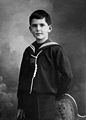
Andrew Allan[edit]

Article(s): Andrew Allan (shipowner)
Request: Nice image that might benefit from some TLC. (Please don't reduce resolution or make any drastic changes. Also, upload over the original at Commons.) – JBarta (talk) 06:24, 15 April 2013 (UTC)
Graphist opinion(s): ![]() Done nagualdesign (talk) 02:37, 20 April 2013 (UTC)
Done nagualdesign (talk) 02:37, 20 April 2013 (UTC)
It's a nice attempt, but quite honestly, I think more can be done with it. There are a lot of spots that still remain somewhat because whatever filter was used didn't get rid of them completely. I think more work by hand is required. Also, there are some areas that are too dark (front of horses, carriage, etc) and the left side is too light... I think more can be done there as well. – JBarta (talk) 09:05, 20 April 2013 (UTC)
- After applying the filter I continued removing spots by hand until I'd had enough. I lowered the black point ever so slightly to give me room to create contrast. Most of the darker tones are lighter than they were. The darkest parts of the carriage and horses are only a smidge darker than before and don't respond well to lightening. The left side is too light, yes, but darkening it any more than I have made it look gradually more unnatural. I'd be happy to be shown otherwise though. *Passes baton* nagualdesign (talk) 16:28, 20 April 2013 (UTC)
Resolved[edit]
Need a composite image[edit]
-
 Copernicus
 -
 Gilbert
 -
 Kepler
 -
 Galileo

Article(s): The Man in the Moone
Request:
- Hi. I'd like to have a 2x2 table composite of these four images, clockwise, with Copernicus in the top left corner (so they're chronological). William Gilbert should possibly be cropped to jive with the rest of them. Thanks! Drmies (talk) 14:55, 25 April 2013 (UTC)
Graphist opinion(s):
 .jpg)
|
 
|
| caption goes here |
Will that do? It's a simple table using existing images and each image remains a link to it's full-sized version. (it can be made smaller or larger as needed) – JBarta (talk) 18:23, 25 April 2013 (UTC)
- That's pretty smooth, thanks. But they're not all of the same width and so there's this rough spot in the middle; I'd like them all the same. And can you stick a thin border in between the cells, in black? Thanks! Drmies (talk) 19:34, 25 April 2013 (UTC)

![]() Done – JBarta (talk) 22:09, 25 April 2013 (UTC)
Done – JBarta (talk) 22:09, 25 April 2013 (UTC)
Make brighter please?[edit]
-
 Too dark?

Article(s): Leukoplakia, epithelium
Request:
Graphist opinion(s):![]() Done— Preceding unsigned comment added by Centpacrr (talk • contribs)
Done— Preceding unsigned comment added by Centpacrr (talk • contribs)
John Sentamu[edit]
-
 John Sentamu, Archbishop of York

Article(s): John Sentamu
Request: Please change the background of the image to solid black or blur out the man on the left. Thanks Hazhk Talk to me 01:34, 3 April 2013 (UTC)
Graphist opinion(s):
Well there it is. Looks rather awful though. Even the original looks like a cutout. Open to suggestions to make this better. – JBarta (talk) 02:43, 3 April 2013 (UTC)
- It is rather stygian. Perhaps a Ugandan flag would brighten things up? Only kidding. I re-did it. What do you think? nagualdesign (talk) 15:02, 15 April 2013 (UTC)
- It does look a little bit odd. Any suggestions? nagualdesign (talk) 15:27, 15 April 2013 (UTC)
- I made a few studies about ten days ago using some visual material from the York Ministry ( a door and a wall) that looked better to me but didn't post them in order to avoid another unnecessary kerfuffle. On another subject all of my image work is done on an Apple (Mac) LCD display with LED illumination with the gamma calibrated at 2.2 which is the setting that Apple recommends. If you are viewing them on a monitor set at a lower gamma value (i.e. closer to linear which is 1.0) they will appear artificially lighter to you than the the way I intend them to be. Centpacrr (talk) 19:42, 15 April 2013 (UTC)
- Actually, speaking of problematic additions... I'm looking at the admiral image that was so creatively edited by Centpacrr. I'm specifically looking at the flag. Is that a 50 star US flag? Was not the picture taken in 1957? Didn't the US flag have 48 stars in 1957? If so, isn't that a perfect example why we ought not be cobbling together such frankenpictures? – JBarta (talk) 20:21, 15 April 2013 (UTC)
- Heylo Y'all, Kevjonesin here. I'm new to the Photo Workshop (& Graphics Lab in general). User:Odysseus1479 pointed me this way. The John Sentamu image above caught my eye so I dusted off the GIMP and made a coupla' tries at balancing the background. I layered it up with a little tone and texture then added a touch of gradient shadow. I've uploaded two variations and a copy of the original image file (as posted above)to a Google Drive folder here:
I think I prefer the John_Sentamu-suggestion_save#2.jpg version, especially for embedded web size display. You're welcome to download and play with 'em if you like and offering feedback is encouraged. This is my first time interacting with this region of Wikipedia. So feel free to fill me in on norms and standards, tips, tricks, and local culture as well. : } --Kevjonesin (talk) 01:12, 8 May 2013 (UTC)
- I went ahead and uploaded my new version (1st time for me!) after doing some additional tweaks to the eyes. (Pushed brightness and contrast and then dodged highlights to push them a bit more. Followed by burning abit of the contour of the whites to keep previous from giving a caricatured feel.) --Kevjonesin (talk) 15:22, 8 May 2013 (UTC)
- Looks better to me. Adds a subtle background feel without really changing the background. Nice job. – JBarta (talk) 16:54, 8 May 2013 (UTC)
- I think I prefer the term 'enhanced' to "artificial" in this case. I didn't do the original cut out and fill in bit. I took transparencies of the background as I found it and layered transparencies of color and gradient shading amongst them. Then added HSV noise to the newly inserted layers to naturalize them.
- Adding the noise to the layers was a fresh inspiration. Seems to have helped, along with the gradient shading, to restore a feeling of depth and airspace. The result brought both the softening of photo images beyond a focal point and light on dust motes to my mind. The eye work was also done with a transparent/translucent layer applied over the original. If anyone's curious to look at the process I still have the .xcf GIMP files with the layers preserved and wouldn't object to sharing them.
- I noticed that the image is being used as the lead infobox image for an article. I think that in such a case presenting a clean recognizable representative image of the individual takes priority over faithfully depicting a specific point in space/time with orthodox accuracy. It's being used as a portrait of a person, not as a documentary photo of an event. I support artistic license in the former, but not the latter. --Kevjonesin (talk) 19:56, 8 May 2013 (UTC)
- p.s. And it was fun. : } ...Should we mark it resolved now? --Kevjonesin (talk) 19:56, 8 May 2013 (UTC)
- Personally I'm getting sick of looking at it. The requester hasn't commented since he first posted it. Unless someone wants to add a nude beach scene to it, I'd say it's probably about as good as it's going to get. I'll mark it resolved. If anyone doesn't like that... un-mark it resolved and we'll let it hang around even longer. – JBarta (talk) 00:18, 9 May 2013 (UTC)
- LOLZ (ooh, now it's so tempting...) : } "Blasphemy is a blast for me!" --Kevjonesin (talk) 15:02, 9 May 2013 (UTC)
- Personally I'm getting sick of looking at it. The requester hasn't commented since he first posted it. Unless someone wants to add a nude beach scene to it, I'd say it's probably about as good as it's going to get. I'll mark it resolved. If anyone doesn't like that... un-mark it resolved and we'll let it hang around even longer. – JBarta (talk) 00:18, 9 May 2013 (UTC)
- p.s. And it was fun. : } ...Should we mark it resolved now? --Kevjonesin (talk) 19:56, 8 May 2013 (UTC)
Stephen T. Ayers[edit]
Centpacrr 1:10 pm, 18 May 2013 (UTC−4)

Article(s): Stephen T. Ayers
Request:
- Please remove the red and green vertical lines. Any other fixes would be welcome. -- Delaywaves • talk 00:30, 3 May 2013 (UTC)
Graphist opinion(s):![]() Done— Preceding unsigned comment added by Centpacrr (talk • contribs)
Done— Preceding unsigned comment added by Centpacrr (talk • contribs)
Emily J. Reynolds[edit]
Centpacrr 1:10 pm, 18 May 2013 (UTC−4)

Article(s): Emily J. Reynolds
Request:
- Same as previous image – please remove any vertical red/green lines. -- Delaywaves • talk 00:46, 3 May 2013 (UTC)
Graphist opinion(s):![]() Done— Preceding unsigned comment added by Centpacrr (talk • contribs)
Done— Preceding unsigned comment added by Centpacrr (talk • contribs)
Mac Sweeney[edit]
Centpacrr 1:10 pm, 18 May 2013 (UTC−4)

Article(s): Mac Sweeney
Request:
- Please remove the green vertical lines on the subject's face. -- Delaywaves • talk 22:00, 4 May 2013 (UTC)
Graphist opinion(s):![]() Done— Preceding unsigned comment added by Centpacrr (talk • contribs)
Done— Preceding unsigned comment added by Centpacrr (talk • contribs)
James Blanchard[edit]
Centpacrr 1:10 pm, 18 May 2013 (UTC−4)

Article(s): James Blanchard
Request:
- Please remove the green line on the subject's face. (And any other fixes you wish to do). -- Delaywaves • talk 01:46, 16 May 2013 (UTC)
Graphist opinion(s):![]() Done Centpacrr 2:19 pm, Today (UTC−4)
Done Centpacrr 2:19 pm, Today (UTC−4)
- Taken — User:Centpacrr seems to be working on it. Centpacrr, I tracked down a version of the original from the source site that may be higher res. I uploaded a copy here. Feel free to use it if you'd like to make an upgraded version with fewer artifacts. If not, let me know and I'll likely play with it a bit. --Kevjonesin (talk) 14:02, 17 May 2013 (UTC)
- {{well done}} — Nice job Centpacrr. Looks much improved. --Kevjonesin (talk) 20:02, 17 May 2013 (UTC)
John B. Swainson[edit]
Centpacrr 1:10 pm, 18 May 2013 (UTC−4)

Article(s): John B. Swainson
Request:{
- Please remove the man's face at right. -- Delaywaves • talk 03:13, 17 May 2013 (UTC)
Graphist opinion(s):![]() Done Centpacrr 2:19 pm, Today (UTC−4)
Done Centpacrr 2:19 pm, Today (UTC−4)
- Taken — User:Centpacrr seems to be working on it. --Kevjonesin (talk) 14:05, 17 May 2013 (UTC)
- That looks perfect, thanks! (Although the image isn't displaying in the article for me – I'm not sure if that's the case everywhere). Delaywaves • talk 22:44, 17 May 2013 (UTC)
- There is a known issue with Wikipedia Commons that causes new image file overwrites to not always display immediately. I don't really know why this happens but it does. The new file is on the WP server, however, and will eventually show up in the article. (You may also need to empty you browser's cache as the new image appears in the article already for me.) Centpacrr (talk) 23:57, 17 May 2013 (UTC)
- Essentially what Centpacrr said, although you may want want to try pressing Ctrl + R on Firefox to force a reload. It sometimes works for me. — Crisco 1492 (talk) 00:21, 18 May 2013 (UTC)
- Adding <shift> to the key sequence will refresh your local cache as well. As in : <Ctrl> + <Shift> + R. This often works for me. It's usually my local cache that's out of sync and not a wiki server's, although they lag at times as well. In Firefox holding <Shift> and 'left-clicking' on the page reload icon in the Navigation Toolbar does the same. Refreshes the local cache while reloading the page. One may also add a "purge" option to the wiki page's menu via the preferences settings. --Kevjonesin (talk) 00:38, 18 May 2013 (UTC)
- Exactly, and if I'm not mistaken that "purge" button will work for any browser. Don't think Chrome, Safari, and IE use Ctrl (+ Shift) + R — Crisco 1492 (talk) 00:48, 18 May 2013 (UTC)
- Adding <shift> to the key sequence will refresh your local cache as well. As in : <Ctrl> + <Shift> + R. This often works for me. It's usually my local cache that's out of sync and not a wiki server's, although they lag at times as well. In Firefox holding <Shift> and 'left-clicking' on the page reload icon in the Navigation Toolbar does the same. Refreshes the local cache while reloading the page. One may also add a "purge" option to the wiki page's menu via the preferences settings. --Kevjonesin (talk) 00:38, 18 May 2013 (UTC)
- There is a known issue with Wikipedia Commons that causes new image file overwrites to not always display immediately. I don't really know why this happens but it does. The new file is on the WP server, however, and will eventually show up in the article. (You may also need to empty you browser's cache as the new image appears in the article already for me.) Centpacrr (talk) 23:57, 17 May 2013 (UTC)
- That looks perfect, thanks! (Although the image isn't displaying in the article for me – I'm not sure if that's the case everywhere). Delaywaves • talk 22:44, 17 May 2013 (UTC)
Download and upload image[edit]
-
 To be overwritten

Article(s): Java War, Diponegoro
Request:
- Please download this painting, assemble the tiles as a single set, and upload it over the image linked above (also, if you know a good "How to" about doing this please point me to it. — Crisco 1492 (talk) 01:32, 17 May 2013 (UTC)
Graphist opinion(s):![]() Done Centpacrr 9:59 pm, Today (UTC−4)
Done Centpacrr 9:59 pm, Today (UTC−4)
 Not done, that's the already-stitched version which is actually smaller. There should be tools to easily download and assemble the tiles. — Crisco 1492 (talk) 14:54, 17 May 2013 (UTC)
- Crisco 1492, have you tried requesting a higher res version from the Rijksmuseum directly via their "Photoservice Form" interface? The "Professional use" link via "Downloads" on the page you posted takes one there. I went ahead and put in a request. Seems easier to ask politely for higher res before attempting to produce a hacked together image with questionable usage permission. : } --Kevjonesin (talk) 16:51, 17 May 2013 (UTC)
- p.s. For giggles I looked into lifting the tiled images from the site.
They look to be lower res than the "Personal Use" one-piece download already offered on the Rijks' site.[I hadn't zoomed for more higher res tiles. 17:09, 17 May 2013 (UTC)] In Firefox one simply 'right-clicks' and image options are presented (amongst others) in a menu which pops up. This allowed me to preview each tile separately with the option to download. --Kevjonesin (talk) 17:04, 17 May 2013 (UTC)- I had already downloaded the six tiles separately from the image that the requester linked too using the Firefox (Mac) method described above and stitched them together as requested. It appears that if one wishes to download a different version from the website requires that an account be established to do so and I do not have such an account nor am I really interested in opening one. This is something that the requester should actually do.Centpacrr (talk) 17:38, 17 May 2013 (UTC)
 Done — I went ahead and signed up for the free account. The "personal use" version is a bit higher res and has clear permission for educational web usage with source citation so we're good — I uploaded it. I agree that the OP could easily have done this, but, oh well, I've now found a cool image site. And have put in a request for a gratis high res .tif file which I'll add later if it comes through. I'm optimistic. [www.archives.gov] recently came through with an upgrade for a civil rights march image within hours of my making a request through the site. They sent it as an email attachment. --Kevjonesin (talk) 19:49, 17 May 2013 (UTC)
- *sigh And that is still not the highest resolution available. There are tools to automatically download each and every tile quickly, like what was used with the Google Art downloads, which would allow us to get images in the neighbourhood of 3 to 4k pixels from the Rijkmuseum without having to wait for a reply from whomever is on the other end. I'm forced to assume that the people here are not reading what I'm asking and instead looking for alternative ways which are easier but ultimately less satisfactory. Never mind. — Crisco 1492 (talk) 22:27, 17 May 2013 (UTC)
- Crisco 1492, if you're not interested in waiting for replies from others might I perhaps suggest that you explore the GNU Image Manipulation Program. The article has links to the GIMP website where one may download free image editing software compatible with most common operating systems. I find that it's well worth considering the free Dunning–Kruger FX plugin as well. If you combine it with the tools you assume exist and they actually work as you assume they do perhaps you'll find satisfaction.
- Please share the results of your experience on the talk page as myself (and I'd guess others) would appreciate learning from your knowledge and wisdom. A tool to "automatically download each and every tile quickly" sounds quite handy. Please share it with us. I imagine Centpacrr would appreciate this as well as he has previously stated that he already manually downloaded all 6 tiles available via his web browser from the page you'd linked. But I imagine you already know that as you surely have carefully read and understood (in full) the replies made by he and I.
- Furthermore, Crisco 1492, if you'd be so kind, go ahead and extract the higher resolution tiles from the page and then host the files on the web somewhere — I use Google Drive for such but, as you likely know, many other options exist. Please then provide us with links to the files. I'd like to compare them to what I've been able to extract with the methods known to me as I don't personally know how to trick a museum's webserver into offering up files at a higher resolution than what they publicly broadcast on the internet. If they add up to a significantly larger image I'd even be happy to paste them together for you. Once again, Crisco 1492, I look forward to learning from your knowledge and expertise, --Kevjonesin (talk) 23:37, 17 May 2013 (UTC)
- After a bit of digging I've found that there is a method of easily assembling them, but as the site is using Leaflet and not Zoomify there are not yet any tools for easy download from Rijksmuseum (that I've found). Downloading square by square is a possibility that I may try once I've gone back home (on the road right now and don't have the time, plane leaves soon); they could be then assembled with de-tile.scm. Most of the hints at commons:Help:Zoomable images are singularly unhelpful to me simply because the toolserver is down, but you may be able to make more use of them if you are interested... I imagine it can still be used with Google Art. I would like to thank both of you for the time you have invested in this issue, and a retroactive thanks to Centpacrr his extensive retouching work over a period of more than two years. — Crisco 1492 (talk) 23:56, 17 May 2013 (UTC)
- Furthermore, Crisco 1492, if you'd be so kind, go ahead and extract the higher resolution tiles from the page and then host the files on the web somewhere — I use Google Drive for such but, as you likely know, many other options exist. Please then provide us with links to the files. I'd like to compare them to what I've been able to extract with the methods known to me as I don't personally know how to trick a museum's webserver into offering up files at a higher resolution than what they publicly broadcast on the internet. If they add up to a significantly larger image I'd even be happy to paste them together for you. Once again, Crisco 1492, I look forward to learning from your knowledge and expertise, --Kevjonesin (talk) 23:37, 17 May 2013 (UTC)
![]() Done Stitched all 108 hi-res tiles (12 x 9) as requested. Tedious but straightforward. nagualdesign (talk) 00:23, 18 May 2013 (UTC)
Done Stitched all 108 hi-res tiles (12 x 9) as requested. Tedious but straightforward. nagualdesign (talk) 00:23, 18 May 2013 (UTC)
- Thank you very much. As there appears to be no shortcut I will do any further such downloads on my own. — Crisco 1492 (talk) 00:32, 18 May 2013 (UTC)
- Yeah, I basically zoomed in fully on the page that you linked to, then right-click > save as.. for each tile. No registration or special software was required. Then I dragged the tiles into place in Photoshop by eye (with the snapping tool enabled, so they locked together nicely). That's all. Regards, nagualdesign (talk) 00:36, 18 May 2013 (UTC)
- Alright. The script above (de-tile.scm) might help you if you do such downloads in the future; at least assembling would be less of a pain. I recall I've used it once, although that was several years ago. — Crisco 1492 (talk) 00:45, 18 May 2013 (UTC)
- Right on. I'd assumed (oops) that Centpacrr had been working from full zoom. And 'thank you' to Crisco 1492 for the commons:Help:Zoomable images link. I hadn't stumbled across that one yet. Unfortunately, it raises a question of usage permission.
"But beware: Only use the techniques presented here if you can demonstrate clearly that the image in question is in the public domain (i.e., that it is not copyrighted), or that it is freely licensed, and if you are sure not to break any local laws by doing so."
- Since the site explicitly offers free and non-free versions of the image for download and offers usage and citation guidelines for them I fear that the usability (on the wiki) of the extracted composite may be questionable. I don't have the relevant guideline at hand, but I seem to recall a preference being voiced for freely offered images when museums and galleries make them available.
- p.s. Oh, and apologies for laying on the 'snark' so thick previously. I was feeling snubbed and let it vex me. I may have to update my own Dunning–Kruger FX plugin. : } Feet of clay... --Kevjonesin (talk) 01:20, 18 May 2013 (UTC)
- Err, it seems to be my day to play the 'kill-joy' bearing gifts of technicalities. According to restoration guidelines — which are strongly emphasized in regard to images of antique paintings, see the links posted above in the #Something to consider section of the #James G. Blunt thread — the 2nd iteration (with digital restoration)
uploaded by nagualdesign[oops, Centpacrr did that one — 03:28, 18 May 2013 (UTC)] should probably be forked to a slightly different filename with a cross link added to the "other versions" section. I'd suggest moving the preceding composite on which it is sourced as well. That way we'll be left with the official version (with solid usage permission) available separate from the higher res and digitally retouched versions. I'd suggest adding "do not overwrite" comments to both the official version and the unretouched high res composite (I suspect there may be a template for that as I've seen such a number of times). --Kevjonesin (talk) 02:05, 18 May 2013 (UTC)
- Done — I went ahead and uploaded the museum's file as File:Nicolaas Pieneman - The Submission of Prince Dipo Negoro to General De Kock (Rijksmuseum Official).jpg and cross linked it.
- Also did a bit of web research into the Rijksmuseum's copyright policies. My inference is that the higher res composite is unlikely to draw any objections from them. --Kevjonesin (talk) 15:23, 19 May 2013 (UTC)
The .TIFF from Rijksmuseum has arrived[edit]
I uploaded it as File:SK-A-2238-00.tiff
(I know, gibberish title. I've flagged it to be moved to File:Nicolaas Pieneman - The Submission of Prince Dipo Negoro to General De Kock (Rijksmuseum Official HI-RES).tiff).
As an official source .tiff from a museum it's tagged with the {{Please-do-not-overwrite-original-files}} template. However, feel free to upload derivatives under new filenames and cross-link via the "other versions" section and/or the {{derived from}} template. It would probably be good to have a "...(cropped).tiff" version with the printer's cues on the bottom trimmed off so as to have an alternate in the Commons database. I'll leave that for someone else as my system doesn't handle such large files well. --Kevjonesin (talk) 04:42, 11 June 2013 (UTC)
- Now that's what I call a donation. Heck yeah. — Crisco 1492 (talk) 05:15, 11 June 2013 (UTC)
- Niiice. Much more colour information than in the original tiled version. nagualdesign (talk) 22:35, 11 June 2013 (UTC)
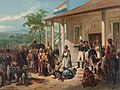
Peru 1970 national football team[edit]
Article(s): Peru national football team
Request:
- Please remove the watermark of "www.fotosfutbolperuano.blogspot.com". Since the image was published in Peru in 1970, it has no copyright. The watermark is an attempt by the BlogSpot to claim copyright, but (since that has no legal value as no significant changes have been made to the image by the BlogSpot) have instead corrupted the image. Due to the length of the watermark this may be a difficult task.
- Also, if at all possible, please correct the bends and scratches that the image has (on upper-left corner and throughout the image).-- MarshalN20 | Talk 21:12, 19 May 2013 (UTC)
Graphist opinion(s):
- Done — Well, my bit at least. : } There's certainly room for further improvement, but should be usable now. Since considerable reworking was involved, I uploaded my edit as [[:]] and cross linked via "other versions". --Kevjonesin (talk) 23:37, 20 May 2013 (UTC)
- That looks absolutely beautiful. I acquired a similar picture several years ago (with a calendar and restaurant advertisement in the back), and this brings back many memories from the time. Thank you for the restoration.--MarshalN20 | Talk 23:57, 20 May 2013 (UTC)
ABS-CBN Corporation[edit]
Article(s):ABS-CBN, ABS-CBN Corporation, and others.
Request: I am really concerned about the vectorized logo of ABS-CBN Corporation. The logo has a light gray box which in my opinion is just a derivative or a variation of the original logo. Although it is true that the company uses that variation (with the light gray box) from time to time, it is also noteworthy that the company uses a variation without the light gray box (transparent or just a plain white). In short, I am requesting for the removal of the light gray box. Hollyckuhno (talk) 09:33, 21 May 2013 (UTC)
- The Wikipedia Photography workshop only works with photo images. For help with vector images (.svg files) please consult the Illustration workshop. They should be able to help you out. Good Luck! --Kevjonesin (talk) 10:03, 21 May 2013 (UTC)
James G. Blunt[edit]

Article(s): James G. Blunt
Request: Can use a little cleanup. It would be wise to start with the 80MB tiff original from the Library of Congress as the current image is rather highly compressed. No sense in starting with a poor image. Also, please don't reduce resolution or make any drastic edits... just give it some love. Upload over the original. – JBarta (talk) 05:22, 18 April 2013 (UTC)
Graphist opinion(s):
I hope it will be useful — Preceding unsigned comment added by Lilot1338 (talk • contribs)
It's very nice, but I was hoping to clean it up without reducing the resolution. Preferrably starting with the tiff original. – JBarta (talk) 08:16, 5 May 2013 (UTC)
- Working from the JPG image (3,000 × 3,848 pixel) that was readily available in commons I cleaned up most of the dark spots and streaks (and some of the light ones). Still has some patina and emulsion texture ...as befits an antique ;-) --Kevjonesin (talk) 23:21, 8 May 2013 (UTC)
- I saw the upload, and while it's a definite improvement, I think still more can be reasonably done with it. – JBarta (talk) 23:40, 8 May 2013 (UTC)
- There's most always more that can be done —says I with a half a smile and a raised eyebrow. What's your goal for it? Where is it meant to be displayed? Embedded in a web page or... ?
- I saw the upload, and while it's a definite improvement, I think still more can be reasonably done with it. – JBarta (talk) 23:40, 8 May 2013 (UTC)
- Oh, and btw, you might have better luck getting someone to work off the Library of Congress TIFF if you post a copy to commons or at the very least provide a direct link here. Myself, I'd forgotten that you'd mentioned an external file before returning to this page. Make it easy for a brother, ya' know? Although, personally, it seems like overkill for web use. —hmm, Jbarta, is you tryin' to Tom Sawyer someone into making a wall-hanger for ya'? : }
- Specifics really would be helpful to anyone who chooses to take the image further. "more can be reasonably done with it" is rather vague. Are you referring to further removal of visual artifacts like streaks and spots? Contrast or brightness levels? Cropping? Please share your observations on how it is now and your vision of what you'd like to see in the future and why you feel it's worthwhile. --Kevjonesin (talk) 00:31, 9 May 2013 (UTC)
- "Tom Sawyer someone?" Never heard that expression... but no... no such ulterior motive. To be more specific, I think there are more spots and scratches that can be removed. Brightness and contrast seem fine. I understand that everyone has their idea of what is "good enough" and I understand the notion of diminishing returns, but in the past photos like this have been restored here to a pretty impressive degree. Your restoration is nice... and certainly an improvement... but not impressive (IMO). Good enough for an article, sure... if that's all you're shooting for. I think with a reasonable amount of additional effort, noticably more improvement can be had. As far as the tiff original, I'm not a big fan of uploading it to Commons when a permanant copy resides on the LOC website. If you click the LOC link on the image description page, you'll find the file easily. I didn't explain that, because I assumed most folks knew that. Now one more person knows ;-) – JBarta (talk) 03:20, 9 May 2013 (UTC)
- Right on. "Tom Sawyer someone" was meant as an allusion to 'getting someone to paint Tom Sawyers fence' which itself is an allusion to the passage in the book.
- Yeppers, I'm a newbie here at the Photography workshop. Please feel free to help me get acquainted with the culture.
- Back to discussion of the image: "improvement... but not impressive", I would agree. My goal was just to make sure something decent was available for insertion in a Wikipedia article or the like. At this point I'm curious as to what one might consider to be the stopping point for cleanup on an image like this? I suppose one could eventually remove all traces of the historic photo emulsion process but fear that this would be like polishing/refinishing an antique piece of silver/furniture and risk losing character and context along with the patina. Taken to the extreme one might end up with something which appears to be a modern photo of someone posed in period dress. I'd be curious to see some of the examples to which you've referred (if they're at hand). It would help me to gain some perspective. And looking at other's "ooh, lookie' what I did!' pieces can be fun —and informative (especially if they share how they did it). --Kevjonesin (talk) 15:52, 9 May 2013 (UTC)
- Here are a couple recent examples that I thought were very well done:
- – JBarta (talk) 16:16, 9 May 2013 (UTC)
- Thanks! --Kevjonesin (talk) 17:09, 9 May 2013 (UTC)
- "Tom Sawyer someone?" Never heard that expression... but no... no such ulterior motive. To be more specific, I think there are more spots and scratches that can be removed. Brightness and contrast seem fine. I understand that everyone has their idea of what is "good enough" and I understand the notion of diminishing returns, but in the past photos like this have been restored here to a pretty impressive degree. Your restoration is nice... and certainly an improvement... but not impressive (IMO). Good enough for an article, sure... if that's all you're shooting for. I think with a reasonable amount of additional effort, noticably more improvement can be had. As far as the tiff original, I'm not a big fan of uploading it to Commons when a permanant copy resides on the LOC website. If you click the LOC link on the image description page, you'll find the file easily. I didn't explain that, because I assumed most folks knew that. Now one more person knows ;-) – JBarta (talk) 03:20, 9 May 2013 (UTC)
Something to consider[edit]
I came across the 'Commons:Overwriting existing files' page recently and it seems to have relevance to the preceding discussion. Specifically it directly addresses the topic of digital restoration here '#Exceptions' and here '#Exceptions to the minor changes rule'. While personally I might not be inclined to apply the guidelines as strictly to some digital images of photography as I would to digital images of oil paintings — I would, for instance, cut more 'slack' to an image which was created digitally initially than I would to a digital photograph of an existing physical print/plate/negative/etc. — when it comes to completely removing characteristics inherent to an antique photographic process (e.g. streaks in hand applied emulsion) I think they should apply. The difference between removing a spot of dust or mold from an image of a painting versus editing out an artist's exposed under-drawing or brush strokes. I'd likely give in, if pressed, to go ahead and apply the convention of renaming (e.g. File:blahblablah_(restoration).jpg) — along with a link back to the source file — globally to all digital photo images of physical photo images. Especially to historical ones. Thoughts or feedback anyone? Should we carry/copy this thread over to the talk page? --Kevjonesin (talk) 14:01, 15 May 2013 (UTC)
- The section '#Improve' at the 'WikiProject Media Restoration/Landmark_images' page encourages such renaming as well. --Kevjonesin (talk) 14:27, 15 May 2013 (UTC)
![]() Done — Since no one else has offered an opinion (recently) I'm calling it "done". If someone would like to work up a heavily restored high res version from the large .tiff it can be uploaded later under a modified filename and cross linked via "other versions". --Kevjonesin (talk) 20:09, 17 May 2013 (UTC)
Done — Since no one else has offered an opinion (recently) I'm calling it "done". If someone would like to work up a heavily restored high res version from the large .tiff it can be uploaded later under a modified filename and cross linked via "other versions". --Kevjonesin (talk) 20:09, 17 May 2013 (UTC)
Painting[edit]
-
 Painting of Solano López, dictator of Paraguay

Article(s): Francisco Solano López
Request:
Graphist opinion(s):
Gived it a whirl. – JBarta (talk) 15:30, 7 May 2013 (UTC)
- Wow. It looks much, much better. You did an excelent job, JBarta. Thanks a lot! --Lecen (talk) 19:40, 7 May 2013 (UTC)
- Better yes, but could possibly even be better still. Other editors are of course welcome to give it a go. It might even be preferrable to use the image(s) in the source URL instead. Would be smaller, but little better quality. – JBarta (talk) 20:49, 7 May 2013 (UTC)
- I tweaked it a little further, adjusted the colours a bit and reduced contrast of the white trousers and tried to reduce the light patch on his boots. Regards, Fallschirmjäger ✉ 23:53, 8 May 2013 (UTC)
- Done — OP has indicated that they're satisfied and, IMHO, the image has clearly been much improved. 'Good enough for the web'. Let's make room for some fresh projects. A high-res version could be forked to a fresh filename if anyone is really interested/enthused/concerned/motivated enough to take such on. --Kevjonesin (talk) 12:03, 15 May 2013 (UTC)
- Better yes, but could possibly even be better still. Other editors are of course welcome to give it a go. It might even be preferrable to use the image(s) in the source URL instead. Would be smaller, but little better quality. – JBarta (talk) 20:49, 7 May 2013 (UTC)
Julian Carroll[edit]
Article(s): Julian Carroll
Request:
- If possible, please remove that shovel handle in the middle of the subject's chest. The uncropped version is linked in the photo's source, if that helps. -- Delaywaves • talk 22:07, 10 May 2013 (UTC)
Graphist opinion(s):
![]() Done – JBarta (talk) 22:46, 10 May 2013 (UTC)
Done – JBarta (talk) 22:46, 10 May 2013 (UTC)
Request highlight masseter on File:Gray378.png[edit]
-
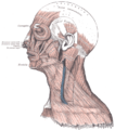 This is the original
 -
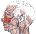 An example of red highlighting of a different muscle


Article(s): masseter, bruxism, submasseteric space, others
Request:
- User:Uwe Gille did a lot of great work based on Gray378 making several copies to highlight indvidual muscles [1]. However, we are missing such a diagram for masseter (I've looked everywhere). Would it be possible for someone good at this kind of thing to highlight masseter in the same fashion as these other diagrams? Note that the required highlighting area is marked with the text "Masster superficial portion / deep portion". Would be good to crop the new image to a similar size as the right hand image too. Thank you, Lesion (talk) 12:23, 21 May 2013 (UTC)
Graphist opinion(s):
.png)
- Done — Uploaded as File:Gray378 (masseter highlight).png. Lesion if you're satisfied with the new image please tag this request with {{resolved|1=~~~~}}. I had fun. Learned some new tricks. : } --Kevjonesin (talk) 21:17, 21 May 2013 (UTC)
- Wow, great job. Much better than I could have managed with the shading. Not sure how this is done. I have tweaked the highlighted area a small bit, the quality of the shading in this area is now not great, but it is so small I think its fine. Thanks, Lesion (talk) 22:35, 21 May 2013 (UTC)
- "Good enough for rock-n-roll". : } . I'll mark this "resolved".
- fyi Lesion, in my version I isolated the part that I highlighted and then made translucent layers. Some with the original color and detail. Others I used the "color to alpha" tool (via GIMP) to make some parts transparent (such as the text, to allow it to show through crisp from below). Colored some of the resulting 'templates' with translucent red. I've been finding layered transparencies useful in preserving detail. Some similarities to cutting stencils, transparent animations cells, traditional multi-color printing and such. It's a growing technique I've been experimenting with for a bit now. Happy to go into more detail on my talk page if anyone wants to 'geek out' on technical details. --Kevjonesin (talk) 12:18, 22 May 2013 (UTC)
- That sounds complex, but I can sort of picture what you did now, and it is interesting to hear what program you used. There is only so much that can be done with Paint I believe. In all honesty I think this workshop does great, professional work, and there is not much incentive for unskilled users like myself to try things on your own when it produces inferior work (e.g. [2], [3], [4], [5], [6] ). The less said about these attempts the better =D Lesion (talk) 22:18, 22 May 2013 (UTC)
- Wow, great job. Much better than I could have managed with the shading. Not sure how this is done. I have tweaked the highlighted area a small bit, the quality of the shading in this area is now not great, but it is so small I think its fine. Thanks, Lesion (talk) 22:35, 21 May 2013 (UTC)
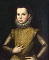
Umberto di Savoy[edit]
-
 Umberto di Savoy
 -
 Umberto di Savoy Done


Article(s): Prince of Piedmont
Request:
- Could some possibly crop and restore this photograph please, many thanks. TRAJAN 117 (talk) 12:40, 22 May 2013 (UTC)
Graphist opinion(s):
- Looks simple, although the full size image would be better.
 Request taken by — Crisco 1492 (talk) 12:45, 22 May 2013 (UTC).
- Did some cropping and removed some scratches; this should be good for article use. Still a bit of dust, but not all that apparent at thumbnail size. — Crisco 1492 (talk) 13:15, 22 May 2013 (UTC)
- Looks great! Many thanks. TRAJAN 117 (talk) 14:20, 22 May 2013 (UTC)
Princes of Piedmont[edit]
-
 Victor Amadeus di Savoy
 -
 Francis Hyacinth di Savoy
 -
 Victor Amadeus di Savoy
(1699–1715) -
 Charles Emmanuel di Savoy
 -
 Umberto Rainier di Savoy


Article(s): Prince of Piedmont
Request:
- Could someone possibly restore these portraits (crop if necessary), many thanks. TRAJAN 117 (talk) 15:02, 22 May 2013 (UTC)
Graphist opinion(s): ![]() Done Centpacrr 3:04 pm, 22 May 2013 (UTC)
Done Centpacrr 3:04 pm, 22 May 2013 (UTC)
- They all look great! Many thanks. TRAJAN 117 (talk) 20:04, 22 May 2013 (UTC)
Fremy restoration[edit]
-
 original
 -
 cropped

.jpg)
.jpg&action=edit&redlink=1)
.jpg)
![[1]](https://commons.wikimedia.org/w/index.php?search=Gray378.png&title=Special%3ASearch)
![[2]](https://commons.wikimedia.org/wiki/File:Submandibular_space_(gray507_edit).png)
![[3]](https://commons.wikimedia.org/wiki/File:Submandibular_space_(Gray386_edit).png)
![[4]](https://commons.wikimedia.org/wiki/File:Submental_space_(Gray386_edit).png)
![[5]](https://commons.wikimedia.org/wiki/File:Submental_space_(Gray507_edit).png)
![[6]](https://en.wikipedia.org/wiki/File:Masticator_space.png)
Please do a crop (make a new file) to cut most of the non-used space. If you change the aspect ratio to be more wide, that is fine (probably good). Any other restoration (rotation, etc.) needed, please do.
TCO (talk) 23:29, 25 May 2013 (UTC)
Done Centpacrr 00:43, 26 May 2013 (UTC)
crop Barber Cup[edit]

Please
1. remove diagonal line in background 2. make the white occlusion sharper (it is unfortunate, but given it exists maybe better if we make it clear) 3. crop to lower the aspect ratio (tall photos are a hassle for article use)
TCO (talk) 18:02, 26 May 2013 (UTC)