
Wikipedia:Graphics Lab/Photography workshop/Archive/Oct 2009
Stale[edit]
Stitch Hell Scroll[edit]
Note: This request was moved from the Illustration workshop to the photography workshop. ZooFari 02:35, 7 October 2009 (UTC)

Article(s): Hell Scroll
Request: The picture is a stitch of individual sections of the scroll. Unfortunately it is not straight, especially at the right end (in fact the beginning of the scroll) where the last section (the excrement hell) bends downward. Can somebody do a better stitch than me? JPG and TIFF files of the sections are found in commons:Category:Hell Scroll (Nara National Museum). Thanks. bamse (talk) 10:47, 29 September 2009 (UTC)
Graphist opinion(s):
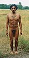
Modify photo of nude male for anatomy depiction[edit]
Note: This request was moved from the Illustration workshop to the photography workshop. ZooFari 02:35, 7 October 2009 (UTC)
-
 Nude male human standing with arms at side on grassy backdrop

Article(s): Human
Request: Remove the background, remove the stray weeds (and clone/repair or whatever the overlapping body parts), and repair the obscured foot using the unobscured one. It's being considered as an image to illustrate human anatomy (hence the nakedness). Cybercobra (talk) 00:32, 5 October 2009 (UTC)
Graphist opinion(s):
- Wouldn't these images work better for that purpose? — raeky (talk | edits) 01:44, 5 October 2009 (UTC)
- To counter systemic bias, several feel we should avoid using a European. --Cybercobra (talk) 01:53, 5 October 2009 (UTC)
- That's BS, and the requested image is far inferior in quality and the proposed changes you want to it are extremely difficult and to recreate his foot would be near impossible. I highly doubt any graphic artist here is going to take on that request when theres perfectly good higher quality versions to use already in existence that better illustrate what you want to illustrate. Your refusal to use a "white guy" is racist. — raeky (talk | edits) 05:56, 5 October 2009 (UTC)
- Fine with me, I was the one who suggested just using the white guy in the first place. --Cybercobra (talk) 06:01, 5 October 2009 (UTC)
- That's BS, and the requested image is far inferior in quality and the proposed changes you want to it are extremely difficult and to recreate his foot would be near impossible. I highly doubt any graphic artist here is going to take on that request when theres perfectly good higher quality versions to use already in existence that better illustrate what you want to illustrate. Your refusal to use a "white guy" is racist. — raeky (talk | edits) 05:56, 5 October 2009 (UTC)
- To counter systemic bias, several feel we should avoid using a European. --Cybercobra (talk) 01:53, 5 October 2009 (UTC)
- Also, this dude has tattoos and piercings, which rather lessen his value as an anatomical model. I'm not anti-body-modification, but anatomical models should be as "typical" as possible. --Slashme (talk) 12:10, 8 October 2009 (UTC)
Resolved[edit]
Javanese language[edit]
![]() Done
Done
.jpg)
_(cropped).jpg)
Article(s): Javanese language Request: Trim away blank space so inner text appears more clearly... Chris (クリス • フィッチュ) (talk) 11:40, 18 September 2009 (UTC)
Graphist opinion: Already done. Time3000 (talk) 13:03, 18 September 2009 (UTC)
- Cool, thanks! Chris (クリス • フィッチュ) (talk) 13:12, 18 September 2009 (UTC)
Cut out parts of the image[edit]
Note: This request was moved from the Illustration workshop to the photography workshop. ZooFari 02:35, 7 October 2009 (UTC)


Article(s): List of National Treasures of Japan (sculptures)
Request: In the first picture please cut out (and if necessary/possible improve) Yuima (see image description) and the small statue on the very left. Upload as two separate pictures. Do the same with Monju Bosatsu (see image discription) in the second picture. bamse (talk) 08:38, 14 September 2009 (UTC)
Graphist opinion(s): ![]() Done: I managed to cut myself. bamse (talk) 23:03, 16 September 2009 (UTC)
Done: I managed to cut myself. bamse (talk) 23:03, 16 September 2009 (UTC)
trim to encyclopedic[edit]
Note: This request was moved from the Illustration workshop to the photography workshop. ZooFari 02:35, 7 October 2009 (UTC)

Article(s):
Request: trim to encyclopedic (bordering, extra space...) Chris (クリス • フィッチュ) (talk) 03:28, 29 September 2009 (UTC)
Graphist opinion: ![]() Done -- Here you go, have uploaded over old bordered versions as see no reason to keep them. Fallschirmjäger 18:26, 4 October 2009 (UTC)
Done -- Here you go, have uploaded over old bordered versions as see no reason to keep them. Fallschirmjäger 18:26, 4 October 2009 (UTC)
Remove watermark[edit]
Note: This request was moved from the Illustration workshop to the photography workshop. ZooFari 02:35, 7 October 2009 (UTC)
-
 cropped

Article(s): None, image needs to be identified
Request: Please remove the watermark and upload to Commons. Categorize it under Commons:Category:Unidentified birds. ZooFari 23:06, 7 September 2009 (UTC)
Graphist opinion(s):
- Seems like a lot of clone tool work for such a poor quality image... an unused image like this would be more likely candidate for deletion then graphic work and moving to Commons, imho. Am I missing something that makes this image worth any effort? — raeky (talk | edits) 01:43, 14 September 2009 (UTC)
- I agree. On the other hand, there's a lot of tree and very little bird. Can we just crop it? Certes (talk) 17:10, 14 September 2009 (UTC)
- Don't really care what you do with it. I just want it out of IFC. ZooFari 00:28, 16 September 2009 (UTC)
 Done It was moved to commons on the 9th of September, although the cropping was not very good, just cropped the image further...it appears on the Philippine Eagle page, and is categorised on commons.--Goldsztajn (talk) 22:29, 11 October 2009 (UTC)
- Don't really care what you do with it. I just want it out of IFC. ZooFari 00:28, 16 September 2009 (UTC)
- I agree. On the other hand, there's a lot of tree and very little bird. Can we just crop it? Certes (talk) 17:10, 14 September 2009 (UTC)
Chesapeake High School clouds[edit]
-
Chesapeake High School
Article(s): Chesapeake High School (Baltimore County)
Request: Remove darker clouds from photo. They look unnatural, and distract from the intended subject of the image. SchuminWeb (Talk) 18:16, 8 October 2009 (UTC)
Graphist opinion(s): ![]() Done: How's that? I just completely redid the sky, considering how unrealistic it used to look - Kingpin13 (talk) 16:48, 12 October 2009 (UTC)
Done: How's that? I just completely redid the sky, considering how unrealistic it used to look - Kingpin13 (talk) 16:48, 12 October 2009 (UTC)
- Better, but the sky still looks kind of unnatural. Is it possible to still make the sky look overcast? SchuminWeb (Talk) 16:52, 12 October 2009 (UTC)
- Yuh, I agree that it was a bit too clear, but I fund it difficult to judge having seen the old image. I've tried to make it more overcast as you requested, how's that? - Kingpin13 (talk) 17:55, 12 October 2009 (UTC)
- Perfect. Thank you very much! SchuminWeb (Talk) 18:13, 12 October 2009 (UTC)
- Yuh, I agree that it was a bit too clear, but I fund it difficult to judge having seen the old image. I've tried to make it more overcast as you requested, how's that? - Kingpin13 (talk) 17:55, 12 October 2009 (UTC)
Naledi Pandor BLP lede photo[edit]
Note: This request was moved from the Illustration workshop to the photography workshop. ZooFari 02:35, 7 October 2009 (UTC)
-
 Pandor in front of the Eiffel Tower
 -
 Cropped with brightness curve adjusted in GIMP
 -
 Further brightness adjustment


Article(s): Naledi Pandor
Request: Please crop and clean photo. This will likely be the lede image for this BLP for a while. -- Banjeboi 15:38, 5 September 2009 (UTC)
Graphist opinion(s): First attempt above. Is this what was required? If not, please suggest how to improve the image further. Certes (talk) 21:57, 5 September 2009 (UTC)
- First off thank you for the work so far and apologies for the delay in responding. Is there anyway to lighten up the face that is so poorly lit? I know it must be a challenge but is anything possible? -- Banjeboi 05:47, 14 September 2009 (UTC)
- I have tried again but nothing I did was an improvement. Changing brightness makes one cheek white or the other black; reducing contrast just turns the face grey. Selectively altering one area of the image gives the impression that Ms Pandor is starring as the Phantom of the Opera. Sorry; perhaps someone else can do better. Certes (talk) 17:49, 14 September 2009 (UTC)
- Added my attempt, but basically the photo is just too poor quality to do much with. SpinningSpark 21:35, 22 October 2009 (UTC)
- Thank you! It's still better and we always do try to improve! -- Banjeboi 21:27, 23 October 2009 (UTC)
- Added my attempt, but basically the photo is just too poor quality to do much with. SpinningSpark 21:35, 22 October 2009 (UTC)
- I have tried again but nothing I did was an improvement. Changing brightness makes one cheek white or the other black; reducing contrast just turns the face grey. Selectively altering one area of the image gives the impression that Ms Pandor is starring as the Phantom of the Opera. Sorry; perhaps someone else can do better. Certes (talk) 17:49, 14 September 2009 (UTC)
- First off thank you for the work so far and apologies for the delay in responding. Is there anyway to lighten up the face that is so poorly lit? I know it must be a challenge but is anything possible? -- Banjeboi 05:47, 14 September 2009 (UTC)
Color cast in Ride On bus photo[edit]
-
Original photo
.jpg)
Article(s): Ride On (bus)
Request: The original photo was taken in the late afternoon under clear skies, and as a result, the image has a kind of bluish-greenish cast to it. I attempted to fix the cast myself (shown), and this led to a different color cast that makes it kind of look like an old photo from the sixties. The fix I did is the one used the article, but any corrections probably ought to be made off the original. SchuminWeb (Talk) 00:31, 12 October 2009 (UTC)
Another thought: Just another thought while you are working on this. From my own experience I find that when I focus on a bus, like this example, the result generally leaves the bus floating on a sea of asphalt. The solution that I use is to change the 4x3 format to 16x9 widescreen by simply removing 25% from the bottom. Try it and you will see how much improvement comes from concentrating on the subject matter, especially with the shadow patterns in the foreground here. Obviously, there is sometimes too much sky, and the removal can be adjusted to suit. I also agree that readjusting an adjusted picture is not really the way to go, but it's good to see people striving to make improvements. Thanks Ben for your consistently good work. Secondarywaltz (talk) 19:05, 12 October 2009 (UTC)
- Agreed. Cropping it to 16:9 will make it look really good, eliminating a bunch of that railing shadow. SchuminWeb (Talk) 06:21, 13 October 2009 (UTC)
Graphist opinion: I hate to disagree with a client, but I took a look at the original pic, and I really don't see a cast. The asphalt looks pretty much neutral grey and the whites look white. The hubcaps also look quite neutral to me. I don't have a calibrated screen, though. Any other opinions here? --Slashme (talk) 08:17, 17 October 2009 (UTC)
- You know, I took another look at it, and the photo is not all that great in the first place. It will do for what we need it to do for now, I believe, but ultimately, I think we're probably better off just replacing the picture altogether with a new one. Back to the bus loop for me, I suppose. But thanks for giving it a look. SchuminWeb (Talk) 19:38, 24 October 2009 (UTC)