
Wikipedia:Reference desk/Archives/Miscellaneous/2020 March 2
| Miscellaneous desk | ||
|---|---|---|
| < March 1 | << Feb | March | Apr >> | Current desk > |
| Welcome to the Wikipedia Miscellaneous Reference Desk Archives |
|---|
| The page you are currently viewing is a transcluded archive page. While you can leave answers for any questions shown below, please ask new questions on one of the current reference desk pages. |
March 2[edit]
1980s futuristic font[edit]
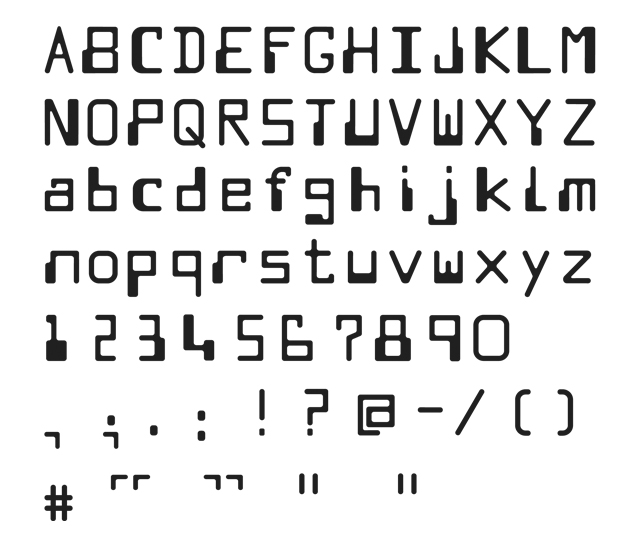
Back in the 80s (and possibly earlier too), there was a particular font (or group of fonts) that seemed to get used on just about anything that was supposed to look futuristic or "spacey". Example here from a computer game screenshot: https://upload.wikimedia.org/wikipedia/en/1/18/Codenamemat.png What was this font? Iapetus (talk) 11:54, 2 March 2020 (UTC)
- It looks like the MICR font developed for Magnetic Ink Character Recognition used on the bottom line of US bank cheques. --Lambiam 12:33, 2 March 2020 (UTC)
- No, it's not that. It's Data 70. --Viennese Waltz 12:47, 2 March 2020 (UTC)
- The original was a font called "Westminster" - see The truth about Westminster (the font!). Alansplodge (talk) 13:04, 2 March 2020 (UTC)
- (edit conflict) I did not say it was that font, only that it looked like it. The Data 70 font ain't the same either; just compare the Vs. Yet another even more similar font: Twobit. The MICR font is apparently based on the E13-B check printing standard, with an extension by the name of Computer Monotone. It is labeled "David Moore Moore Computer 1968" here, and looks even more like that used for the game – although there remain subtle differences, like which of the two V legs is fat. --Lambiam 13:17, 2 March 2020 (UTC)
- I'm not sure what platform that screenshot is from, but if it handled fonts the same way the Amstrad CPC did, then each character would be made up of an 8x8 grid, which would of course limit the ability to replicate those designs. (Although I wouldn't be surprised if some graphic designer somewhere decided they wanted a font that didn't just look like MICR, but an 8-bit computer's representation of an MICR-inspired font). Iapetus (talk) 09:40, 3 March 2020 (UTC)
- The design of E13-B was based on utilitarian criteria: the characters should each give a characteristic voltage pattern when scanned by a 3-track MICR head, and yet also be readable by humans. Esthetic and stylistic considerations were totally subordinate. Westminster may have been the first extension, but is not a monospace font, unlike Computer. For example, the A is at least three times the width of the I. --Lambiam 13:32, 2 March 2020 (UTC)
- No, it's not that. It's Data 70. --Viennese Waltz 12:47, 2 March 2020 (UTC)
- There were a lot of hokey fonts like that, inspired by MICR, but actual MICR (designed for the sole purpose of printing check numbers to be read with the simple automated equipment of the era) didn't have any letters. It only had digits and a punctuation or separator character or two. So the pseudo-MICR fonts were doubly silly. 173.228.123.39 (talk) 07:02, 3 March 2020 (UTC)
Thanks. I see we have articles about MICR and Westminster. Iapetus (talk) 09:40, 3 March 2020 (UTC)
There is a short documentary available online about the futuristic/spacey fonts used in sci-fi films that were released in the 70s and 80s. I think it came out about two years ago. That might interest you. I can't find it at the moment, but I'm sure someone could. Temerarius (talk) 06:15, 5 March 2020 (UTC)
In the 8-bit era we often made up one-shot fonts, only creating the characters that were actually used. All the best: Rich Farmbrough (the apparently calm and reasonable) 13:39, 5 March 2020 (UTC).