Template:Did you know nominations/Thai typography
Appearance
- The following is an archived discussion of the DYK nomination of the article below. Please do not modify this page. Subsequent comments should be made on the appropriate discussion page (such as this nomination's talk page, the article's talk page or Wikipedia talk:Did you know), unless there is consensus to re-open the discussion at this page. No further edits should be made to this page.
The result was: promoted by Cwmhiraeth (talk) 05:32, 14 July 2020 (UTC)
| DYK toolbox |
|---|
Thai typography
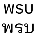
- ... that some typefaces used in Thai typography are designed to resemble Latin sans-serif, and the Thai characters พรบ (pictured in two fonts) may look just like the English letters WSU? Source: "The sans-serif Roman-like Thai typefaces are currently widespread in both appliance and type design. ... However, as single characters, they do not show good performance in visual letter recognition because each may be confused with the original Roman letters. For example, the mimicked characters ‘พ.ร.บ.’ may be confused with the abbreviation ‘W.S.U.’"[1]
- ALT1:... that in some Thai typefaces, the Thai characters พรบ (pictured in two fonts) look just like the English letters WSU?
- ALT2:... that the first printed Thai text was written by an American missionary in Burma, printed in India, then its font brought to Singapore, from where printing was finally introduced to Bangkok? Source: "The first printing in Thai characters was accomplished at Serampore in 1819: a Catechism of Religion that had been prepared by the American Baptist missionary Ann Hasseltine Judson for distribution to a small community of Thai prisoners of war in Burma. In 1823, this Thai font was shipped to Singapore, where the London Missionary Society (LMS) had established a press late the preceding year. ... The ABCFM took possession of the LMS printing establishment in Singapore, and in July 1835 brought it and an old-fashioned press to Bangkok from Singapore."[2]
- Reviewed: Hussein Mohammed
Created by Paul_012 (talk). Self-nominated at 05:59, 24 May 2020 (UTC).
 for ALT0 and ALT1. Article is great, although perhaps the references in type anatomy need to be duplicated for the specific features. The only potential issue I see is that ALT0 and ALT1 might not be obvious enough in their clarification. The parenthetical might be better if it fully said (pictured in two Thai fonts) or similar, as otherwise one might assume that the top row of letters are the Latin characters included for comparison if the picture caption is missed. I see what ALT2 is going for, but it's a bit too convoluted as it stands. CMD (talk) 06:40, 2 July 2020 (UTC)

