User:RobLa/sandbox/Charles Joseph Minard in information visualization

Charles Joseph Minard created 51 thematic maps during his lifetime and is considered "a cartographic pioneer in many respects".[2] Minard is perhaps best known for his cartographic depiction of numerical data on a map of Napoleon's disastrous losses suffered during the Russian campaign of 1812 (in French, Carte figurative des pertes successives en hommes de l'Armée Française dans la campagne de Russie 1812–1813).
Early works
[edit]Minard's earliest known diagram is from 1825,[3]: 16 but he did not start regularly producing statistical graphics until the 1840s. During this period he became interested in studying passenger and freight traffic to aid in the design of railroads. He created bar charts in which the width of each bar represents the length of the corresponding railroad segment, and its height the number of passengers. Analysis of such graphs led Minard to conclude that passengers and freight traveling for short distances between intermediate stations (and not just end-to-end traffic) were of primary importance in designing rail lines.[3]: 18
Flow maps
[edit]Minard created his "revolutionary"[3]: 40 first flow map in 1845 to inform the discussion about routing the rail line in the area between Dijon and Mulhouse. The map shows traffic on the pre-existing roads in the area. Two hundred copies of it were distributed to various stakeholders, and it dominated the debate among the deputies and engineers.[3]: 19
In subsequent decades Minard created tens of flow maps, illustrating subjects such as French wine exports and coal imports, British coal exports, freight traffic on French rivers and railways, European cotton imports, and international migration flows. A comprehensive portfolio of his works is today kept at the École nationale des ponts et chaussées.[3]: 33
Napoleon's Russian campaign
[edit]
- anchor: #NapoleonInRussia
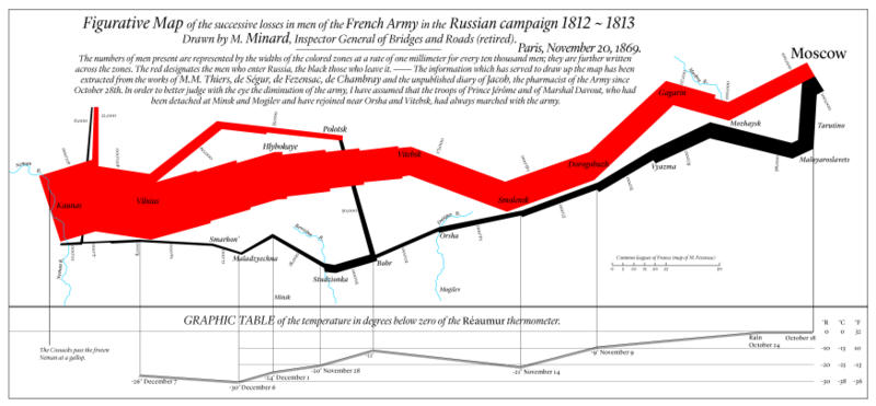
Minard is best known for his cartographic depiction of numerical data on a map of Napoleon's disastrous losses suffered during the Russian campaign of 1812 (in French, Carte figurative des pertes successives en hommes de l'Armée Française dans la campagne de Russie 1812–1813). The illustration depicts Napoleon's army departing the Polish-Russian border. A thick band illustrates the size of his army at specific geographic points during their advance and retreat. It displays six types of data in two dimensions: the number of Napoleon's troops; the distance traveled; temperature; latitude and longitude; direction of travel; and location relative to specific dates without making mention of Napoleon; Minard's interest lay with the travails and sacrifices of the soldiers.[1] This type of band graph for illustration of flows was later called a Sankey diagram, although Matthew Henry Phineas Riall Sankey used this visualisation 30 years later and only for thematic energy flow.
21st century popularity
[edit]
The original description in French accompanying the map translated to English:[4]
Figurative Map of the successive losses in men of the French Army in the Russian campaign 1812–1813.
Drawn by M. Minard, Inspector General of Bridges and Roads (retired). Paris, November 20, 1869.
The numbers of men present are represented by the widths of the colored zones at a rate of one millimeter for every ten thousand men; they are further written across the zones. The red designates the men who enter Russia, the black those who leave it. — The information which has served to draw up the map has been extracted from the works of M. M. Thiers, de Ségur, de Fezensac, de Chambray and the unpublished diary of Jacob, the pharmacist of the Army since October 28th.
In order to better judge with the eye the diminution of the army, I have assumed that the troops of Prince Jérôme and of Marshal Davout, who had been detached at Minsk and Mogilev and have rejoined near Orsha and Vitebsk, had always marched with the army.
A modern redrawing of the map, translated into English:

- ^ a b Corbett, John. "Charles Joseph Minard: Mapping Napoleon's March, 1861". Center for Spatially Integrated Social Science. Archived from the original on 12 March 2017. Retrieved 21 September 2014.
- ^ Arthur H. Robinson (1967), "The Thematic Maps of Charles Joseph Minard", Imago Mundi, Vol. 21, (1967), pp. 95–108
- ^ a b c d e Cite error: The named reference
minard-systemwas invoked but never defined (see the help page). - ^ "Minard's Sources—from Virginia Tufte and Dawn Finley, August 7, 2002".


