
Wikipedia:Featured picture candidates/James Webb Space Telescope Mirror Testing
James Webb Space Telescope Mirror Testing[edit]
Voting period is over. Please don't add any new votes. Voting period ends on 14 Aug 2010 at 14:22:22 (UTC)


- Reason
- Very high technical standard, the lighting and environment makes this a very visually appealing image, we need more space stuff as featured content imho.
- Articles in which this image appears
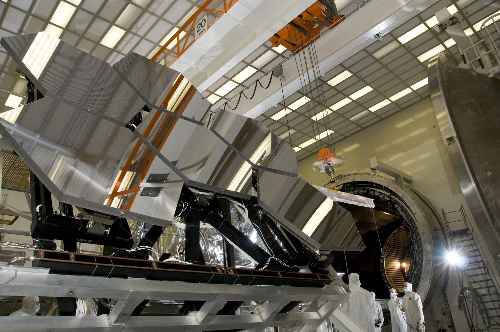
- James Webb Space Telescope
- FP category for this image
- Aeronautics and aviation/Space
- Creator
- NASA/MSFC/David Higginbotham/Emmett Given
- Support as nominator --— raekyT 14:22, 5 August 2010 (UTC)
- Support
Haven't looked at the technicals in detail, but EV-wise,this is a winner. Looks good all-round. Papa Lima Whiskey (talk) 14:26, 5 August 2010 (UTC) - Support One reason: I find it to be exceedingly eye-catching to the point where users will want to read its accompanying article. I don’t think I need to pore over the compositional elements and the nearly unearthly nature of this image. Greg L (talk) 21:55, 5 August 2010 (UTC)
- Comment I think the photographer has thrown a CTO gel on the flash just to the right of the frame (see the flare) then set the white balance such that it appears white. This has resulted in the rest of the frame looking a blue-green colour with the people in white. The end result is pretty cool, but I'm not so sure its good from an encyclopaedic point of view. Correcting leaves lots of the frame looking pretty green, I'm not sure if that is the result of mixed lighting or a green wall behind though. I'm inclined to support it in some form though. Noodle snacks (talk) 04:51, 6 August 2010 (UTC)
- I think it makes it look more industrial and modern and goes more with the theme of the cryogenic testing... but here is another shot from the same shoot with more normal colors. ;-) I don't think theres anything wrong with tweaking colors for artistic intent, same as black & white shots, it doesn't alter the EV I don't feel, the mirrors are white metal anyway, and later coated in gold. The choice to throw everything into the blue range makes it look colder and more alien, which makes it more compelling for a highly industrial shot like this imho. — raekyT 04:58, 6 August 2010 (UTC)
- Yeah, I'd prefer to represent the colour accurately, but this one has the best composition so its hard to say. I quite like [1], compared to say [[2]], which has used the gels again. Noodle snacks (talk) 05:11, 6 August 2010 (UTC)
- I did initially upload those File:James Webb Space Telescope Mirror30.jpg File:James Webb Space Telescope Mirror33.jpg and a couple others. — raekyT 05:14, 6 August 2010 (UTC)
- Different photographer and that set is much smaller then the set these images came from.. and those are at another facility after the gold coating. — raekyT 05:13, 6 August 2010 (UTC)
- Yep, different stage of production, but that doesn't matter imo. 30 is still the best if you constrain the lighting to white in my view. Noodle snacks (talk) 09:26, 6 August 2010 (UTC)
- As a different stage in production, I'd be tempted to nominate 30 separately, the two images I picked I think are both VERY good quality and are during the Cryogenic & X-ray testing. Other images with gold are the final stage before delivery... I really can't wait until this thing is in space and sending us back pictures, it's going to produce some amazing shots! Glad it's NASA and not ESA, otherwise we'd never get to use shots, hate ESA's policies. GRR. — raekyT 15:21, 6 August 2010 (UTC)
- Yep, I'm fine with separate nomination. Noodle snacks (talk) 00:20, 7 August 2010 (UTC)
- As a different stage in production, I'd be tempted to nominate 30 separately, the two images I picked I think are both VERY good quality and are during the Cryogenic & X-ray testing. Other images with gold are the final stage before delivery... I really can't wait until this thing is in space and sending us back pictures, it's going to produce some amazing shots! Glad it's NASA and not ESA, otherwise we'd never get to use shots, hate ESA's policies. GRR. — raekyT 15:21, 6 August 2010 (UTC)
- Yep, different stage of production, but that doesn't matter imo. 30 is still the best if you constrain the lighting to white in my view. Noodle snacks (talk) 09:26, 6 August 2010 (UTC)
- Yeah, I'd prefer to represent the colour accurately, but this one has the best composition so its hard to say. I quite like [1], compared to say [[2]], which has used the gels again. Noodle snacks (talk) 05:11, 6 August 2010 (UTC)
- I think it makes it look more industrial and modern and goes more with the theme of the cryogenic testing... but here is another shot from the same shoot with more normal colors. ;-) I don't think theres anything wrong with tweaking colors for artistic intent, same as black & white shots, it doesn't alter the EV I don't feel, the mirrors are white metal anyway, and later coated in gold. The choice to throw everything into the blue range makes it look colder and more alien, which makes it more compelling for a highly industrial shot like this imho. — raekyT 04:58, 6 August 2010 (UTC)
- Weak Support In spite of the inaccurate colours. Noodle snacks (talk) 09:29, 6 August 2010 (UTC)
- Weak support either I like this and it does look like something I would expect to see on WP:FP, but I'd think the bluish color was maybe fluorescent lighting, can't support it fully if it's not real and the smoothness of the alt isn't as high. --I'ḏ♥One 20:22, 11 August 2010 (UTC)
- The blue color was intentionally created as NS pointed out by the creative use of a colorized filter on the flash, then setting the flash filter color as the white balance. It was done most likely to make the very clinical white and sterile clean room look more visually interesting. — raekyT 01:07, 12 August 2010 (UTC)
Not promoted --Jujutacular talk 15:43, 14 August 2010 (UTC)