Wikipedia:Featured picture candidates/Mission San Juan Capistrano
Appearance

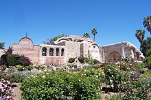
- Self-nom. An interesting combination of textures and colors, and an archaeologically-important site.--Lordkinbote 07:39, 13 February 2006 (UTC)
- Regretful Oppose Good pic but we've set the technical standard very high for pictures that don't represent a one-off photo opportunity and I don't think this one quite makes it. It's unsharp all over and a bit overexposed, and there is noise in the sky even at half resolution. The noise and sharpness could probably be improved (a bit) but I think there is very likely detail permanently lost to the overexposure :-( It's a beautiful place though!!! ~ Veledan • Talk 17:26, 13 February 2006 (UTC)
- Oppose. Bushes and sky take up 70% of the picture. I'm not too regretful that we set the standards this high, as long as people understand that an image contribution does not have to be FP to be useful and appreciated. --Dschwen 17:49, 13 February 2006 (UTC)
- Oppose. Half the building is completely overexposed and highlights are blown. I'm not that impressed with the composition either.. Diliff | (Talk) (Contribs) 23:07, 13 February 2006 (UTC)
- Oppose. Agreed. Alr 23:53, 13 February 2006 (UTC)
- Oppose per above. Flcelloguy (A note?) 00:17, 14 February 2006 (UTC)
Not promoted ; withdrawn by nominator.--Lordkinbote 06:44, 14 February 2006 (UTC)
