
Wikipedia:Featured picture candidates/Notre-Dame de Montréal Basilica

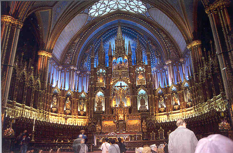
This is a 5x5 mosaic/panorama of the interior of Notre-Dame de Montréal Basilica. Like my previous panorama of Montreal's downtown, this image is extremely high resolution. It is downscaled to around 50% of original size (I worked out that even with some overlap in the stitched images, there is around 200 megapixels of detail) and still comes in at around 12mb, so it unfortunately beats my previous FPC by another 4mb! I tried to reduce the size of the file by compression but I noticed obvious artifacts - there is just too damn much detail and I didn't want to lose any of it. I also tried downsampling it but it has already been done to get it to 7577x5157 and there was obvious loss of detail. So take it or leave it guys, this file is big, but the detail is amazing. For the record, I also created another version with rectilinear projection (this one is cylindrical, hence the slight curve at the bottom of the frame), but I didn't like the way warped the roof, but it is available for reference if you'd like to see it.
- Nominate and support. - Diliff | (Talk) (Contribs) 05:50, 6 January 2006 (UTC)
 Support - You know, at first I was going to complain that it was too dark.. but my my what an astounding image! That thing is massive!! When you zoom in, the darkness problem goes away.. there's so much detail. Excellent. Perfect Featured Picture with an astounding amount of detail. drumguy8800 - speak? 06:27, 6 January 2006 (UTC)
- Support! Impressive Glaurung 07:47, 6 January 2006 (UTC)
- Support. The level of detail is insane. I do worry about those with slow connection though. Raven4x4x 07:58, 6 January 2006 (UTC)
SupportSupport original only. Its almost like beeing there... --Dschwen 11:37, 6 January 2006 (UTC)
- I trust Diliff when he says he wanted to keep the pic as close to the original interior as possible. Has the editor actually been there? --Dschwen 12:50, 9 January 2006 (UTC)
- Support wow very nice. Sarah Ewart 13:21, 6 January 2006 (UTC)
- How can one avoid supporting this? (Rhetorical question... ;-) (Added later: first version) --Janke | Talk 13:34, 6 January 2006 (UTC)
- Support. Amazing. Alr 14:06, 6 January 2006 (UTC)
- Support - Would the phrase holy shit be inappropriate here? --Deglr6328 16:36, 6 January 2006 (UTC)
- Support - highly immersive. -- Debivort 18:43, 6 January 2006 (UTC)
- Support
version 2either version. They both look impressive. - TomStar81 20:36, 6 January 2006 (UTC) - Support - That's the best thing to being there! JQF 21:51, 6 January 2006 (UTC)
- Support High quality, high resolution. The lighting it quite good, especially for being inside a basilica. (On my CRT the image looked a bit dark, but on my LCD it looks fine...). Also, where is the rectilinear projection for reference...? I would like to see it. Diliff, did you happen to take any other photos of the basilica? This image is a good view of the interior in its entirety, but photos of the organ, or other smaller subjects would greatly benefit the article. ~MDD4696 22:18, 6 January 2006 (UTC)
- I've just uploaded the rectilinear projection. I also have an image of the organ pipes at the rear of the basilica that I'm going to upload soon. Its pretty high res too, but not a FPC. ;) Diliff | (Talk) (Contribs) 03:39, 12 January 2006 (UTC)
- Support (speechless) -- Chris 73 | Talk 23:19, 6 January 2006 (UTC)
- Support I'd say this one's a lock. --JPM 00:35, 7 January 2006 (UTC)
- Support Flcelloguy (A note?) 01:08, 7 January 2006 (UTC)
- Support. Oh dear, all the other images on this page are starting to look tiny and low res... enochlau (talk) 05:16, 7 January 2006 (UTC)
- Clarify that I support the original for its accuracy. enochlau (talk) 09:35, 17 January 2006 (UTC)
- Support. The lightened version is simply stunning. I'm going to go read the article it's featured in right now. - 219.89.247.222 14:59, 7 January 2006 (UTC)
- Awesome pic, but can some Photoshop guru do something about it being too dark? Renata3 05:22, 7 January 2006 (UTC)
- Comment I like the first, which was also the only one when I stated my support above. The moody feeling was just right for a cathedral. The second one looks a bit artificially lightened on my monitor. This is an important point: people have their monitors set very differently. I use a calibrated Mac display, while run-of-the-mill PC monitors tend to show images both darker and contrastier. Laptops and flat-panel displays are again different... It's hard to find the right balance to suit all. I won't oppose the lighter version, though, if consensus favors it. --Janke | Talk 16:08, 7 January 2006 (UTC)
- I support the lighter version. And abstain on the first one. That is because even though the resolution is GIGANTIC I cannot see too much detail because it is simply too dark and everything becomes formless shadows of grey/black. Now a lighter version makes a lot more details visible. The moody feeling can be expressed by a low res pic. When you have THAT kind of resolution, you want - and expect - to see the details. And the lighter version should allow it. Renata3 16:49, 7 January 2006 (UTC)
- I agree with Janke here. My support only goes for the first one, I don't think it needed to be lightened -- now it seems too artificial and doesn't have the same feeling to it. --JPM 17:08, 7 January 2006 (UTC)
- I agree that perhaps the original image could be too dark for some people's monitors, but I think if you have a correctly calibrated monitor, you wouldn't find it too dark. I made sure I kept the image looking as close to the actual interior. I don't support the edit as it does look artificial and not as correct - the interior of this particular basilica was quite dark, and the front of it was lit up. If you enhance the shadows you lose this mood. It might look 'prettier' to some viewers but it is definitely not as correct. This is an encyclopaedia, remember. I know that we've discussed this and subjective things like brightness are open to interpretation but I do feel in this case, being the photographer, that the original is more correct and the edit is not. Diliff | (Talk) (Contribs) 00:39, 8 January 2006 (UTC)
- I hear you. But I reserve my right to like the lighter version better :) (in any way, form, or case, dark or bright, the pic is absolutely awsome!) Renata3 02:06, 8 January 2006 (UTC)
- I support the lighter version. And abstain on the first one. That is because even though the resolution is GIGANTIC I cannot see too much detail because it is simply too dark and everything becomes formless shadows of grey/black. Now a lighter version makes a lot more details visible. The moody feeling can be expressed by a low res pic. When you have THAT kind of resolution, you want - and expect - to see the details. And the lighter version should allow it. Renata3 16:49, 7 January 2006 (UTC)
- DUH! Support be careful, if you go to Wikimania this year I might just have to beat you up and steal your camera! Seriously this is fabulous, especially the lightened version. I swear you took this from like 50ft from the back wall and I can practically see the brushstrokes on it. ALKIVAR™
 16:13, 7 January 2006 (UTC)
 - Obvious Support - This is the epitome of a Featured Picture. Amazing detail, no pixelation or blurriness at all, enormous full size, breathtaking shot of a breathtaking scene. This is the poster child for featured pictures. - Cuivienen 20:53, 7 January 2006 (UTC)
- Support Great job.Dunemaire 21:13, 7 January 2006 (UTC)
- Absolute support - original version - agree with Janke, the darker version is better. For the record, I have plain GNU/Linux PC with reasonably set EIZO F56 monitor. Lightened version can be linked from image description - although I believe better place for gamma correction is in the browser software or window system.--Wikimol 22:09, 7 January 2006 (UTC)
- sidenote: it seems info about author got lost in the edit. --Wikimol 22:15, 7 January 2006 (UTC)
- Not in the full res --Fir0002 01:58, 12 January 2006 (UTC)
- sidenote: it seems info about author got lost in the edit. --Wikimol 22:15, 7 January 2006 (UTC)
- Support the darker version Sherurcij (talk) (Terrorist Wikiproject) 00:06, 8 January 2006 (UTC)
- Support, obviously. Camerafiend 01:41, 8 January 2006 (UTC)
- I too prefer the original version. I feel a more subdued lighting is appropriate for the subject. Raven4x4x 03:18, 8 January 2006 (UTC)

- Comment: To test whether your monitor is properly adjusted and can display shadow detail properly, please check this image that I made - in the large square, you should see the left half of the circle very faintly (or not at all), but the right half should be clearly visible. If not, you need to adjust your monitor. Hope this helps! --Janke | Talk 08:52, 8 January 2006 (UTC)
- Hmm, I just ran my laptop through the Adobe Gamma tool on Windows, and pictures look warmer now, but I still can't see the two halves of the circle. Any other suggestions? enochlau (talk) 11:18, 8 January 2006 (UTC)
- Actually, it's quite OK if you can see only the right half clearly, but not the left half. RGB 6,6,6 is a very dark grey, virtually indistinguishable from black. If you see the left side clearly, then your monitor is set too bright. I've just now experimented with a PC laptop, and on this model (Compaq Presario 2100) the settings are pretty coarse - but by tweaking the brightness, I could get a proper adjustment. This changed the mood of the second version to "very brightly lit"... --Janke | Talk 11:24, 8 January 2006 (UTC)
- I still can't see either side! :( enochlau (talk) 16:00, 8 January 2006 (UTC)
- Actually, it's quite OK if you can see only the right half clearly, but not the left half. RGB 6,6,6 is a very dark grey, virtually indistinguishable from black. If you see the left side clearly, then your monitor is set too bright. I've just now experimented with a PC laptop, and on this model (Compaq Presario 2100) the settings are pretty coarse - but by tweaking the brightness, I could get a proper adjustment. This changed the mood of the second version to "very brightly lit"... --Janke | Talk 11:24, 8 January 2006 (UTC)
- Hmm, I just ran my laptop through the Adobe Gamma tool on Windows, and pictures look warmer now, but I still can't see the two halves of the circle. Any other suggestions? enochlau (talk) 11:18, 8 January 2006 (UTC)
PS: Should we include this, or a similar, simple monitor "check test" on the top of the FPC page, in order to alert people to the problems of different monitor settings - which can influence voting rather significantly? --Janke | Talk 11:35, 8 January 2006 (UTC)
- I think it would be useful, but it may discourage casual voting. enochlau (talk) 16:00, 8 January 2006 (UTC)
- Setting a calibration standard would save us from pointless discussions and image edits. It would be a good addition. I don't think it'll dicourage casual voting. If you don't want to recalibrate your monitor you'll at least know not to comment on exposure. --Dschwen 12:57, 9 January 2006 (UTC)
- I think that's making FP's a bit exclusive. I mean we want the FPs to look good for casual users of wikipedia more than anything else. IMO they're there to showcase the best wiki has to offer to users in terms of photography. --Fir0002 01:58, 12 January 2006 (UTC)
- Let me see if I get this straight, you want to sacrifice authenticity and image detail, create a dumbed down McDonalds version of each picture so it looks acceptable for each and every miscalibrated monitor out there, instead of encouraging the user to once and for all calibrate their monitors. Because calibrating a monitor is exclusive, I dare say "elitist"? --Dschwen 13:26, 14 January 2006 (UTC)
- I think that's making FP's a bit exclusive. I mean we want the FPs to look good for casual users of wikipedia more than anything else. IMO they're there to showcase the best wiki has to offer to users in terms of photography. --Fir0002 01:58, 12 January 2006 (UTC)
- Setting a calibration standard would save us from pointless discussions and image edits. It would be a good addition. I don't think it'll dicourage casual voting. If you don't want to recalibrate your monitor you'll at least know not to comment on exposure. --Dschwen 12:57, 9 January 2006 (UTC)
- Support Very beautiful DaGizza Chat 11:41, 8 January 2006 (UTC)
- Support #1 - The second one is too bright it makes it look faux. --Kilo-Lima 12:43, 8 January 2006 (UTC)
- Support Stunning! SoLando (Talk) 09:22, 10 January 2006 (UTC)
- Support both, but prefer number 2 - The brightning of the image in number 2 really brings out the colors in the picture, and makes it much more striking on all the system I viewed it on, including my calibrated photo editing system. PPGMD 18:04, 11 January 2006 (UTC)
- I take issue with the edit mainly because it isn't accurate, not because it isn't striking. Bringing out the colours and shadows in the picture shouldn't really be the aim. It WAS dark there. The edit, to me, just seems to represent the photo as more of a carnival than a church! ;) Diliff | (Talk) (Contribs) 03:47, 12 January 2006 (UTC)
- It depends what you are going for, I look for more striking photos. As a photographer I firmly believe we play with light, and in dark places is the best place to work, light does just some wonderful things when you bring the shutter speed down. PPGMD 15:03, 12 January 2006 (UTC)
- I completely agree with you when the purpose of the photography is artistic expression or something along those lines. I mean, anyone could mess with that photo and completely change its aesthetics with colour saturation/balance and further brighten the shadows and it would certainly look striking, but if someone is reading the article and wants to know what the interior LOOKS like, surely they want an accurate image, not merely a colourful and striking one. I'm all for working with light (and photographic tools) to bring out the best in a photo, but not at the expense of accuracy. I agree with Janke when he said on the talk page that it should really be up to the photographer to make adjustments to things such as colour and luminosity, as only they were there to see it with their own eyes. That said, we can continue to discuss it and figure things out. Consensus rules. Diliff | (Talk) (Contribs) 05:03, 13 January 2006 (UTC)
- Well speaking as someone on dial up, I really would love to see the detail in your photo even in the preview. As it is, unless I view the image at it's full gigantic size, most of the shadow detail is not visible. The brightened version shows a lot more in the preview size. And as you rightly said, this is an encylopedia, and people do want to see the interiror, so atmosphere should be rejected in preference to detail for the average person. However its just a thought and as most people are happy with a dark version that's fine with me. Just another point a bright interior of a church doesn't make it a carnival. For instance this photo has almost daylight brightness. And I'm not saying your lying when you say it was really dark (I can well image), but in this photo and this one, this one and this one {which I think are of the same basilica}, the interior is very bright; so a brightened version isn't really so unrealistic. I'm not trying to detract from your obviously brilliant images, but maybe you should be a little more open to help from others in post processing --Fir0002 06:49, 13 January 2006 (UTC)
- The thing is, I can't speak for everyone as I don't see through their monitor, but I think that the shadow detail CAN be seen for the most part - it is probably just darker than some people would prefer. I don't think that sacrificing accuracy for ease of viewing is right - I think atmosphere is just as important for an encyclopaedia as the detail. It all contributes to the illustration of the article. As for the images you cite, the first is taken with a flash which would illuminate the shadows, the second is of mainly the already lit area of the church and doesn't display any of the darkest parts, the third is just as dark in the shadow areas, if not MORE dark than mine, and I get "Server configuration does not allow access to this page" when I try to view the fourth. Obviously it is POSSIBLE to take a photo that is brigher, but there is nothing to say that it is more accurate. It just keeps coming back to accuracy. I AM open to help in post processing, but I'm still entitled to an opinion on edit policy and on whether the edit reflects the scene accurately. :) Diliff | (Talk) (Contribs) 07:31, 13 January 2006 (UTC)
- Must have some kind of javascript checking to see if you've seen the page first. Go to the source page here
- The thing is, I can't speak for everyone as I don't see through their monitor, but I think that the shadow detail CAN be seen for the most part - it is probably just darker than some people would prefer. I don't think that sacrificing accuracy for ease of viewing is right - I think atmosphere is just as important for an encyclopaedia as the detail. It all contributes to the illustration of the article. As for the images you cite, the first is taken with a flash which would illuminate the shadows, the second is of mainly the already lit area of the church and doesn't display any of the darkest parts, the third is just as dark in the shadow areas, if not MORE dark than mine, and I get "Server configuration does not allow access to this page" when I try to view the fourth. Obviously it is POSSIBLE to take a photo that is brigher, but there is nothing to say that it is more accurate. It just keeps coming back to accuracy. I AM open to help in post processing, but I'm still entitled to an opinion on edit policy and on whether the edit reflects the scene accurately. :) Diliff | (Talk) (Contribs) 07:31, 13 January 2006 (UTC)
- Well speaking as someone on dial up, I really would love to see the detail in your photo even in the preview. As it is, unless I view the image at it's full gigantic size, most of the shadow detail is not visible. The brightened version shows a lot more in the preview size. And as you rightly said, this is an encylopedia, and people do want to see the interiror, so atmosphere should be rejected in preference to detail for the average person. However its just a thought and as most people are happy with a dark version that's fine with me. Just another point a bright interior of a church doesn't make it a carnival. For instance this photo has almost daylight brightness. And I'm not saying your lying when you say it was really dark (I can well image), but in this photo and this one, this one and this one {which I think are of the same basilica}, the interior is very bright; so a brightened version isn't really so unrealistic. I'm not trying to detract from your obviously brilliant images, but maybe you should be a little more open to help from others in post processing --Fir0002 06:49, 13 January 2006 (UTC)
- I completely agree with you when the purpose of the photography is artistic expression or something along those lines. I mean, anyone could mess with that photo and completely change its aesthetics with colour saturation/balance and further brighten the shadows and it would certainly look striking, but if someone is reading the article and wants to know what the interior LOOKS like, surely they want an accurate image, not merely a colourful and striking one. I'm all for working with light (and photographic tools) to bring out the best in a photo, but not at the expense of accuracy. I agree with Janke when he said on the talk page that it should really be up to the photographer to make adjustments to things such as colour and luminosity, as only they were there to see it with their own eyes. That said, we can continue to discuss it and figure things out. Consensus rules. Diliff | (Talk) (Contribs) 05:03, 13 January 2006 (UTC)
- It depends what you are going for, I look for more striking photos. As a photographer I firmly believe we play with light, and in dark places is the best place to work, light does just some wonderful things when you bring the shutter speed down. PPGMD 15:03, 12 January 2006 (UTC)
- Hear, hear! I fully support Diliff's opinion here. He is the photographer, he was there, he knows what it looks like. There are indeed subjects that are mainly very dark, and this certainly is one of them. Remember the Hubble image - there, the consensus favored a darkened sky. --Janke | Talk 06:51, 14 January 2006 (UTC)
- Support I have yet to see a bad quality picture from you. Excellent!--Ali K 14:47, 12 January 2006 (UTC)
- Strong Support - Great picture, fully illustrates article --Tony (Talk), Vandalism Ninja 03:15, 15 January 2006 (UTC)
- Support the second image. Eyesclosed 20:04, 15 January 2006 (UTC)
- Support the first one. impressive detail --Treffer 22:00, 15 January 2006 (UTC)
- User:Vanderdecken/Support I don't think you really need it to win, but I'm going to follow the majority and be a version 2 supporter. —Vanderdecken∴∫ξφ 14:20, 16 January 2006 (UTC)
- Actually I did a quick count and of those that specify support for one version over the other, 8 people support the original and 3 support the edit (not including you), so it isn't the majority. But thanks for your opinion anyway. It would be handy if, in light of what has been discussed about 'accuracy vs striking brightness', people could justify why they support the edit because a lot of the support for it seems to skirt the issue of accuracy. :) Anyway, I probably should just let consensus decide. Diliff | (Talk) (Contribs) 19:38, 16 January 2006 (UTC)
- It's interesting to see the almost inversed reaction on the commons --Fir0002 22:29, 16 January 2006 (UTC)
- Commons shows 5 pro edit/ 1 oppose edit, 4 original, and 4 both. With my support original / oppose edit vote yet to cast :-). --Dschwen 22:49, 16 January 2006 (UTC)
- I think you'll find it's actually 9 pro edit, 4 original, 3 both --Fir0002 23:11, 16 January 2006 (UTC)
- Only 5 voters explicitly vote for the edit (without our votes). But discussing this is pointless, since you obviously count differently. --Dschwen 23:53, 16 January 2006 (UTC)
- As you said this is getting ridiculous. If someone votes support without specifying, they are supporting the nomination (in the commons the edit) --Fir0002 01:25, 17 January 2006 (UTC)
- Only 5 voters explicitly vote for the edit (without our votes). But discussing this is pointless, since you obviously count differently. --Dschwen 23:53, 16 January 2006 (UTC)
- I think you'll find it's actually 9 pro edit, 4 original, 3 both --Fir0002 23:11, 16 January 2006 (UTC)
- Its possible that the reason for the inverse reaction could be due to the lack of discussion regarding the accuracy of the image. I'm not sure how much weight my opinion regarding the realism of the edit carried on this page, but the lack of comment by myself could be contributing. I wasn't even aware that it was up for FPC on commons, actually. Diliff | (Talk) (Contribs) 02:07, 17 January 2006 (UTC)
- Commons shows 5 pro edit/ 1 oppose edit, 4 original, and 4 both. With my support original / oppose edit vote yet to cast :-). --Dschwen 22:49, 16 January 2006 (UTC)
- It's interesting to see the almost inversed reaction on the commons --Fir0002 22:29, 16 January 2006 (UTC)
- Actually I did a quick count and of those that specify support for one version over the other, 8 people support the original and 3 support the edit (not including you), so it isn't the majority. But thanks for your opinion anyway. It would be handy if, in light of what has been discussed about 'accuracy vs striking brightness', people could justify why they support the edit because a lot of the support for it seems to skirt the issue of accuracy. :) Anyway, I probably should just let consensus decide. Diliff | (Talk) (Contribs) 19:38, 16 January 2006 (UTC)
- Support Edit, although with the huge support for the original this vote is almost pointless --Fir0002 23:11, 16 January 2006 (UTC)
Support absolutely amazing. chowells 00:59, 17 January 2006 (UTC)
- Stunned Support. the wub "?!" RFR - a good idea? 12:39, 17 January 2006 (UTC)
- OMFG Support This is the most amazing picture I have ever seen...
- Clarify Support the Second Image.
- Strong Support! cannot... speak! Thelb4 07:46, 19 January 2006 (UTC)
--Magmafox 06:08, 18 January 2006 (UTC)
Promoted Image:Notre-Dame de Montréal Basilica Jan 2006.jpg Raven4x4x 07:21, 20 January 2006 (UTC)