Wikipedia:Featured picture candidates/Periodic Table of the Elements
Appearance
Voting period is over. Please don't add any new votes. Voting period ends on 9 Sep 2015 at 09:21:31 (UTC)

- Reason
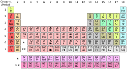
- Ok, not the world's most fascinating image, but for encyclopedic value this one has to be in the top tier. Note that this is an SVG image, and therefore while not at the minimum pixel number, it should not be an issue since images of this type can be resized at will.
- Articles in which this image appears
- There are a lot - and I do mean a lot - of articles that use image, so consult the image page if you want an exhaustive list. The article Periodic Table is the flagship article, so start with that one.
- FP category for this image
- Probably diagrams, but thats my guess.
- Creator
- DePiep
- Actually "inspired by" (=forked from) an earlier similar version. Unfortunately Commons Upload does not have an option to note this. I've adjusted the source notion. -DePiep (talk) 08:50, 2 September 2015 (UTC)
- Support as nominator – TomStar81 (Talk) 09:21, 30 August 2015 (UTC)
- Has the PT ever been featured before? Top EV of course, but even better would be an interactive version; click on an element, and you get a pop-up or something... So, weak oppose for the moment. --Janke | Talk 10:09, 30 August 2015 (UTC)
- Comment It's possible to do that using image mapping. — Chris Woodrich (talk) 23:40, 30 August 2015 (UTC)
- I know. Waiting for it... ;-) --Janke | Talk 07:53, 31 August 2015 (UTC)
- Comment It's possible to do that using image mapping. — Chris Woodrich (talk) 23:40, 30 August 2015 (UTC)
- Oppose. There's of course no questioning the EV of the periodic table, but as an image, the presentation could be much better. The tables in most standard chemistry textbooks are much more visually appealing, IMO. The numbers here are too large relative to the elemental symbols, and the thickness of most lines result in much visual clutter. The legend is also missing from the image description page. --Paul_012 (talk) 10:19, 1 September 2015 (UTC)
- Also, for the info to be complete, we'd need the atomic weight etc. in each cell, like this, but not as "gory": [1].--Janke | Talk 14:51, 1 September 2015 (UTC)
- Atomic weight (introducing neutrons and isotopes) is quite unrelated to the system of the periodic table. Additional, more related info better be like name, valences and electron configuration. That said, this particular image was created with in mind the main introductional placement (top-right of the PT article), stressing the castle-like table structure, increasing atomic numbers, and metal-nonmetal trends (colors) as main PT features. As long as we don't/can't use zooming options, any PT with more detailed info would make us leave those design considerations. -DePiep (talk) 21:15, 1 September 2015 (UTC)
- This detail-vs-overview design choice may be illustrated by this alternative version. -DePiep (talk) 08:54, 2 September 2015 (UTC)
- That one I would support on EV alone - provided it would be in English... --Janke | Talk 12:01, 2 September 2015 (UTC)
- Whatever, Janke. You did not consume any of my points, did you. Or even read them. -DePiep (talk) 23:48, 3 September 2015 (UTC)

- So you set it large, as above, and image map it. It's a matter of presentation. Nobody would really try and show the periodic table at 220px. — Chris Woodrich (talk) 14:48, 3 September 2015 (UTC)
- Per others. --Tremonist (talk) 14:53, 1 September 2015 (UTC)
- Very convincing argument. Mi jealous. -DePiep (talk) 23:50, 3 September 2015 (UTC)
- Oppose The periodic table as a systematic concept is vitally important, of course, but this particular image is not exceptional in any way. Go to google images, type in "periodic table", find the most boring image that shows up, and it will likely be this one. Now I'll assume that some well-meaning person will reply to me by writing "so what do you suggest to make it better?" DePiep's comment that this particular image was created with the introduction to the periodic table article in mind is a good reason why atomic weights and navigational doodads should not be included. The reader is served by this particular image remaining simple and boring and unexceptional. So I don't have a suggestion to make it better. It does its job just the way it is. If we're going to start featuring boring images at Wikipedia that do their job then let's also feature the geometric figures in the introduction to the Circle and Triangle articles. Those are is some good looking images that can't really get much better. But they certainly don't reflect the best that Wikipedia can do with imagery, so they would not be featured by an encyclopedia that cared about featuring exceptional imagery. Focus on the reader instead of putting stars next to things. Flying Jazz (talk) 20:30, 6 September 2015 (UTC)
- I clearly get the "boring" part from your view on this. Thank you. -DePiep (talk) 22:12, 6 September 2015 (UTC)
- You seem to have missed my main points by focusing on the word boring. Do you think the images at https://commons.wikimedia.org/wiki/File:Triangle_illustration.svg and https://commons.wikimedia.org/wiki/File:Circle-withsegments.svg should be featured? They're perfectly good images that suit their purposes at the Triangle and Circle articles. Maybe those two images and this nominated periodic table image should be pictures-of-the-day on three consecutive days? Flying Jazz (talk) 22:52, 7 September 2015 (UTC)
Not Promoted --Armbrust The Homunculus 10:10, 9 September 2015 (UTC)
