
Wikipedia:Graphics Lab/Map workshop/Archive/Jun 2020
| This is an archive of past discussions for the period 2020. Do not edit the contents of this page. If you wish to start a new discussion or revive an old one, please do so on the current main page. |

116 000 map - Britain and Croatia
{{resolved}}

- Article(s)
- 116 000
- Request
- Could someone please make two alterations to the above map:
- 1) The United Kingdom left the EU on 31 January 2020, and still uses the 116 000 hotline number for missing children, so it should be changed to bright blue (like Switzerland for example).
- 2) Croatia joined the EU on 1 July 2013, and currently uses the 116 000 hotline number, so it should be shaded dark blue with the other EU members.
Thanks. Snow Lion Fenian (talk) 19:32, 11 July 2020 (UTC)
- Discussion
- @Snow Lion Fenian: Done, also changed the colours of the crown dependencies (which should've been light blue even before). CMD (talk) 17:00, 15 July 2020 (UTC)
- @Chipmunkdavis: That's fine, and thanks again. Snow Lion Fenian (talk) 17:28, 15 July 2020 (UTC)
Ohio covid alert level map

- Article(s)
- COVID-19 pandemic in Ohio
- Request
- The orange and red used on this map are so similar to each other that they're difficult to distinguish. If the orange could be less red and a lot less dark, and the red a little browner and less orange, it would help a lot, I think. The data for this map is at OPHAS and it's much easier to read. Ping to Oogle12 and Nyttend who I think may have worked on it before. —valereee (talk) 11:07, 17 July 2020 (UTC)
- Discussion
- Valereee Thanks. It looks very good contrast on the monitor I use, but I guess it depends on hardware. I will correct Oogle12 (talk) 20:41, 17 July 2020 (UTC)
- Oogle12, thanks, that is SO much better on my monitor. Wow, I knew monitors could make a difference, but I hadn't realized they'd make that much of a difference! On my monitor, the two colors at the above size were literally only distinguishable because I knew there were two different colors. —valereee (talk) 12:01, 18 July 2020 (UTC)
- {{resolved}}
Improvements to IATSE District map
-
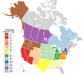 IATSE District Map

- Article(s)
- International_Alliance_of_Theatrical_Stage_Employees#Organization_and_structure
- Request
- I could use some help fixing up this District map for an entertainment industry union. There are two main issues I see:
- * Color scheme - there are 13 districts, so finding colors that are unique but not irritating is difficult. It feels corny right now.
- * Labeling - Having the key on the left doesn't look good, but i couldn't find a way to place the number directly over the districts without smothering and hiding some smaller states. The labeling style also doesn't feel right, and it would be great to make it consistent with the rest of wikipedia.
- I'm willing to try and do some of these changes given the right guidance. Is there a cleaner way to represent this? Thanks! -- Strangerpete (talk) 18:37, 21 June 2020 (UTC)
- Discussion
I hacked away at a new version, modifying the colors slightly from Area maps, and using the legend template. I think its better, but not sure if the large font is acceptable; any feedback is appreciated -- Strangerpete (talk) 15:37, 23 June 2020 (UTC)
Request to correct map
-
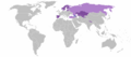 Map of TeliaSonera global activities

- Article(s)
- Telia Company
- Request
- Map misses the northwestern part of Turkey. -- MrClog (talk) 21:02, 13 May 2020 (UTC)
- Discussion
Hi MrClog, I have filled that part in. CMD (talk) 10:58, 24 June 2020 (UTC)
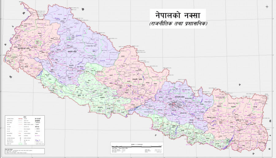
Nepal new map
-
 Locator map of Nepal in orthographic projection
.svg)
- Article(s)
- Nepal
- Request
- Nepal had political map change in Indian controlled area. Add in light green the disputed area to the Nepal map. The color light green should be similar to India's orthographic projection see here https://commons.wikimedia.org/wiki/File:India_(orthographic_projection).svg . Reference this website for the updated map https://kathmandupost.com/national/2020/05/21/with-release-of-new-map-nepal-and-india-enter-a-state-of-cartographic-war-experts-say/
.svg)
-- Manabimasu (talk) 02:06, 23 June 2020 (UTC)
- Discussion
- Manabimasu you appear to have already updated the map yourself. Is there anything further that needs doing? CMD (talk) 10:31, 24 June 2020 (UTC)
- @Chipmunkdavis: I tried myself but the claimed area looks a bit too big. I didn't use GMT when I used inkscape so the claimed area was more of a freehand. If anyone can fix it or show me a tutorial on using GMT with Inkscape then the map can be properly done.Manabimasu (talk) 14:42, 24 June 2020 (UTC)
Specific map of the recent India-Nepal dispute

-
Map showing the tri-section of the China-India-Nepal border
- Article(s)
- Territorial disputes of India and Nepal, Kuthi Valley, Kalapani territory
- Request
- A map is needed to show the claims of Nepal over some parts of Indian-controlled territory. There are two separate but neighbouring claimed areas, the Kuthi valley and Kalapani. An external example showing the differences between the two territories would be this Nepali times map. However, that map is not 100% correct, see this official Nepal map which includes the disputed territory in the top left (although it doesn't distinguish from undisputed territory). One difference is that the official map has a little hook in the top-left not present on the Nepali times map. The Kalapani territory article also has an open street map link which has the disputed borders coloured in orange, and clearly shows the river which divides the two claimed areas. I think a map showing the area somewhere between what is visible on the 5km and 10km open map scales would be the best, but I don't know of a good base map for the area already on Wikipedia. At that scale the map would include 5 areas: China, rump India, rump Nepal, the Kuthi valley, and Kalapani. Thanks to anyone who can take a look at this. -- CMD (talk) 10:56, 24 June 2020 (UTC)
- Discussion