This is an archive of past discussions. Do not edit the contents of this page. If you wish to start a new discussion or revive an old one, please do so on the current talk page.
User:Buidhe has nominated Inner German border for a featured article review here. Please join the discussion on whether this article meets the featured article criteria. Articles are typically reviewed for two weeks. If substantial concerns are not addressed during the review period, the article will be moved to the Featured Article Removal Candidates list for a further period, where editors may declare "Keep" or "Delist" in regards to the article's featured status. The instructions for the review process are here. MediaWiki message delivery (talk) 10:09, 7 January 2023 (UTC)
Left Parties in India
In Communist Party of India (Marxist) and Alliances formed by left-wing parties in the states of India, there is an image of governments formed by CPI and CPIM. There is a mistake in this image. West Bengal and Tripura had chief ministers only from CPIM. Kerala had/has chief ministers from both CPI and CPIM. This image needs to be corrected. How to make it correct?
N.B. : Only colour of Tripura needs to be changed to make it correct. We should add Bihar, Jharkhand and Tamil Nadu as the states where Left parties are in alliance of government (CPI, CPIM, CPIML Liberation in Bihar; CPIML Liberation in Jharkhand and CPI, CPIM, AIFB in Tamil Nadu. Although AIFB has no MLA in Tamil Nadu).
Communist Party of India (CPI) and CPI-M regional control.
State/s which had a chief minister from the CPI.
State/s which had a chief minister from the CPI-M.
State/s which had/has chief ministers from both the CPI-M and the CPI.
States which did not have/had a chief minister from the CPI-M or the CPI.
It looks like it’s a PNG, so worst-case scenario you can put it into paint.net or photoshop and fill-bucket the states to the correct colors. It might be worth asking the creator (@Vibhijain:, who it looks like is the same as @Bharatiya29:?) if they have an SVG version that can be edited more easily. Justin Kunimune (talk) 22:37, 11 January 2023 (UTC)
User 456 legend has formed an image already. XYZ 250706 (talk) 08:56, 12 January 2023 (UTC)
Togolese prefecture map screwed up
File:Savanes prefectures.png was completely wrong: Two of the five prefectures were interchanged, and one was missing altogether. I overwrote it with the Ukrainian map, File:Саванна-Префектури.PNG, which is at least closer to reality, though we loose the small locator map and national boundaries. However, if you run the list of cantons through Google Maps, it would appear that at least two of the Tanjouare cantons (Bombouaka and Nano) are well into the yellow that is labeled as Oti prefecture. I therefore scribbled some blue for Tanjouare in the western part of the yellow, to make it obvious this is not a reliable map, but have no idea if Google Maps identifies the cantons correctly, or where the border would be if it does. The list of cantons per prefecture, as of 2013, is available here.
We also have a JPG map, File:Region Savane.JPG. Although Tone and Kpendjal prefectures are correctly identified, Cinkasse is still missing and the other borders still appear to be wrong, at least by the metric of plugging the cantons into Google Maps: Kpendjal cantons appear well west of the border shown here.
If anyone here has the resources to fix this, I would appreciate it. It may well be that the map was accurate where there were just two prefectures in the region, and the errors came in when those were split up. I don't know if there might be similar errors in other regional Togolese maps. — kwami (talk) 06:19, 30 January 2023 (UTC)
Draft:OpenHistoricalMap - draft article in progress - ready for publishing?
@Wil540 art: The draft was rejected due to a lack of independent sources. If you can find any independent sources besides the ones already in the draft, please feel free to contribute them. Thanks! Minh Nguyễn💬 10:37, 27 February 2023 (UTC)
I think some or all of the info on those pages needs to be moved or copied to a dedicated Help:Maps page.
Feel free to start this help page. I may or may not have time to do so. I might be able to help a little after the help page is created.
--Timeshifter (talk) 06:23, 19 March 2023 (UTC)
Hello. I am trying to get the below infobox mapframe template to work for Electoral district of Kew but it doesn't seem to load as can be seen in my sandbox.
The wikidata code is Q5355563 and the Open Street map relation ID (which was link through wikidata a few days ago) is 15624487.
{{Infobox mapframe|id= Q5355563}}
Thank you in advance for your help //GMH Melbourne (talk) 14:09, 23 March 2023 (UTC)
It looks as though you have deleted the tags on OSM including the Wikidata code. Can you revert the last changes? The Equalizer (talk) 19:26, 25 March 2023 (UTC)
@The Equalizer: I'm sorry, the link that I provided above was incorrect. I redid the boundary because it was wrong and put the old link here. 15624487 this is the new url which was already linked with wikidata. //GMH Melbourne (talk) 23:45, 25 March 2023 (UTC)
I apologise, I had a quick play with the OSM entry, but I think you reverted the edit. Either way, it's working in your sandbox now. The Wikidata entry was missing coordinates which I've added. The Equalizer (talk) 01:29, 26 March 2023 (UTC)
I have started a RFC at WP:VPP asking for clarification of the OR policy regarding the use of maps and charts as sources in Wikipedia articles. I'm posting here as this project would likely be among the most affected. Dave (talk) 06:00, 19 March 2023 (UTC)
Quality assessments by Wikipedia editors rate articles in terms of completeness, organization, prose quality, sourcing, etc. Most wikiprojects follow the general guidelines at Wikipedia:Content assessment, but some have specialized assessment guidelines. A recent Village pump proposal was approved and has been implemented to add a |class= parameter to {{WikiProject banner shell}}, which can display a general quality assessment for an article, and to let project banner templates "inherit" this assessment.
No action is required if your wikiproject follows the standard assessment approach. Over time, quality assessments will be migrated up to {{WikiProject banner shell}}, and your project banner will automatically "inherit" any changes to the general assessments for the purpose of assigning categories.
However, if your project has decided to "opt out" and follow a non-standard quality assessment approach, all you have to do is modify your wikiproject banner template to pass {{WPBannerMeta}} a new |QUALITY_CRITERIA=custom parameter. If this is done, changes to the general quality assessment will be ignored, and your project-level assessment will be displayed and used to create categories, as at present. Aymatth2 (talk) 14:11, 12 April 2023 (UTC)
Historical conversations on improving Wikipedia maps
I moved the following from the "Conversations and projects" section of Wikipedia:Maps for Wikipedia since it seemed to be mostly for historical purposes or for changes to MediaWiki. I kept a few items in the See also list of that page. I thought people interested in the subject might be likely to search the archives of this talk page, so I offer it here. Daask (talk) 20:15, 5 May 2023 (UTC)
There are various discussions about using new automated processes to generate maps for use in English Wikipedia and beyond. Here is an outline of conversations and projects:
The likely future of maps on Wikipedia is that GIS data will be stored in Wikidata. When the information is in Wikidata, any map in or outside of Wikimedia projects will be able to use it, with OpenStreetMap being a likely partner because of its close alignment with Wikipedia community values as a fellow nonprofit, crowdsourced, volunteer-run project. When there are easy ways to get useful datasets into Wikidata, and API development allows any map to connect to that data, then a range of maps will develop more quickly. Eventually, Wikimedia projects will likely have some kind of mapping software built in, so that for example a map created for a city in one language Wikipedia will automatically be shared in the equivalent articles in other language Wikipedias.
Hello all! I noticed that the custom maps used in countries infoboxes don't provide enough detail. Therefore, I recently started a map effort to add labeled maps to geographical locations around the world, in order to identify the names of the neighboring places as well. I have already created and added maps for example File:Guatemala and its region.png to Guatemala. I was wondering if there are other editors interested in joining this effort to add and if needed create such labeled maps to geographical locations? Cheers! Thinker78(talk) 20:29, 14 May 2023 (UTC)
Standard maps to include in infoboxes
There is a discussion at Talk:Russia#Removal of maps about the inclusion of several maps in the infobox. The discussion may evolve into an RfC encompassing all pages of countries. Your input in the discussion is appreciated. Regards,--Thinker78(talk) 02:40, 29 July 2023 (UTC)
OpenStreetMap
The tag on OpenStreetMap in articles indicating that a temporary solution is in place whilst fixes are looked into is no longer there. Yet OSM still seems to be significantly broken. As the tag has been removed I can't find a link to the discussion. Can someone let me know what is going on or provide a link to the discussion around OSM issues? Thanks Jopal22 (talk) 19:46, 7 July 2023 (UTC)
As this is a highly active WikiProject, I would like to introduce you to Credibility bot. This is a bot that makes it easier to track source usage across articles through automated reports and alerts. We piloted this approach at Wikipedia:Vaccine safety and we want to offer it to any subject area or domain. We need your support to demonstrate demand for this toolkit. If you have a desire for this functionality, or would like to leave other feedback, please endorse the tool or comment at WP:CREDBOT. Thanks! Harej (talk) 17:30, 5 August 2023 (UTC)
Qualitative & other non-numeric color scheme
The convention page currently does not mention any qualitative color scheme, which may be useful when describing parties to some opposing international treaties. Similarly, gradient color schemes as currently presented does not quite cover the "agree/concern/disagree" situation in File:International reactions of discharge of radioactive water of the Fukushima Daiichi Nuclear Power Plant.svg. I ended up cherry-picking colors out of ColorBrewer diverging for that, but it sure looks like people will not think about such a choice because no numbers are involved. Artoria2e5🌉 11:28, 29 August 2023 (UTC)
Timeshifter, the color blending between these colors leaves something to be desired in terms of aesthetics... But got to say, the opacity method is clever, and it does work well on that template map's blue/yellow. Artoria2e5🌉 11:31, 29 August 2023 (UTC)
Thought about this a little bit more. The only way to get a fully customizable colormap in SVG that I can think of is via filter effects, using the equally-spaced lookup table. We set the input color as hsl(0, 0, number), so that the filter passes the same R,G,B to the lookup tables. Not very practical, considering you can't run the filter on the fill only. --Artoria2e5🌉 14:15, 29 August 2023 (UTC)
Artoria2e5. I know little about SVG except how to paste in some changes in the user-editable parts. So I do not understand what you are talking about. But you sound like you might be able to help here:
I have no idea how this map is generated. However, it is the wrong scale (far too big) and is pointing to an area too far west. Please help. I'd love to know how to create maps like this. Paolo Oprandi (talk) 21:58, 31 August 2023 (UTC)
@Riparia riparia: I believe the issue was with the coordinates. I have rewritten them using the coordinates template. Please check if everything is correct. — Goldentalk 22:15, 31 August 2023 (UTC)
@Golden: Thanks and what a speedy response! The map now focuses on the right place and the scale looks correct, but it is only a flag stating the general position of the LNR. Before it showed the LNR shape, size and boundaries which I thought that was very helpful. Again I am not sure how it was done, but would like to know. Thanks again. Paolo Oprandi (talk) 06:57, 1 September 2023 (UTC)
@Riparia riparia: I'm not actually sure how to display the size and boundaries on the map. Perhaps someone else might have the answer. — Goldentalk 08:26, 1 September 2023 (UTC)
@Golden: is this the right place to ask - do you know any map experts? - they seem like a dark art Paolo Oprandi (talk) 09:40, 1 September 2023
Fixed the map and removed added co-ords, do check. Details in Wikidata were wrong. Regards, The Equalizer (talk) 12:23, 1 September 2023 (UTC)
Thanks, Equalizer. — Goldentalk 12:58, 1 September 2023 (UTC)
Perfect. I'd love to know how to do it. I'll see if I can work it out. Riparia Riparia (talk) 20:11, 1 September 2023 (UTC)
I see a shape in OSM that seems to match the Benfield LNR and is around the same hectarage (although it is not labelled as such), so see how far you get.
@The Equalizer Thanks - I think I did it. Might have to wait 24 hours to see the results. Riparia Riparia (talk) 07:03, 2 September 2023 (UTC)
Does it look ok to you? Riparia Riparia (talk) 07:04, 2 September 2023 (UTC)
The configs seems to be correct so let's see. Nowadays, the replication takes just a few hours instead of a day so should know about it soon enough. Regs, The Equalizer (talk) 08:01, 2 September 2023 (UTC)
@The Equalizer I think it has worked. Unlike Beacon Hill though, the shape/boundary is not displaying in the map view until you zoom in. I'm hoping this will change overnight. What do you think? Riparia Riparia (talk) 12:29, 2 September 2023 (UTC)
Displays perfectly fine to me now so well done. Regs, The Equalizer (talk) 16:17, 2 September 2023 (UTC)
Hello. Please would an expert be able to help with the lower map for Solihull College? The College is on two sites. On the page, the map for the Blossomfield Campus renders well, but the one for the Woodlands Campus does not. I've tried fixing it, but I fear the task is beyond me. Thanks. Wavehunter (talk) 14:43, 2 September 2023 (UTC)
Done for the marker by adding an extra infobox school parameter. If it was desired to have the shape of the campus as well, the campus shape is in Open Street Map but a new Wikidata entry would have to be created and linked to the area in OSM (as described in the 'Please help: map is wrong' question above), then the resulting Wikidata number referred to in the infobox. Regs, The Equalizer (talk) 17:35, 2 September 2023 (UTC)
Thanks very much for adding the marker. Wavehunter (talk) 08:52, 3 September 2023 (UTC)
Bevendean Down
Bevendean Down is a Local Nature Reserve in 5 parts. It can be seen by going to Magic Maps and searching for Bevendean (ignore Whitehawk/Racehill LNR). As far as I can tell, it is not represented on OSM Maps. Can anyone confirm? If not, do I add it myself? Looking at you The Equalizer. Thanks Riparia Riparia (talk) 13:00, 2 September 2023 (UTC)
Yes, and this where it becomes a challenge. You'll need to get shapefiles for the LNR, those exist clearly and have been used on the Magic site, upload it to OSM and link them together as a feature. Then do the actions as with Benfield. Think you can download such a file from the Environment Agency via gov.uk (https://www.data.gov.uk/dataset/acdf4a9e-a115-41fb-bbe9-603c819aa7f7/local-nature-reserves-england), it appears to be Open Gov Licenced so should be ok but recheck for any conditions (such as needing to mention the source, etc.) If not workable, the park authority or city council could potentially provide those shape files if you cannot obtain. Not sure tracing the outline from the Magic site is viable.
Thanks I will let you know how I get on. There is also a new LNR at Waterhall. I scrambled a page together earlier - it will be improved, but it will need a new map too! Riparia Riparia (talk) 17:46, 2 September 2023 (UTC)
As an aside, looking at Magic many of the LNRs you've edited fall into or abut the South Downs national park, always worth a mention for sure. The Equalizer (talk) 21:39, 2 September 2023 (UTC)
@The Equalizer Thanks. Maps look complicated. I was trying to use JOSM. If you have any more suggestions that would be great.
With regards to Waterhall, thanks for your words of warning. I think the 2024 reference was about something else but you're right it isn't shown in those other places. The people I have spoken to managing the area seem to think it is a LNR, but I will continue to investigate. Riparia Riparia (talk) 07:02, 3 September 2023 (UTC)
Other editors are outlined here with their pros and cons:
Can someone help checking if this map is correct? Some coordinates seem to be wrongly displayed. I don't understand why it shows the wrong location. I'm a new user who just started looking into maps. Thanks in advance for your help.
Example for Los Angeles coordinates Decimal: 34.05, -118.25
I think it may be a bug with the map. If you try the map USA it displays the location correctly. Regards, Thinker78(talk) 06:38, 1 October 2023 (UTC)
Yes, seems to be some kind of bug. Unfortunately the map i need is Module:Location map/data/North America 2, because i want also to include locations in Canada and Mexico. Gor1995 (talk) 08:47, 1 October 2023 (UTC)
Yeah, i know Module:Location map/data/North America exists but it's a little bit zoomed out and shows too much Greenland and South America. That's why i initially chose Module:Location map/data/North America 2. I don't understand what you mean when you say "That's not a location map, i.e., it shouldn't be used in the module". I want to understand how maps are created so i can identify the error and fix it. Thanks :) Gor1995 (talk) 15:26, 1 October 2023 (UTC)
It hasn't been made for such purpose, and therefore, it has no relevant info that can be used to create a map definition for the LM module. M.Bitton (talk) 17:19, 1 October 2023 (UTC)
Any map can in theory be a location map, North America 2 visually appears similar to North America for example. The issue here is that the projection formula for the North America 2 map is incorrect and is therefore calculating the wrong position for the marker. It's been taken from the North America map, but the two maps differ somewhat in orientation. The Equalizer (talk) 19:13, 1 October 2023 (UTC)
Yeah, that's what I thought the problem might be... but unfortunately I know nothing about projection formulas... that's why i posted it here, so someone can help me figure it out. Gor1995 (talk) 20:05, 1 October 2023 (UTC)
Is it bad form to delete the incorrectly specified map? Strebe (talk) 21:19, 1 October 2023 (UTC)
I think Frietjes might be able to help here (thanks in advance). I can see she has written code for generating coefficients for nonlinear projections. We need to understand how this works in order to fix this, and also to be able to create new maps in the future. Gor1995 (talk) 07:14, 2 October 2023 (UTC)
That's not a location map, i.e., it shouldn't be used in the module. M.Bitton (talk) 10:04, 1 October 2023 (UTC)
I’m with Gor1995 here. What about that thing makes it “not a location map”? Strebe (talk) 17:35, 1 October 2023 (UTC)
See my explanation above. M.Bitton (talk) 17:54, 1 October 2023 (UTC)
How is a map made a locator map? Is there instructions somewhere? Regards, Thinker78(talk) 21:57, 1 October 2023 (UTC)
It seems easy for equirectangular projection maps, but other advanced projections require formulas which are not explained in depth there. Gor1995 (talk) 22:04, 1 October 2023 (UTC)
I have nominated it for deletion. if the only desire is to crop the location map, we should be able to add something to Module:Location map to do the {{CSS crop}}. I brought this up at the talk page awhile ago, but there was no interest. Frietjes (talk) 15:23, 2 October 2023 (UTC)
this doesn't provide all of the information (e.g., center). the author has agreed to deletion, so I think the best path forward is to add optional map cropping to location map. Frietjes (talk) 19:45, 2 October 2023 (UTC)
Help needed in creating geoshapes which describe species distributions
Hi all
I’m looking for some information on creating geoshapes. I’m working on a project with Kew Gardens who run Plants of the World Online, the recognised most reliable source for information about plants on English Wikipedia. On the website they display a map of each species distribution which I’ve been able to copy into Wikipedia using Wikidata IDs and geoshapes and openstreetmap data e.g Asparagus horridus.
The issue is that some of the locations that Kew uses don’t appear in Wikidata yet or don’t an area in either a shapefile or OSM (the set of locations they use is an international standard for species distribution). One example of this Solanum atropurpureum which has a distribution of Argentina Northeast, Brazil North, Brazil South, Brazil Southeast, Brazil West-Central, Colombia, Paraguay, Uruguay. These sub areas of countries appear to not fit OSM so would need geoshapes adding to Wikidata. My question is would it be easy to create these Geoshapes? How could they be recreated easily and accurately and who could do this? It is possible I could get these areas from Kew but I don’t know if there will be licensing issues.
@John Cummings:the set of locations they use is an international standard for species distribution – do you have a name or a link for this standard? – Joe (talk) 14:42, 23 October 2023 (UTC)
Great, thanks. github.com/tdwg/geoschemes looks a bit messy and like a work in progress, but github.com/tdwg/wgsrpd (which I think it's supposed to supersede?) contains a set of geojson files with each unit that could be straightforwardly added to Wikidata. I don't imagine it's something that's copyrightable, but I'm no expert there. – Joe (talk) 15:11, 23 October 2023 (UTC)
Hi Joe Roe thanks so much, are you saying that all the information needed to create the missing geoshapes on Commons and then link to Wikidata exist in that github repo? If so do you know who I could request to convert them and add them to Commons? Or can GeoJSON just be uploaded to Commons? They appear to be files with all the areas glued together in them, no idea how to separate them out. This is way way beyond my technical expertise. Thanks again, John Cummings (talk) 15:44, 23 October 2023 (UTC)
All the information is there, yeah. I think the way to do it is to split the geojson files, upload each to Commons (like commons:Data:Algeria.map, which is where the shape in the map on Asparagus horridus ultimately comes from) and then create Wikidata items for them. I can do the first two steps easily enough. I'm less sure about putting them on Wikidata, but we can cross that bridge when we come to it... – Joe (talk) 06:14, 24 October 2023 (UTC)
Okay the files are split here: github.com/joeroe/WikidataBotanicRegions. There are 1039 of them, so I'm looking for a way to batch upload .map files to Commons now. – Joe (talk) 08:43, 24 October 2023 (UTC)
Joe Roe Amazing, thanks so much :) See here for a conversation I was having about splitting the files and the license statement for the files (they're compatible with Commons). Thanks again, John Cummings (talk) 10:15, 24 October 2023 (UTC)
Thanks. I'd also spotted that about the licence, good to know. The .map files in e.g. https://github.com/joeroe/WikidataWGSRPD/tree/main/wgsrpd_level1/map are now ready to be copied to Commons. It turns out it's not an "upload" technically, but a normal page creation – you just copy and paste the contents of the file into the edit box. I've done the top-level continents as a proof of concept:
...but beyond that it gets a little tedious. Do you happen to know anyone good with AWB or Commons bots? – Joe (talk) 12:25, 24 October 2023 (UTC)
Oh wow Joe Roe this is great, also this is a huge number of files to copy over.... Could you provide very clear step by step instructions for what needs to happen to make these files? I have done all the Wikidata matching already which I can share here tomorrow. If you can make very clear instructions I can then ask for help.
Create the page and copy and paste the entire contents of the file on GitHub into the text box, replacing the prefilled content
Publish the page
Then repeat for every .map file in wgsrpd_level2/, wgsrpd_level3/ and wgsrpd_level4.
With Wikidata, do you mean Wikidata:Property proposal/World Geographical Scheme for Recording Plant Distributions ID? I'd imagined that we'd need new Q entities for each WGSRPD unit, because they're not exactly coterminous. If we go with existing entities, I'm not sure how to handle the fact that there needs to be two geoshapes (e.g. one for the country, one for the botanical country). – Joe (talk) 05:49, 25 October 2023 (UTC)
Hi Joe Roe, great, thanks, this is super clear, I'll try and find someone who knows how to do batch editing. I'll have a think on how to do the areas which don't quite match up, I've had this issue with a few other projects before. I'll keep you posted :) John Cummings (talk) 12:11, 25 October 2023 (UTC)
For clarity, wikidata:Q123172874 is an example of what I'd propose doing on Wikidata – repeat for each unit in each level (which is thankfully much quicker and easier on Wikidata than on Commons). – Joe (talk) 12:16, 25 October 2023 (UTC)
I am travelling to the Washington DC area this coming weekend. An event that I may attend on Thursday is in a location that is accessible by the Silver Line (Washington Metro) which commenced service in 2014 and was further expanded in 2022. It is an important line that now provides affordable ($6) service that connects Washington DC to Dulles International Airport and points beyond. The scale map of the DC Metro was uploaded in 2007 and has not been updated since 2012. Because this line of service connects an international airport to the city, I am pretty sure it is important and think people here should take interest in updating this map.-TonyTheTiger (T / C / WP:FOUR / WP:CHICAGO / WP:WAWARD) 01:44, 15 November 2023 (UTC)
Article creation
Hello fellow editors, greetings! I see a need of forming a new article for Geomatics engineering whose scope is increasing and article is yet to be made on wiki. Even Survey engineering can be redirected here. Being a subject of paramount importance and related to this wikiproject I would like to bring it to your kind notice. I would love to assist in the mean process as and when needed but being a civil engineering student I might not be able to accomplish this on my own having been unknown of various terms used. Franked2004 (talk) 19:27, 16 November 2023 (UTC)
Assistance with maps & templates
Hi all,
I have recently been having some trouble with adding a new map to the Arctodus article. For whatever reason, it won't let text wrap around it, or letting me place the map next to the haplotype cladogram. The cladogram has a similar issue, being that it won't leave the left hand side, despite an attempt to input a position. Could someone let me know how to do this? I'm happy to do this myself, but I'm a bit lost. SuperTah (talk) 08:57, 20 November 2023 (UTC)
The templates default to left hand side and don't natively allow left-justified text wrap unless they are aligned to the right.
Legend: Main mitochondrial clade of A. simus (A, B, C, D, E, F, G)
Chiquihuite cave A.simus
Unassigned A.simus
If you surround the map box with table {| & |} that will also give aligning options and text wrap, then it can be placed side-by-side as here.
Do bear in mind a fair majority of Wiki readers are on a mobile device so putting them side by side might not be the best experience for users. Regards, The Equalizer (talk) 17:08, 21 November 2023 (UTC)
This is awesome, thank you very much! Good advice too, I'll place the map a little higher up to allow the section to breathe. Cheers! SuperTah (talk) 05:24, 22 November 2023 (UTC)
un-normalized choropleth maps.
I was looking at pages, and came across a map on the page for humans that really doesn't do our species any favors (see attached). It is a Choropleth showing total population by county. If you are unaware, this is not an appropriate thematic map choice, and should have some form of normalization applied to it, such as people per square kilometer. (Please see the section on normalization on the choropleth map page, and read the cited articles/books before saying you don't think it is a big deal. The literature and cartography textbooks do.)
I replaced it with two other existing maps on the humans page, but the unnormalized choropleth persists in Wiki Commons and is on several pages. People who don't know any better will continue to think it is fine, and embed it throughout the project.
Unfortunately, nominating it for deletion isn't going well, as it seems most people participating don't understand why this is not an appropriate map type for this data set, and those who do understand don't seem to think it's that big a deal to have an inappropriate symbolization. Is there any existing resource or system within this group, on on this site, to explain proper map use? Any way to review maps to ensure they are of relatively decent quality before posted?
World map of countries and territories by population in 2019. >1,000 million 200–1,000 million 100–200 million 75–100 million 50–75 million 25–50 million 10–25 million 5–10 million <5 million No data / permanent population
I can't think of anything that is more lethal to creativity than normalisation. As for this map, I'd have to agree with one of the comments on Commons: some maps show population density, and some show absolute population (like this one). M.Bitton (talk) 17:06, 7 December 2023 (UTC)
There are other thematic map types that can show unnormalized data. If someone was "creative" with a pie chart and used it wrong, that would not be encouraged. Please read the Wikipedia section on Choropleths discussing Normalization, the citations in the Wiki, and justify your opinion with sources. The cartographic conventions on this are fairly well established, and maps that fail to follow them are unnecessarily misleading. While it is possible to go off script in some niche cases, Wikipedia is not the place. GeogSage (⚔Chat?⚔) 17:21, 7 December 2023 (UTC)
Please feel free to cite the WP policy that supports your assertions. M.Bitton (talk) 17:34, 7 December 2023 (UTC)
WP:Editing policy states, "on Wikipedia a lack of information is better than misleading or false information". To this end, potential inaccuracy is a consideration for each and every source brought to an article.
Choropleth map states: "Failure to employ proper normalization will lead to an inappropriate and potentially misleading map in almost all cases. This is one of the most common mistakes in cartography"
If you believe that a choropleth map used in this way is appropriate, I believe that falls under the Wikipedia:No original research policy. To demonstrate that you are not adding original research, you must be able to cite reliable, published sources that are directly related to the topic of the article and directly support the material being presented. The outside cartographic literature is pretty clear on this.
I'm becoming increasingly frustrated with Wikipedia, as my experience with consensus building is that it is not based on outside sources, Wiki guidelines, or policy, but a discussion of what every individual thinks. I try to address points, and give arguments to back my assertions, but they are generally ignored, and demonstrate that despite what Wikipedia is not, most users treat it like a democracy. GeogSage (⚔Chat?⚔) 17:47, 7 December 2023 (UTC)
The policy doesn't say anything about "normalisation".
Wikipedia policy does not define cartographic conventions, and any attempt to do so without relying on outside sources would be original research. Wikipedia policy DOES say that misleading or false information is worse then nothing at all.
In a paper looking at how this impacts perception, they found that using totals can cause inappropriate perceptions, and that "Given the power in the hands of mapmakers, great care should be taken in making design decisions."[1]
In Mark Monmonier's book how to lie with maps, he uses people per square mile and total population as an example in Figures 2.13 and 2.14. For the map showing total population per unit, he says "The map with graytone area symbols is ill suited to portray magnitude." He states "The choropleth map at the right (the unnormalized choropleth map showing total population) is misleading because it's area symbols suggest intensity, not magnitude."
Wikipedia policy says misleading information is worse then no information. "Wikipedia policies and guidelines are developed by the community to describe best practices, clarify principles, resolve conflicts, and otherwise further our goal of creating a free, reliable encyclopedia." The outside cartographic literature is clear that these are viewed as misleading. If there needs to be an internal Wikipedia policy on everything map related, seems like this WikiProject has a project we can work on. Wikipolicy The lack of a guiding policy internal to Wikipedia does not change established cartographic principles, and if a Wikipedia policy on maps did exist, it would need to follow these established cartographic principles to avoid being original research. GeogSage (⚔Chat?⚔) 18:36, 7 December 2023 (UTC)
In other words, you can't back your "normalisation" quest with a WP policy. M.Bitton (talk) 19:02, 7 December 2023 (UTC)
In other words, Wikipedia policy states that misleading is worse then nothing at all. The outside literature says that this map is misleading. Wikipedia policy is a guideline, in the case of maps does not have any policy standards I can find. Therefore, unless you can find some policy that justifies the use of these maps, we have to fall back on the peer reviewed and cartographic literature.
As I said, I'm becoming increasingly frustrated with Wikipedia, as my experience with consensus building is that it is not based on outside sources, Wiki guidelines, or policy, but a discussion of what every individual thinks. You have demonstrated that regardless of what outside information is presented, you are defaulting to your first thought and not providing any rebuttal besides "Wikipolicy doesn't prohibit this exact case of misleading information explicitly."
Does an absence of explicit Wikipolicy supersede the outside sources on the matter of misleading maps? Where is the Wikipolicy justifying your opinion? Where are the outside sources supporting your opinion? GeogSage (⚔Chat?⚔) 19:11, 7 December 2023 (UTC)
WP's content is definitely based on policies. I didn't make them and I don't question them, they are what they are and until they are changed, I will continue to respect them the way they are. Since you are the one who's making the claims, it's your job to support them with the policies and if there is any map that you consider as misleading, then you start a discussion about it and see whether others agree with you. M.Bitton (talk) 19:15, 7 December 2023 (UTC)
WP content policy is a guideline, and is not comprehensive. It broadly states that misleading information is worse then none. I have presented sources demonstrating that this type of map is misleading. At this point, it is not about who agrees, and it is not a matter of opinion. Provide a source refuting the sources I've provided stating that these maps are misleading. Otherwise, the map is misleading and Wikipedia policy is clear about that. Wikipedia is not a democracy. 100 people opinions does not override quality outside sources. Clearly, there is a need to propose clear guidelines spelling out cartographic standards, which sounds like a great thing for this WikiProject to undertake. GeogSage (⚔Chat?⚔) 19:46, 7 December 2023 (UTC)
Wp Policies and wp guidelines are two different things. I don't have to prove a negative given that you are yet to provide a single policy that supports your "normalisation" claim. M.Bitton (talk) 20:08, 7 December 2023 (UTC)
"Because a lack of content is better than misleading or false content, unsourced content may be challenged and removed."
Because Wikipedia doesn't have an explicit policy on maps quality, we can follow recommendations from Wikipedia:Inaccuracy, and use our deductive reasoning based on reliable source statements, to look at what established cartographic conventions say about this. How to lie with maps by Mark Monmonier has been cited at least [2] times on Google Scholar. In this book Mark Monmonier used this exact topic, a choropleth showing population by area, as an example of a misleading map.
The lack of Wikipedia Policy on what constitutes good cartography does not mean that the established practices for making good maps do not apply. Insistence on a specific Wikipolicy to this instance of misleading information is just hiding behind Wikipolicy, or lack there of. Because this map does not meet the established cartographic conventions, it is misleading, and low quality. Misleading information is not educationally or encyclopedically useful, and should be removed.
Cartography is guided by ethical considerations. While there are various outlines on these, it is frustrating not to see strict adherence and passion for simple ethical map principals within WikiProject Maps. Ensuring your "symbols don’t bias the interpretation of the map" is basic cartography. GeogSage (⚔Chat?⚔) 22:37, 7 December 2023 (UTC)
Wikipedia:Inaccuracy is an essay and the rest is WP:OR. If you think that a particular map is inaccurate, you do what we all do, you raise the issue on the article's talk page.
hiding behind Wikipolicy, I didn't make them and you're more than welcome to challenge them. M.Bitton (talk) 22:41, 7 December 2023 (UTC)
Wikipedia's editing policy is not an essay, which is where I got the first quote from "Because a lack of content is better than misleading or false content, unsourced content may be challenged and removed." I have presented sources that describe this exact type of map as misleading. Stating the map type isn't misleading is Wikipedia:No original researchGeogSage (⚔Chat?⚔) 22:44, 7 December 2023 (UTC)
Okay, and Wikipedia's editing policy, which is where I got the quote "Because a lack of content is better than misleading or false content, unsourced content may be challenged and removed" is not an essay. Not normalizing choropleth maps is misleading, which is not debatable within Wikipedia. The outside literature is very clear on this. Wikipedia policies have no impact on what is or is not good cartography, and what constitutes a misleading map.
It is quite frustrating that rather then responding to the sources on this, everyone seems to use their own opinion on this. If we need to make a policy on maps within the group to clear it up for people who have no cartographic background, that is fine. It would make purging bad cartography much easier in fact. However, any such policy would only be able to echo what the established literature says. GeogSage (⚔Chat?⚔) 22:53, 7 December 2023 (UTC)
Because a lack of content is better than misleading or false content, unsourced content may be challenged and removed That's right, but what does that have to do with the "normalisation" that you're after? M.Bitton (talk) 22:55, 7 December 2023 (UTC)
A non-normalized choropleth map is misleading, and as such is worse then no map at all. Therefore, it is beneficial to the project to delete it. Not only is it misleading in its displaying of information, but it sets a bad example to other amateur cartographers, which is actually harmful to both the project and society overall. The map is unethical from a cartographic perspective, and it is my ethical responsibility as a cartographer to call it out. For example, during the COVID-19 pandemic, multiple papers identified normalizations as a major problem on maps. One paper titled "Mapping COVID-19: How web-based maps contribute to the infodemic" uses unnormalized web maps as an example of poor mapping practices. To avoid this in the future, that paper suggests "more interaction between health and government officials, geographers, the geospatial community, and data visualization experts/data journalists to develop guidelines for communication with web-based maps might be the way forward to ensure that web-based maps realize their potential."
Does WikiProject Maps have no cartographic standards or ethics? Or is this project facilitating the democratization of cartography without teaching the needed responsibility and cartographic conventions? Because there are some serious problems with Web Maps today, and now that you know the problem, the ethical responsibility to prevent a repeat infodemic is on you. GeogSage (⚔Chat?⚔) 02:13, 8 December 2023 (UTC)
Sweeping generalizations serve no practical purpose. Please explain in your own words how the map that you want to delete is misleading? M.Bitton (talk) 13:33, 9 December 2023 (UTC)
Why would I explain in my own words? I have outside sources that say this.
"Styling your map using graduated colors, like with a choropleth map, can lead to visual misinterpretations, especially when the features on the map are areas of various sizes or populations. In these cases, larger areas will naturally draw your attention, especially if they're styled with darker colors. You can counter the bias created from different-sized areas in choropleth maps by styling the maps by averages, proportions, rates, and ratios instead of counts or totals. When the data being displayed on a map is a proportional value, it's taking into account the differences between the features, whether it be population, area, or another factor."
"If you want to make a map of counts or totals, such as the total number of restaurants by county, you can make a graduated symbol map."
As I explained in another comment, Russia is big, but has the 9th largest population, less then Pakistan and Indonesian. In an unnormalized map, Russia's size makes it much more prominent compared to other countries, which is misleading. This is why it is important to account for that size by looking at density. A proportional symbol map offers uniform symbols, so the size of the underlying enumeration units is not as important. GeogSage (⚔Chat?⚔) 16:24, 9 December 2023 (UTC)
You don't have outside sources that discuss this particular map. Please explain in your own words how it's misleading. M.Bitton (talk) 16:26, 9 December 2023 (UTC)
Restating an answer that I gave earlier, with sources to a book that uses a population map to demonstrate why a choropleth needs to be normalized.:
The map is the cleanest definition ever of using a choropleth for the wrong dataset, population by unit area vs population density is literally used as an example by Mark Monmonier in How to Lie With Maps. Monmonier was kind enough to upload his book on research gate here, or you can find it on Google Books here. Figures are on pages 22 and 23 in the edition on ResearchGate, and on 24 and 25 on Google Books (The figures are not themselves visible on Google Books, but the corresponding text is. ResearchGate has the figures).
In "My own words:"
Russia is big, but has the 9th largest population, less then Pakistan and Indonesian. In an unnormalized map, like the map in question Russia's size makes it much more prominent compared to other countries, which is misleading. This is why it is important to account for that size by looking at density. A proportional symbol map offers uniform symbols, so the size of the underlying enumeration units is not as important. This is why the ESRI source, the book I linked here, and countless others insist on normalizing values that are symbolized using graduated colors. GeogSage (⚔Chat?⚔) 17:42, 9 December 2023 (UTC)
Russia's size makes it much more prominent compared to other countries, Russia's size is what it is. How is showing it misleading? The map doesn't suggest that Russia's population is larger than Nigeria's (for instance). M.Bitton (talk) 17:52, 9 December 2023 (UTC)
This isn't about your or my opinion on this, it is what the literature says on the matter. Russia's large size makes it appear more prominent, and mapping a total population in the large area makes it appear more prominent then an smaller area with the same value. Did you read the figures and pages on the books I linked?
This problem has real world impacts, and maps like this spread bad cartographic practice's. If we can't ensure they are upheld, others will use them as examples when making more important maps. For example, one study "Policies to influence perceptions about COVID-19 risk: The case of maps" stated:
"The use of case count maps might also be a subtle facilitator of the extreme political polarization surrounding measures to combat COVID that has occurred in the United States."
When you want to map totals, you use proportional symbol and not graduated color. The literature is clear, will anything change your mind, or are you so convinced in your own opinion without providing sources? GeogSage (⚔Chat?⚔) 18:20, 9 December 2023 (UTC)
The literature doesn't mention this particular, and so far, you have failed to apply the theory to it. This is just the tip of the iceberg that you want to create. M.Bitton (talk) 18:26, 9 December 2023 (UTC)
The book I gave you two links to literally mentions this exact particular case, using total population vs a normalized by area one. It is the same type of data. The ESRI source stats "If you want to make a map of counts or totals, such as the total number of restaurants by county, you can make a graduated symbol map." The COVID-19 paper has stated this problem has lead to perception problems, and another has stated this contributs to the infodemic.
This isn't something "I want to create," this is me advocating for cartographic standards, norms, and conventions in Wikipedia to avoid the proliferation of misleading maps. It is an ethical imperative for a cartographer/geographer to speak up about this in any organization they encounter, because the democratization of cartography needs to be tempered with the established norms and theory. If Wikipedia is to be a "more reliable source" it should not be spreading questionable cartography, much less one of the most basic mistakes in the discipline.
If you read through the comments, this IS the tip of the iceberg in terms of the problem, as @Strebe has rightly pointed out the two maps I found to replace the poor symbology are using an inappropriate projections, and they advocated that one should be therefore deleted. While I disagree with them on the issue of symbology, I fully agree that the improper projection does warrant a deletion. There isn't a better projection I can find on Wikipedia showing the data however, so they might need to be made. GeogSage (⚔Chat?⚔) 18:41, 9 December 2023 (UTC)
I'm not interested in the theory and nor will the uploaders of the various maps that are used all over place. All I wanted is for you to demonstrate that this map (that's just one example) is misleading and so far, you have failed to do so. Now, if you, as the editor who wants to set the standards, can't do it in your own words, what are the chances of those who will be judging/policing and arguing with the uploaders? M.Bitton (talk) 18:48, 9 December 2023 (UTC)
I have demonstrated that this map is misleading, you just don't agree, which is in disagreement with the literature. Why would you want my words, I've given you peer reviewed sources, prominent books, and literature from the largest GIS company on Earth that explains the issue.
The map is misleading because, for one of many reasons, larger area countries appear more prominent then smaller, which skews how people perceive the data. This is not an opinion I pulled out of thin air, but established in the literature. If you disagree, that is your opinion, but unless you have sources on it your opinion is irrelevant.
I've given sources, quotes, and explained. What more do you want? GeogSage (⚔Chat?⚔) 18:53, 9 December 2023 (UTC)
Since we seem to be going around in circles, let me wish the best of luck in your quest for standardisation. M.Bitton (talk) 19:01, 9 December 2023 (UTC)
I can not express my frustration on this enough. We have gone in circles because you have repeatedly ignored my explanations, citations, and examples. Thank you for your well wishes, I am losing faith in the projects, so it is both needed and appreciated. GeogSage (⚔Chat?⚔) 19:10, 9 December 2023 (UTC)
I don't see the problem. Every data visualization, every thematic map, is constructed for a chosen purpose. How appropriate or inappropriate, accurate or misleading, such a visualization is depends on the purpose. If the purpose is to show the populations of the countries of the world, the above map with an ordinal categorization of absolute population is fine for this purpose; there is nothing misleading about color coding country population when the desired property to visualize is country population. Normalizing to say, population density, would be incorrect and misleading in this instance.
Normalization in general is a useful tool and can help in some instances to get at what is the best property to visualize for a given problem. But as with any data transformation, it is appropriate only in certain contexts. Because maps like this can be used for many purposes in Wikipedia and beyond, it is inappropriate to try to delete it just because it does not suit your intended purpose. --{{u|Mark viking}} {Talk} 21:04, 7 December 2023 (UTC)
@Mark viking, I don't know if you've read through the comments. This is incredibly frustratingly for me as a cartographer. The literature is very clear, choropleth maps need to show normalized data or they are misleading. There are other visualizations that are suited to the purpose of absolute/total/unnormalized data. Mark Monmonier's book How to lie with maps uses this exact type of dataset to illustrate improper use of a choropleth map. In terms of cartography, there is almost never an excuse to use a choropleth for totals when other thematic map types exist.
I have cited sources on this and can cite more if needed. There are many on the page for choropleth maps as well. This is something widely discussed in cartography literature. Cartographic standards and conventions are not a matter decided by Wikipedia policy. Instead of a choropleth map, if you need to show this kind of data, you can use a dot density, cartogram, or proportional symbol. GeogSage (⚔Chat?⚔) 21:30, 7 December 2023 (UTC)
GeogSage, the replacement map is bad. For spatial densities, you need an equal-area map. The map you put into Human is plate carrée projection (the misnomered “geographic coordinates”), which is not even close to equal-area. Only equal-area projections are suitable for spatial distributions, since only equal-area maps show measure-per-area, which is what density means. That map needs to be removed from the article and is the map that ought to get deleted from Wikimedia commons. It not appropriate for any purpose. The literature shows endless examples of this GIS default projection being misused for spatial densities. It is a common, regrettable mistake.
I also do not agree that the image you are trying ought to be deleted from Wikimedia Commons. Country population is a meaningful measure, and showing it this way is a meaningful way to show it because you can compare relative populations of entire countries on a geographical map (instead of resorting to, for example, a cartogram, where the geographical relationships become distorted).
However, I do agree that the map in Human ought to be replaced with a density map — just not the one you used. Strebe (talk) 18:31, 8 December 2023 (UTC)
Thank you for pointing this out, it is a breath of fresh air to see someone actually care about projections. Most of the thematic web maps use Web Mercator at this point, and even in ArcGIS Online this can be hard to fix. Projection is a much harder one to fix systemically, but should be addressed as well. One problem at a time, but you're right, should have focused on BOTH or nothing. If you want to nominate the other one to be deleted based on projection, I'll support that. Please do in fact!
I agree that the one I used is not ideal, it was the first I found that showed a similar dataset with a normalization in Wikicommons, and I was unable to find a better one. Both maps are flawed and should be removed. I'm looking at either making my own, or trying to find one using the appropriate projection, but I'm not sure about the process of going about uploading one to Commons (I'm not experienced with that project). For example, crediting the boundary layers, and should open source software like QGIS be used, or is it safe to employ a student ArcGIS Pro account? Do you have a suggestion of for a map that already exists in the mean time using a more appropriate projection and population density? If so PLEASE link to it and replace the one I am using.
There is no reason to ever use a choropleth to show totals, hard stop. If you have a reason, you should use another thematic map type to avoid setting a bad example for someone who doesn't understand the nuance. If you don't like cartograms, that is fine, however they are wildly underused in my opinion, especially for maps showing more then one variable. A map that distorts geographic relationships in an obvious way is better then one that uses inappropriate symbolization, and they pair well with other thematic map types to solve Monmonier's "One Map" ethical problem. Dot density or proportional symbol are the common types we should probably push for in the case of totals, and I can throw those together if I'm sure of the process to get them into the commons fairly easily.
After finding a few more maps using totals in this way, I am currently trying to think through how to best go about trying to broach bringing cartographic standards into the Wikiproject. Perhaps insisting on an equal area projection for thematic maps, and a flow chart for what you're trying to show that lead to the appropriate map type. Bit disheartened to see the defense of bad maps here, and lack of willingness to budge on anything. Trying to argue for something like projections seems out of reach for me if people won't budge on normalizing a choropleth map. GeogSage (⚔Chat?⚔) 21:01, 8 December 2023 (UTC)
Changed to the attached map for now. It uses Winkel tripel projection, which is better but we can still do better if we make our own (I'm not sure I like the methodology used to estimate population by grid, but at least it is documented.).
@GeogSage, I think where we differ here is that I do not consider the map that you nominated for deletion to be a choropleth map. In common with choropleth maps, it uses a color scheme to denote a measure in a geographical region, but unlike the usual choropleth map, it isn’t trying to show a distribution: The map is about politics (the national boundaries and the national population) and nothing about how a measure is distributed spatially. Choropleth maps, on the other hand, show an approximation of how a measure is distributed spatially, rather than being explicitly concerned about political boundaries. The reason they use political boundaries is because that’s usually how data are collected. They are basically trying to approximate density maps (= “heat maps”), which you can sort of get at by blurring your eyes as you look at a choropleth map. The unfortunate artificial (= political) boundaries cause the modifiable areal unit problem on any choropleth map, but isn’t a factor in a political population map, where the purpose is to carve the space up according to political territories. Therefore, with purpose and effects being different, I consider the resemblance of the deletion candidate map to a choropleth map to be superficial, and I don’t see that best practices for choropleth maps should apply.
Winkel also is not equal-area, so hopefully we can get that changed out soon. I don’t think there should be any problem using ArcGIS Pro for noncommercial purposes, but I am no lawyer and haven’t looked at how Esri intends to control the output of their software. Certainly QGIS can do this kind of thing. I don’t have any of that handy to take it on myself, though. Cheers. Strebe (talk) 22:24, 8 December 2023 (UTC)
Your explanation for the map not being a choropleth is not accurate. Regardless of the intention of the map to show pollical boundaries, it is employing the symbology of a choropleth.
The map is a statistical thematic map that uses pseudocolor, meaning color corresponding with an aggregate summary of a geographic characteristic within spatial enumeration units, such as population density or per-capita income. It has legend classes corresponding with breaks in the data, rather then using a continuous color scheme. The map is the cleanest definition ever of using a choropleth for the wrong dataset, population by unit area vs population density is literally used as an example by Mark Monmonier in How to Lie With Maps. Monmonier was kind enough to upload his book on research gate here, or you can find it on Google Books here. Figures are on pages 22 and 23 in the edition on ResearchGate, and on 24 and 25 on Google Books (The figures are not themselves visible on Google Books, but the corresponding text is. ResearchGate has the figures). The Modifiable Aerial Unit Problem is a major part of why this is a problem, but only part. What you are describing is magnitude, and a color gradient map is suited to intensity.
A small area like New York city may have a population that puts it in the same legend break as Wyoming. This would mean NYC and Wyoming would be represented with the same symbol class. Population density would put New York into its own class, and facilitate comparison of population, boundaries, and area size. The appropriate thematic map types for what you're describing are dot density, proportional symbol, or cartogram. If you really want to make it political, you could also just include a label showing total population without a corresponding color corresponding with it.
The "heat map#Choropleth maps versus heat maps" Wikipedia page says "If the data were collected and aggregated using irregular boundaries, such as administrative units, then a heat map displaying that data will be the same as a choropleth map, encouraging confusion about how the two differ."
The difference given for heat map is "unlike choropleth maps, heat maps show the proportion of a variable over an arbitrary, but usually small grid size, independent of geographic boundaries."
Note that in the example, Heat map also shows people per square kilometer, not total people. It still has a control for area.
I feel like I'm arguing that the sky is blue, water is wet, and a choropleth map is inappropriate to use for totals. This isn't something that should be debated within Wikipedia, as it has already been debated by cartographers and GIScientists for decades. Using your logic, a map showing Total COVID-19 cases by US State that was intended to be political would be fine, which is demonstrably false within the literature. Intention of the map itself does not change how it will be employed by others, and an ethical cartographer has to think about how different audiences may view and interpret the map.
The Winkel Tripel has always been a compromise projection in terms of what it distorts, however the map I linked is an actual heat map that is using 30 arc-second cells. These cells will distort with latitude anyway. ArcGIS Pro shouldn't be a problem, for non-commercial, but I'll need to make sure I'm using safe boundaries. QGIS is free, you should download it just to play with. If you want to make thematic maps though, GeoDa might be enough, I don't use it much besides for some regression analysis.
This WikiProject needs to consider putting together standards, map review, templates, and guidelines. Maybe someone needs to make a page on Cartographic ethics. As it stands, facilitating the creation of maps without any regard to the established cartographic literature is misleading. I'll try to toss together some choropleth maps that wouldn't fail an introductory cartography class, but bad maps are a problem I'm seeing is pretty widespread.
A choropleth map visualizing United States population density by state.
A heat map visualizing population density per square kilometer around the world in 1994.GeogSage (⚔Chat?⚔) 23:30, 8 December 2023 (UTC)
Please do not make assertions such as, Your explanation for the map not being a choropleth is not accurate. Obviously I feel the same in reverse, but that gets us nowhere. I understand you are passionate. That’s great. Meanwhile, I’m on a first-name basis with Dr. Monmonier and have read many of his books — including, of course, How to Lie With Maps. I’ve also worked with him on a major project. Therefore I am not moved by presumptuous entreaties to read his material so that I can better understand why you are correct. I do not agree that you correctly apply his reasoning to the map that is a candidate for deletion.
The information in this article is not correct:
The "heat map#Choropleth maps versus heat maps" Wikipedia page says "If the data were collected and aggregated using irregular boundaries, such as administrative units, then a heat map displaying that data will be the same as a choropleth map, encouraging confusion about how the two differ."
You can make a bad heat map that way, but a competent heat map uses a kernel of a fixed size that will overlay the arbitrary boundaries differently at each point of the output. Because the heat map construction will still factor in surrounding areas, unlike a choropleth map, it’s not going to result in a choropleth map.
I see this as a straw man: Using your logic, a map showing Total COVID-19 cases by US State that was intended to be political would be fine. The situation is not analogous. The point of a CoViD map is rarely (though, I can see an academic use for that) intended to have a correlation with population (just like many maps that are not normalized unintentionally end up being population maps). A population map, on the other hand, is intended to be a population map. Therefore, it’s reasonable to color territories by total population. You write, If you really want to make it political, you could also just include a label showing total population without a corresponding color corresponding with it. Which is true, but if the entire point of the map is population, why would you do that? That’s not a friendly map: “Here, have a black-and-white map with numbers on it just to make it really hard to see which countries have comparable population.”
The best interpretation I can make for your arguments is that the map is bad because people might interpret it as a choropleth map. Since it’s not a choropleth map, by my understanding, misinterpreting it that way would be bad. On the other hand, I seriously doubt anyone would misinterpret. If they know how to read choropleth maps, they’re not going to be fooled into seeing a national population map as a choropleth map. If they don’t know how to read choropleth maps, they still know how to read that map; contrariwise, it’s choropleth maps that they don’t know how to read.
In summary, there is such a thing as a population map. A population map is different than a population density map. If you have a correlation with population in your map when you do not intend to, then you have misused choropleths, and that is the situation that the literature is so vociferous about. If, on the other hand, your direct purpose is to show population, then the map up for deletion is just fine. Maps of that style are older in usage and more widespread than choropleth maps. Therefore it seems rather rude to me to restrict the symbology coopted by choropleth maps to choropleth maps and ex post facto declare other maps to be bad or wrong.
This doesn’t solve anything: The Winkel Tripel has always been a compromise projection in terms of what it distorts, however the map I linked is an actual heat map that is using 30 arc-second cells. You either end up with more territory on the map at a given density than is correct, or you end up with sparser distribution marks than is correct. The only way to solve this problem is with an equal-area map. Cheers. Strebe (talk) 01:37, 9 December 2023 (UTC)
"I am not moved by presumptuous entreaties to read his material so that I can better understand why you are correct. I do not agree that you correctly apply his reasoning to the map that is a candidate for deletion."
If I can't use outside material to prove my point, my hands are tied. I used the book as an example for why I think what I do. The literature is filled with reasons this is wrong, his book is probably the most cited and well integrated source. The figure is a 1 to 1 explanation of why a map showing population by country without normalization using color is wrong. The variables in the example of the figure are even the same as the one in the population map I nominated for deletion. You are supposed to pick an appropriate symbolization to achieve your goal with a map, the goal of your map does not justify improper symbolization. There is nothing in the map that makes me think "heat map," even if you're "blurring your eyes as you look at a choropleth map.."
"Meanwhile, I’m on a first-name basis with Dr. Monmonier"
Your personal relationship with one of my personal heroes does not give your definitions or opinions weight, and it does not make the assertion less valid. Cite sources that justify mapping totals.
"Styling your map using graduated colors, like with a choropleth map, can lead to visual misinterpretations, especially when the features on the map are areas of various sizes or populations. In these cases, larger areas will naturally draw your attention, especially if they're styled with darker colors. You can counter the bias created from different-sized areas in choropleth maps by styling the maps by averages, proportions, rates, and ratios instead of counts or totals. When the data being displayed on a map is a proportional value, it's taking into account the differences between the features, whether it be population, area, or another factor."
"If you want to make a map of counts or totals, such as the total number of restaurants by county, you can make a graduated symbol map."
Note it says "using graduated colors, like with a choropleth map." Russia is big, but has the 9th largest population, less then Pakistan and Indonesian. In an unnormalized map, Russia's size makes it much more prominent compared to other countries, which is misleading. This is why it is important to account for that size by looking at density. A proportional symbol map offers uniform symbols, so the size of the underlying enumeration units is not as important. GeogSage (⚔Chat?⚔) 03:22, 9 December 2023 (UTC)
Dr. Monmonier’s text states, If the map must emphasize magnitudes such as the number of inhabitants rather than the intensities such as the number of persons per square mile, point symbols varying in size are more appropriate than area symbols varying by graytone. His statement was that point symbols were “more appropriate”, not that “any map that used graduated colors is useless and should be deleted.” The examples he gives are consistent with large-scale maps, not world maps, and while I agree that, in the example, point symbols are fairly clearly better, in a world map, not so much because small, densely populated territories end up with circles much larger than their territories and overlap badly with other territories. That clutters the map, making it hard, or in some cases, impossible to interpret, especially in small formats. All solutions have their drawbacks, and I don’t believe that a single prescription for all cases is a good way to treat the matter.
With regard to, “In an unnormalized map, Russia's size makes it much more prominent compared to other countries, which is misleading,” I don’t agree that the effect is nearly as dire as you express. Color is color; comparing color is easy; and as long as you don’t have too many shades, comparing two colors anywhere on the map is easy and not prone to error. The only exception is extremely small countries, not huge countries like Russia, since people aren’t measuring by area; they’re measuring by the independent variable of color. Maybe it’s jarring, or a violation of piety, for cartographers, who, after a lot of academia, expect all maps using color-by-territory to express density, but I doubt that the same is even remotely true for the general public.
You’ve made your case for the academic dogma. I don’t agree with its applicability in this case and so I can’t support your campaign to get the map deleted. What I can support is not using projections that don’t preserve areas in maps that express distribution by area; those maps are unambiguously wrong. I can also support replacing the map in Human, since total population per country seems like a very weak relationship to express in that context: nationhood isn’t even relevant.
I shouldn’t have name-dropped, which I apologize for. I felt like you were being patronizing. Strebe (talk) 21:34, 9 December 2023 (UTC)
Thank you for the apology. I didn't see this comment until after I replied with my last one. I'm just a graduate student who is actively involved in literature review of thematic maps, I don't mean to sound patronizing, I'm trying to shift away discussion away from what people think about maps as editors on Wikipedia, and what the literature says on the topic. It is quite a frustration to see the literature dismissed outright so quickly here.
Monmonier's book is only one in the tip of the iceberg discussing this topic. What is jarring is that the public is not expected to understand the criteria for all maps, but it is the responsibility of cartographers not to create misleading products. With the democratization of cartography, cartographers need to spread the established cartographic dogma. There is research I've linked that links this type of misleading map error as one of the causes for public polarization on COVID-19. Monmonier's work calls for us to spread map skepticism, and not blatantly create misleading products, which is a consistent call within the body of literature on thematic maps.
In his 3rd edition of How to Lie with Maps, it states when comparing the two:
"Both maps portray population size, but the choropleth map at the right is misleading because its area symbols suggest intensity, not magnitude. Note, for instance, that the dark graytone representing a large county with a large but relatively sparsely distributed population also represents a small county with an equally large but much more densely con- centrated population. In contrast, the map at the left provides not only a more direct symbolic representation of population size but a clearer picture of area boundaries and area size. The map user should beware of spurious choropleth maps based on magnitude yet suggesting density or concentration."
Misleading is the word used to describe these types of choropleths consistently in the literature since at least the 1930s. As far as the literature is concerned, these maps are unambiguously wrong. The literature would suggest Dasymetric maps as the solution to your critique of population, but those are much more complex then simple choropleths. GeogSage (⚔Chat?⚔) 21:32, 11 December 2023 (UTC)
Editing to address projection comment: You're right, the projections on these maps are not ideal. You should nominate them for deletion, I promise you I'll comment in support if you link the nomination. I'm trying to work with what is already on Wikipedia though, while addressing the problem of poor symbolization first though.
With legendWith small country circles (filename change in progress, sorry)Heatmap
Thank you for bringing this up, GeogSage. I agree that this is a real problem. Coloring in countries by total population is just asking for incorrect interperations. I admittedly have not read all of this discussion, but I saw that some of it pertains to non-equal-area map projections. I just uploaded these three population density maps on the Equal Earth projection (see right); is that helpful?
Even if the alternatives aren't perfect I think we should try to get people to stop using the unnormalized chloropleth. Would it make sense to simply replace it everywhere it's used? The image page lists all 80 or so usages on all wikis, so it's doable, though time-consuming to manually replace them all. That might be a less disruptive approach than deleting the file immediately. It's definitely something that should only be done with consensus, though. Personally I would suggest just the equal-area heatmap for Human and just the cartogram for List of countries by population.
It's not our job to impose our views on other projects (they have their own practices and policies). For starters, the borders of the map that you uploaded are problematic and if such map is to be used, they will need to Be highlighted in the caption per NPOV. The cartogram is probably fun for cartographers to show off their skills, but it's totally useless to the average reader. M.Bitton (talk) 20:05, 9 December 2023 (UTC)
It is the ethical responsibility of everyone to call out and correct misleading information. All borders are problematic, which is an excellent point. Perhaps we need to include a template that insists on citing where a person got their boundaries from.
You are entitled to your opinion on Cartograms, however as someone who studies visualizations, I disagree. There is literature on the topic detailing their usefulness, and I find they are underutilized in mapping. Many times, the area, spatial relationship, or shape of enumeration units is simply not meaningful to the variable being displayed. Cartograms are fantastic attention grabbing maps, and facilitate rapid identification of spatial patterns under investigation, especially if the unaltered map is provided for comparison. GeogSage (⚔Chat?⚔) 20:14, 11 December 2023 (UTC)
The third map looks useful to me. The first two are misleading to me at first glance and my guess is that it would just be misleading to most people. It looks a lot like it’s supposed to be displaying population, not population density, and so showing the United States in a lighter color than Mexico inverts the expectation. Strebe (talk) 21:02, 9 December 2023 (UTC)
Come to think of it, I’m having trouble coming up with good reasons for showing a country’s population density. Knowing the ratio of total population to total area doesn’t necessarily tell you much that’s useful. China, for example, has vast, sparsely populated areas and vast heavily populated areas. With such a large variance within a country, what use is an average? Even if the variance is low, that’s not apparent, and so the average still isn’t useful. Strebe (talk) 20:01, 11 December 2023 (UTC)
You are entitled to your opinion on the usefulness of a population density map, but literature exists on their use and usefulness. Perhaps consider your difficulty coming up with a reason to show population density of a country as evidence you may be missing some information on the topic. China's uneven population distribution is an excellent case for normalizing data in a choropleth, but Russia is probably better to illustrate it. Russia is the largest country by land area, but much of that land is sparsely populated. By normalizing, you are showing the story for the entire enumeration unit and facilitating comparison between uneven ones. For example, Russia has a greater population then Japan, but is many times larger then Japan. Without a normalization, comparison of the two countries is challenging, and Russia appears more prominent. With normalization, as we can see in the various maps in the talk page here, Japan will jump out as having a large population for its area, while it is immediately apparent that Russia is sparsely populated. These boundaries are arbitrary and drawn by humans, population density does a better job of conveying what the human geography is like within the countries boundaries.
As the ESRI source I cited above says: "larger areas will naturally draw your attention, especially if they're styled with darker colors." As the enumeration units are different sizes, to facilitate comparison between them normalization needs to be applied. This takes "into account the differences between the features, whether it be population, area, or another factor." If you want to show total population on a map, the literature says to use proportional symbols, dot density, or cartograms. In my experience, most people will use either proportional symbols or choropleth maps unless pushed. Proportional symbols are adjusted visually to facilitate comparison of total values, as instead of being the largest country colored in a color representing its 9th largest population, Russia will be represented by a symbol that takes up the same area as the other countries.
A Choropleth map showing population density with a proportional symbol map showing total population is a great example of combining the strengths of different thematic map types to tell a cartographic narrative. You say you worked with Monmonier, and based on your user name I believe I know what projects you're talking about and what your work is in. If so, I'm sure you know the feeling of being very serious about projections, and people not caring, understanding, or dismissing your well researched concerns as pedantic. Maybe they don't understand why somoene would ever use the Strebe 1995 projection over the Web Mercator projection, and can't come up with a good reason for ever using an equal area projection. I sympathize with that, as I've had to fight tooth and nail over projections in my professional work.
Symbolization is something that has been researched and discussed in the peer reviewed literature for decades, and choropleths are probably the most deeply discussed, including papers by Tobler, Jenks, Monmonier, Brewer, and many others. I'm just a graduate student, not someone who can name drop a connection to Monmonier, but I've had to deep dive the history and literature of thematic maps for my work. For example one [paper] by Jeremy Crampton states goes into history of the choropleth maps development. It the review of this paper, it states of John Kirtland Wright, "Wright disparaged areal maps that “distribute the symbolism evenly over the whole area of each unit, as is often done” (1938, 11), that is, choropleth maps. As early as 1930 Wright was pointing out that “the average density of population of any area, particularly of a large area, is at best an abstraction. It seldom bears any relation to the density that prevails over the greater part of the area, for the concentration of population in cities will always raise the average”" It goes on to note that in 1944, Wright stated "“choropleths indicating absolute quantities pertaining to those units are misleading … (e.g., showing total population by counties)” (Wright 1944, 651)."
The reason I'm frustrated is I've read through over a century of discourse on thematic mapping, and am now experiencing the horror of someone on the internet telling me "I don't think so." I'm trying to bring in the outside guidance of over a century of scientific debate on the topic to the WikiProject Maps group to avoid spreading what is consistently referred to as misleading in the literature. There are multiple types of maps that are much better then choropleths, but unless we can set standards for the most basic/common thematic map type there is no way we can employ these better visualizations. GeogSage (⚔Chat?⚔) 21:09, 11 December 2023 (UTC)
I’m not sure what the project talk page guidelines are (I can’t find anything distinct from guidelines for article talk pages), but whatever they are, we’re probably well past their limits by now. If you’re interested in pursuing this conversation, feel free to contact me by other means. Thanks. Strebe (talk) 00:23, 12 December 2023 (UTC)


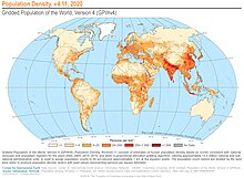

.jpg)


.svg)


