
Wikipedia:Graphics Lab/Image workshop/Archive/Apr 2009
 | This page, part of the Graphics Lab Wikiproject, is an archive of requests for April 2009. Please do not edit the contents of this page. You can submit new requests here. |
Stale
Alfred A. Knopf

Article(s): Alfred A. Knopf
Request: trim down blank edging, sharpen... Chris (クリス • フィッチュ) (talk) 06:14, 18 February 2009 (UTC)
Graphist opinion:
- What you're seeing there is Anti-aliasing, very much needed at the native (and small) size of this logo. It will look worse at low resolution if you remove that. gringer (talk) 11:21, 18 February 2009 (UTC)
- So then it needs enlarged and sharpened. Chris (クリス • フィッチュ) (talk) 16:05, 19 February 2009 (UTC)
- Aside from the fact that it's grainy and reflects poorly on the general quality of Wikipedia graphics? More time is spent arguing against this than it would take to fix it. Chris (クリス • フィッチュ) (talk) 07:49, 13 March 2009 (UTC)
Hard Kaur
-
 Hard Kaur at the Forbidden City, Singapore
 -
 Edited


Article(s): Hard Kaur
Request:
- Remove audience hand.
- Too much of red light, make more natural if possible.
- Too wide, give proper proportion - crop empty spaces in the left and right, and perhaps a bit of empty space on the top.
Jay (talk) 10:11, 10 March 2009 (UTC)
Graphist opinion:
- Doesn't look too hard (groan at own pun). If it's still up when I come around in a day or two, I'll fix it. --Slashme (talk) 17:19, 10 March 2009 (UTC)
- Interestingly enough, just boosting the green did the trick for the colour as far as I can tell. I did the crop and the hand removal as requested, but I actually think the original had a certain magic of its own: it shows the context very nicely; the audience hand and the red glow give atmosphere, and the Chinese Lantern gives a bit of context. But I guess the "fixed" one is a better portrait, so there is some merit in the change. You'll also notice that a higher jpg compression helped a lot to reduce the file size, but I know that's not a serious concern in this case, because most users would just see the thumbnail anyway. --Slashme (talk) 17:18, 11 March 2009 (UTC)
- PS: You can compare the old and the new at File:Hard Kaur.jpg. Not sure how to get the old one into the gallery. There must be some trick for this? --Slashme (talk) 17:24, 11 March 2009 (UTC)
- Wow, that's quite a clever trick ;-] --Slashme (talk) 19:09, 12 March 2009 (UTC)
Jay, can you get your friend to email you his or her permission so that we can satisfy the copyright-monster? I guess if you get him to scribble a note on a napkin and sign it, you could scan that in, email it and get a ticket too. --Slashme (talk) 17:17, 13 March 2009 (UTC)
- The modified image looks good. Now I need to find a way with the copyright format. Jay (talk) 12:44, 14 March 2009 (UTC)
Guatemala-Peten map
-
 map
map -
 svg in progress


Article(s): at the moment Motul de San José, Holtun, Topoxte, Yaxha and possibly many more Maya sites in the future
Request: The selection of hotels (2,3,4) indicated in the map is biased and could be interpreted as advertising. There are many more hotels in the map area. Please remove items 2,3 and 4 from the map. (I did not post this on the map/lab, since no special mapmaking skills are necessary here. Just a bit of photoshop should do.)
Graphist opinion:
I'll do this one: It can become an SVG at the same time, and at no extra charge :-) --Slashme (talk) 15:53, 9 March 2009 (UTC)
- Great, thanks a lot. Since you are doing a new map anyway, you could contact User:Simon Burchell, who is very active on Maya stuff, for suggestions. bamse (talk) 16:31, 9 March 2009 (UTC)
- Well, my time ran out this evening before I finished, so I'll get back to it on Wednesday or so (Tomorrow is go night.) Thanks for the suggestion for help. I'll try to copy the diagram as faithfully as possible without the hotels. Still to come: Some text and an aeroplane icon. --Slashme (talk) 19:12, 9 March 2009 (UTC)
- OK, added the needed info before go. Please proofread. If the map you see doesn't have a legend, numbers, or an aeroplane, you need to update the bitmap. --Slashme (talk) 16:39, 10 March 2009 (UTC)
- Excellent! Just some minor things.
- I know that because of the limitations of the wikipedia svg renderer it is not easy to get a decent looking svg. It moves text in strange ways.
- Actually, in this case, I'd made text to the left of a dot right-aligned and to the right of the dot left-aligned, so I wasn't too surprised at where it ended up.
- So with some of the town labels it is not clear to which dot they belong (e.g.
- San Andres,
- Yes, my font was a bit wide here, so I made this span two lines.
- San Benito, Santa Elena
- Those were a bit of a challenge, and even the original was not so clear here, so I used your suggestion of lines to indicate which text goes with which dot.
- Also some of the labels are above roads, rivers, etc. which makes them difficult to read. The latter can not always be avoided but
- if you move San Miguel to the bottom right of the dot it should be fine.
- Good idea, done.
- In areas where it is very crowded like around Lago Peten Itza you could move labels a bit away on empty places and connect the label with a narrow line.
- Done.
- Maybe change colour of the lake labels to the same colour as the rivers/lake shore.
- I didn't like this idea, but if you feel strongly, I can easily do it.
- I'd also make the black circle around the red cities a bit more narrow
- Done.
- and move the triangles outside the map area such that they have equal distance to the map boundary.
- Hmm, I'd tried to put the triangles the same distance to the edge of the green block, but OK, done.
Thanks a lot for your fast work. bamse (talk) 17:20, 10 March 2009 (UTC)
- Done. I guess if we need a Spanish map, it's easy to translate the SVG (A text editor should do the trick!). --Slashme (talk) 16:56, 11 March 2009 (UTC)
- P.S: What is a good English translation for "Laguna"? Lacune or lagoon? --Slashme (talk) 16:59, 11 March 2009 (UTC)
- I'd say lagoon, but I am not a native English speaker. Thanks once more for the map. Looks perfect now with the modified labels. PS: No, I don't feel strongly about the label colour. Was just an idea to show more clearly that the labels are for water bodies. I think it is very fine as it is now. Maybe "Yaxha lake" with a capital "L"? Just noticed now the river which ends in San Miguel (also in the png-map). It really ends there? bamse (talk) 22:34, 11 March 2009 (UTC)
- OK, done. I also don't know about the river. I guess it will have to stay like that for now. I put in "lagoon" but I have my doubts. Maybe it's just a small lake, so that we should say "lake" instead. --Slashme (talk) 19:03, 12 March 2009 (UTC)
Sequoyah state seal
-

-
 this is clearer and also provides a color scheme, and should itself be SVGified
 -
 svg colourisation in progress
 -
 Cherokee element
 -
 Sequoyah element
 -
 Chickasaw element


Article(s): State of Sequoyah
Request: SVGify... Chris (クリス • フィッチュ) (talk) 06:47, 11 February 2009 (UTC)
Graphist opinion:
- It is hard to resolve some of the details in the image. I can see the bow an arrow, possibly a plow and stack of wheat, a canoe... but the details are messy. A simple trace won't seem to do. It appears I would need additional information in order to accurately recreate this seal... -Andrew c [talk] 16:18, 15 February 2009 (UTC)
- Thank you! Will you also tackle Sequoyah? Chris (クリス • フィッチュ) (talk) 01:04, 14 March 2009 (UTC)
- Yep, I'll see how far I get. Everytime I start a chunk of work, I'll make a note here to "check out" the project, so that whoever else wants to work on it doesn't duplicate work. It'll probably be a multi-week effort, but it seems doable. --Slashme (talk) 10:42, 14 March 2009 (UTC)
- Do you need the B&W version of the state seal as well, as it appears someone... has overwritten it? Anyway, sorry I dropped the ball on this. I didn't like the direction my color version was going so I sort of gave up. I have uploaded my latest version. It's more complete than the last rough draft, but still not exactly there. If someone wants to tweak mine, that'd be great. If someone wants to do one on their own and throw mine out, fine as well. What do you think of the latest color SVG version?-Andrew c [talk] 18:39, 14 March 2009 (UTC)
- Yep, I'll see how far I get. Everytime I start a chunk of work, I'll make a note here to "check out" the project, so that whoever else wants to work on it doesn't duplicate work. It'll probably be a multi-week effort, but it seems doable. --Slashme (talk) 10:42, 14 March 2009 (UTC)
- Slashme's brown-and-yellow fimbriation of the star is closer to the original. Chris (クリス • フィッチュ) (talk) 10:43, 16 March 2009 (UTC)
Olympic slogans
Articles: Chicago 2016 Olympic bid and Madrid 2016 Olympic bid
Request: Upload the Olympic slogans "Stir the Soul" ([1] [2]) and "Hola everyone" ([3] [4]) in SVG format, and as:
- File:Chicago bid slogan for the 2016 Summer Olympics.svg
- File:Madrid bid slogan for the 2016 Summer Olympics.svg
Example:
- File:Rio de Janeiro bid slogan for the 2016 Summer Olympics.svg
- File:Tokyo bid slogan for the 2016 Summer Olympics.svg
Regards; Felipe C.S ( talk ) 21:09, 25 February 2009 (UTC)
Graphist opinion:
Aren't these copyrighted? Are we allowed to upload vectorised versions? The Chicago one looks a bit tough, also! --Slashme (talk) 15:47, 9 March 2009 (UTC)
- There is nothing wrong with uploading vector non-free images--just make sure they are only rendered at web resolution on their articles. [|Retro00064|☎talk|✍contribs|] 02:50, 20 March 2009 (UTC)
Comic artist for the Wikipedia Signpost
Not the usual request we see here, so sorry for it not following a strict pattern. I'm seeking an artist that has talent equal to or better than Greg Williams of WikiWorld. He dropped off the radar awhile ago. From his comments it might be better if a name besides "his" WikiWorld is used, but that's more of a personal option for the graphist.
- Requirements: Work must be humorous, have text taken from an article on Wikipedia that is not modified, be in PNG file format as the end result, and have the appearance of a webcomic.
Other than that, you have free reign as far as your imagination goes. Some suggestions were left here that were never worked on if you need a jumpstart. Of course, before anything would get published it would have to go under the scrutinty of the editor-in-chief (currently Ragesoss) and possibly others at the Post. Multiple graphists are welcome to submit their work. I hope you guys enjoy this one, §hepTalk 01:55, 2 March 2009 (UTC)
- Comments
Long tail
-
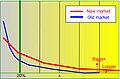 Image now in article
 -
 new SVG


Article(s): Long tail
Request: This chart burns my eyes. Can someone here make it less garish? Anything conveying the basic concept would work fine in the article, I think, so don't worry about copying this totally literally. (The "bigger" and "longer" labels, for instance, aren't really necessary.) Calliopejen1 (talk) 19:35, 15 March 2009 (UTC)
- The more I look at this, the worse it is. Why are some of the lines green and the others gray? Why is 20% labeled when this is just a rough graphic illustrating a general concept? ... Calliopejen1 (talk) 19:38, 15 March 2009 (UTC)
Graphist opinion: How does that look? It's much less busy than the prev image. Does there need to be anything else? Do you want smooth lines instead? --Pbroks13talk? 06:51, 17 March 2009 (UTC)
- I think that's fine. Smooth lines might be good, but I'm not really invested in this. I was just dropping by the article and was slightly horrified at what i saw. :) Calliopejen1 (talk) 18:32, 17 March 2009 (UTC)
- hah, gotcha. glad I could help! --Pbroks13talk? 06:36, 19 March 2009 (UTC)
- Hey, I made the lines smooth, put in proper axes and de-emphasised the vertical gridlines as it's only a rough graph, but I feel they add a certain sense of the relative balance of the graph. Feel free to revert if you don't like it. Inductiveload (talk) 09:09, 19 March 2009 (UTC)
- Per the article, I'm pretty sure the 20% line needs bolded. §hepTalk 03:31, 20 March 2009 (UTC)
- It would need two, one for each line, to make the point clearly. The existing image doesn't make this distincion, and the 20% line only refers to the "old" market line. I'll put them in later. Inductiveload (talk) 07:19, 20 March 2009 (UTC)
- Per the article, I'm pretty sure the 20% line needs bolded. §hepTalk 03:31, 20 March 2009 (UTC)
Newspaper Restoration

Article(s): Kung Kao Po
Request: Please restore the image (eg. remove scratch and fold marks, etc.) Jackl 13:37, 1 April 2009 (UTC)
Graphist opinion: Hi. The original image quality of this is low. Removing the fold marks would be easier if a higher resolution, better quality image was available. Can you contact the editor who contributed the image and get an image at 300dpi (the current image is 96dpi)? I can work with this image, but would prefer if it was possible to have higher quality. Also, re the "scratches"....um, it's not scratches but the trails of bugs who've been happily munching away at this document. I can crop out the trails from the sides of the image, but in the parts of the image which includes Chinese text I can't really replace the correct characters (doi bu qi). --Goldsztajn (talk) 01:11, 3 April 2009 (UTC)
Gas use / density
-
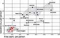 Graph
Graph

Article(s): Urban planning
Request: Could someone vectorize this? I think it would provide a more useful product (especially for those who wish to print) and will make it more easily editable in the future.
Actually, does anyone have access to that article linked as the source? I think our best bet would be to transcribe the relevant data and rebuild and paste the data as the source so that it can be plotted on precise data points and not just traced. If someone has access to the article and could do it that would be great. If not I can send you pictures of the data from the article. gren グレン 22:03, 24 March 2009 (UTC) http://www.sendspace.com/file/5jh202
Graphist opinion: Just commenting here - this would indeed be much better done by recreating the graph from the original data, not tracing. As such, we need to find the original data - note there is also a lot of commentary on the image's talk page about this. —Vanderdecken∴ ∫ξφ 12:29, 25 March 2009 (UTC)
I checked the linked PDF and while I didn't read the article, nothing popped out supplying the data which would allow us to recreate the image above. Have I missed this? Can you supply an exact page number which provides the precise data for the graph? --Goldsztajn (talk) 03:09, 4 April 2009 (UTC)
Resolved
Highway in Georgetown, Colorado
-
 View of Georgetown, Colorado

Article(s): Georgetown, Colorado; Georgetown-Silver Plume Historic District; National Register of Historic Places listings in Clear Creek County, Colorado
Request: Picture was taken from Interstate 70 and thus has the guardrail, plus a small bit of pavement. Since the highway isn't the subject of the picture, could the lower part be cropped to reduce the amount of highway? Nyttend (talk) 02:46, 22 March 2009 (UTC)
Graphist opinion: Guardrail and road removed.--Goldsztajn (talk) 08:09, 28 March 2009 (UTC)
- Thanks! I would have done that, but all I have to edit pictures is Paint. Nyttend (talk) 13:40, 28 March 2009 (UTC)
David Miscavige
Article(s): David Miscavige
Request: Benjiboi (talk · contribs) brought up the recommendation at the article's talk page that this image could be cleaned up. Would appreciate anything that could be done. Thank you for your time, Cirt (talk) 17:46, 25 March 2009 (UTC)
Graphist opinion: There's not a lot to work with in terms of the picture detail, but pushed the brightness, hope this helps.--Goldsztajn (talk) 00:56, 29 March 2009 (UTC)
- Thanks for your help Goldsztajn (talk · contribs). Cirt (talk) 06:59, 29 March 2009 (UTC)


Article(s): WikiProject:Racibórz
Request: Hi everyone.
I'm a moderator of the polish city of Racibórz related WikiProject and Portal on the polish Wikipedia. I want to create a system of giving awards to users, who made important edits related with this project. To do so, I'll need a barnstar symbol connected somehow with the city of Racibórz. My proposition is to compose a barnstar with coat of arms of Racibórz, but, unfortunately I'm not good in making images. So I want to ask for such image any person who could create it. Any propositions please send on page of my discussion on the polish Wikipedia. I'll be very gratefull for any response :) Olos88 (talk) 00:07, 28 February 2009 (UTC)
P.S. Sorry for my english (I'm still learning ;] ) Olos88 (talk) 02:44, 28 February 2009 (UTC)
Graphist opinion:
Here it is a simple barnstar with Coat of arms of Racibórz. ■ MMXXtalk 11:40, 2 March 2009 (UTC)
- I did make another one and uploaded it over same file, how is it? ■ MMXXtalk 13:14, 2 March 2009 (UTC)
- Yeah, how is it? The site keeps marking this request stale, so I had to say something to keep it from doing that (hopefully). :-( [|Retro00064|☎talk|✍contribs|] 21:33, 21 March 2009 (UTC)
Folsom 2003 bondage demo
-
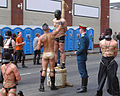 Bondage display at Folsom Street Fair

Article(s): Folsom Street Fair
Request: Please obcure the big phone number on the wall; and, on the left side crop just enough (like just past his face?) to obscure the person in the background who's looking at something else. I'm not sure if it's terribly easy ... but is it possible to tone down the orange t-shirt color as it really pops out. -- Banjeboi 12:26, 28 March 2009 (UTC)
Graphist opinion: Removed the phone number in the banner, cropped the photo as requested and darkened the orange T-shirt.--Goldsztajn (talk) 00:25, 29 March 2009 (UTC)
- Brilliant! You rule! -- Banjeboi 07:26, 29 March 2009 (UTC)
-
 Project Logo • See it in article
 -
 Example of good quality from german Wikipedia • See it in article
 -
 SVG Version
Article(s): WikiProject:Racibórz
Request: Hi everyone. Could somebody make something with quality of the logo of my Project on polish Wikipedia? For example by converting it to svg or by correcting sharpness? Any propositions please send on page of my discussion on the polish Wikipedia. I'll be very gratefull for any response :) Olos88 (talk) 17:15, 28 March 2009 (UTC)
Graphist opinion:
Hello, I've made an SVG version of the banner, have already posted a message on your talk page. What do you think? Tango22 (talk) 23:43, 28 March 2009 (UTC)
SVG created in Mathematica version 6, does not display properly
-
 Comparison of the potential in a hydrogen atom with that in a Rydberg state of another atom

Article: Rydberg atom
Request: I created this image in Mathematica version 6, however there seems to be some incompatibility between the way it was created and the way it is shown in Wikipedia. Note how the axis labels are miss-aligned and compare with the actual image page which looks as it was supposed to. In case this is a browser issue, note that I am using Firefox version 3.0.8. --DJIndica (talk) 12:51, 30 March 2009 (UTC)
Graphist opinion: It's not a browser thing - librsvg (the SVG to PNG rendering library that MediaWiki uses for the image page and thumbnail renders) has quite a few bugs, documented here. There may be a workaround in this particular case, we had a very similar issue with a graph only a few days ago. I'll leave someone who knows SVGs to deal with this. —Vanderdecken∴ ∫ξφ 16:33, 30 March 2009 (UTC)
- Its a simple fix. I just converted the numbers to paths. And yeah, librsvg does a terrible job of converting text when the SVG is converted to PNG. But regardless, how's that? --Pbroks13talk? 20:36, 30 March 2009 (UTC)
- There is a definite improvement in that with a width of less than 600px the image displays properly, however 600 and above the problem still remains. The two images below have widths of 599px and 600px and they display very differently. Unfortunately the image page displays 600px and so still has the problem. In addition the thumbnail still shows the miss-alignment. I'd appreciate it if you could take another look. Thanks.--DJIndica (talk) 00:15, 31 March 2009 (UTC)
<<Images removed>>
I'm sorry, I don't see anything wrong, they both seem to align perfectly. Have you tried purging your cache? --Pbroks13talk? 01:01, 31 March 2009 (UTC)
- Hmm... I'm not sure why you see that. I'm sure it's not a browser problem, becaure I am running on Firefox 3.0.8 too. I think it still may be your cache. Have you tried clearing it? --Pbroks13talk? 17:03, 31 March 2009 (UTC)
-
 Please remove the logo per WP:logo

Article(s): Pakistan International Airlines
Request: Remove logo per WP:logo and also add spain to PIA destinations as here [5] yousaf465 07:57, 22 March 2009 (UTC)
Graphist opinion: Looks like someones already done that. Resolved? --Pbroks13talk? 20:39, 30 March 2009 (UTC)
- Could I ask about the colors of the islands between Russian and Japan? If this image is by countries, shouldn't those be colored green to match the countries they are part of? Thanx, 76.117.247.55 (talk) 23:50, 2 April 2009 (UTC)
- Yes, Hokaiddo and Sakhalin should be coloured. Also fixed up Canada (Victoria Island and Arctic Islands), East Timor, Philippines. Made image file smaller, seems unnecessarily large. At some stage should probably be recreated as SVG. --Goldsztajn (talk) 00:24, 3 April 2009 (UTC)
Underspanned suspension bridge
-
 Original PNG
 -
 SVG mirrored
Article(s): Suspension bridge types, Underspanned suspension bridge
Request: Please vectorize. In addition, consider this the "left" half of the bridge and create a mirror image of the given image and "complete" the bridge, so it's not just half. ¡Muchas gracias! ~ ωαdεstεr16«talkstalk» 05:58, 29 March 2009 (UTC)
Graphist opinion: Not sure if I have done this correctly, but hope this is what is wanted.--Goldsztajn (talk) 11:06, 29 March 2009 (UTC)
- Perfect! ~ ωαdεstεr16«talkstalk» 16:51, 29 March 2009 (UTC)
- Not perfect I'm afraid - that SVG doesn't thumbnail properly and is far too detailed - even including JPG compression! We need a more advanced SVG maker on this. —Vanderdecken∴ ∫ξφ 21:06, 29 March 2009 (UTC)
- Reworked...and, young boy, I am well advanced, thank you very much. :) --Goldsztajn (talk) 00:32, 30 March 2009 (UTC)
- No personal offence meant, old man. :P I don't touch SVGs with a bargepole, so you're all wonderfully advanced from my perspective. I'm also a harsh critic, and I must say the new version is beautiful, much better. :D —Vanderdecken∴ ∫ξφ 15:22, 30 March 2009 (UTC)
- Any objections to marking this resolved?--Goldsztajn (talk) 00:25, 3 April 2009 (UTC)
- Nope, it's all you. ~ ωαdεstεr16«talkstalk» 02:12, 3 April 2009 (UTC)
- Any objections to marking this resolved?--Goldsztajn (talk) 00:25, 3 April 2009 (UTC)
- No personal offence meant, old man. :P I don't touch SVGs with a bargepole, so you're all wonderfully advanced from my perspective. I'm also a harsh critic, and I must say the new version is beautiful, much better. :D —Vanderdecken∴ ∫ξφ 15:22, 30 March 2009 (UTC)
- Reworked...and, young boy, I am well advanced, thank you very much. :) --Goldsztajn (talk) 00:32, 30 March 2009 (UTC)
- Not perfect I'm afraid - that SVG doesn't thumbnail properly and is far too detailed - even including JPG compression! We need a more advanced SVG maker on this. —Vanderdecken∴ ∫ξφ 21:06, 29 March 2009 (UTC)
Vectorization
76.117.247.55 (talk) 19:20, 3 April 2009 (UTC)
-

-
 SVGified...
Articels: Federal depository library
Request: SVGify 76.117.247.55 (talk) 23:52, 2 April 2009 (UTC)
Graphist opinion: OK?--Goldsztajn (talk) 01:55, 3 April 2009 (UTC)
- Looks exactly correct to me. 76.117.247.55 (talk) 19:20, 3 April 2009 (UTC)
Plaque


Request: Straighten and crop, if possible remove the black from "SA OVOG MJESTA". PRODUCER (talk) 17:46, 3 April 2009 (UTC)
Graphist opinion: How's that. I left a little surrounding brickwork for context on the size of the plaque rather than cropping it to the text. Mfield (Oi!) 18:03, 3 April 2009 (UTC)
Attila in Gaul - bad map colors
-
 Map of Attila's campaign

Article(s): Attila the Hun and others
Request: There was a request left on the talk page that this image be altered so that the arrows are not red and green as color-blind readers are not able to distinguish them. Rmhermen (talk) 01:49, 22 March 2009 (UTC)
Graphist opinion: Done, converted to black and grey.--Goldsztajn (talk) 03:51, 3 April 2009 (UTC)
- Marking as resolved.--Goldsztajn (talk) 05:19, 6 April 2009 (UTC)
Hyatt Regency walkway details
-
 Current version

Article(s): Structural engineering, Hyatt Regency walkway collapse, Current Valued Pictures Candidate
Request: A request has been made at WP:VPC that the titles for (a) and (b) read "Original design" and "Actual construction", rather than "Original Design" and "Actual Construction", respectively. Should be quick to fix. Also, this actual file is up for deletion (I just moved it to Commons), so please overwrite the Commons version, not the local copy (unless the local copy has been deleted by the time you get to this-then disregard). Thanks! ~ ωαdεstεr16«talkstalk» 23:16, 28 March 2009 (UTC)
Graphist opinion: I recreated all the text as editable text as it was all vector shapes and it will be easier for other projects to edit into other languages. Decapitalized words as requested, uploaded over. File is 1/3 of the size now too. Mfield (Oi!) 05:46, 29 March 2009 (UTC)
- Yea, I opened this in Inkscape and was trying to figure out why they were shapes and not letters. Yes, a bump that small will scare me away from dealing with SVGs, hehe. Thanks for the help. ~ ωαdεstεr16«talkstalk» 06:00, 29 March 2009 (UTC)
- I think it was so that MediaWiki wouldn't render the text funny at the time. I guess the renderer is better at handling text now =). --Dave the Rave (DTR)talk 19:46, 2 April 2009 (UTC)
- Tag as resolved?--Goldsztajn (talk) 05:15, 3 April 2009 (UTC)
- Oh yea. ~ ωαdεstεr16«talkstalk» 23:54, 5 April 2009 (UTC)
- Tag as resolved?--Goldsztajn (talk) 05:15, 3 April 2009 (UTC)
- I think it was so that MediaWiki wouldn't render the text funny at the time. I guess the renderer is better at handling text now =). --Dave the Rave (DTR)talk 19:46, 2 April 2009 (UTC)
Andorra
-
 Andorra Topographic Map (French)
 -
 Andorra Topographic Map (English)


Article(s): Andorra
Request: Translate into English, so it can be used here at English Wikipedia. 92.21.152.37 (talk) 14:54, 29 March 2009 (UTC)
Graphist opinion: I didn't translate the names of the mountains, passes and rivers as these seem to have been left in the other versions. Just translated the legend, the country names, capital name and mountain range (Eastern Pyrenees).--Goldsztajn (talk) 01:47, 30 March 2009 (UTC)
- Any objections to marking this resolved?--Goldsztajn (talk) 00:26, 3 April 2009 (UTC)
- Marking as resolved.--Goldsztajn (talk) 05:20, 6 April 2009 (UTC)
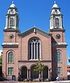
Removing a scratch
-
 Church, with pharmacy on the side
 -
 Edit 1
 -
 Edit 2


Article(s): St. Mary's Church and Pharmacy (future); National Register of Historic Places listings in Ravalli County, Montana
Request: Remove the little white vertical line (apparently a scratch) in the clouds in the top left. While you're at it, might as well remove the border, although Cropbot will get around to it eventually. Nyttend (talk) 15:12, 4 April 2009 (UTC)
Graphist opinion:
![]() Done. ■ MMXXtalk 21:09, 5 April 2009 (UTC)
Done. ■ MMXXtalk 21:09, 5 April 2009 (UTC)
Supreme Court
-
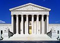 Original
 -
 Edit1
Edit1


Article(s): United States Supreme Court building
Request: Has barrel distortion and might be tilted. Please fix and change anything else that may not be up to par. Thanks! ~ ωαdεstεr16«talkstalk» 15:18, 6 April 2009 (UTC)
Graphist opinion: Fixed pincusion distortion, perspective, vignetting and noise reduction. How's that? Mfield (Oi!) 21:45, 6 April 2009 (UTC)
- Just -><- this much better than perfect. Thank you. ~ ωαdεstεr16«talkstalk» 00:43, 7 April 2009 (UTC)
Chinese character
-
Chinese character cheng, unable to display on most browsers
-
 vector
 -
 2nd version


Article(s): Naming laws in the People's Republic of China
Request: Could someone vectorize this, and remove the light border? Thanks, rʨanaɢ talk/contribs 02:57, 6 April 2009 (UTC)
- New version without border uploaded, now all it needs is to be vectorized. rʨanaɢ talk/contribs 03:00, 6 April 2009 (UTC)
Graphist opinion:
22x24 pixels is not a lot to work with. Does anyone have a higher resolution pic? Dhatfield (talk) 03:35, 6 April 2009 (UTC)
- Probably not, it's a picture of a Unicode font. If it's not possible (or if it's more effort than would be worthwhile), then it's not a huge deal, since the image isn't super-important. rʨanaɢ talk/contribs 04:40, 6 April 2009 (UTC)
- This looks to me like the horse character (馬) repeated three times, is that correct? We could mock up an SVG on that basis.--Goldsztajn (talk) 05:14, 6 April 2009 (UTC)
- The article it's used in specifically says that's correct =) Shoemaker's Holiday (talk) 05:48, 6 April 2009 (UTC)
- Ah, yes, that's a good idea. Do any of the inkers here read Chinese (just so it can be done by someone who has a feel for the way strokes should look, etc., especially when stretched out like this)? rʨanaɢ talk/contribs 13:33, 6 April 2009 (UTC)
- I took a look at that article and the character displays for me so I dug through my fonts and I have a font called MingLiu (I think it came with MS Office) that displays the character like this. It might look a bit squared at the ends at larger resolutions, but I assume that's a correct representation of the character? — ₪₪ ch1902 ₪₪ 15:28, 6 April 2009 (UTC)
- Yep, MingLiU is a Unicode font so it's pretty good with stuff like that. (PMingLiU is slightly better, just because things are less squished, but it's a trivial detail.) As for the svg, that looks perfect! Should we go ahead and delete File:Zh cheng rare.gif? rʨanaɢ talk/contribs 18:42, 6 April 2009 (UTC)
- I tried PMingLiU too, but that particular character looked exactly the same. They don't normally deleted superseeded images on Commons, but it is such a tiny image and it is still on en.wiki it might be worth deleting :) — ₪₪ ch1902 ₪₪ 20:54, 6 April 2009 (UTC)
- Unfortunately, I believe this is a proprietary font [6], if so, it will need to be deleted. SVGs must use public domain fonts, list of SVG fonts for wiki here.--Goldsztajn (talk) 21:30, 6 April 2009 (UTC)
- Oh, darn. I worried about that before when the original version was uploaded (from the Unicode website) but was told it wouldn't be a problem. Looking through the list of acceptable wiki fonts, I don't see any that I know of and can vouch for; WenQuanYi seems to be the only Chinese-specific one, but I've never seen it before. (I can point out that some other Unicode fonts, such as Arial Unicode and Doulos SIL, are notoriously bad with Chinese characters...but they are proprietary as well so that point is moot here.) rʨanaɢ talk/contribs 01:57, 7 April 2009 (UTC)
- I loaded up the above which uses an open source font...I realise it is not close to the beauty of the proprietary font, but I'm not having any luck finding an open source Chinese font which can give similar styling....--Goldsztajn (talk) 04:49, 7 April 2009 (UTC)
- Oh, darn. I worried about that before when the original version was uploaded (from the Unicode website) but was told it wouldn't be a problem. Looking through the list of acceptable wiki fonts, I don't see any that I know of and can vouch for; WenQuanYi seems to be the only Chinese-specific one, but I've never seen it before. (I can point out that some other Unicode fonts, such as Arial Unicode and Doulos SIL, are notoriously bad with Chinese characters...but they are proprietary as well so that point is moot here.) rʨanaɢ talk/contribs 01:57, 7 April 2009 (UTC)
- Unfortunately, I believe this is a proprietary font [6], if so, it will need to be deleted. SVGs must use public domain fonts, list of SVG fonts for wiki here.--Goldsztajn (talk) 21:30, 6 April 2009 (UTC)
- I tried PMingLiU too, but that particular character looked exactly the same. They don't normally deleted superseeded images on Commons, but it is such a tiny image and it is still on en.wiki it might be worth deleting :) — ₪₪ ch1902 ₪₪ 20:54, 6 April 2009 (UTC)
- Yep, MingLiU is a Unicode font so it's pretty good with stuff like that. (PMingLiU is slightly better, just because things are less squished, but it's a trivial detail.) As for the svg, that looks perfect! Should we go ahead and delete File:Zh cheng rare.gif? rʨanaɢ talk/contribs 18:42, 6 April 2009 (UTC)
- I took a look at that article and the character displays for me so I dug through my fonts and I have a font called MingLiu (I think it came with MS Office) that displays the character like this. It might look a bit squared at the ends at larger resolutions, but I assume that's a correct representation of the character? — ₪₪ ch1902 ₪₪ 15:28, 6 April 2009 (UTC)
- This looks to me like the horse character (馬) repeated three times, is that correct? We could mock up an SVG on that basis.--Goldsztajn (talk) 05:14, 6 April 2009 (UTC)
(unindent) SVGs don't have to use open source fonts. That list only applies if you want text elements to render correctly using librsvg since that list of fonts is available on the server, they will render correctly. — ₪₪ ch1902 ₪₪ 07:44, 7 April 2009 (UTC)
- Yes, my mistake...I forgot the important proviso: if the text is not converted to a path, then proprietary fonts cannot be used. Please ignore my (2nd) version and go with ch1902's better version.--Goldsztajn (talk) 08:34, 7 April 2009 (UTC)
- I'm not the requester, of course, but I've gone ahead and implemented this. I went maybe a touch too large, as it'll be easier on anyone with poor vision that way. —Preceding unsigned comment added by Shoemaker's Holiday (talk • contribs) 09:35, 7 April 2009
Cayman Islands Map.svg
-
 Doesn't render properly
 -
 Inkscape PNG Generated from file.


Article(s): Cayman Islands
Request: I created this map for use with the Cayman Islands article, it renders properly in Inkscape and Firefox, however when I uploaded it here it is not rendering properly. Please fix it, as I am new to SVG. RaviC (talk) 19:23, 6 April 2009 (UTC)
Graphist opinion: Wikipedia used librsvg to render the SVG files, and it does a pretty bad job on the text conversion. I just converted all of the text to paths, so it should render correctly now. --Pbroks13talk? 20:51, 6 April 2009 (UTC)
- Thanks. I have nominated the PNG version for deletion since it is not needed now. --RaviC (talk) 15:19, 7 April 2009 (UTC)
- Okay, I'm marking this as resolved. --Pbroks13talk? 17:56, 9 April 2009 (UTC)
- Thanks. I have nominated the PNG version for deletion since it is not needed now. --RaviC (talk) 15:19, 7 April 2009 (UTC)
Vevo logo

Article(s): Vevo
Request: Please vectorize the logo of the new Google/Universal Music Group music video service Vevo. Not sure if it's worth keeping the tag line (it's a small font and difficult to see in the article). Thanks! ~ ωαdεstεr16«talkstalk» 03:15, 10 April 2009 (UTC)
Graphist opinion: Logo is copyrighted, we can't vectorise per the resolution clause of WP:FU. —Vanderdecken∴ ∫ξφ 17:40, 10 April 2009 (UTC)
 Not done Since it is copyrighted, why not leave it as it is? It is best to leave them without modification. After all, it is in PNG format. ZooFari 18:06, 10 April 2009 (UTC)
- Logos are done here all the time. For example, a few in 2009: this, this, and this. Most logos for large, notable companies are in SVG and there has not been a problem. This argument came up before in the January archive and the supporters of vectorizing seem to be in the right. And obviously after an SVG is uploaded, I would request the immediate deletion of the png. Also, one could argue (though I don't feel confident enough to do so) that this logo is PD due to the fact that it's only a typeface. When doing a quick search function in WP:FU and WP:LOGO, nowhere do the strings "vector" or "SVG" exist, so it's apparently not that big of a deal. ~ ωαdεstεr16«talkstalk» 18:32, 10 April 2009 (UTC)
- Personally I think logo PNGs should not be vectorized. I usually encourage others not to vectorize. There is nothing wrong with leaving a logo as PNG, and it is a huge risk to vectorize, but I guess that is not up to me. Still eligible for vectorization... ZooFari 18:44, 10 April 2009 (UTC)
- How do you see it as a risk? Do you mean to Wikipedia or the uploader? I think this is little more than paranoia but that's just my opinion. ~ ωαdεstεr16«talkstalk» 18:52, 10 April 2009 (UTC)
- Personally I think logo PNGs should not be vectorized. I usually encourage others not to vectorize. There is nothing wrong with leaving a logo as PNG, and it is a huge risk to vectorize, but I guess that is not up to me. Still eligible for vectorization... ZooFari 18:44, 10 April 2009 (UTC)
- I don't have a problem with vectorising PNG logos as such, but if too much effort is required to vectorise (e.g. guessing the intent of antialiasing from a very low-resolution image), I don't think it's worth it. This logo in particular should be easy and, as a disclaimer in the PNG file page says, "This logo only consists of typefaces, individual words, slogans, or simple geometric shapes. These are not eligible for copyright alone because they are not original enough, and thus the logo is considered to be in the public domain." gringer (talk) 23:38, 10 April 2009 (UTC)
- Yea, I didn't place those tags there, but I had a gut feeling that that was the case. Didn't feel confident enough to make that call though. But I'd appreciate a vectorization. It's gonna go svg eventually anyway; this product will most likely become very popular once it's up and running. ~ ωαdεstεr16«talkstalk» 17:56, 11 April 2009 (UTC)
- Logos are done here all the time. For example, a few in 2009: this, this, and this. Most logos for large, notable companies are in SVG and there has not been a problem. This argument came up before in the January archive and the supporters of vectorizing seem to be in the right. And obviously after an SVG is uploaded, I would request the immediate deletion of the png. Also, one could argue (though I don't feel confident enough to do so) that this logo is PD due to the fact that it's only a typeface. When doing a quick search function in WP:FU and WP:LOGO, nowhere do the strings "vector" or "SVG" exist, so it's apparently not that big of a deal. ~ ωαdεstεr16«talkstalk» 18:32, 10 April 2009 (UTC)
I'm sorry, but this logo is definitely copyrighted; it not eligible to be in the PD. If anyone disagrees, please let me know. In regards to vectorizing it, I would say just wait until they come out with an official SVG logo. --Pbroks13talk? 23:59, 11 April 2009 (UTC)
- I don't buy this. Like I said previously, this will eventually be vectorized and I haven't seen the case where we just wait for (and depend on) the hosting company to create and distribute said file. ~ ωαdεstεr16«talkstalk» 02:43, 12 April 2009 (UTC)
- Okay, well I made a vector version. What do you think? --Pbroks13talk? 16:57, 12 April 2009 (UTC)
- It looks good. The font on the subline seems to be off. Maybe it should just be excluded? The SM is only on the VEVO part, so maybe we should only consider those four letters the actual logo. ~ ωαdεstεr16«talkstalk» 19:11, 12 April 2009 (UTC)
- Okay, well I made a vector version. What do you think? --Pbroks13talk? 16:57, 12 April 2009 (UTC)
Logo for IPCC
76.117.247.55 (talk) 17:43, 12 April 2009 (UTC)


Articels: IPCC
Request: SVGify if possible, if not, recreate as a PNG to prevent the compression artifacts, such as are currently there. 76.117.247.55 (talk) 05:37, 11 April 2009 (UTC)
Oppinion: How's this? File:Ipcclogo.svg --Pbroks13talk? 17:12, 12 April 2009 (UTC)
- Looks good and I see you've already marked it VVA. 76.117.247.55 (talk) 17:43, 12 April 2009 (UTC)
National Archives Building
-
 Original

Article(s): National Archives and Records Administration, List of museums in Washington, D.C., List of tallest buildings in Washington, D.C., National Register of Historic Places listings in Northwest Quadrant, Washington, D.C.
Request: Please fix the distortion and make any other corrections you deem necessary. Similar request to this. ¡Muchas gracias! ~ ωαdεstεr16«talkstalk» 07:49, 12 April 2009 (UTC)
Graphist opinion: Corrected distortions and CA, NR on sky. OK? Mfield (Oi!) 23:02, 13 April 2009 (UTC)
- Perfect once again. I really need to learn Photoshop... ~ ωαdεstεr16«talkstalk» 02:11, 14 April 2009 (UTC)
Repair an SVG
76.117.247.55 (talk) 00:07, 16 April 2009 (UTC)
.svg)
Articles: A weighting
Request: Fix text so it's not all overlapping on the Y axis as it is now. 76.117.247.55 (talk) 17:45, 12 April 2009 (UTC)
Opinion: Okay, I changed all of the text to paths; how's that? --Pbroks13talk? 00:44, 13 April 2009 (UTC)
- Excellent. 76.117.247.55 (talk) 00:07, 16 April 2009 (UTC)
Equal Justice Under Law
-
 "Equal Justice Under Law"

Article(s): Equal Protection Clause, Equal justice under law, United States Supreme Court building, Corte Suprema de los Estados Unidos (wikipedia español)
Request: Any way to darken the letters in "Equal Justice Under Law"? And any other general touchups would be appreciated. ~ ωαdεstεr16«talkstalk» 06:01, 15 April 2009 (UTC)
Graphist opinion: Your request has been completed. How does it look? You may have to bypass your cache to see the changes. -- penubag (talk) 22:23, 15 April 2009 (UTC)
- That should do, thank you. ~ ωαdεstεr16«talkstalk» 00:08, 16 April 2009 (UTC)
Clapperboard flag icon
-
 Recreate this...
 -
 ...using this...
 -
 ...and this.
 -
 New file


Article(s): {{Kannada-film-stub}}
Request: Can someone please recreate the ghastly looking png on the left as an svg similar to File:Unified Korea film icon.svg, and upload as File:Kannada film clapperboard.svg or similar? Cheers! PC78 (talk) 20:45, 15 April 2009 (UTC)
Graphist opinion: How's that? --Pbroks13talk? 23:30, 15 April 2009 (UTC)
Straighten
76.117.247.55 (talk) 16:56, 18 April 2009 (UTC)


Articel: area-denial weapon
Request: Could the image be rotated and cropped so that the wall is more or less vertical? 76.117.247.55 (talk) 06:24, 17 April 2009 (UTC)
Opinion:
![]() Done How is that? I straightened so that the fire alarm is vertical, not the wall. I also made additional edits (adjusted contrast) in case it was okay. Let me know if this works for you. ZooFari 23:21, 17 April 2009 (UTC)
Done How is that? I straightened so that the fire alarm is vertical, not the wall. I also made additional edits (adjusted contrast) in case it was okay. Let me know if this works for you. ZooFari 23:21, 17 April 2009 (UTC)
- Excellent. 76.117.247.55 (talk) 16:56, 18 April 2009 (UTC)
Badly damage to SVG
-
 Spanish Prefix Map
 -
 Spanshi Prefix Map (SVG)


Article(s): Telephone numbers in Spain
Request: Needs major cleanup. SVG if possible and correct the borders. Since it is badly damaged, the shapes don't need to be accurate. Translate to English if necessary, or just remove the foreign text. ZooFari 17:23, 7 April 2009 (UTC)
Graphist opinion: Vectored. The Spanish has been removed as the English was beside it. Article updated. 綾波風神 (talk) 17:05, 19 April 2009 (UTC)
Heraldic lions (attitudes)
-
 Lion rampant
 -
Lion statant
-
Lion sejant
-
Lion sejant erect
-
Lion salient
-
Lion couchant
-
Lion dormant

Article(s): Lion (heraldry), Attitude (heraldry)
Request: I'm asking for vector images as examples of each position used in heraldry, roughly based upon File:Lion rampant.svg and File:Heraldique meuble lion passant.svg. Please also see the section on lions at this page as a general reference. Feel free to refer to my sandbox to see where I'm going with this. Also note that all lions should face left, as a lion facing right is "toward sinister", a lion looking over its shoulder is described as "regardant", and a lion looking toward the viewer is described as "guardant". For example, this lion is "couchant guardant", and this lion is "sejant regardant". Wilhelm_meis (talk) 04:54, 14 March 2009 (UTC)
Graphist opinion:
- Well, I spent quite some time a few weeks ago making these images
.svg)
.svg)
.svg)

- Might I suggest that these be used as a reference rather than that quite simplistic and untidy-looking lion rampant and passant you give? Admittedly, it's harder to draw them in this style, but if we were to have a whole matching set like this, the effect would be quite striking, I think. I have other commitments right now, but I might make a few up in a couple of week's time. Inductiveload (talk) 09:22, 19 March 2009 (UTC)
- Those are quite nice indeed. I placed your lion rampant in the gallery above, as a starting point. Thank you for that, it is much nicer than the one on my sandbox page. Wilhelm_meis (talk) 04:31, 7 April 2009 (UTC)
-
 Passant
 -
 Passant Guardant
 -
 Passant Reguardant
 -
 Courant
 -
 Rampant
 -
 Rampant Guardant
 -
 Rampant Reguardant
 -
 Coward
 -
 Rampant (forked tail)
 -
 Crossed tail
 -
 Crossed tail (reverse)
 -
 Rampant (tail nowed)
 -
 Statant
 -
 Statant Guardant
 -
 Sejant
 -
 Sejant Erect
 -
 Couchant
 -
 Dormant
 -
 Salient
 -
 Cadent (dexter)


.svg)


Wow, sodacan, that's great! My only criticism is that the lion dormant should have its eye(s) closed because he is sleeping. Those are wonderful lions, though, and in just about every attitude they are ever found in! Wilhelm_meis (talk) 14:50, 15 April 2009 (UTC)
-
 rampant guardant
 -
 rampant reguardant, forked tails
 -
 rampant
 -
 rampant reguardant, 1 forked tail


Drawing lion fur in Inkscape gets me mad, but here are some lions I've made (or edited), in rampant, rampant guardant and rampant reguardant. Some of them have forked tails, too. I haven't extracted and catalogued them as the ones above. If anyone likes them, please do. Personally I've found the designs that are clutching shields as the most useful ones. ![]() can also be used after some motification (I guess axes aren't that common). BTW great work, Sodacan! :) - SSJ ☎ 23:21, 15 April 2009 (UTC)
can also be used after some motification (I guess axes aren't that common). BTW great work, Sodacan! :) - SSJ ☎ 23:21, 15 April 2009 (UTC)
Jesuit Missions of the Chiquitos
-
 church too dark
 -
 Jaakobou ver.1


Article(s): Jesuit Missions of the Chiquitos, San Ignacio de Velasco
Request: lighten church bamse (talk) 07:36, 20 April 2009 (UTC)
Graphist opinion:
- Done. Lightened up and grain was cleaned some. JaakobouChalk Talk 19:18, 20 April 2009 (UTC)
BART map
-
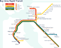 BART system map

Article(s): List of Bay Area Rapid Transit stations and History of the Bay Area Rapid Transit
Request: Can it be cropped so that the extra space on the left and bottom are removed? Also, it would be great if the legend on the upper left corner is moved toward the right a bit.—Chris! ct 01:32, 22 April 2009 (UTC)
Graphist opinion:
![]() Uploaded over original. -Zeus-u|c 03:00, 22 April 2009 (UTC)
Uploaded over original. -Zeus-u|c 03:00, 22 April 2009 (UTC)
- Another request: The station name "North Concord/Martinez" on the upper right corner is cut off. Can someone fix it for me? Thanks—Chris! ct 04:24, 22 April 2009 (UTC)
University of Valle
Article(s): University of Valle#Organization
-
 Final
Final

Request: Some diagrams are needed for the Organization section. A general organization diagram can be found in this file. Other diagrams for the faculties, institutes, and other dependencies can be found in this file. I'll be glad to help in the translation of the names from Spanish. Andremun (talk) 03:45, 30 March 2009 (UTC)
Graphist opinion: Hi, there is a large amount of material in the linked PDFs and a few questions arise: the material seems mostly to be dated from 2003...given universities and their propensity to bureaucratically reorganise at OCD-like frequencies; is producing material like this only going to become obsolete quite quickly? Second, perhaps all the material does not need to be converted...if can you be specific about exactly what you want it would be easier. I take it the first diagram [7] is a must, but can you confirm it is current and not about to be made obsolete? --Goldsztajn (talk) 23:01, 30 March 2009 (UTC)
- Hello. Thanks for the reply. Unless a mayor change in the Colombian law for higher education, the main diagram would not change. The last major change for the law was in 1993, and its possible it would not change in the near future. As for the other diagrams, for now they might not be needed, unless an independent article for each unit is created. -Andremun (talk) 03:52, 2 April 2009 (UTC)
- I can convert this PDF [8] to an SVG (or a JPEG), but I need a license for the file, I can't just assume this is public domain. Once I can get a license I'm happy to mock up an image, I'll translate what I can and you can correct and help me with the rest.--Goldsztajn (talk) 00:58, 3 April 2009 (UTC)
- I guess if it is a public university, then its "assets" are owned by the Government of Colombia, what is copyright law on assets of the Govt? Can you find any other logos or images in the Commons which are govt of Colombia sourced? What is their licence? --Goldsztajn (talk) 04:57, 7 April 2009 (UTC)
I found this from Colombia: Copyright, Law, 28/01/1982, No. 23:
Article 41. Any person shall be allowed to reproduce the Constitution, laws, decrees, ordinances, orders, regulations and other administrative texts and judicial decisions, subject to the obligation to abide strictly by the official edition, and provided that such reproduction is not prohibited.
This is the law that Colombia has notified the WTO as current copyright law [9] and the text is translated from Spanish by the UN agency for intellectual property, so I think this qualifies as WP:RS... :) I'm happy to go ahead on this basis, give me a day or two to begin making the diagram.--Goldsztajn (talk) 21:58, 7 April 2009 (UTC)
- There's a first draft (apologies for any terrible mistakes on the translation, corrections welcome...I had no idea about "Control Interno" and "Junta de Seguridad Social"...I did a literal translation for the latter and guessed for the former).--Goldsztajn (talk) 10:32, 19 April 2009 (UTC)
- Hello. It looks great, but a few changes in the translation must be made. The vice-rector of "Human services", must be changed to "University welfare", "Education" to "Academics", and maybe add to the names of the Vice-rectors the word "of". "Control Interno" is not related to safety but to Internal control, which is in charge to oversee the correct use of the budget. "Social Security Board" is correct. The "Faculty of Technical Arts" should be replaced to "Faculty of Integrated Arts", "Faculty of Social Science and Economics" to "Faculty of Social and Economic Sciences", the "Faculty of Administrative Sciences" to "Administration Sciences". The "University Council" should be changed to "Superior Council". I can wait to see the final version. Maybe you could add some color. Regards -Andremun (talk) 14:53, 19 April 2009 (UTC)
- Hi. Let me clarify some of the translations before I make further changes. "Bienestar Universitario" you say should be "University Welfare", this would be a literal translation. It's not a very familiar description to me, can you describe what that office does? "Superior Council" is again literal, it could be "Higher Council", but "university council" is very common in english as the highest decision-making body within a university. Can I make "control interno", "office of budget management"? Economics in English is rarely referred to as a science (a dismal science, yes!), perhaps "Social sciences and economics" would be better. I hope I'm not seeming pedantic, I'm somewhat familiar with universities, I'm just trying to get language which is most commonly used in English.--Goldsztajn (talk) 22:13, 19 April 2009 (UTC)
- I see what you mean. If you think that is the correct translation for those terms, I'll have to agree with you. As for the welfare office, it is in charge of the medical, recreation, and dining hall services, and scholarships and financial help for low income students, among other complementary services to the students, faculty and staff. I think the "budget management" is not appropriated, and something that indicates that is a regulatory office should be used. I don't know if this helps out. -Andremun (talk) 05:00, 20 April 2009 (UTC)
- Ok, for "Bienestar Universitario" what about "University welfare and services"? For "control interno" what about "budget oversight" or "budget oversight and regulation"?--Goldsztajn (talk) 05:58, 20 April 2009 (UTC)
- I think even "Internal Control Office" would be ok. I see this is a accepted term in English (Even appears in WP), or how about "Internal Audit Office". As for the "welfare", maybe the word services is unnecessary. I think we could reach a final consensus after this. Regards -Andremun (talk) 15:07, 20 April 2009 (UTC)
- OK, fixed the text per the discussion here, can you do one final check if it is ok? I'll then clean up the text appearance. Can you give me some suggestions what you would like coloured and where.--Goldsztajn (talk) 03:17, 21 April 2009 (UTC)
- I'm not sure about the "Vice-Rector for Education". After checking the website of the "Control Interno" office, the office does more than just the budget audit. But also serves as channel between the university and the external audit services, evaluate the management system, budget management, and advise in the decision making process. It might be an understatement to just use the word "budget". I still think that it should be named "Office for Internal Control", since Internal Control seems to be the correct term. As for the colors, I think the boxes could use some color, so it doesn't look so plain. A light blue could be used for the faculties and institutes, a light green for the Vice-rectors and regionalisation offices. I'm not sure what other colors could be used, maybe some yellow or red. I leave this to your artistic criteria. Thanks again for all the help and work! -Andremun (talk) 03:34, 21 April 2009 (UTC)
- Ok, sounds fine, give me another 24 hours and hope to get penultimate draft done. Thanks for your patience.--Goldsztajn (talk) 07:14, 22 April 2009 (UTC)
- Fixed the v-rector for education, to academia (see this definition here for my use of academia rather than academics), and used office of internal control, plus colours. Did I leave anything out? --Goldsztajn (talk) 01:11, 23 April 2009 (UTC)
- Ok, sounds fine, give me another 24 hours and hope to get penultimate draft done. Thanks for your patience.--Goldsztajn (talk) 07:14, 22 April 2009 (UTC)
- It looks great. I'm marking this request as resolved. Please let me know what would be the definite file name to include it in the article, or if you can, please include it yourself. Thank you again for all the work!!! I hope we can work in some other project. Regards -Andremun (talk) 03:41, 23 April 2009 (UTC)
- Ok, I've uploaded the final version with a new name, (University-of-valle-colombia-strucutre.svg...sorry bout the spelling mistake...displayed in the gallery above), and tagged the test version for deletion. Regards...--Goldsztajn (talk) 10:03, 23 April 2009 (UTC)
- It looks great. I'm marking this request as resolved. Please let me know what would be the definite file name to include it in the article, or if you can, please include it yourself. Thank you again for all the work!!! I hope we can work in some other project. Regards -Andremun (talk) 03:41, 23 April 2009 (UTC)
Open containers
-

-
 SVG version


Articels: Bootleggers and Baptists and others
Request:: SVGify (You don't have to keep the strange stripes), upload without the "2006", and update to 2009 by changing Wyoming to "Conforms to Federal...", per <http://alcoholpolicy.niaaa.nih.gov/> 76.117.247.55 (talk) 03:43, 20 April 2009 (UTC)
Opinion: How's that? --Goldsztajn (talk) 04:02, 21 April 2009 (UTC)
- Could you reduce the font size of the state abbreviations, or spell them out? 76.117.247.55 (talk) 00:23, 22 April 2009 (UTC)
- Ok, I'll go for a font size reduction, give me a day or so.--Goldsztajn (talk) 07:17, 22 April 2009 (UTC)
- Font size and the stroke size of the circles on the eastern states reduced.--Goldsztajn (talk) 10:27, 23 April 2009 (UTC)
- That looks more reasonable. 76.117.247.55 (talk) 22:19, 23 April 2009 (UTC)
- Font size and the stroke size of the circles on the eastern states reduced.--Goldsztajn (talk) 10:27, 23 April 2009 (UTC)
- Ok, I'll go for a font size reduction, give me a day or so.--Goldsztajn (talk) 07:17, 22 April 2009 (UTC)
Albany Church (template image)
-
 Original

Article(s): Template:NewYork-NRHP-stub
Request: The quality of this image is poor considering its wide use. This image needs perspective distortion correcting, straightening, and maybe some cropping from the sides. ~ ωαdεstεr16«talkstalk» 16:36, 23 April 2009 (UTC)
Graphist opinion: I've fixed the angle, perspective and cropped the picture. How is it? -- penubag (talk) 03:15, 24 April 2009 (UTC)
- Looks good, thanks. ~ ωαdεstεr16«talkstalk» 03:22, 24 April 2009 (UTC)
University of Sucre logo
-
University of Sucre logo
-
Vectored Version, based on the off-site image.
Article(s): University of Sucre
Request: Greetings. I've noticed that this article has an inappropriate image for the logo. This image needs clean up, retouching, and maybe should be an SVG. An idea in how this logo should be, including colors and shapes, can be seen here. Thanks -Andremun (talk) 03:00, 11 April 2009 (UTC)
Graphist opinion:
I am not skilled in Spanish, so I am not sure of my accuracy in guessing what those words around the symbol are. The words surrounding the symbol are:
Top: Universidad de Sucre (?) Left: Tecnología (?) Right: Ciencia (?) Bottom: Desarrollo (?)
綾波風神 (talk) 13:52, 22 April 2009 (UTC)
- Greetings. It looks great. As for the licence, I'll point out an information found out by Goldsztajn about Colombian copyright, and which was used for another project, and may be helpful for this one.
Article 32. It shall be permissible to make use, to the extent justified by the purpose, of literary or artistic works, or parts thereof, by way of illustration in works intended for teaching, by means of publications, broadcasts or sound or visual recordings, or to communicate, without gainful intent and for teaching purposes works broadcast for use in schools, education, universities and professional training, subject to the obligation to mention the name of the author and the title of the works thus used.
Article 33. Any title, photograph, illustration and commentary on a current event, published by the press or broadcast by radio or television, may be reproduced in so far as this has not been expressly prohibited.
- Also, I think this image fits into the WP:FAIR and WP:LOGO categories, since it is a representative logo of an institution, and the Non-free content criteria could be applied. As for the translations, they are correct. Great job in the graphic. Please let me know if I can be of assistance. Regards -Andremun (talk) 03:55, 23 April 2009 (UTC)
The File has been re-uploaded to the article, locally, with the proper information. The article itself has been updated. The Commons one is just going to expire. Thank you very much Andremun and Goldsztajn. -綾波風神 (talk) 20:52, 23 April 2009 (UTC)
- Hello. Good job on the image. There is a small misspelling in the "Tecnología" word (its written as "Technología"). After this, I can mark this request as resolved. Regards -Andremun (talk) 23:00, 23 April 2009 (UTC)
- Spelling is fixed and image updated.
North-South divide

Article(s): North-South divide
Request: make oceans white so division is clear... Chris (クリス • フィッチュ) (talk) 16:25, 22 April 2009 (UTC)
Graphist opinion: ![]() Done! -Zeus-u|c 18:36, 22 April 2009 (UTC)
Done! -Zeus-u|c 18:36, 22 April 2009 (UTC)
- Vectorized version uploaded; I would appreciate if anyone knows how to get rid of the extraneous background colors (click on the svg and watch the render). -Zeus-u|c 19:11, 22 April 2009 (UTC)
- Just layers of different colours, I've deleted them.--Goldsztajn (talk) 02:55, 23 April 2009 (UTC)
- Great, thank you! Chris (クリス • フィッチュ) (talk) 15:18, 24 April 2009 (UTC)
French Southern and Antarctic Lands error
-
 flag with error.

Article(s): French Southern and Antarctic Lands
Request: The letters and stars should not be transparent in this flag, they sould be just plain white.
could someone correct this mistake? thanks.SelfQ (talk) 22:39, 24 April 2009 (UTC)
Graphist opinion: There you go, hows that? --Pbroks13talk? 04:13, 25 April 2009 (UTC)