
Wikipedia:Graphics Lab/Image workshop/Archive/Aug 2008
 | This page, part of the Graphics Lab Wikiproject, is an archive of requests for August 2008. Please do not edit the contents of this page. You can submit new requests here. |
Stale
JFK motorcade
-
 Only free photo of JFK's motorcade on the day of his assassination

Article(s): John F. Kennedy, Jacqueline Kennedy Onassis, John F. Kennedy assassination, several others
Request: Upon finding this historic gem of a photo I uploaded a crop of the high-rez LoC scan and nominated it for featured picture status. This was premature, as the image could use significant restoration and cleaning up. I've suspended the nomination for now, in the hope that a graphist would take a crack at it. ˉˉanetode╦╩ 08:55, 6 June 2008 (UTC)
Graphist opinion: I'll have a go at it. However, it would seem counter-intuitive to work on the low res crop of the original. Rather I restore the original, then have you crop it how you please. Or you could tell me, I'd crop it for you too. These should be put in jpg format; png is definitely not the right format. XcepticZP (talk) 17:52, 6 June 2008 (UTC)
- I've downloaded the original LoC file and am working on it. Would love it if a collaborator shared the work, because I really hadn't been planning on this job. It's heavily artifacted for an image that's only 45 years old and not in great focus, but considering the underlying importance it's worth a restore. I'm thinking we can each take turns at zapping artifacts until the obvious part is done. The work is simple but tedious, and not a bad way to relax while listening to music. Editors who'd like to help are welcome to contact me by e-mail. DurovaCharge! 19:02, 6 June 2008 (UTC)
- I would prefer to work alone, as I use non-destructive editing methods. And these methods need to stay in .psd files. Those files are too big to email back and forth. But if you want, I'd be glad to collaborate. Post me a message on my talk page when you've uploaded your newest copy and want me to do some work on it. XcepticZP (talk) 15:16, 7 June 2008 (UTC)
Image:Kennedyb.jpg - certainly not all the way but some progress. DurovaCharge! 14:14, 28 June 2008 (UTC)
Congestion charge
-
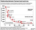 graph
graph -
 Edit 1


Article(s):London congestion charge, Urban density
Request: Vectorise graph. Thanks-- Mangwanani (talk) 08:48, 19 June 2008 (UTC)
Graphist opinion: I've been trying to learn how to do this. I left a request for help at Wikipedia_talk:Collaboration_to_convert_graphs_to_SVG and on User_talk:El_T five days ago and I haven't heard anything yet, so I don't know of anyone active who can do this. If somebody who can help reads this, please do. Dhatfield (talk) 15:26, 22 June 2008 (UTC)
- I redrew it using Inkscape using the original picture as a layer to draw on top of. Hohum (talk) 22:26, 25 June 2008 (UTC)
- This is one way to vectorise, but it is not really accurate. That line is no doubt created by a mathematical equation, and the dots have true values. Unfortunately, it takes a pro in SVG text editing to make that into a graph. Still no response from the pros. Dhatfield (talk) 12:26, 28 June 2008 (UTC)
-
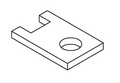
 First Angle Projection in raster
 -
 First Angle Projection in vector
 -
 Example mechanical drawing in raster
 -
 Example mechanical drawing in vector
 -
 Definition of projection angle in raster
 -
 First- and third-angle views in vector (Fvasconcellos)
 -
 Isometric view in raster
 -
 Isometric view in vector
 -
 Isometric view in vector (Fvasconcellos)


Article: Engineering drawing
Request: Vectorise all please - having these in raster is unprofessional. Dhatfield (talk) 14:24, 24 June 2008 (UTC)
Graphist opinion: Inkscape recently added support for isometric (actually, axonometric) drawing, so I did that. I probably can't do the first one, and I can't make any promises, but I'll try a few others.--HereToHelp (talk to me) 15:28, 24 June 2008 (UTC)
- Okay, I've done the basic drawing of the isometric workpiece, since they need to stay consistent. I'll wait for feedback.--HereToHelp (talk to me) 16:02, 24 June 2008 (UTC)
- Thanks HereToHelp, a good start. A couple of comments - Please use the same linestyles and length in the mechanical drawing - they have specific meanings and Section AA should be shaded as per the original. To be accurate the new version really has to be an exact copy of the original. I think the radius of the hole in the isometric view of the same object is a little larger than in the example mech drawing and please use stroke lines, not fill, as per the original. Thanks for your input. Dhatfield (talk) 09:28, 25 June 2008 (UTC)
Really good vectors of ISO paper sizes already exist; check out ISO 216. MissMJ (talk) 21:27, 24 June 2008 (UTC)
- Excellent - withdrawn. Dhatfield (talk) 09:28, 25 June 2008 (UTC)
- I'll take the projection angle one. We rarely get such easy requests here :) Fvasconcellos (t·c) 14:00, 25 June 2008 (UTC)
- OK, done. I've tried to keep it as exact a copy of the original as possible while maintaining accuracy (the original was, well, not so accurate). Fvasconcellos (t·c) 15:47, 25 June 2008 (UTC)
- I've also tried to make a facsimile of Image:Engineering drawing Isometric.png, for what it's worth. Fvasconcellos (t·c) 16:50, 25 June 2008 (UTC)
- It's worth a lot: improvements like this make our encyclopedia better, promote a consistently high standard of work and impress visitors with the attention to detail - I'll get off the soapbox now. Great contributions, very nearly perfect. Would you please do the other two? Dhatfield (talk) 21:03, 25 June 2008 (UTC)
- Thank you—I'll try, but that first one is gonna be a doozy :) As HereToHelp said, no promises... Fvasconcellos (t·c) 14:02, 26 June 2008 (UTC)
- It's worth a lot: improvements like this make our encyclopedia better, promote a consistently high standard of work and impress visitors with the attention to detail - I'll get off the soapbox now. Great contributions, very nearly perfect. Would you please do the other two? Dhatfield (talk) 21:03, 25 June 2008 (UTC)
- I'll take the projection angle one. We rarely get such easy requests here :) Fvasconcellos (t·c) 14:00, 25 June 2008 (UTC)
Posted to article with request for comment. Anybody ready to fix up the mechanical diagram? Colours and linestyles should be preserved because they are referenced in the article. Thanks. Dhatfield (talk) 12:03, 28 June 2008 (UTC)
- I just uploaded a new version. It should more closely match the original. Let me know what you think. Emok (talk) 16:32, 22 July 2008 (UTC)
- Yep, I haven't forgotten—I was just away from my computer for a couple of days. It won't be an exact copy, though, because I'll do something about this. Fvasconcellos (t·c) 00:36, 1 July 2008 (UTC)
Harmonic Drive Animation
-
 Original image.
 -
 New image.


Article(s): Harmonic drive
Request: Improving this image would really clarify how this mechanism works. The existing image is technically correct, but it shakes and it doesn't have annotation to explain what is happening.
The new image should illustrate: 1) that the circular spline (blue) is stationary, 2) that the flex spline (red) flexes due to the wave generator (yellow), and 3) that the flex spline advances by a few teeth for every revolution of the wave generator. A good solution that I've see is to use arrows to indicate a specific tooth on each of the splines. The two arrows start in the same place, but the arrow on the flexspline slowly moves as the mechanism turns.
Let me know if you have any questions. These websites all have good illustrations: http://www.harmonicdrive.net/reference/operatingprinciples/movie.php http://cache.eb.com/eb/image?id=1150&rendTypeId=4 http://www.powertransmission.com/issues/0706/harmonic_fig3.jpg
Emok (talk) 04:33, 26 June 2008 (UTC)
Graphist opinion:
I put through a request to the author at the Dutch WP to take a look at this. Dhatfield (talk) 18:29, 26 June 2008 (UTC)
I will look into it. LaurensvanLieshout (talk) 07:51, 28 June 2008 (UTC)
OK ? LaurensvanLieshout (talk) 14:34, 29 June 2008 (UTC)
This sounds interesting very interesting :) I'm going to try to recreate image in pov-ray ... Miko3k (talk) 11:12, 12 July 2008 (UTC)
- ...wasn't as easy as I thought ... maybe I'll look at it later, but giving up for now... Miko3k (talk) 17:45, 12 July 2008 (UTC)
old coat of arms of Republic of Turkey

Article(s): Coat of arms of Turkey
Request: Hello.this arms is old coat of arms of Turkey. Make svg format and arrange please.Please.Wikipedia need this arms.Signore Faccia di cuoio ileti 16:41, 20 June 2008 (UTC)
Graphist opinion:
- I don't think it will go faster if you move it around like that ;) . Hektor (talk) 20:27, 26 June 2008 (UTC)
Is there a better quality picture anywhere? As it is, I can't even tell if the things on the sides are wheat or feathers. o_O It would be pretty much impossible for us to vectorize it if the detail isn't there in the original image. =( MissMJ (talk) 21:43, 26 June 2008 (UTC)
- I havent a better quality picture. Arms corner is wheat.Signore Faccia di cuoio ileti 15:22, 28 June 2008 (UTC)
- What's the thing @ the top? 68.39.174.238 (talk) 14:32, 28 June 2008 (UTC)
- other --Lord Leatherface (talk) 14:33, 30 June 2008 (UTC)
- I'm sorry—it's still not clear enough for me to make out the elements. Fvasconcellos (t·c) 17:50, 1 July 2008 (UTC)
- other --Lord Leatherface (talk) 14:33, 30 June 2008 (UTC)
- Please make.--Lord Leatherface (talk) 07:22, 4 July 2008 (UTC)
- We can't if we don't know what we're supposed to make: What's the animal below the crescent? What is the thing on top of the shield? If you can give us (in English) the blazon of the image, we can try and make something, but no one can create an image from something they don't know. 68.39.174.238 (talk) 13:28, 4 July 2008 (UTC)
- This animal is wolf. Thing on top of the shield is feather.--Lord Leatherface (talk) 17:25, 4 July 2008 (UTC)
Realm of New Zealand
-
 very bad projection
 -
 remake using this
 -
 Ross territory inset in svg (might want to rotate it 162° clockwise to match the map.


Article(s):New Zealand, Realm of New Zealand
Request: --This was made from a very inaccurate cut and paste pacific centred map. It should be remade with the pacific centred svg map. These maps of the Pacific Ocean may be helpful: [1] [2] --Roke 01:25, 28 June 2008 (UTC)
Graphist opinion:
- The islands should be possible but I'm not sure about the ross dependency. I'll try and see what I can do with Image:Antarctica blank.svg. /Lokal_Profil 12:16, 30 June 2008 (UTC)
- Antarctica terretories looking good, map shouldn't be a problem. /Lokal_Profil 13:07, 30 June 2008 (UTC)
- So after having constructed the Antarctica map as a sideeffect of this request I discovered that BlankMap-World-162E-flat.svg doesn't have high enough resolution for the majority of the islands on the map to be seen. Sorry. /Lokal_Profil 21:28, 30 June 2008 (UTC)
- ...It's a vector. Can't it just be made bigger? Or are you saying the islands weren't drawn in the map to begin with? MissMJ (talk) 19:20, 1 July 2008 (UTC)
- Islands aren't there or just big blobs. Can open the map in Incscape and zoom in. Colour .nz, .ck, .nu (and set opacity=1 for them) the relevant areas. /Lokal_Profil 22:42, 1 July 2008 (UTC)
- The Antarctica locators look excellent! Perhaps the locations could be marked on the world map? It would be exaggerated size, but it is only meant to show their position anyway. --Roke 02:44, 5 July 2008 (UTC)
- Islands aren't there or just big blobs. Can open the map in Incscape and zoom in. Colour .nz, .ck, .nu (and set opacity=1 for them) the relevant areas. /Lokal_Profil 22:42, 1 July 2008 (UTC)
- ...It's a vector. Can't it just be made bigger? Or are you saying the islands weren't drawn in the map to begin with? MissMJ (talk) 19:20, 1 July 2008 (UTC)
- So after having constructed the Antarctica map as a sideeffect of this request I discovered that BlankMap-World-162E-flat.svg doesn't have high enough resolution for the majority of the islands on the map to be seen. Sorry. /Lokal_Profil 21:28, 30 June 2008 (UTC)
- Antarctica terretories looking good, map shouldn't be a problem. /Lokal_Profil 13:07, 30 June 2008 (UTC)
U.S. and Canadian license plates
Article(s): U.S. and Canadian license plates
Request: Using U.S. license plate designs and serial formats, please create graphics for the missing entries. Thanks! -- Chris (??? • ????) (talk) 14:25, 1 July 2008 (UTC)
- Alabama
Arizona British Columbia Colorado Florida Georgia Guam Hawaii Idaho Illinois Indiana Iowa Kansas Kentucky Louisiana Maine Manitoba Minnesota Mississippi Missouri Montana Nebraska New Hampshire New Mexico New York North Carolina North Dakota Northern Mariana Islands Rhode Island South Carolina South Dakota Tennessee Texas Utah Vermont Virgin Islands Washington Wisconsin Wyoming Yukon
Graphist opinion:
- Just a warnign that many of these are copyrighted. Canadian license plates are under Crown Copyright. Guessing that the US ones depend on state laws (so no PD-US-Gov by default). /Lokal_Profil 16:48, 1 July 2008 (UTC)
Map of New-Brunswick, Canada
-
 English Version
 -
 French Version
 -
 German Version (original)
 -
 Spanish Version


Article(s): See the lists on the images page, as there as just way too many to list
Request:
- Kedgewick should be spelled Kedgwick (In the NW) (all versions)
- St-Isidoire should be spelled St-Isidore (In the NE) (all versions)
- 'Camp-bellton should be spelled on the same line Campbellton (In the N) (all versions)
- Matapedia should be spelled Matapédia (In the N, near Campbellton) (all versions)
- Pasbebiac should be spelled Paspébiac (In the NE) (all versions)
- Mc Adam should be spelled McAdan (In the SW) (all versions)
- Saint Jean shold be spelled Saint John (In the S) (English Version)
- Gulf of Chaleurs should be spelled Chaleur Bay (In the N) (English Version)
- Gulf of Fundy should be spelled Bay of Fundy (In the S) (English Version)
- Gulf of St-Laurent should be spelled Gulf of St-Lawrence (In the E) (English Version)
- Gulf of XXX use different fonts for Gulf of and XXX (English Version)
- 'Chignectou Bay should be spelled Chignecto Bay (In the SE) (English Version)
- Strait of XXX' use different fonts for Strait and XXX (English Version)
- Fleuve St-Jean should be spelled Saint John River (In the NW) (English Version)
- Île Campobello should be spelled Campobello Island (In the SW) (English Version)
- Île de Grand Manan should be spelled Grand Manan Island (In the SW) (English Version)
- Île Miscou should be spelled Miscou Island (In the NE) (English Version)
- Île de Lamèque should be spelled Lamèque Island (In the NE) (English Version)
- There is an acute accent near Nova Scotia that shouldn't be there (In the S) (English Version)
- Many letters have white in them and should not (look for text in water) (English Version)
- In general, many places don't seem to be spelled using vector fonts (English Version)
- PEI should be spelled in full Prince Edward Island (In the E) (English Version)
- North America map should probably be moved over to the bottom right corner, as there used to be the legend there, and as of now there's a big blank in Nova Scotia where they should be rivers and town. (English Version)
Headbomb {ta?? – WP Physics: PotW} 03:28, 2 July 2008 (UTC)
- Could someone at least comment? Headbomb {ta?? – WP Physics: PotW} 01:13, 8 July 2008 (UTC)
Graphist opinion:
- Have you checked with Mikmaq (and possibly Qyd). These things are most easily if one of them still has an original with the text as text rather then pixels. /Lokal_Profil 02:13, 8 July 2008 (UTC)
- Isn't .png a vector-format? The German version says it's the original, so I thought that was the original. I'll ask Mikmaq and Qyd soon if it's not. Headbomb {ta?? – WP Physics: PotW} 03:45, 8 July 2008 (UTC)
Silverfish
-
 Silverfish held in bugbox to provide scale

Article(s): Silverfish
Request: Please spiff up. Thanks. -- JohnABerring27A (talk) 22:05, 2 July 2008 (UTC)
Graphist opinion:
- Spiff up is not a good description of what you would like done.
- This was made by yourself a few days ago, so I'm going to assume you can take another shot. First rule of photography: get it right in the camera.
- If you want to show scale, insert a ruler in the image. I have no idea what a 'bug box' is, so I don't know how big it is. I also don't know how big your fingers are.
- This image is low resolution. If at all possible, provide a higher resolution version, with a minimum of .jpeg artifacts. Some of the finer details are at single pixel dimensions and that is very difficult to work with.
- We could spend many hours creating a marginally improved version of this, or you could spend a couple of hours creating a much improved version.
Anyway, that's my 2 cents worth. Dhatfield (talk) 15:46, 6 July 2008 (UTC)
Gambling Template
-

-
 SVG, just a start.
 -
 Alternative SVG image
 -
 Alternative #2


Article(s): Lots of Gambling talk pages. And lots of articles. Project main image.
Request: Please svg-ify. Thank you. XcepticZP (talk) 16:18, 3 July 2008 (UTC)
- Purely out of curiosity, why does the original have its pips upside down? And what happened to the suir on the 3rd card? 68.39.174.238 (talk) 21:30, 14 July 2008 (UTC)
Graphist opinion: Hmm..well, I don't have a lot of time, so this is what I came with. It needs some tweaking, especially with the shades. Anyway, here you go! Cheers mate! Λua∫Wise (Operibus anteire) 20:06, 7 July 2008 (UTC)
I just made another version, I think the shading looks good. Let me know what you think. --pbroks13talk? 00:25, 15 July 2008 (UTC)
- IP...238 made a good point, so I made another with the spade facing up and the club on the last ace. --pbroks13talk? 00:44, 15 July 2008 (UTC)
Emirates map
-
 SVG start
 -
 Emirates
 -
 Jackarangas version


Articel: Emirates of the United Arab Emirates, and derivatives in article about each Emirate
Request: I was wanting an SVG map with the internal divisions of UAE into it's Emirates. There is already an SVG outline of the whole of UAE but only rasters for the interior divisions. /Lokal_Profil 15:14, 6 July 2008 (UTC)
Opinion: You can use this one Image:UAE admin1.svg Jackaranga (talk) 09:59, 7 July 2008 (UTC)
- Thanks =) /Lokal_Profil 16:10, 7 July 2008 (UTC)
- Humm, it seems to be missing parts. Image:MapEmirateAbuDhabi.PNG seems to have more small subdivisions. Are these missing or have the borders been clarified since 2006? /Lokal_Profil 16:23, 7 July 2008 (UTC)
- No idea. Jackaranga (talk) 12:42, 8 July 2008 (UTC)
- Humm, it seems to be missing parts. Image:MapEmirateAbuDhabi.PNG seems to have more small subdivisions. Are these missing or have the borders been clarified since 2006? /Lokal_Profil 16:23, 7 July 2008 (UTC)
-
 The transversal section of Chindia Tower (make a svg sketch of the Tower)
 -
 The transversal section of Chindia Tower (for better view)
 -
 The transversal section of Chindia Tower (circular section). The diameter is 5.80 meters


Article(s): Chindia Tower
Request: Can you make 2 SVG sketches of Chindia Tower (a transversal one and a circular one). Thanks in advance, Sebi (talk) 12:07, 7 July 2008 (UTC)
Graphist opinion:
- Anyone wanting to attempt this should first read the comments in the section above. /Lokal_Profil 02:01, 8 July 2008 (UTC)
- No, there is no copyright violation, because the sketch is on the tower's wall and it's a short presentation of the Chindia Tower, a public space, and it is not an art work. It can be done, there is no source about the author and also, there is more than one author. Hope you'll do it, thanks, Sebi (talk) 10:59, 8 July 2008 (UTC)
Gravelly Hill Interchange
-
 Map of Gravelly Hill Interchange

Article(s): Gravelly Hill Interchange
Request: I produced this from OpenStreetMap, removing as much superfluous details as I could, using Inkscape. However, I admit to being a novice with this software, so I'm sure it can be cleaned up further. For example, I used white rectangles to hide some information that I couldn't find a way to delete. This looked ok in Inkscape, but shows up on a transparent background. Any help would be gratefully received. When complete, the image can be moved to Commons. — Tivedshambo (t/c) 20:16, 10 July 2008 (UTC)
Graphist opinion: Nice idea for a diagram and good quality starting data. Opening in inkscape, I can see the problems easily by switching to "outline" mode under the View->display mode menu option. You can then see and select all the elements in the drawing even if you can't see them in the regular view. What I'll do is use the node tool to select and delete all the extra nodes which are outside the desired viewing area. This will make the drawing much simpler. Jeff Dahl (Talk • contribs) 02:57, 12 July 2008 (UTC)
- I removed a bunch of the lines hidden in the background, and if you want to get rid of some of the roads, try deleting selected nodes rather than the whole object. Jeff Dahl (Talk • contribs) 03:19, 12 July 2008 (UTC)
- Many thanks for that. I've had another look at it, and discovered the nodes tool, so I've made a couple more tweaks. I'll upload this shortly. — Tivedshambo (t/c) 22:49, 12 July 2008 (UTC)
Bathing beauties
-
Panoramic group portrait photograph of the 1927 Bathing Beauty Parade in Long Beach, California from Weaver's print no. 29.
-
Panoramic group portrait photograph of the 1927 Bathing Beauty Parade in Long Beach, California from Weaver's print no. 30.
Article(s): Long Beach, California
Request: Remove the white vertical lines (sew together?) and improve clarity of the images as you see fit. Add to article when you are finished. Thanks. -- GregManninLB (talk) 00:13, 14 July 2008 (UTC)
Graphist opinion:
Mumbai Fire Brigade Logo
Hello All! I have enhanced Mumbai Fire Brigade logo. Its my first work, Any suggestions are welcomed and any thing more I can do for this logo? thank you. Suyogaerospacetalk to me! 03:37, 19 July 2008 (UTC)
-
 original Logo
 -
I have auto adjusted the colours

-
Current fair-use image of WSDOT's logo. (Located here)
Article(s): Washington State Department of Transportation
Request: I would like this logo to be vectorized (svg). Also, I would like the logo enlangred and a second version without text.--CG was here. (T - C - S - E) 20:06, 19 July 2008 (UTC)
Graphist opinion:
University of Illinois
-
University of Illinois Wordmark
Article(s): University of Illinois system
Request: I'm hoping to get this image converted to SVG. I tried to do it myself, but I'm really unfamiliar with the tools and techniques of doing this. There is however a draft style guide for the wordmark which provides most of the information on how to do it. That ought to be helpful. Thanks! —/Mendaliv/2¢/?'s/ 18:01, 21 July 2008 (UTC)
Graphist opinion:
Texas Chainsaw Massacre 2
Article(s):Texas Chainsaw Massacre 2
Request: This poster is Turkish TCM 2 poster. Annihilate stripe in posters middle. SVG or PNG ification. Arrange. Remove blur in picture.-- Lord Leatherface (talk) 16:58, 9 July 2008 (UTC)
Graphist opinion: No reason to go svg o png since original is a jpg. /Lokal_Profil 17:52, 9 July 2008 (UTC)
- Annihilate stripe in posters middle. Arrange. Remove blur in picture.--Lord Leatherface (talk) 18:13, 9 July 2008 (UTC)
- Please.--Lord Leatherface (talk) 12:43, 10 July 2008 (UTC)
- Annihilate stripe in posters middle. Arrange. Remove blur in picture.--Lord Leatherface (talk) 18:13, 9 July 2008 (UTC)
The image has been deleted... Where do we go from here? 68.39.174.238 (talk) 20:48, 18 July 2008 (UTC)
Katliam poster in *cannon/Texas Chainsaw Massacre 2 (1986) Gallery--Lord Leatherface (talk) 13:49, 22 July 2008 (UTC)
Fraction
-
 ¾ fraction in *.png format.
 -
 SVG version
 -
 Another attempt in SVG.


Article(s): wikisource:Index:Goody Two-Shoes (1881).djvu
Request: Please SVG-ize this image. But please try to not make it bold - it should have the same appearance. -- diego_pmc (talk) 06:15, 16 July 2008 (UTC)
Graphist opinion: If you want it to have the same appearance--that is numbers made of square boxes and not smooth--I don't see why you need an SVG. Try doing [[Image:3 4 fraction.png|1000px]] and you will see that it scales just fine looking as it does now. gren ??? 08:17, 17 July 2008 (UTC)
- I believe that Diego is referring to the fact that an SVG image will antialias, making it appear thicker than this image does when displayed at the native resolution of this (non-antialiased) image. Stannered (talk) 11:51, 17 July 2008 (UTC)
- I said what I did under Firefox in Linux where the scaling made it look like native resolution scaling perfectly. Now when I scale this here in Windows for some reason it looks like only the center is black and the outside of the lines are various shades of gray... so, at least SVG will make it more similar over different platforms. gren ??? 18:48, 17 July 2008 (UTC)
Converted it to SVG. Does this work for you? --pbroks13talk? 06:08, 18 July 2008 (UTC)
- That actually does not work well at all. I'm not really sure how you could make it look as well as a PNG version. It might be best to just use that version. --pbroks13talk? 06:17, 18 July 2008 (UTC)
The smooth SVG indeed gets bold when you resize it to 12 or less pixels, as for the other SVG, it doesn't really have a purpose, since the PNG has no curved lines, so when magnified, both the rough SVG and the PNG give the same result. Thanks anyway! diego_pmc (talk) 06:38, 19 July 2008 (UTC)
- For fun, I tried making it look less bold by using a halo. Don't know if this is what you were aiming for. Emok (talk) 17:50, 22 July 2008 (UTC)
Map of New England showing Claude La Badarian's travels
-
 Basic map
 -
 A pretty bad start.


Article(s): Dining Late with Claude La Badarian (13 short stories)
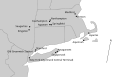
Request: Hi: I would like to know if someone would mind populating a map of New England with the travels and locations (both mentioned and visited) of one fictional character named Claude La Badarian as he lives through 13 short stories written by American writer William Monahan. This would be for the Dining Late with Claude La Badarian article, which is about a serial narrative comprising 13 short stories, really adventures, of Claude La Badarian. La Badarian travels across the states of New York, Connecticut, and Massachusetts (all three adjacent). So this would require a blank map of New England to work with, which I think might be available free use somewhere at Wikimedia Commons hopefully? I broke down the drawing of the map into two stages:-- Manhattan Samurai (talk) 09:04, 24 June 2008 (UTC)
Stage One: The Routes: A circle with a number will be used to show which short story takes place in which cities. So Circle 1 is for the 1st short story, and Circle 4 is for the 4th short story, and so on.
- Circles 1 and 2 are in Saugerties, NY (Ulster County).
- --a travel (by car) line connection to the next stage in...--
- Circle 3 is in Connecticut at a pit stop (midway between Saugerties, NY and Northampton, MA).
- --and continuing the travel (by car) line connection to...--
- Circles 4 to 9 are in Northampton, Massachusetts.
- --a travel line connection in two parts: first by 'car service' from Northampton all the way to Springfield, MA and second by train (boarding to take the Amtrak line) passing thru Stamford, Connecticut and then barreling thru Old Greenwich station to end up finally at Grand Central Terminal in Manhattan, NY.
- Circles 10 to 12 are in New York City, NY
- --travel line connection in two parts: first by unknown means (could assume train) from Manhattan to Northampton and second by scooter from Northampton to Easthampton, MA.
- Circle 13 is in Easthampton, MA (very near Northampton, MA)
Stage Two: Other cities merely mentioned
- Kingston, NY (near Saugerties, NY)
- Catskill Mountains (near Saugerties, NY)
- Boston, MA
- Medford, MA (near Boston, MA)
- Agawam, Massachusetts (near Springfield, MA)
- the cities of Sagaponack and Amagansett, both located in Suffolk County at the end of Long Island, NY
- Ellis Island
- Aquinnah, MA (Martha's Vineyard)
- Hyannis, Massachusetts (Martha's Vineyard)
And that would be it. It's not easy to do, but I would appreciate it a lot! It would be a great help for anyone who would read the Dining Late with Claude La Badarian stories because they would be able to follow exactly where these places are. If you have any questions, please ask. Thanks for even considering to do this work.-Manhattan Samurai (talk) 09:04, 24 June 2008 (UTC)
Graphist opinion: The original map in the New England article was terrible, so I made a new one that should be much easier to work with. MissMJ (talk) 00:49, 2 July 2008 (UTC)
Started it, but the placement of the cities is really approximate... And the map probably should be bigger (maybe even a more detailed starting map?) because there's some fit issues. I don't know how lines would fit into the current map. MissMJ (talk) 01:45, 2 July 2008 (UTC)
- Not a bad start at all. I actually checked to see if the cities were correct, because I thought Easthampton was east of Northampton, and Kingston was north of Saugerties. But your pinpoints were exact. The only thing I can see is that Medford could maybe be closer to Boston. But that's no big deal. I think I went overboard with the numerated circles and the methods of travel idea. Would it be possible to simply trace the route with an unbroken but dashed line showing the direction (such as: - - - - - > - - - - ), or something similar, all the way from Saugerties to Northampton to NYC back to Northampton and then right over to Easthampton? I was also thinking to remove 'Grand Central Terminal' from New York City; it was a silly addition and maybe just 'Greenwich' is better than Old Greenwich station. I was also wondering if it is possible to put in the name of the three states: Connecticut, New York, and Massachusetts, somehow? And even the islands: Long Island and Martha's Vineyard. But thanks so far! I don't know too much about SVG but it has a nice clear effect to it. This is exactly the kind of map I was hoping someone would be able to create for the article.-Manhattan Samurai (talk) 09:02, 2 July 2008 (UTC)
- Quick note: When Claude La Badarian travels from Saugerties to Northampton, he makes a pit stop in Connecticut. The best way I can see to catch a little Connecticut with a traced route would be to drop down just above Kingston leaving Saugerties, and then stay in Connecticut just before Agawam and then go north to Northampton.-Manhattan Samurai (talk) 09:11, 2 July 2008 (UTC)
(outdent)If you want to hear my opinion about how you could trace the route, then here you have it:Go from Saugerties, and go near but always above Kingston to follow through Connecticut and then ride up on the eastside of Easthampton before arriving at Northampton, then a rather direct route straight to New York City, and afterward back to Northampton on a route drawn to the right of the route taken to NYC, so now back at Northampton and simply draw at the top a little final route to Easthampton. This should avoid any kind of crossings of paths and look rather fluid. It is also accurately the route that Claude took. This is just for anyone who wants to continue to work on this. Sincerely, Manhattan Samurai (talk) 04:27, 18 July 2008 (UTC)
- There might be some question as to how you draw the route from Northampton to NYC. If someone could figure out where the train tracks are, that would be one way of doing it. But a general line is fine. Manhattan Samurai (talk) 09:54, 5 August 2008 (UTC)
Dust bowl
-
 original
 -
 original original


Article(s): Dust bowl
Request: Anyone up for a real challenge? You can't remove the dust - because that is the point of the picture. But could you remove the damage and spots? Rmhermen (talk) 23:45, 18 July 2008 (UTC)
Graphist opinion:I did some work on edit one. I know it's not perfect but it's a start -- iDosh! talk? 01:15, 19 July 2008 (UTC)
- The real problem is jpeg artifacts. To fix that, you have to go back to the source and start with the original TIFF. Thegreenj 01:48, 24 July 2008 (UTC)
- I'll upload a higher-quality jpg once I finish the 174MB download... Thegreenj 01:51, 24 July 2008 (UTC)
- OK, it's here. Any further edits should be made from there. BTW, IDosh, if you can, check out Wikimedia Commons and upload free images there, where they can be used for any Wikimedia project, rather than here at WP. Thegreenj 02:46, 24 July 2008 (UTC)
Battleship awards
_Awards_and_Medals.PNG)
_Awards_and_Ribbons.PNG)
Article(s): USS New Jersey (BB-62) and USS Missouri (BB-63), respectively.
Request: If at all possible, I would like these two images to be converted to svg format. Also, the bronze stars on both images and the wreath around the letter "E" in the second image could do with some touching up (I created these using the old copy/paste routine, so they could use some touch up work). In both cases a reference image can be found on the image discription pages should some decide to attempt a conversion/cleanup. -- TomStar81 (Talk) 03:05, 23 July 2008 (UTC)
Graphist opinion:
Trump International Hotel and Tower (Chicago) floor diagram
-
Image:Trump Chicago floor diagram.JPG
floor diagram
With image CSD see original at page 4 of http://www.trumpchicago.com/_files/pdf/brochure.pdf
Article(s):Trump International Hotel and Tower (Chicago)
Request: I started with a fair use diagram. After complaints about the size of the text in the thumbnail format, I fixed the text size. However, there is a complaint that it is not really a fair use when it could easily be recreated from a WP:FAC discussant. Recreate the floor diagram in accordance with proper licensing standards.-- TonyTheTiger (t/c/bio/WP:CHICAGO/WP:LOTM) 22:58, 6 July 2008 (UTC)
Graphist opinion: The problem would be to figure out how to create something which isn't a derivative of the fair use image. /Lokal_Profil 23:28, 6 July 2008 (UTC)
- There is no way to do this that I can see. Excerpt from an image copyright tutorial I'm writing:
- For many people's purposes we want to get from a fair use image to a free license image. Any attempt to go from one copyrightable form to another constitutes the creation of a derivative work and this can only be done with the permission of the copyright holder. That's right: vectorising a bitmap fair use image can only be done with the copyright holder's permission. Same thing with image to text or vice verse. So how to break the derivative work chain? One has to go through a non-copyrightable form. For this purpose, the following is a list of non-copyrightable things: "Ideas, procedures, methods, systems, processes, concepts, principles, discoveries, or devices, as distinguished from a description, explanation, or illustration". If you can turn your image into one of the first sets of things, we can do it, if you must use a "description, explanation or illustion", then sorry we simply cannot do this image without violating copyright. Copyright law bites. Dhatfield (talk) 08:07, 7 July 2008 (UTC)
- I am not a graphist. Are you saying that you could not use your graphical software and recreate the image that is similar. If so, we must use a fair use under the rationale that the diagram can not be recreated.--TonyTheTiger (t/c/bio/WP:CHICAGO/WP:LOTM) 05:40, 14 July 2008 (UTC)
- Now that the image has been CSDed, User:Melesse has said that you are not properly considering the request if you say it can not be done. He instructed me to attempt to get you to complete the request or have you explain to him why you can not.--TonyTheTiger (t/c/bio/WP:CHICAGO/WP:LOTM) 07:44, 14 July 2008 (UTC)
- The problem is that no free image can ever be created based on the unfree image above. For a free image to be created we would need a free source for the building shape (e.g. someone needs to go there and take a photograph of the building). This combined with the info such as how many floors there are and how wide the basements are with respect to the building etc. could be used to create a new free image. Therefore the image fails the fair use criteria because a free alternative is possible, it's just not straight forward. Same applies for e.g. images of living people (e.g. Will Smith) where someone could take a free photograph (thus disallowing fair use) but actually being in the same place so that a free photo can be taken is non-trivial. /Lokal_Profil 19:51, 16 July 2008 (UTC)
- As soon as I look at the PDF you link to, anything I generate is a copyvio and it will be deleted - I've been down that road already and do not want a repeat. Please point User:Melesse here if they have further questions. Dhatfield (talk) 10:37, 20 July 2008 (UTC)
- Yes, the drawing of the building is unfree, but as Lokal said above, a photo of the building is acceptable (this one looks fine). Granted, you may have to guess at the floors, but it's otherwise presenting the same data the same way. Melesse (talk) 04:56, 22 July 2008 (UTC)
- O.K. can someone make the diagram using that photo or any of the thousands available at www.flickr.com using a Trump Tower Chicago or Trump Hotel Chicago search.--TonyTheTiger (t/c/bio/WP:CHICAGO/WP:LOTM) 22:53, 24 July 2008 (UTC)
- Yes, the drawing of the building is unfree, but as Lokal said above, a photo of the building is acceptable (this one looks fine). Granted, you may have to guess at the floors, but it's otherwise presenting the same data the same way. Melesse (talk) 04:56, 22 July 2008 (UTC)
- Now that the image has been CSDed, User:Melesse has said that you are not properly considering the request if you say it can not be done. He instructed me to attempt to get you to complete the request or have you explain to him why you can not.--TonyTheTiger (t/c/bio/WP:CHICAGO/WP:LOTM) 07:44, 14 July 2008 (UTC)
Oypa
Article(s): w:tr:Oypa
Request: Oypa is supermarket in Turkey. This is logo of Oypa. SVG ification. Arrange. Remove blur in picture. Make big. -- Lord Leatherface (talk) 16:09, 23 July 2008 (UTC)
Graphist opinion: I have the image made; however, I cant upload it here or the Commons because the logo would be under fair use. Also, I cant upload it there because i dont know how to read turkish. Is there another way you would like for me to send you the image. --pbroks13talk? 17:58, 23 July 2008 (UTC)
- No. Upload English Wikipedia.--Lord Leatherface (talk) 18:20, 23 July 2008 (UTC)
We used on Oypa page in Turkish Wikipedia. Upload Turkish Wikipedia or open Oypa page English Wikipedia.--Lord Leatherface (talk) 09:56, 24 July 2008 (UTC)
We used Oypa.--Lord Leatherface (talk) 10:07, 24 July 2008 (UTC)
- Done. Image:Oypa Logo.svg --pbroks13talk? 17:36, 24 July 2008 (UTC)
RTP channel logos
-
Logo of RTP1, Portuguese terrestrial public TV channel
-
Logo of RTP2, Portuguese terrestrial public TV channel
-
Logo of RTPN
Article(s): RTP1, RTP2, RTPN, RTP Memória, RTP Internacional, RTP África, RDP Antena 1, RDP Antena 2, RDP Antena 3
Request: Hi, could someone please convert the logos of the television channels and radio stations of RTP (Portuguese boradcasting corporation) to svg? They are already in PNG on the english wikipedia, but they would look nicer in SVG.
The EPS / TIF versions of the logos are here [4], on the "Linha Grafica" tab.
Logos that need to be converted : RTP, RTP1, RTP2, RTPN, RTP Memória, RTP Internacional, RTP África, Antena 1, Antena 2, Antena 3, RDP Internacional
Many thanks!-- 89.152.213.222 (talk) 18:30, 23 July 2008 (UTC)
- What is the reason for having these in SVG since we can't display then at high resolutions. Do you want transparency in place of the white? Is there something else? Usually fair use logos are converted to SVG when they are too low of a resolution to be useful in jpg or png. gren ??? 22:07, 23 July 2008 (UTC)
- There are several reasons for having these logos in SVG: I believe the file size will be smaller than in PNG, and most of the logos uploaded and represented in Wikipedia are in SVG, including most of other public European channels (Such as RAI, NRK, Omroep, etc...), independently of being free logos or not. Besides, having scalable (SVG) logotypes doesn't necessarily mean they have to be displayed at higher resolutions on wikipedia articles. Transparency in place of white background would be perfect! 85.138.171.163 (talk) 14:14, 24 July 2008 (UTC)
Graphist opinion:
Bendery
Article(s): Bendery
Request: This is coat of arms of Bendery. SVG ification. Arrange. Remove blur in picture. Make big. --Lord Leatherface (talk) 14:20, 25 July 2008 (UTC)
- George and the dragon can be taken from the Coat of arms of the Russian Federation. The eagles look like they're off of the Flag of the Byzantine Empire. (A) lion is on the Flag of Venice. 68.39.174.238 (talk) 20:40, 25 July 2008 (UTC)
Graphist opinion:
Coat of arms of Ulcinj
-
jpg version
-
 svg version

Article(s):
Request: make an SVG version Leitz 09:59, 19 July 2008 (UTC)
Graphist opinion:What is the thing on the right side? --pbroks13talk? 17:40, 19 July 2008 (UTC)
- Look, I have everything except for whatever the thing on the side is. I need your reply. Image:CoatUL.svg --pbroks13talk? 06:15, 24 July 2008 (UTC)
Austrian Imperial Crown
-
 Coat of arms of Amsterdam with the imperial crown.
 -
 Coat of arms of Austria-Hungary with the crown.
 -
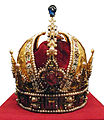 Photograph of the Imperial crown.


Article(s): None, in the crown's pure form (maybe Imperial Crown of Austria) but very usefull as part of other images.
Request: Would it be possible to create an .SVG image of the Austrian Imperial crown? Having one could really help in making SVG images of coat of arms, flags ect where the crown is used. Regards, Sir Iain (talk) 11:06, 26 July 2008 (UTC)
Graphist opinion:
String theory
-
 Existing raster of the String Theory request. Many requested images have no copyright free equivalent
 -
 How's this?
 -
 Standard Model of Elementary Particles


Articles: String Theory, Quark, Fermion*, Elementary particle*, Fundamental interaction*, Unified field theory*, Vacuum energy*, Quantum foam* (would be a very nice 3D project), Grand Unified Theory
* These articles currently have no image at all.
Request: This topic provides scope for significantly improved images in particle physics and quantum theory. For the most basic implementation, the existing raster image should be converted to a labeled vector diagram similar to this or this. For those looking for challenging projects, practically every image on this page would be a fantastic addition to a particle physics article - see links above.
This area also provides scope for more artistic interpretation of the appearance of strings, see here and here for examples. Dhatfield (talk) 11:40, 24 June 2008 (UTC)
Graphist opinion: I can try the String Theory one (although, a torii is not the most optimal original object to draw... any other preferences/suggestions?). For the others... Um, I don't really have much understanding of the subject so I wouldn't know the first place to begin. MissMJ (talk) 21:52, 26 June 2008 (UTC)
- Here you go. I thought vertical format would be better to fit in the article margins. MissMJ (talk) 02:55, 27 June 2008 (UTC)
- Excellent diagram, definitely better layout! I'll ask for comments. Do you feel up to tackling all of the ones on
- http://www.zamandayolculuk.com/cetinbal/elementaryparticles.htm ? Dhatfield (talk) 12:10, 27 June 2008 (UTC)
- ...There's a lot of diagrams there. Is there any specific ones you think will be most useful in those articles? Some of them I could probably do without needing to understand what it is they're talking about. xD The fermion table shouldn't be too difficult... MissMJ (talk) 16:49, 27 June 2008 (UTC)
- That's a gorgeous diagram! Much nicer than the original. Should the quarks, electrons and Carbon atoms be labeled with their symbols (u, d, e- and C), or would that just be distracting? Emok (talk) 14:01, 27 June 2008 (UTC)
- Thank you. =) I think labeling the Carbon wouldn't be a good idea just because the point of the diagram is to illustrate the magnification stages; Carbon is just an example element, you know? It could be anything in reality. I don't know about the others though. I tried making it language neutral? MissMJ (talk) 16:49, 27 June 2008 (UTC)
- Really nice. Would it be possible to move the "4" and "6" sligthly to the left in theire circles? /Lokal_Profil 19:45, 27 June 2008 (UTC)
- They are centered, but I guess another font is being used when Wiki renders the SVG (I used Microsoft Sans Serif, I don't know what that renders as...) making them off center. Firefox displays it fine. I could just turn the numbers to outlines anyway, since there's not many of them. MissMJ (talk) 20:46, 27 June 2008 (UTC)
- Really nice. Would it be possible to move the "4" and "6" sligthly to the left in theire circles? /Lokal_Profil 19:45, 27 June 2008 (UTC)
- Thank you. =) I think labeling the Carbon wouldn't be a good idea just because the point of the diagram is to illustrate the magnification stages; Carbon is just an example element, you know? It could be anything in reality. I don't know about the others though. I tried making it language neutral? MissMJ (talk) 16:49, 27 June 2008 (UTC)
- Excellent diagram, definitely better layout! I'll ask for comments. Do you feel up to tackling all of the ones on
How's this for the Elementary particles article? (I hope I don't get pelted by tomatoes from some physicists. >_>) MissMJ (talk) 23:29, 27 June 2008 (UTC)
- MissMJ, you're working so fast I can't keep up with posting to the articles :) This looks great, if I can make one suggestion, it's to make the green a little darker, the 'leptons' label gets lost in the background - or darken label text slightly? Dhatfield (talk) 11:43, 28 June 2008 (UTC)
- Eh, I got nothing better to do. Made the labels darker. I have them bold in the original, but Wikipedia font rendering is driving me insane. I don't seem to have any of the fonts that are supported, at least not under those names. And I can't figure out what font it uses so I'm fixing alignments blind. -_-' MissMJ (talk) 20:58, 28 June 2008 (UTC)
- Posted the Standard model of elementary particles to Quark (had a lead, added underneath), Fermion (lead), Elementary particle (lead), Fundamental interaction (not lead, but very helpful in explanation). Looks amazing. I've had some success with Verdana, but the renderer sometimes runs on 'strange' quarks ;) Dhatfield (talk) 23:19, 28 June 2008 (UTC)
- Eh, I got nothing better to do. Made the labels darker. I have them bold in the original, but Wikipedia font rendering is driving me insane. I don't seem to have any of the fonts that are supported, at least not under those names. And I can't figure out what font it uses so I'm fixing alignments blind. -_-' MissMJ (talk) 20:58, 28 June 2008 (UTC)
- Standard model picture
- For the standard model picture, a "name" label should be added.
- Masses listed should be those of the Particle Data Group.
Headbomb {ta?? – WP Physics: PotW} 11:31, 30 June 2008 (UTC)
Browse the PDG listing to find the relevant masses. The PDG recommendation is in bold within each .pdf. Headbomb {ta?? – WP Physics: PotW} 15:28, 30 June 2008 (UTC)
- Leptons: Electron should be 0.511 MeV, tau should be 1776 MeV (or 1.78 GeV). W should be 80.4 GeV, Z should be 90.2 GeV. Electron neutrino should be <2 eV, Muon neutrino <0.19 MeV, tau neutrino <18.2 MeV. Other than that, I think the rest of the image is OK.
Headbomb {ta?? – WP Physics: PotW} 16:51, 30 June 2008 (UTC)
- That image now looks fine to me. Headbomb {ta?? – WP Physics: PotW} 06:07, 1 July 2008 (UTC)
- Excellent. MissMJ, I think the problem was (primarily) a switch between the Tau and Tau neutrino masses. Besides that, there were only small discrepancies between older and newer references - thanks for your work. String theory and elementary particles resolved, are you up for some particle/string interaction?. Dhatfield (talk) 08:50, 1 July 2008 (UTC)
- Concerning the string theory.svg image, I think it would be best if there was only 1 "string" located at the bottom, and that both quarks and electrons pointed directly at it. Because as of now, it looks like the string of the electron is a bit less fundamental than the string of the quark. Headbomb {ta?? – WP Physics: PotW} 04:39, 2 July 2008 (UTC)
- Received a note on the Image:Standard Model of Elementary Particles.svg talk page that the electron neutrino should be <2 eV, not <2 MeV. I'd fix it, but I won't be at my PC for a couple of weeks, so I'm text only. Can someone help out here? Dhatfield (talk) 11:14, 19 July 2008 (UTC)
- Fixed. Noticed that the arrows next to mass/charge/spin/name aren't aligned. Ideally they would all be aligned to the right (i.e. equidistant separation with the upp quark box. I'll leave this to Dhatfield though since I'm worried that Inkscape will rip a hole in the Illustrator code. /Lokal_Profil 23:15, 30 July 2008 (UTC)
guardian building
-
 Original image
 -
 Edit 1?
 -
 Edit 2 by Jackl


Article(s): Corrado Parducci ; Guardian Building; Architecture of metropolitan Detroit
Request: Any improvements to the image - maybe better crop, rotate/straighten, maybe something can be done with the sharpness? on right side, etc.
- Please give us a bit more information. Are the doors and plaques at the bottom important or can we take them off? what about the crest at the top? Dhatfield (talk) 21:25, 11 June 2008 (UTC)
- I did some work on Edit 1 iDosh! talk? 23:08, 19 June 2008 (UTC)
- I ran the edit 1 through a warming filter and adjusted the contrast and sharpness, see if you like that. L'Aquatique[review] 01:55, 25 June 2008 (UTC)
- I did some work on Edit 1 iDosh! talk? 23:08, 19 June 2008 (UTC)
Question: Who requested this in the first place? I'd've thought that SinBot would've autosigned them if they didn't... 68.39.174.238 (talk) 22:25, 16 July 2008 (UTC)
- Sorry that was me, Rmhermen (talk). I kind of forgot about this one. Is this level or still slightly leaning to the right? Rmhermen (talk) 23:03, 27 July 2008 (UTC)
- Did the second edit. --Jackl 08:25, 16 August 2008 (UTC)
Graphist opinion::
WikiProject Robotics Barnstar
-
 Basic gear animation
 -
 Rotating barnstar


Article(s):
Request: -- I would like to create a rotating barnstar animation similar to the gears as shown. It will be used for the WikiProject Robotics Barnstar, currently on my sandbox. However, it will be moved back into the Wikipedia namespace once the image is finished. Thanks a bunch! :D - Jameson L. Tai talk ? contribs 04:33, 25 July 2008 (UTC)
- Does anyone want to take a stab at this? Or should I wait longer? - Jameson L. Tai talk ? contribs 20:38, 1 August 2008 (UTC)
Graphist opinion:
Monica
-
Image:Monica car logo.jpg
jpg Logo of Monica -
Image:Monica car logo.svg
svg first attempt
Article(s): Monica (car)
Request: Continuing with defunct car companies, I'd like a ask for a .SVG logo of French luxury brand Monica. From the image, the blue outline should be omitted I think (could a car enthusiast who knows the brand better than I do confirm ?). The letters of MONICA have a font with a "horseshoe" shape design. Hektor (talk) 21:19, 29 June 2008 (UTC)/
PS : You remain welcome to try for a vectorial logo of the Daimler Motor Company above.
- Some change you made probably annoyed MW's image renderer. 68.39.174.238 (talk) 14:21, 20 July 2008 (UTC) (PS. No it's not an ad blocker this time, I've disabled mine on all WMF sites and and it doesn't display either)
- Could someone help with this problem ? I have tried to create the logo myself and now I have nothing left. Hektor (talk) 20:31, 28 July 2008 (UTC)
- It seems to work again (Will display in MW fine). 68.39.174.238 (talk) 21:15, 4 August 2008 (UTC)
Request: Here is our current Wikiproject Xbox logo. We are looking for a little change so if one has an idea for a new one just make it. BW21.--BlackWatch21 19:49, 4 August 2008 (UTC)
Optimize gif: UN member states animation.gif
-
 The image

Article(s): United Nations
Request: When I created this gif I optimized it and the size is 124 KB, however Wikipedia takes a long time generating thumbnails for it. I downloaded a 400px thumbnail and it came up as 892 KB. Is there any way of further optimizing the image so that thumbnails can be generated quickly? Many thanks -- Joowwww (talk) 15:09, 2 August 2008 (UTC)
Graphist opinion:
Resolved
Daimler
-
Image:Daimler logo.jpg
jpg Logo of Daimler -
Image:Daimler logo.gif
Added transparency -
Image:Daimler logo.svg
SVG version
Article(s): Daimler Motor Company
Request: Continuing with car companies, I'd like a ask for a .svg logo of Daimler. From the web site, the colour should be inverted I think and it should be black letters against transparent background.
- www.daimlercars.com (Official Web Site)
- Please in the future sign your name when you post requests here, Hektor. Thank you. XcepticZP (talk) 09:19, 11 June 2008 (UTC)
Graphist Opinion: I'll try iDosh! talk? 21:29, 18 June 2008 (UTC)
- Here you go! Image:Daimler logo.svg, its an SVG image. --pbroks13talk? 02:15, 14 July 2008 (UTC)
SVG please
-
 1
1 -
 SVG of image 1
 -
transparency


Article(s):Multiple micronation related articles.
Request: SVG please
Graphist opinion: I did one image. Doing the second one now. XcepticZP (talk) 19:43, 12 June 2008 (UTC)
- For the SVG1, the center white square is white, while the four white lateral triangles are transparent and NOT white, is this ok ? Hektor (talk) 20:33, 12 June 2008 (UTC)
- Nope, its got to be all white, or it would not function properly as a flag.--SelfQ (talk) 20:42, 12 June 2008 (UTC)
- Now three out of the four triangles have been corrected, but the top one is still transparent. Hektor (talk) 07:35, 13 June 2008 (UTC)
- Please note that image 2 is Fair Use so any derivative will be similarly copyrighted. /Lokal_Profil 11:55, 13 June 2008 (UTC)
- In all fairness, an interpretation on a blazoning isn't going to be too different to that image as its pretty plain and simple. Not like a COA with intricate detials... Mangwanani (talk) 15:29, 13 June 2008 (UTC)
- Please note that image 2 is Fair Use so any derivative will be similarly copyrighted. /Lokal_Profil 11:55, 13 June 2008 (UTC)
- Now three out of the four triangles have been corrected, but the top one is still transparent. Hektor (talk) 07:35, 13 June 2008 (UTC)
Could someone remove the clear edge around the SVG flag, it makes boxing the flag look strange. --SelfQ (talk) 13:12, 19 June 2008 (UTC)
- I think i did it. (my first SVG edit) O_o. how is it? — Navy Blue formerly iDosh 23:54, 22 July 2008 (UTC)
![]() Done --pbroks13talk? 06:07, 24 July 2008 (UTC)
Done --pbroks13talk? 06:07, 24 July 2008 (UTC)
Laura Bush signature
-
 Laura Bush's signature
 -
 Edit 1
 -
 Traced
Article(s): Laura Bush
Request: I am requesting that the background of this image be whitened. Thanks! -- Happyme22 (talk) 02:15, 17 June 2008 (UTC)
Graphist opinion:
- Would it not simply be better to start off with a better one ? Jackaranga (talk) 12:57, 17 June 2008 (UTC)
- I uploaded a better one. Jackaranga (talk) 13:07, 17 June 2008 (UTC)
- Vectorisation? Like Mugabe's? Mangwanani (talk) 15:34, 17 June 2008 (UTC)
- Hey, that looks great. Thank you! Happyme22 (talk) 17:25, 17 June 2008 (UTC)
- Umm, anyone wanting to take over? My traces look poor... Mangwanani (talk) 15:34, 18 June 2008 (UTC)
- Hey, that looks great. Thank you! Happyme22 (talk) 17:25, 17 June 2008 (UTC)
- Vectorisation? Like Mugabe's? Mangwanani (talk) 15:34, 17 June 2008 (UTC)
- I uploaded a better one. Jackaranga (talk) 13:07, 17 June 2008 (UTC)
Well I added transparency (edit 1) iDosh! talk? 23:56, 19 June 2008 (UTC)
- I traced it by hand, please see whether it looks OK. --Slashme (talk) 16:26, 9 July 2008 (UTC)
- Yes, the images look great! What are the main differences in appearance between the second and third images? It doesn't matter to me either way, because all look good and we now have an image to use. Happyme22 (talk) 19:25, 11 July 2008 (UTC)
- The difference is that the third image is a vector image, as opposed to the second being a raster image. It looks like you're happy, so I am going to set this as resolved. --pbroks13talk? 22:02, 14 July 2008 (UTC)
- Yes, the images look great! What are the main differences in appearance between the second and third images? It doesn't matter to me either way, because all look good and we now have an image to use. Happyme22 (talk) 19:25, 11 July 2008 (UTC)
Teapot render
-
 That's not a nice shade of green
 -
 Here's one without the green color balance
 -
 Utah teapot or Aladdin's lamp? A teapot with fractal pigment (the Julia set) in front of a warped mirror - the appearance of the 'lamp' in the reflection was pure coincidence.
 -
 A simpler one, now a featured picture candidate.


Article(s): Computer_graphics, utah teapot
Request: Please render this iconic model with a better surface texture, bump map and shade of lighting. I'd love to see someone turn on all of the bells and whistles on this one. Procedural? Fractal? Dhatfield (talk) 02:36, 24 June 2008 (UTC)
Graphist opinion: I think the texture is fine. I only reduced the green shades. --ZooFari (talk) 16:26, 25 June 2008 (UTC)
- Not quite what I was thinking of - this should be FP quality. This is one of only a handful of 3D models that have historical significance and instant recognition among 3D modelers / renderers. Dhatfield (talk) 21:37, 25 June 2008 (UTC)
- I've asked User:IG-64 to take a look at this. Dhatfield (talk) 23:26, 25 June 2008 (UTC)
Awareness
-
 A child's recognition of their own image in a mirror is a sign of self-awareness

Article: Awareness
Request: Awareness currently has no image and requires an artist's input on a good way to depict this. This may provide inspiration for original artistic input. Dhatfield (talk) 11:40, 24 June 2008 (UTC)
Graphist opinion:
- I'd prefer something at least tangentially relevant to the subject, rather than just a pretty picture, even if that might be hard to come by for such an abstract topic.
- Perhaps something illustrating the mirror test for self-awareness? That article does have a picture, but it shows a species which is not generally considered to pass the test; something with a human child or an animal that does pass the test would seem more appropriate. Maybe this one from mirror stage? I also found this picture in Commons:Category:People with mirrors. —Ilmari Karonen (talk) 15:59, 24 June 2008 (UTC)
- Self-awareness and awareness are completely unrelated. The one does not imply the other at all. Someone can be self-aware (I think, therefore I am) without any senses and almost all living organisms are 'aware' of their environment in some way. Biological psychology may choose to narrow that definition (as they state up front in the intro), but essentially, awareness is about sensing and cognition. I personally find this article to be written with a heavy POV neuroscience slant and do not think that the illustration should limit itself to that interpretation of the definition. Dhatfield (talk) 13:30, 25 June 2008 (UTC)
- In the past {{Resolved}} has been used with an explanation that it is being withdrawn (EG. An impossible request, or similar). I've done that here so it doesn't go "stale". 68.39.174.238 (talk) 14:23, 20 July 2008 (UTC)
-
 Source raster
Article: Design, Booster engine
Request: Please vectorise this image so that we can showcase what modern design drawings should look like. If anyone has other work to contribute that would be appropriate for design, engineering & architecture articles (3D CAD/CAM, CG plans / design drawings or piping and instrumentation diagrams), please submit them. Thanks. Dhatfield (talk) 12:12, 24 June 2008 (UTC)
Graphist opinion: As a CAD example Image:CAD Modeling.gif might be useful. Also commons:Category:Technical drawing with subcategories might contain something. /Lokal_Profil 02:20, 8 July 2008 (UTC)
- Hmmm - all cats are light on high resolution images and esp. vector diagrams, but no point in letting this go stale. Maybe the urge to do it will strike. Dhatfield (talk) 20:21, 20 July 2008 (UTC)
The Mind and Cognitive Science
Articles: Cognitive Science, Mind (has no image), The Magical Number Seven, Plus or Minus Two and numerous articles in this branch
Request: Please help to improve these articles. The image here may may provide inspiration on how to illustrate the concept of numeric processing limits in the brain, but I would like to include the theory that the brain has approximately 7 +- 2 'channels' along which data can travel simultaneously. This could be part of a series illustrating various aspects / theories of cognitive science - this area has very limited access to illustrations and would benefit immensely. Dhatfield (talk) 12:41, 24 June 2008 (UTC)
Graphist opinion:
Let's assume this is impossible, and/or outside of the scope of this Lab. Dhatfield (talk) 20:24, 20 July 2008 (UTC)
John Benjamin Murphy
-

-
 cropped version
 -
 1910 image of Murphy
 -
 Signature of Murphy
 -
 Signature of Murphy (SVG trace)


Article(s): John Benjamin Murphy
Request: -- The John Benjamin Murphy article is at GA status. There are two free (1910) photos at memory.loc.gov that would be great in the article if they can be improved to show Murphy in clearer detail. If you can improve the images, please do so. Thanks. Also, please make the signature background whiter and the signature clearer as you have done with other signatures. Bebestbe (talk) 19:17, 25 June 2008 (UTC)
Graphist opinion: I added the transparency to the signature. I could be improved even more by SVGing iDosh! talk? 21:29, 25 June 2008 (UTC)
- I took a shot at tracing it...how is it? vlad§inger tlk 16:48, 3 July 2008 (UTC)
Here's a an emphasized version of the first image (admittedly short of stellar) which may be an improvement. Ha, I feel like one of the propaganda guys assigned to cut Soviet officials that fell out of favor out from group portraits with Stalin. vlad§inger tlk 04:47, 16 July 2008 (UTC)
Coat of arms of the Federation of the West Indies, try 2
.
-

-

-
 SVG coat


Article(s): West Indies Federation
Request: create color coat of arms-there's a color version at http://www.westindiaregiment.org - just check the sidebar to the left. Chris (クリス • フィッチ) (talk) 16:21, 26 June 2008 (UTC)
Graphist opinion: I just used the color image that you posted in your link. It should work, as it is under fair use. Image:West indies federation color.png. Will this work for you? --pbroks13talk? 20:32, 14 July 2008 (UTC)
- Can it be made larger, without the black border? The coat of arms articles really kind of need larger ones. Thank you so much! Chris (クリス • フィッチ) (talk) 08:14, 15 July 2008 (UTC)
- I fixed the licensing. Chris (クリス • フィッチ) (talk) 08:19, 15 July 2008 (UTC)
There you go. I've made an SVG version of the coat. Will this work for you? --pbroks13talk? 06:16, 19 July 2008 (UTC)
- It's really close. What does everyone think? Chris (クリス • フィッチ) (talk) 13:39, 20 July 2008 (UTC)
- I think it's am amazzing CoA. You should stick around, we get rather intricate coat-requests fairly frequently. 68.39.174.238 (talk) 22:05, 29 July 2008 (UTC)
- Perfect! ;) Renata (talk) 09:15, 30 July 2008 (UTC)
- We have a winner, thank you so much! Chris (クリス • フィッチ) (talk) 10:17, 30 July 2008 (UTC)
Smoking vector
-

-
 SVG redraw
 -
 Alternative 1
 -
 Alternative 2
 -
 Alternative 3
 -
 Alternative 4


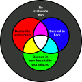
Articles: List of smoking bans in the United States
Request: SVGify and place the "No statewide ban" somewhere so the Venn diagram isn't off centered. 68.39.174.238 (talk) 19:55, 28 June 2008 (UTC)
Opinion: Why is that image even necessary for the legend? There's already a key with the map, simply copy paste it into the caption:
MissMJ (talk) 21:46, 29 June 2008 (UTC)
- That doesn't explain the origin and selection of the colors, as opposed to the color circles, which make it somewhat easier to carry the entire legend mentally. 68.39.174.238 (talk) 21:27, 1 July 2008 (UTC)
- Does the origin and selection of the colors matter? They could be 8 different shades of pink for all anyone cares, really... It just seems weird to me that a legend would require its own separate graphic, especially since looking at that particular one, it's not readily obvious what magenta, cyan, yellow, and white mean; it presumes familiarity with Venn diagrams. I for sure didn't realize that white meant a ban in all public places until I read it in the legend. MissMJ (talk) 00:11, 2 July 2008 (UTC)
- The current color scheme has a logic behind it more than the usuall random selections, and it cannot be easily explained by just a text legend. If it was changed to be just a progressive gradation, then an image would be inappropriate, but currently the image represents the color legend better than just a series of lines of text. 68.39.174.238 (talk) 00:18, 3 July 2008 (UTC)
I've made a vector version of it. Is this what you were thinking of? --pbroks13talk? 21:02, 13 July 2008 (UTC)
- That's it precisely, only could the "No statewide ban" be placed somewhere so the entire image feels centered? If that's not possible it can be removed without any real loss of information. Thanx,! 68.39.174.238 (talk) 22:04, 14 July 2008 (UTC)
- I took the original one (SVG) and used {{double image}}. Thanx, 68.39.174.238 (talk)
Gazelle Helicopter
-
 Gazelle helicopter
 -
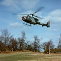 Edit1 Mfield


Article(s): Gazelle friendly fire incident, User:Ryan4314/Sandboxes/Falklands War Gazelle friendly fire incident
Request: Hi guys, would someone mind tidying this image up for me, so it can headline an article I'm authoring, I think it's needs sharpening, anything else? -- Ryan4314 (talk) 11:58, 8 July 2008 (UTC)
Graphist opinion:
Publix
-
Image:Publix Logo.jpg - Publix logo
Article(s):Publix
Request: Hey guys [gals], usual stuff, just SVGify (transparent background) upload as Image:Publix logo.svg Thanks! -- iDosh! talk? 01:21, 9 July 2008 (UTC)
Graphist opinion: Is that their new logo? All online info seems to indicate that [5] (bw) or [6] (colour) is their logo. It also apears as the navimage on their homepage. /Lokal_Profil 02:46, 9 July 2008 (UTC)
- It's fair use anyway. We can't vectorize fair use, can we? MissMJ (talk) 04:40, 9 July 2008 (UTC)
Will this work?? Image:Publix Logo.svg --pbroks13talk? 21:43, 13 July 2008 (UTC)
Request spherical versor
-
 Spherical triangle consisting of great circle arcs
 -
 Alternative #1
 -
 Alternative #2
 -
 Final version


Article(s): Versor
Request: The fit of the diagram to the article would be improved by these changes:
- Remove triangle angles α and β
- Put arrows (direction) on arc AB, arc BC, and arc AC
- Place center 0 in the sphere
- Show and label radii OA = α, OB = β and OC = γ
- Show poles r of arc AB, s of arc BC, and t of arc AC
- Remove interfering parts of great circles that are unecessary for spherical impression.
This is a mathematical-scientific project applicable to the globe, celestial sphere, or other spherical context. Your attention appreciated. Rgdboer (talk) 22:09, 9 July 2008 (UTC)
Replys below questions. Both #2 and #3 are improvements. #2 focuses well on the triangle. #3 shows roundness but teases my focus. So, slight preference for #2. Thank you.Rgdboer (talk) 22:59, 13 July 2008 (UTC)
Graphist opinion: Couple of things arent exactly clear:
- Which way do should the arrows point on arcs AB, BC, and AC?
- arrow directions: A->B, B->C, A->C
- What exactly to you mean by poles?
- A great circle is the equator between its poles. Even an arc defines the pole of its great circle.
- The diagram we are starting with is a spherical triangle with three right angles. In this case the vertices are poles of the opposite sides. There is no additional work necessary then for this image. Thank you. A more generic spherical triangle would have poles away from the vertices.
I've posted what I have right now. There's two alternatives to show the sphere-ness. I know that not everything looks great; I'll tweak it when I know what the other changes are. --pbroks13talk? 22:35, 13 July 2008 (UTC)
- Arrows are done; the poles aren't needed, so this should be it: Image:Spherical triangle.svg. Anything else that you think should be done? --pbroks13talk? 00:54, 14 July 2008 (UTC)
Valencian civic flag/coat
-

-

-
 Crown (SVG)
 -
 Origin of stripes (SVG)
 -
SVG
-
SVG


.svg)
Articels: Xàtiva
Request: SVGify. The crown has already been vectored. The stripes are off the Valencian flag. 68.39.174.238 (talk) 01:40, 10 July 2008 (UTC)
Oppinion: How does this one look? Λua∫Wise (Operibus anteire) 13:22, 12 July 2008 (UTC)
- It looks good. Can you do the flag also? 68.39.174.238 (talk) 13:56, 12 July 2008 (UTC)
- Done! Is it ok? :)Λua∫Wise (Operibus anteire) 14:07, 12 July 2008 (UTC)
- The image on the flag looks a little off center. Is that just an illusion? 68.39.174.238 (talk) 14:21, 13 July 2008 (UTC)
- Nope, you are right. I just uploaded a corrected version. :)
- Cheers mate!
- Λua∫Wise (Operibus anteire) 15:03, 13 July 2008 (UTC)
- The image on the flag looks a little off center. Is that just an illusion? 68.39.174.238 (talk) 14:21, 13 July 2008 (UTC)
igloo
-
 igloo side-view diagram
 -
 SVG redraw
Article(s):igloo
Request: Could someone create a higher resolution, SVG version of this diagram? This one looks MS Painted. thanks! -- iDosh! talk? 02:06, 10 July 2008 (UTC)
Graphist opinion: I made the SVG version; how does it look? --pbroks13talk? 20:19, 14 July 2008 (UTC)
-
 Now up to date line C (by Otourly)
 -
 (Less) out of date line A
 -
 Complete map
 -

-
-
 Line A done (by Otourly)


Article(s): Bordeaux Tramway Line C / Tramway de Bordeaux
Request: -- gren グレン 17:48, 10 July 2008 (UTC) I'd like two things. Image:Ligne C.svg is completely out of date and I'd like a version (SVG or PNG) to match line B and line A. The complete map provides the updated route of line C to be used as a basis. The same applies for line A whose northwest extremity is out of date. Here is an official map which might also help and is completely up to date.
If it's too difficult then any map showing all of the line C stations in order would be a good start rather than the really shortened version.
The complete map is a little out of date--meaning the dashed lines on line C and A are now completed as of February 2008 and needn't be dashed anymore. This should be a relatively easy fix, I think?
Graphist opinion:
This request was also posted at fr:Wikipédia:Atelier graphique/Images à améliorer#Tramway de Bordeaux, I'm a french Wikigraphist and I work on this picture. Cordialement Otourly (talk) 17:44, 15 July 2008 (UTC)
 Done first part is done, please, defer you on the french Graphic Lab for suggestions. Cordialement, Otourly (talk) 19:21, 15 July 2008 (UTC)
- Thank you, I've commented on the French (and for here on EN) it's great only thing is the dashed lines to the last two stations shouldn't be dashed anymore since I think the expansions are complete as per the official map. gren グレン 08:13, 17 July 2008 (UTC)
Haiti location map
-
 Current Haiti location map
 -
 Map with departments shown
 -
 desired effect
 -
 A new map


Article(s): It's used with {{Location map Haiti}}, so it appears on several articles
Request: -- Can someone take the first blank map and add the boundaries for the departments as thin gray lines, like on the German map? — jwillbur 21:30, 10 July 2008 (UTC)
Graphist opinion:
- I tried to do this one , but it is rather inaccurate as the 2 images do not exactly match, so anchor point have to be changed producing, i think, some errors. It would be a lot easier if you can find another image which matches the png version.
Cheers mate! Λua∫Wise (Operibus anteire) 16:32, 12 July 2008 (UTC)
- It's easier just to make another map, I added one above. Jackaranga (talk) 15:01, 14 July 2008 (UTC)
- Yes, that is perfect! Thank you, Jackaranga. — jwillbur 21:31, 14 July 2008 (UTC)
Bear (gay slang) image
.
-
 Watermark removed/brightened

Article(s): Bear
Request: -- There is a watermark to be cleaned off and any general brightening and improvement also welcome. Banjeboi 00:37, 11 July 2008 (UTC)
Graphist opinion:
- thank you!!!! Banjeboi 21:38, 28 July 2008 (UTC)
Net neutrality image

Article(s): Network neutrality
Request: -- It would be nice if someone could recreate something similar in SVG (without CC watermark). Thanks! TIM KLOSKE|TALK 22:07, 11 July 2008 (UTC)
Graphist opinion: How's this? Do you want to keep the drop shadow? Blur effects aren't well supported by all browsers. Jeff Dahl (Talk • contribs) 02:39, 12 July 2008 (UTC)
- I'm sure it will be fine without the shadow. Thanks! TIM KLOSKE|TALK 19:03, 14 July 2008 (UTC)
Goody Two-Shoes
-
 The *.pdf on Commons
 -
 Cover
Cover -
 2nd
2nd -
 4th
4th -
 5th
5th -
 6th
6th -
 7th
7th

.jpg)
.jpg)
.jpg)
.jpg)
.jpg)
.jpg)
A *.djvu version of the book
might be faster to work with
Article(s): Goody Two-Shoes
Request: Please extract all the illustrations from this *.pdf file (including the covers), there's nine of them. Also, it might be easier to extract the illustrations from the *.djvu version of the book above rather than the *.pdf, so I'll post it. -- diego_pmc (talk) 11:44, 12 July 2008 (UTC)
Graphist opinion: Ok, so this is the first time I do something like this. Albeit simple, I still need to make sure what I am doing is what you had in mind before uploading them all, so here are the first four illustrations. Tell me what you think :)
Cheers mate! Λua∫Wise (Operibus anteire) 15:18, 12 July 2008 (UTC)
- I used the pdf by the way :) And there are 8 illustrations, unless I missed one of them.Λua∫Wise (Operibus anteire) 15:21, 12 July 2008 (UTC)
Yeah this is it. The covers weren't all that necessary since they extend on the full page and have no borders I could have used the djvu directly, but upload them anyway - maybe someone who doesn't know how to use djvu's will need them. Thanks for the work. diego_pmc (talk) 16:04, 12 July 2008 (UTC)
- Ok, here they are! :D Λua∫Wise (Operibus anteire) 16:16, 12 July 2008 (UTC)
Convert from .ai to .svg
Article(s): Organization of American States
Request: Someone could upload these seals to commons in SVG format? Please, use these names:
Image:Seal of the Organization of American States.svg
Image:Seal of the Organization of American States (English title).svg
Image:Seal of the Organization of American States (Spanish title).svg
Image:Seal of the Organization of American States (Portuguese title).svg
Image:Seal of the Organization of American States (French title).svg
Thanks — Guilherme (t/c) 03:04, 13 July 2008 (UTC)
Graphist opinion:
![]() Done MantisEars (talk) 21:02, 15 July 2008 (UTC)
Done MantisEars (talk) 21:02, 15 July 2008 (UTC)
Ukraine
Article(s): WOSM-Eurasian Region
Request: Please change Ukraine from green to purple, it just became a member. -- Chris (クリス • フィッチ) (talk) 15:12, 13 July 2008 (UTC)
Graphist opinion: There you go! --pbroks13talk? 01:25, 14 July 2008 (UTC)
- Thank you so much! Very appreciated! Chris (クリス • フィッチ) (talk) 13:52, 14 July 2008 (UTC)
Create an animation showing Map construction
-
 using this SVG.
 -
 final animation.


Article(s): Map Tutorial-cartography_(basic) for wikigraphist (tutorial currently under redaction+expansion)
Request:
The SVG contain 8 layers : 1/ lowest background (valley) ; 2/ plain ; 3/ hills ; 4/ waters ;5/ troops; 6/ labels ; 7/ locator ; 8/ legend .
They are store in the good order of construction for this map.
For better teaching, I request to animate this like if the map was draw under the reader eyes.
Also, please, may someone who know how to animate series of images make a .gif animation of this. The task consist in export the SVG into gif, then delete the layer8 , export the page, delete the layer7, export, ... etc.
Then, put all this image into an animation :
- 4 sec. : all ( layer 1+2+3+4+5+6+7+8 )
- 2 sec : white.
- 2 sec : layer 1
- 2 sec : layer 1+2
- 2 sec : layer 1+2+3
- 2 sec : layer 1+2+3+4
- ....
- 2 sec : layer 1+2+3+4+5+6+7
That will help people interested in map creation to understand the work layer after layer: the very basis of map making ! Help welcome ! Yug (talk) 14:40, 14 July 2008 (UTC)
Graphist opinion:
WP:WPTC task forces
-

-
 SVG version
 -

-
 SVG version
 -

-
 SVG version


Article(s): All talk pages tagged with {{hurricane}}
Request: I tried creating three icons for the new task forces of Wikipedia:WikiProject Tropical cyclones. However, the quality is not very good, and maybe these ideally should be in an SVG diagram. However, my SVG editing skills are sub-par, and I can't do it. By the way, the source images are Weather-rain-thunderstorm.svg (CC-BY-SA 2.5) and Image:Tempête_Catégorie_5.png (PD). -- Titoxd(?!? - cool stuff) 23:40, 15 July 2008 (UTC)
Graphist opinion:I've redrawn all three into SVG format. Let me know if this works for you. --pbroks13talk? 06:42, 18 July 2008 (UTC)
- They look great. The only thing I would do is to modify the color of the lining to use the colors at Template talk:Storm colour, which I tried to do but screwed up because of the alpha channel process I was using to make the pictures. Titoxd(?!? - cool stuff) 19:48, 19 July 2008 (UTC)
- Done. Only the second "season" image had to have color modifications; the CAT 5 color was perfect, as well as the depression color. --pbroks13talk? 08:13, 20 July 2008 (UTC)
- That looks great! Thanks! Titoxd(?!? - cool stuff) 19:11, 20 July 2008 (UTC)
- Done. Only the second "season" image had to have color modifications; the CAT 5 color was perfect, as well as the depression color. --pbroks13talk? 08:13, 20 July 2008 (UTC)
Remove black box from svg
-
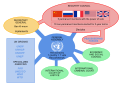 Image
Image

Article(s): None yet
Request: Could somebody please have a go at removing the black box that appears in this image? It doesn't show up in Inkscape, and I'm not sure how to get rid of it. Many thanks -- Joowwww (talk) 11:11, 17 July 2008 (UTC)
Graphist opinion: We've got the same problem with Inkscape. You could corrected it in the XML editor of Inkscape you should search and delete the key called "flowRoot2600" like it is write on the FAQ. Otourly (talk) 16:23, 17 July 2008 (UTC)
Toufik El Hibri
.
Article(s):
Request: can you darken this image for detail? -- Chris (クリス • フィッチ) (talk) 15:09, 18 July 2008 (UTC)
Graphist opinion: I did some work on it. I put it in B/W mode and then added some contrast. What do you think? -- iDosh! talk? 16:14, 18 July 2008 (UTC)
- Great, thank you! Chris (クリス • フィッチ) (talk) 16:31, 18 July 2008 (UTC)
Chart
-
 chart with heavy .jpg artifacts
 -
 SVG version


Article(s): Creation-evolution controversy, History of creationism
Request: SVG please --SelfQ (talk) 17:25, 18 July 2008 (UTC)
Graphist opinion: I created an SVG version. Will this work? --pbroks13talk? 19:26, 18 July 2008 (UTC)
- Could you change the sentence abit to clarify that this is the result of a poll. other then that great work. --SelfQ (talk) 10:24, 19 July 2008 (UTC)
Perfect, cheers. --SelfQ (talk) 09:56, 20 July 2008 (UTC)
-
 Sample flowchart diagram
 -
 Alternative 1


Article(s): Diagram
Request: The diagram in Diagram is a rather poor example. Please change colours, layout & arrow placement for a clearer and more visually appealing diagram - I prefer arrows that go down-across-down, but that's a matter of taste. Also please introduce an arrow from "Think of another term" to "Enter a Wikipedia Search". Please change text of "Enter a Wikipedia search" to "Search Wikipedia". Any other copyediting, groovifying & "spiffing up" is welcome :) Dhatfield (talk) 10:04, 20 July 2008 (UTC)
Graphist opinion: Ive made a "down-across-down" diagram. It looks better in my opinion. What do you think? --pbroks13talk? 18:58, 20 July 2008 (UTC)
- I agree, much improved, I particularly like the 'centered' layout and 'drop shadows', despite rendering issues. One change request: could you go for more subtle colour gradients, the red in particular. Thanks. Dhatfield (talk) 19:47, 20 July 2008 (UTC)
French compass rose
-
-
 Done in SVG.


Article(s): Pessac
Request: This image is used a lot on the French Wikipedia in the same way as my replication on Pessac. This style works really well compared to some of our other compass roses so I'd like at least the one thing (1) and if you're ambitious a second (2).
- Chnage 'O' and 'NO' to 'W' and 'NW' (West is Ouest in French) and upload to a new filename
- SVGify
-- gren グレン 08:02, 25 July 2008 (UTC)
Graphist opinion: Ok I've done it in SVG, the text is stored as text so you can just changed the name of the corners if you wish. --Henrikb4 (talk) 10:47, 25 July 2008 (UTC)
Flags
-
PNG
-
 SVG
SVG -
-
Image:ForvikFlag.svg will be soon
-

Article(s): many
Request: Could someone please SVG these flags? --SelfQ (talk) 10:31, 26 July 2008 (UTC)
Graphist opinion: The other flags were Image:ForvikFlag.jpg and Image:Minerva x250.gif. I'll get on it. --pbroks13talk? 05:18, 27 July 2008 (UTC)
- Well I got three of them. The one that isn't up is because I worked Inkscape froze on me and I dont really feel like working on it again at the moment (probably will tomorrow). --pbroks13talk? 07:18, 27 July 2008 (UTC)
Okay, finished the last one! Will these work for you? --pbroks13talk? 07:29, 28 July 2008 (UTC)
Nebraska National Forest
.
-
 Bessey Ranger District, Nebraska National Forest
 -

-


Article(s): Nebraska Outback, fr:Naturalité
Request: These photos are too dark; a little lightening would help a lot. Please just upload the new versions over the top of the old ones. —Bkell (talk) 00:12, 27 July 2008 (UTC)
Graphist opinion: Done. The reason that these are so dark is that the camera took the much brighter sky as the subject and underexposed everything else. In the future, you might want to consider putting the horizon on the upper third of the image (somewhat like this). Thegreenj 15:29, 27 July 2008 (UTC)
Herzegovina
-
GIF
-
 SVG
SVG

Article(s): Duchy of Herzegovina
Request: SVG ification. Make big. Upload Commons. Please. --Lord Leatherface (talk) 17:00, 27 July 2008 (UTC)
Graphist opinion: I've vectorised it, but I'm wondering if it really was the flag of the Duchy, or that it's just a modern banner of the arms of the duchy? Sir Iain (talk) 19:21, 27 July 2008 (UTC)
- I don't know. Flag in coat of arms of House of Kosača. —Preceding unsigned comment added by Lord Leatherface (talk • contribs) 20:49, 27 July 2008 (UTC)
Mughal Empire flag
-
 Flag of the Mughal Empire.
 -
 SVG
SVG


Article(s): Mughal Empire, British Raj, Empire: Total War.
Request: SVG please -- SelfQ (talk) 12:51, 28 July 2008 (UTC)
Graphist opinion: And I was sure I dint see it in Category:Mughal Empire, oh well, thanks anyway Leatherface --SelfQ (talk) 12:59, 28 July 2008 (UTC)
International Space University
-
Logo of ISU.
-
SVG
Article(s): International Space University.
Request: SVG please -- Hektor (talk) 19:24, 28 July 2008 (UTC)
Graphist opinion: Done. Image:Isu-logo.svg --pbroks13talk?
International Skating Union
-
Logo of ISU.
-
SVG
Article(s): International Skating Union.
Request: SVG please -- Hektor (talk) 19:24, 28 July 2008 (UTC)
Graphist opinion: Here you go! Image:International Skating Union.svg --pbroks13talk? 05:32, 29 July 2008 (UTC)
Kurt Gödel's signature
-
 Kurt Gödel's signature
 -
 Albert Einstein's signature
 -
 Hermann Weyl's signature
 -
 Euler's signature
 -
 Gödel SVG
 -
 Einstein SVG
 -

-
 Euler SVG
Article(s): Kurt Gödel, Albert Einstein, Hermann Weyl and Leonhard Euler.
Request: Hello. I was wondering if anyone was able to vectorise these? Cheers, Ben (talk) 15:12, 30 July 2008 (UTC)
Graphist opinion: Okay, all four are made. Will these work? --pbroks13talk? 20:39, 30 July 2008 (UTC)
Cochlicella acuta, zoom in on one species of snail
-
 Land snails of two different species aestivating on a fence post
 -
-
 Another crop
 -
 One final crop


Article(s): Cochlicella acuta
Request: Please can we get this image cropped so that it mainly shows the small, long, pointed snails Cochlicella acuta, which are mostly clustered in the center of the image? The image seems to have enough DPI to do this OK I think. Invertzoo (talk) 19:11, 26 July 2008 (UTC)
Graphist opinion: Okay, I cropped it. Let me know if it is too much. --pbroks13talk? 07:26, 27 July 2008 (UTC)
- Another crop showing all the snails, also some contrast — Navy Blue formerly iDosh 14:57, 27 July 2008 (UTC)
One final crop — Navy Blue formerly iDosh 14:49, 28 July 2008 (UTC)
Thanks so much guys, this is just what I needed. Invertzoo (talk) 14:33, 1 August 2008 (UTC)
Emilia
-

-
 SVG
SVG


Article(s): w:tr:Emilia
Request: This is flag of Emilia. SVG ification. Make big. Upload Commons. Please.--Lord Leatherface (talk) 14:47, 29 July 2008 (UTC)
Graphist opinion: Done. --pbroks13talk? 20:08, 29 July 2008 (UTC)
WikiProject Superheroes logo
Request: A logo that is like the superman logo but has a W and S.--BlackWatch21 21:14, 31 July 2008 (UTC)
-
 WikiProject Superheroes logo.

How about this?--23230 talk 08:29, 1 August 2008 (UTC)
- I think I looks really good! I left note on Blackwatch21 talk page. — Navy Blue formerly iDosh 17:52, 1 August 2008 (UTC)
Aeroflot logo
-
Image:Aeroflot logo.PNG
Aeroflot logo -
 SVG
SVG
Article(s): Aeroflot, Hammer and sickle.
Request: SVG please -- SelfQ (talk) 21:27, 26 July 2008 (UTC)
Graphist opinion:I think this logo displays satisfactory at the current format, In fact I think it should be lowered in resolution per non-free logo. — Navy Blue formerly iDosh 15:06, 27 July 2008 (UTC)
- I question whether or not that really is Fair Use. The logo is an old one and I suspect someone added {{logo}} because it's a logo, not because it's a copyrighted/fair use logo. According to (BBC from 2003), the logo has been in use for "70 years", so 2003 - 70 = 1933. Unfortunately, I don't know who the original author(s) are, so it's impossible to determine if it's life + 70 or not. Also, check the usual source to see if someone's vectored it already. 68.39.174.238 (talk) 15:58, 27 July 2008 (UTC)
— Requester OK'd new image. 68.39.174.238 (talk) 15:46, 2 August 2008 (UTC)
-
-
 Cropped


Article(s): Diverse Harmony
Request: Hi, please crop the image down a bit to focus on the group holding the banner in the parade. Any other suggestions welcome. Banjeboi 07:41, 29 July 2008 (UTC)
Graphist opinion: Okay, I cropped it. Will this work? --pbroks13talk? 08:05, 29 July 2008 (UTC)
- Yes! That's genius! Thank you! Banjeboi 08:33, 29 July 2008 (UTC)
Coalition forces insignia
-
 Insignia for the Multinational Force in Iraq.
 -
 SVG
SVG


Article(s): 2003 invasion of Iraq, Civil war in Iraq, Multinational Force Iraq, Iraq War.
Request: SVG and put on a clear background. -- SelfQ (talk) 21:47, 30 July 2008 (UTC)
Graphist opinion: Looks interesting. I'm workin on it. --pbroks13talk? 07:21, 31 July 2008 (UTC)
- Okay, I made it. It's not perfect, but what do you think? --pbroks13talk? 18:55, 1 August 2008 (UTC)
Looks great, maybe tweek it a bit so the star is in the same posision as the in the .jpg? --SelfQ (talk) 21:59, 1 August 2008 (UTC)
- Okay, the star matches better. I also enlarged it so you can see more detail, if anything else is wrong with it, or you think something should look better. --pbroks13talk? 05:43, 2 August 2008 (UTC)
3 extreemly minor things, I think it looks great already, but, on its hat, its missing a little nug right where it go's from head to hat. the tail sould line up with the line that extends from the top bit of armour to the back bit of armour, and under its belly its missing a bit of depth to match the faroff leg to the right. If its to much trouble just say so, its great as is--SelfQ (talk) 10:49, 2 August 2008 (UTC)
- Of course, it's not a problem. I tweaked it some more; will it work? --pbroks13talk? 05:52, 3 August 2008 (UTC)
Absolutely great, I wish I had your talent, A+ --SelfQ (talk) 11:09, 3 August 2008 (UTC)
Cuban Olympic Committee
Article(s):Cuban Olympic Committee (User:Navy Blue/To Do/3)
Request: Create an SVG version of this logo. [7][8] Thanks! — Navy Blue formerly iDosh 19:57, 1 August 2008 (UTC)
Graphist opinion: Here you go; by the way, it is under fair use. Make sure that once you make the article Cuban Olympic Committee that you change the images fair use page. Will this work? Image:Cuban Olympic Committee.svg --pbroks13talk? 08:21, 4 August 2008 (UTC)
Papal Swiss flag strageness
68.39.174.238 (talk) 21:11, 4 August 2008 (UTC)
-
 The image in question

Articel(s): Swiss Guard
Request: Something is strange with the code of this image: When viewed through MW's renderer, the two papal coats in the corners don't render correctly. In particular, the one in the lower left is totally blackened. Viewing it straight in Firefox (3.0.1) shows the correct detail of the shields. 68.39.174.238 (talk) 16:17, 3 August 2008 (UTC)
Opinion: Got it. I just copied-and-pasted it to a new file. Look okay on yours? --pbroks13talk? 07:46, 4 August 2008 (UTC)
- Perfect! 68.39.174.238 (talk) 21:11, 4 August 2008 (UTC)
Flag of the CPLC
Article(s):Community of Portuguese Language Countries, United Nations General Assembly observers, Flag of the Community of Portuguese Language Countries, Flags of Europe, Flags of Africa.
Request: SVG and upload to "Flag of the Community of Portuguese Language Countries.svg" --SelfQ (talk) 20:07, 6 August 2008 (UTC)
Graphist opinion:
Logo of the European Free Alliance
Article(s): European Free Alliance, List of active autonomist and secessionist movements.
Request: SVG, upload to "Logo of the European Free Alliance.svg" --SelfQ (talk) 20:23, 6 August 2008 (UTC)
Graphist opinion: Done. Image:Logo of the European Free Alliance.svg. Will this work? --pbroks13talk? 07:27, 7 August 2008 (UTC)


Articel(s): William III of England
Request: Hi, hoping this can be cleaned up and enlarged in some fashion, seems awfully small. All help appreciated! Banjeboi 11:50, 4 August 2008 (UTC)
Opinion: Its just too small to really do anything with I am afraid. Mfield (talk) 01:17, 6 August 2008 (UTC)
- I enlarged it and attempted to clean up and fix some color. What do you think? --pbroks13talk? 01:27, 6 August 2008 (UTC)
- Is this "done" then? 68.39.174.238 (talk) 21:39, 6 August 2008 (UTC)
Shaw and Crompton: simple vector request?
-
Icon of the parish council - found here - requires vectorising for smooth edges. Probably in SVG format?
Article(s): Shaw and Crompton.
Request: SVG; Vectorise with smooth edges and transparent background, please! -- --Jza84 | Talk 20:10, 4 August 2008 (UTC)
Graphist opinion: How does this look? Image:Shaw and Crompton Emblem.svg. --pbroks13talk? 02:14, 6 August 2008 (UTC)
- Wow! - perfect! Thank you very much! I'll swap the image over now! --Jza84 | Talk 15:09, 6 August 2008 (UTC)
Oldham coat of arms: Vector request
-
-
 Sculpted version (the sheild behind the owls should be black not light blue!). This doesn't need editting, it's here purely as an aid.

Article(s): Oldham and County Borough of Oldham.
Request: Vectorisation, including transparent background. SVG format? There are other examples here and here for reference. This is a bit of a challenge for someone, but hope there is a user who can help. :) -- --Jza84 | Talk 20:54, 6 August 2008 (UTC)
Graphist opinion:
The blazon needed for anyone interested in this task is:
ARMS: Sable a Chevron invected plain cottised Or between three Owls Argent on a Chief engrailed of the second a Rose Gules barbed and seeded proper between two Annulets also Gules.
CREST: On a Wreath of the Colours in front of a Rock thereon an Owl Argent three Roses fessewise Gules barbed and seeded proper.
Motto: SAPERE AUDE
/Lokal_Profil 01:20, 7 August 2008 (UTC)
Silent movie icon
-
 Edit 1
 -
 Edit 2
 -
 Alternative #1
 -
 Alternative #2
 -
 Alternative #3
 -
 Edit #3- This is with a machine translation in swedish.
 -
 SVG Swedish translation
 -
 Png Persian Translation


Article(s): every silent movie article using sv:Mall:Filmfakta (the film infobox on sv.wiki)
Request: I would like some help with designing an icon which can represent silent movies. Initially I'm thinking a crossed out mouth or something but any ideas are welcome. The only requirement is that the symbol is simple and that it's clear what it depicts even at small resolutions (think stub-image size). /Lokal_Profil 13:08, 19 June 2008 (UTC)
Graphist opinion:
- Speaker with an overlayed prohibitory sign infront of a film reel or strip? 68.39.174.238 (talk) 22:09, 19 June 2008 (UTC)
- Isn't that the definition? 68.39.174.238 (talk) 21:44, 20 June 2008 (UTC)
- Definition from Silent film: A silent film is a film with no synchronized recorded sound, especially spoken dialogue.. Same thing for the piano, for me it links the thoughts to no-sound movies where the sound is genereated by a live pianoplayer on the stage. For me silent film is primarily linked to intertitles but they would make lousy icons. /Lokal_Profil 22:26, 20 June 2008 (UTC)
How about Edit 1? It's pretty small, it can be visible up to 25-30 px. I can be improved by SVGing. Check this out - User:IDosh/To Do/3 iDosh! talk? 17:49, 21 June 2008 (UTC) Any comments about Edit 2? iDosh! talk? 17:57, 21 June 2008 (UTC)
- Although it's a good icon for silent films in general I don't think the movie reel is needed for an icon in the film infobox. But the lip part might work. Anyhow I'll be busy with IRL stuff this week so if I'm absent from the discussion it doesn't mean that I've forgotten or that I'm ungratefull for all the help I'm getting. /Lokal_Profil 07:57, 22 June 2008 (UTC)
It was suggested that something like this be used, so I made Image:Silent film.svg. Any good? Or are you looking for something esle? --pbroks13talk? 03:16, 14 July 2008 (UTC)
- It's definitely a better (IMAO) representation because it's what most people associate with such a film: The text written in. The only problem might be translation. 68.39.174.238 (talk) 22:24, 16 July 2008 (UTC)
- It shouldn't be too hard. Couldn't we just replace "Silent film" with the Swedish translation? --pbroks13talk? 04:47, 18 July 2008 (UTC)
- Or, maybe it`s better to write it in Esperanto.For multilingual purposes of course!N.samimi island (talk) 13:08, 18 July 2008 (UTC)
- It shouldn't be too hard. Couldn't we just replace "Silent film" with the Swedish translation? --pbroks13talk? 04:47, 18 July 2008 (UTC)
- Problem is, no one would be able to read it, so in the sense that it would be equally unintelligible to all, yes. Probably the idea of a version for each language would work best (EG> silentfilm-sv, -en, etc.). 68.39.174.238 (talk) 20:50, 18 July 2008 (UTC)
- Ok ,then I make the Persian Language version of it and I`ll give the link of it here. N.samimi island (talk) 14:37, 19 July 2008 (UTC)
- The link of the persian language version of it on wikipedia commons is this N.samimi island (talk) 10:18, 20 July 2008 (UTC)
- Ok ,then I make the Persian Language version of it and I`ll give the link of it here. N.samimi island (talk) 14:37, 19 July 2008 (UTC)
- Problem is, no one would be able to read it, so in the sense that it would be equally unintelligible to all, yes. Probably the idea of a version for each language would work best (EG> silentfilm-sv, -en, etc.). 68.39.174.238 (talk) 20:50, 18 July 2008 (UTC)
- I made altenative 2. I have an idea i just cant find a head talking. 5dsddddd (talk) 17:17, 24 July 2008 (UTC)
- I made another one. Is it ok.
For alt #2: The prohibitory sign should be in front of the speaker. According to , the term is sv:Stumfilm. 68.39.174.238 (talk) 20:57, 24 July 2008 (UTC)
- Okay, I'll have the correct Swedish translation by tonight (I'm not at my actual computer). --pbroks13talk? 22:27, 25 July 2008 (UTC)
- Made the Swedish translation. --pbroks13talk? 05:55, 26 July 2008 (UTC)
- Why are you guys sticked to the Swedish translation? Didn`t you guys wanted to make that logo for all Languages? I just made the persian translation of it on the top but Mr.Pbroks13 removed it.So,why only the swedish translation? N.samimi island (talk) 19:26, 29 July 2008 (UTC)
- Made the Swedish translation. --pbroks13talk? 05:55, 26 July 2008 (UTC)
- It's still here. 68.39.174.238 (talk) 22:07, 29 July 2008 (UTC)
- No reply on the sv.wiki talk page but personally I like Image:Silent film-sv.svg a lot and would consider the request fullfilled. Image:Swedishsilentmovie.png has sadly been the victim of machine translation. It reads "Silent Membrane" =). Anyhow a big thanks to everyone who helped develop the image from what was a very sketchy idea at first. /Lokal_Profil 22:59, 30 July 2008 (UTC)
- Umm... I never removed the Persian image from this page, FYI. I just added the Swedish translation... --pbroks13talk? 08:30, 31 July 2008 (UTC)
- By removing I ment removing it from the small gallery on top of this section, not the link of it. And , can I put it there again now? N.samimi island (talk) 09:35, 2 August 2008 (UTC)
- Umm... I never removed the Persian image from this page, FYI. I just added the Swedish translation... --pbroks13talk? 08:30, 31 July 2008 (UTC)
- If you're referring to this edit, you somehow mananged to copy and paste the entire contents of the page again, so it was reverted. You can re-add the image, but you should also specify what the Fa. text is, so it's correctly added as text and not just drawn. 68.39.174.238 (talk) 14:20, 3 August 2008 (UTC)
COA of the Kingdom of Holland
-
 Transparency in PNG

Article(s): History of the Netherlands, Kingdom of Holland, Coat of arms of the Netherlands.
Request: Only put on a transparent backgrownd please --SelfQ (talk) 11:02, 8 August 2008 (UTC)
Graphist opinion: I couldn't really figure out how to add transparency with a JPG image, so I uploaded it as a PNG. Will this work? --pbroks13talk? 05:56, 10 August 2008 (UTC)
Rocky Ford High School
Article(s): Rocky Ford High School
Request: can this be cleaned up? -- Chris (クリス • フィッチ) (talk) 03:56, 10 August 2008 (UTC)
Graphist opinion: I uploaded a better quality image here: Image:Rockyford.png; will this one work? --pbroks13talk? 05:26, 10 August 2008 (UTC)
- Great, thank you! Chris (クリス • フィッチ) (talk) 06:44, 10 August 2008 (UTC)
UNESCOage
Articels: Some UNESCO ones, & templates.
Request: SVGify. 68.39.174.238 (talk) 22:03, 6 August 2008 (UTC)
Oppinion: If the second image is copyrighted then I suspect that the first one is to. Although the image might have been created by a user it would be a derivative of the original logo and as such copyrigthed by UNESCO. It might still be under a free license but we would need an e-mail from UNESCO confirming this.
BTW there was already an svg on Commons which I added to the gallery above. /Lokal_Profil 01:31, 7 August 2008 (UTC)
- marking as resolved snce all images have been deleted as unfree derivatives. /Lokal_Profil 22:37, 12 August 2008 (UTC)
John McCain
-
 Official photo
 -
 Final edit, with proper file format and title.


Article(s): John McCain
Request: -- Hi, I'd like to know if you can please modify the background of this image so that it matches the background here. The Graphic Lab previously did some work on this,[12] but some people objected.[13] The main objection was that we shouldn't be using a background that has not already been okayed by the source of the photo (i.e. Congress). Thanks.Ferrylodge (talk) 19:38, 10 August 2008 (UTC)
Graphist opinion:Can't we just use the one form the PDF it's the exact same picture. — Navy Blue formerly iDosh 01:28, 11 August 2008 (UTC)
Strike that. I see why.. the one here is much higher resolution. — Navy Blue formerly iDosh 01:31, 11 August 2008 (UTC)
- Look at the quality. The quality of the pdf image is horrible, whereas the one above is high res. This image will go at the top of a high-traffic article, and no one would allow the image from the pdf to go there.Ferrylodge (talk) 01:30, 11 August 2008 (UTC)
- Hey that looks great to my untrained eye. You can go ahead and quit your day job. :-) Should I take this and run with it, or did you want to perfect it more?Ferrylodge (talk) 02:07, 11 August 2008 (UTC)
- Thanks very much. Good night.Ferrylodge (talk) 02:17, 11 August 2008 (UTC)
I just uploaded the third image. It's almost the same but I did some modifications to the tux. Also this one has proper file format and title. Is this resolved? — Navy Blue formerly iDosh 19:19, 11 August 2008 (UTC)
- Yes, thanks very much for helping with this. The article is currently a featured article candidate, and I think the new image will probably help. Cheers.Ferrylodge (talk) 19:27, 11 August 2008 (UTC)
- I still had the original file for Image:John McCain official photo portrait-cropped-background edit.JPG. That means I had the mask and layers saved on my hard drive, so it would have taken all of 30 seconds to change the color of the background. I spent a good bit of time creating the original mask on the image for my edit, which I think came out quite good, so I feel bad that another user had to go through the exact same work that I already had. And not to toot my own horn too much, but I think my mask was superior :) (look at 100%, Navy Blue's has issues on McCain's left cheek, and a lot of the fine hair details on the around the edge of his head were lost. In fact, the whole face has a halo of black jaggies). If the current edit is acceptable, then fine. If someone wants my PSD file (with layers and the background masked), I wouldn't mind passing that along, or even changing the background color myself. But only if someone else thinks it's necessary. Like I said, I don't want to stir the pot if the current edit acceptable.-Andrew c [talk] 21:57, 11 August 2008 (UTC)
- Thanks for your comment Andrew c. My initial comment referenced the prior work that the Graphic Lab did on this image. I don't know how you folks divvy up your work, and I also don't know the technical details of how you do things. If you and User:Navy Blue would like to work this out, then that would be fine by me. I certainly did not intend to exclude you, and anticipated that you might be the person who answered my initial request here. No offense intended.Ferrylodge (talk) 22:03, 11 August 2008 (UTC)
- Thanks. Sorry for any confusion or misunderstanding.Ferrylodge (talk) 04:26, 12 August 2008 (UTC)
This is resolved! Thanks Andrew c. — Navy Blue 16:15, 12 August 2008 (UTC)
Vietnam Civil actions ribbon
![]() Done
Done
-
JPG image
-
 SVG version 1
 -
 SVG version 2
Article(s): Talk:George_Thomas_Coker#Verification_of_17_medals
Request: there is no graphic that I can find for the Vietnam Civil actions ribbon. Can you make an svg of it? -- Chris (??? • ????) (talk) 14:47, 18 July 2008 (UTC)
Graphist opinion: I added the ribbon in its JPG version. If you want this to be SVGified, then I need to know what the thing in the middle is. --pbroks13talk? 16:50, 18 July 2008 (UTC)
- User:Marine 69-71 created it so he should know what the thing in the middle is. -- iDosh! talk? 17:05, 18 July 2008 (UTC)
It is a leaf. [14] Bewareofdog 18:50, 18 July 2008 (UTC)
- Actually, according the the author and uploader of the image, it is a palm streamer. --pbroks13talk? 20:07, 18 July 2008 (UTC)
Closer image: [15]. If someone makes a svg of this, let me know please. — Rlevse • Talk • 17:28, 19 July 2008 (UTC)
Okay, I made an attempt to make an SVG version. Will this work? --pbroks13talk? 08:04, 20 July 2008 (UTC)
The background is better, but the device doesn't look like the real thing. See the link here (near the bottom). — Rlevse • Talk • 08:54, 20 July 2008 (UTC)
- I noticed that too, but looking at other Vietnam Civil Actions Medal ([16] [17]) and palm, streamer embroidered ribbons ([18] [19]), I think the author of the original image drew it incorrectly. --pbroks13talk? 17:56, 20 July 2008 (UTC)
Very nice! — Rlevse • Talk • 22:59, 27 July 2008 (UTC)
Vectorizing COA of South Korea
Article(s): South Korea, Template:Politics of South Korea, ...
Request: Because it has some mistakes(look at the left side of label), I want this [22] to be converted... Could you help with this? The text reads "????". --ksiom (talk) 19:54, 1 August 2008 (UTC)
Graphist opinion: This:

..already exists on Commons, although there are a few differences. Is it what you want?--23230 talk 09:58, 2 August 2008 (UTC)
- I feel the current vector, while a good drawing, isn't complying with law. Here is the construction sheet on how to draw the Coat of arms. User:Zscout370 (Return Fire) 10:08, 2 August 2008 (UTC)
- I began to edit the arms image going by that construction sheet, but something is not coming up right. It is going to take some time to fix it, also, I need Korean users to tell me where the good drawings of the emblem is, and also what Korean terms I should use to find information about the emblem. User:Zscout370 (Return Fire) 10:35, 2 August 2008 (UTC)
Make it green = Save the Frog !!
-
 H. meridionalis (bad image name from the 80's ^-^ = bad blue color)
 -
More green.
-
 H. meridionalis (good colors)


Article(s): Hyla meridionalis
Request: Hello graphists ! As you can see, despite displaying the same Frog species (Hyla meridionalis) these 2 pictures are really inequal. According to the author[24], the image 1 come from an old photography back to the 1980's and is far too blue. The 2nd pic is with good colors. Also, if someone may restore the correct green colors that can save this image which, otherwise, will have to been delete (being blue and misleading). Please save this frog ! Yug (talk) 19:29, 12 August 2008 (UTC)
Graphist opinion: I made a version with more of a green tint. What do you think? --pbroks13talk? 05:11, 13 August 2008 (UTC)
- Many thanks ! I uploaded your version upon the old and misleading blue one. Accordingly, I also requested the deletion of the edit file (*2.jpg).
- For the result, the green is not perfectly the same that Hyla meridionalis 01.jpg, but that's welcome : colors of this species can have little variations. This file is saved ! Many thanks Pbroks13 ;) Yug (talk) 17:21, 13 August 2008 (UTC)


Article(s): David Archuleta
Request: OK, hopefully this one is large enough to make a miracle happen. Could you crop the image to upper torso including arms and then clean up in any way possible? I think it's from a cell phone but it's the only image we have so far. Thank you! Banjeboi 06:33, 13 August 2008 (UTC)
Graphist opinion: I did a crop and some contrast but I this is a really bad quality image. — Navy Blue 13:35, 13 August 2008 (UTC)
- I used a larger resolution for it. Also, I added some saturation and tries to clean up the "noisyness" of it. What do you think? --pbroks13talk? 22:50, 13 August 2008 (UTC)
- That's quite wonderful! We've been trying to get a photo of him for ages and we know there are a bizillion cameraphone shots. Thank you all so much! Banjeboi 01:21, 14 August 2008 (UTC)
2008 Xinjiang attack
-
 It shows an area almost the size of Alaska
 -


Article(s): 2008 Xinjiang attack
Request: Perhaps a pushpin map could be devised instead. -- Chris (??? • ????) (talk) 00:25, 6 August 2008 (UTC)
Graphist opinion: Is this what you're looking for? Emok (talk) 02:01, 6 August 2008 (UTC)
- Very cool! Chris (??? • ????) (talk) 08:14, 6 August 2008 (UTC)
Pope John Paul II's signiature
-
 Signiature of Pope John Paul II
 -
 SVG
SVG

Article(s): Non yet - Pope John Paul II upon completion
Request: Could someone please turn this picture into a signiature like the one of Robert Mugabe --SelfQ (talk) 13:08, 14 August 2008 (UTC)
Graphist opinion:
How's that? Time3000 (talk) 15:07, 14 August 2008 (UTC)
- Perfect exept for the J, there's a little thingy that sould not be there, its in the photo as well, but there its damage to the copper plate, not part of the signiature. Good job non the less--SelfQ (talk) 15:30, 14 August 2008 (UTC)
B-36 tracked gear photo
-
 Removed white spots

Article(s): Undercarriage, Convair B-36, Continuous track
Request: I'm told that there are a bunch a "white spots" in this photo and that they would need be removed for it to potentially become an FP (see the discussion at FPC). I was able to crop out a line in the photo, but this is too techinical for me, so I've brought it here, where you guys do such great work on this kind stuff. -- D.B.talk•contribs 23:13, 14 August 2008 (UTC)
Graphist opinion: This should take all of 5 minutes. I'll get it. --Slashme (talk) 10:56, 15 August 2008 (UTC)
Gökköy

Article(s): w:tr:Gökköy, Balıkesir
Request: Make the color a little more rich? Upload Common. Please.--Lord Leatherface (talk) 20:10, 15 August 2008 (UTC)
Graphist opinion:What do you think? — Navy Blue 21:44, 15 August 2008 (UTC)
- Thank you.--Lord Leatherface (talk) 12:41, 16 August 2008 (UTC)
John McWhorter
-
 The linguist John McWhorter at a conference

Article(s):
Request: -- Cut out the gentleman with the red shirt on the right hand side Jasy jatere (talk) 20:46, 29 July 2008 (UTC)
Graphist opinion: I can do this tomorrow if no-one else picks it up today. --Slashme (talk) 18:23, 15 August 2008 (UTC)
- OK, great, thank you very much Jasy jatere (talk) 07:18, 18 August 2008 (UTC)
Little Venn diagram
-

-
 SVG
SVG


Articles: Logic
Request: SVGify the Venn diagram. You can leave the text out, since that is better in the caption of the image. The colors aren't fixed, so if others are better, that's OK. 68.39.174.238 (talk) 02:53, 18 August 2008 (UTC)
Opinion: I agree the text should be left out. I made one; will this work? --pbroks13talk? 04:26, 18 August 2008 (UTC)
- Yes. 68.39.174.238 (talk) 13:30, 18 August 2008 (UTC)
Poitou-Charentes
-
Region logo (needs fixing)
Article(s): Poitou-Charentes
Request: The logo image scales horribly on Poitou-Charentes. I would like you to use either of the two flag images to make it better. I plan on eventually changing the article to use the commons version of the flag but figured I should leave it with original look for now. My main interest is having a logo which scales and looks decent but SVG for any or all of these images is more than welcome, but not necessary. -- gren ??? 00:45, 30 July 2008 (UTC)
Graphist opinion: I'm not quite sure... what are the differences between each? --pbroks13talk? 08:16, 1 August 2008 (UTC)
- Aspect ratio... since the flag has extra white to make it flag-i-dimensional. If you look at Poitou-Charentes it's the proper ratios and I suppose I would have been more clear had I asked to use the higher resolution image to create two in those dimensions. gren ??? 11:16, 1 August 2008 (UTC)
- The PNG flag on commons looks fine to me, and it seems to scale pretty nicely. Making it an svg would not be so much of an improvement, because the text is a large part of the design, and would make a complicated path. The only difference (besides colour depth and smoothing) between that one and the gif is the transparent background, and I think that's probably a good thing – surely the flag has a white background anyway? --Slashme (talk) 13:38, 16 August 2008 (UTC)
- I realize I've been very unclear in this request--SVG was never the primary objective. I'll restate, hopefully clearly this time:
- Image:PC2.png (logo) is a bad version of Image:Poitou-Charentes.png (logo) and should be ignored. [[:]] is a flag with an aspect ratio of 3:2 (150x100). I want to make a version of Image:Poitou-Charentes.png into Image:Poitou-Charentes (flag).png which has extended white space to make it have the same aspect ratio as [[:]]. --gren グレン 18:40, 18 August 2008 (UTC)
- The PNG flag on commons looks fine to me, and it seems to scale pretty nicely. Making it an svg would not be so much of an improvement, because the text is a large part of the design, and would make a complicated path. The only difference (besides colour depth and smoothing) between that one and the gif is the transparent background, and I think that's probably a good thing – surely the flag has a white background anyway? --Slashme (talk) 13:38, 16 August 2008 (UTC)
Add routes to map of Claude La Badarian's travels
-
MissMJ's first take.
-
 Retouch amended v2.

Article(s): Dining Late with Claude La Badarian
Request: Hi: This map was previously worked on by another Wikipedian, and I would like it if someone could help me with a few additional changes to it. I list the additions below:
- Could someone trace a route going from Saugerties, holding near but always above Kingston to follow through to Connecticut, and then north on the east side of Easthampton before arriving at Northampton, and then continuing on a rather direct route straight to New York City, and afterward back to Northampton along the same route but drawn to the right (so doubled up, to indicate there and back, which is an AMTRAK rail line if you are interested), and then finally a small line from Northampton (at the top of the map) going over to Easthampton? This method should avoid any kind of crossings of paths and look rather fluid. A note on drawing the route: When Claude La Badarian travels from Saugerties to Northampton, he makes a pit stop in Connecticut. The best way I can see to catch a little Connecticut with a traced route would be to drop down just above Kingston leaving Saugerties, and then stay in Connecticut just before Agawam and then go north to Northampton. Additionally could an arrow appear intermittently to indicate the direction in which Claude La Badarian is traveling?
- Also, could someone remove 'Grand Central Terminal' from the name New York City and change Old Greenwich station to simply 'Greenwich'?
- And as well, in slightly larger font than the cities, indicate the states Connecticut, New York, and Massachusetts, and the islands Long Island and Martha's Vineyard?
I would really appreciate it if someone could do this. I am quite incompetent in these graphic matters. -- Manhattan Samurai (talk) 21:34, 17 August 2008 (UTC)
Graphist opinion: I'll see what I can do. Debate 木 08:25, 18 August 2008 (UTC)
- How's this? I added some color, but can change it back to the gray if you prefer. Unfortunately, the details require a little bit of squinting at display scale... it's partially a consequence of having to squeeze three routes between Easthampton and Agawam, and the route from Northamption to Easthampton is tiny to begin with. We could make the details a little clearer by cropping the entire image a little tighter if you'd like, but if we do that we might lose some of the recognition factor from the geography. Debate 木 11:19, 18 August 2008 (UTC)
- Not to sound too enthusiastic, but it looks amazing. Could you try out the crop idea? If it makes it clearer then it might be worth it to lose some of the recognition factor. Maybe just a very small crop? I like the colors. Manhattan Samurai (talk) 13:22, 18 August 2008 (UTC)
- Could you also make the dot for Greenwich the same size as the cities? It was previously denoting a train station so it was drawn minute. Manhattan Samurai (talk) 13:24, 18 August 2008 (UTC)
- Done. Keep saying nice things and I might keep helping out around here. :-) Debate 木 15:17, 18 August 2008 (UTC)
- Thanks. I really like the drawing of the route. Makes it seem like Claude La Badarian was some kind of explorer. Would it be possible to maybe do one crop that is a little less? I think somewhere in between the two SVGs might be the right size but I could be wrong. In this one, while the route is clearer and more pronounced, the font is larger than the article's font. Is this a difficult adjustment to do? Manhattan Samurai (talk) 15:52, 18 August 2008 (UTC)
- Shouldn't be a problem, but it will have to be tomorrow. Must sleep. :) Debate 木 15:56, 18 August 2008 (UTC)
- Okay, thanks. I appreciate the help. Manhattan Samurai (talk) 16:02, 18 August 2008 (UTC)
- Shouldn't be a problem, but it will have to be tomorrow. Must sleep. :) Debate 木 15:56, 18 August 2008 (UTC)
- Thanks. I really like the drawing of the route. Makes it seem like Claude La Badarian was some kind of explorer. Would it be possible to maybe do one crop that is a little less? I think somewhere in between the two SVGs might be the right size but I could be wrong. In this one, while the route is clearer and more pronounced, the font is larger than the article's font. Is this a difficult adjustment to do? Manhattan Samurai (talk) 15:52, 18 August 2008 (UTC)
- Done. Keep saying nice things and I might keep helping out around here. :-) Debate 木 15:17, 18 August 2008 (UTC)
- Could you also make the dot for Greenwich the same size as the cities? It was previously denoting a train station so it was drawn minute. Manhattan Samurai (talk) 13:24, 18 August 2008 (UTC)
- Not to sound too enthusiastic, but it looks amazing. Could you try out the crop idea? If it makes it clearer then it might be worth it to lose some of the recognition factor. Maybe just a very small crop? I like the colors. Manhattan Samurai (talk) 13:22, 18 August 2008 (UTC)
<outdent>A few things: One of the arrows, as the route passes through Connecticut, is pointing in the wrong direction. And is it possible to move Medford closer, ever so slightly, to Boston? Is that a really easy thing to do in SVG? Just some minor things. Both versions of the map are great: I'm starting to lean more towards the second, but if you could provide a third option, somewhere in between that could be interesting. Manhattan Samurai (talk) 18:40, 18 August 2008 (UTC)
- Third time lucky. I think this one is significantly better so hopefully it was worth the wait... :-) Debate 木 09:23, 19 August 2008 (UTC)
- Awesome! thanks. The route is even more pronounced and the font size of the place names is now in line with the text (at least on my side). This is perfect. A really great addition to the article. Thanks again, Manhattan Samurai (talk) 12:02, 19 August 2008 (UTC)
Second Nature Recordings logo
-
The logo of the Second Nature Recordings record label
Article(s): Second Nature Recordings
Request: Make it a little less crappy? The original is available at http://rateyourmusic.com/label/second_nature_recordings if it's any help. I tried to clean it up in GIMP but got pissed off with the paths thing not working and then I tried in Inkscape and realised that I'm completely talent-free in image manipulation. If you could double the resolution and smooth it up a little that would be perfect! Seegoon (talk) 02:45, 19 August 2008 (UTC)
Graphist opinion: I made an SVG version; will that work? --pbroks13talk? 16:57, 19 August 2008 (UTC)
Coat of Arms of the Orange Free State
-
 Coat of Arms of the Orange Free State
 -
 PNG with transparency


Article(s): Orange Free State, Presidents of the Orange Free State.
Request: Please only put it on a transparent background. --SelfQ (talk) 16:53, 19 August 2008 (UTC)
Graphist opinion: Will that work for you? --pbroks13talk? 17:04, 19 August 2008 (UTC)
North America
-
 North America with country divisions
 -
 SVG
SVG
.png)

Article(s): Many navigational templates in Category:North America templates
Request: SVG version. Oxygen (believe) 00:05, 17 August 2008 (UTC)
Graphist opinion: Okay I got one. Will that work? --pbroks13talk? 23:35, 17 August 2008 (UTC)
Image:Map-world-murder-rate.svg


Article(s):
Request: please change the "low incident" and "unreported" colors, they are far too similar to each other. -- Chris (クリス • フィッチ) (talk) 02:46, 19 August 2008 (UTC)
Graphist opinion: I'm struggling to see the problem. If anything, it's the 10-20 and 20+ colors that appear to be most likely to cause confusion. Have you tried to calibrate your monitor or video settings? Debate 木 10:49, 19 August 2008 (UTC)
- Others are having this problem also, see the talkpage for the image. Chris (クリス • フィッチ) (talk) 11:14, 19 August 2008 (UTC)
- Both comments appear to have concerns about the monochromal blue in general
without mentioning specific problems with the lighter end of that range. If that's the main issue, however, I'll play with increasing the color range a little to see if we can make the graduations more distinct. Debate 木 12:11, 19 August 2008 (UTC)
- Both comments appear to have concerns about the monochromal blue in general
- Significantly better. Can you upload it over the original? Chris (クリス • フィッチ) (talk) 21:53, 19 August 2008 (UTC)
Flag of the Community of Portuguese Language Countries
-
Image:Flag of the CPLP.PNG
Flag of the Community of Portuguese Language Countries -
Article(s): Community of Portuguese Language Countries, Gallery of flags by design, Flags of Europe, Gallery of flags with circles, Flags of South America, Flags of Africa, List of Portuguese flags, Flag of the Community of Portuguese Language Countries.
Request: SVG please. --SelfQ (talk) 16:53, 19 August 2008 (UTC)
Graphist opinion: How's that? --pbroks13talk? 17:20, 19 August 2008 (UTC)
- Great work as always --SelfQ (talk) 23:31, 19 August 2008 (UTC)
- This is a derivative of a copyrighted image. I've deleted the images but moved a copy of the svg file to en.wiki and added a Fair use rationale (please check that it makes sense). Still I'd like to remind everyone to be critical/realistic when you deal with this sort of images. Logos of international organisations are rarely under a free license and it's even more rare that a wikipedia user owns the copyright to it. /Lokal_Profil 01:10, 20 August 2008 (UTC)
- Gotcha, I didn't even notice. Question though, the article it is being used for shouldn't be EUBINGO, right? Shouldn't there be ones for Community of Portuguese Language Countries and Flag of the Community of Portuguese Language Countries instead? --pbroks13talk? 05:07, 20 August 2008 (UTC)
- This is a derivative of a copyrighted image. I've deleted the images but moved a copy of the svg file to en.wiki and added a Fair use rationale (please check that it makes sense). Still I'd like to remind everyone to be critical/realistic when you deal with this sort of images. Logos of international organisations are rarely under a free license and it's even more rare that a wikipedia user owns the copyright to it. /Lokal_Profil 01:10, 20 August 2008 (UTC)
Kenya lion Scout
.
Article(s): The Kenya Scouts Association
Request: Kind of a weird one, can you clean the crud off of it? :) -- Chris (クリス • フィッチ) (talk) 16:09, 20 August 2008 (UTC)
Graphist opinion: Sure Debate 木 00:18, 21 August 2008 (UTC)
- Done. Debate 木 00:39, 21 August 2008 (UTC)
- Great, thank you! Chris (クリス • フィッチ) (talk) 03:26, 21 August 2008 (UTC)
Hitchhiker sign
-
 Hitchhiker sign: Amsterdam

Article(s):
Request: This image is a bit too dark. Would it be possible to make this picture look a bit "less grey"? No azure sky, just make it look a little bit more friendly. Jasy jatere (talk) 07:27, 18 August 2008 (UTC)
Graphist opinion:
I'm on it. --Slashme (talk) 08:12, 18 August 2008 (UTC)
- much better thank you that was quick Jasy jatere (talk) 08:25, 18 August 2008 (UTC)
Seal of the Confederate States of America
-
 Seal of the Confederate States of America
 -
 PNG with transparent background

.png)
Article(s): Confederate States of America and related
Request:Put on a transparent background please --SelfQ (talk) 11:11, 18 August 2008 (UTC)
Graphist opinion: This was the best I could do. There's still a very thin feathered white edge around the seal so it (hopefully) won't look jagged at low sizes. Fvasconcellos (t·c) 14:25, 18 August 2008 (UTC)
Manchukuo
-

-
 SVG version
 -
 SVG version #2
 -
 note the borders were actually much different then
 -
 REVISED...
 -
 Manchukuo SVG
 -
 note the borders of Tibet were much larger back then
 -
 Mengjiang
 -
 Korea
Korea


Article(s): Manchukuo
Request: Well, English, for starters...-- Chris (??? • ????) (talk) 10:19, 30 July 2008 (UTC)
Graphist opinion: May I suggest using this map instead of a butchered CIA World Factbook map: --SelfQ (talk) 16:41, 30 July 2008 (UTC)

- This is my first attempt at a map, so look it over closely and let me know if I need to make any changes. Emok (talk) 02:16, 1 August 2008 (UTC)
- This may be stupid but I really dislike the missing borders for India/Southeast Asia... it's very inconsistent since it has them for Mongolia/Russia/Koreas and the projection is very odd looking to me. And, there is also a border for a non-existent country splitting Russia into parts (please tell if if I'm wrong and this is an historical region intentionally there?). I think the Image:East Asia area blank CJK.svg creator added it as a border when it was the river. As for as what you did it seems fine to me (although, is there a reason you're using historical names like Peking? If there is you should make sure the other names match from the same (English) time period... because it might be Nanking and Sian instead of Nanjing and Xi'an (this map as example.) gren ??? 03:13, 1 August 2008 (UTC)
- The missing borders were bugging me also, so I went back and started from the map that SelfQ recommended. See version #2. I've only included the country names in this version. I'll add city names if necessary.
- This may be stupid but I really dislike the missing borders for India/Southeast Asia... it's very inconsistent since it has them for Mongolia/Russia/Koreas and the projection is very odd looking to me. And, there is also a border for a non-existent country splitting Russia into parts (please tell if if I'm wrong and this is an historical region intentionally there?). I think the Image:East Asia area blank CJK.svg creator added it as a border when it was the river. As for as what you did it seems fine to me (although, is there a reason you're using historical names like Peking? If there is you should make sure the other names match from the same (English) time period... because it might be Nanking and Sian instead of Nanjing and Xi'an (this map as example.) gren ??? 03:13, 1 August 2008 (UTC)
- The country in Russia on the Imperial Powers map that User:Grenavitar was talking about was a country called the Tuvan People's Republic from 1921 till 1944 when it was annexed by the Soviet Union. --SelfQ (talk) 16:09, 1 August 2008 (UTC)
- For some reason the SVG doesn't show up. Chris (??? • ????) (talk) 06:33, 4 August 2008 (UTC)
- Beautiful! "Tuvan" is the adjective, the land should say "Tannu Tuva". Chris (??? • ????) (talk) 17:43, 4 August 2008 (UTC)
May I suggest the following changes:
Names:
- Add the name of Austrailia.
- Add the name of the Netherlands East Indies to the Indonesia.
- Add the name of New Zeeland.
Borders:
- Add the Manchukuo border.
- Add Portuguese possessions, preferably in green.
- Make the over all borders fatter, right now they are to thin to few correctly in browser.
Color changes:
- Change the United States from purple to a light blue to make tekst more visable.
- Australia was independent by 1939 and sould not be counted as a British colonie (change color to that of China/Canada/etc)
- New Zeeland was independent by 1939 and sould not be counted as a British colonie (change color to that of China/Canada/etc)
- Change British possessions to Yellow.
- Change Dutch possessions to Orange. (National color of the Netherlands)
- Change French possessions to Dark Blue.
Misc:
- Bump up the inbrowser size to make it readable without having to download.
- Around the name of Burma there seems to be a bit of a distortion.
- Add the puppet state Mengjiang.
--SelfQ (talk) 19:15, 4 August 2008 (UTC)
- Thanks for the suggestions. Forgive my ignorance of history and geography, but do you have a map that shows Mengjiang? I didn't find in on the maps or in a quick Google search. Emok (talk) 20:04, 4 August 2008 (UTC)
- here, I made a map for you of Mengjiang's location (in Dark Blue) by combining other wiki maps through the glory of mspaint :D
-
 The dark blue part, ignore the border splitting the two dark blue parts (I forgot to remove it)
.PNG)
--SelfQ (talk) 22:08, 4 August 2008 (UTC)
- Thanks for the sketch, but I wish we had a better reference. Especially since it's a deviation from the original map. I'll do my best to trace the borders. Emok (talk) 17:23, 5 August 2008 (UTC)
- That is a killer map! Couple of typos, it's "Australia" and "Philippine Sea". Chris (??? • ????) (talk) 10:36, 7 August 2008 (UTC)
- Okay, the typos should be fixed. I've added a Manchukuo-specific map.Emok (talk) 01:42, 8 August 2008 (UTC)
- Could you make one where Mengjiang is fat and Manchukuo is pink for the Mengjiang article?--SelfQ (talk) 10:56, 8 August 2008 (UTC)
- The Mengjiang map is added, but I made a typo in its filename. Is there a way to rename it, or do I have to upload again to the correct location??
- I don't want to modify Tibet unless there is a better reference for the borders. The three maps that I used more or less agree that in 1939 it's borders were limited to the yellow area of Tibet-claims.jpg. Emok (talk) 17:12, 8 August 2008 (UTC)
- There seems to be a typo in your Imperial Powers REVISED map, Great Britan sould be Great Britain. Also Mengjiang's borders did not extend into peking, see the red dot on my map, Peking was the capital of Puppet China so it could not have been in Mengjiang. If these things were fix'd then I believe they that they will be of sufficient quality to be added to there respective articles. Anyone disagree? --SelfQ (talk) 16:19, 9 August 2008 (UTC)
- I've updated all three images with the correct location of Peking and spelling revisions. Sorry it took a while. Emok (talk) 03:02, 21 August 2008 (UTC)
- Wonderful! Thank you so much for your hard work! Chris (クリス • フィッチ) (talk) 03:22, 21 August 2008 (UTC)
- I've updated all three images with the correct location of Peking and spelling revisions. Sorry it took a while. Emok (talk) 03:02, 21 August 2008 (UTC)
- There seems to be a typo in your Imperial Powers REVISED map, Great Britan sould be Great Britain. Also Mengjiang's borders did not extend into peking, see the red dot on my map, Peking was the capital of Puppet China so it could not have been in Mengjiang. If these things were fix'd then I believe they that they will be of sufficient quality to be added to there respective articles. Anyone disagree? --SelfQ (talk) 16:19, 9 August 2008 (UTC)
- Could you make one where Mengjiang is fat and Manchukuo is pink for the Mengjiang article?--SelfQ (talk) 10:56, 8 August 2008 (UTC)
- Okay, the typos should be fixed. I've added a Manchukuo-specific map.Emok (talk) 01:42, 8 August 2008 (UTC)
Great work Emok. Just have one more request, could you create one more where Puppet Korea is Dark red and Manchukuo/Japan etc are light red for the Korea under Japanese rule article?--SelfQ (talk) 10:44, 22 August 2008 (UTC)
Stitch two PD images
-
 Philadelphia Navy Yard showing USS Lake Gedney and front of USS Minnesotan
 -
 Philadelphia Navy Yard showing the back half of USS Minnesotan
 -
 Stitched with hugin


Article(s): SS Minnesotan (also known as USS Minnesotan in U.S. Navy service)
Request: Can a Wikigraphist stitch these two PD images together? They were taken the same day from the same vantage point. A quick run I did with a demo stitching program provided satisfactory (thought watermarked) results. Perhaps someone has a licensed and/or freeware program that can accomplish this without watermarks? — Bellhalla (talk) 13:37, 22 August 2008 (UTC)
Graphist opinion: I'll do it manually. Debate 木 15:19, 23 August 2008 (UTC)
I've done another version with hugin which is slightly better imho (it doesn't have the weird bend in the ship's side halfway along). Time3000 (talk) 16:16, 23 August 2008 (UTC)
Easy schematic
68.39.174.238 (talk) 01:02, 25 August 2008 (UTC)
-

-
 SVG
SVG


Article: Mercury arc valve
Request: To make an SVG after this drawing, but with the following differences:
- The lines attaching text to parts should be much thinner and less "heavy".
- The parts such as the contacts and mercury pool should be in a different color
- The drawing should be less "mspaint.exe"-ish (Sorry for the vague criterion). 68.39.174.238 (talk) 20:54, 17 August 2008 (UTC)
Opinion: Okay, I got the first and third parts done, but I'm not sure what exactly needs to be colored. --pbroks13talk? 22:47, 17 August 2008 (UTC)
- The anodes and mercury pudle so they can be easily distinguished from the black glass. I suggest silver for the mercury (obviously), and maybe a "copper" color for the anodes. I don't think the "leads" need to be indicated separately from their anodes. 68.39.174.238 (talk) 02:49, 18 August 2008 (UTC)
- Anything current carrying should be "copper" (Or whatever color is decided), mercury can be silver and I guess you could put a color gradient on the bulb (BTW, I'll be out for a few days, so don't worry if this does go stale). 68.39.174.238 (talk) 13:28, 18 August 2008 (UTC)
- Excellent! 68.39.174.238 (talk) 01:02, 25 August 2008 (UTC)
Adjara


Articel: Adjara
Request: SVG ification. Make big.other--Lord Leatherface (talk) 20:59, 17 August 2008 (UTC)
Oppinion: How's this? Fvasconcellos (t·c) 14:06, 18 August 2008 (UTC)
- Yes. Thank you.--Lord Leatherface (talk) 14:56, 23 August 2008 (UTC)
Coat of Arms of the South African Republic
-
 Coat of Arms of the South African Republic
 -
PNG with transparency

Article(s): South African Republic
Request: Place on a transparent background only please --SelfQ (talk) 13:31, 24 August 2008 (UTC)
Graphist opinion: Done. How is that? --pbroks13talk? 01:01, 25 August 2008 (UTC)
Crown of the Kingdom of the Netherlands
-
 Crown of the Kingdom of the Netherlands
 -
 SVG
SVG

.svg)
![[1]](http://www.gonatural.co.nz/images/pacific-ocean.jpg)
![[2]](http://www.lib.utexas.edu/maps/historical/ward_1912/pacific_ocean_1910.jpg)
.svg&action=edit&redlink=1)
.svg&action=edit&redlink=1)
.svg&action=edit&redlink=1)
.svg&action=edit&redlink=1)
![[7]](http://www.olympic.org/upload/organisation/logo_noc/NOC_logo_CUB.gif)
![[9]](http://www.mediemekka.dk/images_projects/film_projekter/300x183_silent_movie.png)
![[10]](http://www.tololy.com/wp-content/uploads/2008/04/mute-logo1.gif)
![[20]](http://www.ngms.state.ms.us/doim/daphotos/ARMY%20RIBBONS%20and%20Devices%20right%20side_files/R10.jpg)
![[22]](http://www.sharme.or.kr/korea/minjang_00.gif)
.png&action=edit&redlink=1)
Article(s): Crown of the Netherlands
Request: SVG and place on a transparent background please --SelfQ (talk) 13:31, 24 August 2008 (UTC)
Graphist opinion: I made it. Will that work? --pbroks13talk? 00:23, 25 August 2008 (UTC)
- Not quite, there are a few minor issues:
- The Blue jewels are suppose to be oval.
- The Blue and Red jewels are suppose to have a outline.
- Its a little hard to see, but there are Pearls on every... uhh.. spike I guess, witch arnt suppose to be spikes at all, there more like grooves of a half circle.
I added a reference picture:
Love the way you did the leaves though, A+. --SelfQ (talk) 09:19, 25 August 2008 (UTC)
- Looking at [this image] and the one you gave, I think I made it look a bit more like it should. Hows that? --pbroks13talk? 06:40, 26 August 2008 (UTC)