
Wikipedia:Graphics Lab/Images to improve/Archive/May 2008
 | This page, part of the Graphics Lab Wikiproject, is an archive of requests for May 2008. Please do not edit the contents of this page. You can submit new requests here. |
Stale
Niihau Incident

Article(s): Niihau Incident
Request: Is there any way to make this a little more uniform an image? -- Chris (クリス • フィッチ) (talk) 00:40, 6 April 2008 (UTC)
Graphist opinion:
- I uploaded a bigger version of the same image, but I don't understand what you mean by more uniform. If you are referring to the colour of the sea, it has been deliberately left that way, you can read the explanation at http://visibleearth.nasa.gov/view_rec.php?id=16470 Jackaranga (talk) 15:04, 7 April 2008 (UTC)
- Ah. Yes, that's what I meant. Can a second version be made with the sea uniform, with the islands darker for contrast? Chris (クリス • フィッチ) (talk) 15:27, 7 April 2008 (UTC)
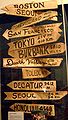
M*A*S*H sign
-
 lightened and cropped by Stepshep

Article(s): Wikipedia:WikiProject M*A*S*H
Request: free-use graphic version of this for the new Wikipedia:WikiProject M*A*S*H -- Chris (クリス • フィッチ) (talk) 04:44, 18 March 2008 (UTC)
- I don't get the request: According to the image page, it is tagged PD. Is this incorrect? 68.39.174.238 (talk) 18:03, 21 March 2008 (UTC)
- The photo itself may be public domain, but because the subject is someone else's creative work, I do not know if the Wikipedia:WikiProject M*A*S*H will get in trouble for using it on templates. My request is for a graphic representation of the sign to be made. If I had any skills like you guys (I don't), it would strike me as kind of fun.
- Meanwhile, can the photo itself also be brightened for detail? Chris (クリス • フィッチ) (talk) 00:18, 22 March 2008 (UTC)
Graphist opinion: So if something is stale can we still touch it? I can't make a graphic of it, too out of my league with all the dimensions, but I could lighten and crop the pic. §hep • ¡Talk to me! 00:47, 10 April 2008 (UTC)
- If something is stale you are welcome to touch it. Just remove the stale template and proceed as normal; if anything the stale template should be an encouragement to work on it as it means the requester has been waiting a while.--Dycedarg ж 20:23, 12 April 2008 (UTC)
- Yes please, if you would lighten and crop that would be wonderful! Chris (クリス • フィッチ) (talk) 20:30, 12 April 2008 (UTC)
- Lightened and cropped. Hope that's better. §hep • ¡Talk to me! 02:14, 13 April 2008 (UTC)
- Yes please, if you would lighten and crop that would be wonderful! Chris (クリス • フィッチ) (talk) 20:30, 12 April 2008 (UTC)
- That's great, thank you! Is anyone up for a graphic version? Chris (クリス • フィッチ) (talk) 02:21, 13 April 2008 (UTC)
Douglas Bay Panorama
-
 A panorama of the Douglas bay in Isle of Man
 -
Edit 1
Article(s): Douglas, Isle of Man
Request:This panorama is stitched from a number of high resolution (5MP) photographs. I am very satisfied with this image though I think the colours could be slightly brighter. I am also wondering whether a different crop would balance the photograph better. I've tried various versions myself but haven't managed to come up with anything remarkably better. -- Ganeshrg (talk) 14:51, 9 April 2008 (UTC)
Graphist opinion: Lightened it. Still looking for an interesting crop. What do you think? §hep • ¡Talk to me! 23:00, 9 April 2008 (UTC)
Comment: It looks slightly better. Do you think cropping out the wall at the left will improve the picture? I tried that but realised that the little piece of wall gives the photo a better perspective. Would anyone think this is a Feature Picture Candidate? If yes, could somebody please help me put it up there? Thanks.
- It has some visible stitching errors, maybe you could upload the individual images used to make this panorama, and let someone else try stitching for you Thisglad (talk) 15:13, 10 April 2008 (UTC)
- Thanks for the update. Could you please inform me how/where I can upload the source images?--Ganeshrg (talk) 16:27, 10 April 2008 (UTC)
--Ganeshrg (talk) 16:27, 10 April 2008 (UTC)
- You can upload them at commons like you uploaded before Thisglad (talk) 16:49, 10 April 2008 (UTC)
- In the edit 1, i cropped out the parking lot on the right. I think It gives it a more uniform look. But ya, if you have all the full res images I would be easy to adjust each image by itself so they all had the same color to them and hand stitch them if there's less than 10 or so. §hep • ¡Talk to me! 19:51, 10 April 2008 (UTC)
- I have put up the originals now. You can find them on this image's description page under "source". They are all 1280x960 resolution so should be small enough to download while being large enough to preserve detail. I would be grateful with anything that you can come up with. I used a Panasonic Lumix FZ20 and the EXIF info on the source photos has been retained so you can see the settings that I have used for each photo on the image description page under the "Metadata" section. The day was quite cloudy yet bright. I hope this helps. If you need any more info, feel free to ask away. Thanks.--Ganeshrg (talk) 11:33, 11 April 2008 (UTC)
Lordy, lordy. This will take a bit. :) Always fun to have a new project. §hep • ¡Talk to me! 21:48, 11 April 2008 (UTC)
- Sorry, I have to drop out of the race. The camera literally tilts angles of the houses from picture to picture. I ran it though an auto one to make sure I wasn't going crazy and it made a circle. Never seen that before. I guess I don't have the skill for this one. Sorry, and good luck! §hep • ¡Talk to me! 22:20, 11 April 2008 (UTC)
- Thanks for trying, Shep. @XcepticZP, is there a way I can EMAIL the large sized originals to you or upload them somewhere else instead of on wikimedia commons? Wikimedia commons is just too tedious coz you have to upload each picture one by one. —Preceding unsigned comment added by Ganeshrg (talk • contribs) 18:34, 12 April 2008 (UTC)
- Yes there is a way. Take them all, compress them to something reasonable like 1mb each. Zip them all together with winrar or winzip. Upload them to rapidshare.com. Then send me the url that they give you. Send me the url by sending me a msg, that way it'll get emailed to me automatically. If you don't mind other people downloading the file, then just post it on my userpage. XcepticZP (talk) 19:54, 12 April 2008 (UTC)
- Hi, I've done as you asked me to. I'm waiting for your response now. —Preceding unsigned comment added by 80.175.8.77 (talk) 23:03, 27 April 2008 (UTC)
Coat of arms of Yemen
Article(s): Coat of arms of Yemen
Request: SVGify -- Chris (クリス • フィッチ) (talk) 03:58, 11 April 2008 (UTC)
Graphist opinion: Looking over google I've found three distinct variants. One with a golden eagle, the one here, and one with the scroll bent out a bit Like here. Should I follow the one on Wikipedia, or is another version the correct one? §hep • ¡Talk to me! 00:32, 12 April 2008 (UTC)
- I believe it should be a golden eagle. The official website of the Yemeni government has the golden eagle. Fvasconcellos (t·c) 15:10, 12 April 2008 (UTC)
Improve contrast and centre image on the parrot
-
 Parakeet clinging to cage bars.
 -
 First edit


Article(s): It might be possible to use an improved imaged on the species page of several language wikis.
Request: Please improve contrast and center the picture on the parrot. There is a different species of parrot in the background on the right side of the picture; this may be distracting and would be better edited out of the photo. This is the only image that the wiki has at the present time showing the white tip of the birds tail feathers. Snowman (talk) 17:06, 12 April 2008 (UTC)
Graphist opinion: I gave my hand at it. I cropped it and sharpened it a bit as there was some motion blur. §hep • ¡Talk to me! 18:21, 12 April 2008 (UTC)
- A bit more space above and below the parrot please. Snowman (talk) 18:46, 12 April 2008 (UTC)
- Fixed it up a bit more. Anything else I missed? §hep • ¡Talk to me! 19:29, 12 April 2008 (UTC)
- A bit more space above and below the parrot please. It is still a bit long and narrow. Can you make it a perfect rectangle shape please? Snowman (talk) 19:40, 12 April 2008 (UTC)
- That's the best I can do to get it a perfect square. §hep • ¡Talk to me! 22:43, 12 April 2008 (UTC)
- A bit more space above and below the parrot please. It is still a bit long and narrow. Can you make it a perfect rectangle shape please? Snowman (talk) 19:40, 12 April 2008 (UTC)
- Fixed it up a bit more. Anything else I missed? §hep • ¡Talk to me! 19:29, 12 April 2008 (UTC)
Coat of arms of Palau
-
 color to match Image:NonFreeImageRemoved.svg
 -


Article(s): Palau
Request: color to match Image:Execseal.gif -- Chris (クリス • フィッチ) (talk) 00:28, 13 April 2008 (UTC)
Graphist opinion:
Root anatomy
Can you help me with root diagram? There should be numbers instead of words.
Article(s):sk.wikipedia.org
Request: -- Pinky sl (talk) 15:46, 17 April 2008 (UTC)
Graphist opinion:
Demographic history of the United States
-

-
Better style (according to Mangwanani)
-
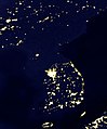 Korean Peninsula at night (A more analogous image, in the author's opinion)


Article(s): Demographic history of the United States
Request: much as I like Twinkle Twinkle Little States... um, yeah. Slow it down and put it on a normal Wiki map background so it doesn't look like the whole thing is a surprise-- Chris (クリス • フィッチ) (talk) 08:48, 3 April 2008 (UTC)
Graphist opinion:
- I'm not a graphist, but a solution to the speed issue would be to include 1x, 2x, 4x, 8x buttons in the description portion of the thumb, each of which leads to a different image that changes at a different speed. This can be done by creating Image:PercentOfUSPopInEachState1x.gif, Image:PercentOfUSPopInEachState2x.gif, Image:PercentOfUSPopInEachState4x.gif, and Image:PercentOfUSPopInEachState8x.gif. The black color is off putting. JohnABerring27A (talk) 15:02, 6 April 2008 (UTC)
Author's opinion:
- こんにちは, I'm the author. Thanks for your interest in this image! Just wanted to let you know that back when I created this image, I tried various speeds, state colors, and background colors. I found that a fast speed was necessary in order to make the movement over the decades most visible... when you slow it down you just can't see the patterns of movement, which is really the whole point of the image. I also found that white --> black was the most intuitive color scheme for the states (brighter = larger share of the population) and easiest for the eye to recognize the subtle shades of difference. And I found that black was the background color that worked best with that. Still, if anyone thinks they can improve, good luck and have fun playing with it! Szu (talk) 05:15, 7 April 2008 (UTC)
- I would change the background color to something else. The northwestern states barely show up on my monitor. 68.39.174.238 (talk) 22:33, 7 April 2008 (UTC)
- They will barely show up on any monitor, and that's on purpose. States with hardly any population are hardly visible; as they get more people they stand out more. That's exactly why I chose black for the background. When I tried other background colors, the black states would become just as visible the brighter ones, drawing attention away from the important action going on in those brighter states. If you do choose another background color I'd hope it would be very dark. Szu (talk) 14:34, 8 April 2008 (UTC)
- I'm sorry but that doesn't make sense. The whole point of the image is to inform people not keep them guessing and thus they need to be able to see the image to be able to use it. If they wanted to guess the information, as will be done on some monitors, they are wasting their time looking at the image as it is as far as I can say. Mangwanani (talk) 19:50, 8 April 2008 (UTC)
- So people who don't know when Idaho, Utah, Montana and Wyoming gained statehood just have to guess at when it's "There's not state here" and when it's "There's a state with no population here"? 68.39.174.238 (talk) 20:17, 8 April 2008 (UTC)
- This image doesn't distinguish between "there's no state here" and "there's a state with no population" because that's not the point of the image. This image is not trying to show when states were admitted to the union; the point of the image is just to show the general movement of population over the decades, which I think it does well and without requiring any guesswork. Still, like I said, if you guys can do better, go ahead and have fun with it! ;-) Szu (talk) 20:51, 8 April 2008 (UTC)
- I'm just going to be blunt about this. I don't think it works. I have added an image of the growth of WWII just as it was the first map I came across that I think works very well in showing its point and timeline. If we could make a new version styled on this I think would be much clearer and less, as Chris called it, Twinkle Twinkle. Mangwanani (talk) 15:46, 9 April 2008 (UTC)
- Thanks for your bluntness. Bear in mind there are other people who do think it works. Also I should say that the fact that you propose a map of WWII conquests as a model suggests that you don't understand the point of the image. This image is not meant to provide detail of a historical event like a military battle or territorial acquisition. It's meant to show a broad social/geographic pattern, just like "Korean Peninsula at night" which I think is much more similar in purpose. But rather than complaining about this image, please go ahead and make your own version. I'll be looking forward to see what you come up with! :-) Szu (talk) 19:12, 9 April 2008 (UTC)
- As I have said before and many times on this page, my graphic skills are limited. I am simply stating that in my opinion the image doesn't work. I also don't see how the Korean Peninsular can be compared to this image. It isn't twinkle twinkle and shows something completely different. Mangwanani (talk) 19:27, 9 April 2008 (UTC)
- I'm sorry, I haven't seen your comments on other images, only this one. On the surface, the WWII map may seem to be more similar: it moves, it's historical, it's a map. But in terms of purpose, "Korean Peninsula at night" is much more similar: it illustrates a broad pattern of human population in a very simple manner; it's not trying to be a precise, detailed record like the WWII map. Szu (talk) 20:00, 9 April 2008 (UTC)
- Because it's on a dark background that renders it illegible on many monitors. Is that clear enough? Chris (クリス • フィッチ) (talk) 01:22, 1 May 2008 (UTC)
- We've already addressed that point: the dark states are less visible on purpose so that the light states stand out. This has been posted here for a month now... Is anyone going to make their own version, or not? Szu (talk) 02:15, 2 May 2008 (UTC)
- I was boiling it down for James1293 who didn't understand the above debate. Chris (クリス • フィッチ) (talk) 14:23, 2 May 2008 (UTC)
Albanian language map
Article(s):
Request: put on regular Wiki-style non-ominous map -- Chris (クリス • フィッチ) (talk) 03:54, 18 April 2008 (UTC)
- I agree with the "ominous" part of it. Also, a correction of boundaries and names (Serbia/Montenegro) would be useful. Thanx, 68.39.174.238 (talk) 18:55, 18 April 2008 (UTC)
Graphist opinion:
Eintracht Frankfurt jersey
Article(s):Eintracht Frankfurt
Request: -- Could someone please create the away and the third jersey, respectively. Maybe this template helps you. Template:Football_kit. If you have further questions, don't hesitate to contact me. Help is much appreciated! -Lemmy- (talk) 10:38, 13 April 2008 (UTC)
Graphist opinion:
Macedonia

Article(s): Macedonia naming dispute
Request: update to show present borders and SVGify -- Chris (クリス • フィッチ) (talk) 05:06, 19 April 2008 (UTC)
Graphist opinion:
Nephron of the Kidney diagram
-
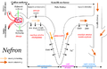 Diagram of the nephron (the main functional unit) of the human kidney, labeled in Polish and saved in PNG format

Article(s): Kidney
Request: Please redraw this diagram in SVG format, including English-language labels. Optionally, it could be made more visually appealing through the use of a more pleasing and professional color scheme. I do not speak Polish so someone who does will need to translate the labels, or alternately a biology subject-matter expert will need to be involved to create correct English-language labels without translation from Polish. Killdevil (talk) 20:40, 21 April 2008 (UTC)
Graphist opinion:
Northwest passage
Article(s): Northwest passage
Request: lighten image -- Chris (クリス • フィッチ) (talk) 04:01, 21 April 2008 (UTC)
Graphist opinion: I have uploaded a lighter version. I hope it is good enough. CountingPine (talk) 00:09, 10 May 2008 (UTC)
Order of the Rising Sun
-
 SVG - Correct?

Article(s): Order of the Rising Sun
Request: enlarge for detail, no reason for it to be so miniscule -- Chris (クリス • フィッチ) (talk) 05:07, 23 April 2008 (UTC)
Graphist opinion: I've had a go at this by converting to SVG. I couldn't find a better image on google to work from, so I made the assumption that there wasn't actually a cross in the center of the circle and that's just an unfortunate pixel effect from scaling it up. The SVG looks odd in comparison, but the "rays" are the same angles. If I'm wrong and it should be a cross or needs some other changes, then just let me know :) — ₪₪ ch1902 ₪₪ 17:49, 24 April 2008 (UTC)
- I have asked the original uploader to weigh in, and am seeking a physical picture now. Thank you so much, thus far! Chris (クリス • フィッチ) (talk) 20:57, 24 April 2008 (UTC)
- I do not have a physical photo of the rosette, but what I can attest, the SVG looks like a good start. User:Zscout370 (Return Fire) 03:27, 25 April 2008 (UTC)
- But as for the cross, it is intentional. Rosettes are made in a specific way. User:Zscout370 (Return Fire) 03:29, 25 April 2008 (UTC)
- I do not have a physical photo of the rosette, but what I can attest, the SVG looks like a good start. User:Zscout370 (Return Fire) 03:27, 25 April 2008 (UTC)
Blank maps
-
 roundy
 -
 rectangulary


Article(s): templates for others
Request: I have looked and I can't find any so could someone make these maps have no borders please. If they exist feel free to hit me with a wet fish. -- Mangwanani (talk) 16:46, 25 April 2008 (UTC)
Graphist opinion:
Coat of arms of the Federation of the West Indies
-
best one I could find, can anyone find better?
-
 flag from website, modified
 -
 the source site says "Blue", unless qualified, usually means the same blue as in a Blue Ensign.
 -
found the image, though I suspect it is really done in the orange and dark blue of the flag and the smaller image
-
 for the lion atop the shield
.svg)


Article(s): West Indies Federation
Request: create large usable coat of arms. Also please correct the flag, based on this link here http://www.crwflags.com/FOTW/FLAGS/gb-carib.html -- Chris (クリス • フィッチ) (talk) 00:28, 13 April 2008 (UTC)
Graphist opinion: Comment: The current flag matches the description "in the West Indies Gazette" (mentioned in the FOTW link you provided). Fvasconcellos (t·c) 01:34, 13 April 2008 (UTC)
- Actually, that link says "The official description given in the West Indies Gazette is "Flag approved has blue ground with four white horizontal wavy bars (the top pair of bars being parallel and the lower pair also parallel) and an orange sun in the centre." Not the most enlightening description. "Blue", unless qualified, usually means the same blue as in a Blue Ensign." (orange, not red) Chris (クリス • フィッチ) (talk) 01:45, 13 April 2008 (UTC)
- Wow—that looks distinctly orange to me (more precisely, tangerine). Do you know of a more official source for the image? I couldn't find any... Fvasconcellos (t·c) 14:49, 13 April 2008 (UTC)
- I've checked two monitors at different locations, it's coming through as red as that Guernsey shield below. If it is orange on yours, it needs to be lightened several shades at any rate. Chris (クリス • フィッチ) (talk) 15:54, 13 April 2008 (UTC)
- It's definitely orange, InkScape ran a color check and it's orange (RGBA:ff6600ff). Should it match the flag at the other link exactly, or just change the circle? I added a verson with the web colors. §hep • ¡Talk to me! 19:28, 13 April 2008 (UTC)
- Thank you so much, I appreciate your time! Could you make it the darker blue of the ensign above? Chris (クリス • フィッチ) (talk) 20:16, 13 April 2008 (UTC)
- Switched over the color. §hep • ¡Talk to me! 20:44, 13 April 2008 (UTC)
- Thank you so much for your hard work! Now to the coat of arms... Chris (クリス • フィッチ) (talk) 21:04, 13 April 2008 (UTC)
- Anything bigger to work off of? §hep • ¡Talk to me! 21:07, 13 April 2008 (UTC)
- When I google, I find Communication and Information Sector's Photobank - Watermark of ...Watermark of the Coat of Arms of the West Indies Federation ... Place: Federal Archives Centre, University of West Indies (UWI). Country: Barbados ...
portal.unesco.org/ci/photos/showphoto.php?photo=4626 - 21k and Communication and Information Sector's Photobank - Watermark of ...Watermark of the Coat of Arms of the West Indies Federation. View Smaller Image ... Place: Federal Archives Centre, University of West Indies (UWI) ... portal.unesco.org/ci/photos/showphoto.php/photo/4626/size/big - 21k but I can't get into either of them. Chris (クリス • フィッチ) (talk) 22:06, 13 April 2008 (UTC)
- Before anyone begin on the Coat of arms, please do not incorporate any material from files that came from Vector-images.com. These images have recently been deemed unfree on Commons where they're hosted after additional communication with the company that produced them. We'll only be able to keep files from them of insignia from countries where specific local laws expressly place insignia in the public domain. This is not the case for any of the files linked to above, so please use some other material for the new image. Any images containing code from vector-images.com will automatically be as unfree as the original image, and will have to be deleted again. Valentinian T / C 00:33, 26 April 2008 (UTC)
- does this really belong here, or on a talkpage somewhere? Chris (クリス • フィッチ) (talk) 00:49, 26 April 2008 (UTC)
- It probably belongs somewhere else as well, but creating a new image that will be deleted because it contains copyrighted material would be a waste of time, so just trying to avoid this situation. I just noticed that all three suggested components came from the same problematic source. Valentinian T / C 10:17, 26 April 2008 (UTC)
- does this really belong here, or on a talkpage somewhere? Chris (クリス • フィッチ) (talk) 00:49, 26 April 2008 (UTC)
decent SVG of the western hemisphere
-
 svg cropped from a projection of a world map (really skewed)
 -
 satellite image with a head-on view (much better)
 -
 Less skewed?


Article(s): many many articles could use a decent SVG of the western hemisphere. one example is Paraguay-United States relations
Request: :Another related request (not urgently needed but this reminded me of something I wanted earlier) - it would be fabulous to have an SVG of the Americas that wasn't super warped. Currently all the base maps of the Americas have this weird skew to them because they're cropped versions of world projections. It would be great if we could have a less distorted map of the Americas. Mangostar (talk) 00:56, 16 April 2008 (UTC) Surprisingly, all the maps of the western hemisphere are horribly skewed. I'm not even really sure where to look to find a decent projection to base a better SVG on (commons doesn't seem to have much). It would be wonderful if we could have a generic western hemisphere SVG for country labeling where it's unnecessary to have the rest of the world, marking the ranges of new world animals, etc. -- Mangostar (talk) 01:07, 16 April 2008 (UTC)
Graphist opinion:
- Rotated the "main" worldmap. This should give a less skewed basis for an Americas only map. I can clean out the other countries later on but exam revision will have to take priority. BTW why cant a "normal" map (such as Image:France Canada Locator.svg) be used for Paraguay-United States relations? /Lokal_Profil 02:39, 16 April 2008 (UTC)
- For that one it's fine because the countries are both very big, but for highlighting very small countries (say Central America or Caribbean) in other articles, when you include the entire world it's very hard to see where the relevant countries even are. Similarly, there are plenty of animals that are just in the western hemisphere, and again including the whole world makes it harder to see what's happening in the relevant part. Mangostar (talk) 15:02, 16 April 2008 (UTC)
- Just tell me the projection you would like and I can make one in about 2 minutes. By the way when you say skewed it is in fact a deliberate choice to try and preserve area rather than angles. You can see different map projections at Map projection Jackaranga (talk) 12:18, 16 April 2008 (UTC)
- That new map made by Lokal is actually really great. (I guess s/he understood from my garbled request that the projection as such wasn't wrong, just where the projection was centered.) A couple little things: Is it possible to make it have the rounded edges-type projection similar to that at Image:BlankMap-World6.svg so that polar stuff isn't so huge? And could someone crop it so you can only see western hemisphere countries? (Sadly/embarrassingly, I have never figured out what I need to do to crop things in Inkscape....) Mangostar (talk) 15:02, 16 April 2008 (UTC)
- It's not possible to have it with the round edges since that "skews" the continents similar to the first image. I can remove the antarctic and "hide" the non-Americas countries but I don't have time to properly remove them (whilst preserving the ISO tag structure) until after exams. /Lokal_Profil 19:44, 16 April 2008 (UTC)
- There, done (once the uploading stops complaining). The only difference between hiding and removing the other countries is the filesize (currently a whopping 3,5MB). I take it it's ok if Iceland is part of the map. /Lokal_Profil 19:56, 16 April 2008 (UTC)
- Thanks for all your help. Maybe later you could consider the rounder projection? I don't think the "skew" would be very bad, because the problem with the original map is that the Americas are all on one side. I guess what I mean is the on the original world map the longitude lines are like <<||>> and when you chop of the non-America part you're left with <<, so it is curved in a strange crescent way. If the Americas were centered, you would get the straighter || part (or really like <> but less severe). Do you understand what I'm getting at?
- File size has now been reduced to a quarter of the original (now ~600kB). I get what you mean but the rounder projection will always be skewed due to the large regions close to the pole (Alaska, Canada, Greenland). Personaly I think this map should prove easier to work with. /Lokal_Profil 18:27, 27 April 2008 (UTC)
- Thanks for all your help. Maybe later you could consider the rounder projection? I don't think the "skew" would be very bad, because the problem with the original map is that the Americas are all on one side. I guess what I mean is the on the original world map the longitude lines are like <<||>> and when you chop of the non-America part you're left with <<, so it is curved in a strange crescent way. If the Americas were centered, you would get the straighter || part (or really like <> but less severe). Do you understand what I'm getting at?
- There, done (once the uploading stops complaining). The only difference between hiding and removing the other countries is the filesize (currently a whopping 3,5MB). I take it it's ok if Iceland is part of the map. /Lokal_Profil 19:56, 16 April 2008 (UTC)
- It's not possible to have it with the round edges since that "skews" the continents similar to the first image. I can remove the antarctic and "hide" the non-Americas countries but I don't have time to properly remove them (whilst preserving the ISO tag structure) until after exams. /Lokal_Profil 19:44, 16 April 2008 (UTC)
- That new map made by Lokal is actually really great. (I guess s/he understood from my garbled request that the projection as such wasn't wrong, just where the projection was centered.) A couple little things: Is it possible to make it have the rounded edges-type projection similar to that at Image:BlankMap-World6.svg so that polar stuff isn't so huge? And could someone crop it so you can only see western hemisphere countries? (Sadly/embarrassingly, I have never figured out what I need to do to crop things in Inkscape....) Mangostar (talk) 15:02, 16 April 2008 (UTC)
UTA TRAX system map
-
 Image in question

Article(s): UTA TRAX
Request: I'm not sure if this qualifies for this page, but with the extension of the northern part of the lines this map needs to be updated. The Delta Center station is now the Arena station, and three new stations have been added at the north end of the Sandy/Salt Lake line and University line. If you need a source for the map, find it here: [1] There was a better image but it seems it's been pulled down. Thanks - CountyLemonade (talk) 04:28, 23 April 2008 (UTC)
- Also, with the linked map, the "hub" by the intersection of 600 West and 200 South is the third new station, the Central station. Thanks - CountyLemonade (talk) 04:14, 24 April 2008 (UTC)
Ignore the above link given, here's a much better pdf: [2] CL — 16:42, 27 April 2008 (UTC) Graphist opinion:
Crest of Hyrule from JPG to SVG
-
Crest of Hyrule
Article(s): The Legend of Zelda (series)
Request: I would just like this image in SVG, making it look exactly if not very similar to that JPG, as it's a very simple design.--24.109.218.172 (talk) 15:22, 18 April 2008 (UTC)
Graphist opinion: Actually, I just did it myself. I converted it to a SVG in Inkscape. It can be found at Image:Crest of Hyrule.svg.--Suit777 (talk) 15:39, 18 April 2008 (UTC)
- Why is it so... yellow? Shoemaker's Holiday (talk) 15:55, 18 April 2008 (UTC)
- Things in the Zelda universe are always yellow. Look at Image:Triforce.svg for example. I can upload it in black though I guess, though this image is really supposed to be yellow. There, I've created a black version: Image:Crest of Hyrule black.svg.--Suit777 (talk) 16:16, 18 April 2008 (UTC)
- Now I haven't played a Zelda game in a while, but I from what I remember it was more of a gold than a yellow.--Dycedarg ж 03:51, 21 April 2008 (UTC)
- Resolved? Mangwanani (talk) 16:53, 29 April 2008 (UTC)
- Now I haven't played a Zelda game in a while, but I from what I remember it was more of a gold than a yellow.--Dycedarg ж 03:51, 21 April 2008 (UTC)
- Things in the Zelda universe are always yellow. Look at Image:Triforce.svg for example. I can upload it in black though I guess, though this image is really supposed to be yellow. There, I've created a black version: Image:Crest of Hyrule black.svg.--Suit777 (talk) 16:16, 18 April 2008 (UTC)
| PNG | |||||||||||||||||||||||
 |
 |
||||||||||||||||||||||
| SVG | |||||||||||||||||||||||
Article(s): Phaistos Disc
Request: SVG versions of the various Phaistos Disc characters. -- Ptcamn (talk) 12:08, 24 April 2008 (UTC)
- I left off the stroke mark (Image:Phaistos glyph 46.png). This one still needs to be SVGified. --Ptcamn (talk) 07:29, 25 April 2008 (UTC)
Graphist opinion: I've got all 45 as SVG images from an extended unicode font and am uploading them now, it'll just take a while to do 45 manually and check they are correct! — ₪₪ ch1902 ₪₪ 17:38, 24 April 2008 (UTC)
- Some of them are being clipped at the edge, I'll sort those out as soon as I can. — ₪₪ ch1902 ₪₪ 18:32, 24 April 2008 (UTC)
- Hey, I know those first three guys! ;) Chris (クリス • フィッチ) (talk) 04:23, 25 April 2008 (UTC)
- I think we're gonna need a bot to add the {{vva}} tag to all the raster images. Mangwanani (talk) 15:40, 25 April 2008 (UTC)
- A lot of the SVGs are cut off. 3 (right side) 7 (bottom) 8 (right) 12 (bottom) 15 (bottom) 23 (right) 25, 26 & 28 (bottom) 34 (right) 38 (bottom AND right), 40 (right), 45 (right) Shoemaker's Holiday (talk) 17:33, 26 April 2008 (UTC)
- I think we're gonna need a bot to add the {{vva}} tag to all the raster images. Mangwanani (talk) 15:40, 25 April 2008 (UTC)
- Hey, I know those first three guys! ;) Chris (クリス • フィッチ) (talk) 04:23, 25 April 2008 (UTC)
23 and 28 are especially bad. Shoemaker's Holiday (talk) 17:39, 26 April 2008 (UTC)
- They render fine in Firefox, it looks like MW's ImageMagick rendering again... Time3000 (talk) 12:38, 27 April 2008 (UTC)
- It looks like there are fractional values for the "width" and "height" attributes near the top of the SVG file. Those seem to cause problems with MW's renderer. I usually just round those up to the nearest full integer value (unless it's like .004 or something, then round down). You can probably just put in the pixel sizes which come out anyways. When I do that, MW's renderer seems to work just fine. Carl Lindberg (talk) 02:22, 28 April 2008 (UTC)
Rangoon coat of arms
Article(s): Yangon
Request: SVGify -- Chris (クリス • フィッチ) (talk) 03:59, 25 April 2008 (UTC)
Graphist opinion: This is going to be physically impossible without a higher quality version (or someone that knows the CoA). James1293 (talk) 21:48, 29 April 2008 (UTC)
Madan Mohan Malaviya
Article(s): Madan Mohan Malaviya
Request: rotate to straight -- Chris (クリス • フィッチ) (talk) 21:02, 29 April 2008 (UTC)
Graphist opinion:
DPRK's coat of arms
-
I kinda started on it a while ago
Article(s): Lots of articles
Request: SVG the coa of North Korea please. Thanks --SelfQ (talk) 13:25, 15 April 2008 (UTC)
Graphist opinion:
- I gave it a stab months ago, just gave up. User:Zscout370 (Return Fire) 03:00, 30 April 2008 (UTC)
Norman Rockwell

Article(s): Norman Rockwell
Request: remove some glue staining around face -- Chris (クリス • フィッチ) (talk) 01:55, 1 May 2008 (UTC)
Graphist opinion:
Request: Hello, it's map, please :
Graphist opinion: So you want this to be made into a vector and uploaded to Wikipedia for the Pêra Rocha article? James1293 (talk) 19:47, 30 April 2008 (UTC)
- For english and portuguese article, a map of production , please , Cancelos (talk) 20:44, 1 May 2008 (UTC)
Burma flag
.svg)
Article(s): Burma
Request: SVGify -- Chris (クリス • フィッチ) (talk) 21:02, 29 April 2008 (UTC)
Graphist opinion: I had a go at it, I used the other Burma peacock, if it should be blue instead of green let me know. On a side note I hope something is up with the ImageMagic stuff, because all of the SVGs I see are really jagged. §hep • ¡Talk to me! 22:47, 29 April 2008 (UTC)
- I think it is supposed to be slightly bluer, but that is splendid thus far! It seems every new government changed the color. Chris (クリス • フィッチ) (talk) 05:04, 30 April 2008 (UTC)
- Sorry, the peackock or the flag itself? I set the background so it's pretty much the same, peacock need bluer as well? §hep • ¡Talk to me! 19:49, 30 April 2008 (UTC)
- Sould the blue from the Ensign not match the blue from the Union Jack like this: thumb|Blue Ensign
- --SelfQ (talk) 22:04, 30 April 2008 (UTC)
- That's what I had originally. I don't have a clue. If it is it's easy to revert. §hep • ¡Talk to me! 23:31, 30 April 2008 (UTC)
- Sorry, the peackock or the flag itself? I set the background so it's pretty much the same, peacock need bluer as well? §hep • ¡Talk to me! 19:49, 30 April 2008 (UTC)
- The peacock should be blue instead of green, is what I meant, sorry for being unclear. Chris (クリス • フィッチ) (talk) 01:32, 1 May 2008 (UTC)
- IMO the coloring didn't come out great. I left the original underneath the blue one if anyone else wants to crack at it. §hep • ¡Talk to me! 20:15, 1 May 2008 (UTC)
Flag of Anna-Paulowna
-
 Flag of Anna-Paulowna

Article(s): Anna Paulowna
Request: SVG please. -- SelfQ (talk) 21:58, 1 May 2008 (UTC)
Graphist opinion:
scale poorly, SVGify
Article(s): several
Request: all scale poorly, SVGify -- Chris (クリス • フィッチ) (talk) 00:24, 2 May 2008 (UTC)
Graphist opinion:
Scout Association of Japan
Article(s): Scout Association of Japan
Request: put on regular Wiki-style white or clear background, lighten for detail -- Chris (クリス • フィッチ) (talk) 00:24, 2 May 2008 (UTC)
Graphist opinion: I think a whole new image would be the best option. Mangwanani (talk) 16:08, 2 May 2008 (UTC)
- Agreed, but failing that... Chris (クリス • フィッチ) (talk) 04:30, 3 May 2008 (UTC)
- Please someone try anyway. Chris (クリス • フィッチ) (talk) 01:25, 19 May 2008 (UTC)
Oil palm

Article(s): Oil Palm
Request: carefully fix minor halftoning [this is at 400 dpi, and I think all that's needed is a slight blur, and maybe a sharpen after.], fix edges. These are the natural colours, I believe, except maybe that funny pink in the title at the top. Shoemaker's Holiday (talk) 15:48, 19 April 2008 (UTC)
- I'll get this with a Fourier transform as soon as I can (it preserves a bit more high frequency than a blur). Time3000 (talk) 16:55, 20 April 2008 (UTC)
Pikachu
Article(s): Pikachu
Request: This SVG image is derived from a CDR file, which can be found here. Because I thought it would look good in the article, I reverted it to SVG. I also reduced the size of it, which seem to have caused quiet an aliasing problem. As you can see in the file history, Tkgd2007 already tried to fix it, but unfortunately it didn't work, so I reverted. Is there anyone who can fix this aliasing? Preferably, the picture should look exactly like the CDR image. -- Face 21:23, 4 May 2008 (UTC)
Graphist opinion:
Just for the record, Tkgd2007 has commented on this issue here. - Face 21:54, 4 May 2008 (UTC)
- This happens when high-resolution (or SVG) images get scaled down, perhaps it could be fixed with a lower resolution PNG -- CD 10:16, 7 May 2008 (UTC)
Resolved
Africa
-
SVG world
Article(s): Template for many uses
Request: Could someone crop this image so that only Africa is in the image. I'd like to keep all the other data such as the country IDs etc. that are already in this image. I'd just like it to be more focussed on Africa. Thanks-- Mangwanani (talk) 16:24, 22 April 2008 (UTC)
Graphist opinion:I created two versions, one cropped and one with Africa only -- Cradel 19:57, 22 April 2008 (UTC)
-
Cropped map
-
Africa only (transparent background)
-
Africa only (white background)
- Ehhh.., the image below already existed before this request...Was there something different that you wanted? /Lokal_Profil 20:04, 22 April 2008 (UTC)
-
 Transparent background and countries named by isocode (both css classes and id) for easy derivatives.

- Typical, you spend hours searching for something and then someone else comes along and finds it straight away. I was looking on Wikipedia:Blank maps for the image and it wasn't there and looked elsewhere and presumed this was one image not on the wiki. :( The border lines aren't as clear in Cradel's versions although this is something I have noticed happen when you try to alter the images sometimes. Thanks anyway for the help. Mangwanani (talk) 08:29, 24 April 2008 (UTC)
- A general tip is if you are looking for images then search Commons first in this case Commons:Category:Blank maps of Africa =) /Lokal_Profil 18:34, 27 April 2008 (UTC)
- Typical, you spend hours searching for something and then someone else comes along and finds it straight away. I was looking on Wikipedia:Blank maps for the image and it wasn't there and looked elsewhere and presumed this was one image not on the wiki. :( The border lines aren't as clear in Cradel's versions although this is something I have noticed happen when you try to alter the images sometimes. Thanks anyway for the help. Mangwanani (talk) 08:29, 24 April 2008 (UTC)
Hyrcania
.
-

-
and...
-


Article(s): Hyrcania
Request: put on standard Wiki-style map -- Chris (クリス • フィッチ) (talk) 06:53, 26 April 2008 (UTC)
Graphist opinion:That means change the abvs. to "Iran" and "Turkmenistan" I guess? --ANONYMOUSPUSSY 16:45, 26 April 2008 (UTC)
- Yeah, and land grey, and water white, and maybe don't label the countries at all as it could be used by several different Wikis, and... Chris (クリス • フィッチ) (talk) 16:53, 26 April 2008 (UTC)
- Much warmer, maybe something could be trimmed from Image:BlankAsia.png ? Chris (クリス • フィッチ) (talk) 17:29, 26 April 2008 (UTC)
- Now it's perfect, please overwrite the original, and thank you! Chris (クリス • フィッチ) (talk) 21:20, 27 April 2008 (UTC)
- Thank you sir! You're a good kind man, and people will write songs about you! Chris (クリス • フィッチ) (talk) 21:13, 28 April 2008 (UTC)
Jake DeShazer
.

Article(s): Jacob DeShazer
Request: undo strange striping across his face -- Chris (クリス • フィッチ) (talk) 06:53, 26 April 2008 (UTC)
Graphist opinion:Here you go, I've overwritten the existing file (You may need to purge your browsers cache) -- Cradel 16:19, 28 April 2008 (UTC)
- Bueno, that's much better, thank you! Chris (クリス • フィッチ) (talk) 21:11, 28 April 2008 (UTC)
Tifinagh
.


Article(s): Tifinagh, to be used for the Berber WikiProject
Request: fix for perspective, maybe using http://hugin.sourceforge.net/tutorials/perspective/en.shtml , put on regular Wiki-style white or clear background -- Chris (クリス • フィッチ) (talk) 05:02, 27 April 2008 (UTC)
Graphist opinion: Would an SVG be better? Given the content of the image (not to mention its quality), it would be simple to create and possibly more effective. Time3000 (talk) 09:07, 27 April 2008 (UTC)
- If you could, please! Chris (クリス • フィッチ) (talk) 16:26, 27 April 2008 (UTC)
- That is beautiful, and thank you! Speaking of real Berber, how do we kick the tires and make the project roll? Chris (クリス • フィッチ) (talk) 21:22, 27 April 2008 (UTC)
- Oh, there are of course many ways... For example here on GL, like looking for a better image to show on Berber people article (the previous one was better, but still not "goody good") or making better maps to show where Berbers live, for this article too and on Berber languages etc... --ANONYMOUSPUSSY 17:13, 28 April 2008 (UTC)
US Route 5 sign
-
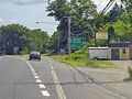 Signage at the southern split between U.S. Route 5 and Connecticut Route 15

Article(s): U.S. Route 5 in Connecticut
Request: Photo was taken from inside a car. Would it be possible to remove the effect of the windshield and also to enhance the contrast and sharpness? --Polaron | Talk 18:55, 9 April 2008 (UTC)
Graphist opinion:
Oh, and you could crop off the lower part of the picture to remove the "windshield effect"... —Preceding unsigned comment added by 68.101.123.219 (talk) 03:51, 10 April 2008 (UTC)
I did a quick contrast increase but there's still the irregularity in the bottom-right corner. Time3000 (talk) 15:59, 10 April 2008 (UTC)
- Request done... Hope you like!! XcepticZP (talk) 18:13, 11 April 2008 (UTC)
- Is this now markable as complete? Chris (クリス • フィッチ) (talk) 20:46, 16 April 2008 (UTC)
London Midland Rail Network Map
-
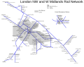 Map of the London Midland railway network.

Article(s): Go-Ahead Group, Keolis, Govia, London Midland.
Request: -- Could some of the errors in this map be corrected please? I've only taken a brief look, but there are several spelling mistakes in the station names, e.g. Blakedown, not Blakedowh; Canley, not Oanley; Barnt Green not Banrt Green; some stations are incorrectly named e.g. Five Ways not "Five Flags"; just "Olton" not "Olton Green"; and some stations are missing altogether, e.g. Sutton Coldfield which should be located between Wylde Green and Four Oaks. Also the railway junction between Dorridge and Lapworth is drawn wrongly. Thanks DWaterson (talk) 00:57, 11 April 2008 (UTC)
Graphist opinion: I have fixed the spellings and names mentioned. Havn't fixed anything else though. Mangwanani (talk) 18:11, 11 April 2008 (UTC)
- I've put in Sutton Coldfield, but I couldn't find Dorridge or Lapworth (!). Time3000 (talk) 10:57, 15 April 2008 (UTC)
Request: -- In the top left: Runcon should be Runcorn. Top centre: Lichfield to Litchfield (both for L. City and L. Trent Valley), Tarnworth to Tamworth. Centre: Stechford to Stetchford. On lines heading south-west from centre: KingsNorton to Kings Norton [space needed]; Bromsglove to Bromsgrove. On the Moor St to Leamington line (centre, heading SE): Acock Green to Acocks Green. —Preceding unsigned comment added by 82.47.220.52 (talk) 20:07, 28 April 2008 (UTC)
 Done. Fvasconcellos (t·c) 20:40, 28 April 2008 (UTC)
2008 protests in Serbia
.

Article(s): 2008 protests in Serbia
Request: lighten for detail -- Chris (クリス • フィッチ) (talk) 21:28, 28 April 2008 (UTC)
Graphist opinion:I've overwritten the existing file -- Cradel 12:59, 29 April 2008 (UTC)
- Much better, thank you! Chris (クリス • フィッチ) (talk) 15:04, 29 April 2008 (UTC)
The Sega Project Logo
-
The logo of Wikipedia:WikiProject Sega
Article(s): Template:Segaproject, Template:Segabox2, and various other uses around the project
Request: I would like to see this image converted to a .svg and have a darker border around the logo. As it stands right now, there's hardly any border to it, it's more like a blend. To whoever uploads this fixed image: you can upload it over Image:Hereimage.svg . The logo itself is in the public domain, so there's no need to worry about copyright. Red Phoenix flame of life...protector of all... 15:56, 29 April 2008 (UTC)
Graphist opinion:It looks like there has been a problem your uploaded svg version, but I uploaded Hereimage.svg (right) anyway,-- Cradel 16:48, 29 April 2008 (UTC)
- Comment Yeah, that would be because I suck at Inkscape. Thanks for the fix, after I verify it with the project I'll mark this one off. Red Phoenix flame of life...protector of all... 19:36, 29 April 2008 (UTC)
- Yep, it works. Thanks. Red Phoenix flame of life...protector of all... 23:05, 29 April 2008 (UTC)
Maynard James Keenan
.
-
 MJK at Roskilde festival 2006.
 -
Darkened background a bit.

Article(s): Maynard James Keenan, Scientology in popular culture
Request: -- east718 says that this image has given him PTSD and that he now suffers chronic headaches just from thoughts of the image. Therefore, with his health as the specific concern, the background is in need of muting a bit, if possible. Lara❤Love 13:56, 14 April 2008 (UTC)
Graphist opinion:
My eyes! My eyes!!!!!!!!!!11!!! (Sorry—actually improving this is out of my league, but I just had to do that.) Fvasconcellos (t·c) 14:27, 14 April 2008 (UTC)
- Not sure it's worth it. Image:Maynard James Keenan Roskilde 1.jpg is better. These photos all turned out a lot better then those I took at the same concert. /Lokal_Profil 21:24, 14 April 2008 (UTC)
President of Afghanistan
.
-
 automatically traced SVG version

Article(s): President of Afghanistan, dozens of others
Request: SVGify -- Chris (クリス • フィッチ) (talk) 07:30, 20 April 2008 (UTC)
Graphist opinion:Here is the automatically traced SVG version, looks like the symbol will need to be cleaned -- Cradel 20:27, 22 April 2008 (UTC)
- Very cool! How do you do the autotracing? Chris (クリス • フィッチ) (talk) 20:56, 22 April 2008 (UTC)
- In Inkscape its Path --> Trace bitmap or alternatively Shift+Alt+B Mangwanani (talk) 08:33, 24 April 2008 (UTC)
- I guess this is done since the original was deleted. Chris (クリス • フィッチ) (talk) 04:48, 30 April 2008 (UTC)
Paneriai monument


Article(s): Ponary massacre
Request: the photo is too dark to see the details. Could someone help? Renata (talk) 19:46, 25 April 2008 (UTC)
Graphist opinion:
Hey! One I can do! How's this? Shoemaker's Holiday (talk) 02:07, 26 April 2008 (UTC)
- Nice. Certainly much nicer than anything I tried :) Is there a way to lighten up only the bottom part of the pic? Like where the plaques are? If not, than it's good. Renata (talk) 00:59, 27 April 2008 (UTC)
- It's possible but it starts to look pretty artificial, the noise levels start becoming an issue, and it loses any solemn mood. I've uploaded a 2b to show about what that would look like. I'd use 2a, however. Shoemaker's Holiday (talk) 05:52, 27 April 2008 (UTC)
- Well, I like 2b... :) At least in thumb size you can see where the monument is and where the trees are. But I just noticed that the tree tops look like covered in snow in both 2a and 2b... Oh, well, I guess it's just a bad pic and somebody will have to go there and get a new one :) Renata (talk) 19:18, 27 April 2008 (UTC)
- Sorry. =) Shoemaker's Holiday (talk) 10:56, 28 April 2008 (UTC)
- Well, I like 2b... :) At least in thumb size you can see where the monument is and where the trees are. But I just noticed that the tree tops look like covered in snow in both 2a and 2b... Oh, well, I guess it's just a bad pic and somebody will have to go there and get a new one :) Renata (talk) 19:18, 27 April 2008 (UTC)
- It's possible but it starts to look pretty artificial, the noise levels start becoming an issue, and it loses any solemn mood. I've uploaded a 2b to show about what that would look like. I'd use 2a, however. Shoemaker's Holiday (talk) 05:52, 27 April 2008 (UTC)
photo doctor
.

Article(s): Cigarette holder
Request: replace glaring orange filter with white, remove partial advert from just below that -- Chris (クリス • フィッチ) (talk) 05:38, 28 April 2008 (UTC)
Graphist opinion:
- Turn this object to make it vertical may be a good idea. 140.122.97.172 (talk) 10:36, 28 April 2008 (UTC)
- Explain? Chris (クリス • フィッチ) (talk) 13:55, 28 April 2008 (UTC)
- This clean up is easy, but this little stick take a lot of space. Turn it of 60• will put it vertically, allowing us to display it, in article, as a [20px large x 150px hight] picture. 140.122.97.172 16:42, 28 April 2008 (UTC) —Preceding unsigned comment added by 220.135.4.212 (talk)
- Explain? Chris (クリス • フィッチ) (talk) 13:55, 28 April 2008 (UTC)
- Let's worry about the other cleanups first, and then see. Chris (クリス • フィッチ) (talk) 21:09, 28 April 2008 (UTC)
Is this what you wanted (I didn't rotate it though) -- Cradel 21:32, 28 April 2008 (UTC)
- That's perfect, that's all that I wanted, would you please overwrite the original? Thank you! Chris (クリス • フィッチ) (talk) 01:03, 29 April 2008 (UTC)
- Umm... the original image is used on several pages and projects — are you sure they all prefer the edited version? —Ilmari Karonen (talk) 01:29, 29 April 2008 (UTC)
- That's perfect, that's all that I wanted, would you please overwrite the original? Thank you! Chris (クリス • フィッチ) (talk) 01:03, 29 April 2008 (UTC)
- Point well taken-I just thought it was a good idea to get the advert out. Chris (クリス • フィッチ) (talk) 15:02, 29 April 2008 (UTC)
- Would it not then wash out the central subject? Chris (クリス • フィッチ) (talk) 16:27, 1 May 2008 (UTC)
Whites in Zimbabwe
.
Article(s): Whites in Zimbabwe
Request: I don't know, it just seems to me this could be improved somehow -- Chris (クリス • フィッチ) (talk) 21:28, 28 April 2008 (UTC)
- Agree - looks like there are water droplets which could be removed and also the whole image could be sharpened and possibly a noise reduction. Mangwanani (talk) 16:49, 29 April 2008 (UTC)
Graphist opinion:I gave it a try, I know it isn't perfect but it might work -- Cradel 18:04, 29 April 2008 (UTC)
- The colours look more Zimbabwe... Mangwanani (talk) 19:54, 29 April 2008 (UTC)
- Perfect, thanks, just what is needed, should we overwrite? Chris (クリス • フィッチ) (talk) 20:49, 29 April 2008 (UTC)
- Yes, of course. When the work is clearly an improvement : overwrite. 220.135.4.212 (talk) 13:41, 1 May 2008 (UTC)
SVG the flag of Seborga
Article(s): Principality of Seborga and others
Request: SVG please --SelfQ (talk) 16:35, 29 April 2008 (UTC)
Graphist opinion:Here you go -- Cradel 17:05, 29 April 2008 (UTC)
- Could you remove the black box, its not suppose to be there.--SelfQ (talk) 18:11, 29 April 2008 (UTC)
- I think he means the outer border. Perhaps a grey separation would be better. Chris (クリス • フィッチ) (talk) 05:02, 30 April 2008 (UTC)
- Yup, thats what I was going for, it has a black border around it now, and thats not suppose to be there. --SelfQ (talk) 11:37, 30 April 2008 (UTC)
- This is just a suggestion, it might be better to compose the flag from existing SVG elements rather than (what looks like) a trace of the raster. For example you could use a crown from SVG coat of arms elements and there are many similar shield shapes on other Italian coats of arms. There isn't an exact match for the crown, but a similar one is used on the Savoia COA, I don't know how much give there is in interpretation for COA... — ₪₪ ch1902 ₪₪ 13:44, 30 April 2008 (UTC)
- Yup, thats what I was going for, it has a black border around it now, and thats not suppose to be there. --SelfQ (talk) 11:37, 30 April 2008 (UTC)
- I think it's alot. You can probably swipe the crown from the Spanish flag, and the coat proper is pretty easy to draw (Except maybe for the point). 68.39.174.238 (talk) 14:23, 30 April 2008 (UTC)
- I accualy believe that the crown of italy and the one on the flag could atleased be based on one and the same.--SelfQ (talk) 14:49, 30 April 2008 (UTC)
- Is this one OK -- Cradel 20:08, 30 April 2008 (UTC)
- Its beter, but while the black edge around the flag is gone, now thers a black edge around the 9 horizontal and single vertical stripes. also the shield seems abit to rounded, atleast the top part sould be at a 90° angle.--SelfQ (talk) 21:32, 30 April 2008 (UTC)
- What about now ?-- Cradel 21:48, 30 April 2008 (UTC)
- Evenout the left edge of the shield so it matches the one on the right and I would say perfect.--SelfQ (talk) 21:57, 30 April 2008 (UTC)
- What about now ?-- Cradel 21:48, 30 April 2008 (UTC)
- Its beter, but while the black edge around the flag is gone, now thers a black edge around the 9 horizontal and single vertical stripes. also the shield seems abit to rounded, atleast the top part sould be at a 90° angle.--SelfQ (talk) 21:32, 30 April 2008 (UTC)
- Is this one OK -- Cradel 20:08, 30 April 2008 (UTC)
- I accualy believe that the crown of italy and the one on the flag could atleased be based on one and the same.--SelfQ (talk) 14:49, 30 April 2008 (UTC)
- I think it's alot. You can probably swipe the crown from the Spanish flag, and the coat proper is pretty easy to draw (Except maybe for the point). 68.39.174.238 (talk) 14:23, 30 April 2008 (UTC)
Ukrainian Sich Riflemen
.


Article(s): Ukrainian Sich Riflemen
Request: put on regular Wiki-style white or clear background -- Chris (クリス • フィッチ) (talk) 21:02, 29 April 2008 (UTC)
Graphist opinion:In oreder to make the background transparent i uploaded a PNG version, I also reduced the file size because it was like 1.5MB, I made a 800x906px file -- Cradel 09:47, 30 April 2008 (UTC)
- There's some residual background on the right side, both top and bottom, if you could get that out, that'd be great. Chris (クリス • フィッチ) (talk) 01:36, 1 May 2008 (UTC)
- Splendid, thanks! You may want to fix the licensing, or I can. Chris (クリス • フィッチ) (talk) 23:45, 1 May 2008 (UTC)
Fédération Indochinoise des Associations du Scoutisme
.
Article(s): Fédération Indochinoise des Associations du Scoutisme
Request: rotate to straight and trim a little -- Chris (クリス • フィッチ) (talk) 00:38, 24 March 2008 (UTC)
Graphist opinion:
- Anyone? Anyone? Please? Chris (クリス • フィッチ) (talk) 01:04, 15 April 2008 (UTC)
- I believe that would constitute a derivative work :( Fvasconcellos (t·c) 01:08, 15 April 2008 (UTC)
- By rotating maybe two degrees clockwise and cropping? How is that derivative? You guys straighten images all the time! Chris (クリス • フィッチ) (talk) 02:52, 15 April 2008 (UTC)
- That's what I am asking for, please do so. Chris (クリス • フィッチ) (talk) 22:37, 19 April 2008 (UTC)
I have rotated the picture upright and improved the colour depth, but I can't find a sensible way to trim it without losing info. If you just want the logo, I could trace that in inkscape for you, though. --Slashme (talk) 08:16, 2 May 2008 (UTC)
- Thank you, that's what was needed, except maybe trim the dark edge on the right side. Chris (クリス • フィッチ) (talk) 14:21, 2 May 2008 (UTC)
Japanese martyrs
.
Article(s): Twenty-six Martyrs of Japan
Request: lighten for detail -- Chris (クリス • フィッチ) (talk) 00:24, 2 May 2008 (UTC)
Graphist opinion:I've overwritten the file -- CD 11:18, 2 May 2008 (UTC)
- Very good, thank you so much! Chris (クリス • フィッチ) (talk) 14:25, 2 May 2008 (UTC)
Ordre national du Mérite
Article(s): Ordre national du Mérite
Request: put on regular Wiki-style white or clear background -- Chris (クリス • フィッチ) (talk) 05:02, 27 April 2008 (UTC)
Graphist opinion:
- The image look a lot like a copyvio so I'm not sure an improvement is possible. /Lokal_Profil 13:14, 2 May 2008 (UTC)
Fire classes logos
Please create a svg file for each of the fire classes logos present in the following image :
-
 Class A
 -
 Class B
 -
 Class C
 -
 Class C #2
 -
 Class D
 -
 Class K - I am unhappy with the pan


Article(s): to improve the tab on the page Fire classes. We have also logo in svg on the french wikipedia... see here
Request: -- Gdgourou (talk) 17:47, 20 April 2008 (UTC)
Graphist opinion:
- Done first one. Note that it is very hard to determine how the details should look like because of low resolution. Renata (talk) 19:29, 20 April 2008 (UTC)
- Looks quite good to me—these are standard on Brazilian fire extinguishers (though usually color coded), see e.g. here. I believe the "log" closest to the boards should be a rolled-up blanket or newsprint, etc. Fvasconcellos (t·c) 19:46, 20 April 2008 (UTC)
- Here's Class D (had to do the easy one, sorry :) Fvasconcellos (t·c) 20:02, 20 April 2008 (UTC)
- Playing the part of the devils advocate: How about the copyright for those original images? If they are copyrighted then any derivative image (sucha as the class A above) will also be copyrighted. /Lokal_Profil 20:45, 20 April 2008 (UTC)
- Here's Class D (had to do the easy one, sorry :) Fvasconcellos (t·c) 20:02, 20 April 2008 (UTC)
- Looks quite good to me—these are standard on Brazilian fire extinguishers (though usually color coded), see e.g. here. I believe the "log" closest to the boards should be a rolled-up blanket or newsprint, etc. Fvasconcellos (t·c) 19:46, 20 April 2008 (UTC)
- Ok, I am done. Unless someone can figure out a way to draw a better pan for Class K. Renata (talk) 20:59, 20 April 2008 (UTC)
- Wow, very nice work—welcome to the Lab! And all in the time it took me to draw one more :D Fvasconcellos (t·c) 21:06, 20 April 2008 (UTC)
Pennſylvanian state logo
68.39.174.238 (talk) 19:19, 7 May 2008 (UTC)
-
 Central shield and eagle crest from here.
 -
 Traced SVG
 -
 Updated. Redraw a lot of it, it's much sharper now. (Text and the bottom thing.)


Articels: Many, including Seal of Pennsylvania
Request: SVGify the seal 68.39.174.238 (talk) 00:14, 20 March 2008 (UTC)
Oppinion: How does that work? I wasn't sure how to incorporate the flag part (specific part wanted?), if there is I'll fix it. §tepshep • ¡Talk to me! 02:03, 20 March 2008 (UTC)
No, I use VectorMagic to edit the bitmap, then make it SVG, I pop it into InkScape and make it transparent. It takes all of 15 minutes to get right if anything gets truly messed up. §tepshep • ¡Talk to me! 17:45, 20 March 2008 (UTC)
- It seems to break down the detail though: For one, the ships rigging becomes sortof a blurred blob. 68.39.174.238 (talk) 03:08, 21 March 2008 (UTC)
- And what I meant with the flag was that the ship, plow and grain were already vectorized on the flag, just in a different shaped shield. Same with the eagle. 68.39.174.238 (talk) 03:09, 21 March 2008 (UTC)
Never said you had to use it, just thought I'd offer some help. No harm done? §tepshep • ¡Talk to me! 04:06, 21 March 2008 (UTC)
- Nono, it's fine. If the flag can't be used or noone else does, then your version is still good enough to be used in place of the raster'd seal. 68.39.174.238 (talk) 18:01, 21 March 2008 (UTC)
I've just updated it so the text and the bottom thing is much sharper. --Henrikb4 (talk) 14:46, 12 April 2008 (UTC)
- Nice; is there any way to get the elements off of the flag? They appear much sharper there... 68.39.174.238 (talk) 16:58, 12 April 2008 (UTC)
OK, I've taken the boat and plough from the flag. Let me know what you think. --Slashme (talk) 15:56, 2 May 2008 (UTC)
- And now I've sharpened stuff up somewhat. I think this is done now. --Slashme (talk) 09:59, 3 May 2008 (UTC)
- It's been so long I'm just glad to have it done and not "stale"'d. Someone can delete the traced version. 68.39.174.238 (talk) 19:19, 7 May 2008 (UTC)
TB in 2005
— Requester says it's good. 68.39.174.238 (talk) 19:15, 7 May 2008 (UTC)
-
 Tuberculosis in 2005
 -
 PNG by Sbw01f


Article(s): Tuberculosis
Request: A better one maybe. → Pepper / ? 20:34, 24 March 2008 (UTC)
- Question: What do the colors mean (IE. Where is the legend)? Also, to whoever takes this: Be very careful, this map is very defective in its borders... 68.39.174.238 (talk) 22:40, 24 March 2008 (UTC)
- The legend is in the image page, Anyway it's this: Cases per 100,000; Red = >300, orange = 200-300; yellow = 100-200; green 50-100 and grey <50. Data from WHO, 2006. [3]
- Yeah, I was filling in Image:BlankMap-World6.svg to export as a PNG and noticed some inconsistencies. For example the area between Pakistan and China, Yemen and above Bangladesh. If they are just meant to be different areas of the same country that's OK but I take the black lines to be borders, which makes no sense in those areas. — ₪₪ ch1902 ₪₪ 23:14, 24 March 2008 (UTC)
- I'd just go with the data and apply it to a blank map. That's what I did with Image:Polio worldwide 2005.png and its companion SVG; the original JPG had several inaccuracies, so I just used the WHO data. Fvasconcellos* (t·c) 02:14, 25 March 2008 (UTC)
- I thought of that too, but upon opening the spreadsheet there are a dozen sheets with different data and I have nooooo idea which sheet or which data it is. Nothing seems to stand out as "cases per 100,000" :-/ — ₪₪ ch1902 ₪₪ 13:40, 25 March 2008 (UTC)
- I see. Maybe 2006 data from the 27th page of this report (http://www.who.int/tb/publications/global_report/2008/pdf/report_without_annexes.pdf) is more useful. → Pepper / ? 15:09, 25 March 2008 (UTC)
- I thought of that too, but upon opening the spreadsheet there are a dozen sheets with different data and I have nooooo idea which sheet or which data it is. Nothing seems to stand out as "cases per 100,000" :-/ — ₪₪ ch1902 ₪₪ 13:40, 25 March 2008 (UTC)
- I'd just go with the data and apply it to a blank map. That's what I did with Image:Polio worldwide 2005.png and its companion SVG; the original JPG had several inaccuracies, so I just used the WHO data. Fvasconcellos* (t·c) 02:14, 25 March 2008 (UTC)
- Yeah, I was filling in Image:BlankMap-World6.svg to export as a PNG and noticed some inconsistencies. For example the area between Pakistan and China, Yemen and above Bangladesh. If they are just meant to be different areas of the same country that's OK but I take the black lines to be borders, which makes no sense in those areas. — ₪₪ ch1902 ₪₪ 23:14, 24 March 2008 (UTC)
Graphist opinion: It appears Sbw01f has produced a PNG from the WHO data—see above. Is this what you had in mind? Fvasconcellos (t·c) 01:12, 15 April 2008 (UTC)
- If the PNG is what was wanted I'll do the SVG for it. Mangwanani (talk) 15:35, 15 April 2008 (UTC)
That's all perfect. → Pepper / ? —Preceding unsigned comment added by PepperIT (talk • contribs) 14:43, 4 May 2008 (UTC)
Nobutaka Machimura


Article(s): Nobutaka Machimura
Request: lighten for detail -- Chris (クリス • フィッチ) (talk) 03:54, 18 April 2008 (UTC)
Graphist opinion: Done, saved as jpg (better for photos) --Slashme (talk) 10:17, 9 May 2008 (UTC)
Peterloo Massacre
-
 A map showing the contingents sent to the Peterloo Massacre. PNG format.
 -
 SVG
SVG


Article(s): Peterloo Massacre
Request: requires an SVG conversion. -- --Jza84 | Talk 21:39, 19 April 2008 (UTC)
Graphist opinion:
- I'll take this. Renata (talk) 21:48, 19 April 2008 (UTC)
- Ok, how's that? Renata (talk) 23:02, 19 April 2008 (UTC)
- Some of the placenames are obscured by the arrows. Any chance of reducing/re-aligning the text size to stop item conflict? --Jza84 | Talk 23:15, 19 April 2008 (UTC)
- Please note that Mediawiki doesn't support the arrowheads. You will have to convert them to paths. That should also fix som of the alignment issues. /Lokal_Profil 23:25, 19 April 2008 (UTC)
- Ghr, ok, fixed arrows. But I do give up re fonts. They just render so differently on my screen than on Commons... If anyone feels like playing with it... Renata (talk) 01:14, 20 April 2008 (UTC)
- Fonts are always problematic. Even though Mediawiki supports DejaVu Sans it still renders it differently from Incscape. A quick and dirty fix would be to convert te text to paths as well. The previous version in the history is always available if someone want's to fix the font issues. /Lokal_Profil 15:50, 20 April 2008 (UTC)
- Ghr, ok, fixed arrows. But I do give up re fonts. They just render so differently on my screen than on Commons... If anyone feels like playing with it... Renata (talk) 01:14, 20 April 2008 (UTC)
- Please note that Mediawiki doesn't support the arrowheads. You will have to convert them to paths. That should also fix som of the alignment issues. /Lokal_Profil 23:25, 19 April 2008 (UTC)
- Some of the placenames are obscured by the arrows. Any chance of reducing/re-aligning the text size to stop item conflict? --Jza84 | Talk 23:15, 19 April 2008 (UTC)
- Ok, how's that? Renata (talk) 23:02, 19 April 2008 (UTC)
Mitch Hedberg
— File was deleted for copyright concerns. 68.39.174.238 (talk) 16:17, 9 May 2008 (UTC)
Article(s): Mitch Hedberg
Request: lighten for detail -- Chris (クリス • フィッチ) (talk) 04:01, 21 April 2008 (UTC)
Graphist opinion: Can't find the image, is this a typo, or was the image removed? --Slashme (talk) 10:24, 9 May 2008 (UTC)
- "19:53, 28 April 2008 Angr (Talk | contribs) deleted "Image:Mitchhedbergbw.jpg" (I7: Invalid justification given for non-free image)" — I'm going to mark this resolved since we can't work on a nonexistent image. 68.39.174.238 (talk) 16:17, 9 May 2008 (UTC)
Spear of Lugh

Article(s): Spear of Lugh
Request: straighten and trim -- Chris (クリス • フィッチ) (talk) 04:18, 22 April 2008 (UTC)
Graphist opinion:Done. Saved as greyscale to reduce file size. --Slashme (talk) 10:50, 9 May 2008 (UTC)
Government Warehouse
Article(s): Government Warehouse
Request: lighten for detail -- Chris (クリス • フィッチ) (talk) 05:07, 23 April 2008 (UTC)
Graphist opinion: Done. --Slashme (talk) 11:13, 9 May 2008 (UTC)
Dominican coat
68.39.174.238 (talk) 16:10, 9 May 2008 (UTC)

Articels: Politics of the Dominican Republic and others
Request: Two: The blue on the tassel in the center should match the other blues, and the bible should have some writing on it in Spanish ("Y la verdad nos hará libres"). 68.39.174.238 (talk) 02:36, 8 May 2008 (UTC)
Oppinion: Like that? §hep • ¡Talk to me! 23:35, 8 May 2008 (UTC)
- Looks OK. I can't find any other examples of it with the words on the Bible, so I'm guessing that may be incorrect. 68.39.174.238 (talk) 16:10, 9 May 2008 (UTC)
View on Taiwan's Valley
- – 220.135.4.212 (talk) 07:06, 11 May 2008 (UTC)
 Resolved
-
 View on Taiwan's Valley

Article(s): Taiwan
Request: This image is really nice, but, sadly, we can notice 3 electric line on the sky. Make disapear this 3 lines would be great. Since it's a clear improvement, please upload the corected image up on the same image on commons (using the same file name). Many thanks. -- 220.135.4.212 (talk) 13:57, 27 April 2008 (UTC)
Graphist opinion: but the lines are realy there, would that not be distorting the true a bit? it would be like removing a scar from someones face to make there biography look beter, right?--SelfQ (talk) 14:50, 27 April 2008 (UTC)
- No, it's a matter of perspective, if the photo was taken from a slightly different angle, the lines wouldn't appear. Minor mods like this are done all the time by the GL. Chris (クリス • フィッチ) (talk) 16:29, 27 April 2008 (UTC)
- I still request the clean up : the electrical lines are out of topic in this picture of natural mountain. These 3 lines are Chart junk (polution), if the photograph wanted to take picture of human building, he probably just had to turn his camera to the right, to take picture of a village. user:220.135.4.212 —Preceding unsigned comment added by 140.122.97.172 (talk) 10:39, 28 April 2008 (UTC)
- Done. There is still somewhat of a smudge in the sky. To remove the last traces would take me quite a while, but I think the distraction of the big black electrical wires was the main problem, so I think we can probably mark this as resolved? --Slashme (talk) 11:35, 9 May 2008 (UTC)
- Yes, resolved ;) many thanks 220.135.4.212 (talk) 07:06, 11 May 2008 (UTC)
McCain


Article(s): John McCain
Request: Hi, the image with black background is a cropped version of the original, and the image with blue background is further revised by me. Is the revised image okay? It seems like bad composition to have a black jacket on a black background. Are there any policies that discourage us from changing the background in the official photo of a living person?
And here's a request: would you please see if you can do a better cut-out than I did, and also use a better background color than I used (the blue seems too bright and distracting)? Any other improvements would be welcome too. Thx.-- Ferrylodge (talk) 19:33, 4 May 2008 (UTC)
- A standard white background would probably be best for this image... Mangwanani (talk) 16:23, 5 May 2008 (UTC)
- Can the Graphic Lab please go ahead and install a white background, then?Ferrylodge (talk) 18:11, 5 May 2008 (UTC)
- I should think so. I'm waiting on new software and unless someone gets there before me I shall have a go... Mangwanani (talk) 18:37, 6 May 2008 (UTC)
- Thanks. And for whatever it may be worth, I think a lighter shade of blue would be better, because McCain has white hair which will blend into a white background. But a white background would be better than black.Ferrylodge (talk) 19:10, 6 May 2008 (UTC)
- Maybe you could duplicate the background from the Obama pic?Ferrylodge (talk) 21:09, 6 May 2008 (UTC)
- I should think so. I'm waiting on new software and unless someone gets there before me I shall have a go... Mangwanani (talk) 18:37, 6 May 2008 (UTC)
- Can the Graphic Lab please go ahead and install a white background, then?Ferrylodge (talk) 18:11, 5 May 2008 (UTC)
- A standard white background would probably be best for this image... Mangwanani (talk) 16:23, 5 May 2008 (UTC)
(undent)Looks like Andrew c's greenish background has been accepted at the John McCain article. Thanks again. Would Mangwanani (or Andrew c or someone else) mind revising the image above with blue background, because the cut-out I did is very rough and has left artifacts; this image with blue background would be nice for other purposes at Wikipedia (e.g. userboxes and other articles about the 2008 election campaign). Merci beaucoup.Ferrylodge (talk) 16:31, 11 May 2008 (UTC)
Graphist opinion:
- This is a relatively straightforward foreground crop. Check out the background edit version I've added to the gallery. The background was a number of gradients layered together, using the color pallet of the Obama background, in order to mimic that look. The Navy Blue background is a good try, but the crop could have been tighter, and the software produced JPG artifacts around the cropped area (which are visible even in the thumbnail). Hopefully my version is satisfactory. -Andrew c [talk] 16:30, 8 May 2008 (UTC)
- Thanks Andrew c. It looks good. The only remaining question I have is one of policy: is there any reason why a biography of a living person (BLP) should stick with the cropped original, instead of using the revised cropped original that you have produced?Ferrylodge (talk) 20:46, 8 May 2008 (UTC)
- Thanks again for your work on this Andrew c. Unfortunately, it appears that the article will continue to use the black on black photo.Ferrylodge (talk) 04:13, 9 May 2008 (UTC)
Bekaa Valley
-
 Picture of the Bekaa Valley

Article(s): Bekaa Valley
Request: Can someone downsample this? Thanks, SpencerT♦C 21:48, 30 April 2008 (UTC)
Graphist opinion: Done. Let me know if that's what you wanted. XcepticZP (talk) 00:09, 13 May 2008 (UTC)
Lloyd
-
Logo of Lloyd brand
-
How's this?
Article(s): Lloyd (car)
Request: Improve this very ugly logo of a long-dead car company and convert to the right image format (Possible source here : http://www.lloyd-freunde-ig.de/ ). Hektor (talk) 23:24, 9 May 2008 (UTC)
Graphist opinion: I'm on it. Vector will be up in a few days.--HereToHelp (talk to me) 01:52, 14 May 2008 (UTC)
- Note that this page suggests that the logo is red, black and white. /Lokal_Profil 04:00, 14 May 2008 (UTC)
- First attempt is up.--HereToHelp (talk to me) 20:59, 14 May 2008 (UTC)
- The base of the triangle should be slightly wider then the sides. Otherwise it looks good./Lokal_Profil 21:28, 14 May 2008 (UTC)
- Two comments:
- The triangle is equilateral, and it seems to me it should be an isosceles with an angle a little more open at top. In the outline of the triangle, the thin line should be a little closer to the thick one.
- Following comment by Lokal, could it be possible to have the vertical bars in red like in this brochure cover : http://www.lloyd-freunde-ig.de/images/Lloyd_Handbuch_g.jpg
- but this is really already great. The shape of the letters LLOYD is real good. Thanks a lot. Hektor (talk) 21:29, 14 May 2008 (UTC)
- How about now?--HereToHelp (talk to me) 22:18, 14 May 2008 (UTC)
- If you could increase the size of the letters so that the word LLOYD is just a little wider than the red triangle, reduce the red triangle just a tiny bit, and move it upwards and closer to the outline triangle to make room for the larger letters I think it would be absolutely perfect and gorgeous. Hektor (talk) 06:36, 15 May 2008 (UTC)
- New version is up.--HereToHelp (talk to me) 20:19, 15 May 2008 (UTC)
- Looks good. =) /Lokal_Profil 20:27, 15 May 2008 (UTC)
- Outstanding ! Congratulations ! And many thanks ! Hektor (talk) 20:29, 15 May 2008 (UTC)
- Thanks. I nominated the old jpg for deletion because it's now an orphaned fair use image.--HereToHelp (talk to me) 20:42, 15 May 2008 (UTC)
- New version is up.--HereToHelp (talk to me) 20:19, 15 May 2008 (UTC)
- If you could increase the size of the letters so that the word LLOYD is just a little wider than the red triangle, reduce the red triangle just a tiny bit, and move it upwards and closer to the outline triangle to make room for the larger letters I think it would be absolutely perfect and gorgeous. Hektor (talk) 06:36, 15 May 2008 (UTC)
- How about now?--HereToHelp (talk to me) 22:18, 14 May 2008 (UTC)
- First attempt is up.--HereToHelp (talk to me) 20:59, 14 May 2008 (UTC)
Computer
-
 Current FP, starting point
 -
 First attempt


Article(s): [4] desktop computer
Request: I found this image on Wikiversity. (It's local, so I can't do a gallery.) I did find Image:Personal computer, exploded 5.svg, but it shows too much detail of the CPU and too little of the other peripherals. What I would like is the be-all, end-all of computer diagrams. Could you adapt it so it has the CPU and its details, monitor, keyoard, and mouse, but also a printer, scanner, external hard drive, camera, mp3 player, etc. (if that sounds like a lot, some of those aren't critical). For software, try generic stylized system and application software. A version with both English labels and numbers would be great. Please upload it to commons. If it comes out how I hope it will, the same diagram should be useable just about everywhere. Thanks in advance!-- HereToHelp (talk to me) 02:45, 10 May 2008 (UTC)
Graphist opinion:
- Don't use the wikiversity image. It has no source and as such any derivatives are problematic copyrightwise eand would probably be deleted. I do agree that a version with more peripherals could be very usefull though. /Lokal_Profil 10:18, 10 May 2008 (UTC)
- I have limited svg skills--enough to do something but not enough to do it on my own--and to get the ball rolling, I added system vs. application (game, in this case) software, printer, iPod, and external hard drive. It's a start; feel free to upload over it. I've also contacted the image's creator, Gustavb. Maybe he can explain the perspective (in Inkscape's axonometric grid, I approximated the x angle to be 42˚ and the z to be 7.5˚, but it looks like it's actually vanishing points of some kind).--HereToHelp (talk to me) 12:22, 10 May 2008 (UTC)
- The Ipod is at a strange angle WRT the holder... it doesn't look right. 68.39.174.238 (talk) 18:33, 10 May 2008 (UTC)
- First, it's supposed to be leaning back about 20 degrees because that's what Apple's holders do. Second, I've uploaded a new version that (among other things *cough* scanner *cough*) tries to fix that. I'm pretty good at figuring out when something doesn't look right; fixing it is the hard part.--HereToHelp (talk to me) 19:20, 10 May 2008 (UTC)
- I have to be away from the computer for a few days, but I uploaded a somewhat final version. I like it; but someone else might have criticism. (Let's worry about the drawing before we--it is we, right?--get into English labels.)--HereToHelp (talk to me) 20:04, 10 May 2008 (UTC)
- Looks nice. Maybe rotating the scanner slightly clockwise and the printer+external hard drive sligtly ACW tough. /Lokal_Profil 00:00, 14 May 2008 (UTC)
- The problem is that the perspective illusion doesn't hold up when the verticals aren't vertical, so it's harder than just a rotation. I worked with them nonetheless and posted the new version. Think it needs a webcam?-HereToHelp (talk to me) 00:49, 14 May 2008 (UTC)
- Withdrawn. I though I couldn't do this alone, but I surprised myself. I'm doing a picture peer review instead.--HereToHelp (talk to me) 20:47, 15 May 2008 (UTC)
- The problem is that the perspective illusion doesn't hold up when the verticals aren't vertical, so it's harder than just a rotation. I worked with them nonetheless and posted the new version. Think it needs a webcam?-HereToHelp (talk to me) 00:49, 14 May 2008 (UTC)
- Looks nice. Maybe rotating the scanner slightly clockwise and the printer+external hard drive sligtly ACW tough. /Lokal_Profil 00:00, 14 May 2008 (UTC)
- I have to be away from the computer for a few days, but I uploaded a somewhat final version. I like it; but someone else might have criticism. (Let's worry about the drawing before we--it is we, right?--get into English labels.)--HereToHelp (talk to me) 20:04, 10 May 2008 (UTC)
- First, it's supposed to be leaning back about 20 degrees because that's what Apple's holders do. Second, I've uploaded a new version that (among other things *cough* scanner *cough*) tries to fix that. I'm pretty good at figuring out when something doesn't look right; fixing it is the hard part.--HereToHelp (talk to me) 19:20, 10 May 2008 (UTC)
- The Ipod is at a strange angle WRT the holder... it doesn't look right. 68.39.174.238 (talk) 18:33, 10 May 2008 (UTC)
2008 HOA Zimbabwe election, constituency winners map
-
 started version
 -
 The map I started from (wrong)
 -
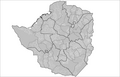 PNG municipalities
 -
 Provinces here too
 -

-
 An example of how this kind of maps look when finished
 -
 An already vectorialized map we can start from
 -
 My Started version
 -
 Finished version
.svg)


Article: Zimbabwean parliamentary election, 2008
Request: Someone at Talk:Zimbabwean parliamentary election, 2008 requested that a map of the House of Assembly constituency winners be made, and I started work on the project. However, I based my map on a vectorialization of Image:Zim-provinces blank.jpg, which has proven to contain some gross errors forcing me to constantly reshape provinces and constituencies. I'm in exams now and can't afford to put more time on this, so I'm here to ask for help: is someone willing to finish the job?. The current status can be seen on the left. Thanks in advance. Habbit (talk) 10:06, 6 April 2008 (UTC)
Graphist opinion:There are better maps of Zimbabwe on which this can be based. There is also this link here which has all the results and some maps also. Mangwanani (talk) 11:18, 6 April 2008 (UTC)
- Yup, that was the website I was checking to get the results and paint the constituencies as required. The second map you posted (PNG municipalities) looks better, but some municipalities are split in several constituencies, partially due to population sizes, and also some gerrymandering. Habbit (talk) 13:43, 6 April 2008 (UTC)
- Yup. It may well be out of date but that's the way things go sometimes. Does the final image have to be vector? Can I also ask why half of Mashonaland East is missing in your map? Mangwanani (talk) 14:03, 6 April 2008 (UTC)
- I would prefer the final image to be vector, as it could be scaled as needed (say, for printing or outside Wikipedia). The final result I was trying for is something like Image:Spanish general election, 2008 - constituency winners.svg. It appears that I chose the wrong map to start with, and I might have overdid the post-vectorization "simplifying" step, so I seemingly cut off part of a province. Thus, it would be better to just start again with another map as the base (Image:Zimbabwe Locator.png looks good), but I won't be able to start in this week, or even month, since I'm in exams right now, that's why I asked for help here. Habbit (talk) 14:20, 6 April 2008 (UTC)
- That's fine. I'm sure we can come up with something. Not sure how good my skills at vector are for this... Mangwanani (talk) 15:03, 6 April 2008 (UTC)
- I have tried but I can't do it. :( My action plan (which I was attempting) was to vectorise the maps from Sokwanele (just the outlines not the colours or the writing) and then once they were all vectorised to slot them neatly into a map of Zimbabwe and then change the colours accordingly to reflect the election results. Mangwanani (talk) 19:39, 6 April 2008 (UTC)
- Well, that's just what I was doing before. I ran into the problem of the bad map I started from (with wrong-shaped provinces), but I believe that doing so with a correct base provincial map should be relatively easy. If no-one else stands up for finishing the map in a week or so (i.e. after I finish my exams), I will restart work with a new base map. Thanks for trying, though! Habbit (talk) 20:17, 6 April 2008 (UTC)
- I have tried but I can't do it. :( My action plan (which I was attempting) was to vectorise the maps from Sokwanele (just the outlines not the colours or the writing) and then once they were all vectorised to slot them neatly into a map of Zimbabwe and then change the colours accordingly to reflect the election results. Mangwanani (talk) 19:39, 6 April 2008 (UTC)
- That's fine. I'm sure we can come up with something. Not sure how good my skills at vector are for this... Mangwanani (talk) 15:03, 6 April 2008 (UTC)
- I would prefer the final image to be vector, as it could be scaled as needed (say, for printing or outside Wikipedia). The final result I was trying for is something like Image:Spanish general election, 2008 - constituency winners.svg. It appears that I chose the wrong map to start with, and I might have overdid the post-vectorization "simplifying" step, so I seemingly cut off part of a province. Thus, it would be better to just start again with another map as the base (Image:Zimbabwe Locator.png looks good), but I won't be able to start in this week, or even month, since I'm in exams right now, that's why I asked for help here. Habbit (talk) 14:20, 6 April 2008 (UTC)
- Yup. It may well be out of date but that's the way things go sometimes. Does the final image have to be vector? Can I also ask why half of Mashonaland East is missing in your map? Mangwanani (talk) 14:03, 6 April 2008 (UTC)
- I made Image:Zimbabwe admin.svg it might be useful. Jackaranga (talk) 20:53, 6 April 2008 (UTC)
- Indeed. It will be extremely useful, since we won't need to create/vectorialize another map of Zimbabwe: just split/join the boundaries for constituencies, and then paint them. Thank you very much!! The only thing we're missing now is a map of the constituencies inside Harare and, iIrc, another province not available in the above website. Habbit (talk) 22:03, 6 April 2008 (UTC)
- Ok, here's my started version. I have vectorised the constituency maps from Sokwanele and inserted them into Jackaranga's map. Mangwanani (talk) 19:32, 9 April 2008 (UTC)
- Is this going how you intended? Before I go any further... Mangwanani (talk) 19:20, 11 April 2008 (UTC)
- Indeed. You're doing a quite wonderful job. My congratulations. Habbit (talk) 13:04, 12 April 2008 (UTC)
- OK, its as done as I can do - can't find a map for the Midlands. It may, nay does, need tyding up a lot around the edges. Additionally, Lake Kariba (partly in black) needs something doing but I'm not sure what. Mangwanani (talk) 17:04, 12 April 2008 (UTC)
- I found constituency maps for the remaining provinces here, which should be easy to correlate with election results sites, thus filling the last voids. Harare will need to be shown enlarged just like Bulawayo (that's why I reserved the 'H' space in my first map and put the color code in another place). About the lake, I'd just forget about it, i.e. show it as part of the constituency next to it. Besides the need for some reconciling of the constituency borders with the provinces, this is a great job. Once again, my compliments. Habbit (talk) 13:31, 13 April 2008 (UTC)
- Sorry, but I really don't have the patience to work with those maps. Sorry. Mangwanani (talk) 14:23, 13 April 2008 (UTC)
- Well, I won't say I'm particularly happy with the coitus interruptus, but still you have gone a long way with this job and I thank you for it. A great map with vectorisations of more than 150 constituencies. My exam streak ends this Wednesday, so I'll take over that night - however, if anyone else in the Graphic Lab wishes to complete this map before, I'll be even happier ^.^ Habbit (talk) 20:29, 13 April 2008 (UTC)
- Just an after-thought and getting ahead of myself, once this is done, can we make a copy that has all the constituencies in grey like the other blank Wikipedia maps for future use... Mangwanani (talk) 15:30, 15 April 2008 (UTC)
- Finished at last! Took me a bit longer that I thought, plagued as I am with constant exams. About the map with all constituencies in grey, it can be done, but take into account that FPTP constituencies change frequently. Habbit (talk) 12:34, 15 May 2008 (UTC)
- That looks so good! Well done Habbit! Mangwanani (talk) 15:38, 15 May 2008 (UTC)
- Finished at last! Took me a bit longer that I thought, plagued as I am with constant exams. About the map with all constituencies in grey, it can be done, but take into account that FPTP constituencies change frequently. Habbit (talk) 12:34, 15 May 2008 (UTC)
- Just an after-thought and getting ahead of myself, once this is done, can we make a copy that has all the constituencies in grey like the other blank Wikipedia maps for future use... Mangwanani (talk) 15:30, 15 April 2008 (UTC)
- Well, I won't say I'm particularly happy with the coitus interruptus, but still you have gone a long way with this job and I thank you for it. A great map with vectorisations of more than 150 constituencies. My exam streak ends this Wednesday, so I'll take over that night - however, if anyone else in the Graphic Lab wishes to complete this map before, I'll be even happier ^.^ Habbit (talk) 20:29, 13 April 2008 (UTC)
- Sorry, but I really don't have the patience to work with those maps. Sorry. Mangwanani (talk) 14:23, 13 April 2008 (UTC)
- I found constituency maps for the remaining provinces here, which should be easy to correlate with election results sites, thus filling the last voids. Harare will need to be shown enlarged just like Bulawayo (that's why I reserved the 'H' space in my first map and put the color code in another place). About the lake, I'd just forget about it, i.e. show it as part of the constituency next to it. Besides the need for some reconciling of the constituency borders with the provinces, this is a great job. Once again, my compliments. Habbit (talk) 13:31, 13 April 2008 (UTC)
- OK, its as done as I can do - can't find a map for the Midlands. It may, nay does, need tyding up a lot around the edges. Additionally, Lake Kariba (partly in black) needs something doing but I'm not sure what. Mangwanani (talk) 17:04, 12 April 2008 (UTC)
- Indeed. You're doing a quite wonderful job. My congratulations. Habbit (talk) 13:04, 12 April 2008 (UTC)
- Is this going how you intended? Before I go any further... Mangwanani (talk) 19:20, 11 April 2008 (UTC)
- Ok, here's my started version. I have vectorised the constituency maps from Sokwanele and inserted them into Jackaranga's map. Mangwanani (talk) 19:32, 9 April 2008 (UTC)
- Indeed. It will be extremely useful, since we won't need to create/vectorialize another map of Zimbabwe: just split/join the boundaries for constituencies, and then paint them. Thank you very much!! The only thing we're missing now is a map of the constituencies inside Harare and, iIrc, another province not available in the above website. Habbit (talk) 22:03, 6 April 2008 (UTC)
Vaillante
- .
-
Logo of Vaillante
-
Vector
Article(s): Vaillante
Request: I assume this is an easy one. Could we have a .svg logo for the fictional French brand Vaillante ? In fact not that fictional, since some SEATs did bear the Vaillante badge. Hektor (talk) 23:24, 9 May 2008 (UTC)
Graphist opinion: Done.--HereToHelp (talk to me) 20:37, 15 May 2008 (UTC)
- As I'm uploading the new svg I get the message "A file with this name exists already". Guess I wasn't quick enough =). I'd probably make the red a touch darker but apart from that it looks good. /Lokal_Profil 21:10, 15 May 2008 (UTC)
- I noticed that too. I'm not going to bother with it anymore; if you want to, go ahead.--HereToHelp (talk to me) 22:08, 15 May 2008 (UTC)
Malé , Maldives
— Not fully recoverable.
-
 "a typical road in malé"

Article(s): Malé
Request: Can someone take out the excess light in the top of the photo? Thanks, SpencerT♦C 01:31, 13 May 2008 (UTC)
Graphist opinion: The image is pretty bad. All the data in the top left is irrecoverable. Shows you what typically happens when you use a cell phone camera. I fixed it as much as I could, but that's the best anyone is going to be able to give you. XcepticZP (talk) 13:47, 13 May 2008 (UTC)
Rhodesia
.
Article(s): Rhodesia
Request: lighten for detail -- Chris (クリス • フィッチ) (talk) 04:18, 22 April 2008 (UTC)
Graphist opinion: Let me know what you think. I tried to remove the lines a little. XcepticZP (talk) 13:53, 13 May 2008 (UTC)
- Sorry for the delay, I'm just getting settled in Japan, it's great, thanks! Chris (クリス • フィッチ) (talk) 01:01, 19 May 2008 (UTC)
Kuni Tomoko
Chris (クリス • フィッチ) (talk) 01:05, 19 May 2008 (UTC)

Article(s): Prince Fushimi Hiroyasu
Request: fix texture chatter -- Chris (クリス • フィッチ) (talk) 05:39, 24 April 2008 (UTC)
Graphist opinion:Looks like a job for the Fourier transform, I'll do it sometime this weekend if no-one picks it up earlier. --Slashme (talk) 11:14, 9 May 2008 (UTC)
- Fourier transform worked like a charm! --Slashme (talk) 19:44, 15 May 2008 (UTC)
- Thank you, that is beautiful! Chris (クリス • フィッチ) (talk) 01:05, 19 May 2008 (UTC)
Luther Halsey Gulick
.

Article(s): Luther Halsey Gulick
Request: trim out framing and lighten around head -- Chris (クリス • フィッチ) (talk) 06:53, 26 April 2008 (UTC)
Graphist opinion: Done. Let me know what you think. XcepticZP (talk) 00:18, 13 May 2008 (UTC)
- Seems to be some horizontal line artifacts on the forehead User:Pedant 06:50, 14 May 2008 (UTC) —Preceding unsigned comment added by 67.49.8.228 (talk)
- Much better, thank you! Chris (クリス • フィッチ) (talk) 01:11, 19 May 2008 (UTC)
Good article star
-
 Featured article star
 -

-
 GA star


Article(s): Wikipedia talk:Good articles#Redesign of symbols
Request: Create an 'empty star' image based on Image:Featured article star.svg, and upload at Image:Good article star.svg. This would keep the black border around the star, but the rest would be blank. This is for a proposed replacement for the Good article symbol.-- Pharos (talk) 22:13, 27 April 2008 (UTC)
Graphist opinion:I created one , Q:does the inside have to be transperant or have a color - Cradel 12:51, 28 April 2008 (UTC)
- Could the plus be aligned with vertical? Currently it looks like one of those optical illusions. 68.39.174.238 (talk) 14:27, 30 April 2008 (UTC)
faces have little feature
.

Article(s): several
Request: lighten for detail, the faces have little feature -- Chris (クリス • フィッチ) (talk) 01:55, 1 May 2008 (UTC)
Graphist opinion: Both done. Enjoy... XcepticZP (talk) 00:03, 13 May 2008 (UTC)
- Sorry for the delay, I'm just getting settled in Japan, they're great, thanks! Chris (クリス • フィッチ) (talk) 01:18, 19 May 2008 (UTC)
SVG of Wildscale
68.39.174.238 (talk) 17:32, 19 May 2008 (UTC)
-
 To be vectored
 -
 Vectored


Article(s): Windscale fire
Request: SVG in place. 68.39.174.238 (talk) 21:24, 11 May 2008 (UTC)
Opinion: This is pretty good for raster, but I'll work on something over the next few days. This is fairly easy compared to the computers, above.--HereToHelp (talk to me) 00:37, 12 May 2008 (UTC)
- How's this?--HereToHelp (talk to me) 20:49, 12 May 2008 (UTC)
- Sorry for the time difference. Is there a reason for the change in sizes of the fuel rods? The older one looks better to me (Those would be huge fuel rods compared to the size of the chimney!). 68.39.174.238 (talk) 21:37, 17 May 2008 (UTC)
- (The rods are too big...I'll let that drop...) How about now?--HereToHelp (talk to me) 15:56, 18 May 2008 (UTC)
- OK; Just one extra thing: Can you use something similar to the original drawing for the replacement of the fuel rods? The current design makes it look like there was a regular stream entering and leaving, while the original makes it look more like "push one in, and one falls out", which is I think how the system actually operated (?). 68.39.174.238 (talk) 16:50, 18 May 2008 (UTC)
- Better now?--HereToHelp (talk to me) 01:31, 19 May 2008 (UTC)
- OK; Just one extra thing: Can you use something similar to the original drawing for the replacement of the fuel rods? The current design makes it look like there was a regular stream entering and leaving, while the original makes it look more like "push one in, and one falls out", which is I think how the system actually operated (?). 68.39.174.238 (talk) 16:50, 18 May 2008 (UTC)
- (The rods are too big...I'll let that drop...) How about now?--HereToHelp (talk to me) 15:56, 18 May 2008 (UTC)
- Sorry for the time difference. Is there a reason for the change in sizes of the fuel rods? The older one looks better to me (Those would be huge fuel rods compared to the size of the chimney!). 68.39.174.238 (talk) 21:37, 17 May 2008 (UTC)
- Perfect! 68.39.174.238 (talk) 17:32, 19 May 2008 (UTC)
Dental explorer
-
 Dental explorer
 -
 A different picture with brighter lighting
 -
 Removing light reflexion and shadow
 -
 Removing background entirely


Article(s): For use in Dental caries or Dental explorer
Request: Can the background be whitened or cleaned up? Thank you! - Dozenist talk 15:49, 11 May 2008 (UTC)
Graphist opinion:
- Since you are the photographer I would recommend retaking the photo with better lighting (preferable many light sources to reduce shadows). If you can't retake the photograph for some reason then please give a shout and someone might be able to whiten the current version. /Lokal_Profil 16:13, 11 May 2008 (UTC)
- I took a new photo of a different explorer, but this time outside with the sun. Would this work better? - Dozenist talk 16:34, 11 May 2008 (UTC)
- I still like the first one better though, perhaps if we removed the shadow and the light reflexion at the top, like this, it would look better -- CD 22:20, 11 May 2008 (UTC)
- Thanks for the work! I think that makes the picture look a whole lot better. Would there be any difficulty or any resulting problem in lightening the photo a little? - Dozenist talk 22:58, 11 May 2008 (UTC)
- What about just removing the background entirely? See above... -- TIM KLOSKE|TALK 22:12, 19 May 2008 (UTC)
- Thanks for the work! I think that makes the picture look a whole lot better. Would there be any difficulty or any resulting problem in lightening the photo a little? - Dozenist talk 22:58, 11 May 2008 (UTC)
- I still like the first one better though, perhaps if we removed the shadow and the light reflexion at the top, like this, it would look better -- CD 22:20, 11 May 2008 (UTC)
- I took a new photo of a different explorer, but this time outside with the sun. Would this work better? - Dozenist talk 16:34, 11 May 2008 (UTC)
The letter's writing
-
 Original
 -
 For reference only


Article(s): Neacşu's Letter
Request: Please try and make the text more visible, if possible remove the shadowing too (not that necessary as the text though). I have already asked Fir0002 for some help, but he hadn't that much time, and was only able to do minor improvements to the image, so he directed me here. There are some sections, particularly in the center shoadow, where just changing the brightness won't do much (manual fixing is needed). -- diego_pmc (talk) 06:23, 19 May 2008 (UTC)
Graphist opinion: Wouldn't it make sense just to leave it the way it is? It "is the oldest surviving document available in Romanian," so shouldn't it look old and be unreadable? -- TIM KLOSKE|TALK 22:17, 19 May 2008 (UTC)
- The problem is that it's unreadable because of the shadow, and not because of the writing. diego_pmc (talk) 05:51, 20 May 2008 (UTC)
- Done. Thank you for the reference image, it came in very handy as an overlay for the text. I uploaded over the original so don't forget to refresh. Let me know what you think, it can still be changed. XcepticZP (talk) 11:07, 20 May 2008 (UTC)
- It looks great! I would have one last request, but do it only if it can be done fast - the image is very good as it is. Could you try to adjust the contrast a little so that the whole text have the same color as in the lower right corner of the unedited original? Many thanks again! diego_pmc (talk) 14:19, 20 May 2008 (UTC)
- Anyway, thanks again - you've done a great job. diego_pmc (talk) 18:04, 20 May 2008 (UTC)
- Done. Thank you for the reference image, it came in very handy as an overlay for the text. I uploaded over the original so don't forget to refresh. Let me know what you think, it can still be changed. XcepticZP (talk) 11:07, 20 May 2008 (UTC)
Flag of the Union of South American Nations
-
 USAN flag
 -
 Start
Start


Article(s): Union of South American Nations, Dutch language
Request: SVG, it sould be extreemly simple, just add the SVGs of the flags together in the correct position and presto!-- SelfQ (talk) 14:47, 27 April 2008 (UTC)
Graphist opinion: I'm on it. Mangwanani (talk) 17:36, 27 April 2008 (UTC)
- Here's a start. Mangwanani (talk) 17:58, 27 April 2008 (UTC)
- The last ones are Image:Flag of Brazil.svg, Image:Flag of Venezuela.svg and Image:Flag of Argentina.svg. Don't forget to credit all of the sources for your images in the image description. Also the coat of arms in Ecuador's flag seems sqashed. Could try Image:Flag of Ecuador.svg instead. /Lokal_Profil 18:42, 27 April 2008 (UTC)
- That is the flag I used. Brazil and Argentina are corrupted. Don't know what happened with Venezula... Mangwanani (talk) 15:34, 28 April 2008 (UTC)
- Oh ye, its corrupted too. Mangwanani (talk) 15:37, 28 April 2008 (UTC)
- It's probably a naming problem. Brazil, Venezuela and Chile probably all have definitions/elements called "star" (or star1 etc). Both Argentina and Uruguay probably have definitions/elements called sun. That's my first guess anyhow. The problem with the Ecuadorian flag is that it is wider then the others. When it's squashed the CoA should remain unsquashed (but still centered). /Lokal_Profil 19:15, 28 April 2008 (UTC)
- Pass Mangwanani (talk) 19:55, 29 April 2008 (UTC)
- My suggestion is just stick with the civil variants as much as possible, just like it was done with Peru. User:Zscout370 (Return Fire) 02:51, 30 April 2008 (UTC)
- I think it would be best to stick as close to the original as posible, you would not add another star to the flag of the EU just because it would be easier to make. I would have thought this would be a snap, clearly I underestimated my knowledge of SVG's. My apologies. --SelfQ (talk) 21:37, 30 April 2008 (UTC)
- It still can be done, I just need to find time to hack at it. User:Zscout370 (Return Fire) 21:40, 30 April 2008 (UTC)
- If it hasn't been done by the time my exams are over I will give it a shot. My plan was to rename the definitions. I.e. open the brasil falg in a text editor and replacing every occurence of "star" by "br-star" and similar for the other clashes. But if anyone gets around to it before then thats great too =) /Lokal_Profil 09:31, 1 May 2008 (UTC)
- It still can be done, I just need to find time to hack at it. User:Zscout370 (Return Fire) 21:40, 30 April 2008 (UTC)
- I think it would be best to stick as close to the original as posible, you would not add another star to the flag of the EU just because it would be easier to make. I would have thought this would be a snap, clearly I underestimated my knowledge of SVG's. My apologies. --SelfQ (talk) 21:37, 30 April 2008 (UTC)
- My suggestion is just stick with the civil variants as much as possible, just like it was done with Peru. User:Zscout370 (Return Fire) 02:51, 30 April 2008 (UTC)
- Pass Mangwanani (talk) 19:55, 29 April 2008 (UTC)
- It's probably a naming problem. Brazil, Venezuela and Chile probably all have definitions/elements called "star" (or star1 etc). Both Argentina and Uruguay probably have definitions/elements called sun. That's my first guess anyhow. The problem with the Ecuadorian flag is that it is wider then the others. When it's squashed the CoA should remain unsquashed (but still centered). /Lokal_Profil 19:15, 28 April 2008 (UTC)
- Oh ye, its corrupted too. Mangwanani (talk) 15:37, 28 April 2008 (UTC)
- That is the flag I used. Brazil and Argentina are corrupted. Don't know what happened with Venezula... Mangwanani (talk) 15:34, 28 April 2008 (UTC)
- The last ones are Image:Flag of Brazil.svg, Image:Flag of Venezuela.svg and Image:Flag of Argentina.svg. Don't forget to credit all of the sources for your images in the image description. Also the coat of arms in Ecuador's flag seems sqashed. Could try Image:Flag of Ecuador.svg instead. /Lokal_Profil 18:42, 27 April 2008 (UTC)
- Here's a start. Mangwanani (talk) 17:58, 27 April 2008 (UTC)
- There we go, should be fixed now. /Lokal_Profil 03:12, 20 May 2008 (UTC)
- Resolved? Mangwanani (talk) 16:17, 21 May 2008 (UTC)
Intifada deaths
.
Article: Second Intifada
Request: I used an online program to create this SVG chart: Image:Intifada deaths.svg
It is currently in this article and section:
There I used this wikicode:
- [[Image:Intifada deaths.svg|thumb|400px]]
In the caption it says "click image to enlarge."
So people do so, and arrive at the image description page where the image is at this size:

Can someone adjust the size of the image so that it is around 600 pixels wide on the commons page, commons:Image:Intifada deaths.svg, so that it is easily legible there? I don't know anything about SVG image editing.
- [[Image:Intifada deaths.svg|none|600px]]
Also, what freeware SVG image editor is the easiest to use? I am interested in simplicity more than I am interested in options.
I see these pages:
- Comparison of vector graphics editors
- List of vector graphics editors --Timeshifter (talk) 02:54, 18 May 2008 (UTC)
- I recommend Inkscape. It's fairly easy to learn and hey, it's free.--HereToHelp (talk to me) 03:18, 18 May 2008 (UTC)
- Thanks. Any others you would recommend also? Is Inkscape easy-to-use for creating charts and graphs? That is my current interest. --Timeshifter (talk) 06:44, 18 May 2008 (UTC)
- Yes. Go to File->Document properties->Grids tab, which helps you keep everything nice and even. The text editing can be a little buggy at times, but it's useable, and there's good color editing and alignment tools, located in the main icon bar towards the right.--HereToHelp (talk to me) 11:44, 18 May 2008 (UTC)
- Thanks again! I hope to check it out soon. --Timeshifter (talk) 22:26, 18 May 2008 (UTC)
- Yes. Go to File->Document properties->Grids tab, which helps you keep everything nice and even. The text editing can be a little buggy at times, but it's useable, and there's good color editing and alignment tools, located in the main icon bar towards the right.--HereToHelp (talk to me) 11:44, 18 May 2008 (UTC)
- Thanks. Any others you would recommend also? Is Inkscape easy-to-use for creating charts and graphs? That is my current interest. --Timeshifter (talk) 06:44, 18 May 2008 (UTC)
- I recommend Inkscape. It's fairly easy to learn and hey, it's free.--HereToHelp (talk to me) 03:18, 18 May 2008 (UTC)
(unindent) I did not know this. I have been using the Firefox browser a long time, and it sees a larger version of the chart when the chart is clicked on the image description page. But in Internet Explorer, one gets a message asking whether to open or save the SVG file. If one does not have an SVG viewer (like the freeware image editor IrfanView) installed, then one will not see the larger version of the chart. So this makes changing the default size of this chart more important. The SVG chart needs to be larger, or I will have to put back the GIF version of the chart in the article, Second Intifada, so that when people click the chart in the article they see a more legible version. The Gif version is not as legible though at the 400-pixel-wide size of the image found in the article. Compare here:
- [[Image:Intifada deaths.svg|thumb|none|400px]]

- [[Image:Intifada deaths.gif|thumb|none|400px]]
Click the GIF image to see that it enlarges in any browser. --Timeshifter (talk) 07:17, 18 May 2008 (UTC)
IMHO this diagram needs some additional work:
- legend for brown color code missing
- legend for violet color code missing
- death number besides blue bullet to be removed
--Túrelio (talk) 07:30, 18 May 2008 (UTC)
- I agree. I used a primitive online editing program to create the chart. It is very quirky and did not allow me to do what I wanted. The chart could use a lot of work. I encourage others to create additional charts using better tools. Please upload those charts separately with different names. I want to keep working on this chart myself. I could use help though in getting it to a larger default size. --Timeshifter (talk) 07:36, 18 May 2008 (UTC)
- OK Image:Intifada deaths2.svg should do it. Also removed the url and the number 44 from the blue bullet point. Text is still needed for the last bullet points though. /Lokal_Profil 15:29, 18 May 2008 (UTC)
- Thanks! The chart is used outside Wikipedia, too. So the URL is needed. I will need to learn an SVG program. There are so many things wrong with my original chart due to the quirkiness of the online editing program I used. I have a request. Could you put "Killed by Israeli civilians" at the bottom right of the chart in the same format as the other column labels? I was unable to do it myself because the online program messed up other stuff when I tried that. Then you can remove the label text altogether from the blue label on the right side. Then I will upload your version of the chart (with or without the URL) in place of my original version. --Timeshifter (talk) 22:24, 18 May 2008 (UTC)
- Added the lable at the bottom of the blue bar but left the legend since all the other colours had them. Although I can see a need for the url when the chart is used outside wikipedia I'd leave it of the one used here, since we have specific image pages all that's needed is to put that info there instead. The only thing that's missing is some sort of legend for the brown and violet colours. Couldn't come up with a good formulation myself but if you have any suggestions I'll be happy to add them. /Lokal_Profil 03:07, 19 May 2008 (UTC)
- Thanks again. How about "Israeli breakdown" and "Palestinian breakdown"? Also, do you happen to know what font the Wikipedia CSS style sheets are using for the SVG text in the chart? It looks good. It might be good to add that font name directly into the SVG code so that the SVG chart looks good outside Wikipedia, too. The SVG chart has a thin ugly font outside Wikipedia when I download the current SVG file and look at in my image editor, IrfanView.
- Thought of something else. It might be good to label the totals too on the side: "Israeli total" and "Palestinian total." --Timeshifter (talk) 07:21, 19 May 2008 (UTC)
- Added the last labels. The whole font issue is tricky since mediawiki has a notoriously bad track record when it comes to fonts. Removing the comic sans tag is however never wrong since it is a silly font to start with =). Anyhow hope the final version is ok. /Lokal_Profil 14:13, 19 May 2008 (UTC)
- It seems that I am having the same problem as before with the online chart creator. One thing gets fixed but then another problem shows up. When I removed the font name from the SVG code text I see that a serif font was then used by MediaWiki. A sans-serif font was being used by MediaWiki before. The serif font makes the chart almost unreadable at the size it is used in the wikipedia article (400 pixels wide).
- Added the last labels. The whole font issue is tricky since mediawiki has a notoriously bad track record when it comes to fonts. Removing the comic sans tag is however never wrong since it is a silly font to start with =). Anyhow hope the final version is ok. /Lokal_Profil 14:13, 19 May 2008 (UTC)
- Added the lable at the bottom of the blue bar but left the legend since all the other colours had them. Although I can see a need for the url when the chart is used outside wikipedia I'd leave it of the one used here, since we have specific image pages all that's needed is to put that info there instead. The only thing that's missing is some sort of legend for the brown and violet colours. Couldn't come up with a good formulation myself but if you have any suggestions I'll be happy to add them. /Lokal_Profil 03:07, 19 May 2008 (UTC)
- Thanks! The chart is used outside Wikipedia, too. So the URL is needed. I will need to learn an SVG program. There are so many things wrong with my original chart due to the quirkiness of the online editing program I used. I have a request. Could you put "Killed by Israeli civilians" at the bottom right of the chart in the same format as the other column labels? I was unable to do it myself because the online program messed up other stuff when I tried that. Then you can remove the label text altogether from the blue label on the right side. Then I will upload your version of the chart (with or without the URL) in place of my original version. --Timeshifter (talk) 22:24, 18 May 2008 (UTC)
- OK Image:Intifada deaths2.svg should do it. Also removed the url and the number 44 from the blue bullet point. Text is still needed for the last bullet points though. /Lokal_Profil 15:29, 18 May 2008 (UTC)
(unindent) I uploaded a clearer version of the chart. A different sans-serif font is used this time (not comic sans). It has one less column, and no longer has a legend (now unnecessary). I also removed "Deaths" on the left side. I returned the source URL. It is important and takes little space. I will keep experimenting (see farther down) and uploading new versions. Feel free to do the same. I like this temp page for experimentation. It is the only way to see what MediaWiki will do with the SVG file. I still need to figure out how to make the default size of the chart larger on the commons image description page.--Timeshifter (talk) 06:53, 20 May 2008 (UTC)
I downloaded and installed Inkscape and tried to figure out how to make charts a little bit. It looks way too difficult at first glance. So I looked at Google spreadsheets, and this is how far I have gotten:
It can export the chart in PDF, HTML, CSV, Excel, .ods (OpenDocument Spreadsheet format used by Open Office), and text. I think I might try Open Office next. I believe it edits charts and can save them in SVG. --Timeshifter (talk) 06:53, 20 May 2008 (UTC)
- Timeshifter, Do NOT delete people's posts. My deleted post was as follows(so all the people can see what you're trying to cover up):
- Why are you incapable of using the set request format presented at the top of this page? The graphic lab is doing you a favor, so you should give us the courtesy and not mess up our system. This is happening way too often. These out of format requests need to be removed and not considered. XcepticZP (talk) 19:45, 18 May 2008 (UTC)
- XcepticZP (talk) 10:26, 20 May 2008 (UTC)
- I had responded to you concerning all of this on the talk page: Wikipedia_talk:Graphic Lab/Images to improve#Format Anomalies, and I had implemented your request. So I removed your now-offtopic comment, since it was a duplication of the talk page, and I did not want to have to duplicate my reply here. So it was not a cover-up. Please WP:AGF, and please reread WP:CIVIL. And please do not continue this offtopic discussion here. --Timeshifter (talk) 12:01, 20 May 2008 (UTC)
(unindent) The first SVG image, Image:Intifada deaths.svg, is not currently showing up. I put in a request for help at:
- commons:Commons:Administrators' noticeboard/Attention#Image:Intifada deaths.svg --Timeshifter (talk) 12:48, 20 May 2008 (UTC)
- The only problem with your update is that it once again made the image to small to read for IE users. I thought that was the main problem we tried to fix. Regarding the URL. I repeat that it should be in the image page and not in the actual image, if you want to use the image with the url outside wikipedia then you can add it to that version. Also lastly I think that the image was probably clearer when there were legends but that's a minor problem which can be fixed in the image caption. /Lokal_Profil 14:40, 20 May 2008 (UTC)
- Fixed image size and URL, also cleaned up the code and uploaded to Image:Intifada deaths.svg. /Lokal_Profil 15:13, 20 May 2008 (UTC)
- The only problem with your update is that it once again made the image to small to read for IE users. I thought that was the main problem we tried to fix. Regarding the URL. I repeat that it should be in the image page and not in the actual image, if you want to use the image with the url outside wikipedia then you can add it to that version. Also lastly I think that the image was probably clearer when there were legends but that's a minor problem which can be fixed in the image caption. /Lokal_Profil 14:40, 20 May 2008 (UTC)
- Thanks! We might agree to disagree on the URL. Sources are commonly added to charts and graphs. I think the chart and the chart text is clearer at 400 pixels wide when the legend is removed. Can you tell me what to do in Inkscape to increase the default size of an SVG chart? I have been experimenting with another program, OpenOffice.org Calc, to try to create this chart better. I am having some luck with it. But it will take more time. --Timeshifter (talk) 15:19, 20 May 2008 (UTC)
- Actually, it does look nicer without the legends. I've added the legend info to he image page instead, that way it can be put into the image description if desired. Hte default size problem is due to the "viewbox" parameter that had been added to the image. However if you just remove the viewbox parameter then you suddenly see all of the white space surrounding the image. The way I solved it was to reove the viewbox parameter then copy paste the whole image into a new image where the "page size" was the same as the image size. Then save it as "plain svg". This also had the added benefit of removing random junk code in the original version. If you find a good program for making charts in svg then please give me a shout since apart from doing it by hand in Inkscape (tedious) I haven't found any and there are a lot of charts/diagrams in commons:Category:Images that should use vector graphics with subcategories. /Lokal_Profil 15:45, 20 May 2008 (UTC)
- Thanks! We might agree to disagree on the URL. Sources are commonly added to charts and graphs. I think the chart and the chart text is clearer at 400 pixels wide when the legend is removed. Can you tell me what to do in Inkscape to increase the default size of an SVG chart? I have been experimenting with another program, OpenOffice.org Calc, to try to create this chart better. I am having some luck with it. But it will take more time. --Timeshifter (talk) 15:19, 20 May 2008 (UTC)
- Thanks for the Inkscape how-to. OpenOffice.org Calc and OpenOffice.org Draw seem to be working for me so far. I have a chart built with them based on a spreadsheet using the stats in the chart here. It needs more work. OpenOffice.org can save in many formats, such as an .odg file. I have been looking for converters to SVG. Here are some links so far:
- http://www.google.com/search?q=svg+open+office
- http://www.google.com/search?q=odg+to+svg+converter
- http://wiki.services.openoffice.org/wiki/SVG_Import_Filter
- http://media-convert.com/ - Online tool.
- http://holloway.co.nz/docvert/
- OpenDocument software
- I am also checking out Swivel.com. Here is what I have so far:
- http://www.swivel.com/data_sets/show/1015629
- I don't know how to convert the data set to a bar chart there yet.
- I added the legend to the image caption at Second Intifada#Combatant versus noncombatant deaths. See this version:
- http://en.wikipedia.org/w/index.php?title=Second_Intifada&oldid=213739185 --Timeshifter (talk) 01:29, 21 May 2008 (UTC)
Indian personalities
— Uzer request.

Article(s): 2008 attacks on North Indians in Maharashtra
Request:
- First photo needs some more light I guess.
- Second one too is not very clear.
- Third one has dark fringes in the corners.
BTW I have no technical knowledge about photography hence may have used incorrect terms above. So feel free to do anything to make these images better. Thanks KnowledgeHegemonyPart2 (talk) 06:27, 13 May 2008 (UTC)
- Please use the guidelines set at the top of the page when you want to post a request. It makes things easier for us and the bot that archives this page. First image I can do. I don't understand what you want on the third image? XcepticZP (talk) 13:36, 13 May 2008 (UTC)
- I am very sorry about not following the guidelines. I striked off the third image.KnowledgeHegemonyPart2 (talk) 19:42, 13 May 2008 (UTC)
- Thanks a ton for improving the image - . Can Image:Amitabh Bachchan.jpg be improved too? KnowledgeHegemonyPart2 (talk) 14:52, 14 May 2008 (UTC)
- No it can't. His hair is black like the background, so I can't separate the two. Sorry. XcepticZP (talk) 21:45, 16 May 2008 (UTC)
- Fine. No prob. I guess this discussion can now be marked as resolved. - KnowledgeHegemonyPart2 (talk) 20:08, 22 May 2008 (UTC)
- No it can't. His hair is black like the background, so I can't separate the two. Sorry. XcepticZP (talk) 21:45, 16 May 2008 (UTC)
- Thanks a ton for improving the image - . Can Image:Amitabh Bachchan.jpg be improved too? KnowledgeHegemonyPart2 (talk) 14:52, 14 May 2008 (UTC)
- I am very sorry about not following the guidelines. I striked off the third image.KnowledgeHegemonyPart2 (talk) 19:42, 13 May 2008 (UTC)
Graphist opinion:
US military bases in the world 2007
-

-
 royal blue
 -
 paler blue
 -
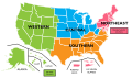 orange
 -
 SVGMore than 1000 US troopsMore than 100 US troopsUse of military facilities


Article(s): List of United States military bases
Request: change to white background for legibility -- Chris (クリス • フィッチ) (talk) 05:06, 19 April 2008 (UTC) (ps-adding that this should be SVG and use an improved color scheme)
Graphist opinion: Done. Not really an improvement—this should be SVG and use an improved color scheme. Maybe I'll get around to it ;) Fvasconcellos (t·c) 14:28, 19 April 2008 (UTC)
- You're right, some of those islands where there are bases totally fade out. Thank you for thus far, and hoping you'll go farther! Chris (クリス • フィッチ) (talk) 15:17, 19 April 2008 (UTC)
+1000
Afghanistan
Azores
Bahrain
Bermuda
Belgium
Bosnia
Bulgaria
Canaries
Diego Garcia
Djibouti
Germany
Great Britain
Guantanamo Bay
Iceland
Iraq
Italy
Japan
Jordan
Kuwait
Kyrgyzstan
Oman
Portugal
Romania
Serbia
South Korea
Spain
Turkey
UAE
US
+100
Albania
Australia
Canada
Croatia
Colombia
Dominican Republic
Egypt
El Salvador
Georgia
Greece
Greenland
Hungary
Macedonia
Nicaragua
Paraguay
Peru
Philippines
Saudi Arabia
Singapore
Thailand
facility use
Azerbaijan
Czech Republic
Ecuador
Indonesia
Kazakhstan
Kenya
Luxembourg
Malaysia
Morocco
Netherlands
Norway
Pakistan
Panama
Poland
Senegal
Somalia
Tajikistan
Turkmenistan
- (What does everyone think a better color scheme would be?) Chris (クリス • フィッチ) (talk) 01:30, 21 April 2008 (UTC).
- I'd go with a sort of royal blue for >1000, paler blue for >100, and a shade of orange for contrast. It's pretty "classic" and perfectly colorblind compliant. Fvasconcellos (t·c) 01:52, 21 April 2008 (UTC)
- Were these similar to the shades you had in mind? Chris (クリス • フィッチ) (talk) 02:33, 21 April 2008 (UTC)
- Pretty much, and thanks for the data. If Lokal profil doesn't get around to it tomorrow, I can do it when I get to my other computer :) Fvasconcellos (t·c) 03:22, 21 April 2008 (UTC)
- I'm short on time for the moment so go ahead =). If you use the SVG world map then all you need to do is to list the relevant iso codes using a text editor, see Image:Map of unitary and federal states.svg for an example. /Lokal_Profil 18:32, 27 April 2008 (UTC)
- Excellent. I'm almost done; I can't get the third set of countries to work (must have screwed up some bit of code :), but I'll upload it as soon as it's sorted out. Fvasconcellos (t·c) 23:09, 29 April 2008 (UTC)
- If you can't get it to work you can always upload it as is and I'll se if I can figure out what's wrong. /Lokal_Profil 15:11, 11 May 2008 (UTC)
- Excellent. I'm almost done; I can't get the third set of countries to work (must have screwed up some bit of code :), but I'll upload it as soon as it's sorted out. Fvasconcellos (t·c) 23:09, 29 April 2008 (UTC)
- I'm short on time for the moment so go ahead =). If you use the SVG world map then all you need to do is to list the relevant iso codes using a text editor, see Image:Map of unitary and federal states.svg for an example. /Lokal_Profil 18:32, 27 April 2008 (UTC)
- Pretty much, and thanks for the data. If Lokal profil doesn't get around to it tomorrow, I can do it when I get to my other computer :) Fvasconcellos (t·c) 03:22, 21 April 2008 (UTC)
Hail to the Chief


Article(s): Hail to the Chief
Request: trim out or clean off beige spraypaintry -- Chris (クリス • フィッチ) (talk) 07:30, 20 April 2008 (UTC)
Graphist opinion: Is this okay? miranda 05:13, 27 April 2008 (UTC)
- Sorry for being unclear. The point is to get the beige off, even if the image has to be greyscaled. Chris (クリス • フィッチ) (talk) 05:33, 27 April 2008 (UTC)
- In light of the new info, how's that? §hep • ¡Talk to me! 01:35, 30 April 2008 (UTC)
- Wonderful, please overwrite original, thanks! Chris (クリス • フィッチ) (talk) 04:56, 30 April 2008 (UTC)
- Can't, I saved it as a PNG which is superior to a GIF. §hep • ¡Talk to me! 19:39, 30 April 2008 (UTC)
- Ah, thanks, sorry, please mark the original vva, thanks! Chris (クリス • フィッチ) (talk) 01:39, 1 May 2008 (UTC)
- I have uploaded a new version of this (a little late, I know); rather than taking the grayscale average, I just took the blue channel - which was least affected by the beige. I have marked the original as superseded. Mine is uploaded to Commons - the name clashes, so follow this link to see it: [5]. CountingPine (talk) 01:13, 10 May 2008 (UTC)
- Would the next step involve transcribing it in GNU LilyPond? --Damian Yerrick (talk | stalk) 15:23, 14 May 2008 (UTC)
- I'm sorry, don't know what that is. :( Chris (クリス • フィッチ) (talk) 01:00, 19 May 2008 (UTC)
- Not only does it export to png, you can even get plugins to make it export to audio!! --Slashme (talk) 10:36, 23 May 2008 (UTC)
Atacama Giant
-
 GIF version
 -
 SVG version


Article(s): Atacama Giant
Request: SVGification. -- Ptcamn (talk) 21:57, 22 May 2008 (UTC)
Graphist opinion: I'll do it.--HereToHelp (talk to me) 21:58, 22 May 2008 (UTC)
- Done. Comments?--HereToHelp (talk to me) 23:22, 22 May 2008 (UTC)
Alcohol consumption
.
-

-
 Vectorised


Article(s): Alcoholic beverage
Request:Correct "per papita" to per capita and vectorize. Thank yous. -- ANONYMOUSPUSSY 13:44, 22 May 2008 (UTC)
Graphist opinion: I'm on it! Mangwanani (talk) 15:35, 22 May 2008 (UTC)
- How does this look?Mangwanani (talk) 16:18, 22 May 2008 (UTC)
- Could the legends be moved out of the image? That way it's usable by all language versions. I've added legends to the image description which could be used in the image caption (also making them more legible). /Lokal_Profil 23:49, 22 May 2008 (UTC)
- Done! Mangwanani (talk) 15:51, 23 May 2008 (UTC)
- Looks nice. Do we know the source for the info? I.e. is it a wiki article/external source/own research? /Lokal_Profil 17:54, 23 May 2008 (UTC)
- BTW. Unless you made a new world map from scratch you should acknowledge the svg basis you used in the source section =) /Lokal_Profil 18:04, 23 May 2008 (UTC)
- I've done my bit on the vector... Mangwanani (talk) 18:46, 23 May 2008 (UTC)
- BTW. Unless you made a new world map from scratch you should acknowledge the svg basis you used in the source section =) /Lokal_Profil 18:04, 23 May 2008 (UTC)
- Looks nice. Do we know the source for the info? I.e. is it a wiki article/external source/own research? /Lokal_Profil 17:54, 23 May 2008 (UTC)
- Done! Mangwanani (talk) 15:51, 23 May 2008 (UTC)
- Could the legends be moved out of the image? That way it's usable by all language versions. I've added legends to the image description which could be used in the image caption (also making them more legible). /Lokal_Profil 23:49, 22 May 2008 (UTC)
- How does this look?Mangwanani (talk) 16:18, 22 May 2008 (UTC)
- Thanks!! --ANONYMOUSPUSSY 09:23, 24 May 2008 (UTC)
Al Anbar Governorate
.

Article(s): Al Anbar Governorate
Request: use same font -- Chris (クリス • フィッチ) (talk) 05:06, 19 April 2008 (UTC)
- Would it be worth it to just request SVGification, or are the borders too messy for that? 68.39.174.238 (talk) 02:12, 2 May 2008 (UTC)
Graphist opinion: This really looks quite doable. I can't find an SVG map of Iraq's administrative divisions on commons, which would have been first prize, but to trace this map in Inkscape looks quite easy, so I'll do it over the weekend. --Slashme (talk) 10:32, 23 May 2008 (UTC)
Please check for correctness, then mark resolved. --Slashme (talk) 18:22, 23 May 2008 (UTC)
- It looks OK to me, but I'm not the requester so I'll wait for them to mark it. 68.39.174.238 (talk) 21:35, 23 May 2008 (UTC)
- It's great, thanks! Chris (クリス • フィッチ) (talk) 14:18, 25 May 2008 (UTC)
New World Regions
.
-
 Final version?

Article(s): WAGGGS-Western Hemisphere Region, image used on several language iterations: it:AMGE-Regione dell'Emisfero Occidentale, vi:Vùng Nữ Hướng đạo Tây Bán Cầu (WAGGGS)
Article(s): WOSM-Interamerican Region, image used on several language iterations: it:OMMS-Region Interamericana), sv:Amerikanska scoutregionen (WOSM), vi:Vùng Hướng đạo Liên Mỹ (WOSM), zh:世界童軍運動組織美洲區
Request: SVGify using Image:BlankMap-World-162E-flat.svg as a base map, include in gold Hawaii, Guam, American Samoa, the Northern Marianas, the Marshall Islands, Micronesia and Palau; only leave Greenland, Cuba and French Guiana grey in region, all other Pacific islands gold -- Chris (クリス • フィッチ) (talk) 01:55, 1 May 2008 (UTC)
Graphist opinion:
- Uploaded a first cut for the map, please tell me if you want the left hand border further to the right or to the left. /Lokal_Profil 09:56, 1 May 2008 (UTC)
- If you could trim Iceland off the right side, and then trim that same depth off the left side, that would be a good trim. Thank you for your help! Chris (クリス • フィッチ) (talk) 16:32, 1 May 2008 (UTC)
- That's great for perspective right there, please remove the blank space all the way around so the thumbnail will shoe up larger, thank you! Chris (クリス • フィッチ) (talk) 23:38, 1 May 2008 (UTC)
- That's all right, take your time, thank you so much, you do such nice work!
- Also, would you put a squared-off white background under eastern Greenland, so it is not an odd-shaped graphic? Thank you! Chris (クリス • フィッチ) (talk) 00:40, 2 May 2008 (UTC)
- No, because Greenland is geographically part of North America, the topic of the map, and Africa is not. Chris (クリス • フィッチ) (talk) 04:34, 3 May 2008 (UTC)
- OK, basically ready to upload, jsut wondering if you really wantone map or if you preferr one for WOSM-Interamerican Region and a separate one for WAGGGS-Western Hemisphere Region since they don't include the same countries. Also is there a suitable colour for Associate members that you would like? /Lokal_Profil 15:08, 11 May 2008 (UTC)
- Humm, after entering the countries in the WOSM-Interamerican Region and WAGGGS-Western Hemisphere Region I'm wondering which countries should be highlighted in addition (and why). Specifically my map includes nothing to the west of Hawaii. /Lokal_Profil 15:35, 11 May 2008 (UTC)
- OK, basically ready to upload, jsut wondering if you really wantone map or if you preferr one for WOSM-Interamerican Region and a separate one for WAGGGS-Western Hemisphere Region since they don't include the same countries. Also is there a suitable colour for Associate members that you would like? /Lokal_Profil 15:08, 11 May 2008 (UTC)
The reason those other island groupings are included is that they are part of the Aloha Council of the Boy Scouts of America. Please see Scouting in Hawaii, and it will give you the rationale for those islands being included. Sometimes it is okay to trust that other editors know what they are asking for. ;) Thanks, Chris (クリス • フィッチ) (talk) 04:16, 18 May 2008 (UTC)
- The problem is that since I'm colouring in by iso code rather then by tryinng to figure out which country is which on the old map I was limited by the information I had. Now that I have a breakdown of the last islands I'll add them =) /Lokal_Profil 15:47, 18 May 2008 (UTC)
- OK, the countries under Aloha Council have been added to the WOSM map. Is there a similar situation for WAGGS? Please also tell me if you see any other places missing ora anything else. /Lokal_Profil 16:00, 18 May 2008 (UTC)
- Just realised that I'd missed the USA insular areas which I'm guessing fall under Boy/Girl scouts of USA. So I'll add as, gu, mp, pr and vi to both maps. With respect to my previous question it's now reduced to whether the Marshall islands, Micronesia and Palau should be part of the WAGGS map. /Lokal_Profil 16:11, 18 May 2008 (UTC)
- OK, the countries under Aloha Council have been added to the WOSM map. Is there a similar situation for WAGGS? Please also tell me if you see any other places missing ora anything else. /Lokal_Profil 16:00, 18 May 2008 (UTC)
- I apologize for not being clear, the original image was a single map, bot the Boy Scout and Girl Scout regions occupy the same territory. There is no need for two separate maps. Chris (クリス • フィッチ) (talk) 01:21, 19 May 2008 (UTC)
- Please use the WOSM map for the base, and overwrite it onto Image:WAGGGS-WOSMWestHemMap-World.svg so the name is correct-it should be "Image:WAGGGS-WOSMWestHemMap-World.svg". Please include Hawaii as part of the United States. Thank you so much! Chris (クリス • フィッチ) (talk) 01:24, 19 May 2008 (UTC)
- Same color is fine. This is great, thank you for all your hard work, I am marking this as done! :) Chris (クリス • フィッチ) (talk) 14:33, 25 May 2008 (UTC)
Delage
— Hektor (talk) 12:26, 25 May 2008 (UTC)
-
Logo of Delage
Article(s): Delage
Request: This is a much less geometric one. Could we have a .svg logo for the defunct French brand Delage ? The Delage logo shown is black and white, but indeed the real logo was nice navy/dark blue, as shown on the web page of the Delage owner's club. Hektor (talk) 23:24, 9 May 2008 (UTC)
Graphist opinion:
- Direct link to the image [6]. /Lokal_Profil 22:49, 16 May 2008 (UTC)
- Can't do SVGs for logos I believe Mangwanani (talk) 17:55, 18 May 2008 (UTC)
- Can someone confirm this ? 193.56.37.1 (talk) 07:25, 19 May 2008 (UTC)
- I don't know where the boundaries lie as there are some uses where SVG logos are allowed but others where they aren't. It would be best for someone to clarify this... Mangwanani (talk) 18:19, 19 May 2008 (UTC)
- I don't understand. I recently asked for a Lloyd logo and nobody said anything of the kind. Hektor (talk) 19:02, 19 May 2008 (UTC)
- This is what I mean by a hazy area. I have requested other logos to be SVGd to be told that it couldn't be done for copyright reasons so I don't know where the boundaries lie... Mangwanani (talk) 19:23, 19 May 2008 (UTC)
- Well I think this is like Lloyd, this is the logo of a defunct company (disappeared in the early 50's) and you can have it at least as fair use on the English language wikipedia, like here : Lloyd or Hudson. Hektor (talk) 08:41, 24 May 2008 (UTC)
- How is this? Mangwanani (talk) 19:07, 24 May 2008 (UTC)
- Could it be possible to have it in the Delage colors instead of black like the image [7]. Hektor (talk) 20:38, 24 May 2008 (UTC)
- Done. I also used geometric ellipses instead of the traced ones. I noticed after uploading that I had left the space between the blue ellipse and the blue outline transparent; does it need to be white?--HereToHelp (talk to me) 21:40, 24 May 2008 (UTC)
- Wonderful, thanks for the geometric ellipses, the outside space between the blue ellipse and the blue outline should be white, indeed. Hektor (talk) 07:02, 25 May 2008 (UTC)
- Removed transparency. Mangwanani (talk) 11:20, 25 May 2008 (UTC)
- Wonderful, thanks for the geometric ellipses, the outside space between the blue ellipse and the blue outline should be white, indeed. Hektor (talk) 07:02, 25 May 2008 (UTC)
- Done. I also used geometric ellipses instead of the traced ones. I noticed after uploading that I had left the space between the blue ellipse and the blue outline transparent; does it need to be white?--HereToHelp (talk to me) 21:40, 24 May 2008 (UTC)
- Could it be possible to have it in the Delage colors instead of black like the image [7]. Hektor (talk) 20:38, 24 May 2008 (UTC)
- How is this? Mangwanani (talk) 19:07, 24 May 2008 (UTC)
- Well I think this is like Lloyd, this is the logo of a defunct company (disappeared in the early 50's) and you can have it at least as fair use on the English language wikipedia, like here : Lloyd or Hudson. Hektor (talk) 08:41, 24 May 2008 (UTC)
- This is what I mean by a hazy area. I have requested other logos to be SVGd to be told that it couldn't be done for copyright reasons so I don't know where the boundaries lie... Mangwanani (talk) 19:23, 19 May 2008 (UTC)
- I don't understand. I recently asked for a Lloyd logo and nobody said anything of the kind. Hektor (talk) 19:02, 19 May 2008 (UTC)
- I don't know where the boundaries lie as there are some uses where SVG logos are allowed but others where they aren't. It would be best for someone to clarify this... Mangwanani (talk) 18:19, 19 May 2008 (UTC)
- Can someone confirm this ? 193.56.37.1 (talk) 07:25, 19 May 2008 (UTC)
- Can't do SVGs for logos I believe Mangwanani (talk) 17:55, 18 May 2008 (UTC)
Artaxiad standard
.
-

-
 HereToHelp's verion
 -
 Slashme's version


Article(s): Artaxiad Dynasty, scads of others
Request: lighten for detail and SVGify, this is supposed to be a flag -- Chris (クリス • フィッチ) (talk) 05:02, 27 April 2008 (UTC)
Graphist opinion: The beak(s) are going to be almost impossible, but I'm working on the rest at the moment James1293 (talk) 20:25, 29 April 2008 (UTC)
- ---Ok, I have the sun done, will upload work in progress tomorrow :-)---James1293 —Preceding unsigned comment added by James1293 (talk • contribs) 00:30, 30 April 2008 (UTC)
- Ok, I uploaded the WIP. I've made several (unsucessful) attempts at tracing the bird; I guess I'm just not good at doing organic-type-tracing :-) --(note that the original gif is behind it for overlaying comparison). -- James1293 (talk) 20:33, 30 April 2008 (UTC)
- The linked image didn't get uploaded it it breaks on MediaWiki, but the sun look very good in InkScape! Good job so far. §hep • ¡Talk to me! 23:33, 30 April 2008 (UTC)
- Have you tried saving it as "plain svg"? --Slashme (talk) 11:22, 9 May 2008 (UTC)
- I removed two elements from the image which were linking to local images on the uploaders computer (figure these were the ones breaking the rendering). However now there are no birds. /Lokal_Profil 21:23, 9 May 2008 (UTC)
- I never made birds, too dificult =P ... perhaps someone with more SVGifying skills than me can do it James1293 (talk) 00:44, 12 May 2008 (UTC)
- I tried creating the birds freehand, from ellipses and then adjusting the nodes. It's hard to judge accuracy given such a low-quality original, but I think I did alright.--HereToHelp (talk to me) 20:38, 23 May 2008 (UTC)
- I didn't realize that you were working on it, so I also made a version. Note, at the moment Wikipedia's svg renderer doesn't handle blur very well, so that might be why yours isn't working properly. Anyway, mine's also no Rembrandt, but FWIW, here it is. --Slashme (talk) 15:54, 24 May 2008 (UTC)
- I didn't think i used blur, but oh well. Good job.--HereToHelp (talk to me) 14:26, 25 May 2008 (UTC)
- I never made birds, too dificult =P ... perhaps someone with more SVGifying skills than me can do it James1293 (talk) 00:44, 12 May 2008 (UTC)
- I removed two elements from the image which were linking to local images on the uploaders computer (figure these were the ones breaking the rendering). However now there are no birds. /Lokal_Profil 21:23, 9 May 2008 (UTC)
- Ok, I uploaded the WIP. I've made several (unsucessful) attempts at tracing the bird; I guess I'm just not good at doing organic-type-tracing :-) --(note that the original gif is behind it for overlaying comparison). -- James1293 (talk) 20:33, 30 April 2008 (UTC)
- Done, it's great, thanks! Please mark the gif as deletable! Chris (クリス • フィッチ) (talk) 14:28, 25 May 2008 (UTC)
- I figured out why is wasn't displaying: I had never deleted the gif from the svg! (That's like a surgeon leaving a scalpel inside you.)--HereToHelp (talk to me) 15:54, 25 May 2008 (UTC)
- Ouch! By the way, Chris, I can now either mark my version as deletable, or upload it on top of HTH's version, depending on which one you prefer (I'm rooting for mine, but I may be biased ;-) --Slashme (talk) 09:29, 26 May 2008 (UTC)
Chess pieces


Article(s): Sicilian Defence, amongst probably a lot others.
Request:I came stumbled across this chess article Sicilian Defence. I noticed that most of the chess pieces aren't SVG. I know this is going to be a big task replacing all of these, so that is why I (a Wiki Graphist myself) am posing this here. I was wondering if anyone else wants to help me with the conversion and replacement of these chess pieces. Hopefully we can actually fix up the {{Chess diagram}} template to use these SVG images too. -- TIM KLOSKE|TALK 22:58, 20 May 2008 (UTC)
Graphist opinion: Once we have a basic set of pawn/rook/knight/bishop/king/queen for one side, on one background color, it should be fairly easy to derive the other player and background. Do we want to use transparency? What should the base size be? How are they to be organized, named, and categorized? This one is going to require some planning to pull off nicely, so hold your horse(men) while I contact m:WikiProject Chess and see how this fits in with with their standardization plans already in progress. EDIT: It would seem that someone has already done the work for us: m:Talk:WikiProject Chess. It is now just a matter of implementation. Perhaps you'd like to speed that along?--HereToHelp (talk to me) 23:02, 20 May 2008 (UTC)
- commons:Category:Chess pieces with subcats has some nice suggestions and at least one svg for each type. Doesn't mean they can't be imporved though. /Lokal_Profil 23:08, 20 May 2008 (UTC)
- and commons:Category:Chess tiles and commons:Category:Chess svg pieces is all svg. /Lokal_Profil 23:10, 20 May 2008 (UTC)
- Awesome! Thanks for pointing this out guys! -- TIM KLOSKE|TALK 18:07, 21 May 2008 (UTC)
- and commons:Category:Chess tiles and commons:Category:Chess svg pieces is all svg. /Lokal_Profil 23:10, 20 May 2008 (UTC)
- If all of them are marked VVA, I guess probably... 68.39.174.238 (talk) 16:16, 24 May 2008 (UTC)
England expects that every man will do his duty!
.
-
 Original Version with Date
 -
 new version without date


![[1]](http://rideuta.com/images/SLhubTRAX.jpg)
![[5]](https://commons.wikimedia.org/wiki/Image:Hail_to_the_Chief_Chorus_Sheet_Music.png)
![[6]](http://www.clubdelahaye.com/logo_DELAGE.JPG)
Article(s): Horatio Nelson, 1st Viscount Nelson, Battle of Trafalgar, HMS Victory and England expects that every man will do his duty.
Request: I hope this won't be too hard. Can someone remove the date at the bottom of the image please? Its a nice image but the "2005/10/22" is the first thing your eye is drawn to. Thanking in advance. --DWRtalk 03:23, 23 May 2008 (UTC)
Graphist opinion: I think I can do the "2005/10" par but I dont know about the "/22" -- CD 11:34, 23 May 2008 (UTC)
- I think I got it. If another graphist wants to go and clean it up a bit more, that'd be great, but I think I did a good enough job... -- TIM KLOSKE|TALK 21:25, 23 May 2008 (UTC)