
Talk:Asami Sato/Archive 3
| This is an archive of past discussions. Do not edit the contents of this page. If you wish to start a new discussion or revive an old one, please do so on the current talk page. |
| Archive 1 | Archive 2 | Archive 3 |
Not fond of the current Asami screengrab, to be honest
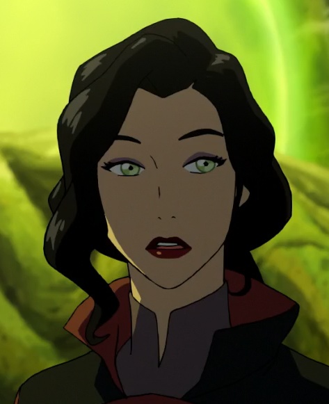
I know the current photo is also the one used on the Avatar Wiki, which is probably how it got here, but I don't think it's super-representative of the Asami Sato we know and love. I'd like to suggest a replacement that I think is more representative of Asami's character particularly as the series progressed. This is a screen capture - she's actually talking to Korra here, but she's down at the docks for business. Solarbird (talk) 10:16, 6 January 2015 (UTC)
Support, I do like this one better than the original, and it looks more representative of how she usually looks in the series. I don't have any issues with the original image, but I would not complain if it got replaced with this. ~Mable (chat) 10:24, 6 January 2015 (UTC)
- We should ping @G S Palmer: hey, you good with this? Solarbird (talk) 10:30, 6 January 2015 (UTC)
- Well, I actually prefer the one we're using now over the new one to be honest, simply because the new one is a bit "off" in terms of character design. I think that episode was done by Studio Pierrot, I remember all the characters looking a tad odd. I wouldn't mind replacing the current one but I think there are better screenshots out there. --Vaerith (talk) 10:59, 6 January 2015 (UTC)
- In that case, I guess we should try to look for another image that everyone approves of? This definitely seems like an improvement to me, though, as I find the current one to look a bit "off" in terms of character design... ~Mable (chat) 11:06, 6 January 2015 (UTC)
- Thanks for the ping, Solarbird. I agree that this one is more representative of the character. Personally, I don't see the problem that @Vaerith: has with the picture: I remember that those episodes had a different look, but this screenshot looks fine. Of course, if they want to find an alternative, I would be fine with that too. In the meantime, though, I would support replacing the current image with this one, and tagging File:Asami Sato 250.png with {{Di-orphaned fair use}}. G S Palmer (talk • contribs) 14:30, 6 January 2015 (UTC)
 Done I also notified the uploader via the orphaned image tag. Vaerith, if you want to find a similarly more representative image made by Studio Mir, I'm open to that - this is Asami's business side, maybe you can find a Studio Mir engineering side that's good? That'd be cool. Solarbird (talk) 17:29, 6 January 2015 (UTC)
- There are a couple of images I have in mind that I think look better, but they don't put an emphasis on Asami's engineer or business side. On the other hand, I don't think that's really necessary anyway. I'm not familiar with uploading images to Wikipedia so I'd have to look it up on how to upload them and all the licensing stuff. But one the images I have in mind is the one when she says "I'll destroy you" when Bolin challenges her to a Pai Sho game (Season 3 episode 7). I guess that might not be "neutral" enough for a profile photo? In any case, that was one of the episodes where Studio Mir were really on top of their game, and in an entirely different league from Studio Pierrot. --Vaerith (talk) 22:38, 6 January 2015 (UTC)
- Well, if you find one, link to it here. It needs to be a good quality screen capture and still have good resolution when not shrunk, which was one of the problems with the other image. It needs to be clear and no less than a medium shot (preferably closeup) - the kind of image that lets people recognise the character immediately and shows detail. I found a lot of really cool pictures of Asami that would've been really great, except that she's far enough back from camera that the crop to just her is tiny, and enlarging it would look terrible. Solarbird (talk) 23:21, 6 January 2015 (UTC)
- I can take screenshots directly from the Blu-rays, so as far as quality goes that's about as good as it'll get. Here's the one I was talking about. Here's another one from Season 1. --Vaerith (talk) 23:29, 6 January 2015 (UTC)
- Well, the first one makes it kind of hard to see the hair shape, which is a pretty big part of her design. Not sure how I feel about the second one. I mean, it's a bit better in the hair-blending-in aspect, but it's, well, not neutral-looking, and also looks kinda low-quality (not the screencap, the actual art itself) and appears to have thicker lines than usual, making me think it's a crop of a shot where she's not the main focus and therefore is drawn less detailed. Eh, I dunno. Hey, just a thought, does any (for our purposes) good art depicting her appear in the LoK artbooks? I don't own copies of any of those books so I can't check it myself. IDVtalk 23:51, 6 January 2015 (UTC)
- This one might work too [1]. 67.252.101.3 (talk) 02:15, 8 January 2015 (UTC)
- That's Book 1, isn't it? It's a fine picture, but unlike the Korra picture in her article, doesn't really reveal as much of her character. Still, if people decide collectively that they'd prefer that one, I wouldn't object. Solarbird (talk) 06:29, 8 January 2015 (UTC)
- It's the one I took from the Book 3 Episode 1 Blu-ray version (just before she teaches Korra how to drive a car), see my post below where I first suggested using that picture. For what it's worth, people on Reddit also seemed to like it. Sure, it doesn't reveal much of her character, but the current one doesn't really tell us a lot more without reading the article. As someone on Reddit mentioned, the screenshot I suggested also happens to highlight the similarity with the photo from Seychelle Gabriel. I don't want to make too big a deal out of this, but I'd just prefer something that more accurately matches how she's supposed to look. If you put the current and new screenshot side by side, I think the difference in design from Studio Pierrot is quite noticeable. Studio Pierrot had a lot of instances where the characters' faces just looked "off", with incorrect positioning of the eyes, nose and mouth. Asami also had a rounder face than she normally does compared to Studio Mir's version. --Vaerith (talk) 19:52, 8 January 2015 (UTC)
- That's Book 1, isn't it? It's a fine picture, but unlike the Korra picture in her article, doesn't really reveal as much of her character. Still, if people decide collectively that they'd prefer that one, I wouldn't object. Solarbird (talk) 06:29, 8 January 2015 (UTC)
- This one might work too [1]. 67.252.101.3 (talk) 02:15, 8 January 2015 (UTC)
- Well, the first one makes it kind of hard to see the hair shape, which is a pretty big part of her design. Not sure how I feel about the second one. I mean, it's a bit better in the hair-blending-in aspect, but it's, well, not neutral-looking, and also looks kinda low-quality (not the screencap, the actual art itself) and appears to have thicker lines than usual, making me think it's a crop of a shot where she's not the main focus and therefore is drawn less detailed. Eh, I dunno. Hey, just a thought, does any (for our purposes) good art depicting her appear in the LoK artbooks? I don't own copies of any of those books so I can't check it myself. IDVtalk 23:51, 6 January 2015 (UTC)
- I can take screenshots directly from the Blu-rays, so as far as quality goes that's about as good as it'll get. Here's the one I was talking about. Here's another one from Season 1. --Vaerith (talk) 23:29, 6 January 2015 (UTC)
- Well, if you find one, link to it here. It needs to be a good quality screen capture and still have good resolution when not shrunk, which was one of the problems with the other image. It needs to be clear and no less than a medium shot (preferably closeup) - the kind of image that lets people recognise the character immediately and shows detail. I found a lot of really cool pictures of Asami that would've been really great, except that she's far enough back from camera that the crop to just her is tiny, and enlarging it would look terrible. Solarbird (talk) 23:21, 6 January 2015 (UTC)
- There are a couple of images I have in mind that I think look better, but they don't put an emphasis on Asami's engineer or business side. On the other hand, I don't think that's really necessary anyway. I'm not familiar with uploading images to Wikipedia so I'd have to look it up on how to upload them and all the licensing stuff. But one the images I have in mind is the one when she says "I'll destroy you" when Bolin challenges her to a Pai Sho game (Season 3 episode 7). I guess that might not be "neutral" enough for a profile photo? In any case, that was one of the episodes where Studio Mir were really on top of their game, and in an entirely different league from Studio Pierrot. --Vaerith (talk) 22:38, 6 January 2015 (UTC)
- Thanks for the ping, Solarbird. I agree that this one is more representative of the character. Personally, I don't see the problem that @Vaerith: has with the picture: I remember that those episodes had a different look, but this screenshot looks fine. Of course, if they want to find an alternative, I would be fine with that too. In the meantime, though, I would support replacing the current image with this one, and tagging File:Asami Sato 250.png with {{Di-orphaned fair use}}. G S Palmer (talk • contribs) 14:30, 6 January 2015 (UTC)
- In that case, I guess we should try to look for another image that everyone approves of? This definitely seems like an improvement to me, though, as I find the current one to look a bit "off" in terms of character design... ~Mable (chat) 11:06, 6 January 2015 (UTC)
- Well, I actually prefer the one we're using now over the new one to be honest, simply because the new one is a bit "off" in terms of character design. I think that episode was done by Studio Pierrot, I remember all the characters looking a tad odd. I wouldn't mind replacing the current one but I think there are better screenshots out there. --Vaerith (talk) 10:59, 6 January 2015 (UTC)
![[1]](http://abload.de/img/asami5yfsq3.png)
Oppose. This pic has a Nick blurb on the bottom of the page. By the way, what exactly is wrong with the previous image? It's a great pic of the character.G. Capo (talk) 02:13, 7 January 2015 (UTC)
- As above, I really think it's unrepresentative, including as of Book 4. (Tho' it does have her Book 4 hair in it, which is useful. And if it's permitted, since it does show her Book 4 hair there's maybe a reason, I'm fine with keeping it for that purpose.) But... I don't get much of any of the impression we've had of the character as a whole from it, which people above seemed to agree with above. This picture makes her look kind of wan, which she's not. Aesthetics aside... I just don't think it's representative of her through the series. Solarbird (talk) 07:24, 7 January 2015 (UTC)
- I added to your caption to note changed hairstyle and height, to support having a second illustrative photo. Since there's a purpose, I think it's reasonable to have both in the article. I also put it by the events of Book 4, while also moving the final spirit column scene down to the discussion of the denouement. This also makes them both more supportable as fair use for purposes of illustration, or so is my intent. Solarbird (talk) 07:37, 7 January 2015 (UTC)
- I think the current way of doing it looks best, as the image is relevant and it makes the wall of text that the plot section still is look much nicer. The reasoning makes sense, so I suggest removing the notice on the page. Also, I personally prefer a small logo on a screenshot than a lower quality screenshot altogether, though I don't know what copyright favors. ~Mable (chat) 07:46, 7 January 2015 (UTC)
- Nick has been okay with screenshot uses as long as they're credited, and the bug is credit, which is a small part of why I picked that shot (and entirely why I didn't edit it out in Photoshop). It's also explained in the picture details, but I figure HEY LOOK WE'RE CREDITING YOU! counts for something given Nick's apparent policies. That may be totally wrong but it's my reasoning, anyway. Solarbird (talk) 07:50, 7 January 2015 (UTC)
- Okay. Considering the fact that Asami did appear as she looks in the caption pic for the majority of the series, I'll drop the issue.G. Capo (talk) 09:17, 7 January 2015 (UTC)
- I'd still like to suggest another Studio Mir alternative to the Pierrot version of Asami. Here's another one from Season 3. It's not my personal favorite, but it's certainly a "neutral" look, even more so than the current one. The colors are also more accurate, as she looks unusually pale in the current screencap. As far as copyright is concerned, I don't see a lot of articles adding a logo to a photo, so I don't think that should be a concern (those logo's themselves are also copyrighted after all). And if it's really required, I could easily add one. Thoughts? --Vaerith (talk) 20:56, 7 January 2015 (UTC)
- Unrelated, but the links you have provided are actually against Wikipedia policy, per WP:LINKVIO. G S Palmer (talk • contribs) 21:38, 7 January 2015 (UTC)
- I'd still like to suggest another Studio Mir alternative to the Pierrot version of Asami. Here's another one from Season 3. It's not my personal favorite, but it's certainly a "neutral" look, even more so than the current one. The colors are also more accurate, as she looks unusually pale in the current screencap. As far as copyright is concerned, I don't see a lot of articles adding a logo to a photo, so I don't think that should be a concern (those logo's themselves are also copyrighted after all). And if it's really required, I could easily add one. Thoughts? --Vaerith (talk) 20:56, 7 January 2015 (UTC)
- Okay. Considering the fact that Asami did appear as she looks in the caption pic for the majority of the series, I'll drop the issue.G. Capo (talk) 09:17, 7 January 2015 (UTC)
- Nick has been okay with screenshot uses as long as they're credited, and the bug is credit, which is a small part of why I picked that shot (and entirely why I didn't edit it out in Photoshop). It's also explained in the picture details, but I figure HEY LOOK WE'RE CREDITING YOU! counts for something given Nick's apparent policies. That may be totally wrong but it's my reasoning, anyway. Solarbird (talk) 07:50, 7 January 2015 (UTC)
- I think the current way of doing it looks best, as the image is relevant and it makes the wall of text that the plot section still is look much nicer. The reasoning makes sense, so I suggest removing the notice on the page. Also, I personally prefer a small logo on a screenshot than a lower quality screenshot altogether, though I don't know what copyright favors. ~Mable (chat) 07:46, 7 January 2015 (UTC)
Oppose. I hate this picture or at least strongly dislike it. Aside from the logo protruding from the side, I'm not exactly understanding why this would be any better than the better quality picture of Asami we had prior to this. I don't really see how her appearing that way for the majority of the series has anything to do with it, as I can remember several of the Dragon Ball character articles having images where they are portrayed not as they were in the majority of the series nor do I understand any fault of the original image. It was chosen on the Avatar Wiki for a reason; because it is more appealing than the one that has replaced it. Informant16 9 January 2015
- This is going to be difficult. Which of the images posted here do you like the most? I've had similar feelings to the previous image as you seem to have to the new one - it just looks particularly ugly to me. Either we find something almost everyone likes, or we should put it up for a fresh vote. ~Mable (chat) 09:52, 9 January 2015 (UTC)
- As per Mable, I quite disliked the old one. I think the colour levels are weird, I think it's too small, I don't like the way it makes her neck look strangely long, and so on. I mean, I'm fine with having it as an additional Book 4 pifture, but if it were up to me, we'd have yet a different one to handle that. (I'm fine with her Book 4 appearance in general, but I do not like that particular screengrab.) All that said, we've talked about a few others above (which lack bugs) since changing out the picture, on the basis that really it should be a Studio Mir and not a Studio Pirrot picture. What do you think of those? Solarbird (talk) 17:06, 9 January 2015 (UTC)
- I've found a few. 1, 2 and 3. There all different from the other picture from the wiki. Informant16 9 January 2015
- I like the first one very much as a Book 4 photo. I'd strongly agree to replacing the current Book 4 photo with that. I like image 2 also - it's a bit small, particularly once cropped appropriately. But even with that, it's a bit larger than what we have there now, so an improvement, so I'd probably go along with it. (I like it as an image, it's just small.) Three wouldn't be bad if it wasn't cropped weird, but it is, so I'm unfond of that one on that basis. BUT: I still think we should have a Book 1-3-design photo in the infobox, because since this isn't a fan wiki, we're supposed to assume that a reader will see this without background knowledge already. That's why we re-explain what the Avatar is, what Benders are, all of that. And if a browser/entry-seeker picks up at the start of the series as a result of this article, they'll get Book 1-3 Asami. Similarly, if they were to pick up at a random point, they have a 75%(ish) chance of getting Book 1-3 Asami. So that's why I think that way. For someone who is not already a fan, a Book 1-3 image will make more sense.
- (I also agree that the fan wiki should have latest-version, and probably should have a Book 4 image as its infobox image. But the audience is different and that's why.)
- But as above, I'm totally onboard with going with a Studio Mir image Book 1-3 over a Studio Pierrot image 1-3 if others want that. We just have to find one that works. Solarbird (talk) 01:08, 10 January 2015 (UTC)
- (And let's make sure @G. Capo: is involved this time. And @Vaerith: and @Maplestrip: and @G S Palmer:. Did I miss anybody?) Solarbird (talk) 01:12, 10 January 2015 (UTC)
- In Season 4 Asami often does have an unusually long neck (especially in the third screenshot Informant16 linked to), which kind of seems to be a side-effect of her not having some type of clothing around it like she did in the other seasons, and the artists not always compensating for that. For reference, here's the screenshots I suggested as possible replacements earlier: [2] [3] [4]. In terms of art, I prefer the first one. In terms of being a "neutral" expression, I think the latter one is better, even though the art is slightly inferior (but I still find it considerably better than Studio Pierrot's version of Asami). Overall, I haven't actually seen anyone state they didn't like that last screenshot (neither here or on Reddit), which is why I think it might be a good choice. In regards to the screenshots Informant16 linked to, if I had to choose from those I'd pick the first one, but she does have a bit of a sad expression there (she was talking to her father in prison then). --Vaerith (talk) 01:39, 10 January 2015 (UTC)
- I'm also open to other suggestions, I can grab high quality screenshots from any episode from Season 1 through 3 from the Blu-ray version (within reason of course, otherwise it'd venture outside of fair use). --Vaerith (talk) 01:44, 10 January 2015 (UTC)
- Oh, yes, those! I wanted to like the second one best but it's so dark where it shouldn't be (hair to clothing, it kind of blends...) and even though I love the expression I can't go for it. But! The third is not expressive (like Korra's is, which is what I really want) but it's fine, and I could certainly accept it. (What's annoying me is that I could fix the second one. But that leads to original edit complications (OE? XD) so yeah let's not.) I think the problem is that Korra is painted in broader strokes, which makes it easier to get a picture that revealing, but Asami is so collected all the time that a still just isn't going to say much. But all that said: I would sign off on the one currently numbered 5 (the third one in the refreshed list) if everybody else agreed. Solarbird (talk) 07:50, 10 January 2015 (UTC)
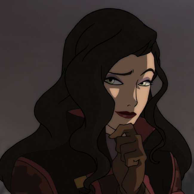
- I get what you mean about the Korra picture. In that case, How about this one? I think this screencap for Asami is actually a really nice counterpart to the one from Korra. And it also seems to capture Asami's "business" style rather well. To be honest I'd really like to try cutting the background from it, since Bumi kind of gets in the way here. Would that really be against the rules? We could crop Bumi out of the picture like I did here, but it somewhat loses the "expression" from the full screencap. --Vaerith (talk) 21:37, 10 January 2015 (UTC)
- I don't like that one, for some reason. It just doesn't seem much like how the character generally looks. G S Palmer (talk • contribs) 21:43, 10 January 2015 (UTC)
- I find the image very amusing, but that's hardly a good reason to use it. It's actually somewhat fitting, compared to that of Korra, and I would support it. Regardless, I guess we can get better. ~Mable (chat) 21:59, 10 January 2015 (UTC)
- I love the character in that one. I love it. And I would support it, but I also acknowledge G S Palmer's commentary above. I agree it's more animated (ha!) than we usually get to see her, and composure is so important to her character that I can see the objection, unfortunately. Solarbird (talk) 03:39, 11 January 2015 (UTC)
- Well, it's indeed not often that we see this kind of expression from her, but I would argue that it's not out of character for Asami either. This was the moment where she presented her Future Industries airship to Korra (who needed one to search for the new Airbenders), so its natural for her to have an expression of pride at that moment. If you look at Season 1, she was equally proud when she first revealed the Sato mobile for Team Avatar. And remember when she first invited Korra to join her in a race with the Sato mobiles. So given how many people would argue Asami is a boring character, this image doesn't exactly help to give people a different view. If you compare it to this, then the latter says more about the character. As this discussion shows, it's difficult and probably impossible to really capture Asami's personality in one screenshot, something which is considerably easier for Korra (at least Season 1 Korra). That's simply because Asami was already considerably more emotionally mature than Korra, Mako and Bolin in Season 1 and you can't always tell what she's thinking based on her expression alone. Would input from other sources like the Reddit community matter in terms of deciding the preferred screencap, or is this something that has to be decided on the Talk page? I'm thinking of compiling all the proposed alternatives in one image together with the current one, so we can have a good overview of them and come to a consensus of which one to use. Unless I'm mistaken, the only one which nobody said they disliked is this one. --Vaerith (talk) 19:31, 11 January 2015 (UTC)
- OK, so here's the selection of different screencaps I talked about earlier. I don't think there are a whole lot more worth adding. It's interesting how Asami's hair seems more detailed throughout Season 3 (notice the glossy hair details). Only in the Season 4 finale it received the same level of detail. I'm still going with number 3 on the list, followed by 1 and 7. But I do kind of like 12 though, despite being the darker Season 1 style. I'd also rank the old screenshot rather highly, if we'd use a higher quality version (I used the original posted here). --Vaerith (talk) 00:49, 13 January 2015 (UTC)
- I like 3 assuming it's large enough. I'd like it a little better with the top of her hair not cropped off so if that's possible, even better. Also as before, I'm fine with 7 also. I adore 12 as a picture - but not for infobox, her hair looks brown in that light when it's black. And even that's just the light, new readers won't know that. Which is a shame, I think it's great. Solarbird (talk) 07:32, 13 January 2015 (UTC)
- OK, so here's the selection of different screencaps I talked about earlier. I don't think there are a whole lot more worth adding. It's interesting how Asami's hair seems more detailed throughout Season 3 (notice the glossy hair details). Only in the Season 4 finale it received the same level of detail. I'm still going with number 3 on the list, followed by 1 and 7. But I do kind of like 12 though, despite being the darker Season 1 style. I'd also rank the old screenshot rather highly, if we'd use a higher quality version (I used the original posted here). --Vaerith (talk) 00:49, 13 January 2015 (UTC)
- Well, it's indeed not often that we see this kind of expression from her, but I would argue that it's not out of character for Asami either. This was the moment where she presented her Future Industries airship to Korra (who needed one to search for the new Airbenders), so its natural for her to have an expression of pride at that moment. If you look at Season 1, she was equally proud when she first revealed the Sato mobile for Team Avatar. And remember when she first invited Korra to join her in a race with the Sato mobiles. So given how many people would argue Asami is a boring character, this image doesn't exactly help to give people a different view. If you compare it to this, then the latter says more about the character. As this discussion shows, it's difficult and probably impossible to really capture Asami's personality in one screenshot, something which is considerably easier for Korra (at least Season 1 Korra). That's simply because Asami was already considerably more emotionally mature than Korra, Mako and Bolin in Season 1 and you can't always tell what she's thinking based on her expression alone. Would input from other sources like the Reddit community matter in terms of deciding the preferred screencap, or is this something that has to be decided on the Talk page? I'm thinking of compiling all the proposed alternatives in one image together with the current one, so we can have a good overview of them and come to a consensus of which one to use. Unless I'm mistaken, the only one which nobody said they disliked is this one. --Vaerith (talk) 19:31, 11 January 2015 (UTC)
- I don't like that one, for some reason. It just doesn't seem much like how the character generally looks. G S Palmer (talk • contribs) 21:43, 10 January 2015 (UTC)
- I get what you mean about the Korra picture. In that case, How about this one? I think this screencap for Asami is actually a really nice counterpart to the one from Korra. And it also seems to capture Asami's "business" style rather well. To be honest I'd really like to try cutting the background from it, since Bumi kind of gets in the way here. Would that really be against the rules? We could crop Bumi out of the picture like I did here, but it somewhat loses the "expression" from the full screencap. --Vaerith (talk) 21:37, 10 January 2015 (UTC)
- Oh, yes, those! I wanted to like the second one best but it's so dark where it shouldn't be (hair to clothing, it kind of blends...) and even though I love the expression I can't go for it. But! The third is not expressive (like Korra's is, which is what I really want) but it's fine, and I could certainly accept it. (What's annoying me is that I could fix the second one. But that leads to original edit complications (OE? XD) so yeah let's not.) I think the problem is that Korra is painted in broader strokes, which makes it easier to get a picture that revealing, but Asami is so collected all the time that a still just isn't going to say much. But all that said: I would sign off on the one currently numbered 5 (the third one in the refreshed list) if everybody else agreed. Solarbird (talk) 07:50, 10 January 2015 (UTC)
- I personally really like 7 and 11. I also like 9 and 12, but sadly, the lighting of those images are way off. I prefered the full version of 3, despite Bumi being in the background. I wouldn't object to 4 and 8. The rest are... ehhhhh.... ~Mable (chat) 08:13, 13 January 2015 (UTC)
- I think we're really close. I think we came close to agreeing on 3, maybe with a different crop. Let me see if I can make a different crop that works for everyone. If not that, do we have general acceptance of 7? Solarbird (talk) 19:35, 16 January 2015 (UTC)
- 7 is pretty good and 3 is okay. I'm cool with it either pic. G. Capo (talk) 04:35, 17 January 2015 (UTC)
COMMENT: I have removed a number of links from the thread above per WP:LINKVIO. I know this makes it hard to discuss which images to use, but Wikipedia can't host links to reproductions of copyrighted materials. G S Palmer (talk • contribs) 21:04, 9 January 2015 (UTC)
- That's unneeded, I think. Linking to small samples of copyrighted material on talk pages for the purpose of discussion is exceedingly unlikely to be considered contributory copyright infringement, because it is the sort of use that fair use is intended to cover. The LINKVIO policy is mainly intended to prohibit links to pirate websites hosting commercially valuable content. Sandstein 21:17, 9 January 2015 (UTC)
- Okay, I'll respect your judgment. I've restored the links. G S Palmer (talk • contribs) 22:59, 9 January 2015 (UTC)
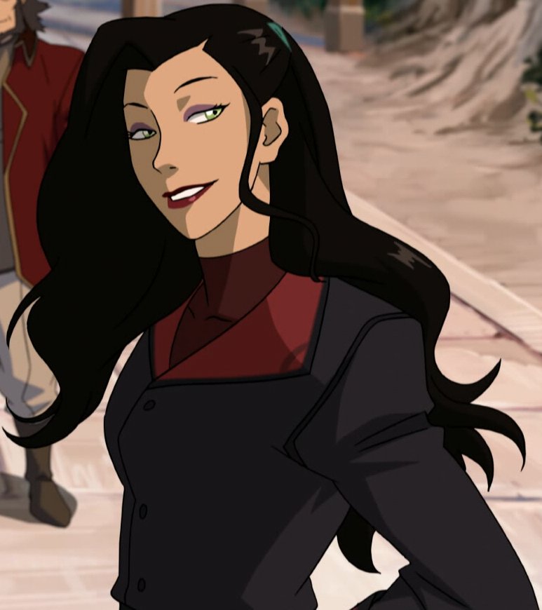
I guess I like the third one by Vaerith the most, from the ones that were posted. I agree with intent to use a book 1-3 image to represent the character. ~Mable (chat) 10:50, 10 January 2015 (UTC)
OKAY HERE IS A NEW CROP OF 3 Proposed Asami Sato Fair Use Picture I also cleaned up some jpg artefacting, I hope that's okay. @Maplestrip, G S Palmer, and Vaerith: What do you think? Solarbird (talk) 20:18, 16 January 2015 (UTC)
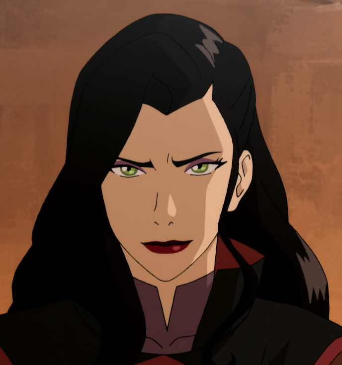
- Not very representative, in my view, it highlights the "vamp" aspect of her design that doesn't do her character much justice. She isn't usually that expressive. Something based on character reference images might be more appropriate or something else creator-approved (I like the lower one). Sandstein 21:01, 16 January 2015 (UTC)
- You think that looks vampish? Huh. I don't see it. But... 'kay... What did you think of 7 in the big box above? That seemed to be an acceptable second choice for a lot of people. Solarbird (talk) 23:25, 16 January 2015 (UTC)
- @Solarbird:, Here's the original PNG image of the JPG I posted earlier, so you didn't actually have to spend time trying to clean up the jpg artifacts. I'd recommend we crop the PNG version instead if we were to use the image, since it's basically the highest quality version out there. Obviously I really like this image since it's such a nice counterpart to Korra's photo, and I think the crop you made of it is a good compromise between getting Bumi out of the way while preserving what makes the image special. As for her typically not being that expressive, I'd argue that's exactly why the image is a good choice (I made a case for that earlier on in the thread). As for the "vamp" argument, I don't really see it either (I'd argue her design in Season 1 often emphasized the "vamp" aspect a lot more). It's really just Asami smiling and, uh, looking "snazzy as usual" :) I'm rather confident that if we were to ask more fans (on for example Reddit) for their preferred choice, that this image would be a very popular choice. But I guess the consensus must be reached here on the Talk page.
- With that said, I'm also surprised that Sandstein just linked to basically the exact same image that I first posted as an alternative. And I didn't know that Bryan actually linked to it as well and said it was a great Asami drawing, but it's not entirely surprising to read that either. In terms of artwork it's one of the best quality images of Asami available, in an episode that featured (in my opinion) some of the best art and animation of the entire four seasons. So it's good to see support for that image as it's still one of my preferred images. But of course this doesn't get us closer to a consensus. I do think that, out of all the alternatives posted here, that there are three images that people seem to be putting forward. We have this one, then the creator-approved one like and then the "neutral" one which nobody dislikes but nobody really prefers either. So in terms of consensus I'm guessing the last image might be preferred, but at the same time it tends to be the least interesting in terms of expression. I'd accept it as well to reach a consensus, even though I'd personally use one of the other ones since those just have more "character". --Vaerith (talk) 00:04, 17 January 2015 (UTC)
- You think that looks vampish? Huh. I don't see it. But... 'kay... What did you think of 7 in the big box above? That seemed to be an acceptable second choice for a lot of people. Solarbird (talk) 23:25, 16 January 2015 (UTC)
Resetting indents again to keep it followable: while none of us think it's best (and sadly few of us agree what that is XD ), do we all find the "neutral" one acceptable? If we do, I'd like to replace the current Studio Pierrot with this one, on the basis that this one is acceptable to everyone and was done by Studio Mir, and thus is more representative of the style of the series as a whole and books 1-3 in particular. Is this okay? Solarbird (talk) 17:58, 17 January 2015 (UTC)
- Okay, I'm sorry for completing things yet again but... I'd agree on using the "neutral" screencap, but there's one last image that I wanted to add. It's this one. As far as I'm aware, this is the only Season 4 image using Asami's new hairstyle that also received the same level of detail she had in Season 3 (it's because of the "glossy" hair, in Season 4 they always used a single color for Asami's hair with no extra detail, except in the finale). Personally I think it might be a better neutral image than the Season 3 one. The background doesn't get in the way and if the image is a bit too dark, the levels can be adjusted. And if it's not deemed suitable for the article photo, perhaps it could be worth considering as a replacement for the current Season 4 screencap. In any case, if the new "neutral" image isn't deemed preferable by everyone, I'll support the old neutral one. --Vaerith (talk) 23:04, 17 January 2015 (UTC)
- Support neutral picture so we can end this discussion. I'm not a huge fan of the Season 4 screencap Vaerith proposed because it's too dark. Honestly, I think the one in there for season four is fine. If that's the only screencap we can find with that detail, it's not representative of her look for the whole season. But if everybody else likes it, I'm okay AS LONG AS it's lightened in photoshop. Luthien22 (talk) 04:58, 18 January 2015 (UTC)
- Support neutral picture, and I'm not a big fan of Vaerith's picture either because her entire face is in a shade. She also starts to look "derpy" when I stare at her for too long (probably due to the open mouth). I don't think it's a better representative of season four than the one we got either, though I do find it more attractive to look at. ~Mable (chat) 09:48, 19 January 2015 (UTC)
- @G S Palmer: Are you okay with using the neutral screencap? I don't think you commented on it yet. Sandstein didn't object to using it so it would seem we're close to a consensus. --Vaerith (talk) 23:01, 19 January 2015 (UTC)
- Meh. It's okay, I guess. Personally, I like your latest suggestion better, followed by number 1 from the collection and this one (I didn't like it at first, but I changed my mind). But if the rest of you have already come to an agreement, I can live with that one. G S Palmer (talk • contribs) 00:19, 20 January 2015 (UTC)
- Yeah, I think we're all at that "well, this one's okay" point. None of us think it's best, but we'll all accept it, which optimistically means it's at least a decent average. And it's Mir rather than Pirrot, so I agree it's better than current on that basis. Unless someone else jumps in tonight, I'll upload it and replace the current. So last call for that, I guess? Solarbird (talk) 00:46, 20 January 2015 (UTC)
- Well, with G S Palmer's change of mind on this one, I think it's only Sandstein who was against using it. So I'd be interested in hearing his/her final opinion on that image given how more people now prefer it over the neutral one. @Sandstein: Can you share your thoughts?
- Fair enough. Hey, @Sandstein:, final call from your end? Solarbird (talk) 07:17, 20 January 2015 (UTC)
- Thanks. Actually, I'm not a fan of this one, because I think it's rather off model. I prefer the "neutral" one more. If everybody else agrees, though, I don't mind. Maybe a WP:Straw poll to make everybody's preferences more transparent? Sandstein 08:56, 20 January 2015 (UTC)
- Well, that's effectively what this has been. Everyone is okay with the "netural" shot, even if it's not their favourite, even G. Capo who didn't chime in again this latest time but stated their preferences from the block of 12 before. (It was actually their first Book 1-3 choice, so I guess it is one person's favourite.) Everybody else has it second or third and nobody really objects, so I'm going to go ahead with the "neutral" picture. Solarbird (talk) 22:16, 20 January 2015 (UTC)
- Thanks. Actually, I'm not a fan of this one, because I think it's rather off model. I prefer the "neutral" one more. If everybody else agrees, though, I don't mind. Maybe a WP:Straw poll to make everybody's preferences more transparent? Sandstein 08:56, 20 January 2015 (UTC)
- Fair enough. Hey, @Sandstein:, final call from your end? Solarbird (talk) 07:17, 20 January 2015 (UTC)
- Well, with G S Palmer's change of mind on this one, I think it's only Sandstein who was against using it. So I'd be interested in hearing his/her final opinion on that image given how more people now prefer it over the neutral one. @Sandstein: Can you share your thoughts?
- Yeah, I think we're all at that "well, this one's okay" point. None of us think it's best, but we'll all accept it, which optimistically means it's at least a decent average. And it's Mir rather than Pirrot, so I agree it's better than current on that basis. Unless someone else jumps in tonight, I'll upload it and replace the current. So last call for that, I guess? Solarbird (talk) 00:46, 20 January 2015 (UTC)
- Meh. It's okay, I guess. Personally, I like your latest suggestion better, followed by number 1 from the collection and this one (I didn't like it at first, but I changed my mind). But if the rest of you have already come to an agreement, I can live with that one. G S Palmer (talk • contribs) 00:19, 20 January 2015 (UTC)
- @G S Palmer: Are you okay with using the neutral screencap? I don't think you commented on it yet. Sandstein didn't object to using it so it would seem we're close to a consensus. --Vaerith (talk) 23:01, 19 January 2015 (UTC)
![]() Done Infobox picture changed to "neutral" image, as per consensus above. Solarbird (talk) 22:42, 20 January 2015 (UTC)
Done Infobox picture changed to "neutral" image, as per consensus above. Solarbird (talk) 22:42, 20 January 2015 (UTC)
- Thanks Solarbird. I was wondering if the resolution of an image is a factor in determining whether or not it's valid for free use? Seeing how the original is basically at its maximum resolution (albeit cropped). --Vaerith (talk) 22:48, 20 January 2015 (UTC)
- I don't think so but I don't know for sure. If it does, we can resize it smaller. I think our usage is certainly appropriately small, and it's nowhere near print resolution (for, say, commercial use in art) so I would really think we'd be okay.
- Separately, something I didn't notice until I put it in - the new neutral picture really highlights the Rita Hayworth similarities now. I like it better, seeing it in that context. Solarbird (talk) 22:52, 20 January 2015 (UTC)
Overlong? Seriously?
It looks like my work is done here. While I would have thought it wise to include the commentary that various portions of the media have posted over the years to show a diverse perspective of the character, it seems Trystan would rather censor that, due to his claims that the section was "overlong". Looking at this page and the longest on the site, I'd not only beg to differ, but question how an article here could ever be overlong without some sort of split. I've seen that done multiple times here for other pages. I wouldn't recommend one for this page because it is not long in general, nor is that section, but if it were, it seems to make more sense to me to split the reception than keep removing it on the grounds that one person can determine what is important and what is not. --Informant16 30 March, 2015
- We do want multiple quotes to provide diverse views on the character. You have done a lot of work to find those sources and add them to the article, for which I thank you. But at a certain point, adding further quotes from people saying more or less the same things starts to make the section unreadable and unfocused. The business of writing an encyclopedia involves looking at the broad array of sources and then summarizing them into something concise and readable that gets the central ideas across to the audience. Quotes can be used to provide representative views, but the coverage shouldn't become an indiscriminate quote farm. Determining what is important and what is not is exactly what we do here - we base it on making sure we give due weight to the views expressed in the reliable sources we have canvassed. It's not censorship not to quote everything everyone has ever said about a topic.
- While this is a topic I find interesting, I would suggest this article should not aspire to be among the longest articles on this site, or anywhere close to that long. Sections can be split out if they become overlong if the subtopic independently meets WP:N; I would suggest that it not the case here, but you can propose it for feedback from others if you wish.--Trystan (talk) 23:53, 30 March 2015 (UTC)
External links modified
Hello fellow Wikipedians,
I have just modified one external link on Asami Sato. Please take a moment to review my edit. If you have any questions, or need the bot to ignore the links, or the page altogether, please visit this simple FaQ for additional information. I made the following changes:
- Added archive https://web.archive.org/web/20090317063646/http://scifiwire.com:80/2009/03/more-are-cast-in-m-night.php to http://scifiwire.com/2009/03/more-are-cast-in-m-night.php
When you have finished reviewing my changes, please set the checked parameter below to true or failed to let others know (documentation at {{Sourcecheck}}).
This message was posted before February 2018. After February 2018, "External links modified" talk page sections are no longer generated or monitored by InternetArchiveBot. No special action is required regarding these talk page notices, other than regular verification using the archive tool instructions below. Editors have permission to delete these "External links modified" talk page sections if they want to de-clutter talk pages, but see the RfC before doing mass systematic removals. This message is updated dynamically through the template {{source check}} (last update: 5 June 2024).
- If you have discovered URLs which were erroneously considered dead by the bot, you can report them with this tool.
- If you found an error with any archives or the URLs themselves, you can fix them with this tool.
Cheers.—InternetArchiveBot (Report bug) 09:56, 19 October 2016 (UTC)
External links modified
Hello fellow Wikipedians,
I have just modified 2 external links on Asami Sato. Please take a moment to review my edit. If you have any questions, or need the bot to ignore the links, or the page altogether, please visit this simple FaQ for additional information. I made the following changes:
- Corrected formatting/usage for http://scifiwire.com/2009/03/more-are-cast-in-m-night.php
- Added archive https://web.archive.org/web/20150322015112/http://comicsalliance.com/legend-of-korra-review-finale-spoilers/ to http://comicsalliance.com/legend-of-korra-review-finale-spoilers/
When you have finished reviewing my changes, you may follow the instructions on the template below to fix any issues with the URLs.
This message was posted before February 2018. After February 2018, "External links modified" talk page sections are no longer generated or monitored by InternetArchiveBot. No special action is required regarding these talk page notices, other than regular verification using the archive tool instructions below. Editors have permission to delete these "External links modified" talk page sections if they want to de-clutter talk pages, but see the RfC before doing mass systematic removals. This message is updated dynamically through the template {{source check}} (last update: 5 June 2024).
- If you have discovered URLs which were erroneously considered dead by the bot, you can report them with this tool.
- If you found an error with any archives or the URLs themselves, you can fix them with this tool.
Cheers.—InternetArchiveBot (Report bug) 23:35, 31 March 2017 (UTC)
External links modified
Hello fellow Wikipedians,
I have just modified one external link on Asami Sato. Please take a moment to review my edit. If you have any questions, or need the bot to ignore the links, or the page altogether, please visit this simple FaQ for additional information. I made the following changes:
- Added archive https://web.archive.org/web/20120722195453/http://www.strangehorizons.com/reviews/2012/07/the_legend_of_k.shtml to http://www.strangehorizons.com/reviews/2012/07/the_legend_of_k.shtml
When you have finished reviewing my changes, you may follow the instructions on the template below to fix any issues with the URLs.
This message was posted before February 2018. After February 2018, "External links modified" talk page sections are no longer generated or monitored by InternetArchiveBot. No special action is required regarding these talk page notices, other than regular verification using the archive tool instructions below. Editors have permission to delete these "External links modified" talk page sections if they want to de-clutter talk pages, but see the RfC before doing mass systematic removals. This message is updated dynamically through the template {{source check}} (last update: 5 June 2024).
- If you have discovered URLs which were erroneously considered dead by the bot, you can report them with this tool.
- If you found an error with any archives or the URLs themselves, you can fix them with this tool.
Cheers.—InternetArchiveBot (Report bug) 06:47, 10 July 2017 (UTC)