
Talk:Main Page/Archive 14
| This is an archive of past discussions. Do not edit the contents of this page. If you wish to start a new discussion or revive an old one, please do so on the current talk page. |
| Archive 10 | ← | Archive 12 | Archive 13 | Archive 14 | Archive 15 | Archive 16 | → | Archive 20 |
(untitled)
56 table-of-contents sections, 13 archives of old talk and 6 pages of talk about layout and colours? Give me a break! Why don't people devote their time to producing content? Miguel 19:38, 2004 Feb 24 (UTC)
- Actually 10 pages of talk about layout. Perhaps we devote our time to layout so that it looks good enough to attract more people producing content and not lost them baffled with arcane Main Page. ;)
Forseti 08:40, 25 Feb 2004 (UTC)
Critiques of the new front page
IMO, the new page looks a lot better than the old one. However, it's getting a little cluttered. I think we should avoid the "web-portalish" look (i.e. a painfully overwhelming layout; visit http://www.lycos.com/ for an example). I would reduce the amount of text in the "Featured article"/"In the news" to 75% of what it is now. Connelly 06:59, 24 Feb 2004 (UTC)
I like the new front page!
Congrats on the new-look main page - much more professional looking! dramatic 20:11, 23 Feb 2004 (UTC)
- Good. I was afraid to be de-sysadmined when I brought it live! -- Kaihsu 20:13, 2004 Feb 23 (UTC)
- Mav thinks we might be unable to keep this reasonably up to date.—Eloquence
- You are wrong. You will see.—Eloquence
- We have a lot of sysops, right? Some of all those can easily fix & update the mainpage at times they just feel like it. —Sverdrup(talk) 21:33, 23 Feb 2004 (UTC)
- Why not just say "In history" instead of "A day in history"?
The new colors totally suck!!! I like the old ones better.
- The new colors are much betta, imho. jengod 20:37, Feb 23, 2004 (UTC)
- New colors are much better! Perl 21:12, 23 Feb 2004 (UTC)
Looks good. The division into a normal and a community main page is also a good step towards a more "professional" look. Thanks. DrZ 20:56, 23 Feb 2004 (UTC)
- I dunno, I don't like it. Maybe I'm just too used to the old one, but somehow I can't say I'm too fond of the new one. PMC 21:19, 23 Feb 2004 (UTC)
It's a lot clearer. Much less busy. And with pictures. Ooooh. And spaces between lines. Aaaah. It might be good to have an in-depth front page, too. Good work overall, IMO. Mr. Jones 21:34, 23 Feb 2004 (UTC)
Congrats on the new main page, it's looking fab! -- Graham :) 21:41, 23 Feb 2004 (UTC)
I agree - it looks fantastic. Keeping it up to date might be a challenge, but I think it can be done. Ambivalenthysteria
At first I thought "ugh!" then "wow, that's gonna be a lot of work, summarizing everything every day, glad I'm not an admin," and finally "y'know, I think I like it!" :) It's growing on me. Good work! --zandperl 02:17, 24 Feb 2004 (UTC)
Very nice, but looks difficult to maintain. Metasquares 03:35, 24 Feb 2004 (UTC)
Excellent. Thank you! MH 11:31, 24 Feb 2004 (UTC)
It looks fantastic. Very professional. Jpo 16:01, 24 Feb 2004 (UTC)
Amazing redesign. -Itai 16:04, 24 Feb 2004 (UTC)
Too much scrolling
I prefer the old frontpage, there you could see all the 'in the news', 'recent additions', 'featured pages', etc. categories at once. And it was just half a page of scrolling to the bottom. Now the frontpage is too large - once can't see all the 'changing' categories at once. Abigail 11:44, Feb 24, 2004 (UTC)
Second this comment. I do not want the chief Wikipedia presentation (seen by everyone) to look just like some commercial web page. It should fit on a single (nominal) screen. The main page should be, essentially, a collection of pointers to more, not images and bitty comments/teasers. Change the new style. It's not good for Wikipedia! ww 17:02, 24 Feb 2004 (UTC)
I agree and disagree. I think it should fit on a single view, but I love the new layout. —Noldoaran (Talk) 02:50, Feb 25, 2004 (UTC)
Date Standard
[[23 February]] or February 23--obits has the former, the rest has the latter. What do we do? jengod 20:37, Feb 23, 2004 (UTC)
- Why not just wikify the obituary dates, so that the users' preferences will make them all look the same? Arwel 21:26, 23 Feb 2004 (UTC)
- Ah. I see, although the dates in Template:Holidays are wikified, they're not formatted as dates are in ordinary articles. Something for the developers to look at! Arwel 21:32, 23 Feb 2004 (UTC)
Unprotected MediaWiki Messages
I protected the 6 embedded {{msg:xxx}} tags of the new page design, assuming that not protecting them was an oversight. Maximus Rex 20:43, 23 Feb 2004 (UTC)
- I assume one rationale for moving it in the first place was to make these sections editable while reducing the risk of vandalism.—Eloquence 20:47, Feb 23, 2004 (UTC)
- Sure thing. I learnt how {{msg:xxx}} works just today, and I don't think casual vandals will (bother to) figure it out. Chalk one up for security through obscurity ;^)
- P.S move this thread outta here fast! Just joking :-) -- Arvindn 15:33, 25 Feb 2004 (UTC)
In the news
I'd just like to say that I really like having full sentences for "In the news" - as it was before, it was like solving a mystery to figure out *why* something was in the news. →Raul654 20:48, Feb 23, 2004 (UTC)
I suggest rewording the request for comments slightly
Since this page will be seen by large numbers of complete newcomers, it might be better to say
- Please let us know what you think about our new Main Page on its discussion page!
rather than the discussion page. Otherwise people might think the link goes to a general discussion page, and we'll get things posted here that should be on the Pump, at the Desk, or somewhere completely different. - IMSoP 21:09, 23 Feb 2004 (UTC)
More info!
The new mainpage lacks these things:
- A larger number of selected articles
- More info in the first paragraph! State our goal right there! (as it was) (our aim is to create a comprehensive and free encyclopedia-ish)
- More text, on all issues.
We could however skip the obituaries. I can't see why they are not news like the rest.
I confess that the I liked the old layout, but we'll see what I say in a 3 days when I've accustomated mystelf to the new MP. It looks fresh, at the least. —Sverdrup(talk) 21:39, 23 Feb 2004 (UTC)
- More links do not mean more information. This Main Page his fewer links, but much more context for the individual pages, which increases the incentive to actually follow the links. I have rarely ever followed a link from the old Main Page, to be honest. We may add more to the individual sections, but this should not be at the expense of the length of the summaries.—Eloquence 21:48, Feb 23, 2004 (UTC)
- Maybe we don't use the wiki in the same way. I hardly ever clicked the categorizing links formerly to the left (no critisim against their being in the new MP), but often followed links in Featured articles - New articles - in the news and Anniversiaries.
- You have a point, on that we should be clear with what we wish to present, and keep the info volume of the MP low to keep usability at high - but I have a simple adjustment I'd like to be done: why not move anniversiaries to the right, and make the left section be 3-4 items like the current featured article and did you know. That'd look good to me, also if the almanac-like info we want to keep in the main page is slightly shrunk in text size.
- Since January 2001 we have been working on 212954 articles in the English version. -- This is not true. Lirath Q. Pynnor
- Argh, your right. I don't see how anyone could have missed that. This needs to be fixed immediately!!! Perl 21:47, 23 Feb 2004 (UTC)
- We've started in January 2001 -- this is bad grammar. Perhaps we need more sysops? Lirath Q. Pynnor
- I nominate Lir! Perl 21:55, 23 Feb 2004 (UTC)
- One of your existing admins just fixed the grammar problem. :-) Hopefully that's fast enough for you, Lir. Jwrosenzweig 21:58, 23 Feb 2004 (UTC)
- In reality, this should probably just be changed to a msg. Perl 22:23, 23 Feb 2004 (UTC)
- One of your existing admins just fixed the grammar problem. :-) Hopefully that's fast enough for you, Lir. Jwrosenzweig 21:58, 23 Feb 2004 (UTC)
- I nominate Lir! Perl 21:55, 23 Feb 2004 (UTC)
New layout
It's nice that the new layout has more details, but it seems a little too slick - makes it look kind of corporate, if you know what I mean. The old way looked more "folksy" somehow.
Is "We've started in January 2001" correct grammar? Doesn't sound right.
Tualha 21:54, 23 Feb 2004 (UTC)
- I most definitely like this new layout, it doesn't seem "corporate" to me, but just "modern" and oriented a little more towards quick facts. But I think there need to be more of the old links to policy pages, FAQ pages, and those kinds of things. Those seem to be missing from the current version. -- Dan Carlson 22:00, Feb 23, 2004 (UTC)
- Have you seen Wikipedia:Main Page?—Eloquence
Reworking intro paragraph
Welcome to Wikipedia, a multilingual, free-content encyclopedia being written collaboratively by thousands of Internet users since January 2001. We're currently working on xxxxxx articles in the English version, and you can help, too. Visit the Community Main Page to find out how.
Comments? I think something more like that would be much more welcoming, a deficiency of the current text, IMHO. -- Seth Ilys 21:56, 23 Feb 2004 (UTC)
- January 2001 is kind of a sacred date - I'd like to keep it in there. Also one of the first questions many journalists ask.—Eloquence
- Makes sense. -- Seth Ilys 22:04, 23 Feb 2004 (UTC)
- I like it. -- James Anatidae @965, 23 Feb, 2004
Just want to say the new layout looks more modern and much nicer than the previous cluttering one. Particularly pictures are eye-catching. It's very good. -- Taku 22:15, Feb 23, 2004 (UTC)
Seductive layout...
It works like the glossy paper wrapper on a book. It's much more accessible to a first-time user. Wetman 22:23, 23 Feb 2004 (UTC)
- Agreed. Kent Wang 22:28, 23 Feb 2004 (UTC)
I really like the new layout. Nice work! Tannin
Question
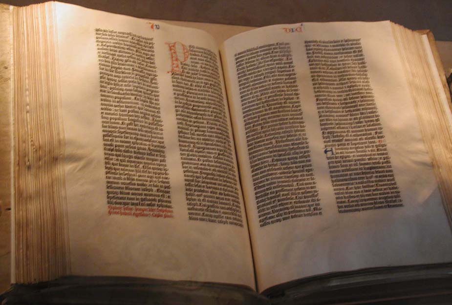
I wanted to change the gutenberg bible image to the one I uploaded and put into the article yesterday (it's a lot better than the current one), but the messages used on the main page don't show up on Wikipedia:MediaWiki custom messages. Where do I go to change them? →Raul654 22:38, Feb 23, 2004 (UTC)
Nevermind - they aren't linked from the custom messages page, but I guessed the URL(s). →Raul654 22:48, Feb 23, 2004 (UTC)
Table Borders
I've noticed the large table cells containting "Featured Articles" and "In The News" look different in Mozilla Firefox (0.8 Windows) and IE6. They have black borders in Firefox and light gray borders in IE. You can make them look the same by adding "border:lightgray" to the style attributes of these two TD elements. New look is great, by the way. User:Farmerchris 22:41, Feb 23, 2004 (UTC)
This applies to the two large cells at the bottom of the page too ("Browse Wikipedia by topic" and "Wikipedia in other languages"). Farmerchris 22:45, 23 Feb 2004 (UTC)
Maintenance needs
The new design looks great! In following its development as a test page, I didn't think it was ready yet, but I've definitely reconsidered. I like the commitment to Today in history. We also need to do more to keep our news section up-to-date, with heavier turnover than we had under the old design. All this means we need quite a few sysops working on it regularly. The design change has generated some enthusiasm, now we need sustained interest. --Michael Snow 23:03, 23 Feb 2004 (UTC)
- At least for now, you don't need to be a sysop to edit the various components at the page (see links at the top of this page).—Eloquence 23:13, Feb 23, 2004 (UTC)
I would like a link to the Wikipedia:Announcements page. Modster 23:05, 23 Feb 2004 (UTC)
- I would like it to always be editable by non sysops. (i'm not a sysop) Perl 23:14, 23 Feb 2004 (UTC)
- I second. I'm not interested in being a sysop, but I think that, with the sections as mediawiki messages, they're sufficiently protected from vandalism and straightforward in their layout that there's no need to restrict them. - Seth Ilys 23:35, 23 Feb 2004 (UTC)
Hey, there's no link to edit the Obituaries section! --Michael Snow 00:33, 24 Feb 2004 (UTC)
- Yeah, I noticed this. It'd be good if this were the case. Ambivalenthysteria 24 Feb 2004 (UTC)
Very Good
I like the new main page a lot. It looks better, it's more categorized, and easier to access for first time users. The pictures of the featured articles, news, etc makes it much more professional. It does not have some of the categories the old one does eg: Welcome, newcomers however I don't mind. The only thing I think would be nice is have an old version main page at least temporarily until people get used to the new one. ZackDude 23:38, 23 Feb 2004 (UTC)
- I like it, but i'm still divided on it.
--Saint-Paddy 23:53, 23 Feb 2004 (UTC)
- The welcome newcomers type of stuff is on the new community main page (Wikipedia:Main Page). I believe an old version of the main page is at Main Page/Old. Gentgeen
Did You Know...
That it wasn't Eqbal Ahmad's brother Daniel at all, it was Philip Berrigan's brother. Please read the article more carefully before putting that on the main page! I'm a sysop and I'd change it but I don't know how, it uses a message for that now and I have no idea how to change those. Sarge Baldy 23:44, Feb 23, 2004 (UTC)
- In general, just edit [[MediaWiki:messagename]]. In this case, the actual links are at the top of this talk page. Dori | Talk 23:48, Feb 23, 2004 (UTC)
- Thanks. I noticed the section doesn't refresh until the main page is updated again, that seems kind of bothersome. Sarge Baldy 23:56, Feb 23, 2004 (UTC)
Much better
I'm very happy overall with the new front page. Although total information content has dropped (with the movement of many things to the Community Main Page), it really grabs your attention with the photographs and immediately relevent facts.
If I had to note a disadvantage, it would be that this page encourages reading above writing of articles; this may not even be a disadvantage.
Derrick Coetzee 00:04, 24 Feb 2004 (UTC)
- This main page is for readers (who outnumber writers IIRC 20-40 to one if not more). I think it was a great idea to separate the two functions. The old main page (which I helped design and itself was a great improvement over the really old main page) tried to do too many things at once. --mav 02:25, 24 Feb 2004 (UTC)
It's Great!
Simply put: nice job guys.
Spectacular!
I really enjoy the look, though I'd shave a bit off the top (ie, move the Welcome to Wiki to a sidebar) and reduce the size of the topic boxes just a bit if I could get four boxes showing instead of just two (on my 17" monitor). Keep working on it! Denni 00:41, 2004 Feb 24 (UTC)
Beautiful
The main page is lovely. The pictures are especially nice although maybe a little bit much. However, I have a question about the Did you know... section - what exactly is it's purpose, and what kinds of articles go there? How is it different from the Featured article? -Alex S 01:41, 24 Feb 2004 (UTC)
- It's the new incarnation of "new pages", but the name is obviously confusing. Unless someone objects, I'm going to change it shortly. →Raul654 01:44, Feb 24, 2004 (UTC)
Alternative headings for Did you know
- Propose an alternative heading, then I can tell you if I have objections.—Eloquence
Just to throw out a few ideas:
- "Featured new article" Voting: Alex S
- "New article du jour"
- "New article spotlight" Voting:
- "New article"
- "Did you know..." Voting: Kingturtle, Perl, —Eloquence, Seth Ilys, Elf, Jengod
- "Hot off the presses"
- "Now Showing"
- "Freshly Written"
- "New and Improved" Voting Mr. Jones
→Raul654 02:07, Feb 24, 2004 (UTC)
Creates a much better first impression. Looks more professional and modern. Well done guys. Splitting the community from encyclopedia elements is retrospectively a rather sensible move. ChrisG 01:59, 24 Feb 2004 (UTC)
Disasterous
Cluttered with excessive information, the layout stretches far too low. No one wants to scroll that much. In short, it's a complete disaster. I would reccomend immediate reversion to the former format until a better idea surfaces. And by 'better idea' I mean just about any idea in the entire world. 172.171.61.76 01:54, 24 Feb 2004 (UTC)
- Actually the old page was cluttered with excessive information. Much material has been removed for this version. I suspect you are browsing at a very low resolution, may I ask which?—Eloquence
- I don't know why, but I think the previous main page looked better. Probably due to lack of good pics for front page or maybe its the lack of colours. Maybe I had got used to the colour scheme. I would suggest that while you keep the pics, revert to the old scheme where coloured borders and header names are in bold inside a darker background while the article links are in a lighter colour. The colours used earlier were soft and soothing. I really can't say if Eloquence is right about clutter. Maybe some stuff was removed but a lot of links have been pushed down. I would rather say the previous compact layout was better. The old look was closer to BBCi (neat) most stuff within one scroll on my mouse and BBCi (not BBC news) front page has a soft colour scheme. The new look is like CNN (yuck) lots of things have been pushed down. The pics are almost black and white. Which gives it a dull look. Maybe the pics do not fit in with a colour scheme. Another thing the pics are thumbnails. They are very small. Whatever there size, more colours will look better anyway. AY 03:12, 24 Feb 2004 (UTC)
Unique nature of Wikipedia is submerged
While I would not call it a disaster, it is inferior because information about What Wikipedia is all about is submerged, and nearly invisible. For that reason alone, I think we should seriously go back for now, and get to the drawing board. At the very least, one of the columns (right hand side?) should be dedicated to Wikipedia information, languages, Village Pump, Announcements, etc. This is a revolutionary project and right now it looks like YANAIS (Yet another news and information site). Also, there is way too much white space in the layout, and not an effective use of real estate. Fuzheado 02:23, 24 Feb 2004 (UTC)
- I completely agree with Fuzheado here. I don't think many people go to WP/Main_page for news. It is not my home page anymore. Humus sapiens 04:18, 24 Feb 2004 (UTC)
- See below re: real estate. Have you seen Wikipedia:Main Page?—Eloquence
- For the record, although I think that page is ugly, I think the introduction is good - better than what we have on the current main page. →Raul654 02:27, Feb 24, 2004 (UTC)
- The current main page is for readers who greatly outnumber writers. --mav 02:28, 24 Feb 2004 (UTC)
- But we also risk not being able to turn our readers into writers, which is what makes Wikipedia flourish. It's not apparent from the new main page that this is what we're about. Maybe the text about what we are is no smaller, but the pictures and layout draw the most attention, such that I'd be liable to skip the top message. Fuzheado 02:32, 24 Feb 2004 (UTC)
- I think it is fair to say that most people did not become Wikipedia editors by visiting the Main Page and reading about Wikipedia being editable, but by coming across an article via a search engine and noting its editability. That being said, however, it is important for us to draw attention to Wikipedia's editability.
- If you think that the images draw attention away from this fact, I think it would be premature to conclude that we must eliminate the images. On the other hand, we may want to think about ways to draw more attention to this small introductory paragraph which contains so much important information. Maybe a change of the border color, maybe an image which represents Wikipedia's editability? As a start, I have added a link directly to editing the sandbox.—Eloquence
- That's why I strongly suggest that we rework the introductory paragraph. I suggested a revision above that (to me at least) is much more welcoming to potential new contributors... -- Seth Ilys 03:51, 24 Feb 2004 (UTC)
vertical space preservation ideas
In order to allow more information density on the new page, I suggest putting the "More ..." links on the same line as the section captions. Right now there is plenty of vacant space to the right of the caption. Let the fonts stay as they are, just move the links like "More featured articles..." upwards. Bevo 02:08, 24 Feb 2004 (UTC)
- I think having a little whitespace is a good idea. We need to stop trying to push too much information into the Main Page. This makes it hard to read and causes fewer people to actually follow the links.—Eloquence
- I agree with Eloquence. Low information density is something to strive for - just look at Google's main page. →Raul654 02:16, Feb 24, 2004 (UTC)
- There is an important difference in Wikipedia's new main page and Google's main page: Google's fits on one screen. Wikipedia's doesn't. To me that's a reason Google can be so free with whitespace, and it's also a reason that Wikipedia should try harder to put more information on that top-most screen. Bevo 02:30, 24 Feb 2004 (UTC)
- If this is important to you, please create an alternative layout on Main Page/Temp (current content can be overwritten). We can then vote / discuss which version we should use.—Eloquence 02:35, Feb 24, 2004 (UTC)
- Fair enough! (except that that page seems to have been overwritten already with a text-only variation; should I revert it to one that's similar to the new page?) Bevo 02:40, 24 Feb 2004 (UTC)
- Ah! Should that have been Main Page/Test instead? Bevo 02:46, 24 Feb 2004 (UTC)
- Fooled me once! With those {{msg:itn}} (etc.) tags, I find I can't simply try new ideas. 8-( Bevo 03:12, 24 Feb 2004 (UTC)
- Google's goals are completely different than Wikipedia's. It's not a good comparison. I'll take a look at Eloquence's. Fuzheado 02:38, 24 Feb 2004 (UTC)
Pictures! Argh!
Guys - before posting pictures to the main page, PLEASE make sure the image page contains full, complete license information. If we're going to feature pictures, I want to make we've got them well documented. →Raul654 02:19, Feb 24, 2004 (UTC)
Usability problem
I know this is inherent in the Wiki system, but when I click on the images on the main page, my brain expects to go to the article, not the bigger version of the image. This is counter-intuitive. Is there any way to change this? RadicalBender 02:20, 24 Feb 2004 (UTC)
- I agree, and also, put a black border stroke on those pictures! This is News layout 101 here, something one learns in high school newspapering. Fuzheado 02:38, 24 Feb 2004 (UTC)
- I'm sure we could benefit from your experience in working on improving the design. Have you seen the MediaWiki namespace links at the top of this page? They allow you to edit the different components of the page. Please go ahead and make changes which you think would be beneficial.—Eloquence
- Is it possible to change the border on the pictures using the advanced image syntax? I haven't seen anything about that. RadicalBender 04:11, 24 Feb 2004 (UTC)
- The problem can be temporarily solved by doing a #REDIR ECT Julius Caesar from the Image: page of the Caesar pic on the main page. The Image: page info is available if you check back. —Sverdrup(talk) 16:43, 24 Feb 2004 (UTC)
New Main Page - comment
Very professional looking. Should attract users of the encyclopedia (not just editors) and all to explore. Disagree with others that think it is a disaster. It looks great! - Marshman 02:35, 24 Feb 2004 (UTC)
Congratulations
Congratulations Eloquence (and others). Your hard work over the last week and a half have paid-off.The new main page moves us foward by a decade. mydogategodshat 02:41, 24 Feb 2004 (UTC)
Major issue with new concept
Folks, this is not to impugn the good name of the folks who worked on the page. Kudos for being bold and moving us forward. However, the prominence (and selection) of the feature article sets us back. What used to be clear in the old design -- neutral, international, multilingual and participatory -- is severely damaged in this new version. We have an article about the "Irish Houses of Parliament." I have nothing against the Irish :), but this is so far afield from what a stranger would have seen before [1], where no particular emphasis or viewpoint was provided. I'm no Luddite, and I do support a graphical and rich new front page, but I really do worry about Wikipedia's inclusiveness if singular items get to overwhelm all the great things done within the community. I'd like to get others' opinions about this, because it took me a while to figure out why I did not have an affinity for this new design, and I think this is it. Fuzheado 02:53, 24 Feb 2004 (UTC)
- Do I understand you correctly - you think that selecting individual featured articles with pictures is not neutral?—Eloquence
- It definitely can be. If you do a quick content analysis of what's on the new page, it's very one dimensional, and dare I say non-NPOV.
- The old page had serial lists of topics, emphasizing science, mathematics, arts, history, how to write for wikipedia, deaths, new articles, anniversaries. The new page, has Irish houses of parliament, Israel-Palestine, Albania, Peerage, Electoral College, Rudyard Kipling, European Greens, Pope Gregory, Roman Empire, Christianity, Estonia. See the trend? It's all West, and not a good reflection of the diverse content inside Wikipedia. Perhaps it's just this initial version, which has not been through the rigors of the wiki process. But can you perhaps see the danger? Fuzheado 03:03, 24 Feb 2004 (UTC)
- And to add (and talking to myself) this page will NOT be going through the full rigor of the wiki process because it is protected, and subject to editing only by the administrators. I'm not sure if this was considered in the initial thinking for this page, but in the past, there was only a handful of lines that were debated as to daily content changes, and now it's the entire page. Fuzheado 03:10, 24 Feb 2004 (UTC)
- Yeah, well... Do you really think that if something that was deemed important on all news sources occurred in Asia, or Africa, or Australia, that we would not include it? Yahoo is probably biased toward the U.S., but look at [2]. There are exactly two articles in the WORLD section that are not in the West: Haiti (which would probably be in the West) and Uganda. But, I suppose you do have a point, I do admit that we could be a bit more attentive to the 2 million-death civil wars that occur in Africa frequently, sadly...
- Actually, it's much easier to put goatse on the Main Page now -- with links to editable messages and images. -- Toby Bartels 05:51, 24 Feb 2004 (UTC)
- I understand your concerns. However, I think the Main Page is truly a magnifying glass for the rest of Wikipedia. There is a bias toward western news on current events, there is a bias toward western culture on Wikipedia:Featured articles. But this bias is not so readily visible because these pages are not as prominent.
- I think we have sweeped this issue under the rug for too long. It is important to make our problems visible in order to be able to fix them. I see this as a good opportunity to do so. Clearly we need more volunteers from the Eastern world to work on the pages which function as a source for material on the Main Page.
- That's of course an easy excuse for me not to make any changes on the Main Page ;-). I do think it is very important to keep an eye on NPOV and balance in descriptions and pictures, and I hope you will be there to remind us when we have failed to achieve that balance. But I also believe that article selection should be a fairly machine-like process, where simply the next artice on Wikipedia:Featured articles is picked and added to Template:Feature tomorrow, without regard to the content. If we add a selection process here, we risk other types of bias.
- Would an article about a CIA operation to install a certain dictator be featured on the Main Page? Would there be an edit war about it? The only way to avoid that, IMHO, is to proceed in robot like fashion in adding one article after the other from Wikipedia:Featured articles. If that results in bias, then the only way to deal with that bias is to actually remove it from the source, the list of featured articles, which may very well be a good thing.—Eloquence 03:17, Feb 24, 2004 (UTC)
- From what I see much of the page remains the same. The contents of the bottom half is right out of the old main page. The main difference is instead of having a list 3 or 4 new articles or featured articles there is just one of each with a link to a much more complete list. I do agree with you however that the admins that monitor this page will have to be concerned with presenting a NPOV. Because there are fewer articles mentioned, page contributors will have to look at how each addition changes the ideological balance. mydogategodshat
- MDAGS, good point, and with the split of the page into separate parts, it will be more challenging to do that. Fuzheado 03:36, 24 Feb 2004 (UTC)
- Eloquence and Ugen64, your points are well taken, and am glad to see the individual sections of the front page are indeed editable in parts, using MediaWiki-namespace names. That's a great step forwared, and kudos. And that will make it easier to balance out the (currently) overwhelmingly European outlook on the front page. But it is indeed an important question to ask re: wikipedia. The new main page is delving deeper into "news and journalism" than in the past, which was purely "reference". It was indeed "machine-like" in terms of content, because articles were selected because of date, newness, categorization, etc. But now much more real estate is dedicated to human-decided editorial. That's a big step, and bound to be more contentious. My goal in bringing this up is to merely highlight this shift, and make sure folks are vigilant. I would personally like to see the category list moved up in prominence, so that it at least has a fighting chance against the editorial parts of the main page. Fuzheado 03:36, 24 Feb 2004 (UTC)
MediaWiki msgs and page caching update issues
IIRC, the page cache, especially for anons, are dependent on when the page was last saved. Therefore changes to the MediaWiki msg pages on the Main Page will not be reflected on the Main Page for most readers until those readers either force a reload or the Main Page is edited and saved. This is less than ideal, IMO. --mav 03:12, 24 Feb 2004 (UTC)
- I'll experiment with this right now.—Eloquence
- It works better than expected, at least in Konqueror -- I don't even have to hit shift+reload, when I reload the page the update is immediately visible. I suspect any caching issues you see are unrelated to the MediaWiki namespace, as it appears that updates to MediaWiki pages automatically expire the cache.—Eloquence 03:20, Feb 24, 2004 (UTC)
- I had to hit Shift-Reload (on Wikipedia:Main Page, using Netscape 7 for Solaris, after editing Template:Totd). *shrug* -- Toby Bartels 06:28, 24 Feb 2004 (UTC)
Wasted whitespace makes page far too tall
Is there anything we can do about this? silsor 03:24, Feb 24, 2004 (UTC)
- We could get rid of the header that says "Main page from Wikipedia, the free encyclo". It is redundant, wastes space, introduces white space in an ugly area, and saps initial impact from the page. mydogategodshat
- Are you referring to the left/right balance? There should probably be an additional news item at least. Also, could you add the screenshot, with a proper filename and caption, to Main Page/Screenshots?—Eloquence
- We could also drop the font size a wee bit; would compact it slightly and make line breaks better on narrower screens/windows. Elf 04:27, 24 Feb 2004 (UTC)
congrats
No matter earlier discussion regarding the Wikipedia:Plain vanilla main page, I would like to thank all people who volunteered their time and effort to make the new main page possible. Indeed, it's more beautiful. But we may still need to have something simpler for users with old computers, PDAs, etc. So, an additional plain vanilla main page wouldn't hurt, if we can maintain it. Optim 03:25, 24 Feb 2004 (UTC)
- Having a link to a simpler Main Page at the top of this one makes sense. Maintaining the two should be easy - just update the MediaWiki msgs and both versions get updated. --mav 03:57, 24 Feb 2004 (UTC)
Changes
Please see Main_Page/Test8 for my ideas on how to tighten the page up. Basically remove the "archive" sections from the vital main page space and integrated the "more" links tighter with the text. jengod 04:02, Feb 24, 2004 (UTC)
- I like it. One of my biggest complaints with the new design is there's too much white space. I feel your version takes care of that problem nicely. Sarge Baldy 04:07, Feb 24, 2004 (UTC)
- Your test8 is better use of space. However, I'd also like to see how the "community" page could be highlighted more. It is just too easy to miss it. Fuzheado 04:09, 24 Feb 2004 (UTC)
- Added Wikiwhat? - Wikommunity Main Page - Wikwestions and Answers jengod 04:19, Feb 24, 2004 (UTC)
- I like it. -- Decumanus 04:21, 24 Feb 2004 (UTC)
- No way, sorry. That's just plain ugly.—Eloquence
- Oog. I am very much in agreement. Please, let's not fall into the "portal trap" where we must find some way to fill in every single pixel of space. Can we add Wikipedia is not ESPN.com? RadicalBender 04:36, 24 Feb 2004 (UTC)
- I find the placement of the "More" links confusing. Sometimes they're at the top, sometimes at the bottom, sometimes right aligned, sometimes left - please try to make that consistent.—Eloquence
- I much preferred the "More blah..." being on separate lines and off to the right. They get lost when they run into the paragraph or are listed as bullets as if they're just another item in the list--which they aren't. White space set them off & made them much clearer. Elf 04:31, 24 Feb 2004 (UTC)
- Main_Page/Test8 Okay, while "More blah..." hate aside, I personally thing obits and holidays are a.) stupid b.) slow--this page HAS to be sexy. Functionality too, yes, but people need to get an impression of our brand from the main page (forgive the vapid marketing-speak), and they can understand it further by exploring some of our bajillion pages. Anyway, it tightens up someone what if you kill obits and holidays and switch the new section to beneath news. jengod 05:22, Feb 24, 2004 (UTC)~
Jengod - I like the way your version looks over the look of the current Main Page. I would, however, use the holiday section in place of the 'Did you know...' section. But since some people really like the sections you removed, I think a better option would be to try to streamline the 6 sections, instead of reducing them to 4. --mav 07:06, 24 Feb 2004 (UTC)
I think a merger of the recent deaths and the In The News is in order. In fact, it's already part way there. →Raul654 07:08, Feb 24, 2004 (UTC)
This test8 is like my thinking. Some tweaking, but overall it's much better than the current rev. —Sverdrup(talk) 14:58, 24 Feb 2004 (UTC)
headers again
Does anyone mind if I change these to start the headers at the appropriate level? I did a quick preview and it didn't seem to muck everything up... Dysprosia 04:22, 24 Feb 2004 (UTC)
- I was the one that smalled 'em up--I think it tightens the page up--the top-level headers are so blaring, IMHO. jengod 05:23, Feb 24, 2004 (UTC)
- It violates the Manual of style - which doesn't look good if the Main Page is nonconformant. Dysprosia 05:28, 24 Feb 2004 (UTC)
- You could also, argue--as I am about to do :)--that the Main Page falls outside the bounds of the Manual's normal guidelines, seeing as how it is the functional equivalent of a title page or table of contents, and inherently different from a regular text page.
- You could also argue, as I am about to do that the Wikipedia has no sense of dedicated "table of contents" nor "title page" ;) The Main Page is a Wikipedia article, just as any other... Dysprosia 06:13, 24 Feb 2004 (UTC)
- You could also, argue--as I am about to do :)--that the Main Page falls outside the bounds of the Manual's normal guidelines, seeing as how it is the functional equivalent of a title page or table of contents, and inherently different from a regular text page.
- It violates the Manual of style - which doesn't look good if the Main Page is nonconformant. Dysprosia 05:28, 24 Feb 2004 (UTC)
I agree with jengod in theory -- the Main Page is different from the encyclopaedia articles. (As mav pointed out once, it doesn't have to follow our downcase naming conventions either.) However in practice??? Well, I don't really care about the size of the headers -- so jengod's change is fine by me -- but I must disagree about the size of the introductory text.
I think that Wikipedia is different from the other encyclopaedias on the Internet -- very different. It's a wiki, and we need to make that prominent. The introductory text does a reasonable job at that (I might write it differently, but it's no big deal). However, with the size reduction, we invite readers to skip over it and look at the pretty pictures. Now, I like the pretty pictures, don't get me wrong! But we also need them to notice why we are special -- we're a wiki. It doesn't do much good to strongly emphasise how "you" can edit any article if we put it at 85% size! This paragraph really should be at normal size, like the other material on the page -- it's at least as important!
-- Toby Bartels 06:39, 24 Feb 2004 (UTC)
- Agree with Toby. jengod 06:47, Feb 24, 2004 (UTC)
- All links, in the directory format, moved up from the bottom of the page to be visible. Ditch obituaries, news and especially featured articles. Restore new pages (!!). Tighten all the white space at the top that makes the page look like someone's homepage from 1996. Information rich. Inviting. My two cents. -- Decumanus 06:53, 24 Feb 2004 (UTC)
- The worst thing about the old/new page, in my opinion, is that for all intents and purposes, for newcomers, the same of this web site is Main Page==Decumanus.
great look
I'm a fan oof wikipedia anyway - but now have good reason to have it as my start page, great work and the new look is informative and attractive. Thanks to all those who put it together, as well as to all who participate in wikipedia and this resource! corqspy
- Thanks! --mav
Cycling content
It seems like the content is being changed every hour. I realize that this is due to the "newness" of the page, but hopefully it will slow down a tad (not too much though :) Dori | Talk 06:09, Feb 24, 2004 (UTC)
- I'm just amazed that my idea for a featured article spot on the main page has gone from planning phase (around Dec 20 or so) to front and center on the main page in just over 2 months :) →Raul654 06:11, Feb 24, 2004 (UTC)
- Not to rain on your parade, but the idea has been around since July 2003 at least.—Eloquence 06:32, Feb 24, 2004 (UTC)
- Damn! Oh well →Raul654 06:35, Feb 24, 2004 (UTC)
Ah, but was it Raul654's suggestion that actually worked? America may have been discovered by the Vikings, the Basques, the Egyptians, the Polynesians, the Chinese, and millions of Siberians' descendants -- but Columbus discovered it too, and his discovery changed the world! -- Toby Bartels 06:52, 24 Feb 2004 (UTC)
- Yes, actually. I started the threat here on talk mainpage, and (when it seemed like everyone pretty much agreed), I suggested that someone who knew html better than I "be bold" and do it. I can't remember who, but someone went ahead and made the change. And that was that. →Raul654 06:54, Feb 24, 2004 (UTC)
- (cur) (last) . . 11:30, Jan 13, 2004 . . Bmills (adding Featured Articles)
No life→Raul654 06:57, Feb 24, 2004 (UTC)
- The most effective approval process around here really does seem to be to have one person mention an idea on the talk page, and then another person implement it. Huge debates, complex voting and mailing lists, on the other hand, are a fairly enjoyable way to waste our time with not too much danger of changing anything (c.f. talk:VfD and its many cousins). Pete/Pcb21 (talk) 09:29, 24 Feb 2004 (UTC)
Pretty good, except for the yellow box, side bars and blank whitespaces
Looks pretty good! A few points though:-)- the welcome box in yellow is too wordy, and important points are not highlighted. And if the latest announcements/comments (such as the now existing sentence asking for comments about the main page) are going to form a permanent feature, its all the more important. Basically the main body of the page is fine, but the yellow box looks more like a statutory warning than a pleasant welcome!:-) Also, can the side bars and the standard top menu be slightly changed? Maybe if the matter below the side bar extends to the full width of the screen with a horizontal break emphasised (through light line/ colour) it would be better. (The browse wikipedia by topic can extend fully thereby avoiding too much of white space) KRS 06:25, 24 Feb 2004 (UTC)
Straw poll
Which version do you like best?
The usefulness of this poll is disputed.
New Version(s)
- Toby's change evilly added after the poll was begun
- ... producing this! (Toby Bartels)
- Anthony DiPierro
- With Jengod's 2nd changes
- mav (I like the overall look better, but miss the holidays section; IMO it would still fit)
- Holidays can be part of today in history--just a thought... Jengod
- Not all holidays happen on the same day every year. --mav
- This is the best in the poll ... (Toby Bartels)
- Anthony DiPierro
- User:Dramatic
- mav (I like the overall look better, but miss the holidays section; IMO it would still fit)
- Jengod's 1st changes
- →Raul654 07:00, Feb 24, 2004 (UTC)
- jengod 07:12, Feb 24, 2004 (UTC) pretty sure my first edits were good--not so sure about second edits. ;)
- Baldhur
- Gentgeen
- Marshman Not sure about differences with these versions, but like the box at top best in this one
- ChrisG I like all the new versions better than the old, but this is probably the best. But where are the links to other languages/link to browse by topic on the top right which I thought were useful?
- Before jengod's changes
- ... although I'd rather start with this, then change the font size ... (Toby Bartels)
- Otherwise we're going to have "death by 1,000 nitpicks." RadicalBender 13:48, 24 Feb 2004 (UTC)
- Dori
- Should keep obituaries (more important than holidays, in my opinion). Need to keep everything short, though, to use up less screen space. --Michael Snow 19:01, 24 Feb 2004 (UTC)
- Angela
- Any of the new versions are fine
- SimonP 17:04, Mar 6, 2004 (UTC)
Old Version(s)
- Previous main page
- Jamesday 07:56, 24 Feb 2004 (UTC)
- I like the new changes. But they still need plenty of work. Until I see something I adore, my vote belongs here. Kingturtle 08:22, 24 Feb 2004 (UTC) P.S. I like the new version better now. But until there is a Community Page button, I cannot endorse the new system. Navagation is less convenient for me now than it was before. Kingturtle 00:30, 28 Feb 2004 (UTC)
- Former page had community, categories and Wikipedia activity (new articles) front and center. It would be nice to brings aspects of that to the new design. Fuzheado 08:59, 24 Feb 2004 (UTC)
- The old one, without any question. I don't mind color changes or minor layout modifications, but I liked the overall concept. Clean and to the point. rschroev 15:40, 24 Feb 2004 (UTC)
- Moriori 22:30, Feb 24, 2004 (UTC) Fifty-fifty on design, but having to scroll down pages to find info previously featured on the left is a no no
- Anthony DiPierro Using "font-size" is a terrible idea.
- JDR ... pls consider frmt usefulness ... recent changes to items in "new and improved" version gives nothing meaningful to watch ... (classic version gave a nice list of related article changes)
- Infrogmation 21:23, 26 Feb 2004 (UTC) Somewhat prefer the old version. IMO, keep it simple and quick loading.
Other
- This new one is amazing!... (Piero Pirrone) 08:09, 24 Feb 2004 (UTC)
- I agree w Piero. I like it the way it is now, and I can't tell where to vote for that. Sam Spade 10:16, 26 Feb 2004 (UTC)
- Which are you voting for? You've listed yourself (almost) under the old version! (If you just mean to comment, then remove the "*#" markup and it'll be clearer.) -- Toby Bartels 08:17, 24 Feb 2004 (UTC)
Change to the worse + remedies
I think that the new desing is change to the worse. First: it doesn't looks well in 800*600 resolution. Second: former design was more compact without unnecessary distractions (like Featured article). I especially enjoyed Selected Articles - you can glance & click to what interests you and it was short and orderly. Even on 800*600 one could view Selected Articles and headers of Encyclopedia and Community. Third: on former everything seemed in place - now the real content is left at the bottom behind Featured Article and In the news sections.
If you want to keep new design anyway, I think that remedies should include:
- restoring Selected Articles on top as it was supposed to be quintessence of Wikipedia. In the news, recently featured, Holidays, Obituaries and A day in history could go there in form of pure links (wiki is not news portal anyway, is it?)
- moving Featured article (with somewhat shrinked photo) to the right column with Did you know below it - these are not terribly important things and so should be kept in supporting right column not main central one). Also Featured article text is too long - it should be about half that lenght.
- The central, widest column should be occupied by Browse Wikipedia by topic as it is IMHO most important thing on the page - a set of entry points to Wikipedia system.
- While it seems good to move Community thingies to separate page, somewhat more of it should be on main page. It could be one-liner of links in their own color box like:
- Community: New to Wikipedia? - Guidelines - Policies - Village Pump - Contact us
Forseti 08:50, 24 Feb 2004 (UTC)
- Community: New to Wikipedia? - Guidelines - Policies - Village Pump - Contact us
- I agree with Forseti's comments, and worry that the community has been lost in the new design. The "Welcome newcomers" is two clicks away, as is "About Wikipedia". Featured article and did you know, both non time sensitive "features" should be grouped together, and made smaller. The topics should be back up top. Wikipedia is a reference site first, and a news site second. Fuzheado 08:55, 24 Feb 2004 (UTC)
- Um, Welcome is the first link, as well as the first word]] on the page. In my opinion, Wikipedia is a website first, a refrence second, a news site somewhere way down the list. With that in mind, we need to understand our market and make sure we grab the reader so they come back a second time. The old page didn't do that, just about the opposite, really. Gentgeen 09:41, 24 Feb 2004 (UTC)
- You can't reasonbly expect anyone to click on that first "Welcome" link. They're in reading mode and will likely never go back to visit it. Fuzheado 09:44, 24 Feb 2004 (UTC)
- I made Main Page/Temp9 so you could see what I mean. Sorry, I haven't much time so it's done only as illustration and needs to be filled up. I merged several Temps and Tests for this. But of course Featured Article needs to be shortened. Comments please.
Forseti 11:15, 24 Feb 2004 (UTC)
New design
I like the new look of the main page. Congratulations and thank you, it is a huge improvement. -- Baldhur 11:13, 24 Feb 2004 (UTC)
{{msg:itn-test}}
How did you create the {{msg:itn-test}} tags that were used for the test page Main Page/Test8? Bevo 09:35, 24 Feb 2004 (UTC)
- See Wikipedia:MediaWiki namespace —Sverdrup(talk) 14:29, 24 Feb 2004 (UTC)
Great
This new frontpage is much more attractive! And it's a great idea to add a sample article... It's nice to read about other topics of ours without looking for it! Definitely, I love it!
pycoucou
- I loooove it! --Ryan and/or Mero 12:33, Feb 24, 2004 (UTC)
Can we have something about carnival day? (brazil) Perl 13:35, 24 Feb 2004 (UTC)
New page design is a great improvement
That's my opinion. -- The Anome 01:26, 27 Feb 2004 (UTC)