
Wikipedia:Graphics Lab/Images to improve/Archive/Jan 2008
 | This page, part of the Graphics Lab Wikiproject, is an archive of requests for January 2008. Please do not edit the contents of this page. You can submit new requests here. |
 Done The Apotheosis of Washington

Article(s): The Apotheosis of Washington
Request: I was wondering if the colors could be improved to make it look more like the rest of the images on that page. -- I. Pankonin (t/c) 07:35, 27 December 2007 (UTC)
Graphist opinion: The small sections in the article seem to me to be too colour saturated, but the one you requested is definitely too flat. Based on this one, I've boosted contrast, especially within the fresco itself, to meet the small sections halfway, so to speak. How's it looking? --mikaultalk 09:07, 29 December 2007 (UTC)
- Much better. Could the opposite be done on the other images? -- I. Pankonin (t/c) 11:58, 29 December 2007 (UTC)
- Not really, as the contrast is already very high, which means the sort of information I recovered from the main pic has been irretrievably lost, and reducing saturation would just make them look "muddy" in comparison. --mikaultalk 12:33, 29 December 2007 (UTC)
- Thanks! -- I. Pankonin (t/c) 07:54, 1 January 2008 (UTC)
- Not really, as the contrast is already very high, which means the sort of information I recovered from the main pic has been irretrievably lost, and reducing saturation would just make them look "muddy" in comparison. --mikaultalk 12:33, 29 December 2007 (UTC)
Done India wine regions


Article(s): Indian wine
Request: This image lacks a professional appearance and should be fairly easy to improve. -- Rmhermen (talk) 21:46, 27 December 2007 (UTC)
Graphist opinion: How's this? Sagredo⊙☿♀♁♂♃♄ 00:44, 28 December 2007 (UTC)
- It's not Gao, it's Goa, as in "There but for the grace of Goa, goa I." ;) Chris (クリス) (talk) 04:46, 28 December 2007 (UTC)
- That's what happens when I'm paid in advance in wine. So, I'll tyr again. Sagredo⊙☿♀♁♂♃♄ 16:14, 28 December 2007 (UTC)
- That's the best way to curry favor. :) Chris (クリス) (talk) 07:50, 29 December 2007 (UTC)
- Oh wow. Thank you guys! :) AgneCheese/Wine 02:00, 30 December 2007 (UTC)
- That's the best way to curry favor. :) Chris (クリス) (talk) 07:50, 29 December 2007 (UTC)
- That's what happens when I'm paid in advance in wine. So, I'll tyr again. Sagredo⊙☿♀♁♂♃♄ 16:14, 28 December 2007 (UTC)
If you have any more detailed areas you might want to try out on Wikipedia:WikiProject Indian maps. Also Image:India-locator-map-blank.svg would be a good base map... and anyone who knows SVG well (not really me...) should be able to fill / shaed the provinces and add labels with no problem. gren グレン 06:20, 2 January 2008 (UTC)
Done Bonin Islands
-
 #1
#1 -
#2+Iwo Jima
-
 #3-second map to clean up, this is pretty bad, maybe a merger of the two ideas?
 -
 #4
#4 -
 map of Palau, actually large central island like Guam


Article(s): Bonin Islands
Request: add Iwo Jima label -- Chris (クリス) (talk) 20:48, 30 December 2007 (UTC)
Graphist opinion: Is Iwo Jima the one immediately above "Volcano Group" or the one above that? Sagredo⊙☿♀♁♂♃♄ 21:05, 30 December 2007 (UTC)
- Near as I can tell, it's the one immediately above the no in Volcano. Chris (クリス) (talk) 21:23, 30 December 2007 (UTC)
- Adding Iwo Jima was easy. The second map could certainly use improvement, but I don't see how to do it. The color map doesn't go far enough south to show Saipan and Tinian, and the strategic importance of being midway between there and Tokyo can't be shown. It would be best to find a new map to work from. I spent some time looking, but to no avail. Map source material is a common problem, as noted in "U.S. winter storm tracks" above. Sagredo⊙☿♀♁♂♃♄ 23:09, 30 December 2007 (UTC)
- I found one with similar details at http://www.lib.utexas.edu/maps/australia/oceania_ref_2007.pdf, can a fusion be made? Chris (クリス) (talk) 23:28, 30 December 2007 (UTC) Fused-yes, made to match and look like one map? not by me, although others certainly could.
- This one is perfect for the geographic range, but not the topic. http://www.nsf-margins.org/SF/I-B-M/IZUBonin.html Chris (クリス) (talk) 23:33, 30 December 2007 (UTC)
- The rights are an interesting question, but that led me here [1] and erasing is easy. I'll work on in tonight. Sagredo⊙☿♀♁♂♃♄ 01:43, 31 December 2007 (UTC)
- This one is perfect for the geographic range, but not the topic. http://www.nsf-margins.org/SF/I-B-M/IZUBonin.html Chris (クリス) (talk) 23:33, 30 December 2007 (UTC)
- Image 4 is great, brilliant, much better! Couple of requests if you could give it a Gao:
- a) It's Philippines, one L, two Ps, as in Pater PatriæIt's always the one you think you should be able to spell!
- 5) Could you name Palau off 'C' in Caroline, (site of Peleliu battle) for context of how Iwo Jima was reached? Done
- Њ) Could you name Truk off 'S' in Caroline Islands, (site of Truk lagoon battle) for context of how Iwo Jima was reached?If we're doing a current map it looks like this.
- ⅞) Could you help me get this stupid Gwen Stefani song out of my damn head...Yes. 1. Time travel to 1945. 2. Climb in a landing craft off Iwo Jima. 3. As soon as the bow hits the beach and the ramp drops, the song will be gone. Absolutely guaranteed.
- Thanks! Chris (クリス) (talk) 08:47, 31 December 2007 (UTC)
- It's been fun. Sagredo⊙☿♀♁♂♃♄ 18:24, 31 December 2007 (UTC)
- Very cool, perfect! Can you overwrite #1 and #3 with #2 and #4? Tried the time travel thing, ended up stuck in a bulkhead, they made a movie about me, I'm back, did you miss me? Gwen who? Chris (クリス) (talk) 20:25, 31 December 2007 (UTC)
- 1 overwritten with #3, I put the new Iwo map at Iwo Jima and the old one at Battle of Iwo Jima; it was also used on one or two other pages. Sagredo⊙☿♀♁♂♃♄ 22:22, 31 December 2007 (UTC)
Wind it up Wind it up Wind it up Wind it up
- Bueno, thanks! Chris (クリス) (talk) 08:59, 1 January 2008 (UTC)
Done KGB logos
-
 Base image
 -
 Image to be replaced (GIF)
 -
 The CoA
 -
 by Sagredo


Request: Take the base KGB image and modify it (With the SVG of the coat of arms) to create an SVG equivalent to the GIF image. 68.39.174.238 (talk) 04:58, 31 December 2007 (UTC)
Oppinion: How's this. Drawn from the gif. Sagredo⊙☿♀♁♂♃♄ 19:10, 1 January 2008 (UTC)
- Uh-oh, you're going to hate me in two languages. It's КДБ, the middle character should be a Д, not an Л. Chris (クリス) (talk) 19:19, 1 January 2008 (UTC)
- I have the confidence of knowing that I can go anywhere in the world and be able to misspell and mispronounce thngs. Sagredo⊙☿♀♁♂♃♄ 20:50, 1 January 2008 (UTC)
- As far as I can tell from the annoyingly low resol'n GIF, it's excellent. Have tagged the GIF as SupersededSVG and replaced all main uses of the GIF with the SVG. 68.39.174.238 (talk) 22:08, 1 January 2008 (UTC)
Done Engaewa similis diagram

Article(s): Engaewa similis
Request: I created Image:Engaewa similis diagram.svg in inkscape, and it shows up fine on my computer but will not display as a thumbnail on Commons or in Wikipedia. I can't figure out the problem (I have tried purging the cache, that didn't work so I think there could be a problem with the SVG file)-- Commander Keane (talk) 05:19, 31 December 2007 (UTC)
Graphist opinion: The file does show if you click on the "full size" link [2] It downloads fine and when opened reveals an object with a blur or gradient off the page to the left. I have had some similar problems, and believe that it has to do with Wikipedia not liking blurs and/or gradients. Slashme will probably know. Sagredo⊙☿♀♁♂♃♄ 21:32, 31 December 2007 (UTC)
The problem was that there was an image still in the SVG. An image, probably used to trace from, was left in the SVG, but not embedded, simply a link to a file. Because this file was obviously not on Wikimedia's servers, it threw up an error and so it wouldn't display. I simply removed the image in a text editor and it displayed fine. (I also vacuumed defs and saved around 20k, remember to do this before uploading!) :-) > Rugby471 talk ⚔ 11:15, 1 January 2008 (UTC)
- Thankyou! --Commander Keane (talk) 01:53, 2 January 2008 (UTC)
Done Asia Pacific Regions
-
 please make a clear map with sharp borders between nations, add Vietnam, SVGify
 -
 for light grey
 -
 for pastel red
 -
just needs Laos greyed out, and the eastern neck of the Caspian, Lake Baykal and Lake Balkhash clear bkgd as water


Article(s): WAGGGS-Asia Pacific Region, image used on vi:Vùng Nữ Hướng đạo châu Á-Thái Bình Dương (WAGGGS)
-
 please make a clear map with sharp borders between nations, add Vietnam and Iran, SVGify
 -
 for light grey
 -
for pastel red
-
 just needs Laos greyed out, Iran made pink, and the eastern neck of the Caspian, Lake Baykal and Lake Balkhash clear bkgd as water


Article(s): WOSM-Asia-Pacific Region, image used on several language iterations: sv:Stillahavs-asiatiska scoutregionen (WOSM), vi:Vùng Hướng đạo châu Á-Thái Bình Dương (WOSM) and zh:世界童軍運動組織亞太區
Request: similar but slightly differing requests, above -- Chris (クリス) (talk) 06:19, 31 December 2007 (UTC)
Graphist opinion: No foreign names to type. This is a job for Sagredo⊙☿♀♁♂♃♄ 20:52, 31 December 2007 (UTC)
- Thank you!
The WAGGGS map just needs Laos greyed out, and the eastern neck of the Caspian, Lake Baykal and Lake Balkhash clear bkgd as water. The WOSM map just needs Laos greyed out, Iran made pink, and the eastern neck of the Caspian, Lake Baykal and Lake Balkhash clear bkgd as water.- Your Laos is my gain! Thank you so much! Chris (クリス) (talk) 03:14, 2 January 2008 (UTC) 05:07, January 1, 2008
- Done, I think, except you get white lakes (they always were white, I believe, as they are objects on tops of the countries instead of gaps between them.) Sagredo⊙☿♀♁♂♃♄ 04:18, 2 January 2008 (UTC)
- Good on WOSM, cache has not yet purged on WAGGGS for me to tell, thanks! Chris (クリス) (talk) 04:38, 2 January 2008 (UTC)
- You ate too much and need a visit to this page Wikipedia:Purge. Sagredo⊙☿♀♁♂♃♄ 06:43, 2 January 2008 (UTC)
- Okay, I visited the suggested vomitorium and tried the first two suggestions (didn't understand the third), bag-o'-nothin'. :( Chris (クリス) (talk) 06:56, 2 January 2008 (UTC)
- The WikiLunesta™ finally wore off, it's great, thanks! Marking as done! Chris (クリス) (talk) 20:01, 2 January 2008 (UTC)
- You know, after you stare at these long enough. . . Sagredo⊙☿♀♁♂♃♄ 20:17, 2 January 2008 (UTC)
- The WikiLunesta™ finally wore off, it's great, thanks! Marking as done! Chris (クリス) (talk) 20:01, 2 January 2008 (UTC)
Done Salt Lake City Flag jpg→svg
-
JPG
Article(s): Salt Lake City, Utah; Real Salt Lake; Flag of Salt Lake City; Template:Real Salt Lake
Request: All I need is for this flag to be converted to an .svg, or .png if an .svg is not possible. Thanks -- 67.41.231.38 (talk) 01:07, 1 January 2008 (UTC)
- Someone needs to add the letters, I did, but they don't show up - --BLACKLEMON-67 yay! (talk) 07:37, 1 January 2008 (UTC)
Graphist opinion: I converted the text to paths so it would show up. The image page also needs a copyright tag, or it will be deleted very soon. Let me know if you have any questions. -- I. Pankonin (t/c) 08:17, 1 January 2008 (UTC)
- It's a public flag converted to a .svg, there is no copyright--BLACKLEMON-67 yay! (talk) 20:35, 1 January 2008 (UTC)
Done 1853 Yokohama
-

-
 by Sagredo


Article(s): Yokohama
Request: lighten, straighten, do y'all's thang -- Chris (クリス) (talk) 09:13, 1 January 2008 (UTC)
Graphist opinion:
How's that? Time3000 (talk) 16:35, 1 January 2008 (UTC)
- Better! Is there any way to pull out a little more detail from the dark areas surrounding the center, or is the image not good enough to extract? Chris (クリス) (talk) 18:09, 1 January 2008 (UTC)
- How's this? Sagredo⊙☿♀♁♂♃♄ 21:25, 1 January 2008 (UTC)
- That's great, thank you! Good enough to overwrite? Chris (クリス) (talk) 22:04, 1 January 2008 (UTC)
- Yeah, I think I'm done offending people here (this image). Sagredo⊙☿♀♁♂♃♄ 06:48, 2 January 2008 (UTC)
- Offending how? :( Are we good? Chris (クリス) (talk) 06:59, 2 January 2008 (UTC)
- ? I vaguely remember writing that (while the Lunesta was kicking in) and now don't remember what was on my mind at the time. I do recall unintentionally uploading my remake over the original and the other fellows remake, perhaps I thought he would be unhappy. Maybe I was thinking about what the photo purists at Featured Images would think of doing some restoration. Wires crossed somewhere. Apologies for the confusion. Sagredo⊙☿♀♁♂♃♄ 17:57, 2 January 2008 (UTC)
Done Arab Regions
-
 please make a clear map with sharp borders between nations, SVGify
 -
 please make a clear map with sharp borders between nations, remove Iran, SVGify
 -
 for light grey and pastel green
 -


.png)

Article(s): WAGGGS-Arab Region, image used on vi:Vùng Nữ Hướng đạo Ả Rập (WAGGGS)
Article(s): WOSM-Arab Region, image used on several language iterations: sv:Arabiska scoutregionen (WOSM)), vi:Vùng Hướng đạo Ả Rập (WOSM)
Request: since these are now the same land area, please merge them into a single graphic labeled Image:WOSM-WAGGGSArabMap-World.svg-- Chris (クリス) (talk) 06:19, 31 December 2007 (UTC)
Graphist opinion: Doen Sagredo⊙☿♀♁♂♃♄ 23:19, 2 January 2008 (UTC)
- Beautiful! Can you scale back the thickness of the borders a bit, and make the West Bank green? Chris (クリス) (talk) 00:49, 3 January 2008 (UTC)
- "Make the West Bank green, eh?" Will you need the Red Sea parted on your way there? Sagredo⊙☿♀♁♂♃♄ 02:17, 3 January 2008 (UTC)
- Could you, if it's not too much trouble? If you're not yellow, then it's blue skies all the way. ;) Orange you glad you asked? Chris (クリス) (talk) 02:28, 3 January 2008 (UTC)
- Oh my Sagredo! ROTFLMAO! Wow! A causeway no less! :) That's great! (actually, could you find a happy medium on the bordering? What you've used in the past is great). What would Sagredo do? Chris (クリス) (talk) 04:07, 3 January 2008 (UTC)
- Oh, and the map should include Bahrain island, since it's large enough. Chris (クリス) (talk) 04:37, 3 January 2008 (UTC)
- This should do it. Bahrain was already there, but very tiny. one had to zoom in a lot. This is based on the world map, rather than the asia map. The borders aren't working quite the same. It's bigger and my computer doesn't like it. Gets way behind and then screws up. (It's downloading some upgrades and I just don't know it, but they suck up memory.)Sagredo⊙☿♀♁♂♃♄ 07:03, 3 January 2008 (UTC)
Great, perfect, done, thanks! Chris (クリス) (talk) 20:25, 3 January 2008 (UTC)
Done Amaterasu
-
 lightened
 -
 lines painted out


Article(s): Amaterasu
Request: This image is a mirror image. Please flip and lighten for detail. -- Chris (クリス) (talk) 21:00, 2 January 2008 (UTC)
Graphist opinion:
- Flipped with jpegtran. Will leave the lightening for someone else. —Ilmari Karonen (talk) 22:43, 2 January 2008 (UTC)
- What are the two vertical lines? If they are seams I can paint them out a bit. Sagredo⊙☿♀♁♂♃♄ 23:16, 2 January 2008 (UTC)
- Hadn't really thought about them before, you're right, they probably are seams from a Byōbu. Good eye! Chris (クリス) (talk) 00:39, 3 January 2008 (UTC)
- That explains why the sunbeams don't line up quite correctly. As the image is used as a representation of a deity and not as a reproduction of a work of art, I see no problems with making small alterations to improve it's appearance. Sagredo⊙☿♀♁♂♃♄ 02:34, 3 January 2008 (UTC)
- That's ichi-ban with me. Since we're doing that, would you trim the visible black edge off the left (American left) :) side? Chris (クリス) (talk) 02:46, 3 January 2008 (UTC)
- Done —Preceding unsigned comment added by 71.36.192.95 (talk) 23:19, 3 January 2008 (UTC)
- Thanks! Chris (クリス) (talk) 05:32, 4 January 2008 (UTC)
Done Placeholder suggestion for Battleships
Article(s): see above.
Request: I had a go another image for a battleship (see comment above), but it's not that brilliant. --Dave the Rave (DTR)talk 19:36, 16 October 2007 (UTC)

| |
| History | |
|---|---|
| Name | HMS Placeholder |
| Ordered | 17 October 2007 |
| Builder | Wikipedia GL |
| General characteristics | |
| Tons burthen | 1934 tons |
Opinions: Actually I think it looks pretty cool. --Slashme 05:37, 17 October 2007 (UTC)
- Yeah, but there's the big grey blob in the middle I couldn't be bothered to do properly... --Dave the Rave (DTR)talk 15:46, 17 October 2007 (UTC)
Oh, I thought that was intentional (as in, fuzzy "insert detail here" area), and it iss a part of the design that I particularly like. --Slashme 19:52, 17 October 2007 (UTC)
- Oh, I didn't think of that. And to answer your question above, the images used at the moment have redirects to either the upload page or guidelines for uploading type pages. --Dave the Rave (DTR)talk 20:04, 17 October 2007 (UTC)
If you're going to use this, at least finish the grey blob in the middle. :-) — Omegatron 02:27, 26 October 2007 (UTC)
- Okay, I added in some more stuff but I'm not sure it's a big improvement. Also, if anyone else would like to have a go, I based the image on Image:Missouri_post_refit.JPG. --Dave the Rave (DTR)talk 19:12, 27 October 2007 (UTC)
- This can be used for any military ship; I don't think we need to have a separate pic for every different class.--Piotr Konieczny aka Prokonsul Piotrus| talk 11:53, 1 January 2008 (UTC)
Are these done? I know my request for the battleship placeholder is good, what about the others? 68.39.174.238 (talk) 07:53, 12 January 2008 (UTC)
Done Scarborough_Chapel_%28front%29
-
 160 px wide
 -
 Edited version
.jpg)
_edit.jpg)
Article(s): A working bench for the article East Texas Baptist University at User:Kushal_one/ETBU
Request: Image might need to be digitally corrected to look at its best. Cropping and straightening might be needed. Direct link to image description is [3] and the image is [4]. Thank you. -- Kushalt 00:53, 12 December 2007 (UTC)
Graphist opinion: I've made a perspective correction, and cleaned it up some, but haven't corrected the chromatic aberration. ?AzaToth 01:47, 12 December 2007 (UTC)
- The new perspective distortion is perfect, I checked it myself. This will work nicely. Should it be marked as done? Blacklemon67 (talk • contribs) 06:58, 1 January 2008 (UTC)
- I've asked the original filer. 68.39.174.238 (talk) 07:58, 12 January 2008 (UTC)
Thank you very much. The photo looks very professional now. Yes, please mark it as done. The image has found its way to East Texas Baptist University.
Thank you once again.
Regards, Kushal Kushalt 12:02, 12 January 2008 (UTC)
Done Delta Sigma Theta Logo Clean up
Article(s):Delta Sigma Theta, List of Delta Sigma Theta sisters
Request: Hopefully make this into an SVG image or a PNG image. Please take out the greek letters ?ST. Miranda 08:47, 20 December 2007 (UTC)
Graphist opinion: Tried to make an SVG of it, hope it's ok. ?AzaToth 09:21, 20 December 2007 (UTC)
- There are some problems with the head portion (face not detailed) and the shoulder part is not connected. Miranda 20:34, 20 December 2007 (UTC)
I'll have a crack at it --Slashme (talk) 07:56, 21 December 2007 (UTC)
- Actually, this is harder than it looks. I'll leave it to others. --Slashme (talk) 08:35, 21 December 2007 (UTC)
Right, it's weekend, so I'll give it another bash. --Slashme (talk) 14:17, 29 December 2007 (UTC)
- OK, here's my effort. Note, this image is marked for deletion, but I put a note on the image page to hang on as it's under construction. --Slashme (talk) 17:41, 29 December 2007 (UTC)
- Thanks! I hid the image due to fair use laws. miranda 03:03, 2 January 2008 (UTC)
- As I understand it, you can use the image on the DST page under fair use. The SVG was just listed for deletion because it was marked as fair use, but not used on a page. As soon as it's actually used on the DST page, it's OK for fair use and you can safely use it. --Slashme (talk) 08:43, 8 January 2008 (UTC)
Done U.S. winter storm tracks


Article(s): Climate of Minnesota
Request: Basically what I'd like is something just about like this, only of better quality and more visually appealing. Here is what specifically should be on it:
1. A background map of the United States (with state borders), Southern Canada and Northern Mexico, just like this map shows.
2. The 3 storm tracks with similar paths as shown. The paths can end as arrows where they do on the map now.
- The northerly one is called Alberta Clipper (keep this some shade of blue)
- The middle one is Zonal flow (one the map this is pink, but that could be changed if you can find one that looks better)
- The one change I'd like to request is for the caption for the bottom track to be Panhandle hook instead of "Colorado Low" (keep this one some shade of green).
3. The "Warm Moist" and "Cool Dry" air mass identifiers should be similarly placed as well.
4. Then in addition what would be nice is some kind of simple legend on the bottom, maybe with a line color and the name of the storm track next to it.
That's about it. As far as sources for the map, do I need to provide that, or is there a repository somewhere? Gopher backer (talk) 03:46, 22 December 2007 (UTC)
Graphist opinion: Should it be for minnesota only, or for the whole US? Doesn't really get that point. ?AzaToth 03:51, 22 December 2007 (UTC)
- Sorry, the subject is a little misleading. These are all storm tracks that occurr in the United States, so in that sense it's accurate. But coincidentally the map I happened to find that had some storm tracks on them all kind of ended them around Minnesota. If a new map reflects the storm tracks only until they get to Minnesota (like the original does) that would be fine with me, but it'd probably also be fine if it was a little more U.S. centric as a whole. Gopher backer (talk) 04:38, 22 December 2007 (UTC)
- Comment- "Alberta Clipper" isn't a proper meterological term, and its meaning may may vary from place to place. Here in Montana "Alberta Clipper" is used to describe a cold dry continental Canadian (sometimes Arctic) air mass moving from the northeast or north northeast. This is the large cold air mass that can extend from Montana to Minnesota and beyond. This seems to support that [5]. He does say these storms are born east of the Canadian Rockies. Not in the Pacific and crosses the Canadian Rockies. A map for the nation would become too complex. too cluttered unless for a specific day slected to be "typical" But one man's typical would be another's nor'easter. An image specific to Minnesota should be feasible. SagredoDiscussione? 06:29, 22 December 2007 (UTC)
- I owe you an apology. The term "Alberta Clipper" appears in both the American meterological Society and NOAA glossaries. It's use for the cold fronts in Montana by the local weather people is incorrect. The preceding low forms in Alberta and develops as it moves east. At least in this instance [6] from Example of an Alberta Clipper. SagredoDiscussione? 03:03, 23 December 2007 (UTC)
- No problem. Different types of weather systems affect people differently depending on their location. Gopher backer (talk) 03:07, 23 December 2007 (UTC)
- I owe you an apology. The term "Alberta Clipper" appears in both the American meterological Society and NOAA glossaries. It's use for the cold fronts in Montana by the local weather people is incorrect. The preceding low forms in Alberta and develops as it moves east. At least in this instance [6] from Example of an Alberta Clipper. SagredoDiscussione? 03:03, 23 December 2007 (UTC)
Wikipedia does have a repository of Blank maps. But the one of North America shows Michigan amalgamated with the Great Lakes into a new state. Does anyone know of a better starting point for this project? Sagredo⊙☿♀♁♂♃♄ 06:16, 30 December 2007 (UTC)
- Would this work, or maybe this? Gopher backer (talk) 02:38, 10 January 2008 (UTC)
- Yeah, stitching maps together is a pain, but the rest is fun. Sagredo⊙☿♀♁♂♃♄ 02:00, 13 January 2008 (UTC)
Done Inkscape help - master blastocyst
http://www.petaimg.com/uploads/1199112761.svg


Article(s): Blastocyst
Request: The blastocyst PNG was converted to an SVG which looks vastly inferior to the PNG on which it was based. I'm trying to replicate the PNG more faithfully using Inkscape's trace tool but I've hit a problem. If you take a gander at the image linked to above, you see that the round thing has a cluster of cells at the top, with a diagonal line connecting the cluster of cells to the side of the circle. That line is an artifact and should not be there. My attempts to break the path have ended in failure and misery. I'm looking to you, Great Wikigraphicists, to right the wronged, to succeed where others have failed, to achieve what others have only dreamed. -- Seans Potato Business 20:23, 30 December 2007 (UTC)
Graphist opinion: I can never seem to get Inkscape to do a trace I like, either, but here's a cleaner starting point. Sagredo⊙☿♀♁♂♃♄ 21:13, 30 December 2007 (UTC)
- Thanks, Sagredo. Smart idea (though I still feel like Inkscape beat me) :(
- Behold! My first Graphics Lab-esque creation! On the far right, is some other guys attempt for comparison/amusement. Although Inkscape did most of the work and I kept looking at other artists illustrations (that's where the red dots came from) for inspiration, I still feel quite proud. The Inkscape tracer did some weird things and I had to spend some time deleting artifacts; a task made much more difficult by the fact that you can only select using a rigid rectangular "rubberband" (couldn't the GIMP donate some code so we can select stuff more efficiently (i.e. the lasso tool was sorely missed)?) --Seans Potato Business 23:04, 30 December 2007 (UTC)
- A suggestion. Stretch the whole thing out until it's about 600 to 800 pixels wide one each side.(after the trace is made.). It might look a little nicer when viewed in Firefox. Sagredo⊙☿♀♁♂♃♄ 07:16, 31 December 2007 (UTC)
Done Awful GIF -> SVG
-
 To be replaced
 -
 For the canton
 -
 For the stripes, this will have to be modified slightly, however.
 -
 The logo
 -
 by Sagredo

.svg)
.svg)


Articels: Any ship in the Revenue Cutter service, the coast guard, etc.
Request: This should be mostly "cut and paste" work, as well as converting the coastguard and federal logos to monochrome. This official photograph [7] prooves that the GIF isn't just a really horrible copy, but is infact mostly correct (Other than being a horrible copy). 68.39.174.238 (talk) 04:45, 31 December 2007 (UTC)
Oppinion: How's this? Both the canon and logo appeared to be all blue in the official photo. I used the red and blue from the logo. It wouldn't be hard to change if they're not the correct shades of red and blue. Sagredo⊙☿♀♁♂♃♄ 05:48, 1 January 2008 (UTC)
- The stripes on the two shields need to be red, all else looks OK. I'm not sure what the official RGB/Pantone colors are (Maybe the Coast Guard doesn't either). 68.39.174.238 (talk) 22:10, 1 January 2008 (UTC)
- Correction, ONLY the bars to the eagle's shield in the canton are colored red, the actual logo in the field is all blue, per President Taft and the USCG ([8]). We appear to be one-up on FotW, which is where that awful GIF appears to have come from. 68.39.174.238 (talk) 22:15, 1 January 2008 (UTC)
- Note, for instance this. I know it's a painting, but I'm guessing (hoping) that the CG wouldn't upload a blatantly incorrectly colored flag and show it off. 68.39.174.238 (talk) 22:20, 1 January 2008 (UTC)
- Correction made. Sagredo⊙☿♀♁♂♃♄ 00:33, 2 January 2008 (UTC)
- Excellent, thank you. 68.39.174.238 (talk) 04:05, 2 January 2008 (UTC)
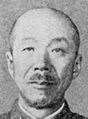
Done Shojiro Iida
-

-
 Sagredo
 -
Is this better?
-
 Fourier masking, 2x2 blur, despeckle, unsharp mask.
 -
 Background blurred


Article(s): Shojiro Iida
Request: fix halftoning chatter -- Chris (???) (talk) 03:13, 2 January 2008 (UTC)
Graphist opinion: Desaturating the color and a little blur help some, but this is probably a good job for Slashme's fourier transforms. Sagredo⊙☿♀♁♂♃♄ 06:05, 2 January 2008 (UTC)
- Tried to make it look better --BLACKLEMON-67 yay! (talk) 23:54, 6 January 2008 (UTC)
- Thanks! The mottling still makes the background and the face kind of run together. Any way to smooth out the background, like was done with George Thomas Coker? Chris (???) (talk) 00:04, 7 January 2008 (UTC)
This looks like a perfect job for the Fourier transform. I'll take a look this evening when I get home. --Slashme (talk) 05:42, 9 January 2008 (UTC)
- The background can be fairly easily painted over, when the face is done. Sagredo⊙☿♀♁♂♃♄ 18:52, 9 January 2008 (UTC)
- I did a fourier transform, masked out the section that corresponded to the halftone pattern with a fuzzy 50% grey brush, transformed back, did a 2x2 blur, a despeckle and an unsharp mask. I think the remaining noise is film grain, and we'll only really be able to get rid of that by hand. --Slashme (talk) 23:20, 9 January 2008 (UTC)
- Starting on Slashme's version, I cut away the background and blurred it. Also a bit of painting on the face. Sagredo⊙☿♀♁♂♃♄ 01:35, 10 January 2008 (UTC)
- Great, thanks all! I think we're good, before it begins to look like a Warhol painting! :) Chris (???) (talk) 02:11, 10 January 2008 (UTC)
- When I initially put Image:Iida Shojiro Fourier blur copy background.png into the article, it disappeared until I doctored the text. Is something weird encoded in the png, or am I Dee-Dee-Dee? Chris (???) (talk) 02:16, 10 January 2008 (UTC)
The link in the article looks perfectly normal. I have any idea how one might encode anything in a png other than the standard metadata. I would guess that there was a delay between wiki's servers somewhere. Haven't you ever run into the Wikipedia Database Locked Page? I just did. Sagredo⊙☿♀♁♂♃♄ 02:02, 11 January 2008 (UTC)
Done Skype logo
-
Png
-
 Svg
Svg
Article(s): Skype,Skype Limited, Features of Skype
Request: -- Image:Skype_logo.png is tagged with {{Convert to SVG}}, so I boldly tried to convert the image using Inkscape, but since I'm new to working with that file format, I somehow messed it up each time. Either the vectorised image doesn't look good, or (like the current version) it doesn't properly display at all. I dorfbaer I talk I 15:29, January 2, 2008
- Did you check brandsoftheworld? 68.39.174.238 (talk) 03:48, 3 January 2008 (UTC)
- I made a SVG of it. All it needs is to be lighter and more saturated --BLACKLEMON-67 yay! (talk) 20:57, 4 January 2008 (UTC)
- Fixed it! --BLACKLEMON-67 yay! (talk) 21:05, 4 January 2008 (UTC)
- I made a SVG of it. All it needs is to be lighter and more saturated --BLACKLEMON-67 yay! (talk) 20:57, 4 January 2008 (UTC)
Graphist opinion:
Done A true Discovery of what a certain Papal coat of arms should actually look like.
-
 The initial image in question
 -
Same blazon except for the positions of the keys

Articles: Vatican City, Coat of arms of the Vatican City, etc.
Request: Change the cable connecting the two keys to match the official one, as shown here and here (Ignore the bizzare "halo" around the website header image). 68.39.174.238 (talk) 03:57, 3 January 2008 (UTC)
Graphist opinion: It might actually be correct. Coats of arms are correct as long as they match the description. It's not like a logo, which must be represented exactly such and such a way each and every time. If you can find the blazon, I would know for sure. -- I. Pankonin (t/c) 00:50, 4 January 2008 (UTC)
- There appears to be some blazonry right below the images on the 1st link (the vatican.va one). 68.39.174.238 (talk) 02:25, 4 January 2008 (UTC)
- It looks like this is correct. Whether it loops, just hangs in the rings, or goes around the key handles seems to be the artist's styling. Look at the other image which is the same blazon except for the position of the keys. I was confused with the blazon given in the first link, because the cords were the wrong color, but the article Coat of arms of the Holy See says gules, two keys in saltire or and argent, interlaced in the rings gules/or, beneath a tiara argent, crowned or, which makes more sense, because it looks like the cords can be red or yellow. -- I. Pankonin (t/c) 04:44, 4 January 2008 (UTC)
- So this could actually replace the 2nd one there? 68.39.174.238 (talk) 23:43, 4 January 2008 (UTC)
- Yes, they're the same blazon. -- I. Pankonin (t/c) 00:00, 9 January 2008 (UTC)
- So this could actually replace the 2nd one there? 68.39.174.238 (talk) 23:43, 4 January 2008 (UTC)
Done Europe Regions
-
 please make a clear map with sharp borders between nations, SVGify
 -
all countries blue on this map, Andorra should be in light grey as no Scouting organization
-
for light grey
-


Article(s): WAGGGS-Europe Region, image used on vi:Vùng N? Hu?ng d?o châu Âu (WAGGGS)
-
 please make a clear map with sharp borders between nations, SVGify
 -
all countries blue on this map, Andorra should be in light grey as no Scouting organization
-
for light grey
-
 Israel?


Article(s): WOSM-European Region, image used on several language iterations: sv:Europeiska scoutregionen (WOSM), vi:Vùng Hu?ng d?o châu Âu (WOSM)
Request: similar but slightly differing requests, above. Andorra should be in light grey as no Scouting organization, member countries pale blue like the map on the side. -- Chris (???) (talk) 06:02, 4 January 2008 (UTC)
Graphist opinion: Hi, Chris. This cropping seemed to make sense, unless you want to show all of Russia. Same cropping for WOSM-Europe? If Israel isn't a member, it might be better if they can be added. - Sagredo⊙☿♀♁♂♃♄ 23:02, 4 January 2008 (UTC)
- Sagredo, from whom all graphics flow, thank you so much!
- Yeah, the cropping is very perceptive of you, it doesn't need to be the whole of Russia or Greenland, you've shown enough to really give the idea.
- Israel is apparently a member of both, for political reasons instead of cultural.
- The only tweak I would ask is that these both need to be the paler blue of the Schengen map, each region we've done so far is meant to be a pastel version of their coloration on the world map.
- Thanks, and once again, you rock! Chris (???) (talk) 01:52, 5 January 2008 (UTC)
- Last tweak and we're done-you have Kosovo marked off on the maps-it is not independent. Please undo it unless and until it is a separate entity. Chris (???) (talk) 03:01, 5 January 2008 (UTC)
- Kosovo has been de-stroked, so the border isn't visible. Sagredo⊙☿♀♁♂♃♄ 08:27, 6 January 2008 (UTC)
- Thank you so much, now I won't have a stroke! :) One more down, beautiful work as always! Chris (???) (talk) 16:04, 6 January 2008 (UTC)
Done Flag of Rhodesia
-
 This "SVG" is up for deletion on Commons as a mislabeled bitmap
 -
 Swipe the bird from here and recolor?

.svg)
Article(s): Flag of Rhodesia
Request: grainy poor svg-certainly we can do better -- Chris (???) (talk) 06:14, 4 January 2008 (UTC)
Graphist opinion:
-
-
 SVG
SVG

This is somewhat of an improvement. Sagredo⊙☿♀♁♂♃♄ 01:34, 5 January 2008 (UTC)
- I am putting a larger image at the right to see how well the new one scales. Chris (???) (talk) 01:59, 5 January 2008 (UTC)
- This is a beautiful job thus far, and the Rhodesiancoatofarms.png also needs SVGinated, so this is the perfect time for the two-birds-with-one-stone. The purple above the pickaxes are thistles, and should visibly scale as thus. The text itself should be visible to read SIT NOMINE DIGNA, and there are characters behind the words (right of scroll), symbolizing mining, that the best way I can describle looks like the 5 on dice. Image:Dice01.jpg Chris (???) (talk) 02:07, 5 January 2008 (UTC)
The last flag was done by inkscape tracing the seal to svg format. It's as good as I'm going to get it by that method. Redrawing it by hand would be a lot of work, and really should have a better image to start with. Sagredo⊙☿♀♁♂♃♄ 03:00, 5 January 2008 (UTC)
- Sorry, I meant no offense, yours is a lot of hard work and beautiful! I can't find a better image, I have looked all over. I know there are some in old books I have, if ever I get my kukai out of storage, but it can wait. This is great! Can you do the same inkscape tracing the seal to svg format to the coat of arms? (you may still have it handy) Then overwrite the old flag svg and we're done! :) You're wonderful, brother! Chris (???) (talk) 03:45, 5 January 2008 (UTC) No offense taken, Chris, you usually ask for less than can be done, and less than I think should be done. Someone else may be able to do a better tracing.
- Does anyone else get weird optical illusions on their monitor from these flag images? No other images on this page do this to me, but this one causes ghosting for some reason. Chris (???) (talk) 14:46, 5 January 2008 (UTC)
The flag had a thin blue line at the top for a while. Very thin; I did not notice at for a while, then fixed it. Not sure why it happened. A stroke effect in Inkscape which I either added unknowningly or Inkscape sometimes seems to do weird things. For the Seal, the svg may not be an improvement over the png. Sagredo⊙☿♀♁♂♃♄ 19:45, 5 January 2008 (UTC)
- I think it is an improvement, as it has lost the grainy. Thank you so much for both! Marking as done! Chris (???) (talk) 21:51, 5 January 2008 (UTC)
FYI you can download an svg by using "save page as" and then upload them wherever you wish. Sagredo⊙☿♀♁♂♃♄ 19:45, 5 January 2008 (UTC)
- My belief, however, is that it should be your thumbprint on the revision history, as it is your hard work and effort, you're the one with the mad skyllz (with both the 'y' and the 'z', yes I went there) so it is to your credit, is all. Chris (???) (talk) 23:17, 5 January 2008 (UTC)
Sorry, but I feel that the old PNG version is more true to the actual look of the image. The SVG version that has been created here is very green and doesn't look right to my eyes. Not only that but the coat of arms are very blurred and it is hard to make the image out. Sadly I lack the knowledge of how to improve the images but is there any way we could make corrections and possibly enlarge the image? Mangwanani (talk) 18:54, 10 January 2008 (UTC)
- Are you sure you're looking at the right ones? The .png is the blurry one. Chris (???) (talk) 20:14, 10 January 2008 (UTC)
- I stand corrected on the blurry front but the colours still don't look right to me. It seems a bit too green still and the motto is largely illegible. I don't know how creating an SVG works. I have never tried it myself so I cannot truly appreciate the way in which the creation/editing of an image in SVG format works however, if anything can be done to a) enlarge the image and b) increase the clarity of the colours and motto it would be nice to have a much clearer image. Mangwanani (talk) 18:48, 11 January 2008 (UTC)
Done Map of Oran Province (Algeria)


Article(s): Everything in Category:Oran Province. Everything.
Request: I need a map as in the example above, showing the administrative borders of the municipalities and districts of Oran Province, Algeria, but without the compass, the small map in the upper left corner, and without labels. Bitmap versions of this map can be viewed on following websites: [9], [10], and [11]. PS: Each municipality should be individually selectable. I already tried to ask for this on the French Wikipedia, but I haven't got an answer since a month, so I hope I can get some help here. TIA!
Graphist opinion: Comme ça? Sagredo⊙☿♀♁♂♃♄ 19:10, 5 January 2008 (UTC)
- Non. The thing is, I do not need a version of the map above without the compass, the small map in the upper left corner, and without labels. But I need a vector version of one of the three maps here (anyone would do): this, this, or this, having a similair style to the map above! (The map above is only an example) --escondites 12:30, 6 January 2008 (UTC)
- OK, I did think that was just too easy. I will start on it in a few days, and then it will probably take a week. If someone else can get to it sooner, that's OK, too. Sagredo⊙☿♀♁♂♃♄ 14:34, 9 January 2008 (UTC)
- I had some time, got started, and. . . I think this is what you want. Sagredo⊙☿♀♁♂♃♄ 04:41, 10 January 2008 (UTC)
- Yeah, that's it. Thank you! But it still needs a small modification: there's quite a lot of space between each municipality... Can't you make them all immediately next to each other, as in the example map above? Thanks. --escondites 18:13, 10 January 2008 (UTC)
This should do everything you want. In addition the borders can easily turned on or off, made any color, and varied from thick to thin. Instructions for Inkscape are on the map's description page. About how many articles will it be used for? Sagredo⊙☿♀♁♂♃♄ 04:10, 11 January 2008 (UTC)
- Thank you! It's fantastic. (For the articles, as I already said, it will be used on all articles of Category:Oran Province.) --escondites 09:01, 11 January 2008 (UTC)
Done New World Regions
-
crude map I made to explain what I mean by shift in perspective
-
I was able to open up the file and trim out the area I need
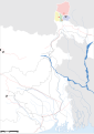
Article(s): WAGGGS-Western Hemisphere Region, image used on several language iterations: it:AMGE-Regione dell'Emisfero Occidentale, vi:Vùng N? Hu?ng d?o Tây Bán C?u (WAGGGS)
Article(s): WOSM-Interamerican Region, image used on several language iterations: it:OMMS-Region Interamericana), sv:Amerikanska scoutregionen (WOSM), vi:Vùng Hu?ng d?o Liên M? (WOSM), zh:???????????
Request: switch perspective, change this map to be Pacific Basin-centric, include in yellow Hawaii, Guam, American Samoa, the Northern Marianas, the Marshall Islands, Micronesia and Palau; only leave Greenland, Cuba and French Guiana grey in region, all others pastel yellow -- Chris (???) (talk) 17:48, 6 January 2008 (UTC)
- note, it seems to be difficult to find good maps in this perspective, there is supposed to be a "World - Countries centered on Pacific Ocean (Education Place) [pdf]" at http://www.eduplace.com/ss/maps/pdf/world_pacific.pdf
but it won't open for me.Chris (???) (talk) 18:15, 6 January 2008 (UTC)
Graphist opinion: If the pdf has no copyright problems, it might be better to use it. It seems to have good quality, and wouldn't be hard to work with in Photoshop. Trying to go from the standard world map would requiring transforms (skewing). Inkscape (at least the version I have) will not skew objects. There's supposed to be an add on that will give it this ability, but I've been unable to download it. Which would leave me down to exporting objects (countries) as bitmaps putting them in Photoshop and making a transformation one country at a time. Then importing them back tracing the bitmaps to svg's and trying to put Humpty Dumpty back together again. Then there's the problem of trying to drag all the Pacific Island groups west across the eastern hemisphere so they end up to the left of the Americas. Or redraw them and get them grouped together properly so that each island group takes the same fill color. I'm afraid this one's beyond my skill level. Do you want me to do a map from the pdf? Sagredo⊙☿♀♁♂♃♄ 23:00, 6 January 2008 (UTC)
- That is totally fine, that's kind of what I thought you would have to do. (at least the part of all that lorem ipsum I understood). Bear in mind I have two DVD players that were gifts I have never hooked up because I am sure I will mess up my TV. :} Chris (???) (talk) 23:05, 6 January 2008 (UTC)
Here is as far as I got so far. I'll get the islands colored when I can. 71.36.192.95 (talk) 01:58, 7 January 2008 (UTC)
- Sagredus incognitus? :) You don't need to have the borders between island chains, once you color in the right ones.
- Also, your view, the butter yellow may be too faint compared to the other maps you've done. Should I pick a darker shade? Chris (???) (talk) 02:26, 7 January 2008 (UTC)
- Perhaps F0E68C would be more vivid while still being pastel. Chris (???) (talk) 14:32, 7 January 2008 (UTC)
- OK, I also did one I call gold. Sagredo⊙☿♀♁♂♃♄ 01:28, 8 January 2008 (UTC)
- I like your antiqued gold one and the one in F0E68C. Decisions, decisions... Based on shading of the other regions (one more only left, thank Ras Tafari), which one more closely matches the series? I value your input, and that's great!
- Can anything be done about the blurring in the islands north of Canada?
- Greenland should be grey
- Can the border divisions be made white and slightly more slender?
- Chris (???) (talk) 02:43, 8 January 2008 (UTC)
- I put them side-by-side with the other images, your burnished gold is spot on! Chris (???) (talk) 03:20, 8 January 2008 (UTC)
- Once the image is settled,
would you name it Image:WAGGGS-WOSMWestHemMap-World.svgso it is inclusive of both organizations sharing the land area? Thanks! :) Chris (???) (talk) 14:38, 8 January 2008 (UTC)- Sorry, my mistake, it's still a .png, please at the finish overwrite the existing basemap. Chris (???) (talk) 15:17, 8 January 2008 (UTC)
- Thanks, that is beautiful! Chris (???) (talk) 03:47, 9 January 2008 (UTC)
Done Ye Htoon

Article(s): Ye Htoon
Request: lighten for detail, crop side areas down to encyclopedic-looking -- Chris (???) (talk) 18:19, 6 January 2008 (UTC)
Graphist opinion: Like this? Sagredo⊙☿♀♁♂♃♄ 23:23, 6 January 2008 (UTC)
- That was EASY! Thanks! Chris (???) (talk) 23:33, 6 January 2008 (UTC)
Done DYK Medal
-
 original
 -
 SVG
SVG -
Attempt 1 —Preceding unsigned comment added by Jackaranga (talk • contribs) 21:29, 7 January 2008 (UTC)


Article(s): Many user/talk pages.
Request: I've done this SVG conversion, but the stripes on the ribbon don't want to be even. I tried using a pattern, but that gave whitespace between the elements. Can anyone tidy this up further? Ta! -- Stannered (talk) 22:36, 6 January 2008 (UTC)
Graphist opinion: How, is it supposed to look ? It looks different depending on the size of the thumbnails, and also looks different viewed in full size inbetween Inkscape and Firefox. In Inkscape the lines are a darker red, in Firefox they are almost black. Jackaranga (talk) 20:52, 7 January 2008 (UTC)
- Bah the wiki software won't even display the image at some resolutions. Here it is using the thumb parameter, I don't know why it won't let me display it in the gallery or at 60px for example.

 Oh well I tried I think the problem is with the wiki software not generating the thumbnail correctly. Jackaranga (talk) 21:34, 7 January 2008 (UTC)
- Basically the stripes should look even at all resolutions; obviously at low resolutions the stripes won't line up with enough pixels to work properly, so they should blur our. In my version, even at higher resolutions the lines are of uneven thickness (as if the antialiasing is going nuts). The image description page render of your version looks better, but I have no idea why it won't render outside of that. Stannered (talk) 22:53, 7 January 2008 (UTC)
- Changed the pattern to objects. That fixed it. -- I. Pankonin (t/c) 01:06, 11 January 2008 (UTC)
- I also did a linear gradient on the edges of the ribband like in the PNG image. -- I. Pankonin (t/c) 01:32, 11 January 2008 (UTC)
- Basically the stripes should look even at all resolutions; obviously at low resolutions the stripes won't line up with enough pixels to work properly, so they should blur our. In my version, even at higher resolutions the lines are of uneven thickness (as if the antialiasing is going nuts). The image description page render of your version looks better, but I have no idea why it won't render outside of that. Stannered (talk) 22:53, 7 January 2008 (UTC)
- That's awesome! How do you do the linear gradient? Is it even possible in Inkscape? Do you want to upload it over the top of mine, or shall I? Thanks! Stannered (talk) 20:45, 11 January 2008 (UTC)
Done Speedtree thumb to SVG
-
To become an SVG
Article(s): Speedtree
Request: Make this JPG an SVG --BLACKLEMON-67 yay! (talk) 00:04, 7 January 2008 (UTC)
Graphist opinion: As this logo is used under a claim of fair use, we can't create derivative works of it, hence can't convert it to SVG ourselves. We have to find a vector version created by the company itself, and convert that. Stannered (talk) 18:13, 7 January 2008 (UTC)
- Check brandsoftheworld? They're usually where such things come from. 68.39.174.238 (talk) 18:55, 7 January 2008 (UTC)
- It is there as an EPS, for anyone who fancies spending time on it. Stannered (talk) 22:50, 7 January 2008 (UTC)
- Done, FWIW. It's missing shading, though, and the color appears quite different from that in the JPG. Fvasconcellos (t·c) 00:21, 8 January 2008 (UTC)
- It is there as an EPS, for anyone who fancies spending time on it. Stannered (talk) 22:50, 7 January 2008 (UTC)
Done Presidential flag of Finland
-
 Add a heraldic rose to this
 -
 "Superseded png" example with a rose. Size might not be best. (looks a bit large maybe?)


Article(s):Flag of Finland
Request: Look at the "swastika" icon at the left upper corner, it misses a heraldic rose in the centre. It should be easy, the image already has those exact heraldic roses in the middle Coat of Arms. One just needs to be rezised properly, border recoloured and put to the Cross. I tried it myself, but as an unexperience SVG user, the image failed when converting to Illustrator. Do what looks best, there aren't true examples of the most correct size. -- Pudeo? 13:57, 8 January 2008 (UTC)
Graphist opinion: How's that? -- I. Pankonin (t/c) 00:19, 11 January 2008 (UTC)
- Good work, thanks! (marked as done) --Pudeo? 12:49, 11 January 2008 (UTC)
Done Africa Regions
-
 please make a clear map with sharp borders between nations, SVGify
 -
 for pastel orange
 -
for light grey
-


Article(s): WAGGGS-Africa Region, image used on vi:Vùng N? Hu?ng d?o châu Phi (WAGGGS)
Article(s): WOSM-Africa Region, image used on several language iterations: sv:Afrikanska scoutregionen (WOSM), vi:Vùng Hu?ng d?o châu Phi (WOSM)
Request: since these are the same land area, please make a single graphic labeled Image:WOSM-WAGGGSAfricaMap-World.svg-- Chris (???) (talk) 04:03, 9 January 2008 (UTC)
Graphist opinion: I'm guessing that you already know that the two available Africa maps are Image:Blankmap-Africa2.png and Image:Africa98.svg. The svg has too many divisions, and it would be a matter of all the borders showing, or none. I can get where you want to go with the png. Sagredo⊙☿♀♁♂♃♄ 14:46, 9 January 2008 (UTC)
- "Too many divisions"? Yes, I would like all the borders showing, that is part of my nefarious plan. Mwahahaha! Chris (???) (talk) 15:01, 9 January 2008 (UTC)
- Do I get to label one Sagredoland? Sagredo⊙☿♀♁♂♃♄ 15:08, 9 January 2008 (UTC)
- Dang, I just looked the svg, they're all Sagredoland. PNG it is, then, but would you put in surrounding landmasses where they fall within the frame? Chris (???) (talk) 15:17, 9 January 2008 (UTC)
- ps-unless (holding out hope as I much prefer SVG) you can trim out the relevant section from the world map, like you used for the other regions, like the basemap you used for the Arab Region? :) Chris (???) (talk) 15:19, 9 January 2008 (UTC)
Yes, especially if you want the surrounding landmasses. Sagredo⊙☿♀♁♂♃♄ 19:12, 9 January 2008 (UTC)
- Thanks for the svg! What have you got against Mali? ;) Unmarked as done until it returns to the community of nations. :) Chris (???) (talk) 20:14, 9 January 2008 (UTC)
- Ohhhhh, now it all becomes clear to me! Gao Region. And they call me a conspiracy theorist! Where is my tinfoil hat?!? Chris (???) (talk) 20:24, 9 January 2008 (UTC)
- Tinfoil hats don't work. I'm wearing one and still suffer the effects of Gao whenever I get near. And part of the time when I'm not. That and when you're zoomed in so you can see the really little countries. . . Sagredo⊙☿♀♁♂♃♄ 22:30, 9 January 2008 (UTC)
- Ohhhhh, now it all becomes clear to me! Gao Region. And they call me a conspiracy theorist! Where is my tinfoil hat?!? Chris (???) (talk) 20:24, 9 January 2008 (UTC)
- Wow, you can see them too? I am so relieved. Thank you again! Chris (???) (talk) 02:18, 10 January 2008 (UTC)
Done Tokonoma


Article(s): Tokonoma
Request: reduce bleedthrough from page behind-- Chris (???) (talk) 04:08, 9 January 2008 (UTC)
Graphist opinion: Intriguing. Sagredo⊙☿♀♁♂♃♄
- How so? I notice you took out the two handles in the Shoji on the right hand side. Is this a Where's Waldo? :) Chris (???) (talk) 07:24, 9 January 2008 (UTC)
- Oh, those were handles. They looked really out of place to me, and I thought they might be caused by the bleed through. I do find myself having an urge to hide my username in images, but on ones this small they'd be too easy to find by flashing from one image to another. And besides, like Project Steve it's funny only once. Sagredo⊙☿♀♁♂♃♄ 14:23, 9 January 2008 (UTC)
- I learn so many new things from you! Thanks, another one down! Chris (???) (talk) 15:12, 9 January 2008 (UTC)
- Intriguing because I didn't know if I could get my magic wand (Photoshop tool) to pick up only on the bleed through without taking out massive parts of the drawing. Some expirementing with its selectivity setting and I learned something, too. Which is far from the only thing I've learned here. Thanks for you patience with my mistakes. Sagredo⊙☿♀♁♂♃♄ 00:54, 10 January 2008 (UTC)
- I don't ever see them as mistakes, it's fun to see the thought process, often you've come up with better ways to do something than I thought of, it's all just fresh perspective. Chris (???) (talk) 02:31, 10 January 2008 (UTC)
Done Fresno Assembly Center merit badge card
Article(s): to be placed in Scouting in displaced persons camps once fixed
Request: straighten, lighten for detail, correct perspective slightly, trim down to blue border, reduce size to wikiable -- Chris (???) (talk) 02:58, 10 January 2008 (UTC)
Graphist opinion: Chip shot - a click on the auto-levels button. You could put 4 or eight of these in one request. Maybe better try 4 at first and see if the files get uploaded in the right places. Although not a big deal if they don't. Sagredo⊙☿♀♁♂♃♄ 05:14, 10 January 2008 (UTC)
- Missed that you wanted it corrected for perspective. Cropping is as the original printed, with more space on the left. Do you want an more even border? Sagredo⊙☿♀♁♂♃♄ 06:18, 10 January 2008 (UTC)
- Four or eight? I don't understand, we have but the one. No, the uneven border is great as it shows the original printing process, that's just fine. Is it possible to lighten the right of the photo more so the blue border shows details like the left does? Chris (???) (talk) 08:06, 10 January 2008 (UTC)
- It comes out better on good monitors, marking as done, with my thanks! Chris (???) (talk) 20:16, 10 January 2008 (UTC)
- 4 or 8 thinking this was just a click on auto levels, you could put up several different images that need simple changes. [12]
- Dodged (PS tool for lightening up) the right. But, what else is gone that you're glad is gone? (Your Where's Waldo for the day.) Sagredo⊙☿♀♁♂♃♄ 20:36, 10 January 2008 (UTC)
- I give up. You've won Ben Stein's money. Chris (???) (talk) 03:55, 12 January 2008 (UTC)
- There were some spots. One notable one right after "on behalf of national council" Sagredo⊙☿♀♁♂♃♄ 06:03, 13 January 2008 (UTC)
- I kind of like it with the blood spatter, actually. Reminds me of my own Woodcarving merit badge. :-o Chris (???) (talk) 15:53, 13 January 2008 (UTC)
Done Coat of arms of Guelma.gif
-
 GIF
GIF -
 PNG with transparent background


Article(s): Guelma
Request: Can someone make the background of this image transparent? --escondites 10:14, 11 January 2008 (UTC)
Graphist opinion:
- Like this? :) If you want a PNG, that's probably a good idea. Fvasconcellos (t·c) 11:42, 11 January 2008 (UTC)
- I've gone ahead and uploaded a PNG version—smaller file size and sharper look :) Fvasconcellos (t·c) 23:52, 11 January 2008 (UTC)
- Yes. Thanks! --escondites 06:26, 12 January 2008 (UTC)
- I've gone ahead and uploaded a PNG version—smaller file size and sharper look :) Fvasconcellos (t·c) 23:52, 11 January 2008 (UTC)
Done North American Solar Challenge logo
Article(s): North American Solar Challenge
Request: I would like to please request that the yellowish-blue background be erased from this logo. At the organization's web page [13], you can see that the yellow and blue background is merely an artifact from the background of the rest of their page. On Wikipedia, the yellow and blue background is just a distraction and makes the image appear unclear. You may also wish to change it to a more appropriate graphics format (?). Thank you! Bry9000 (talk) 20:30, 11 January 2008 (UTC)
- See if they have any PDFs to download, the logo will probably be at the head of them, possibly in vector form. If that doesn't work, brandsoftheworld might have it. 68.39.174.238 (talk) 08:18, 12 January 2008 (UTC)
- Thank you for the helpful suggestions! The .pdf idea worked; I will upload the new version shortly. Bry9000 (talk) 22:38, 12 January 2008 (UTC)
Graphist opinion:
- Note: Can't modify non-free images, need to look for a version that already has no background. Jackaranga (talk) 23:29, 11 January 2008 (UTC)
- Okay, thank you. Bry9000 (talk) 22:38, 12 January 2008 (UTC)
Done A short Confederate color equalization and one more thing...
-
 Start here...
 -

-

-

-
 This just needs to be converted.
.svg)
.svg)
.svg)
.svg)


Articles: A flood of Battles of the American Civil War.
Request: Ensure that the proportions and colors of each flag are the same: The bars should all be the same, the canton size, etc. The only difference should be the number of placement of the stars. I would use the 7-star version as the base image. Also, since the Army of Northern Virginia's flag is so similar, could you convert that the same way? 68.39.174.238 (talk) 08:15, 12 January 2008 (UTC)
Opinion: Looks easy enough. I'll get on it. I'll assume that the stars are supposed to be equally spaced. Are they supposed to be rotated so that one point always faces exactly away from the centre, becuase they are in the reference on but not in the others? Also I'll change the aspect ratio from 883.61:491 = 1.7999 to 1.8:1 to be neater and get everythng on pixel boundaries for crispness. Inductiveload (talk) 02:47, 13 January 2008 (UTC)
Update: Here's what I have so far. I've made them all with one point of each star pointing directly outwards (except the ANV one). If this wrong, tell me so and I will change them right away. The new image size is 810 x 450px which gives nice 150px bars. Inductiveload (talk) 03:52, 13 January 2008 (UTC)
- That looks right (The stars' rotation), however a quick perusal of FotC shows that very few were ever that coordinated. I especially like the one with the extra star just stuck in the lower right of the canton. Thanx. One last thing; do you think that the darker red in the original ANV flag.png looks better then the lighter ones in the SVG? 68.39.174.238 (talk) 13:23, 13 January 2008 (UTC) PS. Also, could it be possible to upload the new SVG colors over the old ones? This would prevent someone having to run around and change all the link and then tag the old ones as superseded, etc.
- I think the darker red does look a bit better. Maybe if I match it to the current flag of the USA? I'll change the new images first and if you like them, I'll upload over the old ones and mark the new ones as duplicates. Inductiveload (talk) 16:12, 13 January 2008 (UTC)
- OK, I've changed the 9-star version to match the current flag, and the 11-star version to match the ANV flag. What do you think? Inductiveload (talk) 17:04, 13 January 2008 (UTC)
- I think the darker red does look a bit better. Maybe if I match it to the current flag of the USA? I'll change the new images first and if you like them, I'll upload over the old ones and mark the new ones as duplicates. Inductiveload (talk) 16:12, 13 January 2008 (UTC)
- Image:CSA Flag (9 Stars).svg by far looks the best. It has a more sober and serious look. The light red reminds me of something that you might find on a GeoCities page from 1997. If, by some unbelievable discovery, it turns out that there WAS a specified standard color of the confederate flags, it can be easily changed later. If you get all 5 of them using the same colors as the current US flag, I think this would be considered done. 68.39.174.238 (talk) 20:51, 13 January 2008 (UTC)
- All done, and I've put in deletion requests for the temporary ones. Inductiveload (talk) 23:04, 13 January 2008 (UTC)
- Image:CSA Flag (9 Stars).svg by far looks the best. It has a more sober and serious look. The light red reminds me of something that you might find on a GeoCities page from 1997. If, by some unbelievable discovery, it turns out that there WAS a specified standard color of the confederate flags, it can be easily changed later. If you get all 5 of them using the same colors as the current US flag, I think this would be considered done. 68.39.174.238 (talk) 20:51, 13 January 2008 (UTC)
- Excellent, you get an inductor]! 68.39.174.238 (talk) 14:05, 14 January 2008 (UTC)
Done Allen Ludden
-
Door #1
-
Door #2
-
Door #3
Article(s): Allen Ludden
Request: lighten for detail, crop side areas down to encyclopedic-looking -- Chris (???) (talk) 19:14, 12 January 2008 (UTC)
Graphist opinion: Should be easy, and I'm in the mood for easy. Sagredo⊙☿♀♁♂♃♄ 02:17, 13 January 2008 (UTC)
- What do you think? Sagredo⊙☿♀♁♂♃♄ 06:21, 13 January 2008 (UTC)
- I'll take Door #2, please upload it over Door #1! :) Chris (???) (talk) 15:58, 13 January 2008 (UTC)
- It was saved as a png, as I believe (not 100% sure), that it should have a hair better quality. Also I'm always reluctant to upload over someone else file. Sagredo⊙☿♀♁♂♃♄ 19:13, 13 January 2008 (UTC)
- I'll take Door #2, please upload it over Door #1! :) Chris (???) (talk) 15:58, 13 January 2008 (UTC)
- You're right, that's my Waldo for the day, marking as done, thank you once again! Chris (???) (talk) 19:21, 13 January 2008 (UTC)
Done Seshat
-
 original
 -
 export bmp/autotrace
 -
 manual pattern


Article(s):Seshat
Request: The pattern fill for the leopard skin is showing up at thumbnail size but not at full size for me (Firefox, XP). How to fix? -- Jeff Dahl (Talk • contribs) 03:13, 14 January 2008 (UTC)
Graphist opinion: I don't know the technical end about Firefox and Wikipedia do not render SVG's the same as Inkscape, but think I found a fix. Export the leopard skin as a Bitmap. Import it back in and trace it. (Path>>Trace bitmap) It ends up a bit small, but isn't hard to resize, and shows up in Firefox. I had a devil of a time with the Minnesota Weather Pattern Map above, and finally just placed one letter at a time. You'll need to adjust the fit, I got lazy. One can open images in firefox to check for these things before uploading. Sagredo⊙☿♀♁♂♃♄ 05:48, 14 January 2008 (UTC)
- Thanks for the edit. I uploaded a version with a pattern done manually, by duplicating and adjusting the spots (600 of them!). It works OK, but file size is bigger and we lose the advantage of having the fill done as a regular pattern. Oh well, at least it works. Thanks, Jeff Dahl (Talk • contribs) 19:44, 14 January 2008 (UTC)
Done Wikimania 2008 banners
-

-

-

-
 SVG
SVG -
 New version
 -
 New version


Article(s): Wikimania, Wikimania 2008 advertisements
Request: Convert from .png --> .svg This would really help the Wikimania 2008 advertisements. miranda 07:59, 14 January 2008 (UTC)
Graphist opinion: Is there a higher resolution image with the WM logo? I'm hesitant, because I don't want to get a trademark wrong. -- I. Pankonin (t/c) 09:50, 14 January 2008 (UTC)
- Done, I did it ! 210.203.61.15 (talk) 13:02, 14 January 2008 (UTC) Joke : (euh... a SVG was already available. It was just need to look around.)
- I've reuploaded the SVGs created by Miranda; they weren't displaying for some reason. Fvasconcellos (t·c) 13:16, 14 January 2008 (UTC)
- Thanks! miranda 18:37, 14 January 2008 (UTC)
- I've reuploaded the SVGs created by Miranda; they weren't displaying for some reason. Fvasconcellos (t·c) 13:16, 14 January 2008 (UTC)
Done Synchronization (Easy)
-
 CoA
CoA -
 Current flag with detailed CoA
 -
 Flag needing synchronization


Articels: President of Guatemala and others
Request: The "Presidential flag" was obviously made from a different model: The colors and coat of arms are totally different from the flag and Coat of Arms of the country (And I don't think that was intentional). Could the "Presidential flag" image be overwritten with the country's flag and the stars added, to make it appear similar? 68.39.174.238 (talk) 18:53, 15 January 2008 (UTC)
Oppinion: About 10 mouse clicks. Sagredo⊙☿♀♁♂♃♄ 03:49, 16 January 2008 (UTC)
A family tree


Article(s): Eadbald of Kent, Wihtred of Kent, with more possible
Request: Basically a simple SVG-ification, mostly in hope that thumb versions will be more legible. -- Circeus 19:55, 31 October 2007 (UTC)
Comment There is Wiki-synatx (a template, I think) to make a family tree. See Template:HarryPotterFamilyTree. It might be of some use. --Dave the Rave (DTR)talk 21:02, 31 October 2007 (UTC)
- Seems tome that using it would take far more room than is needed, besides, the image already exists, so it makes more sense to replace it with a svg than with obnoxiously complex wikicode. Circeus 00:54, 1 November 2007 (UTC)
| Eadbald of Kent | Ymme | Anna, King of East Anglia | |||||||||||||||||||||||||||||||||||||||
| Eormenred | Oslafa | Eanswith | Eorcenberht | Seaxburh | |||||||||||||||||||||||||||||||||||||
| Æthelberht | Eormenburh | Egbert | Eormenhild | ||||||||||||||||||||||||||||||||||||||
| Æthelred | Eormengith | Domne Eafe | Hlothhere | Eorcengota | |||||||||||||||||||||||||||||||||||||
- Come on, it's not that complex... Besides, you get the ability to include some convenient wikilinks in the bargain. —Ilmari Karonen (talk) 01:44, 1 November 2007 (UTC)
- Doesn't mean it's not ridiculously over-large. Given this is a FA, and I myself don't believe the addition of a text replacement like this to be a good idea, don't count on me to fight for the inclusion of this. Circeus 23:39, 1 November 2007 (UTC)
- Come on, it's not that complex... Besides, you get the ability to include some convenient wikilinks in the bargain. —Ilmari Karonen (talk) 01:44, 1 November 2007 (UTC)
- What a rude response given the amount of work Ilmari put into it. Nobody's "counting on you" to do anything, nobody asked you even to put your request here, but since you did, the least you could do is keep a civil tongue in your head while you're here. These Graphic Lab folks do an awful lot of weird requests for a lot of obscure articles, some of which may get a dozen reads a year, as volunteers, and while you may not have thanks for them, they don't need your pedantry. Ilmari's very clear, legible chart is a far improvement over what there was, and took him a great deal of time. If it's not what you seek, explain what you do seek without whining. Chris 06:24, 2 November 2007 (UTC)
- He's certainly got the right not to use the {{familytree}} version if he doesn't like it. It can be made a bit smaller, as I've done above, and enclosed in a {{imageframe}}, but it's certainly possible that an image could be made even more compact while remaining legible. I made this version because it really is pretty simple to do (at least if you know the syntax); it doesn't represent a significant investment of effort on my part. Certainly it shouldn't be too hard to draw an SVG replacement in Inkscape either. Or perhaps someone who's good with Graphviz might want to take a shot at this... —Ilmari Karonen (talk) 21:53, 4 November 2007 (UTC)
Graphist opinion: I'll give this a go. Sagredo⊙☿♀♁♂♃♄ 22:24, 11 January 2008 (UTC) It's done. Sagredo⊙☿♀♁♂♃♄ 17:29, 12 January 2008 (UTC)
- Thanks a lot. Looks good. Circeus (talk) 15:47, 14 January 2008 (UTC)
Image:SpiderGraph Abbe Number.gif
-
Original
-
 SVG
SVG

Article: Abbe number
Request: Please convert to SVG. I can send a high-resolution pdf-Version. My e-mail is fluegel[at]gmx.com. Is there and free software that converts pdf to svg? -- Afluegel (talk) 17:32, 26 December 2007 (UTC)
Graphist opinion: If you have the original data, I could re-do the graph in gnuplot, which can natively produce svg graphs. I'm not sure whether an automatic pdf-to-svg converter exists, but it would not be hard to re-draw a simple straight-line graph like that by hand. --Slashme (talk) 14:14, 27 December 2007 (UTC)
- Reply: OK, I just sent you my e-mail address (flg[at]gmx.com) to exchange the original data.--Afluegel (talk) 15:33, 27 December 2007 (UTC)
Thanks, I have now uploaded an svg. You will notice some changes:
- I left the long comment off the graph, as it is (IMHO) better put into a caption. You'll see it's on the image page now. It's also very easy to add it to an SVG if you feel strongly about it.
- I left the data points on the graph this time, as it provides more information: You can see the deviation from linearity
- I slightly expanded the range of the Y-axis to include at least some data points for lead and titanium
- I made the y-axis title more readable.
I also included the original data and the gnuplot script in the svg file as a comment at the bottom.
Let me know what you think --Slashme (talk) 13:58, 29 December 2007 (UTC)
Thank you for the nice graph. Good job!
- For making sure that a reader does not think that this is generally valid for all glasses it would be possible to put a short note directly into the image (so it does not get lost through editing): Valid only for base composition given in the image description. or something similar.
- The lines should not be extended beyond the available data because it is not sure if the Abbe numbers are realistic there.
- Then we also need to say in the image description that the lines are straight, and they are just there to show the deviation from linearity. The lines do not reflect the property curves.
--Afluegel (talk) 18:05, 30 December 2007 (UTC)
OK, I will add the note to the graph and change the lengths of the regression lines, and you can edit the image page. --Slashme (talk) 08:28, 8 January 2008 (UTC)
- I didn't change the lengths of the regression lines because in the two cases where the lines extend beyond the points shown, there are actually points that fell off the scale of the graph, so it's not really extrapolation. Please explain if you disagree with this decision. --Slashme (talk) 08:38, 8 January 2008 (UTC)
- Thank you very much...--Afluegel (talk) 15:11, 17 January 2008 (UTC)
Lens distortion in obelisk photo
-

-
lense correction, noise reduction and whitebalancing

Article(s): Sioux City, Iowa, Charles Floyd (explorer), List of National Historic Landmarks in Iowa
Request: This is a photo I took of the Sergeant Floyd Monument in Sioux City, Iowa. Unfortunately the lens on my camera distorted the image so the obelisk looks slightly curved. —Bkell (talk) 03:46, 9 December 2007 (UTC)
Graphist opinion: Have straighten the monument up, also made some noise reduction, refocusing and whitebalancing. →AzaToth 17:16, 9 December 2007 (UTC)
- I've asked the original filer if they think this is done. 68.39.174.238 (talk) 07:58, 12 January 2008 (UTC)
- Thanks for the improvement; it looks great. Please feel free to upload the better version over the top of the original. —Bkell (talk) 08:16, 14 January 2008 (UTC)
Marked the old one superseded. 68.39.174.238 (talk) 16:29, 18 January 2008 (UTC)
London Midland Network Map
-
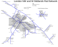 by Sagredo

Article(s):
London Midland only.
Request: This image is currently a copy vio! Please could you redraw the map (ie not a tracing) so that it is no longer a copy vio. Please do in a similar way to the last LM maps, the Superlink map and the Beeching II maps. Thanks, -- Dewarw (talk) 20:55, 5 January 2008 (UTC)
NB Image deletion imminent! Please work as quickly as possible. Thanks, Dewarw (talk) 20:55, 5 January 2008 (UTC)
- Could someone look at this please? Dewarw (talk) 23:14, 7 January 2008 (UTC)
Graphist opinion: Here's a stab at it which will probably need some changes ; ) Sagredo⊙☿♀♁♂♃♄ 00:47, 9 January 2008 (UTC)
- Nice, I like this. Good work so far. I esp. like the clarification of the central B'ham stations. Dewarw (talk) 17:38, 10 January 2008 (UTC)
- I made the mistake of starting out trying to lay it out on a map of England. The center became far too crowded. The central stations bit could be expanded out some as space permits, how far would be appropriate? I. e. which stations?) (I've never been to England.) Let me know what you want changed. Anyone with the knowlege of how to pull the main line out straight would be appreciated. Sagredo⊙☿♀♁♂♃♄ 19:05, 10 January 2008 (UTC)
- Don't pull the main line out strait- this makes it different form the original (ie not a copy vio). Expand the centre, it does not really matter where as it is only a route diagram, not a geographical map. Try to make gaps equal where possible. Remember, at the end, it needs to look different to the original, or it will be back in this lab (for the third time!). Keep up the good work! Dewarw (talk) 18:43, 11 January 2008 (UTC)
- I'm going to mark this as done. It could be improved on but it does satisify the basic need. I've got a bunch of stuff that has come up in the real word, (I'd rather be here) and have made other promises I must (try to) keep. Sagredo⊙☿♀♁♂♃♄ 06:28, 17 January 2008 (UTC)
- I've made some small improvements to the map (fixed font sizes etc.), which I have mentioned to User:Sagredo. IMHO, diagrams like these could be a good collaborative effort for major intercity railway lines where the route diagrams may become too crowded, particularly if branch lines are also included in full. Andrew (My talk) 02:12, 19 January 2008 (UTC)
- Thank you for improving it. Welcome to the graphics lab. Sagredo⊙☿♀♁♂♃♄ 03:53, 19 January 2008 (UTC)
- I've made some small improvements to the map (fixed font sizes etc.), which I have mentioned to User:Sagredo. IMHO, diagrams like these could be a good collaborative effort for major intercity railway lines where the route diagrams may become too crowded, particularly if branch lines are also included in full. Andrew (My talk) 02:12, 19 January 2008 (UTC)
Harare Coat of Arms
-

-
 SVG
SVG -
Easy?
-
 Actually, yes.


Article(s): Harare, Portal:Harare
Request: I would like this image to be converted to SVG. Not a lot really needs doing apart from the conversion but the edges to the different bits of the image could be made sharper/more defined if possible. Many thanks-- Mangwanani (talk) 18:36, 11 January 2008 (UTC)
- That bird you can get off of Image:Flag of Zimbabwe.svg. 68.39.174.238 (talk) 13:40, 13 January 2008 (UTC)
Graphist opinion:
- I'll start working on this. I have to warn you, though—I won't use a tracer, so it will look more... vector-like and less like artwork :) Fvasconcellos (t·c) 19:51, 11 January 2008 (UTC)
- OK, done. Have a look and tell me what you think. Best, Fvasconcellos (t·c) 19:30, 13 January 2008 (UTC)
- Wow! I am dead impressed with that. This look amazing. Is there anyway we could get the mound of earth to look more 3D at all however? But I really am astonished at the difference this has made to the quality of the image. Mangwanani (talk) 16:52, 15 January 2008 (UTC)
- Thank you. That's a tough one; I'll try to add more shading. Fvasconcellos (t·c) 12:09, 16 January 2008 (UTC)
- Wow! I am dead impressed with that. This look amazing. Is there anyway we could get the mound of earth to look more 3D at all however? But I really am astonished at the difference this has made to the quality of the image. Mangwanani (talk) 16:52, 15 January 2008 (UTC)
- OK, done. Have a look and tell me what you think. Best, Fvasconcellos (t·c) 19:30, 13 January 2008 (UTC)
A request: Since you've SVGified the Coat, could you also produce an SVG of the flag? It's just the crest expanded to fit a flag, as can be seen. Thanx, 68.39.174.238 (talk) 00:32, 18 January 2008 (UTC)
- Sure. I need to confirm the colours, though—any suggestions? Fvasconcellos (t·c) 02:01, 18 January 2008 (UTC)
- You can get the blazonry here: http://www.fotw.net/Flags/zw-harar.html , but I don't know if they've bothered to specify exact colors (Pantone, or whatever). 68.39.174.238 (talk) 16:36, 18 January 2008 (UTC)
- Nope. I'll go with the same colors as the original, then. Will upload shortly. Fvasconcellos (t·c) 12:17, 19 January 2008 (UTC)
- OK, done. Fvasconcellos (t·c) 13:05, 19 January 2008 (UTC)
- The colours are fine. The original image was correct anyways. It looks great. Mangwanani (talk) 17:02, 19 January 2008 (UTC)
- Thanks. I've added blades of grass to the mound of earth, as in the original; does that help give a more three-dimensional appearance? Fvasconcellos (t·c) 21:48, 19 January 2008 (UTC)
- Thats it! Perfect. Many thanks. It looks great. Mangwanani (talk) 22:19, 19 January 2008 (UTC)
- You're welcome, glad to help. Fvasconcellos (t·c) 00:31, 20 January 2008 (UTC)
- Thats it! Perfect. Many thanks. It looks great. Mangwanani (talk) 22:19, 19 January 2008 (UTC)
- Thanks. I've added blades of grass to the mound of earth, as in the original; does that help give a more three-dimensional appearance? Fvasconcellos (t·c) 21:48, 19 January 2008 (UTC)
- The colours are fine. The original image was correct anyways. It looks great. Mangwanani (talk) 17:02, 19 January 2008 (UTC)
- OK, done. Fvasconcellos (t·c) 13:05, 19 January 2008 (UTC)
- Nope. I'll go with the same colors as the original, then. Will upload shortly. Fvasconcellos (t·c) 12:17, 19 January 2008 (UTC)
- You can get the blazonry here: http://www.fotw.net/Flags/zw-harar.html , but I don't know if they've bothered to specify exact colors (Pantone, or whatever). 68.39.174.238 (talk) 16:36, 18 January 2008 (UTC)
Japanese addressing system


Article(s): Japanese addressing system
Request: Lighten area of sign on right as focus -- Chris (クリス) (talk) 15:36, 11 January 2008 (UTC)
Graphist opinion: Lightening only on the right makes it look like two unrelated images side by side. To me lightening both sides and the original tend to look that way anyway. To show the address sign, I think one doesn't need much of the buildings, hence the cropped version. Sagredo⊙☿♀♁♂♃♄ 21:42, 11 January 2008 (UTC)
- I have posted this both at the article and at WPJ, I want to get opinions on this one. Chris (クリス) (talk) 01:50, 13 January 2008 (UTC)
- Marking as done, no reply from either. Chose middle image for context. Chris (クリス) (talk) 00:07, 21 January 2008 (UTC)
Jimmy Buffett
.jpg)
.png)
Article(s): Jimmy Buffett
Request: specifically lighten Jimmy Buffett for detail, as Captain Stubing behind him is more visible than my boy Jimmy. (oh, and in your redone version, would you spell his name right?) -- Chris (クリス) (talk) 16:14, 13 January 2008 (UTC)
Graphist opinion:
- Not that it matters, but from looking at his shoulder boards the officer is a rear admiral. -- I. Pankonin (t/c) 08:43, 14 January 2008 (UTC)
- Sorry, it was an obscure reference to bad 1970s TV. Chris (クリス) (talk) 09:10, 14 January 2008 (UTC)
- I wouldn't have known if I hadn't converted the United States Navy officer rank insignia images to SVG, and it's partially my fault for not being alive in the 70's. Otherwise I'm sure I would've laughed. -- I. Pankonin (t/c) 09:35, 14 January 2008 (UTC)
- It comes out well on some monitors, not on others. I would ask for a slight adjustment. Chris (クリス) (talk) 20:27, 14 January 2008 (UTC)
- I got "Stubing." "Old Leadbottom" would have been better. Does that shirt look too faded to you? [14] Sagredo⊙☿♀♁♂♃♄ 01:54, 16 January 2008 (UTC)
- It does look like it's been through the wash a couple more times, yes. But we're on the right track! Chris (クリス) (talk) 03:04, 16 January 2008 (UTC)
- New brand of laundry detergent. Maybe too bright? I don't have a good monitor, either. Actually use a notebook so I can use comfortable chair. Sagredo⊙☿♀♁♂♃♄ 05:27, 17 January 2008 (UTC)
- This is about as far as I know how to take this. With Sam Shepard, I was able to cut him out of the picture, lighten him up, and put him back in. He had nice sharp edges. Buffett's fuzzy arms and the little tuft of hari at the back of his make that unworkable here. The naval officer's name tag appears to read "Deputy Commander" Sagredo⊙☿♀♁♂♃♄ 02:07, 18 January 2008 (UTC)
- "Deputy Commander" in this context would be a post, not a rank, as there is no rank called "Deputy Commander" in the Navy. Similar usage of this term can be found on Wikipedia, such as in the article about Joseph T. McNarney, who at one point in his career held the post "Deputy Supreme Allied Commander, Mediterranean" while his rank was that of a Lieutenant General. This picture seems to have been taken when Admiral Jonathan W. Greenert was only a Rear Admiral (upper half), and his post was Deputy Commander United States Pacific Fleet. -- I. Pankonin Review me! 04:04, 18 January 2008 (UTC)
- It does look like it's been through the wash a couple more times, yes. But we're on the right track! Chris (クリス) (talk) 03:04, 16 January 2008 (UTC)
- Sorry, it was an obscure reference to bad 1970s TV. Chris (クリス) (talk) 09:10, 14 January 2008 (UTC)
- I told him about the bodywaxing, but nooooooooo. Thanks, it does look better! Chris (クリス) (talk) 02:21, 18 January 2008 (UTC)
Coat of arms of Arzew
-
 The "Crown"?
 -
 The light station and ship?
 -
 SVG
SVG


.svg)
Article(s): Arzew
Request: Can someone make the background of this transparent? Thanks. -- escondites 16:20, 13 January 2008 (UTC)
- Question for whoever takes this. Would it be worth SVGing? You can get the mural crown from numerous CoAs, and the ship and lighthouse from the Seal of the Commerce Department. 68.39.174.238 (talk) 16:32, 13 January 2008 (UTC)
Graphist opinion: PNG done. It's quite a large file, though, so IMHO it should be a temporary solution until an SVG is made—and yes, it is worth it. Best, Fvasconcellos (t·c) 16:36, 13 January 2008 (UTC)
- Update I've made an SVG version. Hope it's OK. If it is, we needs "SVG Available" templates on the rasters. Inductiveload (talk) 00:03, 17 January 2008 (UTC)
- Hi. Yes, the SVG is OK, I putted it in the article. Thanks. escondites 09:29, 17 January 2008 (UTC)
Tagged both as superseded. 68.39.174.238 (talk) 16:41, 18 January 2008 (UTC)
Dutch baby pancake

Article(s): Dutch baby pancake
Request: White balance is off, making the subject look very unappetizing. The hue, saturation, and brightness should be adjusted to make the subject look like a Yorkshire pudding or Crêpe. See also this for a more accurate photo. —dgiestc 19:44, 13 January 2008 (UTC)
Graphist opinion: I suggest renaming the photo. "Dutchbaby" does not imply foodstuff. --Seans Potato Business 22:03, 13 January 2008 (UTC)
- Dutch baby. It's what's for dinner. Chris (クリス) (talk) 03:36, 14 January 2008 (UTC)
- Hows this? > Rugby471 talk ⚔ 16:46, 16 January 2008 (UTC)
- Much improved, thanks. —dgiestc 21:44, 18 January 2008 (UTC)
- Hows this? > Rugby471 talk ⚔ 16:46, 16 January 2008 (UTC)
Scouting in Nyasaland
-
what spots?

Article(s): The Scout Association of Malawi
Request: Enlarge, brighten and SVGify 50 year old extinct logo. -- Chris (クリス) (talk) 05:04, 15 January 2008 (UTC)
Graphist opinion:
- I don't understand, isn't converting a copyrighted work from png to svg illegal and against wikipedia policy ? This is why usually when someone asks for a logo to be converted to SVG, the only possible solution is to find a logo already in vector format, such as in a PDF document. Jackaranga (talk) 15:27, 17 January 2008 (UTC)
- That's why it is specified that it is a 50 year old extinct logo for a country that no longer exists, for an organization that did not exist in any form since the 1960s, and its reborn iteration carries a different name and different symbology. Chris (クリス) (talk) 20:12, 17 January 2008 (UTC)
- I'd like to give you the long technical reason as to why that image disappears, but to do that I'd first have to understand it myself. ; ) Sagredo⊙☿♀♁♂♃♄ 22:38, 17 January 2008 (UTC)
- I hate to do this, but you're missing an "A"! ;) Fvasconcellos (t·c) 02:05, 18 January 2008 (UTC)
- I'd like to give you the long technical reason as to why that image disappears, but to do that I'd first have to understand it myself. ; ) Sagredo⊙☿♀♁♂♃♄ 22:38, 17 January 2008 (UTC)
- That's why it is specified that it is a 50 year old extinct logo for a country that no longer exists, for an organization that did not exist in any form since the 1960s, and its reborn iteration carries a different name and different symbology. Chris (クリス) (talk) 20:12, 17 January 2008 (UTC)
- Also, needs a trimmer head, it's a big cat, not a very looooooooooong wolf, ;) and needs the speckle pattern, like you used for Seshat. Thus far it is brilliant, and way better than I could do. Chris (クリス) (talk) 02:24, 18 January 2008 (UTC)
Ok, Please note that Jeff's pattern for Seshat didn't really work. Adding spots, we're up to 1.35MB, which if it isn't a record for an image this size, it's at least notable. The spots are evenly spaced on the image, even if they don't show up that way on some sizes of images in the screen. PNG is probably a better way to go The effect on the sun(?)'s rays in the png is simply noise. Sagredo⊙☿♀♁♂♃♄ 23:24, 18 January 2008 (UTC)
- Okay, go back one step, forget the spots there, Roy Lichtenstein. Wow. Chris (クリス) (talk) 03:53, 19 January 2008 (UTC)
-
5%
-
10%
-
20%
Ok, a png with some noise in the gold. What do you think? And by the way, if you're scanning these, could you use a higher resolution? Sagredo⊙☿♀♁♂♃♄ 01:54, 20 January 2008 (UTC)
- I love the textured ones, it makes them look like gold leaf. Sorry, when I scanned them, I was trying to save space. Chris (クリス) (talk) 03:32, 20 January 2008 (UTC)
- Are we there yet?, or do you want to see more variations? Sagredo⊙☿♀♁♂♃♄ 07:49, 20 January 2008 (UTC)
- Please undo the spots on the svg one, then this should be the best one. Thanks! Chris (クリス) (talk) 16:56, 20 January 2008 (UTC)
- (although, the 5% is also very dignified and classy. Decisions, decisions. But please do remove the spots from the svg. That will be the telling point). Chris (クリス) (talk) 17:01, 20 January 2008 (UTC)
- Please undo the spots on the svg one, then this should be the best one. Thanks! Chris (クリス) (talk) 16:56, 20 January 2008 (UTC)
- Are we there yet?, or do you want to see more variations? Sagredo⊙☿♀♁♂♃♄ 07:49, 20 January 2008 (UTC)
What spots? I don't see any spots. Does anybody see any spots? ; ) Sagredo⊙☿♀♁♂♃♄ 21:53, 20 January 2008 (UTC)
- Did I say spots? Och aye, I meant to say Scots. Dinna fash yoursel'. :) Okay, so I put the two contenders side by side, any preferences? Chris (クリス) (talk) 22:31, 20 January 2008 (UTC)
- No. ; ) Sagredo⊙☿♀♁♂♃♄ 23:19, 20 January 2008 (UTC)
- Now that I am at a good monitor, the svg, though the others are most cool, and thank you for the variety! Chris (クリス) (talk) 20:21, 21 January 2008 (UTC)
- No. ; ) Sagredo⊙☿♀♁♂♃♄ 23:19, 20 January 2008 (UTC)
Alpha Kappa Alpha Founders' Window
Article(s):Alpha Kappa Alpha
Request: Please make this image look like this as best as you can. Thanks! Miranda 02:41, 18 January 2008 (UTC)
Graphist opinion: I cropped, adjusted brightness, etc. to this photo. If anyone is an expert in Photoshop (I used GIMP), you can fix the image. Miranda 04:01, 19 January 2008 (UTC)
- Done I think this is the best that we can do at this point. The important point is, that the picture is received and will be used for the main page, once the FAC is over. Miranda 16:04, 19 January 2008 (UTC)
- Perhaps sharpening? Sagredo⊙☿♀♁♂♃♄ 02:08, 20 January 2008 (UTC)
- I don't know. #3 looks less natural. But that's just my own opinion. Miranda 03:56, 20 January 2008 (UTC)
- It did pick up contrast and some artifacts. I considered it different, not necessarily better. It's certainly a judgement call. We leave that to the requester. Sometimes they're very happy with suggestions (see kermit the frog) and once in a while not. The great majority of the time they happy. Sagredo⊙☿♀♁♂♃♄ 07:21, 20 January 2008 (UTC)
- I don't know. #3 looks less natural. But that's just my own opinion. Miranda 03:56, 20 January 2008 (UTC)
- Perhaps sharpening? Sagredo⊙☿♀♁♂♃♄ 02:08, 20 January 2008 (UTC)
- Thanks. Someone tried to sharpen the image before. But, I like #2, because it's more natural. Thanks for your help. Miranda 23:33, 20 January 2008 (UTC)
Coptic Coat of Arms
-
This and
-
this both need to be replaced by a single image
Articels: Anything to do with Copts
Request: Extract the SVG coat from the flag and modify it to allow a replacement of the two inappropriate JPEGs. Note that the green background on the one was added because the template it's in is green and JPEGs don't have transparency. It can be ignored when the SVG has transparency. 68.39.174.238 (talk) 19:17, 18 January 2008 (UTC)
Opinion: Easy Sagredo⊙☿♀♁♂♃♄ 00:22, 19 January 2008 (UTC)
- Done, thanx. 68.39.174.238 (talk) 03:11, 20 January 2008 (UTC)
Kermit the Frog
-
little frog in background erased
Article(s): Kermit the Frog
Request: lighten for detail -- Chris (クリス) (talk) 05:12, 19 January 2008 (UTC)
Graphist opinion: Do you want the little frog in the background to go away? Do you want the big one in the foreground to go alway, also? Sagredo⊙☿♀♁♂♃♄ 08:06, 19 January 2008 (UTC)
- "little frog in the background"? I would mark this done if I understood. :) Chris (クリス) (talk) 03:23, 20 January 2008 (UTC)
Like this. Sagredo⊙☿♀♁♂♃♄ 04:32, 20 January 2008 (UTC)
- Oh god, good eyes, can't see that on this monitor. I wonder if that's some of the 1960s fancy answer to a music video... Chris (クリス) (talk) 04:42, 20 January 2008 (UTC) It's quite likely that they were fading from one image to the other when the vidcap was done, although I don't think they had/used that type of effect back in the 60's.
- Can you make a white-background version one that might be more Wikipedic? Chris (クリス) (talk) 05:05, 20 January 2008 (UTC)
- Sorry, no. On Steve Jobs I was able to turn up the brightness and contrast until I could tell where Steve's head ended and the background began. It would have been easy to cut him out if the requester had desired. But on Kermit the shadows are so deep, I get nothing in many areas of the frog.
- But take a look at the original and see if you can spot the two eyeballs glowing in the dark background. They're hilarious! Funnier than anything I could have stuck in. Sagredo⊙☿♀♁♂♃♄ 07:04, 20 January 2008 (UTC)
- Now that I am at a good monitor, I see it, weird. Hippies. Thanks! Chris (クリス) (talk) 20:26, 21 January 2008 (UTC)
- Can you make a white-background version one that might be more Wikipedic? Chris (クリス) (talk) 05:05, 20 January 2008 (UTC)
- You can't delete elements from the background of a fair-use image without violating policy and copyright law, it's debatable if you are even allowed to change the contrast. Jackaranga (talk) 20:57, 21 January 2008 (UTC)
- Is this policy written down somewhere? Sagredo⊙☿♀♁♂♃♄ 05:02, 22 January 2008 (UTC)
- Where did that come from? Derivations of copyrighted images are clearly allowed (Providing they meet the Fairuse standards themselves), see EG. Image:Raising of the flag - colored.jpg and its talk page. 68.39.174.238 (talk) 21:02, 22 January 2008 (UTC)
- I'm pretty sure the whole point of copyright is to stop you reproducing a work or a derivative of it. Normally wikipedia doesn't allow users to make derivatives of copyrighted work, for example: for company logos, when someone wants to make an SVG version from a png, it is not allowed and we tell them to look for one in a PDF file instead. Jackaranga (talk) 21:23, 22 January 2008 (UTC)
- Company logos are Trademarks (R), a design associated with a specific company or product. Trademark and Copyright (C) issues are quite different. We probably should take this to the talk page. Sagredo⊙☿♀♁♂♃♄ 00:02, 23 January 2008 (UTC)
- The policy pages are [15] [16] I see no problems here. Sagredo⊙☿♀♁♂♃♄ 06:19, 23 January 2008 (UTC)
Serbian war flag (Easy?)
-
 Use this image as a base
 -
 text jpg
 -
 text svg
 -
 How's this?
.svg)
.svg)
Articels: War flag, Military of Serbia, others.
Request: SVGify the badJPG. Note that the text at the bottom is "ЗА СЛОБОДУ И ЧАСТ ОТАЏБИНЕ" 68.39.174.238 (talk) 20:03, 19 January 2008 (UTC)
Opinion:
- Comment That's a very interesting typeface. Perhaps even hand lettering? I'd hate to lose that in the conversion :P Fvasconcellos (t·c) 00:35, 20 January 2008 (UTC)
- Can you trace it? Unfortunately the uzer who uploaded it, c:User:Rokerismoravee, appears to have left. 68.39.174.238 (talk) 03:10, 20 January 2008 (UTC)
- Perhaps Inkscape's tracer will work if the text is cropped out. Sagredo⊙☿♀♁♂♃♄ 05:01, 20 January 2008 (UTC
- It did fairly well. Go ahead Fvasconcellos (t·c), I've got too many other things to do. Sagredo⊙☿♀♁♂♃♄ 05:15, 20 January 2008 (UTC)
- Nice work; Inkscape's tracer is officially vindicated in my book :) Fvasconcellos (t·c) 12:11, 20 January 2008 (UTC)
- It got a little help (clean up) from Photoshop. ; ) Sagredo⊙☿♀♁♂♃♄ 21:42, 20 January 2008 (UTC)
- I'm almost done, will upload tomorrow. That sabre grip is a piece of work. Fvasconcellos (t·c) 01:57, 21 January 2008 (UTC)
- OK, done. I hope it's accurate. Fvasconcellos (t·c) 13:51, 21 January 2008 (UTC)
- I'm going to mark it as done then; thanx. 68.39.174.238 (talk) 20:51, 22 January 2008 (UTC)
- OK, done. I hope it's accurate. Fvasconcellos (t·c) 13:51, 21 January 2008 (UTC)
- I'm almost done, will upload tomorrow. That sabre grip is a piece of work. Fvasconcellos (t·c) 01:57, 21 January 2008 (UTC)
- It got a little help (clean up) from Photoshop. ; ) Sagredo⊙☿♀♁♂♃♄ 21:42, 20 January 2008 (UTC)
- Nice work; Inkscape's tracer is officially vindicated in my book :) Fvasconcellos (t·c) 12:11, 20 January 2008 (UTC)
Delta Sigma Theta Torch
<gallery> Image:DST Torch.gif Image:DST Torch.svg|svg </gallery>
Article(s): Delta Sigma Theta
Request: GIF --> SVG or PNG. Thanks! miranda 08:58, 22 January 2008 (UTC)
Graphist opinion: Better? -- I. Pankonin Review me! 10:22, 22 January 2008 (UTC)
- Yes! Thanks! miranda 15:36, 22 January 2008 (UTC)
Vectoring images for IUPAC nomenclature


Article(s): IUPAC nomenclature of organic chemistry
Request: Please, convert the images to SVG so we can translate them easily. These are rather simple drawings -- maybe it could be done by some tool (but I don't really know)... -- Ondrejsv (talk) 17:13, 6 January 2008 (UTC)
Graphist opinion: This seems pretty straightforward; I'll gladly have a go, but I'm not an "official member" :) Is that a problem? Fvasconcellos (t·c) 16:56, 7 January 2008 (UTC)
- Thank you, Fvasconcellos. I don't think you need to be any "official member" to help us - graphically challenged ;-) --Ondrejsv (talk) 17:33, 7 January 2008 (UTC)
- OK, all done:


- I did hit a couple of snags, though, and made a few changes:
- I renamed "Iupac" to "IUPAC" in all filenames, of course. I also renamed "halogen" to "haloalkane" and "carboxyl" to "carboxylic acid".
- I'm not sure Image:Iupac-alkane-5.png is accurate—I'm pretty sure that should be 3-methyl-4-propyloctane (with the main chain being the one to the left).
- I replaced "N-methy-N-ethylpropanamine" with "N-ethyl-N-methylpropanamine".
- Have a look and tell me what you think. If any of the atom labels seem out of place, let me know and I'll resize the files so they can be positioned more accurately. Best, Fvasconcellos (t·c) 20:36, 8 January 2008 (UTC)
- I did hit a couple of snags, though, and made a few changes:
- Thank you, Fvasconcellos, you've done a really good and quick job :-). Indeed, it seems you are correct with both "N-ethyl-N-methylpropanamine" and 3-methyl-4-propyloctane, so may I ask you to change the name in the Iupac-alkane-5.png... Again, thanks. --Ondrejsv (talk) 18:08, 22 January 2008 (UTC)
- Done—I hope it's accurate now, I took some... artistic license :) Feel free to replace the PNGs, and if there's anything else I can help you with, just ask. Best, Fvasconcellos (t·c) 19:01, 22 January 2008 (UTC)
- IUPAC nomenclature of organic chemistry is now SVG-friendly (thanks to you and Edgar181 who did the actual replace). Marking as resolved. --Ondrejsv (talk) 14:36, 23 January 2008 (UTC)
- Thank you, Fvasconcellos, you've done a really good and quick job :-). Indeed, it seems you are correct with both "N-ethyl-N-methylpropanamine" and 3-methyl-4-propyloctane, so may I ask you to change the name in the Iupac-alkane-5.png... Again, thanks. --Ondrejsv (talk) 18:08, 22 January 2008 (UTC)
University of Oklahoma map
-
 SVG
SVG -
 PNG
PNG -
 SVG
SVG -
 PNG
PNG -
 SVG
SVG -
 PNG
PNG


Article(s): University of Oklahoma, and possibly Norman, Oklahoma and other University related articles
Request: -- I'm hoping somebody with graphic design skills can create a map in either PNG or SVG similar to Image:MSU campus map.png for the University of Oklahoma. It would actually be two separate maps, one for the main campus and one for the south campus.
On Google Maps, this link shows the main campus which is already grayed. For the south campus, this map shows the area and it would be from E. Constitution on the north to Hwy 9 on the south and Jenkins on the west to Dewey on the east.
I would be happy to answer any further answers if needed.↔NMajdan•talk 21:05, 10 January 2008 (UTC)
Graphist opinion: I hate to see things sit this long, so I got a start on it. Sagredo⊙☿♀♁♂♃♄ 20:31, 18 January 2008 (UTC)
- Thank you. That looks like a great start. Can you drop the dark green? That's just the golf course, and I don't think that should be on the map of the campus. Or at the very least, be more prominent than the main campus.↔NMajdan•talk 04:50, 19 January 2008 (UTC)
- Ok, dark green gone. It was marked in google maps as being associated with the University. So perhaps a slightly darker gray. (It really doesn't matter to me, if you want it totally gone, I'll do that. I just like to look at all the possibilities) Without the golf course, cropping to center on the campus gets kind of tall and skinny, but I think OK. In fact, that might work well on a wiki page. I've left out N, S, E, & W quite a bit. That way the rest of the text is bigger and easier to read. But if we need the directions on the streets, it can go in. Let me know. The cropping on these works like a matte over a photo, you can move it around to show what you want. The map has the south campus as well, and everything to the east that showed in the first view. It's also simple to do a wide view showing both main and south, a third map if you wish. Sagredo⊙☿♀♁♂♃♄ 07:02, 19 January 2008 (UTC)
- I've uploaded a version of how the entire campus might look. Please comment about the labeling of the streets. size, font, placement on streets, use of all caps (I think makes it easier to read) bold (same reason) before I go farther with it. Sagredo⊙☿♀♁♂♃♄ 04:23, 20 January 2008 (UTC)
- The entire campus map looks great. But there are a couple rogue "st"s on the map. One between Imhoff and Hwy 9 and one between Columbia and Merrimac.↔NMajdan•talk 18:22, 21 January 2008 (UTC)
- I have some weird bug (wrong setting?) in Inkscape where text objects drawn from scratch turn into black squares. but I can copy them from other documents and they work. So I paste down a bunch of "ST's and work from there. The big concern is the text style, color, size, font, use of bold, use of all caps and placement on the streets is OK with you before I start labeling streets. Once done there's no easy way I know to change them all at once. Sagredo⊙☿♀♁♂♃♄ 19:49, 21 January 2008 (UTC)
- I have no issues with the font style or placement. Looks great to me.↔NMajdan•talk 20:23, 21 January 2008 (UTC)
- I have some weird bug (wrong setting?) in Inkscape where text objects drawn from scratch turn into black squares. but I can copy them from other documents and they work. So I paste down a bunch of "ST's and work from there. The big concern is the text style, color, size, font, use of bold, use of all caps and placement on the streets is OK with you before I start labeling streets. Once done there's no easy way I know to change them all at once. Sagredo⊙☿♀♁♂♃♄ 19:49, 21 January 2008 (UTC)
- The entire campus map looks great. But there are a couple rogue "st"s on the map. One between Imhoff and Hwy 9 and one between Columbia and Merrimac.↔NMajdan•talk 18:22, 21 January 2008 (UTC)
Ok, here's the big map. It needs a good proof reading. I put up two versions, a .svg and a .png. Often the Firefox browser displays svg's oddly, with the text too big, and it did it here. (Anybody out there with a solution or even just an explanation would be most welcome.) When it's been checked over, I'll do the two smaller versions in both file types. Sagredo⊙☿♀♁♂♃♄ 02:44, 22 January 2008 (UTC)
- On the north side of Boyd Street, its DeBarr not DeGarr. That's the only issue I've seen so far, but letter me take another look tomorrow. Other than that, it looks great. I love the resolution of the PNG, but I know the SVG is scalable and thus the preferred format.↔NMajdan•talk 03:36, 22 January 2008 (UTC)
- Don't see any other issues outside the one mentioned above.↔NMajdan•talk 16:42, 22 January 2008 (UTC)
Look over one version of each the new ones carefully. (the PNG's are probably easier) I moved some street labels around, and could have deleted or submerged something. The SVG with both campuses is the one to be sure to hang on to; it is the master from which the others are made. The other SVG are are complete, but do have some labels moved.
SVG vs PNG As far as I know there is a indeed a move to svg. But at this time Internet Explorer does not read them at all and Firefox doesn't always do it well. (doesn't do the street labels at all well on these.) So, while you may want to use the png's today, the day of the svg will come. You might want have an admin rename the map of the entire campus. (I used main streets meaning main streets labeled - saved in the event of an Inkscape crash) The labeling did not turn out to be as bad a chore as I thought it might. Enjoy! Sagredo⊙☿♀♁♂♃♄ 02:56, 23 January 2008 (UTC)
- They look great. Thanks very much.↔NMajdan•talk 17:22, 23 January 2008 (UTC)
Estonian Barnstar of National Merit
-
 Image to base upon
 -
 Flag to use


Article(s): For WikiProject Estonia
Request: Quite an easy request, can someone please adapt the BoNM above to include the Estonia flag colours? Many thanks, Seaserpent85 02:06, 21 January 2008 (UTC)
Graphist opinion:

WOSM-Africa Region
-
Description of image
Article(s): WOSM-Africa Region
Request: lighten for detail, I just can't get the scanner to pick this up right, should be a light olive green -- Chris (クリス) (talk) 06:03, 22 January 2008 (UTC)
- or somehow get the antelope to stand out better, not a good color scheme... Chris (クリス) (talk) 20:33, 22 January 2008 (UTC)
Graphist opinion: Color is an area I don't understand as well as I'd like. Some experimentation gave this. The image has a lot of artifacts, which make it hard to see. If you could scan at a higher resolution, and then we could downsample it would improve the quality and result in the same low resolution required by the policies. Sagredo⊙☿♀♁♂♃♄ 04:15, 23 January 2008 (UTC)
- That is already miles better, thank you! If you'll overwrite, this one's done! Chris (クリス) (talk) 05:07, 23 January 2008 (UTC)
SVG for COA of Lithuania
-
 Horrid SVG
 -
 Quality PNG
 -
 Low quality GIF


Article(s): Lithuania, etc...
Request: Please please (pretty one with cherry sprinkles on top) create a decent SVG version. There is one on Commons, but it looks nothing like the original when zoomed in. There are two riginals: one in PNG (simple color scheme) and another in GIF (more complex coloring/shading). Tried to trace PNG in InkScape, but I got nowhere... Thank you! -- Renata (talk) 10:08, 1 January 2008 (UTC)
- What exactly is the problem with the current SVG? Comparing the PNG and SVG on my machine shows no appreciable difference, beyond the colors being a little lighter. 68.39.174.238 (talk) 03:47, 3 January 2008 (UTC)
- The current SVG has many details different from the original: like the face, hand, different colors, line thickness, etc. It just looks wrong. It's clear that it was done from scratch, not based on the original. Renata (talk) 06:51, 3 January 2008 (UTC)
- This seems an awful lot like my request about the Papal/VCS arms below; if the Constitution in question just says that "The State emblem shall be a white Vytis on a red background."... well, they're all "white Vytises on a red background" and I don't know that one could be called less accurate than the others. 68.39.174.238 (talk) 07:52, 12 January 2008 (UTC)
- Well, all versions of COA are invariably based on either the PNG or the GIF versions... And our SVG version is made completely from scratch... and it can be seen from rather far away. It just does not look good. Don't know how to explain, but there is a certain way Vytis is supposed to look like and our SVG is not one of them.
- This seems an awful lot like my request about the Papal/VCS arms below; if the Constitution in question just says that "The State emblem shall be a white Vytis on a red background."... well, they're all "white Vytises on a red background" and I don't know that one could be called less accurate than the others. 68.39.174.238 (talk) 07:52, 12 January 2008 (UTC)
Graphist opinion:
- Do you have a link to an "official" version... such as on a government website or an image of a flag? gren グレン 06:27, 2 January 2008 (UTC)
- Here is a rather small pic from Seimas (Parliament) website. There is also a bigger version also hosted by Seimas. Renata (talk) 06:51, 3 January 2008 (UTC)
The only real difference I see is the use of thick outlines on the "quality png" one. I've never been a fan of outlines on coats of arms, because if they're designed right, the colors that border one another contrast with each other. That's clearly the case here. The white horse and rider contrast with the red, so there's no need for a thick black outline.
-
 outlines - notice that the middles of the yellow flowers are completely black
 -
 no outlines
 -
 Black outline on the chain makes it hard on the eyes
 -
 Yellow chains with a light brown outline is pleasing to the senses


.svg)

The color of the spurs is different too, but I think that's just styling. -- I. Pankonin Review me! 11:02, 21 January 2008 (UTC)
- No disrespect, but that is not your call... A government far whatever (silly) reasons decided to make the lines thick and we need to stick with that. Isn't there a (rather) simple way to track the quality png version to get very accurate SVG out of it? Renata (talk) 04:23, 25 January 2008 (UTC)
- No disrespect to you either, but there is no such thing as an "official" version of a coat of arms. As long as the blazon is faithfully followed, it is heraldically the same image, and the SVG version above is really so similar to the PNG and GIF versions that I doubt the uploader could legally claim the copyright on it. -- I. Pankonin Review me! 08:24, 25 January 2008 (UTC)
- Appearently there is. This Vytis was created (and I mean completely redesigned over its ealier versions) in 1991 by painter Arvydas Každailis. And since then eveyrone stuck to this version. What you said is correct for older COAs that date back to generations. But this one is a recent creation (based on old concept), and as such has an "official version".
- Anyhoo, somebody just dug this PDF file and these vector files for me. And already updated our SVG version on commons! Whoohoo! Anyone care for a drink? :P Renata (talk) 23:09, 25 January 2008 (UTC)
- No disrespect to you either, but there is no such thing as an "official" version of a coat of arms. As long as the blazon is faithfully followed, it is heraldically the same image, and the SVG version above is really so similar to the PNG and GIF versions that I doubt the uploader could legally claim the copyright on it. -- I. Pankonin Review me! 08:24, 25 January 2008 (UTC)
I might add that the various .lt government websites all have different looking Vytis's. 68.39.174.238 (talk) 20:18, 25 January 2008 (UTC)
Coat of arms of Béjaïa
.png)
Article(s): Béjaïa
Request: Can someone make the background of this transparent? Thanks. (PS: How exactly do you make the BG of an image transparent?)-- escondites 11:10, 15 January 2008 (UTC)
Graphist opinion: Yes, it should be winding its way through the servers. How it's done varies with image type. For SVG's there's a setting much like the fill setting. File>>Document Properties. It's the second thing down. (While you're there, notice the "fit page to selection" button.) On a PNG the only way I know is involves coping the image to a new document with a clear background, Then erasing the white. Which isn't bad as there's a tool (magic wand) that will select it all, well, 99%. Then hit the delete key. All the white pixel go away. Taking care that you don't get white from the image. Then a little touch up with a small eraser and/or pencil. Can be tedious, but I find it relaxing. Maybe somebody else knows a better way. Sagredo⊙☿♀♁♂♃♄ 02:48, 16 January 2008 (UTC)
- This isn't stale, this is done: The image background is transparent (Or at least MW renders it as such). Should ask Esc if this is what was wanted. 68.39.174.238 (talk) 19:56, 23 January 2008 (UTC)
- Yeah, I worked it over. Guess I should have mentioned that above. ; ) Esc did also ask how it was done. Just left a note on his talk page. Sagredo⊙☿♀♁♂♃♄ 02:08, 24 January 2008 (UTC)
- Oops, sorry guys, I forgot to change this to "done". Well, yeah, it's done! Thanks Sagredo! --escondites 17:33, 24 January 2008 (UTC)
Dalton Trumbo
Article(s): Dalton Trumbo
Request: please lighten for detail -- Chris (クリス) (talk) 02:52, 18 January 2008 (UTC)
Graphist opinion: How's this? Sagredo⊙☿♀♁♂♃♄ 21:47, 18 January 2008 (UTC)
- Hard to say, about the same, on this monitor. Let me check on a better one. Thanks for your work! Chris (クリス) (talk) 04:10, 19 January 2008 (UTC)
- Now that I am at a good monitor, they look essentially the same to me, any preferences? Chris (クリス) (talk) 20:24, 21 January 2008 (UTC)
- The second looks a lot lighter on my notebook. A third, somewhat lighter, but it's starting to loose the highlights. Comments from others would be welcome, especially someone with a quality calibrated monitor. Sagredo⊙☿♀♁♂♃♄ 00:27, 23 January 2008 (UTC)
- Now that I am at a good monitor, they look essentially the same to me, any preferences? Chris (クリス) (talk) 20:24, 21 January 2008 (UTC)
- I've been looking at this from several different monitors now, I wonder if "keep what we've got" is an option that has ever been used before? Chris (クリス) (talk) 06:02, 24 January 2008 (UTC)
- I've had quite a bit of experience working with B&W images at work; how does this new version compare? -YK Timestalk 19:28, 24 January 2008 (UTC)
- Excellent! —Ilmari Karonen (talk) 02:31, 25 January 2008 (UTC)
- Four brings out the audience, thanks! Chris (クリス) (talk) 03:24, 25 January 2008 (UTC)
- Excellent! —Ilmari Karonen (talk) 02:31, 25 January 2008 (UTC)
- I've had quite a bit of experience working with B&W images at work; how does this new version compare? -YK Timestalk 19:28, 24 January 2008 (UTC)
Article(s): Chris Crocker (Internet celebrity)
Request: -- We would like to use as a lede photo at 300px but quality seems to be diminished if we do so. Can anything be done so we can display it at 300px? Benjiboi 21:59, 24 January 2008 (UTC)
Graphist opinion:
- The image doesn't have enough resolution to allow it to be viewed in 300px without upscaling. →AzaToth 22:10, 24 January 2008 (UTC)
- This guy is an attention-seeker. How tough would it be to ask him if he'd release a higher resolution image in the PD for inclusion on Wikipedia?↔NMajdan•talk 22:14, 24 January 2008 (UTC)
- Let's assume good faith that if the subject of the article had any interest in it we likely would have a fabulous photo. Does the phrase "without upscaling" mean that it can't be fixed? Please forgive my complete and utter non-technical grasp of a lot of the image improvement field. Benjiboi 22:33, 24 January 2008 (UTC)
- This guy is an attention-seeker. How tough would it be to ask him if he'd release a higher resolution image in the PD for inclusion on Wikipedia?↔NMajdan•talk 22:14, 24 January 2008 (UTC)
- This is the best the photo will ever look at 300px, all that happens is the pixels look bigger, you don't get more detail: Jackaranga (talk) 22:53, 24 January 2008 (UTC)
- I tried a trick for enlarging photos I learned at work; also did general fixes. Is this any better: (I made it so it is approx. 300px natively) -YK Timestalk 03:49, 25 January 2008 (UTC)
- I also went on trying a trick: →AzaToth 06:54, 25 January 2008 (UTC)
Chuuk
-

-
edit

Article(s): Chuuk
Request: can you guys work your magic with colors, balancing et al so it doesn't seem washed out? You'll know more of the technical terms than I. -- Chris (クリス) (talk) 05:28, 25 January 2008 (UTC)
Graphist opinion:
- First of all, the uploader had the really bright idea of reducing the quality of the image from 85 to 60, but I managed to get the image from the source. I applied the usual: vhitebalance, contrast, greyc and refocusing. →AzaToth 06:38, 25 January 2008 (UTC)
- Very good! Wow, what a difference that makes! Thank you! Chris (クリス) (talk) 14:26, 25 January 2008 (UTC)
Borat is proud...
-
please add Kazakhstan
Article(s): WOSM-Eurasian Region
Request: Folks, you're going to hate me, Kazakhstan just became a member, please change from green to purple. -- Chris (クリス) (talk) 20:21, 25 January 2008 (UTC)
Graphist opinion:
- Dziękuję! Рахмет! Спасибо! Chris (クリス • フィッチ) (talk) 03:59, 26 January 2008 (UTC)
Villa Hermosa/Tabasco
-
 Detailed Version
 -
 SVG Version
 -
 SVG-can the hollow space be trimmed from the sides?
 -
SVG Flag


Articles: Villahermosa, Tabasco and others related to them
Request: SVGification and coordination (The two look nothing like each other). The 1st should be easily converted as its practically an SVG now; the latter I'm not sure about, but it does give an example of what the symbols actually are. 68.39.174.238 15:37, 7 November 2007 (UTC)
Graphist Opinion: Ok I've started this one. I will convert the first one to an svg. Anyone wanting to do further work on it afterwards can use it as a base. By the way, next time please use the template specified on the top of the page. It is there for a reason. Least of all, spelling. XcepticZP 18:36, 10 November 2007 (UTC)
- Almost finished. Still need to do that woman in the bottom left and the hand. Will get round to it maybe tomorrow. XcepticZP (talk) 10:07, 17 November 2007 (UTC)
- Note that the the second is not just a "detailed version", it's the state flag (Different image/use). 68.39.174.238 (talk) 23:03, 22 November 2007 (UTC)
- I drew in the unfinished areas, and made a few other alterations. Sagredo⊙☿♀♁♂♃♄ 15:56, 21 January 2008 (UTC)
- Note that the the second is not just a "detailed version", it's the state flag (Different image/use). 68.39.174.238 (talk) 23:03, 22 November 2007 (UTC)
- If you could also make an SVG of the flag (New coat centered in a white field), this (ancient) request will be completed. 68.39.174.238 (talk) 17:59, 21 January 2008 (UTC)
- Could you stick it on Commons? That way I can mark the raster flag image as VVA'd. 68.39.174.238 (talk) 21:09, 22 January 2008 (UTC)
- Moved to commons
- Question. I have generally been trying to make things such as these match the original jpg/gif/png. I read something about thin lines being preferred even if it changes the appearance. If that the case, I'll certainly start using thin lines. Sagredo⊙☿♀♁♂♃♄ 18:02, 23 January 2008 (UTC)
- Could you stick it on Commons? That way I can mark the raster flag image as VVA'd. 68.39.174.238 (talk) 21:09, 22 January 2008 (UTC)
- When you're dealing with Coats and flags, from what I gather, so long as it matches the blazon or official description, it's OK. For instance, notice the difference between the coat in the raster flag and the raster coat. One is very detailed and the other is blocks of color, yet both are legitimate. I think you could get away with thinning the lines, and if anyone can prove it otherwise, it may be reverted easily. 68.39.174.238 (talk) 20:02, 23 January 2008 (UTC)
As far as I can tell this is done; what's the "Can we trim the hollow space" part? Is that a question directed at me, or someone else...? 68.39.174.238 (talk) 17:40, 26 January 2008 (UTC)
- "Can we trim the hollow space" part? was meant for me, probably. There was something about this image causing the fit page to selection function to leave some wide clear margins in the document. I finally got rid of it. If memory serves, it was some incredibly small objects. It is done, unless there is another issue. Sagredo⊙☿♀♁♂♃♄ 06:12, 28 January 2008 (UTC)
SVG for administrative maps of Poland (1918-1939)
Article(s): 17 voivodeships from administrative division of Second Polish Republic various other articles
Request:
We need to standarize them. There are three variants (see commons:Category:Locator maps of voivodeships of Poland 1921-1939):
- red on blue (the set doesn't seem to be finished, although it's not a hard job to do so)
- dark blue on blue (the set doesn't seem to be finished, although it's not a hard job to do so)
- red on white (mostly used on pl wiki, needs to be imported to Commons)
The discussion at WikiProject Poland has resulted in chosing the first version (red on blue), but nobody has stepped forward to redo them in svg. I expect this should be relatively simple task? --Piotr Konieczny aka Prokonsul Piotrus| talk 12:01, 1 January 2008 (UTC)
-
 Chosen variant, needs conversion to svg, and few images are missing from the set
 -
 to be replaced
 -
 to be replaced
 -

-


Graphist opinion:
Very easy - there was already an SVG, so it's just recolouring. Hope that's what you were looking for. Time3000 (talk) 15:42, 1 January 2008 (UTC)
- Indeed, can you do so for the entire series? So we have all 17+1 voivodeships in svg red on blue format? --Piotr Konieczny aka Prokonsul Piotrus| talk 12:43, 2 January 2008 (UTC)

.svg)

.svg)
.svg)
.svg)
.svg)
.svg)
.svg)
.svg)
.svg)
.svg)
.svg)
.svg)
.svg)
.svg)
Jackaranga (talk) 01:59, 23 January 2008 (UTC)
Request fulfilled, thank you guys! --Piotr Konieczny aka Prokonsul Piotrus| talk 00:12, 30 January 2008 (UTC)
editing placement-Exposition Internationale des Arts et Techniques dans la Vie Moderne (1937)
I think we can call this done. The improved images have been used, and no one ever responded to the request about layout.
-
adjusted contrast
-
adjusted color
-
How's this?
Article(s):
Request: I hope this is the place to come for this type of help. Definitely a photo editor is needed at Exposition Internationale des Arts et Techniques dans la Vie Moderne (1937). Some knowledge of the 1937 World's Fair is needed: Background - Spanish Civil War leading up to WWII.Picasso's Guernica painting a major exhibit. Nazi and Soviet exhibits literally "face off", with major artworks. Any editing advice appreciated. Smallbones (talk) 16:11, 8 January 2008 (UTC)
Graphist opinion: I have no idea on you layout problem, but would suggest more contrast on the Tour Eiffel photo. color adjustment on some of the others Sagredo⊙☿♀♁♂♃♄ 06:58, 10 January 2008 (UTC)
- Thanks - looks great. I'll give up on the layout opinion request - this probably isn't the right place to request that. (Does anybody know a better place?). But given that nobody actually objected to the non-standard layout, I'll let it stand until I hear otherwise. Thanks again. Smallbones (talk) 19:31, 11 January 2008 (UTC)
- I don't think this is a bad place to ask, and we can leave certainly leave it up. You might also try Wikipedia talk:Featured pictures. Also, please feel free to put images here if you'd like us to take a look for things that might be improved. Sagredo⊙☿♀♁♂♃♄ 03:48, 12 January 2008 (UTC)
- I probably uploaded the wrong file when tired. Sagredo⊙☿♀♁♂♃♄ 08:44, 27 January 2008 (UTC)
Some more official Coats
-
The base image
-
 For replacement
 -
 Should be fairly easy?
 -
 To be done if possible (Also visible here)
 -
 Alternate Senate seal?
 -
 Whoever does this one gets a barnstar
 -
 Bad news — Another one (Looks almost exactly like the House one though
 -
 The most un-seal like seal ever
 -
 You can plagairize the deatails from Image:US Vice President Flag.svg or Image:US-NTSB-Seal.svg.
 -

-
 The Greatest Coat. This one is almost all the official Great Seal (Already in SVG, only flattened a little and done in all one color.


-
 Replacement 1
 -
 Replacement 2
 -
 New image based on picture above
 -
 Senate seal
 -
 Unofficial Senate seal #2
 -
 Extracted by Clindberg
 -
 Extracted by Clindberg
 -
 VP
VP -
 President Pro Tempore
 -
 USSC
USSC -
 Speaker of the House
 -
 REVERSE OF THE GREAT SEAL


.svg)
Articels: Anything and everything to do with the United States Legislature
Request: SVGification. The only major difference I can see in the eagle in the House logo and the SVG of the Great Seal is that the shield actually has stars in it. As to the Congress seal, the outer rim is, I think, supposed to be reminiscent of a fasces. Finally, if you can do the Senate logo, that would be great, but I know it looks nothing like the rest of them. Also, I don't think you need to keep the strange black lines, as they are a byproduct of it being rendered in stained glass. 68.39.174.238 (talk) 13:52, 13 January 2008 (UTC)
Opinion:
- I added the reverse of the Great Seal. That one is the most difficult because of the landscape. If nobody does them in the meantime I'll probably get to the other ones tomorrow. -- I. Pankonin (t/c) 10:04, 14 January 2008 (UTC)
- 1 done. -- I. Pankonin (t/c) 03:29, 16 January 2008 (UTC)
- Did you do it manually, or extract from a PDF? Fvasconcellos (t·c) 15:33, 16 January 2008 (UTC)
- Manually. -- I. Pankonin (t/c) 23:26, 16 January 2008 (UTC)
- Did you do it manually, or extract from a PDF? Fvasconcellos (t·c) 15:33, 16 January 2008 (UTC)
- 1 done. -- I. Pankonin (t/c) 03:29, 16 January 2008 (UTC)
- I found a different Senate seal in a photograph. I wonder what the story is behind that. -- I. Pankonin (t/c) 23:54, 16 January 2008 (UTC)
- You may wanna have a look here. Very impressive work, by the way :) Fvasconcellos (t·c) 00:02, 17 January 2008 (UTC)
- Thanks very much. What do you think of the second one? -- I. Pankonin (t/c) 06:04, 17 January 2008 (UTC)
- Excellent! Fvasconcellos (t·c) 02:03, 18 January 2008 (UTC)
- I added a new image based on the podium picture. -- I. Pankonin (t/c) 07:34, 17 January 2008 (UTC)
- Thanks very much. What do you think of the second one? -- I. Pankonin (t/c) 06:04, 17 January 2008 (UTC)
- You may wanna have a look here. Very impressive work, by the way :) Fvasconcellos (t·c) 00:02, 17 January 2008 (UTC)
- Senate seal is done. I need some help on the last one. If somebody could do the plants in the foreground, I think I can manage the rest of it. -- I. Pankonin (t·c) 10:15, 17 January 2008 (UTC)
Sorry to be annoying, but I turned up another "Senate seal". It's such a plagairizm of the House logo though that it should be easily doable. 68.39.174.238 (talk) 15:15, 17 January 2008 (UTC) PS. Also, can I some other coats to this request, or would that be too much? 68.39.174.238 (talk) 15:37, 17 January 2008 (UTC)
- Done I don't mind if you add more as long as they're related. -- I. Pankonin (t·c) 23:53, 17 January 2008 (UTC)
- Added. I think they're all "related" as they're all official Federal Government Constitutional coats and logos. 68.39.174.238 (talk) 00:18, 18 January 2008 (UTC)
- By the way, the seal of the Speaker of the House came from a PDF, so that should be an easy one. Fvasconcellos (t·c) 02:03, 18 January 2008 (UTC)
- I don't have Illustrator, so somebody else can have a chance at that one. At the risk of turning this into a forum, I think it's remarkable how similar the President Pro Tempore seal is to the Prince of Wales's feathers, and I'm willing to bet that's where the idea came from. The Speaker's seems to come from the Mace of the United States House of Representatives. -- I. Pankonin Review me! 02:54, 18 January 2008 (UTC)
- By the way, the seal of the Speaker of the House came from a PDF, so that should be an easy one. Fvasconcellos (t·c) 02:03, 18 January 2008 (UTC)
- Added. I think they're all "related" as they're all official Federal Government Constitutional coats and logos. 68.39.174.238 (talk) 00:18, 18 January 2008 (UTC)
- Just to confuse everybody, I put up 2 more Senate SVG versions extracted from PDF yesterday by Clindberg. I don't think any of the "alternate" Senate seals are being used in any articles after I went through them all with AWB. Every time they were used, it was with the caption "Senate Seal", so I changed all of the entries to the official version. I think the only place they should actually be used is in the Seal of the United States Senate page in a new section that explains what the practice is. Otherwise, I think it's just misinformation. -- I. Pankonin Review me! 03:27, 18 January 2008 (UTC)
- I support that, unless someone at WP:USC or http://www.senate.gov/ knows better (Then they should explain). Amusingly the lower house appears to only have 1 seal that gets thrown around. 68.39.174.238 (talk) 16:40, 18 January 2008 (UTC)
Also, I suspect that Image:Alternative Senate seal 2.svg and Image:US-Senate-UnofficialAltGreatSeal.svg are really the same thing. 68.39.174.238 (talk) 18:35, 18 January 2008 (UTC)
- VP done. The main difference between the two is color tones and outlines, but they're practically the same. -- I. Pankonin Review me! 07:02, 19 January 2008 (UTC)
Hey all, I was not aware of this going on when I uploaded the two I extracted. I've had them done for little while but had not gotten around to uploading them... may have saved a little work, sorry about that. Great job all around though; it'll be nice to have some SVG versions of these. One thing is that the Senate and Congress unofficial seals (and the official Senate one) seem to use a different font than the one used here... not sure if that can be changed or not, but it may help if it could. Some elements of the VP seal are more gray in the source image; that may look better against the white background. A couple of other notes -- the House "seal" here is also unofficial, as is the Congress one. There is no official seal of Congress, and the official House seal apparently apparently dates from 1963 and shows the southeast (House) side of the U.S. Capitol building with a ring of stars around it, but I've never seen an image of it.[17] Earlier house seals apparently showed the Capitol building as it was in the very early 1800s (before even the original dome was built). The senate seal is only used in very particular circumstances, so it seems they have come up with these "unofficial", alternate versions. As you see, one of them always seems to be used on podiums during speeches, etc. The image of the official seal is from a stained glass window in the Capitol (see this image). I guess the House seal is under similar restrictions, so they have a similar set of unofficial versions used on websites etc., but I've not seen a picture of any of the official ones. The stars on the shield probably come from the vector of the Great Seal (see the original PDF source; they have the stars even though the Great Seal is not supposed to have them). Anyways, kudos again on the great job here -- it's great to have SVG versions of a lot of these. And good luck on the reverse of the Great Seal -- I've never found a vector version of it :-) Carl Lindberg (talk) 17:07, 19 January 2008 (UTC)
- Thanks for your input. Very useful. I think we can have some latitude with colors. After all, the seal itself has no colors, nor does the imprint it leaves in wax. Our Great Seal image did come from the PDF, and I modified it and took out the stars a while back. I did make the House of Representatives one with stars, and I kind of regret it now. I think it's terrible that they had stars in an official document about the Great Seal. There really should be a herald somewhere in the government outside of the Army. I'm normally against expanding the government, but I'd make that exception. -- I. Pankonin Review me! 12:06, 20 January 2008 (UTC)
- Yeah... I was the one who originally extracted the Great Seal. Which reminds me, there were some small fixes in the ribbon which later extractions did not do... I'll have to redo those at some point. I think the basic eagle vector image has its origin in the State Department (see this SVG and its source). Not sure if the stars were intentional for just the State Department, or too much artistic license. I decided to leave them there, because that exact image shows up in many official documents and sites. In any event, that basic vector has spread far and wide, as basically the identical image is used in the seals of several government agencies. As for colors on the others yes, we don't need to be exact -- but some of these "unofficial" seals seem more like logos, and it feels like it would be best to get as close as we can to the versions seen on podiums etc. Still, it's not a big deal, and these are far better than we we had (which was nothing). They can always be improved later. Carl Lindberg (talk) 19:58, 21 January 2008 (UTC)
President pro tempore done. -- I. Pankonin Review me! 06:22, 21 January 2008 (UTC)
- One request, can you make the bottom of the Pro-temp seal's shield come to a point like raster version? Other then that, both look excellent. Unfortunately checkusage on Commons appears to have died, so I can't do the replacements. Thanx, 68.39.174.238 (talk) 17:54, 21 January 2008 (UTC)
- Hmm... are you sure the element above the shield is a feather? Doesn't look like it... in this other version especially, it looks like a gavel, which I believe is a symbol for the President Pro Tempore. And the feathers are most likely quill pens. How about that... look at this PDF. Apparently the presiding officer of the Senate uses an ivory gavel, so that is almost certainly what it is. Also, each senator used to have two quill pens placed on their desk each day (today they are pencils). BTW, the other pro tempore image I just linked, plus the speaker of the house one, are embedded bitmaps in the PDF. The uploaded versions look like extracted bitmaps, and not just screenshots. You could try using vectormagic.stanford.edu to convert them (and other logos); it usually does a noticeably better job than either Inkscape or Illustrator from the little bit I've tried it. At the very least it would be a good starting point. They support EPS and SVG downloads... for whatever reason, I get smaller file sizes by downloading the EPS then using Illustrator to convert to SVG, but either way should work. Carl Lindberg (talk) 19:58, 21 January 2008 (UTC)
- That's definitely the notorious Senate gavel. 68.39.174.238 (talk) 21:15, 22 January 2008 (UTC)
- I've fixed the PPT seal and uploaded an SVG version of the Speaker's seal made using vector magic. That's a very nice web app. -- I. Pankonin Review me! 09:19, 22 January 2008 (UTC)
USSC done. -- I. Pankonin Review me! 10:22, 21 January 2008 (UTC)
I'm not sure about Stanford's vector generator: it seems to produce rough edged letters, unlike, say the already uploaded House seal. I think that Stanford may be useful for a start, but things like lettering may be better done by insertion of text manually. 68.39.174.238 (talk) 21:15, 22 January 2008 (UTC)
- Done If you're satisfied with all of them I think we can close. I'm not going to try the reverse of the great seal right now. -- I. Pankonin Review me! 11:02, 23 January 2008 (UTC)
- They pretty much all look good. Going back to the VP seal though... Executive Order 10823 defines the Presidential seal, and Executive Order 11884 defines the VP seal. You're right, they are nearly identical. The differences are in the inscription, and the VP seal has no ring of stars, and in a few colors: the VP seal has gray arrows (instead of proper), a gray scroll (instead of white), gray cloud puffs (instead of proper), and gray mullets (instead of argent). So... using gray may be more important than just an artistic choice. Otherwise though, I think they all look good. Carl Lindberg (talk) 18:21, 23 January 2008 (UTC)
I think they're all done (?), and the back of the Great Seal can wait untill we find a PDF with a vector version of it, or failing that someone lists it here again after a few months. 68.39.174.238 (talk) 20:09, 23 January 2008 (UTC)
- I changed my mind. I've decided that the reverse of the Great Seal is important enough for me to undertake it as a sort of patriotic cause. If I can make it at the same quality as the PNG above, it will probably be my crowning achievement. We'll see how it goes. -- I. Pankonin Review me! 00:09, 26 January 2008 (UTC)
- Please deposit 1 heraldic barnstar at http://en.wikipedia.org/wiki/User_talk:Ipankonin. -- I. Pankonin Review me! 05:52, 26 January 2008 (UTC)
- There is such a thing? 68.39.174.238 (talk) 17:35, 26 January 2008 (UTC)
This is probably easily the most productive request I've ever seen here, I'll have to give you all a  , so you can all take a petal and leave the center for the lab itself ;D. 68.39.174.238 (talk) 17:35, 26 January 2008 (UTC)
Demon drawing
-
 Picture of a demon attempting to kill a cow.
 -


Article(s): Kali (Demon)
Request: Can someone please make a vector drawing of the demon wielding the sword (right) for the infobox of the aforementioned article? I would like it if the blue sky and grass were used in the new pic, but I'll leave that up to the graphist who takes on the task.-- Ghostexorcist (talk) 11:12, 20 January 2008 (UTC)
Graphist opinion: Seems like a lot of work to vectorize a complex character from scratch for a single article. Would you be satisfied if somebody cropped it instead? I'd bet Sagredo could take out the cow and make it look good. -- I. Pankonin Review me! 09:50, 24 January 2008 (UTC)
- I thought of that myself, but I believe it is against policy to have an image that is a cropped version of another image already on wikipedia. Vector drawings for a single article have been done before. The picture in the info box on Zhou Tong (archer) is a vector image isolated from a larger picture present further down in the article. --Ghostexorcist (talk) 14:06, 24 January 2008 (UTC)
- The image can be cropped either between the demon and the figure with the upraised arms, or between the figure (with upraised arms) and the cow. What remains of the cow can be easily removed from either. I am unaware of any policy that does not allow use of crops in this fashion. It looks like a tough draw in vectors, and the result might look quite different from the original. The face looks difficult, and the body would need someone great at shading. Cropping and cleanup could be done in a couple of days. Sagredo⊙☿♀♁♂♃♄ 17:21, 24 January 2008 (UTC)
- This tag {{duplicate}} is not the exact one I am thinking of, but it is similar to one I saw sometime ago that forbade cropping, but I'm sure you guys know better about this stuff than I do. Just crop it with the man and the demon and erase the cow. Please make sure to make the cropping a separate pic since the whole pic is present on 3 different articles. --Ghostexorcist (talk) 21:03, 24 January 2008 (UTC)
- The license tag on the original needs a fair use rationale, although I would think that the images are PD-OLD. In the U. S. copyrights last only 50 years after the death of the author. If this applies to Indian works, you'd be free to upload a higher resolution version. Chris is the expert on making the fair use thing fly. Sagredo⊙☿♀♁♂♃♄ 01:25, 25 January 2008 (UTC)
- The picture was originally published in 1912 according to a book on Indian paintings of Hindu deities. However, this is odd since the painter supposedly died in 1906. I don't know if it falls under a country-specific PD-OLD Tag. The picture is the highest resolution I could find. --Ghostexorcist (talk) 02:11, 25 January 2008 (UTC)
- Ok, I looked into it and I think I found the correct tag for PD. Take a look. --Ghostexorcist (talk) 02:26, 25 January 2008 (UTC)
- Looks great, the copy-vio nazis can't touch us now! (It is possible that it wasn't published until after the artist died.) It's an interesting piece, too bad about the resolution. it won't take long. Sagredo⊙☿♀♁♂♃♄ 06:23, 25 January 2008 (UTC)
- Ok, I looked into it and I think I found the correct tag for PD. Take a look. --Ghostexorcist (talk) 02:26, 25 January 2008 (UTC)
- The picture was originally published in 1912 according to a book on Indian paintings of Hindu deities. However, this is odd since the painter supposedly died in 1906. I don't know if it falls under a country-specific PD-OLD Tag. The picture is the highest resolution I could find. --Ghostexorcist (talk) 02:11, 25 January 2008 (UTC)
- The license tag on the original needs a fair use rationale, although I would think that the images are PD-OLD. In the U. S. copyrights last only 50 years after the death of the author. If this applies to Indian works, you'd be free to upload a higher resolution version. Chris is the expert on making the fair use thing fly. Sagredo⊙☿♀♁♂♃♄ 01:25, 25 January 2008 (UTC)
- This tag {{duplicate}} is not the exact one I am thinking of, but it is similar to one I saw sometime ago that forbade cropping, but I'm sure you guys know better about this stuff than I do. Just crop it with the man and the demon and erase the cow. Please make sure to make the cropping a separate pic since the whole pic is present on 3 different articles. --Ghostexorcist (talk) 21:03, 24 January 2008 (UTC)
- The image can be cropped either between the demon and the figure with the upraised arms, or between the figure (with upraised arms) and the cow. What remains of the cow can be easily removed from either. I am unaware of any policy that does not allow use of crops in this fashion. It looks like a tough draw in vectors, and the result might look quite different from the original. The face looks difficult, and the body would need someone great at shading. Cropping and cleanup could be done in a couple of days. Sagredo⊙☿♀♁♂♃♄ 17:21, 24 January 2008 (UTC)
Here it is.
- Looks good, but can you erase the rest of the text? --Ghostexorcist (talk) 23:30, 25 January 2008 (UTC)
- I wondered at first if I shouldn't have done that, but I got kind of lazy. : ) Sagredo⊙☿♀♁♂♃♄ 04:00, 26 January 2008 (UTC)
- One last little bit of text centered above the dude's head. Chris (クリス • フィッチ) (talk) 04:25, 26 January 2008 (UTC)
- I thought that was part of his hat/headress, but if GE wants it gone, it's gone.
I'm good at making things go away, anybody seen my mouse..? Sagredo⊙☿♀♁♂♃♄ —Preceding comment was added at 07:34, 26 January 2008 (UTC)
- Thanks. I'm putting it on the article now. --Ghostexorcist (talk) 10:53, 26 January 2008 (UTC)
Philip II of Spain

Article(s): Philip II of Spain
Request: pull out details, washes out against the background -- Chris (クリス) (talk) 06:15, 24 January 2008 (UTC)
Graphist opinion: Tried preliminary fixes with shadows/highlights and hue/saturation. How does it look? -YK Timestalk 03:43, 25 January 2008 (UTC)
- Significantly better, thanks! Please upload over original, then we're done! Chris (クリス) (talk) 01:38, 26 January 2008 (UTC)
- Thanks, bueneaux, done! :) Chris (クリス • フィッチ) (talk) 02:52, 28 January 2008 (UTC)
St Pancras Decoration Close-up
-
 A close-up of some of the intricate decoration used in St Pancras railway station
 -
 edit 1
 -


Article(s): St Pancras railway station
Request: Perhaps sharpen and/or improve the colours in the photograph (taken at a high ISO speed). -- Andrew (My talk) 13:27, 24 January 2008 (UTC)
Graphist opinion:
- That was a bit too much noise for me. The only thing I was able to do was to reduce the noise in the chroma channels, other steps resulted in Van Gogh. →AzaToth 00:01, 25 January 2008 (UTC)
- Actually, that seems to work well enough for me. Andrew (My talk) 13:13, 25 January 2008 (UTC)
- A quick click on autolevels seem to bring out the detail some. Sagredo⊙☿♀♁♂♃♄ 16:14, 25 January 2008 (UTC)
- I felt that the chromatic blotches where most distracting →AzaToth 20:56, 25 January 2008 (UTC)
United Kingdom satellite image


Article(s): Geography of the United Kingdom, others
Request: lighten for contrast, I am finding a bunch of these, thankfully I have both good and not-so-good monitors to see from during the course of a day. -- Chris (クリス) (talk) 14:34, 25 January 2008 (UTC)
Graphist opinion:
- I did it, but I suggest you download the GIMP and do this yourself in the future (wouldn't take any more time than it takes to come here and ask). ----Seans Potato Business 00:12, 26 January 2008 (UTC)
- You're making several assumptions there, but thanks for the improvement. Chris (クリス • フィッチ) (talk) 03:48, 26 January 2008 (UTC)
- By the way, your changes were already reverted by some busybody by the time I got there. Chris (クリス • フィッチ) (talk) 03:50, 26 January 2008 (UTC)
- I uploaded it as a new file, since that guy loved the dark one so much. If you prefer it you can use my bright one. Sorry to have made incorrect assumptions; would I be invading your privacy if I asked what they were? ----Seans Potato Business 11:46, 26 January 2008 (UTC)
- By the way, your changes were already reverted by some busybody by the time I got there. Chris (クリス • フィッチ) (talk) 03:50, 26 January 2008 (UTC)
- You're making several assumptions there, but thanks for the improvement. Chris (クリス • フィッチ) (talk) 03:48, 26 January 2008 (UTC)
- Thanks, I prefer it, marking as done! Chris (クリス • フィッチ) (talk) 22:52, 26 January 2008 (UTC)
Kagemusha
Article(s): Kagemusha
Request: lighten for detail -- Chris (クリス • フィッチ) (talk) 04:07, 26 January 2008 (UTC)
Graphist opinion: autolevels went here. I'm not sure what this should look like. Sagredo⊙☿♀♁♂♃♄ 08:23, 27 January 2008 (UTC)
- That is significantly better, thanks! I had no idea it was the family mon in the background, very cool! Chris (クリス • フィッチ) (talk) 15:37, 27 January 2008 (UTC)
- ps-what is the proper tag for "this image has now been superseded, this other one should be used"? Chris (クリス • フィッチ) (talk) 15:41, 27 January 2008 (UTC)
Case Western Logo
-
Case Western's old logo which scales down poorly.
Article(s):Case Western Reserve University
Request:Please make a SVG format to scale down to thumb size -- MBisanz talk 03:47, 27 January 2008 (UTC)
Graphist opinion: ![]() Done Suggest you immediately replace it and remove them from this page once you're satisfied so they don't get deleted. -- I. Pankonin Review me! 04:02, 27 January 2008 (UTC)
Done Suggest you immediately replace it and remove them from this page once you're satisfied so they don't get deleted. -- I. Pankonin Review me! 04:02, 27 January 2008 (UTC)
Another flag
-
This offender
-
 For most of the image
 -
 SVG
SVG


Articles: Battle of Little Big Horn and others
Request: SVGify and sharpen the stars. Note that the copyright status of this particular image is a bit strange: The flag itself is definitely old enough to be out of copyright (As well as a Federal production), however this version came from FotW (Noncommercial). Since the image could certainly be done in a (copyright) free way, the assertion in the fairuse rationale that it is "irreplaceable" is certainly erroneous. Given that, and the tendency of fairuse partolling around here, the .GIF will probably be deleted soon after an SVG is created (Hopefully not before that!). 68.39.174.238 (talk) 00:43, 28 January 2008 (UTC)
Opinion: I doubt they could actually claim a copyright on this, because it's composed entirely of common shapes ("Common geometric forms such as rectangles, ellipses, five-pointed stars, as well as works composed solely of uncopyrightable elements are not copyrightable"). Anyway, I'll do this one. -- I. Pankonin (t·c) 01:41, 28 January 2008 (UTC)
- Done -- I. Pankonin (t·c) 02:34, 28 January 2008 (UTC)
Takarazuka Revue


Article(s): Takarazuka Revue
Request: I don't know if this image can be improved, but you're the folks with the eagle eyes to see if it can. Thanks! -- Chris (クリス • フィッチ) (talk) 03:35, 28 January 2008 (UTC)
Graphist opinion: Autocontrast and sharpening Sagredo⊙☿♀♁♂♃♄ 03:29, 29 January 2008 (UTC)
- Nice! Much better, thanks! Marking as done! :) Chris (クリス • フィッチ) (talk) 04:30, 29 January 2008 (UTC)
Cody Wyoming Cowgirl

Article(s): Cody, Wyoming
Request: brighten for detail. If you change the format to a more lossless one, please - give - it - a - better - name :) -- Chris (クリス • フィッチ) (talk) 02:12, 29 January 2008 (UTC)
Graphist opinion: Isn't a jpg the most suitable format for a photo? Wont PNG be too large? I would have done it already, but you didn't specify a suitable name (and I still wonder why you can do these yourself). ----Seans Potato Business 17:12, 29 January 2008 (UTC)
- You don't know me, in order to warrant an answer. Do the image or don't, but I will not answer your rudeness, you and I have no history such that you are owed anything. This place was a lot friendlier when everyone did what they could, without questioning what everyone else was doing. Deeply sorry that has changed. Chris (クリス • フィッチ) (talk) 01:29, 30 January 2008 (UTC)
- I agree that the graphist should simply do the image or not. Chris's reasons for bringing in easy images are his own, there is no need for an interrogation. Chris is absolutely right that the lab was a lot more fun AND PRODUCTIVE not long ago. See [18] which given there's a surplus of graphists, makes Chris the most valuable person to the lab. Sagredo⊙☿♀♁♂♃♄ 04:10, 30 January 2008 (UTC)
- Well the more mysterious you act about it, the more curious I get. Sorry if my curiosity is tantamount to rudeness in your book; if you'd said in the first instance that you didn't want to answer, then I'd not have asked a second time. I was only trying to see if you would try it yourself, improving your skills and productivity with respect to Wikipedia. I figured whatever the reason was, I'd be able to help overcome it. I was just trying to help --Seans Potato Business 11:10, 30 January 2008 (UTC)
Sagredo, thanks for understanding, I don't think I'm the most important guy, you guys are doing all the heavy lifting, I just keep you stocked. :) The image is great, cute name, much more concise ;), marking as done! Thanks! Chris (クリス • フィッチ) (talk) 04:51, 30 January 2008 (UTC)
Immunology Diagram


Article(s): Natural Killer Cells
Request: This my first attempt at drawing a diagram and it's a perfect storm of why you shouldn't draw diagrams with a) little to no artistic talent b) on a crummy laptop touchpad and c) with truly pitiful illustrator experience. I've uploaded an 'SVG' file here. For some reason the svg messes up the text. I just want it to be... prettier, and more systematic. If the cells could be made to look vaguely like they are portrayed elsewhere on the site (like here, it would be amazing! Thanks! I also have the .ai file, if that helps, but I can't put it on wikipedia. -- Cacofonie (talk) 04:15, 20 December 2007 (UTC)
Graphist opinion: I will fix the text. --Slashme (talk) 07:22, 20 December 2007 (UTC)
Wow, Adobe really did a number on that text. Placing each letter individually, and badly. Anyway, I fixed the text up, but I still want to do a bit of redrawing. --Slashme (talk) 08:08, 20 December 2007 (UTC)
I have now re-drawn the picture from scratch in inkscape. I'm also not a real graphic artist, so it's not picture perfect, but let me know what you think --Slashme (talk) 10:09, 20 December 2007 (UTC)
- That looks awesome slashme! Just a couple nitpicks: Probably won't displayed at full size in the article, so it'd be nice the arrows and receptors were a little thicker so they'd be legible when scaled down. Secondly, where are the two main arrows pointing to the two options? Those are pretty key to conceptual understanding of the diagram. Other than that, it really does look great.. thanks!--Cacofonie (talk) 20:21, 22 December 2007 (UTC)
OK, I made the arrows thicker, and added arrows pointing to the options, but I am slightly doubtful about that: Does the cell start out by presenting the foreign protein, and then have its MHC I downregulated, or does the pathogen downregulate the MHC I from the start, so that the antigen is never presented in the first place? --Slashme (talk) 00:57, 24 December 2007 (UTC)
- It might depend on the pathogen, and the exact mechanism used to disable MHC I surface expression. It is conceivable, (and highly probable) that some host cells endure MHC I downregulation before they even get around to expressing an antigen from the pathogen. This could be purely due to chance, since even if the pathogen takes some time to upregulate its MHC I-disrupting factors, the MHC I machinery may simply not encounter a pathogen-derived molecule that it can process and present (since we're talking about perhaps tens of thousands of infected host cells). I personally, see no reason to change the diagram to further reflect the possibility of MHC I downregulation before pathogen-derived molecule presentation. The receptors might still need thickening though. --Seans Potato Business 14:12, 31 December 2007 (UTC)
- How are the receptor liness now? I thickened them from 3 pt to 5 pt. --Slashme (talk) 11:40, 1 January 2008 (UTC)
- Difficult to tell without checking it at the intended on-screen resolution but something else is that in the original, the blocked arrows were a bit thinner, plus I felt that the red "blocking cross" was more prominent with the circle around it. --Seans Potato Business 12:44, 1 January 2008 (UTC)
OK, done. --Slashme (talk) 08:59, 8 January 2008 (UTC)
- This project isn't mine... I just poked my nose in and made comments. I don't know if now fits the requirements of the original poster. ----Seans Potato Business 12:03, 25 January 2008 (UTC)
- Archived. The requester has not made an edit since this request.↔NMajdan•talk 18:04, 30 January 2008 (UTC)
Stocksbridge Park Steels

Article(s): none as yet, planned for use in Stocksbridge Park Steels F.C.
Request: -- This was my first ever attempt at a SVG file, but I've clearly done something wrong. The image appears to have made it onto the server, as when you click on the empty space where it should be it opens up, but it won't display within the article itself - what have I done wrong..........? ChrisTheDude (talk) 07:49, 5 January 2008 (UTC)
Graphist opinion: Right, first of all the reason it wasn't showing up at all in wikipedia is that you left the image that you traced from in there, because MediaWiki couldn't find the image, it left an error so that's why altogether it wouldn't show. After you got rid of the image, the next reason it wouldn't show was because the fill of the graph, although was black, was transparent, so you saw right through it ( :-) ). I appreciate you are trying to help by creating SVG, my first SVG was a disaster, but now I am much better.
I can see you have created the image in excel and traced it in inkscape. However, tracing an image like this is very ineffecient, creating a high filesize which is not so useful. You can also tell it has been traced by lkie on the text, the borders of it are not straight. A better way to do it is
1) Trace the image yourself, creating rectangles for each 'bar' on the graph, using the text tool to create the labels, and the path tool to create the axis.
'or
2) Use an online program like http://nces.ed.gov/nceskids/createagraph/ or http://www.barchart.be/index.jsp to create from the actual data, and then choose to export it to SVG on the site.
Hope this helps! > Rugby471 talk ⚔ 10:08, 5 January 2008 (UTC)
- I think this is done, again a request for information and not really a request for an image. Sagredo⊙☿♀♁♂♃♄ 06:11, 31 January 2008 (UTC)
Nepal 2006
Article(s): Coat of arms of Nepal, many others
Request: SVGify, scales badly in some places. -- Chris (???) (talk) 03:28, 12 January 2008 (UTC)
- note a png version exists only at bpy:?????? ???????? [Image link: bpy:???:Nepal gov logo.png. 68.39.174.238 (talk) 07:43, 12 January 2008 (UTC)]]
Graphist opinion: The flag can ofcourse be taken from Image:Flag of Nepal.svg, the country outline from Image:LocationNepal.svg or (more detailed) Image:Nepal map.png. 68.39.174.238 (talk) 07:43, 12 January 2008 (UTC)
OK, I see everything but the object on the female arm. I think it's beads, 4 or 5 rows. Sagredo⊙☿♀♁♂♃♄ 07:43, 13 January 2008 (UTC)
- That or a ribbon... I don't know if it's even defined, all the descriptions of it I've heard just say "female arm". It might be worth asking on RDH if there's a specific Nepal national understanding of what that would be. 68.39.174.238 (talk) 19:21, 18 January 2008 (UTC)
- I have gotten some progress on this. Sagredo⊙☿♀♁♂♃♄ 21:58, 23 January 2008 (UTC)
Here it is. Thanks for bringing this one in, Chris (???), it was fun. Thanks also to [[[Special:Contributions/68.39.174.238|68.39.174.238]] for your help and info. (The wrist object turned out to be bracelets made of small beads sewn together.) Sagredo⊙☿♀♁♂♃♄ 01:51, 28 January 2008 (UTC)
- Wow, you're really good at
anthropo, uh,anthr, uh making stuff look human! :) I'm going to call it done if others are satisfied! Chris (??? • ????) (talk) 02:56, 28 January 2008 (UTC)- I get a lot of practice by trying to make myself look human! ; ) Sagredo⊙☿♀♁♂♃♄ 04:43, 28 January 2008 (UTC)
- Despite not being the requester, I approve of this coatofarms. 68.39.174.238 (talk) 19:05, 28 January 2008 (UTC)
A better photostitch?
-
 Requestor's attempt
 -
 AzaToth's attempt
Article(s):BOK Center, Tulsa, Oklahoma
Request: -- The image above is my attempt at photostitching three images together. It doesn't look too bad but my middle photo has a much lighter blue for the sky so I had to crop off a lot of the top to minimize the effect this had on the overall photo. So, I'm asking that if anyone can make a better photostitch, please, go for it. If not, then ignore this request. The three photos can be found at:
- http://btdb.org/personal/images/1.jpg
- http://btdb.org/personal/images/2.jpg
- http://btdb.org/personal/images/3.jpg
Also, any overall improvements to the quality of the photo through post-processing would be welcome.?NMajdan•talk 14:20, 14 January 2008 (UTC)
Graphist opinion: I wish I had time to play with this. But I would make a suggestion. Next time you shoot with the intention of stitching the images together, use manual exposure settings, (of course the same ones.) Then your colors should match exactly. Sagredo⊙☿♀♁♂♃♄ 03:59, 16 January 2008 (UTC)
- Good tip. I'm using a P&S camera and I've never played with manual exposure settings but I'll practice with it until I can get out and shoot again.?NMajdan•talk 13:03, 16 January 2008 (UTC)
I threw it into hugin, and made a try. ?AzaToth 13:31, 27 January 2008 (UTC)
- There is a visible stitch error, because the mid-image is a bit more blurry than the left one. ?AzaToth 13:38, 27 January 2008 (UTC)
- Which one looks better??NMajdan•talk 14:26, 30 January 2008 (UTC)
- Depends, it's not much to do when it's so blurry. ?AzaToth 21:56, 3 February 2008 (UTC)
- Which one looks better??NMajdan•talk 14:26, 30 January 2008 (UTC)
Jennifer Hudson


Article(s): Jennifer Hudson
Request: Easy. Make lighter for detail. Image is on Commons. Thanks. miranda 06:46, 26 January 2008 (UTC)
Graphist opinion: I lack a good monitor, but this should be better. Sagredo⊙☿♀♁♂♃♄ 08:13, 27 January 2008 (UTC)
- Thanks! miranda 00:27, 31 January 2008 (UTC)
Districts of Luxembourg
-

-
 A possible SVG
 -
 How are these boundaries?
 -
 svg
svg


Article(s): Districts of Luxembourg, Luxembourg, Diekirch (district), Luxembourg (district), Grevenmacher (district), Template:Luxembourg-geo-stub
Request: A vector version of the map above, probably using the second map here? (But personally I think the boundaries in map 2 ain't that great...) Please and thank you ![]() -- escondites 16:44, 26 January 2008 (UTC)
-- escondites 16:44, 26 January 2008 (UTC)
Graphist opinion: Thanks for bringing it to us. I don't think the svg will work, it appears to be railroads. Perhaps for the outer boundaries, and draw the inner boundaries from the third image. I have 2 other things in my queue, and shouldn't take any more right now. Sagredo⊙☿♀♁♂♃♄ 07:40, 27 January 2008 (UTC)
- Using the three basic color schemes may be better than the numbering, so it can be used for multiple purposes if need be. Chris (??? • ????) (talk) 20:31, 27 January 2008 (UTC)
- You can use the shapefile from http://biogeo.berkeley.edu/bgm/gdata.php If you would like me to convert it to SVG let me know, and please specify the projection you would like. Mollweide seems to look pretty much like that png. Jackaranga (talk) 23:44, 28 January 2008 (UTC)
Here is this one, let me know if you would like a different projection, or different colours, or numbers, words etc.: Also if you have any other maps you need in SVG and there is a shapefile available, don't hesitate to ask, because it only takes a minute. Jackaranga (talk) 00:30, 29 January 2008 (UTC)
- The projection I used was Mollweide centred on meridian 0, with 0 false easting and northing. Jackaranga (talk) 00:34, 29 January 2008 (UTC)
- Did you use Ogis2svg? I'm guessing DIVA-GIS. Fvasconcellos (t·c) 01:03, 29 January 2008 (UTC)
- The projection I used was Mollweide centred on meridian 0, with 0 false easting and northing. Jackaranga (talk) 00:34, 29 January 2008 (UTC)
- I tried to use Ogis2svg, I had successfully used it before but it didn't seem to work this time, I think the shapefile may not have been one of the kind it can convert, so I used ArcMap. Jackaranga (talk) 02:21, 29 January 2008 (UTC)
- And then Inkscape. Jackaranga (talk) 02:22, 29 January 2008 (UTC)
- Thanks! That's what I looked for! --escondites 08:12, 1 February 2008 (UTC)
- And then Inkscape. Jackaranga (talk) 02:22, 29 January 2008 (UTC)
Robert Mugabe Signature
-
 Signature of Robert Mugabe Easy?
 -
 Traced from original without any cleanup
 -

Article(s): Robert Mugabe
Request: SVG image. could it be black rather than blue too to make it like other signatures please? Thanks Mangwanani (talk) 18:47, 27 January 2008 (UTC)
Graphist opinion: I'll give this a good clean up in Photoshop before the trace with Inkscape. Sagredo⊙☿♀♁♂♃♄ 23:38, 27 January 2008 (UTC)
Here are two possibilities. The first is the Inkscape trace after cleaning up and smoothing (somewhat) the lines in Photoshop. The second is after Inkscape's simplify path function. Tell me what you think. Sagredo⊙☿♀♁♂♃♄ 23:38, 27 January 2008 (UTC)
- I think I'll go with the traced one as, though it is more rugged, the letters are a bit more definite. Thanks. Mangwanani (talk) 17:24, 28 January 2008 (UTC)
- I'll do some smoothing in photoshop and retrace. Sagredo⊙☿♀♁♂♃♄ 01:49, 29 January 2008 (UTC)
- Sometimes I have to do things the hard way, when the easy would have been better. This is better, don't you think? (Do you want a clear background?)_ Sagredo⊙☿♀♁♂♃♄ 03:16, 29 January 2008 (UTC)
- Actually, I quite like that new one. Could we try the image with a clear background just to see? Mangwanani (talk) 16:38, 29 January 2008 (UTC)
- Youbetcha! Sagredo⊙☿♀♁♂♃♄ 02:52, 30 January 2008 (UTC)
- Thats the one! Ta muchly Mangwanani (talk) 18:57, 30 January 2008 (UTC)
- Youbetcha! Sagredo⊙☿♀♁♂♃♄ 02:52, 30 January 2008 (UTC)
- Actually, I quite like that new one. Could we try the image with a clear background just to see? Mangwanani (talk) 16:38, 29 January 2008 (UTC)
- Sometimes I have to do things the hard way, when the easy would have been better. This is better, don't you think? (Do you want a clear background?)_ Sagredo⊙☿♀♁♂♃♄ 03:16, 29 January 2008 (UTC)
- I'll do some smoothing in photoshop and retrace. Sagredo⊙☿♀♁♂♃♄ 01:49, 29 January 2008 (UTC)
John Morrison Pinkerton

Article(s): Pinkerton Academy
Request: there is a weird fade for the top two-thirds of this image, can it be removed?-- Chris (??? • ????) (talk) 04:57, 30 January 2008 (UTC)
Graphist opinion: Hows this? Sagredo⊙☿♀♁♂♃♄ 22:06, 30 January 2008 (UTC)
- That's purdy, y'all got y'allselves whut we call a fait accompli! :) Done with many thanks! Chris (??? • ????) (talk) 02:06, 31 January 2008 (UTC)
Homestead Strike


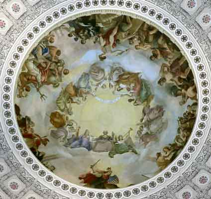
![[1]](https://en.wikipedia.org/wiki/Image:IBM-Locality.jpg)
![[2]](https://upload.wikimedia.org/wikipedia/commons/0/0a/Engaewa_similis_diagram.svg)
![[3]](https://commons.wikimedia.org/wiki/Image:Scarborough_Chapel_%28front%29.jpg)
![[4]](https://upload.wikimedia.org/wikipedia/commons/e/ed/Scarborough_Chapel_%28front%29.jpg)
![[7]](http://www.uscg.mil/history/gifs/CoastGuardEnsign.jpg)
![[9]](http://www.dpat-oran.dz/images/cartewilaya12.png)
![[10]](http://www.aadl.com.dz/images/Oran2002_fr.gif)
![[11]](http://www.m-culture.gov.dz/mc1/fr/carte/31.gif)
.svg&action=edit&redlink=1)
Article(s): Homestead Strike
Request: please lighten for detail and straighten. -- Chris (??? • ????) (talk) 02:17, 31 January 2008 (UTC)
Graphist opinion: How's this? Sagredo⊙☿♀♁♂♃♄ 04:35, 31 January 2008 (UTC)
- That was EASY! Thanks! Chris (??? • ????) (talk) 06:30, 31 January 2008 (UTC)
- In fact, it was so easy... no; I wont... ;) --Seans Potato Business 12:52, 31 January 2008 (UTC)
- As well you shouldn't. You should really resist these urges to be pushy and rude, they don't make this place any friendlier or easier to work together. For the record, once and for all, drop it, mind your business and not others. Chris (??? • ????) (talk) 22:53, 31 January 2008 (UTC)
- Sean, on this page humor is best done in a self-deprecating manor, and certainly should not be done as even a small jab in a place that has proven to be sensitive in the past. You really owe Chris an apology, actually a couple of them, Sagredo⊙☿♀♁♂♃♄ 00:25, 1 February 2008 (UTC)
- Well, I'm sorry that my joke was not appreciated; perhaps it was insensitive and I'll apologies to Chris separately on his talkpage. --Seans Potato Business 08:04, 1 February 2008 (UTC)
- Sean, on this page humor is best done in a self-deprecating manor, and certainly should not be done as even a small jab in a place that has proven to be sensitive in the past. You really owe Chris an apology, actually a couple of them, Sagredo⊙☿♀♁♂♃♄ 00:25, 1 February 2008 (UTC)
- As well you shouldn't. You should really resist these urges to be pushy and rude, they don't make this place any friendlier or easier to work together. For the record, once and for all, drop it, mind your business and not others. Chris (??? • ????) (talk) 22:53, 31 January 2008 (UTC)
- In fact, it was so easy... no; I wont... ;) --Seans Potato Business 12:52, 31 January 2008 (UTC)
Bleimor (Breton Scouting organization)
-
SVG
-
SVG
Article(s): Bleimor (Scouting)
Request: SVGify -- Chris (??? • ????) (talk) 07:47, 31 January 2008 (UTC)
Graphist opinion:I SVGified both of them!Λua∫Wise (talk) 14:20, 31 January 2008 (UTC)
- Thank you so much for that, they're great, glad to have you on board, Auawise! Chris (??? • ????) (talk) 22:55, 31 January 2008 (UTC)
- Let's not forget the Hazing Ritual Sagredo⊙☿♀♁♂♃♄ 21:24, 1 February 2008 (UTC)