
Wikipedia:Graphics Lab/Map workshop/Archive/2016
| This is an archive of past discussions on Wikipedia:Graphics Lab, for the period 2016. Do not edit the contents of this page. If you wish to start a new discussion or revive an old one, please do so on the current main page. |
Achaemenid empire

- Article(s)
- Achaemenid empire
- Request
- Please fix spellings of Phoenicia and Samaria… -- Kintetsubuffalo (talk) 08:58, 9 January 2016 (UTC)
- Graphist opinion(s)
- I intend to do this tomorrow. Maproom (talk) 20:44, 9 January 2016 (UTC)
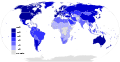
United Kingdom of Great Britain and Northern Ireland uses 'Short scale' for billions, etc, NOT 'Both scales'
-
 World usage of long and short scales

- Article(s)
- Long and short scales
- Request
- In the above map, the UK (United Kingdom of Great Britain and Northern Ireland) is shown in purple (meaning 'Both scales'), whereas it should be red (meaning 'Short scale'), the same color as the neighbouring Republic of Ireland, and as the USA. This was requested last October at Talk:Long and short scales#The map is inconsistent with the article, for the UK, and has since been supported by 3 other editors (including me), giving more detailed justifications. Nobody has disagreed. In case the above gets archived, the same text can be found in the most recent related diff here.-- Tlhslobus (talk) 03:42, 17 January 2016 (UTC)
- Note: The map also appears to be wrong for Brazil, which is short scale according to the text of the article, but is coloured bluish red (short scale with milliard) instead of red (short scale) despite the text indicating that Brazillions say trilhao where other Portuguese speakers say mil milhões or milhar de milhões. A Brazilian has pointed out this apparent error at Talk:Long_and_short_scales#Map_is_wrong_about_Brazil (relevant diff is here).Tlhslobus (talk) 04:08, 17 January 2016 (UTC)
- Graphist opinion(s)
![]() Done FYI, PNG files such as this can be edited with software such as MS Paint (that's what I used) with the colour dropper and floodfill option. This file should be recreated as an SVG to avoid pixelation and those annoying lines that connect islands up. But that's another task. I'm a little busy myself to do that, but you could keep this topic up and request that too. Jolly O Janner 04:38, 17 January 2016 (UTC)
Done FYI, PNG files such as this can be edited with software such as MS Paint (that's what I used) with the colour dropper and floodfill option. This file should be recreated as an SVG to avoid pixelation and those annoying lines that connect islands up. But that's another task. I'm a little busy myself to do that, but you could keep this topic up and request that too. Jolly O Janner 04:38, 17 January 2016 (UTC)
- Sorry, but seemingly nothing has changed, Jolly Janner. The UK and Brazil are seemingly still the same wrong colours. So the change is seemingly not yet "done". Are you perhaps saying that I should change the colours myself using something like MS Paint? I could perhaps try, but it may not work with my out-of-date operating system, and then I don't know how to safely upload the amended file to Wikipedia, especially as this map seems to be used elsewhere, judging by its seemingly Spanish file name. Tlhslobus (talk) 06:01, 17 January 2016 (UTC)
- Purge and/or hard refresh web browser (Ctrl + F5). Jolly O Janner 06:16, 17 January 2016 (UTC)
- Thanks, Jolly Janner. You've been absolutely wonderful. I'll now create a new request to have it converted to an SVG, per your recommendation. Judging from what you say, this might mean it could then no longer be edited with the likes of MS_Paint, but if so, I'm assuming this is outweighed by the benefits. If on reflection you decide this is incorrect, can you please let me know. Thanks again and regards. Tlhslobus (talk) 08:52, 17 January 2016 (UTC)
- Purge and/or hard refresh web browser (Ctrl + F5). Jolly O Janner 06:16, 17 January 2016 (UTC)
Please recreate 'World usage of long and short scales' as an SVG, per wikigraphist's recommendation
-
World usage of long and short scales
-
 vector version

- Article(s)
- Long and short scales
- Request
- Please recreate the above PNG map as an SVG, as recommended by wikigraphist Jolly Janner, who amended it earlier today, but added (see previous section): "This file should be recreated as an SVG to avoid pixelation and those annoying lines that connect islands up. But that's another task. I'm a little busy myself to do that, but you could keep this topic up and request that too." -- Tlhslobus (talk) 09:05, 17 January 2016 (UTC)
- Graphist opinion(s)
![]() Request taken by Mliu92 (talk) 17:00, 23 February 2016 (UTC).
Request taken by Mliu92 (talk) 17:00, 23 February 2016 (UTC).
- @Tlhslobus: Here is an SVG version. The SVG file can be edited using a text editor to add, subtract, or move countries between the various categories using the two-letter country code, formatted as lowercase with a preceding dot (i.e., Mexico would be ".mx" without the quotation marks) in the CSS sheets at the start of the file. I took the country list directly from the Long and short scales article, so there are a few differences versus the current PNG:
- Greenland and Antarctica are not listed in the article, hence I left them grey .
- Brazil, Brunei, and Myanmar appear to use a variant of "billion" and not "milliard" so I colored those the lighter red instead of the darker red .
- Let me know what you think. Cheers, Mliu92 (talk) 17:00, 23 February 2016 (UTC)
- Thanks, Mliu92, great work. But one minor problem and one query. All your changes seem fine except Antarctica, which the continents section of the article describes as using both scales, so it was correctly shown in purple, so could you please restore that. (I had a go at restoring it myself, but my antiquated computer seemingly insists on converting svg to png when downloading). Once you have restored it I'll use your map in the article, and I'll also describe your remaining changes in Talk just in case anyone wants to undo some of them and can find reliable sources (or perhaps other similar good reasons) to justify doing so. I'm not sure whether I should also copy to Talk your advice on how to change the map (I fear, perhaps unnecessarily, that making such changes too easy might facilitate vandals or POV warriors) - any thoughts on that?. Tlhslobus (talk) 08:48, 25 February 2016 (UTC)
- I notice that all the Arabic countries are described as short scale but using 'milyar' for billion (10^9), and should thus probably be darker red instead of lighter red as currently shown. So if you would like to make that change please do, tho if it's too much hassle please leave it, and I can then think about whether I want to bother submitting another request. Tlhslobus (talk) 10:20, 25 February 2016 (UTC)
- @Tlhslobus: I've updated the file with the purple color for Antarctica. This was pretty simple to fix. When the browser was downloading the file as a PNG, were you saving the rendered version? The SVG can be downloaded by going to the file at Commons and then clicking on the "Original File" link.
- Regarding your concern for potential vandalism, I admit I hadn't thought of that possibility. Editing the SVG would require some basic working knowledge of XML, although I tried to lay it out as simply as possible. When you open the SVG you will find these lines towards the top of the file (according to my text editor, they start at line # 145):
 /*
  * Coloring long-scale countries (Escala larga)
  */
.ar, .bo, .cl, .co, .cr, .cu, .do, .ec, .sv, .gq, .gt, .hn, .mx, .ni, .pa, .py, .pe, .es, .uy, .ve,      .bj, .bf, .cf, .cd, .cg, .fr, .pf, .tf, .ga, .gp, .gn, .ht, .ci, .ml, .mc, .nc, .ne, .bl, .sn, .tg, .wf,      .ao, .cv, .tl, .gw, .mo, .mz, .pt, .st,      .aw, .cw, .nl, .sx, .sr,      .ad, .at, .be, .ba, .bg, .hr, .cz, .dk, .fo, .fi, .de, .hu, .is, .ir, .it, .li, .lu, .mk, .mg, .me, .no, .pl, .sm, .rs, .sk, .si, .se, .ch
{
	opacity:	1;
	fill:	#0000FF;
}
 /*
  * Coloring short-scale countries (Escala corta)
  */
.as, .ai, .ag, .au, .bs, .bb, .bz, .bm, .bw, .cm, .ky, .ck, .dm, .er, .et, .fk, .fj, .gm, .gh, .gi, .gd, .gu, .gg, .gy, .hk, .ie, .im, .jm, .je, .ke, .ki, .ls, .lr, .mw, .my, .mt, .mh, .fm, .ms, .nr, .nz, .ng, .nu, .nf, .mp, .pw, .pg, .ph, .pn, .rw, .sh, .kn, .lc, .vc, .ws, .sl, .sg, .sb, .gs, .ss, .sz, .tz, .tk, .to, .tt, .tc, .tv, .ug, .gb, .us, .vg, .vi, .zm, .zw,      .br, .bn, .mm
{
	opacity:	1;
	fill:	#FF0000;
}
 /*
  * Coloring short-scale + milliard countries (Escala corta con millardo)
  */
.dz, .bh, .td, .km, .dj, .eg, .er, .iq, .jo, .kw, .lb, .ly, .mr, .ma, .om, .ps, .qa, .sa, .so, .sd, .sy, .tn, .ae, .eh, .ye,      .af, .al, .am, .az, .by, .cy, .ee, .ge, .id, .il, .kz, .kg, .lv, .lt, .md, .ro, .ru, .tj, .tr, .tm, .ua, .uz
{
	opacity:	1;
	fill:	#DC143C;
}
 /*
  * Coloring both-scales countries (Amblas escalas)
  */
.ca, .mu, .sc, .vu, .na, .za, .pr,      .aq
{
	opacity:	1;
	fill:	#9400D3;
}
 /*
  * Coloring other-scale countries (Otro sistema)
  */
.bd, .in, .np, .pk, .bt, .kh, .cn, .tw, .gr, .jp, .kp, .kr, .la, .mv, .lk, .mn, .th, .vn
{
	opacity:	1;
	fill:	#FFD700;
}
- You would move the country code from one category to another in order to change the color. It is not difficult but it is also not obvious and I would postulate that fixing vandalism would be fairly simple (you can always revert changes to earlier versions of graphics).
- Also note the Arabic-speaking countries (Algeria = .dz; Bahrain = .bh; etc.) are already listed as "short scale + milliard" countries (the darker red, which is hex color #DC143C ). I'm happy to iterate versions here if more changes are needed.
- Cheers, Mliu92 (talk) 15:49, 25 February 2016 (UTC)
- Thanks, Mliu92, I think everything is fine now. In any case I think I can now make any additional changes myself (or at least if any are needed I intend to try to do them myself first). I'll also link to the diff of this conversation on the article's Talk page, mentioning that it says what changes were made and how to change the file (but adding that it took me quite some time to find instructions on how to upload the amended version, which should reduce any vandalism risk). Sorry for not noticing that you had already updated the Arab countries (presumably because you forgot to list them among the changes you made). Anyway thanks again for everything. Tlhslobus (talk) 19:21, 26 February 2016 (UTC)
Commonwealth Games Map - Durban 2022


- Article(s)
- Commonwealth Games
- Request
- Durban, South Africa, is scheduled to host the 2022 edition of the Commonwealth Games, so could someone please mark the city with a black dot accompanied by the year 2022 on the above-left map, in accordance with the other past and future host cities. The location of the city is provided on the above-right map for anyone who wishes to try it.
- Graphist opinion(s)
![]() Done. Maproom (talk) 15:18, 22 January 2016 (UTC)
Done. Maproom (talk) 15:18, 22 January 2016 (UTC)
Group of SVG maps with simple error
-

-

-

-

-
-

-

-

-

-

-

-
-

-

-

-
 Blank map


- Article(s)
- Each is used in the linked article
- Request
- Elk Township is accidentally left transparent in all maps of this collection, except of course for its own. Could you make it white like all the other townships? I tried to do it by editing the SVG in Notepad, merely copy/pasting the hexadecimal color from another township, but I made a mistake and don't know what I did wrongly. Nyttend (talk) 14:56, 13 February 2016 (UTC)
- Graphist opinion(s)
![]() Done. Rather oddly, I noticed the author had kept non-visible layers in the file which contained raster maps. I have absolutely no idea why these were there, but noticed that after removing them the file size went down to 79KB (a 98% reduction!). I've uploaded it over File:Vinton County Ohio incorporated and unincorporated areas.svg as an example. I'm not sure whether to go ahead and do it to all of them. It may be worth asking the original author what they are doing in the file. Jolly O Janner 08:40, 14 February 2016 (UTC)
Done. Rather oddly, I noticed the author had kept non-visible layers in the file which contained raster maps. I have absolutely no idea why these were there, but noticed that after removing them the file size went down to 79KB (a 98% reduction!). I've uploaded it over File:Vinton County Ohio incorporated and unincorporated areas.svg as an example. I'm not sure whether to go ahead and do it to all of them. It may be worth asking the original author what they are doing in the file. Jolly O Janner 08:40, 14 February 2016 (UTC)
- Thanks! I had previously asked the uploader, who responded Elk Township doesn't have a colour (it is transparent) because when I was drawing the map I seem to have failed to turn it white. It doesn't matter enough to have to change the whole lot, though. Since I found the situation confusing, I disagreed with "doesn't matter enough", obviously. Final request, Jolly Janner: would you mind editing File:Vinton County Ohio incorporated and unincorporated areas Elk Township highlighted.svg to get rid of the raster layer there? I didn't request it earlier because I thought it was merely a mistake with the coloring; if you could reduce its file size significantly, that would be helpful. Nyttend (talk) 14:47, 14 February 2016 (UTC)
Commonwealth Republics Map - Tanzania

- Article(s)
- Republics in the Commonwealth of Nations
- Request
- Now that I have edited the article to include Tanzania on the list of Commonwealth republics, could someone please shade it red on the map with the others.
- Graphist opinion(s)
Snow Lion Fenian (talk · contribs)
Commons counties maps have odd county borders
I forked c:File:Democratic Party presidential primaries results by county, 2016.svg and c:File:Republican Party presidential primaries results by county, 2016.svg from c:File:USA Counties.svg. However, it looks like that map's borders are mixed into all sorts of objects, which is making editing the files very difficult. Try to open either in Inkscape and you will see how difficult it is to select a county.
I tried the ungroup function in Inkscape but no matter what I've tried, it's causing more problems.
Can someone fix the maps or redraw them from a good source? Magog the Ogre (t • c) 23:42, 6 March 2016 (UTC)
 Done. I revamped the maps, so the counties should be much easier to edit.—SPESH531Other 06:12, 28 March 2016 (UTC)
Local Government Borders of Ireland

- Article(s)
- City status in Ireland, plus any other article this map is already used on.
- Request
- Due to the Local Government Reform Act 2014, North and South Tipperary County Councils have been merged into a single Council for County Tipperary, plus Waterford City Council and Waterford County Council have been merged into a unified Waterford City and County Council, and same with the Limerick City and County Councils, now one as well. So could someone please remove the border within Tipperary, as well as the borders of both Waterford and Limerick Cities to reflect that. User:Snow Lion Fenian
- Graphist opinion(s)
![]() Done Houdinipeter (talk) 15:32, 23 April 2016 (UTC)
Done Houdinipeter (talk) 15:32, 23 April 2016 (UTC)
Commonwealth Games Map - Azawad/Mali Border
- Article(s)
- Commonwealth Games
- Request
- Given that Azawad no longer exists, even as an unrecognised state, could someone please remove the border between its former territory and the rest of Mali. User:Snow Lion Fenian
- Graphist opinion(s)
![]() Done. Maproom (talk) 22:09, 12 April 2016 (UTC)
Done. Maproom (talk) 22:09, 12 April 2016 (UTC)
Updates needed for map of Cannabis/Marijuana in the United States
-
 Map of cannabis legality by US state/territory

- Article(s)
- Legality of cannabis by U.S. jurisdiction
- Request
- This map needs several states changed in color to reflect legal changes since the map was last updated, and I'm also including a request to tweak the light blue (?) used to indicate Decriminalization, since as a color-impaired person I have trouble distinguishing it from neighboring shades, so maybe it can be adjusted slightly for wider readability. I have opened up a discussion at WikiProject Cannabis noting needed changes and asking if anyone else sees anything to be corrected: Wikipedia_talk:WikiProject_Cannabis#Cannabis_map_in_great_need_of_updating
Thanks! Goonsquad LCpl Mulvaney (talk) 20:41, 20 April 2016 (UTC)
- Graphist opinion(s)
![]() Done Houdinipeter (talk) 15:40, 23 April 2016 (UTC)
Done Houdinipeter (talk) 15:40, 23 April 2016 (UTC)
Irish Ulster Counties Maps - Local Borders


- Article(s)
- Any article these maps are already featured on.
- Request
- Ok, similar to some of my above requests, could someone please remove the border within County Tipperary, and also the former borders of Waterford City Council, in order to reflect the changes of the Local Government Reform Act 2014, on all three of the above maps. User:Snow Lion Fenian
- Graphist opinion(s)
-
- I could do it, but only by converting these large unwieldy SVG images into bitmaps, which many would consider a Bad Thing. Maproom (talk) 22:04, 5 May 2016 (UTC)
- I'll try to do it. Houdinipeter (talk) 03:07, 6 May 2016 (UTC)
- Done Houdinipeter (talk) 03:54, 6 May 2016 (UTC)
Light Rail System Map of Valley Metro Rail
- Article(s)
- List of Valley Metro Rail stations, Valley Metro Rail & Valley Metro
- Request
- If possible, it would be great if a graphist would be able to create a light rail system map similar to File:Trax_and_FrontRunner_c._2013.png for the Valley Metro Rail system. Sources for this map would be here, here and here. Similar to the example image I provided, the Valley Metro Rail map would show the one light rail line (use a gold/yellow color similar to what Valley Metro does), white circles for stations, include the name of each station and bold the station name for the stations that have bus transit centers. The map would also include a legend, north arrow, etc. I don't mind what format the image is in, whatever works best. Please let me know if this would be possible, as I would appreciate it greatly! Let me know if you have any questions. « Gonzo fan2007 (talk) @ 20:37, 20 May 2016 (UTC)
- Graphist opinion(s)
.svg)

Hello @Gonzo fan2007:, there is already a map that corresponds to your request. Please check and let me know. --Ikonact (talk) 20:22, 22 May 2016 (UTC)
- Well, the existing map looks outdated. There are some new stations to be added. I have created a new one. Please check it and let me know. --Ikonact (talk) 21:46, 22 May 2016 (UTC)
- Thanks @Ikonact!. It is definitely a good start! If you don't mind, I have some suggested changes, most of which are based on a new source that I think looks really good. See slide 5 in this presentation. I think making it more of a schematic map would be best:
- Slightly elongate the map so that it is wider (similar to the new source)
- Remove the downtown couplet and make into a single line (similar to the new source).
- Change the station names to their shorthand that is used in the new source.
- Make sure all of the station names are at 45 degree angles with the light rail line.
- Remove the Gilbert Road Extension stations and the 50th St/Washington station for now (we can add them when they open in a few years).
- Make the line a little thicker, and add a black border on the gold light rail line (similar to the new source).
- Add a north arrow.
- I think that is all I have. I really appreciate the help! Let me know if you have any questions. « Gonzo fan2007 (talk) @ 18:04, 23 May 2016 (UTC)
- @Gonzo fan2007:Recommendations implemented, please check and let me know. --Ikonact (talk) 20:49, 23 May 2016 (UTC)
- Thank you @Ikonact! It looks amazing! I have already added it to one of the articles. I really appreciate your quick work! « Gonzo fan2007 (talk) @ 21:10, 23 May 2016 (UTC)
- @Gonzo fan2007: My pleasure. I will consider the work Done and close the request. Thanks--Ikonact (talk) 22:00, 23 May 2016 (UTC)
- @Gonzo fan2007: My pleasure. I will consider the work
- Thank you @Ikonact! It looks amazing! I have already added it to one of the articles. I really appreciate your quick work! « Gonzo fan2007 (talk) @ 21:10, 23 May 2016 (UTC)
- @Gonzo fan2007:Recommendations implemented, please check and let me know. --Ikonact (talk) 20:49, 23 May 2016 (UTC)
- Thanks @Ikonact!. It is definitely a good start! If you don't mind, I have some suggested changes, most of which are based on a new source that I think looks really good. See slide 5 in this presentation. I think making it more of a schematic map would be best:
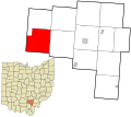
Qld

- Article(s)
- Qld
- Request
- please remove promotional text and compass rose (basically Wikify)… -- Kintetsubuffalo (talk) 04:41, 5 June 2016 (UTC)
- Graphist opinion(s)
![]() Done because you asked, and it was easy. But it's not a good map – most of the county names are barely legible. Maproom (talk) 21:25, 6 June 2016 (UTC)
Done because you asked, and it was easy. But it's not a good map – most of the county names are barely legible. Maproom (talk) 21:25, 6 June 2016 (UTC)
- Thanks! If at some time you want to attempt a better replacement, that would be great! THANK YOU!--Kintetsubuffalo (talk) 02:42, 8 June 2016 (UTC)
Savannah River

In the WP article Savannah River, the primary map of the Savannah River Watershed is beyond minimalist. It should at least include two city labels, Augusta and Savannah, which are both discussed repeatedly in the article. Also, two state labels (Georgia and South Carolina) wouldn't hurt. I'm having trouble locating the map and editing this myself. Any help would be greatly appreciated.Mason.Jones (talk) 19:42, 30 January 2016 (UTC)
- @Mason.Jones:I put what I believe to be the image you want fixed. Did I get the right one? (FYI, all I needed to do was click on the image in the article; I did disable the Media Viewer.) ??? ????? Od Mishehu 05:53, 1 February 2016 (UTC)
Yes, that's the one. Thanks! Mason.Jones (talk) 16:39, 2 February 2016 (UTC)
Europe and World blank maps
-
 World map
 -
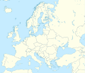 Europe map
.svg)

- Article(s)
- [[]]
- Request
- Can you need pixely, .png image for both World and Europe? dimensions must stay the same -- 46.130.159.30 (talk) 19:57, 16 April 2016 (UTC)
- Graphist opinion(s)
You can download pixel versions of this file below the map on its Commons' description site. You don't need to manually create those. --TUBS (talk) 07:37, 24 April 2016 (UTC)
2004 US presidential election
-
 SVG map of US counties during the 2012 presidential election
 -
 JPG map of US counties during the 2004 presidential election


- Article(s)
- JPG is currently used at ru:????????????? ?????? ? ??? (2004) and uk:????????????? ?????? ? ??? 2004
- Request
- Could you make an SVG version of the JPG and upload it as File:2004 Presidential Election by County.svg? I'm imagining that you could just take the 2012 map and adjust the colors of some counties to reflect the 2004 data. Nyttend (talk) 00:28, 7 June 2016 (UTC)
- Graphist opinion(s)
 Request taken by William S. Saturn (talk) 21:09, 12 June 2016 (UTC).
![]() Done. @Nyttend: I used the .jpg map as the key for filling in the counties. However, there is a discrepancy between it and the Election Atlas, particularly in Iowa. I'll look into this matter further in the coming days.--William S. Saturn (talk) 05:31, 13 June 2016 (UTC)
Done. @Nyttend: I used the .jpg map as the key for filling in the counties. However, there is a discrepancy between it and the Election Atlas, particularly in Iowa. I'll look into this matter further in the coming days.--William S. Saturn (talk) 05:31, 13 June 2016 (UTC)
- The map now corresponds correctly to the results on the Election Atlas.--William S. Saturn (talk) 21:58, 22 June 2016 (UTC)

Britiish Empire Map - French Islands

- Article(s)
- Second Boer War
- Request
- If you look closely at this map of the British Empire in 1898, you'll notice some islands shaded blue, in the sea surrounding Madagascar, islands that I believe were under French control at the time. Could someone please change them to grey, as this is only a map for British territories. User:Snow Lion Fenian
- Graphist opinion(s)
![]() Done Maproom (talk) 23:12, 23 June 2016 (UTC)
Done Maproom (talk) 23:12, 23 June 2016 (UTC)
Nabatean Kingdom

.svg)
- Article(s)
- Nabatean Kingdom
- Request
- Hello, I need a map for the Nabatean Kingdom with a format similar to that of the Seleucid Empire map. Thanksǃ Makeandtoss (talk) 17:56, 9 January 2016 (UTC)
- Graphist opinion(s)
@Makeandtoss ![]() Done. Let me know if you need help. Ali Zifan 02:05, 8 July 2016 (UTC)
Done. Let me know if you need help. Ali Zifan 02:05, 8 July 2016 (UTC)
.svg)

- @Ali Zifan: Awesome! Thanks. Makeandtoss (talk) 08:23, 8 July 2016 (UTC)
Russia Southern Federal District : Template(?) problem

Relief, but no Location map+ for multiple icons

= a template(?) for "SouthernRussia.svg"
Multiple icons, but no relief, even with relief=1 or alt=physical
We have two versions of Russia, Southern Federal District. They differ slightly by lat/long.
- Map1 has relief but does not allow multiple icons
- Map2 allows multiple icons but does not allow relief (at least by what I tried)
- The originator of Map1 was able to make multiple icons on Map1 on the Russian Wiki (Commons User=Hellerick/ discussion/ last line/ click). He used "alt=physical" and Cyrillic map names. Is there a way to combine relief and multiple icons on the English Wiki? Either Map1 or Map2 would work. Either I could not locate the correct template(?) or there is a template that does not copy from Russian to English.Benjamin Trovato (talk) 23:25, 27 January 2016 (UTC)
- This has been inactive for 6 months. Suggest it be cancelled. Benjamin Trovato (talk) 03:58, 8 July 2016 (UTC)
Bellamya aeruginosa distribution map
-
 With many dark areas - to be improved
 -
 One dark area
 -
 Two dark areas


- Article(s)
- Bellamya aeruginosa
- Request
- I need to make the map uniformly red (50% transparency) as are other maps at commons:IUCN distribution maps of Gastropoda (that I uploaded by myself). I think it is caused by the SHP file. I will send you the SHP file on request. You will send me corrected SHP file back and I will finish the work. OK? -- Snek01 (talk) 22:19, 3 February 2016 (UTC)
- Graphist opinion(s)
Request: SVG Map of North and Central America with state boundaries
Hi, I need a map of North America which covers all of the territory seen in this photo, but without the range of the Fraxinus drawn in, and with state boundaries within in Mexico. Basically the map would combine the two second files in the below gallery (except without the Cuba inlay).·maunus · snunɐɯ· 22:54, 16 February 2016 (UTC)


Upon enlarging the text in the maps becomes garbled
-
 Map of Estonia
 -
 Map of Bangladesh
 -
 Map of Burundi
_-_EST_-_UNOCHA.svg)
_-_BGD_-_UNOCHA.svg)
_-_BDI_-_UNOCHA.svg)
- Article(s)
- Request
For those who have time on their hands.
The Category:Maps by United Nations Office for the Coordination of Humanitarian Affairs is filled with maps from around the world. It came under my attention because there are watermarks in the images. I (and others) have been busy removing the watermarks from the images.
Until I remarked that upon enlarging the image, parts of the text in the images becomes garbled up. See the above mentioned images at 2000px. The reason for this is that the text is probably pasted into the images. When one takes a look into the stroke paint it says: "Stroke paint: Unset paint (make it undefined so it can be inherited). No fill and no stroke paint.
There is the additional problem that there are many empty elements in the images.
So, for those who have nothing to do, there is a challenge here.— Preceding unsigned comment added by [[User:{{{1}}}|{{{1}}}]] ([[User talk:{{{1}}}|talk]] • [[Special:Contributions/{{{1}}}|contribs]]) —Preceding undated comment added an unspecified datestamp.
- Graphist opinion(s)
Map of Israel superimposed over Madagascar to compare size
-
Description of second image (if needed)
-
Description of third image (if needed; don't request too many at once, though)
- Article(s)
- Madagascar Plan
- Request
- Map of Israel superimposed over Madagascar showing comparable size -- Raquel Baranow (talk) 00:30, 24 February 2016 (UTC)
- I did it myself, as best I could, HERE.
- Graphist opinion(s)
Map of Research laboratories under CSIR in India
-
 India-locator-map-blank.svg

- Request
- Please provide this India map with Blue Dots of CSIR Laboratories -- Liveankur (talk) 11:54, 3 March 2016 (UTC)
- Graphist opinion(s)
This request requires compiling addresses from each of the labs, and then overlaying a street map in GIS software to find the addresses. Houdinipeter (talk) 16:08, 23 April 2016 (UTC)
Map of internet usage in Africa
-
 Internet Penetration World Map
 -
 Mobile Broadband Internet Penetration World Map.
 -
 Fixed Broadband Internet Penetration World Map


- Article(s)
- Internet in Africa
- Request
- It would be good for the article Internet in Africa to have figure of Africa alone, and also to have the legend a bit adapted (and more differentiated) to small percentages of internet usage. In this way you can better see the differences between African countries-- PJ Geest (talk) 15:17, 6 March 2016 (UTC)
- Graphist opinion(s)
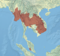
Southeast Asia Map Circa 1750
-
 Southeast Asia until 1700

- Article(s)
- [[History of Laos; Kingdom of Luang Phrabang; Kingdom of Champasak; Kingdom of Vientiane; Lao Rebellion (1826-28)]]
- Request
- Requesting a map of Southeast Asia c1750. The Kingdom of Lan Xang was divided into three kingdoms: Luang Prabang, Vientiane, and Champasak (with the province of Xieng Khouang in Modern Laos being a possible fourth). I tried contacting the editor that produced the original maps for Southeast Asia but haven't ever received a response. There currently is only one map on the internet showing this historical period and it is inaccurate. There are a number of maps showing the division, but can be difficult to find (I can email photos of the pages). Page 17 of A History of Laos, by Martin Stuart Fox (ISBN: 978-0-521-59235-2) is most widely available. I can send additional details if someone (please) picks up the request-- StampyElephant (talk) 14:28, 19 March 2016 (UTC)
- Graphist opinion(s)
It needs to be converted into an .svg as well. Houdinipeter (talk) 16:00, 23 April 2016 (UTC)
Map of South America
-
 European states claimed sovereignty over South America, 1700

- Article(s)
- History of South America
- Request
- (Please be aware that, since this article is undergoing copy-editing and an overhaul by various editors, the wording of that caption may change.) The map shows the areas of South America that were under the control of various European countries between 1700 and (I guess) the present. The coloring on the map changes as the time progresses. However, it changes so quickly that it is hard to take in the information available on the map. If you're looking at the year at the top, you miss the change in the map. If you're looking at the changes in the map, you miss the year. I'm wondering if someone could slow the map down a bit. That's all. – Corinne (talk) 01:58, 1 April 2016 (UTC)
- Graphist opinion(s)
It already seems to be quite slow. Houdinipeter (talk) 15:54, 23 April 2016 (UTC)
Purchasing power parity worldwide
-
Description of first image
-
Description of second image (if needed)
-
Description of third image (if needed; don't request too many at once, though)
-->
- Article(s)
- Purchasing power parity
- Request
- There is still no world map of purchasing power parities, although the demand for it is apparently. Could anyone create one, using the data from [1], using a simple blank world map?--Antemister (talk) 11:19, 3 April 2016 (UTC)
- Graphist opinion(s)
Is the current map for the article not correct? Houdinipeter (talk) 15:57, 23 April 2016 (UTC)
- The map used now in the article shows the countries by PPP-GDP per capita, i. e. nominal GDP/capita * PPP = PPP-GDP/per capita, so such a map does not show the topic of the article. Actually, we "had" File:PPP2003.svg (now removed from most articles), using data at least a decade old and using somewhat "doubtful" data as for countries like Iraq or Argentina, no PPP data can be found in the World Banks database.--Antemister (talk) 08:31, 24 April 2016 (UTC)
Cairo map
-
 Cairo map

- Article(s)
- Egyptian Museum and other articles about Cairo
- Request
- Hi, i was wondering if you can make the map more visually attractive to readers. I tried working on it on Photoshop, but i just don't know what to delete... can you please help me? -- Mikey641 (talk) 13:04, 13 April 2016 (UTC)
- Graphist opinion(s)
Stitching together of Map of Suriname (1860-1879)


- Article(s)
- Suriname and many related articles
- Request
- I don't know how difficult or easy this is and if this is the right place to ask this, but I recently uploaded the amazingly detailed 10-sheet map of Suriname from 1860-1879 to Wikimedia Commons and I would be thrilled to see them merged into one huge file. This map is of great historic value, and my thanks would be immense! -- Fentener van Vlissingen (talk) 14:00, 20 April 2016 (UTC)
- Graphist opinion(s)
![]() Request taken by —Odysseus1479 02:16, 7 June 2016 (UTC). I’ll give it try; no guarantee of seamlessness.
Request taken by —Odysseus1479 02:16, 7 June 2016 (UTC). I’ll give it try; no guarantee of seamlessness.
- Thanks a lot! Fentener van Vlissingen (talk) 18:58, 3 July 2016 (UTC)
- @Fentener van Vlissingen: I’ve done the basic assembly, but before I finish I‘d like some input. The panels are slightly distorted, mainly I guess from warping of the paper as it aged, with the result that they don’t match up very well, even after slight scale & rotation transformations to make each panel as square as possible. So the dilemma I’m facing is between 1) butting them together as best I can, while breaking some lines and obscuring some features along the affected edges, and 2) leaving a little space between the panels, with the result that the overall scale will no longer be continuous. The advantage of the first option is that it would better resemble a single map (from a distance, at least), but the second would minimize damage along the seams and give context to the anomalies by showing the entire frame of each panel. Which would you rather see?—Odysseus1479 22:45, 3 July 2016 (UTC)
- @Odysseus1479: I think I would prefer the second option, I don't mind a little space between the panels as long as the impression of a single map is not entirely lost. Obscuring some features would be worse in my opinion. Thanks again for the work you put into it already! Fentener van Vlissingen (talk) 15:04, 4 July 2016 (UTC)
- @Fentener van Vlissingen: I’ve uploaded a PNG version. I did only a little retouching; have a close look and let me know if there‘s something that especially needs attention—a proper restoration would take more time & skill than I can offer, but I‘m prepared to put a little more into it … The colour depth has been reduced to minimize the file size without resorting to JPEG compression. This has made the background look rather blotchy, but preserves the map detail and the legibility of the type. If you don‘t care for that compromise, other options are available.—Odysseus1479 08:41, 28 July 2016 (UTC)
- @Odysseus1479:Thanks a lot for the assembled map! I think it looks great, my main problem with the individual sheets was that they barely looked like a map on their own. The assembled map gives context while keeping intact the details of the sheets. Well done, thanks again. Fentener van Vlissingen (talk) 16:23, 28 July 2016 (UTC)
- @Fentener van Vlissingen: I’ve uploaded a PNG version. I did only a little retouching; have a close look and let me know if there‘s something that especially needs attention—a proper restoration would take more time & skill than I can offer, but I‘m prepared to put a little more into it … The colour depth has been reduced to minimize the file size without resorting to JPEG compression. This has made the background look rather blotchy, but preserves the map detail and the legibility of the type. If you don‘t care for that compromise, other options are available.—Odysseus1479 08:41, 28 July 2016 (UTC)
- @Odysseus1479: I think I would prefer the second option, I don't mind a little space between the panels as long as the impression of a single map is not entirely lost. Obscuring some features would be worse in my opinion. Thanks again for the work you put into it already! Fentener van Vlissingen (talk) 15:04, 4 July 2016 (UTC)
- @Fentener van Vlissingen: I’ve done the basic assembly, but before I finish I‘d like some input. The panels are slightly distorted, mainly I guess from warping of the paper as it aged, with the result that they don’t match up very well, even after slight scale & rotation transformations to make each panel as square as possible. So the dilemma I’m facing is between 1) butting them together as best I can, while breaking some lines and obscuring some features along the affected edges, and 2) leaving a little space between the panels, with the result that the overall scale will no longer be continuous. The advantage of the first option is that it would better resemble a single map (from a distance, at least), but the second would minimize damage along the seams and give context to the anomalies by showing the entire frame of each panel. Which would you rather see?—Odysseus1479 22:45, 3 July 2016 (UTC)
Specific map of a memorial park
- Article(s)
- Stardust Memorial Park
- Request
- A map of the Stardust Memorial Park, showing the facilities of the park such as the lake, exercise machines and the playground and the all-weather pitch. If more information is needed, don't hesitate to ask. I thank you in advance. -- Ultrafighter (talk) 16:19, 23 April 2016 (UTC)
- Graphist opinion(s)
This map would likely need to source from Open Street Map which does not include every facility you mentioned. The relevant website has images that do not include licensing. Houdinipeter (talk) 14:51, 24 April 2016 (UTC)
World Religiosity map

- Article(s)
- Religiosity
- Request
- A new color scheme for https://commons.wikimedia.org/wiki/File:Gallup_Religiosity_Index_2009.png , similar to https://en.wikipedia.org/wiki/File:Church_or_synagogue_attendance_by_state_GFDL.svg , from red to white preferable, the data is very old, it is from 2009 when we have from 2014 https://en.wikipedia.org/wiki/Importance_of_religion_by_country
- Do you really just want a new color scheme? Would it be acceptable if someone took File:Gallup_Religiosity_Index_2009.png and replaced greenness by redness throughout? Maproom (talk) 07:38, 4 May 2016 (UTC)
Ireland Relief Map - Local Borders

- Article(s)
- Any article this map is already used on.
- Request
- Similar to my above request, could someone please remove the border within County Tipperary, and also remove the former borders of Limerick City Council and Waterford City Council, to reflect the changes of the Local Government Reform Act 2014 to the local government of Ireland. User: Snow Lion Fenian
- Graphist opinion(s)
It should probably be turned into an SVG first. Houdinipeter (talk) 01:09, 4 May 2016 (UTC)
Democratic Party presidential primaries, 2016

- Article(s)
- Democratic Party presidential primaries, 2016
- Request
- please remove small rest-of-the-world map in corner, unnecessary and gives impression whole world can vote… -- Kintetsubuffalo (talk) 01:40, 15 May 2016 (UTC)
- Graphist opinion(s)
![]() Done - though I now see it was added with the edit summary "Democrats Abroad: http://www.cnn.com/2016/03/21/politics/bernie-sanders-wins-democrats-abroad/index.html". Maybe I should revert. Maproom (talk) 09:54, 15 May 2016 (UTC)
Done - though I now see it was added with the edit summary "Democrats Abroad: http://www.cnn.com/2016/03/21/politics/bernie-sanders-wins-democrats-abroad/index.html". Maybe I should revert. Maproom (talk) 09:54, 15 May 2016 (UTC)
- I get it. Is there a better way this can be expressed visually? It looks weird unexplained.--Kintetsubuffalo (talk) 09:58, 15 May 2016 (UTC)
- Maybe a little picture of a globe, with some text "overseas voters"? Any better ideas? Maproom (talk) 10:52, 15 May 2016 (UTC)
- I get it. Is there a better way this can be expressed visually? It looks weird unexplained.--Kintetsubuffalo (talk) 09:58, 15 May 2016 (UTC)
- That may be the best option.--Kintetsubuffalo (talk) 17:55, 15 May 2016 (UTC)
World Sea Ports
- Article(s)
- Request
-- Amitsingh7282 (talk) 04:29, 18 May 2016 (UTC)
- Graphist opinion(s)
- @Amitsingh7282:, could you please give details or maybe a source? Houdinipeter (talk) 18:29, 21 May 2016 (UTC)
Prostitution laws of the world PNG to SVG
-->

- Article(s)
- Prostitution law
- Request
- I'm a graphist here, and I will soon convert this, but if anyone else would like to do so in the meantime feel free.- Houdinipeter (talk) 23:11, 18 May 2016 (UTC)
- Graphist opinion(s)
Needs conversion to SVG, using both a svg worldmap template and some tracing.
Colombo district map
- Article(s)
- Seema Malaka, Cinnamon Gardens
- Request
- Hello. Request location map (pushpin map) for district of Colombo. In the past, I had got Varanasi district location map done and request location map of Colombo district in similar lines. Thanks -- Arun Kumar SINGH (Talk) 16:35, 19 May 2016 (UTC)
- Graphist opinion(s)
Arun Kumar SINGH If it's OK for you to wait until about 10th of August I can take it. I will get back to then. --Goran tek-en (talk) 18:41, 9 July 2016 (UTC)
![]() Request taken by Goran tek-en (talk) 18:41, 9 July 2016 (UTC).
Request taken by Goran tek-en (talk) 18:41, 9 July 2016 (UTC).
- Hello Goran tek-en, you are a star. No issues and I am sure Maproom would appreciate it too. Cheers, Arun Kumar SINGH (Talk) 19:02, 9 July 2016 (UTC)
- Hi Arun Kumar SINGH, I have started to look at your request now but I'm a bit confused. The district I find is this but that is in Sri Lanka.
- Is that the correct district?
- If not you have to show it to me thanks. --Goran tek-en (talk) 17:14, 9 August 2016 (UTC)
- Hello Goran tek-en, yes, Colombo is a district in Sri Lanka. I checked that in Google maps and the boundaries seems to be just about right. Thanks, Arun Kumar SINGH (Talk) 18:44, 9 August 2016 (UTC)
Old request
Hello. Can someone give this old request a look? Appears that it missed everyone's attention. Thanks, Arun Kumar SINGH (Talk) 10:28, 23 June 2016 (UTC)
- I didn't miss it, I just don't have a suitable source from which to create the map you requested. Maproom (talk) 23:17, 23 June 2016 (UTC)
- Hello Maproom, I checked on Google maps and this is very accurate. Can something be done based on this map? Cheers, Arun Kumar SINGH (Talk) 07:30, 27 June 2016 (UTC)
- That map is restricted by copyright. Maproom (talk) 08:00, 27 June 2016 (UTC)
- Yup, I see the problem. Google searched it and could not find a single usable free map. Goran tek-en had earlier made Varanasi district map on my request and pinging him to check if he has some sources for Colombo district map? Arun Kumar SINGH (Talk) 10:11, 27 June 2016 (UTC)
- As you can see here [2] at source I used OSM (Open Street Map) and there is also a link. So I guess you can do the same with Colombo. To get a fair resolution I had to add some screen prints from there into one. --Goran tek-en (talk) 17:40, 27 June 2016 (UTC)
- Thanks Goran tek-en. Hello Maproom, I hope this helps. Arun Kumar SINGH (Talk) 09:11, 29 June 2016 (UTC)
- Hello Goran tek-en & Maproom, Can someone please look into this request? Thanks, Arun Kumar SINGH (Talk) 08:32, 8 July 2016 (UTC)
![]() Request taken by Goran tek-en (talk) 17:33, 8 August 2016 (UTC).
Request taken by Goran tek-en (talk) 17:33, 8 August 2016 (UTC).
Arun Kumar SINGH Now there are two drafts for you to look at;
Give me feedback on what you what you want edit, thanks. --Goran tek-en (talk) 19:08, 21 August 2016 (UTC)
- Hello Goran tek-en. this looks fine. I am good with this if you are ok. Please finalize this one if you think this is suitable. Many thanks and once again, you are a star :-). Cheers, Arun Kumar SINGH (Talk) 20:21, 21 August 2016 (UTC)
- Arun Kumar SINGH I will upload both versions but I will need the following for each of the files;
- Name of the file
- Description
- Category/ies at commons
- to be able to upload it at commons. --Goran tek-en (talk) 15:54, 22 August 2016 (UTC)
- @AKS.9955: I would need your replay to above to be able to upload the maps to common. --Goran tek-en (talk) 16:18, 27 August 2016 (UTC)
- Hello @Goran tek-en:, sorry that I missed your earlier ping. Following is what I suggest;
- Name of the file: Colombo district location map
- Description: Location map of Colombo District, Sri Lanka
- Category/ies at commons: Colombo, SVG maps of Sri Lanka, Location maps of Sri Lanka, Location maps of Sri Lanka by province, Colombo.
- Please let me know if you need something else. Thanks, Arun Kumar SINGH (Talk) 16:42, 27 August 2016 (UTC)
- @AKS.9955: As I told you before I made two versions and uploaded both. Please check and if necessary edit the information if necessary, thanks. --Goran tek-en (talk) 18:53, 27 August 2016 (UTC)
- Colombo district location map
- Colombo district location map blank
- @Goran tek-en:, this looks perfect. Arun Kumar SINGH (Talk) 20:10, 27 August 2016 (UTC)
![]() Done
Done
- Hello @Goran tek-en:, thanks. I tried using the map on Seema Malaka & Cinnamon Gardens and the "pushpin_map" field but it gives and error. Can you please check? Thanks, Arun Kumar SINGH (Talk)
@AKS.9955:
- Have you tried with another location map to see if the problem is the map or the pushpin thing?
- Can you also try with this map Colombo district location map blank to see if that works?
- I have never made a pushpin map so you will have to link me to a page about it so I know what it is, thanks. --Goran tek-en (talk) 14:48, 29 August 2016 (UTC)
- Have you tried with another location map to see if the problem is the map or the pushpin thing?
- Hello @Goran tek-en:,
- The article Seema Malaka already uses a location map that works.
- Other map does not work too.
- In May 2015, I had placed request for another push-pin map and the map was authored by you. Perhaps this might help.
Cheers, Arun Kumar SINGH (Talk) 16:23, 29 August 2016 (UTC)
(Talk) ]] 13:27, 28 August 2016 (UTC)
@AKS.9955:
- Can you try to use this map just to test if that works on your page.
- Please explain for me how you do a pushpin map, I can see the infobox on your page but I don't understand how you connect that to the location map you want to use?
- Both those two new ones and the older map is made in the same way and they are tested against W3 Markup Validation and on commons for rendering. They passed those tests without any error so I'm not sure what to look for. The pushpin is a kind of extra layer and I have really no knowledge on how that works.
- Please give me information as above, thanks. --Goran tek-en (talk) 17:42, 29 August 2016 (UTC)
- What I can see you have to create a Module and a Template, have you really checked them so there is nothing wrong with them, thanks? --Goran tek-en (talk) 17:59, 29 August 2016 (UTC)
- Can you try to use this map just to test if that works on your page.
- Hello @Goran tek-en:, I checked the previous discussion we had in 2015 when you authored map Varanasi location map. Incidentally, we faced same issues back then also and NordNordWest created the missing template. I am pinging @NordNordWest: for help. Cheers, Arun Kumar SINGH (Talk) 17:14, 30 August 2016 (UTC)
- My first location map module after the end of the template era: Module:Location map/data/Sri Lanka Colombo. NNW (talk) 17:56, 30 August 2016 (UTC)
- Brilliant. Thanks a million NNW and Goran tek-en, I have already started using this map. Cheers, Arun Kumar SINGH (Talk) 18:33, 30 August 2016 (UTC)
Map of Ross Perot's support in the 1992 U.S. presidential election
-
 The .svg I created with dark green highlighting the counties Perot won, green highlighting the state in which he received more than 30%, lime green showing the states in which he received between 25 and 30%, lime showing the states where he received between 20 and 25%, light green showing the states where he received between 15 and 20%, light cyan showing the states where he received between 10 and 15%, and white showing the state where he received less than 10%.

- Article(s)
- Ross Perot presidential campaign, 1992
- Request
- I created an .svg showing the support of Ross Perot in the 1992 U.S. presidential election above. I would like to add boundaries to the international borders and coasts of the states but I am not an expert at .svg so I don't know how to do this. Also, I'm not sure why, but in the preview Accomack County, Virginia appears black but it should be light cyan like the rest of the state. -- William S. Saturn (talk) 20:57, 12 June 2016 (UTC)
- Graphist opinion(s)
NC540 Extension Map
- Request
- Can someone please create an OpenSourceMap of the following Map - It is also available in KMZ here - Full project details are available here - Thanks! - Jesse Schulman (talk) 20:02, 13 June 2016 (UTC)
- Graphist opinion(s)
G:link system map

- Article(s)
- List of G:link stations
- Request
![]() Request taken by Shandris.. --Shandristhe azylean 19:45, 2 July 2016 (UTC)
Request taken by Shandris.. --Shandristhe azylean 19:45, 2 July 2016 (UTC)
- I am requesting a system map for the G:link, a light rail system serving the Gold Coast in Queensland. Examples are File:BARTMapNight.svg, File:Mbta district.svg, File:Los Angeles County Metro Rail and Metro Liner map.svg, File:MBTA Commuter Rail Map.svg, File:Oslo t-bane.jpg and File:Vancouver Skytrain Map.png with geography, and File:Copenhagen Metro map.svg, File:London Underground Overground DLR Crossrail map.svg, File:MetroLink map Oct2008.svg, File:Muni Metro (vector).svg, File:Oslo T-bane linjekart.svg, File:Sacramento RT light rail map.png, File:SEPTA Regional Rail Diagram.svg, File:VTALightRail.svg and File:Trax and FrontRunner c. 2013.png without. I don't mind whether the system map includes geography or not. References are available as PDFs here and here, and as a Google Map here. Please let me know if you need any more information. Thank you in advance, New9374 (talk) 01:05, 28 June 2016 (UTC)
- @Ikonact, I recommended @New9374 come here after you made me the map of Valley Metro Rail last month. If you are interested in making this map, let me know! « Gonzo fan2007 (talk) @ 02:46, 28 June 2016 (UTC)
- @Gonzo fan2007,@New9374, I note your request and I will try to make the map but unfortunately I have no time at the moment. I will come back to you in few weeks time. In the meanwhile some other graphic designer can help. Sorry! Cheers --Ikonact (talk) 07:41, 1 July 2016 (UTC)
- @Ikonact, I recommended @New9374 come here after you made me the map of Valley Metro Rail last month. If you are interested in making this map, let me know! « Gonzo fan2007 (talk) @ 02:46, 28 June 2016 (UTC)
- Graphist opinion(s)
- @New9374: Here's my attempt on this. I didn't know whether to include the planned Helensvale extension so I didn't. If you want me to add it I'd be happy to do so. --Shandristhe azylean 14:54, 3 July 2016 (UTC)
- Thank you Shandris. I'm happy to leave out the Helensvale extension for a couple years until its constructed. Could you please increase the font size of the station names though? It'd be really great if it could be readable at 220x311. Thank you, New9374 (talk) 15:22, 3 July 2016 (UTC)
- @New9374: Seems like there was some anomaly with the font as well. Increased the font size for you. Looks better imho. --Shandristhe azylean 22:08, 3 July 2016 (UTC)
- Thank you Shandris. It does look better know you have increased the font size. Unfortunantely though the "Broadwater Parklands" and "Southport South" stations have been switched around, and "Broadbeach North" and "Broadbeach South" are misspelt. Could you please fix those few things up? Many thanks, New9374 (talk) 23:17, 3 July 2016 (UTC)
- @New9374: I deeply apologize. I was in a bit of a hurry and completely missed the spelling mistake and the positional switch between BWPL and SS. I've corrected this in the latest revision. --Shandristhe azylean 21:26, 4 July 2016 (UTC)
- Done No worries at all Shandris. Thank you very much for all your work on this map. I have included it in the article List of G:link stations. Thank you, New9374 (talk) 00:02, 5 July 2016 (UTC)
- It was a pleasure to help out :) Don't hesitate to ask me for any similar requests in the future. --Shandristhe azylean 10:14, 5 July 2016 (UTC)
- @New9374: I deeply apologize. I was in a bit of a hurry and completely missed the spelling mistake and the positional switch between BWPL and SS. I've corrected this in the latest revision. --Shandristhe azylean 21:26, 4 July 2016 (UTC)
- Thank you Shandris. It does look better know you have increased the font size. Unfortunantely though the "Broadwater Parklands" and "Southport South" stations have been switched around, and "Broadbeach North" and "Broadbeach South" are misspelt. Could you please fix those few things up? Many thanks, New9374 (talk) 23:17, 3 July 2016 (UTC)
- @New9374: Seems like there was some anomaly with the font as well. Increased the font size for you. Looks better imho. --Shandristhe azylean 22:08, 3 July 2016 (UTC)
- Thank you Shandris. I'm happy to leave out the Helensvale extension for a couple years until its constructed. Could you please increase the font size of the station names though? It'd be really great if it could be readable at 220x311. Thank you, New9374 (talk) 15:22, 3 July 2016 (UTC)
Custom Mali map

- Article(s)
- Draft:Hamidou Maiga
- Request
- I'd like to make a map that includes several elements (1) cities of Bobo-Dioulasso and Timbuktu, (2) the Niger River, and (3) the political borders of that part of West Africa. Is there a tool that can overlap these basic elements for me? I'd prefer to learn how to do it myself, if possible, but need a good tutorial on how to pull both political boundaries and rivers into the same map, etc. czar 15:30, 30 June 2016 (UTC)
- Graphist opinion(s)
- Done Something like this? I removed all rivers from other countries but Mali, and cities as well, and also added Bobo-Dioulasso to Burkina Faso. --Shandristhe azylean 18:58, 2 July 2016 (UTC)
- Excellent! Thank you! How did you do this? I'd like to be able to create maps like it in the future. And do you need to credit the original map you used to compose this? czar 22:13, 2 July 2016 (UTC)
- No problems! I used Adobe Illustrator as I'm more used to it than using GIMP. I believe I credited the original image in the file description. --Shandristhe azylean 00:34, 3 July 2016 (UTC)
- Just a heads up that it isn't currently in the image description
 czar 19:19, 3 July 2016 (UTC)
- @Czar: Fixed it :) --Shandristhe azylean 21:22, 3 July 2016 (UTC)
- Just a heads up that it isn't currently in the image description
- No problems! I used Adobe Illustrator as I'm more used to it than using GIMP. I believe I credited the original image in the file description. --Shandristhe azylean 00:34, 3 July 2016 (UTC)
- Excellent! Thank you! How did you do this? I'd like to be able to create maps like it in the future. And do you need to credit the original map you used to compose this? czar 22:13, 2 July 2016 (UTC)
1914 World Empires - Australia

- Article(s)
- Any article this map is already featured on.
- Request
- This map of the world in 1914 displaying all the great powers and their Empires shows Australia divided into several different colonies. This is incorrect, as all the colonies on the continent of Australia had already been unified into a single Dominion of the British Empire in 1901. Could someone please remove all the internal borders of Australia on this map.
- Graphist opinion(s)
![]() Done. Maproom (talk) 12:49, 5 July 2016 (UTC)
Done. Maproom (talk) 12:49, 5 July 2016 (UTC)
FIFA World Cup Maps - Colonial Boundaries


- Article(s)
- Any article these maps are already on.
- Request
- Okay, at the time of the World Cups of 1954 and 1958, Rwanda and Burundi were joined as one territory, Ruanda-Urundi, a Belgian Trust Territory from 1922 -1962, yet these maps show them as separate. Additionally, around the same era, Zambia, Zimbabwe and Malawi (then known as Northern Rhodesia, Southern Rhodesia, and Nyasaland) were joined together as the Federation of Rhodesia and Nyasaland, a semi-independent federation of the three British colonies which lasted from 1953 - 1963, yet, again, these maps show them to be separate. Could someone please remove the border between Rwanda and Burundi on both of the above maps, as well as the borders between Zambia, Zimbabwe and Malawi. User:Snow Lion Fenian
- Graphist opinion(s)
![]() Done both changes to both maps. Maproom (talk) 13:00, 5 July 2016 (UTC)
Done both changes to both maps. Maproom (talk) 13:00, 5 July 2016 (UTC)
1950 & 1962 World Cup Maps


- Article(s)
- Any article these maps are already on.
- Request
- Alright, sorry for forgetting to include these in my above request. For the same reason as before, could someone please remove the border between Rwanda and Burundi on both of the above maps, and also remove the borders between Zambia, Zimbabwe, and Malawi on the 1962 map (but not the 1950 map, as the federation didn't come into place until 1953). User:Snow Lion Fenian
- Graphist opinion(s)
![]() Done both. Maproom (talk) 17:04, 6 July 2016 (UTC)
Done both. Maproom (talk) 17:04, 6 July 2016 (UTC)
Empires of the World - 1959

- Article(s)
- Any article this map already features on.
- Request
- Okay, there are a few things about this map of the World in 1959 that need correcting:
1) The borders between all the republics of the Soviet Union, all the components of Yugoslavia, and the border between the Czech Republic and Slovakia (then Czechoslovakia) needs to be removed.
2) The border between Rwanda and Burundi (then Ruanda-Urundi) should be removed, and the territory changed to light blue to mark its status as a Belgian trust territory.
3) For similar reasons to my above requests, could some remove the borders between Zambia, Zimbabwe and Malawi. (then joined as the Federation of Rhodesia and Nyasaland)
4) Ghana gained independence in 1957, so it should be changed from red to grey.
5) Although Malaya gained independence in 1957, East Malaysia remained British until 1963, so it needs to be changed to red.
6) Eritrea was part of Ethiopia at the time.
If anyone could make at least some of these changes, I'd greatly appreciate it, thanks. User:Snow Lion Fenian
- Graphist opinion(s)
![]() Done all six. Maproom (talk) 17:17, 6 July 2016 (UTC)
Done all six. Maproom (talk) 17:17, 6 July 2016 (UTC)
Somaliland globe map
-
 Current png
 -
 India example
 -
 China example
 -
 Somaliland orthographic map

.svg)
.svg)
.svg)
- Article(s)
- Somaliland
- Request
- I would like a svg map of Somaliland using the conventions found at Wikipedia:WikiProject Maps/Conventions/Orthographic maps, examples being the China and India maps above, uploaded to File:Somaliland (orthographic projection).svg on commons. The map needs a light green area in the east. As far as I can tell Template:Somali_Civil_War_detailed_map seems to be fairly accurate, with the yellow dots showing what should be dark green. The light green area should start east of the two cities of Erigavo and Las Anod, and go to the claimed borders which are shown here. Thanks, CMD (talk) 22:46, 10 July 2016 (UTC)
- Graphist opinion(s)
I only have little pockets of time to work on requests, so I can't dedicate a lot of time to one image. With that said I went ahead and uploaded a quick and dirty map to get the ball rolling, hopefully someone else here with more time will be able to updated it to make it more correct. Offnfopt(talk) 02:14, 11 July 2016 (UTC)
- Thanks Offnfopt! Would it be possible to have the dark green moved East however, to clearly include Erigavo and Las Anod? CMD (talk) 23:00, 14 July 2016 (UTC)
- I overlayed File:Map of somaliland border claims.jpg on the map and aligned it the best I could and redrew the dispute borders, is this better or do changes still need to happen?Offnfopt(talk) 02:41, 15 July 2016 (UTC)
- Edit:I see I missed redrawing the east/right side of the Maakhir disputed border, so will have to take another stab at that when I get another free moment. But once I have that done based on File:Map of somaliland border claims.jpg, will that be good? Offnfopt(talk) 02:54, 15 July 2016 (UTC)
- The standard, as done in the India and China maps above, is to base the colour on that country's control not on what others claim. Hence for example Arunachal Pradesh being dark green on the India map while it is light green on the China map (controlled by India), and Aksai Chin being dark green on the China map while being light green on the India map (controlled by China).
- Hence the dark green should include Erigavo and Las Anod, but not Badhan. Where the line lies in between is hard to say, and quite porous, so that can be quite a rough guess! CMD (talk) 07:28, 15 July 2016 (UTC)
- Is there a existing file I can base the changes on? Or would it be possible for you to save one of the maps as png/jpeg and draw lines to show where the boundaries should be (aesthetics don't matter, just for reference by me)? You could draw the lines in any imaging program you have, even mspaint or gimp, etc and upload the image to imgur or a similar site, I could then just overlay that image on mine and re-adjust the borders to match that image. Offnfopt(talk) 08:54, 15 July 2016 (UTC)
- It's tricky because the conflict is still simmering, but unreported in English sources. File:Somalia_map_states_regions_districts.png isn't bad, but is slightly out of date, as from what I know in the south Widh-Widh and Kalabayd have fallen under Somaliland control since then. Still with that slight adjustment, that file should provide a helpful baseline? CMD (talk) 12:39, 15 July 2016 (UTC)
- I made the changes based on that image with the inclusion of Widh-Widh and Kalabayd. Offnfopt(talk) 06:32, 16 July 2016 (UTC)
- Thanks Offnfopt, looks great! CMD (talk) 07:47, 16 July 2016 (UTC)
- I made the changes based on that image with the inclusion of Widh-Widh and Kalabayd. Offnfopt(talk) 06:32, 16 July 2016 (UTC)
- It's tricky because the conflict is still simmering, but unreported in English sources. File:Somalia_map_states_regions_districts.png isn't bad, but is slightly out of date, as from what I know in the south Widh-Widh and Kalabayd have fallen under Somaliland control since then. Still with that slight adjustment, that file should provide a helpful baseline? CMD (talk) 12:39, 15 July 2016 (UTC)
- Is there a existing file I can base the changes on? Or would it be possible for you to save one of the maps as png/jpeg and draw lines to show where the boundaries should be (aesthetics don't matter, just for reference by me)? You could draw the lines in any imaging program you have, even mspaint or gimp, etc and upload the image to imgur or a similar site, I could then just overlay that image on mine and re-adjust the borders to match that image. Offnfopt(talk) 08:54, 15 July 2016 (UTC)
Arabia

- Article(s)
- Arabia
- Request
- please change color of Persia so it is not lost in the water… -- Kintetsubuffalo (talk) 14:53, 15 July 2016 (UTC)
- Graphist opinion(s)
![]() Done Maproom (talk) 19:16, 16 July 2016 (UTC)
Done Maproom (talk) 19:16, 16 July 2016 (UTC)
- Thanks! Just saw this!Kintetsubuffalo (talk) 01:54, 27 July 2016 (UTC)
English-translated version of Caucasus SVG map
-
 French-language annotated topographic map of the Caucasus

- Article(s)
- Caucasus
- Request
- Can someone make a version of this French-language SVG topographic map of the Caucasus that has English annotations? I can supply the English translations if necessary. Thank you. -- Ketone16 (talk) 15:41, 16 July 2016 (UTC)
- Edit: I added the English translations in a comment section of this request. Ketone16 (talk) 20:13, 16 July 2016 (UTC)
- Edit: I created my own English-translated version here. Ketone16 (talk) 04:14, 24 July 2016 (UTC)
- Graphist opinion(s)
- Finished. Ketone16 (talk) 04:14, 24 July 2016 (UTC)
![]() Done:
Done:

Hi, I wanted to know if anyone could make a surname map image for the Maiorana article, or if not, know someone who can? Based on the ones on Griffin (surname) and Jones (surname) pages (which come from this website [3]), it should cover U.K. and Ireland. The website explains how it works, but basically areas with higher density of people (Wigan and Lancashire, etc. in Maiorana's case) are dark red and areas with no people with Maiorana name (Scotland, etc.) stay white, with shades of pink for less people. Here is the numbers of U.K. Maioranas [4](but the numbers don't have to show up on the image). If it's something you can do I'd appreciate it very much and it would be a great benefit to the page, thank you.2A02:C7D:C22A:F600:DD4A:3D0:7A78:7031 (talk) 01:02, 17 July 2016 (UTC)
- It's an Italian surname. Why would you want a map showing the locations of the two dozen Maioranas who now live in Britain? Maproom (talk) 07:20, 17 July 2016 (UTC)
- Second that. Valueless request. Close this.--Kintetsubuffalo (talk) 01:58, 27 July 2016 (UTC)
Update South Sudan administrative division map
-
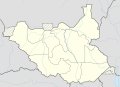 South Sudan map showing the old states
 -
 South Sudan map showing the new states
 -
 South Sudan location map showing the new province boundaries


- Article(s)
- Any article this map already features on
- Request
- This administrative division of South Sudan is still based on the old administrative system and shows the division of country based on the old states despite new states being created in 2015. You can see the extents of new states in the first image of States of South Sudan. I request that the map with the old administrative divisions be updated to reflect the new administrative divisions. Thank you. -- DinoBambinoNFS (talk) 00:25, 27 July 2016 (UTC)
Comment: Why hasn't anyone even commented? It's been two weeks since the request was made. DinoBambinoNFS (talk) 20:17, 10 August 2016 (UTC)
- Graphist opinion(s)
Wikipedia has a map showing the old divisions, which you put in the gallery above. It also has a map showing the new divisions, which you linked to above and I have added to the gallery. Why do you believe it needs a third one? Maproom (talk) 20:50, 10 August 2016 (UTC)
- Maproom The one I added is the type of map used for representing locations of cities, towns, villages and other locations in a country. The other map of South Sudan you added is actually just an image and cannot be used to represent locations. The one I added with the old divisions should be updated so locations in South Sudan are up-to-date and are shown as part of the correct administrative division. DinoBambinoNFS (talk) 22:07, 10 August 2016 (UTC)
- I have uploaded a new location map, see image above. Maproom (talk) 13:02, 11 August 2016 (UTC)
- Thank you for your help Maproom. Much appreciated. DinoBambinoNFS (talk) —Preceding undated comment added 18:27, 11 August 2016 (UTC)
- I have uploaded a new location map, see image above. Maproom (talk) 13:02, 11 August 2016 (UTC)
Sicily and north Africa map
-
 Map showing Sicily in relation to north Africa

- Article(s)
- Operation Mincemeat
- Request
- Could the inset map on File:Pelagie Islands blank map.png be set up on its own, without the black box and black dot (in the location of Rome). If the island of Sicily could be coloured red, that would be great. Cheers - SchroCat (talk) 07:32, 9 August 2016 (UTC)
- Many thanks Maproom! I'll watchlist it in case there are problems and step in if needed. Cheers - SchroCat (talk) 09:54, 9 August 2016 (UTC)
- Graphist opinion(s)
![]() Done, maybe. I have made the changes you requested, and corrected the map's aspect ratio. I recommend waiting a couple of weeks before using it, in case it gets deleted. In my experience, images I upload which are derived from other images here or on Commons often get deleted. Maproom (talk) 09:44, 9 August 2016 (UTC)
Done, maybe. I have made the changes you requested, and corrected the map's aspect ratio. I recommend waiting a couple of weeks before using it, in case it gets deleted. In my experience, images I upload which are derived from other images here or on Commons often get deleted. Maproom (talk) 09:44, 9 August 2016 (UTC)
Please correct File:South Sudan location map, 2015 province borders.png
-
South Sudan location map showing the new states but omitting the disputed Kafia Kingi area in the west
-
South Sudan map showing the new states including the Lol State in the west
-
 South Sudan map showing the old states including the large western one called Western Bahr el Ghazal
 -
South Sudan map showing the old states and the disputed Kafia Kingi area in the west.

- Article(s)
- None
- Request
- This map was made today after a request by me. However it shows the wrong location when entering the coordinates of a place. The reason behind this seems to be the latitude of the western boundary of the missing disputed Kafia Kingi area being used as the latitude for the boundary between Lol State (I have included the images of new states) Kafia Kingi and Lol State. The boundary earlier divided Kafia Kingi and the former Western Bahr el Ghazal state. I had to undo all my updates to locations of many places due to the map showing wrong locations. I request that either the missing Kafia Kingi area be drawn in the map with the latitudes unchaged (I have included the old location map of South Sudan that shows Kafia Kingi for reference). If you can't then please atleast correct the latitude of the western boundary of the Lol state. Thank you. DinoBambinoNFS (talk) 23:58, 11 August 2016 (UTC)
- I derived the map I provided directly from the eight-coloured one shown next to it in the gallery above. I did not use, change, or mention latitudes in any way. I am unable to do what you request. Maproom (talk) 06:25, 12 August 2016 (UTC)
- Maproom The latitudes have been shifted. That is why the locations are out of place every time I add their coordinates. Please base the map on the old location map, and not just the eight-coloured new states map. The new states for the map should only be used as a reference for boundaries of new states. If you don't believe me that there is a problem, please try typing the coordinates of any South Sudan location. You will see that it shows the location at the wrong place. DinoBambinoNFS (talk) 12:10, 12 August 2016 (UTC)
- I've tried to do that, see the rightmost image in the gallery. It may well be deleted in a week or so, I recommend you don't try to use it unless it survives for two weeks. Maproom (talk) 20:34, 12 August 2016 (UTC)
- Maproom The latitudes have been shifted. That is why the locations are out of place every time I add their coordinates. Please base the map on the old location map, and not just the eight-coloured new states map. The new states for the map should only be used as a reference for boundaries of new states. If you don't believe me that there is a problem, please try typing the coordinates of any South Sudan location. You will see that it shows the location at the wrong place. DinoBambinoNFS (talk) 12:10, 12 August 2016 (UTC)
- I derived the map I provided directly from the eight-coloured one shown next to it in the gallery above. I did not use, change, or mention latitudes in any way. I am unable to do what you request. Maproom (talk) 06:25, 12 August 2016 (UTC)
Maproom, I've discovered NordNordWest has solved the problem and uploaded a newer version of his original location map. It is now based on boundaries of the new states. I've tested the map and it is accurately representing the locations. Thank you to you both for your efforts. DinoBambinoNFS (talk) 00:49, 13 August 2016 (UTC)
City of Florence

- Article(s)
- Florence, Florence Cathedral, Palazzo Vecchio, Ponte Vecchio, etc.
- Request
- There is currently no map of the city of Florence, Italy. I think this map would be very useful for a considerable number of articles, including ones I am working on. Any assistance in creating one would be much appreciated.-- Ergo Sum 03:41, 13 August 2016 (UTC)
- Graphist opinion(s)
-
 1835 Map of Florence from S.D.U.K Atlas

Is the above any good? It shows all three structures that you list, and is better than anything I could offer. Maproom (talk) 21:02, 21 August 2016 (UTC)
- @Maproom: Thanks for the reply. The above is a nice map. However, I had in mind something more along the order typically used in infoboxes as a location map, as that is where I intend to use it. Ergo Sum 21:15, 21 August 2016 (UTC)
- Ergo, it might not be my place but as a friendly advice I suggest you make do with what you get. Requests are sometimes not answered here even after weeks. My latest request still hasn't been answered yet. My last request was answered after 2 weeks and that too when I left a personal message to Maproom. There's no telling if your new comment will even be answered back. DinoBambinoNFS (talk) 12:15, 22 August 2016 (UTC)
- @DinoBambinoNFS: I'm aware that everyone is busy and requests often go unanswered. I also do very much appreciate the assistance of Maproom. However, it does not seem to make much sense to utilize a map in very high profile infoboxes that is not well suited for the purpose. Ergo Sum 01:10, 28 August 2016 (UTC)
- Ergo, it might not be my place but as a friendly advice I suggest you make do with what you get. Requests are sometimes not answered here even after weeks. My latest request still hasn't been answered yet. My last request was answered after 2 weeks and that too when I left a personal message to Maproom. There's no telling if your new comment will even be answered back. DinoBambinoNFS (talk) 12:15, 22 August 2016 (UTC)
- @Ergo Sum: How about this? There don't appear to be any set conventions for location maps of cities, so I've made some up. Request taken by Joe Roe (talk) 01:29, 14 September 2016 (UTC).
- @Joe Roe: that looks great. Very similar to what I had in mind. It would be very helpful if there were a standardized convention for cities, as there are for states, countries, etc. Thank you. As a side note, do you know how to make the map available to be called up by the pushpinmap parameter in infoboxes?
- @Joe Roe: that looks great. Very similar to what I had in mind. It would be very helpful if there were a standardized convention for cities, as there are for states, countries, etc. Thank you. As a side note, do you know how to make the map available to be called up by the pushpinmap parameter in infoboxes?
- Done I've set it up to be used as a pushpin map. Just set
pushpin map = Florencein an infobox. Joe Roe (talk) 12:00, 14 September 2016 (UTC)
Please create a map highlighting Greater Pibor Administrative Area in old Jonglei State
-
 Locator map of the old Jonglei State before creation of new states

- Article(s)
- Greater Pibor Administrative Area
- Request
Hello. I would like to request you to make a new map highlighting Greater Pibor Administrative Area in the old Jonglei State in South Sudan. Greater Pibor existed from 2014 - 2015 as a semi-autonomous area under the former lower eastern parts of Jonglei State before creation of new states and was replaced by Boma State after creation of the new states. Here's 2 sources I found whose image maps you can use as a reference to draw Greater Pibor region :
I hope you will create a map of the area. Please draw the map from the locator map I've given above highlighting the old Jonglei state and use a different color to highlight Greater Pibor. I will be highly obliged. Thank you. DinoBambinoNFS (talk) 06:11, 14 August 2016 (UTC)
- Graphist opinion(s)
![]() Request taken by Goran tek-en (talk) 17:39, 16 September 2016 (UTC).
Request taken by Goran tek-en (talk) 17:39, 16 September 2016 (UTC).
@DinoBambinoNFS: I have got a permission to use the map so I will start to work on this now. --Goran tek-en (talk) 17:39, 16 September 2016 (UTC)
- Thanks a lot. DinoBambinoNFS (talk) 08:08, 18 September 2016 (UTC)
- @DinoBambinoNFS: Now there is a draft for you to look at.
- I'm not really sure that this is the overall area you wanted? This map follows the map template that we use now. Give me feedback, anything goes, thanks. --Goran tek-en (talk) 17:49, 26 September 2016 (UTC)
- It is ok Goran tek-en, please upload it. Thanks a lot. DinoBambinoNFS (talk) 11:40, 27 September 2016 (UTC)
- @DinoBambinoNFS: Now you can find it here:
- Greater Pibor Administrative Area in the old Jonglei State in South Sudan. Greater Pibor existed from 2014 - 2015 as a semi-autonomous area under the former lower eastern parts of Jonglei State before creation of new states and was replaced by Boma State after creation of the new states.
- You should probably check the information and categories on the file, thanks. --Goran tek-en (talk) 17:45, 27 September 2016 (UTC)
- @DinoBambinoNFS: Now you can find it here:
- It is ok Goran tek-en, please upload it. Thanks a lot. DinoBambinoNFS (talk) 11:40, 27 September 2016 (UTC)
- @DinoBambinoNFS: Now there is a draft for you to look at.
![]() Done
Done
Please redraw South Sudan topographic map showing the new states
-
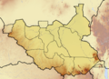 The original topographic map
 -
Location map showing boundaries of new states

- Article(s)
- Any article the topographic map is used on
- Request
- Hello. I'll like to make request for the topographic map of South Sudan to be redrawn so it shows boundaries of the new states. The author of the original map is no longer active and his map is based on old states. A new map is needed for showing the topography in relation to the new states. I've linked his topographic map and a location map showing the boundaries of the new states above. DinoBambinoNFS (talk) 15:11, 25 August 2016 (UTC)
- Graphist opinion(s)
![]() Request taken by Goran tek-en (talk) 16:40, 25 August 2016 (UTC).
Request taken by Goran tek-en (talk) 16:40, 25 August 2016 (UTC).
- @DinoBambinoNFS: Now there is a draft for you to look at.
- Give me feedback on it, text in legend or what ever, thanks. --Goran tek-en (talk) 18:24, 1 September 2016 (UTC)
It's ok Goran tek-en. Please upload it. DinoBambinoNFS (talk) 19:36, 1 September 2016 (UTC)
- @DinoBambinoNFS: Now you can find it here. You should check if the information on the map needs to be edited, thanks. --Goran tek-en (talk) 15:42, 5 September 2016 (UTC)
![]() Done
Done
Two Belgian history related maps
-
 Basic map to use
 -
 Current (very zoomed-in) map of Eupen-Malmedy
 -
 Current poor quality map of the Sillon industriel


- Article(s)
- Eupen-Malmedy
- Sillon industriel and Wallonia
- Request
- I've got two requests for maps relating to the History of Belgium. I'd be very grateful indeed if anyone could help me with it!
- I've made some big additions to the article for Eupen-Malmedy and was wondering if it might be possible to get a map to go with it. Ideally the map would show the territory of Eupen-Malmedy within a map of Belgium. The current map (here) is needlessly elaborate and the best alternative barely shows the territory at all because of its different focus.
- The second map is, essentially, just a cleaner version of this CIA map showing the Sillon industriel. It's the blue basins which are important here and the rest of the map is just a distraction which also prevents its use on articles about Belgium before the 1960s when national industry looked very different to how it did in 1968 when the map was produced.
Many thanks! —Brigade Piron (talk) 16:20, 25 August 2016 (UTC);Graphist opinion(s):
Blank map of the region between Suez and Sydney of the Indian Ocean
-
 A version of this map with the information on flight MH370 and cities removed would be useful
 -
 Or something along the lines of this map in a larger size, and with a tighter focus would be better still


- Article(s)
- Operation Pamphlet
- Request
- I'm hoping to develop the article on Operation Pamphlet, an important convoy operation of World War II, from A-class to FA class. One of the things which would help to get it across the line would be a good map showing the route the convoy took from the Suez Canal to Sydney (via Fremantle near Perth in Western Australia). To my surprise, there aren't any good blank maps of the Indian Ocean or region between the Suez Canal available on Commons to use as a basis for this, and I'd be grateful if someone could generate one which I can then add the convoy's route onto. A map showing the region between the Suez Canal and Sydney would be perfect, but a blank variant of the map showing the Indian Ocean above would also be great. Thanks, Nick-D (talk) 04:27, 29 August 2016 (UTC)
- Anotherclown has very generously taken this on, and there's a discussion of the resultant map at: User talk:Nick-D#Possible map for Operation Pamphlet Nick-D (talk) 10:39, 31 August 2016 (UTC)
- Graphist opinion(s)
- Request taken by Anotherclown (talk) 22:42, 31 August 2016 (UTC).
- Mostly completed now per Nick's cmt above. Happy for others to make suggestions / changes though of cse. Map created is here. Anotherclown (talk) 22:42, 31 August 2016 (UTC)
- Mark as Done now. If any further tweaks are needed though of cse pls let me know. Anotherclown (talk) 06:07, 2 September 2016 (UTC)
- Mark as
- Mostly completed now per Nick's cmt above. Happy for others to make suggestions / changes though of cse. Map created is here. Anotherclown (talk) 22:42, 31 August 2016 (UTC)
Democracies in the Middle East
-
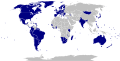 Electoral democracies of the world
 -
 Blank world map, can be coloured through text editor
 -
 Blank map of the Middle East, can't be coloured through text editor
 -
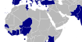 Finished map


- Article(s)
- Democracy in the Middle East
- Request
- I would like a map of the Middle East coloured by which countries classify as "electoral democracies" according to Freedom House. I imagine the simplest thing would have been to copy the "list of countries" text from the top of the file "File:Electoral democracies.svg" and simply paste it into "File:BlankMap-Middle East.svg", but that doesn't seem to work. Gabbe (talk) 09:02, 7 September 2016 (UTC)
- Graphist opinion(s)
- @Gabbe: Whoever made that map had a strange definition of the Middle East, but Done: File:Electoral democracies in the Middle East and North Africa.svg. Joe Roe (talk) 18:30, 20 September 2016 (UTC)
- @Joe Roe: Great! Any idea why Turkey, Sicily, Sardinia, etc. are not coloured blue? Gabbe (talk) 20:50, 20 September 2016 (UTC)
- @Gabbe: oops, missed that. The blank map of the Middle East wasn't as nicely formatted as the world one, but I've added a bit of extra code that ought to fix it. Would you mind checking, though? Joe Roe (talk) 22:21, 20 September 2016 (UTC)
- @Joe Roe: Fantastic! Seems like Madeira is still not coloured blue, but it's such a tiny spec that I doubt anyone will notice. Great work! Gabbe (talk) 05:31, 21 September 2016 (UTC)
- @Gabbe: oops, missed that. The blank map of the Middle East wasn't as nicely formatted as the world one, but I've added a bit of extra code that ought to fix it. Would you mind checking, though? Joe Roe (talk) 22:21, 20 September 2016 (UTC)
- @Joe Roe: Great! Any idea why Turkey, Sicily, Sardinia, etc. are not coloured blue? Gabbe (talk) 20:50, 20 September 2016 (UTC)
Cemaes Rural District
-
 St Dogmells RD
 -
 Llanfyrnach RD


- Article(s)
- Cemaes Rural District
- Request
- I've inserted the two maps above into Cemaes Rural District, showing the two former rural districts that have been amalgamated. I would like to combine the two pink areas into one combined pink area, on a single map. Can this be done? Tony Holkham (Talk) 21:20, 11 September 2016 (UTC)
- Graphist opinion(s)
- @Tony Holkham: Like this File:Cemaes_Rural_District.png? -- AxG / ✉ / 10 years of editing 20:22, 13 September 2016 (UTC)
- @AxG: Absolutely brilliant - thank you very much. Tony Holkham (Talk) 21:28, 13 September 2016 (UTC)
Sassanian_Empire

- Article(s)
- Sassanian_Empire
- Request
- Please remove first "m" in "Khwarezm"… -- Kintetsubuffalo (talk) 10:05, 13 September 2016 (UTC)
- Graphist opinion(s)
- Unfortunately because of the format the map was saved in it's difficult to make this change without distorting the image, minor as it seems. However, the maps original creator, Keeby101 appears to still be active, so you might try asking them to make the correction. Joe Roe (talk) 11:47, 13 September 2016 (UTC)
- Hello there Joe Roe. I was notified immediately after logging in. I have been working on a 2.0 version of this map for sometime. Making some adjustments, but I have been at a crossroads lately as I have been very busy in real life with school. However, if you all are capable of replicating a map of the Sasanian Empire that is similar to mine, then I am all for it. You have my permission to do so. Cheers! Kirby (talk) 00:57, 15 September 2016 (UTC)
Deception Island Map.svg
Thank you!
-
 Deception Island Map

- Article(s)
- Deception Island
- Request
- Can you please fix this so the word "station" isn't cut off in the PNG version and the two words in the legend aren't superimposed? Thanks! -- 141.254.5.5 (talk) 18:20, 16 September 2016 (UTC)
- Graphist opinion(s)
![]() Done, also removed "t" from the word "Peak". Maproom (talk) 16:37, 18 September 2016 (UTC)
Done, also removed "t" from the word "Peak". Maproom (talk) 16:37, 18 September 2016 (UTC)
How to add a scale to a map?
-
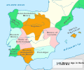 Iberia Late Bronze.svg

- Request
- How to add a scale to this map? When I google for this subject, I only get tutorials for Qis programs. Please, don't add the scale yourself. I would like to do it myself. What I need is a good tutorial or some good explanation how to do it properly. Wereldburger758 (talk) 18:26, 19 September 2016 (UTC)
- Graphist opinion(s)
-
- Here is a generalization that might be good to do some day. Modify Location map + to draw a straight line from one lat/long to the previous one. This would allow anyone to put a scale anywhere on a location map with label= giving its length. It would also allow other lines that might be useful sometimes. This is not a request, just a suggestion. Benjamin Trovato (talk) 19:16, 19 September 2016 (UTC)
- @Benjamin Trovato: AFAIK most location maps are unprojected (and have post-processing distortion applied to boot), so that wouldn't really be appropriate. It would be nice to see them have lat/long lines added, though. Joe Roe (talk) 21:46, 19 September 2016 (UTC)
- @Wereldburger758: Without original georeferenced files or at least some information on the projection used it's not possible to add an accurate scale bar. The best you could to is to approximate from a known distance, like the width of the Mallorca. However, one wouldn't usually use a scale bar on a medium/small scale map like this. Without getting too technical, the process of transforming the spherical earth into a flat image introduces distortions that mean the scale couldn't possibly be accurate for every distance on the map. The normal way to convey scale on a map like this is to add lines of latitude and longitude, a numerical scale factor (e.g. 1:1,000,000), or simply rely on the fact that it depicts a familiar landform. Since the former two options again aren't possible without knowing more about how the map was produced, I'd just assume that most people have a rough idea how big Spain is. Joe Roe (talk) 21:44, 19 September 2016 (UTC)
- Thank you for your answers. Wereldburger758 (talk) 12:39, 20 September 2016 (UTC)
- I disagree with some aspects of Joe Roe's answer. With a map showing a small part of the earth's surface, such as the one in question, the projection doesn't really matter, the same scale will be reasonably accurate for all parts of it (unless it has had its aspect ratio changed, which I do not believe is the case here). And if you are working out what the scale should be, it's best to measure as long a distance as you reasonably can, say from the Strait of Gibraltar to Arcachon Bay in this case, rather than picking a relatively small feature such as Mallorca. Maproom (talk) 18:47, 20 September 2016 (UTC)
- I'd call the entirety of the Iberian peninsula a rather large part of the earth's surface myself, but I guess that's a judgement call. My main concern was that it might well be in a geographic CRS. Joe Roe (talk) 19:03, 20 September 2016 (UTC)
- But I doubt it's large enough that, using any reasonable projection, the scale would vary by more than 10% over the region covered (I do not consider Mercator's, or Gall's, reasonable). What's a CRS? Maproom (talk) 21:13, 20 September 2016 (UTC)
- Sorry, CRS = coordinate reference system, geographic CRS = an "unprojected" system like plate carrée. Joe Roe (talk) 21:25, 20 September 2016 (UTC)
- But I doubt it's large enough that, using any reasonable projection, the scale would vary by more than 10% over the region covered (I do not consider Mercator's, or Gall's, reasonable). What's a CRS? Maproom (talk) 21:13, 20 September 2016 (UTC)
- I'd call the entirety of the Iberian peninsula a rather large part of the earth's surface myself, but I guess that's a judgement call. My main concern was that it might well be in a geographic CRS. Joe Roe (talk) 19:03, 20 September 2016 (UTC)
- Here is a generalization that might be good to do some day. Modify Location map + to draw a straight line from one lat/long to the previous one. This would allow anyone to put a scale anywhere on a location map with label= giving its length. It would also allow other lines that might be useful sometimes. This is not a request, just a suggestion. Benjamin Trovato (talk) 19:16, 19 September 2016 (UTC)
Location maps of Turkey
-
 (1)
(1)
Main location map

- Request
- Make a Turkey location map or upload a new version.
- Add the two Tigris and Euphrates rivers in Turkey. And rivers and lakes in neighboring countries. For example, Iraq, Syria, Iran, Armenia, Russia, Bulgaria and Greece.
- The colors of the provinces should be corrected. The background color of the provinces on the map should be a little darker. Like that and that.
- And the borders of the provinces should be slightly thicker than black. like that
- Make provincial borders thicker than district borders.
- It is must be the same as the Syria location map.— Preceding unsigned comment added by [[User:{{{1}}}|{{{1}}}]] ([[User talk:{{{1}}}#top|talk]] • [[Special:Contributions/{{{1}}}|contribs]]) —Preceding undated comment added an unspecified datestamp.
- Graphist opinion(s)
1900 map of London
-
 1900 map of London
.jpg)
- Article(s)
- Siege of Sidney Street
- Request
- Hi, I wonder if someone could help and advise with a map I want some work done on? There is an excellent map of London here on which I want to highlight two locations (They were the places of murder and mayhem involved in the Siege of Sidney Street. I'm working on the article in userspace to take it to FA.)
- I can show exactly where the two buildings are if some is willing to help. I'm also unsure if there is an ideal way of pinpointing them on the map that is clear enough to show but that doesn't obstruct the detail, so any advice would be most welcome. Cheers – SchroCat (talk) 09:45, 22 January 2016 (UTC)
- Graphist opinion(s)
Fix post WW1 Map
-
 Europe after WW1

- Article(s)
- 20th century
- List of national border changes since World War I
- Self-determination
- World War I
- Request
- By 1923 the Irish free state had been established this map should reflect this. Short chat about it here. Thanks-- Gnevin (talk) 13:22, 16 June 2016 (UTC)
- Graphist opinion(s)
Australian federal election electoral maps
-
 Australian federal election, 2010
 -
 Australian federal election, 2007

- Article(s)
- Australian federal election, 2013, Australian federal election, 2016
- Request
- Please create an electoral map similar to the one used for past Australian federal elections with the 2013, 2004 and 2016 electoral division boundaries respectively. For the 2013 and 2004 maps, include the results of the elections. For the 2016 map, leave blank for later use. Thanks! -- Jay942942 (talk) 21:24, 17 June 2016 (UTC)
- Graphist opinion(s)
Better Canadian federal election, 2015 by riding map
-
 Current map
 -
 2011 election map
.svg)

- Article(s)
- Canadian federal election, 2015, Conservative Party of Canada leadership election, 2017
- Request
- The current election result by riding map for the 2015 election page does not provide as good an insight as previous election result by riding maps, such as those used in 2011 and 2008, which indicate the results in physically small ridings in major metropolitan areas. These results are simply not visible in the 2015 map. It would be good if someone could make a map similar to the 2011 and 2008 maps which allows the results in these ridings to be seen. Also, please provide a blank map with 2015 riding boundaries that can be used for the Conservative leadership election results. Thanks!-- Jay942942 (talk) 21:37, 17 June 2016 (UTC)
- Graphist opinion(s)
- Article(s)
- List of suburbs and localities in the City of Gold Coast and it's 81 articles
- Request
- Simply Australia's first-level administrative divisions are states/territories, Australia's second-level administrative divisions are local government areas and Australia's third-level administrative divisions are suburbs/localities. I am requesting a location map of the City of Gold Coast (a local government area in Queensland, a state in Australia) that shows it's suburb/locality boundaries. Examples are File:Utah Locator Map.PNG without labels, and File:New Jersey Counties.svg and File:Map of Tennessee counties (labeled).png with labels. I am also requesting 81 individual locator maps for each suburb/locality within the City of Gold Coast. Examples are File:Map of Utah highlighting Beaver County.svg, File:Map of New Jersey highlighting Atlantic County.svg and File:Map of Tennessee highlighting Anderson County.svg. The Queensland Goverment has released a KML file known as the Queensland Globe with local government area and suburb/locality boundaries. Please let me know if you need any more information. Thank you in advance, New9374 (talk) 04:28, 22 June 2016 (UTC)
- Graphist opinion(s)
Connacht Counties Maps - Local Borders


- Article(s)
- Any article these maps are already featured on.
- Request
- Similar to some of my above requests, could someone please remove the border within County Tipperary, and also the former borders of Waterford City Council, in order to reflect the changes of the Local Government Reform Act 2014, on all of the above maps. User:Snow Lion Fenian
- Graphist opinion(s)
I could easily do this by converting those SVG maps to PNG, and editing and uploading the PNGs. However there is a widely-held view that I should not do this as vector-format is better than raster-format. In fact those images have a structure (over 7000 lines of unreadable and uncommented SVG) that combines all the disadvantages of both, making it impossible for me (and others, judging by previous requests here) to work on them.
Please let me know if you would like me to ignore the official advice and upload the PNGs anyway. Maproom (talk) 08:30, 23 June 2016 (UTC)
- The SVG code here is clearly sub-standard, I will look to improve the code for the base map (Island of Ireland location map.svg). Please do not upload any PNGs in meantime.--Nilfanion (talk) 09:14, 23 June 2016 (UTC)
- I think I'll need to entirely rebuild the map. There is an additional problem, as Northern Ireland shows the obsolete districts, and these will need to be fixed as well. Final map will have "good" code! :)--Nilfanion (talk) 10:03, 23 June 2016 (UTC)
- We meet again Nilfanion on the topic of maps :-) Me and Rannpháirtí anaithnid created all these county maps, however they weren't perfect at the time and where created to give the general view of the county in question. If you can improve them then please do so. I don't have any real ability with SVG code, and I found it incredibly awkward colouring in the original SVG file via Adobe Illustrator. The maps would also probably look better following the standard colouring convention for maps. But I'll be happy with whatever you come up with as they will be an improvement! Mabuska (talk) 23:37, 26 June 2016 (UTC)
- I've updated File:Island of Ireland location map.svg. It shows the current districts in both Northern Ireland and the Republic of Ireland, and the code has been tidied.
- Maproom, Mabuska - the code is a lot simpler now. Each county or district has its own path and is labelled with the county name, eg changing the fill of Co_Antrim from "none" to "#fbc1c1" shades County Antrim to the same pink as the previous maps. Other colours are also possible of course. It should be trivial to get the above maps updated now.
- Snow Lion Fenian, you may want to double check the entire set of maps. The provisions of the Local Government (Boundaries) Order (Northern Ireland) 2012 and the Local Government Reform Act 2014 both need to be accounted for.--Nilfanion (talk) 12:46, 28 June 2016 (UTC)
- We meet again Nilfanion on the topic of maps :-) Me and Rannpháirtí anaithnid created all these county maps, however they weren't perfect at the time and where created to give the general view of the county in question. If you can improve them then please do so. I don't have any real ability with SVG code, and I found it incredibly awkward colouring in the original SVG file via Adobe Illustrator. The maps would also probably look better following the standard colouring convention for maps. But I'll be happy with whatever you come up with as they will be an improvement! Mabuska (talk) 23:37, 26 June 2016 (UTC)
Please correct the Polygamy legality map

This map showing legality of polygamy around the world incorrectly shows polygamy is completely illegal in India. However, polygamy is still allowed for Muslims and hasn't been banned. Can someone please correct the map? 117.199.90.129 (talk) 21:53, 27 June 2016 (UTC)
World Map 1974

- Article(s)
- Any article this map already features on.
- Request
- Okay, similar to some of my above requests, could someone please make some corrections to this map of the world in 1974:
1) Removal of the borders between the components of the Soviet Union, Yugoslavia, and Czechoslovakia.
2) Eritrea was part of Ethiopia at the time.
3) Singapore had already ceased to be British before 1974, so it should be changed to grey.
4) Brunei should be shaded red, as it was a British protectorate until 1984.
5) The Seychelles were British until 1976, so they should also be shaded red.
6) Zimbabwe didn't officially gain independence until 1980, so it should probably be red too.
7) Installation of the borders between East and West Germany, North and South Yemen, and North and South Vietnam.
- Graphist opinion(s)
User:Snow Lion Fenian
![]() Request taken. — Music1201 talk 02:41, 27 July 2016 (UTC)
Request taken. — Music1201 talk 02:41, 27 July 2016 (UTC)
- @Snow Lion Fenian:, is this good? (ignore the random East Germany in the ocean, i'm fixing):

- @Music1201: Nice work, I appreciate it, thanks. Though I will point out that Czechoslovakia and Yugoslavia were never part of the USSR, only influenced by it, so they shouldn't be shaded dark purple. Plus, Puerto Rico and Hawaii should be shaded light purple (for the USA) and the Falklands red (for Britain). And there should be no border between Sudan and South Sudan either. And Tajikistan and Kyrgyzstan are supposed to be part of the USSR as well. Sorry for the inconvenience! (And, on a side note, any chance you could do the PNG map separately?)— Preceding unsigned comment added by [[User:{{{1}}}|{{{1}}}]] ([[User talk:{{{1}}}#top|talk]] • [[Special:Contributions/{{{1}}}|contribs]]) —Preceding undated comment added an unspecified datestamp.
Niger-Congo

- Article(s)
- Niger-Congo
- Request
- Please put in South Sudan border and fix spelling of Swahili… -- Kintetsubuffalo (talk) 01:52, 27 July 2016 (UTC)
- Graphist opinion(s)
- Thanks @Offnfopt!--Kintetsubuffalo (talk) 12:17, 9 October 2016 (UTC)
Update map of Israel Railways
-
 Map of Israel Railways

- Article(s)
- Israel Railways
- Request
- Please add the Ofakim station to the map - in the line currently drawn in red, between Netivot and Be'er Sheva. See this map for an official source - despite the link URL, the map is also labeled in English. עוד מישהו Od Mishehu 08:25, 27 January 2016 (UTC)
- Graphist opinion(s)
![]() Done Joe Roe (talk) 23:58, 13 September 2016 (UTC)
Done Joe Roe (talk) 23:58, 13 September 2016 (UTC)
Colonialism in 1938

- Article(s)
- Any article this map already features on.
- Request
- Okay, this is a similar map to the one above, but from 1938. And there are a few changes that need to be made to reflect the situation at the time:
1) Egypt and Iraq gained independence from Britain in 1922 and 1932 respectively, so they should be changed from red to grey.
2) Togo was a French colonial mandate (as French Togoland) at the time, yet it is coloured brown as if it were still a German colony. It needs to be changed to blue.
3) Removal of the borders between all the components of French West Africa (Mauritania, Mali, Niger, Senegal, Guinea, Benin, Ivory Coast, Burkina Faso).
4) Removal of the borders between the components of French Equatorial Africa (Chad, Central African Republic, the Congo, Gabon).
5) Removal of the borders between India, Pakistan and Bangladesh (then part of British India).
6) Removal of the borders between Vietnam, Laos and Cambodia (Then part of French Indochina).
7) Removal of the border between Rwanda and Burundi (then Ruanda-Urundi).
8) Removal of the all the borders between the purple areas of the Soviet Union (except Mongolia, which was under Soviet influence, but not part of it)
9) Removal of the border between the two Koreas.
10) Removal of the borders between the components of Czechoslovakia and Yugoslavia.
11) Moldova was part of Romania at the time.
12) Removal of the border between Israel and Palestine, then part of Britain's Mandatory Palestine.
13) Cuba should be changed from light purple to grey, as it gained independence from the United States in 1902
Again, I know this is a tall order, but if anyone could make at least some of these changes, it would be much appreciated, thanks. User:Snow Lion Fenian
- Graphist opinion(s)
- Those requests are not at all demanding, I could do them easily. But I won't have access to the graphics editor I need, until around July 18th. If someone else takes them on first, that's fine with me; but if they're still outstanding, I'll get them done by the end of July at the latest. Maproom (talk) 10:39, 7 July 2016 (UTC)
- Done. You didn't specify what to do with the formerly-German Cameroons, so I have left them part red part blue, and separated by a border from the components of French Equatorial Africa. French Cameroons suggests that this is correct. Maproom (talk) 16:17, 16 July 2016 (UTC)
- @Maproom: Thanks, I appreciate it. Though I don't think Algeria was ever part of French West Africa, plus the borders of Europe don't reflect the situation at the time. Anything you can do?
- Snow Lion Fenian: sorry, I've only just seen your response.
- In 1938 Algeria was not part of French West Africa, it was ruled as a department of France.
- Yes, there are several oddities in Europe – the FYRoM was part of Yugoslavia, and the German/Polish borders are wrong. Do you have a list of things that need changing there? Maproom (talk) 14:51, 27 September 2016 (UTC)
- @Maproom: Thanks for replying. Yes, there are a few things regarding the borders of certain places that I think should be altered to reflect thee situation at the time. If you're interested, this blank map of the world in 1938 (https://commons.m.wikimedia.org/wiki/File:BlankMap-World_1938.png) should serve as a guide, thanks. (Oh, and while we're at it, do you think you'd be able to take on a request I might make about correcting certain frames in a gif map showing the territorial evolution of the British Empire?)— Preceding unsigned comment added by [[User:{{{1}}}|{{{1}}}]] ([[User talk:{{{1}}}#top|talk]] • [[Special:Contributions/{{{1}}}|contribs]]) —Preceding undated comment added an unspecified datestamp.
-->
City of Venice
- Article(s)
- St. Mark's Cathedral, La Fenice, Piazza San Marco, Doge's Palace, etc.
- Request
- There is currently no available map of the city of Venice, Italy. Several of the articles I am working on would benefit from such a map. If anyone is available, I would much appreciate it. Ergo Sum 03:02, 16 August 2016 (UTC)
- Graphist opinion(s)
- @Ergo Sum: I'd like to have a stab at this too, but before I start, what kind of coverage did you have in mind? Just the historical city? Or the whole commune? Request taken by Joe Roe (talk) 12:03, 14 September 2016 (UTC).
- @Joe Roe: I'd be inclined to say the part of the city in which the notable areas (and presumably historically significant areas) reside. I wouldn't think the whole Metropolitan City of Venice would be necessary, but in terms of just how local, I can't say I'm tremendously knowledgeable enough to say. If I had to decide, I'd think the centro storico part of Venice would do. Ergo Sum 17:10, 14 September 2016 (UTC)
Relief location maps of states in the USA
- Article(s)
- Climate of Minnesota
- Colorado § Climate (showing the locations of cities whose climate is compared), Pikes Peak, Longs Peak, Mount Elbert
- Climate of Oregon, Mount Hood, other articles on mountains in Oregon
- Request
- California, Washington, and North Carolina have topographical location maps with county borders. Many states don't. Ideally, all states should: topographical maps are best for showing the natural contours of the state and providing the context in which a city, mountain, or other natural feature is located, in climate or geography articles. The current blank location maps with county boundaries and rivers are okay, but adding topography would make them so much better.
- For an example, compare the bare location map (places whose temperatures are compared in Climate of California) with the relief version:


- The relief map gives perspective on why some of the cities have similar climates. For instance, those in interior valleys are hot in the summer, while those at higher elevations are cooler. The corresponding bare map only gives perspective on the locations along the coast, since it does not show elevation.
- Really, most states could benefit from relief location maps, but I picked three that I am interested in. — Eru·tuon 08:34, 21 August 2016 (UTC)
- Non-graphist opinion
Please don't merely add relief to existing maps; if you take this request and add relief, please upload it as a new map. In many cases, especially the historic-site articles on which I routinely work, the addition of relief would make the article somewhat less useful. Nyttend (talk) 17:29, 24 August 2016 (UTC)
- Graphist opinion(s)
World Borders 1959
-
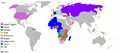 Colonialism in 1959
 -
 World Borders 1957

- Article(s)
- Any article this map already features on.
- Request
- Okay, there are some things on the above-left map of Colonialism in 1959 that need to be changed to reflect the borders of the world at the time:
1) Installation of the border between British Somaliland and Italian Somaliland, and also the former shaded red, and the latter light green.
2) The border between East and West Germany.
3) The border between Sikkim and India.
4) The actual border between North Yemen and South Yemen.
5) The border between Sarawak and North Borneo
6) The borders of British Cameroons.
Many of these borders are displayed on the above-right map of the world in 1957 for those who wish to try it.
- User:Snow Lion Fenian—Preceding undated comment added an unspecified datestamp.
- Graphist opinion(s)
Post-Colonial International Organisations

- Article(s)
- Decolonization
- Request
- Okay, a few things about this map could do with correcting:
1) Botswana is a CON member, so it should be shaded red.
2) Gambia left the Commonwealth in 2013, so it should now be grey.
3) Rwanda is a member of both the CON and LF, so it should be shaded in red and blue stripes, like Canada.
4) Andorra is an LF member, so it should be shaded blue.
5) And, Corsica, being part of France, should be blue as well.
- Graphist opinion(s)
User:Snow Lion Fenian—Preceding undated comment added an unspecified datestamp.
- Done but Gambia is white not grey (there's no grey on the map), and Corsica was already blue. Maproom (talk) 21:15, 23 September 2016 (UTC)
Time zone map #1

- Article(s)
- Time zone
- Request
- As of right now, Chile is on DST now and Uruguay has abandoned DST. Please fix the colors accordingly. Darken Chile and lighten Uruguay. Thanks 8.40.151.110 (talk) 23:16, 6 August 2016 (UTC)
- Graphist opinion(s)
Time zone map #2

- Article(s)
- Time zone
- Request
- As of right now, Chile is on DST now, Chile needs to be blue. Please fix the colors accordingly. Thanks 8.40.151.110 (talk) 23:16, 6 August 2016 (UTC)
- Graphist opinion(s)
Add a scale
-
 San Marino map #1 (to be modified)
 -
 San Marino map #2 (source for modification)


- Article(s)
- Lots of articles, including {{Location map San Marino}}, and Special:GlobalUsage/San_Marino_location_map.svg seems to indicate that it's used on 502 different pages WMF-wide
- Request
- Could you edit map #1 by adding a simple miles-and-km scale? Map #2 has a scale, so you don't need to wonder how big the country is, and you don't need to pull up Google Maps to find out. Nyttend (talk) 20:15, 24 August 2016 (UTC)
- Graphist opinion(s)
![]() Done - Offnfopt(talk) 12:22, 7 November 2016 (UTC)
Done - Offnfopt(talk) 12:22, 7 November 2016 (UTC)
Map showing Huelva
-
 Basis of map to use

- Article(s)
- Operation Mincemeat
- Request
- Hi, Could someone produce a scaleable SVG map showing the location of Huelva, Spain. If you can duplicate the map labelled "Location in Andalusia" on the Huelva article (which uses the File:Spain Andalusia location map.svg map), that would be great. Thanks – SchroCat (talk) 13:09, 29 August 2016 (UTC)
- Graphist opinion(s)


There already exists File:Huelva-loc.svg, File:Huelva in Spain.svg and File:Localización de la provincia de Huelva.svg. Offnfopt(talk) 21:21, 7 November 2016 (UTC)
Relabelling in an SVG
-
 Counties and cities in Virginia

- Article(s)
- National Register of Historic Places listings in Virginia, plus two non-mainspace pages
- Request
- Bedford ceased to exist as a city a few years back, so it merged with the surrounding Bedford County and needs to be removed from this map. Therefore, could you (1) remove the area listed as "2", making it just part of the surrounding county, and (2) renumber all of the cities 3-39 so that they become 2-38, both on the map itself and in the box at top left? I'm assuming that the first request will be quite easy but that the second request might take a bit of work, so if it's too difficult, please let me know and I won't renew that side of the request. Nyttend (talk) 23:43, 31 August 2016 (UTC)
- Graphist opinion(s)
Nyttend ![]() Done - Misunderstood the request at first because of the city and county having the same name. Removed Bedford numbered label and relabeled the cities. Offnfopt(talk) 05:24, 8 November 2016 (UTC)
Done - Misunderstood the request at first because of the city and county having the same name. Removed Bedford numbered label and relabeled the cities. Offnfopt(talk) 05:24, 8 November 2016 (UTC)
- Thanks! But Offnfopt, could you remove the boundaries for the city (as well as the label), so that there's no separate zone in the middle of the county? The interior of the county should look the same as the interior of Botetourt County just to the north: nothing at all inside the county's boundaries, except for the county-name label. Nyttend (talk) 11:53, 8 November 2016 (UTC)
- Nyttend Done - Offnfopt(talk) 21:08, 8 November 2016 (UTC)
- Exactly what I needed. Thanks! Nyttend (talk) 21:45, 8 November 2016 (UTC)
- Nyttend
Munster Counties Maps - Local Borders


- Article(s)
- Any article these maps are already featured on.
- Request
- Okay, could someone please remove the border within County Tipperary, and also the former borders of Waterford City Council, in order to reflect the changes of the Local Government Reform Act 2014, on all of the above maps. User:Snow Lion Fenian—Preceding undated comment added an unspecified datestamp.
- Graphist opinion(s)
- See the discussion at Wikipedia:Graphics_Lab/Map_workshop/Archive/2016#Connacht_Counties_Maps_-_Local_Borders above. Maproom (talk) 08:14, 9 September 2016 (UTC)
Imperialism in 1975

- Article(s)
- Any article this map is already on.
- Request
- Okay, Australia, Canada, New Zealand and Guyana had all already gained independence from Britain before 1975, so they should be changed from red to grey. And I think Hong Kong and Bermuda are in need of being shaded red as well (And if you see any other British territories that aren't shaded, feel free to do so)
(And, based on the original version of this map, I think the PRC should be changed back to light lilac, and it's flag added to the others in the side bar)
User:Snow Lion Fenian—Preceding undated comment added an unspecified datestamp.
- Graphist opinion(s)
- This map doesn't appear to be used on any articles. Joe Roe (talk) 18:08, 20 September 2016 (UTC)
British Empire - 1939 & 1945


- Article(s)
- Any article this map is already on
- Request
- Okay, a few things a about these maps could do with correcting. Firstly, British Honduras (modern Belize) and British Cameroons (now part of Cameroon) should both be shaded red, as they were both part of the British Empire at the time. Plus, given that Egypt officially gained independence in 1922, it should probably be changed to grey (and perhaps light red on the second map, to show its status as militarily occupied?). And, I think the unnecessary captions at the bottom of both maps should be removed as well, thanks. User:Snow Lion Fenian—Preceding undated comment added an unspecified datestamp.
- Graphist opinion(s)
- At a glance your corrections all seem to check out but since I'm not an expert and they involve a degree of historical interpretation, I'd be reluctant to make them without seeing some sources or a consensus at British Empire in World War II, where the maps are used. I'd recommend discussing these issues with User:Robert Brukner, who created the map originally and is still active. Joe Roe (talk) 18:03, 20 September 2016 (UTC)
- Hello, The map intends to show the extent of the land surface of the empire regardless of the exact political relationship of each component entity. Egypt gained "independence" but for all intents and purposes was a protectorate, and at the very least a thoroughly military occupied entity with no control over its foreign affairs. If British Honduras is missing its my error entirely and I'll see to fixing it up asap. thanks for the heads upRobert Brukner (talk) 19:15, 2 October 2016 (UTC)
US-centered world map of US territories
-
 US-centered world map, blank
 -
 Map of US territories


- Article(s)
- List of states and territories of the United States
- Request
- This list has a map of US territories worldwide, which is good, but because they're split between the western part of the Western Hemisphere and the eastern part of the Eastern Hemisphere, some US possessions end up being separated from the rest; one island group is even split in half, with Midway Island cut off from the rest of the Hawaiian Islands. Therefore, could you mark the various US territories on the US-centered blank world map and upload it as a new file? Nyttend (talk) 11:52, 23 September 2016 (UTC)
- Graphist opinion(s)
Lebanon_districts
-
 Lebanon_districts map
 -
 Lebanon sectors map
 -
 Lebanon religious groups distribution
 -
 Lebanon religious groups


- Article(s)
- Religion in Lebanon
- Request
- Please add administrative boundary in religious maps -- Kaiyr (talk) 14:18, 27 September 2016 (UTC)
- Graphist opinion(s)
Please fix the colours used in maps at Human sex ratio

The colours used in different maps on the page are inconsistent, see Talk:Human sex ratio#Color unification, thanks. Roger (Dodger67) (talk) 07:34, 28 September 2016 (UTC)
- Changing the colours would be easy enough. Making corresponding changes to the colours shown in the caption at Human sex ratio would also be easy. But there's a total of 18 pages that use that map, and I won't know how to change the caption at e.g. mr:/लिंग_गुणोत्तर – I can find and click the edit button there, but I don't understand what happens next (nor, it seems, why that link doesn't take me to here). Maproom (talk) 19:45, 2 October 2016 (UTC)
- Instead, I've uploaded a modified version of the map to Commons, put it at Human sex ratio, and edited the caption accordingly. I'll ignore the 17 other pages that use the image. Maproom (talk) 20:49, 2 October 2016 (UTC)
maps with dark oceans


- Article(s)
- various
- Request
- please make oceans white for easier visibility… -- Kintetsubuffalo (talk) 07:56, 1 October 2016 (UTC)
- Graphist opinion(s)
First two are ![]() Done, the first and third image aren't being used in any articles. Changing the 3rd to white doesn't look right and the image isn't being used in any articles so leaving as is. Offnfopt(talk) 13:41, 7 November 2016 (UTC)
Done, the first and third image aren't being used in any articles. Changing the 3rd to white doesn't look right and the image isn't being used in any articles so leaving as is. Offnfopt(talk) 13:41, 7 November 2016 (UTC)
- Thank you, sorry I was late catching this!--Kintetsubuffalo (talk) 14:05, 9 November 2016 (UTC)
pushpin_map = Ukraine
- Article(s)
- All Ukrainian settlements, e.g. Sviatoshyn, Ozeryshche (Ukraine), Chernihiv
- Request
- I've noticed that since the 15th of October 2016 the variable:
pushpin_map = Ukraine
stopped working in Template:Infobox settlement. In fact the map of Ukraine is not shown in the infobox. It have affected all Ukrainian settlements where that infobox is used.
Any ideas? -- TimeWaitsForNobody (talk) 01:45, 16 October 2016 (UTC)
- Graphist opinion(s)
- I've found that the problem appears when using the "View -> Zoom In" feature in Firefox otherwise there's OK. --TimeWaitsForNobody (talk) 07:17, 16 October 2016 (UTC)
- Out of scope request, discussion on the issue can be found @ Template_talk:Infobox_settlement#pushpin_map_.3D_Ukraine and it is being looked into. Closing this request. Offnfopt(talk) 14:01, 7 November 2016 (UTC)
Template:Location map Ukraine Kiev Oblast
- Request
- The map on Template:Location map Ukraine Kiev Oblast is coordinated incorrectly. As а reference point can be Kotsiubynske. It's a small spot inside the Kiev city area. But in fact on this map, it's moved towards the top-right side.
I tried to correct it myself but I have no experience in such a job. I cannot even find Module:Location map/data/Ukraine Kiev Oblast Could you please help me? -- TimeWaitsForNobody (talk) 09:59, 16 October 2016 (UTC)
- Graphist opinion(s)
Out of scope request, discussion on the issue can be found @ Module_talk:Location_map#Location_map_Ukraine_Kiev_Oblast and the issue has since been resolved, closing request. Best place to ask for help on issues with templates/modules is on the talk page for the template/module, the ones watching those pages are more familiar with the inner workings of the modules/templates and will be able to better help with issues specific to those templates. If a image file in the File: namespace needs editing/updating this is the place for that. Offnfopt(talk) 14:08, 7 November 2016 (UTC)
NCAA Division I FBS independent schools
-
 NCAA Division I FBS independent schools
 -


- Article(s)
- NCAA Division I FBS independent schools
- Request
- UMass went Independent in 2016. 2602:302:D1A2:C740:B8A9:DF0B:C3A1:CF80 (talk) 18:09, 23 October 2016 (UTC)
- More specifically, to reflect UMass' addition to the league, Massachusetts should be colored blue in the map. Thanks in advance! Huon (talk) 18:14, 23 October 2016 (UTC)
- Graphist opinion(s)
![]() Done: I have added Massachusetts. I don't know a whole lot about conversions to SVG, but the traced image is 100kb larger than the PNG, so I just left it as PNG. -- AntiCompositeNumber (Leave a message) 19:01, 23 October 2016 (UTC)
Done: I have added Massachusetts. I don't know a whole lot about conversions to SVG, but the traced image is 100kb larger than the PNG, so I just left it as PNG. -- AntiCompositeNumber (Leave a message) 19:01, 23 October 2016 (UTC)
- I've created a SVG version File:NCAA Division I FBS independent schools map.svg - Offnfopt(talk) 09:02, 8 November 2016 (UTC)
File:Lake Maracaibo map-es.svg
-
 File:Lake Maracaibo map-es.svg
 -
 File:Lake Maracaibo map-en.svg


- Article(s)
- Henry Morgan
- Request
- Could an English version of this be provided please? Thank you for any help you can provide. - The Bounder (talk) 07:29, 30 October 2016 (UTC)
- Graphist opinion(s)
Can you provide the text translations for the map? Offnfopt(talk) 21:45, 7 November 2016 (UTC)
![]() Done, see above. But don't rely on it surviving. When I upload to Commons an image which is derived from another user's work, it often gets deleted. Maproom (talk) 18:21, 9 November 2016 (UTC)
Done, see above. But don't rely on it surviving. When I upload to Commons an image which is derived from another user's work, it often gets deleted. Maproom (talk) 18:21, 9 November 2016 (UTC)
Maritime boundaries of Belize
-
 Existing map for Mexico
 -
 Blank SVG map of Belize


- Article(s)
- Geography of Belize, Belize–Mexico border, Belize–Guatemala border
- Request
- Please create a map showing the maritime boundaries of Belize. The map should be based on data from http://www.marineregions.org/gazetteer.php?p=details&id=8457 or a similar source. The boundary can be shown with either just a line or a shaded area, although shaded area would be preferred. -- Kaldari (talk) 22:52, 21 October 2016 (UTC)
- Graphist opinion(s)
![]() Done — Preceding unsigned comment added by Houdinipeter (talk • contribs)
Done — Preceding unsigned comment added by Houdinipeter (talk • contribs)
- @Houdinipeter: There's a bit of weirdness with the country land border around Belize. It's thinner than the other country borders on the same map except along the Cayo District border. Compare [7] and [8]. Kaldari (talk) 05:54, 28 November 2016 (UTC)
- Fixed. Kaldari (talk) 04:05, 1 December 2016 (UTC)
-
 Maritime Boundaries of Belize.svg

Inset is hard to use
-
 Map of the Rogue River

- Article(s)
- Rogue River (Michigan)
- Request
- When you're viewing this file at significantly less than full size (for example, in the article where it currently appears), the inset is small enough that you can't easily see where in Michigan the river is; I saw the tiny line but initially thought it was a speck of dust on my screen. Would you please put a box around the blue area on the inset, so it stands out a little better? No need to make it conform precisely to the area of the bigger map; approximate equivalence will be fine. Bonus points if you can make the inset larger, whether by extending it up and right or by extending it down and left, or both. Nyttend (talk) 01:44, 5 December 2016 (UTC)
- Graphist opinion(s)
- @Nyttend: Done. Hopefully a little clearer now? Joe Roe (talk) 12:31, 5 December 2016 (UTC)
- It's easier to see it at the tiny resolution displayed here than was the pre-edit map at the somewhat larger resolution displayed in the article. Thanks! Nyttend (talk) 12:52, 5 December 2016 (UTC)
York UA UK location map.svg
-
 Map of North Yorkshire, UK with York highlighted.
 -
 Map of North Yorkshire, UK
.svg)
.svg)
- Article(s)
- Bishopthorpe Palace, Goddards House and Garden, York Cold War Bunker, Yorkshire Air Museum etc.
- Request
- A location map of the Unitary Authority of York, UK (highlighted red on the York UK locator map), from Ordnance Survey OpenData (or OpenStreetMap), with Geographic limits: West: 1.23W East: 0.91W North: 54.06N South: 53.87N, similar in style to the North Yorkshire location map, and including a North Yorkshire inset if possible -- EdwardUK (talk) 18:57, 19 October 2016 (UTC)
- Graphist opinion(s)
![]() Done
@EdwardUK: I have added a map at the Bishopthorpe Palace article, using {{OSM Location map}} rather than create a new map template. It should be possible for you to copy and adapt it for the other ones, customising for their dot locations and content. RobinLeicester (talk) 00:50, 14 December 2016 (UTC)
Done
@EdwardUK: I have added a map at the Bishopthorpe Palace article, using {{OSM Location map}} rather than create a new map template. It should be possible for you to copy and adapt it for the other ones, customising for their dot locations and content. RobinLeicester (talk) 00:50, 14 December 2016 (UTC)
- Thanks, I didn't know there was a map template for doing this - it will be very helpful for showing locations within a city when the other maps don't show enough detail. EdwardUK (talk) 05:29, 14 December 2016 (UTC)
- @EdwardUK:, It's great to see you finding good uses and possibilities for it in the York area. I am hoping other place based articles will start to discover it. RobinLeicester (talk) 23:51, 14 December 2016 (UTC)

Hi, may you please fix this map? It's impossible to read the text from preview.--2003:D2:1BC8:8DCC:41DC:62EE:1D92:2A36 (talk) 20:20, 14 November 2016 (UTC)
- I have doubled the height and width of the SVG so it is easier to see the details/text of the map when you click to view the original file. If you want to see the details of the map click "Original file". Offnfopt(talk) 02:37, 15 November 2016 (UTC)
Battle of Mosul (ongoing)
-
 0 General map (uptodate, already a team managing this one)
 -
 1 Localisator (better could be done)
 -
 2 Surrounds (work in progress, Yug)
 -
 3 Urban area itself (work needed)


.svg)
.svg)
.svg)
.png)
![[7]](https://upload.wikimedia.org/wikipedia/commons/b/b6/Blank_map_of_Belize.svg)
![[8]](https://upload.wikimedia.org/wikipedia/commons/2/21/Maritime_Boundaries_of_Belize.svg)
- Article(s)
- Battle_of_Mosul_(2016)
- Request
- Hello maps makers ! I started to draw a map of the ongoing Battle of Mosul, doing lot of data mining. This map(s) still lack of elegance. Feel free to jump in and improve those. -- Yug (talk) 09:40, 22 November 2016 (UTC)
Early sources
- http://www.nytimes.com/interactive/2016/10/17/world/middleeast/iraq-mosul-isis-map.html -- last update : 2016/11/02
- https://www.almasdarnews.com/article/latest-battlefield-map-mosul/ -- last update : 2016/10/31
- http://rudaw.net/english/middleeast/iraq/021120162 -- last update for text : 2016/11/22, last update for map : ???
- Bataille de Mossoul : le recul de l’Etat islamique cartographié jour par jour
Data (major advances)
Please help us to complete this table with key victories. Namely, we need the villages or districts names, dates. If possible with sources. Map makers will use these data to draw dated control-lines.
| Front | Village / districts[1] | Date & reference | Event |
|---|---|---|---|
| Generalist | Initial positions. | 10/17[2] | Initial positions. |
| East | Bashika | ... | Pershmerga victory |
| South | Baghdede | ... | Iraqi army victory |
| North | Tel Keppe | ... | Besieged by Iraqi Army |
| West | Western front offensive | ... | Iraqi Militia victories |
| West | Tal-afar military base | 11/16[3] | Iraqi Militia victory over ISIS |
| S.East | Qaryat as Salamiyah | 11/20 | Iraqi Army victory |
| East? | (Muharabeen, Ulama/Ulamaa neighborhoods (adjacent to Tahrir neighborhood)) | 11/20[4] | Iraqi Militia (PMF) victory |
| West | Raqqa-Mosul road cut note: 3,000 families left Tal Afar, half to Syria, half northward to Kurds |
11/23[5] | Iraqi Militia victory over ISIS |
| South-East | Hawsalat; Tawajina, Qarat Tapa,Yarghinti ; not:Julukhan | 11/2-23[6] | Iraqi Army victories |
| ... | ... | ... | ... |
| ... | ... | ... | ...
|
| |||
- Graphist opinion(s)
- @Yug: I've marked this as resolved because (as I understand it) this page is for specific requests rather than ongoing projects. Joe Roe (talk) 12:43, 17 December 2016 (UTC)
Maldives and the CON
- Article(s)
- Any article these maps already feature on.
- Request
- Now that the Maldives has withdrawn from the Commonwealth of Nations, the above maps could do with an update: The Maldives themselves should be shaded green on the first map, grey on the second, and white on the third. User:Snow Lion Fenian
- Graphist opinion(s)
![]() Done all three. Maproom (talk) 14:38, 25 November 2016 (UTC)
Done all three. Maproom (talk) 14:38, 25 November 2016 (UTC)