
Wikipedia talk:Main Page (2016 redesign)/Archive 2
| This is an archive of past discussions. Do not edit the contents of this page. If you wish to start a new discussion or revive an old one, please do so on the current talk page. |
| Archive 1 | Archive 2 | Archive 3 |
Panel design
I know gradients and shadows is not everyone's cup of tea, when used in moderation, it can be effective. None the less, I invite your ideas for the basic panel design (including the heading). As long as it does have some design; just a single-line border doesn't quite cut it. This is what basically determines the look of the page, so go wild. -- [[User:Edokter]] {{talk}} 21:01, 7 September 2015 (UTC)
- I'd be curious to see how it would look without shadows. (As you know, I think they make it look blurry.) Eman235/talk 21:36, 7 September 2015 (UTC)
- If you know how to use your browser's developer tools (like Chrome's Web Inspector), you can toggle each individual property, showing you the results immediately.
-- [[User:Edokter]] {{talk}}10:55, 8 September 2015 (UTC)
- If you know how to use your browser's developer tools (like Chrome's Web Inspector), you can toggle each individual property, showing you the results immediately.
Not an improvement for me
I liked being able to see the "news" and TFA side-by-side. I turned off the setting in my preferences so it's back to the old way.
Now, if I were on a small screen but using the "desktop" view then this would be an improvement.
When this is rolled out, please have a preferences setting for "classic main page layout" or something similar. davidwr/(talk)/(contribs) 22:11, 7 September 2015 (UTC)
- Can't do that... The cost of maintaining old versions or options would not outweight the benefits.
-- [[User:Edokter]] {{talk}}10:58, 8 September 2015 (UTC)
I also like having TFA and the news side-by-side. It's the reason I have the Main Page set as my browser's home page. The Transhumanist 16:47, 11 September 2015 (UTC)
@Davidwr: At this time, it doesn't appear that this redesign will be rolled out. It doesn't have consensus over the current Main Page. If they try and replace the Main Page without getting community consensus first, it will displease many, and the community will directly intervene. The Transhumanist 17:20, 11 September 2015 (UTC)
@Davidwr: The relevant link is: Wikipedia talk:Main Page (2015 redesign)#Please restore In the news to the top of the page! The Transhumanist 17:16, 11 September 2015 (UTC)
Jarring page load experience
During the one second or so that the page loads, the page looks a certain way. Then a second later, as the page finishes loading, the page elements visibly shift and arrange into the final format we see. (If your page loads faster than mine this may be difficult for you to see before it has already taken place.) It's a rather jarring load experience; can anything be done about that? For example, in the early days of web development, the web development community soon learned to load placeholders of images, which load slower than text, so that the text would appear in its final layout while the images loaded into the placeholders. Beautiful job, otherwise! Prhartcom (talk) 20:37, 11 September 2015 (UTC)
Update: Perhaps I should delete my comment: I took a screenshot as the page was loading and saw that the problem is only the "You are viewing this page without styling" template message that, I assume, is temporary. The message appears while the page is loading then promptly disappears and the page elements shift into the space occupied by the message. I have just changed my preferences to see the new design on the real main page, and it looks great without that message. Now, I still do see the briefest moment of page element shifting, but it is not as bad as before. Best, Prhartcom (talk) 20:50, 11 September 2015 (UTC)
- Thanks! The shifting is sometimes unavoidable becauuse the CSS has to be loaded separately. This is done as early as possible (using a gadget) but it can kick in late on oocasion. These are temporary issues; if the page ever goes live, the CSS would be moved and the message removed, so no styling flashes should appear.
-- [[User:Edokter]] {{talk}}09:13, 12 September 2015 (UTC)
Banner wordmark

Space is cramped with the wordmark at narrow widths. How about ditching the workmark and incorporating in into the background instead? -- [[User:Edokter]] {{talk}} 12:08, 13 September 2015 (UTC)
- No. It's not clear at all, and could be accused of impeding accessibility for some readers. The page as it stands now is good, and at a wider screen size is considerably more efficient at making use of screen estate than many other sites. Narrower widths do seem to waste some space, which is what I suspect you are trying to address. I would opt for retaining the workmark left-aligned over the globe background regardless of window width and look instead at the positioning (or selective omission) of the other blurb. Regardless of all this, your continuing work is to be commended. Bazza (talk) 12:59, 13 September 2015 (UTC)
- I agree that it's very unclear. To a lesser extent, I find the current version problematic, as the links overlapping the background image present a similar issue.
- Given the draft banner's current layout (and the fact that both the wordmark and globe logo appear at the top of every page), I don't see why either image is needed here. I'd prefer something closer to this, with emphasis on the message instead of redundant decorations. —David Levy 13:54, 13 September 2015 (UTC)
- I prefer a little decoration. The transparency can be increased further (now 80%), which would eliviate readability.
-- [[User:Edokter]] {{talk}}14:43, 13 September 2015 (UTC)- The same elements (Wikipedia wordmark and globe logo background, among other suggested background images) were proposed during the 2006 redesign process, along with a distinct icon for each portal link. After a great deal of experimentation and discussion, there was no consensus for any of them. Consensus can change, of course, but the general trend has been to move away from such decorations (in favor of cleaner, simpler, flatter designs). As others have noted, this also includes a sharp decline in the usage of gradients and shadows (two additional elements rejected in 2006).
- I don't personally dislike the gradients or shadows, but their use is inconsistent with the goal of modernizing the main page. —David Levy 22:12, 13 September 2015 (UTC)
- I wish everyone forgot about 2006. The CSS standards were so poor back then that browsers hardly supported these styles (IE6 was da bomb!) We're nearly 10 years further now. I think I created a good lookin panel design, and I also asked for more designs, but none came. I don't think anyone is truly interested anymore.
-- [[User:Edokter]] {{talk}}22:48, 13 September 2015 (UTC)- It goes without saying that the coding methods available now are vastly superior to those of 2006. I'm referring to opposition that arose due to style preferences. The elements in question lacked sufficient support in 2006, and it seems highly unlikely that this has changed (given that Web design in general has shifted in the opposite direction).
- I agree, unreservedly, that the current draft looks good. And with a few adjustments, it'll stand a better chance of actually being adopted as our new main page.
- I can't speak for others, but I declined to create a separate design because I found this one (even at earlier stages of development) highly impressive. I'm capable of performing some basic tweaks, but I couldn't begin to code a comparable framework from scratch. So when I suggest revisions, you should take this as a compliment; it's only because I favor the design so strongly that I'm investing time and effort in its refinement. —David Levy 00:16, 14 September 2015 (UTC)
- Thanks. You can still create your own version using this framework, and it's not that hard to rearrange them (I could set up a skeleton). Remember that I intended to separate layout and styling.
-- [[User:Edokter]] {{talk}}08:03, 14 September 2015 (UTC)- A skeleton would be handy.
- Mock-ups of suggested design tweaks can aid comparison and collaboration, but it's important that we avoid descending into another "competition" (in which participants create a dozen or two arbitrary designs, expecting the community to select a "winner"). Whatever level of apathy exists pales in comparison to that which such a proposition inevitably evokes. This, more than anything else, is what nearly derailed the 2006 process. And despite warnings from those who witnessed that, the error has been duplicated repeatedly in the intervening years.
- The result is on display at Main Page. It, too, could be described as a "skeleton" – of the dinosaur variety. —David Levy 11:01, 14 September 2015 (UTC)
- I wouldn't call that a skeleton, more of a showcase; it (largely) has my arrangements and panel design. A skeleton would consist of the basic building blocks for the main page (ie. a full-widht panel, a two-panel row, unstyled panels etc.). I think a step back is in order. We do have consensus on the framework, but not of layout and styling. If I draft a skeleton that anyone with moderate HTML/CSS skills can work with, then the community is more likely to get involved.
-- [[User:Edokter]] {{talk}}12:44, 14 September 2015 (UTC)- Oh, I realize that Main Page isn't a "skeleton" in the sense that you used the term. That was a poor attempt at humor on my part ("dinosaur skeleton" = prehistoric). Sorry about that.
- I agree with the course of action that you've suggested. —David Levy 14:08, 14 September 2015 (UTC)
- I wouldn't call that a skeleton, more of a showcase; it (largely) has my arrangements and panel design. A skeleton would consist of the basic building blocks for the main page (ie. a full-widht panel, a two-panel row, unstyled panels etc.). I think a step back is in order. We do have consensus on the framework, but not of layout and styling. If I draft a skeleton that anyone with moderate HTML/CSS skills can work with, then the community is more likely to get involved.
- Thanks. You can still create your own version using this framework, and it's not that hard to rearrange them (I could set up a skeleton). Remember that I intended to separate layout and styling.
- I wish everyone forgot about 2006. The CSS standards were so poor back then that browsers hardly supported these styles (IE6 was da bomb!) We're nearly 10 years further now. I think I created a good lookin panel design, and I also asked for more designs, but none came. I don't think anyone is truly interested anymore.
- I prefer a little decoration. The transparency can be increased further (now 80%), which would eliviate readability.
All topics?
The portal collection doesn't cover all topics, so the link, "All topics" doesn't lead to what it says it leads to. It does, however, lead to portals. The Transhumanist 16:42, 11 September 2015 (UTC)
- It links to the main content portal page where all main topics are covered, and almost every (sub)portal is linked there. The purpose of the banner links is to provide readers an easy yet comprehensive route to their desired topic. I also feel that 'Portals' is a bit jargon, and may not be quite clear to visitors.
-- [[User:Edokter]] {{talk}}20:14, 11 September 2015 (UTC)- All topics are divided among the provided subject classifications. Therefore, those already represent all topics, as well as all formats of presentation. The former renders the link name All topics redundant, while the latter renders the portals link itself redundant. Due to this double redundancy, maybe that extraneous link should be dropped. Also, doing so would prevent word wrap at a fairly low screen resolution, thus further streamlining the header and minimizing its height. The Transhumanist 09:37, 17 September 2015 (UTC)
- We do need some link to the complete list somehow. How do you suggest we do that?
-- [[User:Edokter]] {{talk}}11:39, 17 September 2015 (UTC)
- We do need some link to the complete list somehow. How do you suggest we do that?
- All topics are divided among the provided subject classifications. Therefore, those already represent all topics, as well as all formats of presentation. The former renders the link name All topics redundant, while the latter renders the portals link itself redundant. Due to this double redundancy, maybe that extraneous link should be dropped. Also, doing so would prevent word wrap at a fairly low screen resolution, thus further streamlining the header and minimizing its height. The Transhumanist 09:37, 17 September 2015 (UTC)
Closing in on a design the community will adopt...
What David said above about the importance of approach is true; a process with competing designs doesn't work well in the wiki environment. One reason is that they (competing designs) split the vote supporting replacing an existing design. This becomes especially inane when some of the designs are almost exactly the same -- then interpreting consensus becomes impossibly subjective. It is a much stronger approach to work on a single design draft, via consensus building, and then present that to the community for a final decision.
The idea is to maximize the chance of the draft being adopted by the community as the new Main Page, and so we need to, via a process of educated guessing (and perhaps seeking some feedback), provide layout and style elements that they will like and accept. Having a redundant wordmark and logo may be a turn off. Streamlining the header to a minimum height, thus maximizing the content presented on the screen, may be a turn on. Moving In the news from its place at the top of the page may disappoint too many users. Moving Did you know further down the page may disappoint further users. Changing the order of presentation of the content features when the preference of users has not changed could kill the proposal.
It looks like we are getting very close to a design we can propose to the community, and give them what they want, pleasing as many of them as possible. Toward that end, is there a way to let each user select (in Preferences) which order to have the content features presented for each of them? If so, then the default presentation order could become much less of an inhibiting factor in achieving community adoption of the new design. The Transhumanist 09:01, 17 September 2015 (UTC)
- Don't confuse your own opinions with that of the communitiy's. I can't help but notice you are repeating the same arguments; that most content should be crammed into the least ammount of pixels ('minimum height'), and the restoration of ITN to the top. But to answer your question: no, there is no mechanism to move sections around the page like that. Rearranging means rebuilding the page itself. So having different pages would be the only options, but that is rather unworkable.
-- [[User:Edokter]] {{talk}}20:52, 18 September 2015 (UTC)- I used the word "may", because I was merely guessing. No confusion here. It could go either way on each of those issues. But finding out what the community thinks of a specific change is easy enough, as Taku demonstrated on the Main Page's talk page recently. The Transhumanist 08:38, 20 September 2015 (UTC)
I like this redesign!
This looks a lot more organized and more like a normal Wikipedia article than the Teahouse or some similar WikiProject. OmegaBuddy13 (talk) 18:48, 3 October 2015 (UTC)
Aesthetically it is an improvement
This page design is an improvement over the existing one in terms of its aesthetics. I do not feel massively strongly about the rearrangement of the panels, or necessarily feel that any rearrangement is needed. Negatives of the new layout are that the page can initially appear text-heavier. I would ideally like Today's Featured Picture to be visible "above the fold", but I understand that this may be difficult to achieve. If people cannot agree to changes to the panel arrangement, then please let us at least implement the new look-and-feel over the existing panel arrangement. I have advocated this in the past, and I still feel it is the best way to inch forward if agreement on wider changes cannot be reached. 109.152.148.75 (talk) 17:50, 9 October 2015 (UTC)
LINKS TO REFDESK AND HELPDESK AT TOPSIDE OF PAGE AND IN BIG BOLD LETTERS
for great knowledge and notifying attention. OP did not know refdesk existed until fifth year of using wikipediaMahfuzur rahman shourov (talk) 08:01, 16 October 2015 (UTC)
Please make main sidebar sticky!
I think readers would like the ability to always see the sidebar so they can quickly navigate back to home page in their language. Contributers could also make use of tools always available! — Preceding unsigned comment added by Davidvail (talk • contribs) 20:23, 28 October 2015 (UTC)
- That falls outside the scope of this page. The sidebar is part of the MediaWiki software (more specifically, the Vector skin).
-- [[User:Edokter]] {{talk}}21:54, 28 October 2015 (UTC)
Participation
I like the new page and think that it would replace the old page pretty good. Is this project still active though? I don't want this to die like every other main page design. There should be a [link] in the Village Pump soon. At least, we should have more people working on it. Swordman97 talk to me 03:47, 6 October 2015 (UTC)
- I will be drafting a proposal/white-paper in the near future. It's on the back burner for now.
-- [[User:Edokter]] {{talk}}15:23, 6 October 2015 (UTC)
I agree with Swordman. I have set this redesign as my preference, and have grown accustomed to it over the past weeks. It gives WP a much more modern, inviting feel. I do consider that Featured List should be included, and that the Sister Projects be at the bottom of the page (similar to what MrJules's proposal has done), but these are minor points when compared to the overall improvement.--MarshalN20 Talk 16:32, 6 October 2015 (UTC)
- I strongly agree with Marshal (and Swordman). FL should be included IMO. Rehman 13:59, 15 November 2015 (UTC)
The new page
I really like the new design of the main page. I added the link for registering in be an editor. :) The Pancake of Heaven! 08:59, 20 November 2015 (UTC)
- That implies registering is mandatory, which is not the case. It is handeld in the Introduction anyway. But thanks.
-- [[User:Edokter]] {{talk}}11:43, 20 November 2015 (UTC)
Modification ideas
Here it goes. So, maybe in between the Wikipedia bar at the top of the page and the Featured Article bar, a ticker could be added to scroll recent news and events across. Also, what about some sort of Article Suggestions bar that could be turned on/off in preferences (default on):
Suggested articles to read
Here are some articles that you might like to read. You can turn this feature off or change settings in your preferences.
In preferences you could also change how many are shown. In this example, ten suggested articles are shown. You could change from using ten (default), to five, fifteen, twenty, or twenty-five.
I made the example based on what I may search (ghost towns, old highways, historical buildings). The color at the heading would be different because, well, the colors for each of the bars are different, so it should follow.
The bar would not be used or seen if you're not logged in.
Well, that's it.--
A personal view on the redesign of Wikipedia's main page Comment
TheCaretakerTemptalk 14:39, 25 November 2015 (UTC)
Personally, the redesigned Wikipedia main page is more elegant than the current one. The heading and table-based design is cleaner, spacious and elegant, while the frame-based design is cramped. The "featured document" section is featured better since it is centered, and the "on this day" and "in the news" are side-to-side, making reading easier. The portal and sister projects link groups are more visible. A suggestion is making the portal logos visible above each link, and making the descriptive text of Wikibooks aligned.
My Ideas
1: Its should be better to having a more colorful box (Web Safe Colors). such as today's featured article use a 66ff99. In the news as 6699ff. On this day as ff6666 (or f66) for the header. and ff9999 (or F99) for the box. the Wikipedia languages/Sister projects box should be colored as?. Red or Yellow-Green?. 2: in the Wikipedia Text. its slogan "The Free Encyclopedia" (i dont want to add "that anyone can edit") could be used. 3: From today's featured article should be recalled as just Today's featured article. more ideas. make reply to this post. --Chazpelo (talk) 21:28, 8 December 2015 (UTC)
added link
hey I added a link to the main page we also need a brief COC explaining stuff changeing pages as needed (talk) 10:59, 10 December 2015 (UTC)
Some Suggestions
A. About general appearance and page-structure.
1. It will good, if mark with specific colored shaded boxes, the different qualities of contents (text, paragraph, image etc.) , such-as
i. Contents originally published in Wikipedia.
ii. Contents edited by user(s) , but drastically reviewed by Wikipedia-officials.
iii. Contents edited by user(s) , is on notice of wikipedia-officials, yet not drastically reviewed.
iv. Recently edited by user(s) , & may be deleted or edited very soon.

(however the picture is just a suggestion or example. )
B. For more print-friendly pages:
1. will-be very-good if give more-than-one, important clips from animated-gif s (& other small-animations) in printer-friendly version.
2. Please discard the buttons (such as option to different language, tools, etc ) from printable version.
3. Adjust the image-size appropriate for the paper. Please enlarge the image to appropriate-level, so that labelling on the diagram could be read .
In printer-friendly version, good if get an option to Not to use text-wrap, instead fill a large part of page with the image (for major images only- Not for images in table or line or emoticons etc.)
4. fill the rest-portion of page with text, in a compact manner. fill-up the line-termini by breaking words (optional to user) , and may fuse points (list) into continuous lines...each points separated by bullets (symbol) only . (Optional to user)
. May use compressed fonts (like Franklin-Gothic-medium etc.). May use lesser line-spacing and paragraph-spacing but slightly-greater font-size.
5. while converting colored text into black-&-white, may use a shade of grey, or may use underlines of specific style.
6. While preparing the page for black-and-white printout, may increase the contrast of image. Places where the different colors produce same-darkness when printed black-and-white (thus vanish pointings etc.) , may be forcefully altered into separate darkness.
C.Some user-friendly features related to book-creating
1. While showing the button "add this page to your book", please input the name-of book on-which work is going on.
2.Prevent generating many separate copies of one book, & ensure the user that, all-the additions are being saved in only the latest, single copy of the book.
3.Ensure wheather the new additions (by clicking link on normal pages) to the books are being saved or not.
4. Also add feature to prevent deletion of links in book due to accidental clicks on links in normal pages.
Thanks RIT RAJARSHI 06:16, 19 December 2015 (UTC)
- Thanks for the suggestions, but I think these are ment for Wikipedia in general, and not specific to the main page redesign.
-- [[User:Edokter]] {{talk}}09:29, 19 December 2015 (UTC)
"Be an editor" tag
I may be the only one who finds it weird, but does "Be an editor" strike anyone as grammatically incorrect? I would have thought "Become an editor" would be used because it sounds better and is a lot more inviting to new users. Maybe I'm just overanalyzing it, but I figured I would drop a note here before I did any changes that could be reverted. Kevin Rutherford (talk) 18:44, 19 November 2015 (UTC)
- "Become" an editor does sound a lot better imho
 samtar {t} 18:48, 19 November 2015 (UTC)
- Okay, I just went ahead and changed it, as I'm glad I"m not the only one who thought it sounded bit strange. Thanks for the input! Kevin Rutherford (talk) 19:36, 19 November 2015 (UTC)
- Undone. This has come up before. Gramatically, it is correct. And I chose "be" instead of "become" on purpose to emphasize that there is no process into becoming and editor; you are and editor when you make your first edit.
-- [[User:Edokter]] {{talk}}20:55, 19 November 2015 (UTC)
- Undone. This has come up before. Gramatically, it is correct. And I chose "be" instead of "become" on purpose to emphasize that there is no process into becoming and editor; you are and editor when you make your first edit.
- Okay, I just went ahead and changed it, as I'm glad I"m not the only one who thought it sounded bit strange. Thanks for the input! Kevin Rutherford (talk) 19:36, 19 November 2015 (UTC)
- It is now "Be the editor". Good or no? Cole128 (talk) 16:56, 20 December 2015 (UTC)
- No, there is no single editor.
-- [[User:Edokter]] {{talk}}18:49, 20 December 2015 (UTC)
- No, there is no single editor.
Same colors for different sections?
It appears that sections "On this day" and "In the news" have the same header color. This defies the design base that every section has its own color. We should not underestimate the importance of such a design feature, and stick to it. With 6 sections (the lower wiki-related sections don't count and one grey is okey for these/gray is okay), these sections can more easily have six different, id-assocciated colors. Color-technically, this can be solved by thinking HSV colors (not sRGB), choosing the 6 hues out of the rainbow (as different as can be), and applying the same -SV values to all them. -DePiep (talk) 00:36, 21 December 2015 (UTC)
- btw, the decay of the header color left-to-right gives the effect that the box is tilting or hanging. Some force and instablity is suggested, by the assymmetry. Pulls the eye. -DePiep (talk) 01:00, 21 December 2015 (UTC)
Single column is backward not forward
I don't see a major improvement. I see no need to change to a single-column design. Having multiple headers in one view is great for webpage design: the main page is only there as an invitation to click. It is not a reading page. Just a telling detail: the Featured image is even further below (the change should be: in or near top. Webpages is a visual thing first).
Even worse. I suspect that the mobile devices are dictating new designs like this one. As we know, mobile screen is extremely single-column. However, that does not imply our desktop/general screen should be so. It is up to the designers to provide different presentations for different screens. This is what css is about.
A loose idea: maybe the first visible screen (ie main page without scolling) can have icons linked to a section below (the Featured image!). Don't mobile have icons too in there? Newspapers and magazines have. -DePiep (talk) 00:48, 21 December 2015 (UTC)
- @DePiep: "different presentations for different screens" That's exactly what this layout does. On wider displays (roughly >1024px, i.e. most desktop screens), ITN and OTD display side-by-side, as do DYK and "Be an editor". On narrower display or browser widths, they automatically rearrange into a single column. jcgoble3 (talk) 05:15, 21 December 2015 (UTC)
- OK & thx. So I had the right expectation ;-). Maybe it better be ">=1024px", because that is why my desktop screen does show a single-column (as opposed to old style 2-column).
- And I'm still a bit enthousiastic about the idea to put more icons/ankeilers/teasers in top. But that's a longer shot. -DePiep (talk) 08:52, 21 December 2015 (UTC)
- The switch happens at 64em (1024px at 16px font-size), so font-size also affects at which point the page is switched between single- and mult column.
-- [[User:Edokter]] {{talk}}11:57, 21 December 2015 (UTC)
- The switch happens at 64em (1024px at 16px font-size), so font-size also affects at which point the page is switched between single- and mult column.
Add interwikilink to Sindhi Wikipedia on main page
AOa, Kindly Add interwikilink to Sindhi Wikipedia on main page........--Jogi 007 (talk) 13:17, 22 December 2015 (UTC)
- Please see Template talk:Main Page interwikis.
-- [[User:Edokter]] {{talk}}17:30, 22 December 2015 (UTC)
Instead of this total redesign...
I believe the Project's Main Page will look far more cleaner, efficient, natural, and ergonomic adapting from or at least taking inspiration from the German Wikipedia main page. Anyone else agree?--Sığe |д・) 20:36, 6 November 2015 (UTC)
- A bit too simple for my taste, and their banner looks cluttered.
-- [[User:Edokter]] {{talk}}20:41, 6 November 2015 (UTC)- How about Spanish Wiki? I really am a fan of the boxes and colors. Our current redesign seems over-minimalistic and blinding.--Sığe |д・) 20:46, 6 November 2015 (UTC)
- I'm with Edokter. The UX on those looks far more minimalistic than our redesign, but that's of course only my opinion. Overall I think the redesign is fantastic. I especially like the "Be an editor" section. I have had friends tell me they didn't know they could edit Wikipedia (despite the "Edit" links that are EVERYWHERE), but having this explained right on the main page is promising and likely to attract more contributors. I also favour the larger emphasis on today's featured article. I am a little curious what's up with the portal links, and why they differ from the current main page? — MusikAnimal talk 18:34, 7 November 2015 (UTC)
- I felt that the Main Page should provide access to all our contents, and not just 'featured' portals (as the current MP does). The links to the Contents portals are an excellent and comprehensive method to do just that.
-- [[User:Edokter]] {{talk}}18:49, 7 November 2015 (UTC)- That is quite sensible. Seems it would make the site easier to navigate! You said you were going to draft up a proposal? I'm sure the old timers are going throw a huge fit... but I for one would love to see this happen. — MusikAnimal talk 19:55, 7 November 2015 (UTC)
- Will do at some point. Right now, real life is demanding too much of my time.
-- [[User:Edokter]] {{talk}}21:10, 12 November 2015 (UTC)- So closer that if this was finished... -- Chazpelo (talk)
- Why do we need to use soo many colors for headers ? Can we keep it clean and minimalistic? -- Sasank86 (talk) —Preceding undated comment added 19:49, 27 November 2015 (UTC)
- The Chinese version looks very organised. --Emphrase 04:24, 26 December 2015 (UTC)
- What about Latin, Dutch? --betseg 12:52, 3 January 2016 (UTC)
- Latin looks great, both on widescreens, as well as lower resolutions. Rehman 13:23, 3 January 2016 (UTC)
- I know it's almost impossible to get this done so sooner. But if we could agree on a new design and launch it on our 15th anniversary, it would be so cool. Just saying... Rehman 13:37, 3 January 2016 (UTC)
- What about Latin, Dutch? --betseg 12:52, 3 January 2016 (UTC)
- The Chinese version looks very organised. --Emphrase 04:24, 26 December 2015 (UTC)
- Why do we need to use soo many colors for headers ? Can we keep it clean and minimalistic? -- Sasank86 (talk) —Preceding undated comment added 19:49, 27 November 2015 (UTC)
- So closer that if this was finished... -- Chazpelo (talk)
- Will do at some point. Right now, real life is demanding too much of my time.
- That is quite sensible. Seems it would make the site easier to navigate! You said you were going to draft up a proposal? I'm sure the old timers are going throw a huge fit... but I for one would love to see this happen. — MusikAnimal talk 19:55, 7 November 2015 (UTC)
- I felt that the Main Page should provide access to all our contents, and not just 'featured' portals (as the current MP does). The links to the Contents portals are an excellent and comprehensive method to do just that.
- I'm with Edokter. The UX on those looks far more minimalistic than our redesign, but that's of course only my opinion. Overall I think the redesign is fantastic. I especially like the "Be an editor" section. I have had friends tell me they didn't know they could edit Wikipedia (despite the "Edit" links that are EVERYWHERE), but having this explained right on the main page is promising and likely to attract more contributors. I also favour the larger emphasis on today's featured article. I am a little curious what's up with the portal links, and why they differ from the current main page? — MusikAnimal talk 18:34, 7 November 2015 (UTC)
- How about Spanish Wiki? I really am a fan of the boxes and colors. Our current redesign seems over-minimalistic and blinding.--Sığe |д・) 20:46, 6 November 2015 (UTC)
Change for 2016
I actually thought this would go online on 1st January 2016, sadly it didn't. It is far better that what we currently have. Maybe it is time we go ahead and change it? We can always modify afterwards... Rehman 01:09, 2 January 2016 (UTC)
- No it isn't, the current version's layout is better than this one, it's more uniform, whereas this one is not uniform at all and looks like it's from the 90s. --Emphrase 03:16, 2 January 2016 (UTC)
- I like it. Inviting people to edit is a particularly nice addition. I'm very skeptical about the CSS shadow effect though. In my opinion that's one of those over-stylized effects that can detract from a page. I'd very much like to compare a shadow-free version. in the CSS. Ping me if someone makes that comparison version available. Alsee (talk) 02:00, 4 January 2016 (UTC)
- Alsee, I agree about the shadows, they make the text look blurry. You can use the inspector panel (F12 most browsers) to see how it looks without it (as suggested here). Eman235/talk 12:52, 4 January 2016 (UTC)
- I experimented on the inspector panel.
- I'd remove all shadows. The header text-shadow blurs the text, and IMO Wikipedia shouldn't be doing the fake 3D styling.
- The background-image gradient on the headers works, but I'd drop background-image from the panel. On the panel it slightly reduces the text contrast, and IMO it's unpleasant when it blurs into the header gradient at the top-right corner.
- Maybe turn off the panel margin-top? I kinda liked it when I tried that. Things were still well framed and well spaced without that extra whitespace.
- Definitely a nice enhancement from the current main page. (Although to be honest I almost never see the main page. My normal access methods bypass it.) Alsee (talk) 01:03, 5 January 2016 (UTC)
- I experimented on the inspector panel.
- Alsee, I agree about the shadows, they make the text look blurry. You can use the inspector panel (F12 most browsers) to see how it looks without it (as suggested here). Eman235/talk 12:52, 4 January 2016 (UTC)
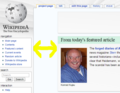
From today's featured article
Personally, I think it should be 'Today's featured article" and 'From' should be removed. Please think about it. Also, for columns that are side-by-side, a simple vertical line should be added so that people would not confuse between the columns. Thanks!--Varun Tokas (talk) 15:59, 13 January 2016 (UTC)
Yeah, help
Good evening-night, how to help me, even if the pre-recorded anything. I came, and behold, here :) just talk, but my preferences writes that you can help.--L.ukas lt 13 --Talk 20:15, 15 January 2016 (UTC)Lukaslt13
- Hi. I was just about to revert this, before realizing that this is a machine translation. How can I help you? Rehman 23:52, 15 January 2016 (UTC)
Panel shuffling
I think the "Be an editor" panel needs to be on the left-hand side of the second row – if we're really trying to recruit new editors, that panel needs to be immediately visible to them. I'd slide "In the news" to the right and bump the anniversaries to the next row with DYK. (If that row needs to be a bit wider, so be it.) Wikipedia's greatest strengths are its openness and its timeliness – the sections of the Main Page that best demonstrate these qualities should be more prominent. Cobblet (talk) 11:26, 12 December 2015 (UTC)
- There's no concept of "left" and "right" on the page's layout — make your browser window narrower, or use a small-screened device, to see what I mean. If the window is wide enough, some of those will be next to each other; otherwise all are displayed vertically. The content is displayed in order of FA, ITN, OTD, DYK, BAE, TFP. Bazza (talk) 13:41, 12 December 2015 (UTC)
Wikipedia's featured articles are usually esoteric and not of general interest. I would put the featured picture before the featured article. The order I favor is "In the news" and "On this day", then "Did you know" and "Be an editor", then "Todays featured picture", then "Featured article". Blue Rasberry (talk) 21:02, 5 January 2016 (UTC)
- I agree with Blue Raspberry: FP more in top. Maybe next to the FA's image! (images/icons are way more important in UI response aka clickbait). -DePiep (talk) 18:35, 29 January 2016 (UTC)
Style
Hello, I suggest change Wiki main page style, because this style sick, and bored. I suggest when you move the mouse on the article, which is the home page that it would increase, i.e. to be animated. And after all of these kinds of forms to create the ideal. This a single proposal. (More not fit the paint) This is a new suggesting for wiki style. (sorry, just not be enough space from paint app)--Wikipedia great! - Lukaslt13 My talk - Yes? - Yes 14:59, 8 February 2016 (UTC)
Note
i asked that the user called To use a encyclopedia . here is the code: Welcome to wikipedia the free encylopedia, we have over 5,000,000 articles and growing! Help us by editing wikipedia into a better place! If you want to test your edits, use the sandbox to test it. and now:
i undo it because the pipe. it make to the link this: Special:Statistics%7C. (while %7C is the pipe). if you click. it shows:
The requested page title contains invalid characters: "|". Chazpelo (talk)
- Note. i found this was Can up you lol's sockpuppets does that -- Chazpelo (talk)
Panels, colors and our clickbait
- I see today that the panel background colors have disappeared from the proposal. I repeat that this is pandering to the 30% mobile users at the cost of 70% of the other users. How immature a design. I am still wondering why there is no w3c/css form that serves all, uncompromised.
- I note again that this proposal does not aim for icons in top to click. Exactly that is the modern UI approach (serving both mobile and desktop users right away). -DePiep (talk) 00:23, 9 February 2016 (UTC)
- Response
Hi DePiep. I thought exactly the same as you when I first saw the 2015 redesign. Then I noticed the article message box at the top of the page:
You are viewing this page without styling. Use this link, or enable the "Show the new version of the Main Page currently under development" gadget under the Testing and development section in your preferences. Please share your ideas, and what you like and dislike about the design, on the talk page. Thank you. |
You have to click on the hyperlinked text saying “this link” to view it in all its glory.
Regards, Ntmamgtw (talk) 02:19, 13 February 2016 (UTC)
Purpose?
Out of curiosity, what issues with the existing page do you aim to solve with this one? Not sure if I'm digging this style yet but I'm curious what the agenda is. Atreem (talk) 06:11, 8 February 2016 (UTC)
- Agreed, I'm not a fan of the style in the latest redesign proposal at all. The pastel gradients all over the page just make me feel nauseous. I much prefer the clean look of Chinese Wikipedia or French Wikipedia. --MCEllis (talk) 05:06, 17 February 2016 (UTC)
When is this going to be released?
It is called the 2015 redesign. It is now 2016. When will it be released? Cole128 (talk) 12:08, 18 January 2016 (UTC)
- There is simply not enough motivation/participation. Someone should just compile the suggestions mentioned above, and get the versions out for a public vote, on a fixed deadline. I'd like to do this, but RL is seriously tough these days... I was really hoping that this would be released on our 15th birthday... Rehman 15:05, 18 January 2016 (UTC)
- Ive opened a 2016 version https://en.wikipedia.org/wiki/Wikipedia:Main_Page_(2016_redesign) Paladox (talk) 16:58, 26 January 2016 (UTC)
- No need to move or copy the current page. The redisign in its current form originated in 2015.
-- [[User:Edokter]] {{talk}}22:11, 30 January 2016 (UTC)
Gradient Pastel Title Background
A few people have complained about the gradient background on the titles. Personally, I like them, but think there is not enough colour selection. Cole128 (talk) 23:02, 21 March 2016 (UTC)
Some feedback on the design
Just stumbled upon this for the first time. First impression I got was that it looked 'old' for some reason. But then I scrolled down, took it in a bit more, and kind've liked it. Though again, nothing 'new' or exceptionally special really stood out. But that's okay with me, the status quo is time-tested well-worn, and maybe a little 'rearranging of the furniture' wouldn't hurt. The one suggestion I'd make is to change the font/styling of the big WikipediA at the top. Can't quite place it, just doesn't 'feel' right. Overall though I like it. -- Ϫ 09:40, 15 March 2016 (UTC)
- Thanks. The Wikipedia workmark is the official wordmark though.
-- [[User:Edokter]] {{talk}}20:47, 16 March 2016 (UTC)
- Take note that while it looks visually similar to the current design, the underlying code has changed considerably. Eman235/talk 00:09, 17 March 2016 (UTC)
HERE I HAVE WATHED THE PAGES AND I HAVE I AM FEELING SOMETHING IS MISSING .THERE IS NO ANY GOOD AND KNOWLEDGEABLE ARTICLE.DESIGN IS GOOD BUT CREATION IDEA IS WRONG.DID YOU KNOW QUESTION ARE NOT GOOD IN FACT DESPITE OF SOME .SO ALONG WITH DESIGN THERE SHOULD BE SOMETHING COVERED WITH SOME OF THE KNOWLEDGAABLE AND FASCINATIING CREATION Rahul Prasad wagle (talk) 03:02, 1 April 2016 (UTC)
AND THERE IS NOT ANY FEAT HERED PICTURE.TRY SOMETHING OTHER.THERE ARE MANY OTHER PICTURE OF NATURE SCIENCE TECHNOLOGY BIRDS ANIMAL HISTORICAL PLACE AND SO ON WHIC ARE GOOD .TRY SOMETHING BETTER WITH REGARDING THIS PICTURE Rahul Prasad wagle (talk) 03:07, 1 April 2016 (UTC)
Layout
I'm not going to quibble about the coding and color issues. I question why the layout is now a series of horizontal sections, instead of the left-half, right half layout currently used. Chris Troutman (talk) 20:55, 26 March 2016 (UTC)
- Just a design decision. However, a two-column design as we have now, is very hard to incorporate into a responsive design.
-- [[User:Edokter]] {{talk}}22:02, 26 March 2016 (UTC)- Ok; I'm not sure what that means. I think there's utility in making the other sections visible at first glance rather than requiring the reader to scroll down to see DYK and ITN, etc. Chris Troutman (talk) 13:17, 27 March 2016 (UTC)
- A design decision made by whom? The Transhumanist 03:14, 29 March 2016 (UTC)
- That is a perpetual discussion which I try to avoid; scrolling is unavoidable for any section which falls below the fold, no matter what comes first. I think we need to let go of the idea that scrolling 'should be unnecessary'.
-- [[User:Edokter]] {{talk}}20:13, 27 March 2016 (UTC)- @Chris troutman: I also like the 2 column format, and I don't think we should avoid this discussion. I request that it (2 column format) be put into this redesign. With the current Main Page, I usually see 4 sections (featured, in the news, did you know, and on this day). I like it that way. And so do a lot of others. I think if a redesign is to have any chance of approval by the community, it will need to retain the 2-column format. The Transhumanist 03:19, 29 March 2016 (UTC)
- That is a perpetual discussion which I try to avoid; scrolling is unavoidable for any section which falls below the fold, no matter what comes first. I think we need to let go of the idea that scrolling 'should be unnecessary'.
- The page switches to two columns when the window is wide enough to accommodate them. Enlarge (or shrink) your browser window to see this happen responsively. Bazza (talk) 10:46, 29 March 2016 (UTC)
- Why, though, does the TFA part take up a row by itself by default? Eman235/talk 00:07, 30 March 2016 (UTC)
- I choose to give each featured section (TFA, TFL and POTD) full width regardless.
-- [[User:Edokter]] {{talk}}17:24, 1 April 2016 (UTC)
- I choose to give each featured section (TFA, TFL and POTD) full width regardless.
- Why, though, does the TFA part take up a row by itself by default? Eman235/talk 00:07, 30 March 2016 (UTC)
New Font (April 1, 2016)
I am not sure if the new font is supposed to be an April Fool's joke (in which case it is actually funny), but I hope this is not the one that the proposed new page is going to adopt (because that would not be good).--MarshalN20 Talk 19:38, 1 April 2016 (UTC)
- Comic Sans? Definitely a joke. Eman235/talk 20:20, 1 April 2016 (UTC)
- Obviously. But if you miss any styling at all, that is because there is something wrong with ResourceLoader, for real.
-- [[User:Edokter]] {{talk}}23:00, 1 April 2016 (UTC)
- Obviously. But if you miss any styling at all, that is because there is something wrong with ResourceLoader, for real.
The shadows feel gratuitous
The page looks heavyweight due to the use of shadows behind the boxes. I would remove the boxes entirely (replacing them, perhaps, with thin divider lines) and add more space around each section, so that the content feels airy and uncramped. I know Wikipedia seems to have an urge to cram everything into boxes, but up to now it hasn’t tried to make those boxes look even more cluttered by means of shadows. —Born2bgratis 22:11, 2 April 2016 (UTC)
Page deleted
It seems ResourceLoader is giving me the Giant Middle Finger and puposelully serving the joke version of the new main page CSS, or no styling at all. There seems to be no way to get it removed, so until this RL issue is resolved, I have deleted the page and the associated gadget for the time being. -- [[User:Edokter]] {{talk}} 10:50, 2 April 2016 (UTC)
- Probably reported already, this happaned before. Anyway, after leaving the page and gadget deleted for a few hours, it finally seems to have cleared.
-- [[User:Edokter]] {{talk}}14:01, 2 April 2016 (UTC)
- Probably reported already, this happaned before. Anyway, after leaving the page and gadget deleted for a few hours, it finally seems to have cleared.
- Ultimately, problem was in Chrome.
-- [[User:Edokter]] {{talk}}16:00, 2 April 2016 (UTC)
- Ultimately, problem was in Chrome.
Times New Roman must die
This header's font is ugly! Please replace it with some other font with or even without serifs, make it more clear to fit the contemporary Wikipedia design.--Orange-kun (talk) 05:13, 18 April 2016 (UTC)
- Georgia isn't much better. The preferred font is actually Linux Libertine (as used in the logo), but if not installed, it falls back to Times as the closest match.
-- [[User:Edokter]] {{talk}}10:55, 18 April 2016 (UTC)- Yes, Linux Libertine is a way better. Isn't that the font which used in sections' names? And in pages' titles? Then I think it somehow downloads via Wikipedia CSS and we could try to use it.--Orange-kun (talk) 23:33, 18 April 2016 (UTC)
- Wikipedia already does that. As does this page. So if you see Linux Libertine on other pages, you should see it here too. Mind you though... At small sizes, LL may look just like Times.
-- [[User:Edokter]] {{talk}}11:00, 19 April 2016 (UTC)- It would be better if you could change it to the regular font such as one which used in Categories section--Orange-kun (talk) 18:30, 30 April 2016 (UTC)
- Wikipedia already does that. As does this page. So if you see Linux Libertine on other pages, you should see it here too. Mind you though... At small sizes, LL may look just like Times.
- Yes, Linux Libertine is a way better. Isn't that the font which used in sections' names? And in pages' titles? Then I think it somehow downloads via Wikipedia CSS and we could try to use it.--Orange-kun (talk) 23:33, 18 April 2016 (UTC)
In the news above the fold, mainly
LOVE the new layout. It looks more professional. The old looks dated and is not responsive. It's hard to get a large community to agree on a new layout, even if it's an improvement for 99% of all users, so maybe start small?
- Why ITN should be above the fold
Showcasing FAs as the first item is good. However, on my 13" screen (1366x768) the TFA is all I can see. ITN is more important, because it makes visitors (me) want to return to the main page when they (I) wouldn't otherwise. And let's face it, most TFAs are not very interesting; I cannot even remember the last time reading that blurb lead me to anything interesting. No scrolling at all is unavoidable, but if the new layout kept ITN above the fold at 1366x768 (one of the more popular resolutions per [1][2]), I'd be very happy to support it.
- Slightly reordered
Current/old:
[TFA ][ITN]
[DYK ][OTD]
[   TFP   ]
[    O    ] <-- O = "Other areas of Wikipedia" / "Be an editor"
[sister p.]
[languages]
Current redesign:
[   TFA   ]
[ITN ][OTD] <-- ITN below the fold on medium screens
[ DYK  ][O] <-- DYK below the fold on large screens
[   TFP   ]
[LG ][ SP ] <-- Languages + Sister Projects
Improved redesign:
[ TFA][ITN] <-- the two most important sections
[ DYK][OTD] <-- 3rd and 4th most important sections
[ TFP  ][O] <-- too much padding if TFP has its own row*
[LG ][ SP ]
            <-- no orphans
*Probably requires moving the "Recently featured ... Archive" links to below the image, but it seems like we're already doing this (Wikipedia:Picture of the day/April 2016).
It's hard to make a responsive layout work well on all screens when the content is dynamic (ie length, lists vs. full paragraphs). But I think that would work? Not tested with real markup/styling. On small screens there's only a single column, and on medium to large there would be some padding after either TFA or ITN (which is not that much different from the old layout). As for super large screen, people with these are used to browsing the web with everything slightly off (and we have the same issue with old layout anyways).
Editors also seem to like the DYK section, and this would put it back where it was. DYK placement is not very important to me, but like ITN, it has been mentioned as a deal-breaker in the archives. Without pushing one as better than the other (or a completely different order), I'm certain this redesign will end up as "No consensus" unless this is changed.
- Headings
The new heading are also better imo:
- "Other areas of Wikipedia" --> "Be an editor"
- "Wikipedia's sister projects" --> "Sister projects"
More generous spacing is also nice. Minor detail: "Did you know" might be better with the periods (not OTD though).
- Header
The top header also looks better, although I must admit I'm not a fan of the large logo, probably due to the large "A" which we cannot change, and because it's repeated from the sidebar. I also think the "Welcome to ... It currently" lines looks better without serifs, but that's a minor detail. The header is not a deal-breaker for me personally; I'm more interested in replacing the old layout with something fresh, and I think more editors would support the redesign if it were more similar the old layout. Change is hard... I'd hate to see this redesign end up in the archives as "No consensus" like the previous proposals from 2008, 2011, 2012, 2013, 2014 and 2015. I honestly thought this comment would basically be a support !vote, and despite the ITN placement deal-breaker and that "don't do that thing with the header", it almost is, but yeah, change really is hard ;) jonkerz ♠talk 15:35, 23 April 2016 (UTC)
- @Jonkerz:, thanks for the feedback. I can't say I agree with all of it :) It took me some though to get away from the current layout, and you basically suggest keeping the current (old) layout). (You also left out TFL.) Also, your assertion that ITN is more important then TFA really needs non-empirical evidence. What should be above the fold is really something that should be determined in a larger discussion, one I hope I can set up in the near future.
-- [[User:Edokter]] {{talk}}18:50, 30 April 2016 (UTC)
Sister projects layout
Hello! New layout looks amazing to me. Here is a bit however that I would like to see fixed -<http://prntscr.com/b0fl0a> (Wiktionary floats in the middle for some weird reason). Thanks! AMMESSAGE 05:10, 5 May 2016 (UTC)
- That should not happen; the columns should be closer together. What browser are you using, and do you see any difference when resizing your browser window?
-- [[User:Edokter]] {{talk}}08:52, 5 May 2016 (UTC)- I'm using Mozilla Firefox (ver. 47.0b2) on Windows 10 (build 10586.218. Display resolution: 1280x800). I see the same layout on IE & Edge browser (I don't have Chrome). And there is not much difference when resizing window (<http://prntscr.com/b0uc99>. On further resizing column splits into three <http://prntscr.com/b0uci1>). -AMMESSAGE 05:53, 6 May 2016 (UTC)
- I cannot reproduce this effect in Firefox... Is this your own desktop, or some browser test site?
-- [[User:Edokter]] {{talk}}05:58, 6 May 2016 (UTC)- That's weird. Yes, I'm using personal computer. I will try it on my friend's pc in few minutes and let you know. -AMMESSAGE 06:02, 6 May 2016 (UTC)
- My friend's pc has almost same configuration except display resolution, i.e.1366x768 (this is perhaps why layout appears in three column as opposed to on mine pc in two column). Screenshot on Firefox v.45.0.1, Chrome v.50.0.2661.94 (Firefox resized, Chrome resized). -AMMESSAGE 06:26, 6 May 2016 (UTC)
- Did you log in on your friend's PC? the only explanation I can come up with is that some custom CSS is causing this. I notice the headings in the screenshots are not serif, and you probably use Monobook.
-- [[User:Edokter]] {{talk}}11:02, 6 May 2016 (UTC)- Yes, I was logged into my account on my friend's pc (because it would otherwise show default Main page). I just visited the redesigned layout (link) without logged in on my pc and voila! no such layout error!! You are right, it has something to do with my account preferences and yes I've monobook theme enabled (Just blanked Common.css and Monobook.css is a red link. May be something from Common.js or Gadgets is the real culprit. I will play around later to figure out this thing). Thanks for your help! -AMMESSAGE 12:20, 6 May 2016 (UTC)
- I know of no gadget that creates such a conflict. It is definitely caused by one of the user scripts you are loading from your common.js. Disable them and re-anable them one by one, and you will find the real culprit.
-- [[User:Edokter]] {{talk}}19:10, 6 May 2016 (UTC)- It actually is in Gadgets under Appearances section called "Justify paragraphs". sorry I'm experimenting with signature. this one should last long.. Anup [Talk] 02:36, 7 May 2016 (UTC)
- Aha! That is an old one. Thanks for spotting that.
-- [[User:Edokter]] {{talk}}07:49, 7 May 2016 (UTC)
- Aha! That is an old one. Thanks for spotting that.
- It actually is in Gadgets under Appearances section called "Justify paragraphs". sorry I'm experimenting with signature. this one should last long.. Anup [Talk] 02:36, 7 May 2016 (UTC)
- I know of no gadget that creates such a conflict. It is definitely caused by one of the user scripts you are loading from your common.js. Disable them and re-anable them one by one, and you will find the real culprit.
- Yes, I was logged into my account on my friend's pc (because it would otherwise show default Main page). I just visited the redesigned layout (link) without logged in on my pc and voila! no such layout error!! You are right, it has something to do with my account preferences and yes I've monobook theme enabled (Just blanked Common.css and Monobook.css is a red link. May be something from Common.js or Gadgets is the real culprit. I will play around later to figure out this thing). Thanks for your help! -AMMESSAGE 12:20, 6 May 2016 (UTC)
- Did you log in on your friend's PC? the only explanation I can come up with is that some custom CSS is causing this. I notice the headings in the screenshots are not serif, and you probably use Monobook.
- My friend's pc has almost same configuration except display resolution, i.e.1366x768 (this is perhaps why layout appears in three column as opposed to on mine pc in two column). Screenshot on Firefox v.45.0.1, Chrome v.50.0.2661.94 (Firefox resized, Chrome resized). -AMMESSAGE 06:26, 6 May 2016 (UTC)
- That's weird. Yes, I'm using personal computer. I will try it on my friend's pc in few minutes and let you know. -AMMESSAGE 06:02, 6 May 2016 (UTC)
- I cannot reproduce this effect in Firefox... Is this your own desktop, or some browser test site?
- I'm using Mozilla Firefox (ver. 47.0b2) on Windows 10 (build 10586.218. Display resolution: 1280x800). I see the same layout on IE & Edge browser (I don't have Chrome). And there is not much difference when resizing window (<http://prntscr.com/b0uc99>. On further resizing column splits into three <http://prntscr.com/b0uci1>). -AMMESSAGE 05:53, 6 May 2016 (UTC)
Be an editor
Why was this section added? The current design doesn't have it and for good reason: space is at a premium. Chris Troutman (talk) 15:27, 7 May 2016 (UTC)
- The current design has "Other areas of Wikipedia". So not really a new addition - it is just renamed, a bit improved and pushed a little above (to fit?) in redesigned version. It should help to convert visitors into volunteers. Anup [Talk] 16:41, 7 May 2016 (UTC)
- I'd like to see it removed. We have too many editors on Wikipedia, already; we chase them away on a regular basis. Meanwhile, we have a lot of featured content that has been pushed "below the fold" by this redesign and this section, if it appears at all, ought to be at the bottom. I'd sooner see The Signpost hold real estate on the front page than this "be an editor" stuff. Chris Troutman (talk) 17:20, 7 May 2016 (UTC)
- Wait, we chase newbies away on purpose? That's news to me. Eman235/talk 19:37, 7 May 2016 (UTC)
- I'd suggest that "We have too many editors on Wikipedia" perhaps needs to be rephrased/clarified/optimistically-interpreted... I think everyone would agree that we want more patient/intelligent/neutral newcomers to become new editors! I would guess that Chris is concerned about impatient/obtuse/COI-pushing editors, and wondering how to most effectively redirect their currently harmful (though often well-intentioned) efforts... Quiddity (talk) 23:00, 7 May 2016 (UTC)
- Wait, we chase newbies away on purpose? That's news to me. Eman235/talk 19:37, 7 May 2016 (UTC)
- I'd like to see it removed. We have too many editors on Wikipedia, already; we chase them away on a regular basis. Meanwhile, we have a lot of featured content that has been pushed "below the fold" by this redesign and this section, if it appears at all, ought to be at the bottom. I'd sooner see The Signpost hold real estate on the front page than this "be an editor" stuff. Chris Troutman (talk) 17:20, 7 May 2016 (UTC)
- It's been a component of most of the popular proposed-redesigns in recent years. It was strongly endorsed in Wikipedia:Requests for comment/Main Page features#Entice readers to become editors and in Wikipedia:Requests for comment/Main Page features#Prominent links to joining, as well as the yearly discussions. HTH. Quiddity (talk) 23:00, 7 May 2016 (UTC)
Kudos, fontsize, and background image
Kudos for continuing to push this along. (I helped with the current/2006 design, and tried to help in a few subsequent attempts, but they always got mired down by mixing together the arguments about content with the arguments about design.)
This looks good and works well (responsively). Two small quibbles:
1. The font size for the description of the sister projects, seems too small. (I see it's wrapped in <small> tags). Could that be increased back to baseline, or closer to it? I tried removing the small-tags, and noticed (a) the weird linewrap in http://imagizer.imageshack.com/img923/5403/SKjsYR.png but also (b) the large empty area in the right of that section's div. Possibly fixing (b) will enable an easier time with fixing fontsize and (a).
2. The background image of the titlebar seems somewhat redundant to the sitewide sidebar logo, plus it interferes with the legibility of the words it is behind, plus it adds 40kb of download without great benefit. I recommend removing that from MediaWiki:Gadget-NewMainPage.css.
HTH. Quiddity (talk) 02:06, 3 May 2016 (UTC)
- Hi Quiddity, thanks for the feedback. I know the sister project links are not perfect. I see you have verdana, which is quite wide compoared to Arial, hence the wrapping. I could make the sparate boxes wider to prevent that, but that wastes more space. That is also why the subtitle is a little smaller, but that could also be tweaked. I played with the CSS a bit and the weird wrapping should be gone.
- As for the banner; it's not redundant on all skins, and not uncommon for ohter website homepages. I'd like to have some decoration, otherwise I think it become somewhat boring. Any alternatives are welcome though.
-- [[User:Edokter]] {{talk}}10:02, 5 May 2016 (UTC)- Re: The fontsizes and linewrapping - appear to be fixed now, thanks. :)
- Re: The banner image - I think the downsides (legibility problems, and 40kb extra download) outweigh any potential & subjective aesthetic improvements. I find the way it emphasizes the link to "Culture" as quite distracting. Also, the wordmark provides some decoration (plus of course the actual page-content!). HTH. Quiddity (talk) 23:12, 7 May 2016 (UTC)
Thoughts on the redesign
Thought I would jot down a few thoughts on the redesign as it is at the moment:
- Definitely agree with the need to rework, looks like there is a way to go, but the overall feel is definitely cleaner and crisper.
- Do get the impression that this is purely cosmetic at this stage, not seeing a great deal of thought being put into what is actually being shown and how it is presented. Feel we are missing an opportunity to overhaul and simplify, enticing the user in rather than just presenting a load of links.
- An odd thing is that the way this seems to be set up it actually looks easier to read on my mobile browser than it does on my desktop
- Overall feel:
- box shadows just don't work for two reasons:
- They clash visually with the blue outlines used on the rest of the page
- As the section headers fade they look weird because they do not as well
- Various sections presentationally still all over the place (i.e. alignment of "In the News" / "On This Day" different to "Did you Know" / "Be an Editor"). Difficult to read down the page, your eye is led all over the place
- box shadows just don't work for two reasons:
- Banner:
- Big waste of the most prime real estate on the page
- No need for the word Wikipedia in big letters when it is placed right next to the icon in the top left, let's lose that.
- Also, let's lose the number of articles as a bit irrelevant
- Why is Reference not included in the contents list?
- A simple welcome message plus the content links would save space and avoid duplication.
- Featured article:
- Like the layout, much easier to read, should be the model for all other sections
- In the News / On This Day
- Looks weird not being divided down the centre, though appreciate this would not work
- Should be two boxes on top of each other aligning with the featured article
- Did you know
- Should be one boxes underneath "On this day" aligning with the featured article
- Be an Editor
- Looks completely shoehorned in
- Makes no sense positionally in the middle of various sections on content.
- Seems unnecessary, is this not essentially covered off by the links in the welcome banner and the links in the sidebar?
- If needed should this not go down the bottom with the other "wiki-admin" bits?
- Featured picture
- I've long wondered why this is here, stuck in the middle of nowhere. Either this should be promoted to below the featured article, or we should look to streamline the page and remove it entirely, a link to the day's featured picture could be provided at the bottom of the featured article box
- As well as this, links to all of the day's featured xxx could be provided in this manner
- Languages
- Complete waste of space as it duplicates info / links already shown on the main page
- total articles already noted up the top
- other languages already listed in side bar
- sole purpose seems to call out a selection of wikis by size. Not sure this adds any value, would rather see the space being used for featured topic / list box or something promoting enWiki content
- Sister Projects
- Neat way of finishing the page
- Looks weird as a list, prefer the old way of presentation but in the new format.
Interested in other's thoughts on these notes. Fenix down (talk) 11:48, 12 May 2016 (UTC)
- Thanks for the comments. It's a mixed bag, but you are right on one point: the redisign is purely cosmetic and does not take content into account; that is the responsibility of the various section directors/projects. In my philisophy, content and presentation should be separated. That leaves placement, and since not everything can be at the top, choices have to be made, but as a colaborative effort. Some sections may seem to duplicate inforamtion from the sidebar, but remember Vector is not the only skin. As for the banner, in pixel count, the banner is not that much bigger then the current one, but does appear a lot roomier. References isn't there because it does not point to content. I hope to address all these concerns in a series of RfC in the near futrure, because we do need something new after 10(!) years.
-- [[User:Edokter]] {{talk}}20:14, 12 May 2016 (UTC)
- Fenix down, I'll just briefly add to Edokter's comment: The last few attempts at redesigns all went in circles (and eventually nowhere) precisely because everyone kept trying to change everything at once, and hence there was never consensus forming around any aspect (from underlying structural improvements, to aesthetic updates, to content changes, to layout decisions), let alone a switch from existing to proposed overhauls. Edokter's approach is exactly what is needed, to get this ball slowly rolling again, piece by piece (whilst keeping the overall scope and the variety of potential long-term options in mind at the same time). I think we also need to take a closer look at what many of the other languages/projects have done with their main pages, to be aware of any mergeable good ideas. Quiddity (talk) 05:54, 23 May 2016 (UTC)
- Hi guys, thanks for the responses. Definitely agree that something needs to be done to freshen up the main page and that this needs to be done piecemeal to get asd many people onside as possible. Agree that reviewing other wikis is a good idea too. I wonder for enWiki, whether there has been any survey done on user habits re the main page? I'd be interested to see any data form this as a lot of my points stem from my use or lack thereof. Fenix down (talk) 08:23, 23 May 2016 (UTC)
- Fenix down, Ah, yes, and good question, because it was hard for me to find just now. There was a big discussion about this in 2011 at Wikipedia:Requests for comment/Main Page features, and in 2013 at Wikipedia:2013_main_page_redesign_proposal/RFC (See conclusion linked at top-right, for a summary). I've now added those links to Wikipedia:Main page redesign proposals. Some good notes in both of those. -- Quiddity (talk) 20:32, 14 June 2016 (UTC)
- I generally agree with the things above, and I notice one of the major changes is the removal of colored background? While I understand the reason for that, and the need to simplify the coding for the page, as it is now, it's difficult for me to actually look at the page, because it just strikes me as a bunch of white and black text and links? This version, it's difficult for my eye to pick out the sections, especially in two column, i.e. there's no immediate way to pick out a vertical divide. The colored backgrounds make it much easier for my brain to parse what section was what, I guess I'm trying to say. Admittedly, I'm not overly familiar with the history of the redesign and I'm picking my way through all the RFCs, but while I do think a crisper and cleaner look is good, this is almost too clean, if that makes sense. I'm not necessarily suggesting the colored approach, but is there a way to make the vertical division between sections clearer and easier for the eye to follow? ~Cheers, TenTonParasol 23:34, 24 June 2016 (UTC)
- TenTonParasol, I think you're seeing the unstyled page. There is a link at the top ("use this link"), or enable the "New Main Page" gadget in your preferences.
-- [[User:Edokter]] {{talk}}07:55, 25 June 2016 (UTC)- Edokter, ah! Yes, these are reasons I shouldn't do anything when tired. I miss certain important things. At any rate, so, I'm curious at this point: now that "In the news" and "On this day" are separated, it seems a little odd they're the same color? It's ultimately cosmetic. And I really have to echo the box shadow thing mentioned above. It looks very odd. But, I'm not sure how the boxes would work without them.
- It might just be because it's today, but that small gap at the bottom of "In the news" makes me wonder if this format would ever result in sizeable gaps at the bottom of boxes in the two column portions. I'm not sure how much of a problem it would potentially be, considering the current page seems to do just fine with it, but I'm a little curious if that'd ever happen.
- Also, considering the "In the news" and "On this day" sections are now distinctly separated, it seems a little odd to have them be shaded with the same color? That's ultimately cosmetic, but it just strikes as odd. ~Cheers, TenTonParasol 15:19, 25 June 2016 (UTC)
- TenTonParasol, the sections are sort of 'color coded', with green denoting featured content, and blue for time-related content (just like the current page). As for balancing, ITN tries to match its height with Did You Know as it currently is, which may result in a gap. No doubt that once the new page is up, the gap will be minimal. The box shadow is quite subtle (5%). I guess it takes a little getting used to. If you know how to work your browsers console, you can disable the box-shadow rules that apply to mw-panel to see how it looks without.
-- [[User:Edokter]] {{talk}}15:51, 25 June 2016 (UTC)- Ah, that's not immediately apparent, but I'm not sure if it needs to be immediately apparent? At any rate, I realized I said shadow when I meant border. (I apologize so much for generally fumbling around in this and getting easily mixed up.) I do think the borders around the boxes are odd because the overall page has that blue outline and it looks odd with the fade. I disabled the border to get a sense of what it looked like without the borders, and I think it looks better without the borders? A little crisper. But, to reiterate, the shadows I think look fine. ~Cheers, TenTonParasol 01:21, 26 June 2016 (UTC)
- TenTonParasol, the sections are sort of 'color coded', with green denoting featured content, and blue for time-related content (just like the current page). As for balancing, ITN tries to match its height with Did You Know as it currently is, which may result in a gap. No doubt that once the new page is up, the gap will be minimal. The box shadow is quite subtle (5%). I guess it takes a little getting used to. If you know how to work your browsers console, you can disable the box-shadow rules that apply to mw-panel to see how it looks without.
- TenTonParasol, I think you're seeing the unstyled page. There is a link at the top ("use this link"), or enable the "New Main Page" gadget in your preferences.
- Hi guys, thanks for the responses. Definitely agree that something needs to be done to freshen up the main page and that this needs to be done piecemeal to get asd many people onside as possible. Agree that reviewing other wikis is a good idea too. I wonder for enWiki, whether there has been any survey done on user habits re the main page? I'd be interested to see any data form this as a lot of my points stem from my use or lack thereof. Fenix down (talk) 08:23, 23 May 2016 (UTC)
"WikipediA" without the globe looks terrible
The "WikipediA" text looks really bad when it's not framing the globe above it. If you want to have consistent type there and in the sidebar logo thing, the latter is going to need some tweaking too so that they can both look decent. Other than that, this is a good start - a 'refreshed' version of the current main page is an excellent base on which to debate and build. --Keiyakins (talk) 22:03, 29 May 2016 (UTC)
- The main page (or any page for that matter) does not have any control over the sidebar, so not much we can do about that.
-- [[User:Edokter]] {{talk}}10:51, 30 May 2016 (UTC)
- Agree. Should be Wikipedia (it's not like it's a trademark version, just see all the other instances of "Wikipedia". I'd change it but am too junior. Gsnerd (talk) 01:35, 15 June 2016 (UTC)
- It is the official wordmark actually, just a little bigger.
-- [[User:Edokter]] {{talk}}08:07, 25 June 2016 (UTC)
- It is the official wordmark actually, just a little bigger.
Lead header text
Suggest changing "It currently contains" to "Containing". — xaosflux Talk 17:29, 25 June 2016 (UTC)
- Tried that; it becomes a runaway sentence.
-- [[User:Edokter]] {{talk}}19:01, 25 June 2016 (UTC)
So much whitespace

At very wide resolutions what's with all this whitespace? — xaosflux Talk 17:36, 25 June 2016 (UTC)
- Xaosflux, I've set the maximum content width to 120em, to prevent sections from being overly stretched. This is quite common. It should fill 1920px wide screens at default font size. Is that the actual size of your font? That is really small.
-- [[User:Edokter]] {{talk}}18:31, 25 June 2016 (UTC)- @Edokter: I used a huge resolution just to see what would happen. The overly stretched problem is only going to occur for readers with huge resolutions correct? You said: "The Main Page is basically just the same as an article, which happens to be a lot more visible." - now I take it you meant that towards being WP:BOLD, but I can't see a good use for forcing arbitrary whitespace between the sidebar and the page, only for Main page, while treating all other article whitespace layout different. — xaosflux Talk 19:29, 25 June 2016 (UTC)
- It is just a design decision. The whole will become incohesive if it is allowed to stretch into infinity. Since the height of the images and lists prevent the various boxes to shrink vertically, you'd only end up with more whitespace inside the boxes. Plus it is generally not recommended for text lines to be overly wide; that is an accessability issue. And I don't think the example you showed is actually a realistic one.
-- [[User:Edokter]] {{talk}}19:38, 25 June 2016 (UTC)
- It is just a design decision. The whole will become incohesive if it is allowed to stretch into infinity. Since the height of the images and lists prevent the various boxes to shrink vertically, you'd only end up with more whitespace inside the boxes. Plus it is generally not recommended for text lines to be overly wide; that is an accessability issue. And I don't think the example you showed is actually a realistic one.
- @Edokter: I used a huge resolution just to see what would happen. The overly stretched problem is only going to occur for readers with huge resolutions correct? You said: "The Main Page is basically just the same as an article, which happens to be a lot more visible." - now I take it you meant that towards being WP:BOLD, but I can't see a good use for forcing arbitrary whitespace between the sidebar and the page, only for Main page, while treating all other article whitespace layout different. — xaosflux Talk 19:29, 25 June 2016 (UTC)
I logged on with a vanilla account to do better previews, using default browser/resolution/zoom/etc settings. The whitespace still seems off when using monobook - this is not present on other pages or the current mainpage - any ideas? — xaosflux Talk 19:51, 25 June 2016 (UTC)
-
 Vector whitespace is ok
 -
 Monobook whitespace is excessive


- Monobook does use a smaller fontsize, so the page become narrower. I focus mainly on Vector, as that is the default skin that every new visitor sees.
-- [[User:Edokter]] {{talk}}19:56, 25 June 2016 (UTC)- How are you with 160em (preview here) - cleans up monobook and I'm not seeing any drawback on vector. — xaosflux Talk 20:12, 25 June 2016 (UTC)
- No, sorry. Lines are too long to read, and the boxes start breaking up.
-- [[User:Edokter]] {{talk}}20:36, 25 June 2016 (UTC)- Well maybe someone else will come by with a good idea - or maybe I'm the only one that thinks the white space gaps are bad design. — xaosflux Talk 20:54, 25 June 2016 (UTC)
- Like I said above; they are actually quite common in web design when it comes to wide screens. (You can override it in your personal CSS though.)
-- [[User:Edokter]] {{talk}}21:35, 25 June 2016 (UTC)
- Like I said above; they are actually quite common in web design when it comes to wide screens. (You can override it in your personal CSS though.)
- Well maybe someone else will come by with a good idea - or maybe I'm the only one that thinks the white space gaps are bad design. — xaosflux Talk 20:54, 25 June 2016 (UTC)
- No, sorry. Lines are too long to read, and the boxes start breaking up.
- How are you with 160em (preview here) - cleans up monobook and I'm not seeing any drawback on vector. — xaosflux Talk 20:12, 25 June 2016 (UTC)
Be An Editor white space
This section has been resolved
|
|---|
|
Here is another gap I don't like, present in both vector and monobook. This is at standard resolution and font size (no zoom/stretch/etc). — xaosflux Talk 20:07, 1 July 2016 (UTC)
|


SA/OTD & DYK
I suggest having DYK & SA/OTD switch spots. Articles featured at SA/OTD are generally more mature and well developed. I would rather have them higher up on MainPage. --PFHLai (talk) 22:29, 25 June 2016 (UTC)
- I'd echo this suggestion? I've been trying to think of a way to move "Be an editor" further down the page so it's closer to the more thematically related "sister projects" in place of the languages. (I'm not sure exactly how useful languages it? Considering they're listed at the main .org and are along the side.) Do you think it'd be wise to make "On this day" up where "Did you know" is, move "featured picture" directly under the "In the news" and "On this day" row (move featured content more up the page?), and have "Did you now" full width under that? I'm not sure if "Did you know" is suitable for a full width panel, however? Ah, I kind of feel like I'm bumbling around in suggestions here. ~Cheers, TenTonParasol 01:29, 26 June 2016 (UTC)
- I just swapped OTD with DYK to give DYK more exposure (partly due to another users suggestion). One of the purposes of the main page is to atract new editors, and I think I balanced it accordingly; content (mostly) on the left and project-related topics (mostly) on the right. I think this is one of the topics that may warrant an RfC of some sort to determine placement of all the sections.
-- [[User:Edokter]] {{talk}}07:38, 26 June 2016 (UTC)
Styling looks horrible
The page looks a lot better without the styling provided by the MW-extension. That is apart from the box that tells you that you haven't enabled the styling. Carl Fredrik 💌 📧 10:25, 4 July 2016 (UTC)
- I'm not sure what you mean. What MW extension? Do you mean the gadget? Have you looked at the page with styling?
-- [[User:Edokter]] {{talk}}15:19, 4 July 2016 (UTC)- You know exactly what I mean, yeah the gadget. It looks far better without all the clutter and colors. Carl Fredrik 💌 📧 18:06, 4 July 2016 (UTC)