
Wikipedia:Featured picture candidates/July-2013
| Featured picture tools |
|---|
Please cut and paste new entries to the bottom of this page, creating a new monthly archive (by closing date) when necessary.
Voting period is over. Please don't add any new votes. Voting period ends on 7 Jul 2013 at 05:48:51 (UTC)

- Reason
- Good quality, high EV and better than the lead image in the article.
- Articles in which this image appears
- Grand Coulee Dam, List of conventional hydroelectric power stations
- FP category for this image
- Wikipedia:Featured pictures/Places/Architecture
- Creator
- Farwestern
- Support as nominator --BNK(talk) 05:48, 28 June 2013 (UTC)
- Strong Oppose Very inconsistent lighting in the sky, kinda looks like it's HDR? Either way, not FP quality. — raekyt 07:34, 28 June 2013 (UTC)
- Oppose. Agree with Raeky, something is wrong with this. It almost looks like a stitched panorama, but with the seams very close together. Perhaps the photographer 'panned' across the sky with his finger on the shutter taking too many photos and too close together. Also probably without locking the exposure given how obvious the seams are in the sky. Just a guess though. Ðiliff «» (Talk) 09:35, 28 June 2013 (UTC)
- Oppose i don't think for a mere 120° shot there is a need to stitch these many shots together.Sanyambahga (talk) 09:46, 28 June 2013 (UTC)
- Oppose per above. -- mcshadypl TC 02:16, 29 June 2013 (UTC)
- Withdraw I withdraw my nomination per above comments.— BNK(talk) 01:43, 1 July 2013 (UTC)
Not Promoted -- — Crisco 1492 (talk) 09:04, 1 July 2013 (UTC)
- Withdrawn — Crisco 1492 (talk) 09:04, 1 July 2013 (UTC)
Voting period is over. Please don't add any new votes. Voting period ends on 1 Jul 2013 at 11:54:58 (UTC)

- Reason
- High quality and high EV
- Articles in which this image appears
- Moshe Ya'alon
- FP category for this image
- Wikipedia:Featured pictures/People/Political
- Creator
- Reuven Kapuscinski
- Support as nominator --Tomer T (talk) 11:54, 22 June 2013 (UTC)
- Support Not very subtle background, but excellent photograph regardless. – Kerαunoςcopia◁galaxies 23:16, 22 June 2013 (UTC)
- Support--BNK(talk) 09:58, 24 June 2013 (UTC)
- Support Great official portrait with a gentle background. -- Homo trisapiens (talk) 3:32, 25 June 2013 (UTC)
- Support --WingtipvorteX PTT ∅ 18:37, 25 June 2013 (UTC)
Promoted File:Moshe Ya'alon.jpg --Armbrust The Homunculus 12:01, 1 July 2013 (UTC)
Voting period is over. Please don't add any new votes. Voting period ends on 1 Jul 2013 at 16:13:36 (UTC)
_Weltvogelpark_Walsrode_2012-015.jpg)
- Reason
- Quality image, good angle.
- Articles in which this image appears
- Inca Tern, Tern, List of Charadriiformes by population
- FP category for this image
- Birds
- Creator
- Fiorellino
- Support as nominator --Brandmeistertalk 16:13, 22 June 2013 (UTC)
- Support Seems okay. – Kerαunoςcopia◁galaxies 23:18, 22 June 2013 (UTC)
- Support Cool bird. Only niggle is that it is half squinting from the fill pre-flash. (something to watch out for!) JJ Harrison (talk) 09:49, 23 June 2013 (UTC)
- Support --Arctic Kangaroo (✉ • ✎) 15:24, 23 June 2013 (UTC)
- Support - nice one. --BNK(talk) 09:55, 24 June 2013 (UTC)
- Support as above. Cowtowner (talk) 04:41, 25 June 2013 (UTC)
- Support Great EV! --WingtipvorteX PTT ∅ 18:35, 25 June 2013 (UTC)
Promoted File:Larosterna inca (Inca Tern - Inkaseeschwalbe) Weltvogelpark Walsrode 2012-015.jpg --Armbrust The Homunculus 16:14, 1 July 2013 (UTC)
Voting period is over. Please don't add any new votes. Voting period ends on 9 Jul 2013 at 15:54:59 (UTC)

- Reason
- High Resolution, Excellent Color balance; a highly inferior scan was being used on almost all of the pages involving Richelieu, so I've replaced them with this version; it has great encyclopedic value.
- Articles in which this image appears
- Cardinal Richelieu, Cardinal (Catholicism), Crown-cardinal, Luxembourg Palace, Protestant Reformation, Philippe de Champaigne, Académie française, Collection of the National Gallery, London, Portal:Biography/Selected anniversaries/September 9
- FP category for this image
- http://en.wikipedia.org/wiki/Wikipedia:Featured_pictures/People/Political
- Creator
- Philippe de Champaigne
- Support as nominator --Indefatigable2 (talk) 15:54, 30 June 2013 (UTC)
- Support nice.--g. balaxaZe ႫႨႼႤႰႠ 19:52, 30 June 2013 (UTC)
- Oppose based on the painting composition itself. Note, the picture is mostly being used to illustrate the Cardinal himself. But he has a pinhead and it blends into the background. The robes are too voluminous. Just because we have a Counter-reformation artwork, does not mean it is good art.TCO (talk) 18:36, 1 July 2013 (UTC)
- I Withdraw my Nomination I just found a major scanning error at the bottom of the lace on the robes; this scan is no good. Indefatigable2 (talk) 19:04, 1 July 2013 (UTC)
Not Promoted --Armbrust The Homunculus 19:14, 1 July 2013 (UTC)
Voting period is over. Please don't add any new votes. Voting period ends on 7 Jul 2013 at 13:05:44 (UTC)

- Reason
- At 1,200 × 1,687 pixels, this image is on the small side; however, there are several reasons why I have come to the conclusion that this image of Peter the Great is without doubt the best choice for FP status. If the size is too much of an obstacle, fine; but I feel the worth and encyclopedic value of this image easily overrides that, so I decided to bring it here. These aforesaid reasons are:
1.) This portrait, unlike the many others of Peter the Great that are of similar, though ubiquitously lesser, technical acumen, was actually painted during his lifetime, circa 1717. Its colors and contrast are excellent, especially when one looks at the other versions and scans of this painting. This particular portrait has been duplicated in paint, but this is clearly the best and most balanced version. One looks at the others and readily sees this shine above. Besides, even if these other versions and scans were equal to this in composition, they are all of lower resolution on Wikipedia. Larger scans of the inferior versions can be found, but they are not drastically larger, and, regardless, pale next to this piece.
2.) Another portrait of Peter the Great, perhaps famous, is the one executed by Paul Delaroche in 1838: [1]. However, besides being painted around 113 years after Peter the Great's death, the better version of this painting, (still, I feel, plainly inferior to Nattier's) which is the one I have linked to, can only be found in a small size. The larger version, here: [2], --still smaller than the scan of Nattier's portrait-- seems as though it is actually a copy of the original, and has a rough, unfinished look, negating its encyclopedic value and making it, in my opinion, even a tad cartoonish. Nattier wins again, easily.
![[1]](https://commons.wikimedia.org/wiki/File:Peter_der-Grosse_1838.jpg)
![[2]](https://commons.wikimedia.org/wiki/File:Peter_der-Grosse_1838_PR.jpg)
3.) This portrait is an excellent illustrator of Peter's personality and governmental philosophy; he wears handsome western European style armour, signifying his place as the Russian ruler who officially displaced 'Tsar' as the monarch's title in favor of 'Emperor.' Upon his pauldron over his left shoulder, is emblazoned the star of the Order of St. Andrew, the first and most illustrious Russian chivalric order, established by Peter the Great himself to inculcate a sense of loyalty and pride, save land and money, and further adopt the ideas and customs of western Europe, all of which are representative of his approach to ruling. His sword is prominently featured, just as in the Delaroche portrait, but in this portrait there is a significant addition: the Tsar wears a flowing white sash about his waist that is far more prominent than the similar sash in the Delaroche portrait; in the Russian context, the white is essential, as it symbolizes both divine right monarchy and divine purpose. Similarly, the blue sash of the Order of St. Andrew is a reflection of state legitimacy, and, combined with the red plumes, comes together to a white, blue and red, signifying the Russian flag that Peter introduced as one of the main points of his reign. Once one focuses on this painting, one sees that it really is far superior to not just many historical portraits, but most portraits in general. It adds immense value to its articles, is very illustrative, and, notwithstanding its smaller size, is a very fine image in many regards.
- Articles in which this image appears
- Peter the Great, History of Western civilization, History of Russia, Treaty of Constantinople (1700)
- FP category for this image
- http://en.wikipedia.org/wiki/Wikipedia:Featured_pictures#People
- Creator
- Jean-Marc Nattier
- Support as nominator --Indefatigable2 (talk) 13:05, 28 June 2013 (UTC)
- Oppose While I agree that this is probably the right portrait if one were to be featured, it's not up to snuff size wise. Firstly, I expect that this, like most portraits of royalty, is quite large and we should expect the resolution of the reproduction to reflect that. Secondly, if you compare it to the other paintings of royalty already featured, it's clear that the image is well below those standards. So while it's valuable for illustrating the article, it's not feature-worthy until a better quality scan becomes available. Cowtowner (talk) 18:45, 28 June 2013 (UTC)
- My own feelings, perhaps; better to be scrupulous than not, for sure. Indefatigable2 (talk) 02:22, 29 June 2013 (UTC)
- WITHDRAW I wish to withdraw my nomination. This scan is not up to par, and this painting isn't going anywhere. We can wait for a better one. Indefatigable2 (talk) 17:56, 1 July 2013 (UTC)
Not Promoted --Armbrust The Homunculus 19:15, 1 July 2013 (UTC)
Voting period is over. Please don't add any new votes. Voting period ends on 1 Jul 2013 at 23:34:09 (UTC)

- Reason
- The painting is a one of the most prominent marine paintings of all time. Note that it was selected as picture of the day on Wikimedia Commons on August 18, 2010 and is a FP on Tamil WP.
- Articles in which this image appears
- The Ninth Wave, Ivan Aivazovsky
- FP category for this image
- Wikipedia:Featured_pictures/Artwork/Paintings
- Creator
- Ivan Aivazovsky

- Support as nominator --Երևանցի talk 23:34, 22 June 2013 (UTC)
- Strong oppose [original] Per my talk page comments from a short while ago. In brief: over-saturated. – Kerαunoςcopia◁galaxies 00:47, 23 June 2013 (UTC)
- I added an edit using the museum photographs as a guideline. I cannot guarantee my colors are correct (I could not gauge the yellows properly), unfortunately, as I've never seen the painting, but looking at an Aivazovsky gallery, I don't see anything extremely saturated as the original image is. Also, it's pretty well known that sometimes my uploads have issues when the original image doesn't have an embedded color profile, so if my edit (sRGB) looks absolutely bizarre, let me know. I desaturated reds, yellows, cyans. – Kerαunoςcopia◁galaxies 01:36, 23 June 2013 (UTC)
- I think you've gone substantially too far, unfortunately. Compare http://www.artsstudio.com/reproductions/paintings/aiv_9thwave-000-0.jpg - probably the site I'd trust most on the colours. Adam Cuerden (talk) 06:53, 23 June 2013 (UTC)
- I agree completely and opposed below. I uploaded the image with reservations. I despise the original image, it looks like it went through a digital fire and any information is irrecoverable. I was trying to make more of a point and should've just left my original statement stand. However, I'm crossing my fingers that these gorgeous paintings get scanned properly someday. – Kerαunoςcopia◁galaxies 18:08, 23 June 2013 (UTC)
- I think you've gone substantially too far, unfortunately. Compare http://www.artsstudio.com/reproductions/paintings/aiv_9thwave-000-0.jpg - probably the site I'd trust most on the colours. Adam Cuerden (talk) 06:53, 23 June 2013 (UTC)
- I added an edit using the museum photographs as a guideline. I cannot guarantee my colors are correct (I could not gauge the yellows properly), unfortunately, as I've never seen the painting, but looking at an Aivazovsky gallery, I don't see anything extremely saturated as the original image is. Also, it's pretty well known that sometimes my uploads have issues when the original image doesn't have an embedded color profile, so if my edit (sRGB) looks absolutely bizarre, let me know. I desaturated reds, yellows, cyans. – Kerαunoςcopia◁galaxies 01:36, 23 June 2013 (UTC)
Support edited version. I agree with the above statements regarding the color. The edited version is more aligned with the actual painting. Proudbolsahye (talk) 09:39, 23 June 2013 (UTC)
- Oppose Both The original is too saturated, and I think the colour is out of wack on the edit too. It is too purple for a start. JJ Harrison (talk) 09:47, 23 June 2013 (UTC)
- Strong oppose both The original is VASTLY over saturated, and any attempt to "fix" it will never result in an accurate color rendition. This is a picture of the actual painting, as you can see nether of these pictures comes close to the correct colors. — raekyt 15:56, 23 June 2013 (UTC)
- Oppose both Even my own :) I agree completely with JJ Harrison and Raeky. I tried my best but I also don't like the original scan at all, the image just seemed destroyed, either by the over saturation or over contrast or maybe jpg artifacting and graininess, and I did upload the image not with a smile on my face but wondering if I should have even been doing that at all. This painting (actually most of Aivazovsky's paintings) need an extremely high-resolution professional treatment. – Kerαunoςcopia◁galaxies 18:04, 23 June 2013 (UTC)
- Oppose both per above. --WingtipvorteX PTT ∅ 18:33, 25 June 2013 (UTC)
- Oppose both per above -- mcshadypl TC 02:28, 29 June 2013 (UTC)
Not Promoted --Armbrust The Homunculus 23:37, 1 July 2013 (UTC)
Voting period is over. Please don't add any new votes. Voting period ends on 2 Jul 2013 at 09:37:01 (UTC)

- Reason
- High quality photo taken at the top of Thailand's highest mountain, Doi Inthanon. The tail behind the tree evinces the shy nature. I took this photo by waiting strategically in freezing-19-°C temperatures with a hide after spotting a small flock.
- Articles in which this image appears
- Rufous-throated Partridge
- FP category for this image
- Wikipedia:Featured pictures/Animals/Birds
- Creator
- JJ Harrison
- Support as nominator --JJ Harrison (talk) 09:37, 23 June 2013 (UTC)
- Oppose While the quality is good, ultimately the bird is missing a tail and its feet, which is too much in my mind to be featured. Also, the shy nature of the bird isn't discussed in the article and even if it were, I'd be inclined to say that this would still be a bird standing behind a tree more than hiding or exhibiting some sort of self-evident behaviour. Cowtowner (talk) 10:33, 23 June 2013 (UTC)
- Oppose - Prefer a picture that shows the full bird. Feet still acceptable, but tail part is totally missing in pic. Arctic Kangaroo (✉ • ✎) 15:21, 23 June 2013 (UTC)
- Support Call me nuts but I get to claim righteous ignorance here. I like birds and most of the time, I don't give a damn about the tail. Perhaps EV is hiding behind the tree, but perhaps not. Until a better picture comes along (good luck), I find this photograph to be eye-catching and kind of cool. I don't get the "shy" feeling from this image either, but the bird appears to be on its way to work, unlike other photographs where they're just sort of staring like they're in a coma. So the subtle sense of action kind of makes up for the lack of tail. As a bird layperson, I think this has EV. – Kerαunoςcopia◁galaxies 06:37, 24 June 2013 (UTC)
- You might not give a damn about the tail, but the encyclopedia does. In a photograph like this not showing the whole animal inevitably diminishes the EV. It leaves the question (and it sounds ridiculous) "How does the bird end?" unanswered. Cowtowner (talk) 23:05, 24 June 2013 (UTC)
- The pedant in me feels the need to point out that no photo can show more than 50% of an animal. Anyway, why is it that the parts obscured in the 'bird on stick' case are rarely worried about? The person likely to be reading the article would be most concerned with plumage features used to identify it. The tail is not important to differentiate it from other members of the genus. JJ Harrison (talk) 02:57, 25 June 2013 (UTC)
- I'd point out in reply that most animals are pretty symmetrical, so 50% is sufficient. If by bird on stick, you mean perched, I'd say (and having looked through your FP uploads) that they're usually much less obscured than this one. 99% (if not all) of your previous bird FPs and the ones in the gallery purporting to be body shots have their tails. As for the person reading this article, they'd firstly be likely frustrated by the fact that it is rather stubby and then maybe kind of concerned that the bird is missing its stub. The gist of this is that I think a bird missing its tail is diminished in its EV and out of line with the standards that have been established for this kind of picture, in part due to the fact that your other contributions have set an exemplary and high standard. Cowtowner (talk) 04:40, 25 June 2013 (UTC)
- Support Tomer T (talk) 14:42, 24 June 2013 (UTC)
- Oppose Great picture, good quality, but more artistic than encyclopedic. The full bird must be showing. Don't get me wrong, there is value to this image, but is it one of the finest images on the English Wikipedia? No. This subject could be executed better.Indefatigable2 (talk) 11:21, 28 June 2013 (UTC)
Not Promoted --Armbrust The Homunculus 09:38, 2 July 2013 (UTC)
Voting period is over. Please don't add any new votes. Voting period ends on 2 Jul 2013 at 09:40:18 (UTC)

- Reason
- High quality, easily the best availible image.
- Articles in which this image appears
- Bar-throated Minla
- FP category for this image
- Wikipedia:Featured pictures/Animals/Birds
- Creator
- JJ Harrison
- Support as nominator --JJ Harrison (talk) 09:40, 23 June 2013 (UTC)
- Support per nom. Cowtowner (talk) 10:33, 23 June 2013 (UTC)
- Support Nev1 (talk) 12:06, 23 June 2013 (UTC)
- Support --Arctic Kangaroo (✉ • ✎) 15:23, 23 June 2013 (UTC)
- Support Simply gorgeous. – Kerαunoςcopia◁galaxies 06:31, 24 June 2013 (UTC)
- Support-Per nom. QatarStarsLeague (talk) 16:54, 24 June 2013 (UTC)
- Support as above. J Milburn (talk) 17:32, 24 June 2013 (UTC)
- Support per above. Excellent image! --WingtipvorteX PTT ∅ 18:29, 25 June 2013 (UTC)
- Support Commendable photograph. Indefatigable2 (talk) 20:54, 1 July 2013 (UTC)
Promoted File:Minla strigula - Doi Inthanon.jpg --Armbrust The Homunculus 09:41, 2 July 2013 (UTC)
Voting period is over. Please don't add any new votes. Voting period ends on 2 Jul 2013 at 09:43:03 (UTC)

- Reason
- Another colourful Pitta. I got seriously lucky with some of these a while back. High quality, sharp image. The two second exposure is mostly a fluke!
- Articles in which this image appears
- Hooded Pitta
- FP category for this image
- Wikipedia:Featured pictures/Animals/Birds
- Creator
- JJ Harrison
- Support as nominator --JJ Harrison (talk) 09:43, 23 June 2013 (UTC)
- Support, another beauty pageant contestant (although I wonder why modern cameras still can't entirely focus on small objects like these). Brandmeistertalk 09:59, 23 June 2013 (UTC)
- Because physics. Going off the exif data and this calculator at f/4 with a 500mm focal length and the subject 6.47m away with JJ's camera there's 2.84cm of depth of field--which is smaller than the bird is. Cowtowner (talk) 10:28, 23 June 2013 (UTC)
- Assuming a perfectly spherical bird in a vacuum... J Milburn (talk) 17:33, 24 June 2013 (UTC)
- Someone, somewhere has probably decided that's animal cruelty, but I'd be curious to see one anyways. Cowtowner (talk) 23:03, 24 June 2013 (UTC)
- Support per nom. Cowtowner (talk) 10:28, 23 June 2013 (UTC)
- Support --Arctic Kangaroo (✉ • ✎) 15:23, 23 June 2013 (UTC)
- Support Two second exposure time! Maybe this bird was waiting for you ✿ --Laitche (talk) 16:16, 23 June 2013 (UTC)
- Eternal Support for two-second exposure – Kerαunoςcopia◁galaxies 06:33, 24 June 2013 (UTC)
- Support as above. J Milburn (talk) 17:33, 24 June 2013 (UTC)
- Support per above. --WingtipvorteX PTT ∅ 18:30, 25 June 2013 (UTC)
- Support. Two second exposure?? A fluke but also a bit of an accident, surely? Completely inappropriate shutter speed/ISO. :) I'm shocked that you didn't get any blur. Even if you used mirror lock up, there must be some sort of vibration (wind, etc) in two seconds...? Ðiliff «» (Talk) 10:18, 26 June 2013 (UTC)
- My newish tripod is pretty rock solid (gitzo GT-5532LS). I broke the old one. But for this shot I was dealing with a broken (read: wobbling) tripod head. Sharp shots around 1/15th were proving difficult. Since the bird was sitting extremely still for a few seconds at a time I tried a longer exposure with a remote release and live view to avoid mirror slap. A two second shot can have less blur because there is time for vibration to die out. Eventually I'll get a new gimbal, when I can afford it. Since then I've made makeshift repairs. JJ Harrison (talk) 03:38, 27 June 2013 (UTC)
- Support Excellent. Indefatigable2 (talk) 21:20, 1 July 2013 (UTC)
Promoted File:Pitta sordida - Sri Phang Nga.jpg --Armbrust The Homunculus 09:43, 2 July 2013 (UTC)
Voting period is over. Please don't add any new votes. Voting period ends on 2 Jul 2013 at 12:48:42 (UTC)

- Reason
- High EV and good quality
- Articles in which this image appears
- Ekaterina Skudina
- FP category for this image
- Wikipedia:Featured pictures/People/Sport
- Creator
- Platon Shilikov
- Support as nominator --Tomer T (talk) 12:48, 23 June 2013 (UTC)
- Support, quite nice (the framing may be slightly tight, but it doesn't bother me). Brandmeistertalk 13:57, 23 June 2013 (UTC)
- Support Fantastic, very interesting portrait. – Kerαunoςcopia◁galaxies 06:29, 24 June 2013 (UTC)
- Support I like it. Rreagan007 (talk) 16:29, 24 June 2013 (UTC)
- Support. Brilliant to have these photographs, and featuring the strongest of them may help encourage other organisations to donate their work, too. J Milburn (talk) 17:30, 24 June 2013 (UTC)
- Support Lively portrait and very high quality. -- Homo trisapiens (talk) 3:38, 25 June 2013 (UTC)
- Weak Support Image is great, just a little low on the EV side, seeing that the article is so short. --WingtipvorteX PTT ∅ 18:23, 25 June 2013 (UTC)
- Not part of the criteria. There is no EV difference for an individual who has a stub article and one who has a featured article. — Crisco 1492 (talk) 23:38, 25 June 2013 (UTC)
Promoted File:SkudinaEkaterina5.jpg --Armbrust The Homunculus 13:01, 2 July 2013 (UTC)
Voting period is over. Please don't add any new votes. Voting period ends on 2 Jul 2013 at 12:55:12 (UTC)

- Reason
- High quality and high EV. Notable person, photograph by notable photographer.
- Articles in which this image appears
- Ethel Waters, +2
- FP category for this image
- Wikipedia:Featured pictures/People/Entertainment
- Creator
- William P. Gottlieb
- Support as nominator --Tomer T (talk) 12:55, 23 June 2013 (UTC)
- Comment Image could use some restoration. Lots of dirt and spots throughout. --WingtipvorteX PTT ∅ 18:21, 25 June 2013 (UTC)
- I could have a go, but I'm half-way through Herschel, so it might be a little bit. Suspend? Adam Cuerden (talk) 08:20, 26 June 2013 (UTC)
- No problem. Thanks Adam. Tomer T (talk) 08:32, 26 June 2013 (UTC)
- I could have a go, but I'm half-way through Herschel, so it might be a little bit. Suspend? Adam Cuerden (talk) 08:20, 26 June 2013 (UTC)
Not Promoted --Armbrust The Homunculus 13:08, 2 July 2013 (UTC)
Voting period is over. Please don't add any new votes. Voting period ends on 2 Jul 2013 at 13:05:05 (UTC)

- Reason
- High quality and high EV
- Articles in which this image appears
- Hexaplex cichoreum
- FP category for this image
- Wikipedia:Featured pictures/Animals/Molluscs
- Creator
- Archaeodontosaurus
- Support as nominator --Tomer T (talk) 13:05, 23 June 2013 (UTC)
- Comment from a member of WIkipProject Gastropods: It's a nice shell and in good condition. One problem is that the black background makes it hard to see where the black spines end. I might suggest a different color background. Invertzoo (talk) 22:59, 23 June 2013 (UTC)
- Comment from a member of WIkipProject Gastropods: Looks good, but I have a suggestion. Both shell views are somewhat misaligned vertically. Try following this featured picture's example [3]. Black background is OK for me, it's the usual background for colored plates in scientific papers... You could try grey or navy blue too. Daniel Cavallari (talk) 18:30, 24 June 2013 (UTC)
![[3]](https://en.wikipedia.org/wiki/File:Chicoreus_ramosus_001.jpg)
Not Promoted --Armbrust The Homunculus 13:09, 2 July 2013 (UTC)
Voting period is over. Please don't add any new votes. Voting period ends on 2 Jul 2013 at 13:20:06 (UTC)
.jpg)
- Reason
- The picture doesn't excell quality-wise, but is a highly valuable document: a picture taken in the early days of photography, which depicts one of the most important figures of the time - John Herschel, who also contributed to the beginning of photography. Shot by one of the most important photographers of the time - Julia Margaret Cameron.
- Articles in which this image appears
- John Herschel
- FP category for this image
- Wikipedia:Featured pictures/People/Others
- Creator
- Julia Margaret Cameron (edit by MichaelMaggs)
- Support as nominator --Tomer T (talk) 13:20, 23 June 2013 (UTC)
- Support — High EV photograph of an important historical figure taken by a major photographic pioneer. Stigmatella aurantiaca (talk) 16:32, 23 June 2013 (UTC)
- Neutral bordering on weak oppose. Question Would a restored version of the original photograph be better? I can't volunteer to do it due to time constraints unfortunately. I find this image to be drastically too dark, losing details. Someone tried to make a dramatically lighted photograph out of a regular studio portrait. – Kerαunoςcopia◁galaxies 18:23, 23 June 2013 (UTC)
- Oppose This is a crop of the full image and is overly contrasted at the expense of much of the original detail. This gives a better idea of what we should be working from for restoration and featuring. Cowtowner (talk) 18:41, 23 June 2013 (UTC)
- Is suspect that this image from the Metropolitan Museum is also the best scan that is available. Cowtowner (talk) 18:46, 23 June 2013 (UTC)
- On it. Adam Cuerden (talk) 13:10, 24 June 2013 (UTC)
- Oppose as above- looking forward to seeing what Adam can do. J Milburn (talk) 17:28, 24 June 2013 (UTC)
- Considering the age of the photograph, if this was the best we could get, I'd support. I'll wait for Adam's version before casting a vote. --WingtipvorteX PTT ∅ 18:17, 25 June 2013 (UTC)
- This is NOT done, but here's a progress report: File:Julia Margaret Cameron - John Herschel (Metropolitan Museum of Art copy, restored).png Adam Cuerden (talk) 08:49, 26 June 2013 (UTC)
.png)
- I'd Oppose the current version, but I Support the one that Adam Cuerden (talk) is working on. Indefatigable2 (talk) 05:24, 28 June 2013 (UTC)
Not Promoted --Armbrust The Homunculus 13:25, 2 July 2013 (UTC)
Voting period is over. Please don't add any new votes. Voting period ends on 2 Jul 2013 at 14:15:42 (UTC)
_1972.jpg)
_1972.jpg)
- Reason
- High resolution image of aircraft; best available image of Royal Navy Phantom
- Articles in which this image appears
- McDonnell Douglas F-4 Phantom II in UK service, Fleet Air Arm
- FP category for this image
- Featured pictures/Vehicles/Air
- Creator
- US Navy
- Support as nominator --Hammersfan (talk) 14:15, 23 June 2013 (UTC)
- Oppose Doesn't meet size standards and the nosecone is cut off. – Kerαunoςcopia◁galaxies 06:39, 24 June 2013 (UTC)
- Oppose missing tip of the nose. Sanyambahga (talk) 08:51, 24 June 2013 (UTC)
- Oppose-Nosecone is only partially visible. QatarStarsLeague (talk) 19:25, 24 June 2013 (UTC)
- Oppose Cut off nosecone. --WingtipvorteX PTT ∅ 18:14, 25 June 2013 (UTC)
- Comment, and New Image There are most certainly better images available. I find this take-off one decidedly more suitable, and it has the bonus of showing the plane in action. It is dynamic. It seems to be in the same series of images, so I'll put it up here so you all can see and appraise it. I would perhaps consider a Support of the take-off one. Indefatigable2 (talk) 06:22, 28 June 2013 (UTC)
- Support the above suggestion Hammersfan (talk) 22:09, 28 June 2013 (UTC)
Not Promoted --Armbrust The Homunculus 14:28, 2 July 2013 (UTC)
Voting period is over. Please don't add any new votes. Voting period ends on 11 Jul 2013 at 03:25:24 (UTC)


- Reason
- The famous Apollo 11 photograph of Buzz Aldrin taken by Neil Armstrong, with Armstrong and the Apollo 11 lander visible in Aldrin's visor reflection, and one of the lander's legs partially visible in the foreground
- Articles in which this image appears
- 1960s, Apollo 11, Buzz Aldrin, Cold War, Examination of Apollo Moon photographs, Extra-vehicular activity, History of spaceflight, History of the United States (1964–80), Human spaceflight, List of spaceflight records, Moon landing conspiracy theories, Of a Fire on the Moon, Omega Speedmaster, Space exploration, Terrestrial Analogue Sites
- FP category for this image
- http://en.wikipedia.org/wiki/Wikipedia:Featured_pictures/People/Others
- Creator
- Neil Armstrong
- Support as nominator --Indefatigable2 (talk) 03:25, 2 July 2013 (UTC)
- Support — A truly iconic image. Stigmatella aurantiaca (talk) 04:27, 2 July 2013 (UTC)
- HOLD ON! It appears this image is already featured...the altered version: http://en.wikipedia.org/wiki/File:Aldrin_Apollo_11.jpg (See caption to the right...) What should be done? Should this be a de-list and replace, or should it be left as is? Indefatigable2 (talk) 04:28, 2 July 2013 (UTC)
- Should be changed to de-list and replace After reading some more, I have come to this decision. The original is more evenly lit, and, as the authentic exposure, is more honest; the edited version cuts out a very important antenna on the space suit, just to make the picture seem more 'harmonious.' This original is encyclopedia material, not the altered NASA publicity version, which has sadly given fuel to the hoaxers. Indefatigable2 (talk) 04:34, 2 July 2013 (UTC)
- I think this nomination would be withdrawn and an official delist & replace nomination created. Both are archived separately. But you might wait for a more experienced opinion. At the moment, delists are still given a longer nomination period. – Kerαunoςcopia◁galaxies 05:27, 2 July 2013 (UTC)
- I'm in favor of withdrawing this nom and starting a D&R. That said, don't count me as a more experienced opinion :D --WingtipvorteX PTT ∅ 23:05, 2 July 2013 (UTC)
- I think this nomination would be withdrawn and an official delist & replace nomination created. Both are archived separately. But you might wait for a more experienced opinion. At the moment, delists are still given a longer nomination period. – Kerαunoςcopia◁galaxies 05:27, 2 July 2013 (UTC)
- Should be changed to de-list and replace After reading some more, I have come to this decision. The original is more evenly lit, and, as the authentic exposure, is more honest; the edited version cuts out a very important antenna on the space suit, just to make the picture seem more 'harmonious.' This original is encyclopedia material, not the altered NASA publicity version, which has sadly given fuel to the hoaxers. Indefatigable2 (talk) 04:34, 2 July 2013 (UTC)
- I Withdraw my Nomination And I will create a delist and replace. Indefatigable2 (talk) 03:20, 3 July 2013 (UTC)
Not Promoted --Armbrust The Homunculus 07:49, 3 July 2013 (UTC)
Voting period is over. Please don't add any new votes. Voting period ends on 6 Jul 2013 at 16:08:49 (UTC)

- Reason
- The high quality of the photography is clear, as it portrays the soon-to-be-dethroned monarch looking tired and resigned to the end of the monarchy,
- Articles in which this image appears
- Pedro II of Brazil
- FP category for this image
- History
- Creator
- Lucien Walery (1863-1935) Lecen
- Support as nominator --Lecen (talk) 16:08, 27 June 2013 (UTC)
- Strong Oppose, suggest speed close...again. As I pointed out at your last nomination we have already featured a picture of Pedro II which is of much better quality and has effectively the same EV as the ones you are nominating. This one, like the last, does not meet the resolution requirements and is damaged beyond all hope of restoration. I understand that you are apparently passionate about the topic but I suggest you look through out galleries to understand what we expect for historical images and then try and utilize the featured picture which is already available since you have not been able to find an alternative. Cowtowner (talk) 20:28, 27 June 2013 (UTC)
- Oppose per Cowtowner. I would've opposed anyway. – Kerαunoςcopia◁galaxies 19:33, 1 July 2013 (UTC)
- Oppose Not nearly as good as the current FP of Pedro II. Is there a high resolution scan of a painting of him in his coronation robes or in full uniform? We could feature that... Indefatigable2 (talk) 21:09, 1 July 2013 (UTC)
- Oppose and agree with speedy close--WingtipvorteX PTT ∅ 23:31, 2 July 2013 (UTC)
Not Promoted --Armbrust The Homunculus 07:54, 3 July 2013 (UTC)
- Speedy close, below size requirements. Armbrust The Homunculus 07:54, 3 July 2013 (UTC)
Voting period is over. Please don't add any new votes. Voting period ends on 3 Jul 2013 at 06:48:51 (UTC)

- Reason
- High quality scan of 1974 portrait photograph of American actress Lee Remick, photographed by Allan Warren. (Thanks to Cowtowner for introducing me to these photographs.) Not as large in size as some of his other scans, but I chose it as my favorite portrait of his. Spots/stains and hairs were removed from entire photograph. No color profile added, but please let me know if image appears bizarre or vastly different from the original to you. I replaced the same image in her article.
- Articles in which this image appears
- Lee Remick
- FP category for this image
- Wikipedia:Featured pictures/People/Entertainment
- Creator
- Allan Warren, photography; Keraunoscopia, clean up
- Support as nominator --– Kerαunoςcopia◁galaxies 06:48, 24 June 2013 (UTC)
- Support. Beautiful -BNK(talk) 07:24, 24 June 2013 (UTC)
- Comment - I think I see JPEG compression artifacts around her nose (highlights look a little blown there too). Otherwise fantastic. — Crisco 1492 (talk) 07:26, 24 June 2013 (UTC)
- Crisco 1492, updated, can you check and see if I got what you were referring to? Tip of nose especially. Nose glare wasn't really blown out, but I diminished it a smidge, but this was a separate layer so I can easily remove it if it's unnecessary. – Kerαunoςcopia◁galaxies 18:06, 24 June 2013 (UTC)
- Support. Yeah, that looks much better — Crisco 1492 (talk) 22:59, 24 June 2013 (UTC)
- Support. Brilliant. J Milburn (talk) 17:25, 24 June 2013 (UTC)
- Support Cowtowner (talk) 23:06, 24 June 2013 (UTC)
- Support Looks good. --WingtipvorteX PTT ∅ 18:13, 25 June 2013 (UTC)
Promoted File:Lee Ann Remick, London, 1974.jpg --Armbrust The Homunculus 08:29, 3 July 2013 (UTC)
Voting period is over. Please don't add any new votes. Voting period ends on 3 Jul 2013 at 07:21:42 (UTC)


- Reason
- Good quality and high EV for the description section.
- Articles in which this image appears
- Snow leopard, List of Indian state animals, Wangchuck Centennial Park
- FP category for this image
- Wikipedia:Featured pictures/Animals/Mammals
- Creator
- Tambako The Jaguar on Flickr from Switzerland and edited by Niabot
Support either as nominator--BNK(talk) 07:21, 24 June 2013 (UTC)
- Support Unedited Original I didn't know that the background was changed—BNK(talk) 16:19, 29 June 2013 (UTC)
Supportwow. Sanyambahga (talk) 08:54, 24 June 2013 (UTC)- Comment This is created by Tambako The Jaguar, Switzerland and edited by Niabot. JKadavoor Jee 10:31, 24 June 2013 (UTC)
- Sorry. I didn't observe. I corrected it. Thanks for pointing out. --BNK(talk) 11:01, 24 June 2013 (UTC)
SupportGood head closeup. Brandmeistertalk 10:28, 25 June 2013 (UTC)
- Support unedited original, I was unaware of it. Brandmeistertalk 12:07, 29 June 2013 (UTC)
SupportThe sharpness! --WingtipvorteX PTT ∅ 18:12, 25 June 2013 (UTC)- Oppose Edited image (original nom) per edited background. Weak Support unedited original I really do wish crop wasn't as tight on the chin. --WingtipvorteX PTT ∅ 23:51, 2 July 2013 (UTC)
- Support unedited original Excellent portrait, beautiful animal. Cowtowner (talk) 17:56, 26 June 2013 (UTC)
- Support UNEDITED Original, Strong Oppose Edited The change in background is needlessly artificial, and, regardless of that, the edit removes essential definition around the edge of the leopard, especially at the bottom around its neck and at the top across its crown, where the fine and encyclopedically valuable, especially for those studying the animal, outline of fur has been corrupted into a nondescript grey-beige blur and cut off, respectively. I understand that the editor desired to take the animal out of the zoo and place it in its natural habitat, perhaps in a spirit of adding relevancy and value to the image, but this is far too drastic, and, as aforementioned, needlessly and arbitrarily robs the image of far more encyclopedic value than it could ever hope to add. And all that for a white background of snow. This is not the image that was taken; it was never a scene in reality. The background in the original zoo image, as such, is too unremarkable to make any detraction; it's not as if there's a handler or steel cage distractingly juxtaposed there. On the contrary, the original version is more defined, more truthful and sincere to its viewers, and, in my opinion, makes the snow leopard stand out more in definition; the original pulls attention more, looks cleaner, and exudes a certain kind of class that the edited version does not. I sincerely hope others follow my lead here. However, if you were to place the original original image, which I find both dazzling and savagely beautiful, in place of this art project of the digital age (and I am sincerely sorry if I offend the editor; this just has to be said), you will then have my unadulterated Support. Indefatigable2 (talk) 05:08, 28 June 2013 (UTC)
- I have replaced the edited image with the unedited original in all the pages where the edited image was being used. – BNK(talk) 01:36, 3 July 2013 (UTC)
- Good catch. I was actually writing a reply thinking that the only alteration had been the addition of space to the bottom and I ECed with this. I'm rather glad I did now. Loss of detail doesn't justify the gain; I also don't think the tightness at the bottom (in the original original) is a major concern. Cowtowner (talk) 05:26, 28 June 2013 (UTC)
- Yes! Actually, the tightness could be considered a benefit; it frames the animal's face very nicely, and draws the viewer in more. Nothing is lost from tightness on this photo, but much is lost from amending and doctoring it. The image with the white background is two photographs arbitrarily melded into one; it is a visual lie of sorts. Indefatigable2 (talk) 05:35, 28 June 2013 (UTC)
- Don't get me wrong. I think a little more space under the chin would make for a better picture, but the condition of the rest of the image negates that value. What I mean to say is that I don't think the framing is so tight as to be reason for opposing the image. Cowtowner (talk) 10:04, 28 June 2013 (UTC)
- Oppose edited images as such have no place among other FP's. -- mcshadypl TC 02:15, 29 June 2013 (UTC)
- And the unedited image? Cowtowner (talk) 05:40, 29 June 2013 (UTC)
- Neutral I prefer the original original, but I want to know what the creature looks like apart from its head. A photograph of the mountain lion's head could possibly give the wrong impression of what the cat looks like since its head is so teeny-tiny compared to its immense body. I would argue the same thing here. Plus its fur patterns is extremely important. Nice picture, but it's a floating head. – Kerαunoςcopia◁galaxies 20:11, 1 July 2013 (UTC)
- Support unedited original Tomer T (talk) 21:26, 2 July 2013 (UTC)
Promoted File:Snow leopard portrait.jpg --Armbrust The Homunculus 08:43, 3 July 2013 (UTC)
Voting period is over. Please don't add any new votes. Voting period ends on 3 Jul 2013 at 16:46:30 (UTC)

- Reason
- I feel heraldry and vexillology is a underrepresented topic at FP.
- Uganda, Religion in national symbols
- FP category for this image
- Diagrams, drawings, and maps
- Creator
- Sodacan
- Support as nominator --QatarStarsLeague (talk) 16:46, 24 June 2013 (UTC)
- Comment That's way too many articles to list for anyone to make any sense of it. Please list the very top article this image has the most EV in, or two articles. More articles does not equal excellent EV, and can apparently sometimes diminish EV. But the image seems fine to me. – Kerαunoςcopia◁galaxies 18:38, 24 June 2013 (UTC)
- Comment AFAIK for the reasons of fair representation we don't feature modern emblems and flags - nearly all of them pass the size requirements and it's only a matter of personal taste rather than EV (but historical insignia are welcome). Brandmeistertalk 10:26, 25 June 2013 (UTC)
- It depends, surely. Generally speaking, I'd say we should go with a minimal-level-of-artistry criteria. Something like the Japanese, Swiss, or English flags (simple red and white designs) couldn't pass; something like this should, at least in theory, be eligible.
- Now, whether we should promote it depends on a lot of things, such as fidelity and artistry of the reproduction. Although, in theory, coat of arms can be drawn a lot of different ways and still be valid, that also rather behoves us not to promote a reproduction unless it's particularly good. I'm not entirely convinced by the fur shading (particularly on the rear leg) of whatever the antelope-like creature on the left is (There's a lot of animals that look a bit like that). I'd also say this needs far better documentation - the full listout of the arms grant should be included in the image description. As such, I lean oppose, but am open to arguments for why the shading is valid, such as demonstrating it's how the stylization is near-inevitably realised. Adam Cuerden (talk) 13:47, 25 June 2013 (UTC)
- Support Per nominator. Also, good EV and excellent quality.
-- Homo trisapiens (talk)16:44, 3 July 2013 (UTC) — Preceding unsigned comment added by 66.130.136.126 (talk)
Not Promoted --Armbrust The Homunculus 17:09, 3 July 2013 (UTC)
Voting period is over. Please don't add any new votes. Voting period ends on 3 Jul 2013 at 18:32:23 (UTC)


- Reason
- High quality and high EV
- Articles in which this image appears
- Canary Wharf, +2
- FP category for this image
- Wikipedia:Featured pictures/Places/Architecture
- Creator
- Diliff
- Support as nominator --Tomer T (talk) 18:32, 24 June 2013 (UTC)
SupportVery nice, artistically.Has good EV.--WingtipvorteX PTT ∅ 18:11, 25 June 2013 (UTC)- Change to Oppose both per the below discussion on reduced EV due to the buildings' color not showing at night. Option 2 is not good enough for FP IMO. --WingtipvorteX PTT ∅ 23:46, 2 July 2013 (UTC)
- By that logic the daylight shot should be penalized for not showing the lights. Saffron Blaze (talk) 23:59, 2 July 2013 (UTC)
- Change to Oppose both per the below discussion on reduced EV due to the buildings' color not showing at night. Option 2 is not good enough for FP IMO. --WingtipvorteX PTT ∅ 23:46, 2 July 2013 (UTC)
- Support— BNK(talk) 04:54, 1 July 2013 (UTC)
- Comments More buildings in the picture would have been better. extra999 (talk) 10:18, 1 July 2013 (UTC)
- Comment I find trouble with this. Perhaps a picture during daylight hours would be better; with the nighttime one, one cannot tell what the shades of metal and glass on the different buildings are. It's a wonderful picture, but perhaps we could consider this second option (or one similar to it), taken during daylight hours, instead. Indefatigable2 (talk) 18:34, 1 July 2013 (UTC)
- Support Original I am convinced; the trouble I had above is over. This is FP material. The detail is excellent. Indefatigable2 (talk) 05:39, 3 July 2013 (UTC)
- Oppose both
alt (option 2)I'm not seeing the EV here. I agree with Indefatigable2, and would prefer a daylight photo to show the wharf in action. But alt is a snapshot photograph, and the night image, while very nice and sharp, shows me the outlines of the buildings, but not much else. – Kerαunoςcopia◁galaxies 20:07, 1 July 2013 (UTC) - Support Original. Saffron Blaze (talk) 23:04, 1 July 2013 (UTC)
Support originalChanged my mind regarding its EV. – Kerαunoςcopia◁galaxies 18:46, 2 July 2013 (UTC)- Oppose. I'm with Keraunoscopia- while the original is quite striking (a good Commons candidate), the second has the encyclopedic value. J Milburn (talk) 18:59, 2 July 2013 (UTC)
- Okay so I'm not crazy. I agree, it's a pretty picture but my original opinion wasn't way off the chart. I'll oppose both and be done with it. – Kerαunoςcopia◁galaxies 19:12, 2 July 2013 (UTC)
- Comment This business of denigrating the EV of nighttime skylines is asinine. The Canary Wharf skyline is distinctive both during the day and night. The day one isn't better, it is simply different. Saffron Blaze (talk) 21:46, 2 July 2013 (UTC)
Not Promoted --Armbrust The Homunculus 19:07, 3 July 2013 (UTC)
Voting period is over. Please don't add any new votes. Voting period ends on 4 Jul 2013 at 13:15:59 (UTC)

- Reason
- Size criteria; clear example of two generations of US interceptors; clear resolution; high contrast between background colour (blue) and subjects
- Articles in which this image appears
- No. 19 Squadron RAF, McDonnell Douglas F-4 Phantom II in UK service, McDonnell Douglas F-4 Phantom II non-U.S. operators, F-14 Tomcat operational history
- FP category for this image
- Featured pictures/Vehicles/Air
- Creator
- Camera Operator: LCDR Dave Parsons, US Navy
- Support as nominator --Hammersfan (talk) 13:15, 25 June 2013 (UTC)
- Comments Still trying to wrap my head around this one. There is the vignetting (likely from the window from which the picture was taken) that I don't like and feel should be removed. I'm not too sure on EV here; to me, the image does not represent either aircraft too well, and only marginally better at showing both. The F-14's tail covering part of the F-4 is not ideal. Also, the picture having been taken from the side, there is not a lot of depth, making it hard to compare the aircrafts' size relative to each other. I am leaning towards opposing right now, but would like to know what others think first. --WingtipvorteX PTT ∅ 18:09, 25 June 2013 (UTC)
- Oppose I agree with clear contrast, good exposure, etc, but image is just soft and subjects still seem tiny within the frame. Too much dead space. – Kerαunoςcopia◁galaxies 20:04, 1 July 2013 (UTC)
Not Promoted --Armbrust The Homunculus 13:22, 4 July 2013 (UTC)
Voting period is over. Please don't add any new votes. Voting period ends on 8 Jul 2013 at 11:57:56 (UTC)
- Reason
- 1)It has high resolution. 2)Has a free license 3)Is among Wikipedia's best work. (Historical image, making the viewer want to know more)
- Articles in which this image appears
- Order of the Golden Fleece
- FP category for this image
- Wikipedia:Featured pictures/History/Others
- Creator
- Bertramz
- Support as nominator --Balakhadze
 11:57, 29 June 2013 (UTC)
 - Oppose. Not in use on the English Wikipedia. J Milburn (talk) 17:17, 29 June 2013 (UTC)
 Comment: I know in first time I wanted to add this photo File:Medea Statue In Batumi.jpg but it has big incline and I changed my mind but uploaded this File:Medea Statue In Batumi (corrected_incline).jpg how do you think will it get oppose because of this little change?--g. balaxaZe ႫႨႼႤႰႠ 21:00, 29 June 2013 (UTC)
- This pic can be added in this article (I think): Order_of_the_Golden_Fleece. But I'm not sure, anyone? Godhulii 1985 (talk) 22:02, 29 June 2013 (UTC)
- Comment: Good idea, I'll do.--g. balaxaZe ႫႨႼႤႰႠ 08:24, 30 June 2013 (UTC)
- I'm really struggling to see the relevance in that article. What does the statue have to do with the order of chivalry? J Milburn (talk) 14:05, 30 June 2013 (UTC)
- It is the Golden Fleece Order, that Golden Fleece comes from Colchis, where Medea lived. This statue represents all history of the Golden Fleece in connection with, this Order called itself.--g. balaxaZe ႫႨႼႤႰႠ 14:51, 30 June 2013 (UTC)
- I'm really struggling to see the relevance in that article. What does the statue have to do with the order of chivalry? J Milburn (talk) 14:05, 30 June 2013 (UTC)
- This pic can be added in this article (I think): Order_of_the_Golden_Fleece. But I'm not sure, anyone? Godhulii 1985 (talk) 22:02, 29 June 2013 (UTC)
- SupportGeorge Talk 12:59, 1 July 2013 (UTC)
Support --Jaba1977 (talk) 13:15, 1 July 2013 (UTC)- Support --Fiqriasidamonize (talk) 13:54, 1 July 2013 (UTC)
- Support --Mikheil Talk 13:55, 1 July 2013 (UTC)
- Oppose EV, the article it's in it contributes very little if anything too. — raekyt 14:13, 1 July 2013 (UTC)
- But this Golden Fleece and this Medea articles contributes many thing.--g. balaxaZe ႫႨႼႤႰႠ 14:40, 1 July 2013 (UTC)
- Picture is not in those articles, thus irrelevant for this discussion. — raekyt 02:29, 2 July 2013 (UTC)
- But this Golden Fleece and this Medea articles contributes many thing.--g. balaxaZe ႫႨႼႤႰႠ 14:40, 1 July 2013 (UTC)
- Support--Medgeorgia (talk) 14:39, 1 July 2013 (UTC)
.jpg&action=edit&redlink=1)
- Suspend nomination I have just nominated the image for deletion at Commons. The relevant discussion is at commons:Commons:Deletion requests/Files in Category:Medea Statue in Batumi. Armbrust The Homunculus 15:02, 1 July 2013 (UTC)
- Comment: Where the hell are all these blind supports coming from? Where has this been advertised? J Milburn (talk) 23:37, 2 July 2013 (UTC)
- I don't like this one bit, and have raised it on the incidents noticeboard. J Milburn (talk) 23:53, 2 July 2013 (UTC)
- Strong oppose: Even if it was included in several articles on en-WP it is nothing more than a tourist snap shot, an underexposed poor quality picture that isn't even close to being "one of the best pictures on Wikipedia". Thomas.W (talk) 13:35, 3 July 2013 (UTC)
- Oppose: Even ignoring the copyright issues being raised at Commons, the lighting is very poor. Virtually all detail on the face and left side of the statue is lost in shadow. --Carnildo (talk) 23:21, 3 July 2013 (UTC)
Deleted MER-C 06:36, 5 July 2013 (UTC)
Voting period is over. Please don't add any new votes. Voting period ends on 5 Jul 2013 at 02:33:48 (UTC)

- Reason
- High EV showing the eastern pygmy possum in its natural habitat.
- Articles in which this image appears
- Eastern pygmy possum
- FP category for this image
- Wikipedia:Featured pictures/Animals/Mammals
- Creator
- Photo by Phil Spark
- Support as nominator --ELEKHHT 02:33, 26 June 2013 (UTC)
- Oppose. The composition is simply too 'busy'. Ðiliff «» (Talk) 09:23, 1 July 2013 (UTC)
- Yes, is different. --ELEKHHT 13:17, 1 July 2013 (UTC)
- Oppose per Diliff. Unfortunate—even though natural—surroundings. Nothing wrong with the photograph to many extents, but simply too hard to see the subject. – Kerαunoςcopia◁galaxies 20:03, 1 July 2013 (UTC)
- Oppose per Diliff --WingtipvorteX PTT ∅ 23:43, 2 July 2013 (UTC)
Not Promoted -- — Crisco 1492 (talk) 07:00, 5 July 2013 (UTC)
Voting period is over. Please don't add any new votes. Voting period ends on 5 Jul 2013 at 02:46:20 (UTC)

- Reason
- Though not of the minimum size required, but highly encyclopaedic illustrating the sizes of the planets with good quality
- Articles in which this image appears
- Earth, List of examples of lengths, Solar System
- FP category for this image
- Wikipedia:Featured pictures/Space/Understanding
- Creator
- Lsmpascal
- Support as nominator --BNK(talk) 02:46, 26 June 2013 (UTC)
- Oppose - There is no reason a comparison can't be made with proper resolution (we have tons of NASA images) — Crisco 1492 (talk) 04:41, 26 June 2013 (UTC)
- Comment Should the dwarf planets be included? Adam Cuerden (talk) 08:40, 26 June 2013 (UTC)
- Oppose I appreciate what's going on here, but the image is just too soft and tiny and not very well done. – Kerαunoςcopia◁galaxies 20:01, 1 July 2013 (UTC)
- Oppose Sorry, doesn't cut it. Indefatigable2 (talk) 20:47, 1 July 2013 (UTC)
- Oppose there is no reason not to have a much higher resolution file that is much more sharp. Per Adam's comment, I would like the dwarf planters to be included since they are part of the solar system. --WingtipvorteX PTT ∅ 23:42, 2 July 2013 (UTC)
- Apparently there are only five of them (I didn't know), so I agree and think this is feasible and even interesting. – Kerαunoςcopia◁galaxies 01:01, 3 July 2013 (UTC)
- Oppose This sort of thing is better illustrated with a drawing that doesn't pretend to be anything else. This image, which appears to be digitally rendered with shadowing, artificial background, etc. just doesn't make sense to me. Why go through all that work to make it look like a photo of a plastic model? Stigmatella aurantiaca (talk) 10:28, 4 July 2013 (UTC)
Not Promoted --Armbrust The Homunculus 07:27, 5 July 2013 (UTC)
Voting period is over. Please don't add any new votes. Voting period ends on 5 Jul 2013 at 08:35:16 (UTC)

- Reason
- Good quality and high EV
- Articles in which this image appears
- Gemsbok, List of even-toed ungulates by population
- FP category for this image
- Wikipedia:Featured pictures/Animals/Mammals
- Creator
- Hans Stieglitz
- Support as nominator --Tomer T (talk) 08:35, 26 June 2013 (UTC)
- Support Another nice find. Only thing that bugs me is the Gemsbok on the right side is not in focus. It is slightly blurry. --BNK(talk) 14:34, 26 June 2013 (UTC)
- Comment I'm not really convinced here. Of the 5 Gemsboks in the picture only one is shown particularly well, and it has a broken horn which I'm imagining reduces its EV. Cowtowner (talk) 18:36, 28 June 2013 (UTC)
- Support I'm convinced. I disagree about loss of EV. Gemsboks (all animals, in fact) aren't always perfect—life happens. I can also deduce from the other horns in the frame what the missing one should look like :) Very, very attractive image that reminds me a bit of the Burrowing owl image. My only qualm would be the slight darkness of the gemsboks. – Kerαunoςcopia◁galaxies 19:59, 1 July 2013 (UTC)
- Weak Support EV is good. Their faces (can you call them that?) are a tad too dark for my taste, I'd like more detail to be visible. --WingtipvorteX PTT ∅ 23:40, 2 July 2013 (UTC)
- Support --Arctic Kangaroo (✉ • ✎) 14:36, 3 July 2013 (UTC)
Not Promoted --Armbrust The Homunculus 09:49, 5 July 2013 (UTC)
- Not enough support for promotion. Armbrust The Homunculus 09:49, 5 July 2013 (UTC)
Voting period is over. Please don't add any new votes. Voting period ends on 5 Jul 2013 at 14:40:30 (UTC)

- Reason
- Good quality and high EV.
- Articles in which this image appears
- Lion
- FP category for this image
- Wikipedia:Featured pictures/Animals/Mammals
- Creator
- Falense
- Support as nominator --BNK(talk) 14:40, 26 June 2013 (UTC)
- Weak Support I wish she filled the frame a bit more, but I have no immediate problems aside from that. Contrasts very nicely with the male lion on the article. – Kerαunoςcopia◁galaxies 19:51, 1 July 2013 (UTC)
- Changed to weak, I do agree it's not the most amazing portrait of a lioness in the entire world but it's not awful either. – Kerαunoςcopia◁galaxies 04:44, 5 July 2013 (UTC)
- Support Quality is OK. EV is good. --WingtipvorteX PTT ∅ 23:38, 2 July 2013 (UTC)
- Support Nice. --Arctic Kangaroo (✉ • ✎) 14:35, 3 July 2013 (UTC)
- Oppose For an animal as majestic and photographed as a lion, I would want something more dynamic and 'wow'y --Muhammad(talk) 08:41, 4 July 2013 (UTC)
- Oppose per Muhammad. Sanyambahga (talk) 10:00, 5 July 2013 (UTC)
Not Promoted --Armbrust The Homunculus 14:55, 5 July 2013 (UTC)
Voting period is over. Please don't add any new votes. Voting period ends on 5 Jul 2013 at 17:55:07 (UTC)

- Reason
- High quality, high resolution image. Easily the best available non-propaganda image where he is not wearing sunglasses, or having his head caved in (which incidentally means we won't be getting any more pictures). Definitely better than our FP of Saddam.
- Articles in which this image appears
- Muammar Gaddafi and 30+ others.
- FP category for this image
- People - Political
- Creator
- U.S. Navy
- Support as nominator --Cowtowner (talk) 17:55, 26 June 2013 (UTC)
- Support This is excellent. Ok the focus is a few mm in front on his chin rather than his eyes but this isn't a studio shot. The conditions are unforgiving: 200mm lens, ISO 1600, 1/100s, and f/2.8 gives no depth of focus to play with. Great EV. Colin°Talk 19:57, 26 June 2013 (UTC)
- Support. It's a peculiar pose, but a fairly important portrait and not likely to be improved on. Ðiliff «» (Talk) 20:32, 27 June 2013 (UTC)
- Support - I'm not crazy about how serious he looks in this portrait, but then again the pose rather befits him. I doubt pictures of him smiling or laughing would have as much EV. — Crisco 1492 (talk) 08:20, 28 June 2013 (UTC)
- They should have just as much EV, because we should be striving for NPOV. But if you do a google image search, at least 80% of them have the same stern expression as in this photo, so I think it's representative. Ðiliff «» (Talk) 09:20, 28 June 2013 (UTC)
- If the majority of his pictures are with the same stern expression, I'd say that's solid evidence that this has higher EV than a smiling picture of him. — Crisco 1492 (talk) 13:49, 28 June 2013 (UTC)
- They should have just as much EV, because we should be striving for NPOV. But if you do a google image search, at least 80% of them have the same stern expression as in this photo, so I think it's representative. Ðiliff «» (Talk) 09:20, 28 June 2013 (UTC)
- Support I felt for a while that this should be a featured picture. Very crisp! It really shows Gaddafi characteristically. Indefatigable2 (talk) 14:46, 28 June 2013 (UTC)
- Support Not perfect, but neither is the man. Visually attractive and dynamic image with perfect color palette. – Kerαunoςcopia◁galaxies 19:49, 1 July 2013 (UTC)
- Support, but I would like to see a slightly more neutral caption when it hits the main page... J Milburn (talk) 18:55, 2 July 2013 (UTC)
- Support this is likely the best we'll ever get. --WingtipvorteX PTT ∅ 23:37, 2 July 2013 (UTC)
Promoted File:Muammar al-Gaddafi at the AU summit.jpg --Armbrust The Homunculus 18:15, 5 July 2013 (UTC)
Voting period is over. Please don't add any new votes. Voting period ends on 5 Jul 2013 at 20:16:11 (UTC)

.jpg)
- Reason
- High quality, high resolution and high EV.
- Articles in which this image appears
- Älvkarleby Hydroelectric Power Station
- FP category for this image
- Wikipedia:Featured pictures/Places/Others
- Creator
- Arild Vågen
- Support as nominator --ArildV (talk) 20:16, 26 June 2013 (UTC)
- Weak Oppose I would have preferred better lighting on the five arches. Sanyambahga (talk) 10:35, 28 June 2013 (UTC)
- Weak Oppose Original per Sanyambahga : Light is not on the subject. --ELEKHHT 13:54, 30 June 2013 (UTC)
- I uploaded a new version, exposure fusion from two versions of the orginal file.--ArildV (talk) 13:59, 1 July 2013 (UTC)
- Support Al(l)t is that a typo? ;) – Kerαunoςcopia◁galaxies 19:47, 1 July 2013 (UTC)
- Yes, it is.--ArildV (talk) 21:21, 2 July 2013 (UTC)
- Support alt Tomer T (talk) 21:24, 2 July 2013 (UTC)
Not Promoted --Armbrust The Homunculus 20:23, 5 July 2013 (UTC)
Voting period is over. Please don't add any new votes. Voting period ends on 5 Jul 2013 at 23:02:42 (UTC)

- Reason
- High quality scan of a notable artwork; image is from museum so presumably colours are accurate (was a point of contention at the first nomination)
- Articles in which this image appears
- The Pearl and the Wave +2
- FP category for this image
- Wikipedia:Featured pictures/Artwork/Paintings
- Creator
- Paul-Jacques-Aimé Baudry
- Support as nominator -- — Crisco 1492 (talk) 23:02, 26 June 2013 (UTC)
- Support per nom. If the colors are actually inaccurate, could be D&R-ed. Brandmeistertalk 10:32, 27 June 2013 (UTC)
- Support, I'm of the view that the colours are correct. They fit with my recollection, and we have used the Prado's reproductions before which makes me inclined to employ and trust them again here. Cowtowner (talk) 21:10, 27 June 2013 (UTC)
- Support although I don't know what you all mean by "accurate colors". Color is a function of lighting, the enviroment in which the subject is viewed and the screen in which it is viewed. Tomer T (talk) 08:50, 29 June 2013 (UTC)
- That is true, but this was also painted with intent and the artist wanted it to look a certain way. Museums are lit accordingly. While there is no perfectly accurate rendition, there are some that are better than others, and versions can vary considerably. We should strive to find the best/most faithful/accurate one. Cowtowner (talk) 10:38, 29 June 2013 (UTC)
- Question Crisco 1492, I went to the source page and I can zoom in much farther on the painting, which would allow the painting to be (I presume) tiled and pieced together to be larger. But is this a digital zoom and therefore not accurate? Is your large upload the largest the image can get without falsifying pixel information? – Kerαunoςcopia◁galaxies 19:43, 1 July 2013 (UTC)
- To me that looks like a digital zoom (I think I see individual pixels), but another editor would be welcome to comment. — Crisco 1492 (talk) 23:44, 1 July 2013 (UTC)
- Support Was waiting for a response from third party but anyway, I wish it were larger but we can always hope for the future. – Kerαunoςcopia◁galaxies 04:42, 5 July 2013 (UTC)
- Comment. So her skin is really supposed to be green? Kaldari (talk) 03:05, 8 July 2013 (UTC)
Promoted File:Baudry paul the wave and the pearl.jpg --Armbrust The Homunculus 23:09, 5 July 2013 (UTC)
Voting period is over. Please don't add any new votes. Voting period ends on 6 Jul 2013 at 02:54:05 (UTC)
.jpg)
- Reason
- High resolution portrait photograph of the budding American film actress.
- Articles in which this image appears
- Nicola Peltz
- FP category for this image
- Wikipedia:Featured pictures/People/Entertainment
- Creator
- Justin Campbell (photographer); Keraunoscopia (derivative)
.jpg)
- Support as nominator --– Kerαunoςcopia◁galaxies 02:54, 27 June 2013 (UTC)
- Comment I would like to support, but it looks considerably soft at full size with something that looks like jpg artefacting (not sure). Also the background color differs from the original. Brandmeistertalk 10:49, 27 June 2013 (UTC)
- Original background color (blue) was involved with sockpuppetry (User:MyCanon). That, plus I nom'd the original (blue) image on Commons FPC and someone pointed out pink "ghosts" behind her hair near her neck. So I changed the background color as a sort of "can't beat 'em, join 'em" decision to hide the pink ghosts... which don't bother me. I wasn't able to get in touch with the original photographer. (Just an extra note, I did confirm the OTRS email is valid.) – Kerαunoςcopia◁galaxies 18:07, 27 June 2013 (UTC)
- The pink version has obvious and poorly done colour masking. There's a pink tinted edge in the middle of her hair at the top. I would guess therefore that the blue is the true 'original' but even so, the blue version has a strange blotchy pinkness to the background, tends to get more pink the closer to the hair it gets, and is pretty badly posterised (I guses that's what you were describing as ghosts). Ðiliff «» (Talk) 20:30, 27 June 2013 (UTC)
- Original background color (blue) was involved with sockpuppetry (User:MyCanon). That, plus I nom'd the original (blue) image on Commons FPC and someone pointed out pink "ghosts" behind her hair near her neck. So I changed the background color as a sort of "can't beat 'em, join 'em" decision to hide the pink ghosts... which don't bother me. I wasn't able to get in touch with the original photographer. (Just an extra note, I did confirm the OTRS email is valid.) – Kerαunoςcopia◁galaxies 18:07, 27 June 2013 (UTC)
- Weak oppose. A bit soft, and image quality is poor as per above comments. Ðiliff «» (Talk) 20:30, 27 June 2013 (UTC)
- oppose I'm not a fan of the framing which crops the top of the head.Geni (talk) 21:27, 29 June 2013 (UTC)
- Oppose per above. -- mcshadypl TC 01:13, 30 June 2013 (UTC)
Not Promoted --Armbrust The Homunculus 07:27, 6 July 2013 (UTC)
Voting period is over. Please don't add any new votes. Voting period ends on 6 Jul 2013 at 03:29:23 (UTC)

- Reason
- Great EV. Good quality. Historical significance.
- Articles in which this image appears
- Armenian General Benevolent Union
- FP category for this image
- Wikipedia:Featured pictures/People/Others
- Creator
- Proudbolsahye
- Support as nominator --Proudbolsahye (talk) 03:29, 27 June 2013 (UTC)
- Oppose I feel the quality is mediocre (small size, pooled blacks, rather grainy, scratches and stains) and the EV is weak (the history section of the article is sorely lacking and underdeveloped, this isn't even the founding branch but the first European one which receives no mention whatsoever). Cowtowner (talk) 20:38, 27 June 2013 (UTC)
- Oppose per Cowtowner --WingtipvorteX PTT ∅ 23:32, 2 July 2013 (UTC)
Not Promoted --Armbrust The Homunculus 07:28, 6 July 2013 (UTC)
Voting period is over. Please don't add any new votes. Voting period ends on 6 Jul 2013 at 20:57:24 (UTC)

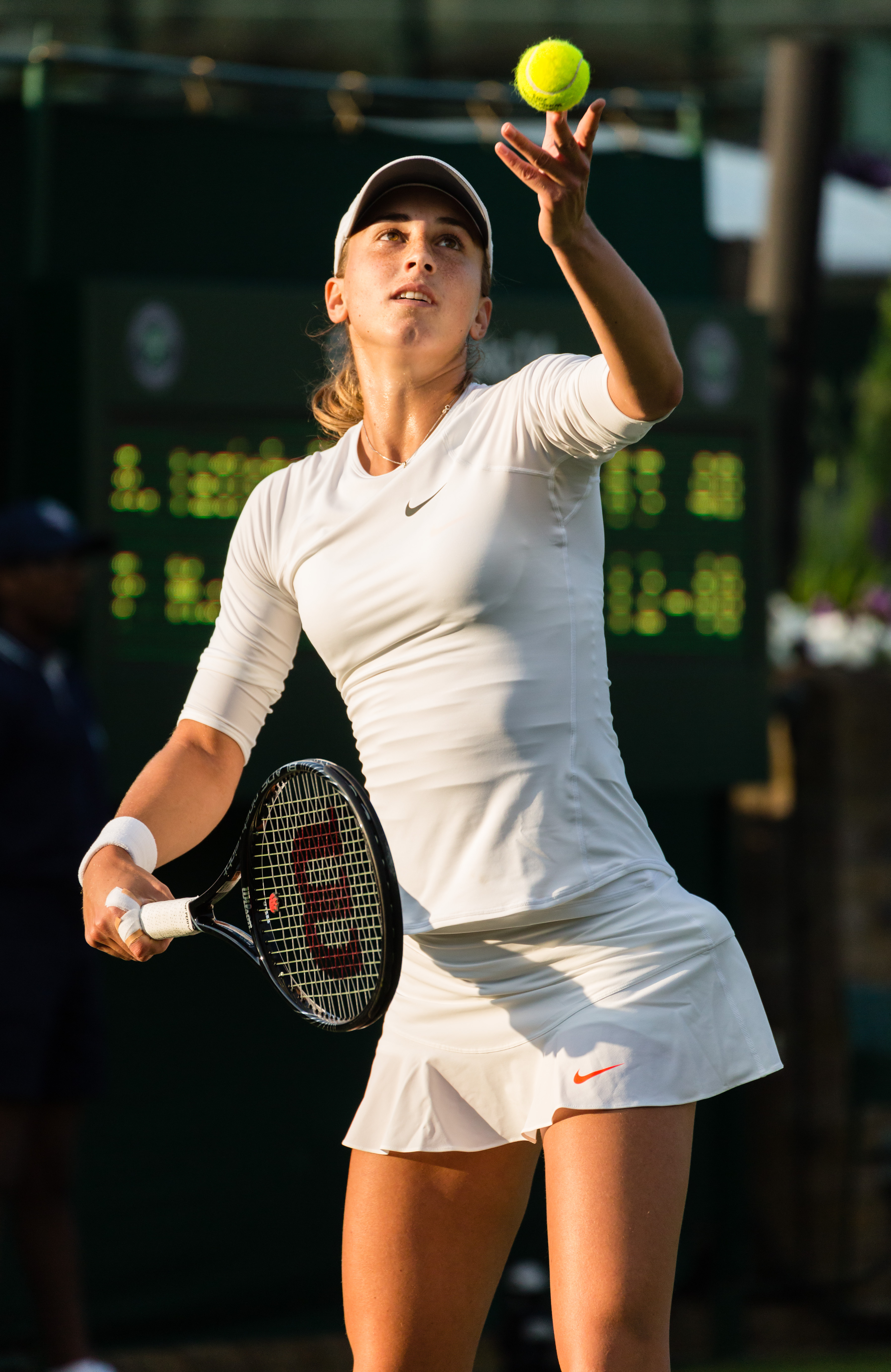
- Reason
- It's a very high resolution (for a portrait) headshot of Petra Martić, a Croatian tennis player taken at the 2013 Wimbledon Championships. It's a natural and candid photo of her taken directly after her first round match. All the important details are in clear focus (you can even see the drops of sweat on her face). There's a little noise on her forehead under the hat but at reasonable viewing distances, this isn't an issue IMO.
- Articles in which this image appears
- Petra Martić
- FP category for this image
- Wikipedia:Featured pictures/People/Sport
- Creator
- User:Diliff
- Support as nominator --Ðiliff «» (Talk) 20:57, 27 June 2013 (UTC)
- Support. I clicked on this to see the full size image and got a screen full of teeth. She needs to work on her flossing technique ;-). Very good. Colin°Talk 22:24, 27 June 2013 (UTC)
- I feel bad for the poor girl, she had no idea she was going to be subjected to the critiques of FPC when she woke up that morning. ;-) Ðiliff «» (Talk) 22:52, 27 June 2013 (UTC)
- Support for the sweat drops and the dental plaque. Sanyambahga (talk) 10:16, 28 June 2013 (UTC)
- Support Tomer T (talk) 16:09, 28 June 2013 (UTC)
- OpposeI find this commentary off putting. I'd be inclined to fix that for her instead of subjecting her to ridicule. Saffron Blaze (talk) 02:09, 29 June 2013 (UTC)
- Let me get a toothbrush. I do kid, support. I imagine if I were to have played a professional tennis match, my oral hygiene would not be in a condition that I'd like Diliff pointing his camera at me, either. Cowtowner (talk) 05:39, 29 June 2013 (UTC)
Discussion about the ethics of digitally removing dental hygiene issues from the photo
|
|---|
|

- Support Fantastic portrait. Great work. Jujutacular (talk) 07:02, 30 June 2013 (UTC)
- Support Nice job, Diliff. – Kerαunoςcopia◁galaxies 19:30, 1 July 2013 (UTC)
Supportas it meets criteria. Great image. On the context of her dental hygiene, I would just point everyone to WP:MUG. The discussion on whether or not this image should be used should be held in her article's talk page. --WingtipvorteX PTT ∅ 23:30, 2 July 2013 (UTC)- I
withdraw my votewhile I think about the edit. --WingtipvorteX PTT ∅ 00:19, 6 July 2013 (UTC)- OK, made up my mind. Oppose original due to shadows on eyes, and Oppose Edit due to aggressive Noise Reduction. I Support the downsampled edit.--WingtipvorteX PTT ∅ 18:14, 6 July 2013 (UTC)
- I
- Oppose Very detailed, but the lighting is poor and could have been easily fixed with fill flash. It is way too dark around the eyes and forehead. JJ Harrison (talk) 01:29, 3 July 2013 (UTC)
- But that's like saying your bird photos aren't detailed enough because you didn't get close enough and had to crop it, so therefore you should have used a bigger lens. ;) This was not a planned, posed portrait - it was taken at a sporting event and flash photography is not allowed. Sometimes you have to deal with the conditions as they are, not as you'd like them to be ideally. I don't think the darkness around the eyes and forehead is a dealbreaker anyway. It's normal for caps to shade the eyes. You can still see the detail and colour of the eyes and there's a subtle transition due to the diffused overcast lighting. Ðiliff «» (Talk) 08:11, 3 July 2013 (UTC)
- A selective shadows adjustment in that area gives good results. --Muhammad(talk) 15:53, 3 July 2013 (UTC)
- Could you show an example? The image already has lifted shadows, hence the noise... Any more and I thought the noise levels were unacceptable but I suppose selective noise reduction could also be applied after lifting further. In any case, I still think the shadows under the cap are not excessive... Ðiliff «» (Talk) 17:30, 3 July 2013 (UTC)
- Sample edit uploaded. Personally though, the shadows are not a problem for me either --Muhammad(talk) 00:00, 4 July 2013 (UTC)
- Could you show an example? The image already has lifted shadows, hence the noise... Any more and I thought the noise levels were unacceptable but I suppose selective noise reduction could also be applied after lifting further. In any case, I still think the shadows under the cap are not excessive... Ðiliff «» (Talk) 17:30, 3 July 2013 (UTC)
- A selective shadows adjustment in that area gives good results. --Muhammad(talk) 15:53, 3 July 2013 (UTC)
- But that's like saying your bird photos aren't detailed enough because you didn't get close enough and had to crop it, so therefore you should have used a bigger lens. ;) This was not a planned, posed portrait - it was taken at a sporting event and flash photography is not allowed. Sometimes you have to deal with the conditions as they are, not as you'd like them to be ideally. I don't think the darkness around the eyes and forehead is a dealbreaker anyway. It's normal for caps to shade the eyes. You can still see the detail and colour of the eyes and there's a subtle transition due to the diffused overcast lighting. Ðiliff «» (Talk) 08:11, 3 July 2013 (UTC)
- Support edit The lighting fix really makes a big difference. upstateNYer 02:17, 4 July 2013 (UTC)
- I agree. The edit itself is drastically reduced in size for sample purposes, but I would support an edit. – Kerαunoςcopia◁galaxies 02:33, 4 July 2013 (UTC)
- I think if the full resolution sample edit image was uploaded, you'd really see just how bad the noise is in the shadows though. It was already at the limit of what I'd call acceptable, but lifting it further just doesn't work IMO. I've done a similar thing to what Muhammad has done and at 100%, the noise is just awful and uncorrectable (it becomes banded and blobby, as most shadows do when approaching the lowest values the sensor could capture). Muhammad has done a good job but he's hidden the noise considerably by downsampling it. So the question is, do we want a portrait with shadow adjustment just barely at the minimum resolution, or do we want the full resolution version with heavier shadows...? I don't think we can have both resolution and lighter shadows, realistically. Ðiliff «» (Talk) 10:50, 4 July 2013 (UTC)
- In this case the down sampling is well justified and the need for the full resolution is debatable. Saffron Blaze (talk) 11:00, 4 July 2013 (UTC)
- I don't see why downsampling is "well justified" unless we're back to the teeth thing again. Thanks Muhammad for uploading the high-rez. I compared the two. While I really like the lightened shadows, I'm not a fan of the amount of noise reduction. Maybe a compromise between the two—less brightness, but less NR. I'll stick with my original vote though. – Kerαunoςcopia◁galaxies 16:49, 4 July 2013 (UTC)
- Down sampled justified if necessary to eliminate the noise. Concur with assessment of too aggressive NR in the full res. Saffron Blaze (talk) 21:29, 4 July 2013 (UTC)
- I don't see why downsampling is "well justified" unless we're back to the teeth thing again. Thanks Muhammad for uploading the high-rez. I compared the two. While I really like the lightened shadows, I'm not a fan of the amount of noise reduction. Maybe a compromise between the two—less brightness, but less NR. I'll stick with my original vote though. – Kerαunoςcopia◁galaxies 16:49, 4 July 2013 (UTC)
- In this case the down sampling is well justified and the need for the full resolution is debatable. Saffron Blaze (talk) 11:00, 4 July 2013 (UTC)
- I think if the full resolution sample edit image was uploaded, you'd really see just how bad the noise is in the shadows though. It was already at the limit of what I'd call acceptable, but lifting it further just doesn't work IMO. I've done a similar thing to what Muhammad has done and at 100%, the noise is just awful and uncorrectable (it becomes banded and blobby, as most shadows do when approaching the lowest values the sensor could capture). Muhammad has done a good job but he's hidden the noise considerably by downsampling it. So the question is, do we want a portrait with shadow adjustment just barely at the minimum resolution, or do we want the full resolution version with heavier shadows...? I don't think we can have both resolution and lighter shadows, realistically. Ðiliff «» (Talk) 10:50, 4 July 2013 (UTC)
- I agree. The edit itself is drastically reduced in size for sample purposes, but I would support an edit. – Kerαunoςcopia◁galaxies 02:33, 4 July 2013 (UTC)
- High res edit uploaded over the old edit. --Muhammad(talk) 13:10, 4 July 2013 (UTC)
- Though at thumbnail size it looks better, the NR is too strong in the edit. I'm torn. Not sure what is more important, if less shadow or higher res... Will think about this. --WingtipvorteX PTT ∅ 00:19, 6 July 2013 (UTC)
- After some thinking, I've decided the downsampled edit is probably the best of what we've seen, and have changed my vote accordingly. --WingtipvorteX PTT ∅ 18:14, 6 July 2013 (UTC)
- Though at thumbnail size it looks better, the NR is too strong in the edit. I'm torn. Not sure what is more important, if less shadow or higher res... Will think about this. --WingtipvorteX PTT ∅ 00:19, 6 July 2013 (UTC)
- Support any version --Muhammad(talk) 19:01, 6 July 2013 (UTC)
- Oppose edit the NR is too strong and the lightening too much and not even -- if you want to simulate the effect of a fill-light, then her neck needs lightened too. Her forehead is just a bit too light now. But also importantly, the colourspace has changed form sRGB to AdobeRGB, which should never be used for JPGs on the internet. If you want to use AdobeRGB, use it for tiffs when sending files to a print lab and nowhere else. It will nearly always produce the wrong colours for people with dumb browsers/tablets and will produce colour banding for everyone else. Colin°Talk 19:22, 6 July 2013 (UTC)
Promoted File:Petra Martic Portrait, Wimbledon 2013 - Diliff.jpg -- — Crisco 1492 (talk) 00:39, 7 July 2013 (UTC)
- Original is the only one with a clear consensus for it; consensus seems to be against the edit. — Crisco 1492 (talk) 00:39, 7 July 2013 (UTC)
Voting period is over. Please don't add any new votes. Voting period ends on 7 Jul 2013 at 07:54:43 (UTC)

- Reason-and some History
- An excellent and encyclopedically valuable image of Emperor Paul I (1754-1801), painted ca. 1800 by Vladimir Lukich Borovikovsky (Владимир Лукич Боровиковский), the principal Russian portrait painter of the turn of the 19th century. The portrait shows Paul I characteristically himself, as he was known for his high enthusiasm for military pageantry and pomp. It also shows him wearing the famous Imperial Crown of Russia, and, even more significantly, shows him wearing the robes of the Grand Master of the Knights Hospitaller, a position he was elected to in October 1789 after Napoleon seized Malta from the knights in June of that same year. His membership was a notable element of his reign. The Priory of St. Petersburg had declared in September 1789 that the former Grand Master had betrayed the Order by selling Malta to Napoleon, and thus decided to elect the Emperor Paul I as their new leader. Thus was born the Russian tradition of the Knights Hospitaller. This image of Paul I also shows him wearing the collar of the Knights Hospitaller and the collar of the Order of St. Andrew, the highest order of chivalry of the Russian Empire and also, after being reinstated, of today's Russia. Paul I strove to make the government meet his ideals of knighthood. Such ideals are reflected in official art, of which, for Paul I, this painting may be the most exceptional representative. He wanted to form the Russian nobles into a sort of loyal chivalric class, an ideal which he almost seems to demonstrate here with his elevated posture and gesturing with the scepter of state. This image is of a good quality, and does an indispensable job of illustrating this interesting ruler and his singular character.
- Articles in which this image appears
- Paul I of Russia, List of Russian rulers, List of rulers of Estonia
- FP category for this image
- Wikipedia:Featured_pictures/People/Royalty
- Creator
- Vladimir Borovikovsky
- Support as nominator --Indefatigable2 (talk) 07:54, 28 June 2013 (UTC)
- Comment - This is below the minimum size requirements (not by much though) — Crisco 1492 (talk) 08:18, 28 June 2013 (UTC)
- Agreed, but it's probably of sufficient quality and sharpness not to be a major factor. Ðiliff «» (Talk) 09:33, 28 June 2013 (UTC)
- What's the size of the painting? — Crisco 1492 (talk) 12:37, 28 June 2013 (UTC)
- The best I can guess is something larger with the proportions of 49x33.8 cms, as Borovikovsky did a similar portrait of Paul I with these dimensions. This portrait is currently at the State Russian Museum in St. Petersburg, I believe, but I cannot find enough information on it. Indefatigable2 (talk) 14:06, 28 June 2013 (UTC)
- Not, in the end, that I think it really matters, as this is definitely the most descriptive and well-executed portrait of this figure that exists, in what is most probably its highest definition and best color balance to be found on the internet. Indefatigable2 (talk) 16:02, 28 June 2013 (UTC)
- It does matter, in the end. The original size of the painting is proportional to the resolution we should expect. Also, merely being the best available on the internet does not automatically equate to being of FP quality. Cowtowner (talk) 18:34, 28 June 2013 (UTC)
- Thank you, Cowturner. Precisely my point. If the original painting is like 10*6 cm, okay this resolution is certainly nice. If the painting is life size? The resolution isn't up to par. — Crisco 1492 (talk) 00:01, 29 June 2013 (UTC)
- You are of course both right, "best on internet" is by no means a criterion for an FP; that would make for many poor FP's. However, in saying "not that I think it really matters," I was echoing Diliff, in that this image's color balance has been made effectively as best as possible and has been improved drastically over its former version; the image is very sharp with no artefacts that I can see, unlike the Horatio Nelson portrait that was just made an FP about a day ago, which, although of a higher resolution than this image, had some noticable digital artefacts when viewed on full size. Even though it is on the small side, I feel this image is sharp enough to pass muster, and is definitely large enough to make out the fine details. Even if the portrait in person were a larger one, I feel it should not be disqualified for this reason; if a better scan comes up in the future, we can, just like the voters on the Horatio Nelson portrait, agree to replace it in the future. But on its own I feel the color balance of the painting and the sharpness of the digital image negates the small deficiency in size. This was my thought. For me, this particular image left a significant impression, as it illustrates its subject in a way that is rare among portraits; it makes it 'fine' and a 'significant' contribution. That was why I felt it had high EV. Indefatigable2 (talk) 02:15, 29 June 2013 (UTC)
- I don't think anyone is doubting that this is a good picture and of high EV. We're concerned about the resolution. My experience with portraits of nobility (say, Napoleon) is that the portraits are generally a little larger than life. If that's true, this resolution (although quite sharp) is on the low side. — Crisco 1492 (talk) 02:28, 29 June 2013 (UTC)
- Good point Crisco. It could be that I'm having a lackluster moment (always a possibility), but I can't find dimensions for this painting... They're just not coming up in any of my searches on the Russian government art databases, so we may have to go by what we have here. In my opinion, I think this image meets the checklist. Consider this: hypothetically, would you prefer a larger image (like the Nelson one you put up) with some artifacts, or one that is smaller with less artifacts (such as this, it seems), the sharpness being the same on both? What would make the more worthwhile image? On another note, consider what user 'Stigmatella aurantiaca' said when voting on Nelson, it is 'good enough and the best for now.' Would you think that that is the case for this one, or do you believe it best to wait it out and see? I for one think we'll be hard pressed to see a scan as good as this anytime soon, and that this deserves an elevated status. Indefatigable2 (talk) 03:04, 29 June 2013 (UTC)
- One of the key differences between the Nelson portrait and this one is that Nelson portrait was 63.5 × 76.2 cm (i.e. nowhere near life size), so even at 1,500 * 2,000 or what have you it would have been reasonably big. As for this painting, I'm probably leaning weak support unless we find that it is quite small. — Crisco 1492 (talk) 03:08, 29 June 2013 (UTC)
- I FOUND IT I finally discovered the dimensions of the portrait, after looking though many pages in the virtual gallery of the Russian Museum. The portrait is housed currently in the Mikhailovsky Palace at the Russian Museum in St. Petersburg. It can be viewed in the virtual gallery hanging on the wall at this web page: http://www.virtualrm.spb.ru/rmtour/zal-12.html Make your decisions. Indefatigable2 (talk) 04:02, 30 June 2013 (UTC)
- I'm getting a 404 error. Could you put the dimensions on the file description page? — Crisco 1492 (talk) 04:04, 30 June 2013 (UTC)
- Alas, there is no concrete data, only a high-res panorama of the room the picture is hanging in. I found this link as well: http://www.saint-petersburg.com/museums/russian-museum/main-collection-mikhailovsky-palace/ ; the Paul I portrait is hanging in the second image down to the left of the doorway. Indefatigable2 (talk) 04:19, 30 June 2013 (UTC)
- Oh yeah, that's either life size or otherwise very close to it. — Crisco 1492 (talk) 04:25, 30 June 2013 (UTC)
- Alas, there is no concrete data, only a high-res panorama of the room the picture is hanging in. I found this link as well: http://www.saint-petersburg.com/museums/russian-museum/main-collection-mikhailovsky-palace/ ; the Paul I portrait is hanging in the second image down to the left of the doorway. Indefatigable2 (talk) 04:19, 30 June 2013 (UTC)
- I'm getting a 404 error. Could you put the dimensions on the file description page? — Crisco 1492 (talk) 04:04, 30 June 2013 (UTC)
- I FOUND IT I finally discovered the dimensions of the portrait, after looking though many pages in the virtual gallery of the Russian Museum. The portrait is housed currently in the Mikhailovsky Palace at the Russian Museum in St. Petersburg. It can be viewed in the virtual gallery hanging on the wall at this web page: http://www.virtualrm.spb.ru/rmtour/zal-12.html Make your decisions. Indefatigable2 (talk) 04:02, 30 June 2013 (UTC)
- One of the key differences between the Nelson portrait and this one is that Nelson portrait was 63.5 × 76.2 cm (i.e. nowhere near life size), so even at 1,500 * 2,000 or what have you it would have been reasonably big. As for this painting, I'm probably leaning weak support unless we find that it is quite small. — Crisco 1492 (talk) 03:08, 29 June 2013 (UTC)
- Good point Crisco. It could be that I'm having a lackluster moment (always a possibility), but I can't find dimensions for this painting... They're just not coming up in any of my searches on the Russian government art databases, so we may have to go by what we have here. In my opinion, I think this image meets the checklist. Consider this: hypothetically, would you prefer a larger image (like the Nelson one you put up) with some artifacts, or one that is smaller with less artifacts (such as this, it seems), the sharpness being the same on both? What would make the more worthwhile image? On another note, consider what user 'Stigmatella aurantiaca' said when voting on Nelson, it is 'good enough and the best for now.' Would you think that that is the case for this one, or do you believe it best to wait it out and see? I for one think we'll be hard pressed to see a scan as good as this anytime soon, and that this deserves an elevated status. Indefatigable2 (talk) 03:04, 29 June 2013 (UTC)
- I don't think anyone is doubting that this is a good picture and of high EV. We're concerned about the resolution. My experience with portraits of nobility (say, Napoleon) is that the portraits are generally a little larger than life. If that's true, this resolution (although quite sharp) is on the low side. — Crisco 1492 (talk) 02:28, 29 June 2013 (UTC)
- You are of course both right, "best on internet" is by no means a criterion for an FP; that would make for many poor FP's. However, in saying "not that I think it really matters," I was echoing Diliff, in that this image's color balance has been made effectively as best as possible and has been improved drastically over its former version; the image is very sharp with no artefacts that I can see, unlike the Horatio Nelson portrait that was just made an FP about a day ago, which, although of a higher resolution than this image, had some noticable digital artefacts when viewed on full size. Even though it is on the small side, I feel this image is sharp enough to pass muster, and is definitely large enough to make out the fine details. Even if the portrait in person were a larger one, I feel it should not be disqualified for this reason; if a better scan comes up in the future, we can, just like the voters on the Horatio Nelson portrait, agree to replace it in the future. But on its own I feel the color balance of the painting and the sharpness of the digital image negates the small deficiency in size. This was my thought. For me, this particular image left a significant impression, as it illustrates its subject in a way that is rare among portraits; it makes it 'fine' and a 'significant' contribution. That was why I felt it had high EV. Indefatigable2 (talk) 02:15, 29 June 2013 (UTC)
- Thank you, Cowturner. Precisely my point. If the original painting is like 10*6 cm, okay this resolution is certainly nice. If the painting is life size? The resolution isn't up to par. — Crisco 1492 (talk) 00:01, 29 June 2013 (UTC)
- It does matter, in the end. The original size of the painting is proportional to the resolution we should expect. Also, merely being the best available on the internet does not automatically equate to being of FP quality. Cowtowner (talk) 18:34, 28 June 2013 (UTC)
- Not, in the end, that I think it really matters, as this is definitely the most descriptive and well-executed portrait of this figure that exists, in what is most probably its highest definition and best color balance to be found on the internet. Indefatigable2 (talk) 16:02, 28 June 2013 (UTC)
- The best I can guess is something larger with the proportions of 49x33.8 cms, as Borovikovsky did a similar portrait of Paul I with these dimensions. This portrait is currently at the State Russian Museum in St. Petersburg, I believe, but I cannot find enough information on it. Indefatigable2 (talk) 14:06, 28 June 2013 (UTC)
- What's the size of the painting? — Crisco 1492 (talk) 12:37, 28 June 2013 (UTC)
- Agreed, but it's probably of sufficient quality and sharpness not to be a major factor. Ðiliff «» (Talk) 09:33, 28 June 2013 (UTC)
- Weak oppose: Good reproduction, beautiful painting. But considering the actual size of the painting (looks to be close to 2m tall) the lack of resolution is just too offputting. — Crisco 1492 (talk) 04:25, 30 June 2013 (UTC)
- Support. Good reproduction. Colour balance and blacks seem accurate. Ðiliff «» (Talk) 09:33, 28 June 2013 (UTC)
- Oppose Basically on the grounds of the resolution (and the supposition of its size as well as the standards of the gallery). It's the best for now and valuable, but not good enough. Cowtowner (talk) 05:37, 29 June 2013 (UTC)
- Oppose per above discussion on resolution. – Kerαunoςcopia◁galaxies 19:25, 1 July 2013 (UTC)
- Oppose per Cowtowner and Keraunoscopia--WingtipvorteX PTT ∅ 23:25, 2 July 2013 (UTC)
Not Promoted --Armbrust The Homunculus 08:00, 7 July 2013 (UTC)
Voting period is over. Please don't add any new votes. Voting period ends on 7 Jul 2013 at 10:59:44 (UTC)

- Reason
- Great photo, high quality and showing the whole body of the cat. Probably better than the current FP of European wildcat.
- Articles in which this image appears
- European wildcat
- FP category for this image
- Wikipedia:Featured pictures/Animals/Mammals
- Creator
- Lviatour
- Support as nominator --Tomer T (talk) 10:59, 28 June 2013 (UTC)
- Support But I notice the two cats are of different color phases. Perhaps they both could be FP's, with yours as the main one? They could have distinct EV's; the other is from Hanover, and yours, it seems, is from the great Kingdom of Belgium. The article talks about distinct subspecies; perhaps this comes into play? If so, it should be included and emphasized. If I had to choose, it would be yours, as even though the focus isn't perfect it is more informative. Indefatigable2 (talk) 15:21, 28 June 2013 (UTC)
- Just a note, because you refered the currently discussed picture as "mine": I'm not the photographer of any of them (but I'm the nominator of both of them). Tomer T (talk) 16:07, 28 June 2013 (UTC)
- Support, almost entirely in focus, high EV. Brandmeistertalk 17:05, 28 June 2013 (UTC)
- Brandmeister's right; I rescind what I said above about the focus, which is great (I should have said digital artifacts, which are mildly present, but make no real difference here); I reiterate, this image has a higher EV than the current wildcat FP; I love it; I would feel comfortable with this replacing the older image as a FP, as it would be an improvement. Indefatigable2 (talk) 02:30, 29 June 2013 (UTC)
- Support—BNK(talk) 09:27, 29 June 2013 (UTC)
- Support. Good lighting and detail. Framing not perfect but good enough. Ðiliff «» (Talk) 09:21, 1 July 2013 (UTC)
- Support I like this picture. Even though the description isn't difficult to figure out for non-French-speaking people, I wouldn't mind if someone added an English description if it's going to be featured in English. – Kerαunoςcopia◁galaxies 19:21, 1 July 2013 (UTC)
- Support --WingtipvorteX PTT ∅ 23:23, 2 July 2013 (UTC)
- Support - Meow meow meooow meow, meow meow. Meow meow meow. Cacophony (talk) 09:02, 7 July 2013 (UTC)
Promoted File:Felis silvestris silvestris Luc Viatour.jpg --Armbrust The Homunculus 11:06, 7 July 2013 (UTC)
Voting period is over. Please don't add any new votes. Voting period ends on 8 Jul 2013 at 16:27:58 (UTC)

- Reason
- Good quality and high EV
- Articles in which this image appears
- Chat Flycatcher
- FP category for this image
- Wikipedia:Featured pictures/Animals/Birds
- Creator
- Yathin sk
- Support as nominator --BNK(talk) 16:27, 29 June 2013 (UTC)
- Support --Arctic Kangaroo (✉ • ✎) 15:33, 1 July 2013 (UTC)
- Support bird. – Kerαunoςcopia◁galaxies 19:14, 1 July 2013 (UTC)
- Support nice photo. extra999 (talk) 11:12, 3 July 2013 (UTC)
- Sharpness could be better in the tail, and I wouldn't mind more resolution, but for small, active birds, this is ample. Support. Adam Cuerden (talk) 01:01, 7 July 2013 (UTC)
Promoted File:Bradornis infuscatus.jpg --Armbrust The Homunculus 16:28, 8 July 2013 (UTC)
Voting period is over. Please don't add any new votes. Voting period ends on 9 Jul 2013 at 13:51:33 (UTC)


- Reason
- Excellent picture, with high EV
- Articles in which this image appears
- Wolfsburg
- FP category for this image
- Wikipedia:Featured pictures/Places/Architecture
- Creator
- Richard Bartz
- Support as nominator --ELEKHHT 13:51, 30 June 2013 (UTC)
- Support. Seems good to me.— BNK(talk) 01:49, 1 July 2013 (UTC)
- Comment. Colour balance seems way off, far too warm. But should be easily fixed. Ðiliff «» (Talk) 08:32, 1 July 2013 (UTC)
- I've been there and the image does not strike me as unnaturally warm, although in cloudy weather the building appears much darker. --ELEKHHT 12:50, 1 July 2013 (UTC)
- I'm not saying the building looks off-colour (it's already warm coloured so it's much harder to judge), it's the rest of the scene that is warm tinted. Look at any of the whites in the scene, they're all skewed towards the red. I'm loathe to upload over the top of it as it's already featured elsewhere, but I think a colour correction would help. I don't know whether uploading an edit is the answer either though. Ðiliff «» (Talk) 13:11, 1 July 2013 (UTC)
- Whites appear white on my screen but you're more than welcome to upload and nominate a corrected version under an Alt name. --ELEKHHT 13:15, 1 July 2013 (UTC)
- Done. I used the white of the VW logo on the side of the building as the guide for the WB correction as some of the other whites may have been a bit creamy or off-white to begin with. Ðiliff «» (Talk) 14:07, 1 July 2013 (UTC)
- Many thanks, I can see the difference now. --ELEKHHT 23:26, 2 July 2013 (UTC)
- Done. I used the white of the VW logo on the side of the building as the guide for the WB correction as some of the other whites may have been a bit creamy or off-white to begin with. Ðiliff «» (Talk) 14:07, 1 July 2013 (UTC)
- Whites appear white on my screen but you're more than welcome to upload and nominate a corrected version under an Alt name. --ELEKHHT 13:15, 1 July 2013 (UTC)
- I'm not saying the building looks off-colour (it's already warm coloured so it's much harder to judge), it's the rest of the scene that is warm tinted. Look at any of the whites in the scene, they're all skewed towards the red. I'm loathe to upload over the top of it as it's already featured elsewhere, but I think a colour correction would help. I don't know whether uploading an edit is the answer either though. Ðiliff «» (Talk) 13:11, 1 July 2013 (UTC)
- I've been there and the image does not strike me as unnaturally warm, although in cloudy weather the building appears much darker. --ELEKHHT 12:50, 1 July 2013 (UTC)
- Oppose - There is scaffolding visible on the façade between the towers from a possible ongoing restoration work. Sanyambahga (talk) 09:58, 1 July 2013 (UTC)
- Scaffolding is normal, hardly distracting on a factory. In this case it obscures 0.1% or so of the image. I don't see how that's an argument enough to oppose....--ELEKHHT 12:50, 1 July 2013 (UTC)
OpposeThis image and the article don't really mesh. The article is about Wolfsburg. The article makes it note that the VW factory is the most notable part of the city. But the VW factory isn't the city. At the same time, the image shows only the factory's power station, not the factory. It's also a wide photograph of a square subject, therefore I have to also mention that I think the crop on the right is poor. The image should be on an article about the VW plant... or it should show the city. Not just a part of the factory which is a part of the city. Does this make sense? I also find it a touch contrasty, but that's a personal thing (I find a lot of FPs to be too contrasty). – Kerαunoςcopia◁galaxies 20:19, 1 July 2013 (UTC)
- Comment: Images of local landmarks, particularly those discussed in depth in a city/village article, still have EV. Compare the Church of St John the Baptise at Harescombe. — Crisco 1492 (talk) 23:55, 1 July 2013 (UTC)
- At first, I was going to argue that Harescombe has a section devoted to the church, whereas Wolfsburg merely mentions the VW factory almost in passing a couple of times, but then I looked at the article more closely and it's obvious "Volkswagen" plays a major role in the city—something I should've checked first instead of skimming the topmost part of the article. So I'll change my vote to Support Edit 1. Thanks for bringing to my attention. – Kerαunoςcopia◁galaxies 00:21, 2 July 2013 (UTC)
- Support Edit 1 --WingtipvorteX PTT ∅ 23:21, 2 July 2013 (UTC)
Not Promoted --Armbrust The Homunculus 13:56, 9 July 2013 (UTC)
- Not enough support for promotion. Armbrust The Homunculus 13:56, 9 July 2013 (UTC)
Voting period is over. Please don't add any new votes. Voting period ends on 9 Jul 2013 at 17:07:36 (UTC)


- Reason
- Has lots of pixels and the man is handsome. If you read the Flickr page, there is a very interesting effort by the IWM to release photos and get the public to research the histories of some of the men from WWI. This guy is not just some person in people's families, but a fellow that we have a Wiki article on. And his one book that I have read (Wind in the Sahara) is very cool: imagine Richard Halliburton crossed with T. E. Lawrence.
- Articles in which this image appears
- R. V. C. Bodley
- FP category for this image
- Wikipedia:Featured pictures/People/Military
- Creator
- unknown, placed on flickr by IWM, uploaded to Wiki by TCO.
- Support as nominator --TCO (talk) 17:07, 30 June 2013 (UTC)
- Support handsomeness :) Could be cleaned up, but this is a nice find as-is. – Kerαunoςcopia◁galaxies 20:30, 1 July 2013 (UTC)
- I was figuring on suckering one of you bitchez (tm Russavia), err...I mean fine upstanding graphic artists, to do the image improvement for me. ;) TCO (talk) 22:05, 1 July 2013 (UTC)
- Support Nev1 (talk) 18:35, 2 July 2013 (UTC)
- I'm going to
Opposeon the grounds that is is not the best WP has to offer, as it could be greatly improved with some restoration done to it. I agree it is a great image though, and would really like to see it become featured. --WingtipvorteX PTT ∅ 23:20, 2 July 2013 (UTC)- Support Alt 1. Looks good Adam, thanks! --WingtipvorteX PTT ∅ 23:37, 6 July 2013 (UTC)
- Alt 1 uploaded. Support alt. Adam Cuerden (talk) 22:46, 6 July 2013 (UTC)
Thanks Adam, he looks even prettier now.TCO (talk) 22:56, 6 July 2013 (UTC)
Promoted File:R. V. C. Bodley restoration.jpg --Armbrust The Homunculus 17:08, 9 July 2013 (UTC)
Voting period is over. Please don't add any new votes. Voting period ends on 9 Jul 2013 at 17:19:58 (UTC)

- Reason
- One of best executed portraits in all of history, painted by the great Titian in 1548, of Charles V, Holy Roman Emperor, King of Spain; perfect color balance, very high resolution (it is available in a set of scanned tiles), very high encyclopedic value, without doubt this should be a featured picture.
- Articles in which this image appears
Charles V, Holy Roman Emperor, Equestrian Portrait of Charles V, Titian, Battle of Mühlberg, Habsburg Spain, List of works by Titian, Pedro Muñoz, Schmalkaldic War
- FP category for this image
- People-Royalty
- Creator
- Titian
- Support as nominator --Indefatigable2 (talk) 17:19, 30 June 2013 (UTC)
- Yes by Carlos, I think you've got it. A little dark (common for Google's scans) but look at the resolution! The cracks are all visible. To repeat an old joke, I think I see some bacteria! — Crisco 1492 (talk) 15:25, 1 July 2013 (UTC)
- Yes = Support, btw. — Crisco 1492 (talk) 14:32, 8 July 2013 (UTC)
- Support Not my favorite portrait of the man, and I agree, it's dark, but it seems the man liked his dark portraits (and dark armor). – Kerαunoςcopia◁galaxies 20:37, 1 July 2013 (UTC)
- Support I reviewed this at 3,000px × 3,560px (a hundredth of the full size, but well over our requirements) due to computer issues: That is a processor-killer of an image. It looks great, so I feel comfortable supporting. . Adam Cuerden (talk) 13:43, 8 July 2013 (UTC)
Not Promoted --Armbrust The Homunculus 17:21, 9 July 2013 (UTC)
- Not enough support for promotion. Armbrust The Homunculus 17:21, 9 July 2013 (UTC)
Voting period is over. Please don't add any new votes. Voting period ends on 10 Jul 2013 at 09:59:58 (UTC)


- Reason
- High quality and high EV
- Articles in which this image appears
- Buland Darwaza, Fatehpur Sikri, Architecture of Uttar Pradesh, Tourism in Uttar Pradesh, List of World Heritage Sites in India
- FP category for this image
- Wikipedia:Featured pictures/Places/Architecture
- Creator
- Sfu
- Support as nominator --Tomer T (talk) 09:59, 1 July 2013 (UTC)
- Comment - The colour balance seems a bit too warm. Sanyambahga (talk) 10:06, 1 July 2013 (UTC)
- Second that. It is very noticeable. --WingtipvorteX PTT ∅ 23:15, 2 July 2013 (UTC)
- Added an alt. Tomer T (talk) 06:46, 3 July 2013 (UTC)
- Second that. It is very noticeable. --WingtipvorteX PTT ∅ 23:15, 2 July 2013 (UTC)
- Weak Support Looks good to me, though not quite sharp. — BNK(talk) 13:34, 1 July 2013 (UTC)
- Comment I'm not keen on the composition. It's unfortunate that the foreground chops off the bottom of the building so awkwardly. 86.146.104.35 (talk) 11:28, 8 July 2013 (UTC)
Not Promoted --Armbrust The Homunculus 12:23, 10 July 2013 (UTC)
Voting period is over. Please don't add any new votes. Voting period ends on 10 Jul 2013 at 10:34:49 (UTC)

- Reason
- Has high EV, visually appealing, and every other criteria. Only the shorter length, is below 1500 meters, however, given the quality and uniqueness of the photo, I feel we can ignore it.
- Articles in which this image appears
- Stamen
- FP category for this image
- Wikipedia:Featured pictures/Plants/Others
- Creator
- Aka
- Support as nominator --extra999 (talk) 10:34, 1 July 2013 (UTC)
- Oppose due to low resolution and blown highlights in the red and green channels. This is an extremely common subject that can easily be re-photographed, I may even already have a similar image which does not have these issues... - Zephyris Talk 11:45, 1 July 2013 (UTC)
- Oppose This isn't good enough. For such a very common and important subject, the photograph should be perfect in nearly every way. Indefatigable2 (talk) 17:53, 1 July 2013 (UTC)
- Oppose It isn't that strong technically and is small. The image forms a nice enough abstract but the EV is lowered because if you weren't familiar with stamen or read the caption, you wouldn't know what it was. We have loads of flower pictures. Colin°Talk 19:23, 1 July 2013 (UTC)
- Oppose per above. --WingtipvorteX PTT ∅ 23:13, 2 July 2013 (UTC)
Not Promoted --Armbrust The Homunculus 12:27, 10 July 2013 (UTC)
Voting period is over. Please don't add any new votes. Voting period ends on 10 Jul 2013 at 12:22:33 (UTC)
.jpg)
- Reason
- Highly significant document, high resolution, quality scan, well-used
- Articles in which this image appears
- Alaska Purchase, History of Alaska, Russian America, 1867
- FP category for this image
- Wikipedia:Featured pictures/History/USA History
- Creator
- Signed by Edouard de Stoeckl and William H. Seward (if I'm not mistaken), scan by US Government
- Support as nominator -- — Crisco 1492 (talk) 12:22, 1 July 2013 (UTC)
- The Strongest Support --g. balaxaZe ႫႨႼႤႰႠ 12:39, 1 July 2013 (UTC)
- Support Tomer T (talk) 14:56, 1 July 2013 (UTC)
- Support Nice scan of an important document in U.S. history. Indefatigable2 (talk) 16:02, 1 July 2013 (UTC)
- question Why is it trapezoid?Geni (talk) 19:34, 1 July 2013 (UTC)
- Weak support Nice. Sort of had the same thought as Geni, but I'm not sure what the circumstances are. Unrelated to my vote, wouldn't mind if redlinks in description would be corrected (not exactly sure they're needed either). – Kerαunoςcopia◁galaxies 20:27, 1 July 2013 (UTC)
- I feel the 'trapezoid' impression may be due to some natural curling of the document. Indefatigable2 (talk) 20:30, 1 July 2013 (UTC)
- That was my impression as well. — Crisco 1492 (talk) 23:40, 1 July 2013 (UTC)
- BTW: Links removed. — Crisco 1492 (talk) 23:58, 1 July 2013 (UTC)
- Trapezoidal is generally due to either A. uneven shrinkage as paper dries out or B. not lying flat, since noone will press a one-of-a-kind ancient document down just to make it flatter. Adam Cuerden (talk) 02:19, 2 July 2013 (UTC)
- I feel the 'trapezoid' impression may be due to some natural curling of the document. Indefatigable2 (talk) 20:30, 1 July 2013 (UTC)
- Comment Is the back side of the document available? Brandmeistertalk 10:02, 2 July 2013 (UTC)
- Not in the sources I've seen (I went to the Archive's website [what a mess] and didn't find anything either) — Crisco 1492 (talk) 10:22, 2 July 2013 (UTC)
- Support Good scan of historical document. --WingtipvorteX PTT ∅ 23:12, 2 July 2013 (UTC)
Promoted File:Alaska Purchase (hi-res).jpg --Armbrust The Homunculus 12:42, 10 July 2013 (UTC)
Voting period is over. Please don't add any new votes. Voting period ends on 10 Jul 2013 at 15:15:36 (UTC)

- Reason
- It's a quality action photo of Japanese tennis player Kei Nishikori at Wimbledon. All important details of the player are in focus. Also, please, any issues or complaints relating to Kei Nishikori's teeth should be directed to his dentist! ;-)
- Articles in which this image appears
- Kei Nishikori
- FP category for this image
- Wikipedia:Featured pictures/People/Sport
- Creator
- User:Diliff
- Support as nominator --Ðiliff «» (Talk) 15:15, 1 July 2013 (UTC)
- Support on condition you update his retro hairstyle. But seriously, fine photograph. I would've preferred the racket to be separate from his body, but I'm not going to complain. I only got to watch Bobby Reynolds vs. No Joke Djokovich over the weekend. – Kerαunoςcopia◁galaxies 20:24, 1 July 2013 (UTC)
- Support I think that's a fantastic photo, and I'm pleased to see that you uploaded a lot more of them to Commons. I don't suppose you have a zoom lens and a burning desire to watch cricket? Our articles on cricketers would really benefit from some action shots like this. Nev1 (talk) 20:51, 1 July 2013 (UTC)
- And we don't have any featured pictures of cricketers. We just have one old diagram. — Crisco 1492 (talk) 23:52, 1 July 2013 (UTC)
- I'm happy to do more sports photography, but cricket is another game entirely. The fields are often very large and all the action happens in the middle, a long way from the boundaries. The lens I used at Wimbledon is a 70-300mm lens - the perfect range for the intimate outside courts, but the sort of lens you need for cricket is something like this. Very large (almost 50cm long), very heavy (4kg) and very expensive (£10,000 / $15,000)! Ðiliff «» (Talk) 09:13, 2 July 2013 (UTC)
- I went to a test match between India and England with my gear but was stopped at the security check and told to leave the stadium or leave my camera :( --Muhammad(talk) 09:24, 3 July 2013 (UTC)
- Every sporting venue and/or organisational group seems to have different rules on what you can bring. I looked up what Cricket Australia's rules are and apparently anything longer than 200mm is not allowed. Wimbledon's is pretty camera-friendly, I think it's anything that you can fit into a bag (but the bag limits were more strict than an airline's carry on policy)... It's a shame that events feel so threatened by amateur photographers. I've often wondered what the reasoning behind it is... They obviously let news organisations' photographers in with whatever gear they want, but I assume there is some arrangement where they pay for 'press access'. What that arrangement is or how much it costs, I'm not sure. I looked at some of the professional photography from Wimbledon and I don't think my photos were significantly worse than the pros. They had a slightly more suitable lenses (300-400mm f/2.8) though which help to get closer and separate the background, and a camera with faster shooting speeds, but the results weren't much different. Ðiliff «» (Talk) 11:06, 4 July 2013 (UTC)
- I went to a test match between India and England with my gear but was stopped at the security check and told to leave the stadium or leave my camera :( --Muhammad(talk) 09:24, 3 July 2013 (UTC)
- I'm happy to do more sports photography, but cricket is another game entirely. The fields are often very large and all the action happens in the middle, a long way from the boundaries. The lens I used at Wimbledon is a 70-300mm lens - the perfect range for the intimate outside courts, but the sort of lens you need for cricket is something like this. Very large (almost 50cm long), very heavy (4kg) and very expensive (£10,000 / $15,000)! Ðiliff «» (Talk) 09:13, 2 July 2013 (UTC)
- Support Saffron Blaze (talk) 22:59, 1 July 2013 (UTC)
- Strong Support It is always great to have photos of players in action.– BNK(talk) 01:45, 2 July 2013 (UTC)
- Support Laitche (talk) 15:59, 2 July 2013 (UTC)
- Support, excellent action shot, used appropriately in the article. J Milburn (talk) 18:50, 2 July 2013 (UTC)
- Support --WingtipvorteX PTT ∅ 23:11, 2 July 2013 (UTC)
Promoted File:Kei Nishikori 1, Wimbledon 2013 - Diliff.jpg --Armbrust The Homunculus 15:33, 10 July 2013 (UTC)
Voting period is over. Please don't add any new votes. Voting period ends on 10 Jul 2013 at 19:07:35 (UTC)
.jpg)
- Reason
- High resolution portrait photograph of English model Katie Green.
- Articles in which this image appears
- Katie Green +1 other
- FP category for this image
- Wikipedia:Featured pictures/People/Others (or /Entertainment?)
- Creator
- NGUYEN DINH Quoc-Huy, photography; Keraunoscopia, derivative
- Support as nominator --– Kerαunoςcopia◁galaxies 19:07, 1 July 2013 (UTC)
- Support I thought this might be an overly flattering image. It wasn't, despite being a bit dated. Saffron Blaze (talk) 23:00, 1 July 2013 (UTC)
- Comment. To really illustrate the caption would be good to have a picture that shows her figure. Also, if that is her noteworthy feature...TCO (talk) 23:21, 1 July 2013 (UTC)
- She's also notable for her height. Should I add a scale to the image? :) I'd see your point if it were illustrating an article on large-size models, but my experience is that full-length portraits aren't usual for lead images. This is what she looks like; the article expounds on how others wish her to appear. There is another image on the article, a little lower, that shows more of her body, but it's still difficult to really see that she's "larger" without her standing next to a size zero model, imo. – Kerαunoςcopia◁galaxies 03:10, 2 July 2013 (UTC)
- Then it's poorly captioned (which technically is a criteria...go look). Better to just say "Kate Green". And yes, if the caption mentioned how tall she was and showed a head shot, it would also be poor information design. It's not rocket science. Basic concept.— Preceding unsigned comment added by TCO (talk • contribs) 13:11, 2 July 2013
- Ah, thanks, I'm still learning here. I saw on the Gaddafi nom that the caption should be more neutral for the main page so then I started wondering if captions here are used on the main page. I didn't realize that, I was just throwing out information. The template says "for context" but I didn't know how far that carried. Updated caption to be standard-fare stuff. – Kerαunoςcopia◁galaxies 19:17, 2 July 2013 (UTC)
- Then it's poorly captioned (which technically is a criteria...go look). Better to just say "Kate Green". And yes, if the caption mentioned how tall she was and showed a head shot, it would also be poor information design. It's not rocket science. Basic concept.— Preceding unsigned comment added by TCO (talk • contribs) 13:11, 2 July 2013
- She's also notable for her height. Should I add a scale to the image? :) I'd see your point if it were illustrating an article on large-size models, but my experience is that full-length portraits aren't usual for lead images. This is what she looks like; the article expounds on how others wish her to appear. There is another image on the article, a little lower, that shows more of her body, but it's still difficult to really see that she's "larger" without her standing next to a size zero model, imo. – Kerαunoςcopia◁galaxies 03:10, 2 July 2013 (UTC)
- Support Looks good. Brandmeistertalk 09:56, 2 July 2013 (UTC)
- Support. I tweaked the caption, just a bit more, because I was honestly curious if it was a wedding pic. (Seems she is still on the market...purely editorial interest of course...)— Preceding unsigned comment added by TCO (talk • contribs) 13:14, 3 July 2013
- Support. A model modelling- a nice dynamic portrait, as you'd expect from a professional photographer with a professional model! I agree with Keraunoscopia about a full-body shot- I think demanding we see the body of a model because we need to see how thin she is(n't) is patronising, even offensive. J Milburn (talk) 13:20, 3 July 2013 (UTC)
Promoted File:Katie Green, Nikon Solutions Expo, 2008 (crop).jpg --Armbrust The Homunculus 19:11, 10 July 2013 (UTC)
Voting period is over. Please don't add any new votes. Voting period ends on 10 Jul 2013 at 20:19:22 (UTC)

- Reason
- High Resolution image, good colors, several applications
- Articles in which this image appears
- Ceramic, Dome of the Rock, Tile, Turquoise
- FP category for this image
- Artwork-Others
- Creator
- Godot13
- Support as nominator --Indefatigable2 (talk) 20:19, 1 July 2013 (UTC)
- Support Godot13 does good work. – Kerαunoςcopia◁galaxies 20:40, 1 July 2013 (UTC)
- Support Saffron Blaze (talk) 22:54, 1 July 2013 (UTC)
- Support Tomer T (talk) 06:44, 2 July 2013 (UTC)
- Support --WingtipvorteX PTT ∅ 23:09, 2 July 2013 (UTC)
- Support - Sanyambahga (talk) 13:07, 8 July 2013 (UTC)
- Support M7S6M (talk) 13:44, 8 July 2013 (UTC)
Promoted File:Palestine-2013-Jerusalem-Temple Mount-Dome of the Rock-Detail 01.jpg --Armbrust The Homunculus 20:28, 10 July 2013 (UTC)
Voting period is over. Please don't add any new votes. Voting period ends on 11 Jul 2013 at 00:30:59 (UTC)
- Reason
- The last nomination was withdrawn due to a scanning error being discovered. Luckily, the error was of a type that I know how to fix invisibly with no loss of data: the flaw is a repeated section, so, presuming the original crop is good, you can just delete the repeat and have a perfect image.
Some JPEG artefacting is noticeable at 400% zoom, but that's normal. It's a good scan overall.
- Articles in which this image appears
- Cardinal Richelieu, Cardinal (Catholicism), Crown-cardinal, Luxembourg Palace, Protestant Reformation, Philippe de Champaigne, Académie française, Collection of the National Gallery, London, Portal:Biography/Selected anniversaries/September 9
- FP category for this image
- Wikipedia:Featured_pictures/People/Religious figures
- Creator
- Philippe de Champaigne
- Support as nominator --Adam Cuerden (talk) 00:30, 2 July 2013 (UTC)
- Support Again As the previous nominator, I renew my support for this very illustrative, very handsome painting, in this (now) excellent scan. Good show, Adam Cuerden. Indefatigable2 (talk) 01:56, 2 July 2013 (UTC)
- Glad I could help! Sometimes, you just need the knowledge of how to fix it. Adam Cuerden (talk) 01:59, 2 July 2013 (UTC)
- Support Looks gorgeous (and fine) to me. One of my favorite paintings of this man is Richelieu au Siège de La Rochelle (Siege of La Rochelle) but nothing that would hold up to FP standards, I don't think (can't see his face). I only know the man through Dumas, but he scares me anyway. – Kerαunoςcopia◁galaxies 03:19, 2 July 2013 (UTC)
- It was mentioned in the previous nomination that he has a pinhead/voluminous robes. I could be wrong but I believe he would have been standing on a stool or ottoman or something to enhance his height and therefore intimidation factor, am I right? The portrait does its job well. – Kerαunoςcopia◁galaxies 03:21, 2 July 2013 (UTC)
- No, it seems, alas; you can see His Eminence's shoe peeping out from under his robes... Indefatigable2 (talk) 03:42, 2 July 2013 (UTC)
- Wild, it's like an optical illusion. I can picture him as a tiny man on a stool or a normal sized man; all thanks to the robes. I couldn't find any height information in the article. That's a dark(ly positioned) shoe, I never saw it :) – Kerαunoςcopia◁galaxies 03:51, 2 July 2013 (UTC)
- Dumas' treatment of Richelieu does not really fall in line with the real man (in several ways). He is portrayed as extremely powerful in fiction, whereas in real life (where he was only highly powerful), he indeed depended on the king for his position, as this: Day of the Dupes, may illustrate. I admittedly know relatively little of the Cardinal myself, but Richelieu could be quite ruthless, and was, as a matter of practice. To be referred to as the "father of the modern nation-state, modern centralised power [and] the modern secret service," as Canadian historian and philosopher John Ralston Saul did, he had to be quite ruthless... Indefatigable2 (talk) 03:58, 2 July 2013 (UTC)
- Wild, it's like an optical illusion. I can picture him as a tiny man on a stool or a normal sized man; all thanks to the robes. I couldn't find any height information in the article. That's a dark(ly positioned) shoe, I never saw it :) – Kerαunoςcopia◁galaxies 03:51, 2 July 2013 (UTC)
- No, it seems, alas; you can see His Eminence's shoe peeping out from under his robes... Indefatigable2 (talk) 03:42, 2 July 2013 (UTC)
- It was mentioned in the previous nomination that he has a pinhead/voluminous robes. I could be wrong but I believe he would have been standing on a stool or ottoman or something to enhance his height and therefore intimidation factor, am I right? The portrait does its job well. – Kerαunoςcopia◁galaxies 03:21, 2 July 2013 (UTC)
- Question Actually is there another glitch at the very bottom? What's the dark line going across the floor? The transition doesn't seem smooth... – Kerαunoςcopia◁galaxies 03:29, 2 July 2013 (UTC)
- No, that dark band is present in the painting itself. The line isn't completely horizontal; if you follow it to the left, you will see it is a border design in the carpet. Indefatigable2 (talk) 03:40, 2 July 2013 (UTC)
- Ah ok, thanks. – Kerαunoςcopia◁galaxies 03:51, 2 July 2013 (UTC)
- No, that dark band is present in the painting itself. The line isn't completely horizontal; if you follow it to the left, you will see it is a border design in the carpet. Indefatigable2 (talk) 03:40, 2 July 2013 (UTC)
- Support - Very good painting, although one wonders the symbolism of him holding his hat like that... — Crisco 1492 (talk) 04:00, 2 July 2013 (UTC)
- The hat is a Biretta, a traditional cap worn as part of the vestments of Catholic clergy. I feel here Richelieu is simply displaying it with outstretched arm as a mark of his office, similar to the way his red robes are portrayed as shimmering and dynamic. Indefatigable2 (talk) 04:06, 2 July 2013 (UTC)
- Except he holds it at a distance, as if it is something distasteful to him. Off topic, of course. — Crisco 1492 (talk) 04:11, 2 July 2013 (UTC)
- Is he holding it "over" the land (in the background)? – Kerαunoςcopia◁galaxies 04:28, 2 July 2013 (UTC)
- Other portraits can be seen of him wearing it. Such as this: http://1.bp.blogspot.com/_NDKeSTF6cDA/TNoO-DDFJ0I/AAAAAAAAABY/9nKSpOlggfM/s1600/cardinal5.jpg However, in this one, the emphasis is definitely made on his holding out the cap. He is holding it out into the light (his robe is gently highlighted as well), and he is wearing his Zucchetto at the same time, so his head is not uncovered. Cardinals, specifically, wear scarlet Zucchettos, scarlet Birettas, and scarlet robes, so here Richelieu is consciously proffering to the viewer all of his marks of office as a Cardinal. As you can see, he is holding his robes as he holds his cap. Indefatigable2 (talk) 04:43, 2 July 2013 (UTC)
- I figured if we're diving into the realm of OR that maybe there was a crafty "reason" for the window being conveniently behind his Biretta. The contre-jour is certainly not silhouetting it. He's well lit by the (I assume) setting sun, and so is "his domain" :) – Kerαunoςcopia◁galaxies 05:07, 2 July 2013 (UTC)
- Other portraits can be seen of him wearing it. Such as this: http://1.bp.blogspot.com/_NDKeSTF6cDA/TNoO-DDFJ0I/AAAAAAAAABY/9nKSpOlggfM/s1600/cardinal5.jpg However, in this one, the emphasis is definitely made on his holding out the cap. He is holding it out into the light (his robe is gently highlighted as well), and he is wearing his Zucchetto at the same time, so his head is not uncovered. Cardinals, specifically, wear scarlet Zucchettos, scarlet Birettas, and scarlet robes, so here Richelieu is consciously proffering to the viewer all of his marks of office as a Cardinal. As you can see, he is holding his robes as he holds his cap. Indefatigable2 (talk) 04:43, 2 July 2013 (UTC)
- Is he holding it "over" the land (in the background)? – Kerαunoςcopia◁galaxies 04:28, 2 July 2013 (UTC)
- Except he holds it at a distance, as if it is something distasteful to him. Off topic, of course. — Crisco 1492 (talk) 04:11, 2 July 2013 (UTC)
- The hat is a Biretta, a traditional cap worn as part of the vestments of Catholic clergy. I feel here Richelieu is simply displaying it with outstretched arm as a mark of his office, similar to the way his red robes are portrayed as shimmering and dynamic. Indefatigable2 (talk) 04:06, 2 July 2013 (UTC)
- Support. Looks good! — Statυs (talk, contribs) 04:56, 2 July 2013 (UTC)
- Support Great painting! --WingtipvorteX PTT ∅ 23:07, 2 July 2013 (UTC)
- Support — nice picture.--g. balaxaZeႫ 09:52, 4 July 2013 (UTC)
Promoted File:Cardinal de Richelieu.jpg --Armbrust The Homunculus 03:55, 11 July 2013 (UTC)
Voting period is over. Please don't add any new votes. Voting period ends on 11 Jul 2013 at 05:19:16 (UTC)

- Reason
- The official NASA crew photograph. All three men of the Apollo 11 crew in the highest quality of studio photographs.
- Articles in which this image appears
- Apollo 11, Apollo Program
- FP category for this image
- Wikipedia:Featured_pictures/People/Science and Engineering
- Creator
- NASA
- Support as nominator --Indefatigable2 (talk) 05:19, 2 July 2013 (UTC)
- Support, but, to channel TCO a little, it's a shame it's so small in the infobox. J Milburn (talk) 18:39, 2 July 2013 (UTC)
- The "Infobox space mission" is to blame. They've set the size to 200px. Don't know why they don't use the default thumb size. Suggest you take this to the template talk page. Colin°Talk 19:07, 2 July 2013 (UTC)
- Support Colin°Talk 19:07, 2 July 2013 (UTC)
- Support Tomer T (talk) 20:03, 2 July 2013 (UTC)
- Support --WingtipvorteX PTT ∅ 23:02, 2 July 2013 (UTC)
- Support per above -- mcshadypl TC 05:17, 3 July 2013 (UTC)
Promoted File:Apollo 11 Crew.jpg --Armbrust The Homunculus 05:19, 11 July 2013 (UTC)
Voting period is over. Please don't add any new votes. Voting period ends on 11 Jul 2013 at 16:56:33 (UTC)

- Reason
- A high resolution scan of the famous world map from the first true modern atlas, created by Abraham Ortelius and published May 20, 1570 in Antwerp
- Articles in which this image appears
- Abraham Ortelius, Age of Discovery, Commercial Revolution, Early world maps, History of cartography, Prime meridian, Theatrum Orbis Terrarum, World map
- FP category for this image
- https://en.wikipedia.org/wiki/Wikipedia:Featured_pictures/Diagrams,_drawings,_and_maps/Maps
- Creator
- Abraham Ortelius
- Support as nominator --Indefatigable2 (talk) 16:56, 2 July 2013 (UTC)
- I'm uncomfortable with the cropping out of the borders. A 1570 map will not have razor-straight edges in its original form. Weak oppose, though I'd support a less extreme crop readily. Adam Cuerden (talk) 01:07, 7 July 2013 (UTC)
Not Promoted --Armbrust The Homunculus 16:58, 11 July 2013 (UTC)
Voting period is over. Please don't add any new votes. Voting period ends on 11 Jul 2013 at 18:42:18 (UTC)

- Reason
- Nicely done, high resolution (meets size requirements) portrait photograph of the athlete.
- Articles in which this image appears
- Irfan Kolothum Thodi
- FP category for this image
- Wikipedia:Featured pictures/People/Sport
- Creator
- Muhammad Mahdi Karim
- Support as nominator --– Kerαunoςcopia◁galaxies 18:42, 2 July 2013 (UTC)
- Support Yes, good image. --WingtipvorteX PTT ∅ 22:59, 2 July 2013 (UTC)
Oppose License.— raekyt 23:49, 2 July 2013 (UTC)- Note: Per Wikipedia:Featured picture criteria and Wikipedia:Image_copyright_tags this is not a valid !vote --Fir0002 00:19, 3 July 2013 (UTC)
- Criteria #4... And you should probably read WP:Speedy #F3 if you want to refer to Wikipedia's policy on GFDL 1.2-only images. — raekyt 02:06, 3 July 2013 (UTC)
- We recently featured File:Male impala profile.jpg in April, which is licensed under GFDL 1.2. Anyway, regarding this image, should I contact him and see if he'd be willing to license the image under a CC license? Or update it to 1.3? I don't understand GFDL, I've always kind of just ignored it as a huge hassle to deal with when it comes to images. – Kerαunoςcopia◁galaxies 02:24, 3 July 2013 (UTC)
- I've left a note on his talk page. – Kerαunoςcopia◁galaxies 02:29, 3 July 2013 (UTC)
- That will be a waste of time, lol. He uses this license to specifically restrict commercial use of his images, and very VERY much opposed the attempt to ban promotion of images with this license last time around. Currently Commons is considering banning this license, just as Wikipedia did a long time ago ( commons:Commons:Requests_for_comment/AppropriatelyLicensed ) Regardless of recent promotions or not, I don't think we should be promoting and putting on our front page images that would be speedy deleted if it was uploaded locally for it's license choice. — raekyt 02:34, 3 July 2013 (UTC)
- Well, I don't know the guy and maybe he'll have a change of heart if he wants his images to be, in the end, used freely. Kind of baffles me that someone would upload images to Commons and still restrict it with loophole licenses, but maybe bringing it to his attention (again or not) will force a final decision on his part. – Kerαunoςcopia◁galaxies 02:37, 3 July 2013 (UTC)
- Well he surprised the crap out of me by actually adding a free license, now add it to all your images Muhammad. :P — raekyt 12:52, 3 July 2013 (UTC)
- Well, I don't know the guy and maybe he'll have a change of heart if he wants his images to be, in the end, used freely. Kind of baffles me that someone would upload images to Commons and still restrict it with loophole licenses, but maybe bringing it to his attention (again or not) will force a final decision on his part. – Kerαunoςcopia◁galaxies 02:37, 3 July 2013 (UTC)
- That will be a waste of time, lol. He uses this license to specifically restrict commercial use of his images, and very VERY much opposed the attempt to ban promotion of images with this license last time around. Currently Commons is considering banning this license, just as Wikipedia did a long time ago ( commons:Commons:Requests_for_comment/AppropriatelyLicensed ) Regardless of recent promotions or not, I don't think we should be promoting and putting on our front page images that would be speedy deleted if it was uploaded locally for it's license choice. — raekyt 02:34, 3 July 2013 (UTC)
- I've left a note on his talk page. – Kerαunoςcopia◁galaxies 02:29, 3 July 2013 (UTC)
- We recently featured File:Male impala profile.jpg in April, which is licensed under GFDL 1.2. Anyway, regarding this image, should I contact him and see if he'd be willing to license the image under a CC license? Or update it to 1.3? I don't understand GFDL, I've always kind of just ignored it as a huge hassle to deal with when it comes to images. – Kerαunoςcopia◁galaxies 02:24, 3 July 2013 (UTC)
- Criteria #4... And you should probably read WP:Speedy #F3 if you want to refer to Wikipedia's policy on GFDL 1.2-only images. — raekyt 02:06, 3 July 2013 (UTC)
- Note: Per Wikipedia:Featured picture criteria and Wikipedia:Image_copyright_tags this is not a valid !vote --Fir0002 00:19, 3 July 2013 (UTC)
- Support It's a nice piece of work. JJ Harrison (talk) 01:24, 3 July 2013 (UTC)
- Support – BNK(talk) 02:08, 3 July 2013 (UTC)
- Support. I'm not a fan of attempting to ban the license in the slightest, but, regardless of that issue, this is an excellent portrait. I can't call myself a fan of the sport, but he's clearly a significant athlete in his particular field. (I gave the article a quick clean, too.) J Milburn (talk) 13:13, 3 July 2013 (UTC)
- Support Another good job. Mydreamsparrow (talk) 14:17, 6 July 2013 (UTC)
Promoted File:Irfan Kolothum Thodi 2013.jpg --Armbrust The Homunculus 18:44, 11 July 2013 (UTC)
Voting period is over. Please don't add any new votes. Voting period ends on 11 Jul 2013 at 18:38:48 (UTC)

,_1865.jpg)
- Reason
- high quality and EV
- Articles in which this image appears
- Egbert Ludovicus Viele, Manhattan
- FP category for this image
- Wikipedia:Featured pictures/Diagrams, drawings, and maps/Maps
- Creator
- Egbert Ludovicus Viele
- Support original as nominator --Armbrust The Homunculus 18:38, 2 July 2013 (UTC)
- Oppose alt Some parts of the map are missing and it's too dark. Armbrust The Homunculus 09:00, 10 July 2013 (UTC)
- Support Now that I placed it on the Manhattan article. Indefatigable2 (talk) 19:08, 2 July 2013 (UTC)
- Support per nom. --WingtipvorteX PTT ∅ 23:00, 2 July 2013 (UTC)
- Comment Much of the text is bordering on the illegible at this resolution, which is a big negative for a map. 86.160.215.246 (talk) 20:29, 3 July 2013 (UTC)
- Support Interesting map, high EV. --ELEKHHT 08:27, 4 July 2013 (UTC)
- Oppose original, support alt 1. A [http://www.loc.gov/item/2006629795 larger copy is available from the LoC. Adam Cuerden (talk) 13:48, 8 July 2013 (UTC)
- Uploaded alt 1, though I'm afraid it's too large for me to edit until I get a new computer. Adam Cuerden (talk) 18:18, 8 July 2013 (UTC)
Not Promoted -- — Crisco 1492 (talk) 23:10, 11 July 2013 (UTC)
- Neither version got 5 support !votes. — Crisco 1492 (talk) 23:10, 11 July 2013 (UTC)
Voting period is over. Please don't add any new votes. Voting period ends on 12 Jul 2013 at 05:26:17 (UTC)


- Reason
- An interesting old image of Detroit. Perspective map not drawn to scale. I just found a copy that has very high resolution that may qualify as a Featured Picture. The original is 30 x 50 cm. and resides in the Library of Congress Geography and Map Division, Washington, D.C.
- Articles in which this image appears
- History of Detroit
- FP category for this image
- Wikipedia:Featured pictures/Diagrams, drawings, and maps/Maps
- Creator
- Calvert Lithographing Co. (Detroit, Mich.)
Support as nominator--Diannaa (talk) 05:26, 3 July 2013 (UTC)- Crop's too tight; if the image is a little off square, a tight crop emphasizes that - though this is understandable, given the weird crop of the original scan. I'd probably add a little paper at the top, since the paper is almost certainly there. Pencil marks in lower right; some marks on it. Think this one'll be a quick restoration, though, so I'll set to work. Adam Cuerden (talk) 11:21, 4 July 2013 (UTC)
- Thank you, Adam! There's also some pale while lines that may be the result of folding the document. I don't know if anything can or should be done about those. -- Diannaa (talk) 14:24, 4 July 2013 (UTC)
- First one in a bit I've managed to do to the FPC schedule. Not a perfect scan - it could stand to be a bit sharper, but the good resolution makes up for that, and a little sharpening fixed it up further. It's a good example of a somewhat under-represented style of Victorian lithograph. For the record, scans have a tendency to yellowshift when scanning slightly yellowed paper; further, the LoC is known to use uncalibrated scanners. Adjusting the yellowed paper somewhat blued up the colours a bit, which I believe is likely more accurate, but if anyone would prefer, ask me for a colour-unadjusted version. Support Alt Adam Cuerden (talk) 22:53, 4 July 2013 (UTC)
- The restoration is lovely :) I like what you've done with the colour. -- Diannaa (talk) 23:02, 4 July 2013 (UTC)
- Glad to help! It's a great image, and I like making sure that lithographs and engravings look as good as possible =) Adam Cuerden (talk) 23:32, 4 July 2013 (UTC)
- Support Alt -- Diannaa (talk) 03:01, 5 July 2013 (UTC)
- Glad to help! It's a great image, and I like making sure that lithographs and engravings look as good as possible =) Adam Cuerden (talk) 23:32, 4 July 2013 (UTC)
- The restoration is lovely :) I like what you've done with the colour. -- Diannaa (talk) 23:02, 4 July 2013 (UTC)
- First one in a bit I've managed to do to the FPC schedule. Not a perfect scan - it could stand to be a bit sharper, but the good resolution makes up for that, and a little sharpening fixed it up further. It's a good example of a somewhat under-represented style of Victorian lithograph. For the record, scans have a tendency to yellowshift when scanning slightly yellowed paper; further, the LoC is known to use uncalibrated scanners. Adjusting the yellowed paper somewhat blued up the colours a bit, which I believe is likely more accurate, but if anyone would prefer, ask me for a colour-unadjusted version. Support Alt Adam Cuerden (talk) 22:53, 4 July 2013 (UTC)
- Thank you, Adam! There's also some pale while lines that may be the result of folding the document. I don't know if anything can or should be done about those. -- Diannaa (talk) 14:24, 4 July 2013 (UTC)
- Support Alt 1 --WingtipvorteX PTT ∅ 00:04, 6 July 2013 (UTC)
Not Promoted --Armbrust The Homunculus 05:26, 12 July 2013 (UTC)
Voting period is over. Please don't add any new votes. Voting period ends on 11 Jul 2013 at 19:57:03 (UTC)


- Reason
- Valuable and uncommon picture from the set of the film "The Delta Force" (1986), kindly contributed by the official stills photographer of the movie: Yoni S. Hamenahem. Very high EV and quality seems acceptable for 1986. I also added an alt version - a downsampled one, in which the zoom view is more pleasant.
- Articles in which this image appears
- Chuck Norris, The Delta Force
- FP category for this image
- Wikipedia:Featured pictures/People/Entertainment
- Creator
- Yoni S. Hamenahem
- Support as nominator --Tomer T (talk) 19:57, 2 July 2013 (UTC)
- Comment A bit concerned with the copyright here. It is possible (almost likely) that the photographer may not own the copyright if this picture was taken in the US and it was taken as part of his job, as that would be work for hire, in which case the copyright owner would be the studio or whomever Hamenahem was working for. Could someone with OTRS access log in and fill us in with what is in there? --WingtipvorteX PTT ∅ 22:56, 2 July 2013 (UTC)
- I agree, this is very likely a work for hire. — raekyt 23:48, 2 July 2013 (UTC)
- The OTRS ticket is in Hebrew, and it is a forwarded message from Yoni S. Hamenahem. Armbrust The Homunculus 07:40, 3 July 2013 (UTC)
- I asked Hanay from Hebrew Wikipedia about the OTRS ticket, and she said that the mail sent by Yoni Hamenahem was in the standard form of OTRS (the Hebrew translation of Commons:Email templates#Declaration of consent for all inquiries). Tomer T (talk) 15:28, 3 July 2013 (UTC)
- Heres the image in an image gallery dated in 2012 before it was uploaded.... [4]. — raekyt 21:06, 6 July 2013 (UTC)
- Which comes to imply...? Tomer T (talk) 04:35, 7 July 2013 (UTC)
- That the image obviously has been out there before it was uploaded here, that it appears to be a studio promo still (high quality, hes in uniform on set acting, closeup) and that a very basic blanket OTRS here may not be enough to prove he's the copyright holder and not the studio. — raekyt 20:06, 9 July 2013 (UTC)
- As I said below, this was not shot in the US, but in Israel, in which the copyright rules are different. The studios need to prove they're the copyright holders, if they want to claim that. And of course it was out there - as I said in the nomination itself, Menachem was the official stills photographer of the film, and obviously his work was published as promotional. Tomer T (talk) 20:15, 9 July 2013 (UTC)
- That the image obviously has been out there before it was uploaded here, that it appears to be a studio promo still (high quality, hes in uniform on set acting, closeup) and that a very basic blanket OTRS here may not be enough to prove he's the copyright holder and not the studio. — raekyt 20:06, 9 July 2013 (UTC)
- Which comes to imply...? Tomer T (talk) 04:35, 7 July 2013 (UTC)
- Heres the image in an image gallery dated in 2012 before it was uploaded.... [4]. — raekyt 21:06, 6 July 2013 (UTC)
- I asked Hanay from Hebrew Wikipedia about the OTRS ticket, and she said that the mail sent by Yoni Hamenahem was in the standard form of OTRS (the Hebrew translation of Commons:Email templates#Declaration of consent for all inquiries). Tomer T (talk) 15:28, 3 July 2013 (UTC)
- The OTRS ticket is in Hebrew, and it is a forwarded message from Yoni S. Hamenahem. Armbrust The Homunculus 07:40, 3 July 2013 (UTC)
- I agree, this is very likely a work for hire. — raekyt 23:48, 2 July 2013 (UTC)
Suspended for OTRS checkAdam Cuerden (talk) 13:38, 8 July 2013 (UTC)- I've brought up the discussion here commons:Commons:OTRS/Noticeboard#Possible_.22work_for_hire.22_and_thus_OTRS_not_valid.3F since I think it's pretty clear he was an employee of the studio for this film, thus this is a work for hire. — raekyt 22:50, 9 July 2013 (UTC)
- I asked Tzahy Lerner, who uploaded the photo, and he said that the film was photographed in Israel (actually, it was the whole time written in the article, but I didn't think of checking it). According to the Israeli copyright law (section 35 a) it seems Yoni Hamenachem is indeed the copyright holder. Tomer T (talk) 19:05, 8 July 2013 (UTC)
- Excellent work Tomer. As far as I'm concerned now, it is up to Hamenachem's employer at the time to prove they had an agreement to own the copyright. I suggest de-suspending this nom.--WingtipvorteX PTT ∅ 20:16, 8 July 2013 (UTC)
- Thanks. Desuspended. Tomer T (talk) 04:32, 9 July 2013 (UTC)
- Section 34 is the relevant part, work for hire. — raekyt 20:07, 9 July 2013 (UTC)
- No, it's not, because he was not an employee of the studios. Tomer T (talk) 20:18, 9 July 2013 (UTC)
- And you know this because? According to an article here http://he.wikipedia.org/wiki/%D7%99%D7%95%D7%A0%D7%99_%D7%94%D7%9E%D7%A0%D7%97%D7%9D he was involved in the production of this film and many others arround the time... so where do you assume he wasn't an employee of the studio or someone connected or wasn't entirely freelance and not an employee when this photograph was made? — raekyt 21:59, 9 July 2013 (UTC)
- He's listed as a still photographer on the IMDB for this movie: http://www.imdb.com/title/tt0090927/fullcredits?ref_=tt_cl_sm#cast so... yes.. he probably DOES NOT own the copyright to this image... — raekyt 22:08, 9 July 2013 (UTC)
- I asked Tzahy Lerner, who wrote the article about Menachem in Hebrew after he interviewed him (and uploaded the photo), and he said that Menachem worked as a freelancer and was not an employee of the studios. Tomer T (talk) 09:48, 10 July 2013 (UTC)
- That's not enough to satisfy OTRS here... IF he's listed in the credits of the movie there WILL have to be a release or statement from the studio to that effect... — raekyt 13:14, 10 July 2013 (UTC)
- I suggest we, once again, suspend the nom until the commons discussion makes a determination on the copyright. --WingtipvorteX PTT ∅ 15:05, 10 July 2013 (UTC)
- That's not enough to satisfy OTRS here... IF he's listed in the credits of the movie there WILL have to be a release or statement from the studio to that effect... — raekyt 13:14, 10 July 2013 (UTC)
- I asked Tzahy Lerner, who wrote the article about Menachem in Hebrew after he interviewed him (and uploaded the photo), and he said that Menachem worked as a freelancer and was not an employee of the studios. Tomer T (talk) 09:48, 10 July 2013 (UTC)
- He's listed as a still photographer on the IMDB for this movie: http://www.imdb.com/title/tt0090927/fullcredits?ref_=tt_cl_sm#cast so... yes.. he probably DOES NOT own the copyright to this image... — raekyt 22:08, 9 July 2013 (UTC)
- And you know this because? According to an article here http://he.wikipedia.org/wiki/%D7%99%D7%95%D7%A0%D7%99_%D7%94%D7%9E%D7%A0%D7%97%D7%9D he was involved in the production of this film and many others arround the time... so where do you assume he wasn't an employee of the studio or someone connected or wasn't entirely freelance and not an employee when this photograph was made? — raekyt 21:59, 9 July 2013 (UTC)
- No, it's not, because he was not an employee of the studios. Tomer T (talk) 20:18, 9 July 2013 (UTC)
- Excellent work Tomer. As far as I'm concerned now, it is up to Hamenachem's employer at the time to prove they had an agreement to own the copyright. I suggest de-suspending this nom.--WingtipvorteX PTT ∅ 20:16, 8 July 2013 (UTC)
- Support It has the typical film grain for 1986 action shots, but it's quite good. Adam Cuerden (talk) 07:37, 9 July 2013 (UTC)
- Support Good image, great EV. Sorry guys, could not come up with a FP-Chuck Norris joke :p --WingtipvorteX PTT ∅ 13:58, 9 July 2013 (UTC)
- Unhappy Oppose - We need to confirm that the OTRS submitter actually has the rights before we promote this, otherwise we all face the danger of Norris' beard-fist pummeling a can of mountain dew through our walkers. — Crisco 1492 (talk) 07:11, 10 July 2013 (UTC)
Not Promoted --Armbrust The Homunculus 05:31, 12 July 2013 (UTC)
Voting period is over. Please don't add any new votes. Voting period ends on 12 Jul 2013 at 13:15:11 (UTC)

- Reason
- A high resolution picture, perhaps the most recognizable image of the event
- Articles in which this image appears
- Extra-vehicular activity, Omega Speedmaster, Gemini 4, Edward Higgins White
- FP category for this image
- http://en.wikipedia.org/wiki/Wikipedia:Featured_pictures/Space/Getting_there
- Creator
- James McDivitt, with NASA
- Support as nominator --Indefatigable2 (talk) 13:15, 3 July 2013 (UTC)
- Support Great historical EV. That said, isn't there a version that is a bit sharper? --WingtipvorteX PTT ∅ 00:13, 6 July 2013 (UTC)
Not Promoted --Armbrust The Homunculus 13:17, 12 July 2013 (UTC)
Voting period is over. Please don't add any new votes. Voting period ends on 12 Jul 2013 at 14:44:44 (UTC)
_-_male,_January_2013,_Singapore.jpg)
- Reason
- Parallel, good exposure, composition, and very detailed, can even see the wing scales.
- Articles in which this image appears
- Autumn Leaf, Defense in insects, Butterfly
- FP category for this image
- Animals
- Creator
- Arctic Kangaroo
- Support as nominator --Arctic Kangaroo (✉ • ✎) 14:44, 3 July 2013 (UTC)
- Support – BNK(talk) 16:22, 3 July 2013 (UTC)
- Support I enjoy how the wings are in perfect focus. Indefatigable2 (talk) 16:34, 3 July 2013 (UTC)
- Support I had no idea you can find such a beautiful insect near Changi Airport. Good one. ☯ Bonkers The Clown \(^_^)/ Nonsensical Babble ☯ 13:51, 4 July 2013 (UTC)
- The place where I shot it has a considerable amount of butterflies, too bad they are gonna clear/have cleared that place to build new runways for CA. I haven't been there for a while, and email me if you want me to disclose the location to you. ✉→Arctic Kangaroo←✎ 14:08, 4 July 2013 (UTC)
- And I'm surprised that you labelled the butterfly as "beautiful". I thought only butterfly photographers will be able to appreciate this kind of butterflies. ✉→Arctic Kangaroo←✎ 14:11, 4 July 2013 (UTC)
- Well, I like to "embrace nature". Pity I don't see much wildlife. ☯ Bonkers The Clown \(^_^)/ Nonsensical Babble ☯ 14:29, 4 July 2013 (UTC)
- Support I've never understood the "blend into the environment" thing. I get that they can't be seen by predators... but can't they be stepped on? – Kerαunoςcopia◁galaxies 17:07, 4 July 2013 (UTC)
- Don't worry, Autumn Leaves are very skittish and have a very large circle of fear. I was only lucky with this guy because he was cooperative enough to sit and smile for the camera. It's very rare for this species of butterfly to cooperate.
 ✉→Arctic Kangaroo←✎ 14:37, 5 July 2013 (UTC)
- Don't worry, Autumn Leaves are very skittish and have a very large circle of fear. I was only lucky with this guy because he was cooperative enough to sit and smile for the camera. It's very rare for this species of butterfly to cooperate.
- Support as earlier. JKadavoor Jee 17:47, 5 July 2013 (UTC)
- Comment: The image may be temporarily unavailable later, as I have nominated it for deletion on Commons as I want to localise it. But don't worry, I will upload it again ASAP after it is deleted. ✉→Arctic Kangaroo←✎ 13:40, 12 July 2013 (UTC)
- You can always upload a local copy at Wikipedia and mark it with {{Keep local}}. There's really no reason to delete the Commons file, which would rather be a shame imo. De728631 (talk) 13:56, 12 July 2013 (UTC)
- Sorry, I'm maintaining my stand here as the creator of the work. But yes, after it has been deleted (or I will protest), I would be uploading the local copy here on en.wiki and placing that {{Keep local}} on it. ✉→Arctic Kangaroo←✎ 13:59, 12 July 2013 (UTC)
- Please see also my response at commons:Commons:Deletion requests/File:Doleschallia bisaltide bisaltide (Autumn Leaf) - male, January 2013, Singapore.jpg. And I fear deletion over there won't be as quick as you desire. Speedy deletion by request of the uploader is limited to a period of seven days after the initial upload, so now this will to undergo a full deletion discussion at Commons. De728631 (talk) 14:12, 12 July 2013 (UTC)
- Responded. The protest will continue. Commons is so messy and disorganized, I've heard. So... ✉→Arctic Kangaroo←✎ 14:16, 12 July 2013 (UTC)
_-_male,_January_2013,_Singapore.jpg)
Promoted File:Doleschallia bisaltide bisaltide (Autumn Leaf) - male, January 2013, Singapore.jpg --Armbrust The Homunculus 14:45, 12 July 2013 (UTC)
- This image has been deleted at the request of the creator, [5]. The promotion tag has been removed from the file page and the FP count decremented. Julia\talk 13:07, 4 August 2013 (UTC)
![[5]](https://commons.wikimedia.org/wiki/Commons:Deletion_requests/File:Doleschallia_bisaltide_bisaltide_%28Autumn_Leaf%29_-_male,_January_2013,_Singapore.jpg)
Voting period is over. Please don't add any new votes. Voting period ends on 12 Jul 2013 at 15:59:27 (UTC)

- Reason
- We already have as a featured picture the facsimile version, here: http://en.wikipedia.org/wiki/File:Us_declaration_independence.jpg however, I felt it would be prudent to feature this high resolution scan of the actual document as well, provided by the National Archives. Perhaps we could place them together in a two-picture set.
- Articles in which this image appears
- Historical document, Physical history of the United States Declaration of Independence, Thomas Jefferson and religion, United States Declaration of Independence
- FP category for this image
- http://en.wikipedia.org/wiki/Wikipedia:Featured_pictures/History/USA_History
- Creator
- Scanned by the National Archives
- Support as nominator --Indefatigable2 (talk) 15:59, 3 July 2013 (UTC)
- Holy mother of... support - Wow. Just... wow. — Crisco 1492 (talk) 02:26, 4 July 2013 (UTC)
- Happy Suppourth of July. By the way, previous nomination is here. – Kerαunoςcopia◁galaxies 04:03, 4 July 2013 (UTC)
- Support — Stigmatella aurantiaca (talk) 09:41, 4 July 2013 (UTC)
- Support May be faded an illegible, but the sheer EV of this document is much too great to not support. Dusty777 16:32, 4 July 2013 (UTC)
OpposeWe already have a featured version (File:Us declaration independence.jpg). --WingtipvorteX PTT ∅ 00:09, 6 July 2013 (UTC)
- Note: That FP is not a scan of the original, but is the version most used in WP. We should D&R. --WingtipvorteX PTT ∅ 00:10, 6 July 2013 (UTC)
- Disagree on D&R. Stigmatella aurantiaca (talk) 12:00, 9 July 2013 (UTC)
- Rethinking after reading Tomer's comments below. They do show different things. I removed my oppose vote. --WingtipvorteX PTT ∅ 14:05, 9 July 2013 (UTC)
- Disagree on D&R. Stigmatella aurantiaca (talk) 12:00, 9 July 2013 (UTC)
- Note: That FP is not a scan of the original, but is the version most used in WP. We should D&R. --WingtipvorteX PTT ∅ 00:10, 6 July 2013 (UTC)
Opposereally hard to read anything, as opposed to the current FP. Tomer T (talk) 19:21, 8 July 2013 (UTC)
- Except, you know, this is the actual document as opposed to a facsimile version. That makes it have much more EV. — Crisco 1492 (talk) 04:41, 9 July 2013 (UTC)
- Well, I disagree. Seeing the texture of the document is really negligible to me compared with the ability to read the original handwriting. But actually, they both have high EV - of different kinds (this one shows the texture, current FP shows the handwriting). So I removed the oppose vote, and I disagree that only one pictrue should be featured. Tomer T (talk) 10:03, 9 July 2013 (UTC)
- Support For original historical documents, yay! — raekyt 22:56, 9 July 2013 (UTC)
Promoted File:USA declaration independence.jpg --Armbrust The Homunculus 16:02, 12 July 2013 (UTC)
Voting period is over. Please don't add any new votes. Voting period ends on 12 Jul 2013 at 16:19:02 (UTC)

- Reason
- Stunning and rare capture of the weather phenomenon from space
- Articles in which this image appears
- Tule fog
- FP category for this image
- Wikipedia:Featured pictures/Natural phenomena/Weather
- Creator
- NASA, MODIS
- Support as nominator --Rishabh Tatiraju (talk) 16:19, 3 July 2013 (UTC)
- Support This is attention grabbing and is an excellent photo. A high quality NASA image. Indefatigable2 (talk) 16:24, 3 July 2013 (UTC)
- Support - Good quality and size, almost looks like snow. High EV as lead image in Tule fog. Chris857 (talk) 21:58, 4 July 2013 (UTC)
- Support Ahh, so that is what it looks like from space... --WingtipvorteX PTT ∅ 00:06, 6 July 2013 (UTC)
- Support - Does a great job at illustrating the article. Cacophony (talk) 09:00, 7 July 2013 (UTC)
- Support - Very interesting phenomenon, nicely illustrated. Jujutacular (talk) 15:45, 12 July 2013 (UTC)
Promoted File:Tule Fog California - 2005.jpg --Armbrust The Homunculus 16:20, 12 July 2013 (UTC)
Voting period is over. Please don't add any new votes. Voting period ends on 12 Jul 2013 at 16:19:30 (UTC)
.jpg)
- Reason
- High Resolution
- Articles in which this image appears
- Several Hundred Pages Link to This Image (See Here: http://en.wikipedia.org/wiki/Special:WhatLinksHere/File:Magna_Carta.jpg)
- FP category for this image
- http://en.wikipedia.org/wiki/Wikipedia:Featured_pictures/History/Others
- Creator
- Scanned by the British Library
- Support as nominator --Indefatigable2 (talk) 16:19, 3 July 2013 (UTC)
- Comment is that jpg artefacting or the grain of the paper? Odd how this one is more legible than the Declaration of Independence below. — Crisco 1492 (talk) 02:26, 4 July 2013 (UTC)
- It seems to be both the grain of the parchment as well as jpg artefacting visible in edge effects. Nevertheless, Support — Stigmatella aurantiaca (talk) 09:31, 4 July 2013 (UTC)
- Support - Significant document, legible (although I can't read it), EV is through the roof. — Crisco 1492 (talk) 06:59, 5 July 2013 (UTC)
- Support EV is tremendous. --WingtipvorteX PTT ∅ 00:07, 6 July 2013 (UTC)
- Support For original historical documents, yay! — raekyt 22:55, 9 July 2013 (UTC)
Promoted File:Magna Carta.jpg --Armbrust The Homunculus 16:22, 12 July 2013 (UTC)
Voting period is over. Please don't add any new votes. Voting period ends on 13 Jul 2013 at 02:14:25 (UTC)

- Reason
- Though the composition could have been better, but clarity wise, it is at par with FP standards and has good EV regarding dressing styles of Quechua woman and children.
- Articles in which this image appears
- Quechua people, Andes, Amaicha, + 30 other
- FP category for this image
- Wikipedia:Featured pictures/People/Traditional dress
- Creator
- quinet on Flickr
- Support as nominator --BNK(talk) 02:14, 4 July 2013 (UTC)
- Comment It's not really on Amaicha and all those articles; this image is used as a stub template image. Your first two articles listed are okay though. – Kerαunoςcopia◁galaxies 04:58, 5 July 2013 (UTC)
- Support I think it's quite a good image; reminds me of National Geographic images in many ways. Adam Cuerden (talk) 23:21, 5 July 2013 (UTC)
- Oppose for now. The image is definitely not very sharp. Blown skies were probably unavoidable... There is EV there, just not enough to overcome the technical problems. --WingtipvorteX PTT ∅ 00:03, 6 July 2013 (UTC)
- Oppose per Wingtipvortex. Sanyambahga (talk) 13:12, 8 July 2013 (UTC)
Not Promoted --Armbrust The Homunculus 04:30, 13 July 2013 (UTC)
Voting period is over. Please don't add any new votes. Voting period ends on 13 Jul 2013 at 11:23:18 (UTC)

- Reason
- Good quality and high EV
- Articles in which this image appears
- Tagetes erecta
- FP category for this image
- Wikipedia:Featured pictures/Plants/Flowers
- Creator
- JDP90
- Support as nominator --Tomer T (talk) 11:23, 4 July 2013 (UTC)
- Question Is the color balance too green or is the flower naturally that way? --WingtipvorteX PTT ∅ 23:59, 5 July 2013 (UTC)
- Oppose Nice quality but two-dimensional face-on angle, too-close framing, lack of context, and atypical colour result in poor EV.--Melburnian (talk) 06:27, 12 July 2013 (UTC)
Not Promoted --Armbrust The Homunculus 11:27, 13 July 2013 (UTC)
Voting period is over. Please don't add any new votes. Voting period ends on 13 Jul 2013 at 11:27:21 (UTC)

- Reason
- High quality and high EV
- Articles in which this image appears
- Moyland Castle
- FP category for this image
- Wikipedia:Featured pictures/Places/Architecture
- Creator
- Rainer Lippert
- Support as nominator --Tomer T (talk) 11:27, 4 July 2013 (UTC)
WeakSupport Oversharpened (at least on the towers) and doesn't look straight. I read on the Commons discussion the towers are deliberately "weird" but that's not what I'm referring too... the ground just doesn't sit right to me. But one can't deny that that's also a mighty fine looking castle, perfect exposure, and excellent EV. – Kerαunoςcopia◁galaxies 04:51, 5 July 2013 (UTC)
- That might be an optical illusion. Maybe it is straight. Silly shrubbery. – Kerαunoςcopia◁galaxies 04:52, 5 July 2013 (UTC)
- Weak Support image looks good. My only dislike is what appears to be some CA on the side of the towers. --WingtipvorteX PTT ∅ 23:58, 5 July 2013 (UTC)
- Comment Unless the towers really are leaning at odd angles, something has definitely gone wrong with this one. 86.176.210.160 (talk) 01:48, 6 July 2013 (UTC)
Not Promoted --Armbrust The Homunculus 11:29, 13 July 2013 (UTC)
Voting period is over. Please don't add any new votes. Voting period ends on 13 Jul 2013 at 11:31:40 (UTC)

- Reason
- High quality and high EV
- Articles in which this image appears
- Sella Pass, Sella group
- FP category for this image
- Wikipedia:Featured pictures/Places/Panorama
- Creator
- Dmottl
- Support as nominator --Tomer T (talk) 11:31, 4 July 2013 (UTC)
- Support Probably one of those disgusting places where you just can't take a bad picture. – Kerαunoςcopia◁galaxies 04:47, 5 July 2013 (UTC)
- Support great image. Though I'll disagree with Keraunoscopia, lots of things can go wrong with your exposure when you shoot in the snow ;) --WingtipvorteX PTT ∅ 23:56, 5 July 2013 (UTC)
- Support, very nice indeed. — Crisco 1492 (talk) 04:38, 9 July 2013 (UTC)
Not Promoted --Armbrust The Homunculus 11:34, 13 July 2013 (UTC)
- Not enough support for promotion. Armbrust The Homunculus 11:34, 13 July 2013 (UTC)
Voting period is over. Please don't add any new votes. Voting period ends on 13 Jul 2013 at 11:35:35 (UTC)

- Reason
- Good composition, good detail, high EV
- Articles in which this image appears
- Iris sibirica
- FP category for this image
- Wikipedia:Featured pictures/Plants/Flowers
- Creator
- Böhringer
- Support as nominator --Tomer T (talk) 11:35, 4 July 2013 (UTC)
- Support per nom. --WingtipvorteX PTT ∅ 23:50, 5 July 2013 (UTC)
Not Promoted --Armbrust The Homunculus 11:35, 13 July 2013 (UTC)
Voting period is over. Please don't add any new votes. Voting period ends on 13 Jul 2013 at 21:44:30 (UTC)
,_1824_(Google_Art_Project).jpg)
- Reason
- High resolution painting of the Holyrood Abbey lit by moonlight by French artist, stage designer, and photographer Louis Daguerre. Conflicting dates, but around 1824, Daguerre built and exhibited a 70-foot wide diorama of the ruins of this abbey and would backlight it, revealing "a ghostly figure wandering in the moonlit Gothic ruin" (source for quote). This painting was created after this effect, minus—in this version—the figure.
- I removed a one pixel extremely dark (almost black, but not quite) border on the right and bottom edges, and then I copied five pixels from part of the sky to cover up a five-pixel hair or glitch at the very, very top right corner. I left the dangling part simply because it appears more natural than the pixel-straight glitch and isn't distracting to me.
- Articles in which this image appears
- The Ruins of Holyrood Chapel
- FP category for this image
- Wikipedia:Featured pictures/Artwork/Paintings
- Creator
- Louis Daguerre
- Support as nominator --– Kerαunoςcopia◁galaxies 21:44, 4 July 2013 (UTC)
- Support What a lovely painting! Adam Cuerden (talk) 18:12, 5 July 2013 (UTC)
- Support Concur with Adam, nice paining! --WingtipvorteX PTT ∅ 23:49, 5 July 2013 (UTC)
- Support Interesting and nicely painted. Brandmeistertalk 15:28, 9 July 2013 (UTC)
- Support - Nikhil(talk) 10:41, 13 July 2013 (UTC)
Promoted File:The Ruins of Holyrood Chapel (Louis Daguerre), 1824 (Google Art Project).jpg --Armbrust The Homunculus 21:56, 13 July 2013 (UTC)
Voting period is over. Please don't add any new votes. Voting period ends on 13 Jul 2013 at 21:54:06 (UTC)
.jpg)
- Reason
- High resolution cleaned-up portrait photograph of American stage (and film) actress Minnie Maddern Fiske, photographed by Zaida Ben-Yusuf. She is known simply as Mrs. Fiske. I stumbled onto her article quite by accident and noticed her portrait was tiny, so I just replaced it on the article with this version. Work was done from the Library of Congress TIFF scan, which was in color and had color noise, so I smoothed out the noise, then converted the image to grayscale (no color profile saved).
- Articles in which this image appears
- Minnie Maddern Fiske and Women in photography
- FP category for this image
- Wikipedia:Featured pictures/People/Entertainment
- Creator
- Zaida Ben-Yusuf, photography; Keraunoscopia, restoration
- Support as nominator --– Kerαunoςcopia◁galaxies 21:54, 4 July 2013 (UTC)
- Support, though it does seem to be begging for some contrast tweaks. Adam Cuerden (talk) 18:01, 5 July 2013 (UTC)
- Weak Support a bit more contrast would do it good. --WingtipvorteX PTT ∅ 23:48, 5 July 2013 (UTC)
Not Promoted -- — Crisco 1492 (talk) 22:02, 13 July 2013 (UTC)
Voting period is over. Please don't add any new votes. Voting period ends on 13 Jul 2013 at 23:02:22 (UTC)
.jpg)
- Reason
- High quality photo.
- Articles in which this image appears
- https://fr.wikipedia.org/wiki/Tetragnatha_extensa
- FP category for this image
- https://en.wikipedia.org/wiki/Wikipedia:Featured_pictures/Animals/Arachnids
- Creator
- Marcel Zurreck
- Support as nominator --Xairoo (talk) 23:02, 4 July 2013 (UTC)
- Comment Image not used in any article at the moment. --WingtipvorteX PTT ∅ 23:47, 5 July 2013 (UTC)
Not Promoted --Armbrust The Homunculus 23:04, 13 July 2013 (UTC)
Voting period is over. Please don't add any new votes. Voting period ends on 14 Jul 2013 at 04:40:06 (UTC)
_and_Her_Daughter_Rachel_-_Google_Art_Project.jpg)
- Reason
- High resolution (Google Art Project) of an outstanding painting by American portrait artist John Singer Sargent. This is the second nomination as the previous one didn't quite pass muster due to borderline EV. There is now an article on the painting itself.
- Articles in which this image appears
- Mrs. Fiske Warren (Gretchen Osgood) and Her Daughter Rachel
Gretchen Osgood Warren
+ 2 others - FP category for this image
- Wikipedia:Featured pictures/Artwork/Paintings
- Creator
- John Singer Sargent
- Support as nominator --– Kerαunoςcopia◁galaxies 04:40, 5 July 2013 (UTC)
- Support A fine copy of a painting by a notable actress. Adam Cuerden (talk) 10:25, 5 July 2013 (UTC)
Support A lovely example of Sargent's work. Adam Cuerden (talk) 10:51, 5 July 2013 (UTC)- Voting twice, Adam? — Crisco 1492 (talk) 12:29, 5 July 2013 (UTC)
- For some reason thought the first hadn't saved. Adam Cuerden (talk) 15:14, 5 July 2013 (UTC)
- Voting twice, Adam? — Crisco 1492 (talk) 12:29, 5 July 2013 (UTC)
- Support. Don't much care for the painting, and I was worried initially that the proportions were slightly off, but I'm happy to support this. J Milburn (talk) 12:10, 5 July 2013 (UTC)
- Support Looks good. --WingtipvorteX PTT ∅ 23:45, 5 July 2013 (UTC)
- Support -- Colin°Talk 16:07, 6 July 2013 (UTC)
Promoted File:John Singer Sargent - Mrs. Fiske Warren (Gretchen Osgood) and Her Daughter Rachel - Google Art Project.jpg --Armbrust The Homunculus 07:05, 14 July 2013 (UTC)
Voting period is over. Please don't add any new votes. Voting period ends on 14 Jul 2013 at 12:19:35 (UTC)

- Reason
- This quality image is bursting with EV. We have red and brown onions, with and without skins, sliced horizontally and vertically and in rings. The lighting and black background highlights the rich colours and the glossy surfaces. All key elements are in focus.
- Articles in which this image appears
- Onion
- FP category for this image
- Wikipedia:Featured pictures/Food and drink
- Creator
- Colin
- Support as nominator --Colin°Talk 12:19, 5 July 2013 (UTC)
- Comment - This is brilliant, but for a food I'd expect to see a more appealing background than just black. I rather like File:Various grains edit2.jpg, although that's not quite the same background you'd be going for. — Crisco 1492 (talk) 12:29, 5 July 2013 (UTC)
- There's more than one way to do this for sure. A more rustic-kitchen still-life is one way though a fair bit of effort to set up with photogenic and pristine props. Most of the single-food photos we have are isolated on white, which is fine and useful, but also not "appealing". I wanted to try something different and the white onion flesh isn't so visible on white and the colours less contrasted. For the lead image, I wanted the focus just on the onions alone. -- Colin°Talk 14:34, 5 July 2013 (UTC)
- I can agree with that (and note that yes, our food pictures are mostly on plain backgrounds). Weak support as the EV is fairly high, but it's not quite appetizing as a food picture. — Crisco 1492 (talk) 23:43, 5 July 2013 (UTC)
- There's more than one way to do this for sure. A more rustic-kitchen still-life is one way though a fair bit of effort to set up with photogenic and pristine props. Most of the single-food photos we have are isolated on white, which is fine and useful, but also not "appealing". I wanted to try something different and the white onion flesh isn't so visible on white and the colours less contrasted. For the lead image, I wanted the focus just on the onions alone. -- Colin°Talk 14:34, 5 July 2013 (UTC)
- Comment - While I don't feel qualified to comment for the most part, I'll just say that I personally think that the black background creates an appetizing food picture in this case, but I find the bright reflection in the bottom left corner slightly distracting to the eye when viewing the image at smaller sizes (where the transitional dimmer reflection becomes less visible). -- Junkyardsparkle (talk) 20:56, 5 July 2013 (UTC)
- Support Great quality and EV. I'm not concerned about the background, FPs don't have to be aesthetically pleasing... --WingtipvorteX PTT ∅ 23:44, 5 July 2013 (UTC)
- WP:FP? #3: "It illustrates the subject in a compelling way, making the viewer want to know more. A photograph has appropriate lighting to maximize visible detail; diagrams and other illustrations are clear and informative." — Crisco 1492 (talk) 00:23, 7 July 2013 (UTC)
- I'm not quite sure your point in quoting this, Crisco? I hope the arrangement of colours, shapes, slices and skins are compelling. Wrt lighting (and the comment below) I'm puzzled that a bit of shadow affects "EV". The brown onions (with skin and without) show the full shape of the onions. Remember that if this was lit evenly on all sides, the onions would look flat -- one needs tonal variation in a 2D picture to determine shape. The difference with the red onions is the colour of the skin (rear onion) and the rings in the slices (foreground cuts). I don't see how any "EV" is lacking because the outer surfaces are in shade -- which is a standard technique to focus the viewer's attention and to emphasise a curved surface. Colin°Talk 07:20, 7 July 2013 (UTC) BTW, it is interesting to drag this image into Google Images and use "still life" as a search term. A "still life on black" is a common theme for food. Colin°Talk 07:49, 7 July 2013 (UTC)
- My problem isn't with the shadows themselves. What I meant was that the shadows blend into the black background, making it difficult to see the outer contours of the red onions. --Paul_012 (talk) 00:29, 8 July 2013 (UTC)
- I never brought up EV/shadows. I was just pointing that aesthetic considerations / interest factor are part of the criteria, even if they don't have to be all gumdrops and roses and whiskers on kittens. — Crisco 1492 (talk) 01:01, 8 July 2013 (UTC)
- My problem isn't with the shadows themselves. What I meant was that the shadows blend into the black background, making it difficult to see the outer contours of the red onions. --Paul_012 (talk) 00:29, 8 July 2013 (UTC)
- WP:FP? #3 also states: "A featured picture is not always required to be aesthetically pleasing." If you look back at my comments, I did not mention it was not compelling or that it did not make the viewer want to know more; simply that it did not have to be aesthetically pleasing. I, in fact, do think it is compelling. --WingtipvorteX PTT ∅ 17:31, 8 July 2013 (UTC)
- I'm not quite sure your point in quoting this, Crisco? I hope the arrangement of colours, shapes, slices and skins are compelling. Wrt lighting (and the comment below) I'm puzzled that a bit of shadow affects "EV". The brown onions (with skin and without) show the full shape of the onions. Remember that if this was lit evenly on all sides, the onions would look flat -- one needs tonal variation in a 2D picture to determine shape. The difference with the red onions is the colour of the skin (rear onion) and the rings in the slices (foreground cuts). I don't see how any "EV" is lacking because the outer surfaces are in shade -- which is a standard technique to focus the viewer's attention and to emphasise a curved surface. Colin°Talk 07:20, 7 July 2013 (UTC) BTW, it is interesting to drag this image into Google Images and use "still life" as a search term. A "still life on black" is a common theme for food. Colin°Talk 07:49, 7 July 2013 (UTC)
- WP:FP? #3: "It illustrates the subject in a compelling way, making the viewer want to know more. A photograph has appropriate lighting to maximize visible detail; diagrams and other illustrations are clear and informative." — Crisco 1492 (talk) 00:23, 7 July 2013 (UTC)
- Oppose I find the dark background makes it too difficult to discern the shadowed sides of the onions, thus reducing EV. --Paul_012 (talk) 05:34, 6 July 2013 (UTC)
- Oppose For the purpose of illustrating an encyclopedia a well lit subject on a white background would be much preferable. This photo of carrots
 is a great example. — Preceding unsigned comment added by Cacophony (talk • contribs) 08:50, 7 July 2013
Not Promoted --Armbrust The Homunculus 12:25, 14 July 2013 (UTC)
Voting period is over. Please don't add any new votes. Voting period ends on 14 Jul 2013 at 17:58:04 (UTC)
.jpg)
- Reason
- Well, he invented photography, and the photographer is one of the most highly acclaimed early photographers. Between that, there's obvious EV. Sorry this took so long, by the way. We could go with a tighter crop if desired; let me know what all of you think.
- Articles in which this image appears
- John Herschel. Could probably go in Julia Margaret Cameron as well, but, as that article's a little full, I didn't want to be the one to add it.
- FP category for this image
- Wikipedia:Featured_pictures/People/Science and Engineering
- Creator
- Julia Margaret Cameron, restoration by User:Adam Cuerden.
- Support as nominator --Adam Cuerden (talk) 17:58, 5 July 2013 (UTC)
- Support Excellent work Adam! I like the corp as it is. --WingtipvorteX PTT ∅ 23:43, 5 July 2013 (UTC)
- Support as nominator in the first round. Tomer T (talk) 06:52, 6 July 2013 (UTC)
- Support — Stigmatella aurantiaca (talk) 14:26, 6 July 2013 (UTC)
- Support -- Colin°Talk 16:06, 6 July 2013 (UTC)
Promoted File:Julia Margaret Cameron - John Herschel (Metropolitan Museum of Art copy, restored).jpg --Armbrust The Homunculus 18:35, 14 July 2013 (UTC)
Voting period is over. Please don't add any new votes. Voting period ends on 14 Jul 2013 at 23:35:39 (UTC)

- Reason
- Highly historical image showing NASA engineers and the famous 'Mailbox' that was used to save the lives of the Apollo 13 crew when the carbon dioxide levels reached dangerous levels aboard the spacecraft by adapting a spare filter from the Command Module to fit in the Lunar Module. Has tremendous EV in terms of showing Aerospace Engineers in action in what is considered "NASA's finest hour." Image has recently gone through the graphics lab, this is the best version we were able to find.
- Articles in which this image appears
- Aerospace engineering, Apollo 13, Christopher C. Kraft Jr. Mission Control Center
- FP category for this image
- Wikipedia:Featured_pictures/People/Science and Engineering, Wikipedia:Featured pictures/Space/Getting there
- Creator
- NASA
- Support as nominator --WingtipvorteX PTT ∅ 23:35, 5 July 2013 (UTC)
- Support excellent historic value. --Pine✉ 06:03, 7 July 2013 (UTC)
- Support high historic value. extra999 (talk) 08:08, 7 July 2013 (UTC)
- Comment Agree that the image has great historic value, but it currently only appears in a gallery in Apollo 13, where it potentially has the greatest EV. The current version, based on the
25 March 201028 June upload, is also lacking direct source info. --Paul_012 (talk) 00:24, 8 July 2013 (UTC) (Edited - wrong date)
- Though I think the image's greatest EV is in the Aerospace Engineering article, I concur that its EV in the Apollo 13 article was weak and have therefore moved it to a more suitable location in the article. --WingtipvorteX PTT ∅ 04:01, 8 July 2013 (UTC)
- Support — Stigmatella aurantiaca (talk) 23:13, 9 July 2013 (UTC)
- Support A few remaining dust spots, though. Want me to get them? Adam Cuerden (talk) 17:23, 11 July 2013 (UTC)
- Absolutely! --WingtipvorteX PTT ∅ 18:14, 11 July 2013 (UTC)
Promoted File:Apollo 13 Mailbox at Mission Control.jpg --Armbrust The Homunculus 23:35, 14 July 2013 (UTC)
Voting period is over. Please don't add any new votes. Voting period ends on 15 Jul 2013 at 00:07:43 (UTC)

- Reason
- Good quality and high EV
- Articles in which this image appears
- Eurasian Sparrowhawk
- FP category for this image
- Wikipedia:Featured pictures/Animals/Birds
- Creator
- Pierre Dalous

Support as nominator --BNK(talk) 00:07, 6 July 2013 (UTC)
- Support ALT as nominator --Nikhil(talk) 16:42, 10 July 2013 (UTC)
- Comment I wonder if this might benefit from tighter cropping. I'm not sure the large expanse of green background adds much. 86.176.210.160 (talk) 01:54, 6 July 2013 (UTC)
- Reluctant oppose - Background... ✉→Arctic Kangaroo←✎ 03:40, 7 July 2013 (UTC)
Not Promoted --Armbrust The Homunculus 00:08, 15 July 2013 (UTC)
- If it matters, though, I'd have probably voted for the alt, had I got to it in time. Adam Cuerden (talk) 00:27, 15 July 2013 (UTC)
Voting period is over. Please don't add any new votes. Voting period ends on 15 Jul 2013 at 06:24:58 (UTC)

- Reason
- A fine, rather candid portrait of a notable singer. The dilapidated background suits common themes in blues and jazz (and was a bugger to clean up without removing legitimate stains. Think I managed.) This nomination is a followup to Wikipedia:Featured picture candidates/Ethel Waters, in which I promised to do a restoration, but was unable to get to it in time due to working on Herschel. I rather wish I had checked this one first: It was far, far easier.
Image is cropped just enough to make it square. Annoyingly, the edges aren't at all straight; I don't know why, this is a bit out of the era I tend to work on.
- Articles in which this image appears
- Ethel Waters, +2
- FP category for this image
- Wikipedia:Featured pictures/People/Entertainment
- Creator
- William P. Gottlieb, restoration by Adam Cuerden
- Support as nominator --Adam Cuerden (talk) 06:24, 6 July 2013 (UTC)
- Support as nominator in the first round. But maybe it will be better to use the crop and white balance of the original nom? Tomer T (talk) 06:51, 6 July 2013 (UTC)
- It's almost impossible to get an exact replication of white balance (and felt details were being lost when I tried tweaking it. As for crop... well, we need a copy of the full version anyway, as it represents the original artistic vision, and I was a little worried the original crop looked a little busy, without space to breathe. Adam Cuerden (talk) 11:14, 6 July 2013 (UTC)
- That said, I welcome Alts, if anyone wants to try one. Just remember to work from the lossless PNG version. Adam Cuerden (talk) 17:33, 6 July 2013 (UTC)
- It's almost impossible to get an exact replication of white balance (and felt details were being lost when I tried tweaking it. As for crop... well, we need a copy of the full version anyway, as it represents the original artistic vision, and I was a little worried the original crop looked a little busy, without space to breathe. Adam Cuerden (talk) 11:14, 6 July 2013 (UTC)
- Support -- Colin°Talk 16:04, 6 July 2013 (UTC)
- Comment There appears to be some remaining dirt/hair top center. Not sure though, it is hard to tell what is image and what is junk... --WingtipvorteX PTT ∅ 23:57, 6 July 2013 (UTC)
- Having looked at that a while, I think it's damage or markings on a metal plate (or wooden panel? Kind of looks like metal given the damage, but not sure) above her head. Like, a dent or a ding or the like. The area she's being photographed in is rather dilapidated, and it has the film grain over it. Adam Cuerden (talk) 00:16, 7 July 2013 (UTC)
- OK, you are the expert
 Support--WingtipvorteX PTT ∅ 17:42, 8 July 2013 (UTC)
- OK, you are the expert
- Having looked at that a while, I think it's damage or markings on a metal plate (or wooden panel? Kind of looks like metal given the damage, but not sure) above her head. Like, a dent or a ding or the like. The area she's being photographed in is rather dilapidated, and it has the film grain over it. Adam Cuerden (talk) 00:16, 7 July 2013 (UTC)
- Support, very good job Adam. — Crisco 1492 (talk) 22:03, 13 July 2013 (UTC)
Promoted File:Ethel Waters - William P. Gottlieb.jpg --Armbrust The Homunculus 07:02, 15 July 2013 (UTC)
Voting period is over. Please don't add any new votes. Voting period ends on 15 Jul 2013 at 08:52:24 (UTC)

- Reason
- Another map to SVG conversion. I had to do several bits of checking (I'm still a little unsure if I have the height scale numbers right - but I looked at several supporting maps), which underlines for me the problems of a JPG's raster nature. Good source nonetheless, straightforward EV, has a certain aesthetic quality as well. SVG format, so no size issues. I couldn't help this really being one of those maps where you can see only the general characteristics in thumbnail - the front lines are as bold as I thought possible without dominating the zoomed in version.
Two notes to add: first, I am used to nominating similar files more than once, which I am more than happy to do if there are little things that need changing - though do use the full size version since the rasterisation widget is not great - so just through them at me; second, the file is partly new and partly a straight replacement for the last one, so I thought 3 days would be appropriate (no sense of opposition to the replacement anywhere).
- Articles in which this image appears
- Battle of the Somme, about a dozen other related or contingent battles.
- FP category for this image
- Map, diagrams and drawings
- Creator
- User:Grandiose; US military (for inset map, check description).
- Support as nominator --Grandiose (me, talk, contribs) 08:52, 6 July 2013 (UTC)
- Support, the map makes the topography explicit, which is a vast improvement on previous examples. I'd try to extend the Anglo-French army boundary and put one in for the 10th and Reserve armies if I knew how.Keith-264 (talk) 17:56, 7 July 2013 (UTC)
- With respect to the Anglo-French boundary - I assume you mean extending it east as the advance progressed - then what I'd say is the location of all the divisions are for one period of time only; it would be almost impossible to trace (on a single map) the progress and addition of many more men to the front. At the start of the attack, the Reserve army would (I think) not have had any defined area of control and so the situation's quite similar to the first point. As to the tenth, what did you mean? The Micheler/Fayolle boundary is shown for some distance, did you mean extending it somehow? Grandiose (me, talk, contribs) 08:40, 12 July 2013 (UTC)
- Comment Any thoughts regarding Keith's suggestion? — Crisco 1492 (talk) 23:22, 11 July 2013 (UTC)
- I meant extending the red lines showing the army boundaries, from the original front line to the final one of late November. Just a minor suggestion to an excellent map.Keith-264 (talk) 10:19, 12 July 2013 (UTC)
- Since red lines are German positions, they changed very quickly as a much larger number of soldiers were moved to this part of the front. I don't think it's really possible to capture this development without causing confusion. Grandiose (me, talk, contribs) 20:28, 13 July 2013 (UTC)
- Support looks like a quite useful map, although like all of these images we need to see it at full size to understand it properly. — Crisco 1492 (talk) 23:25, 14 July 2013 (UTC)
Not Promoted --Armbrust The Homunculus 09:42, 15 July 2013 (UTC)
Voting period is over. Please don't add any new votes. Voting period ends on 16 Jul 2013 at 05:58:05 (UTC)

- Reason
- Lead image in the article, already featured on Commons.
- Articles in which this image appears
- Grant Park (Chicago)
- FP category for this image
- Wikipedia:Featured pictures/Places/Urban
- Creator
- Poco a poco
- Support as nominator --Pine✉ 05:58, 7 July 2013 (UTC)
- Oppose - The image in no way demonstrates the large size of the park (319acres). Sanyambahga (talk) 13:15, 8 July 2013 (UTC)
- Support - Beautifully detailed, good color, and nice composition and contextualization. - MrX 22:11, 15 July 2013 (UTC)
- Support IT's not always possible to include every aspect of a subject in one photo. This does a good job of showing it's a park in Chicago; a second image can add detail from there. Adam Cuerden (talk) 04:57, 16 July 2013 (UTC)
Not Promoted --Armbrust The Homunculus 07:04, 16 July 2013 (UTC)
Voting period is over. Please don't add any new votes. Voting period ends on 16 Jul 2013 at 06:15:37 (UTC)

- Reason
- High EV, lead image, good quality
- Articles in which this image appears
- Christopher C. Kraft Jr. Mission Control Center, Control room, Houston, Lyndon B. Johnson Space Center
- FP category for this image
- Wikipedia:Featured pictures/Space/Getting there
- Creator
- NASA
- Support as nominator --Pine✉ 06:15, 7 July 2013 (UTC)
- Oppose The image looks quite noisy and doesn't have the sharpness. There are lots of red and white spots. It has good EV, but it still doesn't hide the aforementioned issues. Sorry. – Nikhil(talk) 01:59, 10 July 2013 (UTC)
Not Promoted --Armbrust The Homunculus 07:05, 16 July 2013 (UTC)
Voting period is over. Please don't add any new votes. Voting period ends on 17 Jul 2013 at 08:37:54 (UTC)

- Reason
- High EV, good quality
- Articles in which this image appears
- Admiralty Arch, Admiralty
- FP category for this image
- Wikipedia:Featured pictures/Places/Architecture
- Creator
- Diliff
- Support as nominator --Tomer T (talk) 08:37, 8 July 2013 (UTC)
- Comment I have an impression that there's a slight tilt to the left. Brandmeistertalk 18:25, 8 July 2013 (UTC)
- I don't think there's a significant tilt, but I'm not sure if I would support it, myself. I have been meaning to take a 'better' photo of the Admiralty Arch for a while now. It's a tricky subject to shoot though due to traffic. It's so rare to get even this few cars on The Mall. Maybe I'll use this nom as a motivation to improve on it. Ðiliff «» (Talk) 14:20, 10 July 2013 (UTC)
Not Promoted --Armbrust The Homunculus 08:52, 17 July 2013 (UTC)
Voting period is over. Please don't add any new votes. Voting period ends on 17 Jul 2013 at 09:41:43 (UTC)

- Reason
- High quality and high EV
- Articles in which this image appears
- Federal Council (Switzerland), Head of state, List of members of the Swiss Federal Council, Politics of Switzerland, Switzerland
- FP category for this image
- Wikipedia:Featured pictures/People/Political
- Creator
- Swiss Federal Council (Photographer: Monika Flückiger)
- Support as nominator --Tomer T (talk) 09:41, 8 July 2013 (UTC)
- Support This is a rather cheesy image (even allowing for the low standards of the genre), but it's well executed and has strong EV. Nick-D (talk) 08:53, 9 July 2013 (UTC)
- Support–Nikhil(talk) 16:18, 9 July 2013 (UTC)
- Weak Oppose– It's a funny image with all of them forced to smile and pose simultaneously. The image does not potray them as people with political authority. Sanyambahga (talk) 16:08, 11 July 2013 (UTC)
- Weak Oppose Everyone in the picture looks like they've been trying to hold a smile too long. I can't see this as amongst our best work. Adam Cuerden (talk) 20:13, 14 July 2013 (UTC)
- Support - I don't know how I missed the names in the description.
Oppose - It's a good image, but fairly useless without a description of who the individual people in the photo are. - MrX 22:37, 15 July 2013 (UTC)- MrX 11:30, 16 July 2013 (UTC)- The description is in the file's page. I didn't assume it is neccesary to include it on the caption here too. Tomer T (talk) 11:17, 16 July 2013 (UTC)
Not Promoted --Armbrust The Homunculus 09:42, 17 July 2013 (UTC)
Voting period is over. Please don't add any new votes. Voting period ends on 17 Jul 2013 at 10:52:39 (UTC)


- Reason
- This is a high quality image of notable subject in an interesting pose
- Articles in which this image appears
- Frankie Howerd
- FP category for this image
- Wikipedia:Featured pictures/People/Entertainment
- Creator
- Allan warren
- Support as nominator --SchroCat (talk) 10:52, 8 July 2013 (UTC)
- support–Nikhil(talk) 16:13, 9 July 2013 (UTC)
- Support, though I am alarmed that a non-free image was used in the infobox, while this one was shufted down the article... I've fixed it now. J Milburn (talk) 12:59, 10 July 2013 (UTC)
- Comment There's a black line at the top which should be removed --Muhammad(talk) 14:18, 10 July 2013 (UTC)
- Good spot: now removed - SchroCat (talk) 14:35, 10 July 2013 (UTC)
- Support — Excellent image. -- CassiantoTalk 14:45, 10 July 2013 (UTC)
- Oppose colors seem waaay off. Renata (talk) 20:36, 12 July 2013 (UTC)
- 1973 film tended to do that a bit, though. That said, there's dust spots and a lot of JPEG artefacting. The first is fixable, but the second forces me to Oppose, reluctantly. Adam Cuerden (talk) 21:01, 14 July 2013 (UTC)
- Oppose, face is distorted, likely due to being too close to camera. -- King of ♥ ♦ ♣ ♠ 06:30, 15 July 2013 (UTC)
- Oppose - Not very well lit and color issues. Also, the white levels are too low, but this could be easily 'shopped. - MrX 21:55, 15 July 2013 (UTC)
- Oppose per Adam. --WingtipvorteX PTT ∅ 00:35, 16 July 2013 (UTC)
Not Promoted --Armbrust The Homunculus 10:53, 17 July 2013 (UTC)
Voting period is over. Please don't add any new votes. Voting period ends on 18 Jul 2013 at 04:35:27 (UTC)

- Reason
- Beautiful design, ridiculously high resolution, heck of a good scan
- Articles in which this image appears
- United States ten-dollar bill, Lewis and Clark Expedition, American bison, United States Note
- FP category for this image
- Wikipedia:Featured pictures/Culture, entertainment, and lifestyle/Culture and lifestyle
- Creator
- The Bureau of Engraving and Printing, scan by Godot13
- Support as nominator -- — Crisco 1492 (talk) 04:35, 9 July 2013 (UTC)
- Support Good scan. Such fine banknotes are rarely made now. Brandmeistertalk 17:13, 10 July 2013 (UTC)
- Support Thanks for the nomination... -Godot13 (talk) 00:50, 11 July 2013 (UTC)
- Support There's a small stain on the "I" in "AMERICA" on the front, and some pencil marks in the lower left of the back, but those are relatively minor issues. Adam Cuerden (talk) 19:29, 14 July 2013 (UTC)
- Even with a stain in the I, this is probably one of the most perfect specimens you're going to see of this bill.. heh. The ascension number I think increases EV instead of decreases, it's how the museum tracks their items. — raekyt 01:02, 15 July 2013 (UTC)
- Hence why I voted "support". Adam Cuerden (talk) 14:14, 15 July 2013 (UTC)
- Question What are those marks that look like pencil marks in otherwise empty space about 1/3 the distance from the right and left edges? --Pine✉ 23:56, 14 July 2013 (UTC)
- That would be a question for Godot13, the uploader. Godot? — Crisco 1492 (talk) 00:44, 15 July 2013 (UTC)
- Ah, yes. Well there are two different marks. If you're referring to the red and blue squiggles running the length of the note from top to bottom, they are silk fibers embedded in the paper as an anti-counterfeiting measure. Typical placement was about 1/3 of the way in from both sides. They are routine in notes from this period. They could even be seen in modern era US banknotes through the 1970's or 1980's, though there were very small. There is also a pencil notation in the lower left reverse margin. This is the accession number written on the note when it was donated by the US Treasury to the Smithsonian Institution. Any other question just let me know.--Godot13 (talk) 00:59, 15 July 2013 (UTC)
- Actually, even on today's US notes, close inspection will show a few very small stray fibers still, but not in the concentrated patter seen in the image...-Godot13 (talk) 01:03, 15 July 2013 (UTC)
- Support Hope theres still more bills being uploaded from the collection eventually. ;-) — raekyt 01:04, 15 July 2013 (UTC)
- Support - MrX 22:27, 15 July 2013 (UTC)
- Support as all previous sets. --WingtipvorteX PTT ∅ 00:37, 16 July 2013 (UTC)
Promoted File:US-$10-LT-1901-Fr.114.jpg --Armbrust The Homunculus 07:57, 18 July 2013 (UTC)
Voting period is over. Please don't add any new votes. Voting period ends on 20 Jul 2013 at 01:54:34 (UTC)
.jpg)
- Reason
- Good quality and high EV.
- Articles in which this image appears
- Black-headed Gull, List of Charadriiformes by population, List of birds of Sweden
- FP category for this image
- Wikipedia:Featured pictures/Animals/Birds
- Creator
- Hans Hillewaert
- Support as nominator --Nikhil(talk) 01:54, 11 July 2013 (UTC)
- Comment not enough contrast between bird's head and background. 81.159.105.254 (talk) 13:47, 11 July 2013 (UTC)
- Reluctant weak oppose - Same here. ✉→Arctic Kangaroo←✎ 15:48, 11 July 2013 (UTC)
- Oppose - In my opinion the image does not meet criteria 3. - MrX 21:47, 15 July 2013 (UTC)
- Oppose per above. --WingtipvorteX PTT ∅ 00:34, 16 July 2013 (UTC)
Not Promoted --Armbrust The Homunculus 06:04, 20 July 2013 (UTC)
Voting period is over. Please don't add any new votes. Voting period ends on 20 Jul 2013 at 11:13:53 (UTC)

- Reason
- High resolution, gives us a good look at this painter and the style of its creator (only surviving portrait by the artist). Previous nom just fell short.
- Articles in which this image appears
- Raden Saleh, Friedrich Carl Albert Schreuel, +1
- FP category for this image
- Wikipedia:Featured pictures/People/Artists and writers
- Creator
- Friedrich Carl Albert Schreuel
- Support as nominator -- — Crisco 1492 (talk) 11:13, 11 July 2013 (UTC)
- Support Not really my favourite artistic style, but eh, a notable painter, notable subject... It ticks the boxes, regardless of what I feel about the painting itself. Adam Cuerden (talk) 19:33, 14 July 2013 (UTC)
- Support agree with Adam. --Pine✉ 23:50, 14 July 2013 (UTC)
- Support per nom. Good quality, and since it's the only surviving portrait by the artist, it has ev. SpencerT♦C 20:03, 15 July 2013 (UTC)
- Support - MrX 21:41, 15 July 2013 (UTC)
- Support very good EV. And a painting in the painting! --WingtipvorteX PTT ∅ 00:33, 16 July 2013 (UTC)
Promoted File:Raden Saleh.jpg --Armbrust The Homunculus 11:14, 20 July 2013 (UTC)
Voting period is over. Please don't add any new votes. Voting period ends on 20 Jul 2013 at 17:16:39 (UTC)
 |
 |
- Reason
- A high-quality mini-set of photos by a notable photographer. These two were chosen to give both a really good view of Vaughan performing, as well as a more standard photo of her from the front, to assist identification. Some flaws - these are relatively candid shots - but they're also irreplaceable. Interesting fact: There's three people (besides Sarah Vaughan) visible in No. 2, although you can only see two of their faces.
- Haven't done a restoration set in a bit. Good to get back to them. In this case, I think the photos both add lot of value, since they have completely different angles and attitudes. Adam Cuerden (talk) 17:28, 11 July 2013 (UTC)
- Articles in which this image appears
- Both are used in Sarah Vaughan; the first is used in several additional articles.
- FP category for this image
- Wikipedia:Featured pictures/People/Entertainment
- Creator
- William P. Gottlieb, restored by Adam Cuerden
- Support set as nominator --Adam Cuerden (talk) 17:16, 11 July 2013 (UTC)
- Support both Beautiful photos! I happen to love the fact that they are candid. To me it gives more personality. Jujutacular (talk) 14:47, 12 July 2013 (UTC)
- Oh, aye, definitely, that's not one of the flaws, it's just a probable cause for them, for instance, the background above her head in the first shot isn't ideal, but the benefit of being a candid shot - the expressiveness - more than makes up for it. Adam Cuerden (talk) 16:14, 12 July 2013 (UTC)
- Support both nice. Tomer T (talk) 09:22, 14 July 2013 (UTC)
- Support both. - MrX 21:18, 15 July 2013 (UTC)
- Support high EV. --WingtipvorteX PTT ∅ 00:31, 16 July 2013 (UTC)
Promoted File:Sarah Vaughan - William P. Gottlieb - No. 1.jpg --Armbrust The Homunculus 17:17, 20 July 2013 (UTC)
Promoted File:Sarah Vaughan - William P. Gottlieb - No. 2.jpg --Armbrust The Homunculus 17:17, 20 July 2013 (UTC)
Voting period is over. Please don't add any new votes. Voting period ends on 21 Jul 2013 at 06:47:21 (UTC)

- Reason
- One of the painter's best works, used in diverse WP articles. High resolution allowing to see some curious details not easily spotted (like a green, winged, fire-breathing dragon). Public domain. I have written an extensive description of the painting, based on a reliable source.
- Articles in which this image appears
- Stanislaus of Szczepanów, Archbishop of Kraków, Renaissance in Poland, Patron saints of Poland
- FP category for this image
- Creator
- Stanisław Samostrzelnik (c. 1490–1541)
- Support as nominator — Kpalion(talk) 06:47, 12 July 2013 (UTC)
- Support Brandmeistertalk 19:38, 15 July 2013 (UTC)
- Support - MrX 21:12, 15 July 2013 (UTC)
- Support with question: The binding of the book causes some curvature on the right hand side. Is it worth trying to fix this? Adam Cuerden (talk) 21:27, 15 July 2013 (UTC)
- I wasn't able to fix this, but anyone with better software and skills is welcome to give it a try. — Kpalion(talk) 00:21, 16 July 2013 (UTC)
- Support per nom. --WingtipvorteX PTT ∅ 00:29, 16 July 2013 (UTC)
Promoted File:Stanisław Samostrzelnik, Św Stanisław.jpg --Armbrust The Homunculus 06:47, 21 July 2013 (UTC)
Voting period is over. Please don't add any new votes. Voting period ends on 21 Jul 2013 at 08:35:45 (UTC)


- Reason
- High resolution, beautiful image of a beautiful ship, digitally restored (first nomination was almost there, but the lack of restoration sank it)
- Articles in which this image appears
- HMAS Australia (D84) +2
- FP category for this image
- Wikipedia:Featured pictures/Vehicles/Water
- Creator
- Photo: Allan Green / State Library of Victoria; Restoration: Crisco 1492
- Support as nominator -- — Crisco 1492 (talk) 08:35, 12 July 2013 (UTC)
- Support for alt too. — Crisco 1492 (talk) 06:06, 21 July 2013 (UTC)
- Support Excellent restoration of an excellent photo with strong EV. Nick-D (talk) 12:08, 15 July 2013 (UTC)
- Oppose on technical grounds. Tilted horizon and white levels are a little low. These could be easily fixed in Photoshop. - MrX 21:08, 15 July 2013 (UTC)
- Considering both your oppose !votes that I've seen are questioning the white/black levels (when other editors have no issue), I wonder if your monitor is properly callibrated. I'll admit that the horizon is not straight, but considering this is a historical photograph rotating it to make the sealine level would misrepresent the original work. — Crisco 1492 (talk) 00:34, 16 July 2013 (UTC)
- My monitor is calibrated with a Datacolor Spyder2Pro, so I don't think that's an issue. I looked at the histogram in Photoshop and the whitest white (highlights on the gun turrets and lifeboats) is about 225. It should be closer to 255 (Usually around 250, because most monitors will render anything above about 250 as pure white). - MrX 01:17, 16 July 2013 (UTC)
- Very well, then it isn't your calibration. I've played with the histogram/levels in Photoshop and it looks way too bright to be real. We're not going for what a machine says is the correct balance, we're going for what will look good to the human eye. — Crisco 1492 (talk) 01:26, 16 July 2013 (UTC)
- I guess we will have to agree to disagree then. Imaging standards and monitor calibration exist for exactly this reason. - MrX 01:40, 16 July 2013 (UTC)
- The brightest points in an image need not be 255 in the brightest channel. Consider for example a photograph of a grey wall. I think that this ship was probably painted grey, so don't agree with the need to adjust the brightness. My monitor is also calibrated. JJ Harrison (talk) 05:27, 21 July 2013 (UTC)
- Support per nom. --WingtipvorteX PTT ∅ 00:28, 16 July 2013 (UTC)
- Support--Nikhil(talk) 02:13, 20 July 2013 (UTC)
- Support per nom. But I too would be happier if the horizon was level. JJ Harrison (talk) 05:27, 21 July 2013 (UTC)
- By popular demand. Any thoughts, Nick-D, MrX, Wingtipvortex, Nikhil, and JJ Harrison? — Crisco 1492 (talk) 06:06, 21 July 2013 (UTC)
- Support alt --Pine✉ 06:50, 21 July 2013 (UTC)
Promoted File:HMAS Australia Oct 1937 SLV straightened.jpg --Armbrust The Homunculus 08:38, 21 July 2013 (UTC)
- Alt1 is unopposed. Armbrust The Homunculus 08:38, 21 July 2013 (UTC)
- Post closure reply to Crisco: straightened version is ok with me. --WingtipvorteX PTT ∅ 20:20, 24 July 2013 (UTC)
Voting period is over. Please don't add any new votes. Voting period ends on 21 Jul 2013 at 13:21:30 (UTC)

- Reason
- Satisfyes all of the criterion.
- Articles in which this image appears
- Black Sabbath
- FP category for this image
- Wikipedia:Featured pictures/People/Entertainment
- Creator
- Enterpassworddude
- Support as nominator --Enterpassworddude (talk) 13:21, 12 July 2013 (UTC)
- Comment - Lighting is uneven (compare right and left sides) — Crisco 1492 (talk) 15:06, 12 July 2013 (UTC)
- I'll see what I can do. Adam Cuerden (talk) 14:42, 14 July 2013 (UTC)
- Comment: It looks like the crop is slightly different than the advert itself. How's that work under copyright law? Adam Cuerden (talk) 21:31, 15 July 2013 (UTC)
- I think if we were to match our crop to the advert's there would be no issue. Other than that, not sure. — Crisco 1492 (talk) 05:47, 16 July 2013 (UTC)
- I'll start work as soon as we're sure. Adam Cuerden (talk) 08:46, 18 July 2013 (UTC)
- I think if we were to match our crop to the advert's there would be no issue. Other than that, not sure. — Crisco 1492 (talk) 05:47, 16 July 2013 (UTC)
- Comment: It looks like the crop is slightly different than the advert itself. How's that work under copyright law? Adam Cuerden (talk) 21:31, 15 July 2013 (UTC)
- I'll see what I can do. Adam Cuerden (talk) 14:42, 14 July 2013 (UTC)
- Oppose - Uneven exposure and loss of shadow detail.
More importantly, there is a copyright notice on page six of the source publication, which would apply to the entire contents of the publication.- MrX 21:00, 15 July 2013 (UTC)
Not Promoted --Armbrust The Homunculus 14:19, 21 July 2013 (UTC)
Voting period is over. Please don't add any new votes. Voting period ends on 22 Jul 2013 at 15:37:54 (UTC)
- Reason
- In the previous nomination it was nearly promotes. I think it's a highly valuable photo of very good quality.
- Articles in which this image appears
- Sella Pass, Sella group
- FP category for this image
- Wikipedia:Featured pictures/Places/Panorama
- Creator
- Dmottl
- Support as nominator --Tomer T (talk) 15:37, 13 July 2013 (UTC)
- Support per previous nom. — Crisco 1492 (talk) 22:00, 13 July 2013 (UTC)
- Support –- Nikhil(talk) 01:54, 15 July 2013 (UTC)
- Oppose - As beautiful as this photo is, it's much nicer when it's properly color balanced. (Photoshop: Image/Auto Color). - MrX 20:49, 15 July 2013 (UTC)
- Auto Color more often than not makes the colors unrepresentative of real life. I've done it with pictures of my wife, and her somewhat olive skin gets turned much more pale than in reality. Manual tweaking would be best, assuming tweaking was necessary. — Crisco 1492 (talk) 00:54, 16 July 2013 (UTC)
- True, it doesn't always work, especially with skintones. In the case of this landscape image, It removes the overly blue cast from the clouds and especially the snow, and warms up the mountains in the background, making the image look much more realistic in my view. - MrX 01:28, 16 July 2013 (UTC)
- Support as before. --WingtipvorteX PTT ∅ 00:25, 16 July 2013 (UTC)
- Support It looks good. Might be a bit bigger, but it's ample. Adam Cuerden (talk) 06:37, 21 July 2013 (UTC)
- Support --Pine✉ 06:48, 21 July 2013 (UTC)
Promoted File:Sella group panorama.jpg --Armbrust The Homunculus 15:40, 22 July 2013 (UTC)
Voting period is over. Please don't add any new votes. Voting period ends on 23 Jul 2013 at 15:06:34 (UTC)


- Reason
- Good resolution, nice and sharp, fairly interesting for an official portrait. I've had to remove a bit of dust and some hairs (this photo seems to have been taken in the late 80s)
- Articles in which this image appears
- Dale D. Myers, List of Administrators and Deputy Administrators of NASA
- FP category for this image
- Wikipedia:Featured pictures/People/Science and engineering
- Creator
- Uncredited NASA photographer; restoration by Crisco 1492
- Support as nominator -- — Crisco 1492 (talk) 15:06, 14 July 2013 (UTC)
- Just a note: I've also gone and expanded the article 12-fold (not too much to demand, considering it was not even 300 characters to start with). No issues with this one hitting the main page. — Crisco 1492 (talk) 14:44, 15 July 2013 (UTC)
- Support Tomer T (talk) 10:50, 15 July 2013 (UTC)
- Support Mydreamsparrow (talk) 13:26, 15 July 2013 (UTC)
- Support the new version uploaded by Muhammad. That's much better.
Oppose - Black levels are too high, reducing overall contrast. This could be easily fixed in Photoshop (Image/Auto Color - ping me if you want me to do it - I'm not sure what the protocol is during an FPC review). - MrX 20:39, 15 July 2013 (UTC)- MrX 22:59, 16 July 2013 (UTC)
- On my monitor I don't see any issues with black levels here. — Crisco 1492 (talk) 00:30, 16 July 2013 (UTC)
- Thus is the nature of perception, I suppose. I would recommend looking at the histogram values, or trying as I suggested in Photoshop. It does improve the photo noticeably. - MrX 01:32, 16 July 2013 (UTC)
- As with the Australia picture, we will have to agree to disagree on any "improvement" from auto-levels. — Crisco 1492 (talk) 01:51, 16 July 2013 (UTC)
- I agree regarding the levels. Have uploaded a manual levels edit. --Muhammad(talk) 22:49, 16 July 2013 (UTC)
- I think (though I haven't met Mr. Myers in person) that the skin tone is slightly off in the edit, based on our other pictures of him and the colour photograph here. But eh, que sera sera. — Crisco 1492 (talk) 23:29, 16 July 2013 (UTC)
Support Edit 1and Weak Support original --WingtipvorteX PTT ∅ 22:32, 17 July 2013 (UTC)- Oppose edit 1 per Adam below. Need to dial down the saturation a bit. --WingtipvorteX PTT ∅ 21:18, 19 July 2013 (UTC)
- Oppose edit 1 - It looks rather too saturated. Generally speaking, after a levels adjustment, you usually have to lower saturation. Adam Cuerden (talk) 11:34, 19 July 2013 (UTC)
- Ah, so it wasn't just me thinking it was oversaturated compared to the original... --WingtipvorteX PTT ∅ 21:18, 19 July 2013 (UTC)
- As I was saying... — Crisco 1492 (talk) 01:03, 20 July 2013 (UTC)
- Ah, so it wasn't just me thinking it was oversaturated compared to the original... --WingtipvorteX PTT ∅ 21:18, 19 July 2013 (UTC)
Not Promoted --Armbrust The Homunculus 15:17, 23 July 2013 (UTC)
- Neither images have 5 supports. Armbrust The Homunculus 15:17, 23 July 2013 (UTC)
Voting period is over. Please don't add any new votes. Voting period ends on 23 Jul 2013 at 22:34:40 (UTC)


- Reason
- High quality and resolution, improves reader's understanding of subject
- Articles in which this image appears
- Cathedral of the Blessed Sacrament (Sacramento, California)
- FP category for this image
- places
- Creator
- DavidLeighEllis
- Support as nominator --DavidLeighEllis (talk) 22:34, 14 July 2013 (UTC)
- Suggestion I like this and I think it would have higher EV with File:CathedralOfTheBlessedSacrament2.jpg nominated as a paired set. David, would you mind adding this image to this nom and having them hopefully promoted together? I think they're much stronger that way. --Pine✉ 00:21, 15 July 2013 (UTC)
- Done. DavidLeighEllis (talk) 01:44, 15 July 2013 (UTC)
- Support as a set. --Pine✉ 02:44, 15 July 2013 (UTC)
- Done. DavidLeighEllis (talk) 01:44, 15 July 2013 (UTC)
- Support both photos. - MrX 20:27, 15 July 2013 (UTC)
- Weak Support both photos. EV is not quite there for full support from me as the images are just in a gallery. --WingtipvorteX PTT ∅ 22:33, 17 July 2013 (UTC)
- Problem solved. DavidLeighEllis (talk) 23:56, 17 July 2013 (UTC)
- Oppose The tone mapping is overbaked and too obvious. Dial it down a bit and I'd support. JJ Harrison (talk) 05:00, 21 July 2013 (UTC)
- Regretfully, your request cannot be accommodated. The HDR processing of this image was contemporaneous with the taking of the source photos, with only the result being recorded. I would need to return to Sacramento and retake the photo to alter any tone mapping parameters. Logistical constraints currently preclude my participation in such an activity. DavidLeighEllis (talk) 22:18, 21 July 2013 (UTC)
Not Promoted --Armbrust The Homunculus 05:22, 24 July 2013 (UTC)
Voting period is over. Please don't add any new votes. Voting period ends on 24 Jul 2013 at 00:35:16 (UTC)

- Reason
- Large photo of a building with high EV on a site that is significant to multiple religions.
- Articles in which this image appears
- Dome of the Rock, List of World Heritage Sites in the Arab States, History of the Quran, Oleg Grabar
- FP category for this image
- Wikipedia:Featured pictures/Places/Architecture
- Creator
- David Baum
- Support as nominator --Pine✉ 00:35, 15 July 2013 (UTC)
- Oppose many distortions. Tomer T (talk) 10:49, 15 July 2013 (UTC)
- Oppose - Chromatic aberration, and sensor dust in the sky are the biggest issues. The verticals should be more vertical also. - MrX 20:22, 15 July 2013 (UTC)
- Reluctant oppose - per above and also the shadow of a tree is a bit of a distraction from the subject.–Nikhil(talk) 02:09, 16 July 2013 (UTC)
- Support - per nominator and I like the photo. Kavas (talk) 01:33, 17 July 2013 (UTC)
- Reluctant Oppose per Nikhil, MrX and Tomer. --WingtipvorteX PTT ∅ 22:35, 17 July 2013 (UTC)
Not Promoted --Armbrust The Homunculus 05:25, 24 July 2013 (UTC)
Voting period is over. Please don't add any new votes. Voting period ends on 24 Jul 2013 at 01:11:45 (UTC)

- Reason
- Lead image, good EV
- Articles in which this image appears
- Flight helmet
- FP category for this image
- Wikipedia:Featured pictures/Vehicles/Air or Wikipedia:Featured pictures/Engineering and technology/Others
- Creator
- Julian Herzog
- Support as nominator --Pine✉ 01:11, 15 July 2013 (UTC)
- Oppose - Busy background. For a product shot like this either a pure-white background is best, or showing it in use — Crisco 1492 (talk) 07:02, 15 July 2013 (UTC)
- The background can be cut off and made pure white. Brandmeistertalk 07:18, 15 July 2013 (UTC)
- Never said it couldn't, but I'm not going to support on a "could" — Crisco 1492 (talk) 07:26, 15 July 2013 (UTC)
- Support - Excellent perspective and the background provides context, and is not really very distracting. Meets all other criteria. - MrX 20:15, 15 July 2013 (UTC)
- Oppose per Crisco: it should be possible to get much better images of a flight helmet than this. The front-on perspective is also inferior to a three-quarter type perspective given that it doesn't clearly depict the face mask component of the helmet. Nick-D (talk) 11:16, 17 July 2013 (UTC)
- Weak Oppose don't really like the front-on view, and agree with Crisco that showing it in use would have more EV. --WingtipvorteX PTT ∅ 22:37, 17 July 2013 (UTC)
Not Promoted --Armbrust The Homunculus 05:26, 24 July 2013 (UTC)
Voting period is over. Please don't add any new votes. Voting period ends on 24 Jul 2013 at 06:03:00 (UTC)
.jpg)
- Reason
- Good quality and high EV
- Articles in which this image appears
- List of San Francisco Designated Landmarks, Port of San Francisco, San Francisco Ferry Building
- FP category for this image
- Wikipedia:Featured pictures/Places/Architecture
- Creator
- JaGa
- Support as nominator --Nikhil(talk) 06:03, 15 July 2013 (UTC)
- Support - Very nice image. Meets all criteria. - MrX
- Support -- Diannaa (talk) 03:50, 16 July 2013 (UTC)
- Support meets criteria. --WingtipvorteX PTT ∅ 22:38, 17 July 2013 (UTC)
- Comment It says it's cropped. Is it possible to get a little more space at the top? Adam Cuerden (talk) 15:58, 18 July 2013 (UTC)
- It has been cropped from the original image by about 34 pixel on the horizontal side and 88 pixel on the vertical side. Does it make any difference? Not much, I think.--Nikhil(talk) 01:52, 19 July 2013 (UTC)
- Support Tomer T (talk) 10:38, 20 July 2013 (UTC)
Promoted File:San Francisco Ferry Building (cropped).jpg --Armbrust The Homunculus 06:09, 24 July 2013 (UTC)
Voting period is over. Please don't add any new votes. Voting period ends on 24 Jul 2013 at 06:27:24 (UTC)

- Reason
- Great picture of an iconic ship and highly encyclopaedic
- Articles in which this image appears
- RMS Titanic, Royal Mail Ship, Passengers of the RMS Titanic,
- FP category for this image
- Wikipedia:Featured pictures/Vehicles/Water
- Creator
- F.G.O. Stuart (1843-1923) and uploaded by Antonynizh
- Support as nominator --Nikhil(talk) 06:27, 15 July 2013 (UTC)
- Oppose Grainy as all can be. — Crisco 1492 (talk) 07:05, 15 July 2013 (UTC)
- Can you please do any restoration work? I observed those white spots and dust, but I don't know how to remove it.—Nikhil(talk) 07:45, 15 July 2013 (UTC)
- That doesn't look to be something fixable. I think this picture's scanned from a book or something. — Crisco 1492 (talk) 14:20, 15 July 2013 (UTC)
- Oppose - Loss of shadow detail, blown sky, flat lighting and tilted horizon. The grain and horizon can be fixed, but the exposure issues can not. - MrX 20:05, 15 July 2013 (UTC)
- Actually, I'm pretty sure the "grain" is JPEG artefacting. It's one of those things you have to train your eyes a bit to tell. It has this funny horizontal-line pattern whereas film grain generally doesn't tend to be so strictly oriented. (As such, Oppose)Adam Cuerden (talk) 04:16, 16 July 2013 (UTC)
- Weak Oppose Image has lots of EV, but it does need either heavy restoration, or a rescan. --WingtipvorteX PTT ∅ 22:40, 17 July 2013 (UTC)
- I think there's too much JPEG artefacting for a restoration to do much, frankly. Adam Cuerden (talk) 08:49, 18 July 2013 (UTC)
Not Promoted --Armbrust The Homunculus 06:33, 24 July 2013 (UTC)
Voting period is over. Please don't add any new votes. Voting period ends on 24 Jul 2013 at 10:54:53 (UTC)
_jeannaea.jpg)
- Reason
- Good quality and high EV
- Articles in which this image appears
- Spanish painted frog
- FP category for this image
- Wikipedia:Featured pictures/Animals/Amphibians
- Creator
- Benny Trapp
- Support as nominator --Tomer T (talk) 10:54, 15 July 2013 (UTC)
- Support. I'm a big fan, especially as this is a moderately rare species from a non-English-speaking part of the world. I'd be interested to hear what the photographers think of the picture, though. J Milburn (talk) 11:42, 15 July 2013 (UTC)
- Support Excellent illustration of the frog's camouflage. I note that its rear end (for want of a better term) is a bit out of focus, but suspect that would have been difficult to avoid. Nick-D (talk) 12:06, 15 July 2013 (UTC)
- Support - Nice work. - MrX 20:01, 15 July 2013 (UTC)
- Support very strong EV. --WingtipvorteX PTT ∅ 22:50, 17 July 2013 (UTC)
- Comment - could use a tighter crop. Kaldari (talk) 05:33, 20 July 2013 (UTC)
Promoted File:BennyTrapp Cädiz-Scheibenzüngler bzw Iberischer Scheibenzüngler Discoglossus (galganoi) jeannaea.jpg --Armbrust The Homunculus 10:55, 24 July 2013 (UTC)
Voting period is over. Please don't add any new votes. Voting period ends on 24 Jul 2013 at 13:23:29 (UTC)


- Reason
- Good quality, good EV, good composition
- Articles in which this image appears
- Kochi, Thevara
- FP category for this image
- Creator
- Augustus Binu
- Support as nominator --Mydreamsparrow (talk) 13:23, 15 July 2013 (UTC)
- Oppose. Sorry, the resolution is too small. See Featured picture criteria. —Bruce1eetalk 13:33, 15 July 2013 (UTC)
- I resolved the problem of resolution and made it little more clear. Mydreamsparrow (talk) 14:06, 15 July 2013 (UTC)
- Oppose - poor lighting and conditions, and the processing unfortunately leaves much to be desired as well (way oversaturated, too much brightening). Juliancolton (talk) 17:07, 15 July 2013 (UTC)
- Oppose - Color and compression artifacts on the buildings and loss of sky detail. - MrX 19:59, 15 July 2013 (UTC)
- Oppose minimal EV, poor quality and does not meet size requirements. --WingtipvorteX PTT ∅ 20:08, 17 July 2013 (UTC)
Not Promoted --Armbrust The Homunculus 18:05, 24 July 2013 (UTC)
Voting period is over. Please don't add any new votes. Voting period ends on 25 Jul 2013 at 07:44:42 (UTC)

- Reason
- Inventor of the LED. Though not of the minimum size required, but it has good clarity and high EV
- Articles in which this image appears
- Nick Holonyak, Laser diode, Timeline of United States inventions (1946–91)
- FP category for this image
- Wikipedia:Featured pictures/People/Science and engineering
- Creator
- Deglr6328
- Support as nominator --Nikhil(talk) 07:44, 16 July 2013 (UTC)
- Oppose as size is well below the minimum and, as Holonyak is still alive, the image is still replaceable. — Crisco 1492 (talk) 23:36, 16 July 2013 (UTC)
- Comment Can't we have a D&R, if a better image is found? This is a good pic IMO.--Nikhil(talk) 01:43, 18 July 2013 (UTC)
- Weak Oppose size is only concern. Quality is great and EV is tremendous with all those LEDs behind him. --WingtipvorteX PTT ∅ 20:07, 17 July 2013 (UTC)
Not Promoted --Armbrust The Homunculus 09:31, 25 July 2013 (UTC)
Voting period is over. Please don't add any new votes. Voting period ends on 25 Jul 2013 at 11:24:46 (UTC)

- Reason
- High quality and high EV
- Articles in which this image appears
- Southern marbled newt
- FP category for this image
- Wikipedia:Featured pictures/Animals/Amphibians
- Creator
- Benny Trapp
- Support as nominator --Tomer T (talk) 11:24, 16 July 2013 (UTC)
- Weak Support a bit more contrast between the tail and background would be better. Will fully support if it is determined impossible to take a picture where the newt is in more contrast with the background. --WingtipvorteX PTT ∅ 22:50, 17 July 2013 (UTC)
- Is the newt's colouration camouflage? 81.159.104.219 (talk) 03:37, 24 July 2013 (UTC)
Not Promoted --Armbrust The Homunculus 12:17, 25 July 2013 (UTC)
Voting period is over. Please don't add any new votes. Voting period ends on 25 Jul 2013 at 14:06:16 (UTC)

- Reason
- High quality and high EV
- Articles in which this image appears
- Lymantria dispar dispar, List of Lepidoptera that feed on Carpinus, Historical ecology
- FP category for this image
- Wikipedia:Featured pictures/Animals/Insects
- Creator
- Archaeodontosaurus
- Support as nominator --Tomer T (talk) 14:06, 16 July 2013 (UTC)
- Support - MrX 14:29, 16 July 2013 (UTC)
- Support — Nikhil(talk) 01:51, 17 July 2013 (UTC)
- Support Gorgeous. Adam Cuerden (talk) 15:16, 17 July 2013 (UTC)
- Support, meets criteria. Beautiful colors too... --WingtipvorteX PTT ∅ 20:04, 17 July 2013 (UTC)
- Oppose Very blotchy background. Lycaon (talk) 12:22, 25 July 2013 (UTC)
- For my friend Lycaon: this is not a studio work but work in the forest. Thank you to Tomer T for this nommination --Archaeodontosaurus (talk) 14:46, 25 July 2013 (UTC).
Promoted File:Lymantria dispar MHNT Chenille.jpg --Armbrust The Homunculus 14:07, 25 July 2013 (UTC)
Voting period is over. Please don't add any new votes. Voting period ends on 26 Jul 2013 at 02:33:58 (UTC)

- Reason
- I believe this photo meets all of the FPC criteria: it is of a high technical standard, high resolution, and it is the best image I have ever seen of this species. The image is highly encyclopedic, illustrating simultaneously several characteristic identifying features (e.g., the hairs at the base of the stipe, spacing and arrangement of the gills and their attachment to the stipe, shape/color/texture of the cap, substrate and habit) all in one attractive image. As a work of a US government employee, the photo is public domain.
- Articles in which this image appears
- Mycena overholtsii
- FP category for this image
- Fungi
- Creator
- US Forest Service 2011-2013 Southern Cascades Fungi Survey (US Forest Service); photographer=Noah Siegel
- Support as nominator --Sasata (talk) 02:33, 17 July 2013 (UTC)
- Support - MrX 02:44, 17 July 2013 (UTC)
- Support I agree: That is an excellent fungal photo. Adam Cuerden (talk) 15:17, 17 July 2013 (UTC)
- Support as above. J Milburn (talk) 17:05, 17 July 2013 (UTC)
- Support Tomer T (talk) 17:20, 17 July 2013 (UTC)
- Support per above. --WingtipvorteX PTT ∅ 20:03, 17 July 2013 (UTC)
- Comment. It is not clear to me whether the specimens at the top have been pushed flat, or even picked and laid flat, so that their gills are more clearly visible, or whether they are naturally growing in that unlikely-looking orientation. 86.151.119.226 (talk) 20:56, 17 July 2013 (UTC)
- The top ones have been clearly picked and layed down to show the underside gills. — raekyt 16:41, 18 July 2013 (UTC)
- I don't think it's as clear as you say. 86.179.115.136 (talk) 19:18, 18 July 2013 (UTC)
- If you say so... — raekyt 08:08, 19 July 2013 (UTC)
- That's pretty standard in mushroom photography, as the characteristics of the gills are usually important identifying details. Further, it's not like picking flowers as individual mushrooms typically only last a couple of days, and picking them does next to no damage to the organism (all of these mushrooms will be the same individual fungus). J Milburn (talk) 15:22, 20 July 2013 (UTC)
- In my opinion the arrangement would be much improved if the picked mushrooms were placed apart from the others, and not shown as if they are all part of the same mass of growth. 86.160.208.172 (talk) 01:01, 22 July 2013 (UTC)
- That's pretty standard in mushroom photography, as the characteristics of the gills are usually important identifying details. Further, it's not like picking flowers as individual mushrooms typically only last a couple of days, and picking them does next to no damage to the organism (all of these mushrooms will be the same individual fungus). J Milburn (talk) 15:22, 20 July 2013 (UTC)
- If you say so... — raekyt 08:08, 19 July 2013 (UTC)
- I don't think it's as clear as you say. 86.179.115.136 (talk) 19:18, 18 July 2013 (UTC)
Promoted File:Mycena overholtsii 333331.jpg --Armbrust The Homunculus 02:34, 26 July 2013 (UTC)
Voting period is over. Please don't add any new votes. Voting period ends on 26 Jul 2013 at 20:55:38 (UTC)


- Reason
- Historical flight, commemorated on several occasions, including fragrance of the same name. More than standard resolution, the model on the table adds further EV.
- Articles in which this image appears
- Apollo–Soyuz Test Project, July 1975, Space Race, Vance D. Brand, NASA
- FP category for this image
- People/Others
- Creator
- NASA
- Support as nominator --Brandmeistertalk 20:55, 17 July 2013 (UTC)
Supportexcellent image with tremendous EV. --WingtipvorteX PTT ∅ 22:31, 17 July 2013 (UTC)- Support Alt Excellent work Adam! --WingtipvorteX PTT ∅ 13:30, 25 July 2013 (UTC)
SupportSupport Alt--Nikhil(talk) 16:48, 20 July 2013 (UTC)- Comment Could use a little restoration. Lots of long scratches. Adam Cuerden (talk) 22:27, 24 July 2013 (UTC)
- Uploading... Adam Cuerden (talk) 04:09, 25 July 2013 (UTC)
- Finally up. Support Alt 1 Adam Cuerden (talk) 11:22, 25 July 2013 (UTC)
- Great work!--Nikhil(talk) 12:07, 25 July 2013 (UTC)
- Finally up. Support Alt 1 Adam Cuerden (talk) 11:22, 25 July 2013 (UTC)
- Uploading... Adam Cuerden (talk) 04:09, 25 July 2013 (UTC)
Not Promoted --Armbrust The Homunculus 04:10, 27 July 2013 (UTC)
- Not enough support for promotion. Armbrust The Homunculus 04:10, 27 July 2013 (UTC)
Voting period is over. Please don't add any new votes. Voting period ends on 27 Jul 2013 at 12:19:17 (UTC)

- Reason
- High quality, easy to follow diagram which is useful for its subject
- Articles in which this image appears
- Paper fortune teller
- FP category for this image
- Wikipedia:Featured pictures/Diagrams, drawings, and maps/Diagrams
- Creator
- MichaelPhilip
- Support as nominator -- — Crisco 1492 (talk) 12:19, 18 July 2013 (UTC)
- Comment. The deficiency I see with this illustration is that it does not show where the numbers and/or fortunes are written. 86.179.115.136 (talk) 13:58, 18 July 2013 (UTC)
- Good point (and I forget how to do it myself). Will try to find something for SVGs, but I'm terrible at that. — Crisco 1492 (talk) 14:31, 18 July 2013 (UTC)
- Question: How is WP:NOTHOWTO applied to images, if at all? --WingtipvorteX PTT ∅ 14:06, 18 July 2013 (UTC)
- See it as "how something is made" and not "how to make something". We've got featured pictures of a uranium extraction process, after all. — Crisco 1492 (talk) 14:31, 18 July 2013 (UTC)
- We do? The only Uranium FP we have that I'm aware of is File:HEUraniumC.jpg which is a billet of highly enriched uranium... nothing to do with extraction (Crushing, then creating Uranium hexafluoride) nor does it have to do with the enriching process. Theres also a fundamental difference if we did have a FP quality picture of any of these industrial processes, it it wouldn't exactly be a guide. This is pretty much a guide, so I dunno. — raekyt 16:39, 18 July 2013 (UTC)
- This set, though admittedly not as detailed as the one here. — Crisco 1492 (talk) 23:51, 18 July 2013 (UTC)
- Out of curiosity, is the image being nominated fundamentally different than, say, File:Regular Dodecagon Inscribed in a Circle.gif, which shows "how to" construct a dodecagon?
- Weak support - Agree that adding the numbers would be informative. Chris857 (talk) 00:01, 19 July 2013 (UTC)
- Oppose. Not really effective as a set of instructions, and some of the diagrams (#8, for example) are particuarly unclear. An animation would be far more effective. Spikebrennan (talk) 21:05, 19 July 2013 (UTC)
- Weak oppose I was ready to support this up until the last 2 pictures. The transition between them is not shown clearly at all, and that's probably the most complex part of this process.-- mcshadypl TC 14:15, 20 July 2013 (UTC)
Not Promoted --Armbrust The Homunculus 14:29, 27 July 2013 (UTC)
Voting period is over. Please don't add any new votes. Voting period ends on 28 Jul 2013 at 21:40:52 (UTC)

- Reason
- It's a high-quality poster for a notable theatrical adaptation, and well-placed in both articles.
- Articles in which this image appears
- Ben-Hur (play), Ben-Hur: A Tale of the Christ
- FP category for this image
- Wikipedia:Featured_pictures/Culture,_entertainment,_and_lifestyle/Theatre
- Creator
- Strobridge & Co. Lith., restored by Adam Cuerden
- Support as nominator --Adam Cuerden (talk) 21:40, 19 July 2013 (UTC)
- Support per nom. Although I preferred the version with the women in brassieres. — Crisco 1492 (talk) 01:11, 20 July 2013 (UTC)
- Heh. You know the Signpost accidentally declared that one to be a poster for the actual play? Adam Cuerden (talk) 01:13, 20 July 2013 (UTC)
- LoL... oh Hahc. — Crisco 1492 (talk) 02:15, 20 July 2013 (UTC)
- Heh. You know the Signpost accidentally declared that one to be a poster for the actual play? Adam Cuerden (talk) 01:13, 20 July 2013 (UTC)
- Support Tomer T (talk) 13:49, 22 July 2013 (UTC)
- Support great EV. --WingtipvorteX PTT ∅ 16:43, 25 July 2013 (UTC)
- Support per nom. Saffron Blaze (talk) 16:20, 28 July 2013 (UTC)
- Support – Kerαunoςcopia◁galaxies 19:17, 28 July 2013 (UTC)
Promoted File:Strobridge & Co. Lith.- Ben-Hur - Klaw & Erlanger's Stupendous Production.jpg --Armbrust The Homunculus 23:00, 28 July 2013 (UTC)
Voting period is over. Please don't add any new votes. Voting period ends on 30 Jul 2013 at 23:44:25 (UTC)

- Reason
- It's Anastasia! (Oh yeah, and it's high resolution, well-restored if I say so myself, an interesting pose, and absolutely free)
- Articles in which this image appears
- Grand Duchess Anastasia Nikolaevna of Russia, +3
- FP category for this image
- Wikipedia:Featured pictures/People/Royalty and nobility
- Creator
- Bain News Service, publisher, restoration by Crisco 1492
- Support as nominator -- — Crisco 1492 (talk) 23:44, 20 July 2013 (UTC)
- Support I agree. Some grain, but that's normal for the period. I'd like to see the date added to the image page, though. Adam Cuerden (talk) 03:51, 21 July 2013 (UTC)
- Added what the LOC has ("no date") and date of restoration. — Crisco 1492 (talk) 05:06, 21 July 2013 (UTC)
- Support — Stigmatella aurantiaca (talk) 08:13, 21 July 2013 (UTC)
- Support great EV. --WingtipvorteX PTT ∅ 19:53, 24 July 2013 (UTC)
- Support Tomer T (talk) 22:18, 24 July 2013 (UTC)
- Support Saw this on the main page a short while back and fell in love with the image. Great work. – Kerαunoςcopia◁galaxies 19:18, 28 July 2013 (UTC)
Promoted File:Grand Duchess Anastasia Nikolaevna Crisco edit letters removed.jpg --Armbrust The Homunculus 23:44, 30 July 2013 (UTC)
Voting period is over. Please don't add any new votes. Voting period ends on 31 Jul 2013 at 03:43:27 (UTC)
- Reason
- The previous nomination had no opposes, but failed from lack of participation, for which I (Adam) blame myself: By the time I had the restoration ready, it was well down the page. Diannaa had this one right: It's a valuable image for the history of Detroit, by showing a snapshot of it at this point of time. It's also a lovely example of a sort of lithograph - a limited-colour image - that we don't have many of.
- Articles in which this image appears
- History of Detroit
- FP category for this image
- Wikipedia:Featured pictures/Diagrams, drawings, and maps/Maps
- Creator
- Calvert Lithographing Co. (Detroit, Mich.)
- Support as co-nominator --Adam Cuerden (talk) 03:43, 21 July 2013 (UTC)
- Support as co-nominator and thank you to Mr Cuerden for the beautiful restoration. -- Diannaa (talk) 14:00, 21 July 2013 (UTC)
- Support: Very good. — Crisco 1492 (talk) 05:08, 21 July 2013 (UTC)
- Support as before. --WingtipvorteX PTT ∅ 19:51, 24 July 2013 (UTC)
- Support Tomer T (talk) 22:17, 24 July 2013 (UTC)
Promoted File:Bird's eye view of Detroit, Michigan, 1889 - . Calvert Lithographing Co..jpg --Armbrust The Homunculus 07:48, 31 July 2013 (UTC)
Voting period is over. Please don't add any new votes. Voting period ends on 31 Jul 2013 at 05:06:58 (UTC)

- Reason
- Highly illustrative photo of a colourful bird.
- Articles in which this image appears
- Blue-winged Pitta
- FP category for this image
- Wikipedia:Featured pictures/Animals/Birds
- Creator
- JJ Harrison
- Support as nominator --JJ Harrison (talk) 05:06, 21 July 2013 (UTC)
- Support Excellent quality photo with strong EV Nick-D (talk) 07:38, 21 July 2013 (UTC)
- Support Excellent photo, great level of detail. --ELEKHHT 08:07, 21 July 2013 (UTC)
- Question: It may be a testament to your wonderful pictures, JJ, but didn't we already feature one of your pictures of a Pitta? — Crisco 1492 (talk) 11:39, 21 July 2013 (UTC)
- We've got at least four FPs of other species: File:Pitta sordida - Sri Phang Nga.jpg, File:Pitta cyanea 2 - Khao Yai.jpg, File:Pitta oatesi female - Mae Wong.jpg and File:Pitta oatesi male - Mae Wong.jpg. J Milburn (talk) 16:23, 21 July 2013 (UTC)
- Yes, per J Milburn. I suspect this will be the last for quite a long while. Only very difficult ones left in Thailand, and I may be heading home before that long. JJ Harrison (talk) 02:38, 22 July 2013 (UTC)
- Odd, I thought we had a blue-coloured Pitta. Support. — Crisco 1492 (talk) 10:55, 22 July 2013 (UTC)
- Yes, per J Milburn. I suspect this will be the last for quite a long while. Only very difficult ones left in Thailand, and I may be heading home before that long. JJ Harrison (talk) 02:38, 22 July 2013 (UTC)
- We've got at least four FPs of other species: File:Pitta sordida - Sri Phang Nga.jpg, File:Pitta cyanea 2 - Khao Yai.jpg, File:Pitta oatesi female - Mae Wong.jpg and File:Pitta oatesi male - Mae Wong.jpg. J Milburn (talk) 16:23, 21 July 2013 (UTC)
- Support - Not much reason to oppose. --✉→Arctic Kangaroo←✎ 15:23, 21 July 2013 (UTC)
- Support as above. J Milburn (talk) 16:23, 21 July 2013 (UTC)
- Support per above. --WingtipvorteX PTT ∅ 19:50, 24 July 2013 (UTC)
- Support per above. Mattximus (talk) 03:39, 30 July 2013 (UTC)
- Support per above. --Anton017 (talk) 11:23, 30 July 2013 (UTC)
Promoted File:Pitta moluccensis - Kaeng Krachan.jpg --Armbrust The Homunculus 07:59, 31 July 2013 (UTC)
Voting period is over. Please don't add any new votes. Voting period ends on 31 Jul 2013 at 05:12:14 (UTC)

- Reason
- Great quality photo of this Thai visitor. Taken in the hot season on a dried out lake bed from a small fishing canoe in a water channel.
- Articles in which this image appears
- Oriental Pratincole
- FP category for this image
- Wikipedia:Featured pictures/Animals/Birds
- Creator
- JJ Harrison
- Support as nominator --JJ Harrison (talk) 05:12, 21 July 2013 (UTC)
- Weak oppose - Too little space behind the bird, and too much wasted space in front of the bird. ✉→Arctic Kangaroo←✎ 15:22, 21 July 2013 (UTC)
- Support - Agree with Arctic Kangaroo, but not as critical to me so as to oppose it.--Nikhil(talk) 12:09, 23 July 2013 (UTC)
- Support Also agree with Arctic Kangaroo, but it not really a big concern to me. --WingtipvorteX PTT ∅ 19:49, 24 July 2013 (UTC)
- Support I don't mind the composition, really. Adam Cuerden (talk) 16:52, 28 July 2013 (UTC)
- Support Agree with Arctic Kangaroo, but also agree that it's not a big concern. Mattximus (talk) 03:18, 30 July 2013 (UTC)
Promoted File:Glareola maldivarum - Beung Borapet.jpg --Armbrust The Homunculus 08:03, 31 July 2013 (UTC)
Voting period is over. Please don't add any new votes. Voting period ends on 31 Jul 2013 at 05:22:04 (UTC)

- Reason
- I don't think we have promoted many images related to Buddhism. This image shows four contemporary adolescent monks in Cambodia. In Cambodia (and Thailand) young men may undergo a period of tempoary ordination, which may last up to about three years.
- Articles in which this image appears
- Buddhist, Buddhism in Cambodia, Preah Pithu
- FP category for this image
- Wikipedia:Featured pictures/Culture, entertainment, and lifestyle/Religion and mythology
- Creator
- JJ Harrison
- Support as nominator --JJ Harrison (talk) 05:22, 21 July 2013 (UTC)
- Support, looks solid, use in article seems okay to me. — Crisco 1492 (talk) 10:54, 22 July 2013 (UTC)
- Support--Nikhil(talk) 12:10, 23 July 2013 (UTC)
WeakSupport Great image, my only concern is somewhat mediocre EV due to how it is used in the articles. --WingtipvorteX PTT ∅ 19:59, 24 July 2013 (UTC)- Fully support now that there is increased EV. --WingtipvorteX PTT ∅ 19:35, 28 July 2013 (UTC)
Opposenot very high EV per usage in the articles. Tomer T (talk) 14:23, 27 July 2013 (UTC)- Support After addition to Preah Pithu article. Tomer T (talk) 18:15, 28 July 2013 (UTC)
- Support: I have added it to Preah Pithu, which I think vastly increases its EV. Adam Cuerden (talk) 16:56, 28 July 2013 (UTC)
- Comment: To me the image raises more questions than it answers. We get to see some Cambodian novice monks and a glimpse of the temple. However, I'm left wandering what novice monks are doing in an ancient, mainly Hindu temple. This is an issue I generally have with photos of monks in Angkorian sites. The monks' robes and the sandstone make for appealing composition, but one often wonders if there is any actual story there at all. --Paul_012 (talk) 21:22, 29 July 2013 (UTC)
- Comment Agree with Paul 012. Wondering what this picture of Buddhist monks at a Hindu temple is adding to the articles? It's a nice picture, but I wonder about the EV. Mattximus (talk) 03:46, 30 July 2013 (UTC)
Promoted File:Preah Pithu T Monks - Siem Reap.jpg --Armbrust The Homunculus 08:10, 31 July 2013 (UTC)
Voting period is over. Please don't add any new votes. Voting period ends on 31 Jul 2013 at 08:02:18 (UTC)

- Reason
- High quality
- Articles in which this image appears
- Fanous Ramadan
- FP category for this image
- Culture and lifestyle
- Creator
- User:Ibrahim.ID
- Support as nominator --فلورانس (talk) 08:02, 21 July 2013 (UTC)
- It's pretty, but I'm not quite sure I understand the significance of the lantern colours and such, and the article doesn't really explain much beyond lanterns being connected to Ramadan (I gather from Fanous that they represent light into the darkness, but is this lantern and its colours more significant than other lanterns?) I do apologise for my ignorance. Adam Cuerden (talk) 19:17, 21 July 2013 (UTC)
- the significance is this that is an old and handmade lantern (Fanous), Made of Copper and stained glass and lighted by a candle. this type of lanterns now become so rarely. the another reason is the wonderful blending of the colors make a pretty artwork. --»» Ibrahim.ID 07:03, 23 July 2013 (UTC)
- Oh, I agree it's beautiful, just the article it's attached to isn't very good at present, so, in order to integrate the picture better, we need to expand the article a bit. Adam Cuerden (talk) 20:30, 24 July 2013 (UTC)
 you are right, the article is very small and low content, I will expand it »» Ibrahim.ID 22:58, 24 July 2013 (UTC)
- Oh, I agree it's beautiful, just the article it's attached to isn't very good at present, so, in order to integrate the picture better, we need to expand the article a bit. Adam Cuerden (talk) 20:30, 24 July 2013 (UTC)
- the significance is this that is an old and handmade lantern (Fanous), Made of Copper and stained glass and lighted by a candle. this type of lanterns now become so rarely. the another reason is the wonderful blending of the colors make a pretty artwork. --»» Ibrahim.ID 07:03, 23 July 2013 (UTC)
- Support Unique and original work for folklore, and meet all featured picture criteria. --»» Ibrahim.ID 07:03, 23 July 2013 (UTC)
- Support Having thought about this, I think I will support it, even though its article is very poor. Adam Cuerden (talk) 17:25, 28 July 2013 (UTC)
- Comment - The caption needs to be improved. "An old and Handmade Fanous Ramadan or Ramadan lantern, is a famous Egyptian folklore associated with Ramadan..." doesn't make any sense. Folklore is the set of stories, songs, customs, etc., associated with a certain people. You can't say an object is "a folklore"; and this image represents a single lantern, not the whole class of them. The caption should also say how it's used or something of its symbolism. Right now, not only is the caption written in poor English, it isn't informative enough. As for the picture, it's pretty but it lacks context -- where is the lantern in the picture? Where are such lanterns usually found? I feel like this picture raises more questions than it answers. Aɴɢʀ (talk) 19:27, 28 July 2013 (UTC)
Not Promoted --Armbrust The Homunculus 08:28, 31 July 2013 (UTC)