
Wikipedia:Featured picture candidates/April-2014
| Featured picture tools |
|---|
Please cut and paste new entries to the bottom of this page, creating a new monthly archive (by closing date) when necessary.
Audi Quattro[edit]
Voting period is over. Please don't add any new votes. Voting period ends on 1 Apr 2014 at 02:59:30 (UTC)

- Reason
- High resolution, good angle, very clear details
- Articles in which this image appears
- Audi Quattro
- FP category for this image
- Wikipedia:Featured pictures/Vehicles/Land
- Creator
- Der Wolf im Wald
- Support as nominator --///EuroCarGT 02:59, 22 March 2014 (UTC)
- Support but something is terribly wrong with the section of the article about it. Adam Cuerden (talk) 03:25, 22 March 2014 (UTC)
- Oppose Well currently that section is absent due to copyvio. A section on a concept car seems rather unimportant when photographs of actual Audi Quattro's would have higher EV and this famous old car model needs a dynamic photo rather than just an average showroom snapshot. I'm not really sure why it got FP on Commons. -- Colin°Talk 13:05, 22 March 2014 (UTC)
- Comment I don't want to opposite it, but this is totally unrealistic HDR. --CyberXRef☎ 05:46, 25 March 2014 (UTC)
- Support this isn't a HDR image. --Alchemist-hp (talk) 21:16, 31 March 2014 (UTC)
Not Promoted --Armbrust The Homunculus 04:45, 1 April 2014 (UTC)
Trakai Island Castle[edit]
Voting period is over. Please don't add any new votes. Voting period ends on 8 Apr 2014 at 09:05:48 (UTC)

- Reason
- High resolution, great colors and quality, shows important object in Lithuania history - Trakai Island Castle.
- Articles in which this image appears
- Trakai
- FP category for this image
- Wikipedia:Featured pictures/Places/Architecture
- Creator
- Jan S. Krogh
- Support as nominator --Pofka (talk) 09:05, 29 March 2014 (UTC)
- Oppose -- I think we have much better image of the castle that has been taken from a better angle. Sanyambahga (talk) 12:55, 29 March 2014 (UTC)

- Support — Of course, this isn't the usual postcard shot, which is more like the one at left.
- But, having been there, I find this view, with sailboats, interesting. Sca (talk) 14:19, 29 March 2014 (UTC)
- Oppose - View of the castle is cut off by the boats and walkway, and even the boats are cut off a little. — Crisco 1492 (talk) 15:37, 29 March 2014 (UTC)
- Speedy Close - This has no chance of passing. — Crisco 1492 (talk) 10:29, 1 April 2014 (UTC)
- Oppose per Crisco. J Milburn (talk) 17:14, 29 March 2014 (UTC)
- Comment This is definitely not a postcard of the castle. Look at the image as whole: dark mysterious water in the bottom (who knows how many Teutonic knights sank there), boats, bridge with people and castle in the background. That is a really great composition with perfect colors. --Pofka (talk) 21:35, 29 March 2014 (GMT +2)
- Oppose Cluttered composition means that this isn't a photo of anything in particular. It doesn't clearly illustrate what the castle looks like, it doesn't clearly illustrate what its approaches looks like, and it doesn't clearly illustrate how it's now a tourist attraction. Nick-D (talk) 22:43, 29 March 2014 (UTC)
- Oppose either--They are not just FP quality. Herald 13:57, 31 March 2014 (UTC)
- Oppose per others Saffron Blaze (talk) 15:39, 31 March 2014 (UTC)
Not Promoted --Armbrust The Homunculus 13:26, 1 April 2014 (UTC)
- Speedy close. Armbrust The Homunculus 13:26, 1 April 2014 (UTC)
Vilnius Old Town life[edit]
Voting period is over. Please don't add any new votes. Voting period ends on 8 Apr 2014 at 08:39:08 (UTC)

- Reason
- High resolution, great colors and quality, beautiful baroque church dome in the background, shows citizens and tourists daily routine in the Vilnius old town.
- Articles in which this image appears
- Vilnius
- FP category for this image
- Wikipedia:Featured pictures/Places/Urban
- Creator
- Phillip Capper
- Support as nominator --Pofka (talk) 08:39, 29 March 2014 (UTC)
- Comment — Looks tilted, and the shadowing is problemmatic. Besides, this is a tourist scene in a gentrified district. I think there are many more interesting sights, architecturally and in terms of human interest, in Vilnius, to which I've been numerous times. Sca (talk) 14:32, 29 March 2014 (UTC)
- Oppose. Pleasant, but I'm not keen on the dark shadows or the tilt. J Milburn (talk) 17:13, 29 March 2014 (UTC)
- Oppose lighting Saffron Blaze (talk) 15:39, 31 March 2014 (UTC)
- Oppose lighting issues. Vieque (talk • ctb) 20:41, 31 March 2014 (UTC)
- Oppose and Speedy close: lighting and framing issues are insurmountable. — Crisco 1492 (talk) 10:28, 1 April 2014 (UTC)
Not Promoted --Armbrust The Homunculus 13:27, 1 April 2014 (UTC)
- Speedy close. Armbrust The Homunculus 13:27, 1 April 2014 (UTC)
Mount Morrison[edit]
Voting period is over. Please don't add any new votes. Voting period ends on 2 Apr 2014 at 01:55:31 (UTC)

- Reason
- Really striking picture of Mount Morrison in the Sierra Nevada.
- Articles in which this image appears
- Mount Morrison (California)
- FP category for this image
- landscapes
- Creator
- Robert Hamilton on Flickr, Hike395 was uploader
- Support as nominator --hello, i'm a member | talk to me! 01:55, 23 March 2014 (UTC)
- Oppose. The tonality of the image is quite poor due to overprocessing/tone mapping. Also, detail in the foregound and mountains has been lost as a result. It's virtually apparent even in the thumbnail. Ðiliff «» (Talk) 08:53, 23 March 2014 (UTC)
- Oppose per Diliff. It does look nice, but it's definitely lacking the detail required for featured picture. Lewis Hulbert (talk) 11:38, 24 March 2014 (UTC)
- Oppose — Not sharp enough. Sca (talk) 15:56, 24 March 2014 (UTC)
- Oppose — Per above...Herald 14:02, 31 March 2014 (UTC)
- Oppose and Speedy close: this is never going to pass. — Crisco 1492 (talk) 10:28, 1 April 2014 (UTC)
Not Promoted --Armbrust The Homunculus 13:27, 1 April 2014 (UTC)
- Speedy close. Armbrust The Homunculus 13:27, 1 April 2014 (UTC)
Man sweeping ash from the road during the 2014 eruption of Kelud[edit]
Voting period is over. Please don't add any new votes. Voting period ends on 1 Apr 2014 at 14:12:55 (UTC)

- Reason
- High technical quality, FP on Commons, not easily retaken. Decent EV for Kelud#2014 eruption
- Articles in which this image appears
- Kelud#2014 eruption; could have EV in volcanic ash if there were a section on clean-up
- FP category for this image
- Wikipedia:Featured pictures/People/Others, maybe?
- Creator
- Chris Woodrich
- Support as nominator -- — Crisco 1492 (talk) 14:12, 22 March 2014 (UTC)
- Support Striking. Adam Cuerden (talk) 21:11, 22 March 2014 (UTC)
- Support Well executed photo with strong EV Nick-D (talk) 22:39, 22 March 2014 (UTC)
- Support It is interesting to see how the picture of a small moment of that incident can educate the viewers how much it affected the day to day life of the people there. Jee 02:47, 24 March 2014 (UTC)
- Support Good EV and powerful. --Godot13 (talk) 20:47, 25 March 2014 (UTC)
- Support Good EV, thought of nominating it myself. --ELEKHHT 05:54, 26 March 2014 (UTC)
Promoted File:Ash in Yogyakarta during the 2014 eruption of Kelud 01.jpg --Armbrust The Homunculus 14:13, 1 April 2014 (UTC)
- Placed image in the Wikipedia:Featured pictures/Natural phenomena/Others category. Armbrust The Homunculus 14:31, 1 April 2014 (UTC)
Church of St Nicholas and St Mary, Stowey[edit]
Voting period is over. Please don't add any new votes. Voting period ends on 1 Apr 2014 at 15:17:32 (UTC)


- Reason
- Demonstrates the mixed stone architecture of the church
- Articles in which this image appears
- Church of St Nicholas and St Mary, Stowey
- FP category for this image
- Wikipedia:Featured pictures/Places/Architecture
- Creator
- Rodw
- Support as nominator --— Rod talk 15:17, 22 March 2014 (UTC)
- Comment - Tower seems to be leaning inward. Is there lens distortion here? — Crisco 1492 (talk) 15:25, 22 March 2014 (UTC)
-
- Rod , it appears you may have done a simple rotation but a perspective correction is what is really required. Otherwise you end up with a straight tower and sloped walls (or vice versa). Saffron Blaze (talk) 17:56, 22 March 2014 (UTC)
- Agree that perspective appears distorted, which is distracting & detracts from pic. Sca (talk) 20:37, 22 March 2014 (UTC)
- Do be careful about this. The number of old buildings I've seen that genuinely have a tilt to them is fairly high. Though this does seem far more than could reasonably be expected in this case. Adam Cuerden (talk) 20:52, 22 March 2014 (UTC)
- I've looked up Perspective distortion but I'm still unsure what you want me to do.— Rod talk 21:26, 22 March 2014 (UTC)
- Let me have a go. — Crisco 1492 (talk) 00:43, 23 March 2014 (UTC)
- I've looked up Perspective distortion but I'm still unsure what you want me to do.— Rod talk 21:26, 22 March 2014 (UTC)
- Do be careful about this. The number of old buildings I've seen that genuinely have a tilt to them is fairly high. Though this does seem far more than could reasonably be expected in this case. Adam Cuerden (talk) 20:52, 22 March 2014 (UTC)
- Agree that perspective appears distorted, which is distracting & detracts from pic. Sca (talk) 20:37, 22 March 2014 (UTC)
- Rod , it appears you may have done a simple rotation but a perspective correction is what is really required. Otherwise you end up with a straight tower and sloped walls (or vice versa). Saffron Blaze (talk) 17:56, 22 March 2014 (UTC)
- Comment - I have uploaded a version with the lens distortion removed over Rod's straightened file (the ALT). Owing to a very close crop, I also had to add some sky. Support ALT1. — Crisco 1492 (talk) 01:11, 23 March 2014 (UTC)
- Comment - as usual, the straightening has been overdone. If the tower at one end of the building is made parallel to the wall at the opposite end (i.e. all verticals are parallel) then the end result is that the tower and the chancel wall (the one on the right) are leaning outwards from each other. Combining this with the lie of the land, and we now have a nice little church with a very serious problem of subsidence. Amandajm (talk) 07:51, 23 March 2014 (UTC)
- The problem is that what is referred to on these pages as "camera distortion" is in fact about 90% the effect of visual perspective. Rod's eye level was on the height of the lower edge of the left-hand window (horizontally) and near the centre drainpipe (vertically). This means that every vertical above that window sill was sloping in towards the centre, regardless of whether it was perceived by the human eye of Rod, or by his camera lens. That inwards lean affects the tower in particular, because it is tall. But if you remove the perspective entirely, the building falls apart down the middle.
- My adjustment is lower resolution and could to be improved. I have put it here to indicate that a more subtle approach than making the lines parallel would be better. Please feel free to upload a better version over the top. Amandajm (talk) 08:25, 23 March 2014 (UTC)
- I think Crisco misspoke in calling it lens distortion (although as you say, there may have been some of that also), because the distortion that we are talking about here is predominantly perspective distortion and has nothing to do with the lens but the consequences of rectilinear projection of a curved scene onto a flat surface. The human eye does not see the world this way, and this is why there is a fundamental problem between comparing what a camera sees and what the human eye sees. But as I've said many times already, I really don't think the human eye (and its visual perception system) actually sees the inward sloping vertical lines as a rectilinear lens does when tilted upwards. There are many reasons for this, but the main reason is simple: We only see very small sections of a scene at any one time with the centre of our vision, and piece them in our brains to form a cohesive perception of a scene. When our eyes scan around the scene, they centre the view on those vertical lines, and the lines no longer slope inwards as they would if they were off-centred. As such, I honestly believe you are mistaking what our eyes see with what a camera usually captures when you argue for the preservation of inward leaning verticals and this affects your judgement on what photo should look like in order to replicate our perception of a scene.
- However, in spite of all of the above, I think you are right about one thing. The tower is subsiding and is leaning in reality. This is evident because although the tower is now vertically corrected in Crisco's edit, the wall and drainpipe in the middle of the building is now leaning considerably outwards. Although this wall too could be affected by subsistence so I'm not sure there are any vertical lines that we can be certain of. Ðiliff «» (Talk) 09:20, 23 March 2014 (UTC)
- I agree, I likely misspoke earlier. Rod would probably have to provide feedback regarding exactly how far out everything is leaning, or in, as he's been on-site. I'm a wee bit far away. — Crisco 1492 (talk) 09:51, 23 March 2014 (UTC)
- I was thinking of going back and taking more shots of the church (and some interiors) but around it is private land & I'm not sure where I will be able to get (it is also raining here at present). The tower didn't look to have much of a lean unlike This church.— Rod talk 10:04, 23 March 2014 (UTC)
- I nipped back between showers and there are now a load of other views for comparison in the new commons cat Church of St Nicholas and St Mary, Stowey. I took every angle I could get to without trespassing.— Rod talk 11:12, 23 March 2014 (UTC)
- Amanda, your edit looks somewhat nice, but it needs some more sky (it's a little off-centre). Do you mind if I add it? — Crisco 1492 (talk) 09:52, 23 March 2014 (UTC)
- Support ALT1 -- Sanyambahga (talk) 06:17, 1 April 2014 (UTC)
Not Promoted --Armbrust The Homunculus 15:17, 1 April 2014 (UTC)
The Ratification of the Treaty of Münster, 15 May 1648.[edit]
Voting period is over. Please don't add any new votes. Voting period ends on 1 Apr 2014 at 15:53:56 (UTC)
.jpg)
- Reason
- Good encyclopedic value and quality.
- Articles in which this image appears
- Eighty_Years'_War, Westphalia, 1648, History_of_North_Rhine-Westphalia + 2 more.
- FP category for this image
- Wikipedia:Featured pictures/History/Others
- Creator
- Gerard_ter_Borch
- Support as nominator --Godhulii 1985 (talk) 15:53, 22 March 2014 (UTC)
- Support Well-executed, and historic. Adam Cuerden (talk) 16:08, 22 March 2014 (UTC)
- Support — Finely detailed portrayal of a significant historical event. Sca (talk) 20:34, 22 March 2014 (UTC)
- Support high quality scan of a very useful painting. — Crisco 1492 (talk) 01:51, 23 March 2014 (UTC)
- Support. It looks to have been reproduced very professionally. One question, and excuse my ignorance of art, but it appears to have a lot of blue speckles throughout the image. Was this done deliberately by the painter, perhaps to add texture? Accidental contamination from at some point in the distant past? Dust? Ðiliff «» (Talk) 10:56, 28 March 2014 (UTC)
- I was assuming reflections from spots where the paint has cracked (one of the reasons Google [notoriously] uses rather dark scans), but dust makes sense too. — Crisco 1492 (talk) 23:25, 28 March 2014 (UTC)
Promoted File:Westfaelischer Friede in Muenster (Gerard Terborch 1648).jpg --Armbrust The Homunculus 15:54, 1 April 2014 (UTC)
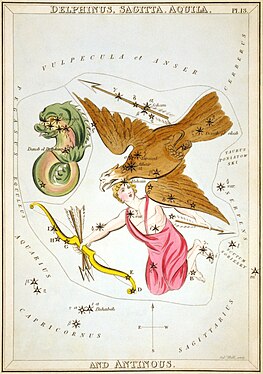
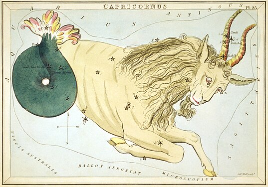
The sea! the sea! the open sea! / The blue, the fresh, the ever free![edit]
Voting period is over. Please don't add any new votes. Voting period ends on 2 Apr 2014 at 00:19:15 (UTC)
All images are from Urania's Mirror, an 1824-5 set of star charts.
-
-
-

-
 Noctua, Corvus, Crater, Sextans Uraniæ, Hydra, Felis, Lupus, Centaurus, Antlia Pneumatica, Argo Navis, and Pyxis Nautica


- Reason
- Per my FA push for Urania's Mirror, I'm trying to restore all 32 plates - although I suspect two will have to be pulled from FP as the LoC does not make high-resolution copies available for those at present, so I'm having to go with next-best-thing. Hopefully I'll pick those up soon.
- Anyway, as I said, I'm trying to break this into manageable nominations, so this nomination handles all the constellations of The Sea - Capricornus, Cetus, Delphinus, Eridanus, and Hydra - excepting those three which are already featured - Aquarius and Piscis Austalis and Pisces
- Three more sets remain after this one, four if I manage to source a good Orion and/or Pegasus.
- Articles in which this image appears
- All are in Urania's Mirror, they are also, with rare exceptions, in all of the constellations linked in their respective descriptions.
- FP category for this image
- Wikipedia:Featured pictures/Artwork/Others is where they've been going; I'd go with some division of Space, myself, but we can discuss that later.
- Creator
- Sidney Hall and Richard Rouse Bloxam, after Alexander Jamieson, restoration by Adam Cuerden.
- Support as nominator --Adam Cuerden (talk) 00:19, 23 March 2014 (UTC)
- Support - Good luck with the FAC. — Crisco 1492 (talk) 01:45, 23 March 2014 (UTC)
- Note I decreased the vertical thumbnail sizes so they're less overwhelming on the FPC nominations page. --Pine✉ 18:38, 23 March 2014 (UTC)
- I tried fiddling with that, but honestly wasn't getting anything that took up substantially less space, since it's too many to get under two rows Adam Cuerden (talk) 22:54, 23 March 2014 (UTC)
- Support - As with the other star chart cards, good solid pictures. --CyberXRef☎ 00:33, 27 March 2014 (UTC)
- Support Jee 16:41, 30 March 2014 (UTC)
- Support Saffron Blaze (talk) 15:24, 31 March 2014 (UTC)
Promoted File:Sidney Hall - Urania's Mirror - Delphinus, Sagitta, Aquila, and Antinous.jpg --Armbrust The Homunculus 01:11, 2 April 2014 (UTC)
Promoted File:Sidney Hall - Urania's Mirror - Capricornus.jpg --Armbrust The Homunculus 01:11, 2 April 2014 (UTC)
Promoted File:Sidney Hall - Urania's Mirror - Psalterium Georgii, Fluvius Eridanus, Cetus, Officina Sculptoris, Fornax Chemica, and Machina Electrica.jpg --Armbrust The Homunculus 01:11, 2 April 2014 (UTC)
Promoted File:Sidney Hall - Urania's Mirror - Noctua, Corvus, Crater, Sextans Uraniæ, Hydra, Felis, Lupus, Centaurus, Antlia Pneumatica, Argo Navis, and Pyxis Nautica.jpg --Armbrust The Homunculus 01:11, 2 April 2014 (UTC)
Galactic Center composite image[edit]
Voting period is over. Please don't add any new votes. Voting period ends on 2 Apr 2014 at 18:35:32 (UTC)

- Reason
- Striking image of the Galactic Center of the Milky Way
- Articles in which this image appears
- Galactic Center and just added to Compositing
- FP category for this image
- Wikipedia:Featured pictures/Space/Looking out
- Creator
- NASA/JPL-Caltech/ESA/CXC/STScI
- Support as nominator --Pine✉ 18:35, 23 March 2014 (UTC)
- Weak support-- The image is a deserving one. But the EV seems to be very low for such astronomical images. Herald 13:43, 24 March 2014 (UTC)
- Weak Support — Good image in general, but I agree as per above that actual picture quality and EV could be more up to par for the image type. Still, wonderful image. --Flipandflopped (talk) 23:38, 26 March 2014 (UTC)
Not Promoted --Armbrust The Homunculus 18:37, 2 April 2014 (UTC)
Independence or Death[edit]
Voting period is over. Please don't add any new votes. Voting period ends on 3 Apr 2014 at 00:09:08 (UTC)

- Reason
- This is a beautiful painting, one of the most iconic in Brazil, and it looks great in digital form. FP in Commons
- Articles in which this image appears
- Independence of Brazil
- FP category for this image
- Wikipedia:Featured pictures/History/Others
- Creator
- Pedro Américo
- Support as nominator --ArionEstar (talk) 00:09, 24 March 2014 (UTC)
- Oppose - This painting is huge (I mean, it's seven meters wide!) yet the resolution of this scan isn't even our bare minimum. — Crisco 1492 (talk) 09:06, 24 March 2014 (UTC)
- Oppose per Crisco. On top of that, the scan seems to be quite soft. Lewis Hulbert (talk) 09:32, 24 March 2014 (UTC)
- Oppose per two previous comments. Sca (talk) 15:55, 24 March 2014 (UTC)
Not Promoted --Armbrust The Homunculus 00:15, 3 April 2014 (UTC)
Diagram of Jupiter[edit]
Voting period is over. Please don't add any new votes. Voting period ends on 3 Apr 2014 at 04:35:52 (UTC)

- Reason
- Very informative and encyclopedic diagram in svg format. I replaced a simpler diagram in the article with this one. I think the quality improvement is so significant that there is no need to wait seven days.
- Articles in which this image appears
- Jupiter
- FP category for this image
- Wikipedia:Featured pictures/Space/Understanding
- Creator
- Kelvinsong
- Support as nominator --Pine✉ 04:35, 24 March 2014 (UTC)
- Support -- Also upvoting on the commons FP. This is an outstanding SVG diagram Seppi333 (Insert 2¢ | Maintained) 09:50, 24 March 2014 (UTC)
- Support - Wouldn't have thought this was an SVG before clicking it, a valuable diagram of outstanding quality. Lewis Hulbert (talk) 09:58, 24 March 2014 (UTC)
- Support per nom. Brandmeistertalk 17:36, 24 March 2014 (UTC)
- Support Pink for the win! Saffron Blaze (talk) 01:37, 25 March 2014 (UTC)
- Oh dear I've turned you all into common white girlss... 😂😂—Love, Kelvinsong talk 14:06, 25 March 2014 (UTC)
- @Kelvinsong: Can I have your autograph? Seppi333 (Insert 2¢ | Maintained) 23:03, 25 March 2014 (UTC)
- here : ~~~~ 💁—Love, Kelvinsong talk 01:27, 26 March 2014 (UTC)
- @Kelvinsong: Can I have your autograph? Seppi333 (Insert 2¢ | Maintained) 23:03, 25 March 2014 (UTC)
- Oh dear I've turned you all into common white girlss... 😂😂—Love, Kelvinsong talk 14:06, 25 March 2014 (UTC)
- question What are the two faint circles just to the right of the "far south temperate zone" text?
- Bokeh from the starry background—Love, Kelvinsong talk 03:09, 26 March 2014 (UTC)
- Unlikely. Given that all the moons appear to be in focus the image must be at the hyperfocal distance.©Geni (talk) 15:43, 26 March 2014 (UTC)
- Look closely the moons are bokeh circles too—Love, Kelvinsong talk 00:40, 27 March 2014 (UTC)
- Unlikely. Given that all the moons appear to be in focus the image must be at the hyperfocal distance.©Geni (talk) 15:43, 26 March 2014 (UTC)
- Bokeh from the starry background—Love, Kelvinsong talk 03:09, 26 March 2014 (UTC)
- Support this is a high quality, high EV picture, and on top of it it's an SVG. A very well made diagram. --CyberXRef☎ 23:40, 27 March 2014 (UTC)
- Couple questions: first, according to Metallic hydrogen that state of the element is thought to be common in Jupiter, but not confirmed; why is the conjectural nature of this diagram not explicit? Second, why do you need 5000 px width when this is legible at half that size? — Crisco 1492 (talk) 10:55, 28 March 2014 (UTC)
- Idk, every source I looked at had metallic hydrogen labeled. && I try to avoid too many asterixes on my pictures—Love, Kelvinsong talk 22:17, 28 March 2014 (UTC)
- Half that size would not fit my monitor, where this has resided as the background for the last week. Saffron Blaze (talk) 21:19, 28 March 2014 (UTC)
- This is an SVG, it could be rendered (and thus downloaded) at any size. Kevin, I'm not saying this needs to be in the image itself, but at least on the information page. — Crisco 1492 (talk) 23:22, 28 March 2014 (UTC)
- It's 5000 px bc that's the size I drew it & I don't resize it bc I don't trust Inkscape not to make rounding errors on the coordinates so I avoid certain transformations like rotation & dialation as much as possible—Love, Kelvinsong talk 23:26, 28 March 2014 (UTC)
- Fair enough. So just a note on the information page and then... — Crisco 1492 (talk) 23:51, 28 March 2014 (UTC)
 Done—Love, Kelvinsong talk 00:47, 29 March 2014 (UTC)
- Support - Well done diagram. — Crisco 1492 (talk) 00:58, 29 March 2014 (UTC)
- Oppose diagram not supportd by article text.--(AfadsBad (talk) 05:03, 31 March 2014 (UTC))
Promoted File:Jupiter diagram.svg --Armbrust The Homunculus 06:03, 3 April 2014 (UTC)
Thor’s Helmet Nebula[edit]
Voting period is over. Please don't add any new votes. Voting period ends on 10 Apr 2014 at 13:46:23 (UTC)

- Reason
- One of the perfect images I have ever seen among my 11 FPs.
- Articles in which this image appears
- NGC 2359
- FP category for this image
- Wikipedia:Featured pictures/Space/Looking out
- Creator
- ESO
- Support as nominator --Herald 13:46, 31 March 2014 (UTC)
- Oppose Doesn't show the entire nebula, the wings of the helmet are cut off. See: http://apod.nasa.gov/apod/image/0701/thor_cfht_big.jpg --Janke | Talk 16:47, 31 March 2014 (UTC)
- @Janke:Is that necessary?? Herald 12:44, 1 April 2014 (UTC)
- I would say yes, it's necessary. If you're trying to illustrate an object, and you only show part of the object (without an objective reason for doing so), there is going to be an EV issue. Sven Manguard Wha? 17:14, 1 April 2014 (UTC)
- I think it is definitely necessary. Those wings are what make it a Thor's helmet, not just any hat... ;-) See: http://goblinbeat.com/wp-content/uploads/2012/10/Thor-Helmet-Right.jpg --Janke | Talk 19:37, 1 April 2014 (UTC)
- I would say yes, it's necessary. If you're trying to illustrate an object, and you only show part of the object (without an objective reason for doing so), there is going to be an EV issue. Sven Manguard Wha? 17:14, 1 April 2014 (UTC)
- @Janke:Is that necessary?? Herald 12:44, 1 April 2014 (UTC)
- Oppose per Janke. Sven Manguard Wha? 17:14, 1 April 2014 (UTC)
- Oppose cut off critical parts of nebula. Mattximus (talk) 20:51, 1 April 2014 (UTC)
- Oppose and speedy close; no chance of passing, not with the subject cut off like this. — Crisco 1492 (talk) 00:45, 3 April 2014 (UTC)
Not Promoted --Armbrust The Homunculus 07:00, 3 April 2014 (UTC)
- Speedy close. Armbrust The Homunculus 07:00, 3 April 2014 (UTC)
Françoise Arnoul[edit]
Voting period is over. Please don't add any new votes. Voting period ends on 3 Apr 2014 at 13:22:43 (UTC)

- Reason
- Recently restored version (the cropped version was uploaded by another user over the top).
- Articles in which this image appears
- Françoise Arnoul
- FP category for this image
- People/Entertainment
- Creator
- Moshe Pridan
- Support as nominator --Brandmeistertalk 13:22, 24 March 2014 (UTC)
- Support Godhulii 1985 (talk) 22:52, 24 March 2014 (UTC)
- Oppose until copyright issues are cleared up. First, what is the copyright status of this image in the US? It was likely renewed owing to the URAA (1958 + 51 = 2009, well after the extension date)? Second, is there any indication that this was first published in Israel? The source has jack regarding that. — Crisco 1492 (talk) 09:45, 26 March 2014 (UTC)
- Huh, a posed picture for the Israeli Press Office, and you need evidence that it was published in Israel? --ELEKHHT 10:03, 26 March 2014 (UTC)
- Where does it say on the image page that this was taken for the press office, rather than by Pridan on his own? Even if this was first published in Israel, the URAA concerns are enough for me to oppose. — Crisco 1492 (talk) 10:07, 26 March 2014 (UTC)
- At that time Pridan worked for the Israeli Government Press Office, so this falls under Commons Category:PD Israel & British Mandate. As for URAA, I believe this qualifies as PD-1996. Brandmeistertalk 11:18, 26 March 2014 (UTC)
- How would it qualify as PD-1996, at all? If this is a government-owned work, then the 2008 copyright extensions applied to this image (making it copyrighted in Israel as well). I'm nominating for deletion. — Crisco 1492 (talk) 12:45, 26 March 2014 (UTC)
- See meta:Israeli new copyright law: "the previous status-quo will continue to apply to state-owned photographs (the equivalent of Crown copyright), i.e. any photograph whose copyrights are owned by the state will be subject to the 50 year period arrangement also under the new law.". Since the file's metadata confirms this is a work of the Israeli Government Press Office, per Israeli copyright law: "copyright in a work in which the State is the first owner of the copyright in accordance with the provisions of Chapter 5 shall last for a period of 50 years from the date of its making". Brandmeistertalk 15:53, 26 March 2014 (UTC)
- I'd say, absent evidence to the contrary, that when a government says the works it owns are out of copyright, we can take that as sufficient. Adam Cuerden (talk) 01:13, 27 March 2014 (UTC)
- In that state. But AFAIK, Israel does not consider the PD status of its works to apply worldwide when works become PD owing to age (compare the UK's Crown Copyright, which does apply worldwide), which means the URAA is still a consideration — Crisco 1492 (talk) 01:49, 27 March 2014 (UTC)
- I'd say, absent evidence to the contrary, that when a government says the works it owns are out of copyright, we can take that as sufficient. Adam Cuerden (talk) 01:13, 27 March 2014 (UTC)
- See meta:Israeli new copyright law: "the previous status-quo will continue to apply to state-owned photographs (the equivalent of Crown copyright), i.e. any photograph whose copyrights are owned by the state will be subject to the 50 year period arrangement also under the new law.". Since the file's metadata confirms this is a work of the Israeli Government Press Office, per Israeli copyright law: "copyright in a work in which the State is the first owner of the copyright in accordance with the provisions of Chapter 5 shall last for a period of 50 years from the date of its making". Brandmeistertalk 15:53, 26 March 2014 (UTC)
- He actually worked there for much longer then that. Additionally we can probably upload that photo as well as I am pretty sure we have approval from the Israeli GPO via OTRS (ticket #2012112010011362) --CyberXRef☎ 00:59, 27 March 2014 (UTC)
- How would it qualify as PD-1996, at all? If this is a government-owned work, then the 2008 copyright extensions applied to this image (making it copyrighted in Israel as well). I'm nominating for deletion. — Crisco 1492 (talk) 12:45, 26 March 2014 (UTC)
- At that time Pridan worked for the Israeli Government Press Office, so this falls under Commons Category:PD Israel & British Mandate. As for URAA, I believe this qualifies as PD-1996. Brandmeistertalk 11:18, 26 March 2014 (UTC)
- Where does it say on the image page that this was taken for the press office, rather than by Pridan on his own? Even if this was first published in Israel, the URAA concerns are enough for me to oppose. — Crisco 1492 (talk) 10:07, 26 March 2014 (UTC)
- Huh, a posed picture for the Israeli Press Office, and you need evidence that it was published in Israel? --ELEKHHT 10:03, 26 March 2014 (UTC)
Not promoted --The Herald 13:39, 3 April 2014 (UTC)
Patrick Rothfuss[edit]
Voting period is over. Please don't add any new votes. Voting period ends on 3 Apr 2014 at 21:40:41 (UTC)

- Reason
- A portrait with oodles of character from Kyle Cassidy, a noted photographer. As it happens, we already had a good portrait of Rothfuss when I uploaded this one, but Cassidy tells me that Rothfuss wasn't a fan.
- Articles in which this image appears
- Patrick Rothfuss
- FP category for this image
- Wikipedia:Featured pictures/People/Artists and writers
- Creator
- Kyle Cassidy
- Support as nominator --J Milburn (talk) 21:40, 24 March 2014 (UTC)
- Support. Slightly average composition (too tight at the top IMO) but otherwise, plenty of character as mentioned already. Ðiliff «» (Talk) 22:21, 24 March 2014 (UTC)
- Comment — I was fascinated to read that Patrick Rothfuss "lives in a house." I can say the same! Sca (talk) 15:26, 25 March 2014 (UTC)
- Support Adam Cuerden (talk) 05:10, 26 March 2014 (UTC)
- Support although I echo Diliff's concerns. — Crisco 1492 (talk) 07:29, 27 March 2014 (UTC)
- Oppose -- What's with the halo around the head? Sanyambahga (talk) 17:13, 31 March 2014 (UTC)
- I suspect it's an intentional brightening of the area around the head for 'artistic effect'. I don't particularly like it, but nor does it spoil the portrait IMO. Ðiliff «» (Talk) 18:29, 31 March 2014 (UTC)
- On the contrary, I suspect it deliberate darkening of the concrete wall leaving only natural lighter background around the head. Not sure why this darkening has yellowed the background on the right side. Saffron Blaze (talk) 16:29, 3 April 2014 (UTC)
- I suspect it's an intentional brightening of the area around the head for 'artistic effect'. I don't particularly like it, but nor does it spoil the portrait IMO. Ðiliff «» (Talk) 18:29, 31 March 2014 (UTC)
WeakOppose I am in much the same mind as Sanyambahga on this. Sven Manguard Wha? 21:31, 31 March 2014 (UTC)- This seems like a better pic. Saffron Blaze (talk) 04:57, 2 April 2014 (UTC)
- Reading the responses here, I've contested J Milburn's change and reverted back to the old photo (meaning that this FPC is no longer in the article). It is quite possible that Patrick Rothfuss doesn't like that image, and I'm glad that he's decided to release another one under a free license, but there seems to be a number of concerns with the candidate picture. Sven Manguard Wha? 06:21, 2 April 2014 (UTC)
- The concerns with the candidate picture are artistic in nature, namely the intentional 'vignette' and a tight crop. These are not technical concerns and not something that bring into question the legitimacy of the image... Remember that opposing a picture here doesn't mean opposing its use in the article, it means opposing it being featured. I don't think the image you reverted back to is better in any case. Ðiliff «» (Talk) 07:15, 2 April 2014 (UTC)
- I'm with Diliff (and I have reverted you). The combination of the startled look and the fact Mr. Rothfuss is looking away from the text on the old image make it less than ideal, and the fact he himself doesn't like the image is another good reason to prefer this one. Of course, you don't have to pretend it's worse than the previous image to offer a good faith oppose. J Milburn (talk) 08:40, 2 April 2014 (UTC)
- I'm not pretending anything. To me, this image is worse than the one that was there before. From an encyclopedic value standpoint, I find this image much less worthwhile. The badly executed pseudo-religious iconography thing makes me loathe to see the image in use in an article. Sven Manguard Wha? 18:16, 2 April 2014 (UTC)
- That's just plain offensive. There's no need to attack the photographer just because he's not here. J Milburn (talk) 20:47, 2 April 2014 (UTC)
- That said, I'll assume you are meaning to actually present an argument, so here's why I feel your argument doesn't hold water: I can't see any attempt at any "pseudo-religious iconography" in this image, so I am unclear what you feel is badly executed. What I see is a portrait with charm and character, with lighting carefully used to draw the viewer to the subject's face. Others are unsure about that lighting choice, and that seems like a fair concern to have, but it's not a concern I share. As for the other picture: I find the expression less than ideal, and, while the size and good and the background appropriate, I get the impression that the subject was surprised by the photographer. Again, the fact that the subject is less than happy with that image (something which, in the case of a BLP, we have to consider) and the fact that this image faces the text (which is, whatever other users choose to believe, actually mentioned in the MOS) also serve to suggest that it's less than ideal. That one would not have a chance at FPC, yet there have been several users supporting this one here. That, surely, should give you a reason to pause before supporting the use of your preferred image in the article. J Milburn (talk) 20:56, 2 April 2014 (UTC)
- That's just plain offensive. There's no need to attack the photographer just because he's not here. J Milburn (talk) 20:47, 2 April 2014 (UTC)
- I'm not pretending anything. To me, this image is worse than the one that was there before. From an encyclopedic value standpoint, I find this image much less worthwhile. The badly executed pseudo-religious iconography thing makes me loathe to see the image in use in an article. Sven Manguard Wha? 18:16, 2 April 2014 (UTC)
- I'm with Diliff (and I have reverted you). The combination of the startled look and the fact Mr. Rothfuss is looking away from the text on the old image make it less than ideal, and the fact he himself doesn't like the image is another good reason to prefer this one. Of course, you don't have to pretend it's worse than the previous image to offer a good faith oppose. J Milburn (talk) 08:40, 2 April 2014 (UTC)
- The concerns with the candidate picture are artistic in nature, namely the intentional 'vignette' and a tight crop. These are not technical concerns and not something that bring into question the legitimacy of the image... Remember that opposing a picture here doesn't mean opposing its use in the article, it means opposing it being featured. I don't think the image you reverted back to is better in any case. Ðiliff «» (Talk) 07:15, 2 April 2014 (UTC)
- Oppose -- Neither image is perfect but I prefer the other as it seems fresher (if I can use that word), less staged and composed more appropriately. The looking at text bit is less than convincing. Saffron Blaze (talk) 18:20, 2 April 2014 (UTC)
- You call my policy-based argument "less than convincing", but expect us to accept your assertion that one image is "fresher"? Pull the other one. J Milburn (talk) 20:47, 2 April 2014 (UTC)
- Don't stuff a guideline in my face as policy. I might have given you the courtesy of explaining myself better if you had asked, but as usual people would rather attack than seek understanding. Moreover, I don't care what you accept, but you will have to accept the oppose :-) Saffron Blaze (talk) 23:02, 2 April 2014 (UTC)
- Guideline, policy, who cares? You're just making empty, wishy-washy claims, that's the point. I don't need your "courtesy", I don't need your vague accusations of violence, and I certainly don't "have to" accept anything from you- you've opposed, for dubious reasons. Fine- whatever helps you sleep at night. But don't accuse me of using crappy reasoning when I'm not. That's what I object to. J Milburn (talk) 11:15, 3 April 2014 (UTC)
- Don't stuff a guideline in my face as policy. I might have given you the courtesy of explaining myself better if you had asked, but as usual people would rather attack than seek understanding. Moreover, I don't care what you accept, but you will have to accept the oppose :-) Saffron Blaze (talk) 23:02, 2 April 2014 (UTC)
- You call my policy-based argument "less than convincing", but expect us to accept your assertion that one image is "fresher"? Pull the other one. J Milburn (talk) 20:47, 2 April 2014 (UTC)
- No, what you are doing is trying to invalidate legitimate complaints through high school debate tactics. You are taking this way too personal and I suspect it is because of your relationship to those who provided it. Regardless, even if we get past which image is better I would offer neither is worthy of FP status. In this case you have been presented with concerns over the composition, the lighting, the dullness and the stiff pose. I could go on. However, the point is these reasons are indeed at the root of the rationale for the opposes. They aren't dubious reasons. Saffron Blaze (talk) 16:22, 3 April 2014 (UTC)
- How can I fail to take it personally when you're accusing me of "high school debate tactics"? That is about as dismissive as it comes. You have made it personal by dismissing my comments in the flippant way that you have (repeatedly). I'm sure that there are perfectly good reasons to oppose this image, and I'm not going to be upset if people are opposing for those reasons (and, if useful, I'm happy to discuss those reasons). I have made quite clear what it is that I object to (your dismissive comments towards me, and another user's dismissive comments towards the image's creator) and neither of these things are people opposing this nomination. J Milburn (talk) 17:47, 3 April 2014 (UTC)
- Pull the other one... Saffron Blaze (talk) 18:41, 3 April 2014 (UTC)
- J Milburn, I think that you need to take a step back, and cease commenting on this FPC. Your responses to Saffron Blaze and myself are completely out of line, and, as Saffron said, you are taking this way too personally. I'm not going to engage with you any further on this, and I suggest that Saffron do the same, because at this point the window for constructive discussion seems to be shut. Sven Manguard Wha? 18:11, 3 April 2014 (UTC)
- Human, all too human. Sca (talk) 18:27, 3 April 2014 (UTC)
- Anyone interested in my view on Sven's comment is welcome to check his talk page. I agree that there is no chance of any further constructive discussion, and I think the people responsible knew precisely what they were doing. J Milburn (talk) 18:29, 3 April 2014 (UTC)
- You attacked two good faith opposes in a confrontational way and now act hurt that they stood their ground. Saffron Blaze (talk) 18:49, 3 April 2014 (UTC)
- Anyone interested in my view on Sven's comment is welcome to check his talk page. I agree that there is no chance of any further constructive discussion, and I think the people responsible knew precisely what they were doing. J Milburn (talk) 18:29, 3 April 2014 (UTC)
- Human, all too human. Sca (talk) 18:27, 3 April 2014 (UTC)
Not Promoted --Armbrust The Homunculus 22:48, 3 April 2014 (UTC)
Malmö Central Station[edit]
Voting period is over. Please don't add any new votes. Voting period ends on 5 Apr 2014 at 06:58:24 (UTC)

- Reason
- Good quality photograph that shows the urban setting of Sweden's third busiest train station.
- Articles in which this image appears
- Malmö Central Station
- FP category for this image
- Wikipedia:Featured pictures/Places/Architecture
- Creator
- Sanyam Bahga
- Support as nominator --Sanyambahga (talk) 06:58, 26 March 2014 (UTC)
- Oppose The angle of view and the wide-angle perspective gives the impression the building has no depth. I think File:Malmo Station (5706733907).jpg is taken from a better angle and has less road/sky taking up room. -- Colin°Talk 13:09, 26 March 2014 (UTC)
- Oppose per Colin. I was half expecting this to only be a facade, like the props in those old Westerns. — Crisco 1492 (talk) 14:10, 26 March 2014 (UTC)
- Oppose — Too much asphalt. Sca (talk) 14:54, 26 March 2014 (UTC)
- Oppose. As per the previous opposes. It's fairly high res and vertically correct, but the angle is unfortunate and really does look one-dimensional. Also, as per Colin, there is too much foreground road. I guess it was taken with the camera angled horizontally to avoid inward leaning verticals, but if you're going to do that, you need to be aware that you're not centring the subject. Ðiliff «» (Talk) 09:46, 27 March 2014 (UTC)
Not promoted --Sven Manguard Wha? 00:32, 4 April 2014 (UTC)
- This is a speedy close. Sven Manguard Wha? 00:32, 4 April 2014 (UTC)
Sari temple[edit]
Voting period is over. Please don't add any new votes. Voting period ends on 11 Apr 2014 at 01:35:02 (UTC)


- Reason
- As a way of saying sorry for the low-ish resolution on my last two self-nominations, I've decided to break your browsers with a multi-megapixel stitch of this 17-metre (56 ft) tall Buddhist temple (possibly a former vihara). It's sharp, it's clear, and it's encyclopedic (just look at the reliefs!). What's not to love?
- Articles in which this image appears
- Sari temple, Candi of Indonesia, Kewu Plain
- FP category for this image
- Wikipedia:Featured pictures/Places/Architecture
- Creator
- Chris Woodrich
Support as nominator -- — Crisco 1492 (talk) 01:35, 1 April 2014 (UTC)- Comment -- Isn't it necessary for the photograph to be part of the article for a minimum of 7 days? Sanyambahga (talk) 06:25, 1 April 2014 (UTC)
- The image it replaced was both of objectively lower quality, and taken by me; the replacement should be singularly uncontroversial. That, and the article has had a total of five edits in the past six months, including 3 by me... not what one would call a hotbed of activity. — Crisco 1492 (talk) 07:53, 1 April 2014 (UTC)
- Support Like the composition. Had some difficulty to enlarge it, while clicking on it twice... (Must be the some browsers may have trouble displaying this image at full resolution-thing) Hafspajen (talk) 20:13, 1 April 2014 (UTC)
- You'd have to download the full file, usually. — Crisco 1492 (talk) 16:03, 2 April 2014 (UTC)
- Support Great composition, ridiculous quality, good EV. Mattximus (talk) 20:50, 1 April 2014 (UTC*)
- Support Angle seems good. ///EuroCarGT 21:35, 1 April 2014 (UTC)
- Support -- Godot13 (talk) 03:49, 2 April 2014 (UTC)
Oppose-- Converging verticals make the temple appear as if it is leaning backwards. Sanyambahga (talk) 08:44, 2 April 2014 (UTC)
- Perspective again... will be back with an alt. — Crisco 1492 (talk) 09:01, 2 April 2014 (UTC)
- Sanyambahga, an alt is up. — Crisco 1492 (talk) 10:27, 2 April 2014 (UTC)
- Comment. No, it is the palm in the background that is leaning backwards that gives you this feeling. Cover the palm with your hand an see once more. Original best. Hafspajen (talk) 11:38, 2 April 2014 (UTC)
- I tend to agree with Hafs re: this. — Crisco 1492 (talk) 16:03, 2 April 2014 (UTC)
- Support ALT -- Sanyambahga (talk) 07:33, 3 April 2014 (UTC)
- Comment. While I'm not going to insist that the image be completely perspective-corrected, because doing so may distort the building too much, but did the alt actually correct it at all? To me, it looks like the building's vertical lines are mostly corrected on the right side, but leans inwards significantly on the left side. In other words, you would need to rotate the image counter-clockwise so that both sides are leaning inwards equally, then correct the vertical perspective. But does the building lean inwards by design? I just wanted to ask, because I didn't want to assume that they should be completely vertical. Also, normally I wouldn't suggest downsampling, but the image is fairly soft at 100% and I think you could safely downsample to say 8000x5300 without a loss of actual detail. It would still be very high res but would be more manageable to download, as 50mb is a bit large. Ðiliff «» (Talk) 07:41, 3 April 2014 (UTC)
- I don't think it leans too dramatically, but there seems to be a bit of a lean ... I'll try playing with this a bit more. — Crisco 1492 (talk) 08:53, 3 April 2014 (UTC)
- It does. I put together a quick image to show you the lean (and other significant issues I discovered while looking closer). Rather than clog Commons up with it, I figured I'd upload it somewhere temporarily so you can see what I'm referring to. Click the 'download' button to view the full size image for more detail (I downsized it to 5000x3300 but you can still see the issues clearly at that resolution, and much more obviously at full resolution). It's based on the original image rather than the alt, but both images have the same issues to varying degrees. I suspect these issues were introduced to the image prior to stitching, as I can see that some of the artifacts have actually been distorted by the stitching process so that they are no longer 'rectangular'. I would suggest you go back to the original files, and do any processing work with them as TIF files until you're finally ready to 'save for the web'. This is good practice and minimises the chance of introducing any of these kinds of issues.
- I don't think it leans too dramatically, but there seems to be a bit of a lean ... I'll try playing with this a bit more. — Crisco 1492 (talk) 08:53, 3 April 2014 (UTC)
- Oppose for now based on aforementioned technical issues with the image. If these could be solved, I may support. Ðiliff «» (Talk) 11:42, 3 April 2014 (UTC)
- Withdraw based on input from Diliff and others elsewhere. Apparently my raw files aren't working, so I will need to reshoot to get an FP quality image out of this. — Crisco 1492 (talk) 13:59, 4 April 2014 (UTC)
Not Promoted --Sven Manguard Wha? 02:17, 5 April 2014 (UTC)
- per withdraw Sven Manguard Wha? 02:17, 5 April 2014 (UTC)
Texas Road Planning Map (renom)[edit]
Voting period is over. Please don't add any new votes. Voting period ends on 5 Apr 2014 at 03:25:04 (UTC)
-
 Original – A Civilian Conservation Corps planning map for the routing of a parkway. The route, built in 1934, connected Longhorn Cavern State Park to Texas State Highway 66, and would later be designated as a part of Park Road 4.

- Reason
- From the previous nom, this is an unusual, high-quality, high-EV scan of a highway planning map. Previous nom failed due to a lack of activity after a better version was uploaded. I made a few restorations to the new image (which is way better than the original) and I think this deserves to be an FP.
- Articles in which this image appears
- Transportation planning, Civilian Conservation Corps, Longhorn Cavern State Park
- FP category for this image
- Diagrams, drawings, and maps/Maps
- Creator
- Drawn by C.T. Fohl, uploaded and minor restorations (removed a hole and a few stray pencil marks) made by Awardgive, better version uploaded by Crisco 1492, more restorations made by Awardgive
- Support as nominator --Awardgive. Help out with Project Fillmore County 03:25, 26 March 2014 (UTC)
- Oppose - I really don't trust that major, major shift in colour. The paper is pretty obviously blue, and changing it to white is highly misleading. Adam Cuerden (talk) 05:10, 26 March 2014 (UTC)
Not Promoted --Sven Manguard Wha? 03:19, 5 April 2014 (UTC)
Star Charts: The Cat and the Dog[edit]
Voting period is over. Please don't add any new votes. Voting period ends on 6 Apr 2014 at 03:36:59 (UTC)


- Reason
- Continuation of the series from Urania's Mirror. Canis Major was probably the hardest so far, due to some extensive damage, but think I managed.
Puzzle: Auriga wants to ferry Lynx, Canis Major and Lepus across The Sea. However, Argo Navis is only big enough to hold Auriga and one of the animals ever since Pyxis was split off it. If left alone together, Lynx will eat Lepus, and, likewise, Canis Major will fight with Lynx. How can Auriga get them across? - Articles in which this image appears
- Urania's Mirror, and the respective constellations linked
- FP category for this image
- Wikipedia:Featured pictures/Artwork/Others is where they've been going.
- Creator
- Sidney Hall and Richard Rouse Bloxam, after Alexander Jamieson, restoration by Adam Cuerden.
- Support as nominator --Adam Cuerden (talk) 03:36, 27 March 2014 (UTC)
- Support looks good. — Crisco 1492 (talk) 06:31, 27 March 2014 (UTC)
- Support awesome! --Andrew J.Kurbiko (talk) 21:58, 29 March 2014 (UTC)
- Support nice work.--Godot13 (talk) 03:51, 2 April 2014 (UTC)
- Support Jee 07:17, 2 April 2014 (UTC)
- Support fine pictures. Hafspajen (talk) 16:45, 2 April 2014 (UTC)
Promoted File:Sidney Hall - Urania's Mirror - Lynx and Telescopium Herschilii.jpg Armbrust The Homunculus 03:36, 6 April 2014 (UTC)
Promoted File:Sidney Hall - Urania's Mirror - Canis Major, Lepus, Columba Noachi & Cela Sculptoris.jpg Armbrust The Homunculus 03:36, 6 April 2014 (UTC)
Shepherds from Honchar Museum[edit]
Voting period is over. Please don't add any new votes. Voting period ends on 6 Apr 2014 at 14:23:24 (UTC)
From Ivan Honchar Museum, by unknown painter, c 1690 .
-
 Shepherds Bow, 1690

- Reason
- A beuatifully scanned image by unknown painter from Google Art Project, one of the great ukrainian masterpieces, 1700. We haven't had any featured Ukrainian paintings ever.
- Articles in which this image appears
- Ivan Honchar Museum, History of Christianity in Ukraine, Christmas around the world, etc.
- FP category for this image
- Wikipedia:Featured pictures/Artwork/Others.
- Creator
- unknown, uploaded to commons by DcoetzeeBot and Google Art Project.
- Support as nominator ----Andrew J.Kurbiko (talk) 14:23, 27 March 2014 (UTC)
- Comment: While I appreciate the intent here, I think this pictures really need to be considered on their own merits and should be nominated separately. J Milburn (talk) 14:36, 27 March 2014 (UTC)
- OK. Thank you, allow to nominate this one?--Andrew J.Kurbiko (talk) 14:45, 27 March 2014 (UTC)
- Support
though I think it could be much better described - this is pretty clearly an icon, and a good example of such, but the descriptive text in articles and the file description does not make this clear outside of in History of Christianity in Ukraine. I'll support it for its use there, if nothing else.I've gone in, Google translate was sufficient to check the museum site and check the details: It's on the page for religious icons, so, check, and is described explicitly as being the "Adoration of the Shepherds" - always good to have confirmation. It also gives the date as "latter half of the 17th century". I've updated every usage, to make it better described and thus more encyclopædic. Adam Cuerden (talk) 17:43, 27 March 2014 (UTC)
- Wow, I only used GAP. Great work and useful details! Im trying to do the same operation right now with other works, thank you for your help!👍😊--Andrew J.Kurbiko (talk) 21:11, 27 March 2014 (UTC)
- Support - I'm not wowed by the EV in any of the linked articles, but this artwork is quite interesting so I don't think it's that big of an issue. However, the creator of this icon is most certainly not DcoetzeeBot and Google Art Project. If it's unknown, say "unknown". — Crisco 1492 (talk) 06:18, 28 March 2014 (UTC)
- Support, interesting artwork and perhaps somewhat underrepresented. Brandmeistertalk 17:42, 28 March 2014 (UTC)
- Support as above. J Milburn (talk) 17:12, 29 March 2014 (UTC)
- Oppose I'm not convinced that this image has particularly high EV. It is not used prominently in Adoration of the Shepherds, Christmas Eve, History of Christianity in Ukraine, and its usage in other articles is incidental. For example, it is used in Ukrainian culture, but its usage could be replaced with any other Ukrainian religious image and the article wouldn't suffer at all. We don't know the artist, and the work itself is not notable enough for an article. Sven Manguard Wha? 21:44, 31 March 2014 (UTC)
- Oppose - sadly, because it is really a fine picture - but as an artwork is not that great, as a picture I wonder if the original color wasn't paler maybe, less sharp. Displayed at full size (high-resolution) the crackings are disturbing. This picture was neglected and not renovated or the camera angle caught it somehow, so it even worse than it may look in reality - don't know. This picture is a good picture, but not really a featured picture class. The description should be tempera on wood - not Tempura on wood.
- It was very recently added to Christmas around the world, only some days ago, by the author. Also, was added by the author to the Adoration of the Shepherds and Johnbod removed it, here, and he was right, it is not as good as the other pictures in the gallery. how it came back again, don't know. If I wanted an icon in that gallery I would have chosen these instead for the article.


- (Actually I think it looks like it is oil too me, and it is indeed a religious painting, but it is more naive art than an icon.) Hafspajen (talk) 01:40, 2 April 2014 (UTC)
Promoted File:Shepherds Bow - Google Art Project.jpg Armbrust The Homunculus 14:55, 6 April 2014 (UTC)
Aircraft Rescue Firefighting training[edit]
Voting period is over. Please don't add any new votes. Voting period ends on 7 Apr 2014 at 06:14:16 (UTC)

- Reason
- High technical quality, good EV, and high "Wow!"
- Articles in which this image appears
- Firefighting
- FP category for this image
- Wikipedia:Featured pictures/People/Others
- Creator
- Manuel F. Guerrero, U.S. Marine Corps
- Support as nominator -- — Crisco 1492 (talk) 06:14, 28 March 2014 (UTC)
- Oppose — Sorry, but training "exercises" and other staged events don't seem FP-worthy. Sca (talk) 15:21, 28 March 2014 (UTC)
- How? Because there are safety crews nearby? Doubt you'd be able to get this close to a random fire in a city. — Crisco 1492 (talk) 15:36, 28 March 2014 (UTC)
- Further, the EXIF data doesn't have it as "staged", but "a controlled burn". I quote: "Aircraft, Rescue Firfighters aboard Marine Corps Air Station Miramar fight blazing fires during a controlled burn at the burn pit here. ARFF performed controlled burns June 13-14, they perform these burns about four times a year." — Crisco 1492 (talk) 15:37, 28 March 2014 (UTC)
- So, we disgree. Big deal. Sca (talk) 21:23, 28 March 2014 (UTC)
- Don't be silly. The point of the process is to discuss, not just post votes and shrug over disagreements. Engage. As for the controlled aspect of it, all fire departments take part in "controlled burns" to practice firefighting. The goal is the same as a 'real' blaze: put it out. I don't see how it affects EV. 70.72.190.205 (talk) 17:51, 31 March 2014 (UTC)
- So, we disgree. Big deal. Sca (talk) 21:23, 28 March 2014 (UTC)
- Oppose. I'm not really keen at this one- it's not really clear to me what's going on. They're stood in water, spraying water somewhere else (at we-don't-know-what) while a fire rages in the background. If I was teaching a child about firefighting, I don't think showing them this would help much- I'd show them something like this. J Milburn (talk) 17:11, 29 March 2014 (UTC)
- comment: In your suggested image, two of the three hoses are spraying on something we can't see (and which wasn't on fire). And the text makes clear that they weren't trying to put out the fire at all. So not really much more EV there. 75.41.109.190 (talk) 16:48, 30 March 2014 (UTC)
- Oppose per J Milburn. This is a dramatic and well executed photo, but I agree that its EV isn't terribly strong. Nick-D (talk) 22:45, 29 March 2014 (UTC)
- Support; I see this in a totally different way. Sure we don't get to see what they are spraying water at but that's how they likely see it. They see smoke all around, they see fire everywhere. This is good EV and I support it. --CyberXRef☎ 00:57, 30 March 2014 (UTC)
- Support Interesting to note what there wear and how they work in teams. Certainly the kind of image that would attract me to an article and read more. Saffron Blaze (talk) 02:07, 31 March 2014 (UTC)
- Support A stunning image, and I think the EV is definitely there. Rreagan007 (talk) 17:16, 3 April 2014 (UTC)
- Support Adam Cuerden (talk) 12:43, 6 April 2014 (UTC)
Not Promoted --Armbrust The Homunculus 06:41, 7 April 2014 (UTC)
- The 5 supports and 3 opposed make a 62.5% for promotion, which isn't enough. Armbrust The Homunculus 06:41, 7 April 2014 (UTC)
Otoe Indian Delegation 1881[edit]
Voting period is over. Please don't add any new votes. Voting period ends on 9 Apr 2014 at 19:29:41 (UTC)

- Reason
- High historical and cultural EV. Important Otoe Indian men (some are mixed with Missouria, Iowa, and Omaha heritage) all wearing traditional clothing giving a great look at Otoe material culture during the early reservation era.
- Articles in which this image appears
- Otoe tribe, Otoe-Missouria Tribe of Indians
- FP category for this image
- Wikipedia:Featured pictures/People/Traditional
- Creator
- John Karl Hillers
- Support as nominator --MatGTAM (talk) 19:29, 30 March 2014 (UTC)
- Support — Interesting record of Native Americans; fairly good res. for a 19th C. pic. Sca (talk) 21:23, 30 March 2014 (UTC)
- Comment - Very nice, decently sharp (except for the motion blur on Baptiste Deroin). However, this appears to need some flyspecking to clean up the damage to the photograph. I can do it, but it'll have to wait until tonight. — Crisco 1492 (talk) 01:36, 31 March 2014 (UTC)
- Support per Sca. Brandmeistertalk 08:59, 31 March 2014 (UTC)
Not Promoted --Armbrust The Homunculus 20:19, 9 April 2014 (UTC)
Badab-e Surt[edit]
Voting period is over. Please don't add any new votes. Voting period ends on 19 Apr 2014 at 00:48:29 (UTC)

- Reason
- Large panorama, scene looks amazing
- Articles in which this image appears
- Badab-e Surt
- FP category for this image
- Wikipedia:Featured_pictures/Places/Panorama
- Creator
- Samaee uploaded by: Marmoulak
Support as nominator --///EuroCarGT 00:48, 9 April 2014 (UTC)- Oppose Absolutely and overly edited, doesn't look like a photo anymore. All details in mountains are lost due to noise removal. --Janke | Talk 05:28, 9 April 2014 (UTC)
- Oppose full per Janke. --Alchemist-hp (talk) 20:22, 9 April 2014 (UTC)
Not Promoted --Armbrust The Homunculus 13:41, 10 April 2014 (UTC)
- Withdrawn nomination. Armbrust The Homunculus 13:41, 10 April 2014 (UTC)
Berliner Zeitung[edit]
Voting period is over. Please don't add any new votes. Voting period ends on 12 Apr 2014 at 11:29:00 (UTC)

- Reason
- High quality and resolution images of this famouse GDR architectural landmark in the very centre of Berlin.
- Articles in which this image appears
- Berliner Zeitung
- FP category for this image
- Wikipedia:Featured pictures/Places/Architecture
- Creator
- Arild Vågen
- Support as nominator --ArildV (talk) 11:29, 2 April 2014 (UTC)
- Oppose — Cluttery image (foreground) of essentially monobloc architecture that I don't think would draw much interest from English readers. The subject publication is of interest historically, however, being a survivor from the DDR, and might make a good FA or DYK. Sca (talk) 14:46, 3 April 2014 (UTC)
- Assumptions regarding English readers interest should be completely irrelevant for assessing image quality and encyclopedic relevance imo. The building is architecturally relevant (regardless of what one thinks about East German Modernism), and a landmark in Berlin. And since the house has been the newspaper's headquarters since it was built relevant for the article.--ArildV (talk) 15:05, 3 April 2014 (UTC)
- Support looks good to me. Nikhil (talk) 15:20, 3 April 2014 (UTC)
- Oppose. Nothing technically wrong with the image, but the busy foreground obscuring it somewhat just doesn't give it the simplicity that a featured picture of a building deserves. Ðiliff «» (Talk) 16:58, 3 April 2014 (UTC)
- Oppose. I'm open to the notion that the building itself is relevant, but nothing in the article currently discuses the point. As such I find EV to be lacking, and especially so when taking the cluttered foreground into account. --Paul_012 (talk) 02:55, 4 April 2014 (UTC)
Not Promoted --Armbrust The Homunculus 12:02, 12 April 2014 (UTC)
Immaculate Conception Church, Farm Street, London[edit]
Voting period is over. Please don't add any new votes. Voting period ends on 12 Apr 2014 at 17:59:00 (UTC)
-
 The nave (65 megapixels)
 -
 The entrance (34 megapixels)
 -
 The altar (38 megapixels)


- Reason
- This is my first 'set' nomination. Well, actually I had one many years ago but in the end it was possible to combine into a single image so it was promoted as such. I don't think it would be appropriate to combine these images into one file as they are independently useful but I feel they are all of high quality and high EV, taken in the same lighting and with the same processing and techniques, and contribute to the same article, and could therefore be submitted as a set.
- Articles in which this image appears
- Immaculate Conception Church, Farm Street
- FP category for this image
- Wikipedia:Featured pictures/Places/Interiors
- Creator
- User:Diliff
- Support as nominator --Ðiliff «» (Talk) 17:59, 2 April 2014 (UTC)
- Support Each is featurable in its own right. Saffron Blaze (talk) 18:14, 2 April 2014 (UTC)
- Support Godhulii 1985 (talk) 20:10, 2 April 2014 (UTC)
- Support — Crisco 1492 (talk) 00:43, 3 April 2014 (UTC)
- Support Jee 03:12, 3 April 2014 (UTC)
- Support Well done! Hafspajen (talk) 03:16, 3 April 2014 (UTC)
- Support--Great job..!!! The Herald 16:02, 3 April 2014 (UTC)
- Support -- Sanyambahga (talk) 17:57, 3 April 2014 (UTC)
- Support - Great shots! ///EuroCarGT 01:49, 5 April 2014 (UTC)
- Support, very nice photos of high value. --CyberXRef☎ 19:42, 6 April 2014 (UTC)
- Support --ArildV (talk) 11:06, 7 April 2014 (UTC)
- Support - Bellus Delphina talk 15:50, 9 April 2014 (UTC)
Promoted File:Immaculate Conception Church, Farm Street, London, UK - Diliff.jpg --Armbrust The Homunculus 17:58, 12 April 2014 (UTC)
Promoted File:Immaculate Conception Church Organ, Farm Street, London, UK - Diliff.jpg --Armbrust The Homunculus 17:58, 12 April 2014 (UTC)
Promoted File:Immaculate Conception Church Altar, Farm Street, London, UK - Diliff.jpg --Armbrust The Homunculus 17:58, 12 April 2014 (UTC)
NGC 2359[edit]
Voting period is over. Please don't add any new votes. Voting period ends on 13 Apr 2014 at 13:36:01 (UTC)


- Reason
- This one is complete Thor's helmet and hence makes it a perfect FPC
- Articles in which this image appears
- NGC 2359
- FP category for this image
- Wikipedia:Featured pictures/Space/Looking out
- Creator
- Martin Rusterholz in CXIELO
- Support as nominator --The Herald 13:36, 3 April 2014 (UTC)
- Oppose I'd love to see a good FP of this nebula, but even this doesn't cut it; fuzzy in full size, too dark compared to http://apod.nasa.gov/apod/image/0701/thor_cfht_big.jpg (which isn't FP quality, either). Any better Hubble images of this? --Janke | Talk 06:18, 4 April 2014 (UTC)
- Sorry, no perfect Hubble image. But I find this one is the best one available for FPC. How's the alternate...?? The Herald 09:09, 4 April 2014 (UTC)
Not Promoted --Armbrust The Homunculus 14:44, 13 April 2014 (UTC)
Lagoon Nebula[edit]
Voting period is over. Please don't add any new votes. Voting period ends on 14 Apr 2014 at 19:19:49 (UTC)

- Reason
- FP in Commons
- Articles in which this image appears
- Lagoon Nebula and Astrophysical plasma
- FP category for this image
- Wikipedia:Featured pictures/Space/Looking out
- Creator
- ESO, uploaded by Jmencisom
- Support as nominator --ArionEstar (talk) 19:19, 4 April 2014 (UTC)
- Support -- Tokugawapants (talk) 07:23, 7 April 2014 (UTC)
- Support -- Need it..The Herald 13:31, 7 April 2014 (UTC)
- Support nice image. Rreagan007 (talk) 18:44, 14 April 2014 (UTC)
Not Promoted --Armbrust The Homunculus 19:30, 14 April 2014 (UTC)
- Not enough support for promotion. Armbrust The Homunculus 19:30, 14 April 2014 (UTC)
Bolinus cornutus[edit]
Voting period is over. Please don't add any new votes. Voting period ends on 13 Apr 2014 at 13:38:19 (UTC)

- Reason
- High quality and EV. Already featured on Commons.
- Articles in which this image appears
- Bolinus cornutus
- FP category for this image
- Wikipedia:Featured pictures/Animals/Molluscs
- Creator
- Llez
- Support as nominator --Armbrust The Homunculus 13:38, 3 April 2014 (UTC)
- Support : photo of a high standard that illustrates the subject in a compelling way. JoJan (talk) 15:20, 4 April 2014 (UTC)
- Support Jee 02:15, 5 April 2014 (UTC)
- Support - I note, however, that it looks a little oversharpened, but this is not really noticeable until you get to 150%. — Crisco 1492 (talk) 04:05, 5 April 2014 (UTC)
- Support Adam Cuerden (talk) 12:41, 6 April 2014 (UTC)
- Support -CircleAdrian (talk) 19:09, 7 April 2014 (UTC)
- Support - Bellus Delphina talk 15:50, 9 April 2014 (UTC)
- Support - Seems good to me. It is a pity there is no operculum, but still it is a great image. Invertzoo (talk) 00:59, 11 April 2014 (UTC)
Promoted File:Bolinus cornutus 01.jpg --Julia\talk 19:48, 14 April 2014 (UTC)
Approach to Ratu Boko[edit]
Voting period is over. Please don't add any new votes. Voting period ends on 15 Apr 2014 at 03:58:51 (UTC)

- Reason
- High resolution, crisp, shows visitors' first impression of the (fairly large) site.
- Articles in which this image appears
- Ratu Boko
- FP category for this image
- Wikipedia:Featured pictures/Places/Architecture
- Creator
- Chris Woodrich
- Support as nominator -- — Crisco 1492 (talk) 03:58, 5 April 2014 (UTC)
- Comment. I'm inclined to support as technically it's very sound. But I have to ask, is the panoramic aspect ratio necessary or useful? I would have thought a standard 2:1 ratio centred on the temple would be sufficient and I'm not sure what else we can glean from the extremities in the image. Is there a significance to it that I'm not aware of? Ðiliff «» (Talk) 09:47, 5 April 2014 (UTC)
- Extremities being the length of the walls? As noted in the caption here, it shows the extent of the excavated fortifications, as well as the position of the "crematorium" (what they're calling it, not necessarily sure I agree) in relation to the front gates. The people at the far left (going up the hill towards the viewing area) give a sense of scale without being as distracting as they would be in the middle of the image (where the gates are). A 2:1 crop would necessarily cut out both of those.
- Unlike the nominations I've made before, this is not a temple, but a (relatively) extensive archeological site, consisting of several terraces and fortifications. The first terrace (pictured here) is the biggest, though there are other structures (the guest area, for instance). — Crisco 1492 (talk) 10:05, 5 April 2014 (UTC)
- Yeah, I was referring to the walls and grass at the left and right sides of the frame which seemed incidental (especially as you titled it 'Approach to Ratu Boko which I assumed as the building at the top of the stairs. If they are relevant to and part of the site then I understand. Ðiliff «» (Talk) 11:59, 5 April 2014 (UTC)
- Right, Ratu Boko is the entire complex (though all must pass through the gate/this area, hence "approach to..."). It's traditionally referred to as a kraton (palace); legends holds that it was home of King Boko from the legend of Roro Jonggrang, while scholars have put forth more worldly suggestions. — Crisco 1492 (talk) 12:03, 5 April 2014 (UTC)
- Yeah, I was referring to the walls and grass at the left and right sides of the frame which seemed incidental (especially as you titled it 'Approach to Ratu Boko which I assumed as the building at the top of the stairs. If they are relevant to and part of the site then I understand. Ðiliff «» (Talk) 11:59, 5 April 2014 (UTC)
- Weak support. Well I'll be the first to support then. It's a little lacking in focus, as the vast majority of the frame is taken up by grass and a brick retaining wall and the building in the centre is a little obscured, but I suspect that short of getting an aerial view of the site, it's not going to be possible to do better. One idea for reducing the aspect ratio would be to crop the wall to the right of the central path, just before the white sign. I don't see anything notable beyond that point in the image, just more wall. I don't think the composition would suffer for it. Ðiliff «» (Talk) 08:42, 7 April 2014 (UTC)
Not Promoted --Armbrust The Homunculus 06:45, 15 April 2014 (UTC)
Nintendo DSi[edit]
Voting period is over. Please don't add any new votes. Voting period ends on 15 Apr 2014 at 05:49:30 (UTC)

- Reason
- High resolution, high quality, good product photograph, lead image in an FA
- Articles in which this image appears
- Nintendo DSi +6
- FP category for this image
- Wikipedia:Featured pictures/Engineering and technology/Electronics
- Creator
- Evan Amos
- Support as nominator -- — Crisco 1492 (talk) 05:49, 5 April 2014 (UTC)
- Oppose — Not visually interesting; besides it's already at the top of the Main Page as an FA pic today. Sca (talk) 14:04, 5 April 2014 (UTC)
- It's product photography. It's meant to display the product. As for "it's already at the top of the Main Page as an FA pic today", that's not part of the criteria. — Crisco 1492 (talk) 17:40, 5 April 2014 (UTC)
- Support - IMHO, being on the main page as an FA pic doesn't mean that it can't be supported. I feel the pic is quite good and has good EV. Nikhil (talk) 14:18, 5 April 2014 (UTC)
- Comment I don't think a picture of it turned off is as informative as turned on. I realise game shots might be problematic, but a DSi has menus. Adam Cuerden (talk) 13:38, 6 April 2014 (UTC)
- This kind of thing, right? Or this? I think that would pass the threshold of originality in the US (and it certainly would in the UK), so it's safer to have the DS off than it is to have it on. — Crisco 1492 (talk) 14:53, 6 April 2014 (UTC)
Not Promoted --Armbrust The Homunculus 06:45, 15 April 2014 (UTC)
Mudflat hikers[edit]
Voting period is over. Please don't add any new votes. Voting period ends on 16 Apr 2014 at 10:34:24 (UTC)

- Reason
- High resolution image with a good composition. It shows the vast and desolate mudflats of the Wadden Sea during low tide as well as the contours of the mudflat hikers.
- Articles in which this image appears
- Mudflat hiking, Wadden Sea, Groningen (province)
- FP category for this image
- Culture, entertainment, and lifestyle
- Creator
- Marieke78 (edited by Michielvd)
- Support as nominator --Editør (talk) 10:34, 6 April 2014 (UTC)
- Support — Aesthetically and environmentally interesting; well-executed. Sca (talk) 13:51, 6 April 2014 (UTC)
- Oppose - Below minimum resolution. — Crisco 1492 (talk) 15:21, 6 April 2014 (UTC)
- Oppose. Nicely composed, but too small. Certainly something that could be retaken, so I'm afraid I can't see a good reason to ignore the size in this case. J Milburn (talk) 00:56, 7 April 2014 (UTC)
- Comment - it is a very expressive picture... (well if you disregard the technicalities)Hafspajen (talk) 16:45, 7 April 2014 (UTC)
- Comment - the summary says it was "rotated 2 degrees and cropped". Is the original also on commons somewhere? --CyberXRef☎ 18:48, 7 April 2014 (UTC)
- This is the unedited photo: File:Wadlopen bij Pieterburen 02.jpg. – Editør (talk) 20:02, 7 April 2014 (UTC)
Not Promoted --Armbrust The Homunculus 10:38, 16 April 2014 (UTC)
Heic 0609[edit]
Voting period is over. Please don't add any new votes. Voting period ends on 17 Apr 2014 at 13:45:11 (UTC)


- Reason
- Fine image
- Articles in which this image appears
- Cassiopeia A
- FP category for this image
- Wikipedia:Featured pictures/Space/Looking out
- Creator
- NASA, ESA, and the Hubble Heritage
- Support either or both as nominator --The Herald 13:45, 7 April 2014 (UTC)
Not Promoted --Armbrust The Homunculus 14:52, 17 April 2014 (UTC)
Swans Reflecting Elephants[edit]
Voting period is over. Please don't add any new votes. Voting period ends on 28 Apr 2014 at 12:02:04 (UTC)
[[:File:Swans reflecting elephants.jpg|thumb|right|100000x260px|Original – Swans Reflecting Elephants (1937) is a painting by the Spanish surrealist Salvador Dalí. This painting is from Dalí's Paranoiac-critical period.]]
- Reason
- Simpy a high quality image
- Articles in which this image appears
- Swans Reflecting Elephants
- FP category for this image
- Wikipedia:Featured pictures/Artwork/Paintings
- Creator
- Salvador Dalí
- Support as nominator --The herald 12:02, 18 April 2014 (UTC)
Not Promoted --Armbrust The Homunculus 12:49, 18 April 2014 (UTC)
- Speedy close, non-free images shouldn't be high quality (especially not high resolution) and this file needs size reduction. Armbrust The Homunculus 12:49, 18 April 2014 (UTC)
20140402 MCDAAG Jahlil Okafor dunk[edit]
Voting period is over. Please don't add any new votes. Voting period ends on 19 Apr 2014 at 17:15:02 (UTC)

- Reason
- This is a high quality action photography shot
- Articles in which this image appears
- Jahlil Okafor
2014 McDonald's All-American Boys Game
2014–15 Duke Blue Devils men's basketball team - FP category for this image
- People
- Creator
- TonyTheTiger
- Support as nominator --TonyTheTiger (T / C / WP:FOUR / WP:CHICAGO / WP:WAWARD) 17:15, 9 April 2014 (UTC)
- Comment - Looks a little underexposed, I think. You may need some post-processing. Also concerned about the players' legs in the background. — Crisco 1492 (talk) 01:22, 10 April 2014 (UTC)
- What do you mean by underexposed. What about this photo points toward that assessment? How do you post-process a correction?--TonyTheTiger (T / C / WP:FOUR / WP:CHICAGO / WP:WAWARD) 07:37, 10 April 2014 (UTC)
- The floors at BBall courts are usually very, very, shiny, owing to the amount of polish. Here it has a very matte look. That being said... I'm concerned by the noise in this image. His skin is not very smooth; looks like noise. — Crisco 1492 (talk) 08:13, 11 April 2014 (UTC)
- I suppose noise stems from my use of a monopod rather than a tripod and the fact that I shot at 800 ISO/640 speed in manual mode. FWIW, auto settings for the action setting in this lighting were 1600 ISO/1250 speed when I tested the action setting on the mode dial. Given that I am working with a Rebel T4i, I can't do much better in terms of noise.--TonyTheTiger (T / C / WP:FOUR / WP:CHICAGO / WP:WAWARD) 11:44, 11 April 2014 (UTC)
- I suppose from the angle the image was taken from, there wasn't any reflection. I also agree that it's slightly darker than is ideal. All the whites in the image are dull greys. But I'm more concerned that it's not a true 'action shot'. Obviously, he's actually dunking the ball, but the absence of any defence in the image makes it look a bit staged. A 'demonstration duck' if you will, and not taken during an actual game. I appreciate that it's somewhat of a 'damned if you do, damned if you don't' situation to be in though. If there were a lot of other players in the shot, it would be opposed for messy composition! Ðiliff «» (Talk) 09:37, 11 April 2014 (UTC)
- If you look at the history, you can see that I cropped out the other players in the shot.--TonyTheTiger (T / C / WP:FOUR / WP:CHICAGO / WP:WAWARD) 11:26, 11 April 2014 (UTC)
- Visually, I am not sure what you mean by the whites not being very white. When I look at the word McDonald's on his shirt, that looks about as white as I could have hoped for, IMO. However I see what you are saying in the image brightness histogram. The brightness histogram of the original shot is sort of bimodal with a low peak very close to the left and a higher peak two thirds of the way to the right. There is almost no content in the right quartile of the histogram. I am shocked to see no content in the right quartile of the image histogram. I thought the whites were white, but I see your point.--TonyTheTiger (T / C / WP:FOUR / WP:CHICAGO / WP:WAWARD) 11:44, 11 April 2014 (UTC)
- Looking at the image brightness histograms of all the images that I have uploaded from this game, the only ones with white whites are the non-action ones shot in fully automode. File:20140402 MCDAAG Justin Jackson Jack Daly Award (2).JPG seems to have the best histogram in terms of having white whites without notable spikes going off the chart. File:20140402 MCDAAG MVPs (2).JPG is also decent. However these are at 500 and 400 speeds so they would have more blur in the action shots.--TonyTheTiger (T / C / WP:FOUR / WP:CHICAGO / WP:WAWARD) 12:00, 11 April 2014 (UTC)
- P.S. even in the game-winning dunk (File:20140402 MCDAAG Jahlil Okafor game-winning dunk (2).JPG) by the same player, it does not look like anyone is trying to stop him. So having other players in the shot does not make it look like any more of an action shot in some senses.--TonyTheTiger (T / C / WP:FOUR / WP:CHICAGO / WP:WAWARD) 12:25, 11 April 2014 (UTC)
- OK, you've convinced me that it's just an unfortunate angle that makes it appear that he's completely uncontested. But as for the brightness, perhaps your monitor needs an adjustment because the whites on Jahlil's shirt are not particularly bright. I've made an image which shows the original next to an edit I quickly put together for comparison, and I think it improves on the exposure somewhat. I would say that perhaps the court appears slightly overexposed in the edit (I'm not sure what it looked like 'in person'), but the darker tones of the player's skin and shirt are more what I would expect to see. I suppose it's a tricky scene for the camera to meter. The court is bright and the player is dark. Ðiliff «» (Talk) 13:00, 11 April 2014 (UTC)
- Actually, looking through my files, some of the actions shots with the same settings have significant white whites presence in the histogram. I am going to spend time looking at more images. I like your processing of the whites however. Can you post that edit here for consideration.--TonyTheTiger (T / C / WP:FOUR / WP:CHICAGO / WP:WAWARD) 13:58, 11 April 2014 (UTC)
- Done. Ðiliff «» (Talk) 14:41, 11 April 2014 (UTC)
- I don't know what to say about whether the court is overexposed or depicts the true appearance in the edit. This picture is now a 53.5% crop of a 200m zoom image. We are talking about what the court would look like if I had 20-25x zoom vision in comparison to my regular eyesight. I was not down on the court and don't know its true color.--TonyTheTiger (T / C / WP:FOUR / WP:CHICAGO / WP:WAWARD) 20:24, 11 April 2014 (UTC)--TonyTheTiger (T / C / WP:FOUR / WP:CHICAGO / WP:WAWARD) 03:18, 12 April 2014 (UTC)
- Not that it really matters what 'zoom level' it was taken at, but I think 20-25x is an exaggeration. You shot it at 200mm with a crop-sensor camera, meaning a full frame equivalent of 320mm. The human eye's focal length is apparently 22-24mm, but it's not a direct equivalent to a camera lens because the eye is really nothing like a camera lens/sensor, and you only really see clearly in the central 3-5% of your vision. It gets progressively worse the wider it goes. 50mm is considered to be roughly equivalent to the 'sharp' part of our vision though. So going with 50mm, 320mm is really only about 6x 'zoom'. Ðiliff «» (Talk) 22:38, 11 April 2014 (UTC)
- Then this is cropped so we are looking at about 12X right? Regardless, I don't know what a court should look like. Crisco 1492 seemed to know what the floor should look like.--TonyTheTiger (T / C / WP:FOUR / WP:CHICAGO / WP:WAWARD) 23:20, 11 April 2014 (UTC)
- We're getting a bit caught up in the details now, but different courts look different. They're usually all shiny and waxed though, but the colour and luminosity depends on the wood used to build it, I'd imagine. So unless Crisco has actually been to that particular court, I don't think he'd be any more accurate than you are. If you think it looks fine, let's go with that? In any case, I'm not sure it's going to be a featured picture... The image quality isn't quite there. Ðiliff «» (Talk) 00:19, 12 April 2014 (UTC)
- I can't vouch for this exact court (my only experience with Chicago thusfar has been O'Hare, and that was a combined total of 6 hours), but I think Diliff's edit has the colors a bit more as one would expect a BBall court. That being said, the noise is still significant... once I'm done tweaking my new panorama of Sari Temple, I'll see what this looks like if we denoise it and downsample, see if it can be made featureable or not. Composition wise this is decent, although I think a more direct shot (i.e. from a lower row) might have more "oomph". But then, I'd expect one's mobility with a camera to be limited in such a setting, so I wouldn't think too much of that. — Crisco 1492 (talk) 02:29, 12 April 2014 (UTC)
- Of course an event like this at the United Center is reserved seating. I had a ticket for section 319, which shares an entrance with section 318. In section 318, there is what appears to be a standing room area where I set up.--TonyTheTiger (T / C / WP:FOUR / WP:CHICAGO / WP:WAWARD) 03:18, 12 April 2014 (UTC)
- I was playing with the image in Lightroom, and with Luminescence at 30 (maybe as high as 40) the image is considerably smoother. However, I don't think the loss of detail would be a good trade off. — Crisco 1492 (talk) 00:28, 13 April 2014 (UTC)
- Well, the feedback on this image will greatly improve my photography. You have made me think more clearly about what all the graphs are on my camera. Now, that I have processed that they can tell me if my whites are really white, I will probably choose my settings a lot better. I think almost all the indoor basketball photography that I have done in the past two years has been underdeveloped now that the two of you have coached me to think about whether my images are presenting white whites. Sadly, the images in this set are among my best in terms of being adequately developed. Certainly, something is better than nothing. I am not going to be able to reduce the noise. In action photography as in life, you cannot have speed, quality and affordability. In choosing the Rebel T4i, I have surrendered quality.--TonyTheTiger (T / C / WP:FOUR / WP:CHICAGO / WP:WAWARD) 02:35, 13 April 2014 (UTC)
- What software are you using for processing? Camera Raw and Lightroom are paid software, but they both perform admirably (the "auto levels" is a bit too bright for my liking, but you can easily fix that with the software). — Crisco 1492 (talk) 04:36, 13 April 2014 (UTC)
- Well, the feedback on this image will greatly improve my photography. You have made me think more clearly about what all the graphs are on my camera. Now, that I have processed that they can tell me if my whites are really white, I will probably choose my settings a lot better. I think almost all the indoor basketball photography that I have done in the past two years has been underdeveloped now that the two of you have coached me to think about whether my images are presenting white whites. Sadly, the images in this set are among my best in terms of being adequately developed. Certainly, something is better than nothing. I am not going to be able to reduce the noise. In action photography as in life, you cannot have speed, quality and affordability. In choosing the Rebel T4i, I have surrendered quality.--TonyTheTiger (T / C / WP:FOUR / WP:CHICAGO / WP:WAWARD) 02:35, 13 April 2014 (UTC)
- I was playing with the image in Lightroom, and with Luminescence at 30 (maybe as high as 40) the image is considerably smoother. However, I don't think the loss of detail would be a good trade off. — Crisco 1492 (talk) 00:28, 13 April 2014 (UTC)
- Of course an event like this at the United Center is reserved seating. I had a ticket for section 319, which shares an entrance with section 318. In section 318, there is what appears to be a standing room area where I set up.--TonyTheTiger (T / C / WP:FOUR / WP:CHICAGO / WP:WAWARD) 03:18, 12 April 2014 (UTC)
- I can't vouch for this exact court (my only experience with Chicago thusfar has been O'Hare, and that was a combined total of 6 hours), but I think Diliff's edit has the colors a bit more as one would expect a BBall court. That being said, the noise is still significant... once I'm done tweaking my new panorama of Sari Temple, I'll see what this looks like if we denoise it and downsample, see if it can be made featureable or not. Composition wise this is decent, although I think a more direct shot (i.e. from a lower row) might have more "oomph". But then, I'd expect one's mobility with a camera to be limited in such a setting, so I wouldn't think too much of that. — Crisco 1492 (talk) 02:29, 12 April 2014 (UTC)
- We're getting a bit caught up in the details now, but different courts look different. They're usually all shiny and waxed though, but the colour and luminosity depends on the wood used to build it, I'd imagine. So unless Crisco has actually been to that particular court, I don't think he'd be any more accurate than you are. If you think it looks fine, let's go with that? In any case, I'm not sure it's going to be a featured picture... The image quality isn't quite there. Ðiliff «» (Talk) 00:19, 12 April 2014 (UTC)
- Then this is cropped so we are looking at about 12X right? Regardless, I don't know what a court should look like. Crisco 1492 seemed to know what the floor should look like.--TonyTheTiger (T / C / WP:FOUR / WP:CHICAGO / WP:WAWARD) 23:20, 11 April 2014 (UTC)
- Not that it really matters what 'zoom level' it was taken at, but I think 20-25x is an exaggeration. You shot it at 200mm with a crop-sensor camera, meaning a full frame equivalent of 320mm. The human eye's focal length is apparently 22-24mm, but it's not a direct equivalent to a camera lens because the eye is really nothing like a camera lens/sensor, and you only really see clearly in the central 3-5% of your vision. It gets progressively worse the wider it goes. 50mm is considered to be roughly equivalent to the 'sharp' part of our vision though. So going with 50mm, 320mm is really only about 6x 'zoom'. Ðiliff «» (Talk) 22:38, 11 April 2014 (UTC)
- I don't know what to say about whether the court is overexposed or depicts the true appearance in the edit. This picture is now a 53.5% crop of a 200m zoom image. We are talking about what the court would look like if I had 20-25x zoom vision in comparison to my regular eyesight. I was not down on the court and don't know its true color.--TonyTheTiger (T / C / WP:FOUR / WP:CHICAGO / WP:WAWARD) 20:24, 11 April 2014 (UTC)--TonyTheTiger (T / C / WP:FOUR / WP:CHICAGO / WP:WAWARD) 03:18, 12 April 2014 (UTC)
- Done. Ðiliff «» (Talk) 14:41, 11 April 2014 (UTC)
- Actually, looking through my files, some of the actions shots with the same settings have significant white whites presence in the histogram. I am going to spend time looking at more images. I like your processing of the whites however. Can you post that edit here for consideration.--TonyTheTiger (T / C / WP:FOUR / WP:CHICAGO / WP:WAWARD) 13:58, 11 April 2014 (UTC)
- OK, you've convinced me that it's just an unfortunate angle that makes it appear that he's completely uncontested. But as for the brightness, perhaps your monitor needs an adjustment because the whites on Jahlil's shirt are not particularly bright. I've made an image which shows the original next to an edit I quickly put together for comparison, and I think it improves on the exposure somewhat. I would say that perhaps the court appears slightly overexposed in the edit (I'm not sure what it looked like 'in person'), but the darker tones of the player's skin and shirt are more what I would expect to see. I suppose it's a tricky scene for the camera to meter. The court is bright and the player is dark. Ðiliff «» (Talk) 13:00, 11 April 2014 (UTC)
- The floors at BBall courts are usually very, very, shiny, owing to the amount of polish. Here it has a very matte look. That being said... I'm concerned by the noise in this image. His skin is not very smooth; looks like noise. — Crisco 1492 (talk) 08:13, 11 April 2014 (UTC)
- What do you mean by underexposed. What about this photo points toward that assessment? How do you post-process a correction?--TonyTheTiger (T / C / WP:FOUR / WP:CHICAGO / WP:WAWARD) 07:37, 10 April 2014 (UTC)
- I don't really do much post-processing. I crop in either MS Paint or the Windows 8 Photo app. The Win8 app crops more quickly but is approximate. I might want to retain 3:2, but it might give me a 2401:1600 image instead of 2400:1600 image. Aside from cropping, I don't do much. There was a time when I used Hugin and GIMP fairly regularly, but that has been a few years. Not sure what you mean by "auto levels".--TonyTheTiger (T / C / WP:FOUR / WP:CHICAGO / WP:WAWARD) 05:08, 13 April 2014 (UTC)
- Ah, that explains it; you may need something more powerful for such things as contrast, exposure, highlights, etc. As for the automatic feature: this gives a fairly good overview of Camera Raw. — Crisco 1492 (talk) 06:16, 13 April 2014 (UTC)
- Agree with Crisco. You don't necessarily have to use expensive software, but I would recommend using something to ensure that your photo is the best it can be before submitting an image to FPC. Photos are rarely exposed perfectly straight out of camera. Ðiliff «» (Talk) 10:00, 13 April 2014 (UTC)
- For non-expensive software (i.e. free), GIMP offers some possibilities. I don't use it as much as the software I've mentioned above (I mainly use it for circle cropping; GIMP allows one to resize the cut area much more easily than Photoshop), but it is fairly powerful. — Crisco 1492 (talk) 11:20, 14 April 2014 (UTC)
- Oppose. Well, based on the above conversation, we've managed to improve the exposure issues slightly but I don't think it's quite FP material. Sports photography is inherently difficult, particularly without professional camera equipment. Ðiliff «» (Talk) 10:00, 13 April 2014 (UTC)
- I'm not sure how much either of you is into basketball photography in general, but I could use some feedback at Talk:2014 McDonald's All-American Boys Game#Image_choices. It should take about 10 minutes. Just give me a number (generally 1-4) and a sig for each guy.--TonyTheTiger (T / C / WP:FOUR / WP:CHICAGO / WP:WAWARD) 07:16, 15 April 2014 (UTC)
Not Promoted --Armbrust The Homunculus 18:09, 19 April 2014 (UTC)
Nascar Pit Road[edit]
Voting period is over. Please don't add any new votes. Voting period ends on 19 Apr 2014 at 19:02:17 (UTC)

- Reason
- Photo of a Hot Pit during a NASCAR race
- Articles in which this image appears
- NASCAR rules and regulations - NASCAR - Sonoma Raceway
- FP category for this image
- Wikipedia:Featured pictures/Other
- Creator
- WPPilot
- Support as nominator --WPPilot 19:02, 9 April 2014 (UTC)
- Oppose — Lacks car(s). Sca (talk) 14:11, 10 April 2014 (UTC)
- Oppose. I agree, compositionally and encyclopaedically, it could benefit from car or cars to show what exactly happens in a pit road. Ðiliff «» (Talk) 08:14, 16 April 2014 (UTC)
Not Promoted --Armbrust The Homunculus 19:04, 19 April 2014 (UTC)
Kepler186f[edit]
Voting period is over. Please don't add any new votes. Voting period ends on 30 Apr 2014 at 13:58:24 (UTC)

- Reason
- High quality + higher resolution+ perfect EV = Deserving candidate, viz. This one
- Articles in which this image appears
- Kepler-186f
- FP category for this image
- Wikipedia:Featured pictures/Space/Looking out
- Creator
- NASA Ames/SETI Institute/JPL-Caltech
- Support as nominator --The herald 13:58, 20 April 2014 (UTC)
- Comment - This is an artist's concept, and not an actual photograph. Not sure if consensus is for promoting these. — Crisco 1492 (talk) 15:57, 20 April 2014 (UTC)
- Well I don't see that as a problem..The herald 16:16, 20 April 2014 (UTC)
- Oppose We can't know that this is how it really looks. --Janke | Talk 16:27, 20 April 2014 (UTC)
- Withdraw and Speedy close--The herald 16:59, 20 April 2014 (UTC)
Not Promoted --The herald 17:00, 20 April 2014 (UTC)
Set: Urania's Mirror, Constellations of the Ecliptic[edit]
Voting period is over. Please don't add any new votes. Voting period ends on 20 Apr 2014 at 23:13:52 (UTC)
-
 Aries and Musca Borealis
 -

-

-

-

-
-
-
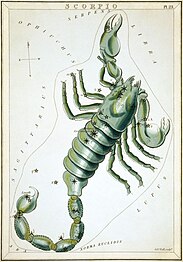
-

-


.jpg)
.jpg&action=edit§ion=T-1)
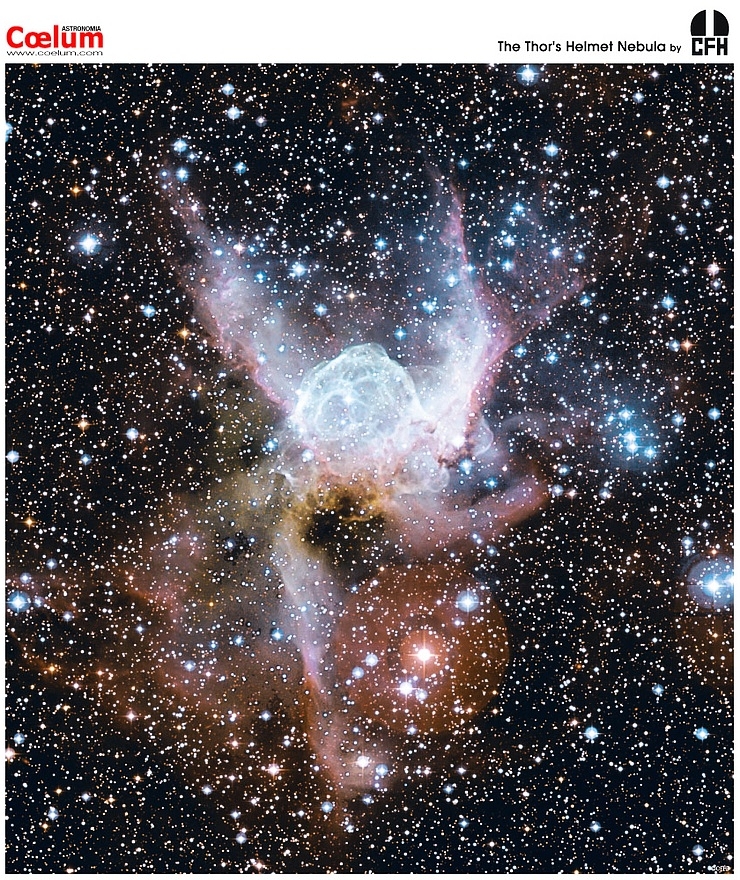
.jpg)
.JPG)
.JPG)
.JPG)
- Reason
- Excluding Aquarius, Pisces, and Capricornus - which are all FPs already - these are the remaining constellations of the ecliptic, including Ophiuchus (under its archaic synonym, Serpentarius). This is probably the penultimate nomination from Urania's Mirror - hopefully soon to be a Featured Article! Do note two of these (Cancer, Leo) were scanned later by the LoC, at higher resolution, so may look a little different.
- Articles in which this image appears
- Urania's Mirror, specific usages largely as linked.
- FP category for this image
- Wikipedia:Featured_pictures/Space/Understanding
- Creator
- Sidney Hall and Richard Rouse Bloxam, after Alexander Jamieson, restoration by Adam Cuerden.
- Support as nominator --Adam Cuerden (talk) 23:13, 10 April 2014 (UTC)
- Support as with previous nominations. Very good. — Crisco 1492 (talk) 23:35, 10 April 2014 (UTC)
- Support as with all the other plates. --CyberXRef☎ 22:01, 11 April 2014 (UTC)
- Support nice work, lovely pictures. Hafspajen (talk) 14:20, 12 April 2014 (UTC)
- Comment Featured set opportunity? HereToHelp (talk to me) 14:42, 13 April 2014 (UTC)o
- Probably better keeping them individual: It will take a long time to get the last two cards from Urania's mirror (I found somewhat decent fill-ins in the meantime.) The LOC didn't scan two of them, you see, so I basically have to beg them. Adam Cuerden (talk) 21:35, 13 April 2014 (UTC)
- Support Saffron Blaze (talk) 14:59, 13 April 2014 (UTC)
Promoted File:Sidney Hall - Urania's Mirror - Aries and Musca Borealis.jpg --Armbrust The Homunculus 23:33, 20 April 2014 (UTC)
Promoted File:Sidney Hall - Urania's Mirror - Taurus.jpg --Armbrust The Homunculus 23:33, 20 April 2014 (UTC)
Promoted File:Sidney Hall - Urania's Mirror - Gemini.jpg --Armbrust The Homunculus 23:33, 20 April 2014 (UTC)
Promoted File:Sidney Hall - Urania's Mirror - Cancer.jpg --Armbrust The Homunculus 23:33, 20 April 2014 (UTC)
Promoted File:Sidney Hall - Urania's Mirror - Leo Major and Leo Minor.jpg --Armbrust The Homunculus 23:33, 20 April 2014 (UTC)
Promoted File:Sidney Hall - Urania's Mirror - Virgo.jpg --Armbrust The Homunculus 23:33, 20 April 2014 (UTC)
Promoted File:Sidney Hall - Urania's Mirror - Libra.jpg --Armbrust The Homunculus 23:33, 20 April 2014 (UTC)
Promoted File:Sidney Hall - Urania's Mirror - Scorpio.jpg --Armbrust The Homunculus 23:33, 20 April 2014 (UTC)
Promoted File:Sidney Hall - Urania's Mirror - Sagittarius and Corona Australis, Microscopium, and Telescopium.png --Armbrust The Homunculus 23:33, 20 April 2014 (UTC)
Promoted File:Sidney Hall - Urania's Mirror - Taurus Poniatowski, Serpentarius, Scutum Sobiesky, and Serpens.jpg --Armbrust The Homunculus 23:33, 20 April 2014 (UTC)
Chital[edit]
.jpg)
.jpg&action=edit§ion=T-1)
Voting period is over. Please don't add any new votes. Voting period ends on 24 Apr 2014 at 00:57:54 (UTC)
.jpg)
- Reason
- This is a featured picture on Wikimedia Commons (Featured pictures) and is considered one of the finest images.
- Articles in which this image appears
- Browsing (herbivory); Chital; Nagarhole National Park
- FP category for this image
- Wikipedia:Featured pictures/Animals/Mammals
- Creator
- Yathin S Krishnappa
- Support as nominator --Hafspajen (talk) 00:57, 14 April 2014 (UTC)
- Support - High technical quality, good representation of a common herbivore behaviour (as well as the species' feeding habits). Very encyclopedic. — Crisco 1492 (talk) 03:37, 14 April 2014 (UTC)
- Support had it on my potential FPC list for a while. --ELEKHHT 11:20, 14 April 2014 (UTC)
- Support Jee 12:18, 14 April 2014 (UTC)
- Support Very good! I like it how the animals in the back blend in with the background, thus also showing the camouflage effect of their skin/fur. --Ebertakis (talk) 17:17, 14 April 2014 (UTC)
- Support Saffron Blaze (talk) 06:52, 20 April 2014 (UTC)
- Support SagaciousPhil - Chat 10:55, 22 April 2014 (UTC)
- Support Good photo of a spotted deer doing something more interesting than the typical photos of them simply eating/drinking. --CyberXRef☎ 23:44, 22 April 2014 (UTC)
Promoted File:Axis axis (Nagarhole, 2010).jpg --Armbrust The Homunculus 00:59, 24 April 2014 (UTC)
The Fall of Phaeton[edit]
Voting period is over. Please don't add any new votes. Voting period ends on 24 Apr 2014 at 07:24:21 (UTC)
.jpg)
- Reason
- Straight from the National Gallery of Art and perhaps one of Rubens' gems.
- Articles in which this image appears
- The Fall of Phaeton (Rubens)
- FP category for this image
- Paintings
- Creator
- Peter Paul Rubens
- Support as nominator --Brandmeistertalk 07:24, 14 April 2014 (UTC)
- Support - Oooh! — Crisco 1492 (talk)
- Support - Lovely. (Question about size): I wonder tought about the dimensions... 98.4 × 131.2 cm .. the size of a coffee table? - surely it is much bigger)... OK, I got that, it is a reproduction, a poster. Well, still it is weird to say 98.4 × 131.2 cm ...38.7 × 51.7 inch -I do think that the original is probably several metres. This [1] said, painting in the large scale. The Fall of Phaeton above is one example of Ruben’s masterful composition on a large scale... 98.4 × 131.2 cm (38.7 × 51.7 in) - is not much of a large scale. Hafspajen (talk) 13:02, 14 April 2014 (UTC)
- All of the sources give 98.4 * 131.2 (ex). I don't think Empty Easel is a site to rely on. — Crisco 1492 (talk) 15:57, 14 April 2014 (UTC)
- The National Gallery of Art entry confirms it's 98.4 x 131.2 cm, without framing. Brandmeistertalk 18:27, 14 April 2014 (UTC)
- How weird. That is a very little space to put all this grandious, flamboyant, splashy, magnificent work on. Great picture. Hafspajen (talk) 21:31, 14 April 2014 (UTC)
- Ah, the explanation: an early work!!! [2]. Thereof the moderate size. His later paintings are much bigger. (Sure when counting he was 27 years when he painted it) Hafspajen (talk) 04:33, 15 April 2014 (UTC)
- Support Gorgeous work by an old master, well-reproduced. Adam Cuerden (talk) 14:47, 16 April 2014 (UTC)
- Support SagaciousPhil - Chat 10:54, 22 April 2014 (UTC)
Promoted File:Peter Paul Rubens - The Fall of Phaeton (National Gallery of Art).jpg --Armbrust The Homunculus 07:25, 24 April 2014 (UTC)
Smoke grenade[edit]
Voting period is over. Please don't add any new votes. Voting period ends on 24 Apr 2014 at 11:08:54 (UTC)
-Romanceor.jpg)
- Reason
- Excellent action shot with high EV, well depicting the topic.
- Articles in which this image appears
- Smoke grenade
- FP category for this image
- Culture and lifestyle
- Creator
- Roman Bonnefoy
- Support as nominator --ELEKHHT 11:08, 14 April 2014 (UTC)
- Question - Is the darkness an effect of the smoke grenade, or an effect of this being shot at 1/1,250? This looks (maybe) a wee underexposed. — Crisco 1492 (talk) 11:22, 14 April 2014 (UTC)
- It's taken in winter late afternoon with high ISO. Various levels of smoke are distinguishable. --ELEKHHT 11:42, 14 April 2014 (UTC)
- Oh, I'm not doubting that it would be quite dark. However, this doesn't look like a 5 p.m. shot in November. This looks to be 6:30-ish. I'll link to a small, quick edit I made, adjusting the exposure just slightly. — Crisco 1492 (talk) 11:46, 14 April 2014 (UTC)
- Dropbox. — Crisco 1492 (talk) 11:50, 14 April 2014 (UTC)#
- With due respect Crisco, how would you know what 5pm in Paris in November looks like unless you live there (or somewhere similar)? ;-) A quick google search reveals what I suspected: It was taken a few minutes after sunset, so with the addition of the thick smoke, it's completely understandable that it's dark. By 6:30pm, it would be completely dark, with only street lighting. In any case, I don't actually see much of a difference between your edit and the original. Ðiliff «» (Talk) 16:08, 14 April 2014 (UTC)
- That's odd; in Lightroom it looked a bit lighter (exposure +0.2)... or did the export not work correctly? Anyways, although technically this has a little bit of blurring, I'd expect that to be (at least in part) due to the smoke. As such, I'd like to
Supportthis nomination. — Crisco 1492 (talk) 01:05, 15 April 2014(UTC)
- Striking support per Diliff's concerns below. — Crisco 1492 (talk) 00:45, 18 April 2014 (UTC)
- That's odd; in Lightroom it looked a bit lighter (exposure +0.2)... or did the export not work correctly? Anyways, although technically this has a little bit of blurring, I'd expect that to be (at least in part) due to the smoke. As such, I'd like to
- It's taken in winter late afternoon with high ISO. Various levels of smoke are distinguishable. --ELEKHHT 11:42, 14 April 2014 (UTC)
- Support it is good to have pictures about controversial topics too. Hafspajen (talk) 04:45, 15 April 2014 (UTC)
- Support good illustrative value. Tomer T (talk) 10:52, 15 April 2014 (UTC)
- Support As above. Adam Cuerden (talk) 12:02, 17 April 2014 (UTC)
- Oppose. It does occur to me that perhaps all the smoke is due to the flares, and not an actual smoke grenade. In which case, it would not be representative in illustrating the article. The image caption, translated from French, is: "Smoke in a demonstration in Paris". It does not imply where the smoke has come from, and the only visible source of smoke in the image is definitely the flares. If I'm missing something here, I'm happy to reconsider. Ðiliff «» (Talk) 12:28, 17 April 2014 (UTC)
- Well, this one has a flare - although I am not a Smoke grenade expert, but it looks like those flares spit out quite a lot of smoke. Hafspajen (talk) 15:22, 17 April 2014 (UTC)
- Well, I agree, both flares and smoke grenades spit out flames and smoke. But as far as I know, smoke grenades aren't meant to be held as they burn, whereas flares are. What we see in the image are definitely flares. Ðiliff «» (Talk) 16:53, 17 April 2014 (UTC)
- Actually "fumigène" as a noun means 'smoke making device'. Since those in the image are used by demonstrators, they are likely self-made and hence might work differently. It is clear from the image that the purpose of the devices is making smoke, and the image illustrates that effect, which is where the EV of the image lies. --ELEKHHT 01:41, 18 April 2014 (UTC)
- Except the connotations of smoke grenade and fumigène are slightly different. This may illustrate fumigène well... but it may not illustrate smoke grenade. — Crisco 1492 (talk) 01:44, 18 April 2014 (UTC)
- Depends on the scope of the article. The English wikipedia does not have currently a generic article on smoke making devices, and en:smoke grenade is the most extensive article on the subject, also linking to fr:fumigène. Note that similarly the German wiki article de:Rauchgranate includes in its scope all other similar smoke making devices (regardless of form), although it links back to en:Smoke bomb. As I am not expert on the subject I am not going to sort this out, but the issue seems to me to be with the article, not the image. --ELEKHHT 01:59, 18 April 2014 (UTC)
- I agree, the problem is not with the image, or the image caption. It's with the EV as it relates to the article it supposedly illustrates. A grenade is by definition designed to be thrown, not held. There is a clear difference in design and purpose between a smoke grenade (intended to be thrown and to generate smoke, with light as an incidental by-product) and a the type of flare in the image (intended to be held and to generate light, with smoke as an incidental by-product). The flare article calls them fusees. Ðiliff «» (Talk) 08:03, 18 April 2014 (UTC)
- Actually "fumigène" as a noun means 'smoke making device'. Since those in the image are used by demonstrators, they are likely self-made and hence might work differently. It is clear from the image that the purpose of the devices is making smoke, and the image illustrates that effect, which is where the EV of the image lies. --ELEKHHT 01:41, 18 April 2014 (UTC)
- Well, I agree, both flares and smoke grenades spit out flames and smoke. But as far as I know, smoke grenades aren't meant to be held as they burn, whereas flares are. What we see in the image are definitely flares. Ðiliff «» (Talk) 16:53, 17 April 2014 (UTC)
- Well, this one has a flare - although I am not a Smoke grenade expert, but it looks like those flares spit out quite a lot of smoke. Hafspajen (talk) 15:22, 17 April 2014 (UTC)
- Oppose — Terminology aside, I don't see much point in running an 'action' shot of an event that took place almost six years ago, given that the pic. isn't going to illustrate an entry on said event anyway. Sca (talk) 15:06, 19 April 2014 (UTC)
- The event itself is not the point though. If the image illustrated a smoke grenade effectively, it wouldn't matter if it was at an event 6 years ago or 40 years ago. They haven't changed substantially. It's more than just terminology though, flares and smoke grenades have very different functions, potentially very different chemistry, and very different results. There are separate articles for each on the English Wikipedia. The problem is that in the German and French Wikipedia (where the image originated), the two subjects are combined in a 'smoke making device' article, which might suit their needs, but not ours IMO. Ðiliff «» (Talk) 18:14, 19 April 2014 (UTC)
- Well, I don't think this more or less random (news-type) pic. has much EV, either. If we're going to illustrate Smoke grenade, we should show an actual smoke grenade burning & smoking away. Those look more like road flares to me. Sca (talk) 20:29, 19 April 2014 (UTC)
- Oppose mixed up with smoke from flares, can also not see any smoke grenade.--Theamazo (talk) 18:12, 20 April 2014 (UTC)
Not Promoted --Armbrust The Homunculus 11:09, 24 April 2014 (UTC)
Enrique Pena Nieto[edit]
Voting period is over. Please don't add any new votes. Voting period ends on 30 Apr 2014 at 01:32:57 (UTC)

- Reason
- high ev as lead image, very high quality, one of the best presidential portraits we have so far
- Articles in which this image appears
- Enrique Peña Nieto, President of Mexico, etc.
- FP category for this image
- Wikipedia:Featured pictures/People/Political
- Creator
- PresidenciaMX 2012-2018
- Support as nominator --Spongie555 (talk) 01:32, 20 April 2014 (UTC)
- Strong oppose - This is supposed to be a photograph, but it's been through some wonky Photoshop filter, leaving it nothing at full size but blots. — Crisco 1492 (talk) 04:19, 20 April 2014 (UTC)
- Oppose - The oil painting texture is goofy. Unless of course this is indeed an oil painting. Saffron Blaze (talk) 06:48, 20 April 2014 (UTC)
- It's surely not actually a painting. The texture looks totally digital, complete with exaggerated microcontrast (check the shirt collar). Ðiliff «» (Talk) 14:42, 20 April 2014 (UTC)
- The description page also notes that this is a photograph. — Crisco 1492 (talk) 15:54, 20 April 2014 (UTC)
- It's surely not actually a painting. The texture looks totally digital, complete with exaggerated microcontrast (check the shirt collar). Ðiliff «» (Talk) 14:42, 20 April 2014 (UTC)
- Oppose per above. Terrible quality at full size. Ðiliff «» (Talk) 14:42, 20 April 2014 (UTC)
- Oppose — Official portrait. ZZZzzzz. Sca (talk) 17:54, 20 April 2014 (UTC)
- Oppose - per above. Nikhil (talk) 06:36, 21 April 2014 (UTC)
- Oppose and speedy close per above. --ELEKHHT 09:39, 24 April 2014 (UTC)
Not Promoted -- — Crisco 1492 (talk) 08:58, 25 April 2014 (UTC)
- Speedy close per opposes. — Crisco 1492 (talk) 08:58, 25 April 2014 (UTC)
Groundhog[edit]
Voting period is over. Please don't add any new votes. Voting period ends on 25 Apr 2014 at 10:50:53 (UTC)

- Reason
- Good position and composition, important parts are sharp, high EV
- Articles in which this image appears
- Groundhog
- FP category for this image
- Wikipedia:Featured pictures/Animals/Mammals
- Creator
- Cephas
- Support as nominator --Tomer T (talk) 10:50, 15 April 2014 (UTC)
- Support — A 9 on the Cute Scale. (And it's not a bird!) Sca (talk) 16:07, 15 April 2014 (UTC)
- Support — As per 9 on the Cute Scale. Hafspajen (talk) 18:39, 15 April 2014 (UTC)(what if it is not a bird? are birds overrepresented on FPC? ) OK;- Diliff
 Hafspajen (talk) 22:30, 15 April 2014 (UTC)
 - Support. If I had to be critical, I'd say that the body shape is obscured and it's a little tightly cropped, but it's otherwise a quality capture. And birds are probably slightly overrepresented, but mainly because they're easier to photograph (well, some of them) and there is a lot of diversity and local availability of bird species. Ðiliff «» (Talk) 20:34, 15 April 2014 (UTC)
- Support if only to keep complaints about birds to a minimum. (Oh, and the image is quite well done as well). — Crisco 1492 (talk) 01:13, 16 April 2014 (UTC)
- Support SagaciousPhil - Chat 10:53, 22 April 2014 (UTC)
- Support Bellus Delphina talk 10:42, 24 April 2014 (UTC)
Promoted File:Marmota monax UL 04.jpg --Armbrust The Homunculus 10:58, 25 April 2014 (UTC)
Happy family[edit]
Voting period is over. Please don't add any new votes. Voting period ends on 25 Apr 2014 at 19:36:04 (UTC)
_and_12_chicks.jpg)
- Reason
- All the little ducklings are looking in the same direction
- Articles in which this image appears
- Mallard
- FP category for this image
- Animals
- Creator
- Charlesjsharp
- Support as nominator --Charlesjsharp (talk) 19:36, 15 April 2014 (UTC)
- Oppose very cute, but weak composition, with 3/4 of the image occupied by water and unfortunate overlay of parent duck and chick in the background. Also, image was just added to the article now, contravening criteria #5 --ELEKHHT 12:24, 16 April 2014 (UTC)
- Oppose — That's a lotta ducklings, but it's a clichéed composition. Sorry. Sca (talk) 14:30, 18 April 2014 (UTC)
- Oppose shows the back of the ducks.--Theamazo (talk) 18:09, 20 April 2014 (UTC)
Not Promoted --Armbrust The Homunculus 19:47, 25 April 2014 (UTC)
Wikipedia:Featured picture candidates/Saffronfarm-860808.jpg
Howard Thurston[edit]
Voting period is over. Please don't add any new votes. Voting period ends on 26 Apr 2014 at 11:53:32 (UTC)

- Reason
- A high-quality scan of a notable magician, by one of my two favourite American lithographers (The other being L. Prang). Was suggested to me by Armbrust as a subject, I found a somewhat better scan, and, so...
- Articles in which this image appears
- Howard Thurston
- FP category for this image
- Wikipedia:Featured_pictures/People/Entertainment
- Creator
- Strobridge Litho. Co., restored by Adam Cuerden
- Support as nominator --Adam Cuerden (talk) 11:53, 16 April 2014 (UTC)
- Support - Good poster, useful for the MP. — Crisco 1492 (talk) 14:09, 16 April 2014 (UTC)
- Support, interesting, with those red imps. Brandmeistertalk 17:40, 16 April 2014 (UTC)
- Support Can't find a flaw, and EV is there. Mattximus (talk) 00:40, 18 April 2014 (UTC)
- Support, love it. J Milburn (talk) 15:50, 19 April 2014 (UTC)
- Support SagaciousPhil - Chat 10:51, 22 April 2014 (UTC)
Promoted File:Thurston the Great Magician - Strobridge Litho. Co..jpg --Armbrust The Homunculus 11:53, 26 April 2014 (UTC)
Sari temple 2[edit]
Voting period is over. Please don't add any new votes. Voting period ends on 26 Apr 2014 at 15:28:30 (UTC)

- Reason
- A high quality, clear stitch of a fairly large temple (the largest one I've nominated so far).
- Articles in which this image appears
- Sari temple, Candi of Indonesia, Kewu Plain
- FP category for this image
- Wikipedia:Featured pictures/Places/Architecture
- Creator
- Chris Woodrich
- Support as nominator -- — Crisco 1492 (talk) 15:28, 16 April 2014 (UTC)
- Support as before Hafspajen (talk) 17:57, 16 April 2014 (UTC)
- Support as before Mattximus (talk) 00:38, 18 April 2014 (UTC)
- Support Minor flaws at full resolution (there's some artefacting in the plants to the far left, for example), but that resolution is so massive that they're insignificant. Adam Cuerden (talk) 01:47, 18 April 2014 (UTC)
- Support. And don't mention the plants!. ;-) Ðiliff «» (Talk) 15:23, 18 April 2014 (UTC)
- Plants I can handle... big fat leaves, on the other hand... — Crisco 1492 (talk) 15:24, 18 April 2014 (UTC)
- Support - impressive work --Godot13 (talk) 00:26, 23 April 2014 (UTC)
- Support Nice exposure and great level of detail. Some distortion around the edges but doesn't significantly affect overall EV. --ELEKHHT 09:52, 24 April 2014 (UTC)
- Oppose I know a lot of work has gone into getting the perspective just right on this subject, but it still looks a bit off to me. It's as though parts of the building seem to be leaning back while other parts aren't; to my eyes, the building seems to disagree with itself in a way that suggests very detailed but ultimately flawed attempts to correct the perspective of a very difficult shot (a process that I'm familiar with). I don't know if any amount of post processing for these source images (or the previous shots) could produce a final composite that sits well with me. I've never been to the temple, but the photo of the replica (and even the photo of the rear) on the temple's page seem fine to me, so it should be possible to photograph this structure in a more favorable way. Also, I don't presume to assert that my appraisal of the perspective is correct or universal; the flaw I see could just be in my own perception, but I feel it's appropriate to voice my concern. Otherwise, great image. -- Tokugawapants (talk) 10:32, 24 April 2014 (UTC)
- Thank you for the feedback. Sadly, a tree growing not far behind where I was standing (visible at the right edge of File:Candi Sari.JPG) precluded getting any further back and thus giving an easier perspective fix; the leaves started overlapping with the top stupa. Going right and back ran me into more issues with leaves. That being said, I agree that a better image can probably be taken, and (perhaps) in the future we can have a D&R. I'm half tempted to bring a stepladder with me, to be honest; as the image I've linked to shows (and Google Maps confirms), this is a very tight space (maybe 5 to 8 metres from fence to temple), too tight to get the whole temple in frame (and leave some reasonable room at the edges) without getting higher up. — Crisco 1492 (talk) 11:30, 24 April 2014 (UTC)
- Thank you for the explanation. Your has been a valiant effort, for sure. If only consumer digital large format cameras were a thing.... Tokugawapants (talk) 14:00, 24 April 2014 (UTC)
- Here's to hoping. Borobudur should be considerably easier, once I get a stretch of clear skies that lasts longer than the hour drive I need... photographers can get some considerable distance between them and the temple. Might even be room enough to use my 100mm macro... (I'll be uploading a large image, of a gate Taman Sari shot with said lens in the next couple days). — Crisco 1492 (talk) 14:14, 24 April 2014 (UTC)
- Support - Bellus Delphina talk 10:42, 24 April 2014 (UTC)
Promoted File:Sari Temple, 2014-04-10, from 52 images.jpg --Armbrust The Homunculus 15:29, 26 April 2014 (UTC)
Mammy's Cupboard 2[edit]
Voting period is over. Please don't add any new votes. Voting period ends on 26 Apr 2014 at 15:33:29 (UTC)

- Reason
- High quality and resolution, notable photographer, freest possible license
- Articles in which this image appears
- Mammy's Cupboard, Mammy archetype
- FP category for this image
- Wikipedia:Featured pictures/Places/Architecture
- Creator
- Carol M. Highsmith
- Support as nominator -- — Crisco 1492 (talk) 15:33, 16 April 2014 (UTC)
- Support One of the uglier gimmick architectures, but if we have an article on it, and it's a very good depiction of that article's subject - which it is - I think the EV is very high. Adam Cuerden (talk) 01:54, 18 April 2014 (UTC)
- It is 'very high EV' within a very low EV article about a kitsch-object that wouldn't be notable wasn't it in the US. Its advertising value is surely higher. --ELEKHHT 23:32, 23 April 2014 (UTC)
- Considering it was known enough for a notable photographer to document it (that link about, to Highsmith, is not to a user page!), and that it's clearly had discussion in some sources (this apparently has a page or two just about the restaurant, and it's got some mention/discussion in 300 Google Books). If it is encyclopedic enough for an article, it's encyclopedic enough for an FP. — Crisco 1492 (talk) 23:58, 23 April 2014 (UTC)
- You know that being photographed by a notable photographer does not confer notability, neither being simply mentioned in x books (btw 300 is not impressive given that even Kim Kardashian gets over 13,000 Google Books hits). If it were a similar building in India with all coverage in Hindi print media, Google wouldn't give any results. But that wasn't the point: wasn't contesting en.wiki notability per current standards, only questioning educational value, per common sense. Approaching 5 million articles on this Wiki, is obvious that the differences between their EV is massive. -ELEKHHT 07:20, 24 April 2014 (UTC)
- I never said it conferred notability. I said that it was notable enough for a photographer who is notable in her own right to want to photograph it. There's a decided difference.
- If there were a similar building in India, and I spoke Hindi, I'd likely try to write an article before nominating. I've done extensive work in Indonesia-related subjects, including several articles I wrote just to have images used (though only one so far has an image that is FP quality), including the National Press Monument, Kadisoka, and Dharma Wiratama Museum. Admittedly none of these are kitsch, but then kitsch isn't really an Indonesian aesthetic. I've been tempted to write about Indonesian food chains (say Bakmi GM or Waroeng Steak & Shake), but there doesn't seem to be much online, and I don't have ready access to trade magazines. Sourcing is, sadly, one of the major challenges faced by people writing about countries other than the UK and US: little is online, and (in the case of Indonesia, at least) it is common for less to be even written on a subject compared to an equally significant one in a Western country.
- Ultimately, and back to this image, I fail to see how the widespread "importance" (since notability, as defined by our policies, is a simple binary yes/no system) of a subject should be a qualifier for FPC, and it is quite rightly not part of the criteria. To be honest I've lost count of the minor celebrities who have FPs (say, Robin Hunicke), whilst some more mainstream ones have terrible images (or no image at all), such as Tim Allen, but since these individuals are notable under Wikipedia policy, the encyclopedic value in the article on the subject is generally high, and thus I've not raised much of a ruckus. — Crisco 1492 (talk) 08:11, 24 April 2014 (UTC)
- You know that being photographed by a notable photographer does not confer notability, neither being simply mentioned in x books (btw 300 is not impressive given that even Kim Kardashian gets over 13,000 Google Books hits). If it were a similar building in India with all coverage in Hindi print media, Google wouldn't give any results. But that wasn't the point: wasn't contesting en.wiki notability per current standards, only questioning educational value, per common sense. Approaching 5 million articles on this Wiki, is obvious that the differences between their EV is massive. -ELEKHHT 07:20, 24 April 2014 (UTC)
- Considering it was known enough for a notable photographer to document it (that link about, to Highsmith, is not to a user page!), and that it's clearly had discussion in some sources (this apparently has a page or two just about the restaurant, and it's got some mention/discussion in 300 Google Books). If it is encyclopedic enough for an article, it's encyclopedic enough for an FP. — Crisco 1492 (talk) 23:58, 23 April 2014 (UTC)
- It is 'very high EV' within a very low EV article about a kitsch-object that wouldn't be notable wasn't it in the US. Its advertising value is surely higher. --ELEKHHT 23:32, 23 April 2014 (UTC)
- Weak support as before. J Milburn (talk) 15:48, 19 April 2014 (UTC)
- Support SagaciousPhil - Chat 11:18, 22 April 2014 (UTC)
- Support -- Godot13 (talk) 00:22, 23 April 2014 (UTC
- Support Bellus Delphina talk 10:43, 24 April 2014 (UTC)
Promoted File:Mammy's Cupboard Restaurant, Natchez, Mississippi, by Carol M. Highsmith.jpg --Armbrust The Homunculus 15:33, 26 April 2014 (UTC)
Burchell's zebra[edit]
Voting period is over. Please don't add any new votes. Voting period ends on 27 Apr 2014 at 09:00:54 (UTC)

- Reason
- Good quality and EV
- Articles in which this image appears
- Burchell's zebra
- FP category for this image
- Wikipedia:Featured pictures/Animals/Mammals
- Creator
- Yathin S Krishnappa
- Support as nominator --Bellus Delphina talk 09:00, 17 April 2014 (UTC)
- Comment: the background seems to have an unnatural blur. – Editør (talk) 10:30, 17 April 2014 (UTC)
- F/4 at 500mm? The bokeh seems to be in line with that. The nomination below (Wikipedia:Featured picture candidates/860808-Saffronfarm-05-IMG 7845-2.jpg) has a similar effect, owing to the focusing. My own photographs (File:Unidentified Insect, Sari Temple, 2014-04-10 05.jpg for instance) sometimes get such an effect as well, when the f number is rather low. — Crisco 1492 (talk) 04:05, 18 April 2014 (UTC)
- Comment — For some reason the zebra looks like a model or plastic toy to me. I'm not saying it is — just that it seems to have that appearance. Sca (talk) 15:11, 19 April 2014 (UTC)
- There's a low-grade noise over the image; I think that it's making the image look plastic by smearing the features. Weak oppose. Adam Cuerden (talk) 14:47, 22 April 2014 (UTC)
- Adam please see the explanation by Yathin, I hope he has clarified things properly. Do you still think, the noise is a problem ? It can be reduced but din't feel to do so Bellus Delphina talk 10:27, 24 April 2014 (UTC)
- ISO 100 on the Mark IV shouldn't produce that kind of noise. If the exif data is correct, then post-processing definitely introduced undesirable graininess (too much sharpening?). As an aside, the zebra itself isn't quite as sharp as I would have liked. It's subtle, so I can't tell if focus is ever so slightly off the mark or there's a bit of motion blur (1/160s exosure at 500 mm is risky). – Juliancolton | Talk 19:28, 22 April 2014 (UTC)
- There's a low-grade noise over the image; I think that it's making the image look plastic by smearing the features. Weak oppose. Adam Cuerden (talk) 14:47, 22 April 2014 (UTC)
- Support Saffron Blaze (talk) 06:46, 20 April 2014 (UTC)
- Support Nikhil (talk) 06:38, 21 April 2014 (UTC)
- Support Possible to crop little bit on left and make it full square? Godhulii 1985 (talk) 07:41, 22 April 2014 (UTC)
- Shudder... no. Definitely not. — Crisco 1492 (talk) 11:38, 22 April 2014 (UTC)
- Oppose, per Adam. He seems to have fingered what was making me uneasy. — Crisco 1492 (talk) 00:27, 23 April 2014 (UTC)
- Comment Seems taken in low light in the evening. Not bad in the available situation. Pinged Yathin for further opinion. Jee 07:38, 23 April 2014 (UTC)
 Comment: as far as I can remember I did play with levels, contrast and temperature. This was photographed hand-held in the last light of the day, with a big storm in the background and quite a bit of dust in the area. So it is rather soft, which is what makes the picture more interesting in my (biased) opinion. ;-) I can upload the original without any post processing when I get back into civilization next week as I'm still in the field in Africa. ~y (talk) 13:03, 23 April 2014 (UTC)
- Support --This guy deserves a !vote. But the rest issues are not of much concern (IMHO)..The herald 12:45, 25 April 2014 (UTC)
- Support (having stumbled here from my FPC discussion page). High quality, stunning and beautiful. Also, SCIENCE !!! — Cirt (talk) 16:48, 26 April 2014 (UTC)
Promoted File:Equus quagga burchellii - Etosha, 2014.jpg --Armbrust The Homunculus 09:02, 27 April 2014 (UTC)
A Polish Nobleman[edit]
Voting period is over. Please don't add any new votes. Voting period ends on 27 Apr 2014 at 10:20:55 (UTC)


- Reason
- High quality photograph of a painting which is prominently featured in two good articles.
- Articles in which this image appears
- A Polish Nobleman, Rembrandt
- FP category for this image
- Wikipedia:Featured pictures/Artwork/Paintings
- Creator
- Rembrandt (painter)
National Gallery of Art (photographer)
Botaurus (uploader)
- Support as nominator --Editør (talk) 10:20, 17 April 2014 (UTC)
- Support - looks fine to me. Hafspajen (talk) 14:54, 17 April 2014 (UTC) (man, is the article Rembrand a Good article? Never seen such crappy gallery - is anyone interested to fix it? )
- Support - Notable painting by notable artist. High resolution, high quality scan. — Crisco 1492 (talk) 15:50, 17 April 2014 (UTC)
- Support - As above. Adam Cuerden (talk) 01:44, 18 April 2014 (UTC)
- Support — Who can oppose Rembrandt? An interesting visage and period portrayal. The subject does look rather like Rembrandt himself (below right). Sca (talk) 14:24, 18 April 2014 (UTC)
- Support (having stumbled here from my FPC discussion page). High quality image of deceased politician. — Cirt (talk) 16:47, 26 April 2014 (UTC)
Promoted File:Rembrandt van Rijn - A Polish nobleman.jpg Armbrust The Homunculus 10:49, 27 April 2014 (UTC)
Lagoon Nebula[edit]
Voting period is over. Please don't add any new votes. Voting period ends on 27 Apr 2014 at 11:51:14 (UTC)
- Reason
- The image never received an oppose !vote in its two nominations. But this time it requires 5 supports. The image is of high quality and perfect resolution for any astro picture.
- Articles in which this image appears
- Lagoon Nebula and Astrophysical plasma
- FP category for this image
- Wikipedia:Featured pictures/Space/Looking out
- Creator
- ESO/VPHAS+ team
- Nominators
- The Herald and ArionEstar
- Support as co-nominator --The herald 11:51, 17 April 2014 (UTC)
- Support as co-nominator-- ArionEstar (talk) 16:01, 17 April 2014 (UTC)
- Support with slight concerns about the crop. Adam Cuerden (talk) 15:46, 19 April 2014 (UTC)
- This one is not cropped as much: https://upload.wikimedia.org/wikipedia/commons/1/16/Lagoon_Nebula_%28ESO%29.jpg --Janke | Talk 19:42, 20 April 2014 (UTC)
- Support -- Tokugawapants (talk)
- Support (having stumbled here from my FPC discussion page). Quite beautiful and striking. Also, SCIENCE !!! — Cirt (talk) 16:44, 26 April 2014 (UTC)
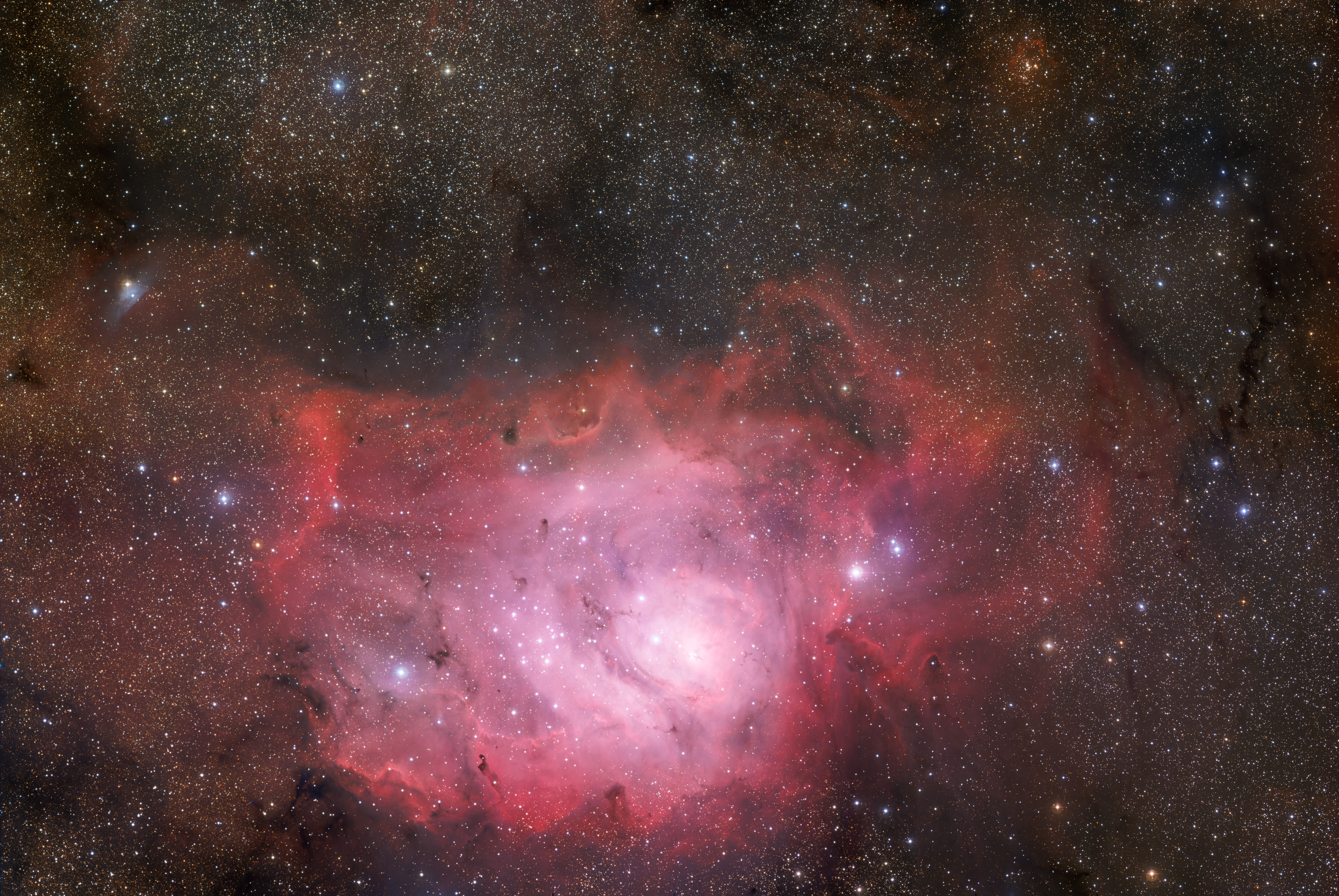
Promoted File:VST images the Lagoon Nebula.jpg --Armbrust The Homunculus 12:05, 27 April 2014 (UTC)
The famed tigress of Bandhavgarh descendant of Sita and the most famous wild tiger in the world, Charger.[edit]
Voting period is over. Please don't add any new votes. Voting period ends on 7 May 2014 at 00:44:26 (UTC)

- Reason
- High quality and resolution, has a free license, high EV value, original/unique image of a famous tigress that really captures the beauty and power of the tigress
- Articles in which this image appears
- Bengal tiger, Bandhavgarh National Park, Felidae
- FP category for this image
- Wikipedia:Featured pictures/Animals/Mammals
- Creator
- Archith
- Support as nominator – Dendro†NajaTalk to me! 00:44, 27 April 2014 (UTC)
- Oppose - Below the minimum resolution; "bokeh" is actually gaussian blur (very clear from the cut out feet). — Crisco 1492 (talk) 01:27, 27 April 2014 (UTC)
- Oppose and speedy close WP:SNOW. --Janke | Talk 07:12, 27 April 2014 (UTC)
Not Promoted --The herald 15:16, 27 April 2014 (UTC)
- Speedy close per WP:SNOW The herald 15:16, 27 April 2014 (UTC)
Monument to the women of World War II (UK)[edit]
Voting period is over. Please don't add any new votes. Voting period ends on 28 Apr 2014 at 18:32:17 (UTC)
.jpg)
- Reason
- High quality, high EV
- Articles in which this image appears
- Monument to the Women of World War II
- FP category for this image
- Wikipedia:Featured pictures/Artwork/Sculpture
- Creator
- Godot13
- Support as nominator --Godot13 (talk) 18:32, 18 April 2014 (UTC)
- Not subject to 7-day rule as the image is a quality upgrade of a very similar image.
- Support Adam Cuerden (talk) 19:36, 18 April 2014 (UTC)
- Support Hafspajen (talk) 20:26, 18 April 2014 (UTC)
- Question - Is it possible to get this at a different time of day when there are not so many sharp shadows? — Crisco 1492 (talk) 03:59, 19 April 2014 (UTC)
- Sorry for the delay, just got back from London. I suppose it is possible, but it seemed like there was only 2-3 hours with the sun shining on the face of the sculpture before it went overhead and then back-lit the object. The building in the current image was (IMHO) a better choice than the shooting the other direction. That being said, I do understand your concern...-Godot13 (talk) 22:45, 19 April 2014 (UTC)
- Fair enough. Support, although a D&R if we get a better shot may be warranted. — Crisco 1492 (talk) 00:42, 20 April 2014 (UTC)
- Sorry for the delay, just got back from London. I suppose it is possible, but it seemed like there was only 2-3 hours with the sun shining on the face of the sculpture before it went overhead and then back-lit the object. The building in the current image was (IMHO) a better choice than the shooting the other direction. That being said, I do understand your concern...-Godot13 (talk) 22:45, 19 April 2014 (UTC)
- Oppose too many shadows on a dark subject make it difficult to see.--Theamazo (talk) 18:07, 20 April 2014 (UTC)
- Oppose — At this size, it's not readily apparent that the sculpture depicts not women but empty "sets of clothing and uniforms" — and the shadows are problematic. A closer, somewhat oblique angle would be better, IMO. Sca (talk) 16:03, 21 April 2014 (UTC)
- Oppose composition is not FP for me, the angle, lighting, time of the day etc. making the background too distracting. Also as pointed out above, the shadows are so dark that the sculpture is not easily legible. --ELEKHHT 23:22, 23 April 2014 (UTC)
- Comment Is everyone checking that their monitors are calibrated (e.g. by using the guidelines at the top of the screen)? I see some comments saying that the shadows are too dark. The shadows are distracting (and I agree that, optimally, this pic would be taken at a different time of day/different lighting conditions), but the shadows are certainly not so dark that they obscure any form on my screen. Looking at the luminosity histogram of the image, there is a good amount of room between the darkest values in the image and the zero point/shadow of the histogram. Tokugawapants (talk) 10:46, 24 April 2014 (UTC)
- Comment::::Considering that it is a relief, those shadows add to the picture. One can be a little bit flexible. Or maybe someting is wrong with my shadows. Hafspajen (talk) 15:05, 25 April 2014 (UTC)
Not Promoted --Armbrust The Homunculus 18:33, 28 April 2014 (UTC)
Arseniy Yatsenyuk[edit]
Voting period is over. Please don't add any new votes. Voting period ends on 29 Apr 2014 at 05:55:40 (UTC)

- Reason
- High ev as lead image,high quality,Very good portrait
- Articles in which this image appears
- Arseniy Yatsenyuk, List of chairmen of the Verkhovna Rada,Prime Minister of Ukraine, Yatsenyuk Government
- FP category for this image
- Wikipedia:Featured pictures/People/Political
- Creator
- Ybilyk
- Support as nominator --Spongie555 (talk) 05:55, 19 April 2014 (UTC)
- Comment — No political bias here, but who knows what Mr. Yatsenyuk's status may be at such time as this shot would appear as a FP? Sca (talk) 14:59, 19 April 2014 (UTC)
Conditional supportLooks dark, perhaps should be slightly lightened. Brandmeistertalk 16:59, 19 April 2014 (UTC)- The image was brightened and cleaned by the graphics lab. Spongie555 (talk) 00:45, 20 April 2014 (UTC)
- I feel like this has a bit too much contrast. Probably deliberate; to make him a beacon of light in the darkness of turbulent times, or to show him as a powerful figure standing above the rest. Technically quite nice, but the contrast is still a bit too high. — Crisco 1492 (talk) 04:23, 20 April 2014 (UTC)
- Support, ok, I've purged the cache and see the change. Brandmeistertalk 08:22, 21 April 2014 (UTC)
- Oppose too dark, poor exposure.--Theamazo (talk) 18:06, 20 April 2014 (UTC)
- Comment: Has this been airbrushed? J Milburn (talk) 17:10, 21 April 2014 (UTC)
Not Promoted --Armbrust The Homunculus 10:12, 29 April 2014 (UTC)
Point Montara Light[edit]
Voting period is over. Please don't add any new votes. Voting period ends on 29 Apr 2014 at 11:03:05 (UTC)
.jpg)
- Reason
- Good quality and high EV
- Articles in which this image appears
- Point Montara Light
- FP category for this image
- Wikipedia:Featured pictures/Places/Architecture
- Creator
- Frank Schulenburg
- Support as nominator --Tomer T (talk) 11:03, 19 April 2014 (UTC)
- Comment — I'm a sucker for lighthouse shots, but I'd like this one better if the headland weren't directly behind the house. Sca (talk) 14:56, 19 April 2014 (UTC)
- Oppose The right side of the image is basically a wasteland of dullness. Saffron Blaze (talk) 06:50, 20 April 2014 (UTC)
- Oppose poor exposure.--Theamazo (talk) 18:05, 20 April 2014 (UTC)
Not Promoted --Armbrust The Homunculus 11:05, 29 April 2014 (UTC)
Itsukushima Shrine[edit]
Voting period is over. Please don't add any new votes. Voting period ends on 30 Apr 2014 at 17:47:14 (UTC)
- Reason
- High EV and good quality
- Articles in which this image appears
- Itsukushima Shrine, Itsukushima
- FP category for this image
- Wikipedia:Featured pictures/Places/Architecture
- Creator
- JordyMeow
- Support as nominator --Tomer T (talk) 17:47, 20 April 2014 (UTC)
- Oppose As at Commons I am completely unconvinced the colours are correct. Saffron Blaze (talk) 18:14, 20 April 2014 (UTC)
- Oppose as per above. Lovely composition but the colours seem more than a little off to me. Sotakeit (talk) 23:50, 20 April 2014 (UTC)
- Oppose The colours are definitely not right. This is a widely-reproduced image (the place where it was taken from is actually concreted to encourage photographers to use it!), and so any FP should be technically perfect. Nick-D (talk) 03:45, 21 April 2014 (UTC)
Not Promoted --Armbrust The Homunculus 18:57, 30 April 2014 (UTC)